Written & Photographed by Kenn Sava
As it was for PhotoBooks, 2021 was a challenging year to see as many newly published Art Books as in years past.
Still, the companies kept releasing them, and there were some terrific ArtBooks released this past year. Since there is no such thing as “best” in the Arts, here are those I most highly recommend, which I call NoteWorthy.
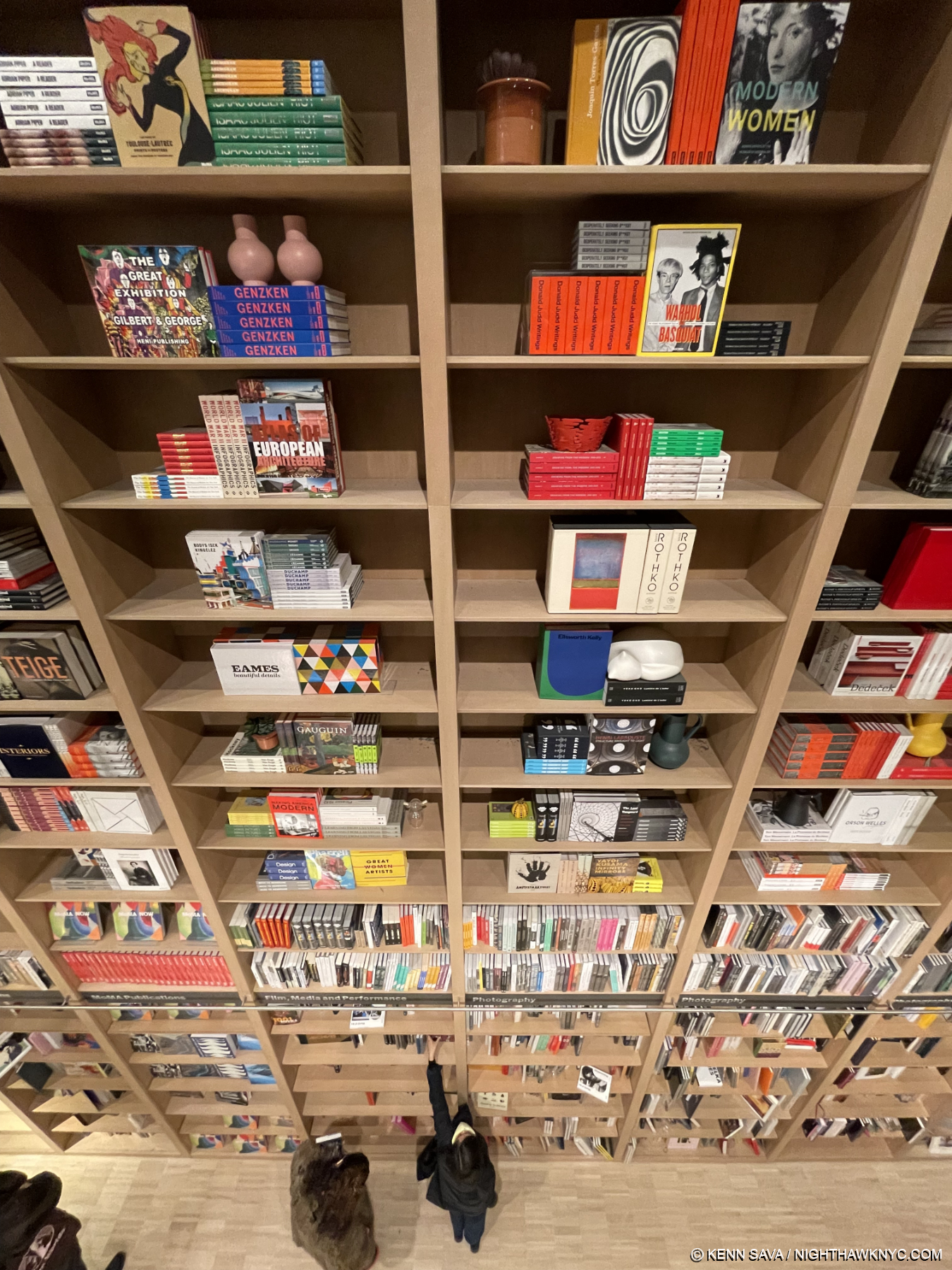
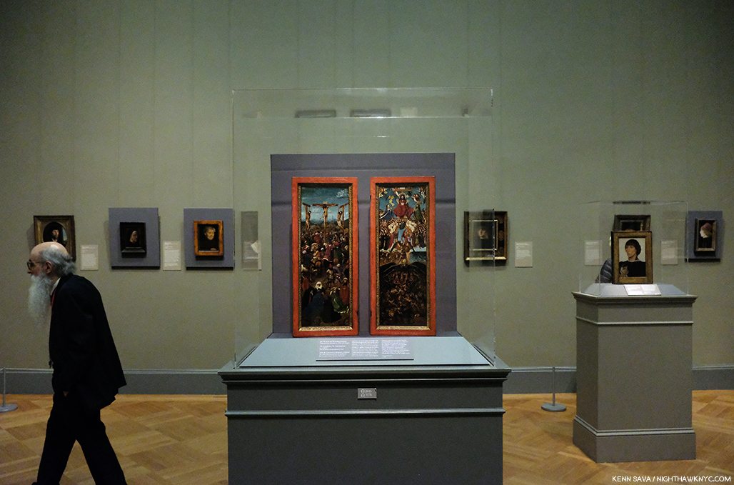
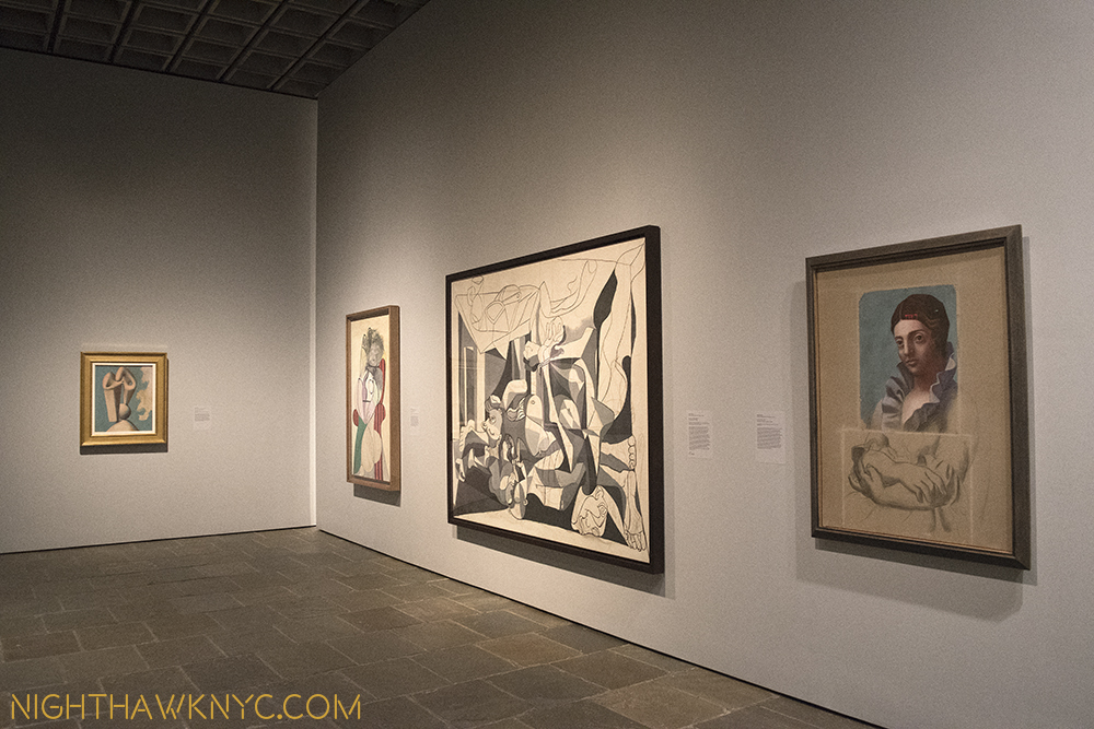
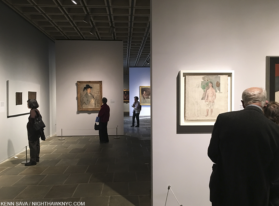
MoMA’s Endless Wall of Art Books is at least 60 feet high and twice as wide. I’ve given up seeing Yoko Ono: Lumiere de L’aube under the sleeping cat sculpture about 20 feet above the lady’s outstretched arm!
NoteWorthy Art Books, 2021
Following on the heels of Jordan Casteel’s terrific New Museum show, Jordan Casteel: Within Reach, accompanied by the now classic book of the same name, 2021 was the year of terrific and important Art Books by Black Women Painters, known, and on the verge of becoming much more well known. I’ll celebrate them first-
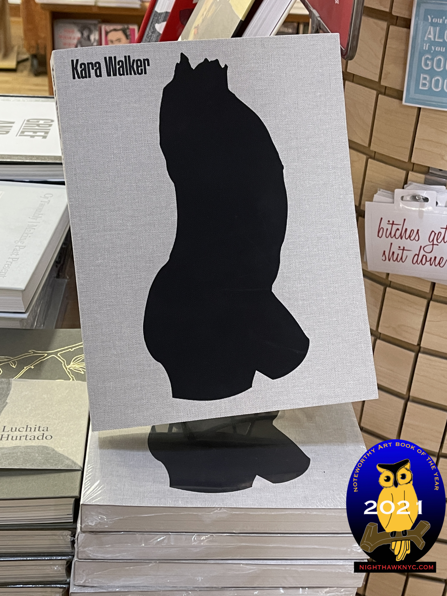
An early nominee for Art Book of the Decade.
Kara Walker: A Black Hole Is Everything A Star Longs To Be, JRP Editions- Kara Walker has never been one to mince a line, a word or a cut image, and in A Black Hole Is Everything, her raw power is seen in full effect in page after page (600 in all!) of stunning Drawings in this catalog for a show of the same name at Schirn Kunsthalle Frankfurt, which she has said was born of “an excavation of my archives.” For those who missed the show, it serves as an excellent retrospective of her Drawings. As anyone who has seen her Drawing shows at Sikkima Jenkins & Co. over the past few years can attest, her Drawings are often timely, and then will surprise by referencing Art history in equally fresh, unique, even humorous, ways. 700 of them created between 1992 and 2020 are included here, with only a small number I saw in her shows, allowing the reader to trace the evolution of this vital side of the Artis’s creativity. Most have never been published. While her huge installations and cut paper pieces often have an all-encompassing effect, her Drawings, which feature immediacy and intimacy, show another side of her range. A number of Kara Walker’s earlier books are now quite hard to find. Given the size of A Black Hole is Everything and the fact that it’s imported, don’t wait long before grabbing yours. An early nominee for one of the most important Art Books of the decade.
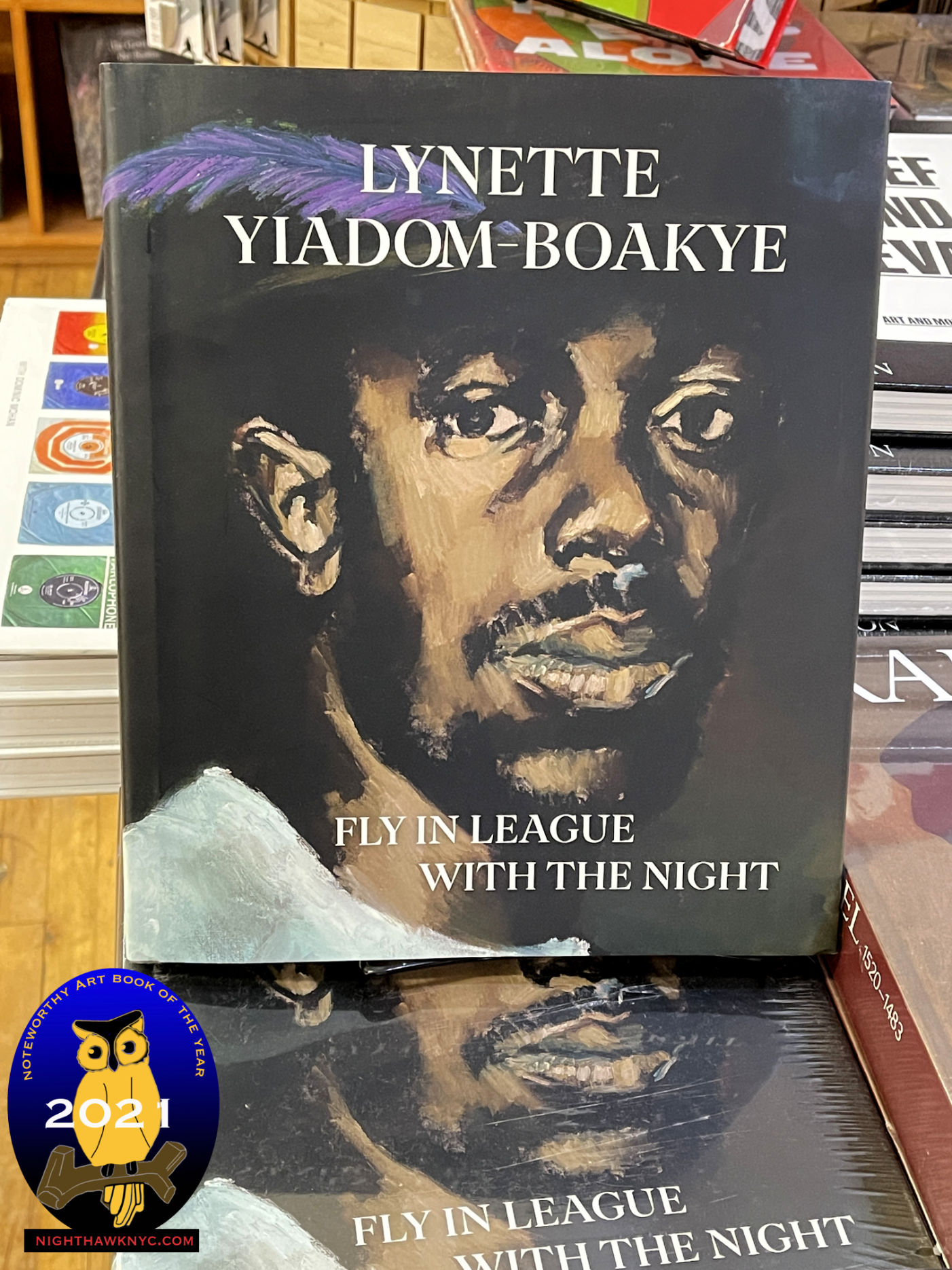
Lynette Yiadom-Boakye: Fly In League With The Night, DAP & Tate- A big year for the British Artist is captured in full effect in this fine book ostensibly published for her exhibition at the Tate, London. It also serves as a fine introduction to her work for those who didn’t see it. I saw her debut NYC solo show in 2019, which the Artist attended, and was immediately impressed with how she made the influence of the masters, like Velazquez and Goya, entirely her own. Her figures are always strong, set against subtle backgrounds, though the overall tone is dark, which is something of a trademark of the Artist, she occasionally offsets them with vibrant color. In this regard, they affect me like some of Hopper’s urban portraits, but Ms. Yiadom-Boakye’s work is even darker. A Painter just beginning to receive world-wide acclaim. I don’t see that ending any time soon.
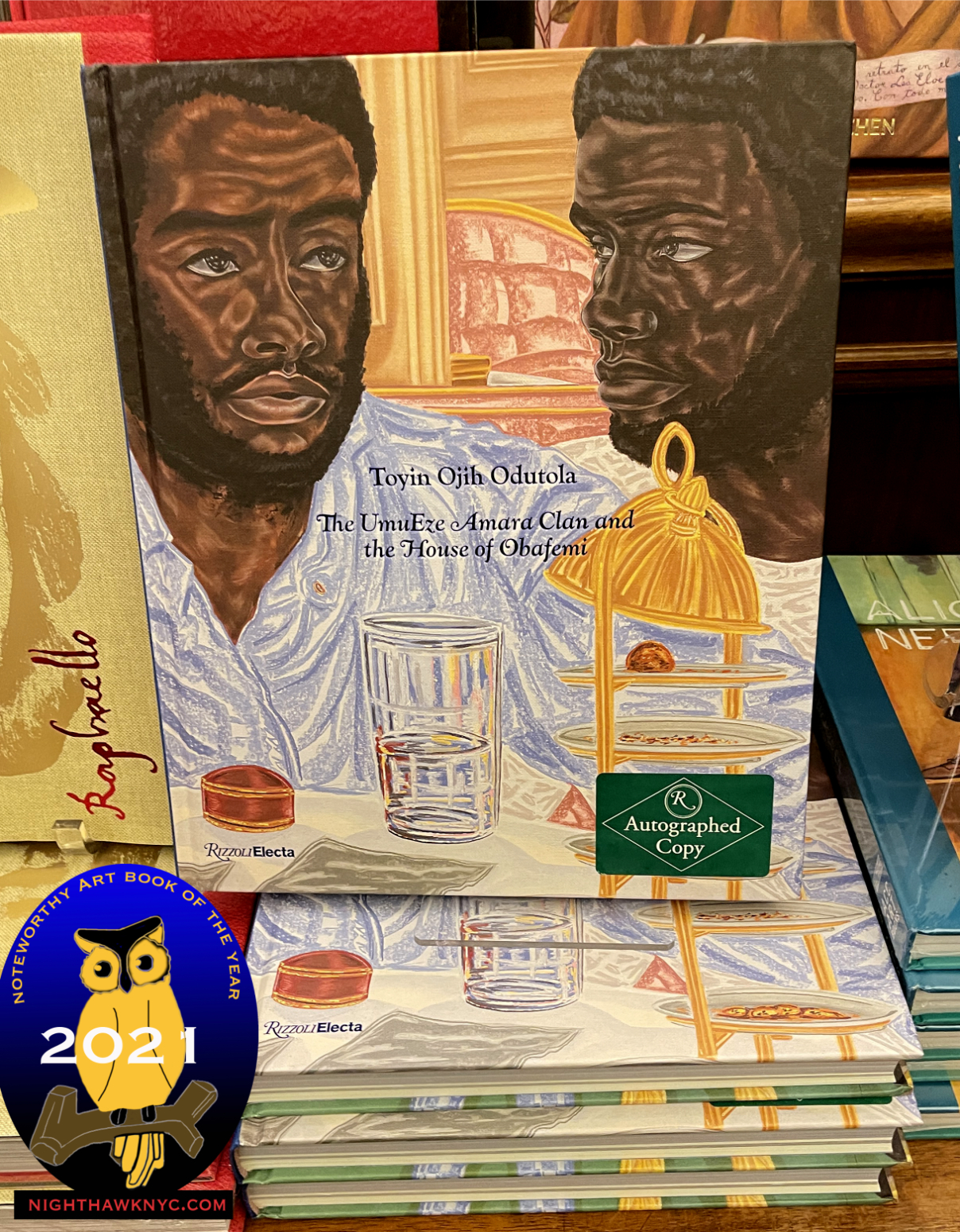
Toyin Ojih Odutola: The UmuEze Amara Clan and the Hour of Obafemi, Rizzoli Electa- I can’t remember when the last time was I was so blown away by a Painter’s debut monograph. And this is after I had seen her terrific Whitney Museum show in 2017, and her work included in an equally wonderful group show at Jack Shainman Gallery in September, 2018. So, her work was not new to me when I picked up The Umueze Amara Clan. Still, I was just mesmerized by it as I paged through and every single time I pick it up since that feeling returns. Her unique style reminds me of a touch of Lucian Freud or Kathe Kollwitz, with larger touches of Charles White and Kerry James Marshall, but, in the end, comparisons are utterly pointless. I’m sure some will pick this up and say Ms. Odutola is “on her way to becoming a great Painter.” Ummm…no. She is one right now. An important book. Not to be missed.
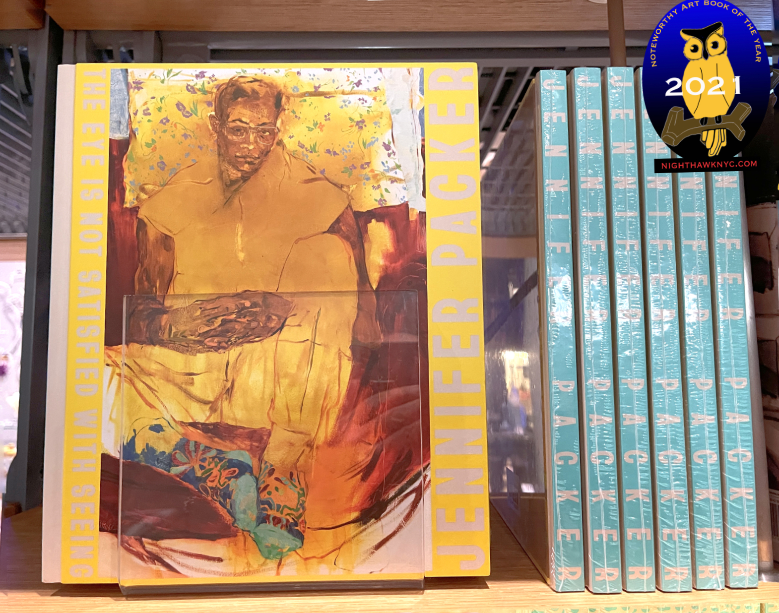
Jennifer Packer: The Eye Is Not Satisfied With Seeing Serpentine Gallery– Most recently, I’ve been completely lost in Jennifer Packer’s work and the exceptional book, Jennifer Packer: The Eye Is Not Satisfied With Seeing, one of the most beautifully designed Painting books I’ve seen- in a year of exceptionally beautifully designed Painting books. Jennifer Packer is another Painter I was introduced to at the Whitney Museum- first in 4 Paintings in the 2019 Whitney Biennial, and now in her spectacular Whitney solo show of the same name as this book, which I saw the day it opened on October 30th, and is currently up as I write this. I’ll have more to say about her soon.
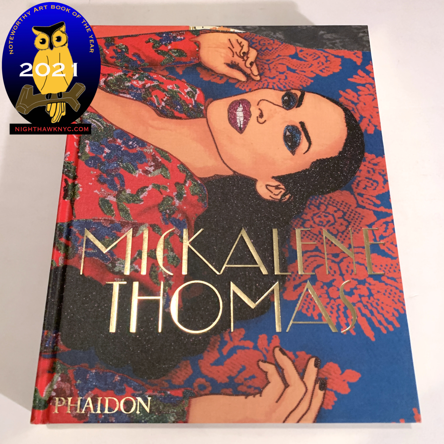
Mickalene Thomas, Phaidon- The newest book on this list was published just in time to make it, and I attended its release just this week. It, too, is one of the most beautifully designed Art Books of 2021, and a fitting overview of the work of this important and ground-breaking Artist & Activist who’s work is Photography based. It’s an overdue collection that was worth every bit of the wait. It joins Aperture’s excellent overview of her Photography, Muse, as an essential book on Ms. Thomas’s work.
Pick one of them? I can’t. I don’t think you can go wrong with whichever one you choose. All are Artists who will only be more and more important as time goes on, yet each of their books sticks a flag in the ground for their Art, and their vision, while making stunning cases for their work right now.
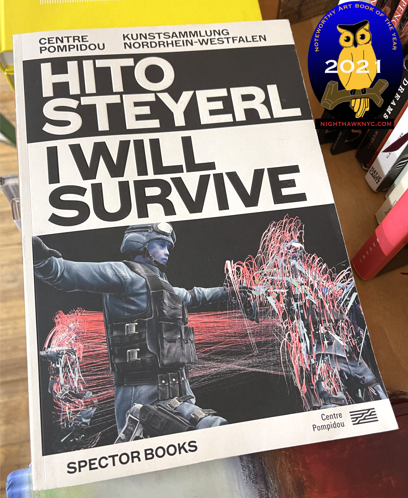
Hito Steyerl, I Will Survive, Spector Books- Though a catalog for a European retrospective covering 30 years of her work, I’m moving this book out of the Retrospective or Exhibition Catalog category this year because her work is that important and this book is just so well done (like Paolo Pellegrin: Un’Antologia was among NoteWorthy PhotoBooks I looked at in 2020). Ms. Steyerl is probably better known in Europe where she famously turned down a top German honor, akin to British knighthood, because of her country’s pandemic response, so this book will hit Americans like it did me- a jolting wake up call to her work, her career, her ideas and how of-the-moment they seem today. (See Sara Cwynar in my NoteWorthy PhotoBooks, 2021 piece). Primarily a filmmaker (like Ms. Cwynar and Arthur Jaffa), theoretician and writer, her work centers on the circulation of images. As images take over our lives, in every realm besides Art, Hito Steyerl has been pointing out the dangers and the damages of this for a very long time. If her time isn’t now, it’s never going to be her time. The loss will be to the rest of us it’s all happening to who haven’t checked her work out.
NoteWorthy Art Book/Autobiography, 2021
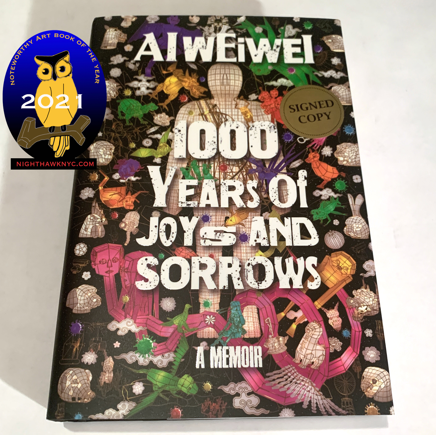
Ai Weiwei, 1000 Years of Joys and Sorrows– A few years ago I wondered if Ai Weiwei was the Artist of the Decade. Now that the 20 teens are over, it’s hard to think of anyone else who had the impact on both Art, and the world, as the former New Yorker, who finally left China behind for Germany, had between 2010 and 2019. His Autobiography couldn’t be more down to earth or matter of fact but that takes nothing away from how riveting page after page is. His journey is legendary, and I’ve written about it before, but to hear him lay it all out, in detail, makes for one of the most compelling Artist’s Autobiographies in the history of Art in my view. An essential document- on Art, on life, on growing up in China, and on living in the world today.
NoteWorthy Exhibition Catalogs, 2021
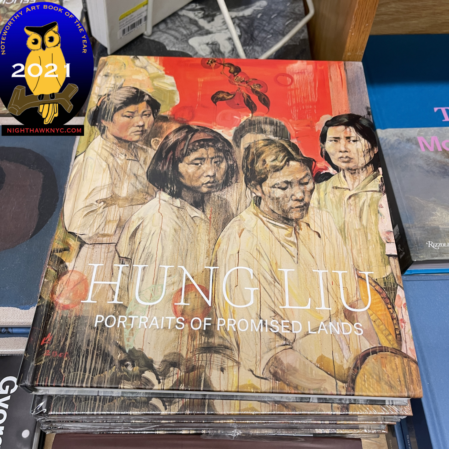
Hung Liu: Portraits of Promised Lands, Yale – A gorgeous book and terrific overview of the work of the late Chinese-American Artist who based some of her Paintings on the work of Dorothea Lange. Not unlike Ai Weiwei, Hung Liu lived with her family in exile during her childhood in China after Mao banished them to the hinterlands for “re-education.” Hung Liu came to know the hardships Dorothea Lange showed personally and spent the rest of her life expressing that in her work showing the disenfranchised of both her countries. Published to accompany the first museum retrospective of her work at the Smithsonian’s Portrait Gallery, the Artist died as it was about to open. (My look at a simultaneous Fall, 2021 NYC show she also worked on before she passed is here.) The book serves as a terrific introduction to the work of an Artist who’s work I believe is going to be with us for the long haul.
The Painter I’ve been looking at, and obsessed with, longer than any other FINALLY gets a book with text & images worthy of him & his Art.
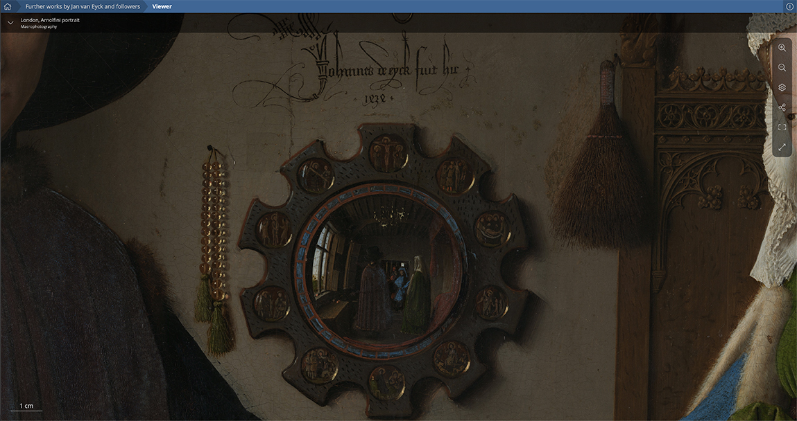
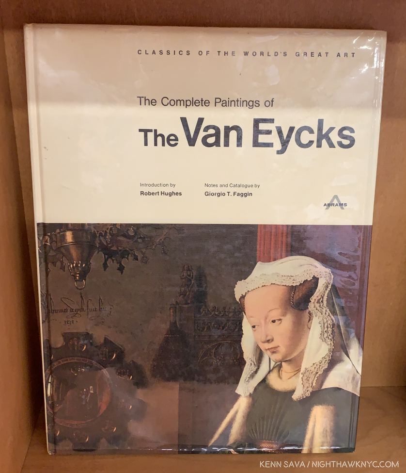
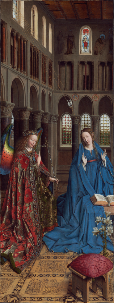
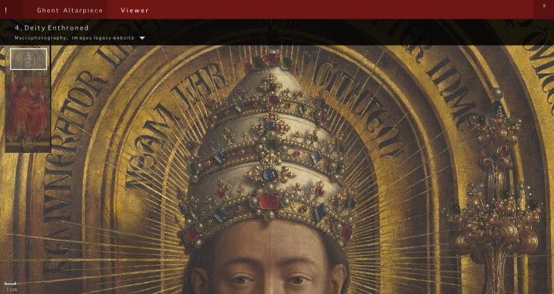
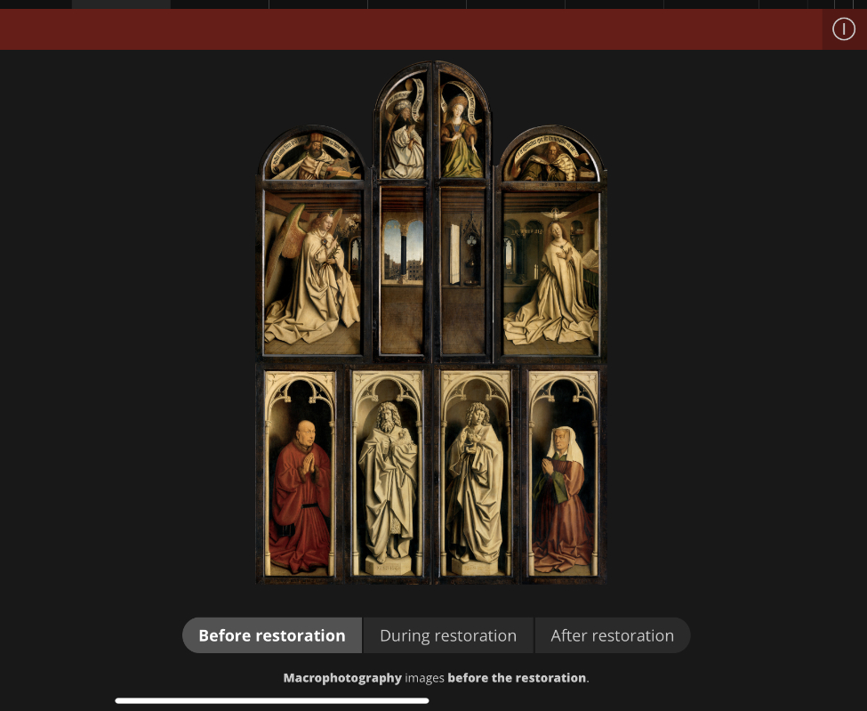
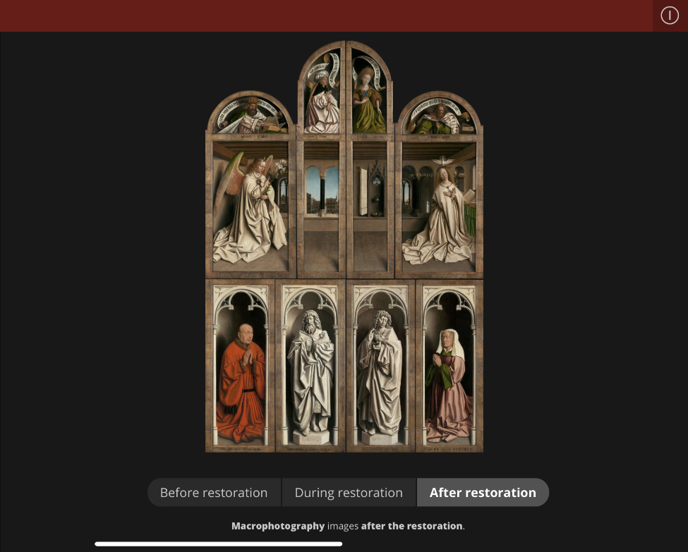
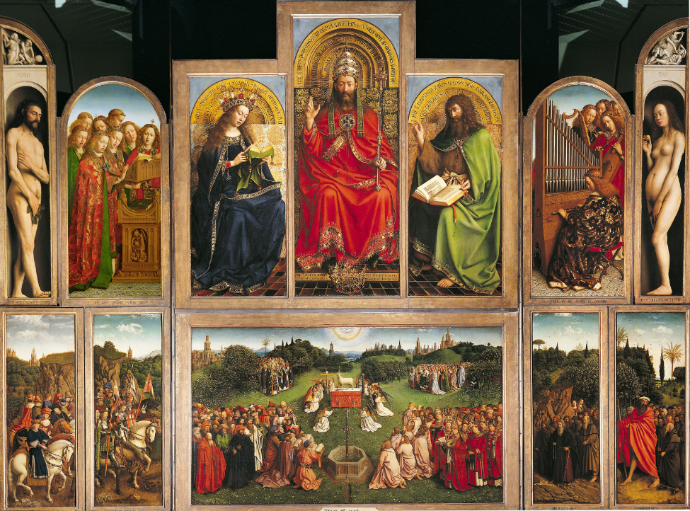
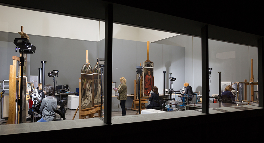
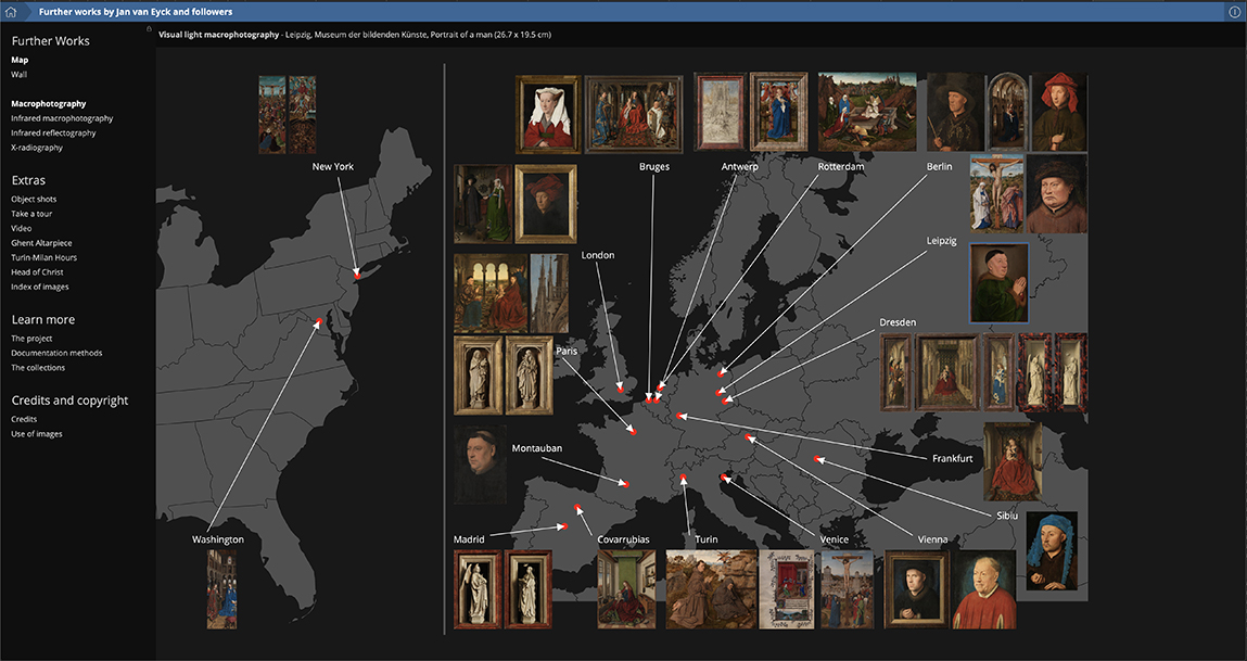
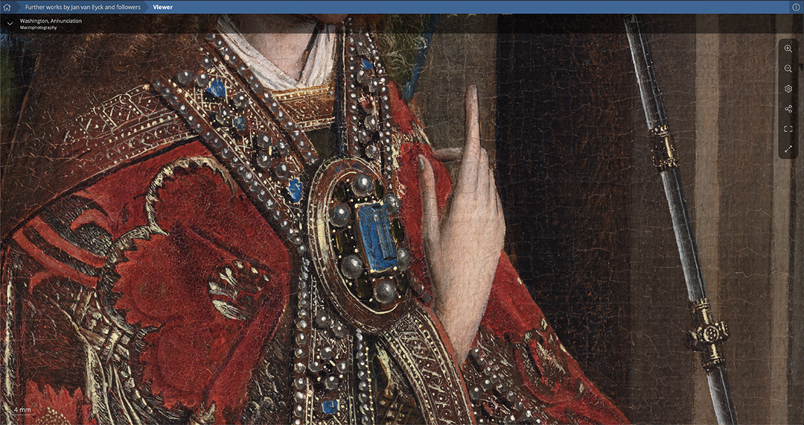
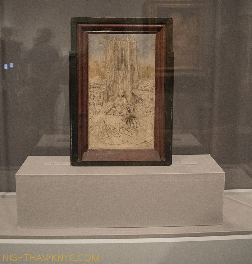
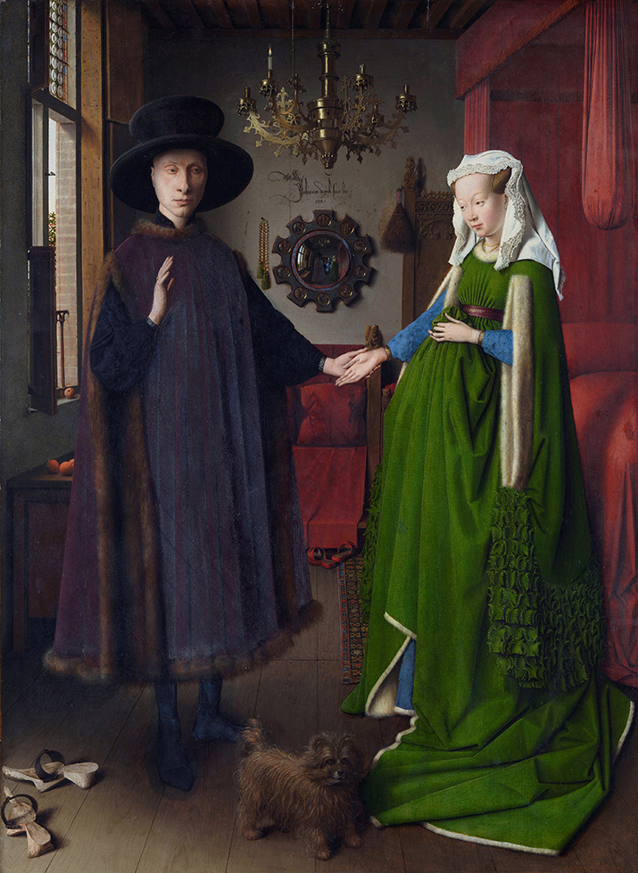
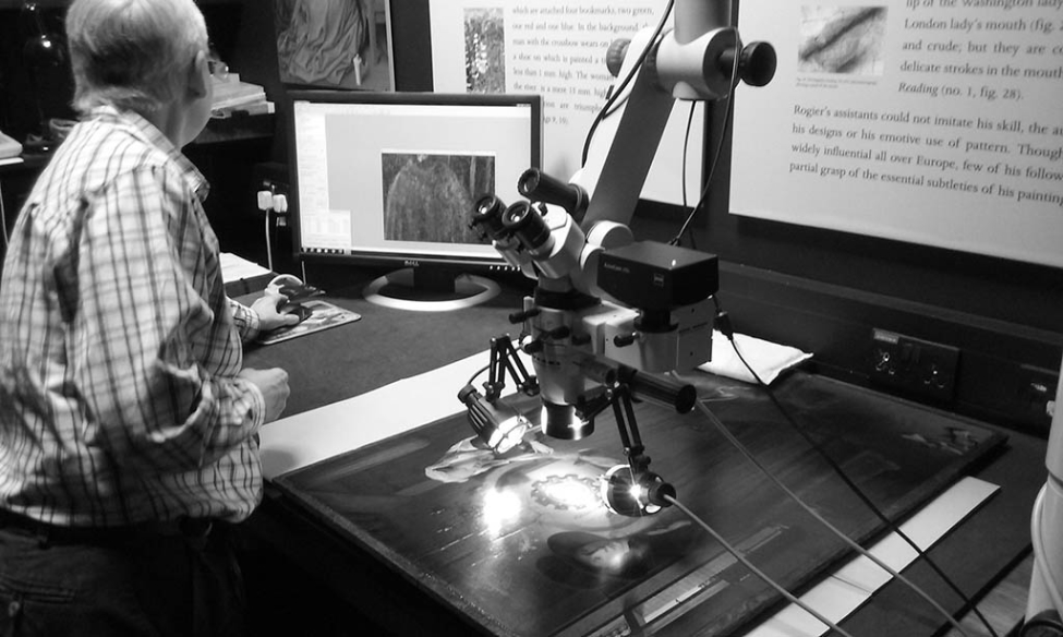
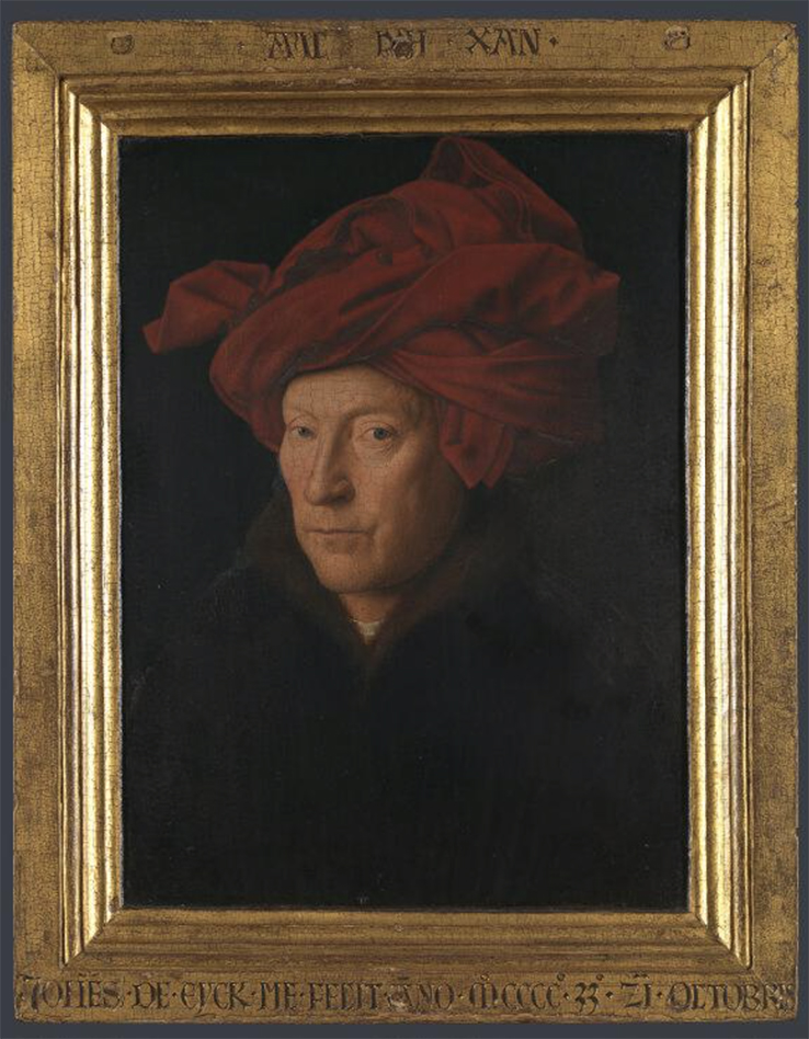
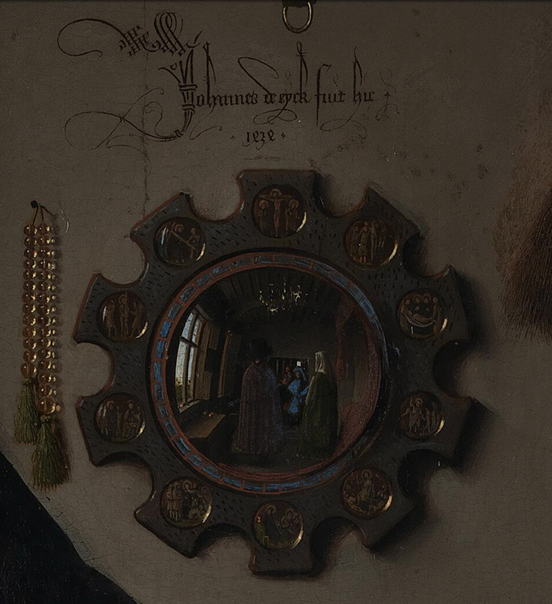
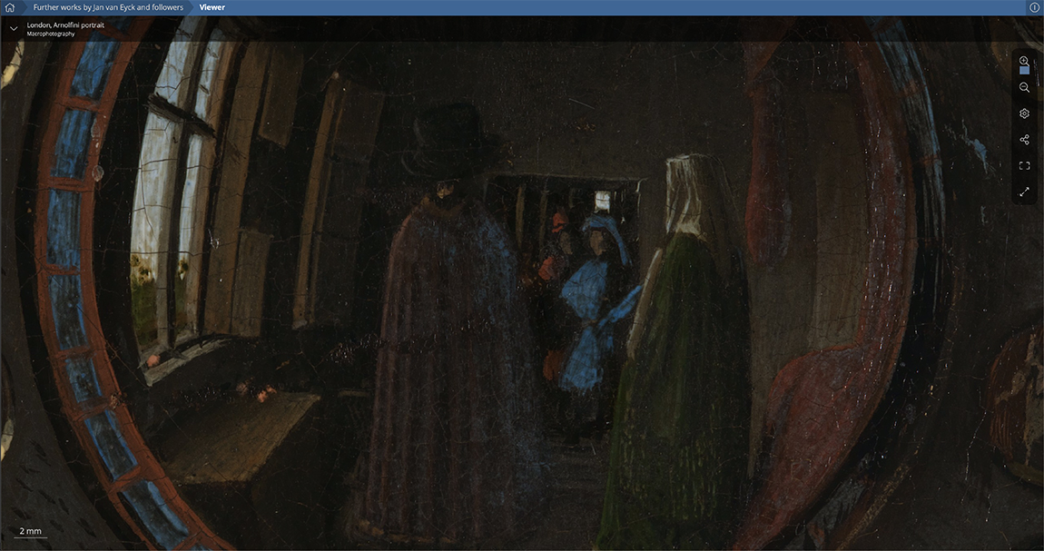
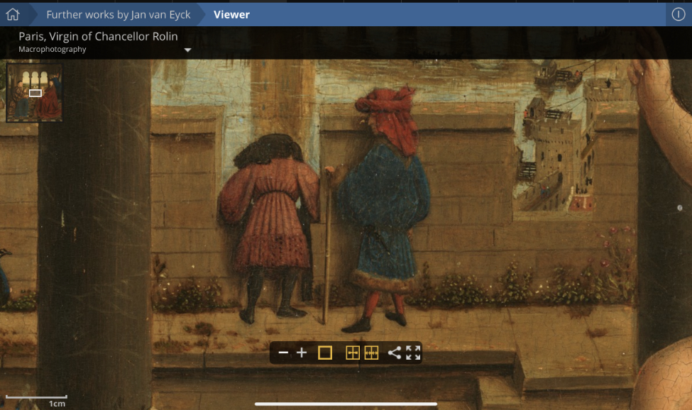
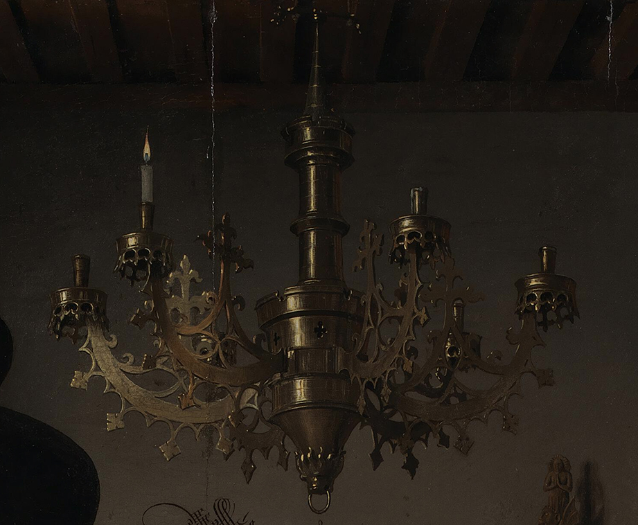
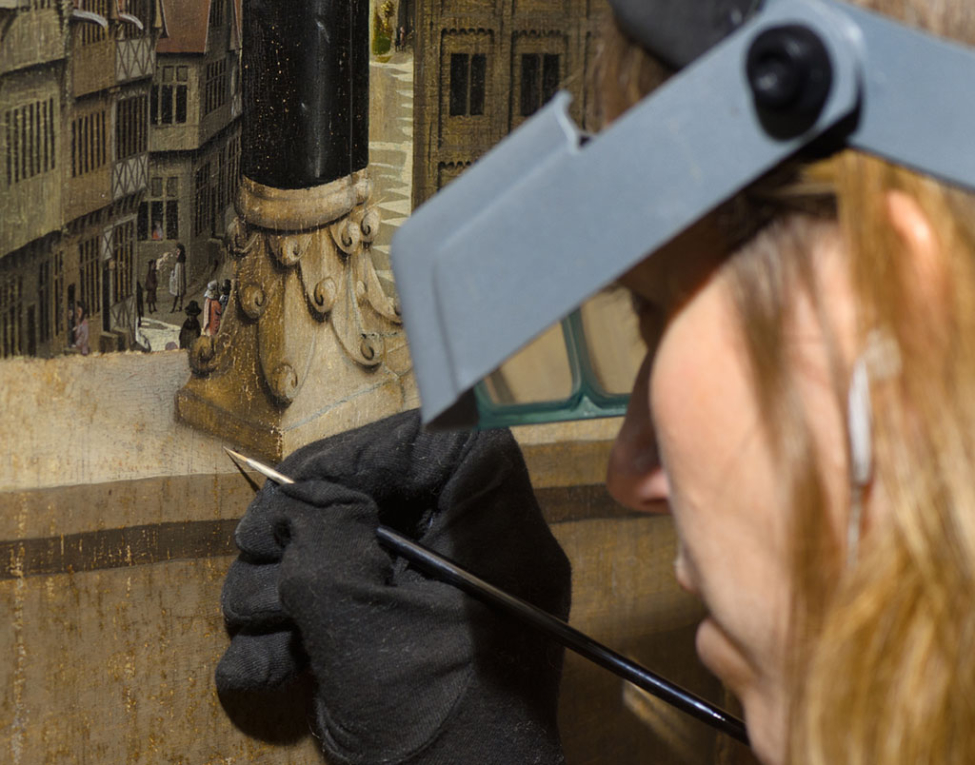
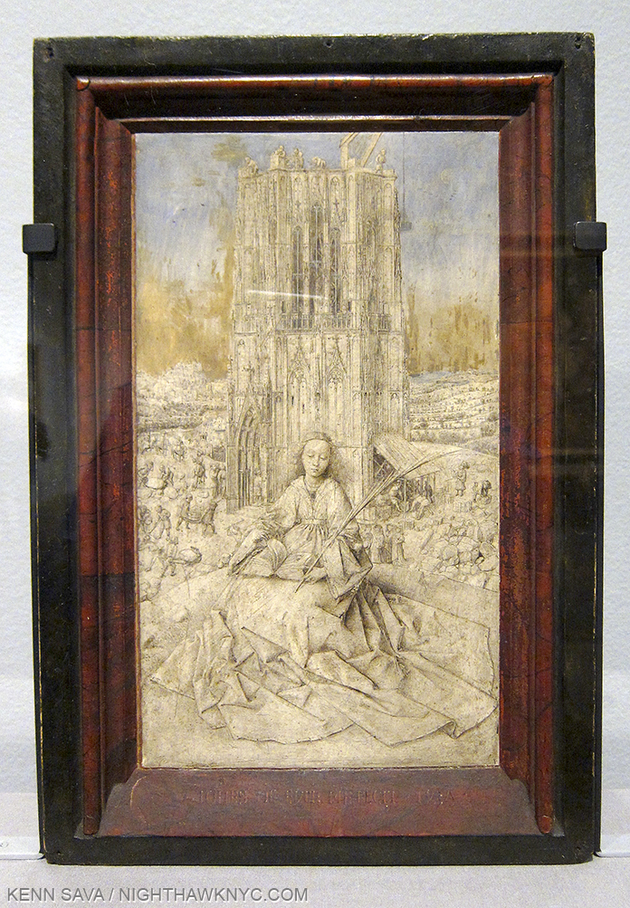
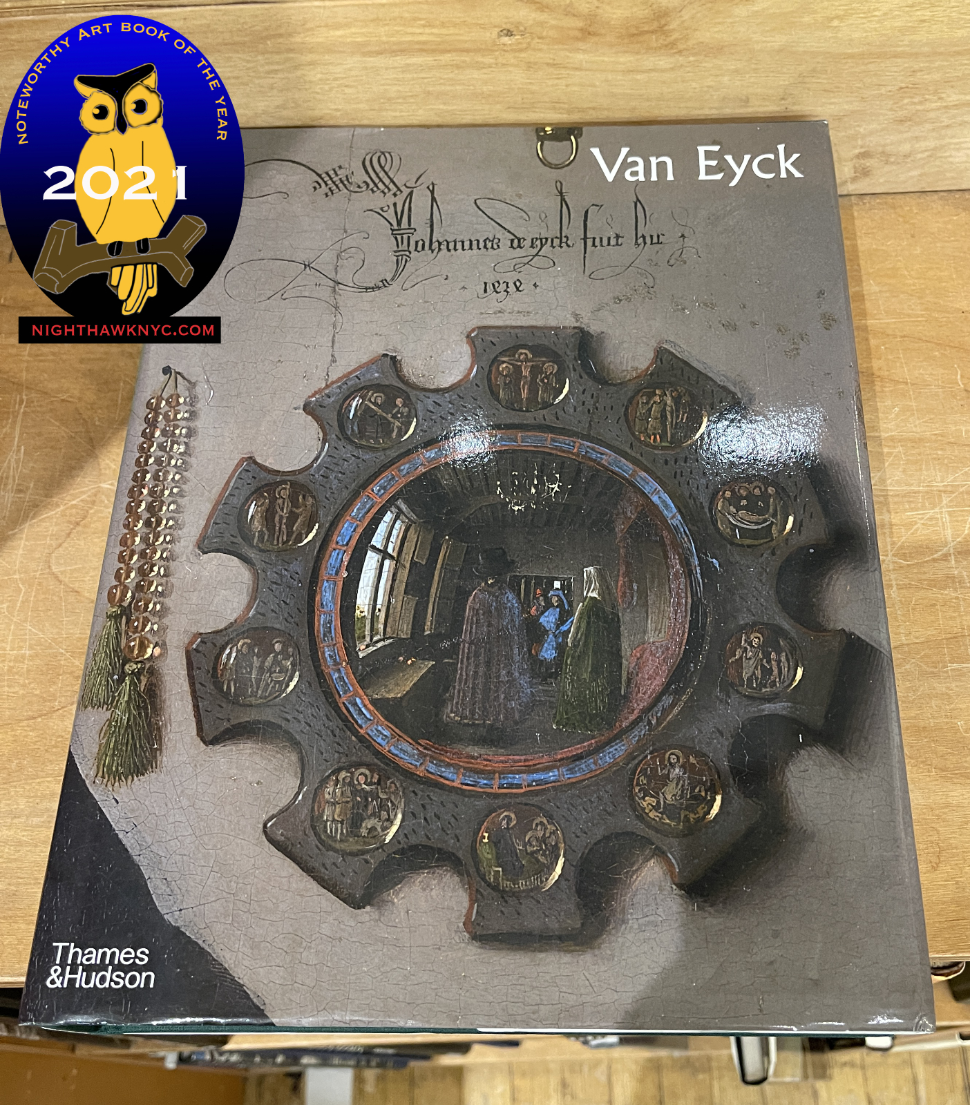
Van Eyck– A “once in a lifetime” show of the work of the Artist I’ve been looking at longer than any other that I missed seeing in person due to the virus. The accompanying book gave me a second chance for which I am very grateful. Overflowing with the latest scholarship on Jan and his mysterious brother Hubert, two Artists who have been largely overlooked in the explosion of Art monographs this past decade. In my opinion, you buy this book for the text. Though a very large book, it does have numerous full page illustrations, which in my view are best seen in the context of supporting points made in the text. All of that said, it is the finest “coffee table” Van Eyck book available1. No Van Eyck book can hope to top the images available for free online at closertovaneyck.org, which I wrote about here, where you can zoom in as close as you want, seeing Art in entirely new ways, which I believe will soon become the norm (issues of print quality vs screen image quality aside). Jan van Eyck has been (rightly, in my view) honored for his unsurpassed technical mastery. Yet, there is far more going on in his work than just brilliant Painting. The man was an equally extraordinary thinker as well, leaving as much to think about in his work as there is to look at. Van Eyck is the state of the art of Van Eyck scholarship and is likely to remain so for a while, though I am very happy to see that scholars all over the world are continuing to explore his life and work. Don’t stop now!
NoteWorthy Art Book Publisher, 2021
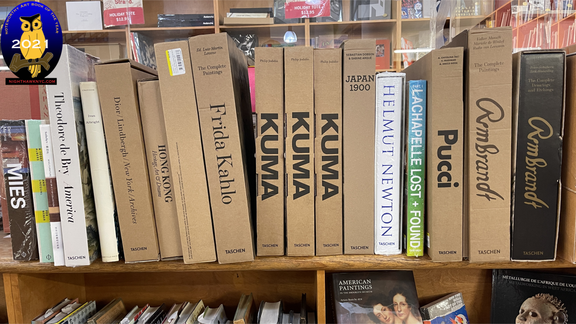
A selection of Taschen’s huge XXL books that weigh 16-22 pounds each. Many are the best way to see the most works by the given Artist in the largest size. They generally run about $200, before they go out of print, which is considerably cheaper than it would cost to go and see these works in person. Frida Kahlo is their newest XXL and immediately goes to the top of the class of Kahlo books as THE best place to see her work. The Rembrandt on the far right was a NoteWorthy Art Book of 2020.
Taschen. It’s just impossible for me not to single out the longstanding, large German publisher for special notice. In particular, I want to make readers aware of the fact that they publish some of the great bargains in new Art Books in a series I call “the bricks.” They’re about the same size and weight as a brick, but they are packed from cover to cover with high quality illustrations and photos and, usually, very good text. At $20 to $25 each, the bricks are the biggest bargain in Art books known to me. ANYone interested in Art should know about them and check them out.
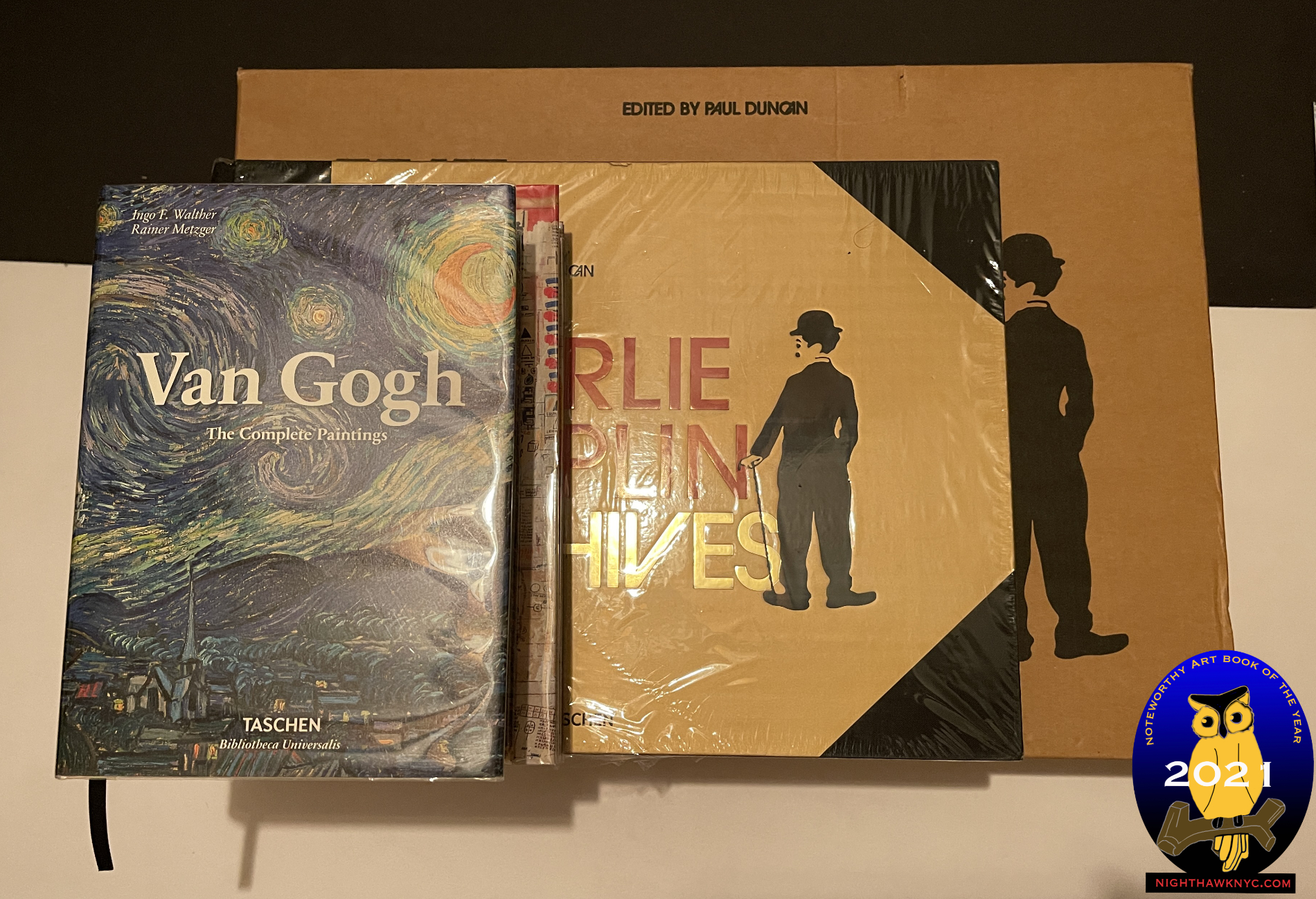
Pick your size. Top to bottom (left to right), Van Gogh in the old, smaller, brick, on top of Basquiat in the new larger brick, on top of The Charlie Chaplin Archives XL and The Charlie Chaplin Archives XXL, bottom, which comes in a brown shipping box.
The subjects, usually monographs, cover a surprisingly wide range of styles from the Old Masters to Basquiat and David Hockney. This past year saw Taschen release their incredible $200 Basquiat XXL 20 pound behemoth in a brick. Yes, the entire book is here, and yes the reproductions are reduced. Still, for $25. list price and over 500 pages, it’s an impossible- to-beat bargain. That’s the thing with Taschen. They release extremely well done Art Books in various sizes over time. First, the huge XXL edition, which usually clock in at about 20 pounds or so and are upwards of 2 feet tall for about said $200. They are, often, the last word on their subject Artist. Then, a year or so later comes the XL size. Substantially smaller and lighter, but still larger than most Art Books, for about $80. Still, at about 3/4 the size of the XXL, I think it’s a very good deal.
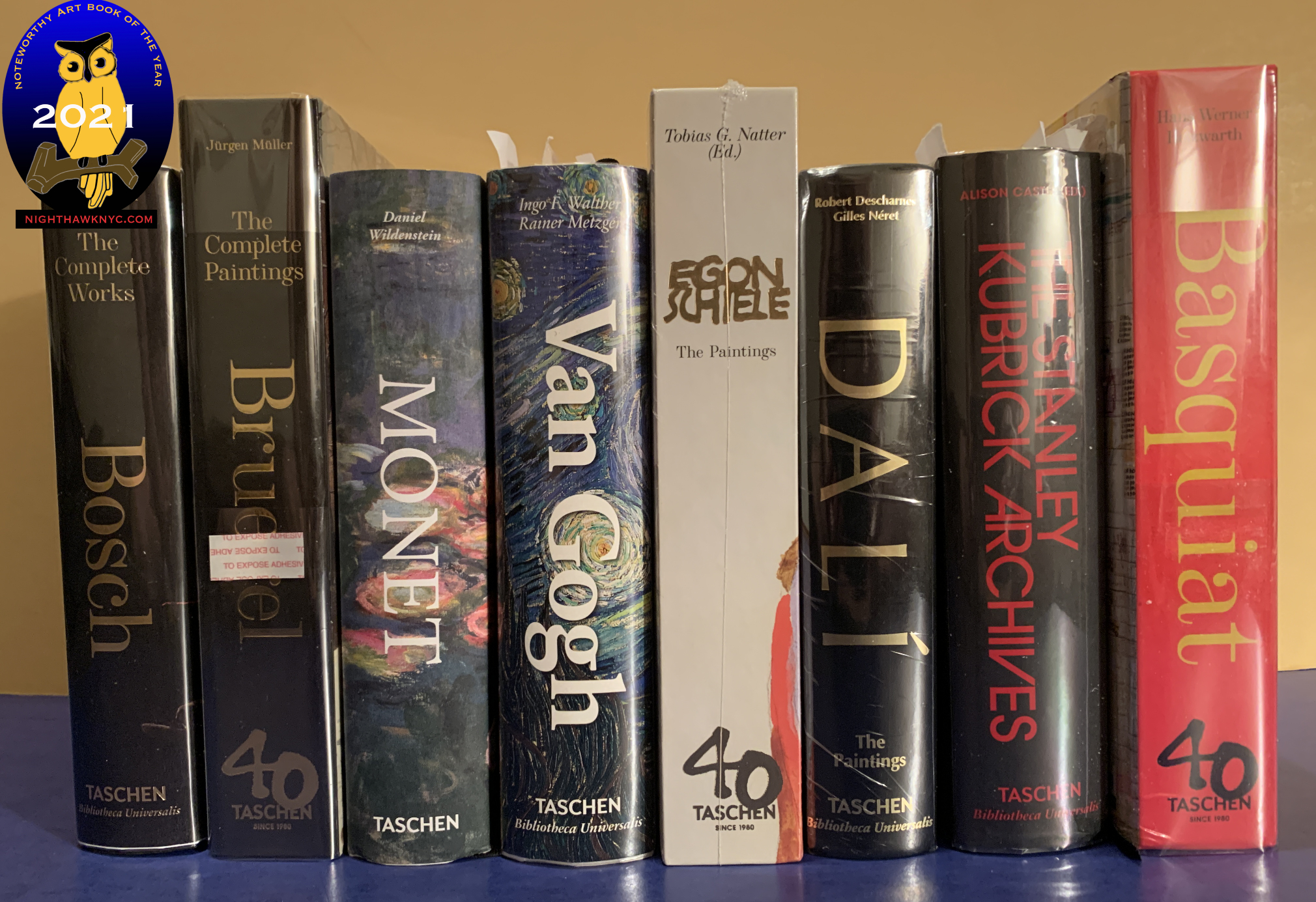
THE greatest bargain in Art books known to me. A row of “bricks” show how Taschen has slightly changed their size over the past decade. The newer releases, part of their 40th Anniversary series, like Egon Schiele and the Basquiat, are the bigger ones. The older bricks list for $20(!), the newer books list for $25. This entire row of 8 books lists for $175., less than the cost of one XXL!
And finally, a few years after the XL comes the brick. So, the buyer has choices. 3 sizes, priced accordingly, for the exact same book. You can build an excellent Art library with only the bricks. They’re handy, excellent overviews that hold up regardless of whatever other books come out, and any work you want to see larger can generally be found elsewhere or online. I’ve been buying the bricks since they began releasing them, and while I prefer the XXL for some books (like the Rembrandt Complete Paintings), I generally wind up with the brick as time goes on. For me, the best thing about these Taschen books (in XXL, XL or brick size) is a good number of them feature “The Complete Works” or “The Complete Paintings,” something that you really can’t see anywhere else in contemporary Art books which make them an essential resource in which ever size you choose.
NoteWorthy Older Art Book Discovered in 2021- Mea Culpa!
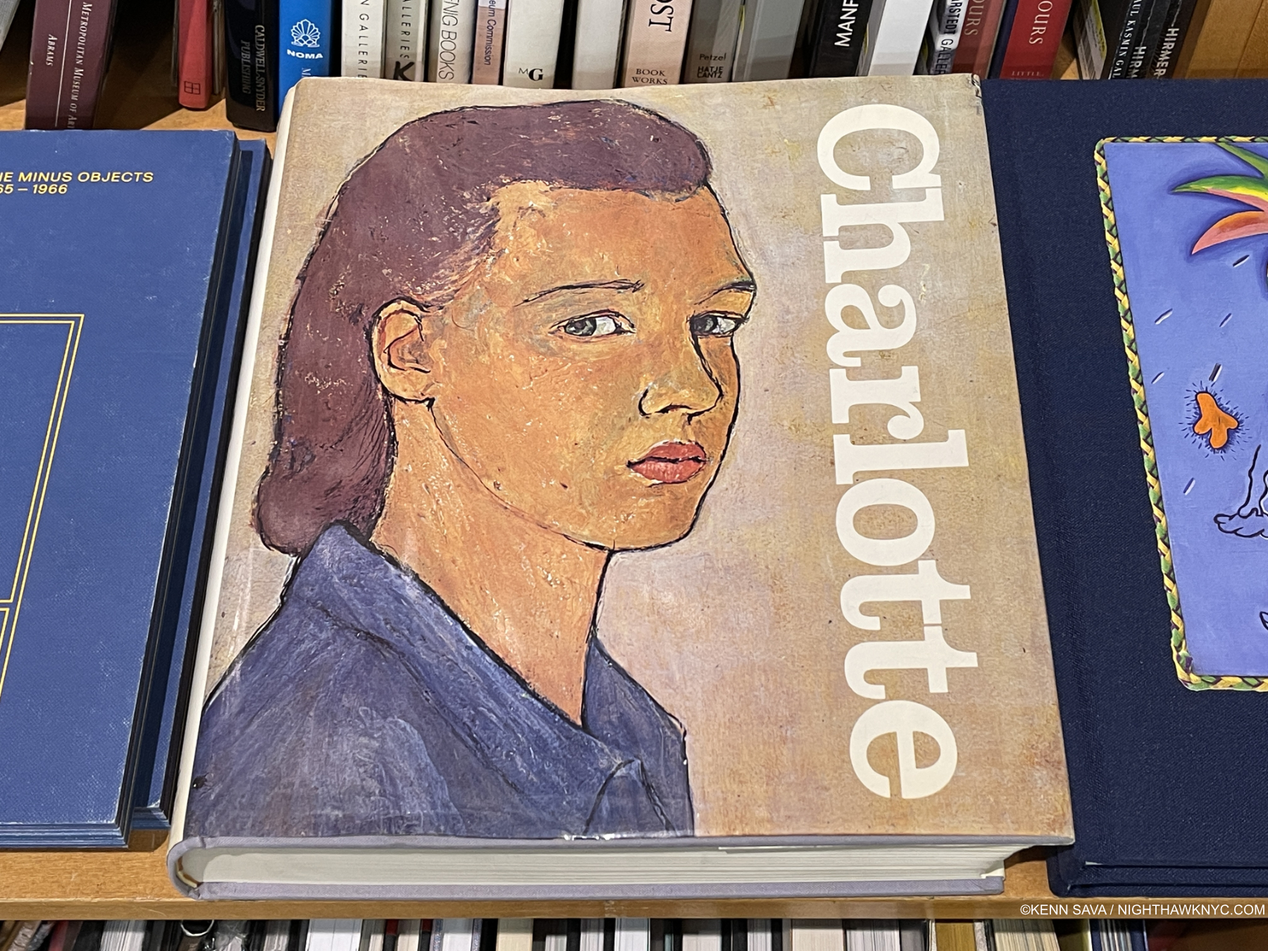
Charlotte Salomon looks out at us in a Self Portrait from 1940 when the Artist was about 23, about two years before she was murdered. This Self Portrait is not part of Life? or Theatre? This is a copy of the 1981 first English edition, published by Gary Schwartz through Viking, the first book to publish the complete Life? or Theater? It’s large size makes it the one to look for among sub-$100 versions.
Charlotte Salomon- Life? or Theatre? As I wrote about the incomparable Photographer & Artist Francesca Woodman a few years ago in my NoteWorthy PhotoBooks piece for 2019, I am equally unable to pick up a copy of Life? or Theatre? and not break into tears. Charlotte Salomon, 1917-42, is one of the most remarkable Artists in Art history, an Artist who achieved something no other Artist known to me has- ever. She recreated her life’s story, and that of her family, in over 900 Paintings, which tell one continuous story that she completed just before being arrested by the Nazis and then executed at about 25 years of age. Equal parts cinema, opera and passion-play, each work is also accompanied by Music! Even more remarkably, each Painting has a velum overlay with text and Drawing on it that creates something of a different experience than seeing the Painting alone. Stylistically, it’s hard for me to look at Lotte’s work and not think of the great Marc Chagall (who, by some reports “was amazed by them” when he was shown them), but she definitely has her own style, one that she executed with just 3 colors!
The great Art writer Gary Schwartz should get the credit for rescuing her work from the archives where her parents donated it, putting together the first publication of the complete Life? or Theater? in 1980. Since, it’s been reprinted a number of times, all of which have gone in and out of print. There are good and not so good things about each edition. Just make sure to get a complete edition (in spite of what I just said above, I’d avoid the Taschen brick edition since it’s incomplete. The edition pictured above is about the same size and is complete). It’s the only series of Paintings ever created that can be “read” as a book! And, it’s also the ultimate revenge of the young Jewish girl who created a body of work that will be seen for as long as people have eyes to look with and will continue to gain her new admirers all the while. After all is said and done, in my eyes, as Life? or Theater? proves, great Art doesn’t only live today. I’m not interested in any other kind.
*Soundtrack for this Post is “Future People” by Alabama Shakes. Full lyrics, here.
NighthawkNYC.com has been entirely self-funded & ad-free for over 7 years, during which over 275 full length pieces have been published! If you’ve found it worthwhile, PLEASE donate to allow me to continue below. Thank you, Kenn.
You can also support it by buying Art, Art & Photography books, and Music from my collection! Books may be found here. Music here and here.
Written & photographed by Kenn Sava for nighthawknyc.com unless otherwise credited. To send comments, thoughts, feedback or propositions click here. Click the white box on the upper right for the archives or to search them. Subscribe to be notified of new Posts below. Your information will be used for no other purpose.
- Ghent Altarpiece: Art, History, Science and Religion, 2019, is an excellent book focused on that one work, based around its ongoing restoration. ↩