Gregory Halpern’s America

Written & Photographed by Kenn Sava (except *)
Late one March afternoon, winding up a long day of looking at The Photography Show/AIPAD, 20171, having seen thousands of Photographs and almost as many PhotoBooks, I was stopped in my tracks when I saw this at Aperture Foundation’s booth-

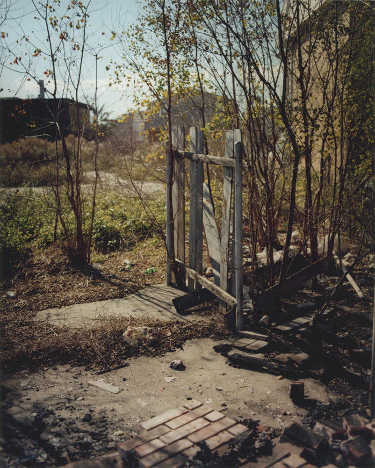
Gregory Halpern, Untitled (from Buffalo), 2017 *Gregory Halpern/Magnum Photos Photo

Who is Gregory Halpern, I wondered? That night I researched him and saw about 30 of his Photographs. While it’s not unusual to see 1, 2 even 5 pieces by an Artist unknown to me that catch my eye, once it gets to more than 10, the Artist has my attention. Here, were threefold that many and I hadn’t seen one that didn’t speak to me. I went back to AIPAD the next day and bought the piece. Mr. Halpern happened to be there and I got a chance to meet him and speak with him. Living with the work for almost 3 years now, I find myself as intrigued by it as I was the first moment I saw it. Everything about it compels me. But something nagged me about the composition. I must have seen this elsewhere, right? It’s ostensibly such a simple subject- what appears to be a man eats a meal at a table- it’s one of the more common subjects in Art History, and any number of Painters and Photographers have mined it. Then something a bit remarkable happened. Try as I might, to this moment, I haven’t found a direct predecessor for it in Art or Photo history.
There’s this by Edgar Degas-

Edgar Degas, The Absinthe Drinker, 1876, Oil on canvas *Photographer unknown

This by Edward Hopper-

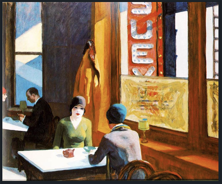
Edward Hopper, Chop Suey, 1929, Oil on canvas *Photographer unknown

Though, perhaps these two Photographs by Constantine Manos of Magnum Photos (of which Mr. Halpern became a Nominee Member of in 2018) come closest of those known to me-

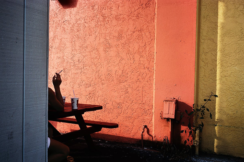
Constantine Manos, Fort Lauderdale, Florida, USA, 2000, Photograph *Constantine Manos/Magnum Photos

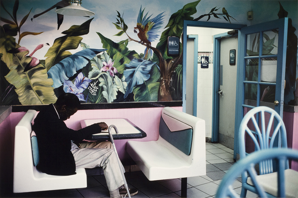
Constantine Manos, Miami Beach, Florida, USA, 2003, Photograph *Constantine Manos/Magnum Photos

A similar thing has happened to me with innumerable Photographs by Gregory Halpern since. Somehow, he manages to skate through Art history without repeating what’s already been done2. I’ve come to think this isn’t by accident. When I’ve spoken to him or read his interviews, I’ve found that he has a veritable encyclopedic knowledge of Photographers and PhotoBooks, and is an avid student of Art History as well.

15 years of work in Omaha, edited down to 150 images. Now? Sequence and arrange these into a classic PhotoBook.

While I was introduced to him as a “wall Artist,” he’s said the PhotoBook is the best medium for his work- “It definitely is. I love the space between images. The things that happen when you turn the page, when you are looking at a new image with the ghost of the previous image lingering in your mind… I love the feel of being swept up, as if by a stream, by a book of photographs.” So, after my introduction to Gregory Halpern, as a “wall Artist,” it was time to explore his PhotoBooks. I’ve spent the past two and a half years doing so.

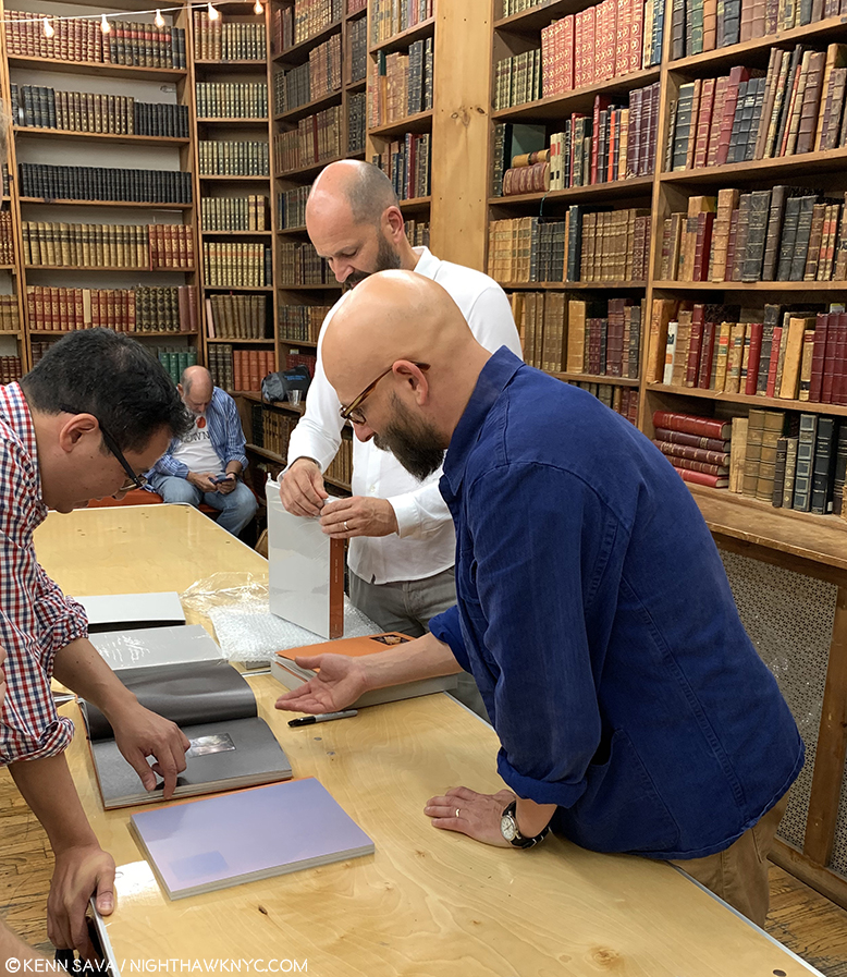
Gregory Halpern, front right, in his element, discussing a PhotoBook. Here, he happens to be introducing the limited “Book Edition” of his brand new Omaha Sketchbook, while publisher Michael Mack, behind him, unwraps copies of it for waiting customers during a signing at The Strand Bookstore, September 21, 2019.

His latest PhotoBook, the MACK Books edition of Omaha Sketchbook, was released in September, completing a 15 year project that was initially published in a book of the same title in 2009 in an edition of just 35 copies by Jason Fulford’s J&L Books. As it was released, I was ready to dig into Omaha Sketchbook when a chance sighting at The Strand Bookstore got me thinking a bit more broadly.

Strand Bookstore, September 25, 2019.

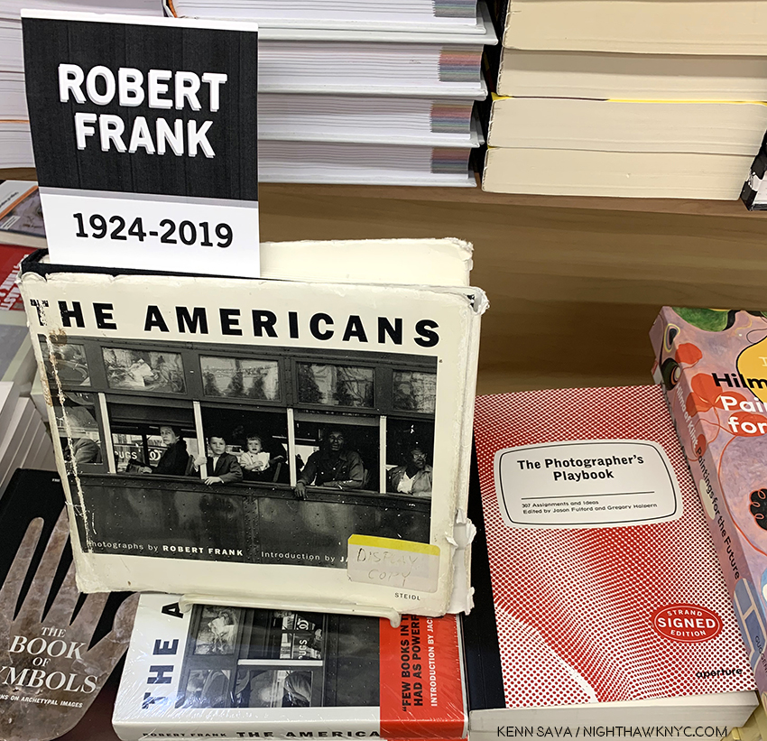
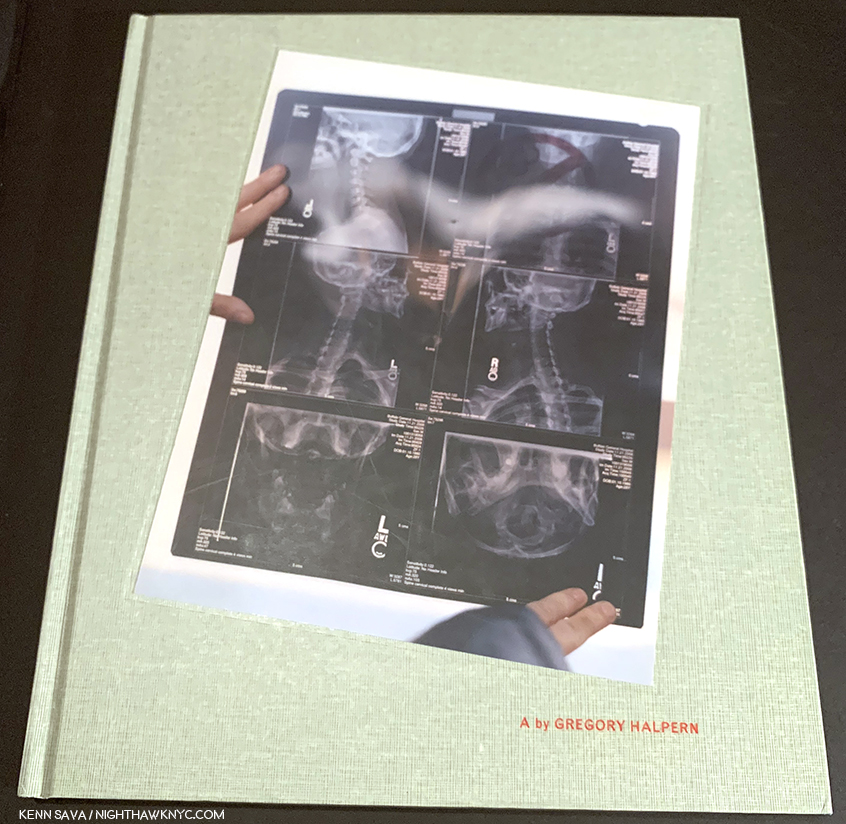
It was the day after Mr. Halpern had been back to the Strand speaking to an audience about the new MACK Books edition of Omaha Sketchbook, the timing of its September release was a bit unfortunately coincidental coming a few weeks after the passing of Robert Frank. There in front of me was an appropriately well worn display copy of Mr. Frank’s landmark PhotoBook, The Americans, next to The Photographer’s Playbook, edited by Mr. Halpern and Jason Fulford. It got me thinking about the last five PhotoBooks Gregory Halpern has now released3 particularly because the new MACK Edition of Omaha Sketchbook happens to bookend this (unofficial) body of five Photobooks, that includes A(2011), ZZYZX (2016), Confederate Moons (2018), and the original, 2009 J&L Books edition, of Omaha Sketchbook.

“Let us be lovers, we’ll marry our fortunes together
I’ve got some real estate here in my bag
So we bought a pack of cigarettes and Mrs. Wagner pies
And walked off to look for America.”^

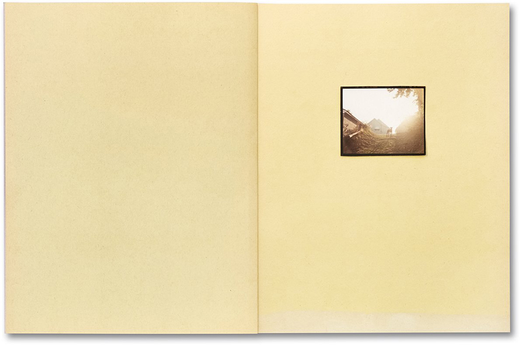
A dog stands watch silhouetted on the first spread in Gregory Halpern’s latest PhotoBook, Omaha Sketchbook, 2019, MACK Books. Interestingly, this was the final image in the J&L Books edition in 2009. If that’s not the definition of “open-ended,” I don’t know what is. Note the color of the paper, which changes with each turn of the page.

Pondering them, his five most recent PhotoBooks do have some things have in common with The Americans. Both Mr. Frank’s and Mr. Halpern’s books resulted from extensive travel through the country, though Mr. Frank’s is a concise look at America as a whole, in his inimitable style, and each of Mr. Halpern’s more local, and even taken in toto, doesn’t cover the country. A close comparison is not the intent of this piece. Besides, it’s dangerous to read too much into this. Mr. Halpern has said “there aren’t honestly any specific ‘models’ I could point to“ for Omaha Sketchbook, specifically referring to The Americans. Leaving aside any question of influence then, particularly after the exercise I undertook with Untitled (from Buffalo), above, I will say I find it utterly fascinating to look through The Americans and then look through each of Gregory Halpern’s books. Sixty years have passed since Robert Frank created the work in his classic book4, and yes, times have indeed changed, but how much has America, or Americans, changed? Have we gone forward, stayed in the same place, or gone backwards since the late 1950’s? This is one question I ask myself as I go back and forth between The Americans and Mr. Halpern’s books, particularly since his body of books now covers 15 years of work. 15 is one of those nice round numbers I like to use as a signpost to consider where we’ve been.

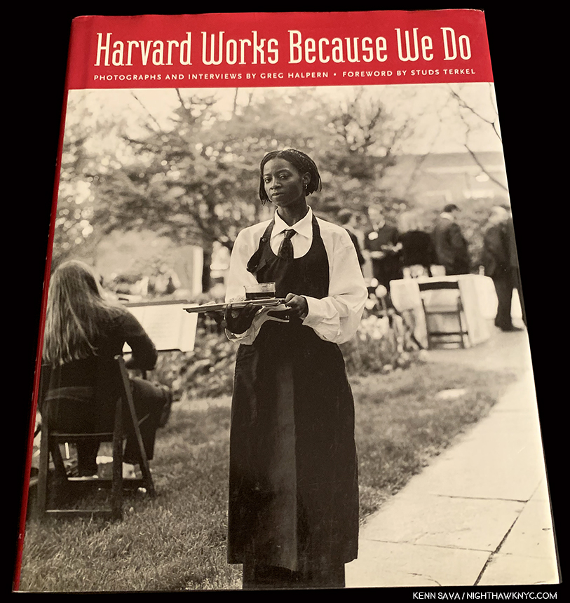
“Greg” Halpern, Harvard Works Because We Do, 2003, his first PhotoBook predates the books under discussion here. It features words(!) and Photos by Mr. Halpern for a cause. Harvard Works is an important book in my view, sadly, every bit as relevant today, Filled with excellent, black & white(!) portraits, like the one on the cover, Don’t miss it if you are interested in his work, or the cause.

Actually, it’s worthwhile to go back one book further, to Mr. Halpern’s first PhotoBook, Harvard Works Because We Do, published by Quantuck Lane Press in 2003, which addressed the issue of the lack of a living wage for University food workers, custodians and security guards. For those who only know his later books, Harvard Works is a fascinating look at Mr. Halpern’s beginnings, one that holds up every bit today, including unfortunately, the importance of the issue he’s addressing, as can be seen in the fact that others, like the fine Artist Ramiro Gomez, have been focusing on the same subject. The book includes transcripts of interviews conducted by Mr. Halpern and edited down into concise statements accompanying the pictured subject. (By the way, I’m taking this as an opportunity to mention that Gregory Halpern is, also, one of the finest writers on Photography today known to me.)

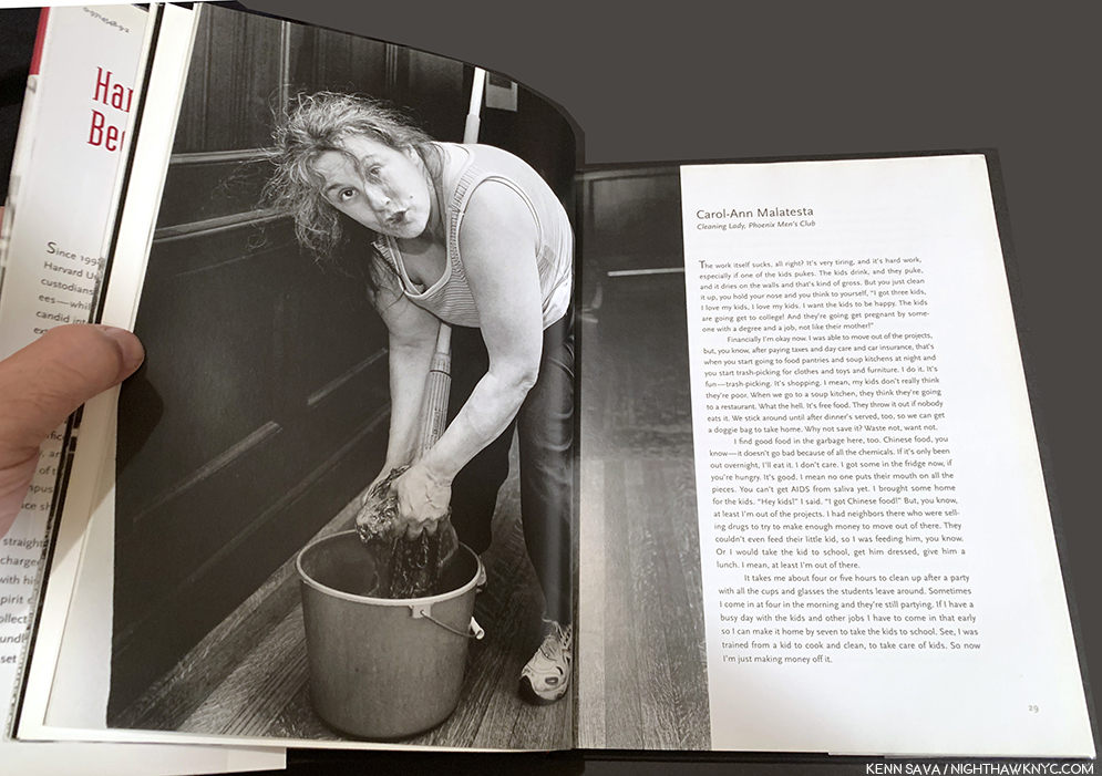
“The work itself sucks, all right?,” so begins the statement of Carol-Ann Malatesta, accompanying her portrait in Harvard Works

For this overview of his work to date, the Photographic portraits are strong, straight forward, though, to my eyes, there are a number that show signs of the Artist within. It’s a significant book, both for the situation and conditions it documents, and centrally, those struggling with them it portrays, as well as for being Gregory Halpern’s first PhotoBook, and for both reasons, it’s a book that will remain important. “Greg” Halpern, as he is listed on the book, came away from Harvard Works feeling he wanted to take a more Artful, open-ended approach that would allow the viewer to react to the image in his or her own way. And this is what we see in each book he’s created since.

“‘Kathy,’ I said as we boarded a Greyhound in Pittsburgh
Michigan seems like a dream to me now
It took me four days to hitchhike from Saginaw
I’ve come to look for America”^5

An extremely rare pristine copy of the first iteration of Omaha Sketchbook, published in 2009 by J&L Books. *Photo from @Gregoryhalpern

Moving forward to 2009, with the publication of the original Omaha Sketchbook by J&L Books,  the stage was set for all that has come after in Mr. Halpern’s PhotoBooks. At The Strand on September 24th with Jason Fulford, he spoke about the genesis of the projectAfter winding up a teaching job in California, he cast around for residencies, finding one at the Bemis Center for Contemporary Art in Omaha. And so began a what would become a body of work that would take 15-years to complete.

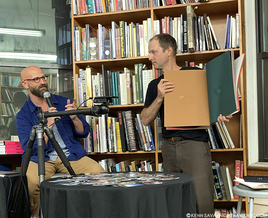
Gregory Halpern, left, explains his working process and the creation of the original, large, construction paper book dummy for Omaha Sketchbook, which Jason Fulford holds. Note the spots on the pages from prints being mounted and removed as the Artist assessed them and possible arrangements. Strand Bookstore, September 24, 2019.

A few years in, after deciding to make a book dummy of the work he’d done, he went to an art supply store and looked at paper. Failing to find inspiration in the sterile white acid-free paper that was de rigueur, then and now, he discovered some faded construction paper in an abandoned school he was shooting in, and in a flash of inspiration realized he could use its rainbow of colors in a myriad of ways. He constructed a large book and mounted his prints- hand-cut from medium format contact sheets(!) with various sticky media that allowed him to place and remove the images and see how they “reacted to each other, for lack of a better word,” he said at The Strand. I find this whole idea ingenious.

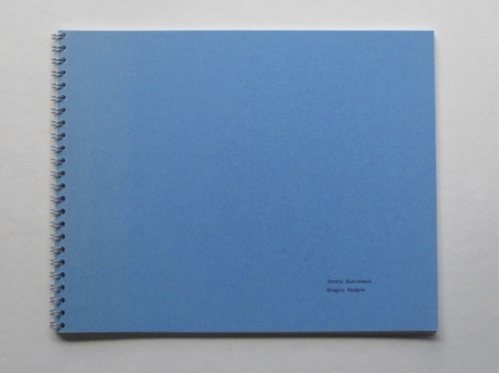
Omaha Sketchbook, 2019, MACK Books edition, front cover.

He discovered that when he removed an image after a few days, a “ghost” of that image remained on the paper. Over a decade later, that effect would be recreated on the cover of the new MACK Books edition. After making his book dummy on the colored construction paper, he showed it to publisher Jason Fulford who decided to publish it through his J&L Books imprint. The J&L edition was produced a short time later, on white paper for expediency’s sake, with the 2009 New York Art Book Fair looming. Though it only sold “a few copies,” at the show, Mr. Halpern spoke of his pride at having created an actual book. He hasn’t looked back. But, he’s gone back. Though three other excellent books followed over the next 9 years, he kept returning to Omaha. I find this absolutely remarkable when you consider that along with this, Gregory Halpern is married (to the terrific and terrifically underknown Photographer, Ahndraya Parlato), he’s a father with young children, a professor at Rochester Institute of Technology, a Nominee Member of Magnum Photos, the co-editor (with Jason Fulford) of The Photographer’s Playbook, a contributor to The New York Times, The New Yorker, California Sunday Magazine and Aperture Magazine (among others), an exhibiting Artist who’s mounted shows on two continents, has a “mid-career” Retrospective coming in 2020 at no less than SFMoMA (Hello, NYC Museums? Is this on?)- ALL while creating 3 of the most memorable PhotoBooks of recent years along the way (A in 2011, ZZYZX in 2016 and Confederate Moons, 2018)- each of which involved extensive travel, two took a number of years. My fingers got tired just typing that list. Time for a paragraph break.

Eventually, Gregory and Jason got what was about 4 years of work at the time down to the 37 images I counted on the 44 pages of the original Omaha Sketchbook (OS, 2009, henceforth) when I was lucky to be able to look through an extremely rare copy for a few minutes. There should be a term for “rarer than rare ” when you’re dealing with something THIS rare. I counted 18 images (about 50%) that do not appear in the MACK edition. That OS, 2009 is remarkably concise becomes apparent when you see the new MACK Books edition (which I call OS, 2019). I found the overall effect of the two books remarkably similar, even though we now get over 100 additional images and Mr. Halpern has been Photographing in Omaha for a further 10 years. How to feel about this? Is the place and its residents, apparently, so little changed? Even though we’re looking at 15 years in the new edition, both books feel like time capsules.

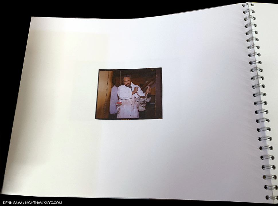
This startling image taken inside a meat plant is the only image in OS, 2009 taken indoors, one of 23 portraits I counted in this edition. Note the white paper.

OS, 2009‘s first 5 images include a house or apartment building, but there’s no “domestic” feel- we don’t go inside them. The feel is we’re visiting, passing through. Instead, the only interior shot in the book is in a meat processing plant. One thread I note in OS, 2009 that continues from Harvard Works– Gregory Halpern is a master portraitist. By my count no less than 23 Photos in OS, 2009 (more than half of the 37) are (or include) portraits, dual portraits, group portraits or “portraits” of animals.

“Laughing on the bus
Playing games with the faces
She said the man in the gabardine suit was a spy
I said “Be careful his bowtie is really a camera”^

A, published in 2011 by J&L Books. A look at the “Rust Belt” in images taken from 2008-11.

This continued in his next book, A, also published by J&L Books, in 2011, consisting of work created in the American Rust Belt in cities like Baltimore, Cincinnati and Detroit, from 2008-11. Here, over 96 pages of large Photographs on its 9 1/2 by 11 3/4 inch pages, we see people and places who have seen better days, alongside some gleaming office buildings- greatly simplifying. A number of the portrait subjects look right into the camera, almost seeming to confront the viewer for a reaction.

From A, 2011. *Gregory Halpern/Magnum Photos

And, speaking of “confronting,” the animal “portraits” continue, too, like this memorable one, the first Photograph in the book.

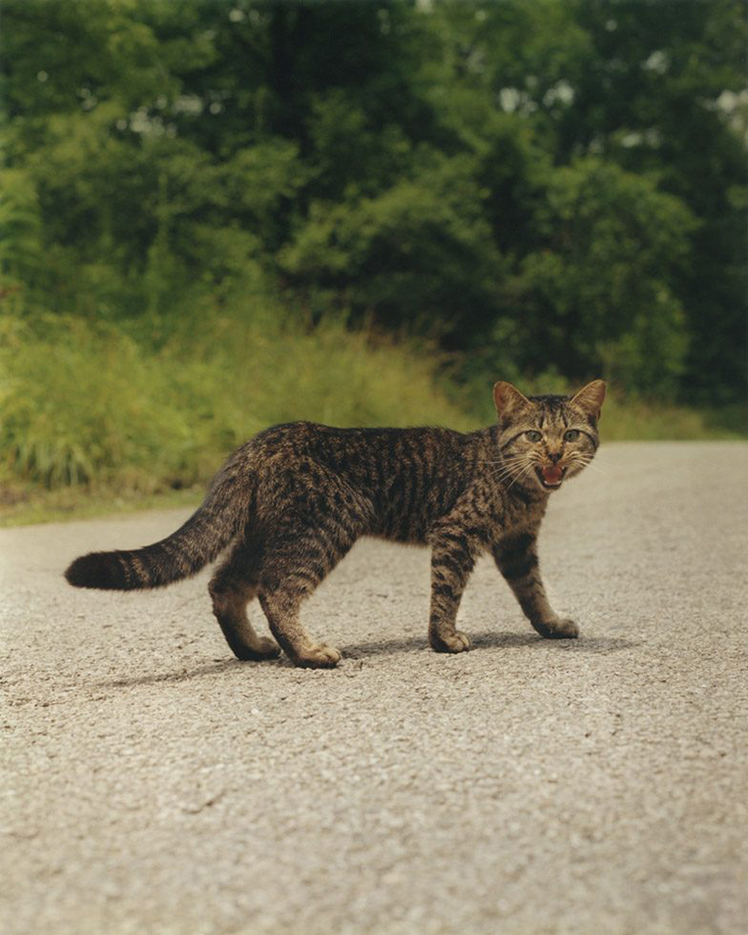
The first image in A, 2011 *Gregory Halpern/Magnum Photos Photo

In my view, A is an overlooked classic. Perhaps, it’s only “overlooked” because its 1,000 copies have long since disappeared and those who have one aren’t parting with it because they appreciate how good it is So, the masses have yet to experience it. As a result, it’s a prime candidate among important contemporary Photobooks to be reissued. What began with OS, 2009, was furthered exponentially in A, before being carried even further, reaching a crescendo of sorts, with Mr. Halpern’s next book, the instant classic, ZZYZX, a look at Los Angeles and its vicinity shot between 2008 and 2015, published in 2016 by MACK Books.

“Toss me a cigarette, I think there’s one in my raincoat”
“We smoked the last one an hour ago”
So I looked at the scenery, she read her magazine
And the moon rose over an open field”^

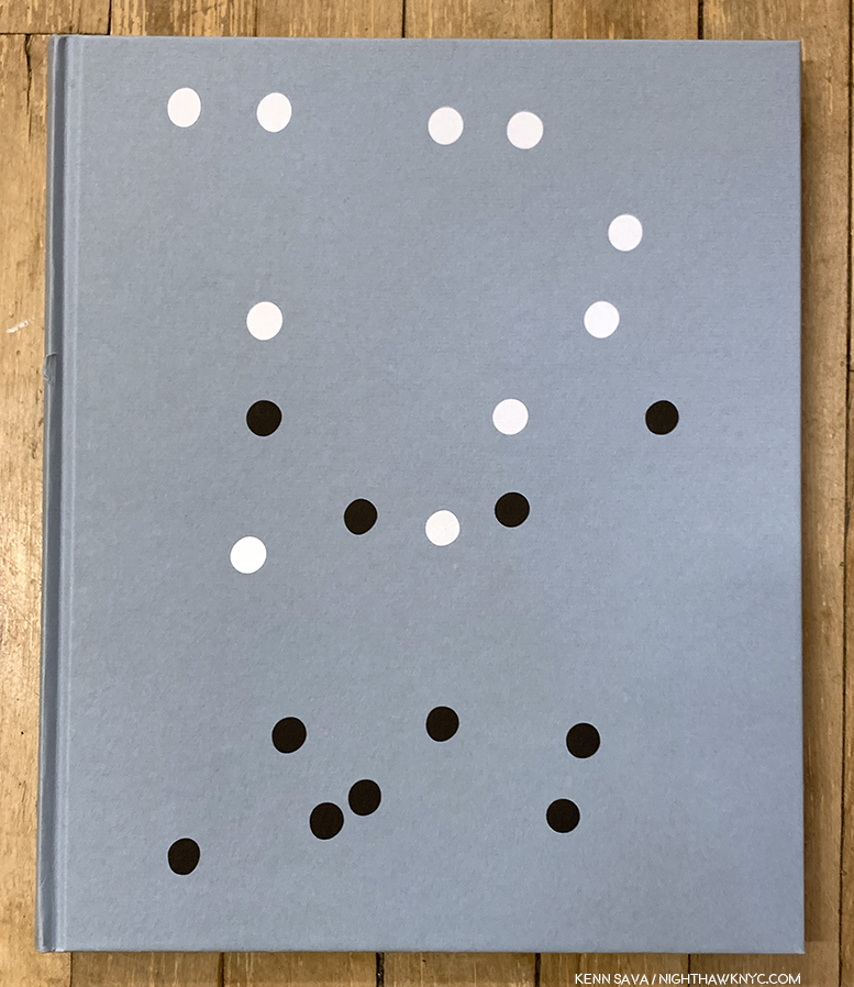
ZZYZX, 2016, one of the most influential PhotoBooks of the decade, now in its 3rd printing in 3 years.

Is it only 3 years since ZZYZX was published? For a book I hear mentioned and referred to so often, it feels as if it’s been around much longer. Today, I can’t tell which is bigger- its influence or its popularity. From the incredibly succinct editing and tight sequencing, to the beauty of its images, it’s a true epic in the Hollywood sense, mirroring the time it took to create. (Speaking of Hollywood- A ZZYZX fun fact- There’s a film named ZZYZX, that’s directed by a gentleman named Halpern. Richard Halpern.)

From ZZYZX, 2016 *Gregory Halpern/Magnum Photos Photo

ZZYZX features more of Mr. Halpern’s memorable portraits, unexpected moments, like the one above, and something I can only describe with one word-

From ZZYZX. “And the moon rose over an open field”^*Gregory Halpern/Magnum Photos Photo

“Magic.”

There are any number of Gregory Halpern’s images that have a “magical” quality for me, including both of these shown above. I know. I was about to agree with you in questioning my own sanity, when I came across this image by his wife, Ahndraya Parlato-

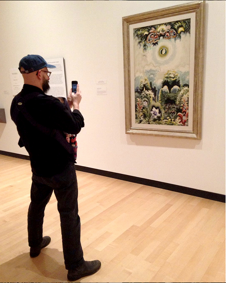
Gregory Halpern, youngster in tow, admiring Charles E. Burchfield’s Moonlight in a Flower Garden, 1961, Watercolor and charcoal on paper at the Burchfield Penney Art Center in his hometown of Buffalo, NY. *Photo by @ahndraya_parlato

Charles E. Burchfield (1893-1967), was an Artist Edward Hopper greatly admired, perhaps as much as any other contemporary, and said so when he was asked6. Mr. Burchfield was “best known for his romantic, often fantastic depictions of nature,” according to the Burchfield Penny Art Center site. Other words used to describe him are “visionary,””one of the most inventive American artists of the 20th century,” “fantastic,” mystically poetic.” It’s easy to imagine Mr. Halpern being influenced by Artists like Charles E. Burchfield, and Ms. Parlato’s image would seem to provide an insight as I try to understand these “fantastical” elements in his work.

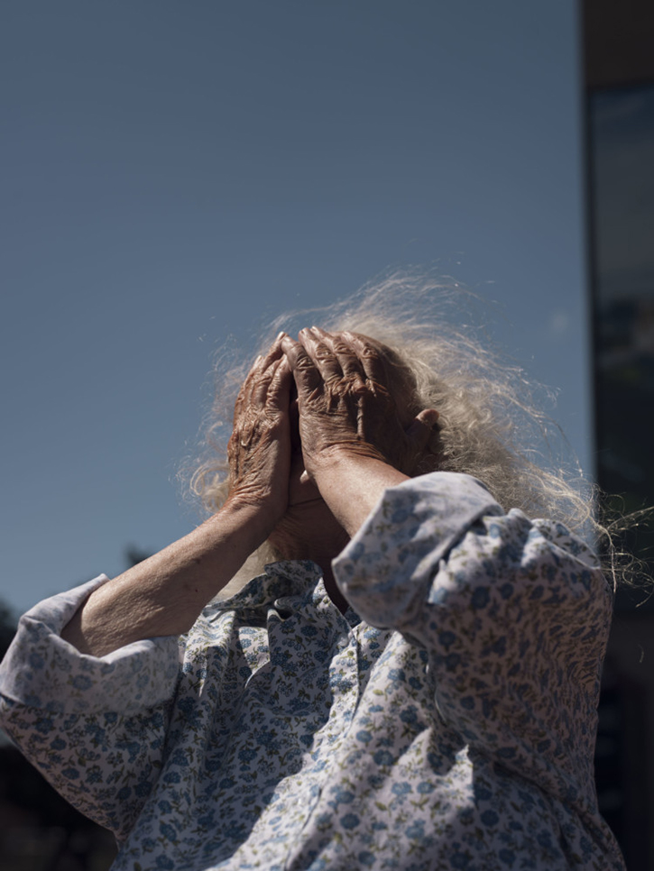
Like this one on the cover of Confederate Moons, 2018, TBW Books  Charles E. Burchfield might be proud of this shot. Incredibly beautiful, ethereal, and equally daring- he’s shooting directly into the sun, a professor “breaking the rules,” which he’s said film has the latitude to allow him to.

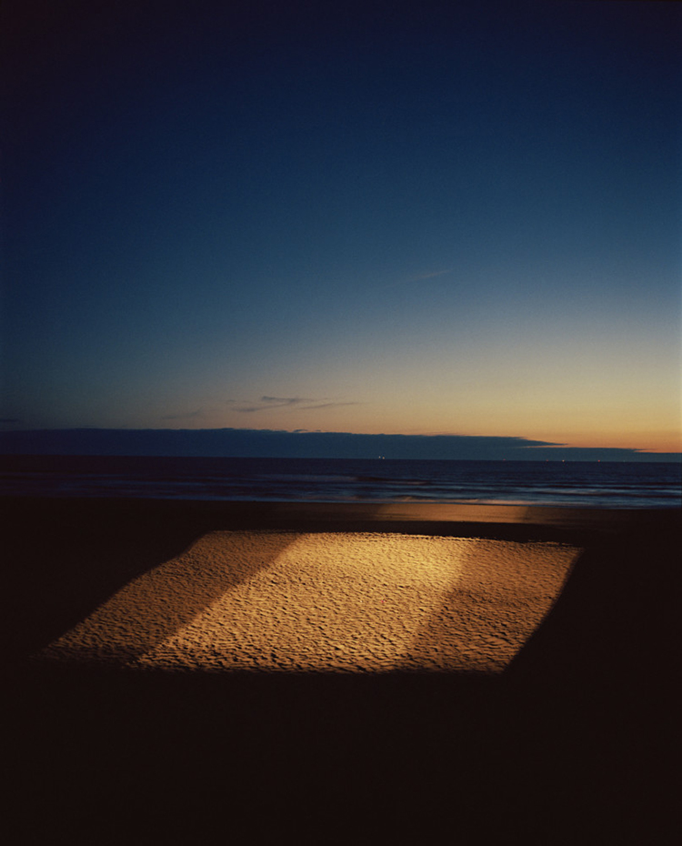
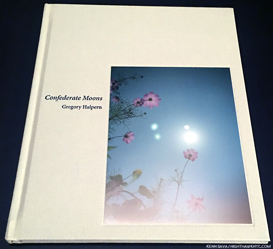
These images are even more present in his next PhotoBook, Confederate Moons, TBW Books, 2018, which I singled out as the one PhotoBook I’d recommend for 2018 in my roundup of books for last year, a year of very strong PhotoBooks. Issued as part of the 4-volume TBW Annual Series 6 in a limited edition of 1,000, it’s now sold out which may explain why I feel it’s a bit overlooked, too. Unlike his other three books, Confederate Moons was shot in North and South Carolina in just one month, August, 2017, the month of the solar eclipse.

From Confederate Moons. *Gregory Halpern/Magnum Photos

While created in a shorter span, and a shorter book than the others, don’t let its brevity fool you. It has every one of the elements that make his 2 preceding books classics and a good deal of experimentation to boot. Living with it since April, 2018, it’s every bit as open-ended as his other books. One time, I read it as a “reminder” that nature, in the form of the sun, is a much more powerful “controller” of life than anyone’s hopes, wishes, or agenda, coming at a time when the nation was as divided as it had been in years. Then, the next time through, I just marveled at how busy Mr. Halpern must have been during those few minutes of the eclipse! Still, it’s another important, and beautiful, book in my opinion, and one I wouldn’t want to be without.

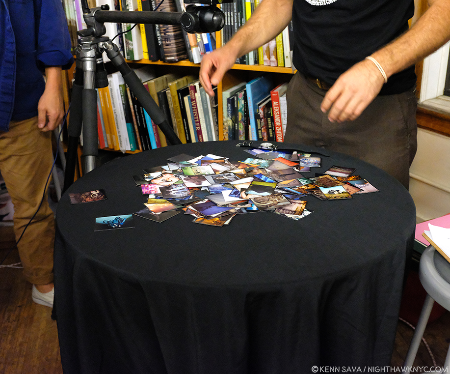
Gregory Halpern and Jason Fulford, with the wrist band, and a selection of the cut up contact sheet prints that appear in Omaha Sketchbook laid out for a talk on the book at The Strand on September 24th.

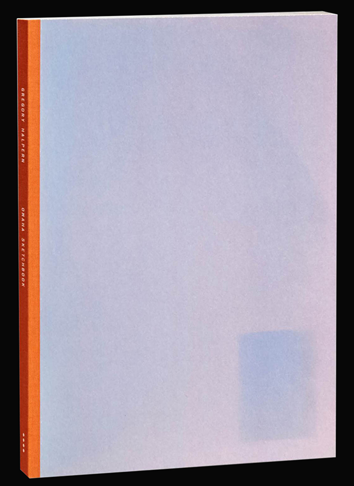
So, the stage was set for this unofficial set of books to be completed and come full circle when MACK Books announced a new edition of Omaha Sketchbook, now with a whopping 152 images. Also in my NoteWorthy PhotoBooks of 2018 piece, I singled out MACK Books for praise for their excellent series of reissues, which enables PhotoBook lovers to buy new editions of classic and now incredibly rare (prounced “expensive”) PhotoBooks in beautifully produced new editions at regular prices. Omaha Sketchbook is the poster boy of this program, given that only 35 or so people got to see it the first time around. Michael Mack and MACK Books Head Designer Morgan Crowcroft-Brown have done a beautiful job from A to Z with OS, 2019, leaving me with only one caveat- I page through it so often, I wish it was a hardcover. But, that would probably add $10. to its $50. list price…MACK’s limited “Book Edition” of OS, 2019, takes the influence of Mr. Halpern’s book dummy literally, hand mounting the 152 prints into a handmade book, in the spirit of the original. (100 signed/numbered copies, $750. per as I write).

Another spread from the MACK Omaha Sketchbook. *MACK photo.

Immediately apparent as you dig into OS, 2019 are its revolutionary aspects- First, the ever-changing color of the pages, like the original book dummy shown earlier. I asked Morgan Crowcroft-Brown what we’re seeing here as I was curious about the paper in the regular edition. She told me, “They are actually scans of US construction paper. The paper was imperfect, covered with scuff marks and sun fading, but it made for an interesting backdrop to the contact prints. So these backgrounds were scanned then printed onto a textured offset paper, in an attempt to mimic the construction paper.” She, MACK and Mr. Halpern have given us the book as close as possible to what it was originally in the early days of the project, now at its completion with 152 images. It brings the project full circle in more ways than one. Given that they take up so much of the page relative to the images, the color is an element that’s impossible to ignore. It’s used in a wide variety of ways. First, to pick up a color in the Photograph, at other times a color that’s in a very small part of it. At still other times it reinforces or contrasts the mood of the Photo. Then there is the way OS, 2019 appears to be in sections- on light color paper in the beginning of the book, followed by a center section in red, leading to a gradual darkening in the last part. This gives the book a flow that reminds me of a Musical composition.

Projected overhead view of the table seen previously, with my ever-present nemesis, glare. During the talk Jason and Gregory created their own spontaneous 3 image arrangement from the pile and assessed how they “reacted” to each other, providing fascinating insight into their editing and sequencing processes. Mr. Halpern added that he would leave 2 and 3 image arrangements up on small shelves for, maybe, a week or a month to see how they worked.

Second- While there are numerous books of contact sheets, try as I might I can’t find another PhotoBook done using prints cut out of contact sheets! If you know of one, please let me know. If you look closely, you can see evidence of the prints being hand cut in their margins in things like uneven borders, which add to the “handmade” feel (the trade edition is, of course, not handmade). While some may prefer larger prints, I’m fine with them at this, smaller, size. Having just spent 5 months researching Jean-Michel Basquiat for a series of pieces on the 5 shows of his work going on around town this year, I recall he once said that he crossed out words to get people to look closer. I get the same feeling here. The small prints make you look closer.

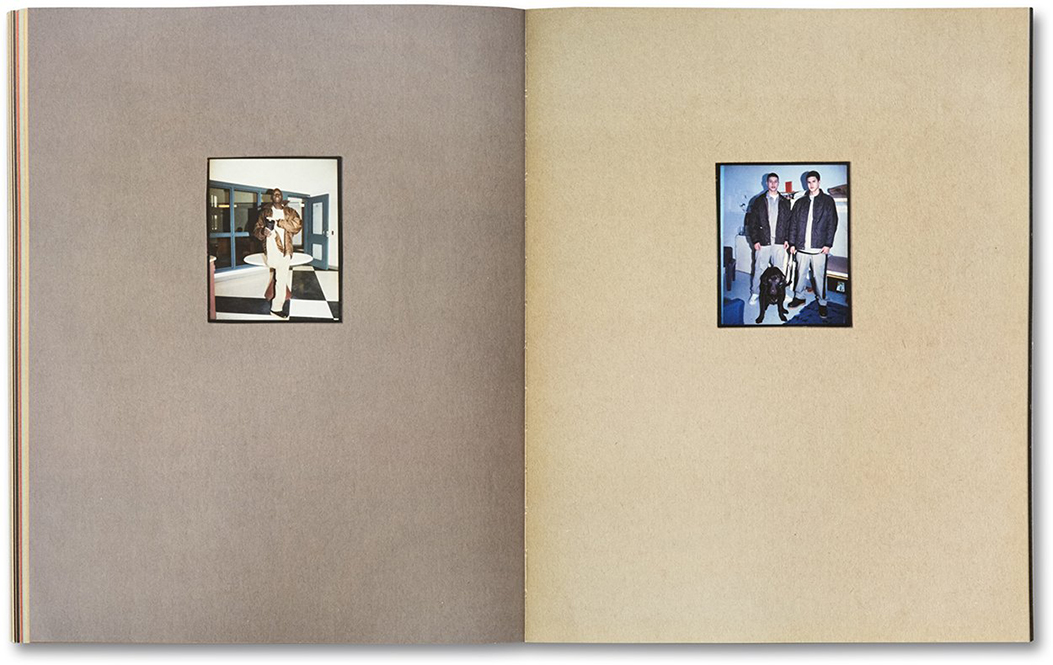
Mr. Halpern has said the diptych on the right “exemplifies” the MACK Omaha Sketchbook for him. *MACK photo.

Another fascinating thing about OS, 2019 is though there are over 100 additional Photos, and though the body of work took 15 years to shoot, it’s impossible for me to tell when the Photos were taken. The only way I’ve found to tell if an image is earlier so far is if it appears in OS, 2009! In fact, if you didn’t know this was 15 years of work, I doubt you’d be able to tell that these weren’t all taken at the same time. Even more remarkably, as I’ve shown a taste of above, Mr. Halpern’s Photographic style has “changed” with each of his books, reaching its most experimental so far (to my eyes) in his most recent book, Confederate Moons. Yet, here, we are right back squarely in the same style he used in OS, 2009! All of these things add to the many levels in the book. Only a few weeks in, I’m sure there are more waiting to be discovered.

“Kathy, I’m lost,” I said, though I knew she was sleeping
I’m empty and aching and I don’t know why
Counting the cars on the New Jersey Turnpike
They’ve all come to look for America
All come to look for America
All come to look for America”^

From A. Taken in the American Rust Belt, this image has haunted me since I first saw it. Today, I find it extraordinarily beautiful, a subject countless Painters might dream of.

In the end, all of those levels help create a different experience, with new discoveries, each time you look at it. Yet, each time I page through it, one thing hasn’t changed. As an Art lover, I find beauty in his work, as I’ve said, in the “picturesque” images as well as in the “grittier” ones. There’s a good deal of both here. No matter what his subject is- portrait, landscape, building or object, I find a full range of beauty in his work, that calls me back to look at and ponder again and again. And yes…there’s that “Magic.”

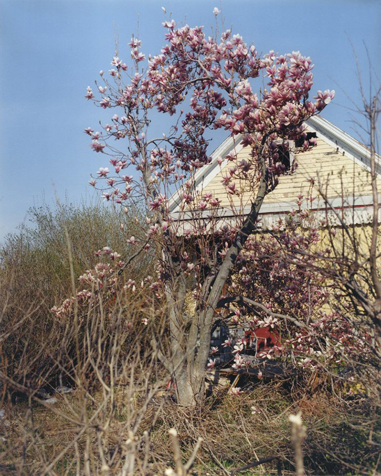
I was about to look for the French Painter who created something like this when I stopped remembering this was done by an American, and not Monet, or the Camilles- Pissarro or Corot. Though in bright sunlight, it has an air that makes some of its exceptional beauty subtle, down to the way the left side of the roof is framed by the two trunks.

In the now three years this month of my “deep dive” into Modern & Contemporary Photography, which I define as being the period after the publication of The Americans, I have yet to find another Photographer who’s work speaks to me like Gregory Halpern’s does.

Some discuss whether or not he’s a “documentary” Photographer, and I’m blessed to have come to Photography years after that discussion was rampant. I’m glad I missed it. As always, I prefer to let the work speak for itself. Gregory Halpern is an Artist, one of the most compelling working today, in my view, so I approach his work the same way I would that of any other Artist- without the baggage of any “boxes” in the way. Though each of his books stand on their own, considered as a “body” they paint a fascinating picture of where he’s been so far- literally and creatively, where you can already see the growth and the amazing things the man has accomplished already, in 15 short years.

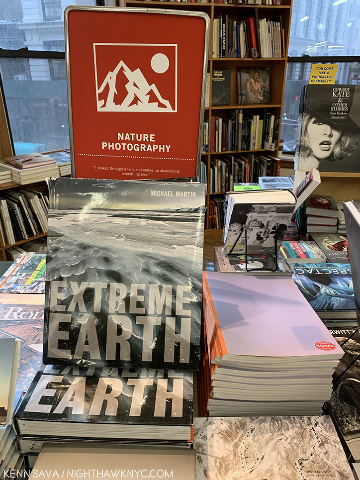
Omaha Sketchbook, now available in the “Nature Photography” section of your favorite store. ? Over 450,000 people live in Omaha. Looks like someone else, besides me, needs to get out of town and “discover America.” On behalf of whoever did this…Sorry, Omaha!

Whether it be Robert Frank, Paul Simon, Gregory Halpern, or any number of the rest of us. People have been “looking for America” for a long time. It seems to me that if it were that easy to find? “America” would have been “found” long ago. In The Americans, as well as in A, ZZYZ, Confederate Moon, and Omaha Sketchbook, you get the sense that it’s here. Hiding in plain sight.

^-Soundtrack for this Post is “America” by Paul Simon and recorded by Simon & Garfunkel from their classic album Bookends, released in 1968.

My thanks to Gregory Halpern, Kellie McLaughlin of Aperture Foundation and Morgan Crowcroft-Brown of MACK Books. 

My prior pieces on Photography are here.
You can now follow @nighthawk_nyc on Instagram for news and additional Photos!

NighthawkNYC.com has been entirely self-funded and ad-free for over 6 years, during which over 250 full length pieces have been published. If you’ve found it worthwhile, you can donate to keep it going & ad-free below. Thank you!

Written & photographed by Kenn Sava for nighthawknyc.com unless otherwise credited.
To send comments, thoughts, feedback or propositions click here.
Click the white box on the upper right for the archives or to search them.
For “short takes” and additional pictures, follow @nighthawk_nyc on Instagram.

Subscribe to be notified of new Posts below. Your information will be used for no other purpose.


  1. My complete coverage of AIPAD, 2017 is here, which includes more on Gregory Halpern.
  2. Yes, there are “echoes” in his work. In his new Omaha Sketchbook, I note works that show the influence of The Bechers’ isolated Water Towers, Walker Evans’ Main Street of Pennsylvania Town, 1936, Robert Adams and his former teacher, Todd Hido, among others. I take these as conscious referencing- echoes, as I like to call them.
  3. Not counting East of the Sun, West of the Moon, which he did with his wife, Photographer Ahndraya Parlato, since it is a collaboration.
  4. The Americans was first published by Robert Delpine in France in 1958, and in the USA by Grove Press in 1959.
  5. On the bootleg album entitled Village Vanguard, a collection of live recordings, in their performance of “America” in 1969, Simon & Garfunkel changed this line from “I’ve gone to look for America,” to “I’ve come to look for America,” which I opted to use here.
  6. Gail Levin, Edward Hopper: An Intimate Biography, P.265.

Unfinished. Auspicious.

Written & photographed by Kenn Sava

“Well, let me tell you ’bout the way she looked
The way she acts and the color of her hair
Her voice was soft and cool, her eyes were clear and bright
But, she’s not there.”*

"Portrait of Mariana de Silva y Sarmiento," 1794, by Mengs

“Portrait of Mariana de Silva y Sarmiento,” 1794, by Mengs

Leonardo da Vinci, Michelangelo, Titian, Van Eyck, Durer, Rembrandt, Velazquez, Manet, Monet, Degas, Van Gogh, Cezanne, Picasso, Pollock, Warhol, Mondrian, Basquiat, Whistler, Alice Neel, Lucian Freud, Klimt, Munch, Whistler, Robert Smithson, Cy Twombly, Gerhard Richter, and on and on. “Unfinished” is a mimi-Museum unto itself that probably rivals quite a few entire Museums. “Unfinished,” along with the “Nasreen Mohamedi” Retrospective, were the inaugural exhibitions at The Met Breuer (TMB), the first shows of two new eras- The Met’s new 8 year Breuer Building Lease (at a reported $17 million a year 1), and Sheena Wagstaff’s tenure as Chairwoman of The Met’s Modern & Contemporary (M&C) Department. No pressure there. It’s a show that leaves you wondering “Why didn’t anyone think of this before,” before you’ve even gotten to it’s second floor.

Opening Day of The Met Breuer. Member's Preview, March 8, 2016

Welcome to the future! Opening Day of The Met Breuer. Member’s Preview, March 8, 2016

Well, for one thing, though many of the works here come from other sources, not a lot of places have the resources The Met has, so yes, a part of this is “showing off.” They’ve chosen to install this in a brand new branch that previously held the entirety of one of the other “Big Three” Manhattan Museums, before the Guggenheim made it the “Big Four.”

If that’s not showing off? I don’t know what is.

The rest is the pure joy of discovery, of seeing a curtain lifted and getting an all too rare chance to see some of what goes into making a masterpiece, a work of Art. And? The hits just keep on coming. The big names, that is, if not the most well-known work by any of those names. 197 works in all filling the 3rd & 4th Floors. While nothing here is “famous,” even in their, supposedly, incomplete state (either left unfinished on purpose, or not, in the case of Lucian Freud’s “Portrait of the Hound,” which was left as we see it on his easel when he died), these works hold up just as they are, making this a show jam packed with excellent, even important pieces. Yes, curating a show of “unfinished” work THIS well is also showing off The Met’s superb staff. Along with the pleasure of looking, they also provide fascinating, voyeuristic, even unique, insights into the Artist’s process- both working and thought. Some, as in Alice Neel’s “James Hunter Black Draftee’, 1965, are, perhaps, more evocative than it might have been had it been “finished.” Mr. Hunter never returned for additional sittings. We are left to wonder why not.

"James Hunter Black Draftee," 1965, by Alice Neel

“James Hunter Black Draftee,” 1965, by Alice Neel

The whole question of “When is a work of Art, finished?” comes front and center here as well, and no less than Rembrandt chimes in on it.

dsc_7639pnh

Highlights? I’ll list those that come to mind quickly because there are so many. For me, Jan Van Eyck was the very first Artist who truly captivated me as a kid. Shortly after getting my driver’s license, I drove the almost 6 hours each way just to see his “Annunciation” in Washington’s National Gallery, then drove right back. Seeing his underdrawing for his unfinished St. Barbara was just breathtaking. It’s truly unbelievable to think that something like this lies underneath his finished masterpieces, like The Ghent Altarpiece! While he is legendary for the extraordinary and exquisite detail of his painting, which has held me in disbelief for all these decades, apparently, he could also draw every bit as well2

Small wonder. "Saint Barbara," 1437, Jan Van Eyck. Barely 12 inches tall.

Small wonder. “Saint Barbara,” 1437, Jan Van Eyck. Barely 12 inches tall.

Just astounding. Oh, and sitting a few feet away was a da Vinci portrait profile that was positively otherworldly. When the show opened (along with the Met Breuer) in March, it was flanked by Leonardo’s “Sketches for the Virgin Adoring the Christ Child” and Michelangelo’s “Study for the Libyan Sibyl.” Since “Unfinished” was up for a very generous four and a half months, the later two were replaced after a while, no doubt due to their fragility. It seemed to me they may have been there in honor of TMB’s opening. Both works are in TM’s permanent collection. More showing off? (Slight smile)

Blink, and you missed it. Briefly on view, Leonardo, center and left, Michelangelo, right.

For a New York Minute, the two greatest figures in Western Art were on view together. Leonardo, center and right. Michelangelo, left. Has so much hunan genius ever been side by side than when work of these two are shown together? March 8, 2016.

Oh, all of this is in the 2nd room. In the first room, upon getting off the elevator on the 3rd Floor, at the show’s beginning, you’re immediately faced with 2 large, powerful Titians that are guaranteed to stop you for a good long while, and a Jacopo Bassano.

This view once the elevator doors opened on 3 is one I'll long remember.

The opening salvo. This is the first thing many visitors to TMB saw after the elevator deposited them on 3. Bassano, left, with 2 Titians.

Rembrandt’s St. Bartholomew, a whole room of Turners, a beautifully selected print gallery, a very “different” Degas of a horse race, a Van Gogh who’s color filled the entire room, a stunning Munch self portrait…all on the 3rd floor, wowed me.

"Street in Auvers-sur-Oise," 1890. In the year he died, no dark clouds in this sky.

Life affirming. “Street in Auvers-sur-Oise,” 1890. The year he died, no dark clouds in this sky. I am among those who believe Van Gogh did not commit suicide.

Finished, or Un? "Lucretia," 1642, by Guido Reni. Magnificent.

Finished, or Un? “Lucretia,” 1642, by Guido Reni. Magnificent.

On the 4th Floor, getting off the elevator was no less dramatic. No less than 4 amazing Picassos greet you, one of which is “the Charnel House,” the work which bookends (with “Guernica”) his WW2 years. While “Guernica,” rightfully, is seen as one of the landmarks of 20th Century Art (and one I’m eternally thankful I got to see in person at Moma’s Picasso Retrospective in 1980 before it was moved to Spain as Picasso’s will required), here is a work that I think deserves more attention. It’s surrounded by 3 other pieces, in 3 other styles (in addition to 2 others in the next gallery, and a few more on the 3rd floor), that show Picasso in the process of thinking through the problems inherent in each work- each one in a different style. After the 1921 “Portrait of Olga,” right, below, he was inventing each of these styles. It’s akin to inventing a new language. There was no one else to help him or guide him. Some artists, like Jackson Pollock, have done this once. Picasso? There’s three in this one gallery, and it doesn’t even include Cubism.

Pick a style-any style. 4th Floor Lobby/Galley 1. Picasso 1921, '29, '31, '45.

Pick a style-any style. 4th Floor Lobby/Galley 1. Picasso 1921, ’29, ’31, ’45.

There was quite a bit of fanfare paid to The Met’s announcement of The Met Breuer as a “Contemporary Outpost,” especially during the years when the 5th Avenue Modern & Contemporary Galleries were to be undergoing the reconstruction they had also announced. Yet, in this co-inaugural show, we get quite a bit of what The Met is famous for, along with about two thirds of the 4th floor of more recent works. The size of many of these newer works seems to cut down on the number of pieces, however, making the show feel skewed towards older Artists. Of the 197 works in the show, I counted 74 works by Artists born after 1900, 12 by Artists born after 1950. (The youngest Artist represented is Urs Fischer, who was born in 1973, and who’s mysterious cast bronze “2,” from 2014 is also the newest work here by my reckoning.)

The day after at the NighhawkNYC offices? No. "2," 2014, by Urs Fischer.

The day after at the NighthawkNYC offices? I’ll never tell. Actually, this is “2,” 2014, by Urs Fischer.

“But it’s too late to say you’re sorry
How would I know, why should I care?
Please don’t bother trying to find her
She’s not there”*

Yet, even among the M&C pieces here on the 4th floor, there are memorable pieces. In additon to Urs Fischer’s “2”, the unfinished Mondrian struck me as a revelation. Yayoi Kusama’s genre defying paintings of consecutive numbers gave pause for thought, as did Sol LeWitt’s amazing tour de force  “Incomplete Open Cubes” nearby  and, Kerry James Marshal’s “Untitled,” 2009, was a nice appetizer for his much anticipated “Mastry” show opening at TMB October 25. The show concludes with a wonderful selection of sculpture, including haunting works by Louise Bourgeois, “Untitled (No.2), 1996, and Alina Szapocznikow’s work about her own battle with breast cancer, “Turmors Personified,” 1971, in dialogue alongside 3 Rodins. The final gallery consisted of only one work- a series of 6 pieces by Cy Twombly, entitled “Untitled I-VI (Green Paintings), 1986, which provided a meditative, cleansing experience I found especially memorable.

The Cy Twombly Gallery closes the show seen in panorama.

Water works? It’s hard not to feel a sense of water in movement in this gallery of 6 Cy Twomblys, which closes the show, seen in panorama.

Overall, what I took from this show as a whole was a possible template for what The Met plans to do going forward, the kinds of Artists they may include in their “new initiative.” It’s something I plan to watch closely as it unfurls. I should say that I have been in the minority regarding The Met and M&C Art. I liked that they were taking their time and allowing time to give some perspective on Contemporary Art before jumping in. It’s always been an honor to be in The Met- they have the best of the the best across all cultures and all times. Yet, given the unprecedented popularity of M&C Art today, they have opted to move more fully into it. Ms. Wagstaff, who I met in June, seems to have a great sense for all of this, and if anything, “Unfinished,” is a show that consists of work across at least a few Met Departments. Being able to work, apparently, so well with the other Met Departments augers well for the future. After all, The Met has 2,000,000 items in it’s collection. Showing M&C Art along side of selected objects in their collection is something I am all for.

Floor beach. As close as I got to a real beach this summer.

Floor beach. “Mirrors and Shelly Sand,” 1970, by Robert Smithson. As close as I got to a real beach this summer. I shot this wearing shades.

For me? That’s what this show says- Here are (unfinished) works by many of the greats. This is where we are starting from. Let’s see how other work that may, or may not, have been influenced by them, looks alongside these. The show may be seen as a number of conversations between Artists they are displayed alongside- Leonardo with Michelangelo. Van Eyck and Durer, Rembrandt with Velazquez(!). Degas and Manet. Van Gogh and Whistler(!). Picasso and Cezanne. Pollock and Kusama. Smithson and Fischer. Marshall and Warhol. Szapocznikow and Rodin. Rauschenberg and Mondrian. And, Picasso, also…with himself, among them. I say bring it on!

Still, there’s no denying that The Met Breuer is a HUGE gamble. Who knows how long Contemporary Art will stay as “hot” as it is? For that matter, who knows how much longer record number of viewers will go to see Art, as they have these past few years? The Met is locked into this for 8 years, and they have already announced a budget deficit that caused them to put off the previously announced reconstruction of the Modern & Contemporary Galleries, and, more sadly, even forced an unknown number of lay offs.

When they return to better times, IF they decide to move forward with those reconstruction plans, they will, most likely, need additional space for the temporary display of their Modern & Contemporary holdings, and Special Exhibitions. What will they do? Extending the lease on the Breuer will be VERY expensive. So far? I have yet to see it’s galleries very crowded. The “Diane Arbus; In The Beginning” Show, which recently opened on the 2nd floor, seems to be drawing pretty well, and “Unfinished” was fairly crowded during it’s last weeks. Yet? They’ve already closed the 5th Floor Cafe & Bookstore and remodeled it as additional Gallery space, which indicates that they want to have more going on there for visitors to see, and their basement restaurant is scheduled to open in about a month, which will be open during some hours The Museum is not. Obviously, this is all new, and still in flux. The Met seems to be reacting fairly quickly, which is a good sign. They did away with late Thursday nights, which I seemed to be among the very few that went to, and changed to late Friday & Saturday nights, like TM, 5th Avenue.

"Tumors Personified," 1971, by ALina Szapocznikow.

Survivor. “Tumors Personified,” 1971, by Alina Szapocznikow.

So far, on very little evidence, I like the direction TM is going at TMB, and with M&C Art. “Nasreen Mohamedi” was a revelation that struck me as the “perfect choice” to be the first M&C Show. “Unfinished” was an unexpected blockbuster the likes of which has never been seen before, which is somewhat startling given how long there have been painting shows. The Diane Arbus show is fascinating and features a ground breaking installation. Also, not to be lost is the reconfiguration of the M&C Galleries at TM on 5th Avenue- I love what they’ve done. The Art has been imaginatively rehung in fascinating new combinations, with some pieces given new prominence, like Edward Hopper’s majestic “The Lighthouse at Two Lights,”1929, and other pieces shown that have long been in storage. Along with this, Thomas Hart Benton’s “America Today” Mural appears to have now been permanently housed, at the center of supporting works and works that enter into interesting dialogue with it nearby. Other galleries are arranged by theme, instead of chronology.

So? There’s been a lot of action coming from new M&C Chairwoman Sheena Wagstaff and her Department. There’s a long way to go, but so far? It’s hard for me to give her less than an “A” for what she and they have accomplished.

Haunting, and then some.

Haunting, and then some. “The Return of Mary Queen of Scots to Edniburgh,” 1870, James Drummond.

Most of the Artists in “Unfinished” won’t get the chance to finish what they started. The Met will.

Stay tuned.

*-Soundtrack for this post is “She’s Not There,” by Rod Argent, recorded by The Zombies, and published by Marquis Songs, USA.

NighthawkNYC.com has been entirely self-funded and ad-free for over 7 years, during which over 250 full length pieces have been published. As I face high expenses to keep it going, if you’ve found it worthwhile, please donate to keep it up & ad-free below. Thank you!

Written & photographed by Kenn Sava for nighthawknyc.com unless otherwise credited.
To send comments, thoughts, feedback or propositions click here.
Click the white box on the upper right for the archives or to search them.
For “short takes” and additional pictures, follow @nighthawk_nyc on Instagram.

Subscribe to be notified of new Posts below. Your information will be used for no other purpose.

  1. http://www.nytimes.com/2016/03/05/arts/design/breuer-building-expands-the-imagination-and-the-budget-of-the-met.html?_r=1
  2. Yes, I saw “A New Look at a Van Eyck Masterpiece” at TM proper, which featured a drawing of the Crucifixion from Rotterdam that may, or may not be, by Van Eyck. I came away VERY impressed by it to be sure, but remaining to be entirely convinced.

Edgar Degas: Beauty & Anarchy

“I saw you standing there
I saw your long, saw your long hair
Opened up my eyes, baby
You made me realize all I want to do now
Is look at you”*

Edgar Degas (1834-1917) didn’t see the world as you or I do. Many of us can’t see beyond the phones in our face to really see most of what is right in front of us (watch out for that bike), and remember even less of it. Not Degas.

I see you. Self Portrait, Etching and drypoint, 1857, aged 23.

Edgar Degas, seemingly, saw everything. Especially when it came to women. He even saw things that I’m not sure were intended to be seen let alone depicted. For that reason, I’ve considered him the “king of the hidden moment.” Some of those moments he chose to remember, and immortalize, were scandalous when he first exhibited them. 125 year later, they may still give us pause. He was a voyeur in the original sense of the word. meaning “one who looks,” but I am sometimes left to wonder if he was in the contemporary sense, as well- a “peeping tom.” Yet, he does it in ways that we can’t take our own eyes off of, “blinding us with science”- his talent and genius.

I see you, too.

I see you, too. Perhaps, only Degas would think of immortalizing this awkward moment. But, why? (Pastels applied to a Monotype, the core medium of MoMA’s show.)

He, thereby, makes us complicit after the fact in his voyeurism. Before the fact, the question is there to be asked- Why this moment? While I choose to respect the privacy he long sought and stay away from looking into the reasons he felt “the artist must live alone” (which he was his whole life) for insights to his work, I have come to blame it on that eye that never closes, and that sees all. While we admire his work, rightly among the greats, there are times when I wonder if having that switch in his brain that said, “Um? No.” might have been a good thing- once in a while.

It’s too late now. No one who owns one of those “questionable subjects” Degas depicted is relegating it to the trash bin. Most of them are in museums, or most likely will be one day. At the moment, 120 of Degas’s works are on view in Degas: A Different Beauty, the summer blockbuster at MoMA though July 24, a show centered around his rarely seen Monotypes, which are usually tucked away because many are too light sensitive for permanent display. Still they are Degas, and the more Degas I see, regardless of the medium he’s using, the more I’m struck by the moments he chooses. Of course, beyond “why?” there’s the “what does the work mean” question.

But, let’s back up. First…what’s a Monotype?

It’s a medium that combines drawing and printmaking that results in a one-of-a-kind work, hence “mono.” It’s created either by adding ink to a copper plate with a brush, or almost anything else, which is called the “Light Field” kind of Monotype, or selectively removing ink from the plate covered with it, again using a brush, etc., which is called the “Dark Field” kind of Monotype. The plate is sandwiched with a sheet a paper and then run through a press resulting in a print. Degas, of course, did both kinds, but as the show wonderfully shows us, he didn’t stop there.

One of Degas' first Monotypes- Dark Field.

One of Degass’s first Monotypes- The Ballet Master, Dark Field Monotype, 1876.

In addition to this  never closing eye, Degas had an incessantly exploratory nature and they combined in an eternally restless Artist, one who was, also, constantly searching for new outlets for his creativity. That led him to the Monotype, an infrequently seen medium in Art, at the suggestion of his friend, the Artist and Monotypist Ludovic Napoleon Lepic in the mid 1870’s. Later, it would lead him to Photography (1895). Degas threw himself into the Monotype with typical intensity. He learned the basics, and then pushed them. Soon, he was doing things like making a second print from the plate, which would naturally be faded as the image degrades after most of the ink had been spent on that first impression, to which he’d add Pastels on top of the black and white image creating shockingly “different” works from the two tone original. Some of these colored images are beautifully displayed side by side with the black & white first image, the pair are called “Cognates.”

Cognates

Cognates. “Woman in a Bathtub Sponging Her Leg” 1880-85. Monotype, and with pastels (right).

But, be warned- this isn’t “Degas 101,” or “Degas’s Greatest Hits.” It’s not even “Degas’s B-Sides”. It’s borderline “The Unknown Degas” (for the casual Degas lover), but that certainly doesn’t mean it’s “bottom of the barrel” Degas (whatever that is. If it exists, I’ll take it!). It means there is so much great Degas that little known works like his Monotypes can hold their own front and center in a big show, even without support from the inclusion of some much more famous paintings 1 But let’s not let the medium be the message here. For me, at least, it’s “still” Degas. What one sees in his paintings, pastels, sculptures and etchings, is also to be seen in his Monotypes. All his “big themes” are here, showing they never were far from his mind, regardless of medium, and giving the casual Degas fan plenty to enjoy, while they see something new. They include-

Beauty. In ANY sense of the word.

Beauty. In ANY sense of the word. Pastel over Monotype.

Ballet Dancers

Bathers

Portraits, and even a Self Portrait or two

Family life

Night Life and City Scenes

Yes. This is a Landscape by Degas, Pastel over Monotype in Oil, 1890

Yes. This is a Landscape by Degas. Pastel over Monotype in Oil, 1890

And? There are also landscapes, something that most Degasians may not be as familiar with2. A whole room of them that Degas called “imaginary landscapes,” inspired by a trip through Burgundy in 1890. They are shockingly different for Degas, who, much like me, preferred the City and found no end of inspiration therein, anticipating the edgy, quasi-abstract late work of Monet (i.e. the Waterlilies, etc) some 20 years later, and the Abstractionists over the rest of the 20th Century.

Oh.

I left out the Brothel Scenes. Well? That’s what the section card says they are. They sure don’t look like scenes from any brothel I’ve ever heard about. (Sorry. I cant’ say I’ve actually been in one, so I’m speaking third-hand.) Of all of these, the Brothel Scenes strike me as being the most intimate, especially because the Bathers are almost uniformly very dark works, where much is hidden in shadow or under water. The Bather rising from her tub, above, is in the Brothel section, and is typical of how well lit these scenes are. Which is good because it also serves to highlight some of the questionable scenes in this section, like the image of a woman either about to use a bidet or rising from one. ?

Then again, it also means there are those priceless moments of ballet dancers and ballet students caught unawares in beautiful, unique poses. Families doing the most mundane of things line one wall, while “everyday scenes” of a different nature abut them in an adjoining wall of brothel scenes. The bathers get the privacy of a room to themselves, as do the landscapes, and the dancers are pretty much everywhere else. Along the way, we see two Self Portraits (one, above), a series of Rembrandtian etching “states” and a somewhat odd scene of smoke stacks, looking somewhat lost, on a wall by itself, heightening it’s “out of place here” feeling.

The “Greatest Hits” collection of Degas themes notwithstanding, there is much to see here, and much that requires close scrutiny. The gorgeous strokes of pastels that seem to have been applied at once both spontaneously and effortlessly, all the while, sublimely, particularly struck me. It’s also fascinating to see how he’ll take a black and white monotype and colorize it. Having the very rare opportunity to see both, side by side is, for me, one of the highlights of this show- The effect is not like seeing a colorized black and white movie. Degas makes it something completely else. As a result, I was quite surprised to see him quoted on a sign to the effect that if it were up to him, he’d work only in black and white, but the public wants color. I, for one, am thankful we have both. While I would never dare to argue his preferences, I also have to say- What a loss to the world it would have been had he never worked in color! I came away with a new appreciation of Degas, the colorist, both in how he applies color to a given composition, (which can be quite bold, like a lightning bolt, as in the dancer, above, but also for his palette. If you get to see this show, or the very good catalog for it, be sure to look for these instances where you can see the Cognates, so you can make up your own mind. Here is one-

Bather. Monotype. First impression.

Bather. Monotype. First impression. A closer view of the Cognates, above.

Bather. Pastel over Monotype. (Second impression)

Bather. Pastel over Monotype. (Second impression)

Then there’s the question of meaning…

“…what is fermenting in that head is frightening.” Rene Degas (his brother), in a letter, April, 1864.3

Degas does not surrender his secrets easily. Anyone who has seen his early masterpiece, Interior, 1868-9, can attest to the mystery his works hold. Some see a rape in it, others see the depiction of a scene in Zola’s then recently published Madeleine Ferat. Personally? Having seen it in Philadelphia first hand, I see different things in it each time I see it, even now in pictures. Beyond its “meaning,” more importantly, right now, I see it as a precursor of Edward Hopper. It’s a classic example of what Jean Sutherland Boggs, in the catalog for a much earlier show at The Met, succinctly says- “The longer one reflects on the work of Edgar Degas, the more elusive it seems.” She continues, however, throwing us a lifeline of insight “…some key to the work, if not necessarily to the man, may be found in his fascination with equilibrium[ 4. Degas 1834-1917, Metropolitan Museum, 1988,  p. 23].” And, yes, beyond the voyeurism, which may take some time to see past, we do see that in the bathing piece above. Though it’s not to be seen in the physical sense in all his work (though it may be on the psychologoclgical sense) it becomes fascinating to look for- The dancers on one foot or bent over, or at the barre, and on and on. Degas is fascinated by man’s relationship to the ground, the earth, and with equilibrium.

DSC_2564PNH

The Met's Degas Sculpture Room. Notice that every single work depicts balance & equilibrium.

To research this further, I went to The Met’s Degas Sculpture Room. Notice how every single work depicts balance & equilibrium.

“Degas is an anarchist. But, in Art.” Camille Pissarro (Artist/Anarchist/Friend of Degas), in a letter.

This show is risky. Degas was exploring in his monotypes. The “beauty” on hand is sometimes “different,” in the sense that it’s, at times, not the beauty Degas is most revered for and that the masses of Art lovers, myself included, associate him with.

One of the most puzzling and "different" Degas I've yet seen. Monotype.

One of the most haunting, and “different,” Degas I’ve yet seen. Monotype.

It seems to me that when “looking for meaning” or trying to reconcile all of this, it pays to look back at Degas’s past. Degas didn’t start out a revolutionary. His early work showed “the classical beginnings, without any gesture of revolt4”  It was in the 1860’s that this would change. His anarchy lies in subverting the past/his past while he reinvents it, and seeks to add to or change his own working processes. Degas spent long hours copying in the Louvre and then in Italy for 3 years. Among the works he copied were an etching after a Michelangelo original of a man scrambling over a riverbank, i.e. climbing out of the water. Once you look for it, this image of a nude entering, or leaving, the water is one that reappears in his work- there’s a gorgeous pastel of one at The Met, here. Therefore, I think the image of the Bather Exiting the Bathtub, way up above, is, partially, another example of that interest, partially due to his interest in “equilibrium,” and partly sensual/erotic. It’s taking the classical idea of Michelangelo and turning it on its head, as an anarchist would be expected to do.

Anarchist Degas then shocked society in 1888 when he showed his nude drawings in an exhibition arranged by no less than Theo van Gogh, Vincent van Gogh’s brother. Vincent van Gogh was quite taken with Degas and was one of the few Artists around capable of understanding, and admiring, his isolation and celibacy. His comments on Degas & women in his Art are fascinating. Up until Degas, the nude was something drawn from models, who were aware of what was taking place and were party to it, even if they were depicted at their “toilette”, which goes back to the 1500’s in Art. With Degas you often have the feeling that neither of these “norms” were true, leaving us with that sense of looking through a door that has been cracked open. I haven’t been able to find out what the subjects thought of these works. Voyeur? Rule breaking visual anarchist? Though he, apparently, lived a sexless life, Degas created his fantasies in his Art (for what purpose I know not), and a number of them are on view here. He created them for himself, only showing the 9 he allowed Theo to exhibit in 1888 during his lifetime, and he kept them until he died. Why? I don’t know and I don’t think it matters. They subsequently came into Museums and private collections when his estate was sold after his death in 1918.

It speaks volume that he was so willing to continue to explore when he had discovered things, like the paintings of dancers, he could have continued to do forever and receive endless acclaim for. It takes a little bit of that same faith to follow him on his exploratory path to get to the gems that are not often seen due to their fragility. They are here, though the show includes works that are not. Some may be characterized as experiments, while others are byproducts of Degas’s refining his process. They are all Degas, though, and as such are precious, edifying and definitely worth seeing. MoMA is to be congratulated for taking the chance of going against the grain of what people know and expect from a Degas show, and for doing it without the “crutch” of including a number of their own very familiar paintings. Here we have Degas the artist who was restlessly exploring new mediums and new techniques, while adding his own steps to the processes he had been taught by others. In that sense, Degas: A Different Beauty is a fascinating insight into the mind of one of the greatest Artists of the past 150 years.

“When it happened
Something snapped inside
Made me want to hide
All alone on my own
All alone on my own”*

For me, this makes Degas a prototypical “Modern Artist” in every sense of the term, as much as anyone working today. Degas would be right at home in our time, with the expanded capabilities Artists have, pushing the possibilities of Photoshop, the iPad, video, or you name it, as he would have been at home, most likely, at ANY time in history. In that sense, like his great influence and forbearer, Rembrandt, and a great Artist he influenced, Picasso, Edgar Degas was an eternally “Modern Artist.”

*- Soundtrack for this Post is “Looking At You” by the MC5, written by Tom Robinson from their Lp Back In the USA. Published by Sony/ATV Music Publishing and Warner Chappell Music Inc. Degas’s brother lived “back in the USA” and Degas actually spent fruitful time in New Orleans in 1872.

NighthawkNYC.com has been entirely self-funded & ad-free for over 8 years, during which 300 full-length pieces have been published! If you’ve found it worthwhile, PLEASE donate to allow me to continue below. Thank you, Kenn.

You can also support it by buying Art, Art & Photography books, and Music from my collection! Art & Books may be found here. Music here and here.

Written & photographed by Kenn Sava for nighthawknyc.com unless otherwise credited. To send comments, thoughts, feedback or propositions click here. Click the white box on the upper right for the archives or to search them. Subscribe to be notified of new Posts below. Your information will be used for no other purpose.

  1. There are 7 Oil on canvas Paintings and 1 Oil on paper mounted on canvas, mostly in the show’s final room, but none are among his famous works.
  2. The Met had a show of Degas’s Landscapes in 1993.
  3. “Degas 1834-1917,” Metropolitan Museum, 1988, p.41
  4. Degas 1834-1917, Metropolitan Museum, 1988, p. 34