NoteWorthy PhotoBooks, 2020

Written & Photographed by Kenn Sava

As it has been in all realms of life, 2020 has been an extraordinarily challenging year to be a book publisher, particularly a smaller one. Working with anyone- from your team, to the subject Artist, right through to the printers and binderies- all had to be done remotely for almost the whole year. Shipping between many countries has been off and on, and off again. (As I write this, shipping between Japan and the USA is still down.) Finally, bookstores around the world have been closed for much of the year. Somehow, a good number of books were published in 2020, though a good many previously announced titles have been pushed back. Under the best of circumstances, it’s not easy to get a PhotoBook published. So, I congratulate any and everyone who has published one this year. Bravo!

Antoine d’Agata, 17.03.2020 – 11.05.2020, page 158 from Virus, taken during the pandemic in Paris from March to May.

Since there’s no such thing as “best” in the Arts, I’ve opted to do a list of recommended “NoteWorthy” PhotoBooks the past 3 years. This year, due to the pandemic, I’ve seen fewer books than I had the past few years. Nonetheless, these books stood out for me among those I have seen, and I decided to do a list this year because I believe they would have been on it no matter how many more I had seen.

Josh Kern’s second PhotoBook, Love me, was released in 2020 and promptly sold out. In this spread from it the Photographer shows us his working notes. Along the top, it reads “There’s nothing that holds it together.” On the side, “Took a thousand pictures of this moment and not a single one is good.” This reminds me that as incredibly hard as it was to publish a book this year, the hardest parts of making a great PhotoBook happen long before it gets to be printed.

Most Photographers don’t have gallery representation, so, PhotoBooks are a primary means of reaching an audience for them. Without a dealer, they’ve taken on the job of building their own followings. Through diligence, a few of them even have upwards of 1 million followers on social media. For me, the accomplishments of these independent Artists is yet another indication that the gallery model is being bypassed by people who are not only creative Artistically. One example of how things are changing is young German Photographer Josh Kern, who I was among the very first in the US to discover last year. Josh did a Q&A with me as his first PhotoBook, Fuck me, was about to sell out of 1,100 copies. He has now sold out of 1,200 and 1,100 copies of his first two PhotoBooks respectively without help from Amazon, a gallery, or even a US book distributor. Remarkable for someone who was a 22 year old college student when he started, and another sign of where things are heading. 

As I’ve mentioned in the previous years I’ve done this list (2018 and 2019), reconciling publishing dates with the date books actually appear is a bit problematic. Some books published in 2019, even 2018, only reached stores here in 2020. I’ve seen a number of books listed as being scheduled to be published in 2020 that have not made an appearance in stores here yet. So, once again, I’m sticking to books I’ve actually seen become available in stores, or to purchase, this year.

NoteWorthy PhotoBooks, 2020
The All-Magnum Photos Edition

That’s right. Coincidentally, each of these books was created by a Member of Magnum Photos, the legendary world’s leading Photographer’s co-operative. If I were to recommend one book this year of all the books I saw, I’d be torn between these two-

Paolo Pellegrin: Un’antologia, Silvana Editoriale. Ok. It says “2018” on the colophon, but how many people here have seen this? D.A.P. listed it as being available in the USA in Fall, 2019. I didn’t see it until late January, 2020. Un’antologia may be the most well-done retrospective I have ever seen. Perhaps, I shouldn’t be surprised. It was designed by a team headed by Yolanda Cuomo, who has designed countless wonderful books, including Diane Arbus, Revelations, the finest book on Ms. Arbus I have seen. Gorgeously produced and extremely thorough, this 6 1/4 pound, 742 page hardcover with over 1,000 illustrations accompanied the show of the same name at the Deichtorhallen, Hamburg, from October, 2019 to March, 2020, and as a career Retrospective- so far (c. 1960 to date). Yes, it ran to March, 2020, so I’m also using that to qualify if for listing here. Page after page is nothing short of stunning to the point that it becomes necessary to remind yourself that you’re looking at the work of one man- and Mr. Pellegrin, 56, is still a relatively young man, with hopefully, decades of work ahead, not someone looking back on a career that’s winding down. Nonetheless, it makes an open and shut case for Mr. Pellegrin as one of the world’s most important Photographers, just in case you didn’t already know that, with a legacy that’s already monumental. There’s an English edition in 1,000 numbered copies, and an Italian edition also numbered to 1,000 copies. That’s all! Un’antologia is also a fitting testament to curator Germano Celant, who passed away this year. Early on, he said to Yolanda Cuomo, “This is not a book by Paolo. It is a book about Paolo,” Don’t wait much longer. 

Virus, rear cover.

Antoine d’Agata, Virus, Studio Vortex. I thought I was a bit prepared to see this from seeing a number of these images on Mr. d’Agata’s social media pages, but no. I was staggered when I first paged through this massive tome. Mr. d’Agata who lives with no fixed address, lived and worked out of the Magnum Paris offices while producing this work (while Paris was shutdown). He also spent “countless” days and nights staying over in treatment centers. Wait. HOW many people are going to accept an offer to go and watch a covid19 patient being treated? Umm. No, thanks. Antoine d’Agata, as you can see above, said “Yes.” “My object is to get photography back to requiring true commitment, to being a language that is unique by its potential subtlety and rawness,” he said1. “True commitment,” in spades. The work he created, which number 13,000 images in the two months, ranges from “normal” Photographs to many taken with a thermal camera, like the image above, which produces shots that reveal things a normal camera wouldn’t. The results are often “painterly,” but unlike any Paintings I have yet seen. Going in to 2020, Francis Bacon was the Painter Antoine d’Agata’s work most reminded me of. With Virus, he’s created his own world, a world we’ve all lived in, alone together. The only other PhotoBook that came to my mind when thinking about Virus is Aftermath, Joel Meyerowitz’ equally massive look at Ground Zero after 9/11. Both Photographers had unique access. Both have succeeded in creating the most remarkable, historic and valuable documents of these horrific events. In the midst of the horrors the world has seen and continues to see during the pandemic, if I may say this, Virus also strikes me as also being a work of Art. There are images of medical professionals treating patients that have no less than a Pieta like feel to them. Just unforgettable. I look forward to the day when I can look through Virus and focus on its Painterly aspects and its qualities as a work of Art, and hope I get to see it. Virus’ 825 pages includes text by Mathilde Girard I admire quite a bit. There are just 325 copies of the English edition. As my co-most highly recommended PhotoBook of 2020, Virus is a staggering accomplishment.

There are two other books by Magnum Photos Photographers that especially stood out for me this year-

Gregory Halpern, Let the Sun Beheaded Be, Aperture. Ho hum…another year, another terrific Gregory Halpern book on this list. Let the Sun joins Confederate Moons and Omaha Sketchbook on this list in the three years I’ve been making one. I find all of his books have remarkable staying power. Meaning that the images linger in my mind long after I’ve closed the cover. That’s every bit the case with Let the Sun, which has more layers to it than it has pages (120), meaning different things are going to jump out to you with each perusing. Then there’s the remarkably intimate Conversation between Mr. Halpern and Stanley Wolokau-Wanambwa. Any place outside of NYC is foreign to me, but Guadeloupe is exceedingly hard for me to imagine. Yet, the shared history with slavery makes Guadeloupe not all THAT foreign and its unique experience with it makes it even more haunting. Somewhat quietly, Mr. Halpern continues to build a remarkably strong body of portraits, more of which lie at the heart of Let the Sun Beheaded Be. Remarkable when you consider the Photographer is not fluent in French and he communicates with his subjects before Photographing them.

Yael Martinez, La Casa sue Sangra (The House that Bleeds), KWY Ediciones. A 2020 Magnum Nominee, his work looks like no one else’s. He seems to have a unique way of getting inside the skin of those he portrays, his Photographs are so intimate. Of La Casa, Mr. Martinez says, “‘A people without memory is condemned to repeat their mistakes.’ Guerrero is one of the Mexican States that have been most affected by organized crime; It is the second poorest and most violent state in the country. I am thus trying to depict the situation which many families in this region face, which they live through daily, and which is one of the causes of the unraveling of Mexico’s social fabric.” La Casa focuses on the forced absence of beloved family members, each image with an overriding darkness and use of color that are both intimate and epic. His Photos bring you right there, capturing moments that often border on the magical. A house that bleeds could be a family or a community, he has said. He began with his family, before eventually expanding the project to include other family around Guerrero. The classic work of the Farm Security Administration Photographers, including Dorothea Lange (see below), came to my mind as a possible influence (though Mr. Martinez shoots in color). Printed in an edition of 1,000 copies, and still in print as far as I can tell, I spent most of 2020 seeking a copy of La Casa. Another marvelously unique Artist and powerful voice for Magnum Photos.

I don’t know how they do it, but year after year Magnum continues to find extraordinary Photographers to add to a roster that makes me ask the impossible to answer question- Is this THE greatest Magnum Photos Roster ever? Until I ask the same question, again the very next year. 

Other NoteWorthy PhotoBooks of the Year, 2020

Gordon Parks: The Atmosphere of Crime, 1957, and Gordon Parks X Muhammad Ali, both Steidl. Sadly, Gordon Parks left us in 2006, but his Foundation has been doing a strong job of keeping his legacy alive with shows (here in NYC at Jack Shainman Gallery), and a superb series of books published by Steidl. On the heels of the essential Gordon Parks Collected Works, (Steidl’s site says it’s Out of Print- you can still find it if you hurry), 2020 brought us The Atmosphere of Crime, 1957, and Gordon Parks X Muhammad Ali. Atmosphere seemed to strike a nerve with buyers when it came out, and garnered more attention, while GP X Ali benefits to no end of the close connection the two shared.

Atmosphere includes the original LIFE articles, like this one from September 9, 1957, and images never before seen.

Atmosphere of Crime is a brilliant look at the true complex nature of crime flying in the face of the mainstream media’s stereotypes, showing completely other sides to the American public with frankness and empathy. Unlike the work of Weegee, or even most of Gordon Parks’ prior Photographs, these are in color, which adds another dimension to both the you-are-there realism and the Artfulness of his timeless work. Powerful, raw, cinematic, Atmosphere paints a remarkably broad picture of the realities of crime in 90 images over 120 pages. It’s gives me the feeling of seeing a 1950s film noire in color. Of course, Mr. Parks later directed the classic Shaft in 1971- only 15 years later. It’s revealing to compare the two. Not to be missed.

One of the most important historical, and creative, records of The Greatest of All Time, Gordon Parks X Muhammad Ali, is centered around 2 assignments Mr. Parks was on to shoot The Champ in 1966 and 1970 for LIFE Magazine. The book is characterized by an intimacy that shows Ali in unguarded moments that are often incredibly poignant. While others, including Thomas Hoepker, have given us classic images of Muhammad Ali, Godon Parks’ stand out for me because they cut right to the heart of the man, which remains here, larger than life for all time.

Reproduction of the original opening spread of the 1966 LIFE article, with text also by Gordon Parks. The full articles are reproduced in both of these Gordon Parks books.

Gordon Parks Photographed The Champ at 2 key points in his life. First, in 1966, amid intense controversy over his becoming a Black Muslim, changing his name to Muhammad Ali, and being a conscientious objector to the Vietnam War. The resulting landmark LIFE Magazine article “The Redemption of the Champion,” also written by Gordon Parks, helped the public see the truth. I remember seeing it in a barbershop waiting for a haircut as a kid. The oversized magazine created a larger than life effect that cut right through all the noise. I believe the article helped start Muhammad Ali on the road to being the icon he remained for the rest of his life. 

Both are the multi-talented Gordon Parks near his considerable Photographic peak. Both speak for themself. Both will live on in your mind, indelibly. A show titled Gordon Parks X Muhammad Ali is scheduled to open at the Nelson-Atkins Museum in 2021. In 2020, I found it impossible to choose one between Atmosphere of Crime and Gordon Parks X Muhammad Ali. Good luck if you try to.

Ernst Haas: New York In Color, 1952-62, Prestel. During my now 4 year deep dive into post-Robert Frank’s The Americans Photography and PhotoBooks, I focused on exploring the history of early color Photography. I soon discovered that William Eggleston was NOT the first Photographer to have a solo show at MoMA. It was Ernst Haas, who’s Ernst Haas: Color Photography opened August 21st, 1962. FOURTEEN YEARS before Photographs by William Eggleston opened there on May 24, 1976. Mr. Haas’ estate has worked with Prestel to publish the wonderful Ernst Haas: New York In Color, 1952-62, which now serves to put Mr. Haas’ work into the same discussion with another legend of earlier color Photography- Saul Leiter, who’s color work in NYC, in the same period, has been held in unique esteem. Mr. Haas’ admirers already treasure Steidl’s classic Ernst Haas: Color Correction, which is to be reprinted.

Ernst Haas, NYC, 1952(!) Move over, Saul Leiter, and tell William Eggleston and Stephen Shore the news…

With the release of Ernst Haas: New York In Color, 1952-62, Mr. Haas goes toe to toe with Mr. Leiter on his own turf, in his own time! Lovers of Photography are the winners. NYC is plenty big enough for both of them. I recommend this book to anyone who loves Mr. Leiter’s Early Color, which I consider an essential PhotoBook of this century, as much as I do.

John Gossage: The Nicknames of Citizens, Steidl. The latest in the renowned Photographer’s “loving yet critical, generous yet ironic vision of America,” to quote the publisher, it follows Jack Wilson’s Waltz, published in 11/2019, Should Nature Change, 8/2019, and precedes I Love You So Much!!!!!!!!, forthcoming, all from Steidl. Picking up any one of these books is like taking one from a box of chocolates. Once you sample the poetry of Mr. Gossage’s images, you’re more than likely going to want to devour the others in the series. I’ve been so focused on exploring the history of color Photography these past 3 years that I was slow on the intake of this series. Nicknames is the first one I’ve gotten and I was immediately captivated by Mr. Gossage’s vision, and as Magnum Photographer Martin Parr said about another John Gossage/Steidl book he witnessed being created, Looking up Ben James- A Fable, “I am amazed that the collective vision of this volume is so familiar, but entirely alien. It restores my faith in photography to know that a mature and original photographer like John Gossage can see the things I just did not notice.” As I perused these books, another series on America came to mind- that of English Magnum Photos Photographer Mark Power’s, Good Morning, America. Mr. Power’s is in color and doesn’t include portraits per se, but the two ongoing series are fascinating to look at together, given one thing they do share- they both look at America during a similar time frame.


Luigi Ghirri, Cardboard Landscapes (Paesagge di cartone), Museum of Modern Art. This book was a gift from Luigi Ghirri to legendary MoMA Director of Photography, John Szarkowski, in 1975. It languished forgotten in the MoMA collection for decades until being recently rediscovered. Now reproduced faithfully for book lovers, it makes a stunning impression. Here, we get the full range of Luigi Ghirri’s considerable gifts, along with his gift of sequencing. The result is a breath of fresh air. The first half of the book is quite humorous. We sense the Artist’s personality shining through. The rest retains a bit of the feel of his recently ended career as a surveyor. In the end, it’s a book that is a serious work of Art that doesn’t take itself oppressively seriously. Still, it’s hard for me to look through it and not see a bit of the roots of Artists as diverse as Maurizio Cattelan, Stephen Shore, Richard Prince and Erik Kessels. Such is the net effect that, even though the Ghirri bibliography has exploded the past few years with some fine titles, Cardboard Landscapes gives us yet another entirely different side of this remarkable Artist.

Dorothea Lange, Words & Pictures, Museum of Modern Art. “All photographs—not only those that are so called ‘documentary’…can be fortified by words2, Dorothea Lange said. Elsewhere she said, “Am working on the captions. This is not a simple clerical matter, but a process…They are connective tissue, and in explaining the function of the captions, as I am doing now, I believe we are extending our medium,” in a note that reveals the importance of captions (and words) in seeing her work. It’s so rare to gain major insights into major Artist who passed away 55 years ago, but that’s exactly what the show this book accompanied did. “Dorothea Lange, Words & Pictures, which opened barely a month before the NYC pandemic shutdown added a completely new dimension to our appreciation of the work of Dorothea Lange by focusing on the role her words play in their understanding. It lives on in this exceptional book that is a joy to look at as well as to read. In many shows where words play a part, they’re often hard to read due to glare on the glass and the numbers of other viewers.

Dorothea Lange, Words & Pictures, Installation view, MoMA Photo.

The open book seen in the lower center wall latrine above as reproduced in Words & Pictures.

Here, you can read them clearly without distraction, glare or others looking over your shoulder, while seeing Ms. Lange’s classic images in gorgeous reproductions printed on 150gsm Arctic Volume Ivory, which makes the book better, in some ways, than seeing the actual show! Also, among the essays is one by the legendary Sally Mann. Along with whatever other books you have on Dorothea Lange, like the excellent Dorothea Lange: The Politics of Seeing, this one is essential.

Roy DeCarava: the sound i saw, David Zwirner Books. Roy DeCarava has been in eclipse since his passing in 2009, just short of his 90th birthday. Due to his estate’s new relationship with Zwirner his work has returned to view in force, both in shows and in books. The classic The Sweet Flypaper of Life (with Langston Hughes) was finally reissued in 2018, and 2019 saw the rerelease of another out of print Roy DeCarava classic- the sound i saw, this time in a luxurious oversized edition which pairs his poetry with many classic images. Growing up studying Jazz through Lps, I wasn’t familiar with Mr. DeCarava’s work as I was with, say, Alfred Lion’s for Blue Note. The difference I see between Mr. DeCarava’s Jazz images and everyone else’s is that I can tell he knew his subjects personally. These images ooze personal connection, and that’s very rare in Jazz in this period. No. It’s uneqelled. I don’t know why more of his amazing images didn’t make it on to record covers, but here many of them are over 208 pages in this 5 pound collection, in addition to others that set the mood. If you love Music, and especially if you love Jazz, this is an essential book that features exceptional, intimate images of legends Mr. DeCarava well knew, including important images of John Coltrane, and Billie Holiday (seen smiling!), Ornette Coleman and Duke Ellington, among others. It is the finest book of Jazz Photography I have ever seen.

NoteWorthy PhotoBook Publisher of the Year, 2020

From Remember the South by Frank Frances, one of the first three auspicious releases on Kris Graves’ new Monolith Edition imprint.

Kris Graves Projects & Monolith Editions. I can’t imagine how hard it was, and is, to produce and sell books in 2020. In addition to the obstacles I listed near the beginning of this piece, once you get the physical books printed and in your hands, all the bookstores were closed for much of this year. And then customers, including this one, have been slow to return to indoor shopping. Yet, through the pandemic, the lockdowns and quarantines that are still going on around the world, book publishers have tried to maintain a sense of “business as usual.” For all of them- big and small, this must have been quite challenging. I’m sure we’ve lost a good many of them already. Yet, Artist-run, Kris Graves Projects has not only carried on, they’ve released a steady string of impressive titles, 18 in 2020, including the third set of LOST, with their usual high quality, and at popular prices. Kris Graves also debuted Monolith Editions this year, dedicated to publishing the work of BIPOC Artists, with three auspicious releases. I reached out to Mr. Graves trying to gain some insight on just how he’s done ALL of it during the hardest year of almost all of our lives. He said-

“This year allowed me to be home more than any other in recent memory, so I worked on making content and working with artists. I wanted to make less books this year but I guess I can’t stop myself. Only four of the books were ideas during the covid times, everything else was in the works. Also, with my photoshoot income diminished, I had to find ways to make some profit on books. I also had more time to let people know the books exist.”

From @themaniwasnt

18 books in 2020 would have been a large output for ANY PhotoBook publisher, but he didn’t stop there. Kris Graves, himself, has created an exceptional, and exceptionally powerful, body of work in 2020, the result of incessant travels around the country, going to sites of monuments and protests, putting himself at considerable risk. It’s a body of work that captures the moment and will, I believe, be historically important. Though not yet published in PhotoBook form, some of this work may be seen on his Instagram feed, @themaniwasnt, and in National Geographic, January & February, 2021. About it, he said-

“As far as my own work, I have done about 30 days of traveling on National Geographic’s watch and dime, so that helped me make a ton of personal work. Without those trips I would not have shown much new work this year. Although, I now have four seasons of Cape Cod imagery and that is becoming a project now. I think that artists need to keep shooting until some magic occurs. If this winter is mild, I will take a bunch of bike rides around Queens to make some new images here also.”
It speaks volumes that at a time when many are stuck, stopped, or done, Kris Graves has not only maintained, he has continued to move forward- on multiple fronts, and produce important work, himself, along the way. 

Finally, this year I’m also listing some NoteWorthy Art Books for the first time. Stay tuned.

Addendum-

Two books I saw late in 2020 were subsequently added to my list, per my Instagram account, @nighthawk_nyc-

Justine Kurland, Girl Pictures, Aperture. My text reads- “Two 2020 PhotoBooks I was late in seeing must be appended to my NoteWorthy PhotoBooks piece for the year. First, is the amazing Girl Pictures by @justine4good, Justine Kurland. Fresh, exciting, challenging, unique, and endlessly mysterious, particularly for this male outsider, it’s not to be missed, especially while it’s not yet sold out and out of print.
It’s kind of amazing it took 20 years for this work to be published as a body. But, here it is and it’s a classic that’s bound to influence generations to come.”

Tyler Mitchell, I Can Make You Feel Good, Prestel. My text reads- “The second of the two 2020 PhotoBooks I was late in seeing that must be appended to my NoteWorthy PhotoBooks piece for the year, Linked in Profile, is Tyler Mitchell’s I Can Make You Feel Good. That’s exactly what his first PhotoBook does. Filled with joy, it’s also filled with remarkable, fresh Photography that runs the gamut from fashion, to documentary, and portraits all serving his vision/dream of a “Black utopia,” aided by the book’s generous 9 1/2 by 12 1/2 inch size. It’s another book, like Girl Pictures just posted, that blurs the line between real and fiction, but isn’t that what dreams do?
An auspicious and important debut PhotoBook as is ANY book that can make us feel good in times like these.” (It should be noted that this is Mr. Tyler’s first PhotoBook for a major publisher. He previously self-published a book. )

NighthawkNYC.com remains ad-free! Yet, the costs are substantial, and have piled up over the past  five years. There are NO affiliate sales links here. If you would like to support what I’ve been doing since 2015, there is a Donations link accessible by clicking the white box at the upper right of the page where the archive lives, with my sincere Thanks.

*-Soundtrack for this Post is “Every Day Is A Miracle” by David Byrne, from American Utopia now a terrific concert film directed by Spike Lee.

NighthawkNYC.com has been entirely self-funded & ad-free for over 7 years, during which over 275 full length pieces have been published! If you’ve found it worthwhile, PLEASE donate to allow me to continue below. Thank you, Kenn.

You can also support it by buying Art, Art & Photography books, and Music from my collection! Books may be found here. Music here and here

Written & photographed by Kenn Sava for nighthawknyc.com unless otherwise credited. To send comments, thoughts, feedback or propositions click here. Click the white box on the upper right for the archives or to search them. Subscribe to be notified of new Posts below. Your information will be used for no other purpose.

  1. Magnum Photos profile
  2. The full quote reads, “All photographs- not only those that are so-called ‘documentary’, and every photograph really is documentary and belongs in some place, has a place in history- can be fortified by words.” Dorothea Lange, Words & Pictures, p. 12.

Harry Gruyaert- In Living Color

Written & Photographed by Kenn Sava (except *)

Freemont Street, Las Vegas. Nevada, USA., 1982. From West in the two-volume set East/West. *Photo by Harry Gruyaert, Magnum Photos.

Harry Gruyaert is one of any number of very fine European Photographers who are much better known at home than they are here. A good many of them have had long, accomplished, careers, and achieved substantial recognition on the other side of the pond. Here, in the USA, not so much. Last year, when I published my conversation with Harry Gruyaert, I was shocked to receive emails that said, “Thanks for introducing me to him.”

In 2017, 174 Harry Gruyaert Photographs were on view in eleven stations of the Paris Metro at the invitation of RATP, the Paris public transport operator. *Seen here in a still from the Harry Gruyaert: Photographer Documentary. Both of these Photographs may be seen in his recent book, Edges.

Really? Harry Gruyaert, who was born in Antwerp, Belgium in 1941, is one of the Photographers responsible for bringing color Photography to the mainstream Fine Art world, along with William Eggleston, Stephen Shore, Constantine Manos and others, after the early, pioneering though not as well known color work of Edward Steichen (going back to 1909!), Keld Helmer-Petersen, (in the 1940s), Saul Leiter and Fred Herzog (from the 1950s, on), and others. Harry was the subject of the recent Harry Gruyaert – Retrospective at FOMU Foto Museum in Antwerp, and the documentary film Harry Gruyaert: Photographer. He’s an Artist who’s work has appeared in eleven Paris Metro Stations and intriguing crops of his work have appeared on the cover of 68 Penguin Books Inspector Maigret detective novels by Georges Simenon. All of this is over and above the fact that he’s been a member of Magnum Photos since 1981 and is a former Vice President of the world’s foremost collective of Photographers.

What’s it going to take for some of these very accomplished Photographers to gain similar acclaim and following here?

The show’s entrance with Antwerp, Belgium, 1988, 13 1/8 x 19 3/4 inches. All prints in the show are Archival pigment prints; printed later.

Perhaps, in his case at least, the tide is beginning to change. Part of the reason Mr. Gruyaert hasn’t been better known here to this point may be that almost all of the PhotoBooks he released earlier in his career are long out of print making it very hard for anyone new to him to discover his work. Though I have had an interest in Mr. Gruyaert’s work, I’ve never seen any of his older books, like the legendary Morocco– even in rare book stores.

Blue, yellow and red- the colors of the covers of three of the most recent Harry Gruyaert monographs.

More recently, Thames & Hudson has released 4 new books over the past 5 years (Harry Gruyaert, 2015, a retrospective with the red cover, and best place to start exploring his work, the also excellent two-volume set East/West, 2107, Edges, 2019, and the just released Last Call, 2020), which are helping to bring his work back to the eyes of the PhotoBook world.

Harry Gruyaert at the Howard Greenberg Gallery, installation view. On the wall or in a book, Harry Gruyaert’s work tends to grab viewers at first sight.

With Harry Gruyaert at the Howard Greenberg Gallery, his first show in the USA in decades, the next step has been taken. After our conversation  last year from Paris, I finally had the chance to meet Harry at the opening. There he was, with Roger Szmulewicz, Director of Gallery51, his European dealer, on January 23rd. Harry told me this was his first USA show since the release of Morocco, which was published in 1990! Then, in keeping with the spirit of Last Call, which he shot in airports, Mr. Gruyaert, still a frequent traveler, told me he was off to Japan in two days.

Harry Gruyaert, left, chatting with Roger Szmulewicz, Director of Gallery51 at the opening.

As I learned in our conversation last year, Mr. Gruyaert is a fascinating, multi-dimensional, man, who has had a remarkable career and life, which has been characterized by being in the right place at the right time, in the right light, as was to be seen in spades on the walls of Howard Greenberg.

Gao, Mali, 1988, 13 1/8 x 19 5/8 inches, left and the haunting Quarzata, Morocco, 1986, 13 1/8 x 19 3/4 inches, right.

Here and now, in the moment, a good many of Harry Gruyaert’s most familiar, and beautiful, pieces were on view.

Province of Brabant, near Wavre, Belgium, 1981, 13 1/8 x 19 5/8 inches

For me, the show felt like reuniting with old friends. Province of Brabant, near Wavre, Belgium, 1981, in particular has long been among my favorites. There’s so many levels to this composition- the colors and their interaction, the distant landscape, the play of geometric shapes and shadows, the jarring angle the VW Beetle sits at, and then you get to the woman sitting in the car. It’s like a still from a movie, an outtake from a Michelangelo Antonioni Film he never made. Mr. Gruyaert, a long-time fan of Michelangelo Antonioni, and a former TV Director early in his career, produced a film that showed clips from Antonioni Films interspersed with some of his Photographs in the show The Image to Come at Cinémathèque Française in 2009.

Installation view. To the right of center works from his East/West series hang next to each other. LA, USA, 1982, the larger piece and Ostend, Belgium, 1982, to its left.

A little known chapter in his distinguished career also saw him in the right place to document the work of the legendary Artist Gordon Matta-Clark during some of the semial years of that Artist’s career. Most of those shots, which are seen frequently when Mr. Matta-Clark’s work is discussed, don’t bear his name, since they now belong to Mr. Matta-Clark’s estate, but the fact that Harry was there at the right time, taking remarkable (black & white) Photos are yet another part of his legend.

National Road #1, Boom, Province of Antwerp, Belgium, 1988, 20 7/8 x 31 1/2 inches

With such a long and distinguished career to dip into to mount shows from, here’s hoping there will be cause for many more Harry Gruyaert sightings on this side of Planet Earth.


Harry Gruyaert, far right, at the opening.

In person, in living color.

*- Soundtrack for this Post is “East West” by Morrissey from Kill Uncle.

NighthawkNYC.com has been entirely self-funded and ad-free for over 6 years, during which over 250 full length pieces have been published. If you’ve found it worthwhile, you can donate to keep it going & ad-free below. Thank you!

Written & photographed by Kenn Sava for nighthawknyc.com unless otherwise credited.
To send comments, thoughts, feedback or propositions click here.
Click the white box on the upper right for the archives or to search them.
For “short takes” and additional pictures, follow @nighthawk_nyc on Instagram.

Subscribe to be notified of new Posts below. Your information will be used for no other purpose.


NoteWorthy PhotoBooks, 2019. And others

Written & Photographed by Kenn Sava

Three years in to my “deep dive” into the world of Modern & Contemporary Photography and PhotoBooks, I find myself at a crossroads. I’ve seen thousands of books, hundreds of Photography shows. I’ve answered most of the questions I had going into this exploration about Photography and its place in the larger Art world. Of course, there will always be more to see and more to learn. The joy of discovering a new (i.e. one previously not known to me) and terrific Artist continues to drive me. Though this past year this was balanced with something else. Frustration. Increasingly, I’m left with one inescapable feeling-

There are too many books!

Time and time again, I find myself holding a book with only one thought in my mind before I finish paging through it. “WHY was this book published??”

Paging through one of these becomes a mind-numbing blur…

99.5% of the time this happens to me with a “name” Photographer. The net result is wonder- I wonder what the process was that got this project to the point where I’m holding it in my hand. What was the publisher thinking? Who edited this material? Did anyone give ANY thought to the fact that at the end of the day, in many of these cases, only the historians are going to remember this book and they are going to use it when they assess said Photographer’s larger body of work, and it’s then going to serve to diminish his/her overall accomplishment.

With this looming on my mind, early this fall I had a dream. I dreamt the large PhotoBook publishers in the world took a year off during which they released no new books. Instead, they focused their efforts on making the public more aware of their existing, already published, PhotoBooks…particularly the really good ones that come out and quickly become afterthoughts when their next batch comes out.

But, wait. A REALLY good PhotoBook doesn’t have an expiration date! It continues to speak to those who pick it up indefinitely.

Before the crush. Early Saturday, September 21st in one of countless rooms at the New York Art Book Fair at MoMA PS1. In the afternoon, this room was so crowded I wouldn’t have been able to move my arms to get this shot.

Meanwhile, back in the hard light of the day, none of what I’ve said above applies to smaller PhotoBook publishers. For most Photographers, getting a PhotoBook published is the only way their work can be seen beyond their immediate circle. As a former (and soon to be again) independent Jazz record producer, I can relate to their realities. Some live from book to book, hoping to break even so they can release their next book. Others, like Michelle Dunn Marsh & Minor Matters, are using new models to realize books by making sure readers want them. And? A good many of the small PhotoBook publishers, like Kris Graves Projects, routinely sell out of their titles. This spring, during a chat with one of the most respected European PhotoBook publishers, he bemoaned to me the conditions in bookstores there, speaking of table after table of deeply discounted books that weren’t selling. Since I haven’t been out of NYC overnight since 2012, I’ll have to take his word for that, and I don’t know which books are sitting on those tables. But I can’t help wonder if that’s an indication that we’re reaching a tipping point…

NYC, Fall, 2019

Yet, of course there are still really good PhotoBooks being released.

As I’ve repeatedly said, I don’t believe in “winners” or “losers.” There is no such thing as “best” in the Arts. Whatever criteria you use, it seems to me, the results are subjective. So? Look for yourself and see what speaks to you. As it was last year, this piece is born out of a common question- “Which books would you most highly recommend of all those you’ve seen this year?” For those with limited funds, or those who don’t have space for a collection of PhotoBooks, these are books that have held up for me, that continually draw me back to them, and have left a strong impression that will continue after the year is over. For the record- I bought every book I write about (this year, like last year, I did receive one as a gift). No one sponsors me. As always, I have not read anyone else’s reviews or looked at anyone else’s list.

NoteWorthy PhotoBooks, 2019

In the approximate order of their release-

Mari Katayama, Gift, United Vagabonds
Petra Collins, Miert Vage Te, Ha Lehetsz en is? or Why be u, when u can be me?, Baron Magazine
Gregory Halpern, Omaha Sketchbook, MACK Books

In Hungarian, where her family is from, Miert Vage Te, Ha Lehetsz en is? or in her English translation, Why be u, when u can be me?, Petra Collins’ latest is unique.

All three books break new ground. The first two, personally, the third both as a PhotoBook and for the way it looks at its subject. Gregory Halpern’s Confederate Moons was my most highly recommended book last year, when Petra Collins’ Coming of Age made my NoteWorthy First PhotoBook list. I recently looked at Gregory Halpern’s Omaha Sketchbook when I looked at Mr. Halpern’s body of PhotoBooks, and I deeply admire what Petra Collins is doing in helping to reclaim the world of imagery of women, particularly young women, in a male dominated world. Her work is even more remarkable when you consider she only picked up a camera for the first time in 2009. In 2019’s Why by u…? her work has grown so much it’s hard to believe it’s only been a year since Coming of Age, was published. And she’s taken her talents in multiple directions, including advertising, Music video and film. Yet, unlike many Photographers who have delved into those fields, so far, no matter what she’s turned her hand to it all feels like part of the whole to me, as can be seen in the second book she released in 2019, OMG! I’m being killed for Super Labo in Japan, which consists of unused (i.e. “killed”) advertising work. Why be u…? continues the threads she wrote about in Coming of Age– it’s deeply personal and startlingly revealing. I spoke with Ms. Collins twice this year and I asked her about the possible influence of Ralph Eugene Meatyard on Why be u…? She instantly, and firmly, said no. Instead she pointed to the opportunity to collaborate with the Artist & Sculptor Sarah Sitkin. The resulting Why be u when u can be me? is one of the most unique and remarkable Self-Portraiture projects of recent times, if not longer, in which she gives models, and herself the opportunity to pose wearing amazingly life-like masks of her face and other body parts. As she approaches one million followers online, I only hope the demons she’s written about so powerfully are in her past. The world needs her.

Mari Katayama is an Artist who’s barely known in the USA, thanks to a solo show this fall at the University of Michigan Museum. I have yet to find her terrific book, Gift, for sale here, so I spent the better part of the year seeking a copy. It so far exceeded my expectations and revealed one of the most remarkable Artists in the known world. Like Ms. Collins’ Why be you…?, it’s another utterly unique book of Self-Portraits. Her site says- “Suffering from congenital tibial hemimelia, Katayama had both legs amputated at age of 9. Since then, she has created numerous self-portrait photography together with embroidered objects and decorated prosthesis, using her own body as a living sculpture. Her belief is that tracing herself connects with other people and her everyday life can be also connected with the society and the world, just like the patchwork made with threads and a needle by stitching borders.” Mari Katayama (like my friend Magdalena Truchan, Christine Sun Kim and others), continue to show the world that disabled does not mean unable, particularly when it comes to Art. Gift leaves me wondering- While we live in a time that’s supposedly about inclusion, particularly in the Arts, why do so few disabled Artists reach the larger public?

NoteWorthy Photobook Publisher of 2019

Red Hook Books-
Sebastian Meyer, Under Every Yard of Sky
Jason Eskenazi, Departure Lounge, and Black Garden
Ben Brody, Attention Servicemember

After a long wait, we got the last 2 parts of Jason Eskenazi’s trilogy this year. The wait was worth it.

As the year went on and more books came out from Red Hook, instead of singling out one of these, I opted to take the easy way out and cite them for their body of work this year. Red Hook is giving Artists who may not otherwise be heard from a voice and they’re executing each project with power. This became very apparent when I heard Sebastian Meyer discuss his book and the difficulties he faced getting magazine publishers to run some of this work. His new, first, PhotoBook serves a double purpose- it documents a decade’s worth of work he created in Iraqi Kurdistan, while it also tells the story of his best friend and associate, the Photographer Kamran Najn, who was captured/abducted by ISIS, and remains missing. With his two books, Jason Eskenazi has finally completed the trilogy of books he began with the now legendary Wonderland: A Fairytale of the Soviet Monolith, 2008. It turns out to be worth the wait, and with copies of Wonderland changing hands for 2 to 3 hundred dollars per these days in any condition, I wouldn’t wait long to buy its two brothers. My “Sleeper Recommdation of the Year” is Attention Servicemember by Ben Brody, a servicemember when he created this remarkable book, which, being a first PhotoBook, will be mentioned again.

NoteWorthy, no, Amazing Accomplishment in PhotoBook Publishing

This view of a full set of Lost II in its slipcase shows the location on the left, which doubles as the title of each book, and the Photographer on the right. .

Various Artists, LOST II, Kris Graves Projects. Last year, Kris Graves Projects had 2 titles on my NWPH, 2018 List- LOST and A Bleak Realty, a total of 11 books. Pretty remarkable. Particularly for an Artist-run smaller company. This year, Mr. Graves Projects has one title, but a total of 20 books on this list! LOST II may be unique in the annals of PhotoBook history. Show me the other 20 volume set that is as consistently terrific as LII is. Chock full of established ”names” and soon to be “names,” each book in the series digs deeply beneath the surface to give the viewer a look at a place you couldn’t get even if you were there. I was privileged to get a look at the making of this series I called “monumental” before it had even been published. Now actually having it, I feel it’s a landmark set people are going to continue to reference indefinitely. Published in a ridiculously low number of complete sets (under 100). If you can find one, don’t wait. I doubt it’s ever going to be cheaper than it is right now.

NoteWorthy First PhotoBook

Mari Katayama, Gift, United Vagabonds- For the second year in a row a book is listed under NW 1st PhotoBook and NW PhotoBook of 2019. It is both. I have no words for the beauty, power, courage shown on every page of this book. Unless that word is transcendental.

Jack Davison, Jack Davison, Loose Joints- The first printing just vaporized and it’s easy to understand why. Mr. Davison is, perhaps, best known on this side of the pond for his stunning work in the New York Times Magazine (most recently in his cover piece for the current, December 15th, issue), but his eponymous first PhotoBook will shock those expecting those haunting portraits with something else again. A tiny bit Saul Leiter, a tiny bit Ralston Crawford, a tiny bit….virtually every image seems to almost recall someone else, but not really. Jack Davison is the real deal and one of the most exciting new voices in Photography in the recent past known to me.

Ryan Vizzions, No Spiritual Surrender, Self-published- Here is a case of someone who finds a cause and is so taken with that cause that he sells all his stuff and moves clear across the country to document it. WOW! WHO does that these days? His cause was documenting indigenous power at Standing Rock, and the book is a collaboration with 6 women of the Oceti Sakowin, with over 100 of his Photographs from the 6 months he spent witnessing the NODAPL resistance.

Ryan Vizzions poses for me in front of a selection of his terrific work at Monroe Gallery’s booth at AIPAD on April 6, 2019 with his book on the shelf to the right.

Amazing work by a remarkable man I had the pleasure of meeting and speaking with this April that deserves to be much more widely seen. Mr. Vizzions announced on December 10th that all 2,200 copies have now been sold, and, he signed every single one of them. He didn’t have to. You can feel how personal this is for him on every single page.

Ben Brody, Attention Servicemember- Mentioned earlier, this is one of the most exceptional books depicting the US wars in Iraq and Afghanistan known to me. An extraordinary thing for a first PhotoBook who’s generous 304 pages still don’t feel like enough.

NoteWorthy Retrospective

Kwame Brathwaite, Black Is Beautiful, Aperture

Kwame Brathwaite, Black Is Beautiful, Aperture
AND
Dawoud Bey, Seeing Deeply, University of Texas Press- WHY did it take SO long for retrospectives on these important Artists? There are other books with selections of Mr. Bey’s work, but none (known to me) of Mr. Brathwaite’s! Aperture and the University of Texas Press have both done terrific jobs with these making it worth the wait, but there’s no forgiveness (to the whole publishing world) for the delay.

Thomas Demand, The Complete Papers, MACK Books A remarkable book documenting a remarkable body of work that’s equal parts Sculpture and Photography. No. It’s more Sculpture, given how much work goes into creating each of his works- in paper! Beautifully rendered and realized in a majestic book that is only going to be more and more sought after as this unique Artist becomes better known in the USA.

NoteWorthy Exhibition Catalog

Dave Heath: Dialogues with Solitude

Dave Heath, Dialogues With Solitudes, Steidl- PLEASE don’t tell me this terrific book is already out of print! That’s what Steidl’s site says. So, RUN, don’t walk, and find a copy. It’s the best recent overview of the work of this wonderful Artist who has been in eclipse since his passing. This book was published in conjunction with the show at Le Bal, Paris last year. In my view, Dave Heath is one of the timeless masters of Photography. That he was, also, a master printer was proved for the ages when no less than the late Robert Frank asked him to make the prints for Mr. Frank’s first solo show at the Art Institute of Chicago after The Americans was released. Nuff said.

Richard Mosse The Castle, MACK Books- I saw Mr. Mosse’s show Heat Maps which included much of the work in The Castle at the renowned Jack Shainman Gallery in 2017 and it was mind-blowing- on any number of levels. For one thing, the pieces were SO big you could ponder them from a distance of 30 or more feet away, and then spend minutes, yes, minutes, walking along them at about arm’s length to inspect and appreciate the endless detail. Of course, the subject Mr. Mosse is addressing is the refugee crisis, and here it’s done using military grade technology in the aim of Art, instead of harm, and Art with the intent of bringing this gigantic crisis to wider attention in a book that includes 28 DOUBLE gatefolds. Each spread is preceded with a brief paragraph recapping the story of the place depicted and accompanied by large details on the outer panels.

The Castle.

This work is beautifully rendered in MACK’s edition of The Castle, who’s first edition promptly sold out. MACK used the opportunity of a second edition to bring Mr. Mosse in to fine tune the highlights. When I first heard this I wondered if it was a marketing ploy to get buyers to buy both editions. I had a chance to compare edition 1 and edition 2 side by side and yes, there is a difference. It struck me that the black point was brought down in the second printing, giving more emphasis to the silver highlights. Personally, I prefer the first printing, yet, it seems to me, that here is a case where you can’t go wrong with whatever edition you get. If you get the first, well then you have an out of print “collectible” by one of the more important Artists working today. If you get the second, you have a version that was overseen by the Artist. All of this is secondary to the fact that The Castle is one of the great achievements in PhotoBooks I saw in 2019.

Most NoteWorthy Book of 2018, Seen in 2019

Daniel Shea, 43-35 10th Street, Kodoji Press- PhotoBooks are a phenomenon and many of the best ones are published in such small quantities that once the word gets out the demand overwhelms the supply and they become impossible for the rest of us to see. Such was the case with 43-35 10th Street. It took me until February, 2019 to track down a copy, and I had to go to the titular address on the coldest day of the year to do so. I froze my butt off on the streets of Long Island City walking to and fro, but it helped me get a feel (once the feeling in my extremities returned) for the subject of this singular and gorgeous book, which is partially set there, a book that is so good had I seen it last year it would have been singled out with Gregory Halpern’s Confederate Moons as my most highly recommended. A year+ later, 43-35 10th Street is seen offered for sale increasingly less and less often. You can preview it on Daniel Shea’s site, and if you decide to go for it, don’t wait any longer.

NoteWorthy PhotoBook Designer, 2019

Morgan Crowcroft-Brown, MACK Books Head Designer- Richard Mosse’s The Castle. Gregory Halpern’s Omaha Sketchbook. Thomas Demand’s The Complete Papers. What do all three of these remarkable, and NoteWorthy, PhotoBooks have in common? Each one was published by MACK Books, and each one was designed by MACK Books Head Designer, Morgan Crowcroft-Brown. EACH of their designs is a significant part of the book’s effect, impact, and in the end, success. Bravo, Morgan!

NoteWorthy Overlooked Group of Photographers…Still!

Painters who Photographed.

Ralston Crawford- The Photographs of Ralston Crawford, and Ralston Crawford Torn Signs– The great Undiscovered Land for the Fine Art Photography world is the work of Painters who were also Photographers. There are more of them than anyone seems to realize and ALL of them have been SERIOUSLY overlooked by the Fine Art Photography world. The list is long and getting longer all the time. Ralston Crawford (1906-78) is just the latest case in point to receive long overdue attention and I’m using the fact that two excellent books on his work were released this year to make the larger point.

NoteWorthy Photographer I Only Discovered This Year

Ok, this is a tough one. Francesca WoodmanOn Being An Angel, Koenig Books (2016)- Well? She is one now, and has been, tragically, for going on 40 years. But, oh my gosh. Every single time I pick up a book of her work, I break down in tears.

Every. Single. Time.

What incredibly beautiful work! What a talent! What an unfathomable loss at just 22 years of age!

Now? It lasts for about 5 minutes, then, thankfully, it passes, and I’m able to continue looking at her impossible work that feels like a message from another world. Thank goodness she created as much she did in 8 or 9 all too short years, between the ages of 13(!) and 22. There are other books on Francesca, and a very good one came out this year, but I’m singling out this one for a few reasons. First, it’s just gorgeous. The kind of book you can get lost in. The collection of her work is excellent. Second, it’s a nice, smaller size (Hey, Publishers? Remember how to make a great, smaller book? We don’t all live in more than 500 square feet.) It’s perfect for someone new to Ms. Woodman, or someone who wants to delve into it on the train. When I first discovered her and her work, I thought “This is the greatest natural Photographic talent I’ve ever seen.” Then, I thought I was doing her skill a disservice saying that. Finally, I realized that she knew exactly what she was doing, what she wanted, and how to get it, so her technique became invisible. I read things that people write diminishing her saying we’ve only seen part of her archives, but I could care less. Isn’t that true of every Artist & Photographer? Michelangelo, “El Divino,” is reported burning Drawings shortly before his death so that nothing by him would be left that was less than perfect. Francesca Woodman didn’t live long enough to have a career, let alone edit it. Even if not one decent image exists in everything else she created that has not yet been seen (which I doubt), her position is unassailable, undiminishable. Perhaps some are so threatened by an Artist who created so fearlessly, so “maturely,” so young? I don’t know. Ignore them and look at her work for yourself. In my opinion, her work will live for as long as humans have eyes with which to see.

On Being An Angel may be one of the most daring titles ever given by an Artist or a Photographer to a Self-Portrait (in this case, a series of them). In the case of Francesca Woodman, there is, of course, no more fitting title. Art is my religion. That’s why I capitalize it, and its associated terms. I believe there should be some distinction between the Art of someone like Michelangelo and art created by someone learning. In my own, personal, “church” of Art, Francesca Woodman is an Angel.


*-Soundtrack for this Post is “Ask The Angels,” by Patti Smith, (a terrific Photographer in her own right, who released an Illustrated Edition of the book that won the NYC One Book Award this year, Just Kids, about her time with Photographer Robert Mapplethorpe this past year),  the first song on her album Radio Ethiopia. She gives it a wild reading here in 1977, while showing off some snazzy pants.

NighthawkNYC.com has been entirely self-funded and ad-free for over 6 years, during which over 250 full length pieces have been published. If you’ve found it worthwhile, you can donate to keep it going & ad-free below. Thank you!

Written & photographed by Kenn Sava for nighthawknyc.com unless otherwise credited.
To send comments, thoughts, feedback or propositions click here.
Click the white box on the upper right for the archives or to search them.
For “short takes” and additional pictures, follow @nighthawk_nyc on Instagram.

Subscribe to be notified of new Posts below. Your information will be used for no other purpose.


On Painting & Photography

Written & Photographed by Kenn Sava (except *)

Note- Robert Frank has been mentioned in many of my pieces over the past 3 years of my “deep-dive” into Modern & Contemporary Photography, a realm that he had a seminal role in creating with the publication of  The Americans. When the sad news came that he had passed away at 94 on September 9th, I was finishing yet another piece that he is a part of- one that summarizes some of my thoughts on Painting & Photography these past three years, and also marks the 60th anniversary of the American publication of The Americans. Too far along to change, I’ve left it as it was, and added this as my “R.I.P.”  That Robert Frank was, and remains, one of the most influential figures in Art of our time was already testified to within.

Subtitle- “On Rembrandt’s 350th, and Robert Frank’s 60th”

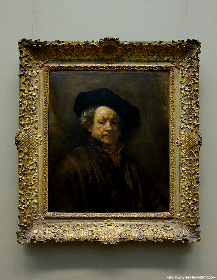
Rembrandt, Self-Portrait, 1660. The Artist is seen here in the last decade of his life. Seen on March 26, 2015 in The Met’s former European Paintings galleries.

When I look at Art, sooner or later, my thoughts involve Rembrandt for any one of a myriad of reasons. I do my best, however, to keep my thoughts about his death to a minimum, so this is going to be purposely short. Rembrandt was pretty poor the last decade of his life. His prior fame had deserted him as if he were a fad, or a “mania,” like tulips were in 1637 when he was 30, and combined with an extravagant lifestyle1 that he could no longer maintain, he lived in housing for the poor at the end2. When he died, at just 63, he was buried in an unmarked pauper’s grave. 20 years later, his bones were destroyed, as was the custom with the remains of such unfortunates. The church, where his unmarked grave was, finally got around to erecting a plaque, inside, in 1909. It redeemed itself some 30 years later when a young Jewish girl who was in hiding nearby from the Nazis took solace in the sound of the church’s bells. Today, there’s a statue of Anne Frank outside the church. His Art largely fell into eclipse, except for a few artists he influenced, for about 100 years, as hard as that is for us to imagine today. October 4, 2019, happens to be the 350th anniversary of his death.

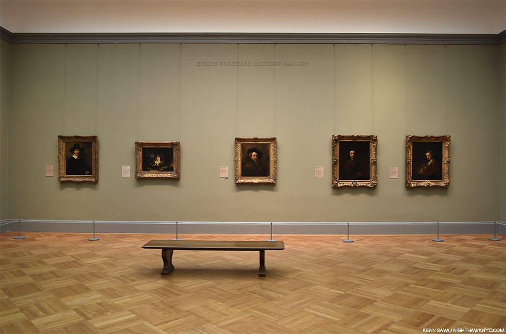
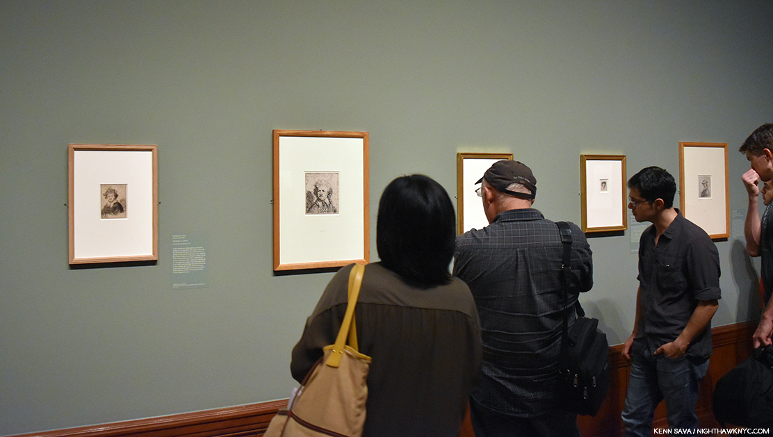
Seen in situ. One of the glories of New York. Five of The Met’s Rembrandts seen in the European Paintings Galleries on June 10, 2017, before the current skylight renovations caused their relocation to the Robert Lehman Collection galleries. When I think of “home,” this gallery comes to mind.

I’ve remained passionate about the work of Rembrandt van Rijn since I was in my early teens and he is one of very very few Artists I can say that about. Almost no where else have I found the humanity, and the depth and range of humanity, I find in Rembrandt. Because of this, I find his Self-Portraits particularly fascinating. In the end, they show me that the Artist, himself, was every bit as human as anyone he ever depicted.

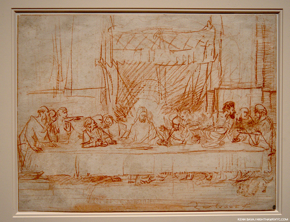
Rembrandt after Leonardo da Vinci, The Last Supper, ca.1634-5, Red chalk, 14 x 18 inches, From The Met’s Lehman Collection. Seen in 2016.

Few other Artists I’ve seen have the power to say as much with just a few strokes as can be seen time and time again in his Drawings- like this one, in which Rembrandt manages to capture the entirety of Leonardo’s masterpiece (and add some additional elements that may have come from a print of the Painting he saw- Rembrandt never left Holland) in so few strokes, you can almost count them.

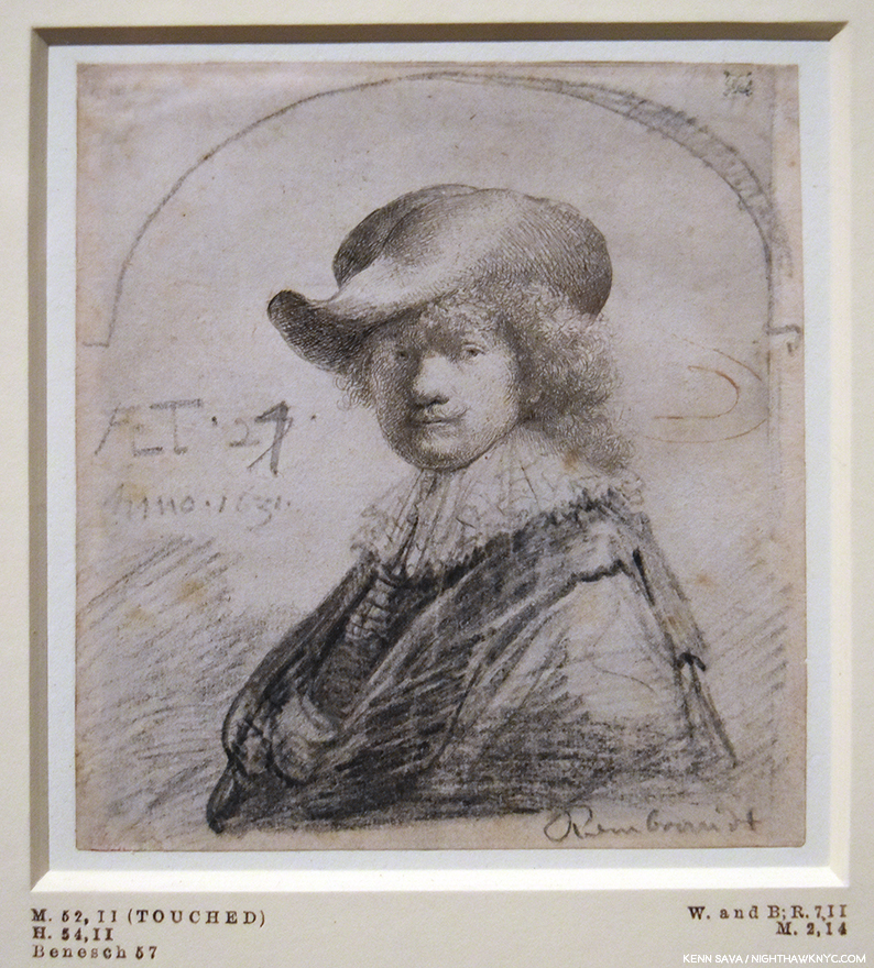
Self-Portrait in a Soft Hat, 1631, Etching completed with black chalk. The Artist was about 25 at this point at the beginning of his career. Seen at the Morgan Library in September, 2016.

Today, he’s honored as Holland’s favorite son. Public places have been renamed in his honor. (“Rembrandt Square,” etc., etc.). In 2015, the country paid a record price for 2 portraits by the Master, 180 million dollars, splitting the cost with France (for the Louvre and the Rijksmuseum), partially (largely?) because of their value to tourism, (i.e. so they can continue to cash in on him). Pretty ironic given how he was treated near and at the end of his life.

The most Rembrandt Self-Portraits in one place I’ve yet been in were these five etchings seen at Rembrandt’s First Masterpiece at the Morgan Library in September, 2016. I was shocked to see them when I walked in. I had no idea they were included.

So, to me, his end is one of the most unfortunate, and saddest, chapters in Art history. I’m not so sure it’s a cause for all that much celebrating. The world of Art seems to agree. There’s only one museum (as far as I know) anywhere in the world mounting a show of Rembrandt’s work that might be construed as honoring/memorializing it anytime close to that date, with that one actually opening on October 4th3.

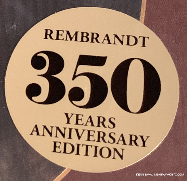
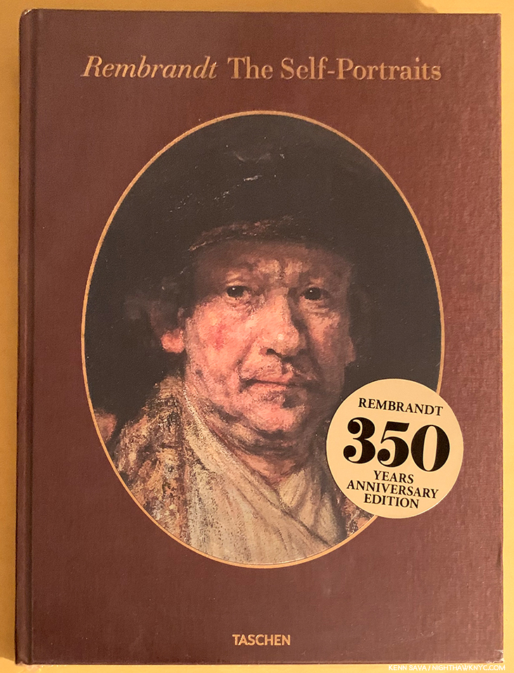
Nonetheless, the chance to put a big round number on the front of a marketing campaign seems to be all that’s required for Taschen to leap into the breach with three new volumes in their XL (aka “HUGE!”) series of books. Well? In 87 years, for the 400th anniversary of his birth in 2106, actual physical paper books may be a thing of the past4 Whether they arrive as physical books, ebooks, or whatever form books will take in 87 years, I won’t be here to see them. As I write this, the first of Taschen’s “trilogy,” Rembrandt: The Self-Portraits (R:TSPs, henceforth) is out and in wide distribution. It’s a handsome volume, with a nifty cover image that displays one of 6 different Rembrandt Self-Portraits depending on the angle you look at it. I picked it up in a store and passed, even though nothing Rembrandt did has held me more spellbound for so long as his Self-Portraits have. So, why did I pass on this complete collection of them?  I was extremely disappointed that the great Rembrandt scholar Gary Schwartz wasn’t involved in it, and from what I understand isn’t involved in the other two volumes either. That statement will serve as my protest since I subsequently bought R:TSPs. With all due respect to the scholars chosen, no one will replace Gary Schwartz for me when it comes to Rembrandt- or any other Artist he turns his unique skillset to (Dear Mr. Schwartz, If you happen to see this? Jan van Eyck, Please?). Suffice it to say that the renowned Professor, Simon Schama, host of the PBS series, The Power of Art, dedicated his own Rembrandt biography, Rembrandt’s eyes, to Gary Schwartz.

“I regard Rembrandt’s self-portraits less as assertions of a strong personal identity than as a means to help the artist, like Saint Paul, become more like other people. Behind them lies a man who depended on his art to offset imbalances in his life and his relations with others.” Gary Schwartz.

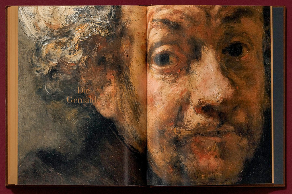
Focusing on what we do get, the book itself is large, oversized as they say in the trade, a full 10 x 13.5 inches and weighs about 4 1/2 pounds, very light for a true Taschen XL which generally weigh in around 20 pounds. Its 176 pages contain a succinct essay and the rest of the book is Rembrandt, in my view, at his best. The reproductions are very good5, with many being reproduced in actual size.

A publicity shot by Taschen. Rest assured the copies sold in the USA are in English.*

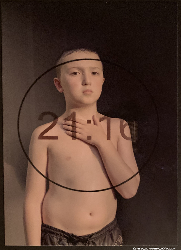
Rembrandt was the first Artist to create a body of Self-Portraits. Yes, the cheap headline is “Rembrandt Invented The Selfie,” which, without looking, I’m sure has already been used to death. That’s not true. He was not the first to do a Self-Portrait, just to create a body of them among Artists known to us today. And what a body of work they are! We don’t have his diary, but, though it’s dangerous to read too much into the SPs (unless you want to), they are not really “pure” autobiography beyond the fact that yes, they do indeed depict the Artist, and we get to see his famous visage evolve as the years and decades go by. Exactly what is going on in each of them has been the subject of much conjecture, and I suspect will continue to be for as long as people look at them. He created them in oil, in ink, and with an etching needle (in Paintings, Drawings and Etchings). Though I love everything the man did, for me, they have been THE supreme body of Art since I saw my first one, shown up top, at The Met way back when. If I had to live the rest of my days only being allowed to look at one work of Art (oh jeez), it would be a Rembrandt Self-Portrait. But, please don’t ask me which one. Right now, I would select his Self-Portrait with Two Circles in England, but that choice is often a factor of which one I’ve looked at last. I’d take any of them- Painted, Drawn or Etched. And in R:TSPs, we get to see every one of them (they say).

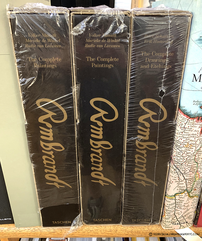
Two pre-release copies of Rembrandt: The Complete Paintings, left, flank a copy of Rembrandt: The Complete Drawings & Etching, which complete Taschen’s “trilogy.” As close as I’ve gotten- so far.

While I am very much looking forward to seeing Rembrandt: The Complete Paintings (TCP, henceforth), it should be mentioned that though The Rembrandt Research Project issued its latest volume of what it calls the “Corpus” of the Master’s Paintings in 2016, the controversy around what that body “should” consist of shows no signs of ending, and so? Buyer beware! What’s agreed upon as his complete Paintings will, very possibly, change in the near future. So, even 350 years after his sad demise, this will most likely not be the “final word” on the subject.

Still, there’s so much of what RvR has accomplished in his other work that can be seen in his Self-Portraits. You can trace a good deal of his development as an Artist in this work. And then? There is the incredible Painting! No matter how much Painting I’ve seen in the 40 year (next year6 I’ve been going to shows, my mind always comes back, for a variety of reasons, to “how Rembrandt Painted it.”

Ok. So, you’re wondering- What does all of this have to do with Robert Frank?

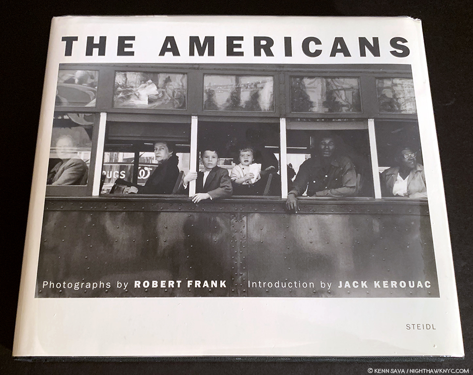
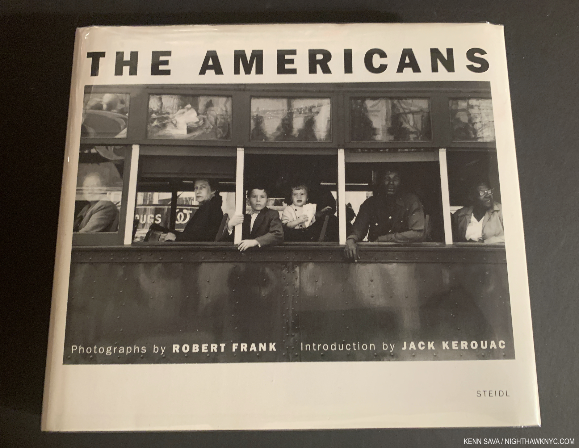
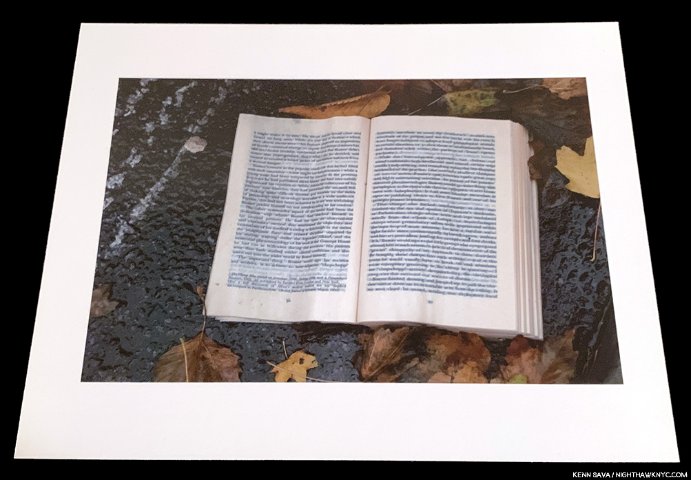
Robert Frank: The Americans, my copy of Steidl’s 50th Anniversary edition, 2008.

Questionable timing aside, for me, the real value of RvR:TSPs coming out now has been the bath of the icy cold water of “reality” it’s thrown on my deep dive into Modern & Contemporary Photography, by which I mean post-Robert Frank’s The Americans, the most seminal PhotoBook of our time. 2019 marks the 60th Anniversary of American publication of The Americans (and there’s been almost no fanfare about that- as far as I’ve seen thus far)7. This fall/winter marks 3 years of my “deep dive” into this realm of M&C Photography that I consider The Americans the first bookmark in, a beginning of, in a sense. I started from the place of believing that Photography had not, as yet, earned its place with Painting, Drawing and Sculpture. Looking at R:TSPs? I realized that after everything I’ve seen, I can’t say my mind has been changed all that much. For one thing, though, it’s still a very young medium- particularly when compared to thousands of years of Painting. After all, they’re marketing the 350th anniversary of Rembrandt’s passing, and he’s thousands of years after Artists started Painting. Jan van Eyck was one of the first to use oil paint in the early 1400’s. Photography (with chemicals) has been around since Sir John F.W. Herschel coined the word in his paper “On the Art of Photography; or the Application of the Chemical Rays of Light to the Purpose of Pictorial Presentation,” on March 14, 18398– 180 years. But, the more I look at both, there’s one thing that strikes me as a major difference between Painting and Photographs-

Time.

It takes time to create a Painting. Even if the Artist does one quickly. In most Paintings, it takes longer to apply one brushstroke than it does to create most Photographs.

I think I can see that. And, I think it’s telling.

I’m not the only one.

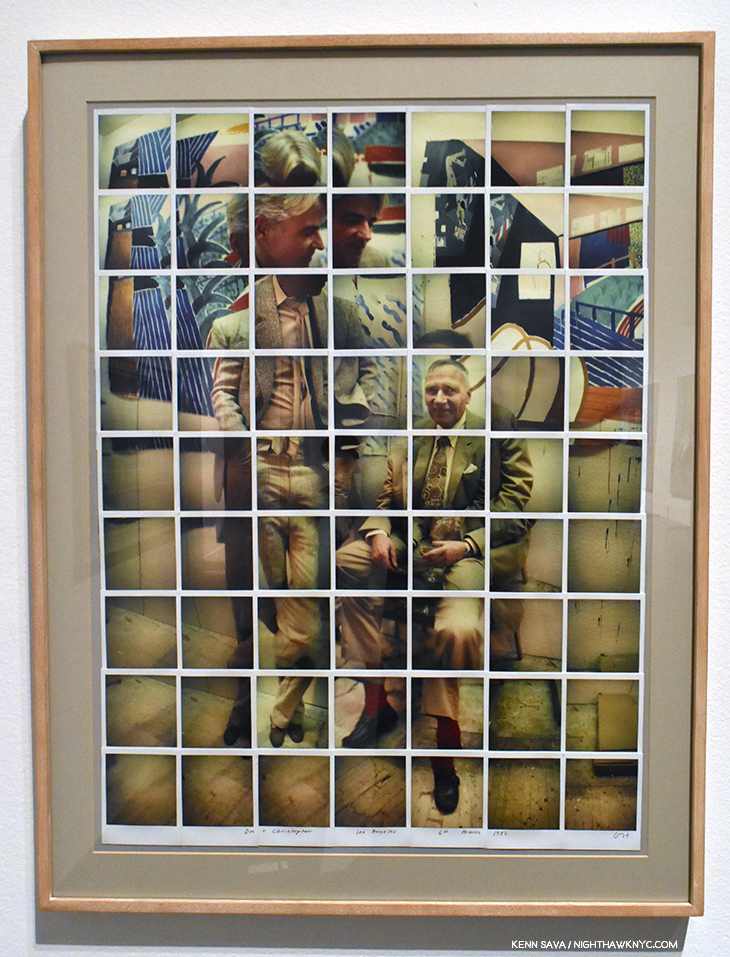
David Hockney, Don & Christopher, Los Angeles, 1982, Polaroid collage “Joiner.” Seen at David Hockney, The Met, January, 2018.

Earlier this year, while I was formulating my thoughts on this subject, before I saw R:TSPs, I came across 2 books by David Hockney, Cameraworks, 1984, and Hockney on ‘Art,’ conversations with Paul Joyce, published in 1999. In both of them, Mr. Hockney 9, a man who has created both Paintings and Photographs (since 196710), and innovated in both realms, put into words much of what I was thinking- uncannily. “During the last several months I’ve come to realize that it has something to do with the amount of time that’s been put into the image. I mean, Rembrandt spent days, weeks, painting a portrait. You can go to a museum and look at a Rembrandt for hours and you’re not going to spend as much time looking as he spent panitng- observing, layering his observations, layering the time.” “My main argument was that a photograph could not be looked at for a long time. Have you noticed that?,” David Hockney, Cameraworks, P.9. There. He just said it for me.

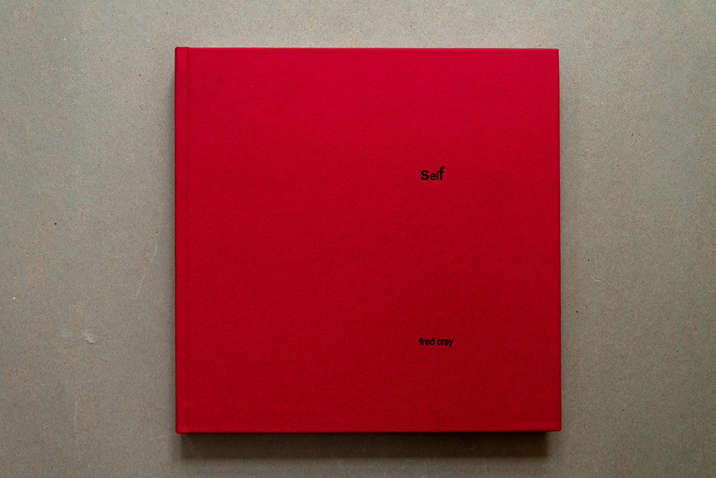
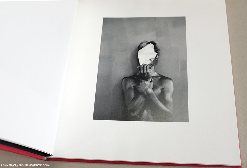
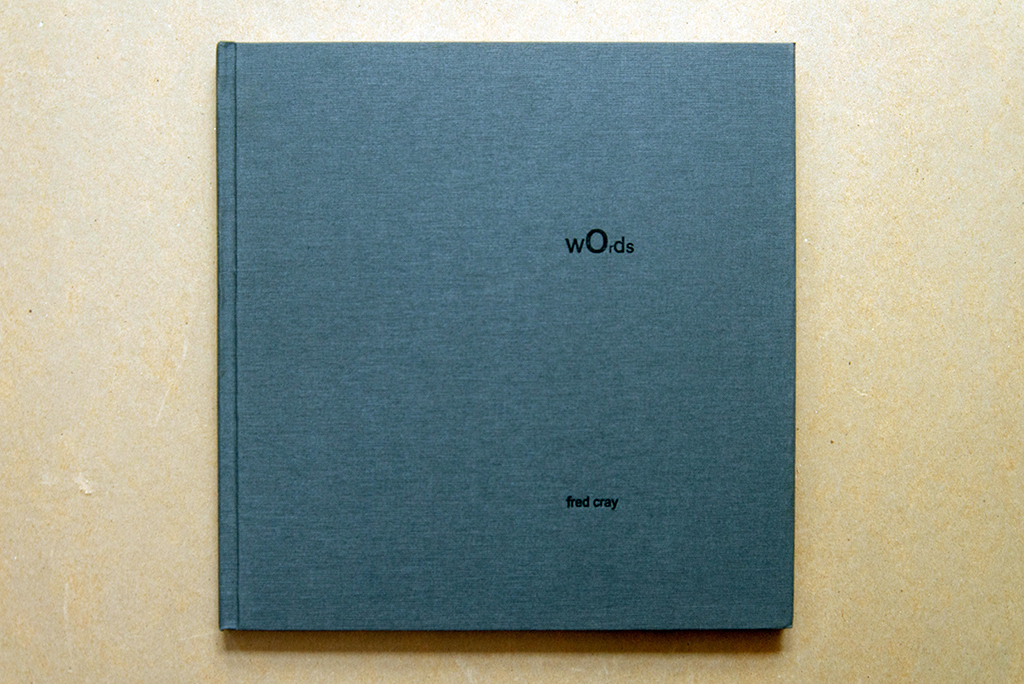
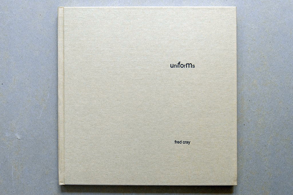
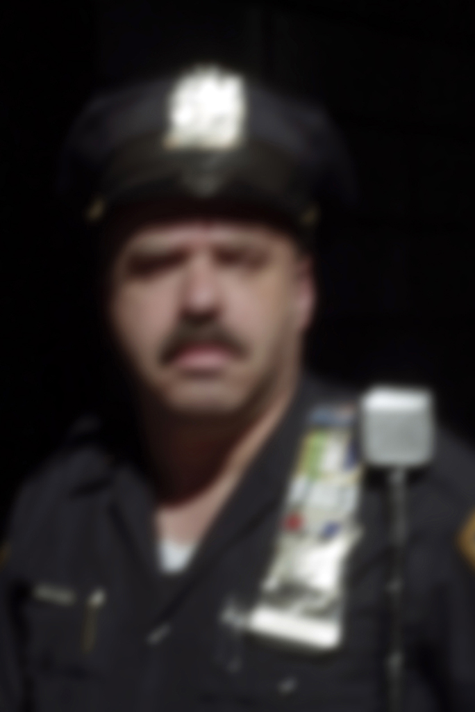
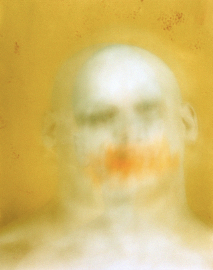
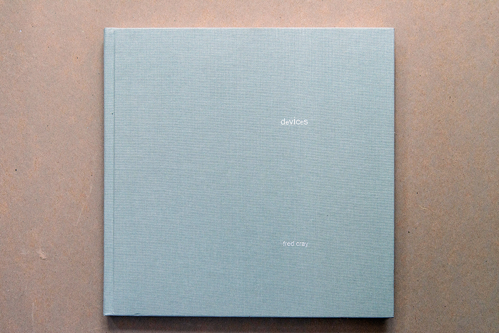
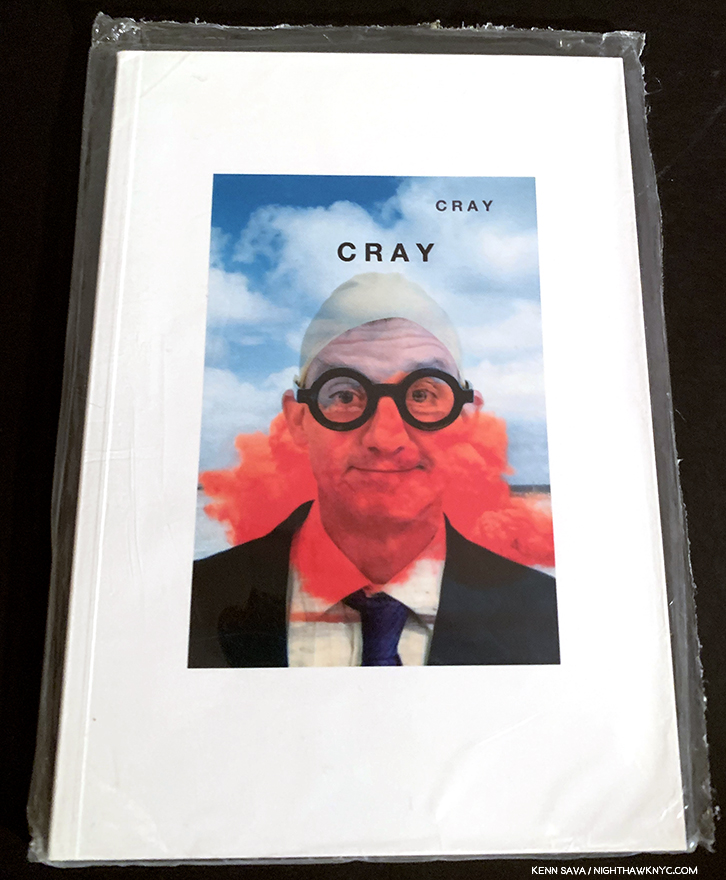
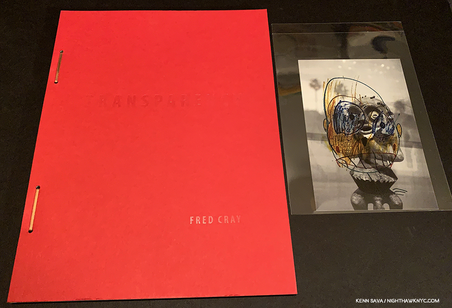
Recently, in these very pages, without any question from me or the knowledge that I was working on this piece, the Photographer Fred Cray said– “One of the concerns I’ve always had with photography is the way it holds up on the wall with paintings and other media. Photography often seems thin and quick compared to painting.”

Anytime I see a Photographic portrait, my mind (at times, unconsciously) always turns to Rembrandt’s Self-Portraits (though, much of what I’m saying here could also be said for almost all of his portraits, as Mr. Hockney inferred). Not as a way of qualitatively comparing them. As a means of gauging the impact. They are the benchmark for me. Most of the time, the impact of the Photography in question isn’t the same. I wondered why for most of the first two years of this dive. Early in 2019, it hit me. Time. Time is a key element in Painting. In so many ways. From the time each stroke takes to apply, to how long it takes to complete the work to the rendering of time, itself, in the work. These are not questions most Photographers have to face. They deal with questions of light and setting before the fact, then they’re finished- unless they modify it later in printing, or digitally.

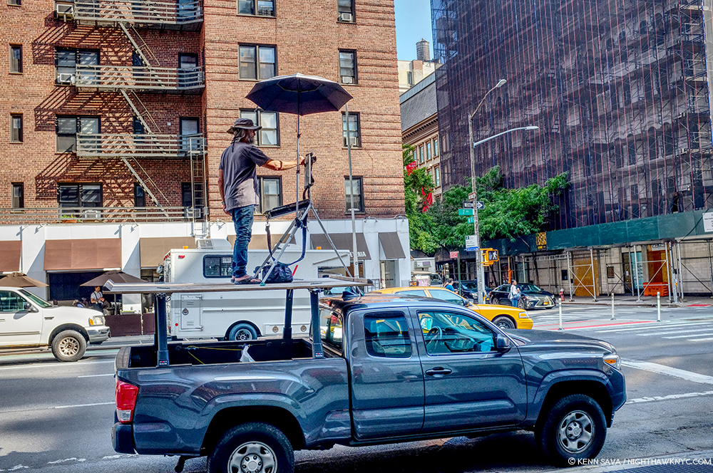
Unknown Artist seen Painting on 7th Avenue, NYC, September, 2019. Yes, he got a parking ticket. Many Street Photographers would have been done long before this gentleman got set up.

Of course, Painters have ways of dealing with this question to ensure whatever level of consistency in the lighting they want. They can work in their studio, or they can work from a live subject, a still life, a Photograph, a Drawing, or what have you. Even au plain air, as the Artist above, is doing. Time is effecting the result in other ways. My feeling is it’s this passing of time, in this multiplicity of ways, that it takes the Artist to create the work that is manifesting itself in the work in subtle ways, maybe some of them are so subtle as to be subconscious, but that are nonetheless part of what the viewer experiences. With each brush stroke, time is passing, and in a real way, time is being layered on to the canvas. Time is absolute in a Photograph- it’s the same time at the top as it is at the bottom, unless you’re shooting with a time lapse, like Stephen Wilkes.

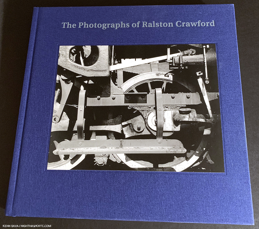
All of this also serves to remind me, again, of possibly why great Contemporary Painters, like Richard Estes, John Salt, Rod Penner, and David Hockney as well, among many others, use their own Photographs as part of their working process, but the reason they are Painters and not Photographers is because of what they find lacking in Photography- what it can’t present of their vision that Painting can. They’re not alone. The list of great Painters who also took Photographs at some point is long- ranging from Thomas Eakins, Edgar Degas and Edvard Munch, through Ralston Crawford and Robert Rauschenberg, and even Picasso. I find it telling that not a single one of them identified himself as a “Photographer.” Only Charles Sheeler was dually identified and that might be because his Photography earned him money to support his Painting.

Then, in the midst of all of these thoughts, a terrific new book was released by Steidl, Dave Heath: Dialogues With Solitude, the catalog for a show at LE BAL, Paris in 2018. It gave me pause for thought.

My copy of Dave Heath: Dialogues With Solitude, Steidl, 2019.

WHO is Dave Heath?

From Dave Heath: Dialogues With Solitude, Steidl, 2019. *Photo courtesy of Steidl.

It turns out that Mr. Heath was, not is, unfortunately, but his work struck me every bit as hard as any I’ve seen in this 3 year deep dive. Particularly, his portraits, and specifically his portraits of one subject not looking at the camera.

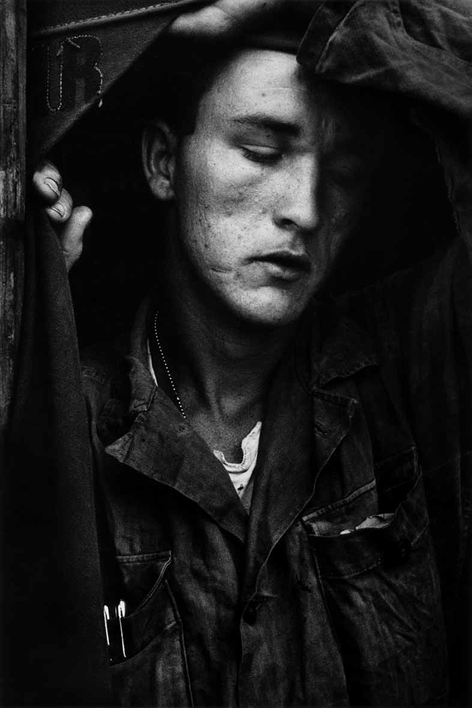
Dave Heath’s earliest body of work are Photographs he took while serving in Korea in 1953-4, including this one. From Dave Heath: Dialogues With Solitude, Steidl, 2019. *Photo courtesy of Steidl.

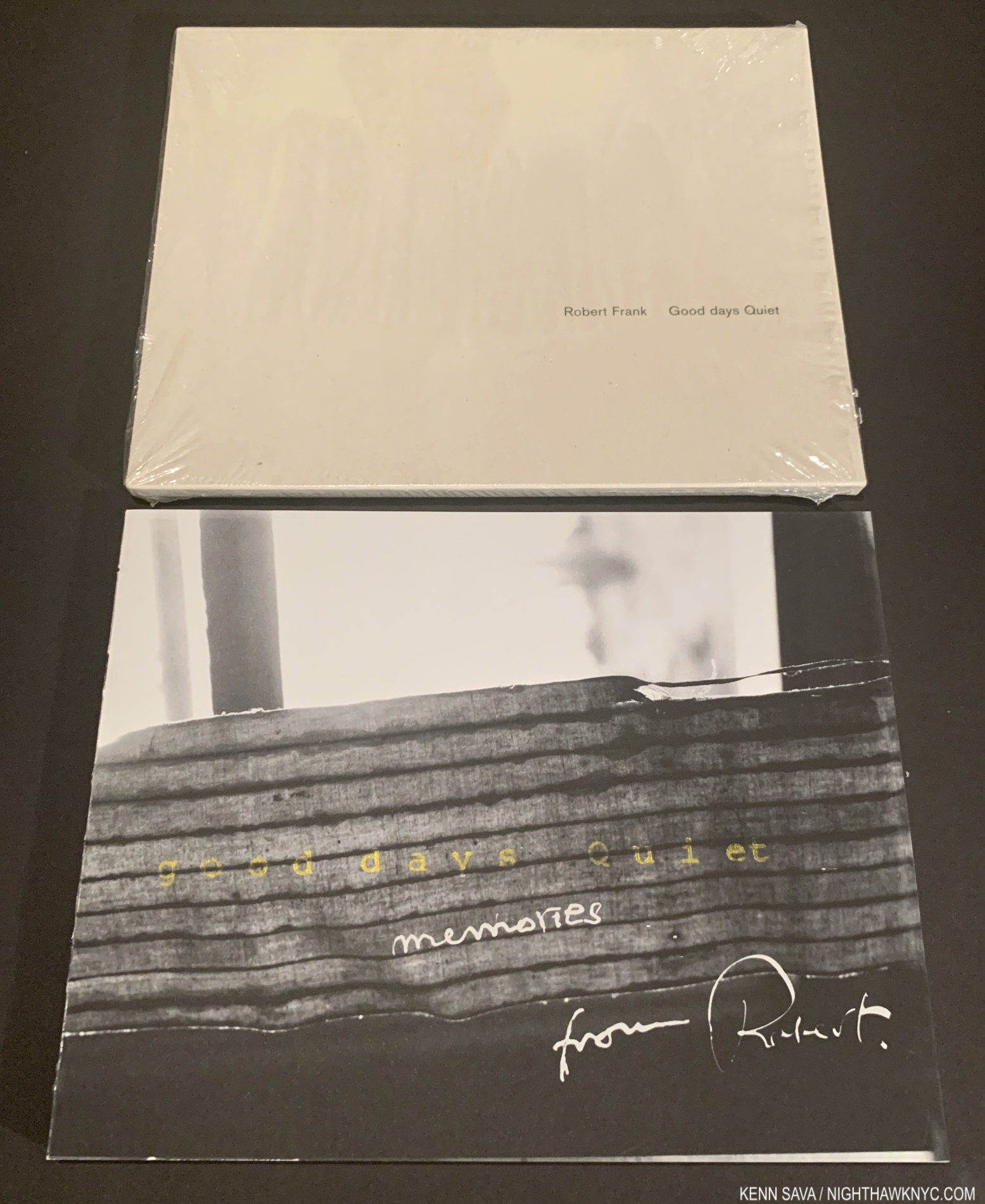
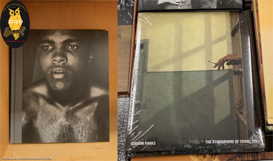
It turns out that he was not only a master with a camera- a master of the Portrait, he was, also, a master printer. To the point that no less than the aforementioned, esteemed, Robert Frank paid Mr. Heath to print his work for what I believe was his first solo show at no less than the Art Institute of Chicago in April, 1961, a byproduct of The Americans’ release here two years earlier. That says it all.

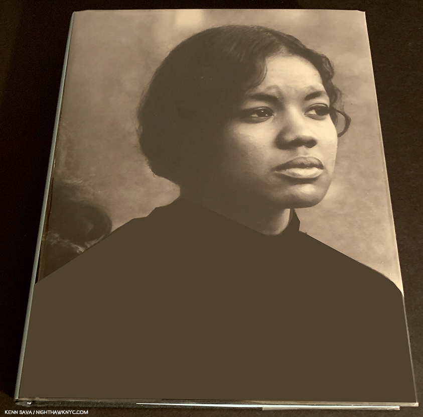
My copy of Dave Heath’s A Dialogue With Solitude in the 2000 Lumiere Press edition. The books is on the right. The print is in the sleeve to the left.

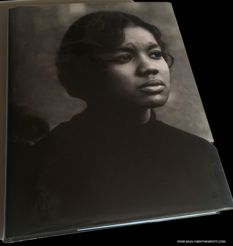
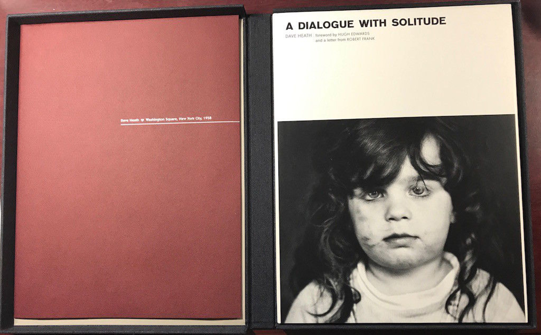
Captivated by what I’d seen in the Steidl book, which is very well printed, in my opinion, though, unfortunately, Mr. Heath, who passed away in June, 2016, was not involved in it, I learned that Dave Heath’s “masterpiece” is the PhotoBook, A Dialogue With Solitude, 1965, a subject I am quite familiar with. I hunted down a “reasonably” priced copy of the 2000 Lumiere Press limited edition reprint with a signed & numbered print. The reprinted edition includes a letter from Robert Frank. The print in my set is “Washington Square, New York City, 1958.”

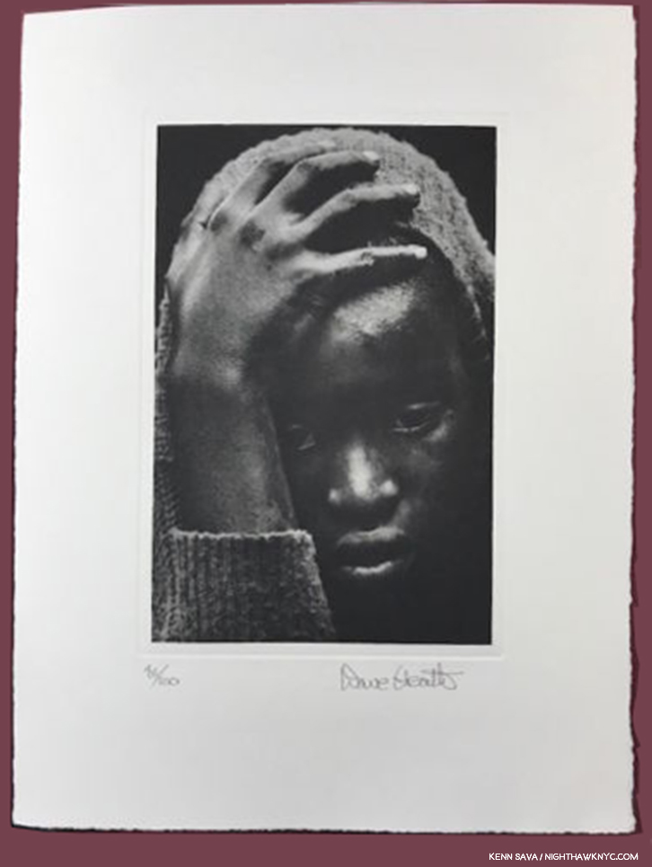
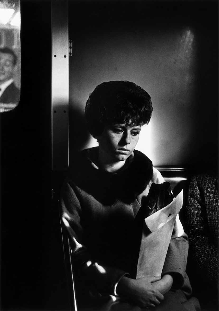
Washington Square, New York City, 1958. A Photograph that leaves me speechless, and turns my thoughts to Rembrandt.

It’s one of the very greatest accomplishments in PhotoBooks I’ve yet seen. Given what I said about his printing, the inclusion of a signed & numbered print in the Lumiere Press edition is a key. When I saw it for the first time I had a feeling that was closest of any Photograph I can think of to that I get while looking at a Rembrandt Portrait. Of course, as always, your results may differ.

For some reason that I can’t fathom, the word is that “Mr. Heath’s work went out of style.” Well? Rembrandt, too, “went out of style,” for well over a century, as hard as that might seem to believe to us now. Now, with Steidl’s Dave Heath: Dialogues With Solitude, it seems to me that a show or a book that returns a great, overlooked or forgotten Artist to the world has done that world a great cultural service. I can’t think of a higher purpose for either.

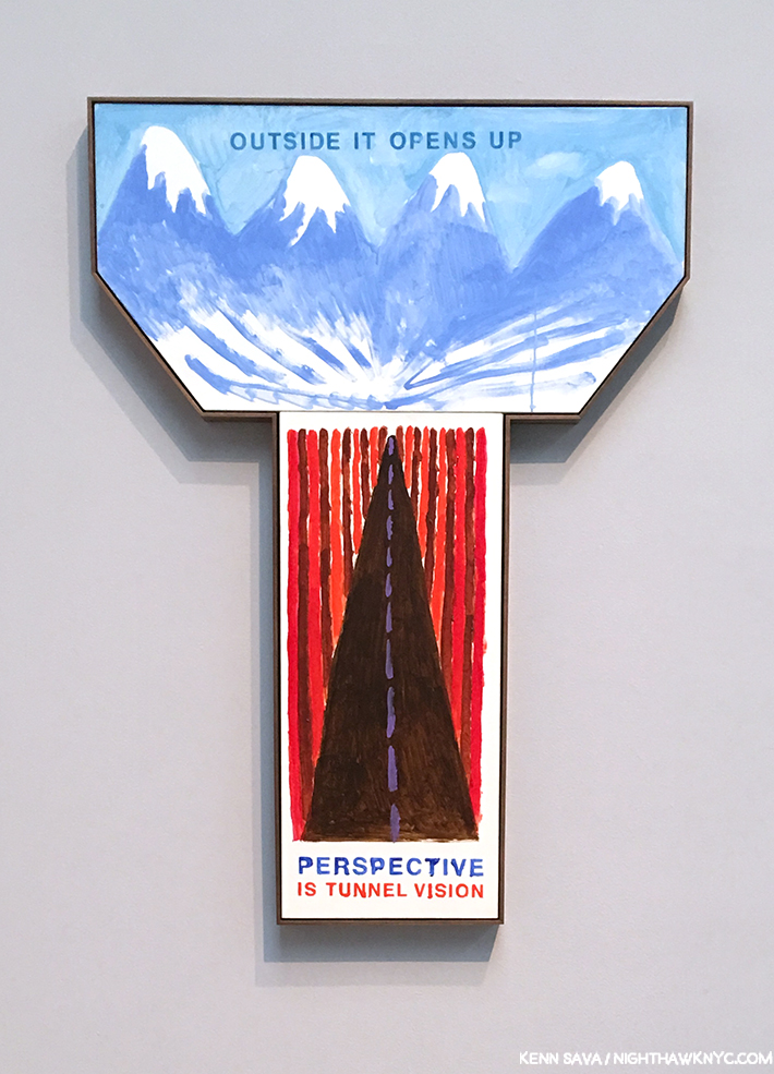
David Hockney, Perspective Is Tunnel Vision, Outside It Opens Up, 2017, Acrylic on two canvases. David Hockney shows how the camera sees in “tunnel vision,” single point perspective,” versus how humans see with what he calls “reverse perspective,” with infinite vanishing points, born of driving through a 10 mile long tunnel in Europe then suddenly coming into the great outdoors in 198511.

Reading David Hockney further, which I highly recommend to anyone interested in Photography, he speaks time and again that cameras, while being great at reproducing two dimensional objects12, do not see the way humans do. He has devoted much of his subsequent Painting career (as seen in his fascinating recent shows) to challenging traditional perspective and exploring the innovations of both Renaissance masters and the masters of Cubism.

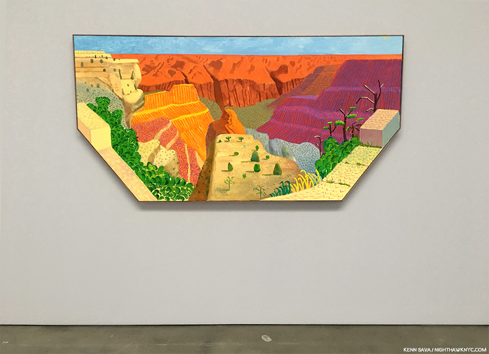
David Hockney, Grand Canyon I, 2017, Acrylic on canvas, 48 x 96″ hexagonal, seen in April, 2018. Outside, it, indeeds, “opens up.” The Artist has also begun cutting the corners off his canvases to reinforce his ideas.

In 1999, Mr. Hockney asked, “How many truly memorable pictures are there? Considering the millions of photographs taken, there are few memorable images in this medium, which should tell us something. There have been far more images made this way than the sum of all previous images put together.” (Paul Joyce, Hockney on ‘Art’, P.43.) One thing that’s changed since Mr. Hockney said those words is that there are now more cameras in the world then there are people. It seems to me that that’s going to be a factor in this. The sheer number of Photographers versus Painters is, and is likely to remain indefinitely, skewed incredibly. Incalculably. It makes the odds of a “great” Photograph out of the billions being taken incrementally greater. “Quality only comes with quantity,” legendary Photographer Daido Moriyama said explaining why he takes so many Photos, in How I Take Photographs, page 7313.

I’ve noticed that the rise of Photography has coincided with a relatively ”quiet period” in Painting, in some ways. While this has lasted a few decades, more recently, I don’t have to look any further than my own 200+ piece Archive. I’ve said a number of times that one of the reasons I decided to focus on Photography the past three years was the lack of Painting shows that spoke to me sufficiently to undertake the work these pieces require. I wonder how much longer this will last- Is this an anomaly, or is this the beginning of the way things are going to be? Will we see the number of painters going forward that we’ve seen for the past 500 years? Of course, sheer numbers, or the lack of them, don’t guarantee masterpieces or geniuses. Greater numbers only serve to increase the odds.

At the three year mark, I’m still not convinced that Photography will come to be seen as Art in hundreds of years when that question is decided, IF anyone still cares about Art then. But? If they do, my bets are that Rembrandt’s will still be among the work most highly appreciated.

A work like Dave Heath’s Washington Square, New York City, 1958, gives me hope that Photography may still get there. Is it, as Mr. Hockney said, an image in a billion? Or is it an indication of what might be possible in the medium? I will continue to look…

Meanwhile, on October 4th? I’ll just light a candle. To go with the one in memory of Robert Frank. While I continue my dialogue with Davids Hockney and Heath…

*-Soundtrack for this Post is “Grace,” written by Jeff Buckley and Gary Lucas from Jeff’s immortal album, Grace. I worked with Mr. Lucas, and I booked Music into the now legendary NYC Music Club/Cafe, Sin-E in 1993, shortly after Jeff had played and recorded there. And then? He was suddenly…gone. I never met him or heard him perform in person. One of the great regrets of my life.

BookMarks

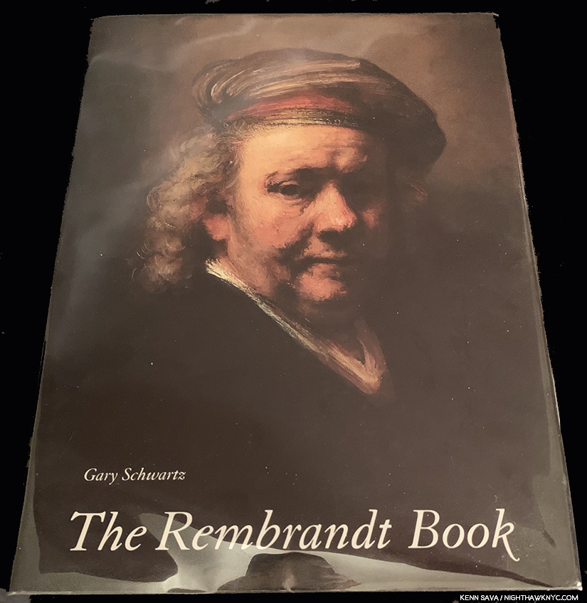
My copy of The Rembrandt Book, (THE Rembrandt Book, or TRB, as I call it), by Gary Schwartz. In my opinion, it’s a model of everything a truly great Art monograph should be.

In addition to the books I referred to above, if someone were to ask me to pick one book on Rembrandt? I would choose The Rembrandt Book, by the aforementioned Gary Schwartz. It’s a book designed for readers both new to Rembrandt or expert on the Dutch Master, and so, it’s a book for a lifetime of enjoyment and research. Published in 2006 by Harry N. Abrams, it’s the SECOND full length monograph on Rembrandt by Gary Schwartz, and they couldn’t be more different (In a world where ANYone else would be thrilled to write one magnificent book on Rembrandt? HOW incredible is that?) or compliment each other better. TRB is oversized at 10 x 13 and weighs 6 pounds, but it is my bible on Rembrandt, and if I can’t find what I’m looking for there? I go to his prior monograph, the equally highly regarded, Rembrandt: His Life, His Paintings, 380 pages and 3.6 pounds, published by Viking in 1985 (and I believe this book has been reissued at least once). Both books can be found very reasonably (for less than they were originally published for) in very good condition. Along with my Sister Wendy books, they are the foundations of my Art library.

Another book that’s very relevant to this discussion, and has been essential for me- one I don’t see recommended nearly often enough, is Believing Is Seeing (Observations on the Mysteries of Photography) by the renowned Errol Morris. 

My prior pieces on PhotoBooks are here

NighthawkNYC.com has been entirely self-funded and ad-free for over 6 years, during which over 250 full length pieces have been published. If you’ve found it worthwhile, you can donate to keep it going & ad-free below. Thank you!

Written & photographed by Kenn Sava for nighthawknyc.com unless otherwise credited.
To send comments, thoughts, feedback or propositions click here.
Click the white box on the upper right for the archives or to search them.
For “short takes” and additional pictures, follow @nighthawk_nyc on Instagram.

Subscribe to be notified of new Posts below. Your information will be used for no other purpose.


  1. You can still visit the beautiful, large, expensive house he bought at Jodenbreestraat 4, in Amsterdam.
  2. Excuse me for seeing a lesson for today’s Art world in this, but I do. If this could happen to one of the greatest Artists who ever lived? It can happen to anyone.
  3. The Wallfar-Richartz-Museum, Cologne, Germany is having a show of Rembrandt’s Graphic Work that opens on, yes, October 4, 2019. The Rijksmuseum, Amsterdam, is hosting a Rembrandt-Velazquez show that opens a week later.
  4. Gary Schwartz says there are some documents that raise the possibility that Rembrandt may have actually been born in 1605 or 1607  (Gary Schwartz, The Rembrandt Book, P.15). I don’t think a year on either side of 2106 is going to make a difference regarding my being around to see it.
  5. My one caveat being that they chose to reproduce only the detail of the early works in which RvR Painted himself as an onlooker in a crowd, denying the viewer the full context and setting.
  6. I consider the incomparable 1980 Picasso Retrospective at MoMA the real beginning of my “looking career” at shows. Looking at Art books predates that by about a decade.
  7. The Americans was first published in 1958 in France by Robert Delpire, and in 1959 by Grove Press in the USA.
  8. //iphf.org/inductees/sir-john-frederick-william-herschel/
  9. Who, in addition to being a world-famous Painter, has also authored two important books on Art & Art History- Secret Knowledge and A History of Pictures
  10. David Hockney, Something New Exhibition Catalog, 2018, P.6
  11. David Hockney, Something New Exhibition Catalog, 2018, P.5
  12. Afterall, what we have in Rembrandt: The Self-Portraits, and every other mass produced book of Paintings, are Photographs of Paintings.
  13. For much more on how Daido Moriyama feels about whether Photography is Art, see P.205-6 in the chapter titled “The Real Daido Moriyama,” in this same book, How I Take Photographs.

The Unique Fred Cray

Written & Photographed by Kenn Sava.
Works by Fred Cray Photographed by Fred Cray.

Maybe this has happened to you?

There you are, minding your own business, possibly looking through a book in a bookstore.

Like John Divola’s Vandalism, to the right on that middle shelf, for example.

And all of a sudden, you see this-

“What’s this Photo doing in here? Is this part of the book? Did someone vandalize John Divola’s “Vandalism?,” I wondered aloud? No answer.

Close up of the inserted 4 x 6 inch Photo.

Turning it over, I see this on the back-

Is this a “Unique Photo” of someone named Fred Cray?

Then, some months later, it happened to me again. I was looking through another PhotoBook, this one by Doug & Mike Starns, and whamo…

A dialogue? A commentary? A random act of kindness?

Seeing the name “Fred Cray” printed on the back both times it dawned on me that- no, it’s not part of the book. Fred Cray isn’t the author of either book I was perusing, the Artist either was about, and this time it’s not a portrait. The Photo must have come from elsewhere. Fred Cray is ANOTHER Artist- the Artist creating these “Unique Photos.” Maybe this Fred Cray, himself, put it in here? And, there’s more. Both times, the particular image being placed in this spot in the book spoke to me. I wound up purchasing both books because I wanted to keep that serendipitous synchronicity intact. I got it! He’s an Artist working with a publisher to help them sell books! Naw…

A Unique Photo included with a copy of Fred Cray’s An Incomplete Journey.

Having this happen to me a few times, the name Fred Cray was now somewhat known to me, though the man and his work remained an utter mystery. At first, like most others who accidentally come across his work, I didn’t know what to make of it. An isolated image here and there? It’s impossible to get a sense of anyone’s work, as you see. Then, by chance, I happened to spot “Fred Cray” on the list of my readers, so I chanced writing to him to ask if he was “THE Fred Cray?” He replied that indeed he was. Shortly after, I discovered that he self-publishes PhotoBooks of his work. Once I began to see his PhotoBooks, I got a sense of his work, and I got interested.

An unusual Unique Photograph by Fred Cray included in his book Conversations. Unusual because it’s a larger 6 x 9 size (4 x 6 being his “standard” size) and because it’s signed on the verso.

I met him in person a few months later at a book signing for another Photographer we’re both interested in, and as we spoke, I realized that he and I had probably been in the same gallery, museum or book store, countless times before. He’s as obsessed by Art & PhotoBooks as I am, and his taste is, unsurprisingly, from looking at his work, wide ranging. I find all of this interesting and a bit unusual. Many Artists, Photographers & Musicians I know don’t want to know what others are doing. They either don’t want to be influenced or are too focused on what they themselves are doing. Not Fred. Every time I have the pleasure of speaking with him or conversing with him by email, he’s up on whatever is going on at that moment. This show or that? The odds are he’s seen it, including a good many out of town, which I don’t get to. Chaos at the Whitney Biennial? He had just been there to see Nicole Eisenman’s work since it might have been leaving, though the announcement it might had only come a day or so before1 And, he just got back from over a month in Spain, where he “vandalized” (soft smile) both parks and the Prado Museum, blanketing the town with Unique Photographs, including some he hung in trees, he told me, with an impish grin. I would have loved to see a “candid camera” catching the reactions of those who discovered them. Taking stock of all of this, I wondered-

WHO gives away one of a kind works of Art?

A haunting Unique Photograph included with a copy of his book titled #. Being unique, need I say the Unique Photos included vary from copy to copy of his books?

As I began to get a sense of what he was doing, I mentioned to Fred that I had decided to write about him and his work. His first, and only, request was that I didn’t ask to follow him around as he distributes his Unique Photographs. The The New York Times had already done that. I can understand that, and I apologize, to him for leading with the Unique Photographs here at all. The Times reported that Fred had left some 30,000 Unique Photographs everywhere he’s been since about 2008. Has anyone in Art ever given away 30,000 unique works of Art? That means A LOT of people, like myself, who had never heard of him are discovering him and his work the same way I did- through finding those works by chance.

The earliest work I saw during my visit to Fred Cray’s studio- this Travel Diary, from the 1990s, above, when he was shooting film and black & white at that.Shortly after he returned from Spain for his annual out of the country summer trip, he invited me out to visit his studio in Brooklyn. Over the 4 hours we spent together, he told me that he has now distributed over 43,300 Unique Photos2! That, by itself, makes Fred Cray something of an NYC Urban Legend, but, as I found out, it’s really only the beginning of the story. Even after returning that night from seeing box after box of gorgeous full size (often very large), original works, the vast majority of them created in an edition of 1, i.e. unique, I realized that though we went through six or seven of the large boxes he had in his studio, he only showed me work dating back to 2017. Fred has been creating work since 1990!

Self-Portrait, 1994 *Fred Cray Photo

Frankly, I was shocked to see that everything he showed me was very good work, and much of it terrific in my opinion, all of it characterized by an exceptionally high consistency. Not only is Fred Cray one of the most interesting Artists using Photography working today, he’s, also, a very good editor. As we spoke, I discovered that anything that didn’t make his grade wasn’t saved. You see this very tight editing in his PhotoBooks, but when you’re looking through recent work in an artist’s studio, I generally expect to see some “work prints,” “pieces in progress,” or abandoned ideas. Not one.

Fred Cray showing me his work from 2017-9 in his studio, July 2019.

Yet? There’s more. As I got lost looking at work after work being passed in front of me for a few moments each, during these few hours, Fred was talking non-stop about the processes (plural) he used on these prints. At first I was stopped by terms like “Reprinted,” “Dissolve,” “Fragments,” and others, and when I backtracked and said, “What?,” I discovered he invented, and named, each process to realize his vision and create the numerous series his work is often grouped in to this point, as well as the multiple projects he’s currently working on. I counted at least 4 of these in various stages of completion. To go along with this, everywhere around the fastidiously neat and carefully organized studio are stack after stack of 4 x 6 inch Photographs- the size of the Unique Photos he distributes. Each pile was 5 to 6 inches tall. So? You tell me- how many photos would be in a 6 inch stack? Multiply that by at least 10 stacks. That’s about how many Unique Photographs Fred Cray had in his working piles. Maybe 5,000? Remember- each one is a one of a kind work of Art. That means it only exists that way on that print. Once he moves on and the files have been removed from his computer, he can’t duplicate it.

A Unique Photograph included with one copy of #. This one has hand punched small holes on it.

In 2019, many Photographers rely on their computers as the focus (sorry) of their workflow, their process, and indeed their work. Though Fred has couple of computers in his studio, I have no idea if they were even on. He never once went to one. He works off what he prints. Like everything else the man does- in his own way.

He’ll make these prints, then spread them out on his work table to study and assess them. From there, he’ll decide what the next step is. Does the print in question get modified? If so, how? Though he attended Painting classes at Yale, a survey of the techniques Fred uses to modify a print would be a study in an of itself, if not a book. Does he put it back in the printer(! Decidedly NOT recommended by most printer manufacturers I know of) and “reprint” it with another image or partial image over it?! Or, maybe he’ll modify it using the spectacular, and spectacularly fragile “dissolve” process he invented that he used to create the works in his 2017 show of the same name at Brooklyn’s renowned Janet Borden Gallery, his dealer since 1998. Some of this series may be seen in his book of the same name (the first 40 copies of which comes with an actual unique print from the Dissolve series).

I’ve never seen a Photograph that comes with its own warning label before. The glassine envelope the Unique Dissolve Photograph included with this copy of the book Dissolve.

To make these works, as I understand it, Fred prints the images on a surface that repels ink! After he does, the image, such as it is, or was, “dissolves” in front of his eyes, morphing into something else, possibly something useless, in moments. The Artist halts the process at the moment that speaks to him, freezing the image in the delicate and fragile state it every bit appears to be in from just looking at it.

The one of a kind Dissolve work inside.

By now, a pattern was emerging here.

Perhaps you, too, see a strong Buddhist influence is all of this (even before that last picture)- The giving away of one of a kind Art works reminds me of the Sand Mandalas created by Tibetan Monks over, in some cases, long days of arduous effort, only to then sweep them away after a ceremony. Impermanence is a core value in Fred Cray’s work- and it permeates his approach was from giving away original unique Art right down to the techniques he’s invented, like his “Dissolve” process, and his new, “Fragments” Series, he gave me a sneak peak at.

A haunting image of The Flatiron Building from the “Dissolve” series now appears in this work from Fred’s new “Fragments” series.

No need to get the science books out to understand this one. (Phew…My science book section totals zero. Unless David Hockney’s Secret Knowledge counts as science.) One day, Fred came home to discover his cats had decided to show him their “editing skills.” They had chewed up some of his work prints. Undaunted, and taking a philosophical approach, he decided to put them to work. He took the “scraps” they had left behind and mounted them on other images. Voila, “Fragments.” A large print of the Flatiron Building hung near his door and captivated me the moment I walked into his studio and saw it. Sure enough, a work from “Fragments.” Often, when he “reprints” a Photograph, or creates a work in his “Dissolve” series, he’s not sure, (exactly, or even at all) what he’ll get. In that regard, there’s a Zen element to his work as well.

And? To my shock (and the horror of the Art history lover in me), it turns out the impermanent nature of Fred’s work extends much further.

Monet in the 21st century? *A work from Fred’s “Dissolve” series.

Over the course of my 2 1/2 year “deep dive” into the world of Modern & Contemporary Photography (think post-Robert Frank’s The Americans), it’s become apparent to me that so-called Fine Art Photography is something of a wild west with no rules. Unlike Painting, a Photograph, in theory, can be reprinted ad-infinitum, indefinitely, for as long as the negative or the digital file exists. That some Photographers have taken to reissuing their work in second editions, something of a strict no-no to this point, and any number of estates have brought in others to print their Artist’s work (which, frankly, raises questions for me), says to me that it can be pretty scary to buy Photography for the big money being asked for it, and all Art, in these days at the top of an Art Market that hasn’t seen a price correction, or worse, in decades. Therefore, it seems to me that, as a by-product of his philosophical approach, Fred Cray is something of a “Photography collector’s dream.” Once Fred is finished working on a body of work, he removes it from his computer.

He keeps no archive!

Like that Unique Photo you found? Keep it safe because it cannot be duplicated or replaced. In this sense, his work is like that of a Painter’s. “Unique” means unique. Fred does create some editions as well, and his PhotoBooks are published in small editions of between 5 and 200 copies each. So fascinated by the PhotoBooks Fred has created over the past decade, I am devoting an entire piece, a Part 2, to look at them.

I looked at you tonite and you weren’t even there. An deeply personal work using found words in a large, editioned size, seen on the wall of his studio.

When I queried him on all of this (I don’t think he noticed my mouth opened as I grocked his replies), I asked him about the 4 x 6 Unique Photos he hands out- “Don’t you have an archive of them? I’d love to be able to look through them and see them all.” He picked up a half sheet of torn paper next to his work table. On it were columns of numbers going down, all but the last of which had been crossed out.

That’s it.

The sheet simply records the last number he had handwritten on a print so he would know which number to start with next time. When he reaches “9999,” he starts again at “1.” I’ll wait until you get up off the floor.

The universe is random. These 3 Unique Photographs that came with a copy of Changing of the Guard have consecutive numbers, something I haven’t seen before.

That means there are now 5 with the number “1” on the back, etc., but no way of telling which one is the “REAL” “1,” and which is ten thousand and “1.” No record. No hermetically sealed vault of originals. Just what you hold in your hand. On the subject, he told me- “I keep lots of images I’ve taken (or found) over the years hoping that they’ll resonate in new ways  when I go back through them. But every time I go through old files I try to delete a bunch. If I can find a way to remake an image in a new way I have no problem doing that. I wouldn’t want to go back and make the print as it was perhaps made before. But you are correct in saying I don’t keep an archive of the Unique Photographs that have gone out.” That sound you’re hearing are the voices of all the future Art Historians who will be fascinated by Fred’s work saying “Goodbye” to their dreams of trying to compile a “catalogue raisonne” of his Unique Photographs.

Splendor Solis, 2019 (Seen in progress.)

On August 22nd, Fred told me he had just completed his latest PhotoBook, Splendor Solis. After working on a series on the Sun for years, taking Photos of it in various ways, he finally came across the right means of collecting and displaying them. One day on 14th Street, he discovered a book he felt was the perfect instrument. He proceeded to buy up 35 copies of it, which were stacked on the floor next to his work table when I visited him in July. On the table, I noticed an array of rubber stamps and some watercolors. He explained to me that he’s going through the books one copy at a time, adding about 15 Unique Photographs (yes, different in each copy of the book) to 3 recurring Photos. Then, he’s customizing pages with a variety of media- the aforementioned rubber stamps, watercolors, etc. The project is loosely based on alchemy. As I looked at what he was showing me, Bruce Conner came to mind, briefly. But, there really isn’t anyone else I can compare Fred to- not Cristina de Middel. Not Ray Johnson (who may be closest in some ways). Not Henry Darger. Not Jim Dine, Gilbert and George, or Vik Muniz. His work is, also, unlike Robert Rauschenberg’s, not an easy thing to do.

Impermanence incarnate. The complete edition of Splendor Solis. 31 copies, plus 5 Artist’s Proofs. Now that he’s finished them, there’s a very good chance they will never be seen together again.

Earlier, I mentioned the Whitney Biennial, in progress as I speak until late September. (My look at the 2017 Biennial is here.) Once again, it leaves me with mixed feelings. On the one hand, it’s so hard for an Artist in this country to receive any recognition for their work, it’s good such things exist. I’m not taking anything away from anyone included when I say that each time the list is announced, my thoughts turn to all the great Artists who get left out.

Like Fred Cray.

The Artist holds one of his Unique Photographs with a selection of his books in front of him during an Artists’s Talk at a 10 x 10 Books Salon, May 16, 2019.

I told him this, and his reply caught me off guard. “Wouldn’t it be great if they had included a great Artist, like David Hammons?”

Undaunted, I’ll up the ante. Having had the chance to look closely at his work, albeit only from the past 3 years, (Fred, a 2003 Guggenheim Fellow, has been creating for almost 30 years now), I believe his work is going to receive more and more attention in the future- and in the near future, from collectors, and particularly from museums & their curators.

Why do I feel this way? Because, along with being continually innovative, the bottom line for me is his work is that good. And? Among all the Artists & Photographers known to me, there’s no one like Fred Cray. He’s unique.

-Soundtrack for this Post is “Changes” by David Bowie from his classic 1971 album Hunky Dory

“I watch the ripples change their size
But never leave the stream
Of warm impermanence and
So the days float through my eyes
But still the days seem the same”*

My thanks to Fred Cray. 

This is Part 1 of my 2 part look at the work of Fred Cray. Part 2 is a look at the PhotoBooks Fred has published over the past decade and may be seen immediately following below this, or here

NighthawkNYC.com has been entirely self-funded & ad-free for over 7 1/2 years, during which almost 300 full length pieces have been published! If you’ve found it worthwhile, PLEASE donate to allow me to continue below. Thank you, Kenn.

You can also support it by buying Art, Art & Photography books from my collection! Art & Books may be found here

Written & photographed by Kenn Sava for nighthawknyc.com unless otherwise credited. To send comments, thoughts, feedback or propositions click here. Click the white box on the upper right for the archives or to search them. Subscribe to be notified of new Posts below. Your information will be used for no other purpose.

  1. The situation seems to have been resolved in the following week, and the works will remain in the Whitney Biennial, as far as I know.
  2. Fred added, “Early on I didn’t number the photographs, so there are probably an additional 1,500 un-numbered. I started numbering them to reiterate the unique aspect of the photographs.”

The Complete PhotoBooks Of Fred Cray: 2009-2019

Written & Photographed by Kenn Sava & Fred Cray

This is Part 2 of my two part look at the work of Fred Cray. Part 1 may be seen above, or here

There’s been quite a bit of discussion about whether Photographs are best seen on the walls or in a book. The question goes much deeper, I think. For one thing, what kind of book are you talking about?

A Unique Photo by Fred Cray. Believe it or not, this was not taken in the NHNYC offices.

Photographs appear in, probably, well over half of all books published each year, I’d guess. Even in the world of Photography books, there are a number of different types of books published ranging from exhibition catalogs to retrospectives to monographs on a particular subject to biographies to how-to’s and on and on. And then there are what has come to be known as PhotoBooks. The PhotoBook is a book created by a Photographer in which they present one (as Paul Graham did in a volume of A Shimmer of Possibility) or more Photographs that are somehow related or connected in the mind and vision of the Artist, in an arrangement and design of the Artist, or under his or her direction. In a PhotoBook, unlike most other Photography books, every detail is part of the overall experience and effect. As a result, PhotoBooks are Artists’ Books and are often self-published due to their highly personal (i.e. limited market appeal) nature and often as close to hand-made feel as possible.

Self-Portrait from Self (2) by Fred Cray.

As I’ve explored the world of Modern & Contemporary Photography (post-Robert Frank’s The Americans, published in France in 1958, in the USA in 1959), I’ve discovered that PhotoBooks are something very much apart in the Art world and in the world of Art book publishing. They are an entirely different way of experiencing Photography besides seeing works on the walls in a show or in other types of Photography books.

Among the Photographers creating PhotoBooks today, Fred Cray’s books are one of the most continually creative bodies of work released in the past decade known to me. However, his first 10 books (his output up to 2013) were published in editions of just 5 copies each. Since then, his editions have totaled no more than 200 copies of a given title, and, to date none have been reprinted. As a result, only a small number of people have seen his books.

A selection of ten books by Fred Cray seen at a 10 x 10 Salon Fred spoke at in May, 2019. The two books in the lower left are display copies of titles that are now out of print.

As I wrote in Part 1 of this 2 part series on Fred Cray, after coming across a few of his Unique Photographs, I discovered Fred had been publishing his own PhotoBooks and began to see them. I found one here, one there, each one raising more questions and leaving me wanting to see more. As I began to look for them, I discovered that no one has as yet done an overview of them. I try and fill that gap here. As he hits the decade mark of self-publishing his own books in 2019, and as more and more people become interested in his work (which, as I said in Part 1, I expect will continue), I think it’s time for the first overview of this sui generis body of work. I am happy to say that I have had Fred’s help throughout, which I greatly appreciate. Still, responsibility for any errors or omissions lies with me, so if you have any corrections or additional information, please feel free to send it.

From Self, his first book, 2009.

Fred had been creating work for almost two decades when he decided to make his own book, as many Artists do who self-publish- as a way to see their work. The result was Self, a collection of black & white self portraits, five copies of which he published in 2009. On August 22nd, 2019, the Artist told me he had completed his latest and the most singular in a singular body of PhotoBooks, Splendor Solis, each of whose 35 total copies are hand modified on a page by page basis!

From Berlin.

Fred not only creates the work they include, he publishes the books, and then he gets out there and serves as his own distributor. Having been an independent Jazz record producer, I find it utterly remarkable that Fred, (as do innumerable other Artists, Photographers- like Kris Graves, who I’ve written about a few times, and Musicians, like Dave Fields), funds and produces each of these projects himself. Given the costs and the financial realities facing Artists in the big business world of books, I doubt his books are a money-maker for him. As with most Independent Publishers and Producers, they’re lucky if they break even so they can fund their next project.

Since he keeps no archive of his work, as I discussed in Part 1, his PhotoBooks are the only record of a good deal of his work, beyond what’s in the hands of collectors and museums (which currently includes The Museum of the City of New York, Middlebury College of Art, Smith College Museum of Art, and the Brooklyn Museum). Here, I’ll give a brief look at each book Fred has self-published to date. Many of the titles published from 2013 are still available, reasonably, at Printed Matter, Photo-eye, Amazon, AbeBooks or Dashwood. The books published from 2009-12, of which only 5 copies exist, begin at a thousand dollars per copy currently. Whether you find one of his Unique Photos out in the world, or buy one of his prints, Fred Cray’s PhotoBooks are portable works of Art in their own right. Over the past 10 years, they have become a very important part of Fred Cray’s Oeuvre. Here’s a look at each of them.

“No sleep til Brooklyn.” All of Fred Cray’s books to date have been created there. Here, a selection of Fred’s share a shelf with the Beastie Boys Book, the composers of that song, in February, 2018,

All books are listed chronologically from the earliest in the following format-
Year published- Title, Publisher (All titles are understood to be self-published. A few bear his “64” imprint1 so these have been noted), followed by the edition size. 
Next are pictures of the cover and sample contents, including Photos taken for this piece by Fred Cray as noted. These are followed by new comments from Fred and publisher’s statement at the time of the book’s release.

All of this is accompanied by my selections from “Song of Myself” by another Brooklyn Poet, Walt Whitman, from Leaves of Grass, as the Soundtrack for this Post.

The Complete PhotoBooks of Fred Cray: 2009-2019

2009, Self- (ISBN 97800984238729) Published in an edition of 5 hardcover copies.

Self. Fred Cray’s first book, copy #5 of 5 in existence is seen here. Photo by Fred Cray.

A collection of his early, black & white, Self-Portraits, a genre in which he has continued to this day, though in color. Fred told me this about Self in 2019- “The work in this book is black and white self-portrait images, usually large format, sometimes multiple exposure. I was transitioning back to photography being the primary or base medium I was working with. Painting, printmaking, iliterary influences and interests inform just about all my photographs from this point on. One main reason I was photographing myself was that I was working a lot of hours (70 plus per week) in the painting/construction trades. I’d get home late and it would often be easier to photograph myself than anything/anyone else. I’ve continued to photograph myself periodically with a primary intention of seeing how far I can transform the same figure, how far the boundaries can be pushed and still have it be the same self. The earlier self portraits followed a period where I had been making a few black paintings and wanted to make black photographs, so I painted the wall and myself black. These images stretched for a couple years into performative aspects (setting myself on fire, eating dirt – a Gabriel Marquez reference), buried, and tarred and feathers. I then moved into using silver body paint (white didn’t resonate for me).”

The first page of Self.

Fred never seems to spare himself in the pursuit of a good image- no matter what he has to endure to get it. From Self.

“I celebrate myself, and sing myself,
And what I assume you shall assume,
For every atom belonging to me as good belongs to you.”*1

2009, Words- (ISBN 9780984238705Published in an edition of 5 hardcover copies with Unique Photographs, letters, and other paraphernalia.

Words. Photo by Fred Cray.

Describing Words Fred Cray said in 2019, “A variety of images from different bodies of work that incorporated words. This includes Sequiturs, Travel Diaries, Unique Photographs, and some general street photography images. This book was intended mostly as a compilation of works with words to show the importance of words and thinking about art (with words vs. instinctual reaction which is a whole other thing). I’ve been observant of text since perhaps high school. The adding of text to a photograph was the first time I digitally altered photographs. To this day I still photograph random bits of text, particularly  when walking around. It’s interesting to me who text is intended for and when it involves people it was not intended for. A lot of what makes text interesting (for me) is context or out of place context. Once I went on vacation to Mexico without a photographic plan. As we walked on the ocean I thought of how waves could make new words. So I spent two or three days making hundreds of photographs where waves erase letters to make new words. For example by erasure tear can become tea. I only used a couple of those images in the book.”

From Words.

Publisher’s statement in 2009- “Book contains 56 images plus numerous original photographs. Also included in the book are signed letters from the artist. Several unscratched lotto tickets are included in the book, either directly visible or underneath original added in photographs. This book included images from several of the artist’s series including his Travel Diaries  and images with text added to create ambiguous meanings.”

2009, Uniforms- (ISBN 978098423871) Published in an edition of 5 hardcover copies.

Uniforms. Photo by Fred Cray.

Fred Cray in 2019- “This is a book with images begun shortly after 9/11 when people in uniforms became much more present in our lives. Police, military, and fire fighters were the primary focus. The uniform portraits initially began as both an inverted extension of my two minute self-portraits and as a slight form of aggression towards the police. The first portraits were hand held two minute photographs (quasi mug shots) of cops standing on duty. I’d never had a great love for cops so I started photographing them as angry cops. I expanded the series to include other military personnel but drew the line there. Over the course of the several years I was working on this project the portraits became much more sympathetic. I felt these people were just being used for agendas they might not like or understand. I believe this is reflected in the images themselves.”

From Uniforms.

Publisher’s statement in 2009- “This book contains 49 images taken over several years and shows the photographer’s changing attitude towards people in uniforms. Taken before and after 9/11 the photographs range from straight forward almost mugshot portraits to soft focus images, to computer altered portraits. Included in the book are several added in one of a kind photographs signed by the photographer.”

2010, Self (2)- (ISBN 97800984238729- It uses the same ISBN number as Self. Fred intended this to be a 2 volume set.) Published in an edition of 5 hardcover copies.

Self (2). Photo by Fred Cray.

Fred Cray in 2019-  “Self(2) contains later color self-portraits, starting with two minute self-portraits. Both (Self and Self((2)) had red cloth covers. The Self-Portraits are an ongoing series of work, and these two volumes were intended to compile a selection of the images to date. A fair number of new images with the self (in one form or another) have been made since then. I believe I started making color self-portraits around 1997. Most of the black and white self-portraits date from the late 1980s-1995. Early in the 90s I was working mostly on Travel Diary work (never did a book of those due to the dense nature of the work not reproducing well on a printed page). One of the concerns I’ve always had with photography is the way it holds up on the wall with paintings and other media. Photography often seems thin and quick compared to painting. The color self-portraits taken after 1997 were large format two minute exposures. I would paint the wall and then paint myself different colors. I could over the course of the two minutes draw or paint with myself. Other images in this book include a few singular Travel Diary  frames where I’ve included a self-portrait as one of the four layers in these multiple exposure works, collaged and rephotographed photographs, and other images that have led to recent work where I am physically breaking down photographs to make new photographs.”

From Self (2).

“Apart from the pulling and hauling stands what I am,
Stands amused, complacent, compassionating, idle, unitary,
Looks down, is erect, or bends an arm on an impalpable certain rest,
Looking with side-curved head curious what will come next”*4

2010, Red- (ISBN 9780984238736) Published in an edition of 5 hardcover copies.

Red. Photo by Fred Cray.

Fred Cray in 2019- “Photographs with red in them. Mostly, I was thinking about a different way of selecting/editing work, but was also aware that red played a role of potency in my images. Red is sort of a compilation project incorporating various series of works. It was more of an editing/concept book than something I went and made work for. Word, Porn, Self-Portraits, street photography all feature in it.”

“I used to lie on the floor. They used to kick me and say ‘the animal’s still alive.'” From Red.

Publisher’s statement in 2010- “Red contains 81 images plus several original unique added in photographs. In this book all the photographs contain some amount of red and cover the photographer’s wide range of work including street scenes, self-portraits, multiple exposures, and images with text.”

2010, Berlin- (ISBN 9780984238750) Published in an edition of 5 hardcover copies.

Berlin. Photo by Fred Cray.

Fred Cray in 2019- “I spent a summer there in 2010 out photographing all day every day. Berlin has been important for artists for quite some time. I wanted to experience the city and witness some of the art scene. These summer trips have been important for me to reside somewhere outside of NY and someplace relatively unfamiliar so I can see “more freshly” than perhaps I do during daily life in NY. There were interventions I photographed with words placed or written in situ. Much of what I ended up doing in Berlin could be considered minor interventions; some interventions were with words and some with objects such as bread crumbs and band aids. In a way these interventions are similar to the process of leaving Unique Photographs, though people wouldn’t want to collect the band aids or bread crumbs. I was in Berlin prior to my leaving lots of unique photographs, though I did leave a few (perhaps around 20). I wrote the words stoned and punk on rocks that were piled in construction sites around the city.”

From Berlin. Fred Cray, “On the plane ride over there I was eating a nondescript, at best, meal and started tearing up the roll. It occurred to me to leave bread crumbs throughout Berlin (similar to Grimm’s fairy tales (they’re buried in Berlin and there’s an image of the tombstone in this book)).”

Publisher’s statement in 2010- “Berlin contains images taken in that city during the summer of 2010. This book continues the photographer’s street work, works using words, multiple exposures, and works with objects. Not a visual description of the city but an impression of a place important to the art world.”

2010, Movies- (ISBN 9780984238736) Published in an edition of 5 hardcover copies.

Movies. Photo by Fred Cray.

Fred Cray in 2019- “I had (and still sometimes do) photographed movies as a source for images to work with. The Travel Diaries in particular contained layer after layer of movie images allowing me to mix elements of time and place. A friend at one point commented on frames within the Travel Diaries suggesting making blow up works from single frames. This book contains later (post Travel Diary) film images, usually two minute images where I hand held the camera for two minutes while the film was rolling. In retrospect, had I known I was going to make the Porn book which followed this book, I probably would not have made this book. The important element for me was the use of time lapse imagery and playing around with time. The Porn book really stretched the use of time lapse. Most of these images were just a few seconds of a film combined into one still photograph.”

From Movies.

2011, Porn- (ISBN 9780984238767). Published in an edition of 5 hardcover copies plus two artists proofs.

Porn. Photo by Fred Cray.

Fred Cray in 2019- “The Movies book contained a few porn images. A few friends who looked at the Movies book commented on how strong and resonant the pornography images seemed to be. They invoked a lot of different things to people.  I spent a couple months watching/photographing pornographic movies. The same time lapse technique was  used so each singular image contains at least two minutes of actual film footage. As I mentioned this came about after the Movies book. When I showed people the Movies book the porn images were commented on most. Talking about porn with people made me realize how prevalent it is and how little it is discussed compared to its prevalence. It turns out just on the world’s largest porn site 5.5 billion hours of pornography is consumed each year. I was buying disks so I could stop and fast forward the images. It seems people don’t mind talking about pornography privately, but they don’t want to talk about it publicly.”

From Porn.

2011, Rome- (ISBN 9780984238774) Published in an edition of 5 hardcover copies plus two artist proofs.

Rome. Photo by Fred Cray.

Fred Cray- “I had been to Rome once years before. I was wary of spending an extended amount of time there fearing there were so many brown monuments that I’d end up with a boring series of images. I took along gels to put in front of the camera lens and ended up with a good number of vivid color works , some of which were shown at Janet Borden for the first gallery exhibition of Unique Photographs. Referring to his annual summer trips, like the one to Madrid this past July, Fred added, “I try to make these summer trips long enough so that something new happens in the work. Generally that means at least six weeks in one place. I try not to leave the city chosen, so that I visit time and time again places and see them in different light and circumstances. Also by staying in the one city I’m making myself  think that there’s not something else or something better somewhere else I should be considering. I spent summers in Athens and Tokyo (which I want to revisit) but don’t want to make book after book about my summer in so and so city. In Rome I wandered into an antique store and found a replica skull. I bought it, spray painted it gold, and carried it around with me to photograph.”

From Rome.

Publisher’s statement in 2011- “This book contains images made in Rome during the summer of 2011. Many of the images are multiple exposures of the city’s monuments and ruins in saturated colors. Contrasting images show contemporary life and people attached to their digital devices. Several unique original photographs are included in this volume.”

2011, Devices- (ISBN 0984238794) Published in an edition of 5 hardcover copies plus two artist proofs.

Devices. Photo by Fred Cray.

Fred Cray in 2019- “For a few years starting perhaps 2008 I started photographing people with their electronic devices. I was particularly interested in the element of isolation in public that phones and headphones create. Many of these images were taken in museums in Rome and Berlin on various summer trips.”

NYC Street shot from Devices.

2013, Unique Photographs- (ISBN 9781617042010) Published by 64, Published in an edition of 200 copies, each containing 4 Unique Photos, and 22 Artist’s proofs.

Beginning with Unique Photographs in 2013, it and every subsequent Fred Cray book includes at least one Unique Photograph laid in.

Each copy comes with four, different, Unique Photographs.

Subtitled “Volume 1 of the Unique Photographs” Fred has distributed. From the publisher in 2013- “Since 2008 over 10,000 Unique Photographs have been left or hidden in unexpected places in New York, around the United States and in different parts of the world including Europe, Asia, Australia and South Africa. The photographs are printed, stamped and numbered. This artists’ book frames the ongoing project, includes many of the best photographs, photographs of them in situ and some emails from individuals who have felt the compulsion to contact the artist after the random encounter with his work. Each copy comes with four Unique Photographs.”

Fred showing pages from the Unique Photographs book at a 10 x 10 Salon, May 16, 2019.

2014, Changing of the Guard (Unique Photographs Volume 2)- (ISBN 9781617042027) Published by 64 in an edition of 200 hardcover copies.

Changing of the Guard, with the Unique Photographs that came with this copy.

Fred told me “The Guard” in question is one of The Metropolitan Museum’s Guards. I can vouch for that as I’ve seen him there a number of times. From the publisher in 2014- “Changing the Guard repeats the same image of a museum guard with 52 variations created by double printing. Fred told me that after publishing the book, he went back to The Met and, after some effort, located this Guard. He showed him the book and his reply was “You make money from this?” As you can already see, in this book, everything but the Guard, changes.

2014, Conversations- (ISBN 9781617042034) Published by 64 in an edition of 200 hardcover copies.

A copy of Conversations, left, with a Unique Photograph, right, found in Aubervilliers, France by Amouret Hugues of French TV in a Wolfgang Tillmans book, that appears to be a variation of cover image.

Publisher’s statement in 2014- “An artist’s book in which photographs of words have been interwoven with the monologue from a 1960s illustrated book, creating a discussion between today and the 1960s. Photographs by Fred Cray. 64 pages; 64 color plates; 9.25 x 11.5 inches.”

2015, Cray Cray- (ISBN 9781617042102) Published by 64 in an edition of 100 softcover copies, and “a few” collector’s copies with 7 unique prints included.

A sealed copy of the now sold out Cray Cray. It contains 1 or 2 Unique Photographs.

Publisher’s statement in 2015- “Cray Cray continues Fred Cray’s work with Unique Photographs. This book contains 36 double-printed images all of which use the same self-portrait as a constant. Each copy comes with at least one unique 4×6-inch double-printed self-portrait. “

2016, # – (ISBN 9781617042041) Self-published in an edition of 150 hardcover copies.

The cryptically titled # with the Unique Photos that came with this copy.

“Clear and sweet is my soul, and clear and sweet is all that is
not my soul.
Lack one lacks both, and the unseen is proved by the seen,
Till that becomes unseen and receives proof in its turn.”*3

2016, Silhouettes– (ISBN 9781617042096) Published by 64 in an edition of 100 softcover copies.  

Silhouettes, with the Unique Photo that came with this copy.

Publisher’s statement in 2016- “Silhouettes continues Fred Cray’s Unique Photographs project. In this book images are derived from scans of double printed works where silhouettes or their inverse are over-layed upon a variety of subjects.

2017, An Incomplete Journey- (ISBN 9781617042089) Published in an edition of 30 softcover copies, and “a few collectors’ copies.”

An Incomplete Journey with the Unique Photographs that came with this copy.

Of this book, in January, 2017, the Artist said that he was “finishing a very limited edition (30+ a few collectors’ copies) handmade book titled An Incomplete Journey. About an abbreviated trip to Kolkata, India last year. Trip was cut short by my mother’s death and title refers both to trip and her life. 8.5″ X 11″ inkjet printed on archival matte paper. Different handmade paper covers. Unique Photos inserted.”

2017, Dissolve- (ISBN 9781617042072) Published in a hardcover edition of 165 copies, the first 40 copies of which come with a Unique Photograph. There is also a Limited Edition of 4 signed copies with 48 Unique Prints, 4 x 6 each, contained in a rigid, 50-page notebook.

Dissolve. This being one the first 40 copies, its Unique Photo is below.

2018, Transparency- (ISBN 9781617042058) Published in an edition of 150 softcover copies bound with a carton staple(!) plus 15 artist’s proofs.

Transparency with the Unique Photograph that came with this copy.

In November, 2018, Fred Cray said of Transparency, “(The) book is a combination of images on paper and on acetate which swings back and forth between two pages. Not a narrative but an interpretation of a recent series where two images were printed on the two materials and then sewn together with thread. Book is printed in a small run of 150 plus 15 collector’s copies. Carton staple bound softcover. Many many thanks to Edition One Books for their extraordinary work and diligent patience with this project.” Elsewhere he added- “Transparency is another component to the Unique Photographs project. The book parallels but also deviates from the recent series of artworks where drawings were printed on acetate and then sewn together with photographic print underneath. For the book some of the drawings have been printed on acetate which flips between two printed pages. Other drawings are incorporated through the artist’s practice of double printing a variety of images with unexpected juxtapositions. The book deliberately aims to create more of a cacophonous experience than the prints did. The book is printed in a small edition of 150 (plus 15 collector’s edition copies). Softcover and carton staple bound. Each book contains at least one 4’x6’ double printed Unique Photograph from the Transparency series.”

The Transparency book features a variation on the larger prints he’s created that have an acetate sheet hand sewn on top of a Photograph. In the book, the acetate sheet is bound between pages, effecting the image on each side depending on how your turn the sheet as I show here, and below-

“Have you reckon’d a thousand acres much? have you reckon’d
the earth much?
Have you practis’d so long to learn to read?
Have you felt so proud to get at the meaning of poems?”*2

2019, Dark Dog- (ISBN 9781617042065) Self-published in an edition of 200 softcover copies. 24 pages, 11 images. Thread bound.

Dark Dog

In November, 2018, the Artist said, “Been working for a while on this series with a (usually dark) dog. I see it as a metaphor for our dark times. I tend not to engage directly in political art so this is as close as I come. Unique Photo pieces with fragments of other photo works.”

The Unique Photograph laid in to this copy.

“I have heard what the talkers were talking, the talk of the
beginning and the end,
But I do not talk of the beginning or the end.

There was never any more inception than there is now,
Nor any more youth or age than there is now,
And will never be any more perfection than there is now,
Nor any more heaven or hell than there is now.”*3

2019, Splendor Solis- (ISBN- Undetermined) Published in an edition of 31 copies with 4 Artist’s Proofs.

Splendor Solis, 2019 (Seen in progress.) This was a brand new book, as seen on the right, until the Artist “modified” it, left. He said, “I’m not sure that there are too many photography books that began by being smacked around with a hammer and then sanded with heavy grit sandpaper and having paint spilled on them.” Photo by Fred Cray.

In preparation as I worked on these two pieces, Fred told me he had completed Splendor Solis on August 22nd. Each copy contains 15 or 16 Unique Prints and 3 repeated prints that are are altered in a way that makes them unique. Each copy is hand modified using rubber stamps and hand-painted watercolor additions and modifications.

Past, present and the immediate future- Fred Cray in his studio, surrounded by his work as he ponders his next step in the creation of Splendor Solis, July 27, 2919. When you speak to him about work in progress, he continually speaks of his “next steps” and “where he can take things” from here.

In August, regarding Splendor Solis, Fred said, “I’d been photographing the sun for a few years. The NYPL picture collection has been a great source for my work. One day I was going through vintage advertisements and came across an image on how to take pictures. There was a drawing that instructed one to never photograph the sun directly but to keep it at one’s back. So that cemented the idea to continue directly photographing the sun (I’d been doing it for a number of years but not with the idea of making a series of it). Since last spring I knew I wanted to make some sort of book about this work. I was talking with a well known educator who also collects photography books. He mentioned he had lots of books he was happy to have but only looked at them once which was when he bought them. In the back of my mind I wanted to make a book that almost demanded multiple viewings. Another aspect to the sun series book was that I wanted each copy of the book to be different, to contain different Unique Photographs, a sort of challenge to myself to see if I could come up with about 400 decent unique photographs of the sun.”

The state of the art. A sample spread from Splendor Solis Fred provided on August 20th. In addition to the Photo on the left hand page, which I believe he took on his summer 2019 trip to Madrid, many of which can be raised from the bottom to reveal another image under, everything in color has been added by the Artist. To get an idea of the size of this project? Multiply this by many of the 104 pages in each book, times 35 books! Photo by Fred Cray.

He added, “One day earlier this summer I was looking for a book with drawings of the sun. I couldn’t find anything but did stumble across this book Splendor Solis which had a couple drawings of the sun in the context of alchemy. The book seemed ideal as a vehicle in which I could insert the Unique Photographs. I intended to insert them and call it quits. Once I started playing around with the insertion I realized something more was needed. I started painting the existing illustrations with water colors. The project grew out of control to the point where I estimate I’ve spent 12-14 hours per book, not including the time it took photographing the sun over the past five or so years, and not including the time it’s taken to make the prints. This book has really fulfilled the ideal I have at the best of times to not know how a project will turn out and to give a project room to grow out of its specific needs. Three of the images repeat in all books as a type of anchor but are altered with holes in ways that I consider to make them all unique. The edition of 31 is to relate to the lunar calendar- plus four. It’s been a time consuming monster, but has become a book I didn’t imagine – which is really the best part of making something.”

In mid-August, I got a first hand look at the level of the attention to detail Fred is bringing to this “monster” project. I accompanied the Artist to The Ink Pad in Greenwich Village.

Fred Cray holds a copy of Splendor Solis as he judges the suitability of rubber stamps to add to it at The Ink Pad, Greenwich Village on August 15th.

Surrounded by upwards of 1,000 rubber stamp designs of every subject under the Sun (sorry), Fred knew exactly what stamps he needed and exactly what kind and color of ink he would use them with.

As a last touch, Fred decided to add gold to the book. Here are the same pages in two different copies giving an idea of the similarity and the variance from copy to copy of Splendor Solis. Photos by Fred Cray.

On August 20th, he said this regarding the premise of the book- how to make gold- “I did come up with another twist/layer to the book in the middle of night last night. Since it’s a treatise on alchemy  and the reader can only be disappointed since gold can’t actually be made, I figured I should include some real gold as a consolation of sorts…I never imagined this project would expand like it did, but I’m glad it did. It’s that thing of staying with something for a while so it organically grows and goes in a certain direction, rather than just being an idea.”

“Stop this day and night with me and you shall possess the
origin of all poems,
You shall possess the good of the earth and sun, (there are
millions of suns left,)
You shall no longer take things at second or third hand, nor
look through the eyes of the dead, nor feed on the
spectres in books,
You shall not look through my eyes either, nor take things
from me,
You shall listen to all sides and filter them from your self.”*2

What I saw of Splendor Solis as it progressed revealed a book that, given all the hand applied elements it contains, in addition to recurring and Unique Photos, blurs the line between PhotoBook and Artist’s Book. If it doesn’t create something entirely new of its own. A fitting culmination to a decade publishing a unique body of books.

Addendum- Other publications on Fred Cray that he was involved in but did not publish himself-

2000, Fred Cray May 3- June 18, Exhibition catalog published by Tremaine Gallery, The Hotchkiss Gallery, Lakeville, CT, Edition size unknown. 12 pages with full page reproductions in color and black & white.

Fred Cray, 2000. An exhibition catalog is the very first publication devoted to Fred’s work.

The earliest publication of Fred’s work known to me. Published to accompany a show of his work at the Tremaine Gallery at the Hotchkiss School, in Lakeville, CT, which he graduated from in 1975, before moving on to get a BA from Middlebury College, studying at the Skowhegan School of Painting and Sculpture, both in 1979, and the Yale Graduate School of Painting, where studied Painting.

“Failing to fetch me at first keep encouraged,
Missing me one place search another,
I stop somewhere waiting for you.”*52

The Artist signing one of his books. May, 2019.

*-“Soundtrack” for this Post are quotes from “Song of Myself” included in the immortal Leaves of Grass by Walt Whitman, that he wrote between 1855 and 1881, along with the stanza number they appear in.

My thanks to Fred Cray.

NighthawkNYC.com has been entirely self-funded & ad-free for over 7 1/2 years, during which almost 300 full length pieces have been published! If you’ve found it worthwhile, PLEASE donate to allow me to continue below. Thank you, Kenn.

You can also support it by buying Art, Art & Photography books from my collection! Art & Books may be found here

Written & photographed by Kenn Sava for nighthawknyc.com unless otherwise credited. To send comments, thoughts, feedback or propositions click here. Click the white box on the upper right for the archives or to search them. Subscribe to be notified of new Posts below. Your information will be used for no other purpose.

  1. When I asked Fred about this, he said, “64 is a pun on a bar/restaurant a friend used to own up on an island (Vinalhaven ) in Maine.”

Louie Palu’s Tools of Remembrance

Written by Kenn Sava. Photos as credited.

“Another day in Kandahar
I must focus now
Think of the frame
Think of each side of the rectangle


Focus on the frame
Stay calm under fire
Focus your mind
Acknowledge the danger
And work
Everything happens so fast
I must control my mind
Relax
and get the shot”
Louie Palu in the opening voiceover in his documentary film, with a screenshot from, Kandahar Journals, 2015

US Marine Lance Corporal Damon Connell, age 20, one of the series of soldier portrait cards included in Front Towards Enemy, by Louie Palu

A few years ago I met Rickey Rogers, as he was about to relocate to London to begin his new role as Global Photo Editor for Reuters. As we spoke, I was struck by his passion for what he called “conflict Photographers.” Though I’ve long had an interest in the work of Matthew Brady, Roger Fenton, Robert Capa, Don McCullin, Larry Burrows and Susan Meiselas among others, after meeting Mr. Rogers, I began looking closer at the work of  the contemporary Photographers who are putting their lives on the line to show us what’s going on in the world- even when it’s very hard to look at what they show us. It’s crucial we do.

Louie Palu is part of that rare breed.

A Canadian soldier walks up a narrow path in what is known as “Route Nightmare” in a village in Kandahar, Afghanistan. The mud paths allow for easy planting of mines and road side bombs by insurgents. This image appears in the newsprint publication included in Front Towards Enemy.

Today, at a time when it’s possibly never been harder to do this job, which has never been “easy,” I’m often reminded of the fact that these Photographers have often turned their lenses to other subjects. Basically, they’ve turned them everywhere their lives took them, capturing a very broad range of the human experience in the process. Robert Capa also Photographed Picasso frolicking on the beach, Susan Meiselas captured Carnival Strippers and the secret world of an NYC S&M club, Mr. Palu’s fellow Canadian, Larry Towell, Photographed the Mennonites, and so on. Yet, because they were, also, present in war, and somehow managed to capture remarkable Photographs in the heat of those moments, their conflict images have become part of history- they are the ones these great Photographers have, largely, become best known for.

The caption reads, “An Afghan police officer who was wounded by gunfire sings to birds at an outpost in Pashmul, Zhari District, Kandahar Province,” from Front Towards Enemy. There is a timeless quality to this image that, save for the arm badge, could have been taken in any war.

Though Louie Palu spent five grueling years in Afghanistan covering the war from 2006-10, which resulted in the thousands of Photographs and the award winning documentary, Kandahar Journals, he’s also created important work on a number of subjects away from war. That might be why Mr. Palu refers to himself, simply, as a “photographer.”

Front Towards Enemy is published in an edition of 750 copies by Yoffy Press, it contains about 60 Photographs and an essay by Rebecca Senf.

Still, I was unfamiliar with Mr. Palu until PhotoBook guru Jackson Charles pulled my coat to the Yoffy Press table in the PhotoBook Publisher’s area at AIPAD in April telling me I “HAD to see” Louie Palu’s latest two books, which Yoffy had just published. As usual, he was right. I was immediately engrossed in his Front Towards Enemy and A Field Guide to Asbestos.

A Field Guide to Asbestos

The design of each may gain your immediate attention (the former, which comes in a slip case/wrap that when opened reveals a variety of elements inside to be explored in any order the reader chooses, (a bit like Chris Ware’s Building Stories).

Front Towards Enemy’s slipcase opened to reveal its four components- a packet of soldier portraits, top,, an accordion fold image set, next, staple-bound zine and a newsprint publication, under. The entire publication can also exist as a pop-up exhibition. This copy is signed on upper left of the inside flap.

And the latter who’s front and back covers suddenly reappear in the center of a book that tells the rending story of two Canadian brothers who each died from mesothelioma after years of working in asbestos mines), but it is the depth of the dedication to the stories each contain that makes them unique & powerful. The first printing of A Field Guide to Asbestos almost immediately sold out.

In addition to being an extremely moving account of the lives of its two subjects, it’s, unfortunately, one of the very rare books (let alone PhotoBooks) about the epic and continuing Asbestos crisis.

Mr Palu happened to be sitting a few feet away at Yoffy’s table, so my first impression of his work was still flooding my brain as I spoke with him. In the succeeding weeks, he graciously found time in a very busy schedule and full life to answer some questions for me. Given that not nearly enough has appeared in the media about Front Towards Enemy and A Field Guide to Asbestos– two of the more compelling and important PhotoBooks of the past year in my view, I’m happy to be able to bring my Q&A with Louie Palu to you here.

Louie Palu, standing left, at the Yoffy Press table in the PhotoBook Publishers section of AIPAD, April, 2019.

Though I always do my own research, here is one time I find it hard to top Wikipedia’s first line as a succinct introduction to Louie Palu- “Louie Palu, RCA, (born 1968) is a Canadian documentary photographer and filmmaker known for covering social-political issues, including war and human rights,” it reads. The RCA is Royal Canadian Academy of Arts, to which Mr. Palu was inducted in 2014. His work has appeared extensively in publications throughout North America and Europe including The Globe and Mail, Toronto (where he was on staff for 6 years) to The New Yorker, The Wall Street Journal, USA Today, The Washington Post, The New York Times, Newsweek and The Atlantic.

A screen shot of the “In Print” tab on Louie Paul’s site shows only a few of Mr. Palu’s images in print. As you scroll down the page, the powerful images just keep loading…

So, it’s highly likely his work is familiar to you even if his name is not. He’s been  exhibited by the Canadian War Museum and was included in the important show War/Photography: Images of Armed Conflict and Its Aftermath at the Museum of Fine Arts, Houston that travelled to Los Angeles, Washington and the Brooklyn Museum in 2012. He’s been honored with the Hasselblad Masters Award and Canadian Photojournalist of the Year Awards, both in 2008, a 2013 Pictures of the Year International Award and has received a Pulitzer Center for Crisis Reporting grant and a 2016 Guggenheim Foundation Fellowship.

The front cover of Cage Call by Louie Palu and Charlie Angus

His dedication and commitment to the issues he’s covered can be seen in the fact that a number of the projects he’s undertaken have lasted over a decade. To date, he’s focused on five- The Canadian Hard Rock Mining Belt, Guantanamo Bay, the Mexican Drug War, Kandahar, Afghanistan, and Asbestos. Counting the two new releases I mentioned, he has now released five PhotoBooks, with, first, Industrial Cathedrals of the North; second, Mirrors of Stone: Fragments from the Porcupine Frontier, and third, Cage Call: Life and Death in the Hard Rock Mining Belt (all three with Charlie Angus), preceding his two new books. In 2015, after a very successful kickstarter campaign, he released the documentary Kandahar Journals, in which he is featured, as well as co-directed and produced.

That’s not blood. The caption on this photo when it appeared in Front Towards Enemy reads, “An Afghan soldier warming his henna stained hands…” The poster for Kandahar Journals, 2015, featuring, co-directed by and produced by Louie Palu.

In Kandahar Journals, Louie spoke about what inspired him to cover war. “My reason for covering the war is related to my family history,” he said. “As a child my parents told me many stories about the war (in Italy in World War II) around the kitchen table. Their traumatic experiences have shaped who I am. One of the stories my father told me was watching his own father being taken away by soldiers at gunpoint. I needed to understand what he understood.” Louie went to Afghanistan, following US, Canadian and Afghan troops and American Medics (including going on 150 medevac missions with the 101st Airborne in 2010). He decided to take a different approach than those reporters who spent short periods there. Instead, he spent five years.

From Kandahar Journals.

Why did he chose this approach, and stay that long? He explained in an interview last year-

“I think there probably isn’t a single person in this room who wasn’t effected by 9/11 and I think that that was sort of the foundation of it, but it didn’t drive me to want to go there yet. When I got there I realized I couldn’t cover the war in the way I thought it should be covered (staying there for a short period)…I wanted to do a long term study. I wanted to keep looking at something over and over and over and over again because I think that things reveal themselves if you look at them over time.” He decided to leave his staff job, go out on his own, and return there. “I’m gonna stay here,” he continued. “When I figure out the story, then I’ll report it. I did sell stuff sort of on a per story basis. But over the years as the pictures started coming together, they started telling a new story, they started explaining things more than just the bombings and the bodies, they started explaining the culture, the place, its history, and I really think it became a unique story, a unique dialog about the place.”

From Kandahar Journals.

The pictures and the story did come together, in Kandahar Journals, and in the PhotoBook, Front Towards Enemy, released last fall, after many of his images from the war had appeared in numerous news outlets. Kandahar Journals is described as “the story of a photojournalist who reflects on the events behind his psychological transformation,” according to its site. It won the Dziga Vertov Award for Best Documentary Feature, 2017. When I saw it, I was struck by stylistic echoes of Apocalpyse Now. Mr. Palu’s voiceover, often reading from his journals, are reminiscent of Martin Sheen’s Captain Willard’s voice in the Francis Ford Coppola epic, but the whole effect of Mr. Palu’s documentary is also a journey into “the heart of darkness” not unlike that taken by Sheen’s Captain Willard, though here also we see him return from the war. Whereas Francis Ford Coppola was showing us a drama based on Joseph Conrad’s Heart of Darkness, Mr. Palu’s doesn’t have a fictional moment in it. The film wonderfully alternates Mr. Palu’s still Photographs, often seen in montage, with moving images, many taken in active combat situations. Known to this point for his still work, his and his team’s filmmaking show a flair for editing that is both taught and spontaneous. It deserves the kudos it’s received, and more viewers.

Seen at work in Kandahar Journals.

This fall, his work on the Arctic will appear in National Geographic, and his work has been selected to be included in the upcoming PhotoBook, On Death, by Jon Feinstein, Roula Seikaly in collaboration with the Humble Arts Foundation and published by Kris Graves Projects.

Kenn Sava (KS)- You’ve been involved in books about Canadian Mining and Miners, a book about the horrors of asbestos- a deadly product that just won’t go away, and, more recently, a film and book about your experiences in Afghanistan covering the war. What drives you? Where does it come from?

Louie Palu (LP)- All my drive comes from my emotional reaction to hearing my parents oral histories about the Second World War, poverty, workers and the experience of immigrants and refugees. My entire childhood neighborhood in the West side of Toronto is filled with a rich mix of migrant workers from the West Indies (mostly Jamaica), Italian, Bosnian, Crotian, Serbian, Indian, Irish and many more nationalities who came to Canada for a new start.

Louie Palu signs Front Towards Enemy, AIPAD, April, 2019.

KS- The public sees the books and the films- the end results of mountains of long, hard effort. The tip of the iceberg. What’s it like being you? Can you give us a bit of a sense of what goes in to being able to make these projects and then make them into a book or film?

LP- I don’t look at what I do as a job. There are conventional work and job-like tasks, but I take it on as a way of living, thinking and feeling about the world and the people around me. These projects are all very hard, no matter how long I have done this (28 years since college). When I start them it’s a real challenge, like the Cage Call project on the mines, that was like being out of breath non-stop because I was young and did not know what I was doing. I failed so many times, but that is how I got to where I am now, that helped me set the bar higher and higher. The difference from my first 20 years at this, and now, is I have the experience and confidence to clearly understand my process and not be afraid of failure now. I enjoy the process more. I was also lucky to have a few mentors come along and show me the way. I can’t say enough postive things about everyone finding a mentor.

On being me… I like being alone. Though work can be very consuming at times, I have found the places I fit in and exist in when I am not doing photography are usually places and events that have nothing to do with photography. Some of these actitvities involve extreme music like hard core punk and death metal. Additionally, alternative versions of theater, music and art are also therapeutic. I love cruising used book stores, actually I love books and places that sell vinyl, comic books and seeing art house films. I am also very active, I run bike, bike and fish. I like being in the woods alot alone and camping.

From Kandahar Journals.

KS- Was it hard to get the permissions you needed to be at the front documenting the war in Afghanistan for five years? Once you were there, was it hard to gain the acceptance of you and your cameras from the soldiers?

LP- It is hard to get access anywhere and always has been. My first project when I was 16-years old was on homelssness in the 1980’s in the East end of Toronto. I recall getting hit in the face by someone who did not want to be photographed on my first day on the street, I got some hard lessons early on. It can be hard to get access to politicians. Actually, that’s probably harder than getting access to a war zone. I have always figured out access and built relationships well with who I was photographing. Many of my indirect teachers for my values, after my parents, were the work of photographers like Peter Hujar, Mary Ellen Mark, Don McCullin, Susan Meiselas, Eugene Smith and many more.

Louie Palu on his way home. From Kandahar Journals.

KS- How did your years in Afghanistan change you? Did you suffer any of what many soldiers have coming back to Canada and United States in adjusting?

LP- Afghanistan was life changing. Everyday I wake up I am pretty positive. Afghanistan set a bar for me, which is if there are no suicide bombings, land mines to step on and I still have my legs I have nothing to complain about. I certainly struggled hard when I got home, but I rallied because I had good friends who made me go to therapy. Helping people can give you a sense of purpose, being a good person can help you help yourself.

KS- Front Towards Enemy is certainly a unique concept for a “photobook.” Why did you decide to make it this set of multiple parts, in different formats and on different papers, so the reader could put it together however they wished? 

LP- FTE is a deconstructed book, it can be taken apart and re-edited by the viewer. I think its good for readers of the news to understand process and editing. Photo editing is a key part of what we see and don’t see, thats what FTE is after, which is participation of the reader. FTE came out in the wake of and is part of a series of self published newspapers on the same concept. They are Mira Mexico (Mexican drug war) 2013, Guantanamo Operational Security Review 2014, Federal City (political identity in Washington DC) 2017. They can all be seen on the Photoeye website.

KS- With Kandahar Journals, released in 2015, you’ve added film to your photographs. Images from the film appear, also, in Front Towards Enemy. When did your film work begin? It seems like it must be hard to know in advance which camera to pick up since you can only guess what is about to happen, and the unexpected certainly happens all the time. Is this where your experience comes in, or do you prefer to stick with still photography for some things and film for others? 

Louie Palu at work on Capitol Hill, Washington, DC. From Kandahar Journals.

LP- I have always been interested in the moving image. I obssessed over several films as a child and felt that cinematography has an experiential quality that still photos do not, neither is better than the other. I think I watched Apocalypse Now fifty times (the original version is still the best), mostly because Vittorio Storaro and the soundtrack created this psychological space for Francis Ford Coppola’s directing that was rare in films. I never have a problem with which camera to use, I go by what I feel I should use. I have since made a short film on Ukraine and am now making a feature version of it among 3 films in development.

From A Field Guide to Asbestos.

KS- A Field Guide to Asbestos is one of the most grimly intense, and, unfortunately, still timely books I’ve seen recently. With reports this month in the NY Times and elsewhere about asbestos possibly making a comeback, it’s a book more people need to know about right now. How did it come about? What’s it going to take for the world to finally get rid of it, once and for all? 

LP- Sadly asbestos still exists and is used in homes and many other materials around the world. If you all only knew what I know, you would be horrified how this material is still very much everywhere. I think bans can be overturned, because they are usually writing. But photos of horrors are tools of remembrance. If we have books, photos and documents that are artifacts and evidence of what it does and people see them enough it will be hard to forget. This book came about because I began to hear the talk amongst some US policy makers that asbestos could be something that could be used again in construction.

The caption, which reads in part, “U.S.soldiers under rocket and small arms fire from insurgents…” neglects to mention that the Photographer, Louie Palu was, as well. From the newsprint publication in Front Towards Enemy.

KS- We live in a time where the truth is under attack, as the essay in Front Towards Enemy points out, and it’s, also, increasingly hard to do what you do- be a journalist/photojournalist/documentarian. What can readers do to help you and the others?

LS- Go to the website for the Commmittee to Protect Journalists and read the stories of journalists being jailed, murdered or attacked just for reporting the news. Help yourself understand and imagine what your mind would be like without a free press so that you could be informed on everyting from vaccinations to human rights or simply even a warning that some of the food you purchased has a serious health related issue or there is a rapist in your community. We would all be blind and worse off.

I met a person at a film festival recently who did not know what D-Day was, imagine if we start forgetting about the Bill of Rights and the Constitution? We would be a nation with no moral compass. The press is a key tool of oversight and a platform so that we don’t lose our way entirely, or at all.

Q&A Ends.

Can a PhotoBook change the world? It seems to me that Photographers like Louie Palu can make the pictures, get them published, and once in a while make PhotoBooks of them. It’s up to those who see them to take things from there.


BookMarks-

From Front Towards Enemy– the soldier portrait cards, the accordion fold image set and exhibition suggestion card, left to right. Photos by Yoffy Press.

Front Towards Enemy, was published by Yoffy Press in October, 2017 in an edition of  750 copies. Inside it’s cardboard slipcase are four components- a set of soldier portrait cards, an accordion fold image set, a newsprint publication, and a staple-bound zine. The entire publication can also exist as a pop-up exhibition, per the enclosed “exhibition suggestions.” It includes about 60 images and an essay by Rebecca Senf. It may be purchased here.

The first edition of A Field Guide to Asbestos sold out after its publication in April, 2019. A second edition is currently available. It’s a softcover of 72 pages, and is available here. You can get a $15 discount if you buy both, as I did, here.

Kandahar Journals is a first hand look at Louie Palu’s experiences in Afghanistan. What more need I say about it?

Lesser known (and not counted in the five books I mentioned earlier) are two additional newsprint publications self-published by Louie Palu, Mira Mexico, 2012, and Federal City, 2017, both 32 pages. The former consists of a group of his Photographs on the Mexican drug war, while Federal City, a haunting publication that looks at the “other Washington,” those who have no direct connection with the Federal government. Since they are not bound or stapled, both publications may be pulled apart and perused in any order the viewer chooses. Personally, I find both compelling and Federal City exceptional. As I write this, both are available through Photo-eye.

For further reading, Photojournalists on War: The Untold Stories from Iraq, by Michael Kamber, though about the war in Iraq, not Afghanistan, is an unprecedented collection of interviews with some of the other leading Photojournalists of our time, including two who were killed in conflicts after being interviewed. It’s a book I find impossible to put down after I pick it up, and its large size brings the words home with full size photographs reproduced throughout. An extraordinary, highly recommended book. I bought mine from Quinn and Tom of Housing Works Bookstore, who I thank.

*-Soundtrack for this Post is “I Believe In Miracles” by The Ramones from Brain Drain, 1989-


My thanks to Louie Palu and Jackson Charles.

My previous pieces on AIPAD 2019 are here, and on Photography are You can

NighthawkNYC.com has been entirely self-funded and ad-free for over 6 years, during which over 250 full length pieces have been published. If you’ve found it worthwhile, you can donate to keep it going & ad-free below. Thank you!

Written & photographed by Kenn Sava for nighthawknyc.com unless otherwise credited.
To send comments, thoughts, feedback or propositions click here.
Click the white box on the upper right for the archives or to search them.
For “short takes” and additional pictures, follow @nighthawk_nyc on Instagram.

Subscribe to be notified of new Posts below. Your information will be used for no other purpose.


Todd Hido- Back To Black

Written & Photographed by Kenn Sava (*unless otherwise credited)

Maybe it was an Lp or CD that had this effect on you. I’ve been there too many times to count. More recently, it’s been PhotoBooks that I’ve related to. 

Todd Hido, House Hunting, 2001.17 by 14 inches. 56 pages containing 26 “carefully selected” Photographs. One of only 4,000 copies. I spent 3 months hunting one. *Nazraeli Photo. Click any picture for full size.

When I first saw House Hunting, it went right through me. It was akin to an album that spoke to you in a formative part of your life- you connect with it when you feel almost no one understands.

Todd Hido, Untitled #7910, 2003, seen at AIPAD, 2017.

I’ve spent most of my life being behind that lone light burning all night long.

But it’s more than that, of course. It’s a nocturnal portrait of suburban American life as (mostly) seen from the outside, with its partially crumbling picket fences, hanging laundry, it-seemed-like-a-good-idea-at-the-time discount clapboarding slapped on structures that don’t meet the floor of anyone’s definition of “architecture,” and aging vehicles. Home sweet home. Like the Artist, I grew up there, too. I’ve learned since that I am far from being alone in connecting with it. His “Houses at Night,” series, the work that first brought the Artist to prominence when it was released in his first PhotoBook, House Hunting, in2001, saw its two printings of 2,000 copies each disappear into the hands of 3,999 others. It wound up being selected by PhotoBook aficionados Martin Parr & Gerry Badger for inclusion in the third installment of their multi-volume rundown of PhotoBooks they find particularly notable, The Photobook, Volume III. It’s interesting to me looking back on it now that this work is so popular while not dissimilar work of his illustrious predecessors Robert Adams (Summer Nights, an acknowledged influence of Todd Hido’s) and Henry Wessel (Night Walk) have found only niche followings. Perhaps it was Mr. Hido’s use of color that explains his series popularity? Or, maybe it’s his series has more of those lone lit windows.

Old friends. 12 works from his “Houses at Night” series, published as House Hunting and Outskirts, include the former’s famous cover image, top row, third from left, with the cover image for the excellent Aperture mid-career retrospective, Intimate Distance to its left. Seen at Bruce Silverstein Gallery.

Outskirts, a veritable House Hunting, Volume 2 followed a year later, but then, with the release of Roaming in 2004, a book that purposely “has no homes in it,” it became apparent that Todd Hido was “no one trick pony1.” There were some dissenting voices that preferred their desolation with a single light burning in it. Roaming, a book who’s grey mood is characterized by its clouds and not a night sky, was the first inkling of what was to come, its title almost serving as a one-word summation of his subsequent creative journey. Todd Hido has not been one to stay in one place, artistically, or rest on his, now substantial, laurels. His work, as seen in his books and gallery shows, has continued to evolve, always in fascinating ways. Interiors, desolate landscapes (sans lights, except for his car headlights on occasion, maybe a rising or waning sun), and even portraiture, introduced, gradually, along the way, are now all part of his repertoire. He’s now, also, no stranger to appearing in the fashion and editorial media. In fact, when I met him earlier this year, Todd Hido was in town to shoot a series of New York Times Magazine covers, and there was the recent dual show of his work up with the fashion Photographer, Miles Aldridge.

*Todd Hido, One of a series of 4 New York Times Magazine covers he shot for its April 14, 2019 issue.

Each new monograph and each new subject brought new realms, both visually and in terms of the inner vistas Mr. Hido’s work stirs up in viewers. After beginning to work with models in 2004, his work with his beautiful and extremely versatile muse, Khrystyna, taking on something of the quality of his own version of Cindy Sherman’s Untitled Film Stills, has been a bit controversial, but for me, as in all of his work, it’s primarily interesting for what it reveals of the Artist. Excerpts from Silver Meadows, 2013, his last monograph until 2018, is a case in point. Though the titular street ran through his childhood neighborhood, the images include those from other places and other times- “surrogates,” as he called them. And that’s how I view all his subjects or actors & models- as surrogates.

“For me, I keep finding and exploring the same place no matter where I go. I draw from within, from my own history, as the basis of my work. All of the memories and experiences from my past come together subconsciously and form a kind of fragmented narrative2.”

Still? NONE of his past work prepared me for what I saw when I walked into Bruce Silverstein Gallery on an appropriately cold winter day to see new work featured in a book that hadn’t yet been released titled Bright Black World in a show of the same name. The press materials say these works, “are the results of Hido’s exploration of the northern hemisphere in the impenetrable depths of winter. The realities of climate change lurk behind in these – the threat of an eternal darkness looming large….Not just a political statement, Bright Black World is infused with Nordic mythology, Ragnarok, and the idea of Fimbulwinter – a winter that never ends3.” And so, the show, and this work, marks more firsts in the work of Todd Hido- work addressing the state of the world, as well as being the first time he’s travelled to another country to create it.

#11389-3087, 2014, 30 x 45 inches from Bright Black World seen at Bruce Silverstein Gallery.

As I looked at the new work, the first thing that struck me was how gorgeous the prints were. Instantly, THE Todd Hido quote that has stayed with more than any other came rushing back to me…

“I photograph like a documentarian, but I print like a painter4.”

Here? Though I own four Todd Hido prints (including Untitled #7910, seen earlier, alas, none at the size of these), in my opinion, he’s taken it to another level. The larger scale of many of them serves to engulf the viewer, who promptly gets lost in the overall feeling and the details. They’re extraordinary, and simply have to be seen to be appreciated.

The second thing that immediately stood out for me was that the character of the light has changed. I’ve never seen darkness quite like this.

“It’s been said that Inuits have many words to describe white. As the polar snow caps melt faster than we ever imagined, I wonder how long it will be before we have as many words to describe darkness,” Todd Hido5.

#11798-4172, 2017, 30 x 45 inches, is also the cover image for his new PhotoBook, Bright Black World.

And? My old friend, the night, makes a return appearance.

The return of the lone light burning at night. #11797-3252, 2017. Courtesy of Todd Hido and Reflex Amsterdam, where a sister show was up concurrently.

In the midst of his incredibly busy life, I am grateful that Mr. Hido found time to answer a few questions for me, both long-standing, and some brought on by his new work. I’ll intersperse them from here on. First, since I live my life at night, and have long been fascinated by the few Artists & Photographers who work at night, I had to ask him- What is it about the night that inspires you?

Mr. Hido replied, “I am inspired by the night for many reasons, but mostly it is because everything slows down and gets quiet. I find that that is when I am able to focus my attention and see the best. Also, there is an atmosphere at night that lends itself to creating the mood that I am interested in.”

#11793-9406, 2017, 20 x 30 inches. It could be a production still from countless horror movies.

Coincidentally, as I walked through the show, a random song started playing on my headphones…

“The windows of the world are covered with rain
Where is the sunshine we once knew?”*

#11801-1971, in particular, held me spellbound for minutes on end.

#11801-1971, 2017, a massive 59 x 88 inches, looks SO cold, even hanging it over the radiator isn’t going to make it feel warmer.

The sign of human intervention in the landscape disappears as the road turns left, leaving the viewer…? Standing there, I felt the ghost of the great James McNeill Whistler in it, among others, but at almost 7 1/2 feet long, it engulfs you in a sense of cold, and a resulting terror, that was unforgettable.

Hence, my second question- I’ve long wondered- Are there any painters who have influenced you?

Mr. Hido said,- “I am definitely influenced by Edward Hopper and Andrew Wyeth and of course I love Gerhard Richter, but one of my favorites is Marlene Dumas.”

#11756-269. That house looks to be the size of a stone.

These images are, therefore, characterized either by light that is fading, distant, faint, or has completely gone (though in some images it’s hard to tell if the sun is setting or rising). Whereas the air was, in my view, unthreatening and calm in the “Houses at Night”/House Hunting works, uneasiness, at least, is in the air in almost every one of these Bight Black World Photographs.

Exact locations for most of these Photos are not known, but it is known that for the first time Todd Hido went overseas, to Northern Europe, to create some of this work. It turns out that my brother from another mother, NYC guitar legend, Dave Fields, was, coincidentally, on tour in Norway the same day I saw this show. Without explaining why I wanted it, I asked him if he would step out of his hotel one evening and snap a picture of the sky. Maybe the amazing skies of Bright Black World are everywhere to be seen there. ? Here’s what he sent me-

*Dave Fields, Lystgaard Skjerstad, Norway, November 18, 2018. A career as a Photographer possibly awaits the brilliant guitarist and singer/songwriter.

There’ve been subtle differences in each of his landscape projects, from House Hunting & Outskirts through those appearing in his subsequent books. Bright Black World continues that progression. Everything I’ve admired about his more recent landscapes- their atmosphere, their “spontaneous” feel that often looks like the shot was taken through a car window (many were), while the car was still in motion (Doubtful. He’s a dad.), the almost miraculous combination of elements, enhanced by their “painterly” feel, are all in full effect here. For me, at least, the results are as beautiful, if not more beautiful, than anything I’ve seen that Todd Hido has done.

#11755-2192. Photographs like this begin to make you understand what J.M.W. Turner might have been seeing that inspired his unequalled sky scapes.

His new book, Bright Black World, published, as each of Mr. Hido’s now seven monographs have been, by Nazraeli Press, saw its entire 3,000 copy first printing sell out almost immediately. On the one hand this is a testament to how popular Mr. Hido has become, as well as to how well done the book is. On the other hand, it’s a bit of a shame that the book is not more readily available for the rest of the world to see, as with so many great PhotoBooks that have gone out of print and become very hard to find or see. It’s a huge book- just about 17 inches long by about 12 inches high, and weighing over 3 1/2 pounds, with 108 pages, but, unlike other large PhotoBooks, it’s size is entirely necessary to convey the intended feeling seeing the full size prints imparts, as well as a sense of all that is in these images.

#11692-492, 2014.

“The windows of the world are covered with rain
What is the whole world coming to?”*

After Aperture’s 2016 mid-career Todd Hido retrospective, Intimate Distance (see BookMarks at the end), the Artist felt it was time to begin anew.

#11599-5811, Kent, OH

Kenn Sava (KS)- It’s been 5 years since Excerpts from Silver Meadows, with the retrospective Intimate Distance intervening. You spoke about “closing that chapter,” (per reflexamsterdam’s site), with Intimate Distance. In Bright Black World there are elements of things from your past series- rooms in decay, the beautiful denuded trees in inclement weather, a portrait of a woman, and even one or two Photos of buildings with a single light on. Yet the feeling, now, is completely different. It’s more ominous, expectant throughout, in my reading. I’m wondering why you chose to end both Intimate Distance and Bright Black World with the same image (#11599-5811, Kent, OH)?

Todd Hido (TH)- Well, to answer your  question it made perfect sense because Intimate Distance was a survey and the last part of that book was of things I had never used in a monograph. That image you are speaking of as dark as it is, I find kind of hopeful.

KS- As a dad, was it hard for you to release a (beautiful) book that’s this dark, one that references Fimbulwinter and the end of days?

TH- As a dad it was crushing to read Cormack McCarthy’s The Road, which I happened to delve into when my children were young. They have always called me “Papa” and that is exactly what the child in book called his father. Whenever I read that it always hit home harder. In terms of my own book, I would say that every book I make helps my children. No matter what my outlook may be.

#11804-3243, 2017, 30 x 41 inches.

“The windows of the world are covered with rain
When will those black skies turn to blue?”*

BookMarks-

Bright Black World, 2019, published as each of his prior 6 monographs have been, by Nazraeli Press, in a first printing of 3,000 copies that sold out almost immediately. It’s generous 17 by 12 inch size wonderfully compliments the expansive nature of the work, as do its two vertical gatefolds. It’s a book full of dark wonders and the most compelling new book of landscapes I’ve seen so far this year. Copies are currently trading for about 150.00, 2 times list, on the aftermarket around the world. Waiting to see if there will be a second printing might be wise at this point, as I don’t think aftermarket prices are going to immediately rise much higher for perhaps a year, or until it’s apparent there won’t be a 2nd printing. I will update this paragraph if I get news of a second printing.

Todd Hido: Intimate Distance: Twenty-Five Years of Photographs, A Chronological Album, Aperture, 2016, is the best place to get an overview of the Artist’s career and accomplishment up to 2016. Given his classic books, House Hunting and Outskirts are both out of print and each going for upwards of 400.00, Intimate Distance is also the place I recommend to start. It’s a very good overview, “roaming” (sorry) over all the series of his work to that point, and so gives a real sense of what he’s done, and achieved, in each realm he’s worked in (in his monographs), thus far.

Ok, yes, House Hunting is one of the great PhotoBooks of the first part of this century, in my view. Published by Nazraeli in a first printing of 2,000 copies in 2001, they vaporized within weeks. The 2007 second printing of 2,000 copies also quickly sold out. Currently, you’re looking at 300.00, and up for a second printing, first printings starting at 425.00, both in very good condition in very good dust jackets.

For Outskirts, 2002, his excellent second book, which has only seen one printing thus far, copies start at 400.00 (in vg/vg). If you are trying to choose between getting either House Hunting or Outskirts, my vote would be for House Hunting, which is much more in demand and more likely to stay that way. 

A sleeper pick, a book that at first glance may seem to be aimed particularly at Photographers, is Todd Hido on Landscapes, Interiors, and the Nude: The Photography Workshop Series, Aperture, 2014. Since it contains the most extensive writing Todd Hido has done on Photography to date, it’s continually insightful for lovers of his work as well. The introduction is by no less than Gregory Halpern, a one time student of Mr. Hido’s, who imparts a classic tale of his experience as one.

*- Soundtrack for this Post is “The Windows of the World” by Burt Bacharach and Hal David, performed by Dionne Warwick.

My thanks to Alison Crosby, Stefanie Williams, Gregory Halpern, Dave Fields, and Todd Hido.

NighthawkNYC.com has been entirely self-funded and ad-free for over 6 years, during which over 250 full length pieces have been published. If you’ve found it worthwhile, you can donate to keep it going & ad-free below. Thank you!

Written & photographed by Kenn Sava for nighthawknyc.com unless otherwise credited.
To send comments, thoughts, feedback or propositions click here.
Click the white box on the upper right for the archives or to search them.
For “short takes” and additional pictures, follow @nighthawk_nyc on Instagram.

Subscribe to be notified of new Posts below. Your information will be used for no other purpose.


  1. Todd Hido: Intimate Distance, P.108
  2. Todd Hido on Landscape, Interiors, and the Nude, P.8
  3.  Here.
  4. Todd Hido on Landscape, Interiors, and the Nude, P.53
  5. Here.

The Photography Show/AIPAD, 2019- Coverage Page

Written & Photographed by Kenn Sava

The Photography Show, Early afternoon, Saturday, April 6, 2019. My thanks to DeShawn for his assistance.

For the third year in a row, I’m proud to bring you the most extensive coverage of The Photography Show, 2019, aka AIPAD, anywhere! This page summarizes my coverage for easy reference. Please see the links below for the pieces I’ve written on the show- so far-

The Photography Show, 2019- The Galleries

The Photography Show, 2019- The PhotoBook Publishers

AIPAD Focus: Michelle Dunn Marsh

Louie Palu’s Tools of Remembrance

As I write this, I am planning on additional pieces. Stay tuned! This page will be updated as I add them.

My coverage of The Photography Show, 2018 may be found here.

My coverage of The Photography Show, 2017 may be found here.

NighthawkNYC.com has been entirely self-funded and ad-free for over 6 years, during which over 250 full length pieces have been published. If you’ve found it worthwhile, you can donate to keep it going & ad-free below. Thank you!

Written & photographed by Kenn Sava for nighthawknyc.com unless otherwise credited.
To send comments, thoughts, feedback or propositions click here.
Click the white box on the upper right for the archives or to search them.
For “short takes” and additional pictures, follow @nighthawk_nyc on Instagram.

Subscribe to be notified of new Posts below. Your information will be used for no other purpose.


AIPAD Focus: Michelle Dunn Marsh- Slinging Pictures With The Best of ‘Em

Written & Photographed by Kenn Sava (*unless otherwise credited)

If you love PhotoBooks, the name Michelle Dunn Marsh is either known to you or lurking somewhere in your home on the colophon of one, or more, of the books you own.

Click any picture for full size.

Michelle is one of the brightest lights in the world of Modern & Contemporary PhotoBooks, a curator of terrific, thought provoking and eye-opening Photo shows, and a self-described “picture slinger,” that is, one of the leading independent PhotoBook publishers in the world with the company she founded, Minor Matters. It’s a status she’s earned through relentless hard work over more than two decades. That’s the short list. For the bigger picture, here’s one summary of her career-

“Michelle Dunn Marsh has served in executive and creative roles for the last 25 years. As Executive Director at PCNW (Photographic Center Northwest) from 2013–2019, she also curated significant exhibitions including Terminal: On Mortality and Beauty, and Eugene Richards: ‘Enduring Freedom’, among others. She co-founded Minor Matters, a community publishing platform for contemporary art, and has published 14 books to date. Dunn Marsh spent fifteen years with Aperture Foundation in New York City, was senior editor of art+design at Chronicle Books in San Francisco; and was a tenured professor in graphic design at Seattle Central Community College among other professional endeavors. She has lectured nationally about visual literacy, publishing, and the history of photography. She holds a BFA from Bard College, where she serves on the Board of Governors, and an MS in Publishing from Pace University1.”

And on the day after tomorrow? She rested.

Chronicle Books published The Rolling Stones 1972, a 2012 best seller with a foreword by Keith Richards, and Photos by legendary Music Photographer Jim Marshall. It was edited and designed by Michelle Dunn Marsh, one of two test cases for her eventual launch of Minor Matters, she told me. *Chronicle Books Photo. 

When I first read about her, she struck me as someone who was a classic New Yorker: She works endlessly in more roles than you’d think one person could manage, let alone excel at, yet everything she touches is permanently marked by the passion she brings to it. It turns out I wasn’t far off. She splits her time between Seattle and NYC. Or, more likely? I think there may be two of her. But, I’ll leave that for future researchers to determine.

What I do know is that last year, she curated the special exhibition All Power: Visual Legacies of the Black Panther Party, honoring the 50th anniversary of the Seattle chapter’s founding, at The Photography Show/AIPAD 2018, where I discovered her. She was back this year behind Minor Matters’ table for all five days of the show, where, after having communicated by email, I finally had the pleasure of meeting her. There she was, proudly showing off some of the fruits of her, her team’s and her Artist’s labor. with a fine and typically diverse collection of PhotoBooks. The respect and esteem the world of Photography has for her was evidenced by the fact that she was continually joined by a steady stream of Photographers, and Photofolks every time I stopped by Minor Matters’ table, causing me to give up on getting a picture of her, alone!

So, I opted for this photo-op. Michelle Dunn Marsh, left, with the multi-dimensional Artist, Marina Font, who’s unique talents are on full display in her auspicious first book, Anatomy is Destiny, seen in the front, second from the right, on April 6, 2019.

However, I’m thrilled to say Michelle somehow found time to answer some questions for me, providing a rare opportunity to get some insights from one of the true movers and shakers in the world of PhotoBooks, and to learn more about this unique lady and her impressive career to date. Without further ado, I am proud to present the subject of my 2019 AIPAD Focus, Michelle Dunn Marsh!

Kenn Sava (KS)- First, I think of you as one of the busiest people I can imagine, a lady who wears many hats. You told me at AIPAD you’re making an effort to cut back. So, could you tell us what roles you’ve decided to focus on these days?

Michelle Dunn Marsh (MDM)- Over the last 15 or so years I have been in many roles highlighting many people in my effort to serve the medium of photography. While I am proud of so much of that work, I reached a point last year where instead of wonder and awe I mostly felt relief at the completion of any given activity (exhibition, publication, lecture, panel) and resignation at what still awaited me on the to-do list. That is not how I want to show up for the work.

So I gave up a fair amount of authority, power, platform, and countless responsibilities in the role I had at PCNW as Executive Director & Curator to take on a new role, Chief Strategist. I am focusing on potential real estate development of our property to secure longterm financial stability, providing oversight to the staff managing our re-accreditation process that happens every 10 years, and implementing new visual literacy programs focused on our mission to teach people how to see.

My activities and responsibilities for Minor Matters haven’t really changed—I have freed up more time to dedicate to them, and to myself. The last few years under the current president have been traumatic; I need to keep myself strong to continue to publish books, lecture, and teach.

Flashback: AIPAD, April, 2018. Michelle curated the special exhibition- All Power: Visual Legacies of the Black Panther Party, which was my introduction to her. In this piece, I’m going to revisit her show in pictures as our Q&A progresses for those who missed it.

KS- Speaking of your Executive Director & Curator time at PCNW, I discovered you last year at AIPAD where the terrific show you curated, All Power: Visual Legacies of the Black Panther Party, honoring the 50th anniversary of the Seattle chapter’s founding, debuted (I believe) before moving to Seattle. That’s quite a feather in your cap, curating a show at AIPAD. How did the show come about, and what was the experience like for you?

Carrie Mae Weems’s The Beginning of Afro-Chic, 2008 (Detail), appears on both the exhibition poster and the cover for the show’s Minor Matters catalog.

MDM- Minor Matters published the book in 2016 to coincide with the 50th anniversary of the founding of the Black Panther Party; the book served as a complement to the tremendous anniversary exhibit Rene deGuzman curated at the Oakland Museum of California. It was an emotional and exhausting and important project, given all else that was happening in the U.S the summer and fall of 2016. My friend and colleague Negarra A. Kudumu ended up co-editing the book with me, and I could not have completed it without her, and without the support of all the artists and contributors.

All Power Installation view. Work by Robert Wade, Gill Baker, Deborah Willis on the left wall, Unknown Photographer, Lewis Watts, and Maikoyo Alley-Barnes, right of quotes from the Black Panther Party Platform and Program.

I knew the Seattle chapter’s anniversary would be coming up in 2018, and that PCNW, located in what was once the Central District (the historically black neighborhood of Seattle) needed to engage in some way. I am very sensitive to conflicts of interest between my roles at PCNW, a 501 (c) 3 organization, and Minor Matters. So I went to the board and said that I could work with the nationally-oriented content I had already developed for the book, or we could develop a Seattle-specific exhibition or program for 2018, but that given the circumstances the decision should come from them so it could not be perceived that I was using my position at PCNW to promote Minor Matters. The board unanimously decided that I should develop an exhibition from the All Power book, which gave me an opportunity to add some artists I either didn’t know or wasn’t able to include in the book, including LaToya Ruby Frazier, Sadie Barnette, Ouida Bryson, Christopher Paul Jordan, Jasmine Brown, and someone you’ve gotten to know well, Kris Graves.

The “legacy” of All Power. I discovered Kris Graves, who I’ve written about since, when I saw these 4 pieces from his series, A Bleak Reality, 2016, revisiting the places where black men were murdered by police,  stopped me cold. The so-called “New Topographics” ends here. Installation view, April 7, 2018.

Simultaneous with the show’s development, I gave a copy of the book to my friend and colleague Steven Kasher (then of Kasher Gallery, now with David Zwirner). Steve has a wonderful history of exhibiting and publishing work related to the civil rights movement and other social justice issues, and I thought he would appreciate the book. He immediately said, “this needs to be seen in New York; would you want to show it at my gallery?” It was such an immediate and generous response. Many of the people in the book have representation through other New York galleries, so I wasn’t sure how that would work out, and said so. And then Steve thought of AIPAD, and asked that I send him the exhibit checklist. The special exhibitions had already been determined, but there was a possibility that one of them was not going to work out.

All Power Installation view of works seen elsewhere in this piece.

I sent him the information, and put the possibility out of my mind. And then in January 2018, I got an email from AIPAD saying they’d like to premiere the exhibition. We had just completed a very complex show in Seattle, Notions of Home, and were opening Jun Ahn: On The Verge. I’d told the exhibit coordinator that All Power would be a simple, straightforward undertaking. Instead in three months we were figuring out how to get the show to New York then back to Seattle with artists spread across the United States, what would be produced and framed where, how it could be crated, for the very small budget allocated. It was insane. And extraordinary.

“Extraordinary” is a word I use to describe the results- the show- one of the more memorable, thought provoking, shows I saw anywhere in 2018, which was full of amazing work- like this, Photographer Unknown, Black Panthers on the steps of the Legislative Building, Olympia, WA, February 28, 1969/2018, printed by Steve Gilbert of PCNW.

Not one to miss a perfect opportunity for a segue, when one is offered, to get another perspective on the show, I asked one of the Artists included in All Power, Kris Graves, Photographer and head of Kris Graves Projects, what the experience of being in All Power was like for him. From Portland, Kris said, “I am honored to have been part of the All Power exhibition. It is an important show that traveled a bit but deserved more air time. The world is not kind to artists of color.” A fellow publisher, in a statement that would seem to speak to why so many well known Artists (like Carrie Mae Weems, Hank Willis Thomas, and LaToya Ruby Frazier) along with a number of historic and newer Artists deserving wider attention (like Emory Douglas and Maikoiyo Alley-Barnes) appear in All Power, Mr. Graves added, “I wish Michelle lived in New York but I’m glad she’s doing good work in Seattle. She is what the art world needs more of. Caring individuals that understand issues of agency in our society. She makes strong projects and I’m inspired by her. One of her new books is with Eirik Johnson and it comes with a vinyl record filled with new music from him and his friends. That shit is awesome. I hope Michelle and I collaborate sooner than later. I’d do whatever she asked.”

Emory Douglas, Free the G.I.’s, 1973, as seen in All Power. 

KS- Michelle, before all of this, as you mentioned, you’ve had many roles. I see you were involved with the Aperture Foundation, one of the most important Photography orgs in the world. What did you take from that experience?

MDM- I will spend much of my future continuing to explore what I gained from Bard College, and from Aperture. Both were incredibly formative institutions for me. When my tenure there ended perhaps my greatest fear was that that would be the conclusion of my life in photography; thankfully it was not.

LaToya Ruby Frazier’s UPMC Professional Building Doctor’s Offices, 2011, from the series, “The Grey Area,” which documents the demolition of Braddock Hospital in her Pennsylvania home town, which she had been involved in trying to save, as seen in All Power. Ms. Frazier’s work in All Power were leant to the exhibition by Gavin Brown’s Enterprise.

I started working freelance for Aperture in the fall of 1996, and went on staff six months later, which began a 15-year pattern of full-time, part-time, and freelance employment as a designer, project manager, Co-Publisher of the magazine, Deputy Director of the foundation, and some titles I probably don’t even remember. I launched Aperture’s first website, in 1997, built with my graduate-school roommate Paula J. Freedman. I worked on its first in-house Macintosh computer to review files in the burgeoning transition to digital mechanicals and typesetting. I sequenced books on the floor of the Burden Gallery with exhibition prints that I later measured top and bottom, left and right, to calculate percentages for how the print needed to be squared and sized for reproduction. I learned from and argued with Michael E. Hoffman, Aperture’s impresario executive director, who once handed me a petal of a dahlia to convey what he wanted the jacket design of a book to feel like. I covered his office with an Amy Arbus photograph of a baby that I desperately wanted to be the cover of an issue of Aperture I was designing (he laughed, which was rare, but did not approve my cover).

I was most closely mentored by Stevan A. Baron, my thesis advisor in grad school and the head of production at Aperture. He took the reproduction of gelatin silver and platinum photographs as seriously as most great photographers took the photographs themselves. I learned about the past history of photography, and the history in the making through work we were publishing or exhibiting. I learned about, and felt, images that hurt to be seen and needed to be seen anyway. I learned the craft of fine bookmaking, from paper to binding to typography to physical size and how the photographs sit most comfortably on the pages. I learned that photography is a vehicle by which we explore the lives we live. Aperture’s mission and founders established strong ideals that still influence me, and my affiliation there opened many doors.

This will be an endless interview if I continue answering this question. I hope that the work I do today continues to illuminate what I gave to and gained from those years at Aperture.

All Power Installation view. LaToya Ruby Frazier, left, and immediately right of the corner and Emory Douglas, right.

KS- How did you get into the world of PhotoBooks? Where did your love of them come from?

MDM- I was raised Catholic. “In the beginning was the Word, and the Word was with God, and the Word was God.” Book of John. Gorgeous notion, even thousands of years later through who-knows-how-many translations. The Word was God. So, my love was first for books, because as I saw it books were manifestations of the divine. In college I learned that in ancient Irish culture poets had great power; I felt connected to that lineage as well through my father’s people. I was also concerned from a young age with the relationship between photography and memory. Did I love the photograph of my third birthday because it reminded me of that amazing experience? Or was that birthday my favorite memory because I often looked at a photograph of it? I was skeptical of the seductive nature of photography, while also drawn to it.

LaToya Ruby Frazier’s UPMC Global Corporation, 2011, from the series, “The Grey Area.” To get a sense of what it was like to live in Braddock, PA, at the time, check this out. As seen in All Power. 

I was introduced to significant photography through the Publications office at Bard, largely due to its director, Ginger Shore. She published portfolios by William Wegman, Thomas Struth, Cindy Sherman, not because they had any connection to Bard but because she wanted people to see their work. She used Wynn Bullock photographs to illustrate science articles. She had only two reactions to a proposed design for a poster or brochure or whatever else I was empowered to work on—”it looks great,” or “it looks like sh*t.” Elena Erber, the art director, slowly taught me about design, about letting a great photograph do the heavy lifting, about color theory and typography. Soon those women were advising me on what classes to take to further my knowledge—color theory, basic painting, history of photography, tutorials on the origins of modern type.

Andy Grundberg’s book Brodovitch triggered an awareness of design, printing, content—elements resulting in a whole greater than its parts. It is the only book I’ve ever contemplated stealing (I didn’t; it should still be in Bard’s library). And then Larry Fink’s Social Graces truly registered with me—the mysterious richness and tonality of the photographs, the warmth of the paper, the placement of the type. I was sitting on the floor of the college bookstore, and remember seeing “Design by Wendy Byrne” on the copyright page. The concept of “design” was still new to me, but I knew then that books could manifest from more than words alone, and whole new worlds opened.

KS- For a publisher making important and beautiful books, why the name Minor Matters?

MDM- There are two primary origin points to our name. The first is Minor White, and yes, I believe that Minor matters. He is a lesser-known figure in our pantheon, and that is unfortunate—his teaching, writing, editing, and photographs deserve greater attention in my opinion.

Given her history at Aperture, which Minor White was a cofounder of, I should have realized Minor Matters was a reference to Minor White. This gorgeously produced volume  is one of my favorite Minor White books, and I share her feeling that he is unduly overlooked today.

The second is that as a tri-cultural mixed race individual in America, I occupy an insider/outsider space, and from my privileged position I want to honor and lift up my and others’ fringe viewpoints.

I developed my expertise under the auspices of a very respected institution in the history of American photography, working with some of the most acclaimed practitioners. That has granted me great privilege. Yet within that space I have also been at various times a minority—because I am from the west coast; because I am a woman; because I am Caucasian; because I am brown; because I am confident; because I am smart; and mostly because I am polyvalent in a world that struggles to genuinely value multiplicity.

All Power Installation view of Sadie Barnette, Selections from My Father’s FBI File, Government Employees Installation, 2017

KS- Your pre-sale model of requiring 500 copies to sell at 50. plus 9.95 shipping before it goes into production would seem to serve a number of purposes. In this day of too many books and too much Art in the world, it helps to save our precious trees by making sure there’s a demand and desire for the work on the part of the public, while remunerating the Artist with 100 copies of a beautiful, well-produced book. What went into Minor Matters settling on this formula?

MDM- It evolved over 20 years in publishing—observing the joys and challenges at Aperture, at Chronicle, drawing from my graduate degree in the business side of the industry, talking to photographers, and honoring what Steve Baron taught me about manufacturing beautiful books for future generations to enjoy.

KS- The process retains a feel of a personal investment on the part of its audience. The first 500 get their names published in the book, and you consider them to be “co-publishers” of the book. That’s pretty cool! Once the book is finished, the “direct” feeling remains—you don’t sell on Amazon, preferring to “privilege and highlight the good taste of independent bookstores,” as it says on your site. I’m in bookstores almost every day and that’s where I discovered your books, after word of mouth told me to look out for them. Being able to physically hold and see a book is priceless, and the only way to fully appreciate all that’s gone into it, in my opinion. How have you managed to survive without depending on the biggest internet platform? What are the benefits you’ve discovered of doing it this way?

All Power Installation view. Robert Wade, upper left, Gill Baker, lower left and Deborah Willis, right.

MDM- When we launched in 2013 we kept getting asked what our “exit strategy” was. Steve comes from the start-up world, so he knew this was code for “when do you think you are successful enough to sell,” or “when do you think you have to pull the plug on your idea?” I had no idea why people kept asking us that. We knew we were not building something to sell! But we agreed that if we launched ten books and none of them made it into print, then maybe our concept wasn’t feasible. We published three of the first five titles we launched.

I am fortunate to have interacted with people like Leon Botstein, president of Bard College, Michael Hoffman at Aperture, Aaron Dixon captain of the Seattle chapter of the Black Panther Party, and so many incredible photographers, so my idealism does not feel isolated or out of keeping with the people around me I admire. I have also learned from all of them that you have to be willing to put in the time, and do the work.

Selling to bookstores it’s like any other sales situation. We have to establish relationships, keep in touch, follow through, be professional.  Thankfully our books do a lot of the work for us—people value them. And I have two decades of experience in publishing, which helps a lot. I know what terms I will offer, what is fair to the bookstores, what is mutually beneficial to them and to us.

Probably the greatest advantage to not being on Amazon is that our price stays the same wherever someone buys our books. That is important to me. We strive to over-deliver at our set $50 price point. I don’t want to see the book somewhere for $4.99 when we’ve collectively invested that many times over in resources of time, materials, and cash to create it. I think our audiences understand that, and likely appreciate that we take their purchase price seriously and don’t want to undercut it.

Taste, style, beauty, range and the unexpected…always. Those are qualities that define Michelle’s and Minor Matters books, for me. That steady stream of visitors continues in the background.

KS- You’ve seen and continue to see as many PhotoBooks in all stages of development for the last 2 decades as almost anyone else on earth. In that time, digital cameras, the increased use of computers and digital technology have brought about the biggest changes in the world of Photography. Has all of this led to better books in terms of a finished product in your view?

MDM- I respond to work that has clarity, a sense of craft of whatever the medium is being explored, and vision—the tools used rarely matter to me. There is a lot more work being produced in this digitized age, but I see a lot of work by people who are not necessarily curious about the history or future of the medium, and no, the photography, and the books resulting, are not necessarily better.

I think the advances in print-on-demand quality are extraordinary—anyone who wants to see their photographs in book form can do so. That’s such a gift to so many creative people! And yet I find that many people who could take great joy in utilizing these advancements are not satisfied by it. It’s too bad.

I am turning toward teaching the history of publishing as much as the history of photography, as my world embraces both, and publishing as an industry is still vague to many, or assumed to be “easy,” when it fact it long predates photography itself!

At this point, I reached out to the aforepictured multi-talented Artist, Marina Font, to learn more about what the experience of working with Michelle and Minor Matters was like for an Artist they published.

Marina Font, Anatomy is Dentiny, published by Minor Matters. *Marina Font Photo. 

KS- How did you come to know Michelle and how did your project get on her radar?

Marina Font (MF)- Michelle and my gallerist, Dina Mitrani, met in 2013 at the Photolucida portfolio review and became fast friends.  Because her involvement with Young Arts, Michelle would come often to Miami and was able to see my last two solo shows at the gallery.

We met for the first time in 2017 at AIPAD, and as the three of us sat over coffee, Michelle proposed the idea of collaborating on the publication of my first monograph. I could not believe it!  A year later the book went to print and I am very honored to share that Aperture selected Anatomy is Destiny to be on Aperture’s Photobook’s Spotlight at AIPAD.

KS- What was working with her making Anatomy is Destiny like for you?

MF- Working with Michelle on the realization of this book has been a dream. Her knowledge and professionalism are impeccable, as well as her openness and respect for the artist’s voice.

Marina Font, from Anatomy is Destiny. The Artist told me this about her background- “Back in Argentina (where she was born), I attended a Design School where I took multi-disciplinary classes, like sculpture, painting and design, and was introduced for the first time to photography. We started making photograms, and since that “magic moment” when I saw an image come to life in the developer tray, I fell in love with the medium. I later joined a local “Foto-Club” and continued to learn there. Once in Miami I completed my Master of Fine Arts in Photography at Barry University in 2009.” *Marina Font Photo. 

The realization of this book presented a couple of challenges: the works presented in the book are a selection of works from two consecutive series that challenge Freudian views of womanhood, and at the same time they challenge the notion of photography.  Here are a few reasons why:

– The entire book is made up of 75 works that depart from one single photograph. What makes each work unique is the manual intervention of each photograph with paint, thread and textiles.  We really wanted the “materiality” of the work to be properly reproduced in the book.

Marina Font, from Anatomy is Destiny. Marina told me this about her process- “In my latest series, I begin with a printed photograph, and then apply paint, textiles and embroidery to the surface of the image.” *Marina Font Photo. 

– The size of the works range from 8 x 6 inch pieces to works where the body is printed in real scale, so we wanted that to be easily read in the book as well.

Marina Font, from Anatomy is Destiny. *Marina Font Photo. 

-The title of the book needed to represent both series, “Dark Continents” and “Mental Maps” so we chose one of Freud’s quotes on gender, “Anatomy is Destiny” to open the conversation.

KS- Michelle, more people than ever before are taking pictures and, by extension, I’m sure that more people than ever before are dreaming of making a PhotoBook, as you touched on. What are the things you wished more people knew before they contacted Minor Matters in hopes of making a book with you?

MDM- I would suggest they take a look at who we’ve published (there are bios for the authors as part of each book description) and run their own resume or CV against one to three of our authors. Are you at a similar point in your career? Do you have multiple developed bodies of work? Is this your first book or the first in some time? Does your work reflect “the surface of life” today? How would you describe it in terms of that?

And why do you want to be published by us? That’s a good question to answer for any publisher you approach.

KS- What’s the percentage of books MM publishes versus the total number submitted to you? Has the number submitted been going up the past few years?

MDM- We read what is affectionately known as the “slush pile” monthly when I was at Chronicle; Aperture had two portfolio drop-off periods when I first started there, then one, and now it is a portfolio prize you apply for.

We actually don’t take submissions, though I am contemplating an annual opportunity to submit (and people send proposals anyway, but Steve fields most of that).

We do often get recommendations for projects through our authors, other photographers, or colleagues such as curators and gallerists.

All Power Installation view with Carrie Mae Weems, People of a Darker Hue, video, left, quotes from the Black Panther Party Platform and Program, right.

KS- At the risk of asking you to choose among your children, which books that you’ve published are you particularly fond of, or wish more people knew about?

MDM- Oh, I love them all, so much! You knew I wouldn’t answer that. I’ve been very verbose elsewhere so it’s good to be silent here.

KS- Since you mentioned freeing up some time for yourself, what “else” do you enjoy?

MDM- That’s a work in progress—The Highline Heritage Museum, nearby where I live, has asked to do an exhibition about me through the photographs I live with, which is stirring up all sorts of challenges. How do I sum up the last 25 years in 10–15 photographs? The exhibit is scheduled to open in June so I won’t be struggling with that too much longer.

In New York, I like to walk, to see the light bounce off buildings, to eat at my favorite haunts, see my friends, and take in the energy. In Seattle, I am caretaker to two old cars (the 1950 is mine, the 1968 is my sister’s) that I drive as often as possible in the summertime. I am also trying to bring the next generation into contact with those old beasts so they can learn to love them, too.

I still read books with words instead of photographs, and would like to do some writing about my family’s histories, which I find fascinating (though I might be an audience of one). What else? Music, good food. If I write much longer I’ll be back to talking about books or photographs…..

The sign reads “A book is not published until it is sold,” a quote from Professor Werner Linz of Pace University,

——–Q&A Ends——-

Minor Matters represents a breakthrough in a publishing business model that I think we will see more and more companies copying (as some have already in the six years since it she founded it). Emulating a business plan is one thing others can do, benefitting from the experience and hard-earned wisdom of PhotoBook veterans, like Michelle Dun Marsh, who have been doing it for multiple decades. But, to be successful, it seems to me, requires an element that cannot be copied- the taste, vision and eye of a leader who knows, who sees a project in its formative stages and has the experience, the skills, and the talent to see it through to becoming the best book it can be.

The companies consistently producing the best PhotoBooks each have one. Minor Matters has Michelle Dunn Marsh.

Influence casts an endless shadow. Minor White, These Images, 1950, from The Time Between: The Sequences of Minor White.

The next time Michelle and Minor Matters “sling pictures” your way, don’t duck- take them in. In the meantime, she’s building quite a legacy that’s becoming major, one that might make even Minor White, smile with pride.


BookMarks-

It’s hard to go wrong choosing among Minor Matters releases. Their catalog is full of quality, and the unexpected, showing a range that might make you wonder if one company published ALL of these books. Right there, in a nutshell, is why Minor Matters is a company to keep your eye on, pay attention to, and consider each one of their releases, like I do.

While you’re at it, why not become a co-publisher of one yourself?  In addition to getting a copy, if you pre-order your name will be printed as a co-publisher in the book! What better way is there of showing that your support matters? More information on doing just that is here.

A spread from Rolling Stones, 1972, *courtesy of Minor Matters.

*- Soundtrack for this Post is “How Can I Stop,” by the Rolling Stones. “How could I stop once I start.”

My thanks to Marina Font, Kris Graves, Margery Newman, and Michelle Dunn Marsh. 

NighthawkNYC.com has been entirely self-funded and ad-free for over 6 years, during which over 250 full length pieces have been published. If you’ve found it worthwhile, you can donate to keep it going & ad-free below. Thank you!

Written & photographed by Kenn Sava for nighthawknyc.com unless otherwise credited.
To send comments, thoughts, feedback or propositions click here.
Click the white box on the upper right for the archives or to search them.
For “short takes” and additional pictures, follow @nighthawk_nyc on Instagram.

Subscribe to be notified of new Posts below. Your information will be used for no other purpose.


  1. //pcnw.org/about-us/who-we-are/