Written & Photographed by Kenn Sava
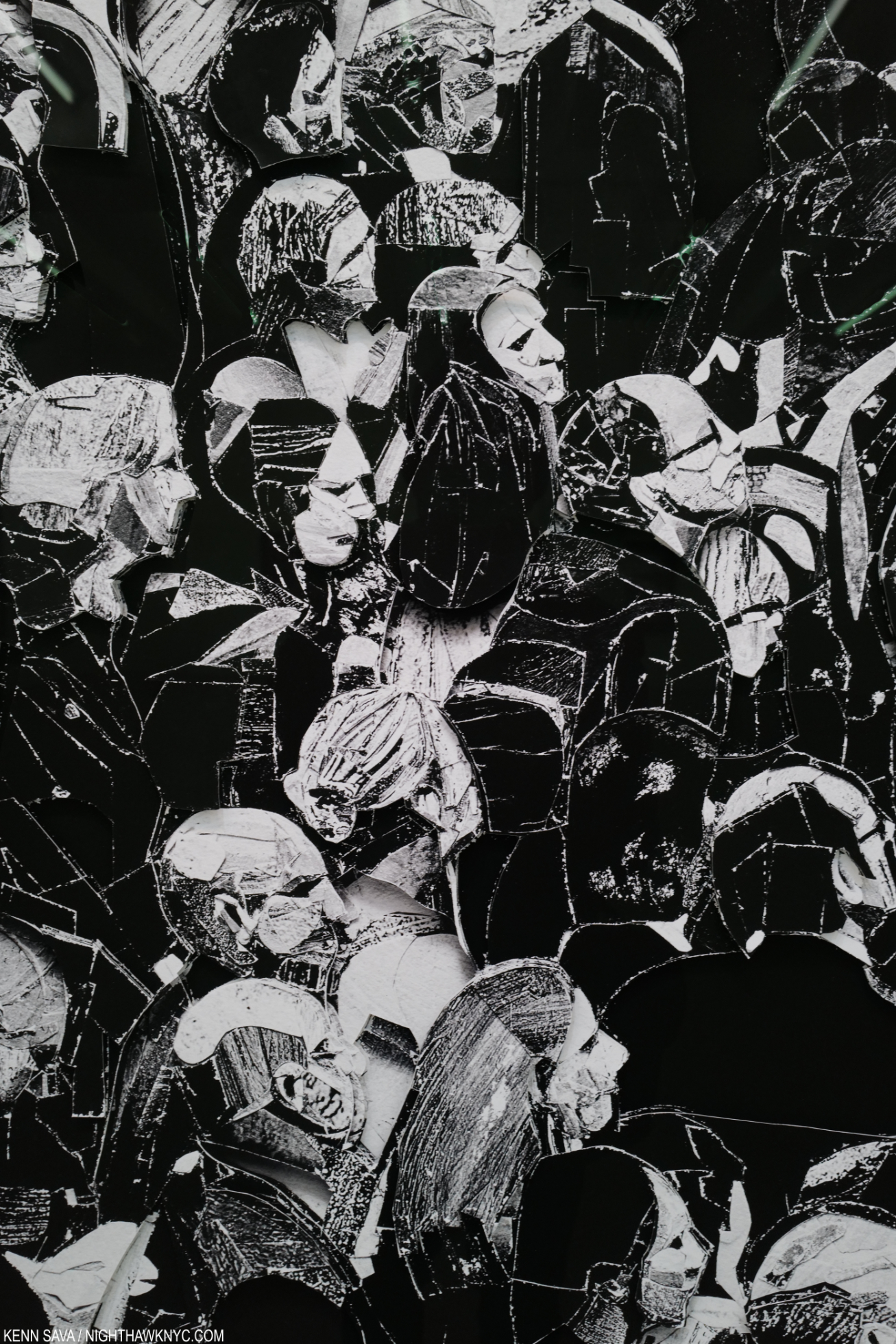
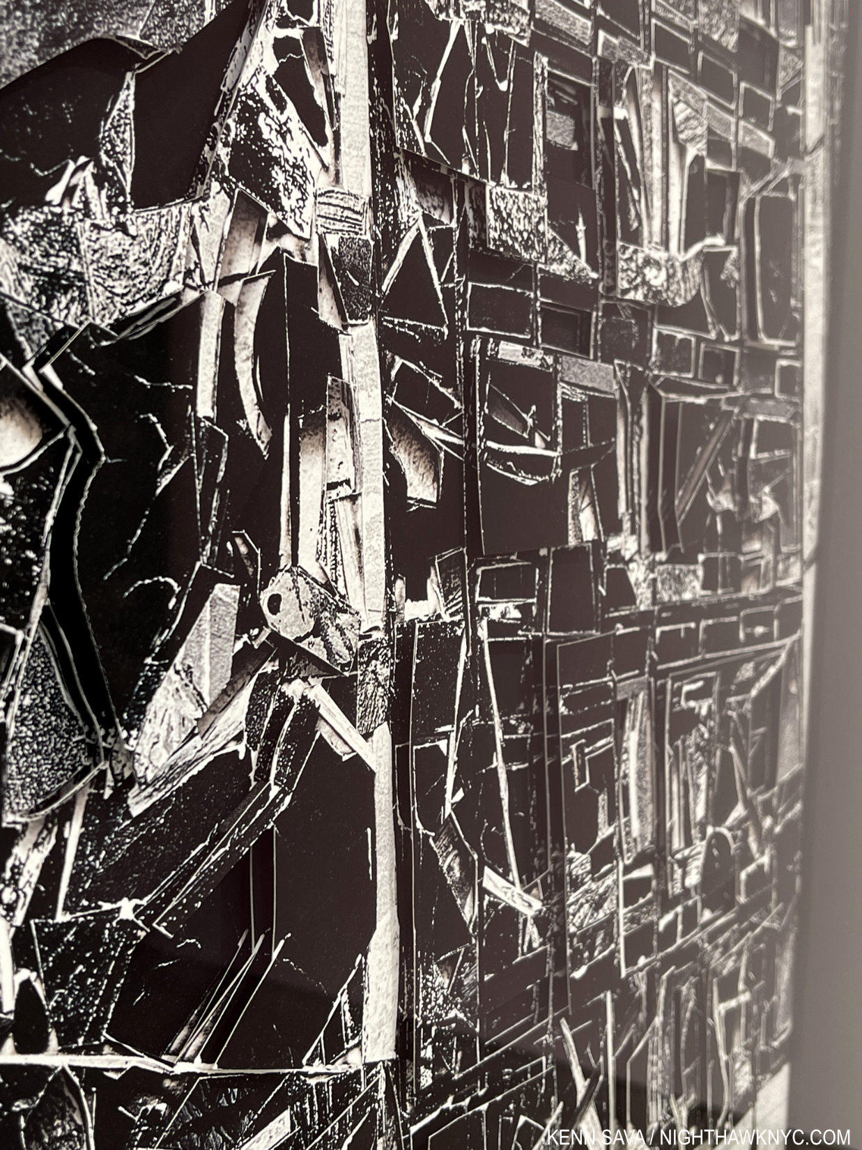
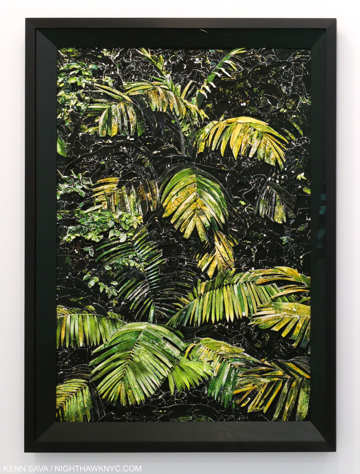
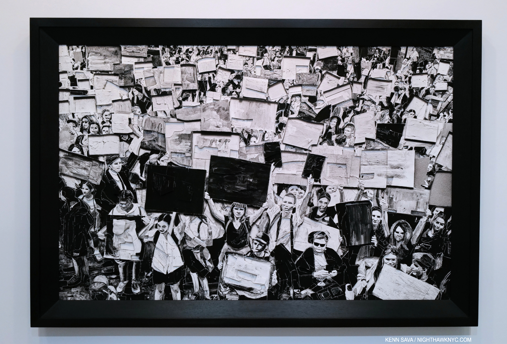
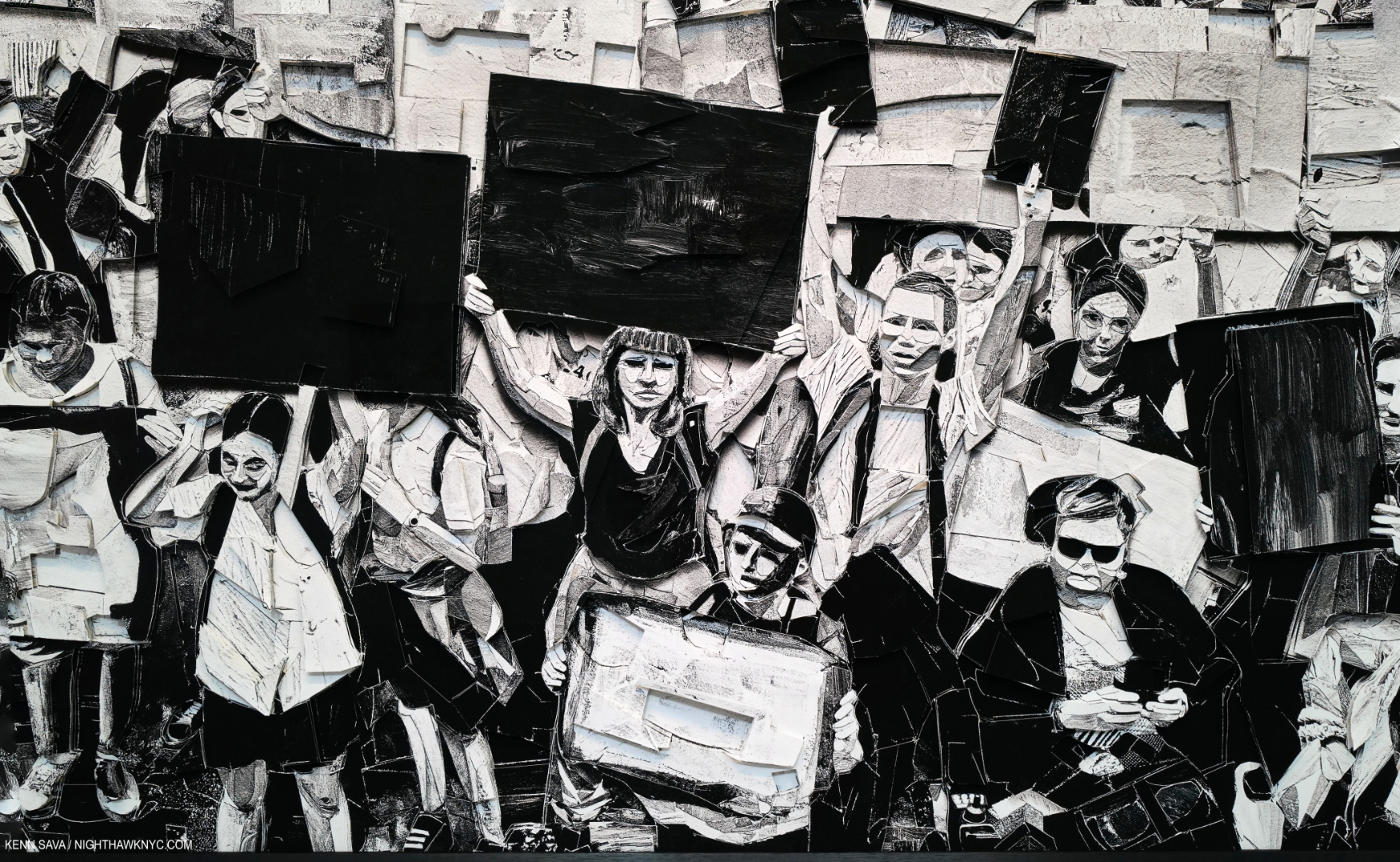
Detail of Gente Indo, 2021, seen in full further below, just to the right of the middle.
Brazilian Artist Vik Muniz is like the weather. The next time you look, his work will be completely different. A seemingly endless font of creativity, he continually invents new techniques with which to create, and has since he began creating Art in 1987. This fact alone is enough to put him on the list of important Contemporary Artists. His massive 16 1/2 pound, two-volume Catalogue Raisonne shows the Artist creating entire bodies of work in materials as diverse, and as far from the Art-world norm, as chocolate sauce, or ketchup, or jelly, in true Duchampian fashion. However, Mr. Muniz is so prolific his C.R. is already 6 years out of date! A look through it does reveal that the Artist’s process is to invent a technique, create an entire body of work with it, then invent another completely different technique, most likely in completely different materials, and create another body of Art using it. Rinse and repeat, over and over and over, for 35 yers now. Through it all, Photography remains central to his oeuvre. Originally a Sculptor, Mr. Muniz Photographs most of his works, those which are too delicate or ephemeral for display. Along with the extreme creativity in their creation, the other remarkable common thread that runs though his oeuvre is his work is often visually stunning and as a whole, in spite of the variety 0f techniques used, somehow manages to coalesce into one of the most unique bodies of work created since the mid-1980s.
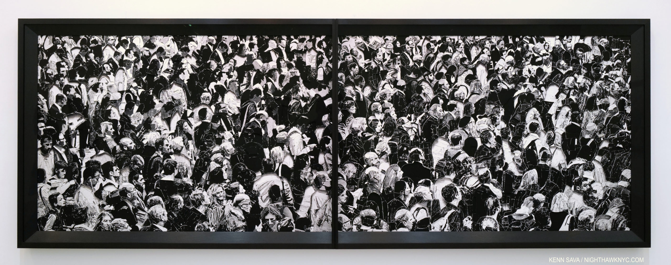
Gente Indo, 2021, Dyptich, Archival inkjet print, 158 1/2 by 57 1/2 inches, One of a kind. Click any Photo for full size.
Needless to say, I had no idea what I was in for this time when I ventured through the doors of Sikkema Jenkins on February 17th, as Mr. Muniz returned with his latest work in a show titled Scraps, that runs through April 9th. His last show, Museum of Ashes, in late 2019, which I wrote about here, included two themes and two equally stunning bodies of work, including one made of its own ashes.
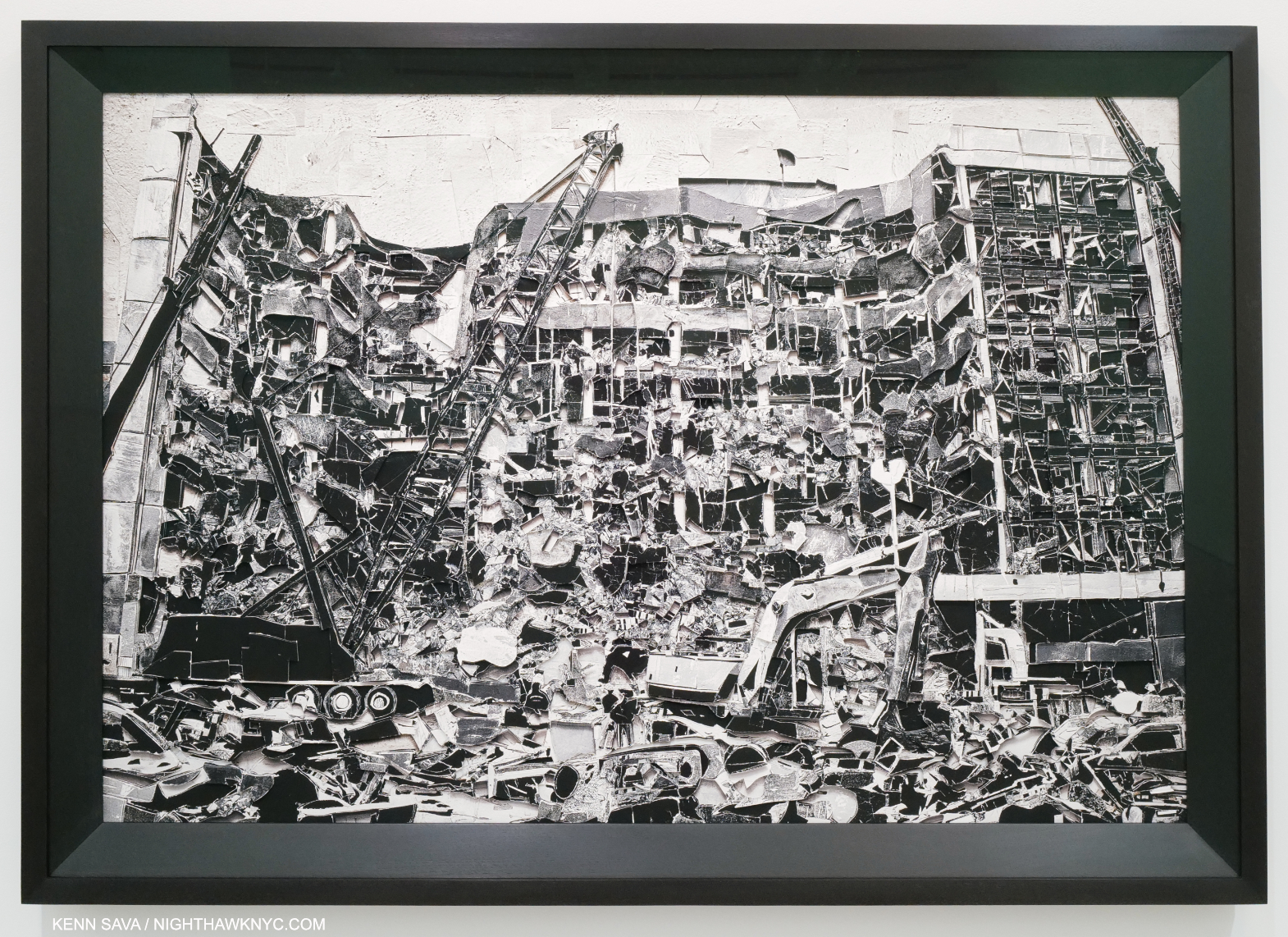
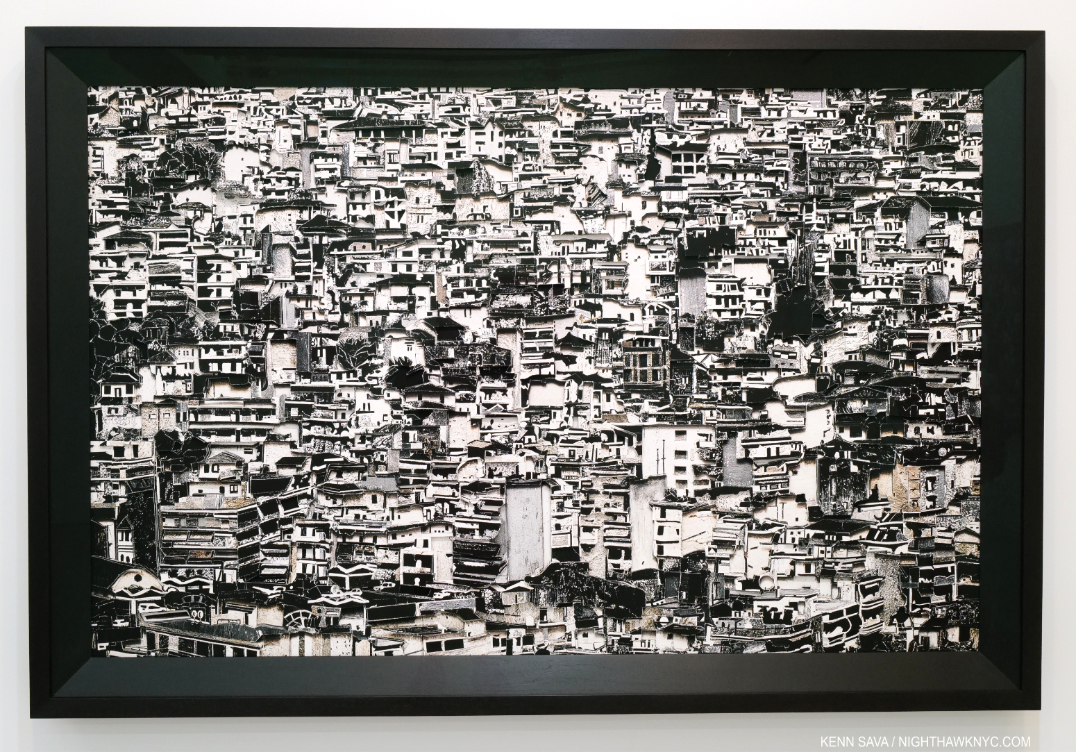
Oklahoma, 2020, Archival inkjet print, 50 1/2 by 71 inches, One of a kind. Good luck trying to count how many pieces make up this amazing recreation, from a media image, of this horrific event.
Detail of the right side seen from an angle.
This time, there is one theme and one body of work on view all sharing a complex process of creation. I’ll let the press release explain- “Muniz’s newest body of work, entitled Scraps, developed from the use of textures in his previous Surfaces series and his interest in mosaic compositions. He begins his collage process by sourcing painted elements from his studio and assembling them into an abstracted mosaic, which is then photographed, printed, and cut up; the cut pieces are arranged and layered to form the new, final photographic image. The physical element of painting is thus subtracted from resulting art object but is evoked visually through the cut prints. These multiple levels of dimensionality effect a dynamic sense of composition, and a sublime tension between part and whole.” I was told that the end piece of Art replicates an original Photo that either he had taken himself, or sourced from the media.
Jakarta, 2021, Archival inkjet print, One of a kind. In this Photo, it looks like a Photo. Standing in front of it, due to all the layers and pieces it’s made up of, it has a depth no 2D Photo can capture, a bit like Sculpture, that comes closer than a Photo does of what it must have felt like to stand there.
In Scraps, his subjects range from the mundane (Gas Station Sink, New Jersey, 2021, below) to the monumental (Oklahoma, 2020, recreating the aftermath of the Oklahoma City Bombing), a number of cityscapes and large crowd scenes, and a stunning over-life sized portrait. I can’t begin to imagine how many individual pieces are in each work, or how long it took to make one. Unlike some of his pieces, the work in Scraps, though infinitely complex and one-of-a-kind, are Photo based and so are stable enough to display. They are mounted in case-like frames that allow three dimensional space for the multiple layers attached to the paper. Each one may be pondered from a distance, or studied in detail as close as one would care to for a different experience, like the work of Chuck Close.
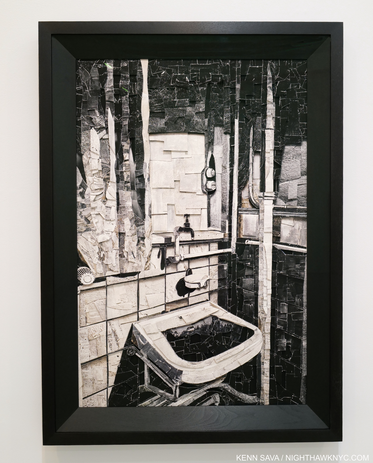
Gas Station Sink, New Jersey, 2021
Scraps also wonderfully combines Painting and Photography in a new way. As seen in the detail from Gas Station Sink, New Jersey, the cut up pieces of Photos that went into this are of Paintings from Mr. Muniz’s studio.
“He begins his collage process by sourcing painted elements from his studio and assembling them into an abstracted mosaic, which is then photographed, printed, and cut up; the cut pieces are arranged and layered to form the new, final photographic image. The physical element of painting is thus subtracted from resulting art object but is evoked visually through the cut prints. These multiple levels of dimensionality effect a dynamic sense of composition, and a sublime tension between part and whole1.”
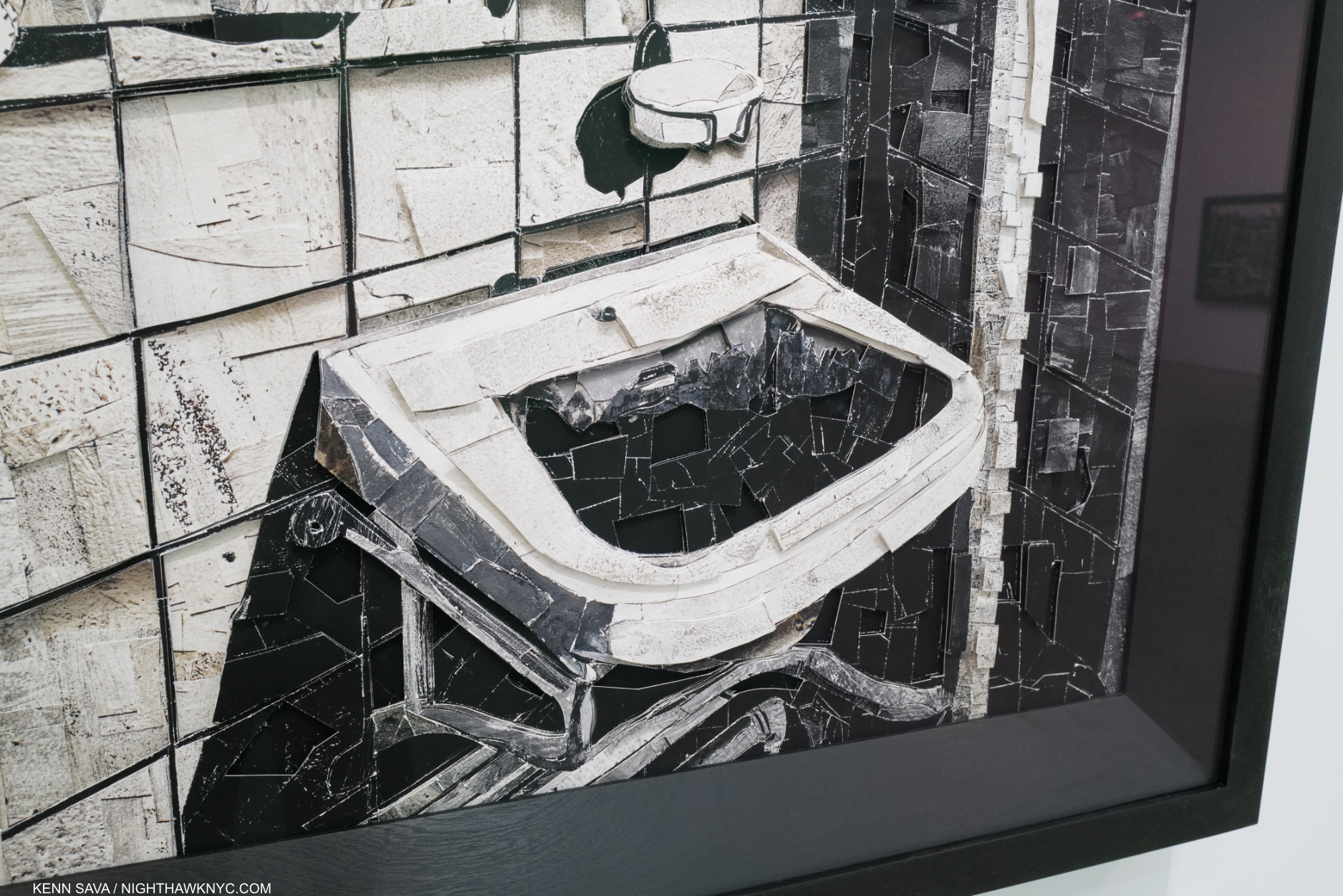
Detail.
The remarkable thing for me about this technique, and many of his prior inventions, is their way of reinventing the world- everything looks new again, and in Scraps he proceeds to walk us around that world through these new eyes.
Gavea (for Jorge Hue), 2021, Archival inkjet print, One of a kind.
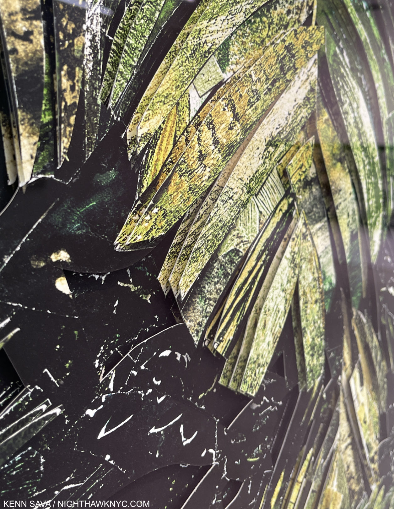
Detail. Here, as in every part of every piece, if you stand to the side, you can see the layering, with, apparently, the same image in each layer. The effect is different from the Cubism of Picasso & Braque, but is still multi-dimensional.
I met Vik Muniz at his 2019 show and spoke with him again at the opening of Scraps. I commented that there was a new kind of cubism going on in this work and he replied that people had been talking about cubism in his work in another recent show.
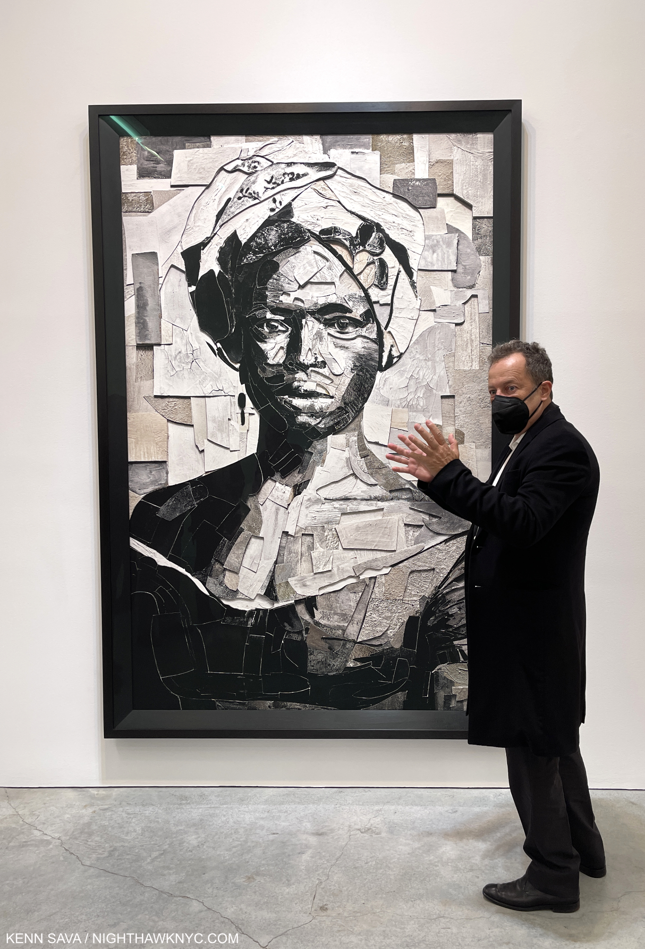
Vik Muniz discusses Nameless (Woman with Turban) after Alberto Henschel, 2020, Archival inkjet print, 90 by 59 inches, One of a kind. Mr. Muniz was saying how this woman is ubiquitous in Brazil.
What I was referring to was the intriguing layering that is seen in every work on display. Not apparent in pictures of them, which flatten the third dimension, as you stand in front of them, the multi-dimensionality is immediately apparent. It draws you closer and almost forces you to look again from an angle. As for a “new type of cubism,” unlike most work that hangs on a wall, every piece in Scraps has layers that protrude from the surface, or are layered on top of each other giving each part of the piece more or less depth. Moving slightly to the side, back and forth, allows the viewer to look behind the upper most layer(s). There he or she will find something fascinating. Each layer is identical. The effect, up close or at a distance, is sculptural, something I also mentioned to Mr. Muniz. “Sculptural” work that is labelled “Archival inkjet prrints,” that are “One of a kind.” Seeing them for first time I thought their effect akin to a kind of “static cubism,” since there is no sense of movement as there is in Picasso’s cubism, because each underlying piece being identical to the one above, shares the same perspective.
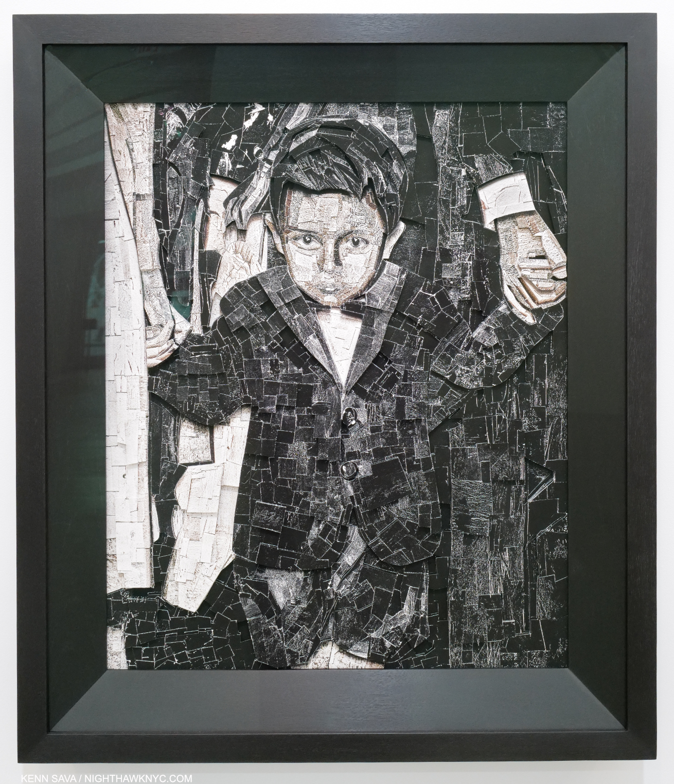
Boy, 2021, Archival inkjet print, 37 by 31 inches. One of a kind. I was told this piece is based oa Photo of Mr. Muniz at age 4.
 Vik Muniz has had a long and successful and accomplished career, and is quite well-known, though he is only in mid-career. Still, it seems to me that his is the kind of work that almost any Art lover could take a shine to. I could see Via Muniz becoming an “Art superstar” very easily. Perhaps the only thing holding his work back from a very large level of popularity is that it really needs to be seen in person to appreciate. A large traveling U.S. mid-career retrospective might do the trick. It’s time.
*-Soundtrack for this Post is “The Secret Life of Plants” by Stevie Wonder from Stevie Wonder’s Journey Through The Secret Life of Plants, 1979.
BookMarks-
If you choose to buy from a link below, I will receive a small commission, with my thanks. There are no such links in the body of the piece, above.
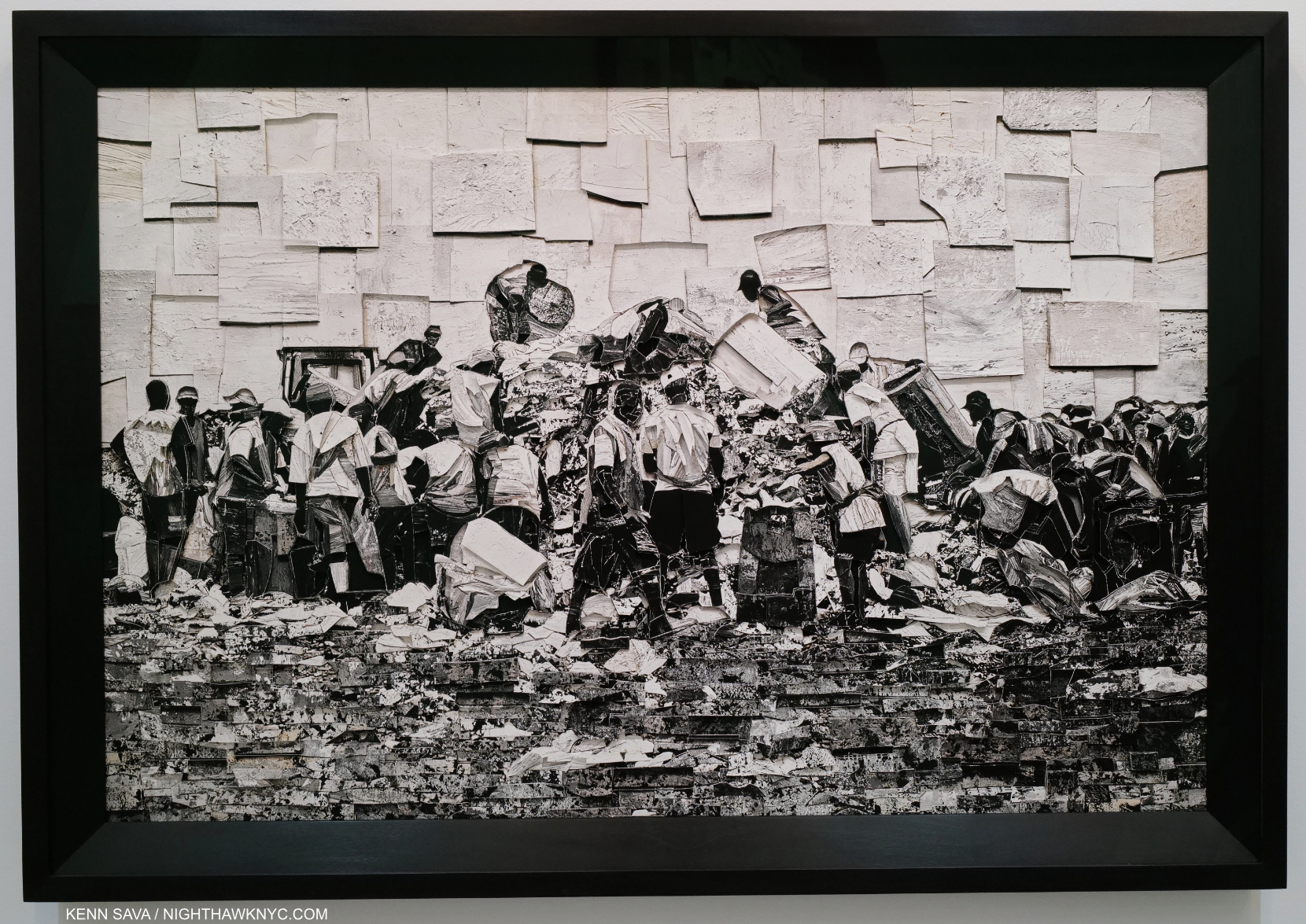
Gramacho, 2021, 50 1/2 by 70 1/2 inches, One of a kind. A work based on the Documentary, Waste Land, 2010, which Vik Muniz starred in.
Perhaps the best introduction to Vik Muniz is in the award winning documentary Documentary, Waste Land, 2010, which he starred in. It’s a look at the garbage sifters outside of Rio de Janeiro as Mr. Muniz creates portraits of them and learns about their lives. It’s available to stream or on DVD.
Vik Muniz: Reflex: A Vik Muniz Primer, Aperture-The best overview I’ve seen on Mr. Muniz and his Art to 2005. Numerous illustrations, though not many full page images. Still, you get a lot of fascinating information about the creation of the Artist’s amazingly innovative techniques that other books don’t have. Copies of this out of print book trade for very reasonable prices (around $10).
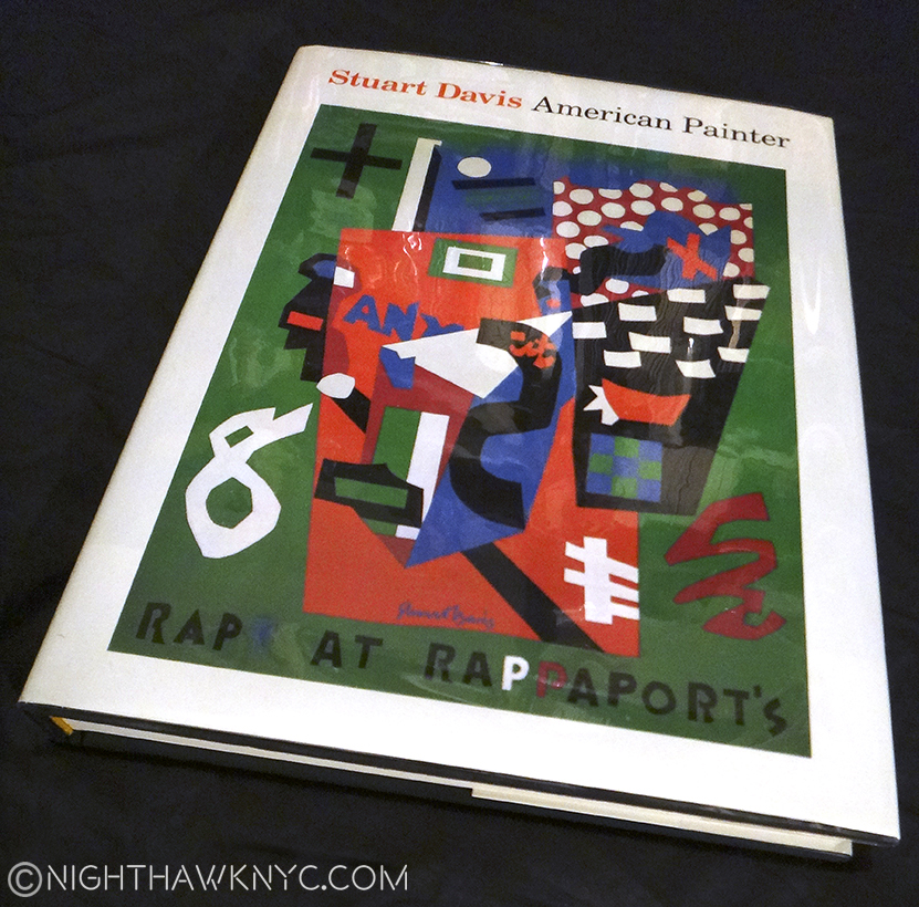
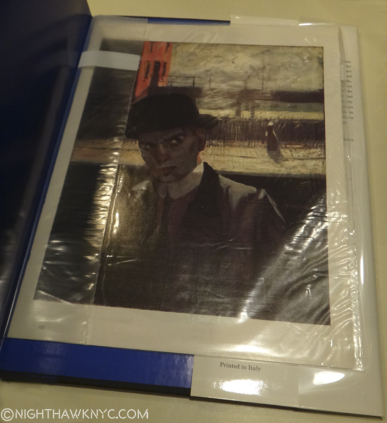
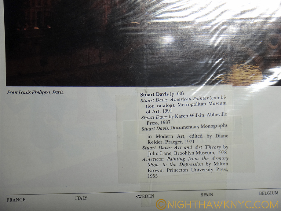
Vik Muniz has released at two Catalogue Raisonnes that I know of, and a third book that calls itself “Incomplete.” Box Vik Muniz: Catalogue Raisonne 1985-2015 is the most current, complete, look at his output. It’s a beautifully produced, huge 16 1/2 pound, two-volumes in a slipcase, set, with countless large Photos of all his work to 2015. It’s a constant treat for the eye. I asked Vik about the fact that it is now 6 years old (published in 2016) and if he planned another one. He said that he was considering doing a Catalogue Raisonne online. So, this may be the last CR in book form. Note- It’s listed as being in Portuguese. The English set is titled Vik Muniz Catalogue Raisonne 1987-2015: Everything So Far (ISBN 978-8589063579). I’d recommend checking with the seller on the language before buying.
The earlier Catalogue Raisonne, Vik Muniz: Obra Complete 1987-2009, is beautiful and only one, large volume, but it only goes to 2009 and is in Portuguese only. Then there is Vik Muniz: Obra Incompleta/Incomplete Works, published in 2004, which is in both English & Portuguese and was published to accompany a retrospective, is also very well done and contains a very well chosen selection of his early work.
NighthawkNYC.com has been entirely self-funded and ad-free for over 6 years, during which over 250 full length pieces have been published. If you’ve found it worthwhile, you can donate to keep it going & ad-free below. Thank you!
Written & photographed by Kenn Sava for nighthawknyc.com unless otherwise credited.
To send comments, thoughts, feedback or propositions click here.
Click the white box on the upper right for the archives or to search them.
For “short takes” and additional pictures, follow @nighthawk_nyc on Instagram.
Subscribe to be notified of new Posts below. Your information will be used for no other purpose.
- Scraps, Press release. ↩