My thanks to Monika Condrea and Steidl, the world’s #1 PhotoBook Publisher, for including my recent Post, “William Eggleston’s Secret Lab” on their facebook page on May 24th.

My thanks to Monika Condrea and Steidl, the world’s #1 PhotoBook Publisher, for including my recent Post, “William Eggleston’s Secret Lab” on their facebook page on May 24th.
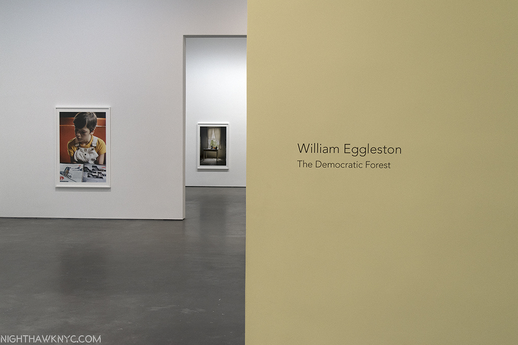
Set the Way Back Machine to December, 2016, when William Eggleston: The Democratic Forest was at David Zwirner Gallery, 537 West 20th Street, where all the trouble began. I had one of those “Dubliners” moments, where James Joyce’s Stephen Dedalus has an epiphany and his life (and the story) is forever altered.
My life hasn’t been the same since.
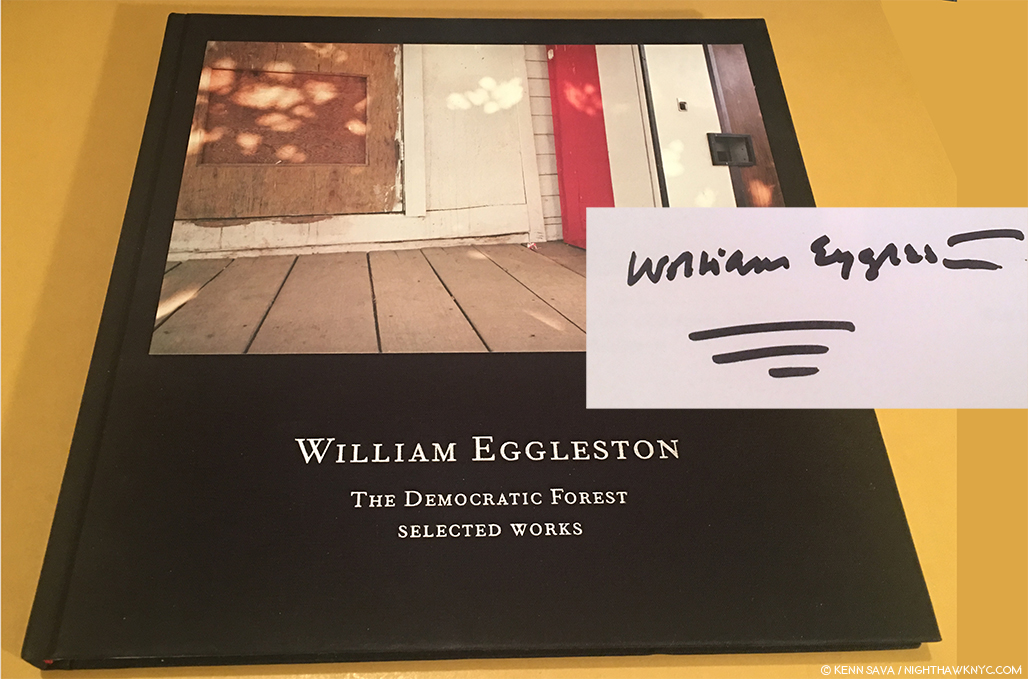
A signed copy of the catalog for the 2016 show, William Eggleston: The Democratic Forest: Selected Works, with William Eggleston’s characteristically vibrant signature, is all that remains to remind me…
As I walked through that show, revisiting the classic images on view (a total of 40, many in a larger size that I still haven’t gotten used to), I left with an overpowering realization that I needed to do a deep dive into the world of contemporary Photography, to catch up on it, Post-Robert Frank’s “The Americans,” 1958 (though Mr. Frank is still with us, of course, and still releasing great books with Steidl. Long may he wave!), and see what’s been going on. I also wanted to do this to gain some perspective on William Eggleston’s place in Photography and his accomplishment to date.
Henri Cartier-Bresson has his cryptic “decisive moment.” Robert Capa has “If your pictures aren’t good enough, you’re not close enough.” Eggleston has his own quote that will keep us guessing indefinitely.
Yes, I knew that famous quote, and William Eggleston’s work, but not in depth. Steidl’s 10 volume set of “William Eggleston: The Democratic Forest,” containing 1,010 images from this body of work, released concurrently with the show, was a sizable step towards addressing that. Never before (or since) had such a large body of color work been published in one set. Add to it the unrelenting quality of the images, and Mr. Eggleston’s extraordinary eye, and you’re face to face with a landmark body of work. From there, I went back to his prior Steidl sets, William Eggleston: Chromes
, 2011, and Los Alamos Revisited, 2012, both of which contain his earliest color work (the former his early slides, the latter his early prints). At this point, there was no denying William Eggleston’s exceptional importance in the world of Photography, being one of the few to bring a new way of seeing to the world.
The question became- “Who else is important?” I’ve explored some of the others I’ve discovered in these pages since Mr. Eggleston’s David Zwirner show, this past year and a half, including 4 article looks at The Photography Shows, AIPAD, in 2017 and 2018. How times have changed here at NHNYC. William Eggleston: The Democratic Forest didn’t even get a full article to itself! The spark that started a bonfire. The journey continues.
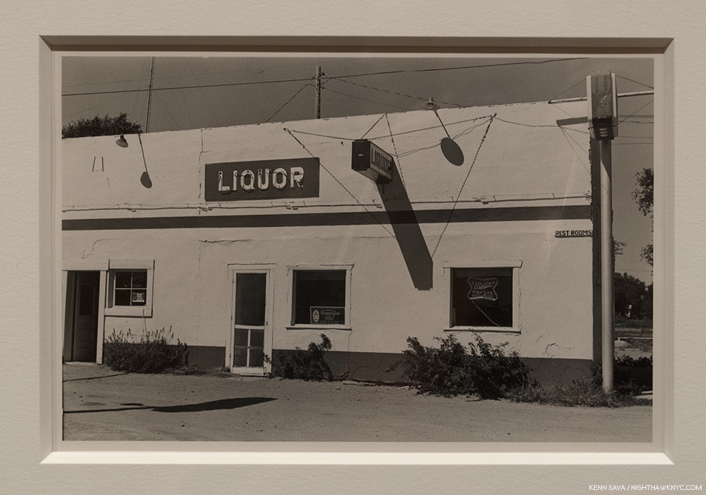
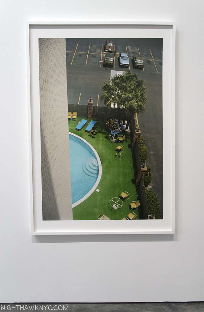
On the road, again. William Eggleston’s Los Alamos was shot on the road, over trips he took across the country between 1966 and 1974. When he, and his friend the curator Walter Hopps hit Los Alamos, NM, scene of the Atomic Bomb development in WW II, the Photographer commented about wanting “his own secret lab.” Click and photo for full size.
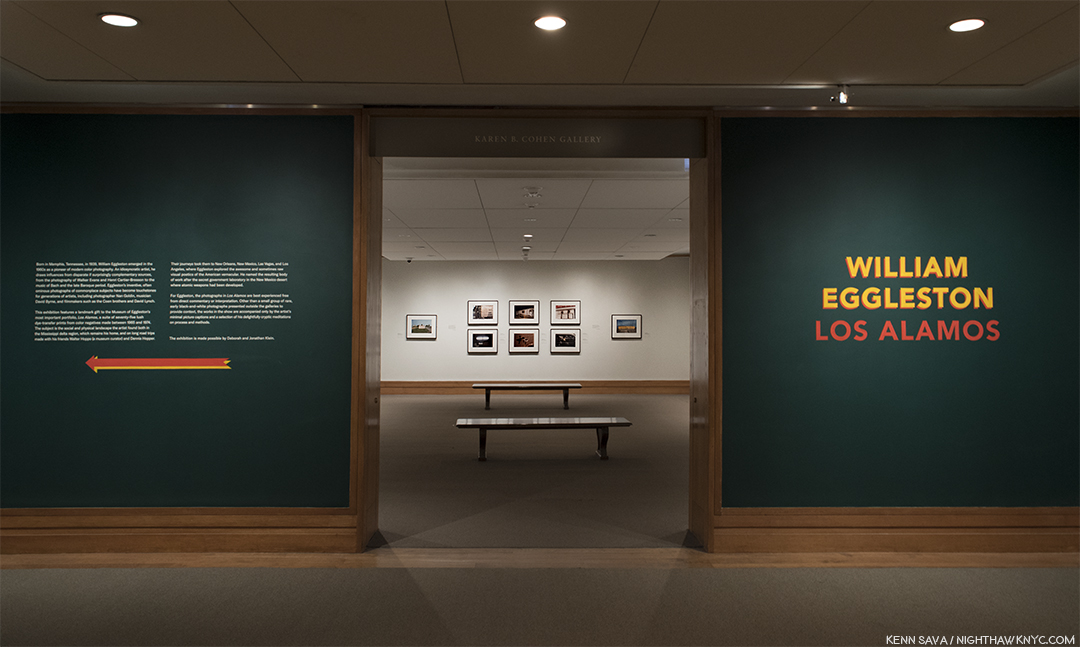
So, after literally hundreds of Photo shows seen, countless PhotoBooks perused and too many bought in the interim, here I was, once again, on the precipice of another William Eggleston show. This one at no less than The Metropolitan Museum of Art, featuring the recently promised gift of one of the seven Portfolios of “Los Alamos,” never previously seen as a set in NYC, containing the Artist’s earliest color print work. A sense of trepidation filled me- What new havoc would Mr. Eggleston wreck upon me now?
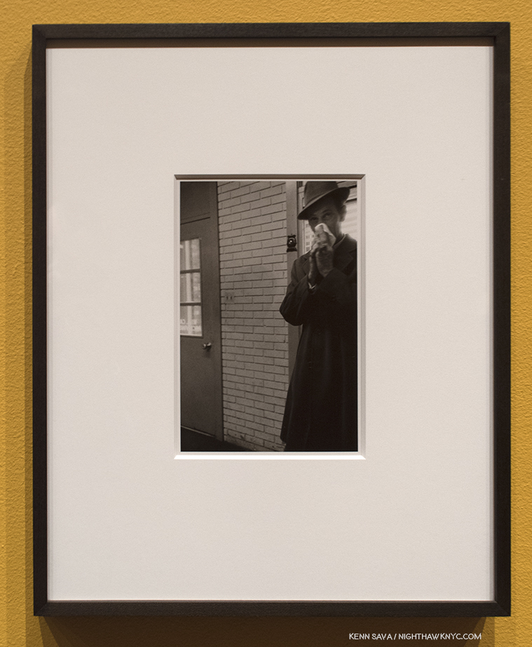
Untitled, 1967-74, Gelatin silver print. Perhaps a touch of the lingering influence of Henri Cartier-Bresson here?
I didn’t have to wait long to find out. As I approached the show’s entrance, I realized The Met had decided to give us more. This monumental show of one of the landmark bodies of color Photography begins with two walls of William Eggleston’s comparatively little known black & white work(!), flanking each side of the show’s entrance containing a total of 11 black & white Photographs created between 1959 and 1974 mounted on mustard walls! 11 Photographs might not sound like many but their subjects and styles are so varied they present a fascinating capsule look at where his work was before he turned to color film.
I’ve seen some of his black & white work in the two Steidl books centered on it1, to feel they are an overlooked realm of his work that deserves a closer look. But, such is the all-encompassing power of his color work that it has garnered only occasional attention.
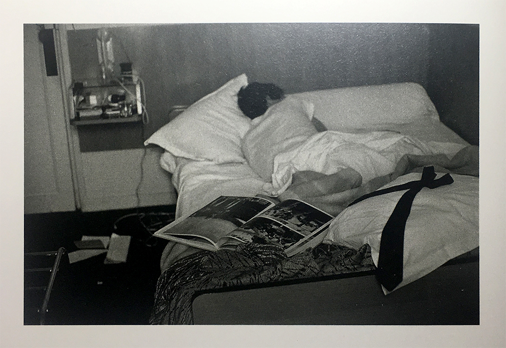
William Eggleston fell asleep reading Cartier-Bresson’s Les Europeans, Paris, 1964, shown here in this Photo by his wife, Rosa, as seen in William Eggleston: From Black and White to Color, P. 176. (Not in the exhibition. )
Early on, William Eggleston was captivated by the work of Henri Cartier-Bresson. He so worried about copying him that during a trip to Paris in 1964, where the French master lived and worked for many years, he didn’t take a single Photograph. Returning home, he realized that “foreign land” surrounded him right there in Memphis (including the new shopping malls and strip malls that were sprouting like weeds) and he set about Photographing it. That is what we see in these 11 black & white shots- a great Artist stepping beyond influences and beginning to trust his own vision. In the shots with human subjects, the influence of Cartier-Bresson’s infamous “Decisive Moment” would seem to be there, but he’s putting his own stamp on it. By the early 1970’s he was on his way.
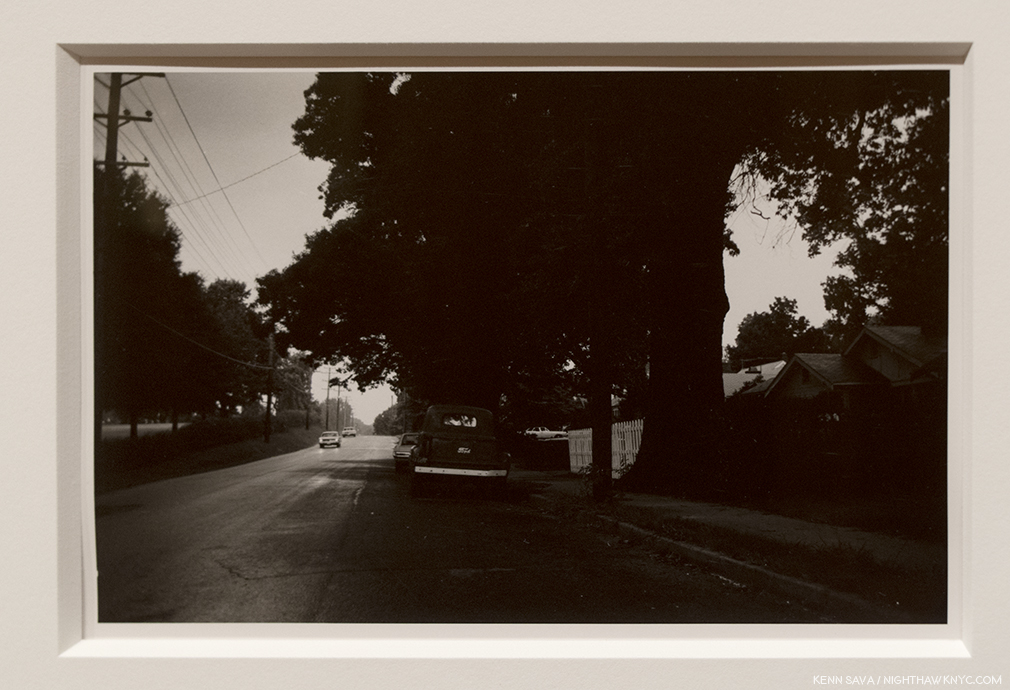
Untitled, 1967-74, Gelatin silver print. Light & dark…day & night…this is one of the most “different” images by William Eggleston I’ve seen.
Moving beyond the images with people, some others show a fascination with a wider view, courtesy of a wide-angle lens, in landscapes where it’s hard to discern details of the scene (above). In these people-less works, compositionally, they’re still fascinating and still “democratic,” the term he used recurringly connoting nothing being more important than anything else in the frame. But, overall, they lack the laser focus that permeates Los Alamos, and much of what has followed.
Untitled, 1967-74, Gelatin silver print. This begins to call to mind any number of William Eggleston’s later color Photos, like Los Alamos.
The revelation from these earlier black & white Photos, for me, is they emphasize the Artist’s gift for composition (including a penchant for Photographing from unusual angles). But this really shouldn’t be a surprise. Like Cartier-Bresson and that other great master of early color Photography, Saul Leiter, William Eggleston is also a Painter. Turning to color film, however, he would also have to find his way. “I’d assumed that I could do in color what I could do in black and white, and I got a swift harsh lesson. All bones bared. But it had to be,” he’s quoted on a wall. The stage having been set, the main event beckoned.
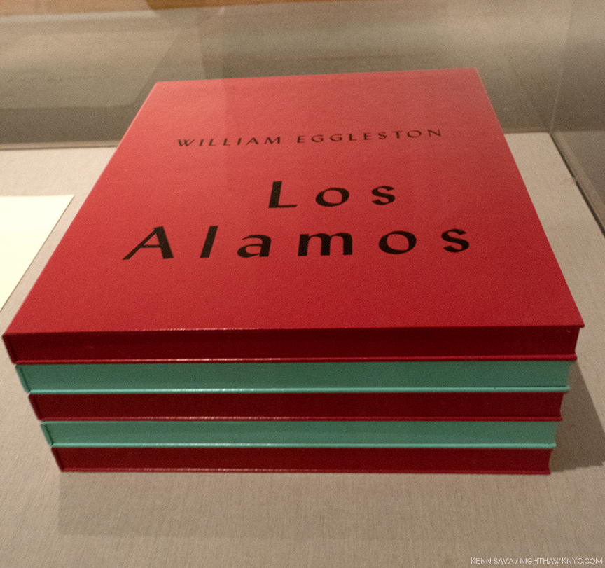
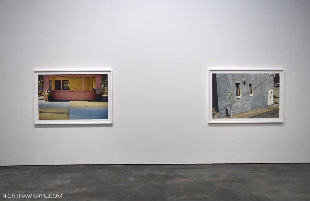
Only SEVEN sets of this large 5 volume set were released in 2002, along with 3 Artist’s Proofs. This extraordinarily rare complete set, in, apparently, pristine condition, is a promised gift to The Met, who is showing the 75 Dye-transfer prints it contains, (15 per box) complete, for the first time ever, in NYC, along with 13 others from the extended series.
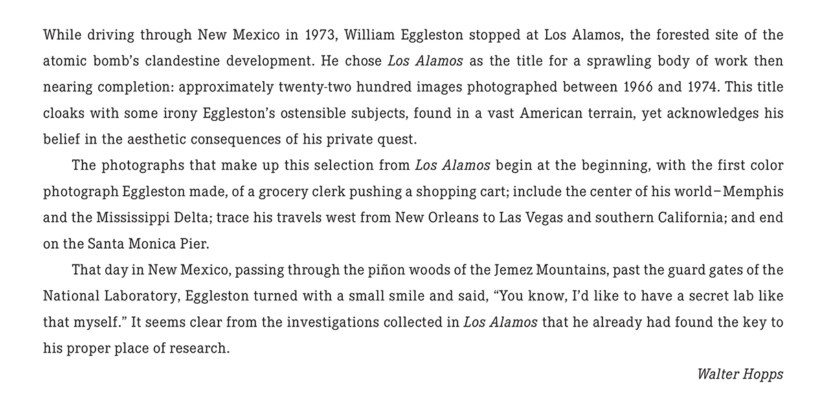
Walter Hopps’ Introduction to Los Alamos as it appears in the Steidl set. Photo courtesy of Steidl.
The first selection was shown at Museum Ludwig, Cologne in 20022, when this Portfolio was released, along with a catalog for the show, also titled, Los Alamos. The Portfolio consists of 75 dye transfer prints, in 5 boxes of 15, perhaps the most revered type of color print, as they possess a larger color gamut and tonal scale than any other process. Since Kodak stopped making the materials for this process, they are rarely created today3 These images were known to me to now through Steidl’s three volume set, Los Alamos Revisited, where they are supplemented by other images from the series. In the “Editorial Note” at the end of Volume 3, Gerhard Steidl says “Los Alamos is presented in its entirety in this three volume set,” though there are far fewer than the 2,200 images Mr. Hopps says was created, above. As good as Steidl’s books are, no book can match seeing a dye transfer print in person.
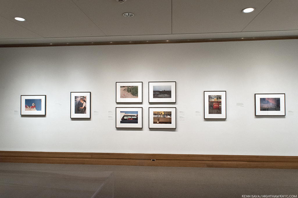
The first wall of William Eggleston: Los Alamos.
Along the show’s first wall, the second print is the image Mr. Hopps refers to as being William Eggleston’s first color Photograph.
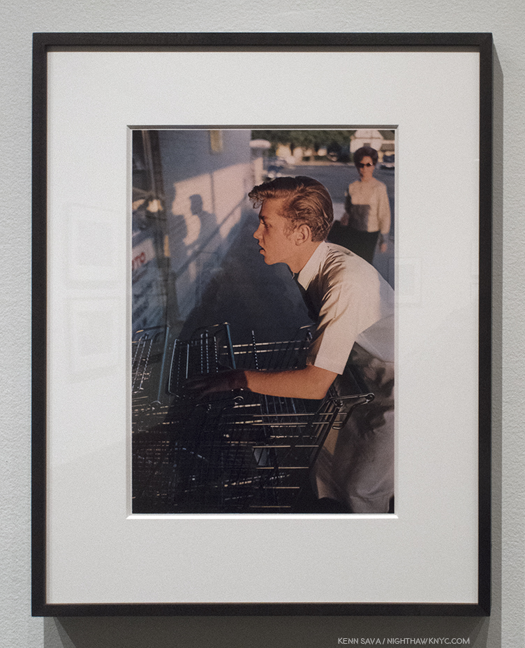
Untitled, 1965, Dye-Transfer print, as are all the Photos that follow.
This man in this incredibly odd image, that would seem to be as far away from “Art” as one could imagine, is not pushing a shopping cart into a row of them. He’s pushing color Photography into the world of Fine Art Photography. Interestingly, 53 years later, for such a famous Photograph, seeing it in person in a dye-transfer print, it’s not a shot that screams with color, as so many others in Los Alamos do. It’s subtle relative to many of the others in the Portfolio. The colors emerge from shadows. Glimpses of light in a grey world. What strikes me are the subtle shades of silver in the carts- some of which are in the light, some are in shade. Then there’s the shadows. They echo the two figures we see, but the woman in the sunglasses isn’t one of them. They are the Photographer and the shopping cart man. The shadows are, almost, black and white images, something I’ve yet to see someone point out. As part of the “grey world” they wonderfully echo the black & white world he’s left behind in the “new world” of color Photography William Eggleston had embarked upon.
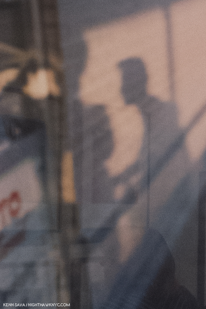
It almost looks like a black & white Photo. Detail of the left center showing William Eggleston, left shadow, taking the photo of the cart worker, on the right.
He would never go back.
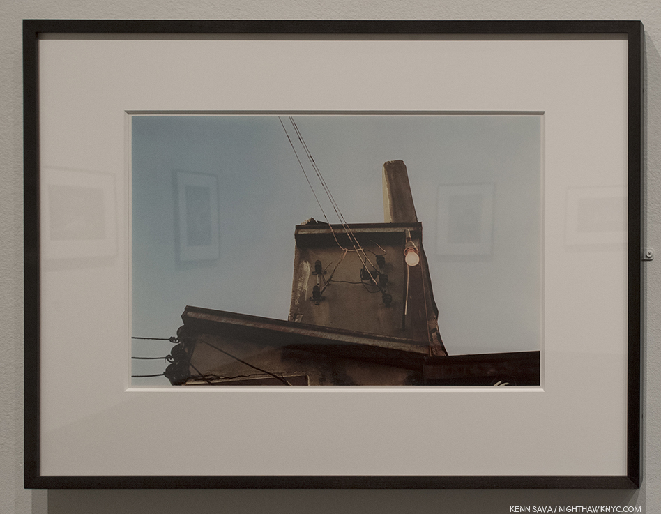
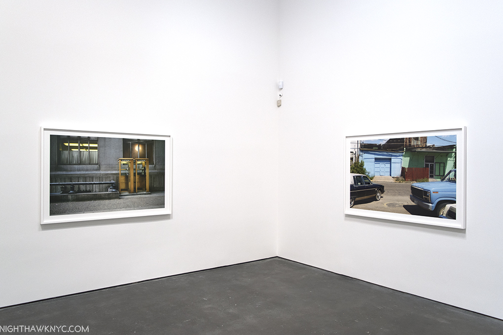
Memphis, 1971-74
Memphis, 1965-68
William Eggleston began his career working in isolation “that was almost inconceivable.” “Photography wasn’t even born yet,” he said later. He even had no knowledge of the controversy the appearance of The Americans caused4. Going back before The Americans, it must be said that it seems to me that it’s hard to speak about ANY American Photographer of the 20th (or 21st) centuries without mentioning Walker Evans, though he did very little color work, and late in his career. It’s hard NOT to see the influence of Walker Evans everywhere in work created after his FSA works of the 1930’s. That includes the work of William Eggleston. I say that not to diminish his accomplishment by any means. I say it because almost every Artist in the western world has been influenced by someone who came before him or her. William Eggleston’s work has a rawness to it, akin to extremely proficient snapshots that I also see in some of Walker Evans’ work. William Eggleston knew the work of Walker Evans before he embarked on the work shown at The Met, but he proves himself over and over to be among the few who’s own vision is strong enough to overcome “echoes” of any influence. This was first seen in his controversial at the time, now landmark 1976 MoMA show Photographs by William Eggleston5,” and in much of what he’s shown us since.
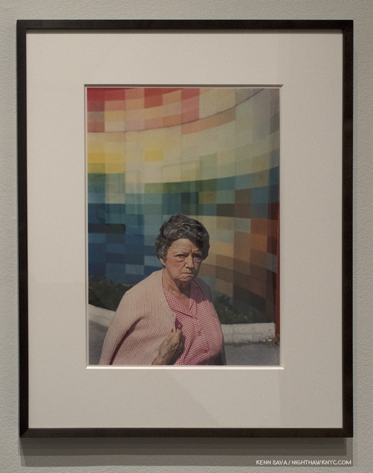
Greenwood, 1971-74
Memphis, 1971-74
Santa Monica, 1974
Speaking of the continuum of influence, it’s hard to walk around this show and not see each image as a jumping off point for the work of so many others. Yet, the big mystery in them- “What do they mean?”- is only answered until you look at them again.
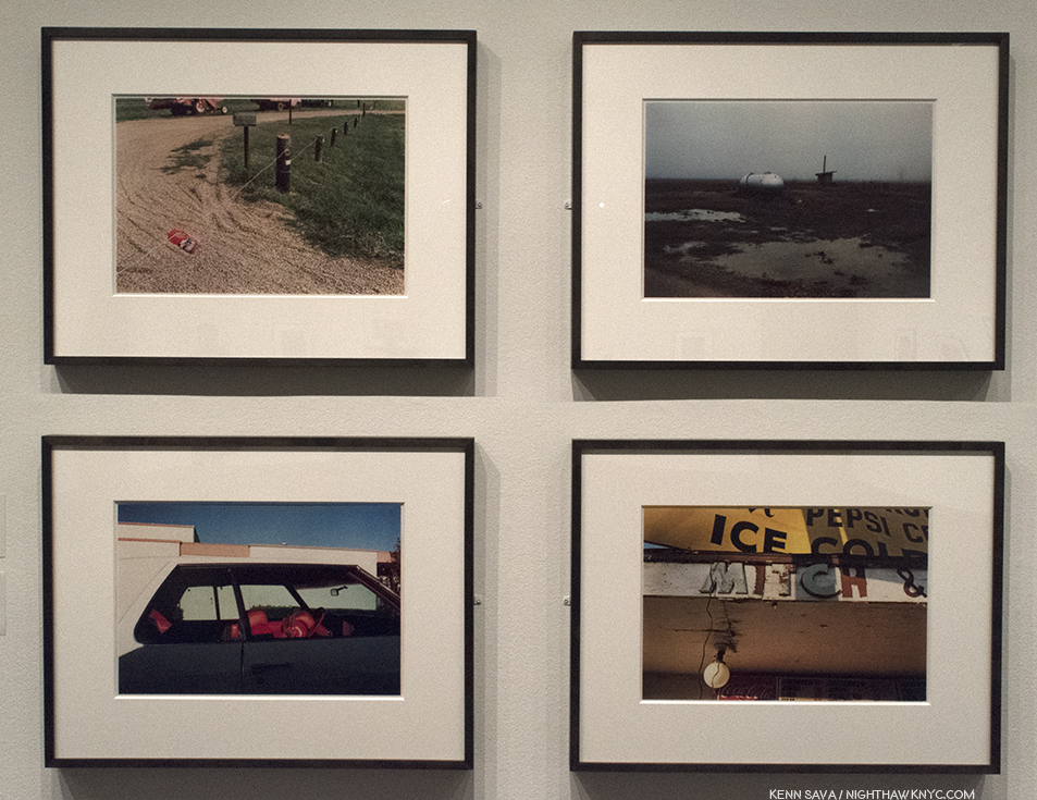
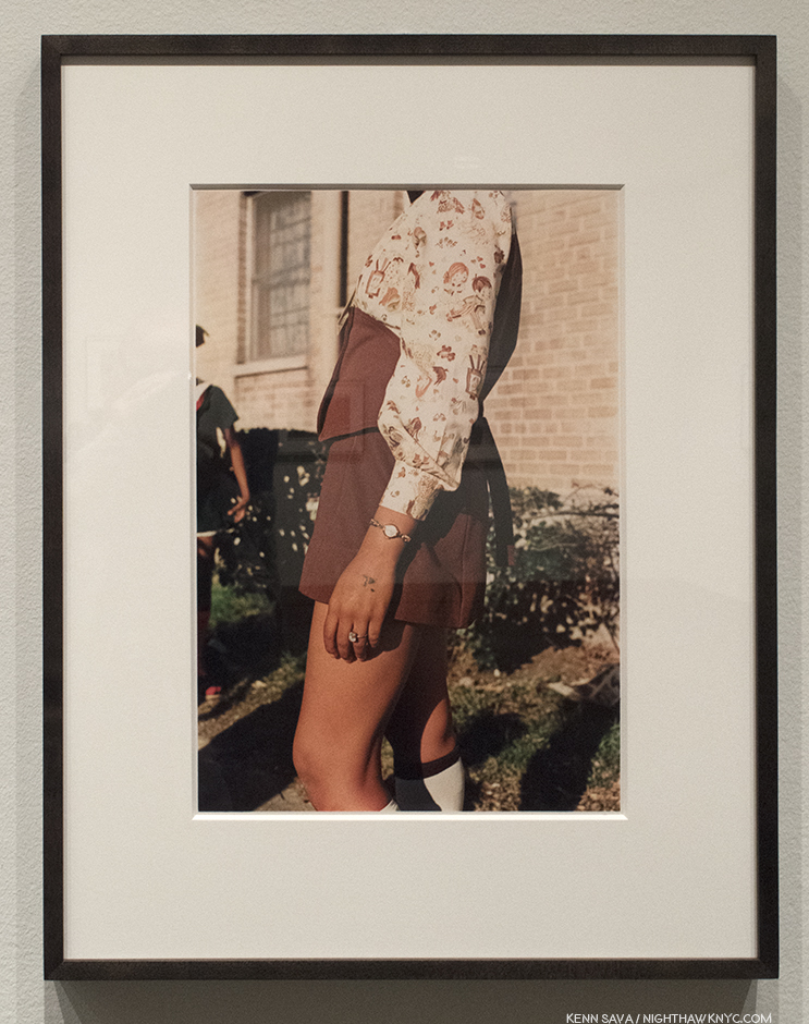
Mississippi, upper right and upper left, Memphis, lower left and lower right, all 1971-74
Part of their “charm” is how the cars, furniture, objects, and places look dated to us now. That’s inevitable with Photography as time goes on. Then, of course, there’s the power of his colors to seduce the eye like few others can.
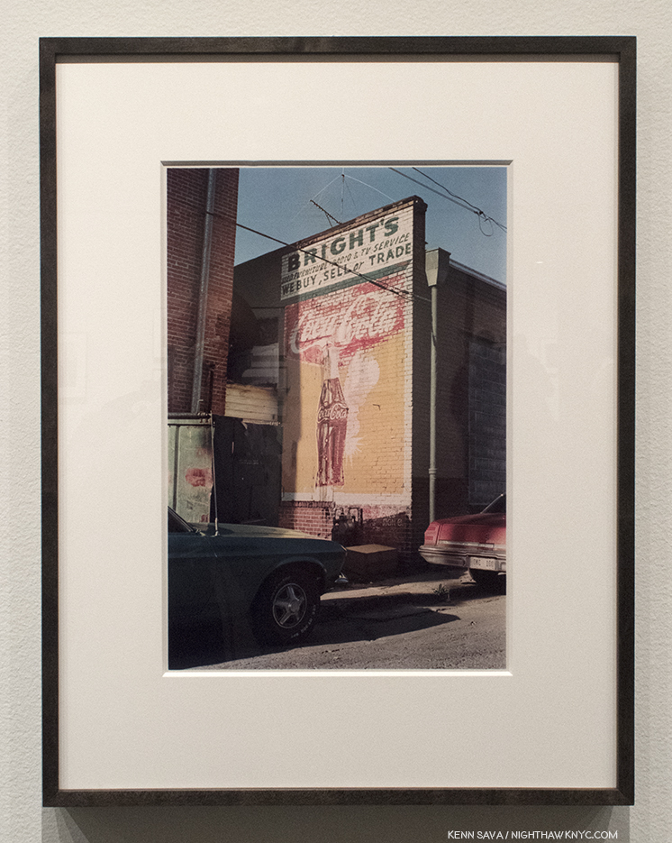
Louisiana, 1971-74
While I’m eternally pondering the “What is he saying?” question myself, I always come back to studying, and admiring, his compositions. Their balance, or their off kilterness…in both cases, manage to retain interest.
Mississippi, 1971-74. Balance. Well? Almost. But, that’s life, right?
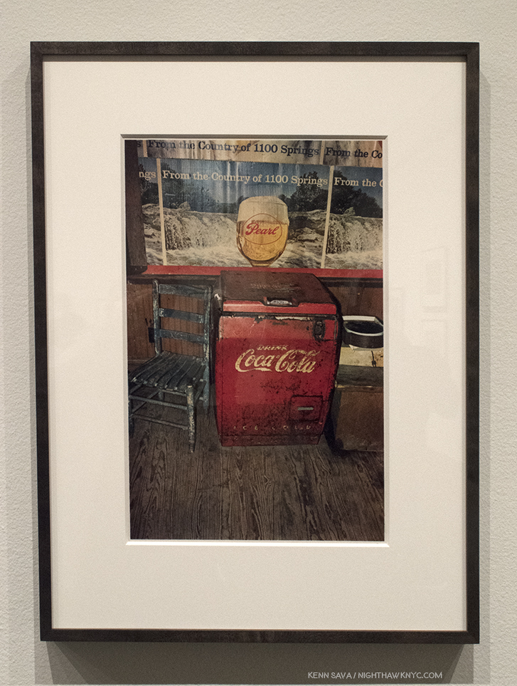
Greenwood, upper left, Memphis, upper right, both 1971-74, Untitled (Bottle on Cement Porch), lower left, and Untitled (White Phone and Vacuum Cleaner, lower right, both 1965-74.
Images like the group of four above spawn countless “I could do that” comments. While I don’t deny the possibility someone could, what’s overlooked is the time and the context. These were taken over 45 years ago, when no one was “doing that.” When seen in the context of the history of Photography, they were, therefore, unprecedented, particularly in color. And yes, today? Countless people, and Photographers, are trying to “do that,” though we’re still waiting for the “next William Eggleston” to reveal him or herself, and so am I.
Louisiana, 1971-74
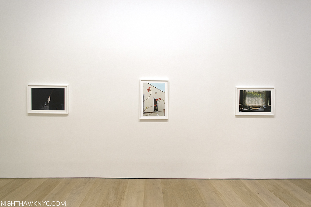
What to make of this image, with its carefully considered composition, shot from a low angle? I don’t know and my efforts at gaining insights reached a dead end. Ostensibly it’s here because it’s part of the complete portfolio, and as such, it’s now in The Met’s Permanent Collection. Though taken over a generation ago, it remains disturbing and offensive, and puzzling. In a 2004 interview in The Guardian, Sean O’Hagan quoted William Eggleston saying, “A picture is what it is, and I’ve never noticed that it helps to talk about them, or answer specific questions about them, much less volunteer information in words. It wouldn’t make any sense to explain them. Kind of diminishes them. People always want to know when something was taken, where it was taken, and, God knows, why it was taken. I mean, they’re right there, whatever they are.” As a result, I can’t help but think it calls into question the whole sense of “detachment” that exists in all of these works. At this point, it seems these questions are going to remain indefinitely.
The last wall at The Met includes the image taken during the plane trip home, far right, as if to put a “bow” on the project.
My current feeling about Louisiana, 1971-74, and the series as a whole, is that these are glimpses of America, moments that passed in front of the Photographer and his camera, that may, or may not, be gone forever, but will remain frozen in time. Taken as a whole, it’s as compelling a portrait of America as Jack Kerouac’s On The Road, (perhaps an inspiration for Mr. Eggleston), is, in my view, albeit in a completely different way. While Jack Kerouac inspired a generation of “Beatniks,” and countless others, Mr. Eggleston has inspired two generations of Photographers, and counting. In Los Alamos we see the mundane, the beautiful, the ugly, and the never noticed before, all seen by a man possessing one of the most singular eyes in Contemporary Art. If not in Art. Period.
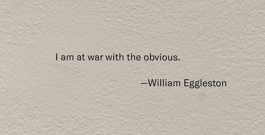
Yes, William Eggleston went to “war with the obvious.” And he imposed his will upon it.
————————————
BookMarks- (A new feature regarding Art and/or PhotoBooks related to this Post). If you want to begin to explore the work of William Eggleston, William Eggleston’s Guide, published by MoMA is the place to start. After that, you really can’t go wrong with any Eggleston book published by Steidl or Twin Palms Publishers, though I would recommend considering William Eggleston: Los Alamos Revisited
, next.
If you find yourself taken by Los Alamos, I highly recommend Steidl’s 3 volume box set.” Produced by William Eggleston, The Eggleston Artistic Trust and Gerhard Steidl, given the involvement of the Artist, it’s highly unlikely to be surpassed as a definitive document of this landmark series. The production is first rate in all respects. At Steidl’s booth at The Photography Show/AIPAD this year there was some question around how much longer copies of Los Alamos Revisited would be available. Released in 2012, I wouldn’t wait long to get one. Steidl’s previous William Eggleston Box set, Chromes, released the year before, is now out of print. The asking price for the cheapest USED copy known to me at the moment is $1,500.00.
*- Soundtrack for this Post are “Inventions & Sinfonias” by Johann Sebastian Bach as performed by Glenn Gould. Mr. Eggleston is, also, a Pianist, who recently released his first CD, William Eggleston: Musik (Vinyl). He lists J.S. Bach as his favorite composer. Something we agree on.
Update 5/22/18- Rewatching the fascinating documentary, The Colorful Mr. Eggleston, I saw what sure looks like one of the other sets of “Los Alamos.” At the 7 minute mark, Mr. Eggleston is speaking at what looks to be the Eggleston Artistic Trust, and behind him to the right, there are five similarly color boxes sitting on a shelf next to a “Coke” sign.
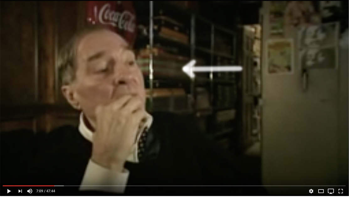
William Eggleston speaking in The Colorful Mr. Eggleston, with what looks to be a set of Los Alamos on the shelf behind him. Walker Evans, also, Photographed, and collected, Coke signs.
My thanks to Monika Condrea and Steidl for their assistance.
My previous Posts on Photography are here.
You can now follow @nighthawk_nyc on Instagram for news and additional Photos!
NighthawkNYC.com has been entirely self-funded & ad-free for over 7 years, during which over 275 full length pieces have been published!
I can no longer fund it myself. More on why here.
If you’ve found it worthwhile, PLEASE donate to keep it online & ad-free below.
Thank you, Kenn.
Written & photographed by Kenn Sava for nighthawknyc.com unless otherwise credited.
To send comments, thoughts, feedback or propositions click here.
Click the white box on the upper right for the archives or to search them.
Subscribe to be notified of new Posts below. Your information will be used for no other purpose.
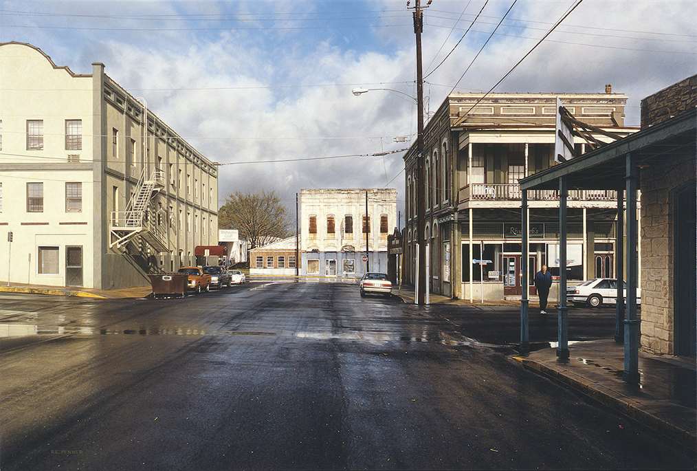
During the recent show, Rod Penner, at Ameringer McEnery Yohe, I was fascinated watching visitor’s reactions to the work.
While it was hard to know if they were familiar with Rod Penner’s work, most seemed taken, startled & impressed with his incredible technique. But then, they lingered. Often for quite a while. I well know that feeling. How well the Paintings are done is a hook that grabs your attention and pulls you in. What happens then? Well…That’s up to the individual viewer.
When you finally step back, you marvel that all of that took place in a space that’s 6 by 6 inches or 5 by 7 1/2 inches. When this first happened to me, in April, 2016, I was left with wonder. I wanted to know more about him and his art. Since I’ve now written about him and this show twice, perhaps others are curious, too. The AMY show answered some of my questions, primarily- Yes. He is THAT good. But, it raised others. I am very pleased to report that, after the show ended, and he arrived safely back in his now long time home in Texas, Rod Penner graciously agreed to answer some of my questions in a very rare Q&A. (For those interested in exploring his work still further, I’ve appended a list of resources known to me at the end of this Post. I welcome hearing about others I don’t know of.) What I’ve learned thus far has confirmed, at least to me, his place as a major Artist. That leaves the other question…
Who is Rod Penner?
“It’s your last chance
To check under the hood
Last chance
She ain’t soundin’ too good,
Your last chance
To trust the man with the star
You’ve found the last chance Texaco”*
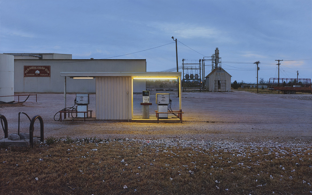
Having previously shown his recent, small Paintings, here’s one of his larger works. Farmers Co-op Gin/Anson, TX, 2012, 20 x 32 inches. All works by Rod Penner, Acrylic on canvas, and are from rodpenner.com and amy-ny.com, unless otherwise noted.
Every work in virtually every show of Rod Penner’s work these past 25 years sold. Remarkable. Those owners are not parting with those pieces, which can be seen in his work not coming up at auction (as far as I know). 8 of the 9 pieces in this recent show were sold before the show opened. I believe the time has come for a closer look at what’s going on here.
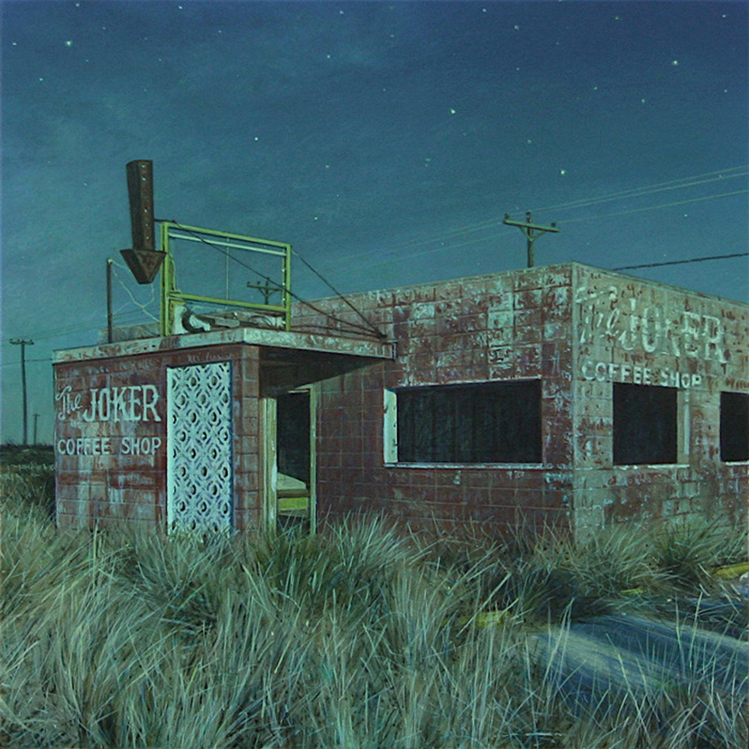
Joker Coffee Shop, 2016, 6 x 6 inches.
What’s going on here, succinctly, is that Rod Penner is quietly creating a remarkably excellent body of Paintings, one that provides all the proof needed that he is a Master Painter.
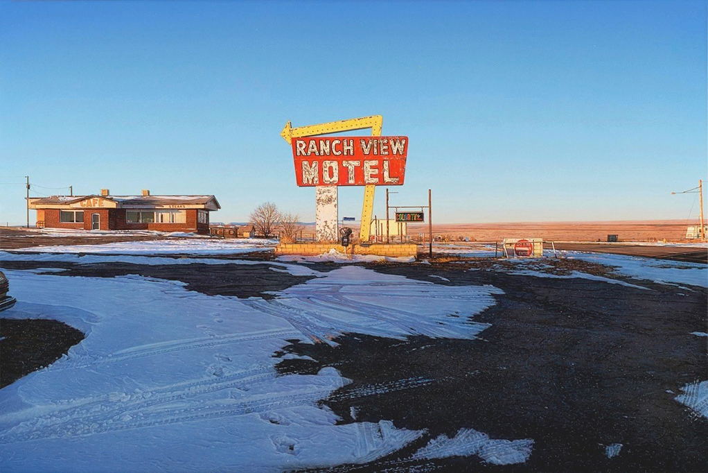
Ranch View, Vaughn MN, 2013, 12 x 18 inches. Compare this with the next two.
Not wanting to take up too much of Mr. Penner’s valuable time, with repetition of things John Seed has addressed in his 3 pieces about the Artist, my questions serve as supplements to those articles (linked at the end). What follows is about his life, and his Art, but I also felt it was important to ask this Master Painter about Art- What he looks for when he looks at Art. Mr. Penner has a deep knowledge of Art History and he is very open minded to styles & periods, perhaps surprisingly so to some. Typically, when I met him at the show’s opening, he told me he was off to The Met while he was in town to see “The Mysterious Landscapes of Hercules Segers.” So? Having a great interest in all of this, I also had to ask him which Painters and periods he feels go under-appreciated these days.
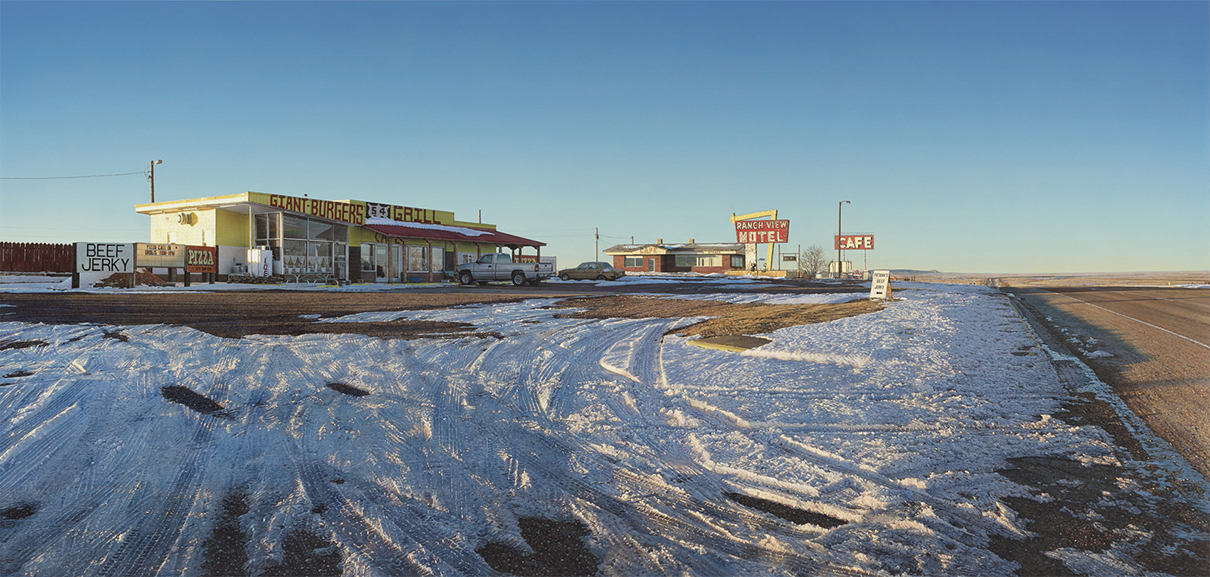
54 Grill, Vaughn, MN, 2016, 30.5 x 64 inches.
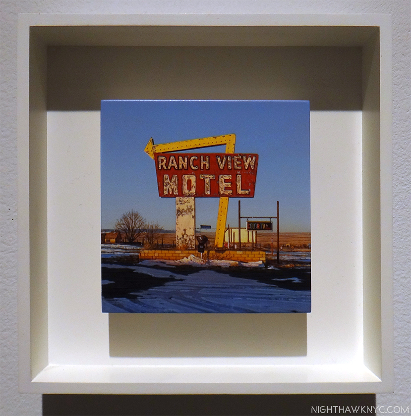
Ranch View, Vaughn MN, 2013, 4 x 4 INCHES! These three works show 3 views of the same place, something Mr. Penner would revisit, in a way, in his recent show. This is the work that hooked me- the first piece of Mr. Penner’s I saw in April, 2016. Previously, I associated scenes like this with William Eggleston. Now? I think of Rod Penner.
Kenn Sava (KS)- In reading about your background, you’ve mentioned your folks being supportive of your skill and development, but I haven’t been able to learn if you studied with someone, if you studied Art in school, or if you are self-taught, as well as what road your education and development as an Artist took. Were you Painting when you arrived in Texas? If so, were they the same (general) style as the work we see on your site from 1992, or did you ever work in a different style?
Rod Penner (RP)- Growing up, our family enjoyed camping, hunting, and fishing. I painted wildlife during this time, emulating the work of Robert Bateman and other Canadian wildlife artists.
After graduating from high school, I attended a local community college for one year and then transferred to Oral Roberts University in Oklahoma where I graduated with a B.A. degree in Studio Art, and while I found myself at odds with certain aspects of the theology, overall it was a positive experience. It was at ORU where I met my beautiful wife, Debbie, and we both made lifelong friends among the students and faculty.
Following college, we married in 1986 and moved to British Columbia. when I started intensely studying the work of Canadian realist painters, Christopher Pratt and Alex Colville. I had a lot of wildlife art commissions at this time and even started selling through a well-known gallery in Denver but the animals became less and less important in my paintings. In 1988, Debbie’s brother was killed in a biking accident, so we moved down to Texas to spend time with her family. We ended up staying and I welcomed the change as a way to start over with my art and break away completely from what I was doing. I got a part-time job teaching, but Debbie worked full time so I could paint. She has always believed in me and supported my efforts. The same year that our second child was born in 1991, my youngest brother died in a plane crash. Nine months later, I gained representation by Ivan Karp and his O.K. Harris gallery, allowing Debbie to quit work in order to stay at home to raise our children. I’ve supported our family ever since solely on the sales of my paintings.
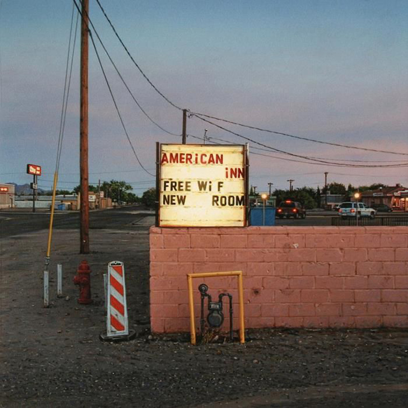
American Inn, 2011, 6 x 6 inches.
KS- What inspired you to get into Art? Who were the Artists you liked early on, and which influenced you early on?
RP- Shortly after arriving in the Lone Star State, I rediscovered the work of John Salt and felt an instant connection. I couldn’t drive past a trailer home (and there are many in Texas) without thinking “Salt.” At this point, I wanted to spend more time in the studio and less time searching out subjects to paint, so I started driving around the town we lived in and took photos of these tract houses that were everywhere. I found them visually interesting. As with all the streets and buildings that I paint, these homes, under certain weather and lighting conditions, became transformed. I painted my first tract house in 1989 and it sparked a series of paintings that were later shown at O.K. Harris in NY.
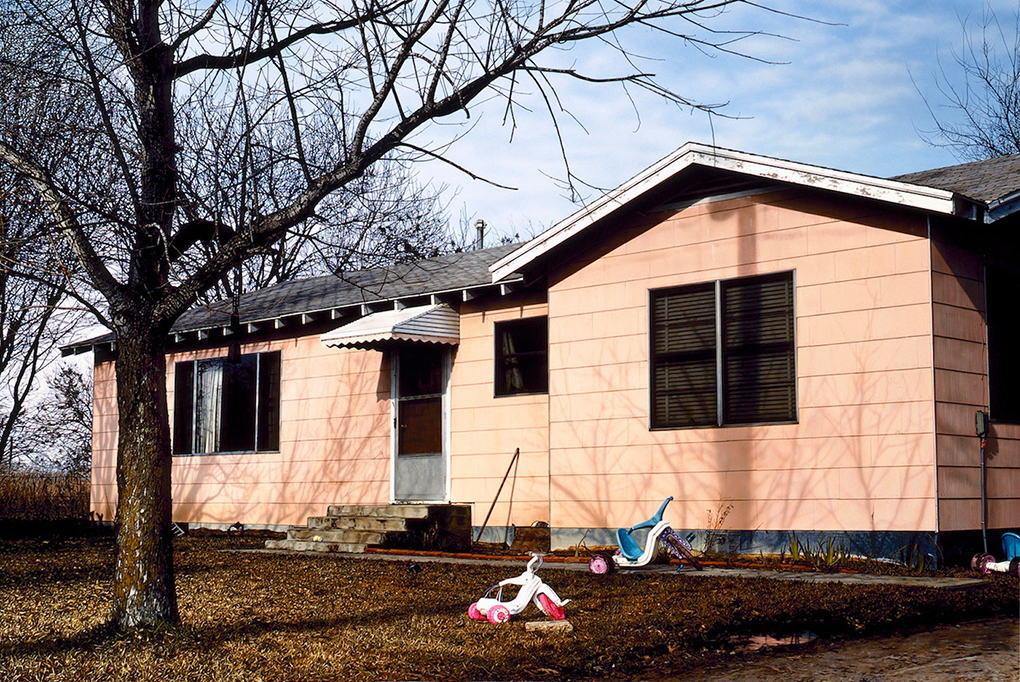
Pink House with Big Wheels, 1992, 36 x 54 inches, is the earliest work in his online Archive.
KS-Your last show at AMY was in 2013. Two of these pieces are dated 2016, the rest 2017. How do you feel your work has changed/evolved since your last show?
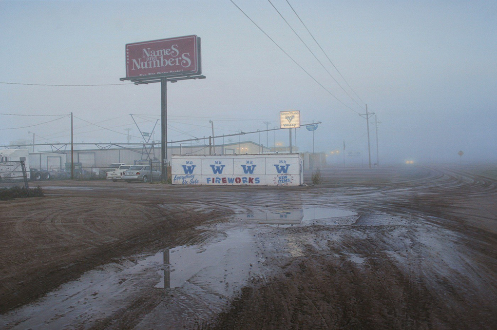
Mr W, Lubbock, TX, 2013, 12 x 18 inches, which appeared in his 2013 AMY, NYC show
RP- Up until 2016, all my previous “micro” paintings were square in shape, but for this show, most of the canvases have a 2:3 size ratio.
I’ve also been exploring more towns in New Mexico.
KS- The work on the catalog’s cover, which is dated 2015 (and is not in this show) appears to be part of this series- a fascinating, alternate view of San Saba Butane. Are there others works in this series?
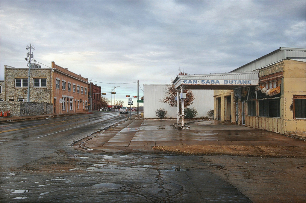
San Saba Butane, San Saba, TX, 2015, 12 x 18 inches, which appears on the recent show’s exhibition catalog’s cover, but which was not in the show. The Painting that was in the show is below.
RP- The painting you’re referring to measures 12 x 18 inches and is based on the photos I took for the series in my show. I’m currently working on a 10 x 15 inch painting of San Saba which will be my final painting in this series. These two paintings will be included in my next exhibit.
KS- I’ve seen you’ve done two views of a same scene in the past, but is this the first “series” of Paintings you’ve done (I know of 10 that are a part of it) of a relatively small area (which feels like it’s within a few blocks), with source material from the same time? Was this a conscious decision- to do a series? Or, is it just coincidental, and the works should be considered independently of each other. (I’m not sure I can do that!)
RP- This show is a first for me in the sense that it is a series of paintings based on photos taken on a single morning of a single town. Most of the locations are in and around the town square of San Saba, TX, and when viewed together they form a more comprehensive “portrait”, both of the town itself, and my personal experiences in this place. That being said, each painting is also meant to stand on its own.
KS- How is your work received locally? Especially in San Saba, if these have been seen there?
RP- I sent a news release for the exhibit, along with some jpegs of my paintings, to a local paper in San Saba but never heard back. Since I don’t show in my hometown of Marble Falls, and rarely in the state of Texas, my work is largely ignored and/or misunderstood. Texas residents have an understandable pride in their communities and my paintings don’t always portray these towns in a cheerful light. However, I’m not interested in painting a romanticized and sanitized version of small-town America. San Saba, along with every town I paint, has its own character, its own curiosities and quirks, its own grit, as well as its own beauty…
So many good memories have been made in this town, but it’s taken almost 16 years for everything to come together in order for me to paint it.
KS- I’m fascinated by San Saba Butane. Without giving away its mystery, is this a place you’re at all familiar with, or is your interest in it purely pictorial?
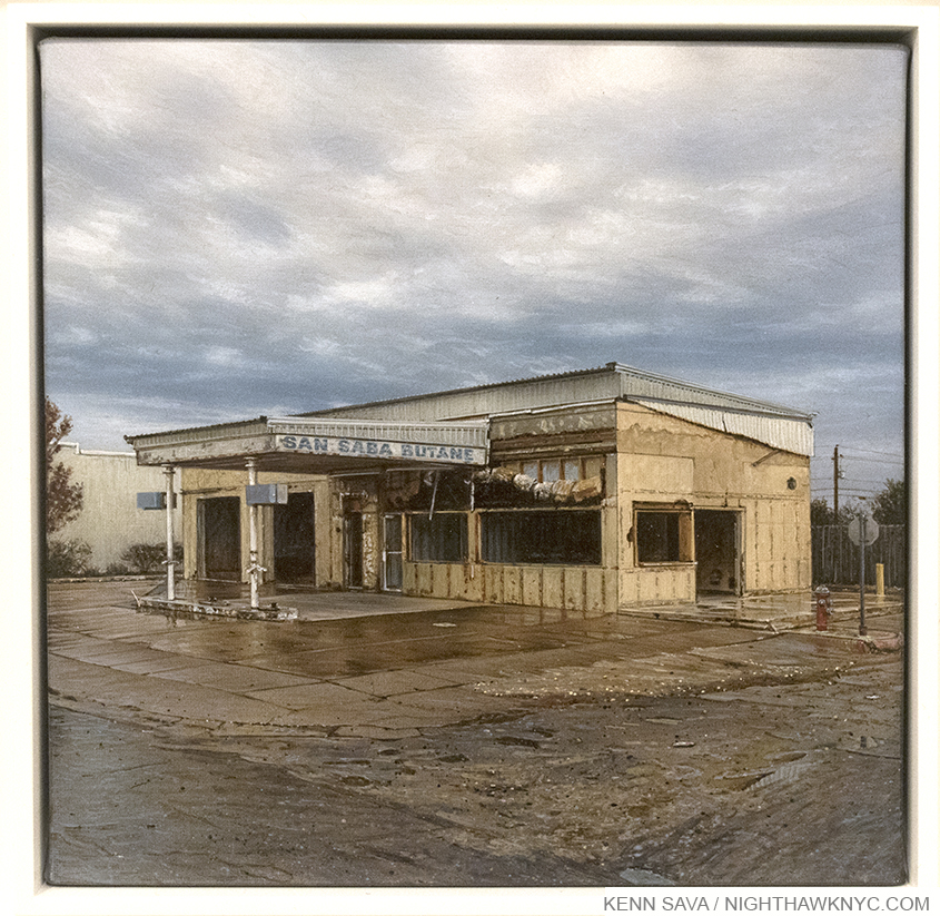
San Saba Butane, 2017, 6 x 6 inches, as seen in this show.
RP- I first photographed San Saba Butane around 15 years ago and have witnessed its slow deterioration over the years. Who owned it and what it was used for doesn’t interest me.
KS- We’ve discussed people calling your work “photorealism,” yet there is a lot of abstraction in your work- the clouds, the cracks in the pavement, the tree branches, patterns of bricks, peeling paint, and on and on. Of course you know its there. What role do you feel abstraction plays in so-called realistic or representational Art? Do people ever notice it? I also saw you mentioned John Zurier, and that makes me wonder if he’s influenced your skies.?
RP- The formalist qualities in my paintings are important. The placement and shapes of clouds, pavement cracks, branches, etc, is always intentional. I’m good at arranging these components within a picture plane while photographing, but afterward, I edit, so that these elements ultimately serve my purpose which is to create a certain mood and a strong composition. Also, you’ll find smaller engaging areas of abstraction within the paintings which I enjoy incorporating. I think this comes from studying and appreciating a range of different styles of painting.
Regarding Zurier, I’m not consciously thinking of his work while painting my skies, but I’m sure he’s influenced certain elements of my art. He creates this terrific sense of light and weather with just pure pigment and the mood in his paintings elicit a certain quiet meditative self-reflection.
Commerce St, Brenham TX, 2002, 24 x 36 inches. One of two Paintings I’ve seen of his with an actual person in it.
KS- You’ve been in Texas just about 30 years now, would you have been shocked if someone told you in 1988 you’d be here for (at least) 30 years? Does being originally from somewhere else (a city, no less) help you in Painting these scenes you’ve been doing all these years?
RP- The Texas Hill Country is a wonderful place to raise a family. Moving here from Canada allowed me to observe my surroundings with the objectivity of an outsider. I don’t have any memories of these locations before the age of 22; however, they do evoke memories from my childhood, but it has little or nothing to do wth a specific building or street. On the flip-side, living here for almost 30 years has endeared me to Texas, and prevents me from patronizing my subject matter.
KS- In the introduction to the show’s catalog, Mr. Seed mentions your reacting against big (large) Painting by others in these quite small works. What is it about big Paintings that you don’t like?
RP- I don’t dislike large paintings per se, only pretentious, self-serving large paintings that tell me what to think and feel, and much of the current art world seems to embrace that kind of work.
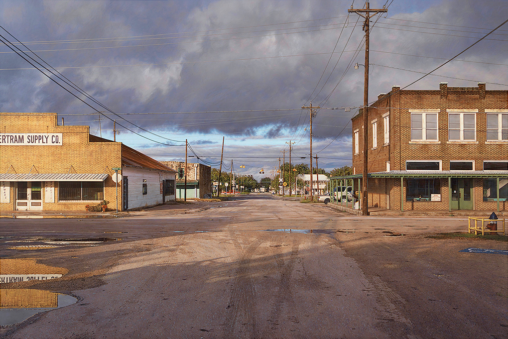
Bertram Supply Co, Bertram, TX, 2016, 36 x 54 inches. One of Mr. Penner’s larger works.
KS- Your taste in art is wonderfully eclectic, ranging from the Dutch & Flemish Masters to the Hudson River School to contemporary Artists including Andy Piedilato. Is there a common thread to the Art you like? When you look at Painting, what do you look for? What makes someone an excellent or great Painter in your book?
Ice Spine, 2015, 102 x 126 inches, left and Pinched Red Sail, 2016, 100 x 117 inches, right, by Andy Piedilato, seen at Danese Corey, NYC, in October, 2016
RP- Someone who has command of their medium and uses it to express mature ideas.
KS- What do you think of NYC? Has anything you’ve seen here ever grabbed you to paint it?
RP- NYC is our favorite place to visit but no, I have never felt an urge to paint it.
KS- Finally, if you were going to suggest to Art Lovers they look at one thing, one style, period or (I’m not a big fan of this word- “school”- unless the Artists themselves put themselves in that group), or the work of one Artist, that you feel has been overlooked, or is especially “important” today, what, or who, would it be?
RP- Perhaps the Tonalists; John Francis Murphy, Bruce Crane, and Birge Harrison are three of my favorites. Contemporary painter Catherine Murphy is in a class of her own. John Salt definitely deserves more attention and credit.
For anyone interested in knowing more about Rod Penner’s Art, as I write, the current resources are-
-Rod Penner has a website, which includes an Archive of his work that goes back to 1992, and includes links to his FB and Instagram pages.
-Ameringer McEnery Yohe has additional info, and details on the past shows they’ve held for Rod Penner here. They also published a catalog for this recent show, and copies of it may (keyword “may”) still be available through them. I’d hurry.
-John Seed’s two pieces may be found here, and here. He also wrote a piece for the AMY catalog.
(And, I have written about him twice previously so far, here and here.)
I’m grateful to Rod Penner for taking the time to answer my questions, for speaking with me at the very hectic opening of his show, and to his wife, Debbie, and their family, for allowing him to take some time away from them to do so. They’ve been married 31 years. I should have asked him what the secret to that is!
*-Soundtrack for this Post is “Last Chance Texaco,” by Rikki Lee Jones, from the classic album of the same name, and published by Rikki Lee Jones. You can see her perform it here.
NighthawkNYC.com has been entirely self-funded and ad-free for over 6 years, during which over 250 full length pieces have been published. As I face high expenses to keep it going, if you’ve found it worthwhile, please donate to keep it up & ad-free below. Thank you!
Written & photographed by Kenn Sava for nighthawknyc.com unless otherwise credited.
To send comments, thoughts, feedback or propositions click here.
Click the white box on the upper right for the archives or to search them.
For “short takes” and additional pictures, follow @nighthawk_nyc on Instagram.
Subscribe to be notified of new Posts below. Your information will be used for no other purpose.
This site is Free & Ad-Free! If you find this piece worthwhile, please donate via PayPal to support it & independent Art writing. You can also support it by buying Art & books! Details at the end. Thank you.
Written & Photographed by Kenn Sava (*- unless otherwise credited)
This is the fourth Post in my series on “The Photography Show, 2017,” aka “AIPAD.” The first three Posts are here. AIPAD was, also, my NoteWorthy Show for March.
This time, I’m finally going to show some Photographs! After all? Isn’t that why anyone went? I’ve shown some in my prior Posts, and here are some more (with who was presenting it, of course), along with a few shots of Gallery Booths (after all, it’s the work being shown that matters, right?), and one of the Collections, (which were included this year for the first time), that stood out to me. Then, I’ll wrap up all of my coverage with the reaction to the show of the Gallerists I spoke to, as well as my own. Ok. Let’s see pictures!
“Look at that cloud
As high as a tree
At least that’s how it looks to me
How about you?
What do you see?
What if we see things differently?
Show me how the world looks through your eyes
Tell me about the sunrise, let me see the stars shine
Show me how the world looks through your eyes”*
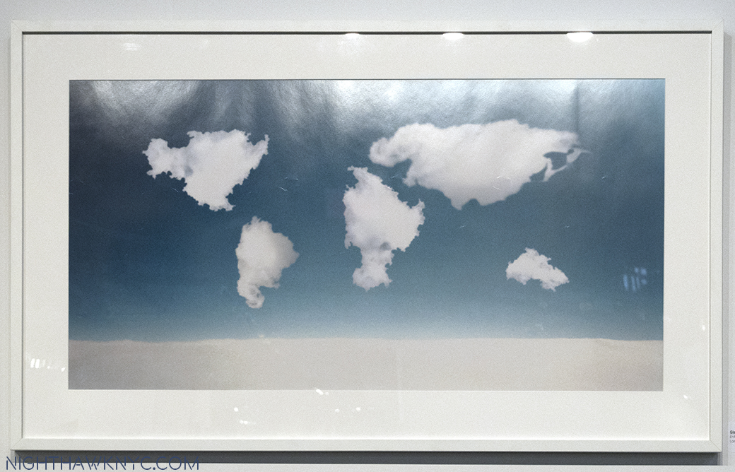
Speaking of “Look at that cloud…,” this is Glenda Leon’s “Between the Air and Dreams,” 2008, from The Plonsker Collection of Cuban Photography (see below). I don’t know if the clouds REALLY aligned like this, but it sums up the global scope of The Photography Show, 2017. Click any image to enlarge.
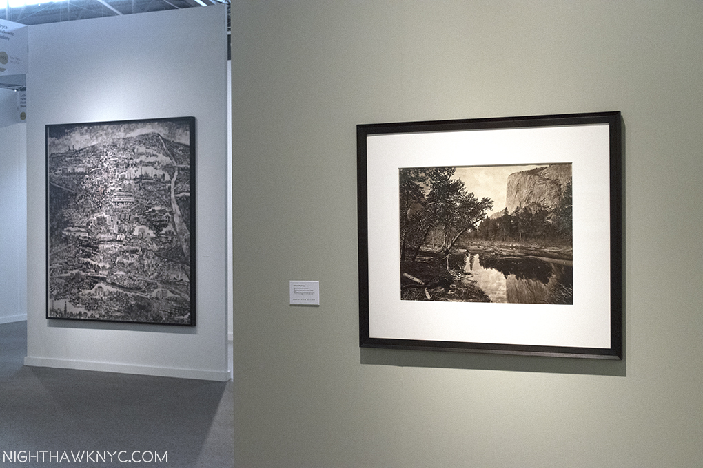
A world, and 140 years apart, gives an idea of the range seen at AIPAD. Sohei Nishino’s incredibly complex “Diorama Map of New Delhi,” 2013, at Bryce Wolkowitz left, across the hall from Edward Muybridge’s equally incredible 1873 “View of Yosemite” at Robert Koch Gallery, right.
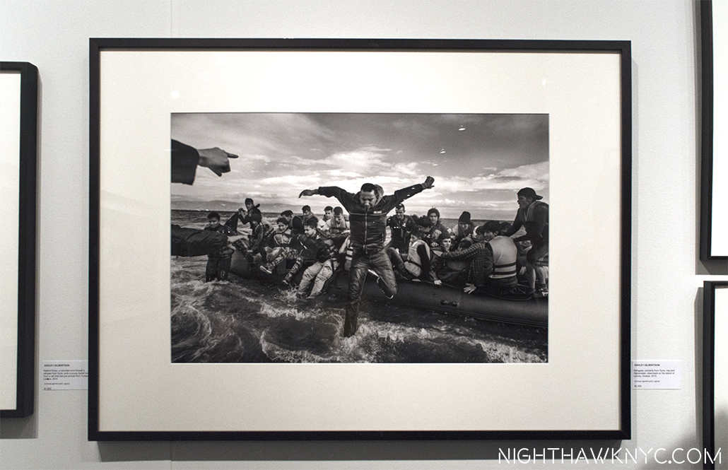
Ashley Gilbertson’s “Refugees Disembark on Lesvos, Greece, 2015,” quickly becoming iconic, at Monroe Gallery, where…
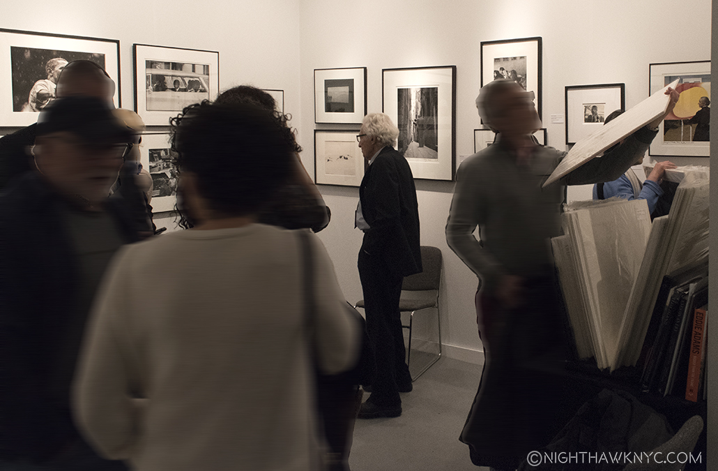
I still can’t believe that really was the legendary Tony Vaccaro. Seen with a wall of his masterpieces to his right. Georgia O’Keefe (below), Picasso, “The Violinist,” Hitler’s Eagles Nest and a fallen GI, from the far right corner, behind him, at Monroe Gallery’s booth.
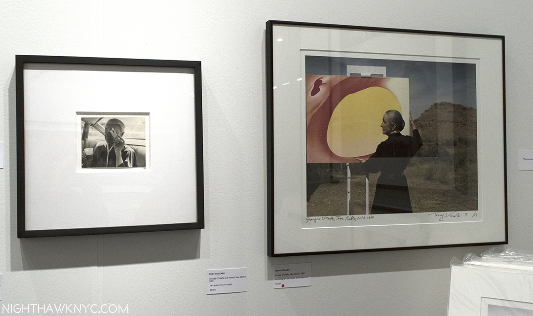
Living history. Mr. Vaccaro actually knew Georgia O’Keefe (seen in both of these), Jackson Pollock, Frank Lloyd Wright, and on and on.
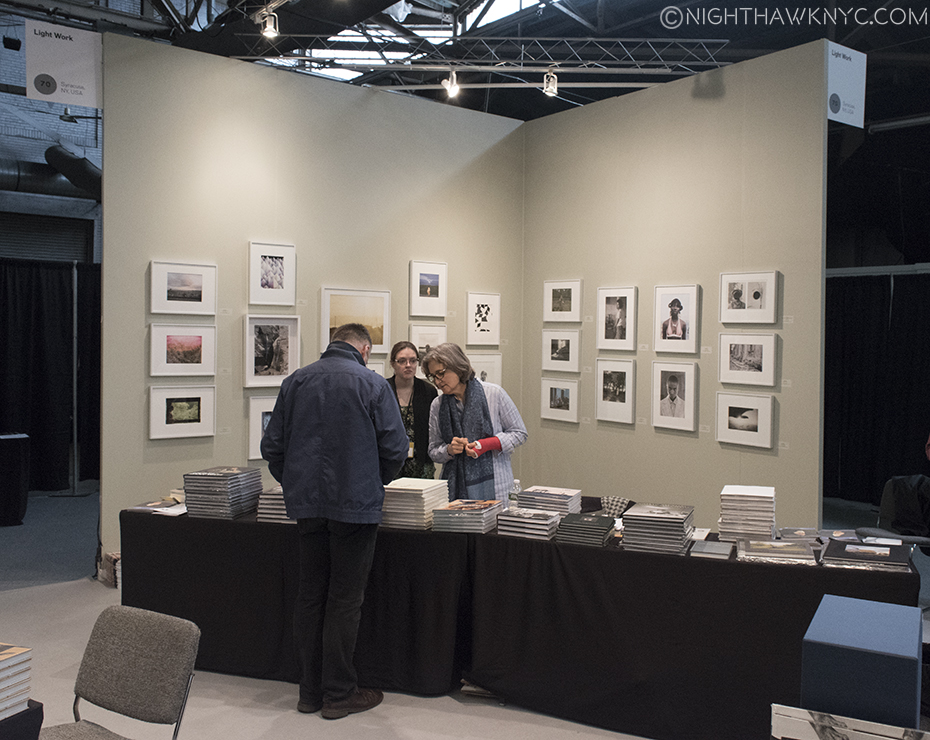
Want to buy top quality work by major Photographers in signed, limited editions for as little as 300.00? Check out Light Work, at lightwork.org, a non-profit in Syracuse, NY. The money goes to help Photographers. Their astounding list of their Artists In Residence to date, which includes Cindy Sherman, can be seen here.
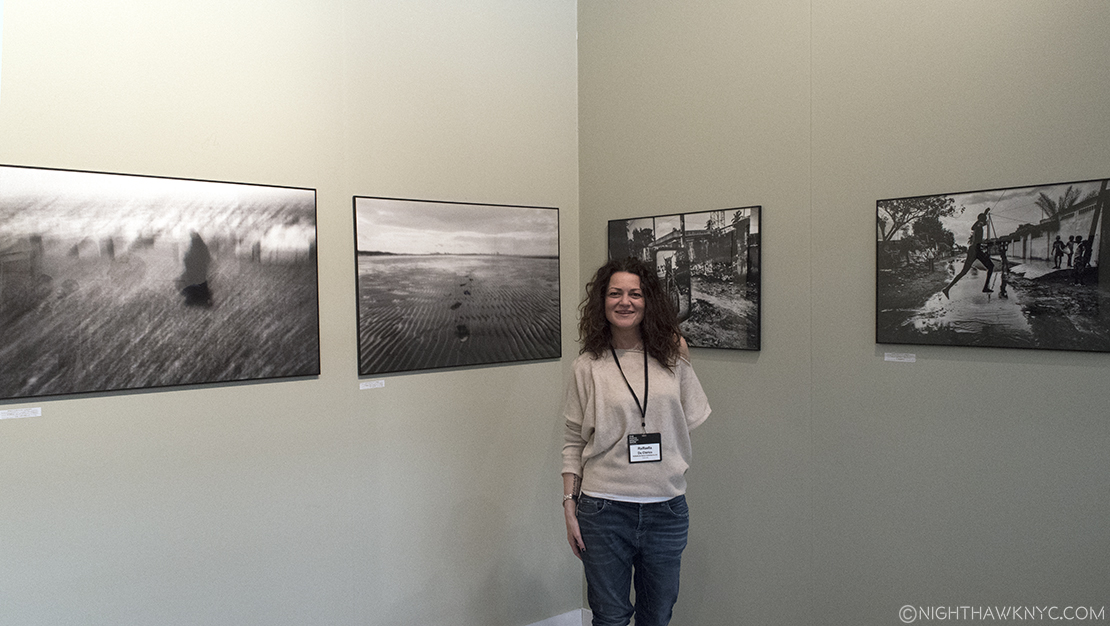
Wonderfully friendly Gallerists were on hand from all over the world, like Raffaella De Chirico, all the way from Turin, Italy, bringing stunning work…
like that of Fabio Bucciarelli, with her, which she sold shortly after I got this photo.
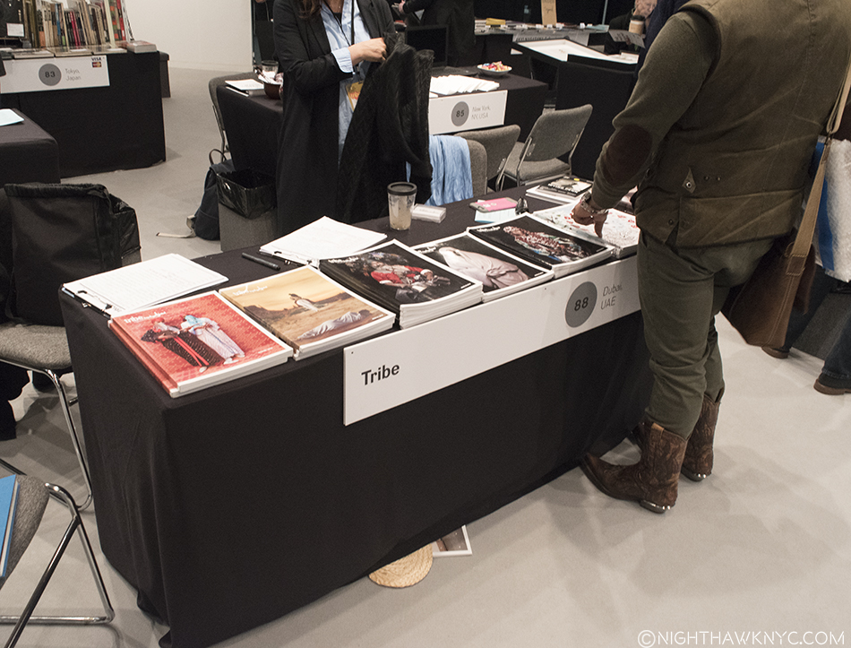
Tribe came all the way from Dubai, U.A.E. to represent the thriving Photo world in 22 Arab countries.
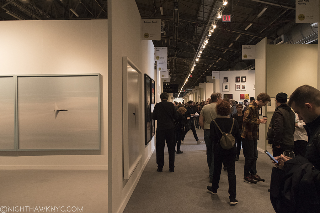
With Galleries as far as the eye can see (check out the signs up top), you’ll need a plane. This is only one aisle of them.
Collections were a new feature this year, including the Plonsker Collection of Cuban Photography, above, and the renowned Walther Collection.
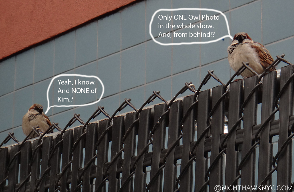
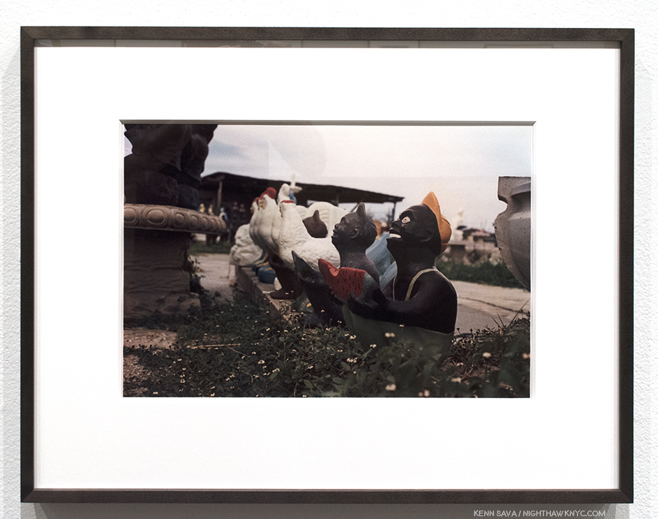
Intermission. In case you need a rest, here’s a little thing I call “On The Fence, #1- AIPAD Edition,” 2017. The Owl in question was by no less than Masao Yamamoto at Yancey Richardson.
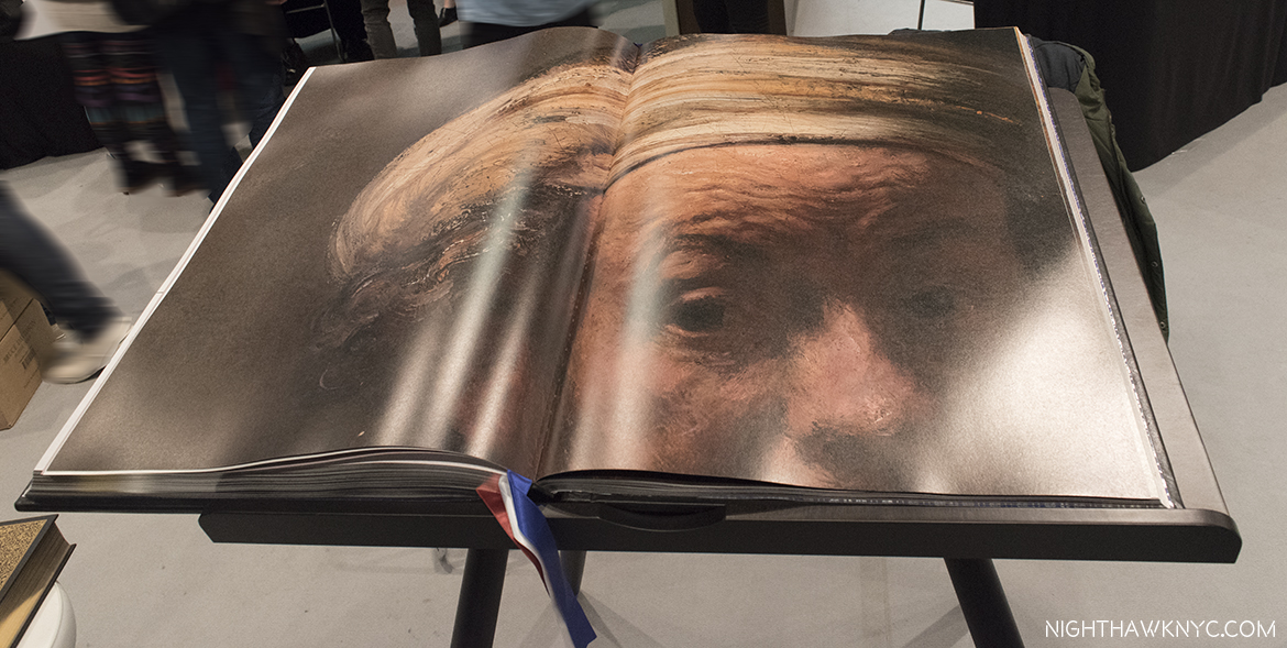
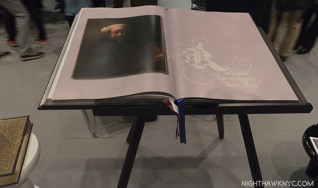
Far & Away THE most amazing book on view, and that’s saying something- “Rijks”. $7,000.00 per, and 55 pounds. Huge! It comes with the table.
Seen the way Rembrandt created it. An immortal “Self Portrait,” as never seen before- UNFRAMED, gives a remarkably different effect.
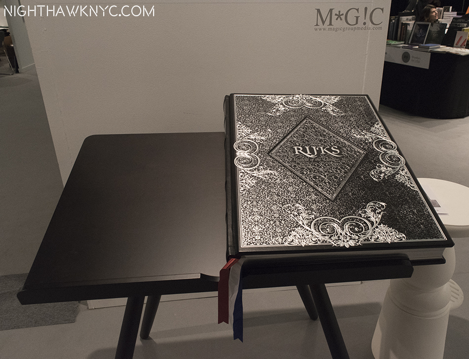
More workmanship went into the cover of it than I could explain in an entire Post.
I know what you’re thinking- “The ‘Painting guy’ goes to The Photography Show and winds up writing about what else? A PAINTING BOOK- The ONLY Painting book in the place, no less! Well…Yes, and no1. It’s “Rijks: Masters of the Golden Age,” published by Marcel Wanders (Uitgeverij Komma and Magic Group Media), a book of photographs of paintings, but not just any paintings. 64 masterpieces from the Rikjsmuseum, Amsterdam’s “Gallery of Honour,” like you will never see them- UNFRAMED. Yes. You read that right (It STILL blows my mind) with details of each blown up to over 1,000%! Of course, I couldn’t stop looking at it, and just WOW! It may well be the greatest, the most beautiful, and the most well done Art Book I’ve ever seen. I’ve never seen Rembrandt in anything close to this level of detail. I told them that most of it’s pages would make stunning posters. For the “rest of us,” who don’t have the 7 grand, the space, or both for this incredible book, there is a smaller version available for 150.00. It’s cheaper than a plane ticket to Amsterdam!
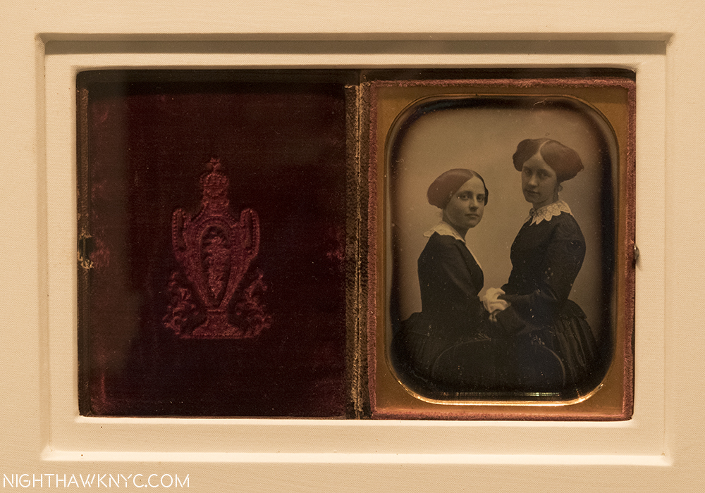
Forever young. “Two Sisters,” 1850, by Southworth and Hawes at Contemporary Works/Vintage Works, Chalfont, PA.
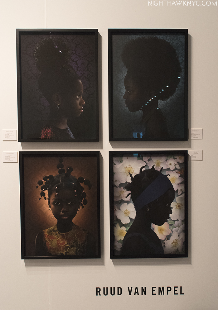
Interesting to contrast with these hauntingly beautiful portraits of the moment by Ruud Van Empel at Jackson Fine Art
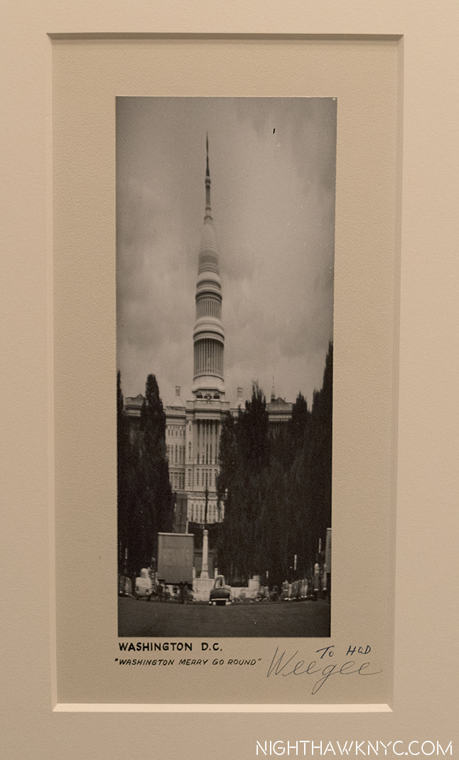
“Washington Merry Go Round,” 1950, by Weegee. An unusual work of his using lens experiments, and a very rare signed piece by the NYC Legend, at Michael Shapiro Gallery.
“Mommy, Are you SURE Kate Moss started out this way?”
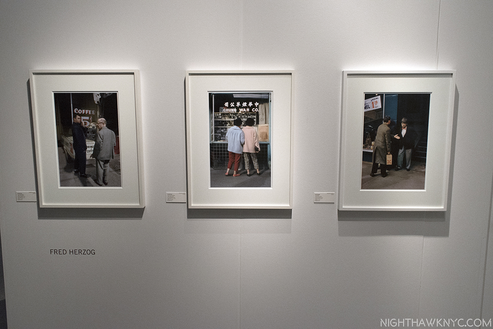
Fred Herzog, who began doing color street photography in Vancouver circa 1954, and continued for 50 years, has only been shown since 2007. He has a marvelous eye, and a universal charm that is only beginning to be as recognized in the USA, as he is in Canada. Vancouver’s Equinox Gallery revealed his range over about 25 wonderfully chosen works.
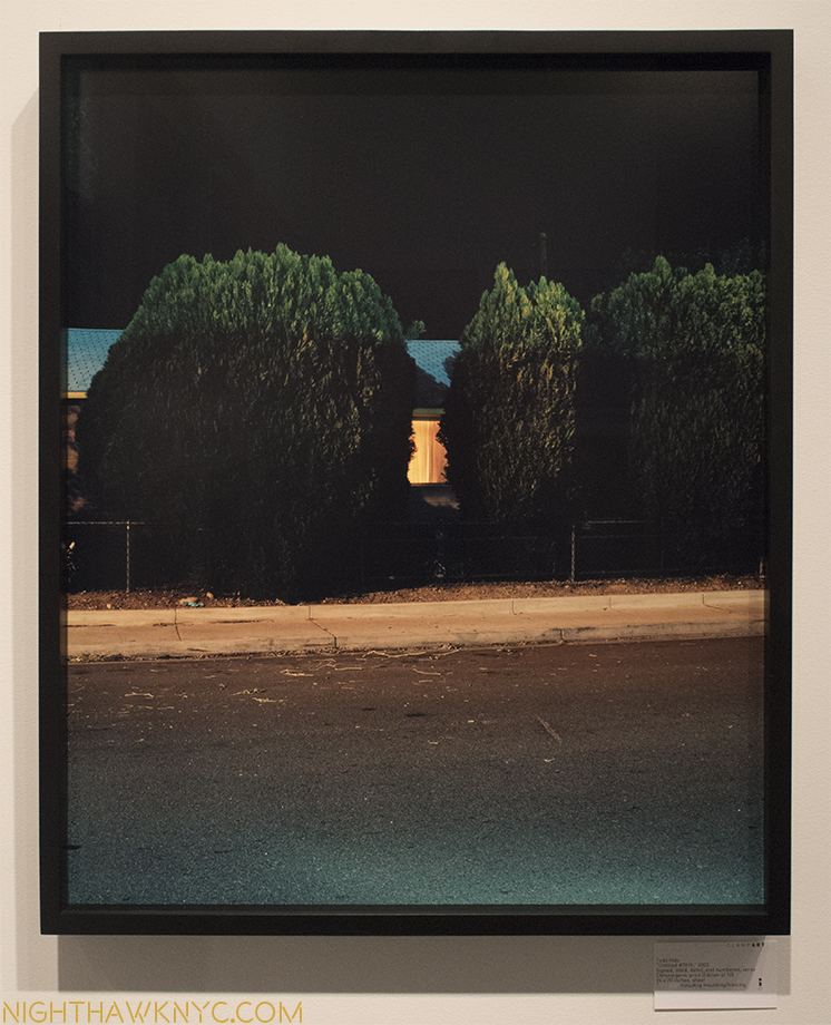
Todd Hido, from his classic series, “House Hunting, 2002,” at ClampArt, NYC. Somebody better buy this before I do!
And, Finally- Summing up AIPAD…
I spoke to approximately 25 Gallerists (out of the 115 or so attending) about their experience at AIPAD starting on Thursday, and followed up on Sunday as the show was about to end. I’ve continued to do so with those I encountered this week as the dust was still settling. (Amazingly to me, most of the NYC Galleries had shows going on WHILE they were at AIPAD!) Of course, there was a range of reactions. Most of the Gallerists I spoke to seemed pleased. Some thought the show was too big, others wondered about the inclusion of the book area. Early on (through Thursday night), most of those I spoke with weren’t happy. “I could have done this from home,” one told me, summing up the general feeling. This was understandable as there was an absolutely torrential rain storm that lasted all day and night Thursday. Given Pier 94’s out of the way location (the trade off for getting it’s generous size), only the very, very dedicated somehow found a way to get to the show (the MTA runs not exactly near it, and cabs in hard rain that far west are as rare as finding a real, signed Diane Arbus at a flea market. There were shuttles, but I never tried them). Friday, the crowds returned, and the show seemed well attended, as far as I could tell, from then on. Activity seemed steady at the Gallery booths, in the book area (aided by a never ending string of book signings), and in the talks. The two cafe areas looked pretty full much of the time. It was hard to judge sales by only looking for red dots on title cards or lists, so I asked. No one dodged my question. On the contrary, most seemed eager to express their experience and feelings. A surprising number had taken the time to wander around and see the show, and were well versed in specifics of what they saw, which was fascinating. Some bemoaned the encroachment of “video,” which I agree with, unfortunately extending to Colleen Plumb’s “Path Infinitum,” a very laudable work about animals in captivity, being out of place in a Photography show. Some felt there was relatively little older/classic work. I found this interesting given that the Art/Painting Gallery world is so skewed towards Modern & Contemporary Art- the number of Galleries showing “classic” works is, relatively, small. I expected to see something similar at AIPAD, especially since I have been to most of the NYC Galleries who were exhibiting. (This was my first AIPAD.) Personally, I was surprised by the number of beautiful classic works by Ansel Adams and Robert Frank, though I was disappointed to see only one William Eggleston, only a handful of Saul Leiters, and no Araki’s (I am sure I just missed them. Many of Araki’s books were present in the book area).
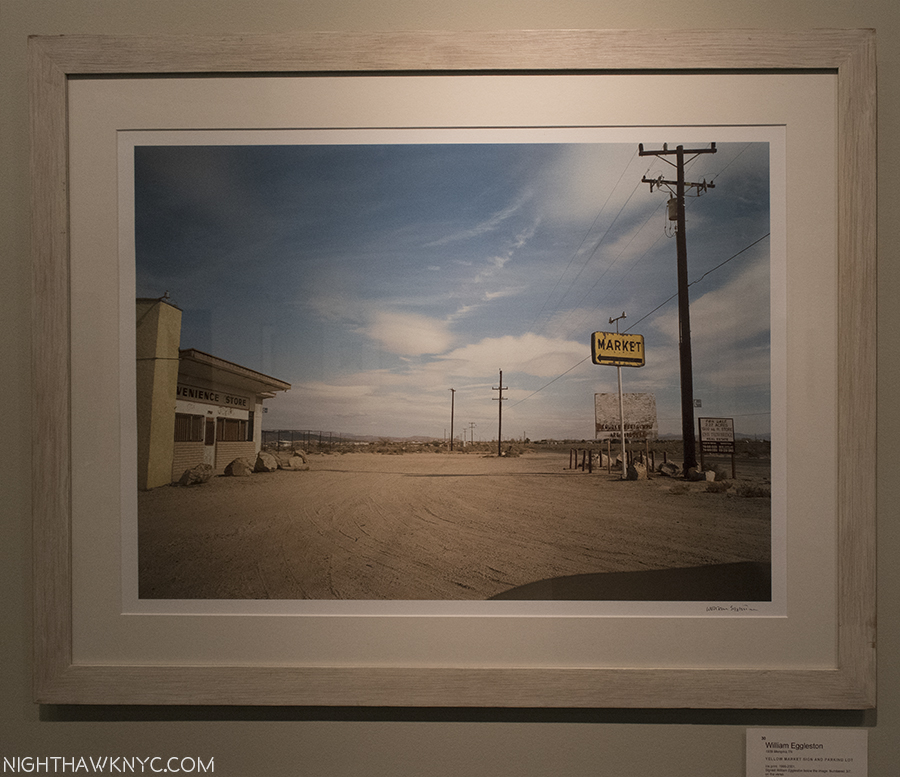
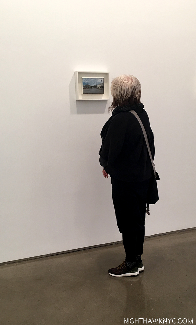
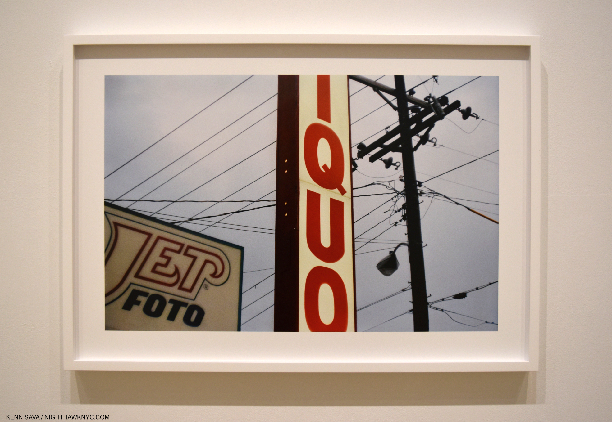
The hair of the dog that bit me. William Eggleston’s “Yellow Market Sign and Parking Lot,” 2001, at Jorg Maass. The only work by the Photographer that I saw. He started all this “trouble” for me back in December, and STILL only continues to grow in my esteem, which surprises the heck out of me, Typically, this work haunts me. What better way to close this chapter?
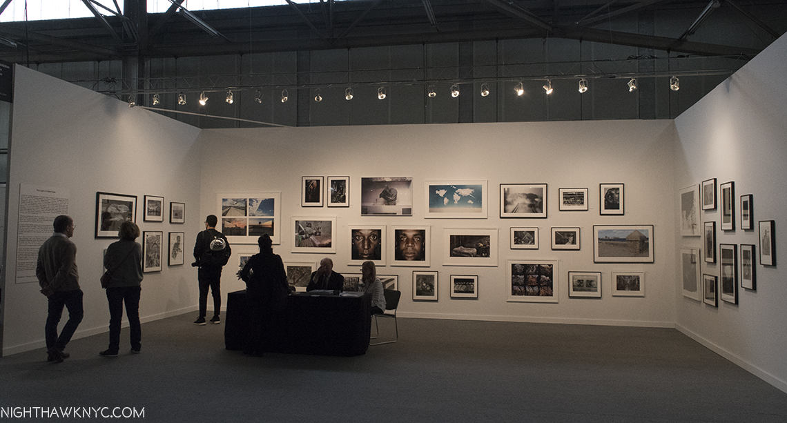
From the following generation of Photographers, there were only a couple of Bruce Davidsons, and Sebastiao Salgados, though there was a nice group of Ernst Hass, who’s “Route 66, Albequerque, New Mexico,” 1969, seemed to stop everyone who passed it at Atlas Gallery. Personally? I came looking for great Photographers previously unknown to me, and aided by an expert, the man called Jackson Charles, I added about 100 names to my lists. Most of the Gallerists I spoke with agreed that there was an impressive amount of PhotoJournalists on display, a number of who turned their cameras on the refugee crisis, with amazing results. Particularly surprising, and impressive, for me were the Galleries that came the longest distances, like Raffaella De Chirico from Turin, shown above, often showed PhotoJouralism, or other similar work that many deem “difficult” to hang. Others who traveled significant distance, featured Photographers who are not big names here, but who’s work deserves more attention, like Shoot Gallery, Oslo, I wrote about earlier.
Too Much Is Never Enough In New York. That’s Pier 92, seen from half way down Pier 94 (where AIPAD was) to give a sense of size. Pier 92 is SMALLER than Pier 94!
The reaction of the attendees I heard most often later on Saturday was their feet were getting tired. It dawned on me that if there wasn’t so much worth seeing, they would have left before their feet got tired. I heard mixed things in the book area. Some Booth-holders were very pleased with how they did. Others not so much. It seemed to me it drew a lot of visitors, not surprising given how many Photographers were on hand for book signings throughout the show. A number of publishers debuted titles, or brought about to be released books. I think there were quite a few people who went to AIPAD purely for the book area. (Maybe this will lead to a separate PhotoBook show…?) Some of these tables seemed a bit small and crowded together (just like NYC Apartments), but the range of Publishers and Organizations present in this area I found most impressive. I hope they are included next year, and the layout is improved.
Personally? I found AIPAD to be professionally staged, managed and run throughout. I think most visitors were impressed by it. I found little to complain about- and I looked hard. Getting to and fro was the biggest downside, in my opinion. In the end, I hope lessons are learned from this year’s show to make a very good experience even better next year.
Thank You’s-
I can’t leave AIPAD without thanking the following people-
-Jackson Charles- Photography & PhotoBook Expert Extraordinaire, for his guidance and insights above and beyond the call of duty over FOUR days.
-Kellie McLaughlin of the legendary Aperture Foundation for introducing me to Gregory Halpern, and considerations throughout
-Paul Schiek and Lester Rosso of TBW Books for introductions to Jim Jocoy, Raymond Meeks, and other considerations
–Jim Jocoy for sharing his extraordinary experiences, and amazing new book with me
–Raymond Meeks for sharing his beautiful work, especially his lovingly crafted hand made new release
-Danny who turned me on to Curran Hatleberg
-Forrest Soper of PhotoEye for turning me on to Moises Saman’s “Discordia”
-Sophie Brodovitch of Equinox Gallery, Vancouver for her Fred Herzog expertise, and consideration
-All the Gallerists and Organizations who spoke with me and shared their expertise and insights with me.
-Margery Newman of Margery Newman Communication for her help and consideration throughout
And, finally, to Bruce Davidson, and all the great Photographers, past and present, all over the world, who are the reason we went to AIPAD- To see the world through their eyes.
*-Soundtrack for this Post is “Through Your Eyes,” written by Richard Marx and Dean Pitchford, published by Wonderland Music Co., Inc.
This is the 4th and final Part of the most extensive coverage of AIPAD, 2017, available anywhere! The rest of this 4-part series is here.
NighthawkNYC.com has been entirely self-funded & ad-free for over 8 years, during which 300 full length pieces have been published! If you’ve found it worthwhile, PLEASE donate to allow me to continue below. Thank you, Kenn.
You can also support it by buying Art, Art & Photography books, and Music from my collection! Art & Books may be found here. Music here and here.
Written & photographed by Kenn Sava for nighthawknyc.com unless otherwise credited. To send comments, thoughts, feedback or propositions click here. Click the white box on the upper right for the archives or to search them. Subscribe to be notified of new Posts below. Your information will be used for no other purpose.
This site is Free & Ad-Free! If you find this piece worthwhile, please donate to support it & independent Art writing. Thank you.
Written & Photographed by Kenn Sava
William Eggleston- The Democratic Forest @ David Zwirner. It’s impossible for us to “see” Eggleston’s work now the way the way it was seen in 1976 when 69 images were presented at MoMA in the legendary show, Photographs by William Eggleston (which you can relive, here, in glorious black & white). In that black & white world, it was received as “shocking,” and widely panned (famously by The Times). If anything, today, there are “too many cameras and not enough food,” as Sting sang, and too many pictures in the world, so, perhaps I shouldn’t be surprised to read a number of comments on Eggleston’s books, shows and works where commenters say they don’t see what’s special about it, or, that, as has often been said about Jackson Pollock, they could do it. Hmmm…Many, many have tried, and are still trying. What’s lost in translation in seeing Eggleston in 2016 is how many photographers have “gone to school” on his work, over the past 40 years, learned from it, and yes, copied it 1, so that much of what he is famous for is now omnipresent. Yet, it’s barely 40 years since his breakthrough at MoMA.
Depth of Field. Untitled, 1983-86, as each work here is so named and dated. Leica can’t buy advertising like this, and the rest of what is on the walls of this show. Note the endless mirror Self Portraits, that mimic all the bottles, jars and cans.
Countless professionals and amateurs shoot “the everyday,” the seemingly mundane now. Who’s to say what’s good, what’s bad, and what’s “Art?”
The road less traveled…It doesn’t exist in Manhattan.
As always? Time will. In the meantime, what about the work of William Eggleston in 2016?
On the left, a classic shot of the so-called “mundane.” On the right, possibly a color Homage to Robert Frank’s The Americans, an early influence.
William Eggleston, now 77, has been making photographs since his college days, closing in on 60 years ago. He’s often called “the father of color photography,” which puzzles me. He was not close to being the first Photographer to shoot in color, nor the first to create a substantial body of work in color. Nor was he, as has often been reported, the first Artist to have a solo show of color Photography at MoMA. Ernst Haas beat him to that honor by 14 years with Ernst Haas: Color Photography at MoMA in fall, 1962! It can be seen here. Still, it’s enough passage of time for some things to be known. For one thing, his work still seems to be gaining in popularity. For another, it still garners a lot of respect from both his fellow Photographers, and Museums, judging how widely they hold and show his work. William Eggleston Portraits at the National Portrait Gallery, London this fall, drew raves. Millions of dollars are being spent on his work at auction. He, and his Eggleston Artistic Trust2, left the Gagosian Gallery this past June and signed with the equally prestigious David Zwirner Gallery for representation, (this being their first show), and this century has already seen a steady stream of stunning books and huge box sets by Steidl, which have the look and feel of monuments, that sell out and some then command a thousand dollars a copy, and more, on the aftermarket.
Famous for his very vivid colors, I found the shot on the left, with it’s pastel colors, equally effective.
In October, The New York Times featured him as one of their six “Greats,” along with superstar (my term) Artist, Kerry James Marshall, and Michelle Obama. William Eggleston is big time. Ok. So, back at David Zwirner on West 20th Street, how’s the show?
The shot on the left (who’s location is unknown to me) makes me yearn to see shots of his taken in NYC.
30-odd years after these works were created they retain a surprising freshness and resonance that’s not easy to explain. I’m not sure it’s entirely the famous(ly) bright colors that are solely responsible for this, either. They’re undoubtedly a hook, but there’s far more going on, and there are works that don’t feature “knock your eyeballs out” colors that are equally compelling. Following in the tradition of Cartier-Bresson and Robert Frank, he has taken their ideas someplace else. Someplace subtle, or very subtle, mundane, often easily overlooked. A place decidedly “American” (in these works), that American viewers instinctively recognize, and one that must look like Mars to the foreign eye. Heck, in a few more years, it’s going to look like Mars to ANY eyes. Yes, so many others have tread this ground since Eggleston’s work became widely seen. They shoot similar subjects, using the same camera. But, in the hands of a visionary master of the medium, the results are truly unique. Seeing 40 works together reinforces all of this, and reveals intimacies about his approach and style. Seen in isolation this sense is harder to glean. His work has a feeling of spontaneity that is, also, often copied, perhaps, increasingly. Watching him at work in documentaries, we see this spontaneity is not contrived. Frankly? I marvel at it. What is going on in his mind as he approaches his spot? As he composes and frames? Untold millions walk around with cameras, raise them and take a photo. None are these. How is this possible? Also an Artist (his book Paris featured his Art alongside his photos), as well as a musician, it should be no surprise that he has one hell of an eye for composition (which can be seen in even his earliest black and white work), and which I feel is under-appreciated given how rarely I hear anyone mention it. It may be as big a part of his impact as color. His is, also, a painter’s eye, which also sets him apart as a photographer. Perhaps it is this that gives him his eye for the “secret life” of what most overlook in the world. All of these things work together to make a composition of random “things” a personal statement, even without people present in most of his photographs, and they seemingly come together in the instant the exposure takes. With a master technician of photography who’s also an Artist behind the shutter, I think his results are going to intrigue viewers for a very long time no matter how many try to copy and imitate him.
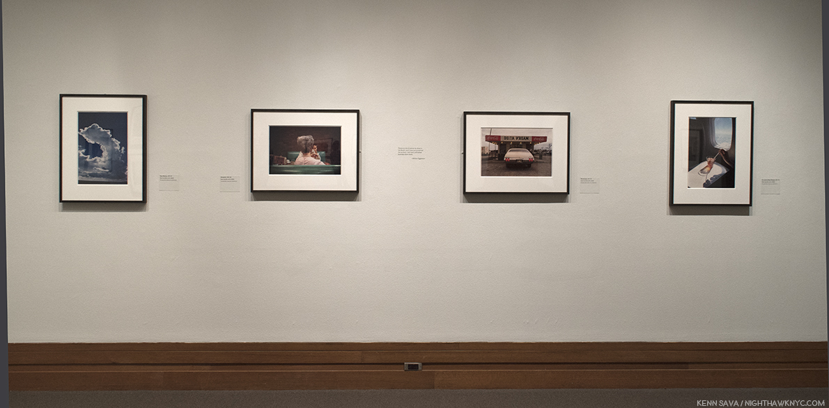
A wall of the smaller, 20 3/4 x 28 3/4 inch, prints for comparison. The work in the center is also in the Whitney, though smaller.
Eggleston said he has over a million and a half images in his archives. They ALL can’t be classics, can they? According to the press release, the show includes 40 works, “the majority of which have not been exhibited previously.” The “Democratic” in the show’s title speaks to the camera’s ability to “render equally what is in front of the lens.” What is rendered in these 40 works includes very few people.
Each work here bears the same title and dating- Untitled, 1983-86. Very democratic, indeed. Not mentioned is that these works are recent prints in a larger size, somewhat controversially, (about 65 x 45 inches, though a few are 20 x 28) Digital Pigment Prints, instead of the Dye Transfer Prints that Eggleston is renowned for, which his works in the collections of MoMA, The Met, and many other places are. For me, the larger size (the original sizes were of the order of 16 x 20 inches), seem to reach for a “painterly” impression. This struck me as soon as I walked in, not surprising, perhaps, since I have looked at mostly Painting in my life. Some succeeded larger, some didn’t. Interestingly, I found images I’ve long struggled with to be among those I am still struggling with larger.
One I’ve struggled with.
This one continues to haunt me with it’s unique blend of a photograph that “borrows” much from painting, then takes it somewhere else.
Another thing that most impresses me…no…blows my mind, is that Eggleston does it taking only a single shot. While he would, no doubt, prefer his work remind me more often of Degas (who, among many other things, was a photographer, as well as a master print maker and immortal Painter), I found myself thinking of him as being somewhere between Edward Hopper/Charles Sheeler and Ed Ruscha/Richard Estes. To study the individual photos in this show closer, check out the exhibition’s catalog. I’ve mostly opted to show the very interesting combinations in which they were hung, which I assume Mr. Eggleston, himself (who was in NYC for the opening, also making rare appearances at The Strand and at Aperture), was involved with, since those won’t be widely documented.
“Well I hope you’re happy with what you’ve made
(Puzzling evidence)
In the land of the free and the home of the brave
(Puzzling evidence)”*
William Eggleston’s worldwide reputation as an important American Artist of our times increases seemingly daily. While his Artistic Trust, which his sons are involved in, seems to have it’s own ideas about the future of his work, it seems assured that his work is going to be seen far and wide for a very long time. With that 1.5 million photos he guesstimated are in his archives, he must have taken some in NYC, as he memorably did of Paris, right? Maybe those will be in a future show called “The Democratic City.”
Francis Picabia @ MoMA- (Note- March 3, 2017. I went back to see this show, again, before it ends March 19, and so I update my Post on it, in hopes of doing it more justice.) Picabia first got me into Abstract Art as a teenager with this work-
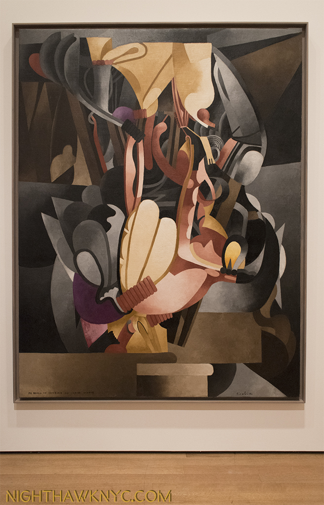
Let’s Get Lost. Picabia’s masterpiece I See Again in Memory My Dear Udnie, 1914. Worth the price of admission by itself.
I bought the postcard of it, which I still have. It sucked me into it- almost literally, it’s grip on my mind, and my eyes, was so intense. It’s a work that looks like you could walk inside and climb around in and explore it’s unprecedented landscape. But, it was it’s title that hooked me…”I See Again in Memory My Dear Udnie.” When I finally climbed back out of it and got around to pondering the name of the work…Well? I’m still pondering it. Most of the other Abstractionists (Pollock, Rothko, Duchamp, even Kandinsky) didn’t usually title their works. This proved a vital “way in” for me. From this, and Picabia’s other works of this period, I discovered Pollock, Kandinsky, Miro, then the Surrealists, Dada, and the Abstract Expressionists. Seeing it, again, in this very well done retrospective brought all of that back to me. I was, initially, startled because I’d forgotten how large it is- over 8 feet high by 6 and a half feet wide. Talk about making a statement. It’s presence, and impact, is still every bit as strong. For me, at least, it’s a central work in his oeuvre. His early abstractions are, still, breathtaking, unique and just gorgeous.
Front row seat to genius. Ecclesiastic, left and Udnie, Young American Girl, both 1913, right. The now immortal Udnie was a dancer named Stacia Napierkowska, who’s on-ship performances Picabia was taken with on his voyage to NYC for the famous 1913 Armory show, a triumph for him. Meanwhile Stacia/Udnie was arrested by the NYPD for “indecent” performances. (Here in the NY Times.).
While Cubism was all the rage at the time (c.1914), I think it’s a shame that other Artists didn’t follow Picablia down this road. Then again? Where else was there left to take it? Perhaps this is why, Picabia, himself, turned his back on this style and adapted others. The man is one of the ultimate chameleons of his time.
It’s not “Cubism,” or “Futurism,” or “Geometric Abstraction.” So? What do you call The Spring, 1912? How about beautiful?
This is a long overdue show, and a big one. It surprised me with Picabia’s endless evolution throughout his career, much of which, post-1925 seems to be a bit in the shadows compared to his early, seemingly endless inventions.
Down in front. The Animal Trainer, 1923, (inscribed “1937”). Fear not- I’ve been assured by MoMA that no Owls were harmed in the making of this Retrospective. Actually? I’m not sure just who is being trained in this work.
It points out that there remains much to see and study in the long career of this defiantly original, prolific and continually surprising individualist. I found myself a bit lost by what came after 1925, but he called me back with his somewhat surprising evolutions during WW2.
Moving on. The Lovers (After The Rain), 1925. Picabia painted over an earlier, abstract work in creating this. I’d love to see an x-ray and see what he chose to paint over.
Good luck trying to stick Francis Picabia in a style hole. He didn’t stand still, as we see here in The Wandering Jew, interestingly, from 1941. A period that features quite a few nudes.
In the end, Picabia is, like I See Again in Memory… one of those Artists who’s work demands, and rewards, repeated viewing. His formidable technique, and endlessly creative & inventive mind gave us an Artist who wasn’t content to stay with one style for very long. When you have that kind of talent? Why would you want to? He was, as he famously said, “a monster.” A monster talent.
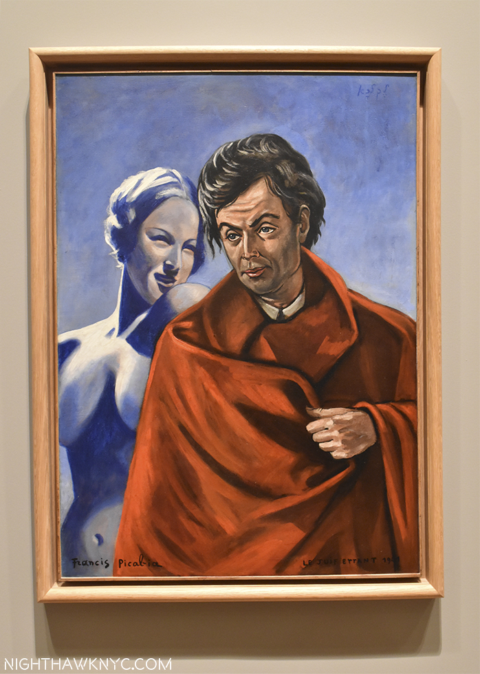
Portrait of the Artist, 1934, a collaboration with Bruno Eggert. A bit of Christian Schad, perhaps? Schad was 40 in 1934, though pretty obscure.
Paths To The Absolute: Kandinsky, Malevich, Mondrian, Newman, Pollock, Rothko and Still @ Di Donna Galleries- A small wonder. All of those big names in one gallery show. Beautifully hung, in fascinating combinations that created wonderful inner dialogues, and one that offered a nice different perspective on Rothko from that going on in the “big” show, concurrently, at Pace, Chelsea. A show I almost missed and long will be grateful I did not.
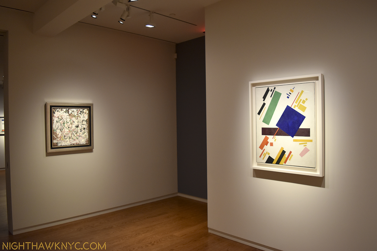
Pollock and Malevich. I don’t believe I’ve ever see them together! Why not?
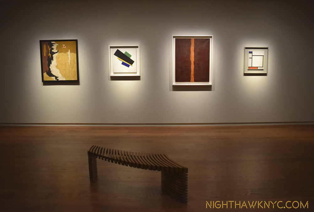
Franz Kline, Malevich, Barnett Newman and Mondrian. And, that bench!
As good as that show was, one Artist was not included…
Richard Pousette-Dart: The Centennial @Pace Gallery, East 57th Street, and Altered States: The Etchings of Richard Pousette-Dart @Del Deo & Barzune. This past June 8th would have been the 100th Birthday of Richard Pousette-Dart (RP-D for short), who died in 1992 at 76. An Artist who, I feel, has not yet been fully appreciated. June 8, 2016 would slip quietly by, but it turned out his 100th had not been forgotten. Pace Gallery 57th Street, opened a Centennial Show on September 6, (with RP-D’s wife and well known son, the musician, Jon Pousette-Dart in attendance). A symposium was held at the Whitney a few weeks later, a restored public work was unveiled downtown, and a revelatory show of his etchings at Del Deo & Barzune in the Flatiron District opened on October 6.
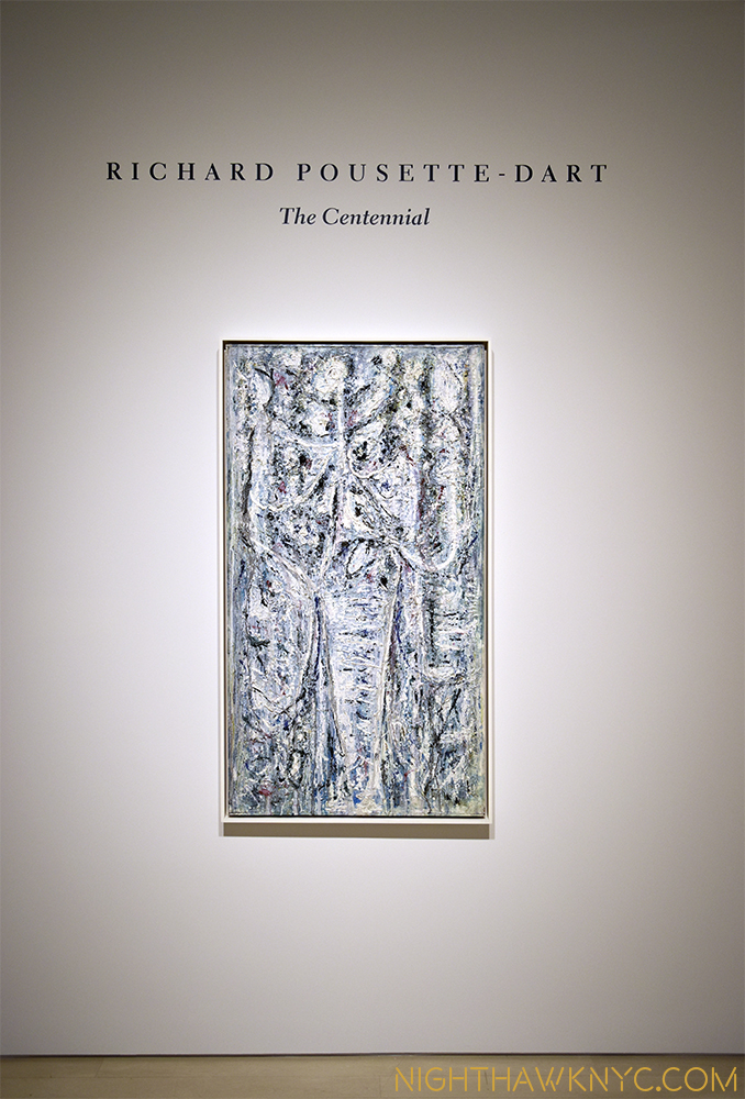
RP-D: The Centennial @ Pace, Uptown
Phew…My fears he’d be forgotten were assuaged. RP-D has become something of a “cause” for me. The more I see of his work, the more I’m baffled that he’s not (often) spoken of with his long time compatriots Jackson Pollock, Mark Rothko, Willem de Kooning, et al. I just don’t get it. For my money (and I have none personally invested), he’s every bit as good, and important, as any of them.
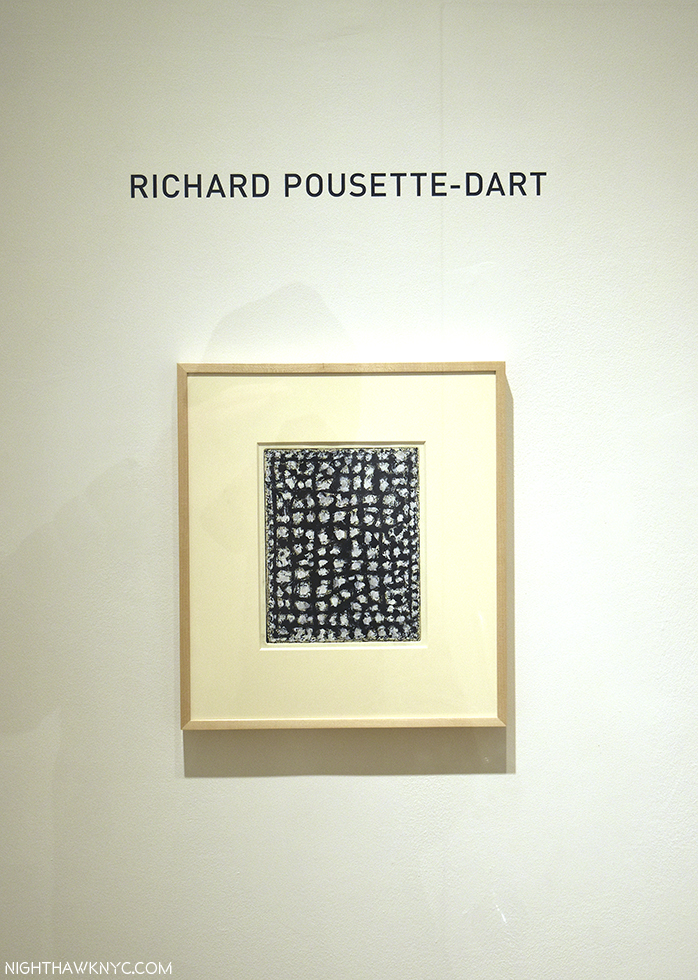
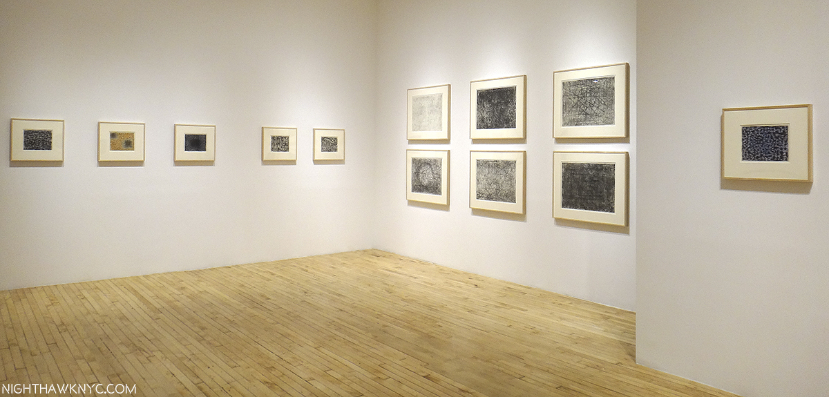
Altered States: The Etchings of RP-D @ Del Deo & Barzune
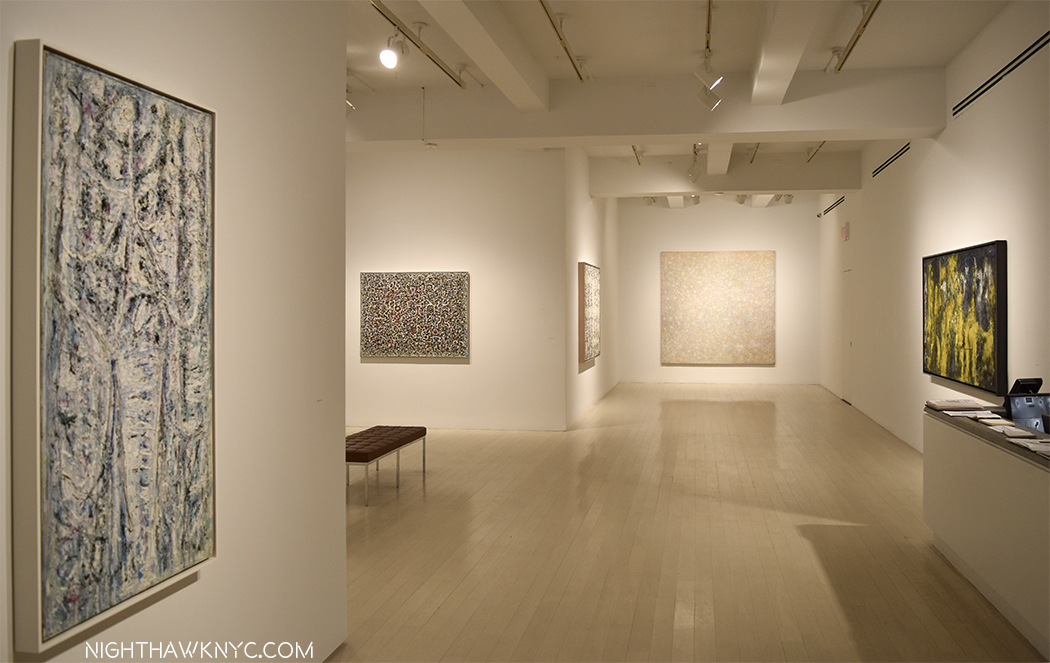
The show at Pace Uptown was nicely concise, giving a taste of the range of his stylistic development, which, for me, were a feast for the eyes. There is something wonderful about his work that allows it to work just as well in a small space (as the etchings prove), or in a large gallery at The Met’s newly rehung M&C Galleries. It’s so easy to get endlessly lost in either close study of his work, or at a distance. His compositions are among the most complex of the AbEx Artists, and his attention to detail borders on the staggering. You wonder how he ever finished one work, let alone as many as he did.
White Silence, 1974, 14 feet long, above. Hurry up and grab a seat before I sit there until they close.
Detail. “…it’s full of stars.”
Astoundingly, RP-D was, also, one of Ai Weiwei’s teachers at The Art Student’s League (on West 57th Street, down the street from where Pace is now) from 1983-86. I have yet to hear, or read, him (AWW) speak about the experience.
Installation view- Pace Gallery
Visiting the wonderful satellite show, with the prefect name, Altered States: The Etchings of Richard Pousette-Dart at Del De & Barzune in the Flatiron, the impression (sorry) is amended (as it always seems to be when one sees a work by RP-D he previously hadn’t seen), enhanced and refined. Here, his attention to detail is in just as full effect, and the results are even more (and even more sadly) unknown. The work on view is uniformly marvelous. They give the same effect as his larger painted masterpieces- ponder them from afar, or get lost in them up close. These are works you will look at for an entire lifetime and still see something new in them. Long live Richard Pousette-Dart.
Just in time for RP-D, 100- Symphony No. 1, The Transcendental, 1942-42, now on view in the newly rehung Modern Galleries at The Met, 5th Avenue.
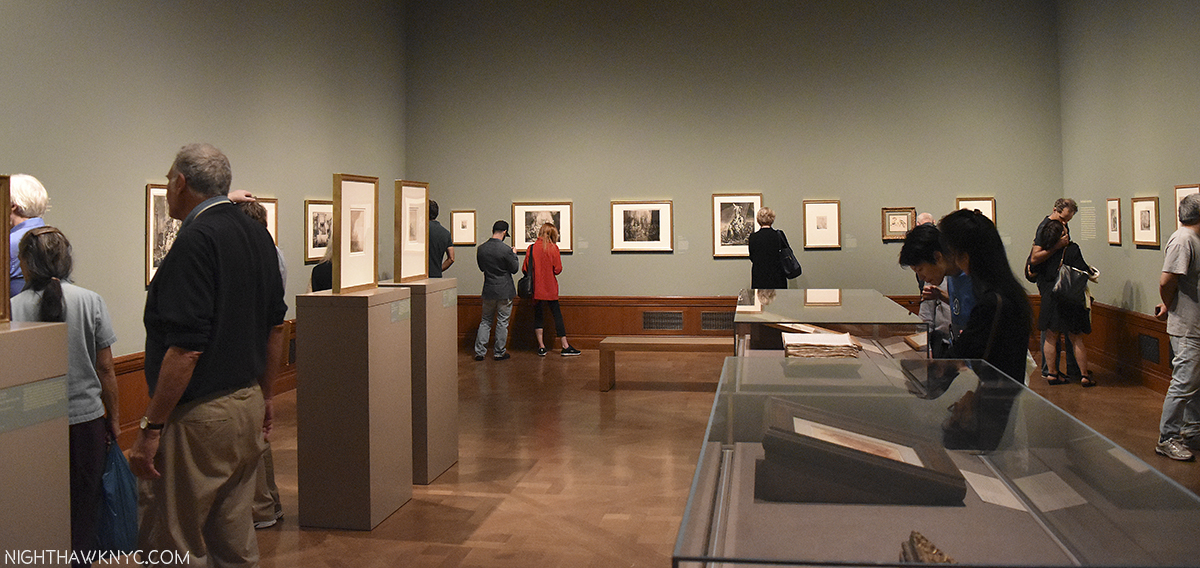
And, finally…a show I planned to write more about but haven’t, and just can’t let get away- Rembrandt’s First Masterpiece @ The Morgan Library. Worth the price of admission to see the figure of Judas in the 1629 painting, Judas Returning the Thirty Pieces of Silver, The Master did at age 23(!), the work that sealed his status as a “Master,” and which I haven’t as yet found an antecedent for in the prior history of Painting3
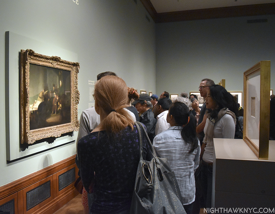
While you were waiting for a slight opening in the throng surrounding it, you were blessed with the rest of this one, large, room being chocked full of some of the greatest impressions of Rembrandt’s prints to be seen in this hemisphere.!
One half of the show.
I could think of worse ways of spending my time “waiting.” Like doing anything else, short of making love. So overwhelming were they that you were 3/4 of the way home before you realized you saw “only” one painting.
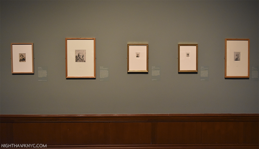
Murderer’s Row. If I could only have one work of Art for the rest of time? I’d take a Rembrandt painted Self-Portrait. So, I was floored to walk into this show and see no less than FIVE Rembrandt Self-Portrait etchings.
And then? The seas parted and lo and behold? THERE IS WAS! QUICK! SHOOT!!!
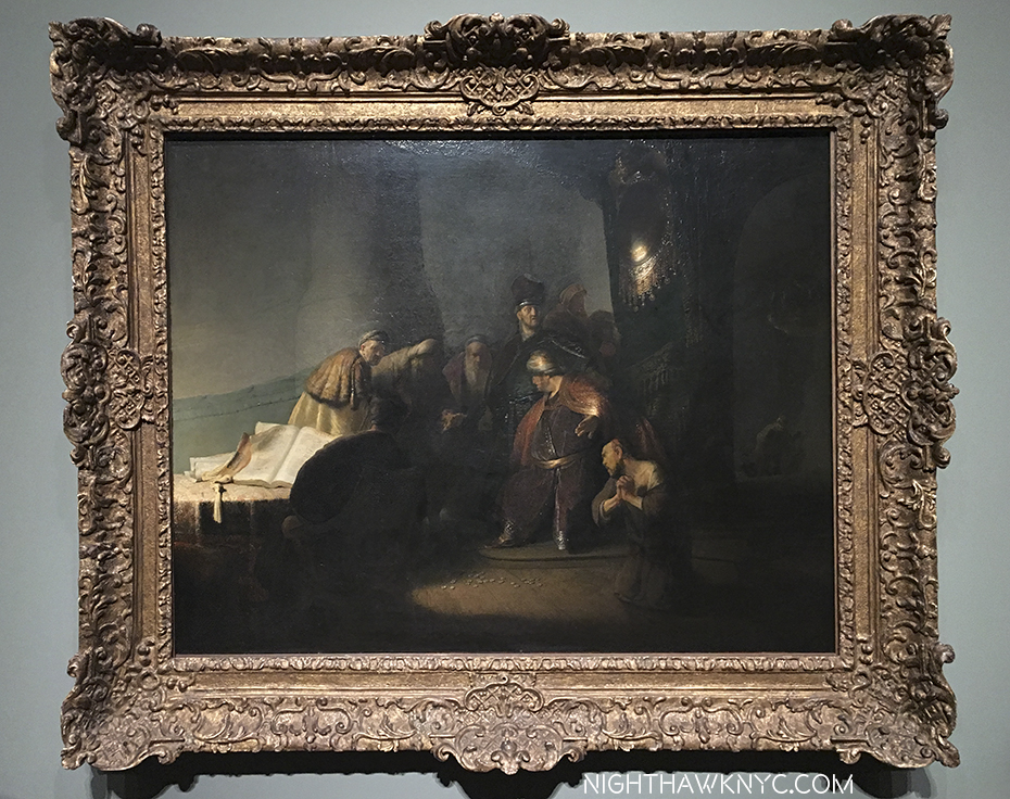
Judas Returning The 30 Pieces of Silver, 1629. Private collection. (i.e. Someone has this hanging on their wall. I felt a twinge typing that.)
Where was I? Oh yeah…”only” one painting here…That was immediately followed by the realization that with Rembrandt? The medium is not the message- The message is the message. it matters not which medium he chooses to work in. He created timeless Art in many mediums, Painting, drawing and prints, here. From what is called his “First Masterpiece,” (I didn’t say that)4, he lets it be known that he is someone that is, and will be, unprecedented in Art History, and earned the admiration of the diplomat, poet and great Art connoisseur Constantijn Huygens, who’s original diary, containing Huygens’ now immortal words about Rembrandt and “Judas,” which put the young Artist on the map, is here as well. Remarkable! Of “Judas,” Huygens writes in THIS very book(!)-
The Legend of Rembrandt begins here.
his Autobiography, written between 1629-31-
“Compare this with all Italy, indeed, with everything beautiful and admirable that has been preserved from the earliest antiquity. The singular gesture of the despairing Judas-leaving aside the many fascinating figures in this one painting-that one furious Judas, howling, praying for mercy, but devoid of hope, all traces of hope erased from his countenance, his appearance frightening, his hair torn, his garment rent, his limbs twisted, his hands clenched bloodlessly tight, fallen prostrate on his knees on a blind impulse, his whole body contorted in wretched hideousness. Such I place against all the elegance that has been produced throughout the ages.”
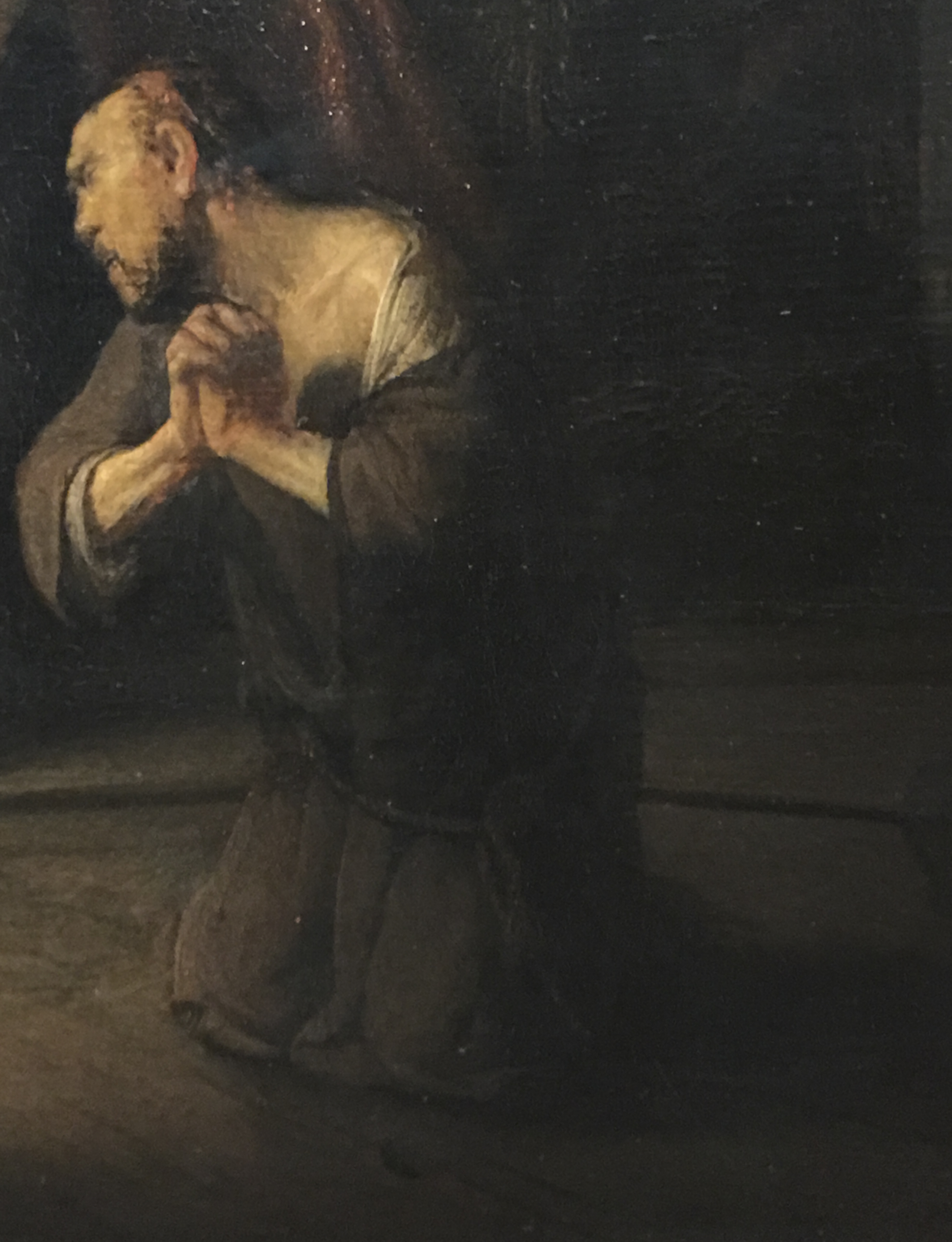
One of the most auspicious, calling cards in Art History…even 388 years later.
This “such” retains every bit of it’s power to awe onlookers nearly 400 years later as it did Mr. Huygens shortly after he created it, to the extent that it’s possible to see so much of what’s come after in this one figure, right up to Lucian Freud and Francis Bacon.
I give this show my award for the exhibition that went the furthest beyond above and beyond delivering on the advertised expectations. Any show that elicits an “Oh My God,” from it’s doorway as I first entered and it dawned on me what awaited and how undersold this show was has to be, at least, NoteWorthy, and at most, unforgettable.
As the new year begins? To any show with designs on winning that award this year, I say “Bring It On!”
*- Soundtrack for this Post is “Puzzling Evidence” by David Byrne and recorded by Talking Heads on True Stories, which was accompanied by a movie and a book of the same name. The book contained photographs by William Eggleston, among others.
NighthawkNYC.com has been entirely self-funded & ad-free for over 7 years, during which over 275 full length pieces have been published!
I can no longer fund it myself. More on why here.
If you’ve found it worthwhile, PLEASE donate to keep it online & ad-free below.
Thank you, Kenn.
Written & photographed by Kenn Sava for nighthawknyc.com unless otherwise credited.
To send comments, thoughts, feedback or propositions click here.
Click the white box on the upper right for the archives or to search them.
Subscribe to be notified of new Posts below. Your information will be used for no other purpose.