Catherine Murphy’s Dreams

After months of Photography shows…Hark! I see a flag and a light that portends some State of the Art American Painting & Drawing in 2018 within.

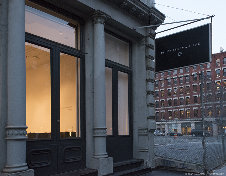
Fellow lovers of Painting, fear not. I’ve surfaced from my year long deep-dive into the world of Contemporary Photography, finding equilibrium just as the New Year is continuing the holiday spirit, bearing Art gifts of it’s own. First, there were the unexpected wonders of “Edvard Munch: Between The Clock and the Bed,” at The Met Breuer, the fascinating “Figuratively Speaking” at Michael Rosenfeld Gallery, and now with “Catherine Murphy,” the long awaited show of recent Paintings & Drawings by the singular and influential Artist and Educator1 at Peter Freeman, Inc., I can positively feel the wind of great Painting blowing through my hair once again. Well, at least my eyebrows. “Long awaited” as Ms. Murphy’s last show, “Catherine Murphy: Working Drawings” at Sargent’s Daughters, was in 2016, but the last show of her Paintings and finished Drawings, also at Peter Freeman, Inc., was back in 2013.

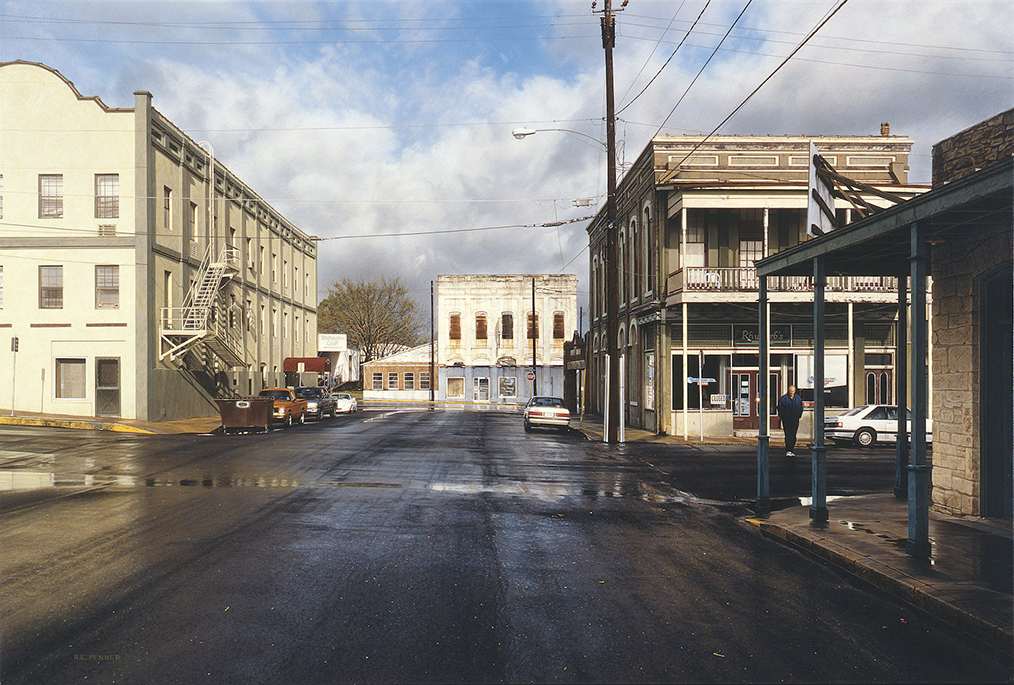
Over a career that now extends more than 50 years, though her style, focus, and her choice of subjects have evolved, there is one constant- an extraordinarily high level of accomplishment. It’s hard to think of another Artist who’s Paintings AND Drawings are among the finest created in each medium over that time. Both bodies of work are marvels. And, at least her more recent pieces are inspired by her dreams. Her new show, which focuses on this more recent work, is a visual tour de force- in more ways than one. No less than Artist Rod Penner told me in the Q&A I did with him last year that, in his opinion, Catherine Murphy “is in a class of her own,” among Artists he feels have been overlooked and/or are “important” today.

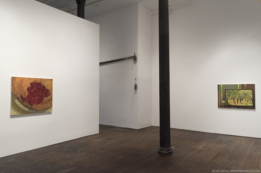
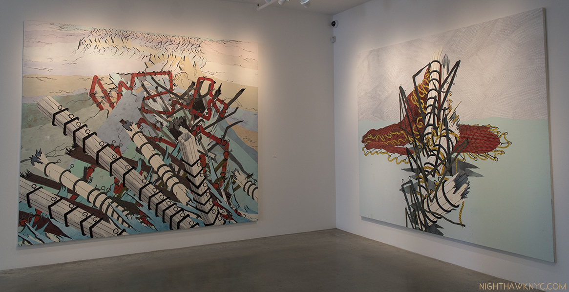
Installation view of part of the first gallery. All Photos by Kenn Sava, courtesy of the Artist and Peter Freeman, Inc. Click any Photo for full size.

As I moved through the galleries I was struck by something I hadn’t noticed as a focus of her work before. Unlike, say, her early landscapes, many of the pieces on view shared the common theme of seeing & perception. Take for example the first Painting in the show, “Cherry Pie,” from 2104. It’s obviously a pie, yet even a quick look reveals it’s a Painted pie, not a “photorealistic” pie.

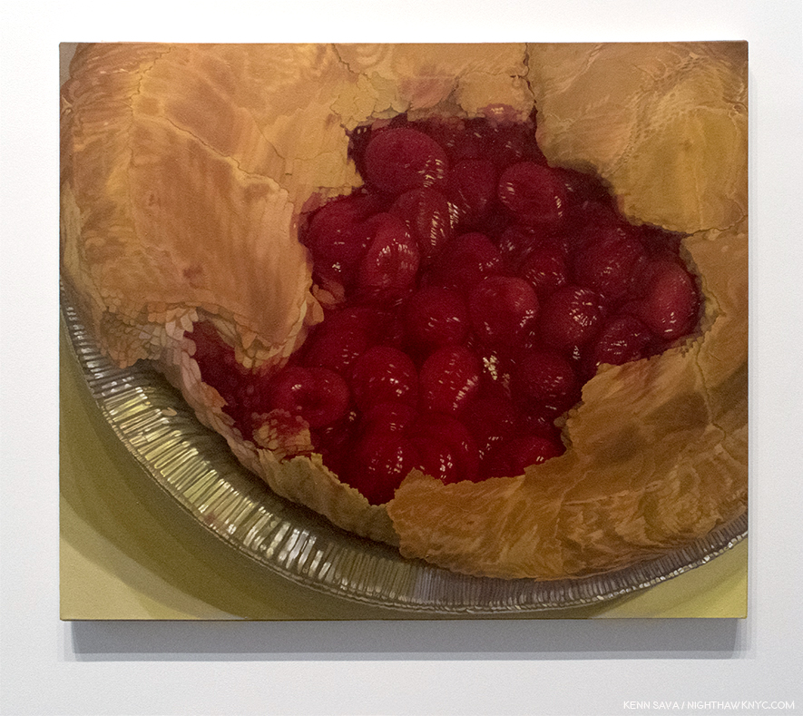
“Cherry Pie,” 2014, Oil on canvas, 38 x 45 1/4 inches

No matter how close, or far, you stand from it, the work remains just out of focus, as if seen at a glance or in a slightly blurry photograph, but the level of artistry brought to bear in the entire work is staggering. The crust is open, missing one section. Strange. You’d expect a slice to be missing. Looking closer I was enraptured by what I saw.

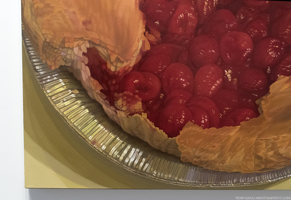
The cherries, for instance, seem to have taken Cezanne’s immortal still lives to a different level. (Not “better,” I don’t believe in those kinds of comparisons. Different.) Look at how finely the highlights and the shading are done on each one. Then look at the broken edge of the pie crust to the left- each flake is carefully and sharply delineated in a way that is positively surreal. When have you seen real pie crust look like this? Their sharpness is in contrast to the overall blurriness, as if they are the point of focus for the absent camera. Then, there’s the pie tin. It’s countless folds appear to be almost individually colored as the light plays off them so magnificently, echoed in the wonderfully realized cast shadows underneath. If we take the pie tin for a “ground,” the work strikes me as a Painting that strives to go beyond two dimensions. It wants to, at once, lie above the surface, on it, and under it- all while drawing us inside of it. These questions of seeing (What do you see? What do you expect to see?) and looking into, though a painting is a flat, thin surface, recur repeatedly in this show.

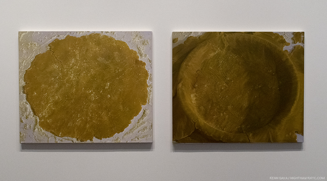
“Shift,” 2016, Oil on canvas in two parts, each 37 7/8 x 45 1/8 inches.

Directly across the room from it is another pie-related work, in two parts. This time, what is apparently the top of the crust is an entirely separate work, displayed next to the empty pie crust. If these were hung separately, Would we think they are a pie crust and it’s top? They could be one of Edward Burtynsky’s aerial landscape Photographs of some distant land and an aerial shot of a crater in an icy land. Still, even in this context, shown together, it seems strange. It’s hard to not see the apparent top being on a pie. I kept thinking about what’s under it. Nothing but the surface it’s laid on. As for the pie crust, itself, we’re left to imagine what’s going to go inside, while we ponder the top now being a surface instead of a top and the empty space of the pie drawing us into a space, which is in reality, flat.

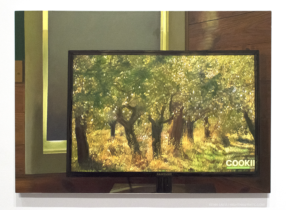
“Flat Screen,” 2016, Oil on canvas, 35 1/2 x 19 1/4 inches.

Adjacent to the previous two works is “Flat Screen,” a work that depicts a lovely, Painted, sunny, outdoor scene on the titular flat screen monitor. Perhaps, it’s a screen saver given the partial text on the lower right. The window behind it is blank being mostly covered by what appears to be a window shade. The light that does come through around the shade mimics the black border around the monitor’s screen. I wonder…wouldn’t we expect see the reverse- a blank, or grey, computer screen, and the sunny outdoor scene outside of the window?  It might be technology taking the place of experiencing nature via a live feed from outdoors, except that we see it’s a Painting. Is it the scene outside the window? We’ll never know. Continuing the spacial relationships, it also reminds us a monitor is flat and presents us with the illusion of 3 dimensions, like a Painting does.

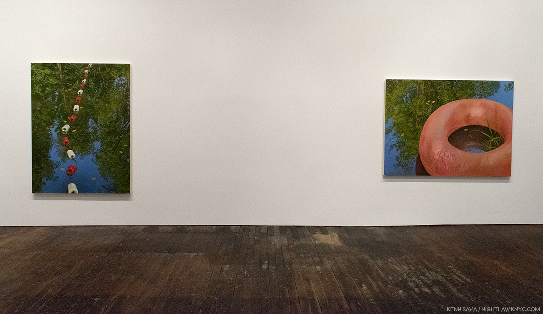
“Float,” 2015, left, “Becalmed,” 2017,  right, both Oil on canvas, 72 x 54 inches and 54 x 72 inches ,

In the main gallery, are two works that might seem descendants of late Monet- both depict scenes taking place on bodies of water with trees nearby. In both, we are left to ponder, and admire, the surface, what’s on top of it, and what’s being reflected on it- all handled masterfully.

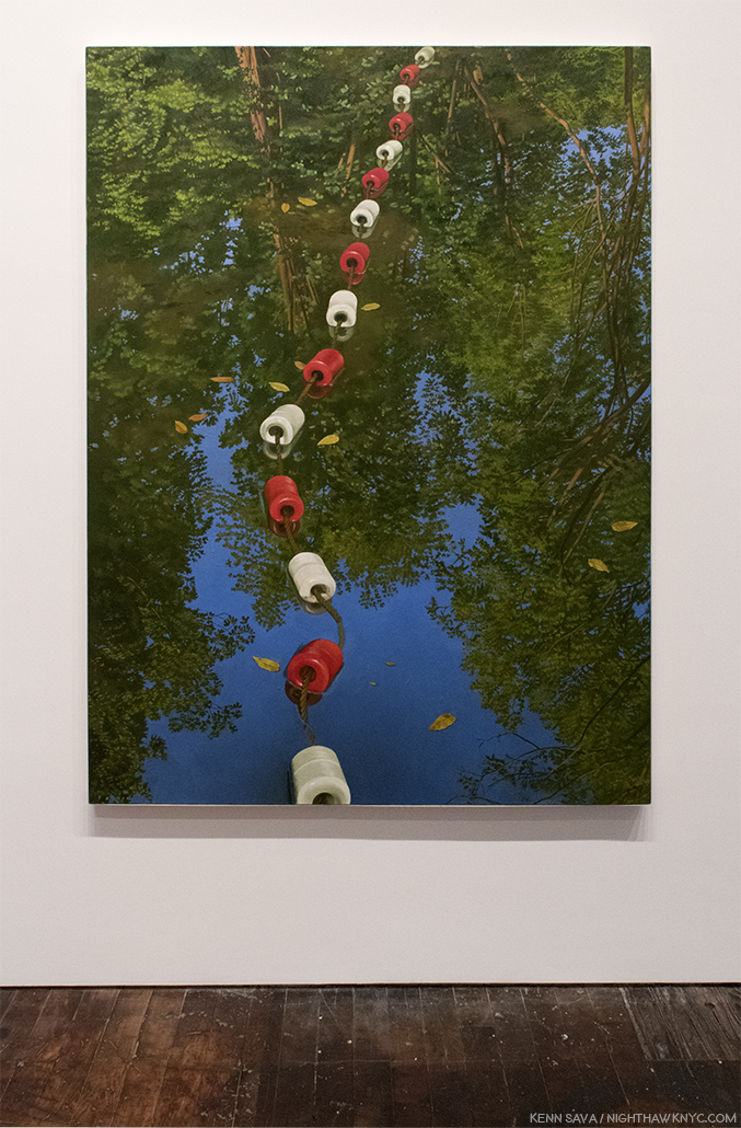
“Float,” 2015, Oil on canvas, 54 x 72 inches.

The one above, “Float,” 2015, is over the top, literally and figuratively. It continues the line of her early landscapes, which were painted outdoors. In 2013, she said, “Any Painting that you see is outdoors is a really slow Painting. Because I have to wait for the sun. I have to wait for the weather…2” “I got very interested in things that look spatial, but are not spatial,” she said in 2014. As you look at “Float,” it’s a bit like looking down the rabbit hole. I almost wondered if I was underneath the water looking up at the surface and the foliage above it, but the yellow leaves would seem to indicate we’re looking down on it. The floats and the leaves floating on the water provide a fulcrum between the two worlds- outer and inner. Again, she has created a scene of extraordinary depth on a simple, flat canvas, a bit like the feeling I got from “Cherry Pie.”

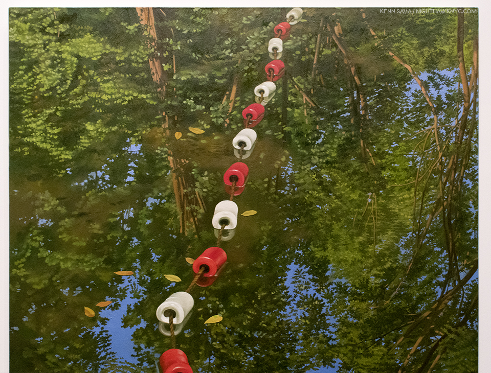
Don’t fall in. It’s only an inch or so “deep” and there’s a concrete wall behind it.

Then, “…I started dreaming Paintings, and thinking about Paintings differently. It was the beginning of a whole thing, giving myself permission to do it in a new way. that is really what stops everyone in the world: because of an idea of who you are you’re afraid to break your rules3.” So, more recently, she’s moved to scenes that are “smaller” closer, or more intimate, like those seen in most of this show. She says that after being inspired by her dreams, she then sets up the scene in her studio.

Half the show is devoted to Catherine Murphy’s amazing Drawings, all of which are these indoor scenes. And, I mean amazing. Like this one-


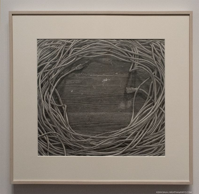
“Studio Floor,” 2015, Graphite on paper, 28 3/4 x 31 3/16 inches.

Again, the mastery of rendering surfaces is just stunning- the shading of each wire mezmerizes. Then, there’s the beautiful wooden floor- all Drawn in graphite. Once again, the feeling of depth is present. We can’t tell how high the pile of wire is from that floor. Is it one insanely long cable, or more? If it’s more, despite the yards of spare cable lying around, those two ends are never going to reach each other. It’s a very daring piece. If you want to test your technique, and your eye? Take a shot at Drawing something like this.

Catherine Murphy, long seen as a champion of figurative/representational Art, surprisingly said she’s “a compulsive Abstract Expressionist.” While I think she may have been referring to the technique of applying paint, I filed that in the back of my mind, though yes, there are passages here and there in this show that do qualify. Perhaps, none more so than “Studio Wall,” 2014, Graphite on paper. Without it’s title or the name of the Artist, one might think it’s by Cy Twombly. The more I looked at it the more I couldn’t believe it’s ONLY graphite on paper.

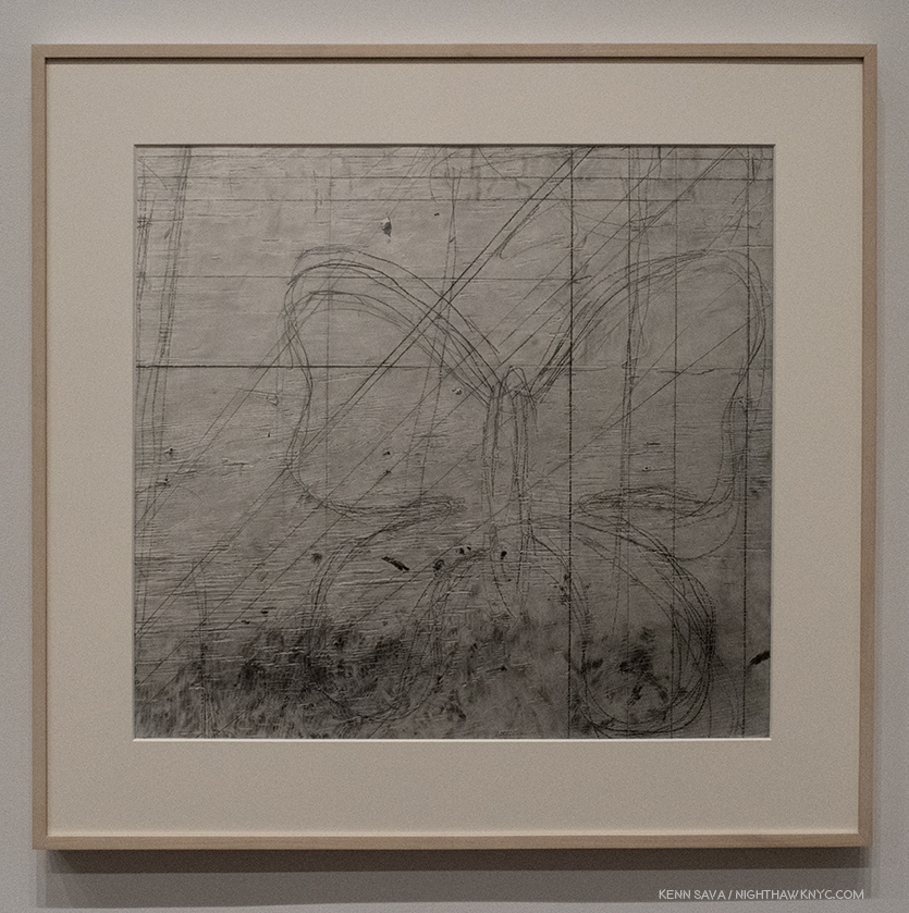
“Studio Wall,” 2014, Graphite, yes, Graphite on paper, 32 3/8 x 34 3/8 inches.

Standing in front of it for the longest time, it looked for all the world to have been Painted. So, I asked Catherine Murphy through the gallery how the background was done. She said, “I just keep adding graphite until the tone is correct.  There is not much actual “white” (although the wall I was drawing from was painted white).  What “white” there is, is the paper.” The fact that there is so little white of the paper left is what amazes me. The shading is so brilliantly done that no matter how close you get to it, the background looks like Paint.

Since she said that her dreams inspire many of her works these days, I asked her if she dreams in color, or black & white, as the resulting works are in both. She replied, “In the dreams the color suggests itself, but I could be dreaming color for all I know. Some things have to be in color and some things have to be in black and white.  But one way or another they are both about color.” Her Drawings are unique, whole works unto themselves that have nothing to do with her Paintings. They stand alongside her Paintings as “different but equal,” so to speak. Well? Except for this one-

“Painting Drawing Painting,” 2017, Oil on canvas, 51 x 72 inches.

In “Painting Drawing Painting,” 2017, she seems to be playing with that, though, blurring the boundaries between the two medium. Again, making us question what we’re seeing- What’s “Drawn?” What’s Painted?” Being oil on canvas, it’s all Painted, but much of it “looks” Drawn. It’s also fascinating that she’s left part of it, apparently, unfinished, while another part, along the right white border, appears to have been erased or removed, something she doesn’t do in her “real” Paintings.  My takeaway was that in this work, she’s giving Drawing the same “status” as Painting, which is traditionally the more valued medium, which also serves to reinforce their importance in her oeuvre as equals.

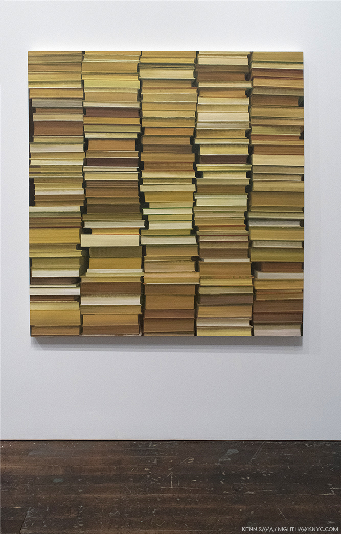
“Stacked,” 2017, Oil on canvas, 60 x 60 inches.

“Stacked,” 2017, one of the three newest Painting on view (“Painting Drawing Painting” being another, “Becalmed,” seen further on, the third), creates the optical illusion that the stacks of books are suspended in mid-air. When I saw this, I wondered if Catherine Murphy had seen my apartment in her dreams. Then, alas, mine haven’t levitated. Yet.

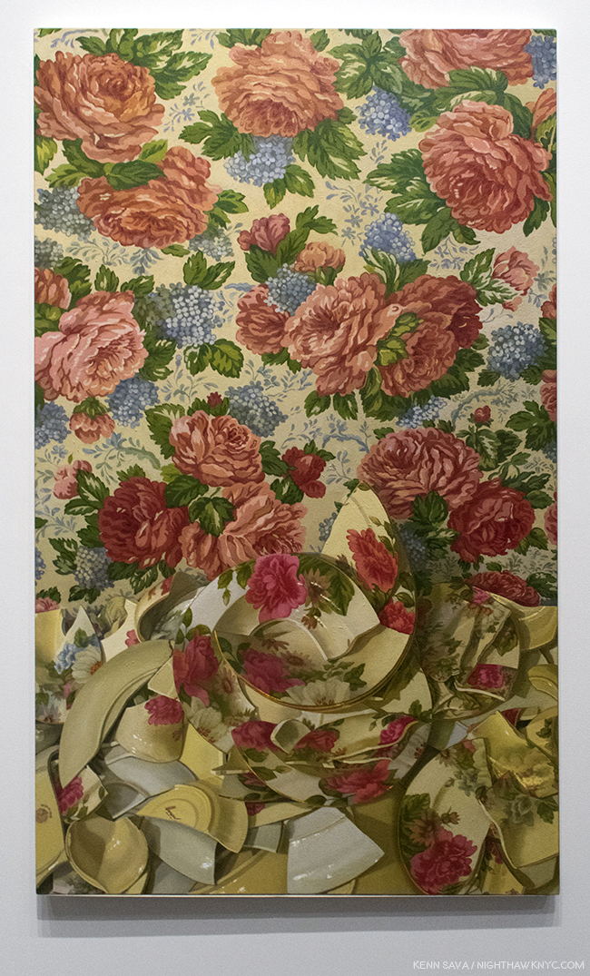
“Floribunda,” 2015, Oil on canvas, 66 1/16 x 41 1/8 inches.

“I’m avoiding the comfort of realism. The pillow you know. The bottle you know. The landscape you know…I want to confront,” she said in 2013. The masterful, knock-out, “Floribunda,” 2015, is a classic example of that. It also speaks to what we see. What, exactly, are the broken dishes lying on, or seen against? The two patterns of whatever it is and the dishes are so similar it takes effort to see where one ends and the other begins as the eye moves across the canvas. It’s almost M.C. Escher-esque. Yes, they, positively confront each other. A detail that caught me in this, among so many others, is the “marrow” of the broken yellowish cup in the lower left corner.

Catherine Murphy has always followed her own star, regardless of what the rest of the Art world was doing or favoring. Marketing ploys, like “photorealism,” have proved to be an albatross around the necks, and careers, of any number of Artists, which has only served to delay (hopefully not permanently) the proper assessment of their work and accomplishment. Modern & Contemporary Realistic, Representational and Figurative Art has been slowly coming back, mostly in the galleries, and in museums elsewhere, but not the NYC museums, beyond, Kerry James Marshall in late 2016, early 2017.

Looking at their websites, Catherine Murphy is in, at least, 3 of NYC’s “Big Five” Museums (as I called them recently). The Met’s site shows 2 Paintings (acquired in 1986 and 1991), The Whitney’s shows 1 Painting (acquired in 1973), and 2 Drawings (acquired in 1993), and MoMA’s shows 2 Drawings, (acquired in 1987 and 2004). It’s a start, but one that hasn’t been followed up on in 14 years, plus. Of those three, only MoMA lists Catherine Murphy’s work as having appeared in an exhibition, both times in group shows, once when she was selected by Artist Vic Muniz, the show’s curator.

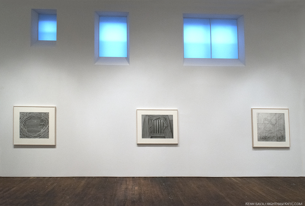
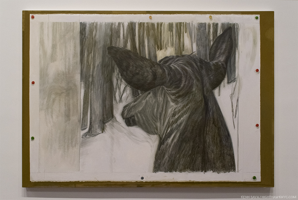
“Studio Floor,” 2015, left, “Chairback,” 2016, Graphite on paper, center, “Studio Wall,” 2014, right.

Yes, many have put her in the category of “Realism,” “Representational” and “Figurative” Art, I know, but Catherine Murphy’s work seems to me to stand aside of all of those categories because there are bits and pieces of any number of influences, periods, and styles going on in her work. Interestingly, she said in 2013 that there isn’t a style of Art she doesn’t like, because there is always someone doing something good in it. Elsewhere she has shown a familiarity with contemporary Photographers Jeff Wall and Gregory Crewdson (both of whom meticulously set up their shots, as Catherine Murphy sets up the scenes she Paints). I have a feeling along with not being afraid “to break your own rules,” as she said, it’s that range that helps her stand apart.

While shows like the Whitney Biennial and the New Museum “Triennial” are major events in the Art world that draw big crowds and gain instant recognition for a number of their younger participants, it seems to me that the time has come for such a show that features established Artists that have, as yet, not received their due in a major Museum show. The point is not to “shame” the Museums, but to give these Artists some of the exposure, attention and recognition, I for one, feel is long overdue.

Casting around for recommendations to be included in such a show (not to mention a Retrospective of her own), you need to look no further than Catherine Murphy.

*-Soundtrack for this Post is “Time Passes Slowly,” by Bob Dylan from “New Morning.” Catherine Murphy has said that her Paintings are about the passing of time. In lieu of the album version I would like to include, Mr Dylan may be seen and heard performing an early version of it, with George Harrison, here.

My thanks to Catherine Murphy, and Alexander Whitehead of Peter Freeman, Inc.

The Archive of previous Posts related to Painting & Drawing may be found here.
NighthawkNYC.com has been entirely self-funded & ad-free for over 7 years, during which over 275 full length pieces have been published! If you’ve found it worthwhile, PLEASE donate to allow me to continue below. Thank you, Kenn.

You can also support it by buying Art, Art & Photography books, and Music from my collection! Books may be found here. Music here and here.

Written & photographed by Kenn Sava for nighthawknyc.com unless otherwise credited. To send comments, thoughts, feedback or propositions click here. Click the white box on the upper right for the archives or to search them. Subscribe to be notified of new Posts below. Your information will be used for no other purpose.

  1. Catherine Murphy was the Senior Critic in Painting & Printmaking at Yale’s School of Art for 22 years, followed by being the Tepper Family Endowed Chair in Visual Arts at Rutgers Mason Gross School of the Arts, where she was followed by Kara Walker.
  2. Here.
  3. Here.

Q&A With Master Painter Rod Penner

During the recent show, Rod Penner, at Ameringer McEnery Yohe, I was fascinated watching visitor’s reactions to the work.

While it was hard to know if they were familiar with Rod Penner’s work, most seemed taken, startled & impressed with his incredible technique. But then, they lingered. Often for quite a while. I well know that feeling. How well the Paintings are done is a hook that grabs your attention and pulls you in. What happens then? Well…That’s up to the individual viewer.


When you finally step back, you marvel that all of that took place in a space that’s 6 by 6 inches or 5 by 7 1/2 inches. When this first happened to me, in April, 2016, I was left with wonder. I wanted to know more about him and his art. Since I’ve now written about him and this show twice, perhaps others are curious, too. The AMY show answered some of my questions, primarily- Yes. He is THAT good. But, it raised others. I am very pleased to report that, after the show ended, and he arrived safely back in his now long time home in Texas, Rod Penner graciously agreed to answer some of my questions in a very rare Q&A. (For those interested in exploring his work still further, I’ve appended a list of resources known to me at the end of this Post. I welcome hearing about others I don’t know of.) What I’ve learned thus far has confirmed, at least to me, his place as a major Artist. That leaves the other question…

Who is Rod Penner?

“It’s your last chance
To check under the hood
Last chance
She ain’t soundin’ too good,
Your last chance
To trust the man with the star
You’ve found the last chance Texaco”*

Having previously shown his recent, small Paintings, here’s one of his larger works. Farmers Co-op Gin/Anson, TX, 2012, 20 x 32 inches.  All works by Rod Penner, Acrylic on canvas, and are from rodpenner.com and amy-ny.com, unless otherwise noted.

Every work in virtually every show of Rod Penner’s work these past 25 years sold. Remarkable. Those owners are not parting with those pieces, which can be seen in his work not coming up at auction (as far as I know). 8 of the 9 pieces in this recent show were sold before the show opened. I believe the time has come for a closer look at what’s going on here.

Joker Coffee Shop, 2016, 6 x 6 inches.

What’s going on here, succinctly, is that Rod Penner is quietly creating a remarkably excellent body of Paintings, one that provides all the proof needed that he is a Master Painter.

Ranch View, Vaughn MN, 2013, 12 x 18 inches. Compare this with the next two.

Not wanting to take up too much of Mr. Penner’s valuable time, with repetition of things John Seed has addressed in his 3 pieces about the Artist, my questions serve as supplements to those articles (linked at the end). What follows is about his life, and his Art, but I also felt it was important to ask this Master Painter about Art- What he looks for when he looks at Art. Mr. Penner has a deep knowledge of Art History and he is very open minded to styles & periods, perhaps surprisingly so to some. Typically, when I met him at the show’s opening, he told me he was off to The Met while he was in town to see “The Mysterious Landscapes of Hercules Segers.” So? Having a great interest in all of this, I also had to ask him which Painters and periods he feels go under-appreciated these days.

54 Grill, Vaughn, MN, 2016, 30.5 x 64 inches.

Ranch View, Vaughn MN, 2013, 4 x 4 INCHES! These three works show 3 views of the same place, something Mr. Penner would revisit, in a way, in his recent show. This is the work that hooked me- the first piece of Mr. Penner’s I saw in April, 2016. Previously, I associated scenes like this with William Eggleston. Now? I think of Rod Penner.

Kenn Sava (KS)- In reading about your background, you’ve mentioned your folks being supportive of your skill and development, but I haven’t been able to learn if you studied with someone, if you studied Art in school, or if you are self-taught, as well as what road your education and development as an Artist took. Were you Painting when you arrived in Texas? If so, were they the same (general) style as the work we see on your site from 1992, or did you ever work in a different style?

Rod Penner (RP)- Growing up, our family enjoyed camping, hunting, and fishing. I painted wildlife during this time, emulating the work of Robert Bateman and other Canadian wildlife artists.

After graduating from high school, I attended a local community college for one year and then transferred to Oral Roberts University in Oklahoma where I graduated with a B.A. degree in Studio Art, and while I found myself at odds with certain aspects of the theology, overall it was a positive experience. It was at ORU where I met my beautiful wife, Debbie, and we both made lifelong friends among the students and faculty.

Following college, we married in 1986 and moved to British Columbia. when I started intensely studying the work of Canadian realist painters, Christopher Pratt and Alex Colville. I had a lot of wildlife art commissions at this time and even started selling through a well-known gallery in Denver but the animals became less and less important in my paintings. In 1988, Debbie’s brother was killed in a biking accident, so we moved down to Texas to spend time with her family. We ended up staying and I welcomed the change as a way to start over with my art and break away completely from what I was doing. I got a part-time job teaching, but Debbie worked full time so I could paint. She has always believed in me and supported my efforts. The same year that our second child was born in 1991, my youngest brother died in a plane crash. Nine months later, I gained representation by Ivan Karp and his O.K. Harris gallery, allowing Debbie to quit work in order to stay at home to raise our children. I’ve supported our family ever since solely on the sales of my paintings.

American Inn, 2011,  6 x 6 inches.

KS- What inspired you to get into Art? Who were the Artists you liked early on, and which influenced you early on?

RP- Shortly after arriving in the Lone Star State, I rediscovered the work of John Salt and felt an instant connection. I couldn’t drive past a trailer home (and there are many in Texas) without thinking “Salt.” At this point, I wanted to spend more time in the studio and less time searching out subjects to paint, so I started driving around the town we lived in and took photos of these tract houses that were everywhere. I found them visually interesting. As with all the streets and buildings that I paint, these homes, under certain weather and lighting conditions, became transformed. I painted my first tract house in 1989 and it sparked a series of paintings that were later shown at O.K. Harris in NY.

Pink House with Big Wheels, 1992, 36 x 54 inches, is the earliest work in his online Archive.

KS-Your last show at AMY was in 2013. Two of these pieces are dated 2016, the rest 2017. How do you feel your work has changed/evolved since your last show?

Mr W, Lubbock, TX, 2013, 12 x 18 inches, which appeared in his 2013 AMY, NYC show

RP- Up until 2016, all my previous “micro” paintings were square in shape, but for this show, most of the canvases have a 2:3 size ratio.

I’ve also been exploring more towns in New Mexico.

KS- The work on the catalog’s cover, which is dated 2015 (and is not in this show) appears to be part of this series- a fascinating, alternate view of San Saba Butane. Are there others works in this series?

San Saba Butane, San Saba, TX, 2015, 12 x 18 inches, which appears on the recent show’s exhibition catalog’s cover, but which was not in the show. The Painting that was in the show is below.

RP- The painting you’re referring to measures 12 x 18 inches and is based on the photos I took for the series in my show. I’m currently working on a 10 x 15 inch painting of San Saba which will be my final painting in this series. These two paintings will be included in my next exhibit.

KS- I’ve seen you’ve done two views of a same scene in the past, but is this the first “series” of Paintings you’ve done (I know of 10 that are a part of it) of a relatively small area (which feels like it’s within a few blocks), with source material from the same time? Was this a conscious decision- to do a series? Or, is it just coincidental, and the works should be considered independently of each other. (I’m not sure I can do that!)

RP- This show is a first for me in the sense that it is a series of paintings based on photos taken on a single morning of a single town. Most of the locations are in and around the town square of San Saba, TX, and when viewed together they form a more comprehensive “portrait”, both of the town itself, and my personal experiences in this place. That being said, each painting is also meant to stand on its own.

KS- How is your work received locally? Especially in San Saba, if these have been seen there?

RP- I sent a news release for the exhibit, along with some jpegs of my paintings, to a local paper in San Saba but never heard back. Since I don’t show in my hometown of Marble Falls, and rarely in the state of Texas, my work is largely ignored and/or misunderstood. Texas residents have an understandable pride in their communities and my paintings don’t always portray these towns in a cheerful light. However, I’m not interested in painting a romanticized and sanitized version of small-town America. San Saba, along with every town I paint, has its own character, its own curiosities and quirks, its own grit, as well as its own beauty…

So many good memories have been made in this town, but it’s taken almost 16 years for everything to come together in order for me to paint it.

KS- I’m fascinated by San Saba Butane. Without giving away its mystery, is this a place you’re at all familiar with, or is your interest in it purely pictorial?

San Saba Butane, 2017, 6 x 6 inches, as seen in this show.

RP- I first photographed San Saba Butane around 15 years ago and have witnessed its slow deterioration over the years. Who owned it and what it was used for doesn’t interest me.

KS- We’ve discussed people calling your work “photorealism,” yet there is a lot of abstraction in your work- the clouds, the cracks in the pavement, the tree branches, patterns of bricks, peeling paint, and on and on. Of course you know its there. What role do you feel abstraction plays in so-called realistic or representational Art? Do people ever notice it? I also saw you mentioned John Zurier, and that makes me wonder if he’s influenced your skies.?

RP- The formalist qualities in my paintings are important. The placement and shapes of clouds, pavement cracks, branches, etc, is always intentional. I’m good at arranging these components within a picture plane while photographing, but afterward, I edit, so that these elements ultimately serve my purpose which is to create a certain mood and a strong composition. Also, you’ll find smaller engaging areas of abstraction within the paintings which I enjoy incorporating. I think this comes from studying and appreciating a range of different styles of painting.

Regarding Zurier, I’m not consciously thinking of his work while painting my skies, but I’m sure he’s influenced certain elements of my art. He creates this terrific sense of light and weather with just pure pigment and the mood in his paintings elicit a certain quiet meditative self-reflection.

Commerce St, Brenham TX, 2002, 24 x 36 inches. One of two Paintings I’ve seen of his with an actual person in it.

KS- You’ve been in Texas just about 30 years now, would you have been shocked if someone told you in 1988 you’d be here for (at least) 30 years? Does being originally from somewhere else (a city, no less) help you in Painting these scenes you’ve been doing all these years?

RP- The Texas Hill Country is a wonderful place to raise a family. Moving here from Canada allowed me to observe my surroundings with the objectivity of an outsider. I don’t have any memories of these locations before the age of 22; however, they do evoke memories from my childhood, but it has little or nothing to do wth a specific building or street. On the flip-side, living here for almost 30 years has endeared me to Texas, and prevents me from patronizing my subject matter.

KS- In the introduction to the show’s catalog, Mr. Seed mentions your reacting against big (large) Painting by others in these quite small works. What is it about big Paintings that you don’t like?

RP- I don’t dislike large paintings per se, only pretentious, self-serving large paintings that tell me what to think and feel, and much of the current art world seems to embrace that kind of work.

Bertram Supply Co, Bertram, TX, 2016, 36 x 54 inches. One of Mr. Penner’s larger works.

KS- Your taste in art is wonderfully eclectic, ranging from the Dutch & Flemish Masters to the Hudson River School to contemporary Artists including Andy Piedilato. Is there a common thread to the Art you like? When you look at Painting, what do you look for? What makes someone an excellent or great Painter in your book?

Ice Spine, 2015, 102 x 126 inches, left and Pinched Red Sail, 2016, 100 x 117 inches, right, by Andy Piedilato, seen at Danese Corey, NYC, in October, 2016

RP- Someone who has command of their medium and uses it to express mature ideas.

KS- What do you think of NYC? Has anything you’ve seen here ever grabbed you to paint it?

RP- NYC is our favorite place to visit but no, I have never felt an urge to paint it.

KS- Finally, if you were going to suggest to Art Lovers they look at one thing, one style, period or (I’m not a big fan of this word- “school”- unless the Artists themselves put themselves in that group), or the work of one Artist, that you feel has been overlooked, or is especially “important” today, what, or who, would it be?

RP- Perhaps the Tonalists; John Francis Murphy, Bruce Crane, and Birge Harrison are three of my favorites. Contemporary painter Catherine Murphy is in a class of her own. John Salt definitely deserves more attention and credit.

For anyone interested in knowing more about Rod Penner’s Art, as I write, the current resources are-
-Rod Penner has a website, which includes an Archive of his work that goes back to 1992, and includes links to his FB and Instagram pages.
-Ameringer McEnery Yohe has additional info, and details on the past shows they’ve held for Rod Penner here. They also published a catalog for this recent show, and copies of it may (keyword “may”) still be available through them. I’d hurry.
-John Seed’s two pieces may be found here, and here. He also wrote a piece for the AMY catalog.
(And, I have written about him twice previously so far, here and here.)

I’m grateful to Rod Penner for taking the time to answer my questions, for speaking with me at the very hectic opening of his show, and to his wife, Debbie, and their family, for allowing him to take some time away from them to do so. They’ve been married 31 years. I should have asked him what the secret to that is!

*-Soundtrack for this Post is “Last Chance Texaco,” by Rikki Lee Jones, from the classic album of the same name, and published by Rikki Lee Jones. You can see her perform it here.

NighthawkNYC.com has been entirely self-funded and ad-free for over 6 years, during which over 250 full length pieces have been published. As I face high expenses to keep it going, if you’ve found it worthwhile, please donate to keep it up & ad-free below. Thank you!

Written & photographed by Kenn Sava for nighthawknyc.com unless otherwise credited.
To send comments, thoughts, feedback or propositions click here.
Click the white box on the upper right for the archives or to search them.
For “short takes” and additional pictures, follow @nighthawk_nyc on Instagram.

Subscribe to be notified of new Posts below. Your information will be used for no other purpose.