Highlights From Rauschenberg At MoMA

Written & Photographed by Kenn Sava (*unless otherwise credited)

They flew in from all over for this one. Click any image for full size.

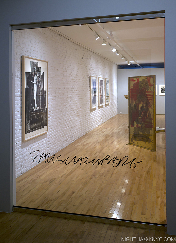
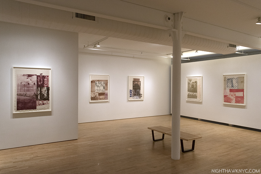
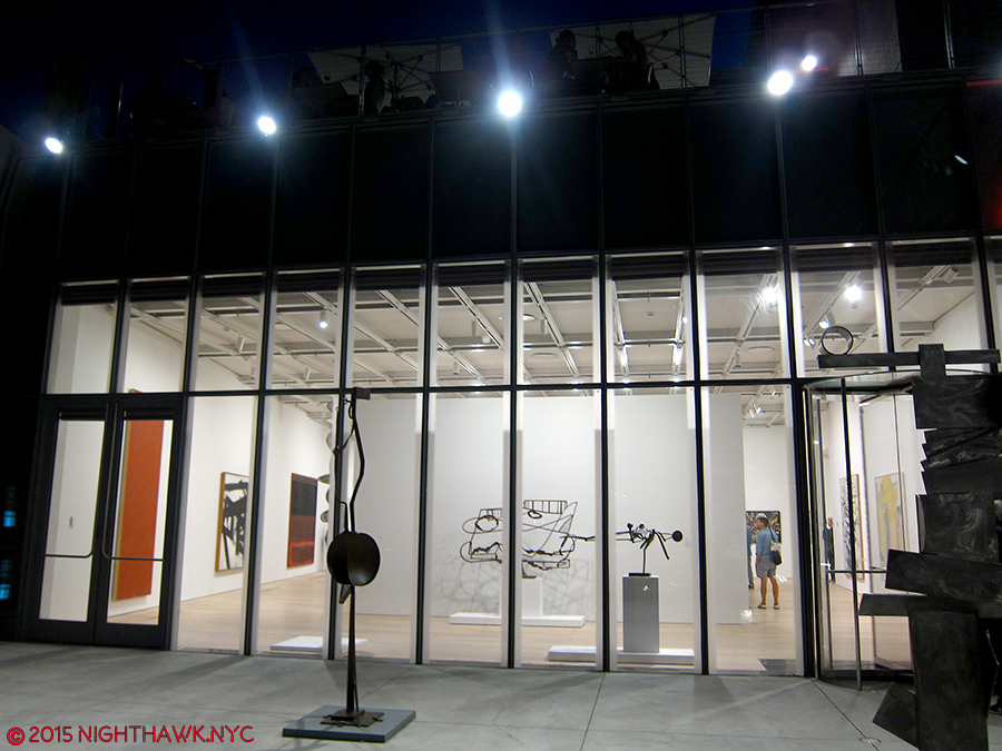
With upwards of 300 works by Robert Rauschenberg on view over 4 shows of his work, and a show of work by early collaborator and ex-wife, Susan Weil, there was too much that lingers in the mind to fit into one Post. My overview of MoMA’s Among Friends is above (here). Part 3, below (or here), looks at the 4 “satellite” shows going on around town. This Post will feature some works that struck me as important, both in terms of Art, and in terms of Rauschenberg’s Art, at Robert Rauschenberg: Among Friends, at MoMA.
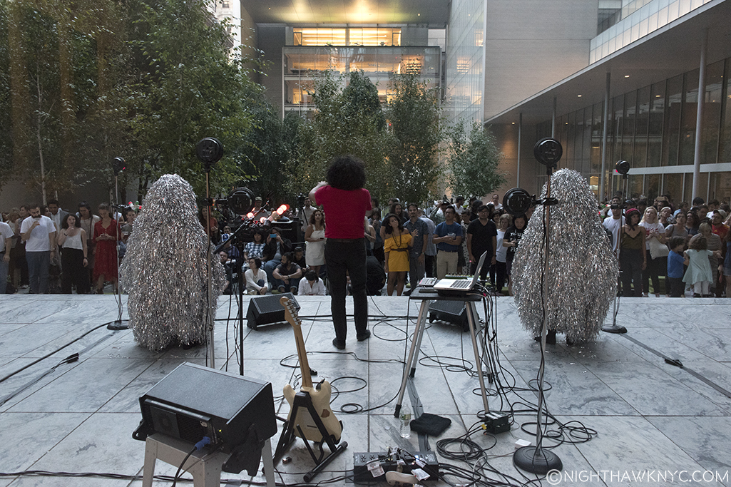
Helado Negro,” with Roberto Carlos Lange, and…? outside in MoMA’s Sculpture Garden on August 31 are hoping there’s no lightning. No, Rauschenberg didn’t design those costumes. I headed upstairs to see what he did create after taking this.

Even on my 17th trip to the show, as with most great Art, I saw something new, and wondered how I missed it before. I’ll explain below. Apparently, I’m not the only one this happens to. In 1961, John Cage wrote this about looking at Rauschenberg. “Over and over again I’ve found it impossible to memorize Rauschenberg’s paintings. I keep asking, “Have you changed it?’ And then noticing while I’m looking it changes1.” His friend, Marcel Duchamp, once said about Paintings- “A painting had an active life of about 30 years; after that it died- visually, emotionally and spiritually2.” Try as I might, I don’t see that at all in Rauschenberg’s work. While I do see an evolution of styles, over the years,  a good deal of it looks like it could have been made this past month. Also, Mr. Rauschenberg’s career not only lasted over 60 years, he was one of the most prolific Artists of our time. Not having seen everything he did, it’s a given that some/many works I previously hadn’t known will seem revelatory. I can’t remember ever feeling, “That’s dated.” Discovery was the joy of these 5 shows for me (and, in looking at Art, in general). And, it was also a very rare chance to see works housed in distant collections, galleries and museums. Still, it was very hard to narrow down the works to those in this Post.

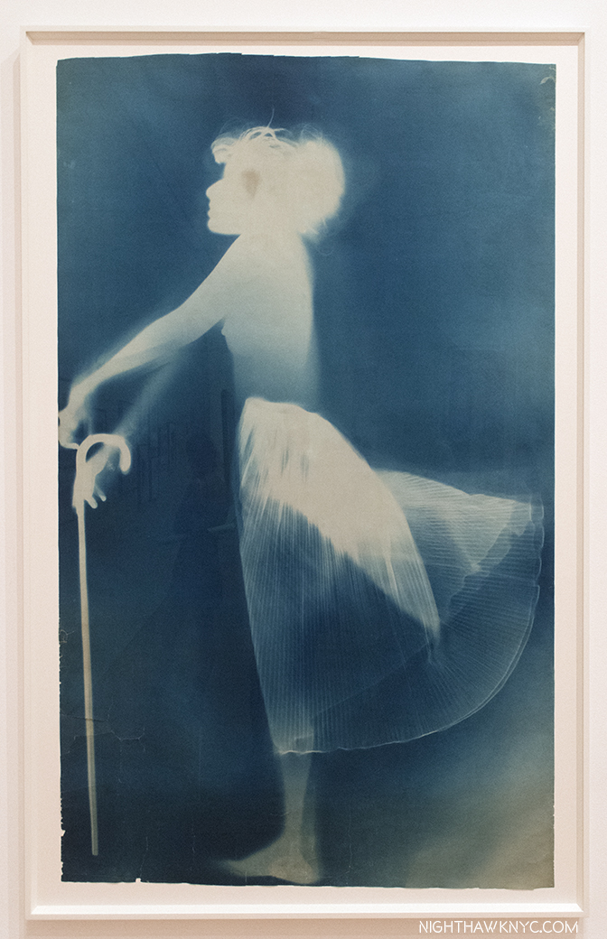
Sue, ca.1950, with Susan Weil, Exposed blueprint paper.

Sue, ca.1950, with Susan Weil, the first work in the show, continuously captivated viewers, as it has for over 65 years. Created with his first collaborator, later his wife and mother of his son, Christopher, and eventually his ex-wife. Early on, they used blueprint paper to create one of a kind works, where the subject would lie on the paper, while the Artist moved over them with a lamp exposing the paper and recording the image. The pair then moved to the bathroom they shared with others to fix the image in the shower. Unique and beautiful, it’s an early example of Rauschenberg’s love of found objects, as they got the paper for free because it came from rolls that had been partially exposed. The works quickly found an audience, being the subject of a 1951 Life magazine photo spread detailing their process, and even resulting in their inclusion in a 1951 MoMA show called Abstraction in Photography. Rauschenberg went on to passionately explore Photography, and Painting, before deciding to be a Painter. Susan Weil is still creating and her show at Sundaram Tagore Gallery this summer will be part of the next Post.

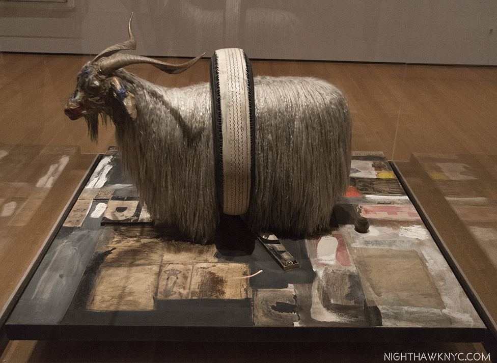
Monogram, 1955-59, Multi-media. Fascinating. From any angle.

Monogram, 1955-59, seen at MoMA, from the Moderna Museet, Stockholm. Ok. It’s famous. Everyone’s seen Photos of it. Seeing it in person is an entirely different animal. An animal that’s rarely seen on this side of the pond. It was last seen here 12 years ago at The Met’s excellent 2005 Rauschenberg Combines show. What made it even more special was it being displayed at MoMA near two survivors of the earlier “states” of the work, as Rauschenberg tried to find the ideal composition in which to incorporate the Angora goat he bought from a second hand store for 35 dollars. He put 15 dollars down on it, and according to Calvin Tomkins, intended “to go back and pay the balance, one day3.” The chance to imagine Rhyme, 1956, and the central panel of Summerstorm, 1959, as part of the work shows he made the right choice, though both are interesting on their own- particularly the inclusion of an image of animals at pasture near the top of that center panel of Summerstorm.

Rhyme, 1956, Combine Painting. In the first state of Monogram,”the goat was mounted right above the red circle. At that point, there was another part of it that extended higher from there.

Summerstorm, 1959. Originally, in the second state of Monogram, its center panel stood in back of the Goat. Later, it was reworked and became a part of this. Yes, that’s a zipper in the middle of the right side.

On my 17th visit I finally noticed this! Near the top of Summerstorm’s central panel, there’s a small image of animals grazing. Rauschenberg went from grazing animals in the second state of Monogram, to his Angora goat “grazing” on Art in the final work.

Then, I used this rare opportunity to study the Combine Painting the goat is mounted on, which is hard to do from photos of it in most books. Each angle of the base reveals new details- the sleeve of a white shirt, to the left of the Goat’s head, a heel from a shoe, part of signs that just can’t quite be pieced together into a word, images of a man looking up, astronauts (a new thing in the world beyond science fiction in 1959), and three small human footprints.

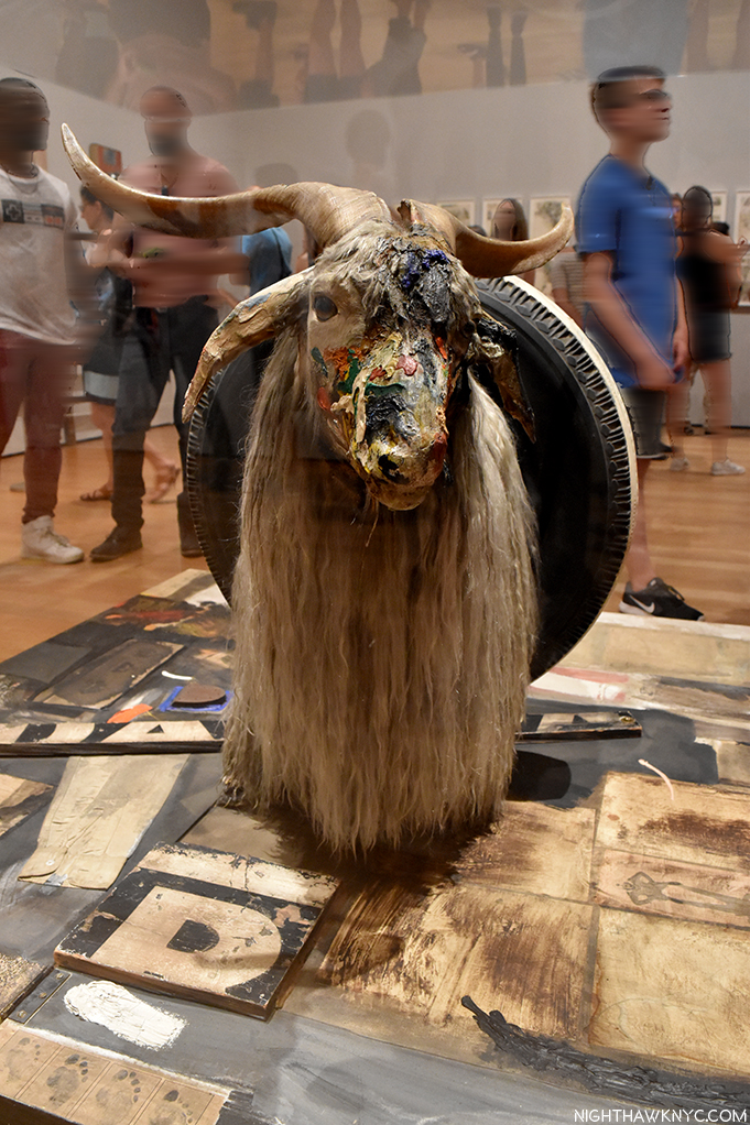
So, how does it feel to be an icon of Modern & Contemporary art? Rauschenberg added the paint on the face to cover damage.

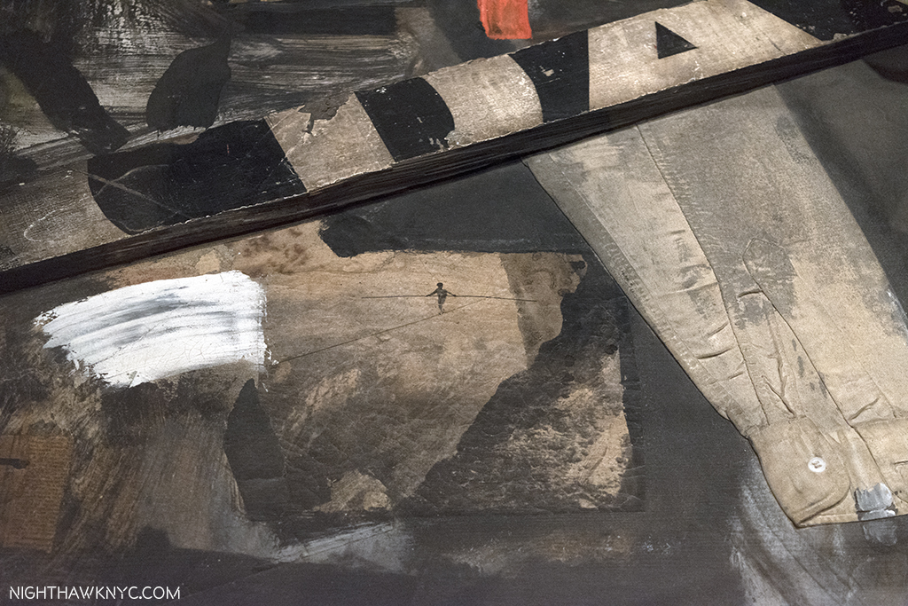
Rolling down his sleeves and walking the high wire of Art. The view of the left front corner as seen from the left side.

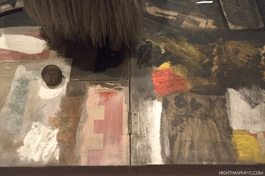
View of the center back. Interesting placement of that tennis ball, right under the rump of the Goat, where it can be “read” as leaving a comment on Art. Also notice the two helmeted figures to the right that could possibly be astronauts.

Another thing about seeing Monogram in MoMA- It’s hard not to wonder about the possible influence Picasso’s famous She-Goat may have had on it. Created in 1950, out of found materials, it appeared in the May, 1953 Magazine of Art, which makes it possible Rauschenberg could have seen it. Also coincidentally, one of the two bronze casts Picasso subsequently made of it were acquired by MoMA in 1959, the year Rauschenberg decided to mount his on top of the Combine Painting it rests on to this day.

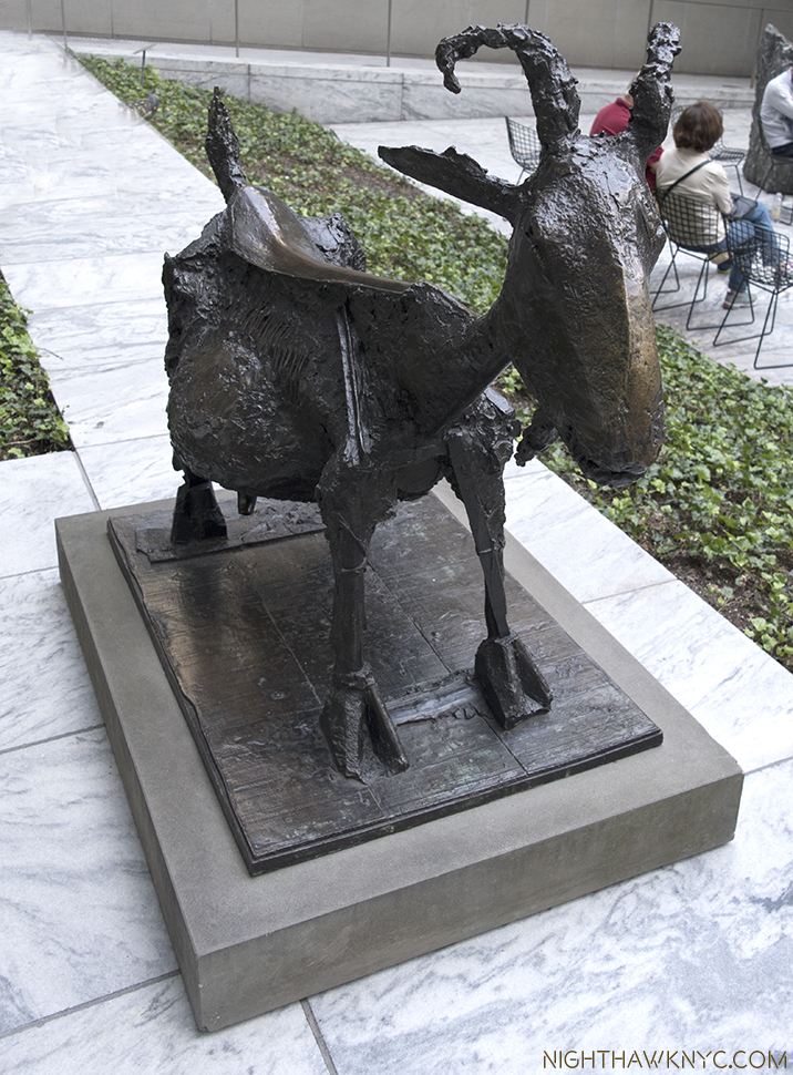
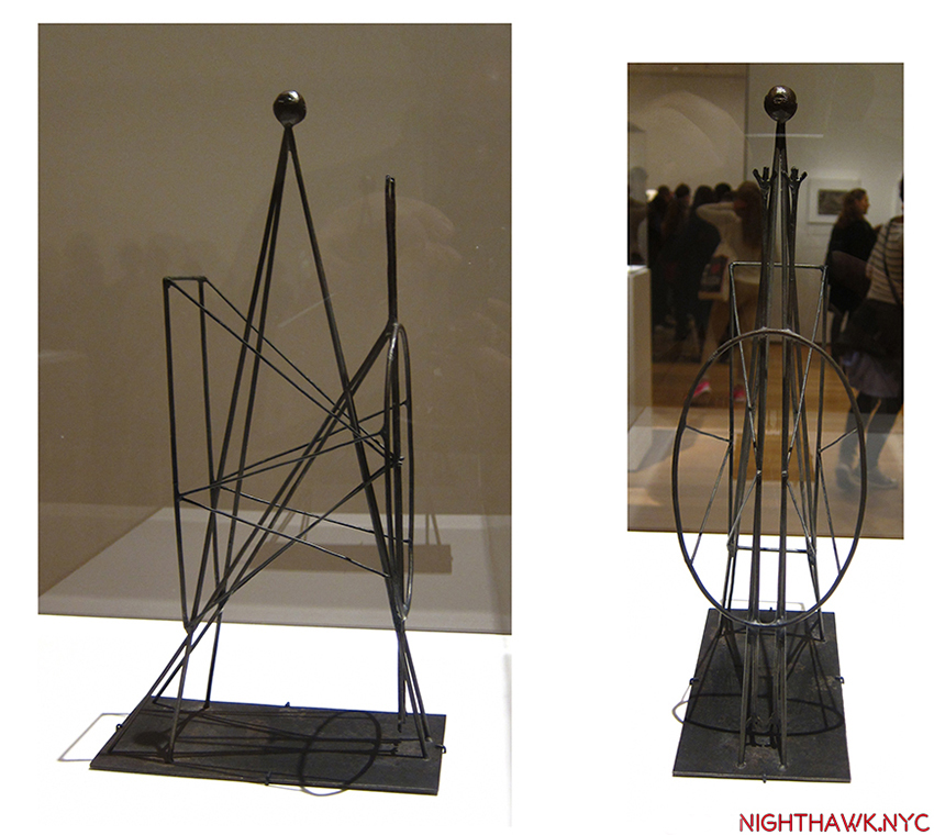
Pregnant with possibilities. Picasso’s (expectant) She-Goat, 1950, cast 1952 as seen outside in MoMA’s Sculpture Garden. Picasso’s original, coincidentally, was made of found objects, and now grazes in the Musee Picasso.

Ok. What does it “mean?” The goat was worshipped by the Ancient Egyptians, where the horns represented Gods & Goddesses, while also symbolizing fertility. In mythology the he-goat was Pan. The goat became the symbol of satanism. Take your pick there. “Animal energy” people say that the goat represents independence, stubbornness, a wild nature, and sexuality4. This last resonates with me. While I don’t know what was on Rauschenberg’s mind when he created it, reading what I have about his personality, journey and perseverance, the “independence” and “stubbornness” parts fit. The “wild nature” fits Rauschenberg’s work to this point as he broke every law of Painting, Sculpture, and Art he could. Beyond that, the best comments on Monogram I’ve seen thus far comes from critic Jerry Saltz who said, “Allegorically, Rauschenberg is a bull in the china shop of art history, a satyr squeezing through the eye of an esthetic/erotic needle. In early Christian art goats symbolized the damned. This is exactly what Rauschenberg was as a gay/bisexual man and an artist, at the time. “Monogram” is Rauschenberg’s credo, a line drawn in the psychic sands of American sexual and cultural values. It is a love letter, a death threat, and a ransom note. It is Rauschenberg carving his monogram into art history5.” As for that “eye of the needle,” the famous tire, Mary Lynn Kotz, a Rauschenberg biographer, points out that the tire is made of rubber, which is made from crude oil, which Port Arthur, Texas, where Rauschenberg was born and raised, was known for6. (If you’re wondering about Rauschenberg’s use of taxidermied animals in his work, he speaks about it here.) Finally, on page 17 of Rauschenberg’s book Photos In +  Out City Limits New York C. there’s a photo of what could be an East Village, or Lower East Side bar (given the beer sign in the window). Gina Guy of the Rauschenberg Foundation told me that “Bob didn’t title Photographs, he simply located them,” so this one is “titled”  New York City, and was taken in 1981. Intriguingly, it includes a fire hydrant with a tire wrapped around it.
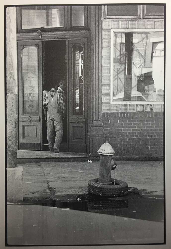
New York City, 1981

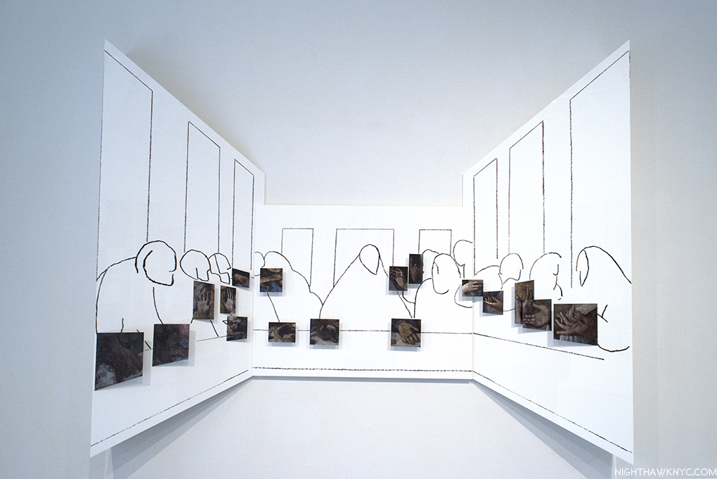
34 Illustrations for Dante’s Inferno, 1958-60, seen at MoMA. For me, these are the key works in his Artistic evolution. Besides the new ground they break on their own, I believe it’s possible to see in them much of what came after in his work. Though Dante’s “Divine Comedy” has been illustrated by many Artists down through the centuries (including William Blake, Gustave Dore, Botticelli and Salvador Dali), Rauschenberg was the first to stage the 14th century classic in modern times. Here, he begins to incorporate Photographs culled from magazines and newspapers, not in collage, but by using the “Transfer Drawing” technique he had developed a few years earlier on a trip to Cuba. It’s a technique where an image is soaked with lighter fluid, placed face down on a piece of Strathmore 14.5 x 11.5 inch Drawing paper, and then rubbed with an empty ballpoint pen, which enabled him to get a shadowy copy of the Photo on to his paper, that he then enhanced using a variety of techniques. Rauschenberg described the end results as “Combine Drawings7.”He created them because he was feeling “increasingly troubled by those who saw his work as a joke8.” “The problem when I started the Dante illustrations was to see if I was working abstractly (previously) because I couldn’t work any other way or whether I was doing it by choice,” the artist explained to Dorothy Gees Seckler. “So I insisted on the challenge of being restricted by a particular subject where it meant that I’ve have to be involved in symbolism… Well, I spent 2 1/2 years deciding that, yes, I could do that9.”

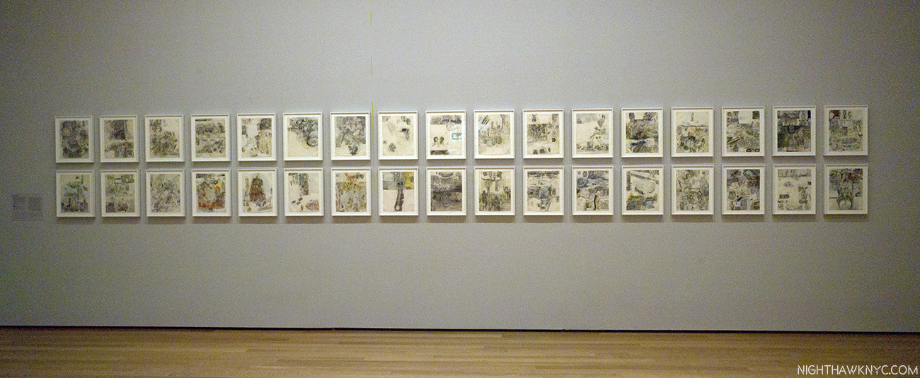
Rauschenberg’s 34 Illustrations for Dante’s Inferno, 1958-60, Transfer drawing on paper, foreshadow much of what was to come. They are rarely seen as a group.

What he created was a way of bringing Dante’s tale of a man “midway in the journey of our life,” into the 20th century, using images he found in newspapers and magazines. They include contemporary figures, (including JFK and Adlai Stevenson), current events, and possibly, gay love. Rauschenberg cloistered himself for the better part of 3 years studying John Ciardi’s “Inferno” translation, communing with the muse, and crafting his remarkable, unique “Illustrations.” The entire set being on view was a highlight of Among Friends10. In the gallery where they were displayed, as I showed in the last Post, they were accompanied by other works with mythological references, including Canyon.

The narrator, Dante himself, is represented by a man with just a towel wrapped around his waist, which Rauschenberg found in an ad in Sports Illustrated for golf clubs. The narrator was 35. Rauschenberg turned 35 on October 22, 1960.

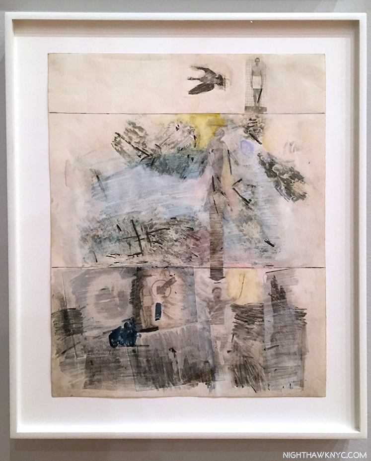
34 Illustrations for Dante’s Inferno, Canto II: The Descent, 1958, Transfer drawing on paper. Our hero, Dante, is at the top, slightly to the right, with a towel around his waist. Interestingly, many of the Illustrations are done in three sections, giving a feeling of being on a journey, and a reminder of the three levels of the afterlife, each given a volume in Dante’s Divine Comedy, The Inferno, being Volume 1..

Halfway through, he began to struggle with certain aspects of Dante’s narration. He decided he needed to work away from the distractions of NYC in the isolation he found in a storage room on Treasure Island, Florida, where he spent 6 months completing the set. “I was so irritated by his morality-the self-righteousness, the self-appointed conscience imposing guilt on old friends. He was the hero and the author….I wanted to show Dante the character in the story, and that forced me into isolation11.” Particularly troublesome for the Artist was reading Cantos XIV and XV, where Dante and his guide, the ancient Roman poet Virgil, encounter the Sodomites in Hell. Among them was an old teacher of Virgil. Virgil responds by taking it personally. “His (Dante’s) morality I treat objectively- the self-righteousness, the self appointed conscience imposing guilt on old friends. He was the author, the hero, and the man who made the world described. He ran into his teacher, and couldn’t imagine what he was doing in hell: It might not have bothered Dante, but it bothered me12.” Rauschenberg found a powerful way of expressing his feelings about this in his Illustration for Canto XIV.

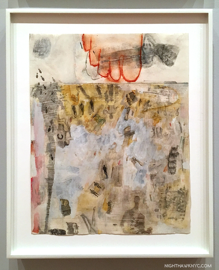
34 Illustrations for Dante’s Inferno, Canto XIV That’s Rauschenberg’s foot traced in red, possibly indicating solidarity with the Sodomites who are condemned to wander hell eternally on burning sands.

In December, 1960, the set debuted at Leo Castelli Gallery, and their reaction served to, finally, establish Rauschenberg’s reputation as a serious Artist. Subsequently, Alfred Barr steered their acquisition by MoMA through an “anonymous” donation, that Calvin Tomkins says came from an architect undergoing a divorce in 1963. Seeing them now, their effect is akin to looking at glimpses of events unfolding through a misty glass, which perfectly fits the distance of 600+ years from the original. Rauschenberg makes the story contemporary, and it’s hard not to think that he might have identified with the central character being “midway in the journey of our life,” though the search for “autobiographical references” in it would be, it seems to me, largely conjecture. Subsequently, he continued to search for new and better ways to get these Photographs, and then his own Photographs, on to canvas, beginning with his Silkscreen Paintings in 1962, and through much of his subsequent career, eventually leading to his use of digital processing of images with computers in his series, Anagrams, through his final works.

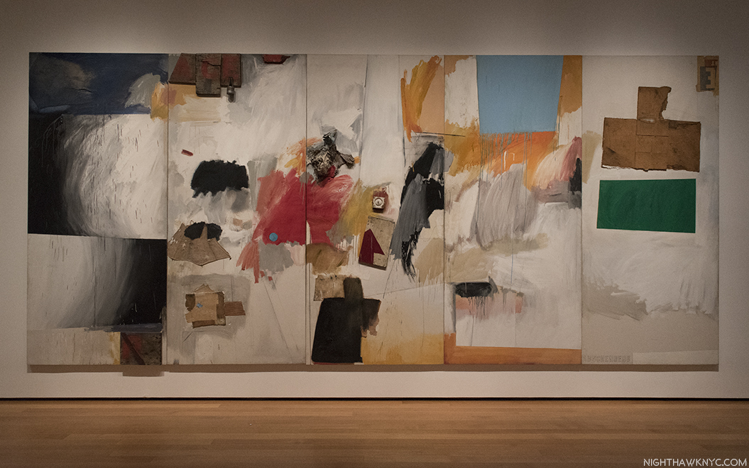
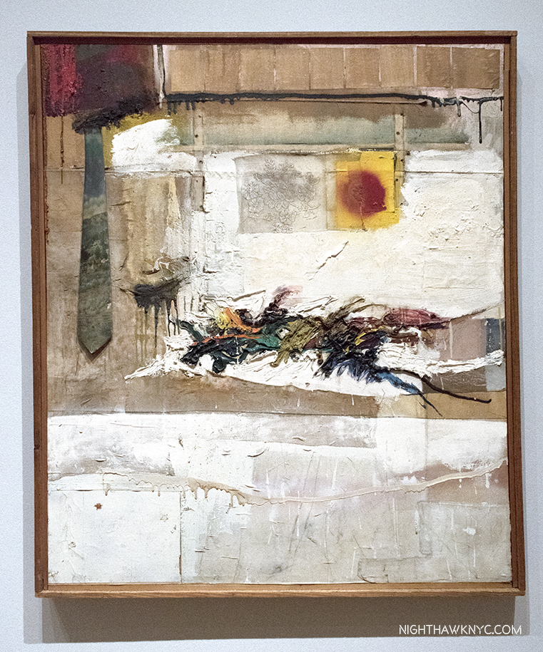
Ace, 1962, Combine Painting. There are some objects attached to the painting, but, unlike in the Combines, they don’t dominate it.

Ace, 1962, Combine painting. After doing Combines for 8 years, Rauschenberg, not surprisingly, felt the urge to move on. As Calvin Tomkins put it, “his methods had become too familiar to him13.” On loan from Albright-Knox Gallery in Buffalo, Ace may be his Painted masterpiece. It’s certainly his most painterly work in the show, it also stands apart, first, for its size (108 x 240 inches, or 20 feet long), and because it was done right before the Silkscreen Paintings took him in a completely different direction. It, apparently, relates to the dancer Steve Paxton, his partner at the time, Ace being Mr. Paxton’s nickname. Though, it also includes some collaged elements, most notably cardboard, here he largely leaves the elements of Combine Painting behind.

The far left panel feels all about motion, told with Abstract Expressionistic/action brushstrokes and drips. That “R” on the bottom is a long way from the “auschenberg,” the rest of his signature, in the far right panel.

Still, almost all of the left-hand 4 panels have the feel of motion, yes, like a dancer in any one of a variety of movements, before we reach the 5th and right hand panel, which seems entirely without motion. Interestingly, it does feature a torso-like cardboard box, a material that would become more prominent in his work. That’s one interpretation. Take from it, as with everything else he created, what you will. In spite of the fact that as Roy Lichtenstein said, “the Combines marked the end of Abstract Expressionism and the return to the subject14,” Rauschenberg continued to use AbEx techniques throughout his career, consistent with his physical, “action” based manner of working.

Mirthday Man, (Anagram, A Pun), 1997, features an x-ray of Rauschenberg done 30 years before, which he called a “self-portrait of inner man.”

“I was the ‘charlatan’ of the art world. Then, when I had enough work amassed,
I became a ‘satirist’ – a tricky word – of the art world, then ‘fine artist’,
but who could live with it? And now, ‘We like your old things better’.”  Robert Rauschenberg, 197215

Not me.

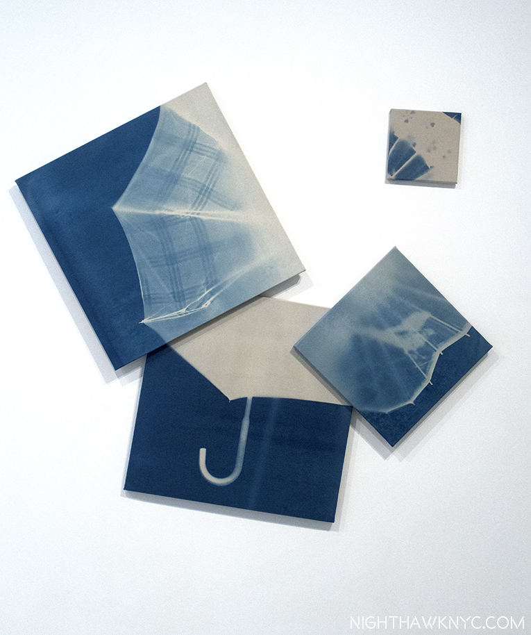
Mirthday Man, (Anagram, A Pun), 1997, Inkjet dye and pigment transfer on polylaminate. (There’s that “transfer” word, again.) Rauschenberg’s later works are the most overlooked part of his career, in my opinion. Maybe it’s because he was so prolific (Calvin Tomkins estimated he had created 6,000 works by 2005, not including multiples16), or maybe it’s because some critics seemed to feel he ran out of ideas earlier on and stopped paying attention. Whatever the reason, the feeling seems to reach into Museums. In New York, it’s rare to see a later Rauschenberg on view in a museum. I think this will all change. To my eyes, his later works are among his most beautiful. While he still loves to finesse an image, and modify it in countless ways, he’s finally perfected getting Photographs into his works in excellent color & resolution-when he wants them that way. He began using Apple Macintosh computers circa 1991 or 1992, back in the day when they were still called “Macintosh.” He was an early adaptor of using digital technology with photographs, though the results of his earlier processes shows that he was getting some of the same layering and modification effects that many Artists now achieve in Photoshop, etc. back in the late 1950’s. In fact, what many Artists do today in Photoshop, etc. looks to me like what Rauschenberg was doing years before digital Photo manipulation. It’s interesting that in his very late work (like the series Scenarios,(an example from which I showed last time, and Runts, 2005-08) the photos are left entirely on their own to dialogue with each other. Mirthday Man, from his Anagram, A Pun series, (which I wrote about here), is a masterpiece of his later period. Created on a single day, the Artist’s 72 birthday in 1997, its images occupy their own spaces and are not layered. While he “modifies” them, the clarity of the base image still shines through. Because they seem scraped or cut up and used in sections, they have a collaged look. Slightly to the left of center is a full x-ray of Rauschenberg’s body from 30 years earlier. (It’s the common denominator with Booster, 1967, which hangs adjacent to it in the large later works gallery.) The images seem impossibly random, and white space is also beginning to come in. The front of an NYC Firetruck (taken near his studio on Lafayette Street), a spoked wheel and an umbrellas (images he’s used frequently), sports jerseys (with a lot of 9’s, 2’s, and 1’s. I looked long and hard, but I couldn’t make out his birthday out of these numbers- 10/22), Botticelli’s Birth of Venus (near the upper right corner. Strangely faded here, it’s an image he also used in Rebus, 1955. The Botticelli is as close as I got to a “birth day” reference…so far! Since most of them are Photographs he took, perhaps the work is a bit of a personal scrapbook, looking back on an extraordinarily eventful & productive 71 years in a way that looks like the way memory often works- in fragments. Whereas he called the x-ray a “self-portrait of inner man,” the rest of the composition is something akin to a portrait of where that man has been, seen in seemingly random moments in dream-like fragments.

He would still have 10 more birthdays to show us the inner man, and everything he saw outside of himself.

*- Soundtrack for this Post is “I’m Looking Through You,” by John Lennon & Paul McCartney of The Beatles.

Thanks to Gina Guy & David White, of the Robert Rauschenberg Foundation, for their assistance.

Oh! One final work…by request. It was in the show, but it’s not by Rauschenberg…

Bob Rauschenberg in Birdo, 1973, by Oyvind Fahlstrom. Per MoMA- “In this work, Fahlstrom affectionately reimagined Rauschenberg’s name in “Birdo,” a language he invented based on American bird sounds….”

I wonder who could have requested it…
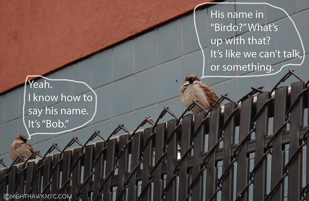
On the Fence #11, Among (Feathered) Friends” Edition

This is Part 2 of my 3 Part series on the shows in this “Summer of Rauschenberg.” Part 1 is above this Part (or here). Part 3, which looks at the 4 “satellite” shows going on around town is below this one, here

NighthawkNYC.com has been entirely self-funded and ad-free for over 6 years, during which over 250 full length pieces have been published. If you’ve found it worthwhile, you can donate to keep it going & ad-free below. Thank you!

Written & photographed by Kenn Sava for nighthawknyc.com unless otherwise credited.
To send comments, thoughts, feedback or propositions click here.
Click the white box on the upper right for the archives or to search them.
For “short takes” and additional pictures, follow @nighthawk_nyc on Instagram.

Subscribe to be notified of new Posts below. Your information will be used for no other purpose.

  1. John Cage, “On Robert Rauschenberg,” in Silence. You can hear him read it here.
  2. Calvin Tomkins Off The Wall, P. 116
  3. Calvin Tomkins Off the Wall, P.124
  4. http://wildspeak.com/animalenergies/goat.html
  5. http://www.artnet.com/magazineus/features/saltz/saltz1-11-06.asp
  6.  https://www.nga.gov/content/ngaweb/audio-video/audio/rausch-ritch2.html
  7. Glenn Lowry in Robert Rauschenberg: 34 Illustrations for Dante’s Inferno, MoMA P.7
  8. Off the Wall, P.143
  9. Quoted in “Robert Rauschenberg: 34 Illustrations for Dante’s Inferno,” MoMA P.9
  10. It’s, apparently, a big deal even to MoMA, itself, who released a limited edition complete set of prints of them in 500 copies for as many dollars, in honor. Unfortunately, as nice as the limited edition is, comparing its prints to the real thing reveals the extremely subtle colors of the originals to be slightly off in the prints to my eyes.
  11. Off the Wall, P.146
  12. Calvin Tomkins Archives at MoMA.
  13. Off the Wall, P. 181
  14. https://www.villagevoice.com/2006/01/03/still-rabble-rousing/
  15. Independent Obituary, 5/14/2008.
  16. “Off the Wall,” P.283

Rauschenberg Around Town: Found Objects

This is the third, and final, part of my series on the “Summer of Rauschenberg”- 5 shows related to Robert Rauschenberg from May though September 30.

Written & Photographed by Kenn Sava (*unless otherwise credited)

Being New York, of course 250 pieces by Robert Rauschenberg on view at MoMA’s “Among Friends” (which I wrote about in Part 1 and Part 2) wasn’t going to be enough for many. Guilty. To the rescue came 4 satellite shows that provided a chance to see more, and even explore lesser known genres of the Artist’s prolific output. With “Among Friends,” they combined to create a fuller, if still not complete, picture of Rauschenberg’s accomplishment. The shows were (in no particular order)-

Robert Rauschenberg: Rookery Mounds, and Selected Series from the 60s & 70s, at Gemini G.E.L. at Joni Moisant Weyl Gallery,
Robert Rauschenberg: Early Networks at Alden Projects,
Robert Rauschenberg: Outside the Box, at Jim Kempner Fine Art, and
Susan Weil: Now and Then at Sundaram Tagore Gallery (Susan Weill was Rauschenberg’s first collaborator, and later his wife & mother of their son, Christopher. Divorced a few years later, she has continued her Art career to this day.)

Among these, too, highlights were plentiful. At Chelsea’s Gemini G.E.L. at Joni Moisant Weyl, it was more like a revelation.

Rauschenberg at Gemini G.E.L. at Joni Moisant Weyl.

As I’ve said in Part 1, I’ve been obsessed with Rauschenberg’s Photography, and was a bit disappointed it wasn’t given a more thorough assessment at Moma’s Among Friends, and so I continued to explore it’s progression as part of his work in the other shows. Rookery Mounds, a series from 1979, turned out to be as close as I got to a breakthrough.

5 of the 11 lithographs comprising Rauschenberg’s Rookery Mounds series, 1979. This was the first time the complete set has been on view since their debut at Leo Castelli Gallery in 1979

Rauschenberg finally started using his own Photographs, exclusively, in his collaboration with Trisha Brown, Glacial Decoy, 1979,  (which was on view at MoMA’s Among Friends, as I mentioned, and showed in Part 1 of this series. In that work, 620 Rauschenberg Photographs were displayed by themselves as the background for the dancers in a constantly changing series of 4 Photos). He subsequently used Photographs from the body of them he created for Glacial Decoy in the series Glacial Decoy Series Etchings and Glacial Decoy Series Lithographs. He also used them in the series Rookery Mounds, 1979, a gorgeous and very important series of 11 prints. These 3 series have a completely different look and feel, to me, from all that has come before. The Photos are shown pretty much on their own in groups, with minimal layering, and, apparently, no surface scraping, washes or other modifications, (besides tinting), and no painting over. They beg the question- “WHY didn’t he do this before?” It took a lawsuit for “borrowing” a Photograph by someone else, without permission, to get Rauschenberg, one of the most under-rated Photographers I can think of, to FINALLY feature his own Photographs in his work.

Hallejulah!

In Rookery Mounds, they are displayed in the most wonderful combination of wildly disparate images, that somehow…magically work together.

Level, left, Steel Arbor, right. Both, 1979, Lithographs from Rookery Mounds.

After looking at so much of his earlier work, the difference is immediately apparent, and startling. In these three series there is a new “clarity” that is different from most of what’s come before, and strikes me as (the beginning of) a new plateau where his Photographs, in higher resolution than ever,  allow him unprecedented image clarity, when he wants it (as here, and in the Scenarios, 2002-06, and Runts, 2007, series, at the end of his career), and, with layering, painting, and other modifications in the Anagrams, 1995-97, Anagrams (A Pun), 1997, and Arcadian Retreats, 1996, series, which I wrote about in 2015. Other series, like the Waterworks, 1992-95, straddle the line between modified/unmodified images. After watching his use of images progress from his Black Mountain Photographs in the late 1940’s, to the Blueprints and the mid-1950’s Combines and Combine Paintings, to the Dante Illustration transfer drawings through the Silkscreen Paintings, it feels like he finally found what he had been seeking all along. Am I saying these are “better” than works containing the Photos of others? No. I don’t believe in those kinds of comparisons. I’m saying that it feels the Glacial Decoy graphic works represent a new style of presentation in his work that is different from what came before, which usually used (more) layering, and I find it to be equally as valid, and to my eyes, perhaps even more beautiful. Those who feel that Rauschenberg ran out of ideas at some point may want to take a look at these.

Rookery Mounds-Crystal, left and Rookery Mounds-Masthead, right. Both, 1979, Lithographs from Rookery Mounds.

Given recent events, one of them, Level, shown above, struck me as ironically prescient…38 years later.

This could have been a real front page a few weeks ago. Detail of Level. It’s ironic that Rauschenberg put this image of water engulfing wood poles on the cover of the Fort Meyers News-Press, as Hurricane Irma, unfortunately, put much of the area under water. Rauschenberg’s studio & home complex on nearby Captiva Island, managed to escape major damage, I’m told.

Why at least one of these weren’t at MoMA in Among Friends, is a question I can’t answer. For the rest of his career he would use his own Photographs, until a stroke denied him the use of his right (Photographing & Painting) arm in the early 2000’s, requiring him to have others take Photos for him. Rookery Mounds is a shining example of why I feel his later work, AND his Photography, are under-appreciated. Rauschenberg was not only the master of the found object in the 2nd half of the century, he was also a master of capturing what I call the “found moment” in his Photographs. Most importantly, the Glacial Decoy project rekindled Rauschenberg’s love of Photography. In the late 1940’s he had agonized about whether to be a Painter of a Photographer. He chose to be a Painter. Now? He’d never look back. His “found moments,” and “found objects” would be central to his work for the rest of his career.

Rookery Mounds- Gray Garden, left, and Rookery Mounds-Night Tork, both 1979, right.

Along with Rookery Mounds, two other rooms featured other works from the 60’s and 70’s, and the discoveries continued. These include a number of Rauschenberg’s work in corrugated cardboard in a series he called Cardbirds, 1971, along side a series of pieces that LOOK every bit like cardboard but are, in fact, made of clay- the Tampa Clay Pieces 1-4, 1972-3.

No, this is not made of cardboard . Tampa Clay Piece 1, 1972-3, Fired clay with screen printed decal and soil patina.

Then there was a set of lithographs- supplementary plates for the deluxe edition of the 34 Illustrations for Dante’s Inferno from 1964. Completely entrhalled by the Dante set, as I wrote about in both prior installments of this series, seeing these darker, black & white works, added new dimensions to them. They share so much with both the Dante pieces, and also with his Screenprint Paintings, also from 1964. JFK appears here as well, among a number of contemporaries, which serves to really act as a bridge between two major series in Rauschenberg’s career.

Ark, from the deluxe edition of 34 Illustrations for Dante’s Inferno, 1964,

And, there was this-

Bellini, #4, 1988, Intaglio in 7 colors on Arches paper. Giovanni Bellini’s Allegory of Vanitas, c.1490 completely restaged.

Down in SoHo, a gem of a show featured rarely seen pieces in a well known but little studied genre of Rauschenberg’s work- Show Posters. Todd Alden and Alden Projects presented a fascinating array of Posters by Rauschenberg, and Artists in his “Early Network,” including Jasper Johns and Cy Twombly, in a show of the same title. The Posters include both unique designs and designs adopted from existing works, or Photographs. Little known is that Rauschenberg created show Posters, continuously, for most of his career. A very nice selection of them from 1959-72, along with an incredible selection of ephemera from the “9 Evenings” theatrical collaboration between Artists and Bell Labs engineers in 1966 was on view. Shows of Rauschenberg’s Posters haven’t happened often after they were included in the 1977 Rauschenberg show that Walter Hopps curated for the National Collection of Fine Arts, which travelled to MoMA.

Robert Rauschenberg: Early Networks at Alden Projects. Installation view. Left are Posters for shows by Jasper Johns and Rauschenberg from the early 1960’s.

Especially memorable were two wonderful Posters by Rauschenberg for his 2nd week of November, 1961 show at Leo Castelli and his first retrospective in 1963 at the Jewish Museum, curated by Alan Solomon. Both are revelations. The 1961 Castelli Poster is particularly brilliant.- wonderfully making sly reference to Rauschenberg’s love of the found object.

Poster for Leo Castelli’s November, 1961 show, showing folds which was the way it came. *Photo courtesy of Alden Projects.

What could be more Rauschenberg then to see the announcement for the show, and it’s title, among a pile of debris, where they, too, become “found objects”- like his materials? Not to mention it’s also a great Photograph, and appears as such in the book, Robert Rauschenberg: Photographs 1949-62 1, though it was, no doubt, taken with the intention of being used for show publicity.

The Jewish Museum piece is both historically important, being for the first ever Rauschenberg Retrospective (the Artist was all of 37), a major event being the first such show at the museum. It was followed by a similar show for Jasper Johns, who also created a wonderful “Flag” Poster which is included in the show, the next year.

Rauschenberg’s rare Poster for his now legendary Retrospective at the Jewish Museum in 1963 features a work unique to this Poster, and the accompanying lithograph..

An audacious work. Rauschenberg was in the middle of his Silkscreen Paintings period, yet this work seems to me to have even more rawness than they do. His handwriting has an edgy look, too. Speaking of “edgy,” stylistically, it presages “punk” rock posters by 13 years.  The lettering of his name on the top reminds me a bit of the “game” he played with his name in signing Ace, 1962, with the R separated from the “auschenberg” by 3 entire panels (see Part 2). Here he moves the “G,” and mirrors the first “R,” leaving “auschenber” looking a bit stranded. The mirroring of the “R” could be seen as mimicking his fondness for including mirrors of various kinds in his works. Given the historical importance of this show- the first retrospective of his work, in 1963, only 10 years after the Arno River incident I led off Part 1 of this series about, and the first retrospective presented at the Jewish Museum, it’s a remarkable piece all around. The only familiar image from the Silkscreen series Rauchenberg brought with him to this Poster appears to be the partially filled glass of water, which could be a reference to the fact that at the time, the Artist was only 37 and had been creating for about 13-15 years. He would go on to create for another 45 years. The glass of his career was barely 1/3 full by that point.

Prophetic. Rauschenberg “Art & Technology” Letterhead, from around the time of “9 Evenings” (1966), an epic series of theatrical collaborations between Artists & Bell Lab engineers at the 26th Street Armory. Rauschenberg’s piece was the infamous “Open Score” tennis match, used technologically enhanced rackets that controlled the lights in the Armory. One of the two players was Artist Frank Stella. “Open Score” may be seen here. *Photo courtesy of Alden Projects.

Over at Rauschenberg: Outside the Box, at Jim Kempner Fine Art in Chelsea, this large work served to be another example of Rauschenberg bringing the viewer into his work, something he does often, as I pointed out in Part 1. In this case, not only is there a chair as there is in Pilgrim, 1960, which I wrote about in Part 1, by 1990, Rauschenberg has become fascinated with reflective/shiny metallic surfaces, which, as seen below, reflect (mirror) whatever is in front of them, bringing the room, and the viewer into the work (and making Photographing it challenging).

Pegasits, from ROCI USA (Wax Fire Works), 1990, Screenprint, wax, polished steel with painted wood chair. 8 feet by 6 feet.

Susan Weil: Now and Then at Sundaram Tagore Gallery. The first collaborator of Robert Rauschenberg, as was beautifully shown at MoMA’s Among Friends, where Susan Weil is Rauschenberg’s collaborator, and subject, of their large blueprint piece, Sue, ca. 1950, (which I showed near the beginning of Part 2 of this series), married Rauschenberg in the summer of 1950. They had a child, Christopher, now the head of the Rauschenberg Foundation, but separated almost a year later, and divorced in 1953, though they remained close after separating. Sharing much of the same Art education background with Rauschenberg, including both going to Black Mountain College beginning in 1948, her Art career had a solid foundation. So, it’s no surprise that she has continued creating, now, for almost 60 years. Their romantic relationship now looks like a small part of her long career.

So, what has she been up to since? A selection of her work from 1972 to date was on view at Sundaram Tagore Gallery this past June, into July, though it was heavily slanted to newer work, with 12 of the 24 pieces on view being from 2016-17.

Susan Weil: Now and Then at Sundaram Tagore Gallery Installation view.

A number of recurring themes were included. Hands- seen in Leftovers, below, which extrapolates the hands from da Vinci’s Last Supper, and Percept Prespect, shows three views of a cupped hand in the shape of  triangles, with each succeeding one receding into space/getting closer to the wall. The effect is akin to falling into the open palm, complete with a sense of space within the work. Trees were, also, the subject of a few works. Her work often has a sculptural element to it, as if it is coming out from the wall to meet the viewer. Many of the works reveal a fondness for using unusual materials and taking images apart. Also on view was a vitrine containing a selection from her journals, which she has been keeping all along.

Susan Weil, Percept Prespect, 2015-16, Inkjet print mounted on paper mounted on Dibond, Each shape is set at different receding distances from the wall, large to small.

Susan Weil, Leftovers, 2015, Digital printing on acrylic sheeting and painted aluminum.

Coming full circle. As she had begun doing with Rauschenberg in the late 1940’s Susan Weil has continued making Blueprints. Here, Penumbrella, 2009, Blueprint. Umbrellas, also, appear frequently in Rauschenberg.

It might be tempting to look for Rauschenberg in her work, but that would be doing both of them a disservice. Susan Weil was “there at the beginning,” and they collaborated for a good many of both of their formative Artistic years. Personally, though there may be some “intriguing echoes” in her work, I don’t see anything more to it than that. She has continually stood on her own and followed her own path, and it was a rare pleasure to see such an interesting overview of her accomplishments.

In thinking about the “sum” effect (sorry) of these 5 shows, the name Man Ray came to mind. They have quite a few things in common. They both worked in an extremely wide range of mediums and broke boundaries in every one. Both had Artistic friends who were associated with various Art “movements,” yet they, themselves, remained beyond category. Both have areas of their achievement that is under-known. Yet, in all the research I did Ray’s name never came up as an influence, or, in fact, was never mentioned in the Rauschenberg interviews I’ve seen, though Man Ray only died in 1976. Of course, some have compared Rauschenberg to Picasso, also because of that wide range of mediums, and because of how innovative both were. While Rauschenberg saw Picasso’s work early on in Paris, and wanted to meet him, I don’t know if he ever did. Rauschenberg strikes me as an Artist who, primarily, especially early on, was living in the moment, perhaps as influenced by his creative friends (including older friends/acquaintances who were Abstract Expressionists) as by Art history (some of his works from the mid-1950’s on feature pieces of masterpieces from the past, like “Bellini #4, 1988, shown earlier, though there is more visual evidence to say that more recent Art history may have been an influence on him- as something to break away from, while he adapted some of it’s techniques). Though Man Ray worked in many mediums, and is, perhaps, best known for his Photographs, he, like Rauschenberg, considered himself a Painter. In 1961, Ray said this about Photography and Painting- “I paint what cannot be photographed, that which comes from the imagination or from dreams, or from an unconscious drive. I photograph the things that I do not wish to paint, the things which already have an existence2.” It’s hard not to see Rauschenberg in that, too..

Mind the gap. Say “Goodbye” to “the Summer of Rauschenberg.”

“Now I’m standing in a doorway with my overcoat on
It really feels like summer’s gone”*

Making 25 trips to these shows from June 1, though their closing on September 30th, these Posts could well be titled “What I Did This Summer.” Taken as a whole, I think these 5 shows could be summed up in one word- “Surprise.” One of the magical things about looking at a Rauschenberg is that you never really see all of it. Certain parts of it speak to you one time, something else the next. It looks different…new to you, each time you see it. Then, there are the works you’ve never seen, since he was so prolific for so long, that surprise you for being unfamiliar. On my first visit, and on my 25th visit there were surprises- new details that altered my thinking about a work, new connections with other works, recent or past, and, new possibilities from them for the future.

I’m not alone in seeing those “new possibilities.” Right now? I can’t think of another Artist who is more influential on other Artists based on what I see in shows these days than Robert Rauschenberg. Not even Picasso.

As the elevator doors closed on my final visit to a Rauschenberg related show this summer, as shown above, I was reminded of his quote from the 1959 MoMA catalog for the show 16 Americans, “Painting relates to both art and life. Neither can be made (I try to act in the gap between the two).” In that “gap” is where I spent my summer.

*-Soundtrack for this Post is “Summer’s Gone,” as recorded by The Kinks. Words & Music by Ray Davies, publisher unknown. R.I.P.-Tom Petty.

Thanks to Gina Guy & David White, of the Robert Rauschenberg Foundation, for their assistance

On the Fence,” #12, The Mind the Canyon” Edition. (The Postscript to this episode follows, below.)

NighthawkNYC.com has been entirely self-funded and ad-free for over 6 years, during which over 250 full length pieces have been published. If you’ve found it worthwhile, you can donate to keep it going & ad-free below. Thank you!

Written & photographed by Kenn Sava for nighthawknyc.com unless otherwise credited.
To send comments, thoughts, feedback or propositions click here.
Click the white box on the upper right for the archives or to search them.
For “short takes” and additional pictures, follow @nighthawk_nyc on Instagram.

Subscribe to be notified of new Posts below. Your information will be used for no other purpose.


  1. as item 109 on Page 217
  2. Undated interview, circa 1970s; published in Man Ray: Photographer, 1981.

Art Shows, 2015 – Who Keeps Your Flame?

“But when you’re gone,
Who remembers your name?
Who keeps your flame?”*

IMG_7838PNH

January, 2015. Goya: Order and Disorder @The Museum of Fine Arts, Boston. Neither snow, nor 5 hours on a train kept the Nighthawk from the Front Door of Great Art.

Since I don’t believe in comparing creative work or creative people, AND I believe that “awards” for “Best” whatever among the Arts (and Sports) are absurd 1, I thought I’d do a “List In No Particular Order” of 2015 Art Shows I saw (some opened in 2014) that may or may not have closed for good, but still continue to open doors in my mind, and that’s more important than any award I could bestow.

“Oh can I show you what I’m proudest of?”*

Goya: Order and Disorder (Museum of Fine Arts, Boston, MA. No photos permitted.) AND Goya:Los Caprichos (National Arts Club, Gramercy Park, NYC)- Two concurrent, excellent shows, 250 miles apart, one huge, the other “small” showing two views of  Goya- one all encompassing, filling the whole lower level of the MFA, one narrowly focused on a rare, complete set of his landmark 80 print, Los Caprichos,(once owned by Robert Henri, who reappears below) combined to show the enduring power, importance, relevance and eternal influence of the Spanish Master. Many saw the former, far fewer saw the latter, tucked away in a dining? lecture? room on the second floor of the NAC (Behind hundreds of chairs on one of my visits!). An artist of nightmares, both surreal and all-too-real, the likes of which perhaps only Bosch can equal, who can then turn around and paint with the utmost lyricism, Goya was all about what it is to be human. Take your pick- portraits, historical pieces, landscapes, the otherworldly or the underworldly, children, tapestries, or his graphic works that hold their own with dare-I-say-Rembrandt, he’ll blow your mind.

DSC07316PNH

Goya/MFA on the show’s elevator entrance, overlooking Dale Chihuly’s Tree.

Remember My Name. Goya’s Self Portrait casts his all-seeing eye on us 215 years later.

The Sleep of Reason Produces Monsters from The Caprichos” So? Stay up!

DSC07711PNH

Neither blizzard, nor the furniture(!), kept the Nighthawk from seeing all of Goya’s incredible Los Caprichos at the National Arts Club, but I think they tried to.

Richard Pousette-Dart (Pace 510 West 25th, Chelsea)- I walked in and was completely captivated by “abstract” Art the way I haven’t been since the Mark Rothko Show at the “Old” Whitney in 1998, which was one of the greatest shows I’ve ever seen. (That’s not comparing.) Don’t be fooled by the apparent geometric simplicity, there is an astounding subtlety to these works that at once feel microscopically considered, often freely rendered, yet globally cohesive. Pousette-Dart had a number of styles, and this show represented one, geometric style, from the 1970’s in both large oils and smaller drawings. For any of those who think that Abstract Expressionism is “easy” to do, go ahead and try creating one of these, the largest is almost 8 foot square, and then see if it has the “Presence” of Dart’s. The amount of work that went into each piece belies their seemingly “simple” composition, is matched by an extraordinary primacy of order, and second only to their transcendent impact. Here, we see Richard Pousette-Dart as the great, “under known” abstract artist. While Pollock & Rothko have grown larger in stature, Pousette -Dart’s name deserves to be right there with theirs. There is only one word to describe this show’s effect- Magical.

Then? There’s never a chair around when you want one. Pousette-Dart @Pace- Presence, Circle of Night, 1975-6, center, Black Circle Time, 1980, left and White Circle Time, 1980, 90″ square each.

Imploding Black, 1975, six feet square. Transcendent,

Detail.

Cerchio di Dante, 1986, six foot square

Detail of the left side.

“Let me tell you what I wish I’d known
When I was young and dreamed of glory
You have no control
Who lives
Who dies
Who tells your story?”*

Richard Estes: Painting New York City (Museum of Art & Design, NYC)- My favorite contemporary artist, and one of the greatest living realists, FINALLY gets an NYC Museum show, and it was worth the wait. A virtual time capsule of NYC from the mid 1960’s to 2015’s astounding Corner Cafe, showing the 83 year old Master is still at the height of his considerable power. Oh…Do NOT call him a “photorealist” in my presence! Estes shows us the world we live in as we do not see it, (more on this soon) and so follows in the footsteps of Edward Hopper and Charles Sheeler in advancing American realism while, perhaps, being the first to include the abstraction that is also a part of the real world. A misunderstood painter, in my eyes, who is only just beginning to be really seen, finally.

Horn & Hardart Automat, 1967. Not since Hopper has a work spoken to me of life in the City like this does.

Columbus Circle, Maine Monument, 1989. 500 years ago, or 100, they came by ship. Now? They come by bus. Frozen in time, side by side.

Times Square, 2004. Nothing captures the experience of the place better than this, though Robert Rauschenberg is capable of giving me a similar feeling (See below).

“I try to make sense of your thousands of pages of writings
You really do write like you’re running out of time.”*

Picasso: Sculpture (MoMA)- If he had never done anything besides paint, Picasso would be considered among the all time Masters. But, noooooooooooo… Picasso was, perhaps, the most unique genius in (known) art history in that his genius was among the most restless. He almost never stopped creating, and he never stopped seeking new outlets for his creative vision. Consider- PICASSO HAD NO TRAINING AS A SCULPTOR! NONE. Yet, that didn’t stop him from becoming, perhaps, THE most revolutionary sculptor up to his time. There is so much great work to see in this show, I don’t even know where to start talking about it. “Picasso: Sculpture” shows us the naked face of endlessly creative genius the like the world has never seen. I’ll sum it up by saying virtually all of it is wonderfully selected, though some of the Cubist works here don’t stand up to his paintings, in my opinion, and wonder- When will we see his like, again? The “other” takeaway, for me, is- Oh…MoMA. I miss you. About as much as I miss your “old” building.

Standing Figure in Wire, 1928. Unprecedented. Astounding.

Sylvette, 1954. “I see you slightly folded…in steel, my dear.” Picasso must have said.

America Is Hard To See (Whitney Museum)- I’m saving my thoughts on the “New Whitney” Building (UPDATE- They may be seen here.), but the opening show in the new place was a wonderful “Welcome Back” to one of the first 3 of NYC”s Big Four Museums and a reminder of its world class (and first anywhere) collection of American Art. My personal highlight? The first floor gallery featuring a selection of Hopper Drawings done at the Whitney Studio which predated the Museum, and the absolutely mesmerizing portrait of Museum founder, the indomitable Mrs. Gertrude V. Whitney (also an overlooked sculptor) that looked out at Gansevoort Street, and for my money? SHOULD HAVE BEEN LEFT RIGHT THERE- PERMANENTLY! It wasn’t.

IMG_0992PNH

Frozen in time. Mrs Gertrude Vanderbilt Whitney looks out on the new home of the collection she started.

Mrs. Gertrude Vanderbilt Whitney by Robert Henri, 1917, with her Study for the Head of her Titanic Memorial from 1922, right. Yes. She was a sculptor, too.

Before the First Whitney Museum opened in 1931, there was the Whitney Studio Club, where artists came to draw from the model. See that guy to the left of center rear with the light shining on his bald head? That’s Edward Hopper, a regular. That’s why his estate was left to The Whitney. Litho by Mabel Dwight, 1931.

America is hard to change. Excellent, rarely seen, works by Grant Wood, Study for Breaking the Prairie, 1939,…

…And Kara Walker, A Means To An End, 1995, struck me as serendipitous.

IMG_0967PNH

America: Seen everywhere. Inside- Rothko’s Four Darks in Red, 1958, Pollock’s Number 27, 1950, Chamberlain, Jim, 1962 & Guston’s Dial, 1956…

IMG_0940PNH

…And, Outside- sculpture from one of the countless roof decks.

“And I’m still not trough I ask myself,
what would you do if you had more time
The Lord, in his kindness
He gives me what you always wanted
He gives me more time.”*

I end this section honoring two endlessly creative American “painters,” featured in very very good shows. Like Richard Estes, these two artists also put that “more” time of a long life to superb use. Yes, despite evidence to the contrary, they both consider themselves to be painters. To me, the “lessons” of their lives, how they were able to survive following their star in this country for so long, may prove to be as important as their considerable artistic legacies.

Robert Rauschenberg- Anagrams, Arcadian Retreats, Anagrams:A Pun (Pace 534 West 25th, Chelsea)- Presaging Photoshop, the late, great Mr. Rauchenberg continues to speak to our times though he, unfortunately, left us almost 7 years ago. Light years ahead of his times, throughout his life,  Anagrams…, a show of Mr. Rauschenberg’s final development, shows that once again, his work will look “contemporary” for years to come, and more amazingly, I think it will be as relevant as what anyone else is doing at the moment! As I just said, he represents something of an American miracle- an artist who was able to spend virtually his entire life creating EXACTLY what he wanted to, answering to no one but himself. That sure must seem miraculous to today’s American artists. Interestingly, like Mr. Estes, the works here are based on Mr. Rauschenberg’s own photography, to very different results. Unlike Mr. Estes, Mr. Rauschenberg’s are directly transferred to the piece, though with such skill and subtlety they have the effect of melting into the others they’re surrounded by. A surprisingly fresh, visually rich, often beautiful show who’s spell will call me a few more times before it ends on January 16. And then, I will miss it, but it will have changed the way I see the world, like Richard Estes has.

Rauschenberg @ PACE. I just loved this show.

Frank Stella (Whitney)- An art mover’s nightmare of a show, the Artist’s helpful hand notated directional markings seen on some of the pieces notwithstanding, it must have been hard for Mr Stella, himself, to narrow his 50-some year career down to one floor at the New Whitney, handsomely displayed in the still-new space. With only one Moby Dick piece in sight, the take away for me is that here is a Triumphant overview of another rare American artist who continues to explore and evolve, fickle times and the “harpoons” of even more fickle critics & collectors be damned. Mr. Stella has devoted his career to the eternal pursuit of finding new possibilities, “new spacial complexities” 2, for the Art Form of painting. Some of these sure look like sculpture, but I’ll bow to what he says on one of the show’s signs- “Q- You still call these paintings? A- Yes. They are, in fact, paintings.” Remarkably, as he closes in on 80 this May 12, Mr. Stella continues to “start over,” as Richard Meier says on the audio guide, eternally following his muse, breaking painting out of 2 dimensions, to lord-only-knows-where-next. In this show’s case? The Journey IS The Destination. Mr. Stella strikes me as a master conceptualist with an endless font of making the unlikely, and especially the unthought-of, real. Forget this show’s afterthought of a catalog, for me, his value, “message” and influence lie in the sheer physical experience of his work- they simply must be seen, and often, walked around like sculpture to be fully appreciated. Who else “paints” like this? If you go, and you should, check out the great quotes from Mr. Stella on the wall signage- “What you see is what you see.” And then some. What I saw was a show to fire your creativity, and inspire you to see new possibilities in anything, if there ever was one. You still have a few days left to see it before it closes after February 7. Then, the art movers get to pack it up and move it out. I would pay to watch that.

50+ years of “starting over.”

“Toto, We’re Not On Canvas, Anymore.” Stella Busts Painting Out.

“Um..A Little Higher On The Right?”

And lest I forget…

Cubism (The Met No photos permitted.)- TM is on a mission to shore up its Modern & Contemporary Art holdings, as we will soon see at The Met, Breuer, but this show featuring works of a promised gift goes a very long way to solidifying TM’s Cubists holdings, and then some. So many strong works by the Masters of Cubism, Picasso, Braque, the underrated Juan Gris, and Leger abound, they made me wonder where TM is going to install them all when they finally get them!

Madame Cezanne (TM No photos permitted.)- Portraits are not the first thing most think of when they think of Cezanne. Many think of his groundbreaking landscapes and genius with color, but this show of his, no doubt long-suffering wife, says as much about this under known muse as it does about Cezanne. The hours she spent posing for him reminds me of “The Man in The Blue Shirt,” by Martin Gayford about sitting for Lucian Freud. The show is a striking look at another side of this master of impressionism, and gives us rare opportunities to see 4 versions of a painting reunited, and Cezanne’s actual sketchbooks. A rare treat for the lover of Impressionism, portraiture and great Art.

China Through The Looking Glass (TM)- Except for Picasso: Sculpture and Goya’s Los Caprichos, the above shows are painting shows, my true love, but CTTLG is in a category all its own. ANY show that can get TM to stay open till Midnight has to make the Nighthawk’s list. After setting the bar high with “Alexander McQueen: Savage Beauty,” TM’s Costume Institute topped themselves with a spectacle that the 800,000 who saw it will remember almost as long, and which will prove quite a challenge for 2016’s “manus x machina,” or MxM, as I’m calling it to equal, let alone top. I predicted 1 Million will attend it, so GO EARLY (or don’t say I didn’t warn you) & Stay tuned!

Francis Bacon- Late Paintings – (Gagosian No photos permitted.) – with one work, a triptych selling for 142 million, I can’t fathom how much 28 are worth, but here was a chance to see that many in one show, focused on the seemingly contemplative, other-worldly “late” Bacon,

DSC07520PNH

especially after seeing the following (Rembrandt show) on the same day, which brought to mind subtle, fascinating convergences- self-portraits, multiple views, or states, for Rembrandt, diptychs & triptychs for Bacon, among them.

Rembrandt’s Changing Impressions (Columbia U.)- In lieu of the “big one” I missed (see below), this was a closer-to-home chance to see 50 or so prints by the Master and a rare chance to see various “states” (versions) of works side by side. A bit light on the most well known of Rembrandt’s etchings, but very worth 4 visits none the less.

Not a triptych. Rembrandt creates 3 masterpieces from one composition.

Chuck Close Recent Paintings (Pace 534, Chelsea)- I met Mr. Close, briefly, but in spite of the fact that he is one of the greatest portraitists of the 2nd half of the 20th Century+, I know he won’t remember my face. He has Prosopagnosia. He’s ALSO paralyzed and in a wheel chair. I never cease to be absolutely astounded at what he achieves and what new ground he breaks. Already a Master before his brain aneurysm, which would have stopped 99.5% of anyone not named Chuck Close, he’s gone on to create ever new works that continue his life long exploration of his famous “grid technique.” These works add even new elements- new palettes, a new approach to focus and depth of field, and more.

Linda & Mary McCartney (Gagosian Books)- If they had taken down all the title cards, removed the iconic shots among Linda’s, and you walked in without knowing which work was by who- Linda McCartney, or her and Paul’s daughter, Mary, you’d never know. That’s how amazingly symbiotic the eyes of the two photographers are. They see as one. Walking out, and I say this with nothing but respect, it really felt like Linda had never passed away. That her work continues. I’ve never seen anything quite like it.

DSC07609PNH

The daughter reflects well on her famous mother.

George Caleb Bingham (TM)- The year’s “sleeper” pick. I don’t know if he ever met Mark Twain, but if Mr. T. ever wanted an artist to illustrate “Huck” or “Tom Sawyer?” G.C.B. would get my vote. His work captured what it was to live on the River the way only Twain, himself, has, and makes a contribution to laying the ground work towards defining a truly “American” style of painting, and by the Mid-Nineteenth Century? It was about time! TM’s show reveals him to be something of a predecessor for that other great American 19th C. portraitist, Thomas Eakins, but with a style and a power of his own that still holds up.

Araki (Anton Kern, NYC)- He lost his wife…he gets prostate cancer…he says he no longer has sex…Nothing stops the indefatigable, legendary Araki. Don’t let the “casual” taping of the photos to the wall fool you- I found this show striking, poignant, meditative and moving. The images flowed one to the next, sometimes in harmony, sometimes in dissonance, but all of them speak with that sense that only Araki has. Some will say he’s a misogynist. I’m not a woman but I disagree. I see beauty and poetry in his shots of women. Reading some of the press materials on hand, I was struck by his comment that he had sex with most of his models. I couldn’t help wonder- Does that include Bjork? Live long, and much health, Araki.

Also lingering in my mind, tormenting me with what I missed, are the ones that got away-

Late Rembrandt (Rikjsmuseum, Amsterdam)- I agonized about going. For months. Like I agonize about Frank Gehry at LACMA right now! (Hello, Sponsorship?)

Bjork (Moma)- Sold out when I went. Bad reviews be damned, I love Bjork.

Overall, it was a good, but not great year. Still, these 17 shows had real staying power and lasting influence. I’m grateful that in NYC, we still have so much to see. As I said a few posts back, I live in mortal fear of missing a great show- Like all those I missed this year because I never knew about them, and still don’t.

As I look back on 2015, the Idea of great Art is what lingers in the mind, inspires, even instructs. The experience, talent and creativity of a great Artist speaks to the highest & best of mankind, in ways the rest of us can, perhaps, relate to, learn from, and even aspire to. As Mr. Pousette-Dart cosmically said-


In these times of so much senseless hatred, violence and the worst of human kind on display, we need this more than ever.

*Soundtrack for this post is “Who Lives, Who Dies, Who Tells  Your Story?” from the 2015 album I listened to the most, “Hamilton– Original Broadway Cast Recording, by Lin-Manuel Miranda.

NighthawkNYC.com has been entirely self-funded and ad-free for over 7 years, during which over 275 full length pieces have been published. As I face high expenses to keep it going, if you’ve found it worthwhile, please donate to keep it up & ad-free below. Thank you!

Written & photographed by Kenn Sava for nighthawknyc.com unless otherwise credited.
To send comments, thoughts, feedback or propositions click here.
Click the white box on the upper right for the archives or to search them.
For “short takes” and additional pictures, follow @nighthawk_nyc on Instagram.

Subscribe to be notified of new Posts below. Your information will be used for no other purpose.

  1. Remember- Charlie Chaplin, Hitchcock, Fellini, Orson Welles, Akira Kurosawa, Ingmar Bergman or Stanley Kubrick, among others, never won an Oscar for Best Director! I rest my case.
  2. as is said on the audio tour, #508

Robert Rauschenberg: Anagrams (A Pun)- But No Joke

This site is Free & Ad-Free! If you find this piece worthwhile, please donate via PayPal to support it & independent Art writing. You can also support it by buying Art & books! Details at the end. Thank you.

Written & Photographed by Kenn Sava

11 days after being here for the final day of the Chuck Close: Recent Works, I returned to Pace’s 534 West 25th Street Gallery to see Robert Rauschenberg: Anagrams, Arcadian Retreats, Anagrams (A Pun), on view until January 16, 2016. Up a few steps to the back office area where the show continues, a short video of Rauschenberg at work in on view. As the camera looks down from slightly above, I noticed that surrounding him all over his studio were numerous works consisting of seemingly chaotic collages of images. I couldn’t help wondering about the effect on a visitor’s brain of spending 8 hours in that studio, and what it would  feel like to then walk outside. I wondered what they said about the images playing inside of Rauschenberg’s mind all the time. Day in. Day out, for the 82 years he lived. It might be why there’s so much to see in even one of his works. This new show makes clear that it may be a long time yet until everything that brain, and he, created in his professional life from the 1950’s until he passed in 2008 is seen, fully appreciated and assimilated.

These works are dated 1996 and 97. Visually, his work presaged the visual chaos of the internet age, and the graphic print style of David Carson and others. Seen in 2015 it fits right in with the everyday chaos of NYC, both on the physical level, where pedestrians have to face a never ending life, death or injury battle with bikes, cars, buses, trucks and lord knows whatever else, simply to get from point A to point B, while being bombarded with every square inch plastered with ads, images or graffiti on the visual level.

The modern world makes me try to make sense out of its visual chaos- like Rauschenberg did so masterfully.

Visual chaos, 2015. Without the “Art.” By the way? Times Square was better before

Anagrams, Arcadian Retreats, Anagrams (A Pun) is a bit different from any Rauschenberg show I’ve yet seen. It’s concise yet catholic, coherent and sharply focused on these three series of works, which share working methods, making it very hard to tell which work is from which series. As such, it’s a rare opportunity to see a selection of late works. Pace’s release states the images are from Rauschenberg’s own photos, which continues a trend in recent shows of artists using, or basing their work on their own photographs (Richard Estes, Chuck Close). Rauschenberg appears to have been at the forefront of image manipulation, made possible by software like Photoshop, while adding “painterly elements.” Regarding exactly what these pieces are and how they were made, Pace’s press release says- to create these works, “he developed and perfected a powerful new technique combing dye transfer with novel supports including plaster, large-scale paper and polylaminate panels…The process produced an aqueous and fluid appearance, blurring the crisp edges of his photographs…The inkjet dye process also liberated Rauschenberg from the mechanical production of printing screens, allowing him to produce sheets exclusively from his own photography on an in-studio printer. In addition to a more painterly effect, these works reflect a more nimble and freer approach to image-making than earlier works which were bound by the limitations of the mechanical process.”


It’s tempting to “read into” the resulting images, some of which are repeated verbatim in other works, and take them as a visual language, to be deciphered for “messages,” even hidden meanings. That will take a lot of looking to compile. Though “anagram” is a word about words, I don’t think I’ll be taking it that literally. I prefer to let the images speak, and this show is an orgy for the eye.

The works range from very large to large and a few of medium size. Two, including the largest, (one, I felt to be the most impactful piece in the show), are owned by the Whitney. Most of the others are not titled, detailed or described. Many feature images from different cultures around the world from the Sphinx and the Pyramids to traditional costumes, apparently from trips he had taken shortly before, which are juxtaposed with images from the western world, like construction equipment, firefighters, store fronts, junked cars, bicycles and soda bottles. Despite being combined, layered, even processed, the results don’t look like images produced in Photoshop. They look more like paintings, which I find somewhat remarkable, probably because I am so used to seeing Photoshopped Photographs. While he anticipated digital image processing and manipulation in works gong back to the late 1950’s, he continued doing things entirely his own way, and only selectively using technology when it suited his aims.

I previously saw some works from these series in the 1977 Guggenheim Rauschenberg Retrospective, but these were new to me. Seeing only works from these series brought home how wonderful they are. They’re different from what he had done earlier in his career, yet they have that undeniable “Rauschenberg” feel. In spite of being Photo based, they retain a “painterly” look, which I think is remarkable, and one of the things that sets his work apart from all those doing these types of works today. For me, Rauschenberg is kind of an American Picasso of the 2nd half of the 20th Century- his creativity and inventiveness knew no bounds. Like Picasso, he never stopped innovating and trying new things and techniques. Even 7 years after his passing, we continue to discover new facets of this work, which seems as fresh and contemporary as anything else around today. That will, no doubt, continue at the first full scale retrospective of his work since the Guggenheim’s 1997 blockbuster to be held next year at the Tate Modern, London.

These are wonderful works that reward repeated looks from a period of the Artist’s career that strikes me as being under appreciated. They seem so of the moment, it’s hard to think they’re going on 20 years old. In that sense, like their creator, they are ahead of their time, even now. I’m continuing to try and get the modern world to look like a Rauschenberg to me, to make that kind of sense, possibly even find the “Art” in it…that is when I’m not dodging bikes, cars, and the rest to actually feel safe enough in it to look around. That danger is what’s missing in these Rauschenbergs. Probably because he seems to be focused on the bigger picture, the dangers of the modern world to ancient cultures and ancient creatures. Including man.

On a bigger scale, like that bike I don’t see coming the wrong way on a one way street, the modern world is obliterating all that came before.

DSC02584PNH

*-Soundtrack for this post is “Crosstown Traffic,” by Jimi Hendrix.

NighthawkNYC.com has been entirely self-funded & ad-free for over 8 years, during which 300 full-length pieces have been published! If you’ve found it worthwhile, PLEASE donate to allow me to continue below. Thank you, Kenn.

You can also support it by buying Art, Art & Photography books, and Music from my collection! Art & Books may be found here. Music here and here.

Written & photographed by Kenn Sava for nighthawknyc.com unless otherwise credited. To send comments, thoughts, feedback or propositions click here. Click the white box on the upper right for the archives or to search them. Subscribe to be notified of new Posts below. Your information will be used for no other purpose.