Philip Guston, George Segal, Jeffrey Gibson, Njideka Akunyili Crosby, Wade Guyton: NoteWorthy Shows, Summer 2023

This site is Free & Ad-Free! If you find this piece worthwhile, please donate via PayPal to support it & independent Art writing. You can also support it by buying Art & books! Details at the end. Thank you.

Written & Photographed by Kenn Sava

What do Philip Guston, George Segal, Jeffrey Gibson, Njideka Akunyili Crosby and Wade Guyton have in common? At least three things. One, they’re all Artists. Second, they each had a NoteWorthy Show up in NYC this summer. Third, I bring them together in my look at each of those shows here as part of my coverage of the busiest summer in the NYC Art world since before the pandemic began.

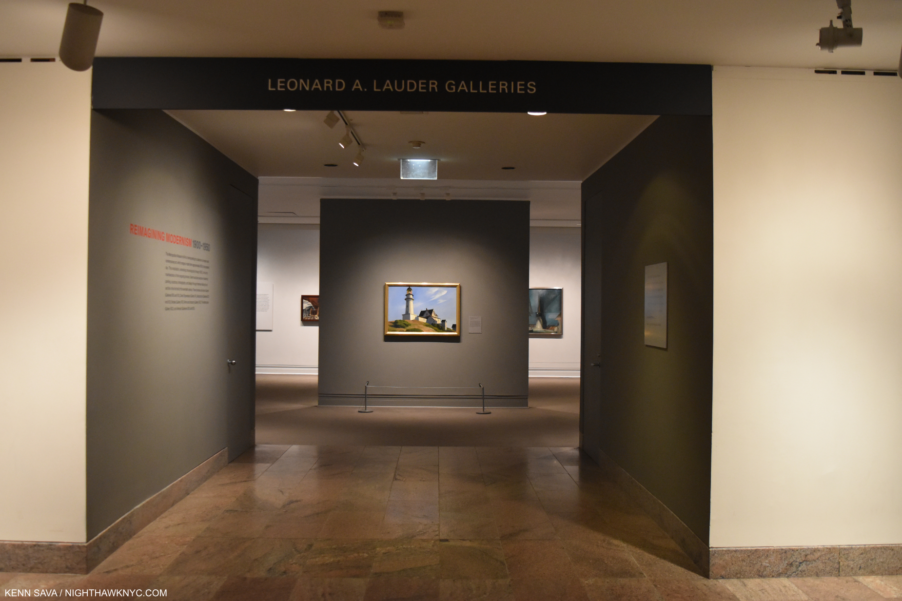
Philip Guston: What Kind of Man Am I? @ The Metropolitan Museum

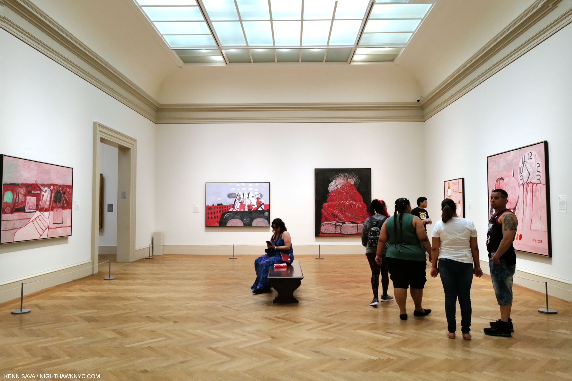
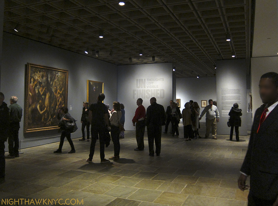
Installation view of 5 of the 8 works on view in this gallery gleaming under the just completed skylight project. Another work, one of his “abstractions” from the 1950s, which I wrote about here, was hung outside the door in the corridor to the Modern Wing to my right. Click any Photo for full size.

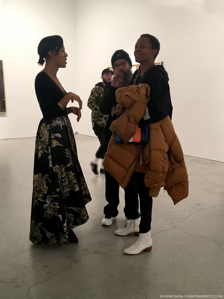
In Part 3 of my series on Edward Hopper’s New York I wrote about the Whitney Museum’s handling (mishandling?) of the extraordinary Jo Hopper Bequest in 1970. I mentioned that it was a lesson for other Artists going forward. In December, 2022, word came that Musa Mayer, daughter of Philip Guston (1913-80), had decided to donate 220 works by her father to The Met. As an American Artist (born in Canada), there’s little doubt the Whitney Museum of American Art (who currently own 3 of his Paintings, and 6 Drawings) was considered for this gift at some point (I surmise). Did their handling of the Jo Hopper Bequest (in which they the Whitney THREW OUT virtually all of Jo Hopper’s Art, and have recently sold a notable Edward Hopper Painting), enter into her decision?

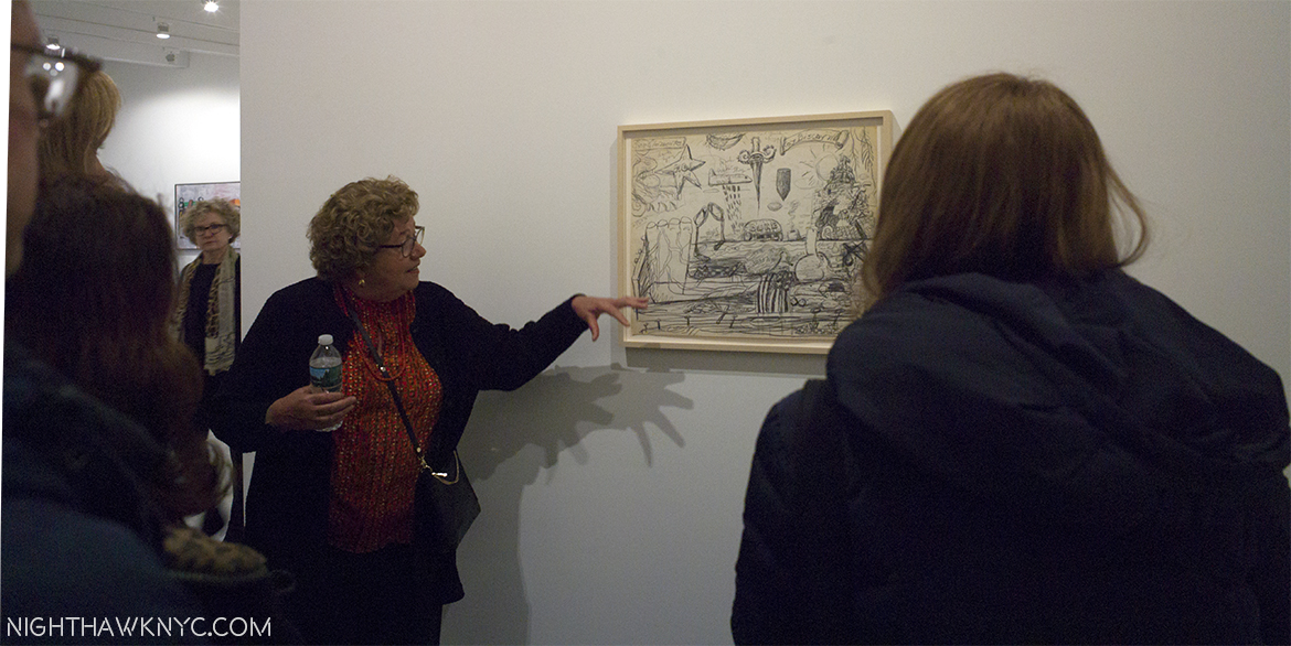
Musa Mayer, the lady responsible for this extraordinary gift, discusses the finer points of one of her father’s Nixon Drawings @ Hauser & Wirth in January, 2017.

I don’t know. Ms. Mayer opted to make this exceptional & vitally important donation to The Met. 

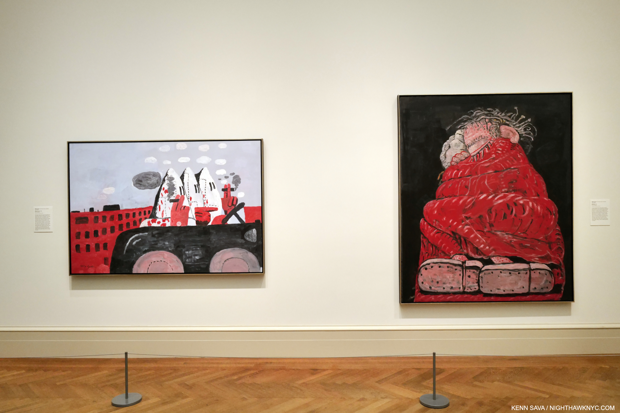
Riding Around, 1969, left, and Sleeping, 1977, right, both Oil on canvas.

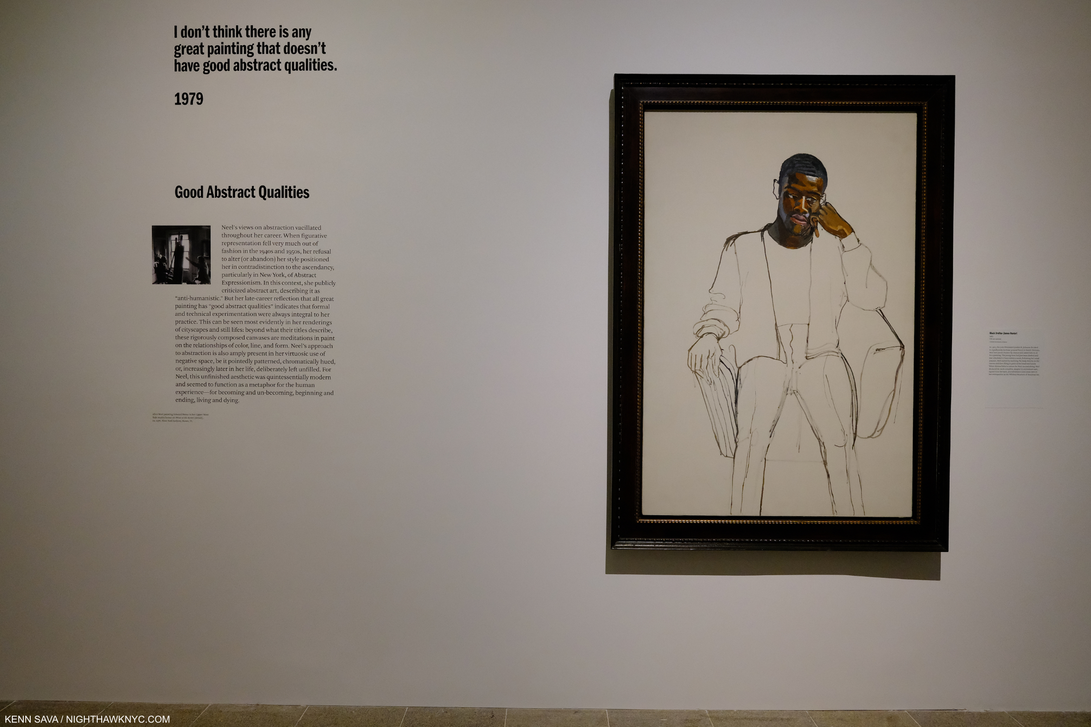
To mark the occasion, The Met mounted Philip Guston: What Kind of Man Am I?, a concise, but powerful show of 8 Paintings. The show focused on the last decade of the Artist’s work from 1969 to 1980 and includes nothing but major works, in my opinion, including one of his “Klan” Paintings (which I wrote about in depth here). His last decade has gotten more and more attention as time has passed, after initially puzzling many viewers. Installed near the Impressionist and Van Gogh galleries, and not in the Modern & Contemporary Galleries across the hall (where at least one Guston is usually on view), I took that as an indication of The Met “saying” that Philip Guston is an Artist for the ages. I bet he’d be proud. 

George Segal: Nocturnal Fragments @ Templon

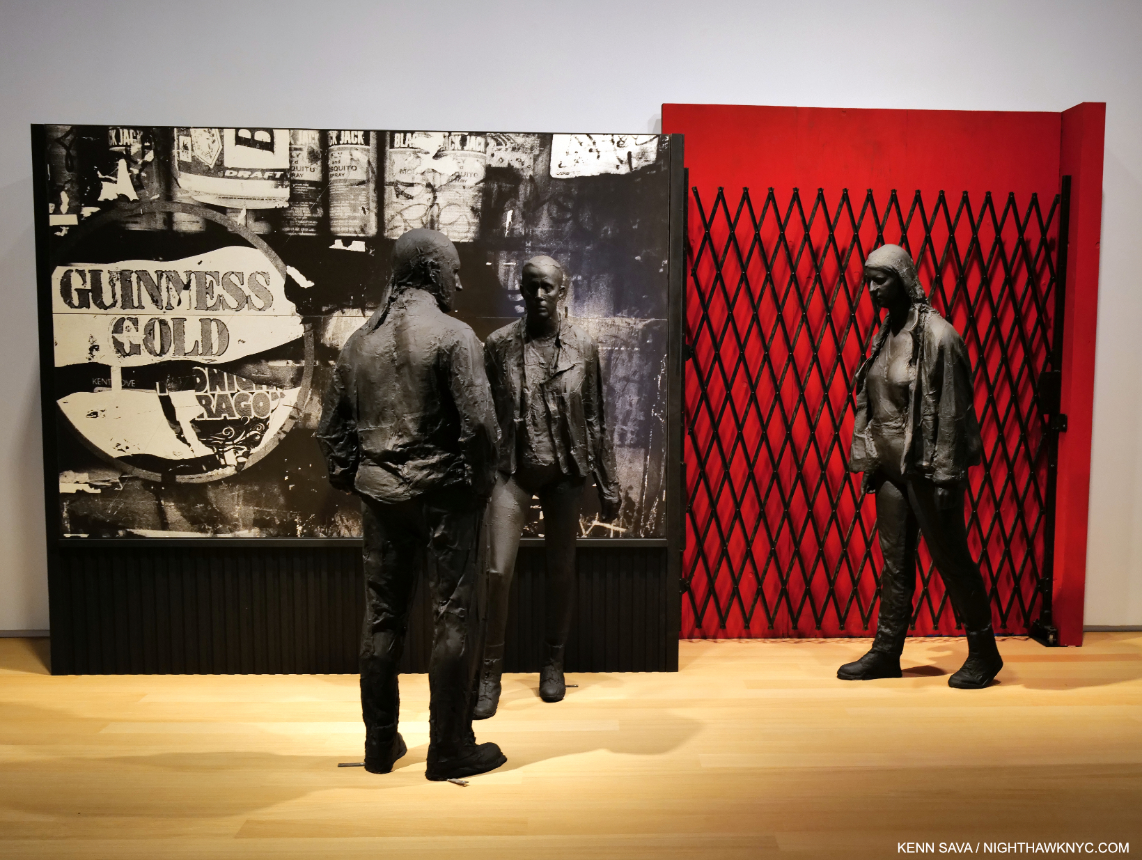
Guiness Gold, 1995, Plaster, wood, acrylic, silverprint, 96 x 64 x 45 inches.

I can’t remember the last George Segal show I saw- if I’ve ever seen one. In fact, Mr. Segal (1924-2000), a contemporary of Philip Guston, may be best known to many New Yorkers through his Public Art installed in Port Authority Bus Station and his Gay Liberation Monument in Sheridan Square. Otherwise, it seems he has fallen into eclipse since he passed. So, George Segal: Nocturnal Fragments at Templon was a welcome surprise and an eye-opener. 

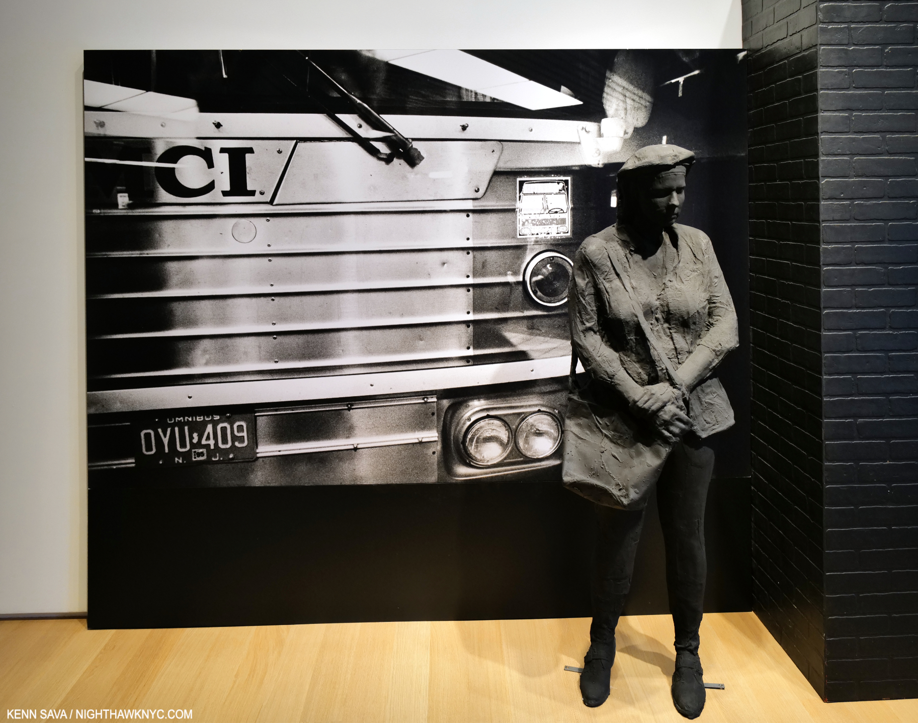
Bus Station, 1995, Plaster and mixed media, 96 x 175 x 33 inches.

Mr. Segal is, perhaps, best known for his meditative Sculptures, but he was also a Painter and installation Artist. To this point, I’ve only seen his work in public settings, where the Artist places his figures in the existing surroundings. In Nocturnal Fragments we get to experience the full George Segal “effect” in environments of his own creation. It’s something no other Sculptor does and it works wonderfully here.  The show provides a wonderful opportunity to experience the full effect of Mr. Segals’s skill over a generous period of time on two floors. I found it a breath of fresh air.

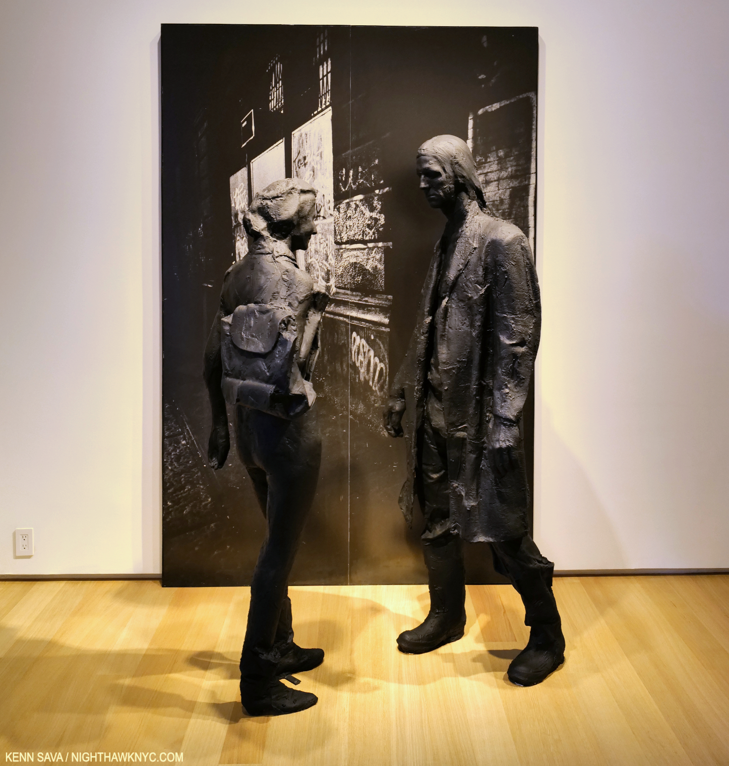
The Encounter, 1996, Plaster, wood, acrylic, silverprint 96 x 64 x 45 inches.

“Discovered” in a so-called “pop” Art show in 1962, Nocturnal Fragments shows, again, that Mr. Segal is much more and his work long ago outlived that tired box– if it was ever even in it!

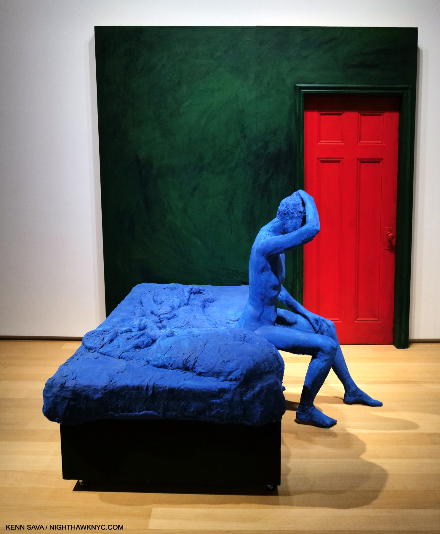
Blue Woman Sitting on a Bed, 1996, Plaster, paint and wood, 96 x 96  x 83 inches. A different take on a scene that Edward Hopper mined often.

An influence on Duane Hanson and Ron Mueck, George Segal’s work has a unique mystery that reminds me more of Rodin than it does either of those two fine Artists. It seems to me it has more than held up since his passing, which should lead to his work being seen more often. I think a whole new generation of Art lovers will find much to like in George Segal’s work. 

Jeffrey Gibson: Ancestral Superbloom @ Sikkema Jenkins

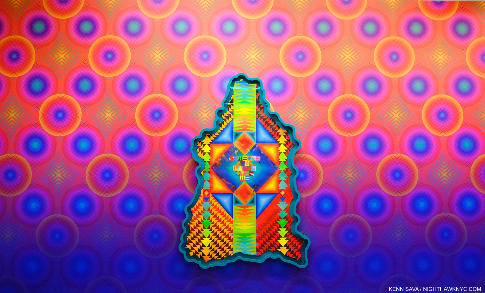
Have you ever seen a Painting shaped like this? SOMEONE TO WATCH OVER ME, 2023, Acrylic paint on elk hide inset in custom wood frame, 103 x 69 x 5 inches, hanging on the Artist’s Wallpaper (Untitled, I was told)  which had a 3-D effect up close.

Jeffrey Gibson: Ancestral Superbloom was one of the most beautiful shows of recent memory, and aptly titled. A virtual supernova of color, most of the pieces centered on a quote from a popular song lyric, turning it into something of a mantra. 

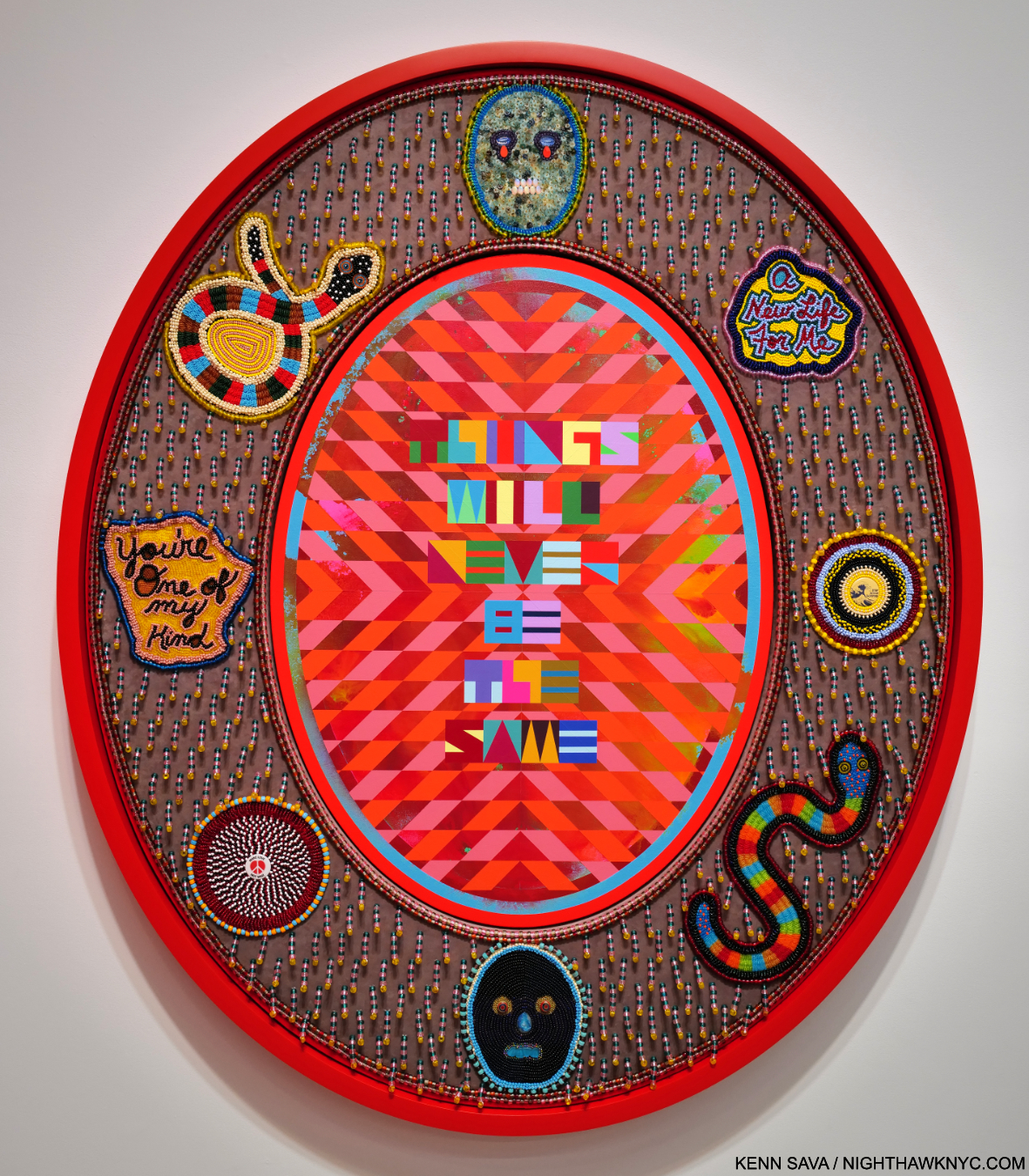
THINGS WILL NEVER BE THE SAME, 2023, Acrylic paint on canvas inset in custom frame, acrylic velvet, acrylic felt, glass beads, plastic beads, vintage pinback buttons, druzy crystal, artificial sinew, nylon thread, cotton canvas, cotton rope, 60 x 50 x 5 1/2 inches

His gifts with color are obvious at a glance, but it’s the clarity of his compositional conceptions and how extremely well he executes them that impress me, along with his fresh approach to, well, everything.

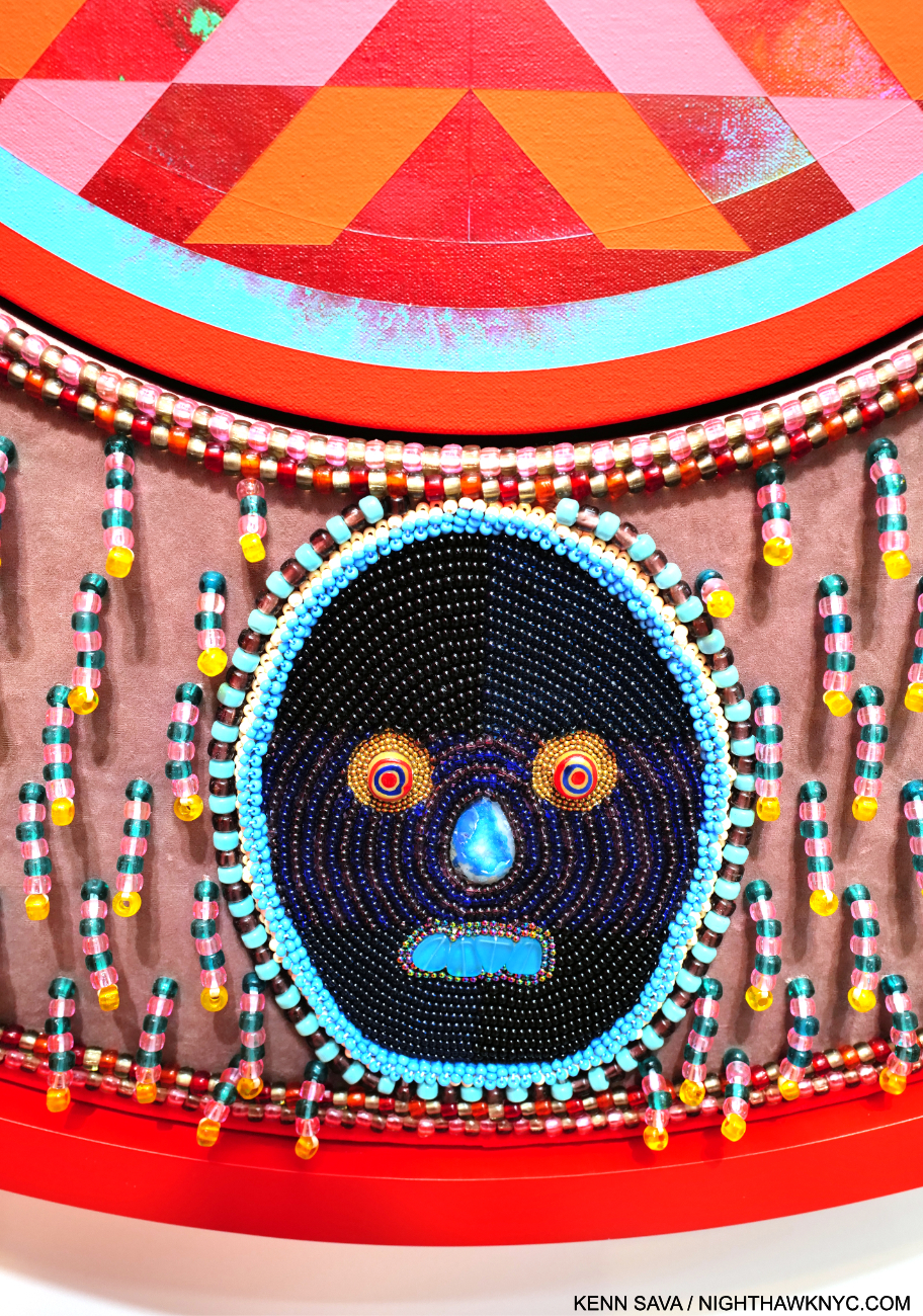
Detail of THINGS WILL NEVER BE THE SAME.

His work is incredibly detailed, requiring and rewarding viewers to work their way around each piece, with each detail adding to the richness and intricacy of the experience.

The show coincides with the publication of An Indigenous Present, a NighthawkNYC NoteWorthy Art Book of 2023, , conceived by Mr. Gibson, which features the work of 60 Indigenous Artists. It’s the best introduction to/overview of this work I’ve seen- an amazingly rich collection. 

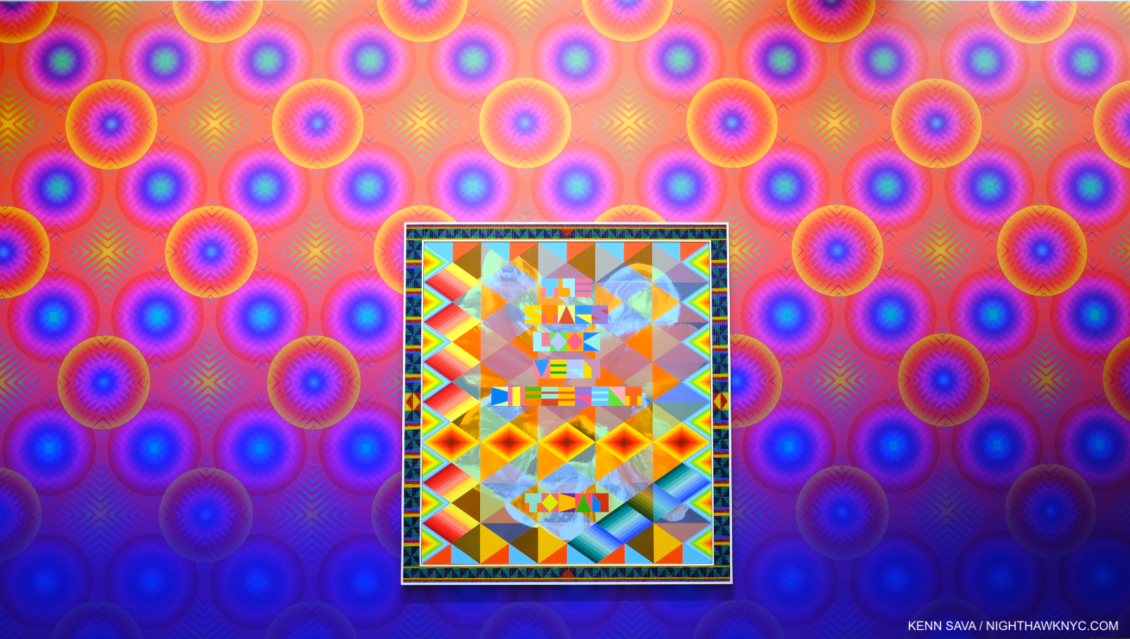
THE STARS LOOK VERY DIFFERENT TODAY, 2023, Acrylic on canvas, glass beads, artificial sinew, inset to custom wood frame, 88 x 80 inches. A line from David Bowie’s “Space Oddity.”

Meanwhile, Jeffrey Gibson: Ancestral Superbloom continues to add to his stature and importance.

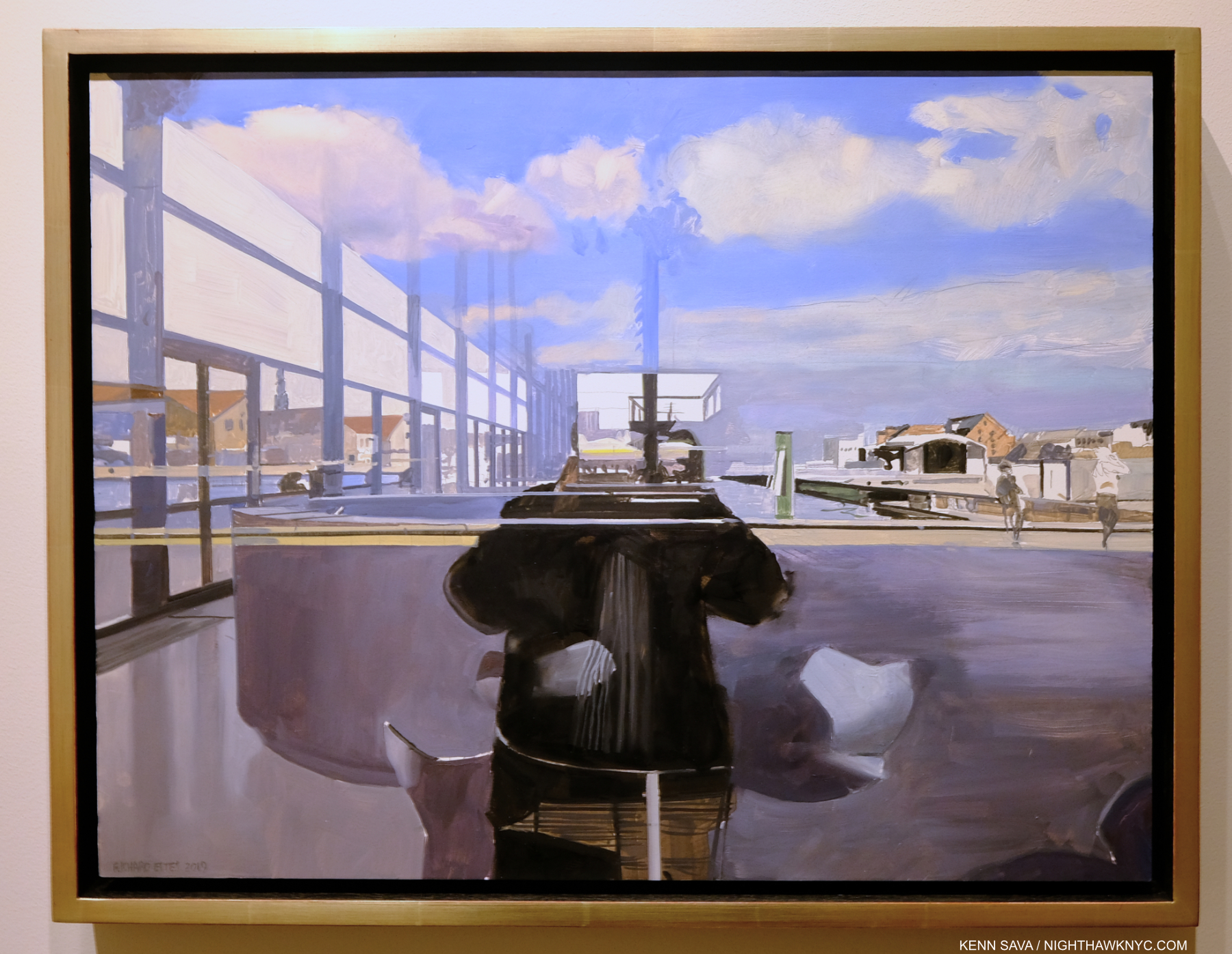
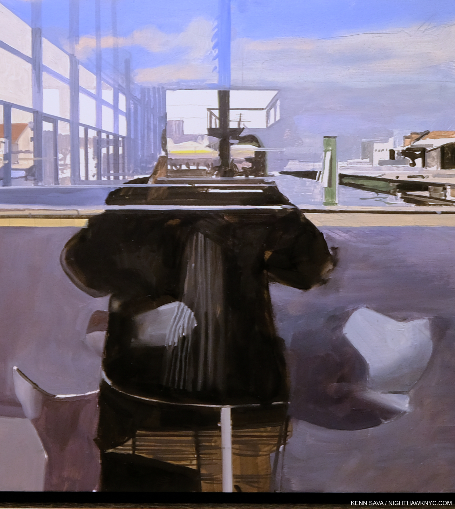
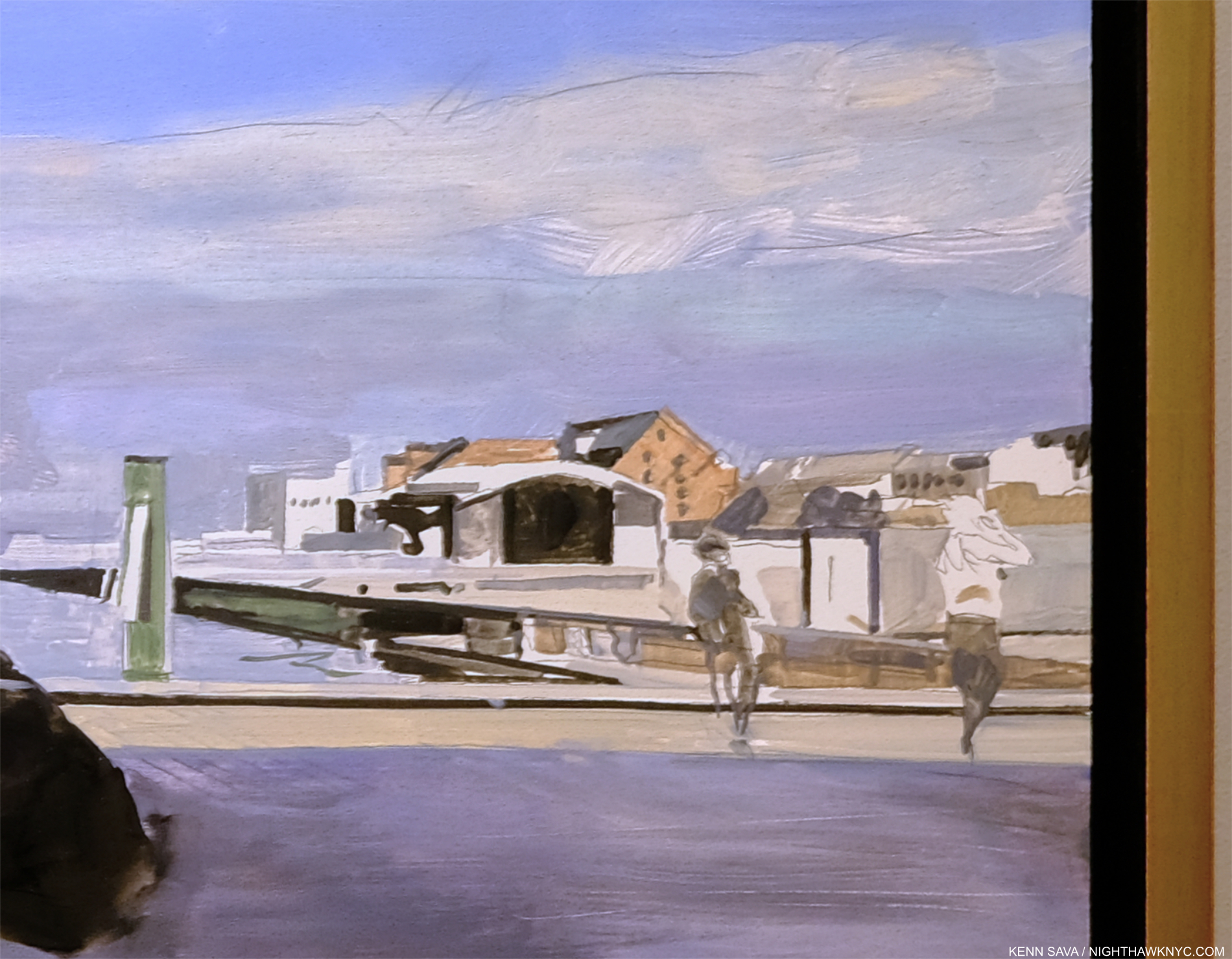
Njideka Akunyili Crosby: Coming Back to See Through, Again @ Zwirner

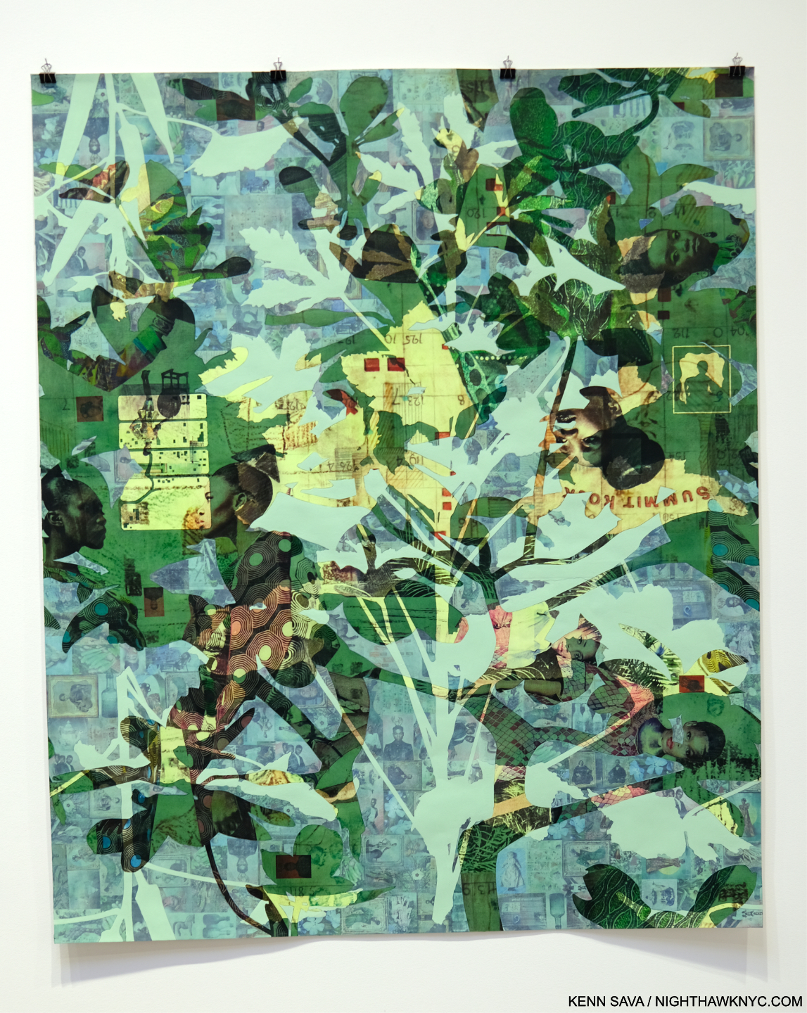
Blend in – Stand out, 2019 Acrylic, colored pencil, charcoal, and transfers on paper 95 3/4 x 123 3/4 inches

Njideka Akunyili Crosby’s NYC debut, which this was, has been a long time coming. Perhaps best known to most from the series of enthralling books published around shows elsewhere, her work is in the Permanent Collections of The Met, MoMA and the Whitney Museums. Pretty precocious for an Artist only born in 1983 (in Nigeria, living and working in L.A. this century). Her career has been in steady ascent. Her latest work shows an amazing juxtaposition of time and techniques through her use of transfers and paint. Frankly, looking as closely as I could, I couldn’t figure out how she does it.

Potential, Displaced, 2021, Acrylic, colored pencil, and transfers on paper 72 1/4 x 60 inches

Layers of photo transfers are seamlessly combined with layers of paint. Each one increasing the depth and adding countless details to the story. Everything is rendered with such smoothness it was beyond me to discern layers that I knew were there. Her craft is as stunning as her Painting.

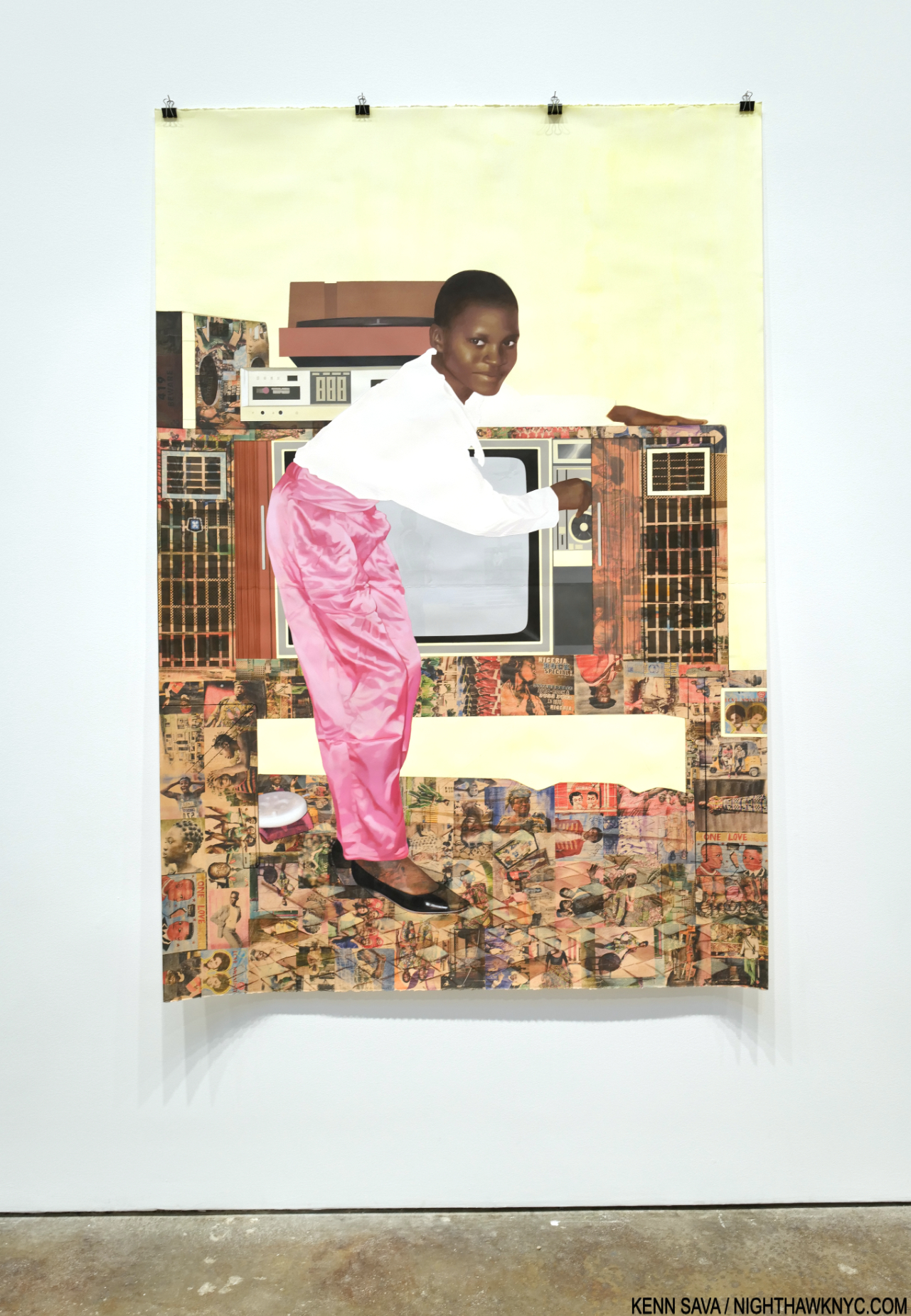
“The Beautyful Ones”Series #10: A Sunny Day on Bar Beach, 2022, Acrylic, colored pencil, pastel, charcoal, and transfers on paper, 78 1/2 x 53 3/4 inches.

It’s all in the service of her subjects, some she’s apparently related to, some not. They’re each treated with such compassion and understanding, it’s hard to tell which are which.
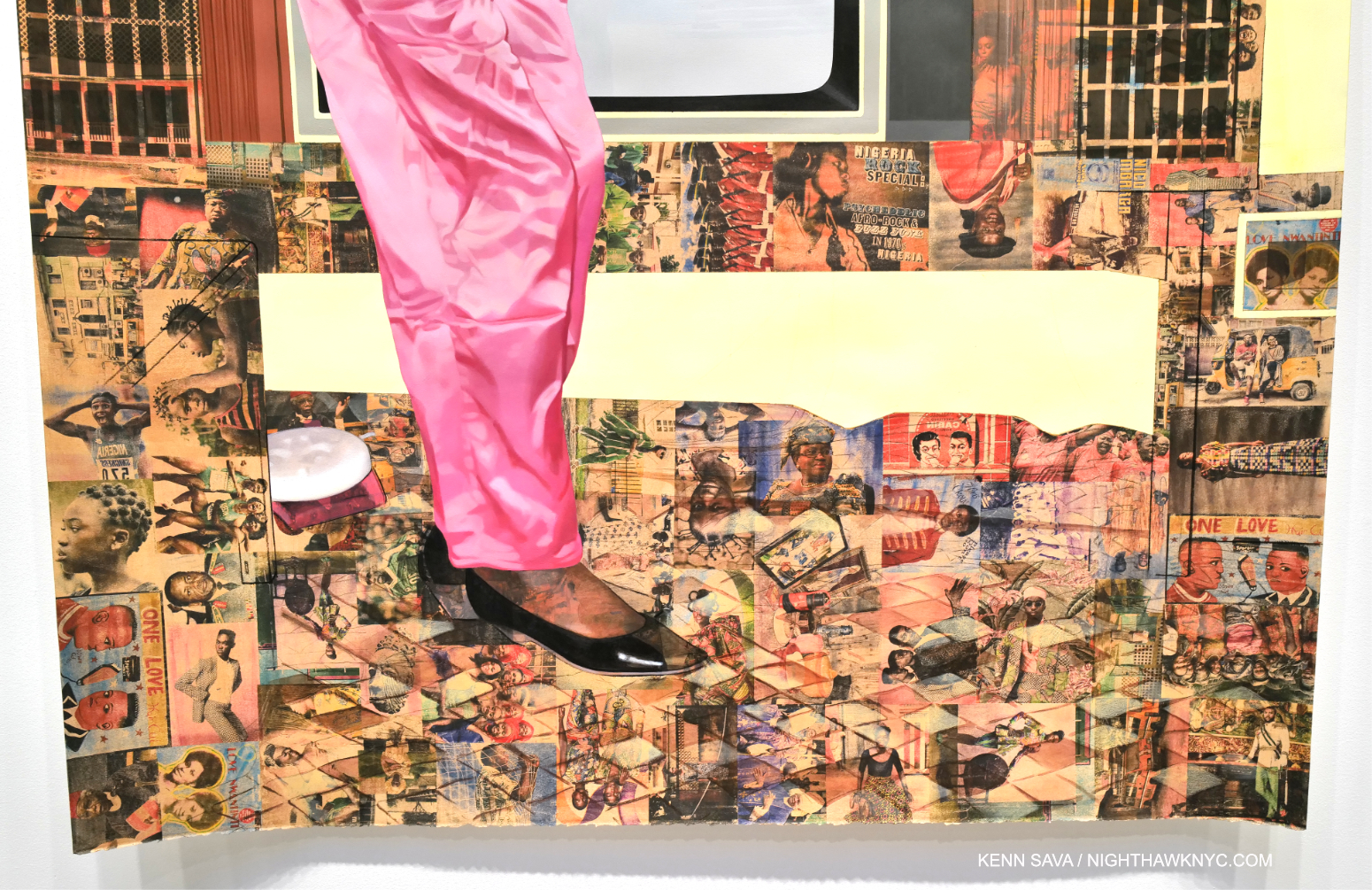
Detail.

Ms. Crosby’s work rewards the casual glance, and extended close study, while serving as something of a bridge from her life now (in the US since 1999), to her Nigerian upbringing. In the process, it helps others begin to understand it, as she presents it in a multifaceted memory standing on layers of time, history and place.

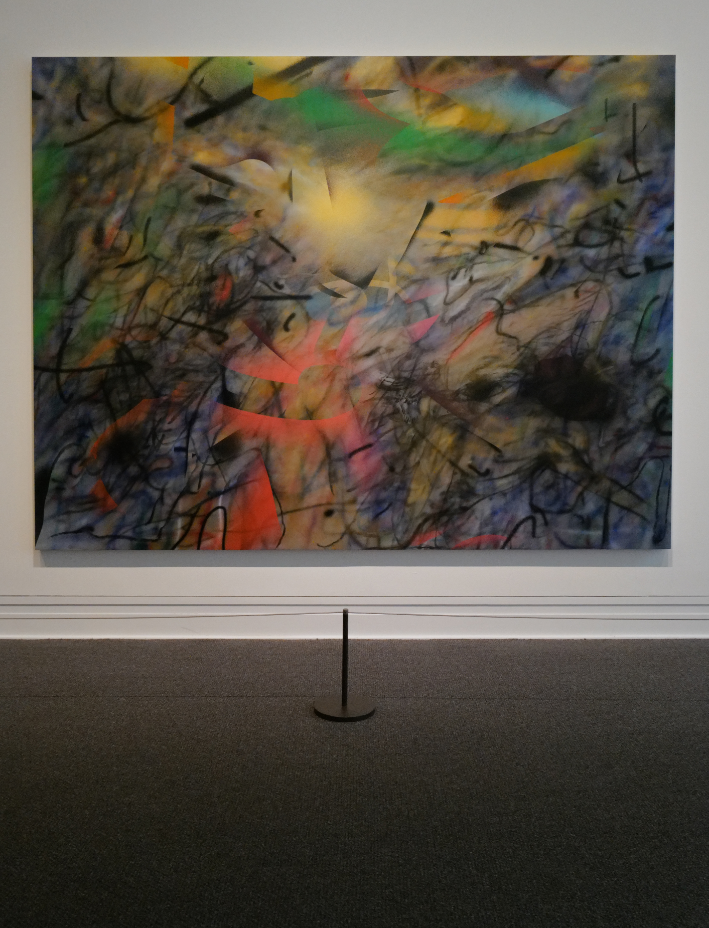
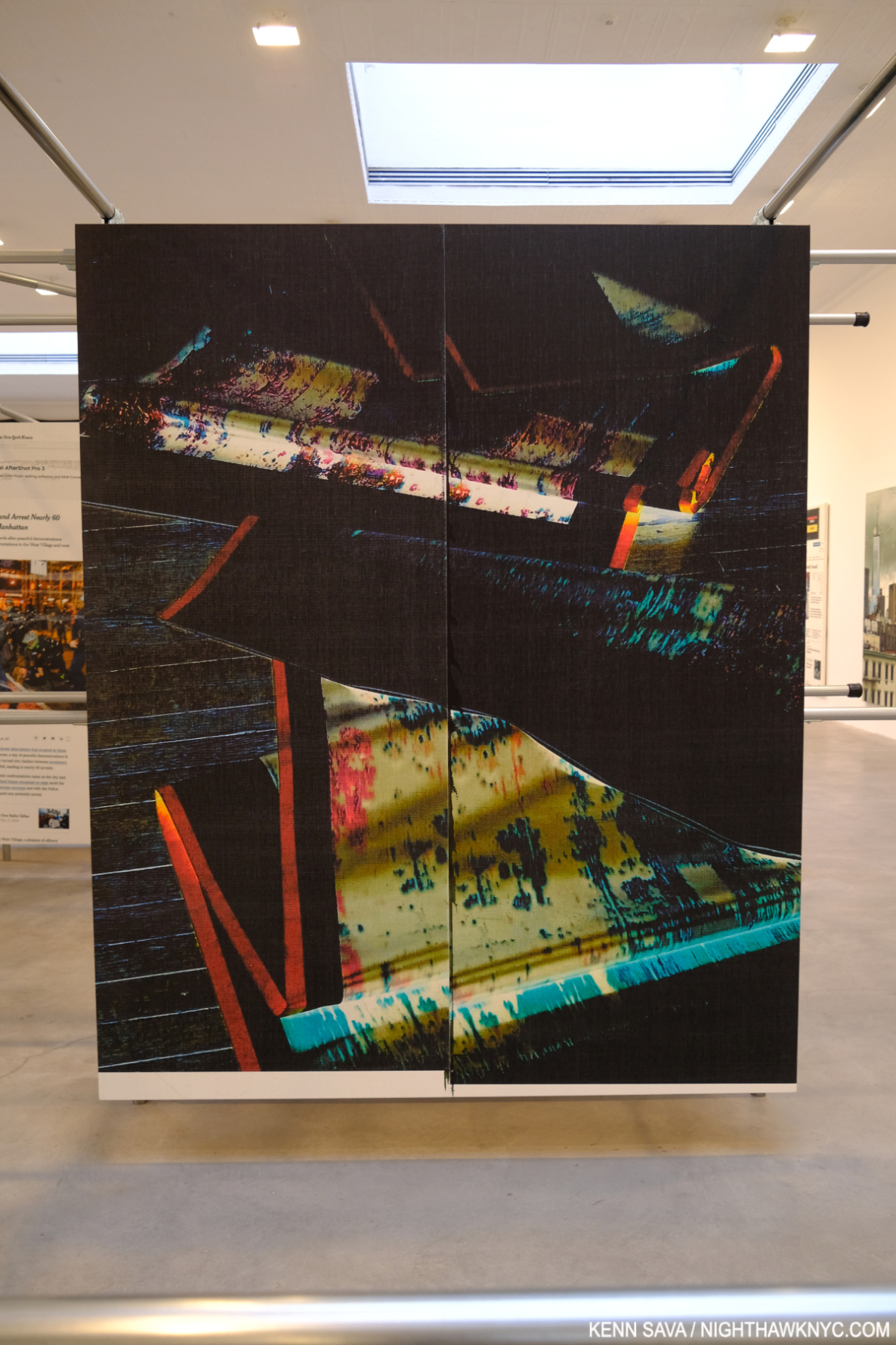
Wade Guyton @ Matthew Marks

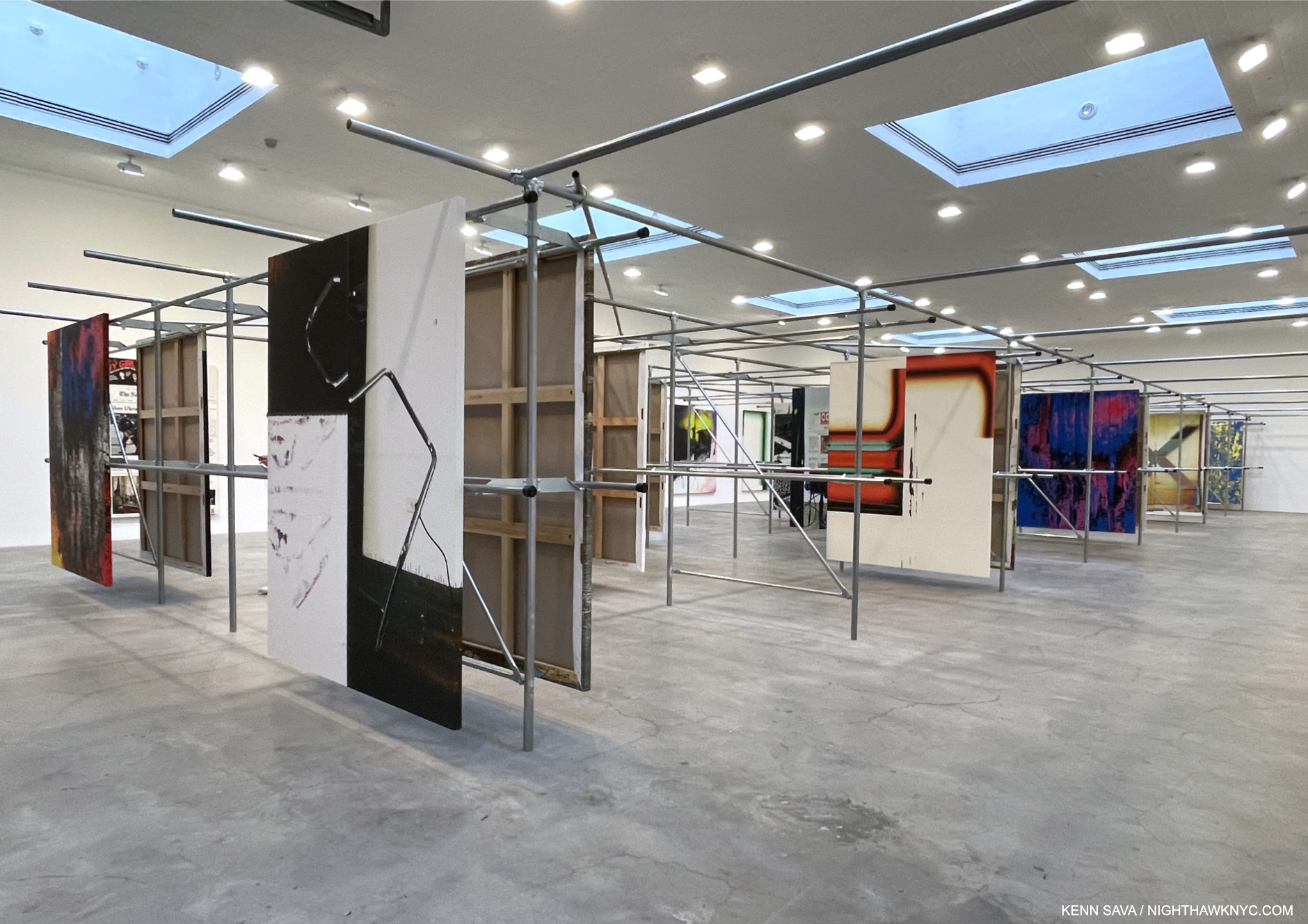
Installation view. All works are Epson UltraChrome HDX inkjet on linen 84 x 69 inches each.

Wade Guyton’s installations are always an interesting element of his entire show experience. In fact, his book Zwei Dekaden emphasizes just that aspect in over 200 installation views over two decades. It’s now like it wouldn’t be a Wade Guyton show without the installation. And so it was at Matthew Marks. The unique steel rack installation was explained thus- “In 2021 Guyton moved into another floor of his studio building that the previous tenant, a clothing company, had filled with metal hanging racks. Rather than remove the racks, he repurposed them to hang his paintings for storage. In the current exhibition, Guyton has duplicated this set of racks and installed paintings in the same manner,” per the press release.

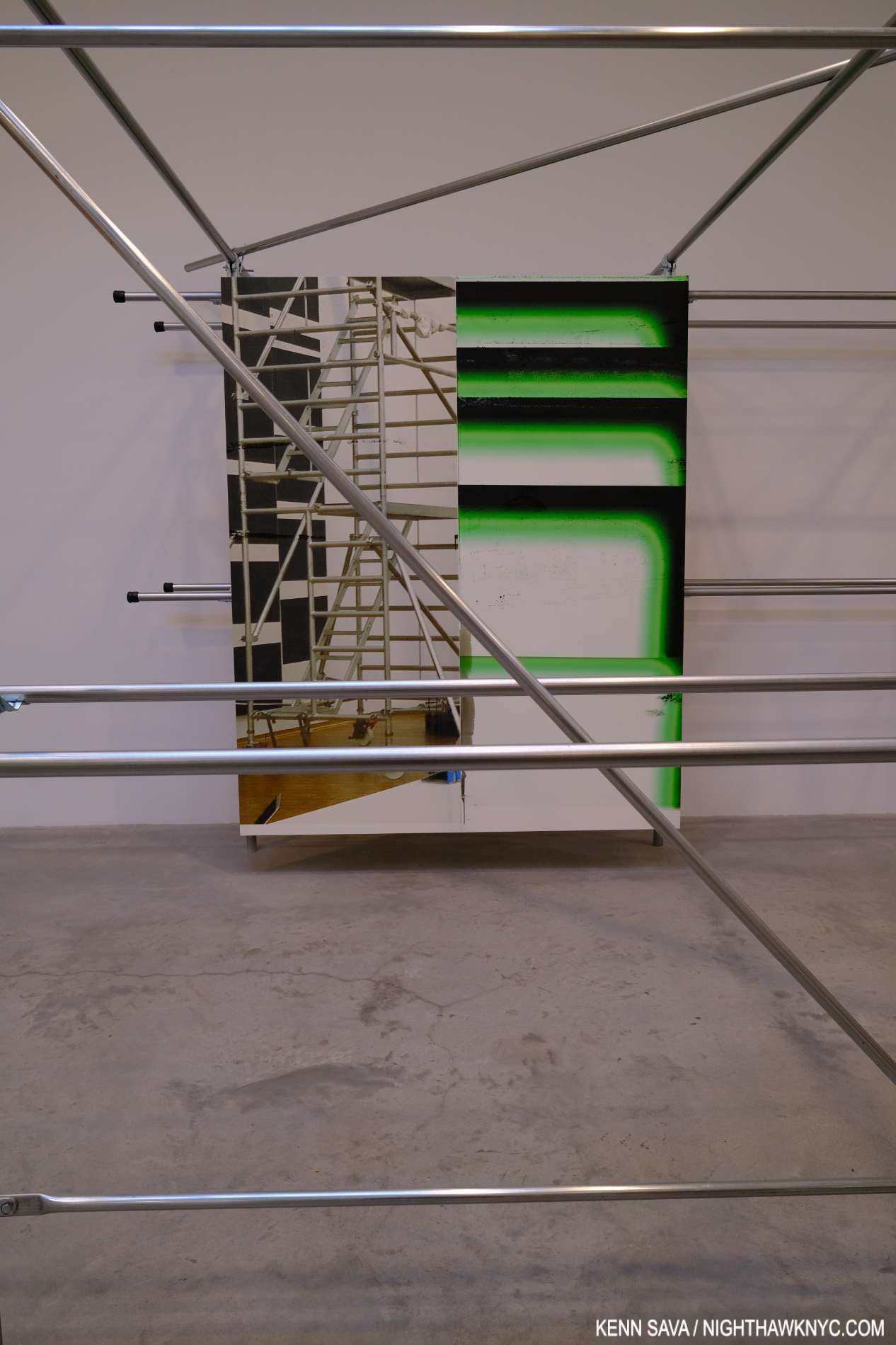
I couldn’t resist making the installation part of seeing the work.

The work looked handsome on its mounts and the structures themselves provided for interesting “other” views of each piece as a visitor moved through the racks. Cross members added unexpected elements to works on the next row and provided a chance to see pieces at a bit of a distance.

Untitled, 2022, (WG5374)

But all of this is secondary to what’s being displayed. Wade Guyton has been at the forefront of combining Printmaking and Painting in interesting ways for a long time. Admirers will find new takes on some familiar themes, but there is also much that is new. The sense of being “somewhere else” was interrupted by pieces based on New York Times front pages; recent headlines jarring a visitor back to “reality.” I love how he incorporates images/Photos into his work, and some of the printing of others has a “squeegee” look that always reminds me of Jack Whitten. Here, it’s still fresh and it’s nice to see the Artist continue to find new possibilities. As he has, once again, with his installation. Both work extremely well together.

NighthawkNYC.com has been entirely self-funded & ad-free for over 8 years, during which 300 full-length pieces have been published! If you’ve found it worthwhile, PLEASE donate to allow me to continue below. Thank you, Kenn.

You can also support it by buying Art, Art & Photography books, and Music from my collection! Art & Books may be found here. Music here and here.

Written & photographed by Kenn Sava for nighthawknyc.com unless otherwise credited. To send comments, thoughts, feedback or propositions click here. Click the white box on the upper right for the archives or to search them. Subscribe to be notified of new Posts below. Your information will be used for no other purpose.

NighthawkNYC.com Is Seven! A Year In The Life Of…

Written & Photographed by Kenn Sava.

In honor of its 7th Anniversary, July 15, 2022, I decided to take a look back at Year Seven of NighthawkNYC.com, my most challenging year yet.

Lying in the hospital in November, I seriously doubted I’d be able to continue NighthawkNYC.com and get through Year Seven. Then, things got a bit worse…

During Year 7-
-The galleries that survived (alongside the countless galleries, stores, restaurants and businesses that didn’t) reopened, with restrictions, after the covid shutdown.
-The museums moved closer to full schedules (though not completely), with restrictions.
-Cézanne, Alice Neel, Jennifer Packer, Jasper Johns were each given blockbuster shows. Richard Estes, who like Jasper Johns also turned 90 this past year, was not. I wrote about all of them this year.

Along with this, this past year was a very hard year for me, personally. I hit year 15 free of cancer, but dealt with a mysterious illness that I still don’t have an answer for, then suffered a devastating financial setback. In spite of ALL of it, I created & published TWENTY-FIVE full-length pieces in those 52 weeks! 20 of them while I was working on the 3 Richard Estes pieces that took me 11 months to finish.
See for yourself-

Published on NighthawkNYC.com between July 15, 2021 and July 14, 2022, Year Seven, interspersed with personal “highlights” of my year-

August 1, 2021- “The Met’s Alice Need Love Letter To NYC” (Clicking on the title in each white box below opens the piece so you can revisit it.)

The Met’s Alice Neel Love Letter To NYC

August 21- “Don’t Call Chuck Close A ‘Photorealist'”

The last time I saw Chuck Close, I ran into him while we were both out gallery crawling late one Thursday eve in October, 2017, here in a small basement gallery in Chelsea. It was fascinating to watch him study Art he (or I) had never seen before and hear his comments.

Don’t Call Chuck Close A “photorealist”

September 10- “Remembering 9/11”- For the very first time, to commemorate the 20th Anniversary of that that horrific, indelible day, I shared my memories of 9/11 and the Photos I took before, on 9/11, and immediately after.

Just unimaginable. The view from my window shortly after 9:05am on 9/11/2001 showing the North Tower, 1 World Trade Center, on fire. I’ve never shared any of the Photos in this piece before.

Remembering 9/11

On September 15th, I began having spells of lightheadedness. I immediately went to the doctor, who tested me and couldn’t find anything wrong. 

September 21- “Cézanne’s Other Revolution”

The Murder, 1874-75, Pencil, watercolor, and gouache on paper. In this tiny work, the knife is held high amidst an idyllic scene, with an ominous cross lurking above.

Cézanne’s Other Revolution

October 23- “Art Is Back In Chelsea”

Metro Pictures on West 24th Street. I have seen many memorable shows here, including the fine Louise Lawler show that’s up now. They said they decided to close because of the globalization of the Art market, which doesn’t suit their model. I’ll miss it.

Art Is Back In Chelsea

November 7- “Tyler Mitchell: Bringing Joy Back To Art”

Tyler Mitchell

Tyler Mitchell: Bringing Joy Back To Art

At 4:30pm on November 9th, I nearly fainted crossing 8th Avenue. Wearing all black in the dark, I’m sure I would have been killed if the light had changed. I staggered to the other side then managed to get in a cab and go to the Emergency Room. After 10 hours, they decided to admit me. I was in the hospital for 3 days and saw 27 doctors. None could tell me what was wrong. I walked home (about 2 miles) after being released feeling just like I did when I went to the E.R. .

November 19- “John Chamberlain’s Twisted Dreams.” A nurse chastised me for working on this piece while I was in the hospital.

John Chamberlain’s Twisted Dreams

At 4:30pm on November 20th, the day after I published the John Chamberlain piece, I had another near fainting spell. I went back to the Emergency Room where I spent another 7 hours. Again, they couldn’t find a cause. This time I was released and walked home. To this minute, I still don’t know what was wrong. I was subsequently put on medication for a heart problem discovered during testing. The lightheadedness seemed to largely get better. The doctors I informed of this said it didn’t make any medical sense. 

November 27- “NoteWorthy PhotoBooks, 2021”

Zanele Muholi, the catalog for her show at, and published by, the Tate, London.

NoteWorthy PhotoBooks, 2021

December 28- “NoteWorthy Art Books (And Bricks), 2021”

Toyin Ojih Odutola, The UmuEze Amara Clan and the House of Obafemi

NoteWorthy Art Books (and Bricks), 2021

January 14, 2022- “NoteWorthy Music Book, 2021- Paul McCartney: The Lyrics”

From The Lyrics: Throughout the text Sir Paul regularly registers a very wide range of literature. Art is not left out. Left, we see him visiting Willem de Kooning, and right, one of his own Paintings from 1991.

NoteWorthy Music Book, 2021- Paul McCartney: The Lyrics

On January 20th, I suffered a devastating financial loss that leaves me having to focus on my survival full-time. To that point, I had worked on NighthawkNYC full-time for 6 1/2 years for no money, while other costs, besides my labor, have been quite substantial. 

February 4-  “Jasper Johns: Contemporary Art Begins Here”

Jasper Johns, Untitled, 2021, Acrylic and graphic over etching on paper. As strong as ever- at 90!

Jasper Johns: Contemporary Art Begins Here

February 19- “Cancer, +15”  Going in to cancer treatment, I had a 20% chance of getting through year 1 without additional treatment. Hard to believe I’m alive 15 years later…There are no words to express my Thanks. I hope sharing my experiences may help others…

Cancer, +15

February 21- “Jennifer Packer Arrives”

Jennifer Packer @ The Whitney. The word is out. The crowds are beginning to show up. December 28, 2021.

Jennifer Packer Arrives

March 21- “The Sculptural Photography of Vik Muniz”

Vik Muniz with his Nameless (Woman with Turban) after Alberto Henschel, 2020, Archival inkjet print, 90 by 59 inches, One of a kind.

The Sculptural Photography of Vik Muniz

April 4- “Nick Sethi’s PhotoBook Release In Canal Street”

Mind the meter. Nick Sethi takes it to the streets.

Nick Sethi’s PhotoBook Release In Canal Street

April 7- “The Brutal/Smells Like Teen Spirit Mashup” (Olivia Rodrigo meets Kurt Cobain)

Screencap of “Good 4 u,” Directed by Petra Collins.

The Brutal / Smells Like Teen Spirit Mashup

April 14- “Highlights of the Whitney Biennial: Matt Connors”

Matt Connors, One Wants to Insist Very Strongly, 2020

Highlights of the 2022 Whitney Biennial: Matt Connors

April 22- “Caslon Bevington’s Counterfeit Weather”

Caslon Bevington, Frictions (Variations A), 2022, Acrylic on panel, 16 x 20″

Caslon Bevington’s Counterfeit Weather

May 9- “Alec Soth: A Pound of Pictures”

Alec Soth: A Pound of Pictures

May 16- “Ahndraya Parlato: Magic, Mystery, Love & Death”

The cover of Who Is Changed and Who Is Dead

Ahndraya Parlato: Magic, Mystery, Love & Death

May 22- “Richard Estes: Painter. With No Prefixes”

Richard Estes even took over my banner for his 90th. Double Self-Portrait, 1967, from near the beginning of his mature career, seen here behind me.

Richard Estes: Painter. With No Prefixes.

June 6- “Richard Estes Art: What I See”

Richard Estes, Times Square, 2004, This may be the most technically astounding Painting I’ve ever seen, along with any Painting by Jan van Eyck. Having stood on this spot before, during and after 2004, I can certainly verify the overwhelming visual noise that still is Times Square, something that has never been more faithfully realized than it is here.

Richard Estes Art: What I See

June 19- “Richard Estes: Two ‘Manifestos'”

Self-Portrait, 2013

Richard Estes: Two “Manifestos”

June 29- “Learning to Think like David Byrne”

Learning To Think Like David Byrne

July 11- “Thank You, Sheena Wagstaff” I’ll miss the recently departed Chair of The Met’s Modern & Contemporary Department. I close out Year Seven of NHNYC with a look at what she’s given me, NYC, and the world this past decade.

Sheena Wagstaff looking at a very large work by Ursula von Rydingsvard at Galerie Lelong & Co., April, 2018, when I happened upon her when we were both making the rounds of galleries one afternoon (independently, of course).

Thank You, Sheena Wagstaff

P H E W!
I can’t begin to tell you how much work all of that was. Oh, and I got through it all, and spent all of the year, alone. Every minute of it for the second year in a row. Trust me. You don’t want to try it.

On July 15, 2015, I started this site to share my passion for Art and what I’ve seen in the NYC Art world with those everywhere else. In the past 7 years, I’ve published about 275 full-length pieces- 275 in 364 weeks! I have created everything you see on this site for free, and it’s been FREE to access for all!

Well, sooner or later something had to give. Nothing is truly “free” on the internet, though. It means that all the expenses incurred in creating, running  and maintaining NighthawkNYC.com have fallen on me. For the past 7 years, I’ve managed to keep this site ad-free. To defray some of the high costs, I experimented with Amazon links for 3 pieces, then abandoned them. I’ve considered using Patreon, I’ve been told I should put up a pay-gate like other similar sites use.

I’ve decided that first, I should see how much support there is for what I’ve been doing.

If you like what I’ve been doing, if you find this site useful, if you’ve discovered an Artist you previously didn’t know and now are interested in, or a book you’ve taken to, or you want to support Independent Art writing- your support has never been needed more than it is right now. THIS is the time to help.

Donate to keep it up & ad-free below. Thank you!

As always- Thank You for reading my pieces.

*-Soundtrack for this Post is “New York Minute” by Don Henley from The End of the Innocence, 1989 performed here by Eagles, unplugged in 1994-

Written & photographed by Kenn Sava for nighthawknyc.com unless otherwise credited.
To send comments, thoughts, feedback or propositions click here.
Click the white box on the upper right for the archives or to search them.
For “short takes” and additional pictures, follow @nighthawk_nyc on Instagram.

Subscribe to be notified of new Posts, if any, below. Your information will be used for no other purpose.

For L.

Thank You, Sheena Wagstaff

Written & Photographed by Kenn Sava.

I was saddened to hear that Sheena Wagstaff stepped down as Leonard A. Lauder Chair of Modern & Contemporary Art at The Met (TM) last week. At least it was, apparently, by her choice, after a battle with long covid1.

Among many highlights I list below, perhaps this was THE highlight of Sheena Wagstaff’s tenure at The Met- The Met Breuer’s lobby seen on the day it opened, Met Member’s Preview, March 8, 2016, 10 days before it opened to the public, with banners for the now legendary shows it opened with.

There is no other person I have singled out for praise in the NYC Art world over the 7 years of NHNYC.com more than I have Sheena Wagstaff. Appointed January 10, 2012, in 2016, I called her the “Person of the Year” in NYC Art. Over her decade at the helm of M & C, she mounted quite a few memorable shows, a number of important shows, and some that are now legendary, at The Met Breuer, and at the 1000 Fifth Avenue Mothership. 

As it turns out, I was there on The Met Breuer’s Opening Day in March, 2016 and it’s closing day in March, 2020, and wrote about both.

The Met Breuer was established to be The Met’s “Modern &. Contemporary outpost” while the M & C wing at 1000 Fifth Avenue was undergoing renovations. Due to the economic situation the renovation was cancelled. The Met Breuer went on for 4 years, about half the originally announced duration, until The Met made a deal with The Frick to take over their Breuer Building lease. After TMB, Sheena Wagstaff continued mounting shows at 1000 Fifth Avenue, including more major & memorable shows. As I write this, two of her shows are up, and maybe there will be more that have already been in the works to come.

In her honor, I revisit some of the memorable shows I’ve seen with links to those I’ve written about, mounted during Sheena Wagstaff’s tenure at The Met-

Opening The Met Breuer

The Artist seen on an iPad at the show.

Nasreen Mohamedand here. To this day, the only show I’ve written about twice.

“Welcome to the future,” I captioned this Photo in the piece. Unfinished on Opening Day of The Met Breuer. Member’s Preview, March 8, 2016

Unfinished: Thoughts Left Visible – Along with Nasreen Mohamedi, the two shows that opened The Met Breuer, March, 2016.

diane arbus in the beginning, 2016 – A brilliant installation of Ms. Arbus’s little known early work, included a Portrait of my late friend, Storme DeLaverie, that she told me Ms. Arbus took, but I’d never seen.

Lygia Pape, Tetia 1, C, 1976-2004, Golden thread, nails, wood, lighting, a work that wonderfully characterized the ephemeral nature of Ms. Pape’s work in a show remembered for its endless variety and surprise. Seen at Lygia Pape: A Multitude of Forms, her first major show in a US museum in June, 2017.

Lygia Pape: A Multitude of Forms, 2017

Having one of the biggest jobs in the entire Art world, I can’t begin to imagine how busy Sheena Wagstaff was. But, here she is looking at a very large work by Ursula von Rydingsvard at Galerie Lelong & Co., April, 2018. She still took the time to make the rounds of the galleries and see shows, as I came across her doing, as I was, here.

NYC Art Shows, 2016: Sheena Wagstaff Rules The Waves – My look at Art in NYC in 2016.

The opening galley of Mastry.

Kerry James Marshall: Mastry , 2017- Perhaps the most important show mounted during the run of the The Met Breuer.

Marsden Hartley, Smelt Brook Falls, 1937

Marsden Hartley”s Maine, 2017– A somewhat mythical Artist got an overdue close look.

Installation view of the first gallery.

Jack Whitten: Odyssey, 2018 – Jack Whitten lived, worked and died without anyone knowing he had ALSO created a large body of Sculpture. And, it was every bit as compelling as his wonderful Painting.

Delirious: Art At The Limit Of Reason, 2017

Edvard Munch: Between the Clock & the Bed 2017 – In my view, though not large, a brilliant show.

Everything is Connected: Art and Conspiracy, 2018

The crowd in the packed first galley struggling to see the blockbuster David Hockney show 2 days before it closed, February 23, 2018.

David Hockney, 2018. Back over at 1000 Fifth Avenue, it still boggles my mind that it was only one of FIVE major shows up at The Met at the same time. Four of them within feet of each other with the once-in-a-lifetime Michelangelo: Divine Designer & Draftsman right behind that rear wall seen above.

The under-known Thornton Dial, 1928-2016, had a few pieces in it, including History Refused to Die, 2004, center.

History Refused to Die: Hightlights from the Souls Grown Deep Foundation Gift, 2018, at 1000 Fifth Avenue. What a great, small, show this was!

Very, very few got to see this. Seen here on its very last day, March 12, 2020. Installation view of the lobby on the 4th floor.

Gerhard Richter: Painting After All, 2020- A brilliantly selected, concise, overview of his long and productive career, which I saw on its last day, the final day The Met Breuer was open.

Home is a Foreign Place, one of the 3 shows that closed TMB, drawn from recent additions to the Permanent Collection showed how far The Met’s collection of M&C has come. Seen on its final day- March 12, 2020.

Home Is A Foreign Place, 2020. The last show I saw at The Met Breuer, which I saw after seeing the Richter show.

The Met Breuer closed, permanently as it turned out, right after I left the Richter show. My look back at it is here and here.

Standing in the covid line, keeping my distance, waiting to be allowed in. Still, it was just so great to be back home again, and it was well worth the inconveniences.

Alice Neel: People Come First, 2021- The first Met blockbuster after it reopened, I saw it as The Met’s love letter to the people of NYC.Epic Abstraction, 2018- Date – A show that’s been up for quite a while and has evolved over its run. Still as compelling in 2022 as it was when it opened.

Louise Bourgeois: Paintings, 2022 – Absolutely terrific. Nothing short of a revelation.

And there were the Roof Garden Commissions by-

Alex Da Corte 2021

Hector Zamora 2020

Alicja Kwade 2019

Huma Bhabha 2018

Adrian Villar Rojas 2017

Cornelia Parker 2016

Pierre Huyghe 2015

Imran Qureshi 2013

Dan Graham 2014

And the Facade Commissions-

Carol Bove 2021

Wangechi Mutu 2020

Before she came to The Met, Sheena Wagstaff was chief curator of the Tate, London. During her time there she mounted a wonderful Edward Hopper show that’s only known to us on this side of the pond through the fine catalog she edited for the show. I hoped she would give us a Hopper show, which didn’t happen. But, when she reinstalled The Met’s M&C galleries she gave Hopper’s The Lighthouse at Two Lights, 1929, pride of place. This was a marvelous choice, in my view, serving as a reminder of a work that has been a bit forgotten after becoming iconic and appearing on a US Postage Stamp in 1970,  Seen in 2018. The galleries have been rehung since.

Along with ALL of this, Sheena Wagstaff oversaw the reinstallation of the M & C galleries at 1000 Fifth Avenue, next to the installation of two galleries devoted to Thomas Hart Benton’s America Today murals and associated works (to the right of the Hopper in the Photo above) which The Met received as a gift shortly after Sheena came on board.

The late Sam Giliiam, 1933-2022, gifted this work, Carousel State, 1968, to The Met in 2018. He was honored by The Museum in 2017. Seen in Epic Abstraction in its current inkcaratnion, July, 2, 2022.

Currently, there are  two shows up as I write this Ms. Wagstaff was involved with- Epic Abstraction and Louise Bourgeois: Paintings. Both are excellent, the Bourgeois, a revelation. There may be more coming along that she was involved with, in addition to the Hew Locke: Gilt Facade Commission scheduled to open in September. 

Sheena Wagstaff before she spoke at the Nasreen Mohamedi Symposium at The Met in 2016. Right after she did, she happened to sit next to me.

I met Ms. Wagstaff, once, when she happened to sit down next to me at the Nasreen Mohamedi Symposium at The Met in 2016. Such was her passion for Nasreen, I learned in the show, that she traveled to India and visited places where Nasreen lived and sought out the site of her unmarked grave. After the symposium ended, I introduced myself to her and thanked her for the Nasreen Mohamedi show. I told her what a powerful impact discovering Nasreen in her show had on me (to this day, the only show I’ve devoted two pieces to). She responded asking me about one word I had chosen in expressing that, and immediately suggested a clarification. I came away feeling I had just spoken to one of the smartest people I’d ever met.

Sheena Wagstaff breaks through. Chelsea, April, 2018.

In 2018, I accidentally ran across her when we were both out seeing shows in Chelsea. The Whitestone Gallery had installed a piece over the entrance to their Gutai Art Association show that appeared as it it had been broken through, requiring visitors to walk through it to enter. I stood in the lobby watching visitors navigating this and snapping photos as they tried to “break through to the other side.” When I got home, I realized that one of those visitors was Sheena Wagstaff! I didn’t recognize her from the back. Now, this Photo speaks to me of her breaking through barriers while she was at The Met. Her shows were about inclusion, and breaking barriers, if nothing else.

Thank you, Sheena, so very much- for all of it.

Julie Mehretu, Conversion (S.M. del Popolo/After C.), 2019-20, just one of the countless pieces to enter The Met’s permanent collection of M & C Art during Sheena Wagstaff’s tenure, one of the last pieces in the most recent incarnation of her Epic Abstraction show, seen on July 2, 2022, the week before she left.

Her Met legacy will live on both in the shows she’s facilitated and the Art she has helped bring into the collection. In my opinion, her’s will be a tough act to follow at The Met. The Museum has been compared to an aircraft carrier. Given its four-city-block size, it’s bigger than one. Turning this ship is a MASSIVE undertaking, which is why I used the sea-faring analogy in my 2016 Sheena Wagstaff “Rules The Waves” piece. She has managed to turn the Met’s M & C exhibitions, and more importantly, its permanent collection, in the direction of inclusion. Whoever comes next is a very critical choice given that AND that the M & C wing is about to undertake is long-awaited remodeling. 

Though The Met is probably casting a very wide net for that person, here in NYC, it seems to me that now might be the time to see if Massimilliano Gioni might be interested in the position. He’s done a terrific job as Artistic Director at the New Museum. I’m saying nothing against them in suggesting him. 

*-Soundtrack for this Post is “Thank U” by Alanis Morissette from Supposed Former Infatuation Junkie, 1998, about which Alanis said, “Basically, I had never stopped in my whole life, hadn’t taken a long breath, and I took a year and a half off and basically learned how to do that…” I hope Ms. Wagstaff is now able to take a long breath. Somehow, I doubt she will.

NighthawkNYC.com has been entirely self-funded and ad-free for over 7 years, during which over 250 full length pieces have been published. As I face high expenses to keep it going, if you’ve found it worthwhile, please donate to keep it up & ad-free below. Thank you!

Written & photographed by Kenn Sava for nighthawknyc.com unless otherwise credited.
To send comments, thoughts, feedback or propositions click here.
Click the white box on the upper right for the archives or to search them.
For “short takes” and additional pictures, follow @nighthawk_nyc on Instagram.

Subscribe to be notified of new Posts below. Your information will be used for no other purpose.

Richard Estes Art: What I See

Written & Photographed by Kenn Sava

This is Part 2 of my look at the work of Richard Estes on his 90th Birthday, May 14, 2022. Part 1 is above, or here. The final Part 3 is below, or here

Over most of my 35+ years of looking at the work of Richard Estes, I’ve simply enjoyed looking at it, and it certainly lends itself to that. As I’ve already said in Part 1, one result of all that looking is that his Art has come to shape the way I see the world around me. As he turns 90, his Painting career has now spanned more than 55 years1! Recently, I began asking myself “What does it all mean?” This Part looks at what I see.

Richard Estes, Antarctica II, 2013, Oil on panel, 16 3/4 x 22 3/4, seen at the show’s entrance. Click for full size.

In Antarctica II from 2013, we see an iceberg floating in a large body of water with a smaller piece of ice, possibly broken off of it, floating on its own. To the left is the hull of the ship apparently containing the Artist on one of his many voyages to a far away land, with the side of a lifeboat visible above. The boat’s wake radiates out towards the berg as the boat moves towards it. One reading of this piece would be man’s impact on Antarctica, which has left it in a precarious state, represented by his alien vessel encroaching on the iceberg’s realm, its wake about to make contact with it.

Not so fast…

“Richard Estes avows that his realism has no hidden meanings, special messages, or stories to tell. Political positions and posturing about the human condition are alien to his art,” in a conversation with Patterson Sims per Patterson Sims, Richard Estes’ Realism2.

Given what I wrote in Part 1 about people disrespecting the Artist’s word on his own Art, though this is not a direct quote (something I address further on), I’m not going back on that now. It is impossible, however, for me not to see the effects of global warming in Antarctica II. How to reconcile this?

Unlike the blockbuster Jasper Johns: Mind/Mirror, which was originally scheduled to coincide with Mr. Johns’s 90th Birthday in 2020, before the virus closed everything, as far as I know at the moment (in early May, 2022), nothing is planned in the Art world to celebrate Richard Estes’s 90th Birthday. My series might be it! Seriously?

Richard Estes: Voyages installation view of View in Nepal, 2010, Oil on canvas, 32 by 43 inches. Part of the show was very nicely installed in the large office space. In Part 1, I wrote about how I believe this work is conceived. Installed like this makes standing close to it difficult, and so the eye is almost forced to the central, white, peak, causing everything in front of it to be out of focus. It’s really a marvelous and somewhat daring composition for this reason, and a stunning contrast to Richard Estes’s Urban Landscapes, like the one to follow…

The closest NYC Art event that might qualify was Richard Estes: Voyages at Menconi & Schoelkopf in July, 2021, the first show of his work here since the Museum of Art & Design’s Richard Estes: Painting New York City in 2015, which I looked at here. Containing about 30 pieces covering the range of his subjects, Voyages featured more recent work. The theme of the show was ostensibly the annual trips and voyages Mr. Estes has taken over many years and the Paintings that have resulted from them, though these were juxtaposed with some of his iconic NYC Urban Landscapes3. An experienced world traveler at this point, his journeys have taken him to the far corners of the globe. At first, being completely taken by his views of NYC, I didn’t know what to make of the resulting views of forests, bodies of water, mountains and deserts that began emanating from his hand after his travels, first to Maine, then ever further afield. All the while, he still continued to give us his iconic Paintings of New York City, and other cities. When I walked into Voyages and saw the Urban Landscapes alongside African landscapes, Antarctic vistas, and deserts, I finally decided to sit down and do a reconciliation of his entire career and try and finally understand what, if anything, his whole body of work is saying to me.

First, Voyages reveals Richard Estes has been as busy Painting as ever. In 2021, at age 89(!), he Painted this-

Brooklyn Diner, 2021(!), Oil on canvas, 37 x 55 1/4 inches. I was dumbstruck when I first saw this. I just hope I can still out of bed if/when I’m 89.

It’s a statement in more ways than one. First, it’s apparent even at a glance that he has lost none of his world-class technique! When I finally finished marveling at that, I began to ponder the unusual composition. I decided to take a look-see for myself. I jumped on the A Train and made a trip to the real Brooklyn Diner, which turned out to be a bit of an outlier on West 57th Street, to see what I could learn from the actual site.

Brooklyn Diner seen from just behind the spot Richard Estes depicts. July 1, 2021. Notice how the “real” view lines up, or doesn’t line up, with the Painting. If I were standing closer, nearer that railing, as in the Painting, I wouldn’t be able to get the same view of the door, without a wider angle lens. The very wide 23mm lens I’m using here barely holds it, and I had to step back to get this! Suffice it to say I wasn’t able to take a Photo that exactly matches the Painting! Therefore, my Photo is not so-called “Paintingrealism,” to coin a box I hope no one uses. See important footnote-4.

Seeing it in person raised all sorts of questions about the Painting. Diner manager Guy told me the scaffolding, not to be seen now, was up from July to around Christmas, 2019, for HVAC work on the roof. Even though the scaffolding is gone, the building is exactly the same as it was. As you can see, I was unable to duplicate the view of the building in Mr. Estes’s Painting in a Photo in spite of using a wide-angle 23mm lens! Being the most colorful place in the area, and that area being Richard Estes’ extended neighborhood, I then wondered why he didn’t render it before or after the repairs. Then, I quickly remembered that over the last decade or so, Mr. Estes has Painted quite a few buildings fronted with scaffolding (another is shown further below).

Booklyn Diner, July 1, 2021. The trees in front of it make its signage a bit less commanding, partially hiding it, like the scaffolding in the Painting does. The trees are our of the frame to the left in the Painting.

Scaffolding adds yet another layer to the countless layers many of his street scenes already had- exterior, reflections, interior, rear exterior, which often adds another level of complexity to the geometry of the whole thing, not to mention another layer of technical difficulty. It also adds mystery. It’s interesting to me that here, the top of the building is cut off. On the main sign to the left, you cannot read “Brooklyn,” and “Diner” is hard to see fully. Neither is legible on the sign to the right. In fact, if he didn’t name the Painting Brooklyn Diner, you wouldn’t know what this place was! This “selective editing” makes me feel that the facade, with its candy color, distantly Art Deco echo, is not the point of the piece, though it’s what catches the eye when you see either the Painting or the actual Diner on the street. The ways he has changed the scene are fascinating. Again, I wonder “Why?” The only conclusion I can make from this is that Mr. Estes is making the scene into what he wants to express.

The Diner sits, incongruously, a half a block, but worlds away from, the glitz, glamour and Artistry of, Carnegie Hall, and directly across the street from the legendary & historic Art Students League. This location is not far from Mr. Estes’s NYC apartment, and that fact has led him to render innumerable sites in this neighborhood in Paint over his long career.

West 57th Street between 7th & 8th Avenues looking east. That’s Carnegie Hall, lit up left, Brooklyn Diner, behind the trees, right. My back is to the Art Students League. July, 2021.

In pondering why he chooses his subjects (which I still often do), I find something quite interesting about this location, and it’s shown in this photo- Richard Estes is a known lover of  Classical Music. Yet, he has never Painted Carnegie Hall, the most famous Classical Music concert hall in the country and one of the most famous in the world! In Brooklyn Diner, a glow of a light may be seen at the far left nearer the top. That may be from Carnegie’s lights as shown here. That’s as close as he’s gotten! It begs the question “With all the buildings he’s depicted in the area, why hasn’t he Painted Carnegie Hall?” As for this subject, he has given un an unorthodox view of Brooklyn Diner, putting the focus of this work in an odd place. I imagine that if 100 other Painters chose to paint the Booklyn Diner, this is not the view we would get. From the street, the neon sign is the most striking thing about the Diner. In Mr. Estes’s Painting, the sign is cut and is far away from the center/focal point of the work. Instead, front and center are details of the scaffolding. What to make of this?

Wholesome Foods, #2, 2018, Oil on panel, 16 x 22 1/4 inches. Another of Richard Estes’s scaffolding Paintings, and another in which the scaffolding is font and center. The woman sitting behind it in the window is engulfed by the detritus of the modern world- glass, steel, wood, paper, cars, buildings, trees, and the materials she’s wearing. In this wonderful composition, which harkens back to, and updates, Edward Hopper’s similar scenes, and a store window reflection Photograph by Eugene Atget, which Mr. Estes has in his collection, she becomes just another element, or someone seen behind glass. I see this as a reminder of how the modern urban world forces its inhabitants to live, a scene that might look as odd to viewers in 300 years as Canaletto’s scenes of Venice look to us today. The geometry and depth of this piece is extraordinarily multi-dimensional, beautiful and ugly at the same time.

 “I don’t enjoy looking at the things I paint, so why should you enjoy it?…I’m not trying to make propaganda for New York, or anything. I think I would tear down most of the places I paint.’” 5.

Those are not idle words. Richard Estes started out to be an Architect before he became an illustrator, and finally a Painter. When I looked at Corner Cafe, 2014-15, from the Painting New York City show, his most recent work at that time, I found that Mr. Estes had not eaten there. I don’t know, but I would imagine the same might be the case for the Brooklyn Diner. So much for a Painting of a place from a personal experience. If we remove personal experience from his choice of subject here (hypothetically) we’re left with something about this site inspiring the Artist creatively. It’s hard for me to look at Wholesome Foods, #2, or Brooklyn Diner, or any of the scaffolding Estes and not think he’s (symbolically) “X”ing out what we’re looking at, given what he said. In the case of Wholesome Foods, #2, possibly with multiple large, literal “Xs.” “… I would tear down most of the places I paint,” leaves it up to the viewer to decide which places he means. Maybe that’s why he hasn’t Painted Carnegie Hall?

Times Square, 2004, Oil on canvas, 64 1/8 x 37 inches. Click on it to be fully engulfed. Seen at his 2015 Museum of Art & Design show, this may be the most technically astounding Painting I’ve ever seen, along with any Painting by Jan van Eyck. Having stood on this spot before, during and after 2004, I can certainly verify the overwhelming visual noise that still is Times Square, something that has never been more faithfully realized than it is here. Like most New Yorkers, including this one, maybe Richard Estes would like to see it torn down? Still, the Painting would live on as a reminder of how we actually lived here in 2004. “Progress” since the time of Canaletto (1697-1768)? It could also be read as a comment along those lines.

Overall, I see Richard Estes as a direct successor to the Artists he has named as influences- Canaletto, his nephew Bellotto, Thomas Cole, Frederic Church and Thomas Eakins. All of these Artists depicted the world around them without an ostensible “message,” though Thomas Cole also created the series The Course of Empire, in 1833-6, which I looked at here, that do appear to have a message. After the fact, Conservation has come to be seen as one interpretation of Cole, Church and their contemporaries, who were lumped in the Hudson River School box by someone else. That aside, I look at Richard Estes’s work the same way I look at any of theirs.

Richard Estes, Corner Cafe, 2014-15, the newest work shown in his Museum of Art & Design Painting New York City show, and seen there in 2015. Oil on Canvas. The Artist was only 83 when he Painted this. I visited the actual Corner Cafe shortly after seeing it. Interestingly, due to a large phone booth in the way, I again had great difficulty trying to duplicate the view seen in the Painting in a Photo!

I get similar feelings looking at some of Mr. Estes’s Urban Landscapes, like Wholesome Foods, #2, Corner Cafe and Horn & Hardart, 1967 that I get looking at Edward Hopper’s urban scenes, including Nighthawks, as I said in my 2016 look at Mr. Estes’s Corner Cafe. This is incredibly rare. Though countless other Artists have tried to emulate Hopper, (which I am not saying Mr. Estes is) I can’t say I’ve felt that from any of them. Seven years after I first saw it, I still get that feeling when I look at Corner Cafe, which I now feel is a masterpiece.

When taken as a whole, the 55 year & counting body of Paintings & Prints he’s created, some interesting things become apparent. Looking back over more than a half century, Richard Estes’s Paintings show us two worlds.

Antarctica II, 2007. Oil on panel, 26 3/8 x 57 inches. Canaletto (1697-1768) lived 300 years ago. In 300 years, will people look at this as something they can relate to in their world, or something from the lost past?

First, the world he lives in and around in NYC, and to a lesser extent, the other cities he has visited & Painted around the world- i.e. his so-called Urban Landscapes6. The second is the world he lives in and around his second home in Maine, and the natural world he has visited on his many trips to other lands. Both groups can be summarized thus- 1) Works depicting the world built by man on the one hand, and, 2) Works depicting the unbuilt, natural world on the other. There is obvious intention in this. Mr. Estes has chosen each and every subject he has Painted. Outside of a handful of Portraits (some commissions, some gifts), I’m leaving nothing out of his oeuvre in saying this. It’s incredibly rare in Art history to find ANY Artist who’s entire body of work fits so neatly into two categories!

Voyages, installation view of the second gallery. NYC Urban Landscapes on the left wall, Antarctica Paintings on the right, one of each to the far left and far fright is cut off.

Seeing some of each of the categories on view face to face in Voyages brought this duality home for me in a convincing fashion. On one wall in the second gallery, left above, a rotating selection of Paintings of Manhattan faced a selection of Paintings of Antarctica on the opposite wall, right. For me, this summed up his career to date in a nutshell. The city scapes show the city (NYC, London, Paris, Madrid, Tokyo, etc) on typical days, much like the Venice Canaletto and Bellotto show us. Mr. Estes’s Paintings of the natural world seem to follow in the long tradition of landscapes by American Artists, including Thomas Cole, Church, et al, as well as Edward Hopper’s views of Maine (among many other Artists who have preceded Mr. Estes and lived & worked in Maine. Thomas Cole also Painted Mount Desert, Maine, the subject of a number of Mr. Estes’s Paintings).

ATM, 2018, Oil on panel, 16 x 20 inches. In this marvelous Urban Landscape, it seems to me that only the three empty chairs in the mid foreground are in sharp focus, doing something Mr. Estes does in many of his pieces- de-emphasizing human subjects to avoid the narrative as I’ve heard him say- even when there are people present in the Painting. No Painter known to me Paints the modern city like Richard Estes. This Painting is hanging to the far left, just out of the frame in the prior picture.

His Paintings of the man-made world (i.e. his Urban Landscapes) might well be called New Topographic if they were Photographs because it seems to me  they see the world through the same lens as the legendary New Topographics Photography show at the Kodak Museum in Rochester in 1975, which focused on the “Man-Altered Landscape,” the show’s subtitle. Mr. Estes’s NYC Paintings predate this show by 7 or 8 years, though the Photographers included in it were working at the same time he was. I have no information that either Mr. Estes knew these Photographers or their work, then or now.

Antarctica I, 2013, Oil on panel, 14 3/4 x 20 inches. Another Antarctica Painting brings me back to what I said I saw in Antarctica II up top.

“Richard Estes avows that his realism has no hidden meanings, special messages, or stories to tell. Political positions and posturing about the human condition are alien to his art,7.”

So, how to reconcile what I said about in the beginning of this piece about Antarctica II with this? Mr. Sims’s words are not an actual quote, and so are less than ideal. As I said, Richard Estes has chosen to show us each and every one of these sites, so there is obvious intention in that. The two facing walls I showed in Voyages were in his show, so there is intention in that, too. Beyond this, he is directly quoted (shown earlier) saying that he would like to see many of the sites he has Painted torn down. Is he fearful of the loss of much of the natural world during his lifetime? He is known to be actively involved in conservation efforts, particularly in Maine. Is he recording both the man-made and the state of the natural world for future generations? Given the time he has spent studying Canaletto and Thomas Cole, even visiting sites they Painted, I would say it is possible. Yet, it must be admitted that Mr. Estes may simply be an observant onlooker at the ever-changing world he’s seen first hand near and far, then creating Paintings that express what he’s experienced. As I’ve demonstrated, these are NOT verbatim depictions. He’s an Artist, not a replicating machine, as I showed in Part 1. Regardless of the nebulous statement from Mr. Sims above, Mr. Estes intends exactly what he shows us, aided by a technique that is the equal of that only a very few Artists in Art history have had to render his intentions as clearly as is humanly possible. He also is well aware that every viewer will see in his work what they will, as he sees, has seen, and is himself influenced by, those he admires who have come before him.

What will our world look like to people 300 years from now? A viewer looks at Canalellto’s Piazza San Marco, 1720s, in 2019, almost exactly 300 years after it was Painted, at The Met. While I have no doubt that Richard Estes, himself, has stood in this spot any number of times, this isn’t just any viewer. This is Lana Hattan, who pushed me to start NighthawkNYC in 2015. Seen here on one of the last times I’ve seen her, December 14, 2019. If you find this site worthwhile, you owe her your thanks. Without her push, it wouldn’t be here.

Richard Estes’s Paintings speak for themselves, and they should be allowed to- beyond boxes or other limitations.  The Artist doesn’t need to stand up and say, “This Painting is about _____.” They are what they are. Look for yourself at them and see what they say to you. 

“I see what I see,” as Frank Stella says. For me, Richard Estes has Painted the most compelling record of the New York City of my lifetime in it. He has also created a beautiful record of much of what’s left of the natural world. It’s a record of the world in his time- what’s been built by man, and and what’s left of the natural world, rendered through the hands and mind of an Artist. I see a “dialogue” going on when I look at both bodies of his work. In the end, intentionally or not, his work shows the condition of the world in his (and our) time. Including (again, intentionally or not), depictions of a number of key issues modern man faces and has created.

I can only wonder what viewers in hundreds of years will make of what he shows us. I have a sneaking feeling that Richard Estes has thought a lot about this, too.

-The 3rd, and final, Part of this series, “Richard Estes: Two Manifestos” is below this one, or here.
-Part 1 is here.
-My piece on Richard Estes’s Corner Cafe, 2013, may be seen here. 
My look at the 2015 Richard Estes: Painting New York City show at the Museum of Art & Design may be seen here.
-My piece “Death to Boxes!” is here.

*-Soundtrack for this Post is “Once in a Lifetime,” by David Byrne & Talking Heads, from Remain in Light, 1980, and performed here In Los Angeles in 1983, extracted from the Film Stop Making Sense

NighthawkNYC.com has been entirely self-funded and ad-free for over 6 years, during which over 250 full length pieces have been published. As I face high expenses to keep it going, if you’ve found it worthwhile, please donate to keep it up & ad-free below. Thank you!

Written & photographed by Kenn Sava for nighthawknyc.com unless otherwise credited.
To send comments, thoughts, feedback or propositions click here.
Click the white box on the upper right for the archives or to search them.
For “short takes” and additional pictures, follow @nighthawk_nyc on Instagram.

Subscribe to be notified of new Posts below. Your information will be used for no other purpose.


  1. From Bus with Reflection of the Flatiron Building, 1967,  shown in Part 1
  2.  P.1. Wait. Shouldn’t it read “Richard Estes avows that his Art has no…?” Substituting the “realism” box for the “photorealism” box isn’t any better, in my view. Richard Estes is a Painter- with no prefixes, in my book, the point of Part 1 of this series. Death to boxes!
  3. Urban Landscapes is the title of 3 series of Screenprints the Artist has created. I showed one from my collection in Part 1. It was also the title of a show of Mr. Estes’s work in 1978 at the Museum of Fine Arts, Boston.
  4. After I finished this Part, I saw the book Richard Estes: Voyages. In it, Mr. Estes says that he now destroys his source Photographs because he doesn’t want them compared to the Painting. I understand and respect his decision. I saw a few of his source Photos in the 2015 M.A.D. Museum show and showed a few in my piece on Corner Cafe. To honor his feelings, I have revised that piece and removed them. I am publishing these because- a) they are not his source Photos, and b) because I feel they highlight the differences between actual locations and his Paintings, showing the lie to some of the hype around Richard Estes’s work, as I outlined in Part 1. It must be noted, and I think it is very interesting, that I was unable to replicate the view seen in both Brooklyn Diner, 2021, and Corner Cafe, 2014-15 when I visited both
  5. ibid, p.1
  6. I’m including his so-called “Still Life” Paintings in this since they depict objects seen in windows or on shelves and are not studio setups.
  7. In a conversation with Patterson Sims per Patterson Sims, Richard Estes’ Realism, P.1

Richard Estes: Two “Manifestos”

Written & Photographed by Kenn Sava (*unless otherwise credited)

This is Part 3, the final part, of my look at the work of Richard Estes on his 90th Birthday, May 23, 2022. Part 1. Part 2.

As I look through the work of Richard Estes, two Paintings stand apart for me. Both are “Self-Portraits.” Though those words are in their titles, I put it in quotes though because you can’t really see the Artist in either one, only his shadow or ghost, and so they’re not typical Self-Portraits. Yet, that’s what the Artist has titled each. First, some context-

This ISN’T one of them. Double Self-Portrait, 1967, Oil on canvas, 24 x 36 inches. When I think of how Richard Estes taught me how to see, this is a prime example of it.  *Smithsonian Photo

Richard Estes has been given us a few Self-Portraits and de facto Self-Portraits dating back to 1967’s Double Self-Portrait, which is now in MoMA. In other Paintings, we see his shadow on the landscape, though these are not titled “Self-Portraits.” In 2015, at the Museum of Art & Designs, Richard Estes: Painting New York City show, which I wrote about here, I was taken by a Self-Portrait, dated 2013, one of the most recent Paintings in the show, hung near the end of it. I can’t say I’d seen anything like it in Richard Estes’s oeuvre to that point.

Self-Portrait, 2013, Oil.on board, 15 x 13 inches. The Artist “seen” on the Staten Island Ferry. Another work that further effected how I see the world. Seen in Richard Estes: Painting New York City at the Museum of Art & Design in 2015.

I put a picture of it up and I’ve looked at it often these past 7 years since I first saw it. In it, the body of the ferry is rendered in crystal clear and vibrantly colored detail. You can clearly see the texture of the paint on the ship, a Painting of paint by the Artist! The eye makes out the shape of a torso and we are to assume that this is the titular “Self-Portrait.” Apparently, the Artist is holding a camera, though the center of Mr. Estes’s head and upper chest, where the camera would be, is missing or hidden by reflections.

Detail of the “Painting inside the Painting.” The “abstract” Richard Estes in full effect- in the real world!

The window acts as a sort of frame for the main part of the composition. Inside that “frame” things are completely different. Nothing is in sharp detail, though everything is sublimely Painted. Silvery lines lead the eye further and further back to the NYC skyline lining what may be the “background,” though it’s hard to tell. It, too, is out of focus and indistinguishable to the point that I can’t identify any of the buildings. Richard Estes: Abstractionist? His work DOESN’T need another box!

What to make of this?

My personal view is that this may be something of a “manifesto.” In it, Mr. Estes shows that he is perfectly capable of Painting wonderfully in multiple styles, and he, represented by the mysterious partial shadow, won’t be “defined” by one, i.e. a sharply detailed Portrait, like we see in Double Self-Portrait up top. HOW can this be called so-called photorealism when you can’t even clearly see the “Self-Portrait” in a work titled just that? Yes, he can paint crystal clearly- when it suits him and his purpose, but he’s perfectly able, and apt, to Paint however he needs to to achieve his purpose.

Thinking about this further, Painting up until the beginning of the 20th century was strictly “representational.” Around the turn of the century, Artist like Hilma af Klint, Kandinsky, Monet and others, began exploring abstraction. Abstraction became the 2nd great type of Art in Art history. In Self-Portrait, 2013, I see both, side by side, as they appear in the real world.

In summing up the Art of Richard Estes, in my opinion, Richard Estes’s represents nothing less than a kind of culmination of the history of Painting in a way. He is among the first to combine representational and abstraction in his Art, even if he has done it unintentionally. This is what I see it when I look at his Art. In my view, THIS is something that should be receiving a lot more attention than it has gotten (i.e. almost none). It hasn’t because people are too busy being limited by what his work is “supposed” to be, as decreed by the box makers. They think that is all his Art is, as I said in Part 1! That’s because they’ve stopped looking at it. To wit-

In July, 2021, at Richard Estes: Voyages, I was stopped by another recent Self-Portrait, this one strategically installed half way through the show.

Self-Portrait in Copenhagen, 2019, Oil on panel, 16 x 20 inches. The Artist seen 52 years after Double Self-Portrait!

Again, this piece has been on my mind from the moment I first saw it. It shares some elements with the Ferry Self-Portrait, like the row of lines leading the eye further and further in, and the central titular dark shape with the “head” missing. This time, the “frame” of the outside world, that served to “ground” the Ferry Self-Portrait, to prepare the viewer (in a way) for the abstraction, has been removed. That means NOTHING in this piece is sharply rendered! EVERYTHING in it is nebulous. In that regard, it strikes as an “evolution” from the 2013 Ferry Self-Portrait- now, the whole Painting is that “Painting in a Painting” I showed earlier inside the Ferry Self-Portait(!). It is, perhaps, its logical culmination.

Detail of the center.

NOTHING in focus is downright shocking to see in a finished Painting by Richard Estes (which I assume it is since it was in his shows in NYC, London and Florida). To top it off, parts of it appear to be unfinished! Obviously, given its exhibition history, this is intentional. As a result, it’s hard for me to not see it as an extension of the “manifesto” of the 2013 Ferry Self-Portrait. Mr. Estes is showing us he will Paint as he pleases- without the expectations of anyone.

Detail of the right section. Note the figure exiting to the right. This section looks to me more like something by Neo Rauch than Richard Estes.

Look! That figure on the far right is only half Painted! His or her torso is only outlined! There is nothing like this in Richard Estes’s oeuvre since 1967!

A Self-Portrait is a Portrait created by an Artist of his or herself. If I read these last two Self-Portraits literally, they are how the Artist sees himself, and in my view, how he sees his Painting. In the 2013 Ferry Self-Portrait, he shows us his mastery of multiple styles and uses them to present representation and abstraction in the same piece (as I see it). In his 2019 Self-Portrait in Copenhagen we see the Artist completely comfortable in showing us only a “looser,” FREER (a keyword about this piece for me), uninhibited, and perhaps MORE PAINTERLY style than we have seen in an entire Painting since 1967.

This says to me “THIS is how I see myself, and my Painting.”

Many more, Mr. Estes!

*-Soundtrack for this Post is a wonderful, surprise, blending of Beethoven’s Eroica with Happy Birthday for Sir Roger Norrington on his 84th as performed by the SWR Symphonieorchester borrowed for the 90th of this fan of Classical Music-

NighthawkNYC.com has been entirely self-funded and ad-free for over 6 years, during which over 250 full length pieces have been published. As I face high expenses to keep it going, if you’ve found it worthwhile, please donate to keep it up & ad-free below. Thank you!

Written & photographed by Kenn Sava for nighthawknyc.com unless otherwise credited.
To send comments, thoughts, feedback or propositions click here.
Click the white box on the upper right for the archives or to search them.
For “short takes” and additional pictures, follow @nighthawk_nyc on Instagram.

Subscribe to be notified of new Posts below. Your information will be used for no other purpose.


The Met Breuer: Hail, and Farewell

Written & Photographed by Kenn Sava

Part Two of a series.

2,197 days.

I’m about to enter it for what would turn out to be the last time, on what would turn out to be its very last day. I’ll miss it.

That’s how long The Met Breuer (TMB) was open. March 8, 2016 (Member’s preview) through March 12, 2020, when it “temporarily closed” for the pandemic shutdown1. With the calendar turning to July, The Met’s time in the Breuer Building has ended, as I outlined in Part 1, making March 12th the final day it was open to the public. I was there on both its first and last day, and some in between. Though I regretfully missed some of TMB’s shows, I saw the major shows and a good many of the others. 

The Met Breuer, March 12, 2020.

My interest in The Met Breuer was born in curiosity. In May, 2011, they announced they would be taking over the Breuer building at 945 Madison Avenue.

“With this new space, we can expand the story that the Met tells, exploring modern and contemporary art in a global context that reflects the breadth of our encyclopedic collections. This will be an initiative that involves curators across the Museum, stressing historical connections between objects and looking at our holdings with a fresh eye and new perspective. This project does not mean that we are taking modern and contemporary art out of the Met’s main building, but it does open up the possibility of having space to exhibit these collections in the event that we decide to rebuild the Lila Acheson Wallace Wing where they are currently shown…” Met Director, Thomas P. Campbell, in The Met’s press release May 11, 2011. 

Going up. The elevator doors open onto Jack Whitten: Odyssey in October, 2018, one of the true blockbuster shows mounted at TMB.

After decades of being in denial about Modern & Contemporary Art’s worthiness of being in The Met, this marked a gigantic turn. Of course, it came 40 years too late to acquire most of the major works (or ANY of the major works) of some of the most important Artists of the past 40 years. Truth be told, I for one, was in agreement with The Museum about M&C Art from 1980 until about 2014, when I felt enough time had passed to begin to assess what had been done. A LOT of money had been invested in renovations to, and an 8 year lease on, the building Marcel Breuer had designed at 945 Madison Avenue at East 75th Street fo the Whitney Museum (see Part 1 for more on the history). The pressure was on. The Met, under then Director Thomas Campbell, had decided to make its mark in Modern & Contemporary Art, and brought Sheena Wagstaff on board from the Tate Modern, London, in January, 2012, as Chairman of the Department. What approach would Ms. Wagstaff (who’s shows at the Tate ranged from Edward Hopper to Jeff Wall), her staff and The Met take to M&C Art and how would it hold up against shows up at the Guggenheim, MoMA, The New Museum, The Whitney and the Brooklyn Museums?

Home is a Foreign Place, one of the 3 shows that closed TMB, drawn from recent additions to the Permanent Collection showed how far The Met’s collection of M&C has come.

Going into the opening, the press was all about how The Met was “hopelessly behind” NYC’s other Big Five museums, let alone those elsewhere in the country, in Contemporary Art. 2,197 days later, The Met Breuer has done the remarkable- It’s put The Met on that map. It did so by mounting a number of the most important shows of the past four years. From Nasreen Mohamedi and Unfinished: Thoughts Left Visible, which opened TMB, to Gerhard Richter: Painting After All, which closed it. In between, Kerry James Marshall: Mastry, will remain it’s peak moment in my mind, though there were others. And there were a surprising number of revelations along the way.

Sol LeWitt was an Artist I never paid much attention to until I saw this work, 13/3, 1981, Painted balsa wood, in the Breuer’s show, , in December, 2017. Ever since, his work continues to fascinate me

Originally scheduled to be open as TMB until July 5th, it still would have closed with the Gerhard Richter and Home Is A Foreign Place: Recent Acquisitions In Context and From Gericault To Rockburne: Selections From The Michael & Juliet Rubenstein Gift, the final three shows on its 2020 schedule. While the legacy is complete, in terms of the shows mounted, the influence was cut short as countless thousands more would have gotten to see these shows over the approximately four months longer they would have remained open. 

For now, I look back at some Highlights from The Met Breuer. The name of each show, listed in no particular order, is linked to the piece I wrote about it at the time-

Approaching this work, I thought “What is a piece of textile doing here?” “Untitled, 1970s, Graphite and ink on paper,” the wall card read. Wait. What? This is a DRAWING? Then, all of a sudden, a loud click when off in my mind, and Art was never the same for me again.

Nasreen Mohamedi Revelations. That might be the word that lingers with me with I think about TMB. They began on Day 1…The first show I saw that first day at TMB remains my personal favorite of all the shows I saw there. I had no idea who Nasreen Mohamedi was when I got off the elevator that day on 2. But Sheena Wagstaff sure did.

Incomparable is the word I now use to describe Nasreen Mohamedi, who lived in obscurity for 53 years and gave away her Art as gifts. Seen here in one of the handful of existing Photos of her, this one has lingered in my mind from the first moment I saw it, here in a slide show in the final gallery in March, 2016.

The show included Photos taken by Ms. Wagstaff of the area of Nasreen’s unmarked grave well off the beaten path in Kihim, Mumbai, India. THAT’S passion. THAT’S dedication. At that moment I saw them, I knew TMB would be one of NYCs most important cultural institutions. 

Unfinished, Member’s Preview. The first look at one of the most memorable shows to appear at The Met Breuer, March 8, 2016. Work by Titian, left.

Unfinished: Thoughts Left Visible. In the hundreds of years Art shows have been mounted, someone must have mounted one around this concept, right? I haven’t heard of it. If there was one, I doubt it was mounted as incredibly well and included rarely seen works by Michelangelo, Leonardo (the twin Kings of the unfinished work in the Renaisaance), Jan van Eyck, JMW Turner, and countless others. TMB’s first major blockbuster, and the other inaugural show in March, 2016, along with Nasreen Mohamedi. It belied The Met’s stated “mission” with TMB as “an outpost for Modern & Contemporary Art,” filling two floors, while the Nasreen got one. Given all the riches included, I have yet to hear anyone complain. Overall, over time, TMB was what The Museum said it would be.

Diane Arbus: In The Beginning was a revelation, as well, as much for the work as for the amazing way the show was installed- each of the over 100 pieces got its own wall- another thing I’ve never seen before. It also included a portrait of a departed friend of mine, Stormé DeLarverie, who told me more than once that it was she whose scuffle with police had incited the Stonewall uprising (she disagreed with the use of the term “riot.”), and that she had posed for Diane Arbus in 1961. At the time, I took both claims with grains of salt. Now, the world knows that both are facts, and in her gorgeous portrait by Ms. Arbus, which I snuck a shot of and show in my piece, Stormé will forever live on in The Met. In In The Beginning, she, fittingly, got a wall to herself.

The beginning of Kerry James Marshall: Mastry.

Kerry James Marshall: Mastry. As great a Painting show as I’ve seen in years. Maybe decades. 

Edvard Munch: Between the Clock and the Bed. A welcome reminder of the enduring accomplishment of this wonderful Artist who’s rarely seen in a show here. Between showed Mr. Munch is one of the very few Artists to successfully use techniques, styles and colors in realms that had only been used by Vincent van Gogh, who he was only 10 years younger than, and who he outlived by 54 years. 

Lichnos, 2008, at the entrance. 100 feet into this show my jaw was on the ground. It stayed there throughout.

Odyssey: Jack Whitten Sculpture, 1963-2017. Quick. Who’s the other Artist who is a Master of one medium, and who kept his mastery of another from public view his entire career? One stunning revelation after another that never let up. More remarkable for such a large show.

As I said in my piece on the show- “TWO whole museum floors of about 100 Paintings? My idea of heaven…” Having five floors at The Breuer added different dimensions to any number of shows, allowing a good number of shows to fill two whole floors- the kind of space that would be VERY hard to have at 1000 Fifth Avenue. The space between works at Gerhard Richter: Painting After All was one of its most memorable features and gave it an entirely different feel, allowing each work “space to breathe,” rare in big shows, and something I’ll miss very much.

Gerhard Richter: Painting After All. Exquisitely selected and hung, somehow managing to condense almost 6 decades of work into a selection that while not a “greatest hits” included enough of them, along with a good many surprises, and a chance to see the monumental Birkenau works. Unfortunately, it was open for all of NINE DAYS! It turns out that I saw it on its final day, at considerable risk. 

Along with other memorable shows-

Marsden Hartley’s Maine Marsden Hartley was unique and an Artist, though steeped in what the Europeans had and were doing, found his own ways. This was a show that served to open the mind, even in 2017, to the possibilities of Painting seen through a very free eye and mind in often daring fashion. A real breath of fresh air.

Marsden Hartley, Mont Sainte-Victoire, c.1927. Pretty daring to go to Aix-en-Provence and go toe-to-toe with the Master, Cezanne, in the land he made iconic. This work, in a show about Marsden Hartley’s work in Maine, this work set the stage for his bold brushwork and use of color in what would come.

Lygia Pape:A Multitude of Forms  No one medium could hold Lygia Pape’s vision, so the visitor to A Multitude of Forms was met with an ever-changing presentation that delighted the eye as much as it captured the mind.

Lygia Pape, Tetia 1, C, 1976-2004, Golden thread, nails, wood, lighting, a work that wonderfully characterized the ephemeral nature of Ms. Pape’s work in a show remembered for its endless variety and surprise. Seen at Lygia Pape: A Multitude of Forms, her first major show in a US museum in June, 2017.

Everything is Connected: Art and Conspiracy-

Rachel Harrison, Snake in the Grass, 1997. A work inspired by the Artist’s trip to Dealey Plaza, sight of JFK’s Assassination. While I was captivated by it, NHNYC Researcher Kitty said this work reminded her of being in her father’s garage.

And shows consisting of work from The Met’s Permanent Collection including-

Obsession: Nudes by Klimt, Schiele and Picasso From the Schofield Thayer Collection. With only 9 by Klimt and the majority by Shiele- no complaints here.

Provocations: Anselm Kiefer At The Met Breuer-

Anselm Kiefer, Iconoclastic Controversy, 1980, Gouache and ink on photograph, the wall card reads in part, “Rooted in the Second Commandment’s prohibition of graven images, the medieval debate involved the persecution of the artist-monks and the destruction of icons. Here he restaged the conflict in his studio with miniature versions of WWII tanks (one has destroyed a piece of clay in the shape of an artist’s palette)…The image links the iconoclastic battle to the Nazi’s attack on 
“degenerate art” in the late 1930s, which led to the destruction of hundreds of works of modern art.”

and Home Is A Foreign Place: Recent Acquisitions in Context. (Installation view of its lobby shown earlier)-

Mark Bradford, Crack Between the Floorboards, 2014. Can an Art writer have personal favorites? If he/she is a human being, it’s pretty hard not to. Mark Bradford is one of mine. So, I will long remember that this piece was the third to last work I saw on what turned out to be the closing day of The Met Breuer in the show Home Is A Foreign Place. The penultimate piece was Untitled, 1970, by Nasreen Mohamedi.

It’s fitting to end this piece with this show. Here, one could see just how far The Met’s Permanent Collection has come. Yes, there is a long way to go. Museums elsewhere in the US have built a lead in Contemporary Art that is, perhaps, insurmountable. But, The Met now has enough work in its own collection to mount fascinating shows like this. I was most impressed by the steps they’ve taken thus far as I looked at the acquisition dates on the items in Home Is A Foreign Place.

The very last work I saw at The Met Breuer is this piece from a series by Walid Raad, from 2014-5 in Home Is A Foreign Place. The wall card spoke about the Artist’s interest in the shadows these objects cast and how they enhance and expand the form. A bit like the shadow a museum visit casts…

And then, there were the shows I missed, like Vija Clemins. Phew…ALL of this in exactly 4 years! I think that’s a track record that can hang with what any of NYC’s other big museums- including The Met, 1000 Fifth Avenue.

Yes, there were a lot of very good, even great, shows at The Met Breuer during its four year run. You probably have your own list of favorites. Regardless of which show we’re talking about, the Breuer Building gave all of its shows the added dimension of space- often a whole floor, even two. There’s a lot to be said for that, and it will be very difficult to mount such shows at 1000 Fifth Avenue2. I’ll miss the place as The Met Breuer. I already cherish the days I got to spend there.

This is the Second part of my look back at The Met Breuer. Part 1 is here. Some thoughts on the “bigger picture” are coming.  

*- Soundtrack for this post is “Hail & Farewell” by Big Country. “Hail and farewell, Life begins again…”

You can now follow @nighthawk_nyc on Instagram.

NighthawkNYC.com has been entirely self-funded and ad-free for over 7 years, during which over 250 full length pieces have been published. If you’ve found it worthwhile, you can donate to keep it going & ad-free below. Thank you!

Written & photographed by Kenn Sava for nighthawknyc.com unless otherwise credited.
To send comments, thoughts, feedback or propositions click here.
Click the white box on the upper right for the archives or to search them.
For “short takes” and additional pictures, follow @nighthawk_nyc on Instagram.

Subscribe to be notified of new Posts below. Your information will be used for no other purpose.


  1. By my count. Subtract 10 days if you want to count from its official opening on March 18th.
  2. The huge China: Through the Looking Glass Fashion show in 2015 was mounted in different parts of The Met, which probably remains the only way to do it.

Jean-Michel Basquiat, At 59

Written & Photographed by Kenn Sava (except *)

Part 3 of a series…

In January, 1983, Henry Geldzahler asked Jean-Michel Basquiat- “Is there anger in your work now?
He replied, “It’s about 80% anger1.”

Jean-Michel Basquiat, at about age 20, walks with his clarinet at the intersection of East 88th Street and 5th Avenue across from the Guggenheim Museum, circa 1980-81 in a screenshot from the movie, Downtown ’81, directed by Edo Bertoglio and written by Glenn O’Brien. 39 years later the Guggenheim has mounted a show of work the Artist would create over the next few years. *

The Brant Foundation’s Jean-Michel Basquiat was the largest show of the five going on in NYC this year featuring the work of Jean-Michel Basquiat (J-MB, henceforth), or about him. Though it provided a rare opportunity to see a broad range of his Paintings through most of his career, there was no context to the show, beyond it being an exceptional, diverse, collection of his Paintings. My impression was the attention paid to presenting groups of work by theme consisted of a group of portraits in the rear gallery on the 4th floor, a room half full of Paintings of Boxers and a wall of Paintings with unusual stretchers, both on the second floor. The lack of a theme or themes is mitigated by the fact that in many of his works there are multiple themes present allowing viewers to piece together their own narratives in, and between, pieces. Yet, as time goes on, and the focus of J-MB studies turns away from the well-worn biography and more and more to the “less discovered land,” i.e. his work, some of the themes lying just beneath the surface are starting to finally get the attention they deserve.

In that same interview with Henry Geldzahler, J-MB said that “royalty, heroism and the streets” were his favorite subjects. Over on the sixth floor of the Guggenheim Museum, in Basquiat’s Defacement: The Untold Story, the only museum show of the five J-MB and J-MB related shows going on in NYC this year, all three of those themes were featured, with “the streets” perhaps most front and center. The show’s overriding focus was the death of Michael Stewart, a 26 year old Artist who died of injuries he received “on the streets,” after being arrested by the Port Authority Police on September 25th, 1983, for allegedly drawing or writing in the 14th Street L subway station two weeks earlier on September 15th.

The scene of a crime. The 1st Avenue Brooklyn bound L Subway Station, currently under construction. It’s a narrow platform as subway platforms go with nothing obstructing the view from one end to the other. The only entrance/exit, the one Michael Stewart must have entered and been removed through, is just to my right rear. Seen in October, 2019.

A public outcry and numerous protests ensued. The effect was immediate, deep and lasting, as the show reminds us, bringing us right back to the moment. The downtown community of Artists that Michael Stewart, J-MB, Keith Haring, and many others, were a part of, also responded with their creativity. In his “Chronology” in the Whitney Retrospective catalog, Franklin Sirmans writes, “Basquiat always conscious of racial realities is deeply effected by the death of Michael Stewart on September 15th…Basquiat, perhaps in fear, practices a form of denial. He consciously distances himself from the situation. No matter what his art world status might have been, incidents such as this were a constant part of his life2.” He continues, quoting Keith Haring, “One thing that affected Jean-Michel greatly was the Michael Stewart story…He was completely freaked out. It was like it could have been him. It showed him how vulnerable he was.” He then quotes J-MB as saying, “It could have been me. It could have been me3.” Michael Stewart died 8 months or so after J-MB said his work is “about 80% anger.”

Keith Haring’s Cable Building studio after Defacement was cut from the wall to the right of center, where he created it, 1985. *Keith Haring Foundation Photograph.

The show’s centerpiece is a work that has come to be called Defacement (The Death of Michael Stewart), 1983, that J-MB created on a wall of Keith Haring’s Cable Building studio at some point between September 29th and October 5th, 19834.

Keith Haring’s Bedroom, Greenwich Village, 1989. *Photograph by Nancy Elizabeth Hill, Keith Haring Foundation.

When he moved out of the Cable Building, Mr. Haring had it cut out of the wall and framed. In an indication of how he felt about the work, it hung over his bed, where it remained, apparently, until he died, in February, 1990, almost exactly a year and a half after J-MB.

Along with it, in the first gallery were 6 other Paintings and two limited edition prints by J-MB. In the second gallery, the rest of the show recounts the tragic story highlighted by vintage posters announcing protests, newspaper articles and ephemera, accompanied by Art by Keith Haring, David Hammons, George Condo, Lyle Ashton Harris and Andy Warhol. A moving highlight of the show is the inclusion of very rare examples of Michael Stewart’s work, which I have never seen before, from his family’s collection. At the time of his death, Mr. Stewart was planning his first show. Seeing these works now, the sense of lost possibilities remains undimmed 36 years later. Of him, Fred Brathwaite (aka Fab5Freddy) says- “Michael Stewart was a new artist making moves on the scene and one of the few people of color in the mix downtown at that time. He came from an intellectual educated family and wanted to find a place where he could express himself in a cool way around like-minded people….When he was killed and the police claimed he was writing his name on the wall in the subway-which was surprising and seemed unlikely to us- the media jumped all over the idea that he was a graffiti artist. …It was like a chill going through you, realizing that it could be me- it could be any of a number of people I knew. Even though we all knew that Michael Stewart was not the graffiti artist they were portraying him to be, it could clearly have been any person of color, particularly myself and the numerous others I knew who were making art and would occasionally tag a wall, or had that background. That was frightening5.”

Andy Warhol, Daily News (Gimbels Anniversary Sale), ca. 1983, Synthetic polymer paint on canvas, 24 x 16 inches.

Mr. Brathwaite’s testimonial is excerpted from an interview he gave for the show’s exceptional catalog, which deserves special mention. Informative new essays by curators are followed by almost 60 pages of recollections by Artists, journalists, and other figures were were part of this period in NYC history, each based on new interviews conducted by curator Chaédria LaBouvier in 2018 and 2019 that were edited into concise statements for this publication- an amazing list that includes Mr. Brathwaite (Fab5Freddy), Dianne Brill, Michelle Shocked, Kenny Scharf, Eric Drooker, Lyle Ashton Harris, Jeffrey Deitch, Annina Nosei, George Condo, Tony Shafrazi, ABC-TV reporter Lou Young (who did over 60 pieces on the Michael Stewart story), Ronald Fields (a member of the first grand jury in 1983) and Carrie Stewart, mother of Michael Stewart. Their contributions bring the reader, as the show does, right back to the place and time in the kind of detailed recollections only those who lived it on the front lines could relate. When I’ve spoken in Parts 1 & 2 about the need for those who knew the Artist to step up and speak, this is a shining example of what those with first hand knowledge to bring to the table. Anyone interested in Jean-Michel Basquiat, Michael Stewart and/or his tragic end should find their way to the catalog before it goes out of print. Many exhibition catalogs have a notoriously short shelf life after shows end.

Defacement (The Death of Michael Stewart), 1983, Acrylic and marker on plasterboard, 25 x 30 1/2 inches.

In the first gallery, a long, rectangular space leading to Defacement (The Death of Michael Stewart), 1983, as the work is now known, due to the fact the Artist has written “¿Defacement©? ” in the upper center, are other works by J-MB that revolve around the themes of the police, royalty and the death of kings. Defacement feels like a dream, or nightmare, due to the presence of “clouds” of blue, pinkish and black paint. Painted on a white background, the blue figures, with pink/red skin, of the police frame and tower over the central black figure, apparently seen from the back. There are parts of what appears to be two circles in black around the head of the center figure, who’s hands and feet are not visible. Apparently, some of the marks on the work may have been added by others, like the letters on the right side that appear to be (“ZERLOL”), but it appears these circles are under the blue paint and so may have been done by J-MB. One of the policemen appear to be looking out at the viewer.

Francisco Goya, The Third of May, 1808, Oil on canvas, *Prado Museum.

One thing that stands out to me is the composition in context of Art History, particularly, in works of Goya and Picasso. In Goya’s legendary The Third of May, 1808, the soldiers stand decidedly to the right- the same side as the viewer.

Picasso, Massacre in Korea, 1951, Oil on canvas, *Picasso Museum, Paris.

In Picasso’s Massacre in Korea, 1951, the viewer is placed right in the center, with the soldiers on the right, and the victims on the left, one or two of who look out at the viewer. In Defacement, J-MB has also placed the viewer in the center, between the policemen, and directly behind the black figure/Michael Stewart, who appears without hands or feet. The effect made me feel like being in line to run the gauntlet- like you’re next in line, in line with his reported feeling “It could have been me. It could have been me.” It’s hard not to take the Painted “¿Defacement©?” as a double entendre. Did Michael Stewart really deface the subway station? And, why are the police “defacing” him, removing his face from the world?

La Hara, 1981, Irony of a Negro Policeman, 1981, both Acrylic and oilstick on wood panel, both 72 x 48 inches, Untitled (Sheriff), 1981, Acrylic and oilstick on canvas, 51 1/2 x 74 inches, from left to right.

On the right hand wall are three Paintings featuring policemen. All three are different. One has a white officer, one a black officer, one a grey officer (the two in Defacement appear to be pink-ish red). Two have white backgrounds, one red. All three are extremely nebulous (at least to me), even in the nebulous work of J-MB. All three are terrifying, and so perfectly set the stage for, and compliment Defacement.

The prints Back of the Neck, 1983, 50 1/4 x 102 inches, which I saw 14 years ago at the Brooklyn Museum (See Part 1Part 1), who is is on loan from, and Tuxedo (1982-3), 102 1/4 x 60 inches, both prints are editions of 10.

On a wall facing it are the limited edition print, Back of the Neck, also from 1983, my old friend from the 2005 Brooklyn Museum Retrospective on loan from the museum, and another print, Tuxedo, 1982-3, a work that references kings. As others have pointed out, Back of the Neck could be a reference to the injuries sustained by Mr. Stewart.

CPRKR, 1982, Acrylic, oil stick, and paper collage on canvas, mounted on tied-wood support, 60 x 40 inches, Self-Portrait, 1983, Oil, acrylic and oil stick on two wood doors and wood panel, with graphite and ink on paper, 96 3/4 x 63 3/4 inches, and Charles the First, 1982, Acrylic and oil stick on canvas, three panels, 78 x 65 inches, left to right.

On the 4th wall are a stunning trio centered around the Self-Portrait, 1983, and two works that pay homage to another of J-MB’s “Kings,” Charlie Parker. Both of those relate to (his) death, and the death of kings. To the left is, perhaps, the most poignant work the Artist did referencing Bird, CPRKR. In it, he memorializes his death, listing the place and date, under a crown, with the moniker, “Charles The First” written below. And so, it fits with Defacement. Right next to it is the Self-Portrait, 1983, which in this show is impossible to think about without considering the year it was Painted, particularly since on its right-hand panel, the words “To Repel Ghosts” are Painted. To the right of these is Charles the First, 1982, with it’s equally haunting words “Most Young Kings Get Their Heads Cut Off” written along the bottom. Of the “young kings” referenced in this room, Michael Stewart died at 26, J-MB at 27 and Bird at 34. Charlie Parker turns 100 on August 29, 2020. Michael Stewart would be 61 today. As I pointed out in Part 2, J-MB should be 59 years old RIGHT NOW, in mid-career as the museums call it. Both should be living, vibrant, forces. Not ghosts.

Jean-Michel Basquiat, Untitled, 1987, Andy Warhol, Daly News (Gimbels Anniversary Sale), 1983, Keith Haring, Michael Stewart- USA for Africa, 1985, left to right.

Not mentioned anywhere that I’ve seen, this is the only time Jean-Michel Basquiat, Andy Warhol and Keith Haring, the three figureheads of the Art of their time in NYC ever addressed the same event, (as far as I know). I’m not saying Untitled, 1987, shown in the group above, seen in the second gallery, is a reference to Michael Stewart- I don’t know, but Defacement is. Describing the amazing Keith Haring work, the defunct website basquiatdefacement.com said, “It depicts a black man being strangled while handcuffed to a skeleton holding a key. People from all nations drown in a river of blood below, while others shield their eyes from the scene, and the green hand of big money oversees the scene6.”

Michael Stewart poses for Dianne Brill Menswear, 1983, from the show’s catalog. “Michael was buried in a suit I designed,” Dianne Brill writes in her piece in the catalog (P.107).*

Basquiat’s Defacement: The Untold Story is one of the most powerful, smaller shows I’ve seen in years. Though it depicts events that took place 36 years ago, its relevance was, I’m sure, not lost on a good number of its viewers.

Alexis Adler, Jean-Michel Basquiat (the exact title is unknown to me).

Two other shows, the last two I saw in the group of five7, document little seen sides of J-MB. In The 12th Street Experiment: Photographs of Jean-Michel Basquiat, the Photographs in question are by embryologist and former J-MB girlfriend and roommate, Alexis Adler, who lived with the Artist from 1979-80.

Alexis Adler speaks about Jean-Michel Basquiat and her Photographs of the Artist at The Bishop on Bedford Gallery, Brooklyn, May 18, 2019.

A veritable Portrait of the Artist as a Young Man, this was a show that, along with the items in Ms. Adler’s archive J-MB left behind in, and on, her apartment (on tour in museums shows elsewhere at the time, most recently at the Cranbrook Museum, The Museum of Contemporary Art, Denver and in Europe), form an important and unique collection. In my research, I’ve come to see that J-MB’s formative period after he left home for good has gone largely overlooked and understudied. Alexis Adler has stepped forward, sharing her experiences and her knowledge, in books, essays and traveling around the world speaking about her time with Jean-Michel Basquiat from 1979-80 and his Art, in addition to sharing her collection in the shows I mentioned. As she walked me through the show of her Photographs at The Bishop Gallery on Bedford, Brooklyn, I was amazed at both the J-MB work that Alexis has documented in Photographs and the range of experimentation the young Artist was undertaking- extending down to his continually evolving hairstyles! Lacking funds, he worked with whatever he found, whatever was at hand- including the doors, walls, and floor of the apartment, and whatever he found on the street, making him part of the line that includes Duchamp, Rauschenberg and Jasper Johns, among others.

A Performance piece that involved installing a television set in a refrigerator. J-MB wears one of his hand Painted helmets here in one of a series of Photographs documenting the performance.

There is an element of performance in a number of these Photographs and in the work, which took place at the time he was performing with his band, Grey (and he is seen practicing his clarinet). Personally, I find this work fascinating and remarkable- on its own and for what it anticipates. A good deal of it might surprise many only familiar with his Paintings and Drawings.  This period seems to me to be more than only “early experimentation,” as it contains the roots and beginnings of much that came after, including his Painting. That he was Painting on everything he could find (out of a lack of funds for traditional Art materials, no doubt), presages his later Paintings executed on doors, like Self-Portrait, 1983 in the Guggenheim show, to fence slats, like Gold Griot, seen at The Brant in Part 2, among others.

Alexis Adler, Basquiat in the apartment, 1981. Note the work by Bacon right behind his head. In another of Alexis Adler’s Photos, Burroughs’ Naked Lunch is seen attached to the wall. More evidence of J-MB’s Beat connection I mentioned in Part 1.

In addition, Ms. Adler said that J-MB studied her Art textbooks from the classes she was taking at the time. I found fascinating evidence of this in this Photo of hers, where a work by Francis Bacon is mounted on the wall. I wondered in Part 2 what Francis Bacon would think of J-MB’s Untitled, 1981. Here is the proof that J-MB knew of Francis Bacon’s work that very year.

Alexis Adler, Painted television in the apartment, c.-1979–1980. It’s amazing this Photo of the work exists, but I would love to see it in color because there’s nothing else like this in his subsequent Paintings!

Ms. Adler, who spoke about having her ear to the ground and priding herself on being aware of what was coming next, said she “knew” J-MB was an important Artist almost immediately. “He said he would. I was definitely the first one to believe him. Everyone else was like, ‘Sure Jean.’ He was brilliant. I could tell. His spirit — everything about him. He was an amazing person, a very deep-thinking individual.” It’s only because she acted on that feeling and bought a camera that we have a record of these works which would otherwise be lost to history.

Alexis Adler, Refrigerator in the apartment, ca. 1979-80, Untitled (Famous Negro Athletes), 1980-81, left to right.

Seeing the show, I came to feel that this early period of J-MB should be appreciated as a “period” of his work every bit as much as his later work has been broken down into periods. It stands apart. While it’s formative and precocious and different from what he’s “famous” for, it’s a part of the whole. It has the same spirit of freedom, of experimentation, the unexpected, of seeing new possibilities that characterize all his work.

Lee Jaffe was a Musician at the time who had just recorded and performed with Bob Marley when he met J-MB. The two struck up a friendship and traveled extensively together. In the fifth and last show I saw, Lee Jaffe’s Photographs of J-MB at Eva Presenhuber Gallery, show him in relaxed settings, where the Artist is just being himself. He’s seen as just another tourist, mugging with other tourists, and looking extremely at ease.

Lee Jaffe, Jean-Michel Painting in St. Moritz, 1983-2019, Dye sublimation on aluminum, 60 x 209 inches.

The highlight of Mr. Jaffe’s show for me was this fascinating montage showing J-MB creating a work in St. Moritz, virtually from start to finish, something I don’t recall seeing anywhere else.

Four Untitled works, 1985, far left, with three black & white works from 1984-2019. J-MB, as a real person. About two hundred feet behind that wall on the right, Jean-Michel Basquiat lived from 1983, until he died, on August 12th, 1988.

Somehow, these images felt jarring to me after reading so much drama-soaked biography and anecdote. Compounding this “reality,” ironically, the show was installed at 39 Great Jones Street, just a few doors west of 57 Great Jones Street, where J-MB lived, and died, which I showed at the very beginning of Part 1 of this series, bringing this five-month journey full circle.

Coincidentally, right around the corner from The Brant, on B and East 10th Street, is Charlie Parker Place, where Bird lived from 1950 to 1954, in the building to the right with the woman in white on the stairs. May, 2019.

A few weeks after seeing The Brant show, I took a trip to “Charlie Parker Place,” on Avenue B where Bird lived from 1950 to 1954. Taking stock of everything I’d seen, I sat across the street in Tompkins Square Park and listened to Bird, trying to hear him through J-MB’s ears. The soaring, unexpected majesty, the spontaneous “flights” of imagination, the beauty (much of it created in the sordid world of 1940s nightclubs, rife with drugs, crime and of course alcohol), the daring, the guts to be different, to be yourself…to be free, inside yourself, and then outside. I was sitting a mere 4 blocks from The Brant Foundation, and around the corner from where J-MB lived with Alexis Adler. As such, ironically, I was at a sort of center of this whole journey I’d been on, right across the street from Bird’s former residence, a man who’s been a part of my evolution, too.

I kept thinking back to the fact that J-MB lost his spleen, his (blood) filter, when he was hit by a car at age 6. That’s what his work looks like. It includes everything, everything around him, at the time, or in his experience. So much is going on in modern life, how else can you really depict it? The only “filter” in the work of Jean-Michel Basquiat is that of his unique eye and sensibility.

The Artist @OR1EL poses with his work which includes what appears to be a Portrait of Jean-Michel Basquiat next to his left knee. I note a J-MB Crown on his left shoe. Seen at the 8th Avenue L Station- 4 stations west of the L station Michael Stewart was arrested in, May 28, 2019.

Alas, Jean-Michel Basquiat isn’t 59 right now. He’s a ghost, a spirit. His Art is only 31 to 40 years old. It remains very much alive- speaking to, and moving, an extraordinary number of people. In the 31 years since his own tragic end his influence seems to still be increasing.

Charlie Parker Place, June 7, 2019.

As I left Charlie Parker Place that June day, I was startled to see what someone had written on a newspaper box right on the corner. Downtown 81 is the film that J-MB starred in made in 1980-81, a still from which I showed at the beginning of this piece. In the same style as the Film’s logo, someone had appended “DOWNTOWN 18.” Jean-Michel Basquiat learned from those who came before him, and today others are learning from him.

Portraits of Jean-Michel Basquiat and his associates Keith Haring and Andy Warhol flank Frida Kahlo at 22nd Street & 10th Avenue in Chelsea, looming over the Chelsea Art galleries behind me.

Art history is a continuum. Pass it on.

To answer that question I asked in Part 1– Over these past five months, five shows, all the books, and now three long pieces on his Art, I have come to side with the believers. I’ve come to believe that Jean-Michel Basquiat was, perhaps, the most important Painter known to me to emerge in the 1980s. His work is here to stay.

Postscript-
It turns out I’m not the only one who’s come around to the Art of Jean-Michel Basquiat. Tonight, I went the Preview for the “New MoMA.” And, lo and behold in one of the very first galleries on the 2nd floor, I saw this-

Well? They borrowed it from a “Private Collection.” But, that it’s here is a big statement, and possibly a reversal of their assessment I wrote about way back in Part 1. Now? It appears they feel it’s not only “worth the storage space,” his work is worth giving pride of place to, too. By the way? It’s clear that MoMA’s researchers need to take heed from J-MB’s own words that he was “not a graffiti artist,” which I quoted in Part 1. They also left out that Glenn O’Brien wrote the screenplay for Downtown ’81, which I showed a still from up top. He cast him in the Film after featuring J-MB regularly on his cable access show…which brings this piece full circle, too.

– Soundtrack for this Post is “Donna Lee’ by Charlie Parker as performed by the Charlie Parker All Stars featuring the legendary Bud Powell on piano and that other immortal of Music, Miles Davis, on trumpet. Miles was 21(!) when this recording was made, live, on August 5, 1947. In 1976, when I was coming up as a bassist, another genius, Jaco Pastorius, (to my mind, the “Jimi Hendrix of the bass), blew everyone’s minds by beginning his debut solo album with a performance of “Donna Lee” on his bass. Jaco, who I met and spoke with over the years, was tragically killed in September, 1987 at at 35, less than a year before J-MB’s death. Both performances are pillars of the Art of Music. Here’s Bird & Miles-

*My thanks to to Alexis Adler, May Yeung of the Guggenheim Museum, and to Lisa for pulling my coat to Alexis Adler’s talk.

This is Part 3 of my series on the five Jean-Michel Basquiat and related shows going on in NYC this year. Parts 1 & 2 are under this one, or here and here

NighthawkNYC.com has been entirely self-funded and ad-free for over 6 years, during which over 250 full length pieces have been published. If you’ve found it worthwhile, you can donate to keep it going & ad-free below. Thank you!

Written & photographed by Kenn Sava for nighthawknyc.com unless otherwise credited.
To send comments, thoughts, feedback or propositions click here.
Click the white box on the upper right for the archives or to search them.
For “short takes” and additional pictures, follow @nighthawk_nyc on Instagram.

Subscribe to be notified of new Posts below. Your information will be used for no other purpose.


  1. Henry Geldzahler was the former Curator for American Art at The Met, later Commissioner of Cultural Affairs for NYC. He interviewed J-MB in January 1983, for Andy Warhol’s Interview Magazine, as reprinted in Jean-Michel Basquiat, published by Charta, 1999, P.LIX,
  2. Whitney Retrospective Catalog, P.243
  3. from an interview with Suzanne Mallouk.
  4. Defacement Exhibition catalog, P.19
  5. Defacement Exhibition catalog, P.104
  6. Here, footnote 22.
  7. I wasn’t able to get to the sixth show, Basquiat x Warhol, which was 3 hours outside of NYC.

At The Photography Show, 2019: The Galleries

Written & Photographed by Kenn Sava (*unless otherwise credited)

I love The Photography Show.

AIPAD, 2019, stretches as far as the eye can see- in all directions. There’s A LOT to see, and I’m here to see ALL of it. The view early Saturday afternoon, April 6, 2019. My thanks to DeShawn for his assistance with this shot. Click any picture for full size.

After all, the Association of International Photography Art Dealers, who present it, and I, have a core value in common- a passion for Fine Art Photography.

The Photography Show entrance at Pier 94 on the Hudson River, April 7, 2019.

More commonly referred to as AIPAD (as I will henceforth), the show is the only chance all year in NYC for a large segment of the Fine Art Photography world here, or able to get here, to get together. That alone makes it a must attend event for anyone involved in Photography, for anyone interested in seeing the widest range of Fine Art Photographs presented in one place at one time in town all year long, and for anyone looking for something to hang on their wall that they will want to keep looking at indefinitely.

And? AIPAD is so B I G, there really is something for every taste hanging inside Pier 94.

In 2019, the show was noticeably smaller, though, as you can see, it was still plenty large enough that it really required at least two visits to see all of it, and that’s not counting  the AIPAD Talks (which included Dawoud Bey, Sarah Greenough, Stephen Shore, and Harry Benson, separately, this year), Aperture’s Photobook Showcase, and various book signings and Photographer booth visits, which were ongoing over the weekend. If you wanted to take in some or all of those, too, attendance for the full five day run was the only way. Taking my own advice, over my five long days of attendance, I believe I saw all of it, though I was so busy with the gallery and PhotoBook areas I missed all the talks this year, much to my chagrin.

I love the smell of freshly hung Photographs in the morning.

For me, and I think for most other visitors, no matter how many Photographers you’re familiar with? You’re guaranteed to add a few new names to your list- and “new names” has nothing to do with their age.

The legendary Danny Lyon, subject of a solo retrospective at The Whitney Museum in 2017, takes a break during his book signing on Saturday, April 6th at Etherton Gallery’s booth in front of a collage he created between 2016 and 2018.

Most of all? I love getting to see and meet Photographers. Maybe even get a book signed. After all? If it wasn’t for the Photographers? There’d be no show. 

The closing day crowd at SoPhoto Gallery’s booth, who came all the way from Beijing, China, to show Yaqiang Chen.

In the gallery booths, the range and variety of work on view was the best thing about the show. As I was in 2017 and 2018, I was most impressed by the displays of Photographers not as well known in NYC, or in the USA for that matter, as they are elsewhere shown by galleries who traveled long distances to attend, like SoPhoto and PeterFetterman Galleries.

8 evocative Untitled works by Noell Oszvald, a Hungarian Photographer still in his 20’s, seen at Peter Fetterman Gallery, Santa Monica, CA.

Others paid homage to the host City with classic reminders of our Photographic past.

All the way from Munich, Germany, Galerie f5.6 brought beautiful and interesting work, as well as these two classic slices of vintage NYC from one of its favorite sons, Saul Leiter.

The NYC Galleries were also in the house, of course, and well represented by long standing big names like Laurence Miller Gallery-

Ray K. Metzker’s extraordinary Nude, 1966-74, one of his legendary Composites highlighted his long time dealer, Laurence Miller Gallery’s, presentation.

Howard Greenberg Gallery-

Dave Heath, a new discovery for me in 2019, who quickly became one of my favorites for his powerful, poingent portraits and his superb printing. Seen here at Howard Greenberg.

Edwynn Houk Gallery-

A gorgeous Sally Mann portrait, Virgina #42, 2004 flanked by The Trombone Player #6, 2018, by Paolo Ventura, left, and American Dream, Self-Portrait with Alex, 2018, by Erwin Olaf at NYC’s Edwynn Houk Gallery.

Yancey Richardson Gallery-

Zanele Muholi beautifully filled all of Yancey Richardson Gallery’s space.

Bruce Silverstein-

Rosalind Fox Solomon, Selected Photographs, 1975-2011, featuring a number of images from her recent MACK Book, Liberty Theater, which made my NoteWorthy PhotoBooks, 2018, list. Ms. Solomon and Dawoud Bey were announced as winners of the ICP 2019 Infinity Award in February. Seen at Bruce Silverstein.

and newer names, including Elizabeth Houston Gallery-

Nico Krijno at Elizabeth Houson Gallery.

who displayed a fascinating group of pieces by the talented and versatile Nico Krijno.

Dawoud Bey, Untitled #17 (Forest), from Night Coming Tenderly, Black, 2017, at, and *Photo courtesy of, Stephen Daiter Gallery

But, the consensus “hit” of the show, from all those I spoke with- Photographers, publishers, visitors and other gallerists, was undoubtedly the the work of Dawoud Bey shown by Stephen Daiter Gallery, Chicago. The group of new landscapes from his Night Coming Tenderly, Black, series based on an imagining of the flight of passage along the Underground Railroad, were singled out more than anything else on view by those I spoke with, and his group of four portraits dating from 1989-90 were almost as frequently mentioned. This continues the recent overdue attention given to this 40 year veteran Photographer’s work, along with the concurrent show at the Art Institute of Chicago of 25 works from Night Coming Tenderly, Black, and the February announcement of Mr. Bey as a recipient of the 2019 International Center of Photography Infinity Award.

Portraits by Dawoud Bey, from left to right, Young Man at a Tent Revival, 1989, A Woman at Fulton Street and Washington Avenue, 1989, Couple in Prospect Park, 1990, and A Girl With A Kinfe Nosepin, 1990at Stephen Daiter Gallery

As mentioned earlier, Etherton Gallery devoted their main space to a mini-retrospective of the work of Danny Lyon, titled Danny Lyon: For the Record. 

On view were works from all of his most well-known series, The Bikeriders and Conversations With the Dead, and The Destruction of Lower Manhattan.

Along side others not as well-known

Two works that hint at the range of Danny Lyon over what has been a long and acclaimed career.

Monroe Gallery, returned to us from Sante Fe, New Mexico, showing the work of Tony Vaccaro, graced by the presence of the Dean of all Photographers once again, looking as spry as ever at NINETY-SEVEN! (Tony, WHAT’S your secret??)

97 years young, Tony Vaccaro sits in front of a wall of his historic work at Monroe Gallery on April 6th. Off frame, to the left, he and I are surrounded by a crowd filling the space to see & hear the legend, who I had the honor of speaking with last year.

As joyful as it always is to see Mr. Vaccaro, the discovery for me at Monroe Gallery was the work of independent Photojournalist Ryan Vizzions.

Ryan Vizzions, Protestors face off with police and the National Guard on February 1, 2017, near Cannon Ball, North Dakota, 2017. *Courtesy Ryan Vizzions.

I happened to walk into Monroe Gallery’s booth when Mr. Vizzions was there signing his brand new PhotoBook, No Spiritual Surrender: A Dedication to the Standing Rock Movement and discussing both the work on view and his background, both of which held me rapt. Shortly after his father’s passing, he quit his job and armed with a Nikon D3300, he headed west to document the Standing Rock Protests, one of the largest in American History, taking place at Standing Rock Reservation in North Dakota from April, 2016 to March, 2017. After an initial 3 week visit to Oceti Sakowin camp, he was so taken with what he found that he went home, sold everything and headed back. He stayed from late October through the winter and came away with an amazing body of work that, in my opinion, follows right in the footstep of the finest tradition of PhotoJournalism.

Ryan Vizzions poses in front of a selection of his powerful work at Monroe Gallery’s booth at AIPAD on April 6, 2019.

I subsequently found that I’m far from the only one taken by this young man’s work. Ryan has already won multiple “Photo of the Year” Awards- in 2016 from People, Artsy.net, and Mic.com. In 2017, from the Guardian and ABC News. He’s also had his life threatened. Now, he’s represented by Monroe Gallery. More on Ryan and his story, here. Ryan’s book, No Spiritual Surrender: A Dedication to the Standing Rock Movement  is highly recommended.

Elsewhere around the show, here are some other highlights-

Mary McCartney, Tracey Emin as Frida Kahlo, London, 2000, seen at Staley Wise Gallery

A selection of classic Henri Cariter-Bresson prints seen at Augusta Edwards Fine Art, London, UK.

Brian Clamp, the tall gentleman, center, seen at his ClampArt booth, showing cutting edge work, as usual.

One of the leading Photography gallerists in the South, Atlanta’s Arnika Dawkins, left, of Arnika Dawkins Gallery Photographic Fine Art, presented one of her latest finds, Ervin A. Johnson’s mixed media portraits, and Jeanine Michna-Bales, who I featured in an AIPAD Discoveries piece last year.

Imogen Cunningham Agave Design 1, 1920. Seen at Edwynn Houk Gallery.

Installation view- A Room for Solace: An Exhibition of Domestic Interiors Curated by Alec Soth

A discussion of highlights has to include the exhibition curated by world renowned Magnum Photographer Alec Soth, fresh off the release of his newest book, I Know How Furiously Your Heart Is Beating, and the opening of his solo show of the same work at Sean Kelly Gallery.

This section consists of Wayne F. Miller, Rebecca Norris Webb (who’s married to Alex Webb) and Harry Callahan, left to right.

Mikael Levin, Onus, 2000, Sirkka Liisa Konttinen, Emma Dowds (Step by Step series), 1982, Unknown, Interior of an American Home, c.1900, Marie Cosindas, Sailors Key West, 1966, Bill Owens, We’re really happy, 1972, from Suburbia, Walker Evans Kitchen in Floyd Burrough’s Home, Hale County, Alabama, 1936

Osamu James Nakagawa, Curtain, Tokyo, Spring, 2003, From the series Kai

Mr. Soth selected a fascinating variety of Photographs around the theme, A Room for Solace: An Exhibition of Domestic Interiors. His selections  from the galleries attending the show was continually fresh and surprising, made all the more fascinating in his carefully considered hanging. Couches and tables in the space added a “homey” touch, but most of all, I was excited to see a Photographer have a chance to select and lay out at least one section of AIPAD, and Alec Soth did a terrific job, in my opinion.

Observations-

I really can’t say that over the five days in the gallery section, I heard any complaints. The only issue seemed to be with the carpeting in the booths, which was lumpy in places throughout the show, and seemed to be a bit tricky for those wearing certain types of shoes. I witnessed one stumble that could have been disastrous (for the visitor and the Art), except for a quick extended hand keeping a stumble from being a fall. Outside of that, the only question I heard more than once, and I heard it each day, was where “Where can I get coffee?” (The only spot I found was in the very back, behind the publishers.) Those minor issues aside, I think it’s safe to say that AIPAD was a well-run machine this year and that any issues from prior years were addressed for this year’s edition (this, the opinion of some returning booth holders I spoke with, and some I pointed out in the past). The staff was friendly, cordial yet focused, and professional throughout, regardless of the role they had. Security was exceedingly well handled, from a visitor’s perspective, both entering and leaving the show. I didn’t encounter anyone who had an issue with a staff member throughout the run of the show.

Of course, the biggest issue remains Pier 94, itself. It’s in one of the least convenient areas of mid-town Manhattan, barely serviced by mass transit, which makes it hard to get to, or leave, particularly in any kind of inclemency. Here’s one esteemed visitor’s experience getting there this year. My feeling is this must cut down on attendance dramatically. Perhaps 33 to 50%? Of course that needs to be weighed versus the added cost and size limitations of a different location, something I have no doubt has been considered long and hard. When I asked a variety of those I encountered about the location, all agreed about its inconvenience, but none were willing to sacrifice the size for convenience. I agree with them.

In conclusion-

Any piece such as this can only hope to show only a sample of the many thousands of Photographs on display. The work on view was only a portion of what the galleries actually brought to the show- a good number brought a fair amount of stock with them that wasn’t actually hanging on the walls as well. As I walked through the galleries each day, it seemed to me the attendance was steady and the galleries were busy. From the telling “red dots” I saw on name cards, and from the wrapped pieces I saw being carried out, my sense was that business was as good as it was last year. Prices seemed to have edged up, particularly for the “big names” in Modern & Contemporary Photography, but there was plenty of work I saw by Photographers who are well known today that were to be had at quite affordable prices, (and almost all of it was in signed & numbered editions this year, after seeing a number of open editions in prior years).

Alec Soth chose to end his show with Fred Herzog’s My Room, Harwood Street, 1958, a work that has special resonance for me. After seeing the display of his work at Equinox Gallery’s booth, I bought my Fred Herzog at AIPAD in 2017.

Considering the length of the history of Photography, the increasing international exposure for Photographers from all over the world by galleries, PhotoBooks, and the internet, the range and the quantity of Fine Art Photographs available for sale has never been greater. The Photography Show was a terrific opportunity to see a good deal of it in one place, to learn more about Photographers you’re interested in and discover new ones, to see how the work of different Photographers looks hanging side by side, to compare prices, and to walk away with something new to hang on your walls.

And I have.

For the third year in a row, I’m pleased to present extensive coverage of The Photography Show presented by AIPAD. As I did in 2017 and 2018, this will include a portfolio of pieces, each focused on a segment of the show. The next part looks at the PhotoBook Publishers, Book Dealers and Organizations area. Two subsequent pieces consist of an “AIPAD Focus” close up look at a leading light in Photography, and at least one (and I am hoping two) AIPAD Discovery piece(s), reprising a popular feature I inaugurated last year, that will focus on a particularly NoteWorthy Photographer previously not known to me. Hopefully, two. Stay tuned!

*- Soundtrack for this Post is “Take Me To The River” by Al Green.

My thanks to Margery Newman. 

NighthawkNYC.com has been entirely self-funded and ad-free for over 6 years, during which over 250 full length pieces have been published. If you’ve found it worthwhile, you can donate to keep it going & ad-free below. Thank you!

Written & photographed by Kenn Sava for nighthawknyc.com unless otherwise credited.
To send comments, thoughts, feedback or propositions click here.
Click the white box on the upper right for the archives or to search them.
For “short takes” and additional pictures, follow @nighthawk_nyc on Instagram.

Subscribe to be notified of new Posts below. Your information will be used for no other purpose.


R.I.P Ricky Jay: Art Collector Extraordinaire

Written & Photographed by Kenn Sava

When I learned that Ricky Jay had passed on November 24th at 72, I found myself revisiting his remarkable show Wordplay: Matthias Buchinger’s Drawings from the Collection of Ricky Jay that appeared at The Met spring, 2016. I’ve never been into magic but I have to admit being completely under the spell of Ricky Jay when I’ve seen him on TV, video and even the movies he appeared in. Even being an outsider to his world, he struck me as being remarkable. As I watched, it seemed he was a throwback, someone who learned his craft like Musicians and Artists learn theirs, through direct experience with their predecessors and through long and careful study of them. I admired most the respect he had for those who had mastered his craft before him. I soon discovered there was much more to Ricky Jay. How to characterize him?

“Oh what a thrill
Fascinations galore
How you tease
How you leave me to burn”*

Well, the bio on his site says, “While Ricky Jay has long been considered one of the world’s great sleight-of-hand artists, his career is further distinguished by the remarkable variety of his accomplishments as an author, actor, historian and consultant.” Ricky Jay was a wonder in many, many ways. As it turns out, even that wide-ranging description leaves out his accomplishments as a collector. 

Installation view of Wordplay: Matthias Buchinger’s Drawings from the Collection of Ricky Jay at The Met, March 18, 2016.

Wordplay was a unique opportunity to take a look at part of the one-of-a-kind collection Ricky Jay amassed, and it also revealed how much he knew about the amazing Artists, and people, it included.

Elias Back, Portrait of Matthias Buchinger Surrounded by Thirteen Vignettes, 1710, when Mr. Buchinger would have been about 36, showing him surrounded by 13 scenes of him displaying some of his remarkable skills. The bottom part of the sheet was left blank, Mr. Jay surmises so the Artist could inscribe and dedicate it. This work is “a promised and partial gift by Ricky Jay to The Met” in 2015.

Chief among them was Matthias Buchinger, one of the most astounding figures in the history of Western Art. Born in 1674 in Ansbach, Germany, without hands or lower legs, he stood all of 29 INCHES tall. Nonetheless, he went on to master an incredible range of skills. Surrounding a 1710 portrait of Matthias Buchinger by Elias Back, when he would have been about 36, are vignettes depicting him displaying some of his remarkable skills including shaving himself, making a quill pen, performing cups and balls, drawing, threading a needle, playing musical instruments, playing cards, and a form of bowling.

Matthias Buchinger, Self-portrait, London, 1724, 7 1/2 x 11 5/8 inches. Collection of Ricky Jay. Photo by The Met.

In the realm of Art, Matthias Buchinger became a master draftsman, a master calligraphy.

Detail showing Mr. Buchinger’s amazing micrography, the miniature writing embedded in the hair. Photo by The Met.

This he also demonstrated (or showed off) through micrography, the art of writing in minute characters that he often embedded in his Drawings, even complete Psalms(!).

Matthias Buchinger, Ten Commandments, London, December 3, 1730, 14 1/2 x 21 inches, A “promised and partial gift of Ricky Jay” to The Met.

Being a long-time aficionado, and student of the Art of Drawing, I had never seen anything like it. And haven’t. To this day.

Detail of the lower panel bearing the Artist’s inscription and dating of the work.

Ricky Jay brought to wider attention one of the most remarkable figures in Western Art History (as it is known to me), while bringing that figure into the world of Fine Art in one of the world’s greatest museums, where his work stood alongside the most renowned Artists in history. Yet, the show was remarkable not only for showing Matthias Buchinger but for including other Artists who were born without limbs, all in works from Ricky Jay’s collection amassed over 30 years.

Unknown Artist, Portrait of Johanna Sophia Liebschern, 1780-90, states that “she has no arms but is able to use knife, fork, snd spoon with her left foot and feed herself, [and] is able to prettily write, sew, draw, cut a quill pen, load and shoot a pistol.” Collection of Ricky Jay.

So, in honor of the late Mr. Jay, I pay my respects by revisiting the piece I Posted on April 5, 2016 about this remarkable show, The Greatest German Reality Show Star, Circa 1700. I’ll be most interested to see what happens to Mr. Jay’s remarkable collection. Personally? Of course, I hope it goes to The Met, to whom he already generously partially donated some of the Artworks shown here.

*- Soundtrack for this Post is Tomorrow Never Dies, by Sheryl Crow, the theme from the James Bond movie of the same name, one of the 39 or so films Ricky Jay appeared in.

NighthawkNYC.com has been entirely self-funded and ad-free for over 6 years, during which over 250 full length pieces have been published. If you’ve found it worthwhile, you can donate to keep it going & ad-free below. Thank you!

Written & photographed by Kenn Sava for nighthawknyc.com unless otherwise credited.
To send comments, thoughts, feedback or propositions click here.
Click the white box on the upper right for the archives or to search them.
For “short takes” and additional pictures, follow @nighthawk_nyc on Instagram.

Subscribe to be notified of new Posts below. Your information will be used for no other purpose.


Deana Lawson’s Rising Star

Recently, MoMA opened “Being,” it’s New Photography 2018 show featuring 16 Photographers born between 1974 and 1987. Walking through the show, I couldn’t help but remember that one of those included in their New Photography 2011 show was Deana Lawson. Being born in 1979, Ms. Lawson would fit right into the demographics of MoMA’s current show. But, she’s already made her “name” and her star is still ascendant. After being an Artist in Residence at Light Work in 2008 (from who you could buy an original Deana Lawson signed & numbered print for all of $300. as recently as January), Ms. Lawson’s work has continued to impress every time I’ve seen it. She has a remarkable way of creating unique works out of what seems to be standard portrait situations and poses, that in her hands become entirely her own.

On March 1st, Sikkema Jenkins & Co. opened what I believe to be the first NYC solo show of her work featuring 10 new pieces. An Artist who works, and produces work, slowly, each piece was characterized by the extraordinary intimacy I’ve admired in her earlier works.

Since each Photograph appears to have been taken in the subject’s home, they contain the “dual intimacy” of the subject in their space. The sense of family looms large in most of her work, which shouldn’t surprise as she has said she considers her subjects to be “family,” though the works in this show were taken in South Carolina, Swaziland, Jamaica, Soweto, South Africa as well as in Brooklyn, where the Rochester, NY native lives now.

As part of what makes her style already instantly recognizablly a “Deana Lawson,” many of her subjects are “cornered” in one way or other. Many are standing or sitting along a wall. They look at the camera at 45 degree angles. Above all, there’s an obvious level of comfort they feel with the Artist, which brings a level of openness to the picture that’s generally only seen in family snapshots or selfies, and is rare in Fine Art Photography. But, there’s more. As we look at them and their surroundings, her subjects look back at us.

Last year, I called Deana Lawson one of the “stars” of the 2017 Whitney Biennial, where her work was brilliantly shown in dialogue with that of Painter Henry Taylor. Before the Biennial, Ms. Lawson was commissioned to do the Photographs for Time Magazine’s piece on the June 17, 2015 Charleston, South Carolina massacre. The article, which shows another side of her work, may be seen here.

Flashback- May, 2017. Installation view of the Deana Lawson-Henry Taylor gallery at the 2017 Whitney Biennial.

Ms. Lawson, currently an Assistant Professor of Photography at Princeton, is also the subject of the solo show, Forum 80: Deana Lawson, which opened recently at the Carnegie Museum of Art in Pittsburgh through July 15.

Deana Lawson, left, talks with renowned Artist Kara Walker, right, who braved the freezing temperatures to attend the opening on March 1st in the same space where her latest show was this past fall.

Knowing I was going to write a piece on both Artists, unfortunately, I didn’t get a chance to ask Deana Lawson about Gordon Parks‘ possible influence on her. Then, this past week, word coincidentally came that the Gordon Parks Foundation has awarded the 2018 Gordon Parks Foundation Fellowship to her. As Ms. Lawson’s star continues to rise, the Aperture Foundation is preparing to release the first monograph on her work, with an essay by acclaimed English Novelist Zadie Smith, this fall. Among many other things, Aperture is renowned for publishing Diane Arbus’s first monograph in 1972. While I’m certainly not comparing Diane Arbus and Deana Lawson (or any creative beings or works), there are some interesting similarities in their work, particularly the striking level of intimacy they both achieve and the comfort level they elicit from their subjects. Stay tuned.

*- Soundtrack for this Post is “Family Portrait,” by Pink from Missundaztood.
NighthawkNYC.com has been entirely self-funded & ad-free for over 7 years, during which over 275 full length pieces have been published! If you’ve found it worthwhile, PLEASE donate to allow me to continue below. Thank you, Kenn.

You can also support it by buying Art, Art & Photography books, and Music from my collection! Books may be found here. Music here and here.

Written & photographed by Kenn Sava for nighthawknyc.com unless otherwise credited. To send comments, thoughts, feedback or propositions click here. Click the white box on the upper right for the archives or to search them. Subscribe to be notified of new Posts below. Your information will be used for no other purpose.