NoteWorthy Art Books- Rod Penner: Paintings, 1987-2022

This site is Free & Ad-Free! If you find this piece worthwhile, please donate via PayPal to support it & independent Art writing. You can also support it by buying Art & books! Details at the end. Thank you.

Written & Photographed by Kenn Sava.

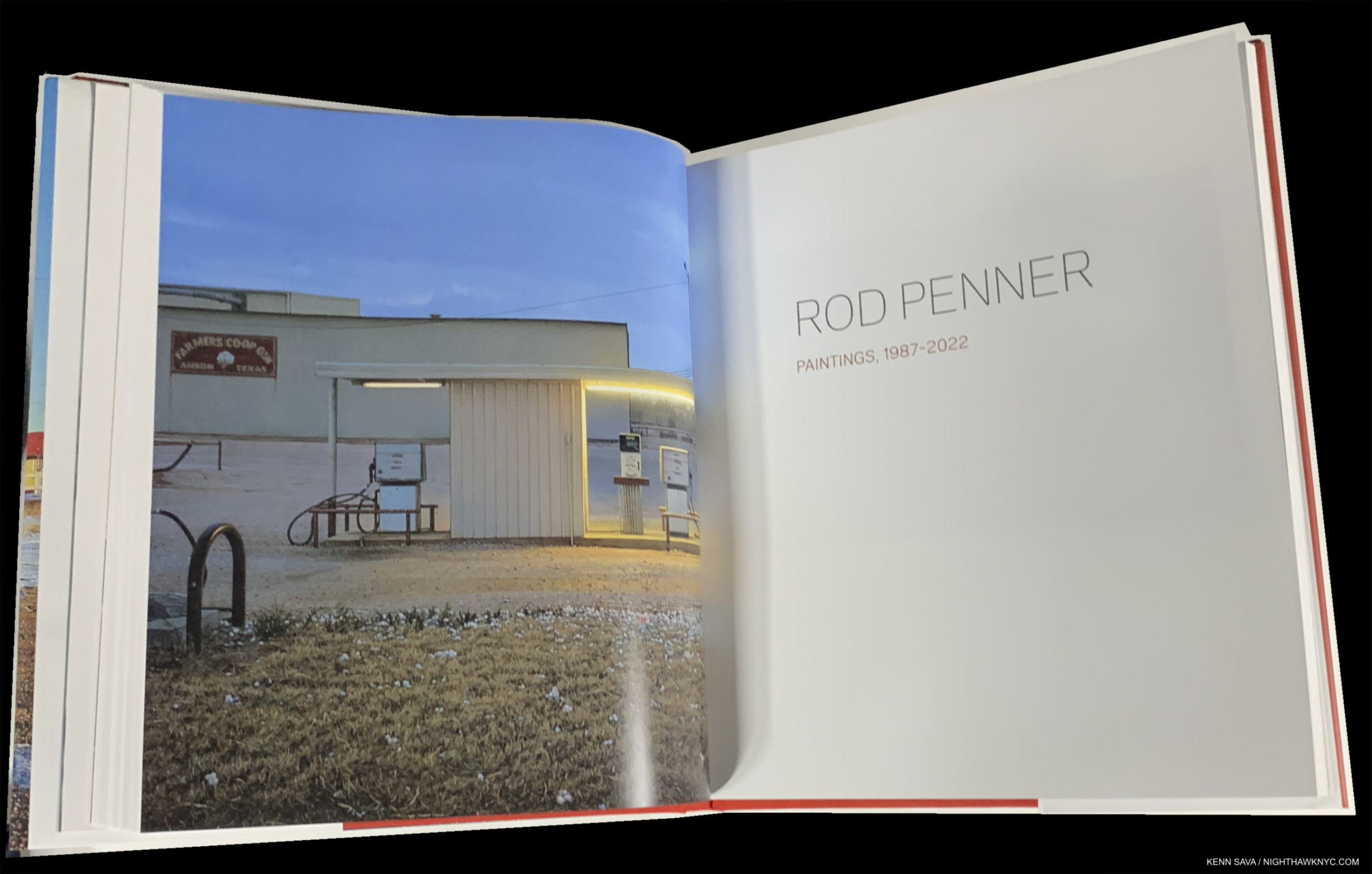
Book review- Rod Penner: Paintings, 1987-2022, published by The Artist Book Foundation.

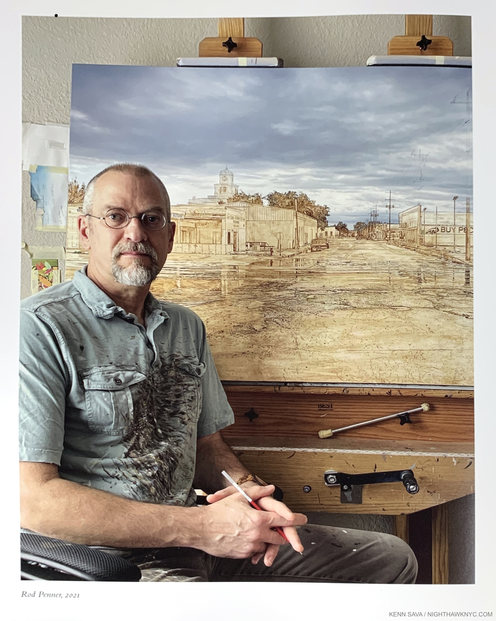
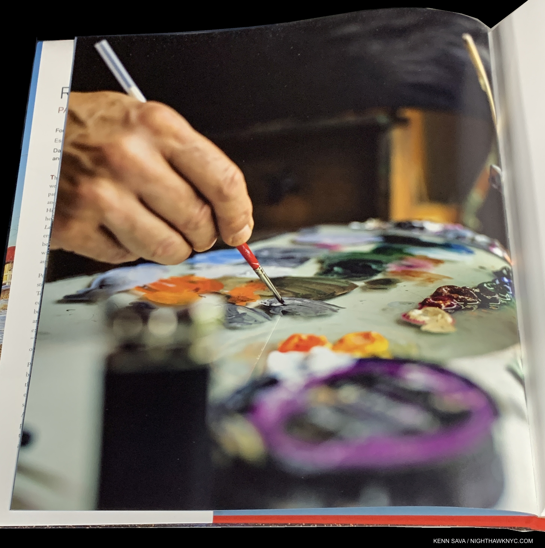
Rod Penner at his easel at work in the early stages of what would become Buy Pecans Here/San Saba, TX, in 2021, as seen in the book. Click any image for full size.

Rod Penner is best known for his Paintings of small-town America that combine his unique Artistic sensibility with a seemingly other-worldly level of technical mastery. Small-towns being most of what America is made up of, the scenes he renders resonate with the shared experience of life in America in Paintings that are open-ended allowing the viewer to create their own narratives and outcomes. Whenever they’re through basking in the sheer delight just looking at them brings, that is. Born and raised in Canada, the Artist settled in Texas in 1988, where he finds most (but not all) of his scenes. In spite of how detail-rich they are and time-consuming to make, he’s amassed a sizable body of work while still in mid-career. Yet, a Rod Penner monograph has been a long time coming. This month, with the publication of Rod Penner: Paintings, 1987-2022, the 36-year wait is over. It’s finally here.

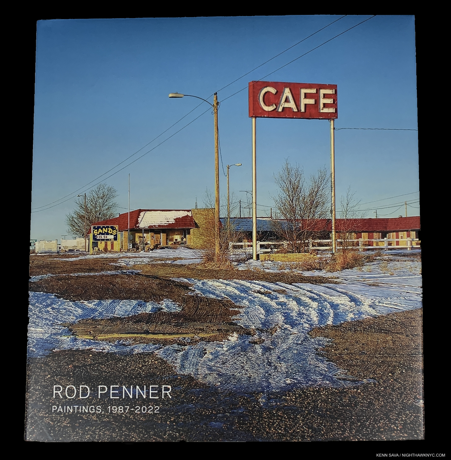
Rod Penner: Paintings, 1987-2022 is a book that makes a real attempt to cover a lot of bases. It’s an introduction to his work, a monograph on his career to date, and a Catalogue Raisonne. That makes it fairly unique among Art books I’ve seen in my half century of buying Art books. Most books set out to be one of those things. In pondering that, keep this in mind- it’s hard for a Painter to get a book published. The great Alice Neel didn’t see her first monograph published until the year before she died at 84! Therefore, it’s not surprising that the first full-length book on Rod Penner is one that strives to check a lot of boxes and fill a lot of needs.

Whether you’re new to the Paintings of Rod Penner, or not, expect to be immersed in what the Artist has created because EVERYTHING Mr. Penner has Painted through 2022 is in it (along with a few stellar Drawings)! The #1 complaint I hear from Art book buyers is- “Not enough pictures!” Complaint #1A is “Not enough pictures in color.” With 268 color images over 200 pages, that’s not going to be the case here. However, Rod Penner: Paintings is not a pure monograph, per se, where sections of an Artist’s career are broken down and analyzed, which some new to his work might miss. The Paintings flow continuously from the beginning of the Paintings section,  shown above, to the end of it (pages 52 through 183). The benefit of this is that one is able to follow the Painter’s development on a work by work basis, right from the start, without interruption through 2022, which is unheard of in a monograph.

As a result, in my book, Rod Penner: Paintings scores highest as a Catalogue Raisonne, which is where it will probably have the longest-lasting importance, immediately becoming the standard reference on his Paintings through the end of last year. Though it doesn’t include a catalog numbering system usually seen in a Cat Raisonne, the pertinent information is provided for each piece. Works are referred to by their title, which will now remain their official reference point. Interestingly, nowhere in the book, or on The Artist Book Foundation site, is the term “Catalogue Raisonne” mentioned. Perhaps, someone feared it would scare off general Art book buyers. Yet, all his Paintings are included, so that’s indeed what it is. A rose by any other name…

In Mr. Penner’s case, a book containing all his work is particularly welcome, a dream for his staunchest admirers, and those wanting to see more. Shows have been infrequent, making the chances to see his Paintings in person precious. Rod Penner’s work always sells. When it does, it disappears into a private collection where chances for the public to see it are rare at best. So, Rod Penner: Paintings is a chance for the rest of us to see all of what the Artist has created. I, for one, am happy that this is the path that was chosen, though a “greatest hits” book might have been more marketable. Marketable, maybe. But, having watched visitors over multiple visits to three shows of his work, it seems to me viewers either like it right off, of they don’t. If they like it, why not show them more, even all, of it?

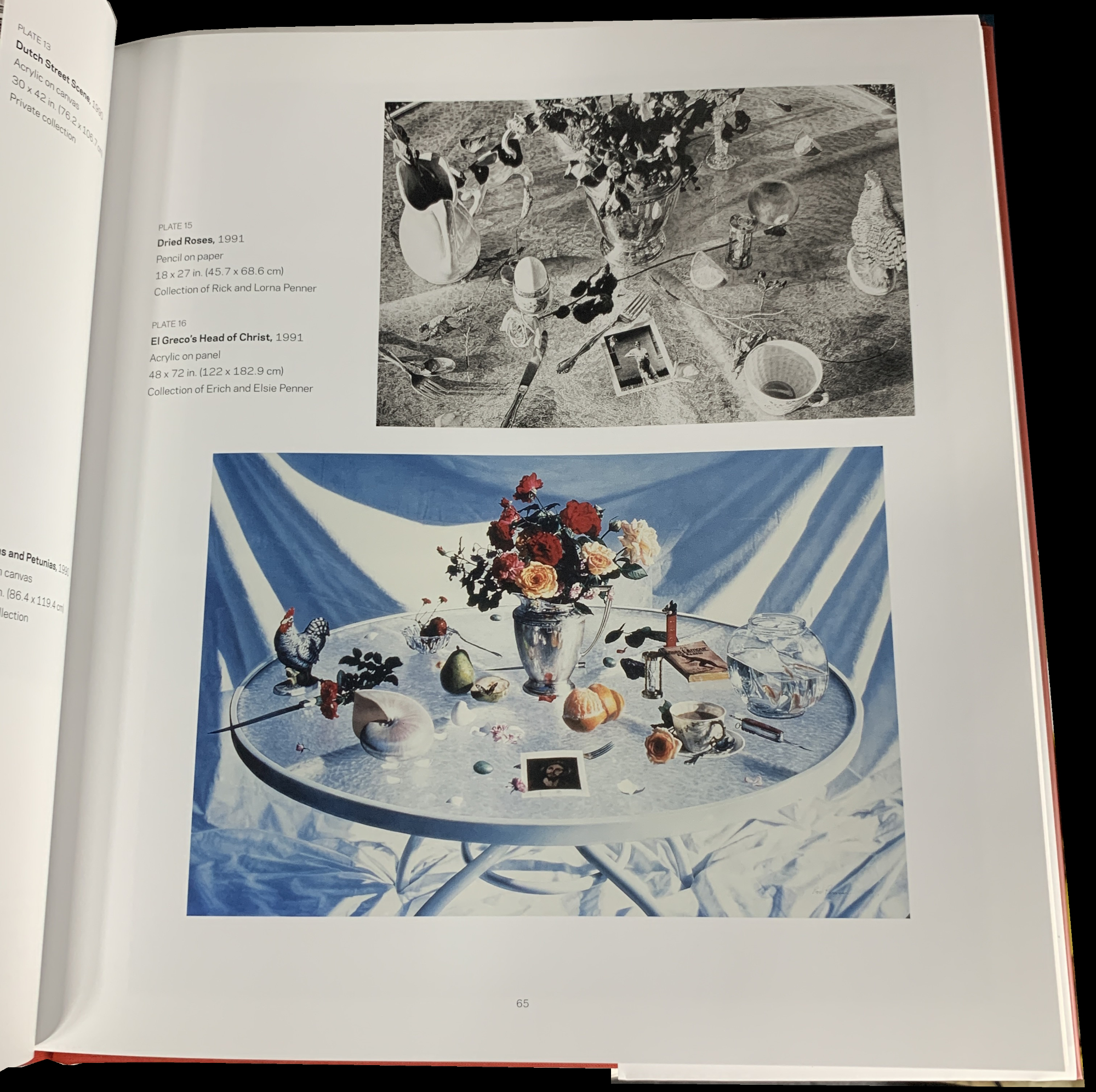
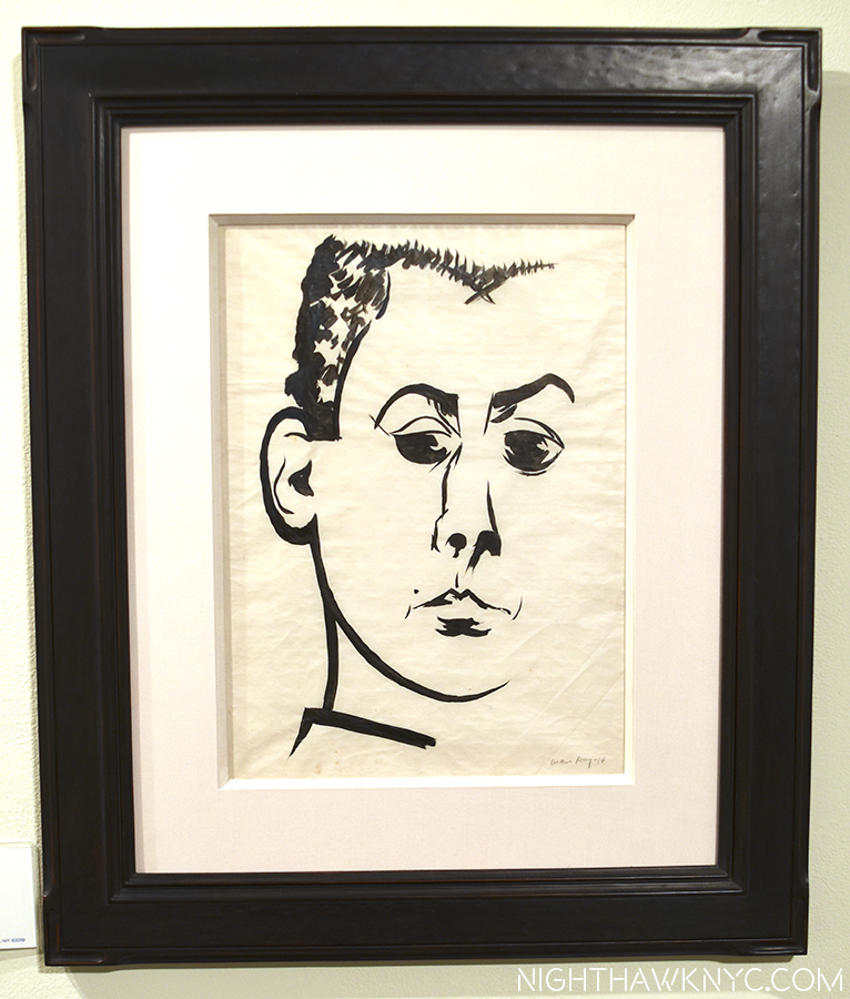
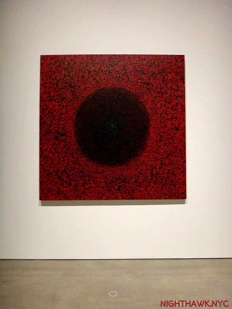
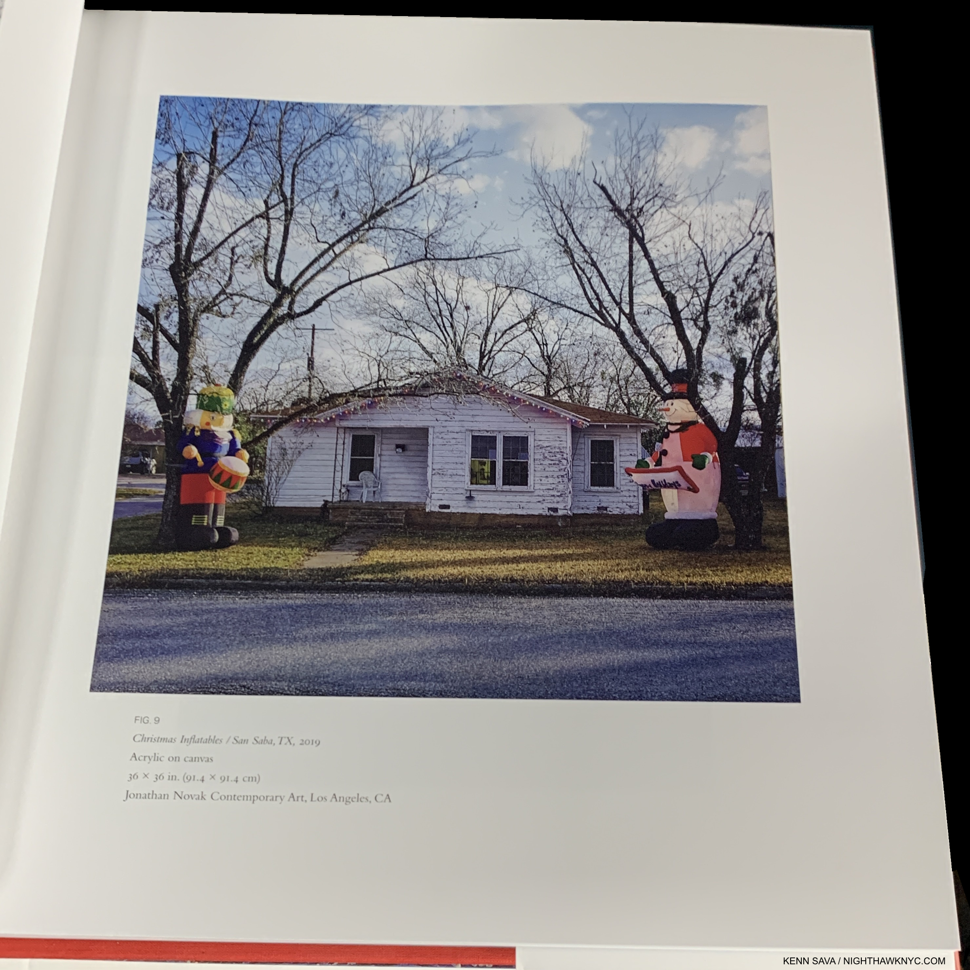
Two earlier works that will surprise those familiar with the “small-town” work. The top piece, El Greco’s Head of Christ, 1991, is one of his rarely seen Drawings.

Content determined, the next questions are- what’s the format of the book? How’s the design and how are the images laid out? What are the materials used? And, perhaps most importantly, how are the Photos of the Paintings? For Paintings as detail-rich as Rod Penner’s are, high-quality Photos are, possibly, the most important element in any book on his work. In a book covering over 3 decades of work, the early work might suffer from inferior Photography when compared with the more recent Paintings, particularly because these pieces “disappeared” into private collections after leaving his easel in the late 1980s and 1990s. A drop off in the quality of the Photos of the earlier work is not noticeable here. The Photos are of a consistently good quality of reproduction, with accurate colors and sufficient detail, assuaging what was a large concern going in. However, deciding to include all of his Paintings in one book temps my “law of more.” That is, “More of one thing means less of something else.” Welcome to the realm of the trade-off.

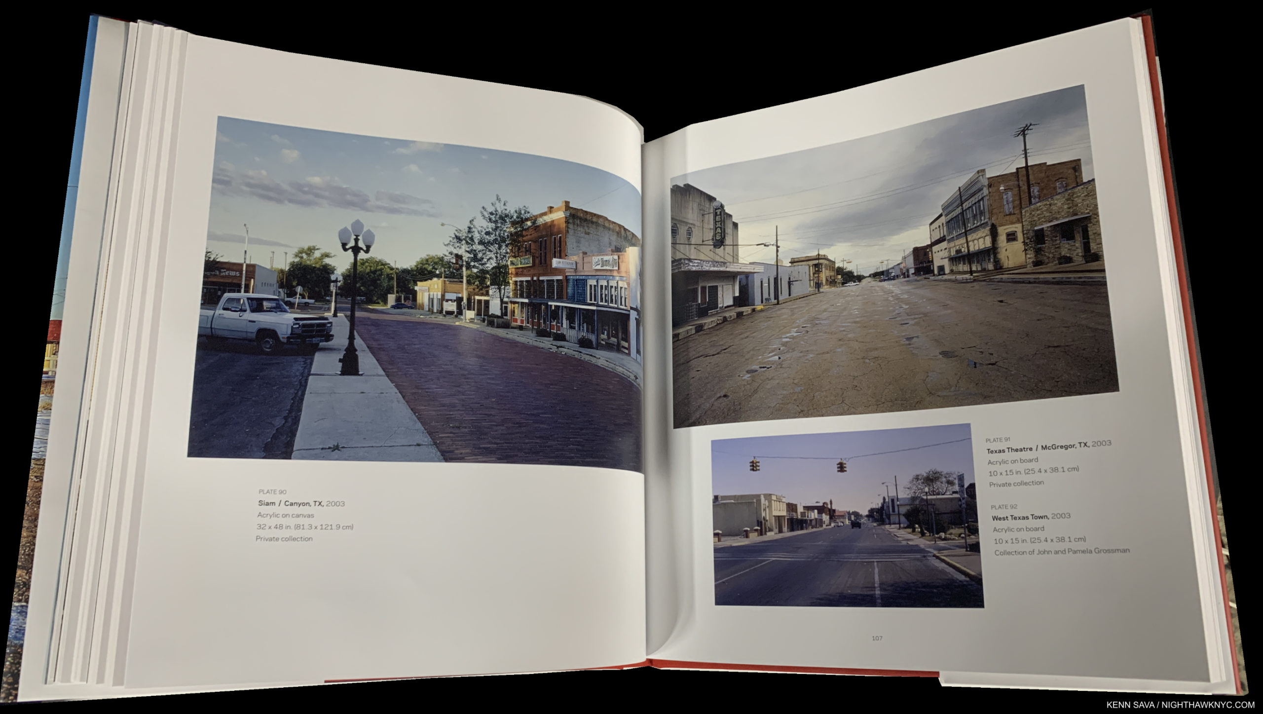
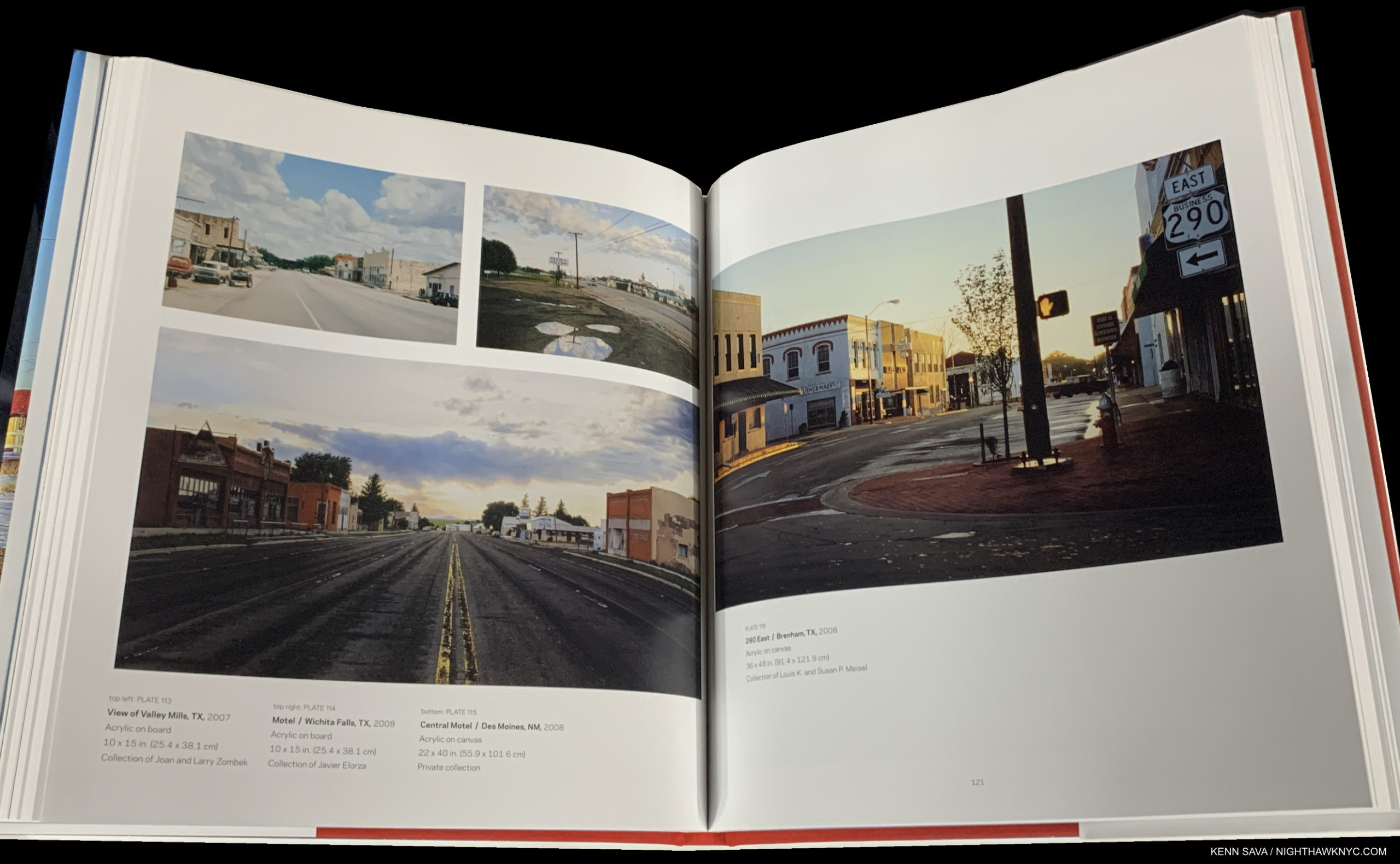
The book clocks in at 11 by 12 inches, an unusual format as Painting books go in my experience. If it had been any smaller in this format, I think the book may have failed. I was surprised it’s not a landscape format book to match the format of most of Mr. Penner’s Paintings. In any event, with 268 color plates and 200 pages, not all of them are going to be full-page. The Artist and the book designer appear to have worked together to carefully decide how big each Painting should be reproduced, instead of just making each image the same size. Since Mr. Penner was so involved with the making of this book, the relative sizes could be taken as an indication of which he feels are his most important works. But, that’s conjecture. I can quibble with some of their size choices, but overall, the results are surprisingly good. So, if all the Paintings are here, what’s missing?

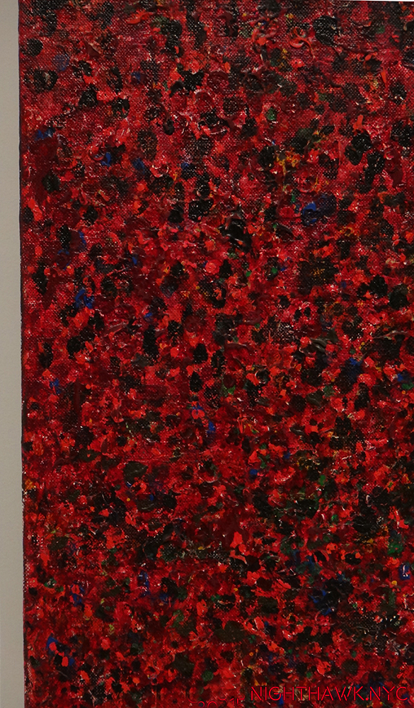
The two Paintings in the upper left are about as small as I’d want to see a Rod Penner Painting reproduced.

The trade-off appears to be details. As anyone who has seen Mr. Penner’s Art knows it’s characterized by extraordinary details- everywhere you look, virtually ad infinitum. Watching visitors to those shows I mentioned, I see a familiar pattern.

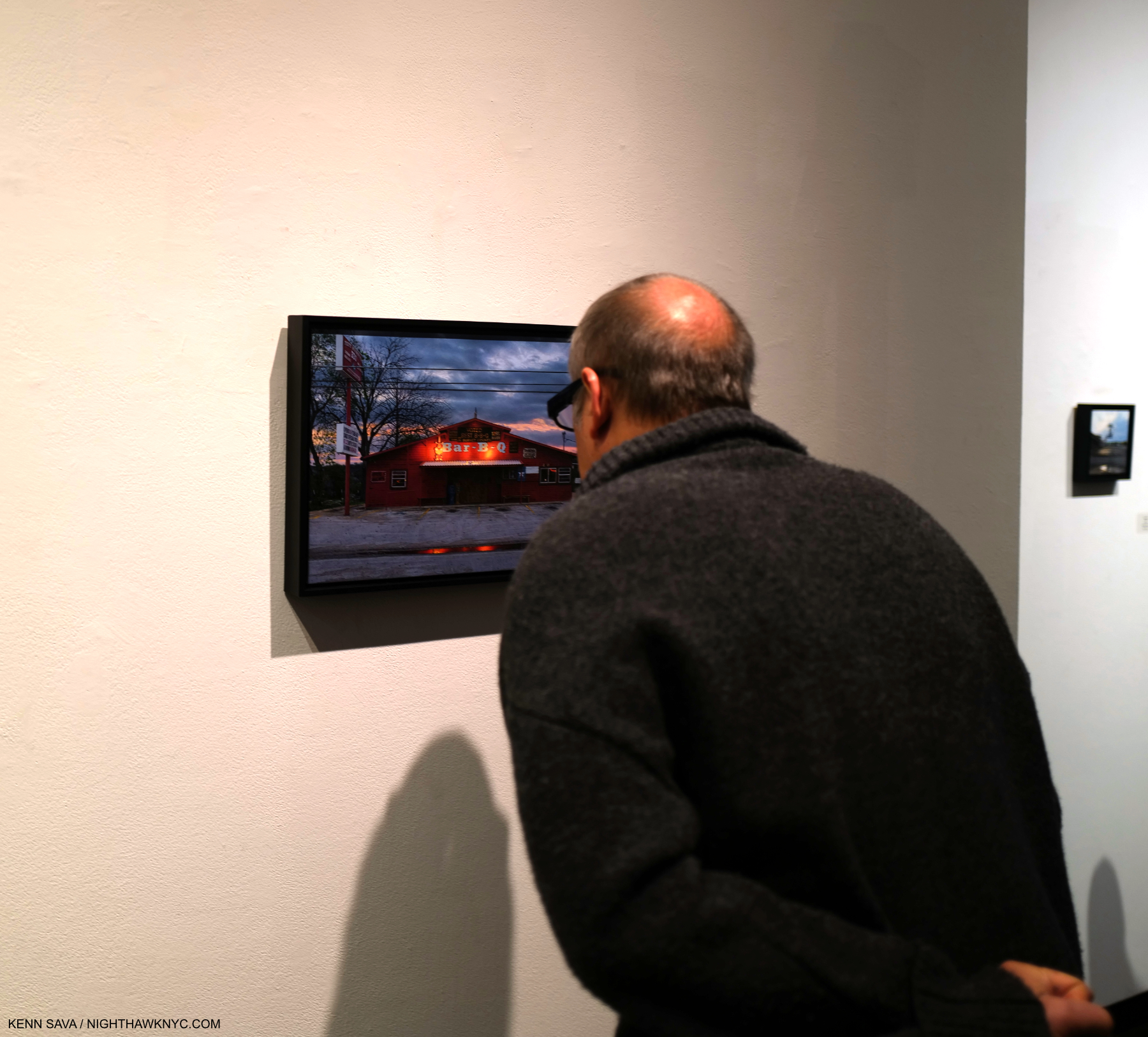
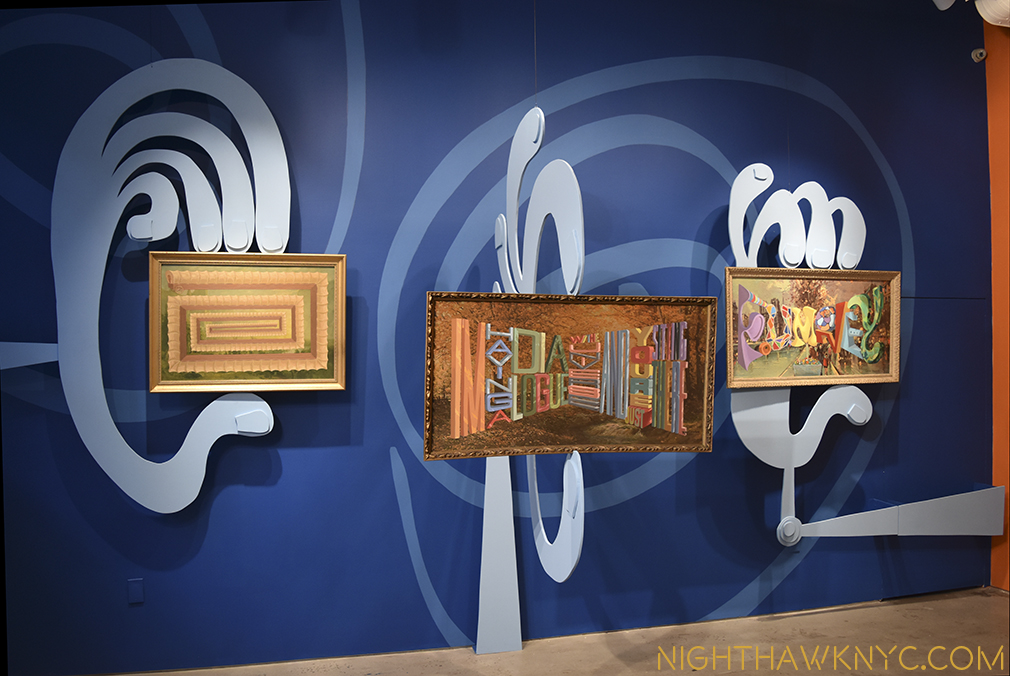
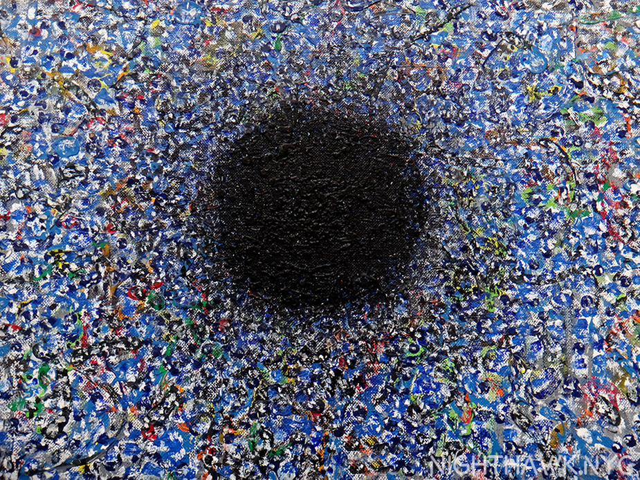
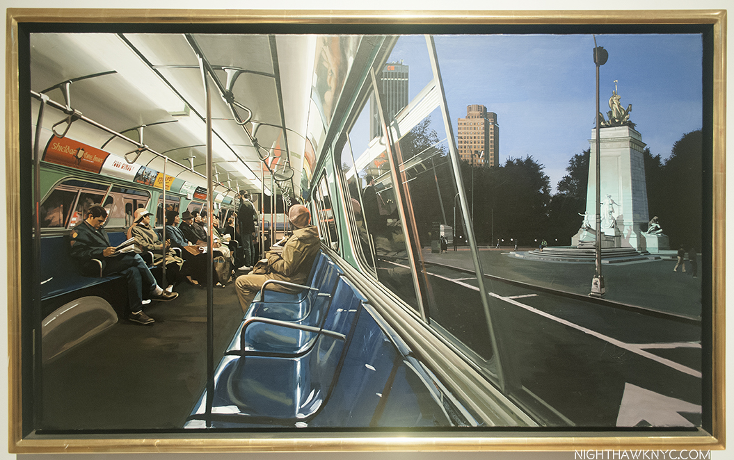
The “Penner Neck Crane.” Something first-time and long-time Rod Penner viewers are very familiar with. The charming work under consideration here is Bar-B-Q/Marble Falls, TX, 2022, the most recent work in his current show, Rod Penner: Small Town Meditations in NYC.

First, the jaw slackens, then the mouth opens in disbelief at what the eyes are seeing. These are hallmarks of a first-time Penner experience. Then, the neck cranes, to look closer and closer. Then, the slight shuffle of the feet. This to look closer at another part of the piece. Rinse and repeat. Unfortunately, steps 2 & 3 are not particularly possible with a book. Here, the reader will find there are only a handful of details of Paintings, which is a sizable disappointment, but one that I, for one, will accept in order to see more Paintings. 

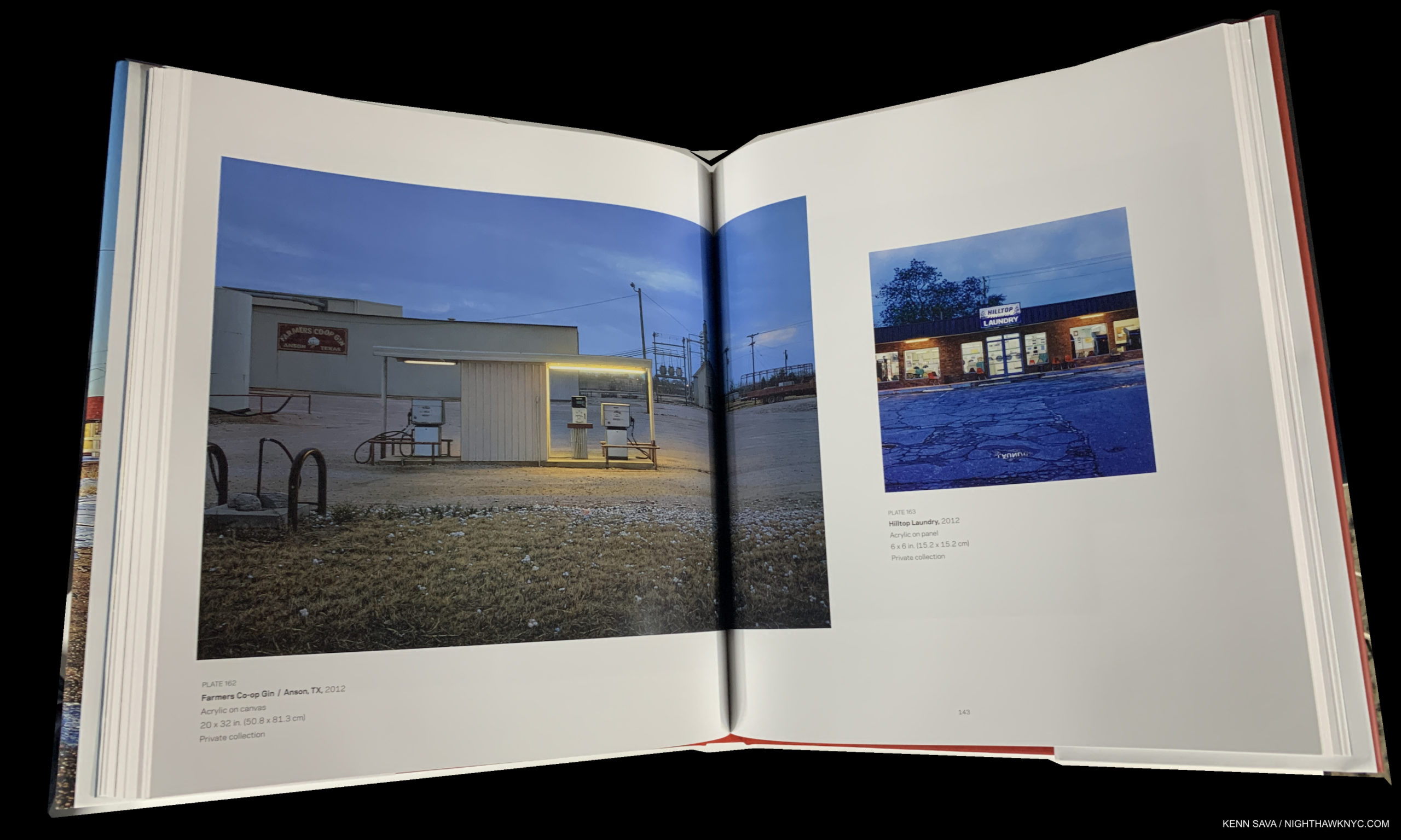
The Artist and the editors present a surprisingly wide range of image sizes. Luckily, the book is a good size so that most of the images are larger than you would see in a typical monograph. And they are tastefully placed, chronologically, on the page with not too big of a border. Inevitably, with a book like this representing 30 years of work, there will be some wailing that such and such a work is shown smaller than one would wish and you can’t study the detail. When that happens, ask yourself which Paintings you would have omitted. That’s the trade off. Yes, at 200 pages, perhaps another 50 of details could have been added. I would love to see details (plural), but not at the expense of a single Painting. Welcome to the world of budgetary considerations! The book lists for $65., which is $5 to $10 below most similar Art books I see, and as such is a very good value.

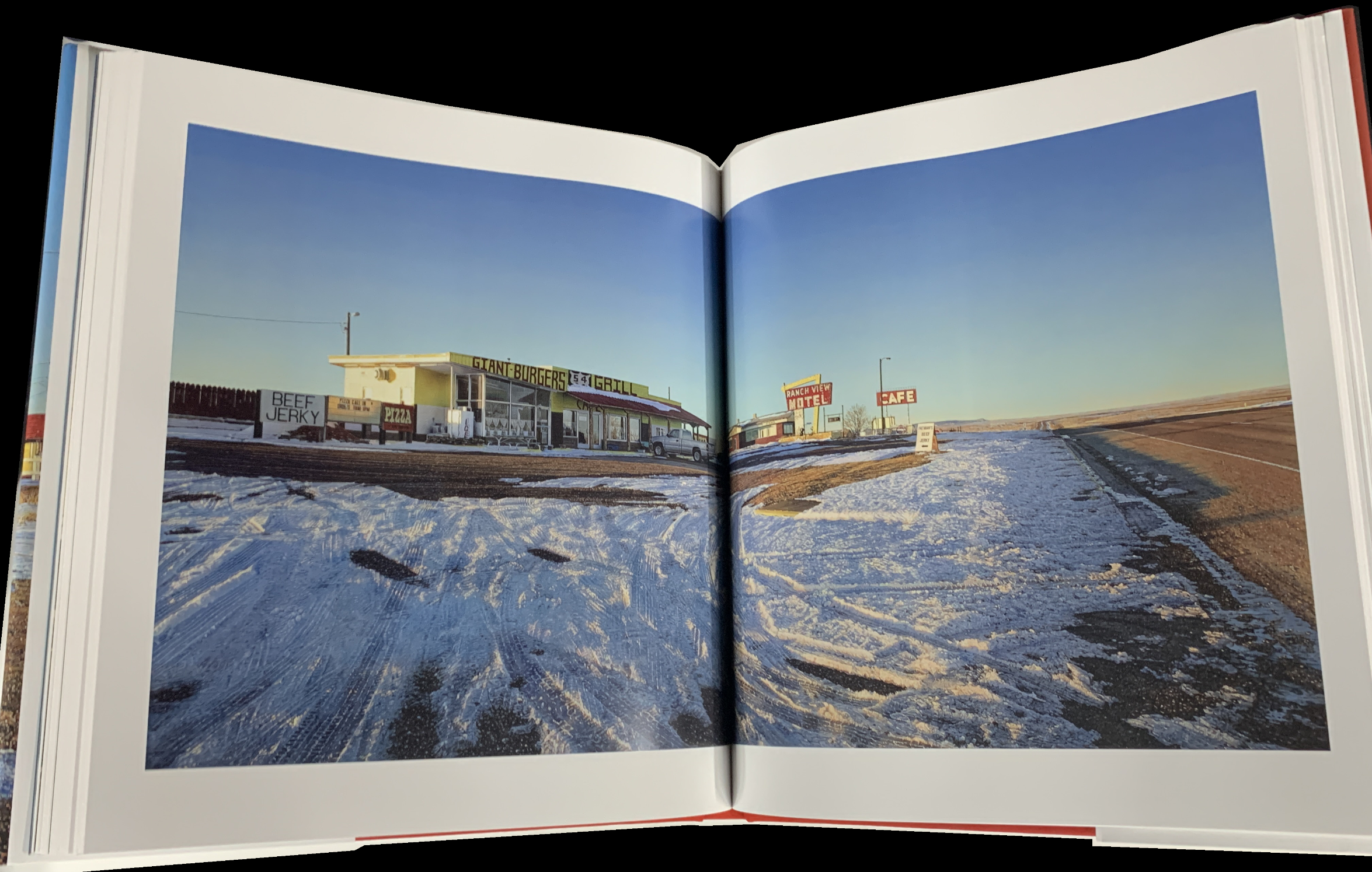
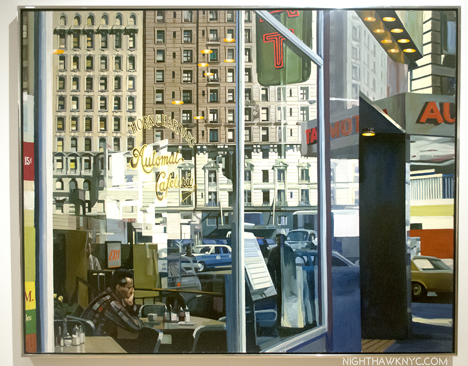
The #2 complaint Art book buyers make is that works go over the gutter. Before you ask, seven Paintings are shown large enough so that they go over the gutter by my count in the book (two them are shown here). I always feel I haven’t really seen a work that goes over the gutter when one appears in a book, in spite of the chance to see details. That is the case here, but, thankfully, it’s kept to a minimum. I really can’t blame them for doing this. Rod Penner’s work wants to be seen as close to life size as possible to give that effect they have in person. Without ANY large reproductions, you’re not showing that, and you’e doing Mr. Penner’s work a real disservice.

Overall, I find the design is tastefully minimal. Meaning it doesn’t get in the way. The book is a red cloth covered hardcover with a sewn binding and a dust jacket featuring Sands Motel & Cafe/Vaughn, MN, 2019, currently on view in Rod Penner: Small Town Meditations in NYC, wrapped around it. The red boards, (with the title appearing in white), are a bit of a surprise, red being a bit of an outlier in terms of frequency of appearance in his palette, but they work. The flaps don’t mention how many images are included, which I know book buyers consider when making a purchasing decision. The book is printed on 150gsm archival Garda Matt made by Lecta, a quality stock that should hold up to the book being used more than the average Art book given its comprehensiveness. When considering how sturdy gsm 150 is, consider that a gsm of 170 or over is considered board.

Among the included text, most importantly, Rod Penner has authored an Artist’s Statement, essential reading from an Artist who prefers to let his work speak for itself. Essays by David Amfan and Terrie Sultan, are also included as are a Foreword by Louis Meisel, a Chronology and a Bibliography where you will find my name with a list of the pieces I’ve written on Mr. Penner (which also appears below).

Rod Penner: Paintings will be an automatic acquisition for Rod’s collectors and admirers. For all other Art lovers- particularly lovers of Painting who’ve never seen a Rod Penner Painting- it’s a book you should make a point of seeing. You’ll know instantly if Rod Penner’s work is for you, or not. If it is, don’t hesitate to buy a copy. Books like this tend to go out of print, or sell out, quickly and then sell for substantial sums on the aftermarket.

With the publication of this book, and everything he’s created for the last 35 years now a matter of record, the real work can begin – assessing Rod Penner‘s place among his peers, and those who have preceded him, in Art history.

As I said in the beginning of this piece, Rod Penner: Paintings is a book that is many things. Given the Artist’s close involvement in each step along the way, it’s the definitive reference book for the collector, buyer or seller of his Art.  Yet, it’s also a treasure trove of the sheer beauty and skill a supremely gifted Artist can create that will endlessly delight lovers of Art and Painting.

Any page of the book shows how masterful a Painter Rod Penner is. As you page through it, moving through the years and decades of his work, the consistency of the very high level of quality of his Painting becomes every bit as impressive.

In the end, therefore, among everything else it is, Rod Penner: Paintings, 1987-2022 is also a personal testament.

*- Soundtrack for this piece is “On The Road Again,” by Willie Nelson from the Honey Suckle Rose Soundtrack album, 1980.

As far as I know, to this point, I have written more extensively about Rod Penner’s Art than anyone else has. My previous pieces on Rod Penner are-

The Vermeer of Marble Falls, Texas,” April 28, 2017

Rod Penner: Brilliance, Under Cloudy Skies,” June 10, 2017

Q & A With Master Painter Rod Penner,” June 14, 2017, and

“Rod Penner’s Neighborhood,” August 3, 2018

My previous BookMark pieces are here.

My thanks to Leslie Pell van Green and and Amanda Romanelli of The Artist Book Foundation.

NighthawkNYC.com has been entirely self-funded & ad-free for over 7 1/2 years, during which almost 300 full length pieces have been published! If you’ve found it worthwhile, PLEASE donate to allow me to continue below. Thank you, Kenn.

You can also support it by buying Art, Art & Photography books, and Music from my collection! Art & Books may be found here. Music here and here

Written & photographed by Kenn Sava for nighthawknyc.com unless otherwise credited. To send comments, thoughts, feedback or propositions click here. Click the white box on the upper right for the archives or to search them. Subscribe to be notified of new Posts below. Your information will be used for no other purpose.

Studio K.O.S. Carries On After Tim Rollins

Written & Photographed by Kenn Sava

I’ll always miss my late friend Tim Rollins who left us at just 62 years of age in January of last year1, but I can’t imagine how his “Kids” feel.

Tim Rollins & K.O.S.: A History. Published in 2009 to accompany the traveling retrospective of 25 years of their work. I’ll never forget seeing Tim with the phone book sized “draft” of this book in 2009, which he let me thumb through, in awe, while it was in preparation.

His Kids, better known as “Kids of Survival,” or K.O.S., a group of at-risk public school students, some barely in their teens, (as you can see in the Photo taken of them, above, by Lisa Kahane in the 1980s that appears on the cover of the retrospective on them), that Tim taught Art to that became the group “Kids of Survival” in 1984. When they began, he told them, “Today, we’re going to make art. We’re also going to make history.” With work in over 87 museums and public institutions (and counting)2, they’ve succeeded on both counts. In 2010, a terrific documentary film on Tim and K.O.S. was released entitled Kids of Survival: The Art and Life of Tim Rollins and K.O.S., which details the unprecedented journey both Tim and the members of K.O.S. took as they forged their own way into Art history. “History” is a word that keeps coming up in discussing Tim and K.O.S. in 2019, which is fitting because this year marks the 35th Anniversary of the founding of K.O.S..

Boys to men. Together, they made history. Tim Rollins & K.O.S. in 2016. Steven Vega, Ricardo Savinon, Robert Branch, Tim Rollins, and brothers Angel & Jorge Abreu, left to right, at Lehmann Maupin Gallery, West 22nd Street. Lehmann Maupin Photo

“To dare to make history when you are young, when you are a minority, when you are working, or nonworking class, when you are voiceless in society, takes courage. Where we came from, just surviving is ‘making history.’
So many others, in the same situations, have not survived, physically, psychologically, spiritually, or socially. We were making our own history. We weren’t going to accept history as something given to us.” Tim Rollins.

Tim even added “and K.O.S.” to his signature. Angel Abreu signed under it. From my collection.

While he taught them Art in school, with the goal of having them get into college, he also began naming everything he and the they created as being by “Tim Rollins & K.O.S.” Giving the students/apprentices equal status with the Artist as collaborators was unprecedented in the history of visual Art, as far as I know, as so much of what he did was unprecedented in Art education. Now, a year after Tim’s passing, K.O.S. have announced that they are going to continue as Studio K.O.S.. “History” becomes “living history.”

Curator Ian Berry, “Thinking about the increasingly important role of what Tim and K.O.S. did together over 30 plus years is so important for us to see now.” Installation view of Tim Rollins and K.O.S.: Workshop at Lehmann Maupin in May.

The past, the present and the future were the subjects of the show Tim Rollins and K.O.S.: Workshop at Lehmann Maupin in May and June, the first by Studio K.O.S. It included a “mini-retrospective” of their work curated by Ian Berry, who said of his selection, “The show’s called Workshop. I was thinking of works that really exemplified the idea of a group of artists sitting together around a table making work together. Sharing ideas. Thinking, reading, talking, seeing together. So each of the works is a very overt example of their hands and the imagery of the individual members on each of the works.”

Amerika (For Karl), 1989, Watercolor on paper mounted on canvas, 97 x 132 inches

He continued, “And then, I’m thinking about the guys being in Studio K.O.S. without Tim, and I’m thinking about the crazy politics that we’re living in, and thinking about the increasingly important role of what Tim and K.O.S. did together over 30 plus years is so important for us to see now. I really value the idea of this show now. It’s so important to see education leading to justice. It’s so important seeing different versions of identity and self-empowerment and speech, that is so needed now. It’s great seeing these images of Pinocchio logs potentially waiting for birth. It’s great to see this really intense room of all black works, which I hope moves you to be engaged, and be active in thinking about what’s going on around you. It’s a history, but it’s also a workshop that we’re all hopefully invited to join in.”

“It’s great to see this really intense room of all black works…” Two works from I see the promised land (after the Rev. Dr. Martin Luther King, Jr.), both 2008, Matte acrylic and book pages on canvas, 108 x 72 inches each.

Walking through the show with as unbiased eyes as I could possibly muster, given my personal connection, I found myself in complete agreement with Mr. Berry when he spoke of “the increasingly important role of what Tim and K.O.S. did together over 30 plus years.” When I’ve seen their work over the years, it’s generally been a piece here or there, as in MoMA’s 2007 show What is Painting: Contemporary Art from the Collection, where the group’s Amerika VIII, 1986-7, was on view.

Installation view of MoMA’s 2007 show, What is Painting: Contemporary Art from the Collection, with Amerika VIII, 1985-6, left. MoMA Photo.

I remember standing in front of it and feeling overcome with joy- the joy of a beautiful work and my sense of all that had gone into, and all that had been overcome, achieving it- let alone having it wind up in the Permanent Collection of the Museum of Modern Art (An aside- To this day, MoMA owns NO Paintings by Jean-Michel Basquiat. That’s another story). Then, I walked over to the label you can barely see to the right of the work in the Photo. My jaw hit the floor. Here’s exactly what it said-

If you know of another Artist in Art history who included the names of his students or apprentices on his work, let me know. MoMA Photo.

I remembered standing there thinking- “Can you imagine being them, having overcome all they did, then seeing not just your work, but YOUR NAME on the wall at the Museum of Modern Art?” Angel Abreu was about 12 years old(!), Ricardo Savinon was about 15(!) when this was made.

Seeing a wonderfully chosen selection of their work today, it looks remarkably prescient. Beyond it being a landmark collaboration that marks fresh paths for Art education, their work doesn’t feel one bit dated, and, even more? I think it’s going to hold up; it’s going to continue to speak indefinitely to viewers, regardless of age. My recommendation is that the other museums & institutions not included in the current list of 87 above step up and acquire a work while they can.

The “Kids” are adults now who have forged their own successful careers in Art, and Tim lived to see it happen, something I’m sure gave him as much joy as anything else he experienced in his life. You can see just that on his face in the Photo of he and K.O.S. from 2016 I showed earlier. While each now has a successful career of their own, the legacy they embody and share is still every bit a vital part of their lives, and it sounds like it will continue to be going forward. There remains much to be done.

The legacy continues. Ricardo Savinon, Robert Branch, Jorge and Angel Abreu, members of Studio K.O.S., joined by curator Ian Berry, from left to right. Lehmann-Maupin Gallery, West 22nd Street, May 3, 2019.

During the run of the show, a panel discussion was held on May 3rd in which Ian Berry was joined by four long standing members of K.O.S.- Ricardo Savinon, Robert Branch, and brothers Angel & Jorge Abreu, men that were very young men when they first met Tim and became members of K.O.S.. Surrounded by Art they created with Tim, each proceeded to tell his story- how he came to be part of the group and the journey they’ve taken over the years, that I’m sure felt like they passed way too quickly. Over the course of 90 minutes, the stories were powerful and joyful, each one a remarkable tale of perseverance and single-minded dedication on the part of students and teacher. Nary a tear was shed, instead laughter was free flowing throughout.

Ricardo Savinon is someone I’ve known for well over a decade. During that time, he was the person I saw most often with Tim. They struck me as having a closeness that truly was on that fine line between family members and close friends along with a very strong level of mutual respect. Rick, as he’s known, was extremely ill, hospitalized, and was reportedly near death himself, when Tim passed away. Thankfully, he recovered, but when I last saw Rick, at Tim’s Public Memorial Service last April, he looked very thin and gaunt. So, I was extremely relieved to see him now back to his usual full of life self, with his ever present sharp wit and even sharper mind in full effect. Rick joined K.O.S. in 1985 at about 14. He went on to study at the School of Visual Arts before becoming the interior designer, Art installer and curator he is today. Angel Abreu, who is about 3 years younger than Rick, met Tim and joined K.O.S. in 1986. He has worked on every major K.O.S. project and exhibition since he joined. Today, he’s a Painter and is on the faculty of the School of Visual Arts, where Tim, himself, studied between 1975 and 1977 and more recently was an SVA faculty member when he passed. His brother, Jorge, joined K.O.S. at age 12 about 1991, as he related in an unforgettable story I relay below. Today, he’s working on a poetry collection around growing up in the golden age of hip-hop. Robert Branch joined Tim and K.O.S. at 16, circa 1993. Today, he holds a BFA from Cooper Union and a masters from Teacher’s College, Columbia University. I had met both Angel and Robert in passing with Tim over the years.

Angel Abreu speaking about participating in a show at Saatchi Gallery in London at age 13, rubbing elbows with Ashley Bickerton and Jeff Koons.

Angel Abreu- “What I’d like to say before we get into this, is that if you can imagine, at 12, 13, 14, or 15 years old, we really didn’t know what was going on. But what we did know, at least I can speak for myself, is that I could not stay away. This was before cellphones, right. And there were many moments when we had, and again, Tim would tell us, ‘There’s no greater motivator than a deadline.’ We are so thankful that we had so many amazing deadlines.”

By any means necessary (Trapped/Caught), 1985-7, Black gesso on book pages mounted on canvas, 21 x 28 inches. From The Autobiography of Malcolm X.

“But we had no idea. It wasn’t really until later until I think we got into high school and into college where we realized how extraordinary this was that we were doing. But, really it was the day to day we’d go into the studio. And he’d say, ‘Ok, by the way, we just got included in the next Whitney Biennial.’ Alright, that’s cool, Tim. I have no idea what that is. Yeah, that’s good.”

Ricardo Savinon, “Tim was Professor X…”

Rick Savinon- “Also, I want to chime in. How impactful that us being part of the group and realizing that we were kind of outsiders with our families joining an outsider group. So, it was almost like the X Men where Tim was Professor X and he got together this group of mutants who didn’t know how to hone in their skills.”

X-Men/Malcolm X (after Marvel Comics and Malcolm X), 1997, Comic book covers on rag board. 1 of 12 parts.

“But in the studio he taught us how. But, in doing so, we impacted so many people, Our peers, our families, our friends. I mean I remember probably after 15 years of being in the group, I have a friend of mine who was walking down the street and said, ‘I was taking Art History class and I saw a picture of you. What the hell’s going on? What are you up to?’ I just said well very calmly, ‘I’m glad that you’re pursuing art. I’m part of this art group for the past 20 years, and this is what we’ve been doing. And he was so proud because we managed to come from a situation where there’s a lot of poverty, violence and we together, we decided to do what was necessary for ourselves. And a lot of others, our peers, our friends that are still friends of mine. I’m very modest. ‘What are you doing right now?’ I’ll say ‘Well, I’m an artist.’ ‘Well, what kind of art, maybe graffiti?’ ‘No, no…’ And so, they’ve always been proud, my family’s been proud. That’s part of the reason my niece is studying engineering at this point because I’ve influenced her. In some subtle way, in the things that I’ve done. Not sitting her down and lecturing her. But just because she’s acknowledging what I’ve been doing. I’m sure that Angel and Jorge and Robert their family does the same…their kids.”

Jorge Abreu, “So, this was a tragedy for my family…”

Jorge Abreu- “Alright, so I’ve got a story to tell. So, just imagine seeing your older brother he’s going off to London (at age 12) and doing all these great things, and you’re home playing Nintendo 64, except it wasn’t Nintendo 64. No. We still had the Commodore. So, obviously this was ground breaking. The way I sort of came into the group was sort of an S.O.S. kind of thing. We had a summer vacation with my dad down to the D.R. We had a terrible car accident, the day before we were supposed to fly back to New York. I was unconscious for 2 weeks. Woke up. Before then I was a kind of straight A student. But, I woke up. Lost my memory. Didn’t recognize who my family was. Ended up staying in the Dominican Republic for a couple months after that rehabbing and recuperating.”

“So, this was a tragedy for my family. We lost my dad at that point, through the accident. Finally get back to New York. I couldn’t walk. One day I woke up. Had to do a whole lot of rehab. My memory was shot. So I went back to school. I believe it was the sixth grade. Really lost. Really intimidated. Really insecure. My mom had some concerns. But, I’d always been a writer as a younger child. I don’t know what happened, sort of a transformation. Now, I wanted to draw. I started drawing and doodling. Obviously my mom was a little concerned for me, so she sort of approached Tim. ‘He’s starting to draw. try to get him involved in the group.'”

Amerika, The Hotel Occidental, 2006, Acrylic and graphite on book pages on canvas, 72 x 59 inches.

“I remember the first day. I had known of Tim. When I went into the studio, I had my portfolio. Alright. And this portfolio consisted of many MLB team logos. Right? So, top notch stuff. So, Tim sort of laughed it off but he gave me a shot. I’m a true believer that this you can take from one of Tim’s great quotes from Amerika when Karl joined the utopian group that took him in right before he was going to leave America. That everyone is an artist. This skill can be developed. If you stick with it. It’s all about just doing it. So, I’m pretty sure Tim was kinda like, ‘This kid’s alright, but he’s not the best.’ But, I continued to come and kept coming and kept coming. I earned my spot. I’m definitely thankful for that. I didn’t know what I was joining. But hey, if it took this guy to London (indicating Angel), I want to be part of it. Next time I want to go, too. “

Robert Branch, “This was my one opportunity and I wasn’t going to let it go.”

Robert Branch- “So, I joined the group later on, I was 16 years old, I was at a High School in the Bronx. JFK. That doesn’t stand for ‘jail for kids.’ The only reason I was going to school was that I had these Dominican working parents. Listen, you either go to school or you get a job or dad’s going to kick your ass. My dad’s bigger than me, so…I was real lucky in that there was a dean who was real tough and he wouldn’t let me skip class.  I really wanted to be a comic book artist. Waiting to be the right age where I could bring my portfolio down to Stan Lee. Luckily, the Art teacher would make sure I attended school, he would call my dad. So, I had this kinda thing where they were really on me and they didn’t want me to fail.”

A Midsummer Night’s Dream (After Shakespeare and Mendelssohn), 2014

“I was really fortunate that the Art teacher brought me to the studio on a trip, walked past the Pinocchio on a freezing cold day, I come all the way down there to the Bronx and I’m like, ‘This is it.’ I’m coming to study here. I’m going to ask as many questions as I can. This is my one shot to figure out what it’s like to be an artist. Because, up to that point, I had not been able to take an art class until my junior year in high school. Think about that. New York City, one of the wealthiest cities in the world, and it had no opportunities to take art classes, and I was in a high school that had some resources, so you know I made the most of it. I was in the studio and I was like ‘What’s this? What do you do with this?’ I asked at least a dozen questions and Tim said, ‘Oh my god, he’s either really into art, or he’s going to come back and rob me.'”

In each work a seed is included- somewhere. In, this detail of A Midsummer Night’s Dream (After Shakespeare and Mendelssohn), as seen above, it’s a a mustard seed visible right in the center of this picture. A beautiful and fitting metaphor.

“So, it was just a wonderful experience because this was my one opportunity and I wasn’t going to let it go. Tim was deeply intuitive and he knew that I had this interest in making art. And that was the beginning of a journey that took me from…my dad…I ended up going to college and I would never have crossed that threshold  if it weren’t for the support and mentorship that Tim gave me. And you know what a college experience can mean to a person’s life. I wouldn’t have gone down that path.”

“Tim wasn’t just my friend, my first white friend, he was an authority figure. I remember dropping something off at his apartment. I had my nephew in the back. My dad drove us. I’m a real city kid- I don’t drive. So, my nephew asks, ‘Who’s that guy?’ My dad said, ‘Well, next to me, that’s the most important man in Robert’s life.’ And that’s the gift that Tim gave me with his friendship and consummate mentorship.”

Believe it or not, out of everything Tim & K.O.S. created thus far, this work, what appears to be simple logs laying on a gallery floor, speaks to me, personally, as much as anything they’ve created.

“Recognize the creative glimmer in others,” Tim said.

When you look closer…Detail of Pinocchio (after Carlo Collodi), as seen above, 1991, Wood, plastic, wax, tung oil, 43 x 6 x 6 inches.

As their work, Pinocchio shows, brilliantly in my opinion, locked inside each of us are whole untapped worlds of possibilities. Tim Rollins even saw mine.

*My thanks to Rick Savinon, Studio K.O.S., and Twice Sold Tales, Seattle, WA. 


BookMarks-

Tim Rollins and K.O.S.: A History by the aforementioned Ian Berry is the standard reference on the group’s work and history, as I mentioned published to accompany the traveling 25th Anniversary Retrospective. 220 pages, full of illustrations, stories and an interview with Tim. Highly recommended to anyone interested in exploring their amazing accomplishments and the even more amazing story of how it all came to be.

Kids of Survival: The Art and Life of Tim Rollins + K.O.S.. is an unforgettable documentary on Tim and the group, a must see for everyone- Art lover or not, in my view. It’s, also, an invaluable look at teaching Art today. Having known Tim and a few members around the time of it’s release, it gave me a “you are there” look at their incredible backstory, into them before I knew them, and even much, much younger. It’s somewhat miraculous that this story exists on film as much as it does, and it leaves me praying that there will be an updated version, given this was released in 2010.

*- Soundtrack for this Post is the X-Men Theme from the 1996 Television show.

NighthawkNYC.com has been entirely self-funded and ad-free for over 6 years, during which over 250 full length pieces have been published. If you’ve found it worthwhile, you can donate to keep it going & ad-free below. Thank you!

Written & photographed by Kenn Sava for nighthawknyc.com unless otherwise credited.
To send comments, thoughts, feedback or propositions click here.
Click the white box on the upper right for the archives or to search them.
For “short takes” and additional pictures, follow @nighthawk_nyc on Instagram.

Subscribe to be notified of new Posts below. Your information will be used for no other purpose.


  1. My Remembrance of Tim Rollins is here.
  2. Per the list, here.

NoteWorthy Shows- November, 2016

This site is Free & Ad-Free! If you find this piece worthwhile, please donate via PayPal to support it & independent Art writing. You can also support it by buying Art & books! Details at the end. Thank you.

Written & Photographed by Kenn Sava (*- unless otherwise credited)

Things are reaching a fever pitch in the Galleries as the year end approaches, with nary a Black Friday Gallery sale in sight, allowing me to sleep in this year. Still, there was plenty to see and be Thankful for, along with the usual smattering of turkeys, but let’s get right to dessert, shall we? As in October, here’s my list, in no particular order, of what I found NoteWorthy in November. Once again, each one of these deserves a longer, in depth piece that I’m not going to have time to do, but I would be remiss in not mentioning them at all. November, also, marked the end of the world as we know it, so…

The world looks different…Brian Dettmer’s Western Civilizations 3, 2016. A “Book Sculpture.” More below.

Faberge from the Matilda Geddings Gray Foundation Collection @ The Met- Will the artist in modern history who is a greater craftsman than Carl Faberge please stand up and make yourself known to me? Thank you. While I’m waiting on that, this is the first show of the work of Faberge in New York since 2004. As small as one of the details on his timeless (and priceless) masterpieces, this show in a hallway at The Met is easy to miss (countless thousands do just that as they wait in line for the elevator to the roof, right in front of this very show). Ms Gray began collecting Faberge in 1933, when prices for his work were cheaper than they will ever be again. Money aside, Faberge combines the equally rare gifts of ingenuity, vision, craftsmanship and delight in works that are a century old but have lost none of their grace, beauty or charm. Scheduled to end on November 27, this show has been extended until 2021, giving you plenty of time to see it.

Imperial Lillies of the Fields Basket, 1896, Yellow & green gold, silver, nephrite, pearl, rose-cut diamond. This is considered THE most important Faberge piece in the USA. It was presented to the wife of Czar Nicholas at her visit to the Pan-Russian Exposition in 1896. This is only 7 1/2  x 8 1/2 inches!

Imperial Napoleonic Egg, 1912, gold, enamel, rose-cut diamond, platinum, ivory, gouache, velvet, silk. One of the infamous “Faberge Eggs,” this was presented by the Czar to his wife for Easter, 1912. Designed to commemorate the 100th Anniv of victory over Napoleon. This is 4 5/8 inches tall! The inside is solid gold, and holds…

a six-panel screen depicting paintings of six regiments she was an honorary colonel in.

Description in next photo. Click any photo in this Blog to see it larger.

Imperial Caucasus Egg, for Easter, 1893. This is 3 1/2 inches high!

Easy to miss, this is the whole show!

Joan Mitchell: Drawing Into Painting @ Cheim Read- Yet another good sized show of an Abstract Expressionist, “second generation” this time, and the most renowned female (Lee Krasner may be gaining on her) AbEx painter, right down the street from the blockbuster Mark Rothko: Dark Passage Show, it makes the perfect before or after bookend to it. I owned a Joan Mitchell print until a few years ago, so I lived with the energy and lyricism her work is known for. Looking around, her work is in most major museums, though it’s been 12 years since an American museum gave her a show. So, it’s been left to Cheim & Read to fill the gaps, and they’ve mounted Joan Mitchell shows every two years, or so, going back to the late 1990’s. This one does make for fascinating pairing with the Rothko show- they couldn’t be more different, while sharing what the scholars call Abstract Expressionism, I’ve heard some of the Artists, including Philip Guston, say they prefer the term “New York School.”

UNTITLED, 1958, oil on canvas

LA GRANDE VALLEE XVI POUR IVA, 1983, oil on canvas

UNTITLED, 1982. oil on canvas

Man Ray: Continued and Noticed @ Francis Naumann- It’s been too long between Man Ray shows. Readers already know my fondness for Man Ray. Francis Naumann Gallery opened 15 years ago with a Man Ray show, so they revisited him for this anniversary show and they did it in style. Man Ray was so prolific, and so prolifically diverse he can be hard to “sum up” in a gallery show, but this one was an out and out winner, a must see, especially for anyone who thinks of Ray as “only” a ground breaking photographer. While featuring a wonderful selection of his photos, portraits and “Ray-o-grams,” it also included his drawing, painting, sculpture, writing, and even no less than 2 Ray designed chess sets.

Paletteable, 1969

The great Man (Ray). Self-Portrait, 1948. A card under speaks of his concerns in his early work- “1) a defiance of artistic convention replaced by steadfast commitment to absolute freedom in the arts.” That says it all.

…and seen again. Autoportrait, 1917/70, Screen print on plexiglass. Really? Hmmm…

…and again. Self Portrait, 1914

Yes, that’s one of the chess sets Man Ray designed to the left of the chair.

Lampshade, center, surrounded by an astounding range of creativity.

Philip Guston: Laughter in the Dark, Drawings from 1971  & 1975 @ Hauser & Wirth- There was no more auspiciously timed show than this one which not only brings us the 73 drawings Philip Guston selected for his Poor Richard series but 100 additional drawings that didn’t make the cut and 3 wonderful paintings that are related or have relevance to them. Opening exactly 4 months after Hauser’s last Guston show, it would be very very hard to find work more different than those in seen in Philip Guston Painter, 1957-67, which I wrote about here, perhaps the “darkest” of his career, in many ways. Though the show’s title refers to the presence of “laughter” here, make no mistake it is more than tinged with darkness, especially because viewing them now, we know how things turned out for Nixon. These were dark times for the country, and many of these drawings were Guston’s “at the moment” reaction to unfolding events. Even before Watergate, the Nixon Presidency was not without a sizable opposition, for more reasons than the seemingly endless war in Vietnam. Everything about Nixon rubbed many people the wrong way, and provided a brilliant Artist ample fodder for “political satire” of the highest order. Most interestingly, for me, these are works in which Guston turns his focus outwards for, perhaps, the only time in his post 1940’s career. Poor Richard was published in 2001 and is still in print. You can see it here.

The 73 drawings that Guston selected for Poor Richard are shown, here (and below), together.

Title Page. Guston Depicts Nixon with VP Spiro Agnew (triangular skull), Attorney General John Mitchell (with his pipe) and Advisor Henry Kissenger (as glasses) as the cast of characters

Guston’s series begins with young Richard Nixon.

Jeff Elrod: This Brutal World @ Luhring Augustine- Chelsea & Brooklyn Galleries. It pains me not to write a longer piece on this. Jeff Elrod has been at the cusp of reinventing painting by combining digital drawing and computers with the end result of that stage outputted to canvas.where it may, or may not be combined with analog, old fashioned painting (at least those on display here). Dealing with blurriness from my recent eye treatment, my initial reaction was, “Hmmmm…If I close my right eye, my good eye, this is how the world looks to me these days.” But, I was drawn back repeatedly, even compelled to make the (unheard of for me) trip to Brooklyn to see the Bushwick segment of this show. In both locations, the effect was the same- I couldn’t get them out of my mind. They’re like something you see when you’re not really looking, or when you’re not fully awake after dreaming, or about to fall asleep…My initial reaction was “This looks easy to do on a computer. Take a photo, blur the heck out of part of it in Photoshop. Add a layer of a frenzied drawing and output to canvas. Then, I remember people say the same thing about Pollock and Rothko, yet no one else has done them. Some works remind me of passages of Monet, some of Yves Tanguay. But not really. They weren’t created like those were and so they don’t look like anything else. Mr. Elrod’s work commands some fancy prices. Ah well…They’re much too big for my place, anyways. If there’s a “cutting edge” in painting in 2016, Jeff Elrod’s work is the closest I’ve seen to being on it. I’m very much looking forward to seeing where this is going.

Auto-Focus, 2016 UV Ink on Canvas 9064 inches. Mystifyingly alluring.

Rubber-Miro, 2015 Acrylic and UV Ink on canvas. His uniquely shaped canvases give the work a different feel from most square/rectangular paintings.

Rake-Adaptable, 2016 UV Ink on FIscher canvas. The ghost of Robert Motherwell? “Haunting” is a word his work brings to my mind most often.

Under The Skin, 2016 UV Ink on canvas, 108 x 84 inches.

Plume, 2016 as seen in Bushwick, Brooklyn. 16 1/4 feet long by 9 1/2 feet tall.

After countless visits, I began to “see” “Jeff Elrods” everywhere I went. Like here-

Life Mirrors Art.

Brian Dettmer: Dodo Data Dada @ P.P.O.W. Mr. Dettmer creates “Book Sculptures,” something new to me. As far as I can tell, he takes a scalpel to a book, or books, and carves away all but what he wants to remain. I’ve never seen anything quite like it.

Funk and Wag, 2016. As in, the whole encyclopedia.

Ew Ass, 2016

PostScript.- And meanwhile, over at Gagosian, Richard Serra’s MASSIVE Every Which Way, 2015, all 16 slabs of it was coming down, making way for the next show there…

Richard Serra, Every Which Way, 2015 @ Gagosian

*-Soundtrack for this Post is “It’s The End Of The World (As We Know It)” by Michael Stipe, Mike Mills, Peter Buck and Bill Berry of R.E.M. and published by Warner/Chappell Music, Inc and Universal Music Publishing Group, from their 1987 album “Document.”

NighthawkNYC.com has been entirely self-funded & ad-free for over 8 years, during which 300 full length pieces have been published! If you’ve found it worthwhile, PLEASE donate to allow me to continue below. Thank you, Kenn.

You can also support it by buying Art, Art & Photography books, and Music from my collection! Art & Books may be found here. Music here and here

Written & photographed by Kenn Sava for nighthawknyc.com unless otherwise credited. To send comments, thoughts, feedback or propositions click here. Click the white box on the upper right for the archives or to search them. Subscribe to be notified of new Posts below. Your information will be used for no other purpose.

Stuart Davis- The King of Swing

This site is Free & Ad-Free! If you find this piece worthwhile, please donate via PayPal to support it & independent Art writing. You can also support it by buying Art & books! Details at the end. Thank you.

Written & Photographed by Kenn Sava (*- unless otherwise credited)

Try it yourself.

Walk into your local Art Museum and look for Stuart Davis. I bet they own at least one, and I also bet it’s on display. I’m making this wager based on my experience that every American Museum I’ve been to, including many smaller ones, owns at least one work by Stuart Davis, and that work seems to always be on view1. This is a testament to his wide, and ongoing, appeal. Stuart Davis’ Art still has a contemporary look and feel to it. Maybe that’s because so many Artists who have come after him, like much of “Pop Art,” have been influenced by him. Somehow, Davis is also an Artist who is rarely given a show. The last big one I know of was “Stuart Davis: American Painter” at The Met in 1991. It’s left me with years of longing to see more than one or two of his works at a time, so I was very excited when I heard about “Stuart Davis: In Full Swing,” June 10-September 25 at the Whitney.

dsc_6043pnh

It turns out to have been worth the wait. With 75 works ranging from 1923 until his final work left unfinished on his easel the night he died in 1964, we get to see much, if not all, of his accomplishment. The 1991 Met show featured 175 works, 31 before the earliest work in this show. While I’m a bit disappointed the show is missing the first decade of his work, (the title “Stuart Davis: In Full Swing” refers to his career being in full swing during the period of his work displayed), what’s included has been marvelously hung adding much insight into Davis’ process and development.

Davis' seminal 4 "Egg Beater" Paintings, 19__, rarely united

Davis’ seminal 4 “Egg Beater” Paintings, 1927-28, rarely united.

…I nailed an electric fan, a rubber glove and an eggbeater to a table and used it as my exclusive subject matter for a year.” Egg Beater No. 4," 1928

Breakthrough. “I nailed an electric fan, a rubber glove and an eggbeater to a table and used it as my exclusive subject matter for a year.2” Egg Beater No. 4,” 1928

Beyond this, it’s simply gorgeous to behold. Davis, the colorist, is  something not often  spoken about, and for me, is under-appreciated. His work needs to be seen in person, where his color makes a vibrant, stunning, often shocking first impression- even in 2016. Looking closer, it becomes apparent that though he uses relatively few colors and repeats them from piece to piece he is a master of color schemes. Has any American Artist used Yellows or Oranges the way Davis has?

"Cliche," 1955

“Cliche,” 1955

Having come out of the end of the era of  “Ashcan School,” Davis’s early work, often depicting street scenes of the greater New York area, shared their darker palette. Here and there he’d inject very bright passages of color, as in “Bleecker Street,” 1912. Soon, they would dominate as the influence of the Europeans, the Cubists 3, and Joan Miro took hold, his palette brightened. Matisse was also an early influence, and  even in the 1950s, Davis’ work features shapes that echo those found in Matisse’s late Cut-Outs.

dsc_2983nefpnh

“Midi,” 1954

The title “Stuart Davis: In Full Swing” is a double entendre, also referring to his love of Jazz- “swing” being the most popular form of the music in the 1920’s and 1930’s. Stuart Davis loved Jazz. As I wrote not all that long ago upon accidentally discovering where he lived for 20 years in Greenwich Village, it was, coincidentally or not, around the corner from some of the greatest jazz clubs in the world4.

DSC_7025P2NH

The plaque outside Davis’ home of 20 years where he created works that have “come home” to the nearby Whitney.

Looking at his work, it’s clear that he “gets” what it’s like to play Jazz, what goes on in the mind of the musician or singer, and it comes out of his hands, like it does for musicians, too.

Davis In Full Swing. "Swing Landscape," 1937

In Full Swing. “Swing Landscape,” 1938, over 14 feet long, the largest work here, originally intended for a Brooklyn Apartment Building.

Walking around, I spent quite a bit of time trying to associate Davis’ work with specific Jazz Artists. While I found there were many who came to mind for specific works, I came to feel that Davis’ work was ahead of it’s time, musically, as well as visually/Artistically. His shapes seem to anticipate the angular developments of Musicians like Thelonious Monk and Andrew Hill. Standing in front of a work like “Swing Landscape,” 1938, an endlessly fascinating blend of nautical visual motifs in a riot of color, the feeling is like listening to a great Big Band. Take Duke Ellington’s or Count Basie’s classic Big Bands that were chock full of unique soloists. each one with a recognizable solo voice. When Lester Young soloed on Tenor Sax for Basie, there was no doubt who was playing. Same for Johnny Hodges, “Tricky” Sam Nanton, Ben Webster, or Bubber Miley with Duke, not to mention Duke and the Count, themselves. Looking at “Swing Landscape,” is like hearing a big band to me, a band comprised of unique voices (colors on shapes), each playing their own part, but still a part of the whole. There is an overriding feeling of joy, and life. But, there were other works that looked to me more like the music of non-swing Masters Art Blakey’s Jazz Messengers and even early Ornette Coleman. Though I mixed them in, and many others, I found myself repeatedly returning to Duke Ellington, one of the greatest composers of the century, in any style of music, who also continually pushed and evolved his style, taking the Big Band to many other places musically, like Davis did with Cubism, as the soundtrack for my visits.

Stuart Davis with Duke Ellington, 1943, from the show's catalog.

Let’s talk about Jazz. Stuart Davis with Duke Ellington at a Davis show, 1943, from this show’s catalog.

Also like a Jazz Artist, Davis returned again and again to earlier compositions and “riffed” on them, as Patricia Hills said 5. Davis re-interpreted his earlier compositions the way Jazz Artists reinterpret standards- using his original theme as a jumping off point to create something entirely new.

Progress in the Process. All 3 of these works are based on the center work from 192_. Left, 195_ and 19__, right

Riffin’ on a Theme. All 3 of these works are based on “Landscape, Goucester,” center, as follows.

dsc_3001pnh

“Landscape, Goucester,” 1922…

"Colonial Cubism," 1954

Became this- “Colonial Cubism,” 1954

dsc_2996pnh

And then, this- “Memo, #2,” 1956

In terms of Jazz in Art, I can’t think of another Artist who has a similar effect on me. Other Artists listened to Jazz, during the same time and later, but Stuart Davis’ work looks like Jazz to me. I get that feeling from isolated works by other Artists, especially that of Romare Bearden, who Davis told to visualize the relationships between jazz and art in 1940, though his works are primarily collages, not paintings, but Davis’s whole body of work, with rare exception, gives me that feeling6.

Blue Note. "The Woodshed," 1969, collage by Romare Bearden. The "Woodshed," or "Shed" is where musicians hone their craft.

Blue Note. “The Woodshed,” 1969, collage by Romare Bearden, at The Met Breuer.. The “Woodshed,” or “Shed” is where musicians hone their craft.

Yet, there’s more going on here than Jazz.

Revolutionizing the still life. “Super Table,” 1924. For me, the earliest masterpiece in this show.

We watch Davis breaking through and coming into his own in works like “Super Table,” 1924, and the “Egg Beater” series of 1927-28, which were revolutionary takes on the Cubist “still life,” that proved to be the jumping off points for all his future work that would see him develop his own approach to Cubism, becoming one of the very few outside of the inventors of the style to do so. While he built upon the influences of others, he was very influenced by place and environment as well. His 1928 trip to Paris crops up again and again in his later work. His summers along the water in Gloucester, Mass supplied a life long reservoir of nautical imagery, as did, NYC, while Jazz provided inspiration. Products appear in Davis’ work, possibly evolving out of the still life works of the Cubists, but quickly becoming his own. He then takes words, first seen in ads and on products, and uses them in new ways, sometimes referencing the “hip” jargon of the time, sometimes cryptically, that only he really understands.

"Odol," 1924, a bottle of mouthwash, presaging Warhol by 35 years.

“Odol,” 1924, a bottle of mouthwash, presaging Warhol by 35 years.

A walk through the show reveals that Pop Art, and a number of it’s leading lights were creating work that featured elements Stuart Davis began using way back in the 1920’s. In fact, after seeing it, you may never look at Andy Warhol, Roy Lichtenstein, Jasper Johns or James Rosenquist quite the same again. Beyond his use of products, his use of words is something that many Artists since Davis, right up to Ed Ruscha, Jenny Holzer and Wayne White, have continued, some basing their entire Artistic output on them. While his influence is huge, it’s also interesting to me how different his work is from the work of the other Abstract Artists of his time, especially the Abstract Expressionists, who were then working right around him every day in NYC and it’s suburbs. Philip Guston speaks of knowing him 7. What about Jackson Pollock, (who was born, lived and work, then died during the time Davis was alive)? Did Davis know him? It would seem to me they must have met, especially since they both worked for the WPA (Works Progress Administration). It’s hard to imagine two more different Abstract Artists.

The end. "Fin," 1962-64, as it was left on his easel when he died.

The end. “Fin,” 1962-64, as it was left on his easel when he died. The yellow-ish lines are masking tape Davis used as guides.

dsc_2690pnh

“Arboretum by Flashbulb,” 1942

It must also be mentioned that Mrs. Gertrude V. Whitney was a substantial, and early, supporter of Davis, in a number of ways, both financially (buying his Art and advancing him funds) and through the Whitney Studio Club, the precursor of the Whitney Museum, where he got his “big break,” 8 with a 2 week retrospective exhibit in December, 1926. 90 years later, Davis returns to the latest incarnation of the Whitney Museum, a few minutes walk from where he once lived, something of a “champion” of American 20th Century Art, himself. His influence is ongoing. His achievement is still being considered. Yet? All in Stuart Davis’ Legacy is not painted in the bright colors he used so masterfully in his work.

"Little Giant Still Life," 1950, a box of "Champion" matches

“Little Giant Still Life,” 1950, a box of “Champion” matches.

While the joy, beauty and insights this show provides will stay with me for a very long time, it’s impossible not to also be reminded of the fact that 90 works by Stuart Davis were discovered to have been “looted” 9 from the Artist’s Estate by Laurence Salander of Salander-O’Reilly Gallery, the long time dealer for Stuart Davis’ Estate, in 2007. The court ruled that Salander owes Earl Davis and the Estate $114.9 million dollars, but being as Salander is behind bars on Riker’s Island no one knows if and when any of that money will be repaid. As bad as that is, perhaps even more tragically, to this day, I’m not sure that all of Davis’ works have been accounted for. The case led to the creation of new laws pertaining to Artist/Gallery dealings. That is the saddest part of what is otherwise the great and ongoing influence that is the legacy of Stuart Davis, one of America’s greatest, and most influential, Artists.

Even his beautiful signature, boldly featured in many of his works, has the peaks and valleys, the ebbs and flow, of a Jazz solo.

*-Soundtrack for this Post is “It Don’t Mean A Thing (If It Ain’t Got That Swing)” by Edward Kennedy “Duke” Ellington, the title of which appears on Davis’ painting “Tropes de Teens,” 1956.

NighthawkNYC.com has been entirely self-funded & ad-free for over 8 years, during which 300 full length pieces have been published! If you’ve found it worthwhile, PLEASE donate to allow me to continue below. Thank you, Kenn.

You can also support it by buying Art, Art & Photography books, and Music from my collection! Art & Books may be found here. Music here and here

Written & photographed by Kenn Sava for nighthawknyc.com unless otherwise credited. To send comments, thoughts, feedback or propositions click here. Click the white box on the upper right for the archives or to search them. Subscribe to be notified of new Posts below. Your information will be used for no other purpose.

  1. I’m not wagering “anything” on this, so if you find one that doesn’t have a Stuart Davis, write me and let me know and I’ll send this Post to them to hopefully influence their future purchases!
  2. Stuart Davis “Autobiography” in “Stuart Davis” edited by Diane Kelder, P.26
  3. Davis, 21, was the youngest artist to be included in the legendary Armory Show of 1913, the first modern art show in America, which marked the arrival of Cubism in New York.
  4. His parents had lived in the Hotel Chelsea, 11 blocks north.
  5. “Stuart Davis,” by Patricia Hills, P. 19
  6. I am only talking about Artists who were/are Painters first, so I am leaving out Musician/Artists like Miles Davis, Art Blakey, Tony Bennett, Muhal Richard Abrams, Anthony Braxton, Roscoe Mitchell, et al..
  7. Guston “Collected Writings” P.40
  8. according to Patricia Hills “Stuart Davis” P.73
  9. Artnews April 18, 2014

Does Humor Belong In Art? Ask Wayne Whiter

This site is Free & Ad-Free! If you find this piece worthwhile, please donate via PayPal to support it & independent Art writing. You can also support it by buying Art & books! Details at the end. Thank you.

Written & Photographed by Kenn Sava.

In 1986 the great Frank Zappa released an album who’s title asked “Does Humour Belong In Music?” The same year Wayne White was working as set designer, puppet creator & operator on the ground breaking, now classic, avant-garde TV show, “Pee-Wee’s Playhouse,” for which he won 3 Emmy Awards. Not content with that, 1986 also saw him win a Billboard Magazine award for best Art Direction for Peter Gabriel’s music video “Big Time.” He followed that up with an MTV Music Video Award for designing the Smashing Pumpkins video “Tonight, Tonight” in 1996-

20 years later I caught up with what he’s doing now over at his show, “I”m Having A Dialogue With The Universe And You’re Just Sitting There,” at the Joshua Liner Gallery, in the shadow of the new Zaha Hadid Building still going up on West 28th street. (They’ve added her name in very large letters at the very top, looking not unlike one of Wayne White’s “Word Paintings,” though it’s temporary…I assume.) As for Wayne White, he’s moved on from Pee-Wee to this-

3 Works in Wayne's custom hand holders.

Wayne White’s “set-like” installation for 3 of his “Word Paintings.”

The endless sailboat is now the endless covered wagon above on the left, below, and is joined by a series of Wayne’s “Word Paintings,” which consists of words and phrases he paints on top of old lithographs he finds in thrift stores, and one sculpture.

"I'm Having A Dialogue With the Universe And You're Just Sitting There," 2016

“I’M HAVING A DIALOGUE WITH THE UNIVERSE AND YOU’RE JUST SITTING THERE,” 2016

It turns out that all the while (actually, most of his life) Wayne White has been drawing incessantly, as can be seen in the 400 page monograph edited by designer Todd Oldham entitled, “Wayne White: Maybe Now I’ll Get The Respect I So Richly Deserve.” But even this only covers some of his creative work. Yet, he is clear on what he wants to accomplish.

“My mission is to bring humor into fine Art. I’m not talking about coy art world funny. I’m talking about real world, Richard Pryor funny. Humor is our most sacred quality. Without it, we are dead,” he says.

dsc_8839pnh

“HAD IT GOIN ON BUT LOST IT THEN GOT IT BACK THEN FUCKED UP AND LOST IT,” 2016

"DEMAGOGUE," 2016

“DEMAGOGUE,” 2016

Is this Art? Hmmmm….Time will tell. There is a history of “word art” in museums, from Stuart Davis through Jasper Johns, Warhol, Ed Ruscha, Jenny Holzer and Barbara Kruger.

Ed Ruscha's "OOF," 1962, at Moma, one of the most beloved works in Western Art at the NighthawkNYC Offices (It's an inside joke.)

Ed Ruscha’s “OOF,” 1962, at Moma, a favorite here at the NighthawkNYC Offices.

There is the whole question about the ethics of taking someone else’s art and painting over it, though Mr. White only paints on lithographs, not paintings, so he’s not defacing a one of a kind, like Hans-Peter Feldman, who happened to have a show right around the corner, does. There is recent precedent for this in Ai Weiwei’s “Coca-Cola” painted on an antique Chinese Urn, among others, but I am not an intellectual property lawyer.

dsc_8826pnh

I find it ironic that he did the Art Direction for Gabriel’s Big Time…

whose lyrics now seem prophetic-

“The place where I come from is a small town
They think so small, they use small words
But not me, I’m smarter than that,
I worked it out
I’ll be stretching my mouth to let those big words come right out”*

Born and raised in Chattanooga, Tennessee, his life changed when he discovered the underground comics of Art Spiegelman and R. Crumb. He hunted down Spiegelman and took his cartooning class at the School of Visual Arts. After graduating, Pee-Wee, and the music videos, a studio accident led to his putting words on found art, and his “Word Paintings” were born. Over a decade later, they are becoming iconic- most of those on view are sold, some for as much as $25,000.00. But, they are only one side of the man’s talent. I yearn to see a more complete showing of his range- his more abstract Word Paintings, as well as his other paintings which are not based on found lithographs, his sculpture, his puppets, and on and on. The breath of his talent is both mind-bending and mind-opening.

Mr. White is, also, quite a self-promoter, which he accomplishes with both southern charm and his trusty banjo in hand. There is no better sample of, or introduction to him, than this-

And? If you want to see more of him, there’s a new documentary on him called “Beauty Is Embarrassing,” that was a hit at the festivals and is now out on DVD.

Also of note is the installation- a set design, itself. Along with the “art holders,” White has collaborated with a Brooklyn company to create his own “Waynetopia” wall paper, which in installed in the back half of the show. You can buy it for 11.00 the square foot.

img_6659nh

The rear half of the show features White’s “Waynetopia” wallpaper, available at $11. the sq foot, and a windmill word sculpture.

Side view of one of White's Art Holders.

Side view of one of White’s Art Holders. LOVE the painted faux shadow lines on the wall..

High above the show are his initials, as he signs his patintgs.

High above the show are his initials, as he signs his paintings.

dsc_9251pnh

Oh! And lest I forget- If you don’t have a spare $20,000. laying around for a painting, you can always head over to the wonderful Fishs Eddy who have collaborated with him on a collection of serving trays. Yes, serving trays. At popular prices. I guess with a couple of hooks you could hang one on your wall, and take a trip around the world with the savings. (I’ve got my eye on the “Luv Hurtz” tray myself, though “Beauty Is Embarassin’!” is a close second.)

Wayne White Serving Trays in collaboration with Fishs Eddy, NYC

Wayne White Serving Trays in collaboration with Fishs Eddy, NYC, seen in their Broadway store.

While I prefer his edgier work (surprise, surprise), Wayne White is so prolific, he’s like the weather in Miami- If you don’t like it now, wait 15 minutes- it’ll change. Meaning, he’s almost certainly got something in his oeuvre to wow you. He has begun to get shows where he’s been able to bring all of his talents to bear, (like “BIG LICK BOOM,” an installation at the Taubman Museum,Roanoke,VA. in 2012). He is yet another of the generation of Artists who have come up influenced as much by  R. Crumb’s “Zap” and Art Spiegelman’s “Raw” as by Raphael. Yet, I’ll give him this- Wayne White is, perhaps, funnier than Speigelman or Crumb (though both, assuredly, have many moments of their own, I don’t think humor is their primary goal.) Time will tell what Wayne White’s ultimate “goal” is. For now, he’s building a following and breaking barriers. It will be interesting to see where he takes things.

"THOSE GUYS ARE PUSSIES, 2016. I can see this hanging on some exec's wall.

“THOSE GUYS ARE PUSSIES, 2016. I can see this hanging on some exec’s wall.

WE WERE IN AWE OF HIS WORK BUT HE WAS A GIANT ASSHOLE, 2016

WE WERE IN AWE OF HIS WORK BUT HE WAS A GIANT ASSHOLE, 2016

As I left Joshua Liner, I came away thinking that it’s not often an Artist goes to such lengths to install a show, especially one that is only up for exactly one month. The work designing and creating this installation must have taken much much longer. As much as the work on display, I was impressed by what that says. It really was like walking around in a “Wayne White World.” It’s unique, wonderfully well thought out, and, ummmm, what’s that word I’m looking for? Oh yeah….FUN!

*-Soundtrack for this Post is “Big Time” by Peter Gabriel, from “So,” and published by Sony/ATV Music Publishing, LLC.

NighthawkNYC.com has been entirely self-funded & ad-free for over 8 years, during which 300 full length pieces have been published! If you’ve found it worthwhile, PLEASE donate to allow me to continue below. Thank you, Kenn.

You can also support it by buying Art, Art & Photography books, and Music from my collection! Art & Books may be found here. Music here and here

Written & photographed by Kenn Sava for nighthawknyc.com unless otherwise credited. To send comments, thoughts, feedback or propositions click here. Click the white box on the upper right for the archives or to search them. Subscribe to be notified of new Posts below. Your information will be used for no other purpose.

If You Ever Missed A Show At Moma? You’ve Just Been Reborn!

This site is Free & Ad-Free! If you find this piece worthwhile, please donate via PayPal to support it & independent Art writing. You can also support it by buying Art & books! Details at the end. Thank you.

Written & Photographed by Kenn Sava (*- unless otherwise credited)

dsc_6336nefpnh

“If I had my life to live over
I’d do the same things again
I’d still want to roam
Near the place we called home
Where my happiness would never end”*

This, today, from MoMA-

“THE MUSEUM OF MODERN ART LAUNCHES A COMPREHENSIVE ONLINE EXHIBITION HISTORY BEGINNING WITH ITS FOUNDING IN 1929

Installation Photographs, Archival Documents, and Catalogues of Exhibitions Now Available to Students, Researchers, Artists, Curators, and the Public

NEW YORK, September 15, 2016—The Museum of Modern Art announces the release of an extensive digital archive accessible to historians, students, artists, and anyone concerned with modern and contemporary art: a comprehensive account of the Museum’s exhibitions from its founding, in 1929, to today. This new digital archive, which will continue to grow as materials become available, is now accessible on MoMA’s website, at moma.org/history.

Providing an unparalleled history of the Museum’s presentation of modern and contemporary art on a widely available platform, the project features over 3,500 exhibitions, illustrated by primary documents such as installation photographs, press releases, checklists, and catalogues, as well as lists of included artists. By making these unique resources available at no charge, the exhibition history digital archive directly aligns with the Museum’s mission of encouraging an ever-deeper understanding of modern and contemporary art and fostering scholarship.

“The Museum of Modern Art has played a crucial role in the development of an audience for modern and contemporary art for nearly 90 years,” said MoMA Director Glenn D. Lowry. “In making these materials freely available, we hope not only to foster and enable scholarship, but also to encourage a wider interest in this important chapter of art history that the Museum represents.”

The exhibition history project was initiated and overseen by Michelle Elligott, Chief of Archives, and Fiona Romeo, Director of Digital Content and Strategy, The Museum of Modern Art. Over the course of the last two-and-a-half years, three MoMA archivists integrated over 22,000 folders of exhibition records dating from 1929 to 1989 from its registrar and curatorial departments, performed preservation measures, vetted the contents, and created detailed descriptions of the records for each exhibition.

The digital archive can be freely searched, or browsed in a more structured way by time period or exhibition type. Each entry includes a list of all known artists featured in the exhibition. Artist pages likewise list all of the exhibitions that have included that artist, along with any of their works in MoMA’s collection online. The index of artists participating in Museum exhibitions now includes more than 20,000 unique names.”


I almost fell over when I saw this. Now? You can revisit every show in the history of MoMA. Unprecedented! I’ve lost my day looking through this site. It’s absolutely unbelievable! Having the chance to FINALLY “see” shows I missed and only heard about, and shows I saw (like the 1980 Picasso Retrospective, possibly the greatest Art show ever), again, is just a dream come true! Here’s a sample, from Moma’s very first show titled “Cezanne, Gaugin, Seurat, Van Gogh,” in 1929!

Mom'a First Show! Installation view of the exhibition Cézanne, Gauguin, Seurat, Van Gogh, on view November 7, 1929 through December 7, 1929 at The Museum of Modern Art, New York. The Museum of Modern Art Archives, New York. Photographer: Peter Juley

MoMA’s First Show! Installation view of the exhibition Cézanne, Gauguin, Seurat, Van Gogh, on view November 7, 1929 through December 7, 1929 at The Museum of Modern Art, New York. The Museum of Modern Art Archives, New York. *Photographer: Peter Juley

To this point, Art shows have only lived on, after their closing, through exhibition catalogs and what’s been written or posted about them.

No more!

Here’s a chance to see how the show was hung, what works were grouped together or hung next to each other. Just Wow!

And? You can download catalogs, too!

Now? Of course I’m hoping The Met shocks me with something similar, and every other Museum in the world follows Moma’s groundbreaking example!

Don’t wait. Do not pass “Go.” Go here, now!

*-Soundtrack for this Post is “If I Had My LIfe to Live Over,” by Larry Vincent, Moe Jaffe and Henry H. Tobias, and performed by Doris Day.

NighthawkNYC.com has been entirely self-funded & ad-free for over 8 years, during which 300 full length pieces have been published! If you’ve found it worthwhile, PLEASE donate to allow me to continue below. Thank you, Kenn.

You can also support it by buying Art, Art & Photography books, and Music from my collection! Art & Books may be found here. Music here and here

Written & photographed by Kenn Sava for nighthawknyc.com unless otherwise credited. To send comments, thoughts, feedback or propositions click here. Click the white box on the upper right for the archives or to search them. Subscribe to be notified of new Posts below. Your information will be used for no other purpose.

…And Here’s How It Looked Monday Evening

NighthawkNYC.com has been entirely self-funded & ad-free for over 8 years, during which 300 full-length pieces have been published! If you’ve found it worthwhile, PLEASE donate to allow me to continue below. Thank you, Kenn.

You can also support it by buying Art, Art & Photography books, and Music from my collection! Art & Books may be found here. Music here and here.

Written & photographed by Kenn Sava for nighthawknyc.com unless otherwise credited. To send comments, thoughts, feedback or propositions click here. Click the white box on the upper right for the archives or to search them. Subscribe to be notified of new Posts below. Your information will be used for no other purpose.

Words To Live By From Man Ray

This site is Free & Ad-Free! If you find this piece worthwhile, please donate via PayPal to support it & independent Art writing. You can also support it by buying Art & books! Details at the end. Thank you.

Written & Photographed by Kenn Sava (*- unless otherwise credited)

“The conscious individual striving to experience all the sensations of life is forced by his physical and temporal limits to receive them in a more concentrated form. This concentration of life is offered by the expressive arts.”

Man Ray, “No. 6 The Conscious Individual” November, 1915 from “Writings On Art”, P.20 Published by Getty Research Institute

One of the most unique Artists in history, Man Ray is one of those people who seems to continually appear…as one of the most revolutionary photographers ever, a painter (his first love), a sculptor, a graphic artist, and on and on…and also as a writer. He’s in all the major museums, but rarely gets a show of his own. I’ve always admired his work, and continually been surprised by it, and his accomplishment (as in “That’s a Man Ray, too?”) Having published a fascinating autobiography, perfectly titled “Self Portrait,” which drips with both insight and intrigue, now comes a collection of his writings about art. It’s a book that even rewards random reading- almost every page has a fascinating example of his one of a kind mind.

I think they make wonderful meditations…

Soundtrack for this post is, what else? “Man Ray,” by the Futureheads from their 2004 self-titled album.

NighthawkNYC.com has been entirely self-funded & ad-free for over 8 years, during which 300 full-length pieces have been published! If you’ve found it worthwhile, PLEASE donate to allow me to continue below. Thank you, Kenn.

You can also support it by buying Art, Art & Photography books, and Music from my collection! Art & Books may be found here. Music here and here.

Written & photographed by Kenn Sava for nighthawknyc.com unless otherwise credited. To send comments, thoughts, feedback or propositions click here. Click the white box on the upper right for the archives or to search them. Subscribe to be notified of new Posts below. Your information will be used for no other purpose.

Art Shows, 2015 – Who Keeps Your Flame?

“But when you’re gone,
Who remembers your name?
Who keeps your flame?”*

IMG_7838PNH

January, 2015. Goya: Order and Disorder @The Museum of Fine Arts, Boston. Neither snow, nor 5 hours on a train kept the Nighthawk from the Front Door of Great Art.

Since I don’t believe in comparing creative work or creative people, AND I believe that “awards” for “Best” whatever among the Arts (and Sports) are absurd 1, I thought I’d do a “List In No Particular Order” of 2015 Art Shows I saw (some opened in 2014) that may or may not have closed for good, but still continue to open doors in my mind, and that’s more important than any award I could bestow.

“Oh can I show you what I’m proudest of?”*

Goya: Order and Disorder (Museum of Fine Arts, Boston, MA. No photos permitted.) AND Goya:Los Caprichos (National Arts Club, Gramercy Park, NYC)- Two concurrent, excellent shows, 250 miles apart, one huge, the other “small” showing two views of  Goya- one all encompassing, filling the whole lower level of the MFA, one narrowly focused on a rare, complete set of his landmark 80 print, Los Caprichos,(once owned by Robert Henri, who reappears below) combined to show the enduring power, importance, relevance and eternal influence of the Spanish Master. Many saw the former, far fewer saw the latter, tucked away in a dining? lecture? room on the second floor of the NAC (Behind hundreds of chairs on one of my visits!). An artist of nightmares, both surreal and all-too-real, the likes of which perhaps only Bosch can equal, who can then turn around and paint with the utmost lyricism, Goya was all about what it is to be human. Take your pick- portraits, historical pieces, landscapes, the otherworldly or the underworldly, children, tapestries, or his graphic works that hold their own with dare-I-say-Rembrandt, he’ll blow your mind.

DSC07316PNH

Goya/MFA on the show’s elevator entrance, overlooking Dale Chihuly’s Tree.

Remember My Name. Goya’s Self Portrait casts his all-seeing eye on us 215 years later.

The Sleep of Reason Produces Monsters from The Caprichos” So? Stay up!

DSC07711PNH

Neither blizzard, nor the furniture(!), kept the Nighthawk from seeing all of Goya’s incredible Los Caprichos at the National Arts Club, but I think they tried to.

Richard Pousette-Dart (Pace 510 West 25th, Chelsea)- I walked in and was completely captivated by “abstract” Art the way I haven’t been since the Mark Rothko Show at the “Old” Whitney in 1998, which was one of the greatest shows I’ve ever seen. (That’s not comparing.) Don’t be fooled by the apparent geometric simplicity, there is an astounding subtlety to these works that at once feel microscopically considered, often freely rendered, yet globally cohesive. Pousette-Dart had a number of styles, and this show represented one, geometric style, from the 1970’s in both large oils and smaller drawings. For any of those who think that Abstract Expressionism is “easy” to do, go ahead and try creating one of these, the largest is almost 8 foot square, and then see if it has the “Presence” of Dart’s. The amount of work that went into each piece belies their seemingly “simple” composition, is matched by an extraordinary primacy of order, and second only to their transcendent impact. Here, we see Richard Pousette-Dart as the great, “under known” abstract artist. While Pollock & Rothko have grown larger in stature, Pousette -Dart’s name deserves to be right there with theirs. There is only one word to describe this show’s effect- Magical.

Then? There’s never a chair around when you want one. Pousette-Dart @Pace- Presence, Circle of Night, 1975-6, center, Black Circle Time, 1980, left and White Circle Time, 1980, 90″ square each.

Imploding Black, 1975, six feet square. Transcendent,

Detail.

Cerchio di Dante, 1986, six foot square

Detail of the left side.

“Let me tell you what I wish I’d known
When I was young and dreamed of glory
You have no control
Who lives
Who dies
Who tells your story?”*

Richard Estes: Painting New York City (Museum of Art & Design, NYC)- My favorite contemporary artist, and one of the greatest living realists, FINALLY gets an NYC Museum show, and it was worth the wait. A virtual time capsule of NYC from the mid 1960’s to 2015’s astounding Corner Cafe, showing the 83 year old Master is still at the height of his considerable power. Oh…Do NOT call him a “photorealist” in my presence! Estes shows us the world we live in as we do not see it, (more on this soon) and so follows in the footsteps of Edward Hopper and Charles Sheeler in advancing American realism while, perhaps, being the first to include the abstraction that is also a part of the real world. A misunderstood painter, in my eyes, who is only just beginning to be really seen, finally.

Horn & Hardart Automat, 1967. Not since Hopper has a work spoken to me of life in the City like this does.

Columbus Circle, Maine Monument, 1989. 500 years ago, or 100, they came by ship. Now? They come by bus. Frozen in time, side by side.

Times Square, 2004. Nothing captures the experience of the place better than this, though Robert Rauschenberg is capable of giving me a similar feeling (See below).

“I try to make sense of your thousands of pages of writings
You really do write like you’re running out of time.”*

Picasso: Sculpture (MoMA)- If he had never done anything besides paint, Picasso would be considered among the all time Masters. But, noooooooooooo… Picasso was, perhaps, the most unique genius in (known) art history in that his genius was among the most restless. He almost never stopped creating, and he never stopped seeking new outlets for his creative vision. Consider- PICASSO HAD NO TRAINING AS A SCULPTOR! NONE. Yet, that didn’t stop him from becoming, perhaps, THE most revolutionary sculptor up to his time. There is so much great work to see in this show, I don’t even know where to start talking about it. “Picasso: Sculpture” shows us the naked face of endlessly creative genius the like the world has never seen. I’ll sum it up by saying virtually all of it is wonderfully selected, though some of the Cubist works here don’t stand up to his paintings, in my opinion, and wonder- When will we see his like, again? The “other” takeaway, for me, is- Oh…MoMA. I miss you. About as much as I miss your “old” building.

Standing Figure in Wire, 1928. Unprecedented. Astounding.

Sylvette, 1954. “I see you slightly folded…in steel, my dear.” Picasso must have said.

America Is Hard To See (Whitney Museum)- I’m saving my thoughts on the “New Whitney” Building (UPDATE- They may be seen here.), but the opening show in the new place was a wonderful “Welcome Back” to one of the first 3 of NYC”s Big Four Museums and a reminder of its world class (and first anywhere) collection of American Art. My personal highlight? The first floor gallery featuring a selection of Hopper Drawings done at the Whitney Studio which predated the Museum, and the absolutely mesmerizing portrait of Museum founder, the indomitable Mrs. Gertrude V. Whitney (also an overlooked sculptor) that looked out at Gansevoort Street, and for my money? SHOULD HAVE BEEN LEFT RIGHT THERE- PERMANENTLY! It wasn’t.

IMG_0992PNH

Frozen in time. Mrs Gertrude Vanderbilt Whitney looks out on the new home of the collection she started.

Mrs. Gertrude Vanderbilt Whitney by Robert Henri, 1917, with her Study for the Head of her Titanic Memorial from 1922, right. Yes. She was a sculptor, too.

Before the First Whitney Museum opened in 1931, there was the Whitney Studio Club, where artists came to draw from the model. See that guy to the left of center rear with the light shining on his bald head? That’s Edward Hopper, a regular. That’s why his estate was left to The Whitney. Litho by Mabel Dwight, 1931.

America is hard to change. Excellent, rarely seen, works by Grant Wood, Study for Breaking the Prairie, 1939,…

…And Kara Walker, A Means To An End, 1995, struck me as serendipitous.

IMG_0967PNH

America: Seen everywhere. Inside- Rothko’s Four Darks in Red, 1958, Pollock’s Number 27, 1950, Chamberlain, Jim, 1962 & Guston’s Dial, 1956…

IMG_0940PNH

…And, Outside- sculpture from one of the countless roof decks.

“And I’m still not trough I ask myself,
what would you do if you had more time
The Lord, in his kindness
He gives me what you always wanted
He gives me more time.”*

I end this section honoring two endlessly creative American “painters,” featured in very very good shows. Like Richard Estes, these two artists also put that “more” time of a long life to superb use. Yes, despite evidence to the contrary, they both consider themselves to be painters. To me, the “lessons” of their lives, how they were able to survive following their star in this country for so long, may prove to be as important as their considerable artistic legacies.

Robert Rauschenberg- Anagrams, Arcadian Retreats, Anagrams:A Pun (Pace 534 West 25th, Chelsea)- Presaging Photoshop, the late, great Mr. Rauchenberg continues to speak to our times though he, unfortunately, left us almost 7 years ago. Light years ahead of his times, throughout his life,  Anagrams…, a show of Mr. Rauschenberg’s final development, shows that once again, his work will look “contemporary” for years to come, and more amazingly, I think it will be as relevant as what anyone else is doing at the moment! As I just said, he represents something of an American miracle- an artist who was able to spend virtually his entire life creating EXACTLY what he wanted to, answering to no one but himself. That sure must seem miraculous to today’s American artists. Interestingly, like Mr. Estes, the works here are based on Mr. Rauschenberg’s own photography, to very different results. Unlike Mr. Estes, Mr. Rauschenberg’s are directly transferred to the piece, though with such skill and subtlety they have the effect of melting into the others they’re surrounded by. A surprisingly fresh, visually rich, often beautiful show who’s spell will call me a few more times before it ends on January 16. And then, I will miss it, but it will have changed the way I see the world, like Richard Estes has.

Rauschenberg @ PACE. I just loved this show.

Frank Stella (Whitney)- An art mover’s nightmare of a show, the Artist’s helpful hand notated directional markings seen on some of the pieces notwithstanding, it must have been hard for Mr Stella, himself, to narrow his 50-some year career down to one floor at the New Whitney, handsomely displayed in the still-new space. With only one Moby Dick piece in sight, the take away for me is that here is a Triumphant overview of another rare American artist who continues to explore and evolve, fickle times and the “harpoons” of even more fickle critics & collectors be damned. Mr. Stella has devoted his career to the eternal pursuit of finding new possibilities, “new spacial complexities” 2, for the Art Form of painting. Some of these sure look like sculpture, but I’ll bow to what he says on one of the show’s signs- “Q- You still call these paintings? A- Yes. They are, in fact, paintings.” Remarkably, as he closes in on 80 this May 12, Mr. Stella continues to “start over,” as Richard Meier says on the audio guide, eternally following his muse, breaking painting out of 2 dimensions, to lord-only-knows-where-next. In this show’s case? The Journey IS The Destination. Mr. Stella strikes me as a master conceptualist with an endless font of making the unlikely, and especially the unthought-of, real. Forget this show’s afterthought of a catalog, for me, his value, “message” and influence lie in the sheer physical experience of his work- they simply must be seen, and often, walked around like sculpture to be fully appreciated. Who else “paints” like this? If you go, and you should, check out the great quotes from Mr. Stella on the wall signage- “What you see is what you see.” And then some. What I saw was a show to fire your creativity, and inspire you to see new possibilities in anything, if there ever was one. You still have a few days left to see it before it closes after February 7. Then, the art movers get to pack it up and move it out. I would pay to watch that.

50+ years of “starting over.”

“Toto, We’re Not On Canvas, Anymore.” Stella Busts Painting Out.

“Um..A Little Higher On The Right?”

And lest I forget…

Cubism (The Met No photos permitted.)- TM is on a mission to shore up its Modern & Contemporary Art holdings, as we will soon see at The Met, Breuer, but this show featuring works of a promised gift goes a very long way to solidifying TM’s Cubists holdings, and then some. So many strong works by the Masters of Cubism, Picasso, Braque, the underrated Juan Gris, and Leger abound, they made me wonder where TM is going to install them all when they finally get them!

Madame Cezanne (TM No photos permitted.)- Portraits are not the first thing most think of when they think of Cezanne. Many think of his groundbreaking landscapes and genius with color, but this show of his, no doubt long-suffering wife, says as much about this under known muse as it does about Cezanne. The hours she spent posing for him reminds me of “The Man in The Blue Shirt,” by Martin Gayford about sitting for Lucian Freud. The show is a striking look at another side of this master of impressionism, and gives us rare opportunities to see 4 versions of a painting reunited, and Cezanne’s actual sketchbooks. A rare treat for the lover of Impressionism, portraiture and great Art.

China Through The Looking Glass (TM)- Except for Picasso: Sculpture and Goya’s Los Caprichos, the above shows are painting shows, my true love, but CTTLG is in a category all its own. ANY show that can get TM to stay open till Midnight has to make the Nighthawk’s list. After setting the bar high with “Alexander McQueen: Savage Beauty,” TM’s Costume Institute topped themselves with a spectacle that the 800,000 who saw it will remember almost as long, and which will prove quite a challenge for 2016’s “manus x machina,” or MxM, as I’m calling it to equal, let alone top. I predicted 1 Million will attend it, so GO EARLY (or don’t say I didn’t warn you) & Stay tuned!

Francis Bacon- Late Paintings – (Gagosian No photos permitted.) – with one work, a triptych selling for 142 million, I can’t fathom how much 28 are worth, but here was a chance to see that many in one show, focused on the seemingly contemplative, other-worldly “late” Bacon,

DSC07520PNH

especially after seeing the following (Rembrandt show) on the same day, which brought to mind subtle, fascinating convergences- self-portraits, multiple views, or states, for Rembrandt, diptychs & triptychs for Bacon, among them.

Rembrandt’s Changing Impressions (Columbia U.)- In lieu of the “big one” I missed (see below), this was a closer-to-home chance to see 50 or so prints by the Master and a rare chance to see various “states” (versions) of works side by side. A bit light on the most well known of Rembrandt’s etchings, but very worth 4 visits none the less.

Not a triptych. Rembrandt creates 3 masterpieces from one composition.

Chuck Close Recent Paintings (Pace 534, Chelsea)- I met Mr. Close, briefly, but in spite of the fact that he is one of the greatest portraitists of the 2nd half of the 20th Century+, I know he won’t remember my face. He has Prosopagnosia. He’s ALSO paralyzed and in a wheel chair. I never cease to be absolutely astounded at what he achieves and what new ground he breaks. Already a Master before his brain aneurysm, which would have stopped 99.5% of anyone not named Chuck Close, he’s gone on to create ever new works that continue his life long exploration of his famous “grid technique.” These works add even new elements- new palettes, a new approach to focus and depth of field, and more.

Linda & Mary McCartney (Gagosian Books)- If they had taken down all the title cards, removed the iconic shots among Linda’s, and you walked in without knowing which work was by who- Linda McCartney, or her and Paul’s daughter, Mary, you’d never know. That’s how amazingly symbiotic the eyes of the two photographers are. They see as one. Walking out, and I say this with nothing but respect, it really felt like Linda had never passed away. That her work continues. I’ve never seen anything quite like it.

DSC07609PNH

The daughter reflects well on her famous mother.

George Caleb Bingham (TM)- The year’s “sleeper” pick. I don’t know if he ever met Mark Twain, but if Mr. T. ever wanted an artist to illustrate “Huck” or “Tom Sawyer?” G.C.B. would get my vote. His work captured what it was to live on the River the way only Twain, himself, has, and makes a contribution to laying the ground work towards defining a truly “American” style of painting, and by the Mid-Nineteenth Century? It was about time! TM’s show reveals him to be something of a predecessor for that other great American 19th C. portraitist, Thomas Eakins, but with a style and a power of his own that still holds up.

Araki (Anton Kern, NYC)- He lost his wife…he gets prostate cancer…he says he no longer has sex…Nothing stops the indefatigable, legendary Araki. Don’t let the “casual” taping of the photos to the wall fool you- I found this show striking, poignant, meditative and moving. The images flowed one to the next, sometimes in harmony, sometimes in dissonance, but all of them speak with that sense that only Araki has. Some will say he’s a misogynist. I’m not a woman but I disagree. I see beauty and poetry in his shots of women. Reading some of the press materials on hand, I was struck by his comment that he had sex with most of his models. I couldn’t help wonder- Does that include Bjork? Live long, and much health, Araki.

Also lingering in my mind, tormenting me with what I missed, are the ones that got away-

Late Rembrandt (Rikjsmuseum, Amsterdam)- I agonized about going. For months. Like I agonize about Frank Gehry at LACMA right now! (Hello, Sponsorship?)

Bjork (Moma)- Sold out when I went. Bad reviews be damned, I love Bjork.

Overall, it was a good, but not great year. Still, these 17 shows had real staying power and lasting influence. I’m grateful that in NYC, we still have so much to see. As I said a few posts back, I live in mortal fear of missing a great show- Like all those I missed this year because I never knew about them, and still don’t.

As I look back on 2015, the Idea of great Art is what lingers in the mind, inspires, even instructs. The experience, talent and creativity of a great Artist speaks to the highest & best of mankind, in ways the rest of us can, perhaps, relate to, learn from, and even aspire to. As Mr. Pousette-Dart cosmically said-


In these times of so much senseless hatred, violence and the worst of human kind on display, we need this more than ever.

*Soundtrack for this post is “Who Lives, Who Dies, Who Tells  Your Story?” from the 2015 album I listened to the most, “Hamilton– Original Broadway Cast Recording, by Lin-Manuel Miranda.

NighthawkNYC.com has been entirely self-funded and ad-free for over 7 years, during which over 275 full length pieces have been published. As I face high expenses to keep it going, if you’ve found it worthwhile, please donate to keep it up & ad-free below. Thank you!

Written & photographed by Kenn Sava for nighthawknyc.com unless otherwise credited.
To send comments, thoughts, feedback or propositions click here.
Click the white box on the upper right for the archives or to search them.
For “short takes” and additional pictures, follow @nighthawk_nyc on Instagram.

Subscribe to be notified of new Posts below. Your information will be used for no other purpose.

  1. Remember- Charlie Chaplin, Hitchcock, Fellini, Orson Welles, Akira Kurosawa, Ingmar Bergman or Stanley Kubrick, among others, never won an Oscar for Best Director! I rest my case.
  2. as is said on the audio tour, #508

Picasso Sculpts The Next Dimension

This site is Free & Ad-Free! If you find this piece worthwhile, please donate via PayPal to support it & independent Art writing. You can also support it by buying Art & books! Details at the end. Thank you.

Written & Photographed by Kenn Sava (*- unless otherwise credited)

In the summer of 1980 I made 2 trips to New York specifically to see the Picasso Retrospective at Moma. Consisting of over 350 works (including the masterpiece “Guernica” in its farewell before being returned to Spain as Picasso requested in his will), it filled the entire building. I remember walking around the show in a daze. After the first floor, my brain had glossed over the way it does during mind-blowing sex. I staggered back out into the sunlight utterly overwhelmed…

Here it ALL was. ALL of what “Modern Art” was, and is. What else did you need to see?

Being a working musician at the time, I didn’t give any thought to what it must have been like to have been an artist seeing it. It must have felt like I did the first time I heard Jaco Pastorius a few years before. As a bassist, I almost threw my Rickenbacker 4001 electric bass into Miami’s Biscayne Bay that night (for real)- there was almost nothing left to play on the bass. I sold my Rick and started playing the upright bass, double bass or bass violin as it’s variously known. Can you imagine being an artist and seeing this show? You must have left it feeling like I did after hearing Jaco-

“Now what? What’s left to do that he didn’t do?”

I was reminded of all of this while attending another Picasso blockbuster show at Moma today, 35 years after that one- Picasso Sculpture.

IMG_2666PNH

“Do not attempt to adjust the horizontal…the vertical…” or, your Absinthe Spoon.

Like many artists in all realms of the arts, and many “other” people (I’ll be there, too), Picasso may not be high on the list awaiting canonization as a saint. Yet, as an artist, his legacy is likely to astound and influence artists and art lovers alike for centuries to come. Had he “only” been a sculptor people would be talking about him being among the greatest, both in terms of his work and how many unique styles he invented or co-invented.

Hmmm…kinda like that Spanish painter. What’s his name? Oh yeah. Picasso.

It’s the name that stands like the gigantic monolith in “2001” in the middle of the road to the future of art, where everything that is or will be is built on the shoulders of what was.

IMG_2666P2NH

“Open the Pod Bay Doors, Pablo Ruiz.”

I feel for the artists of today, or tomorrow, who’s life and work lie along that road. What’s left? Indeed.

Even only viewing his work in one medium (if you can call it one)- sculpture, his achievement is almost beyond comparison. Amazingly, though his dad was an artist (a painter) AND an art teacher, Picasso had no training in sculpture. Perhaps this is why, after he found his footing in it, his work quickly achieved a freedom that had never been seen before. He had nothing to “unlearn.”

Then, he began his journey towards freeing his vision. That is what we see here.

Whether working in “traditional” materials (especially bronze- more on that in a moment), or using things that had never been used in sculpture before, what’s now called “found” materials, his endless creativity, often in this show in interpreting the human form, astounds. In spite of the fact that there may be more monographs on Picasso than any other artist of the 20th Century much of what’s on view was new to my eye. Unlike any art monograph yet published (Coco Rocha’s app “Study of Pose” possibly excepted), you can get a full 360 degree view by walking around almost all of the pieces on display on Moma’s 5th Floor. As much as anything else it is, sculpture is a 360 degree medium.

Scale makes no difference to the impact these works have, either. Some are a few inches tall, moquettes (models) for what became very large/monumental public sculptures, like the one in the Daley Center, Chicago. Thought startlingly tiny for those who have seen the monumental versions, they have a different effect, yet one that is every bit as compelling. They reminded me of the amazing show of Bernini’s original small clay models of many of his monumental masterpieces at TM a couple years ago. Like architects creating architectural models (and there happens to be an interesting show of them on the 2nd Floor in the drawings galleries), Picasso, also, proves to be a master of scale.

What would Michelangelo think?

The first thing Picasso changed was the definition of the word “sculpture.” Truth be told, a number of these pieces are not “sculpture,” in the traditional sense. Some are collages (an art form he co-invented), multi-media works, a few are constructions, plastic arts, and yes, some are traditional sculptures. But, as they are 3 dimensional works, they are being called sculpture under a broader than traditional definition.

IMG_2666PNH3

Click, to enter another dimension.

The second thing he changed was the materials that could be used (including every day things like gloves, sand, upholstery fringe, absinthe spoons, nails, tin plate, and wire – all by 1930).

Most compelling for me among the traditional materials were the bronzes Picasso made while living in Paris during the Nazi occupation. They constricted bronze to military use only, but Picasso brazenly managed to get enough of it to  continue to work in it during the occupation. He, and his collaborators, no doubt risked death making these works in, of course, a style of art the Nazis had already branded “degenerate.” For me, the examples displayed are among the highlights of the show. (Since my posts to this point have been about shows that have ended, or were about to, and this one recently opened and runs until February 7, 2016, I’m not posting pics of the work to allow you to see it for yourself, which you should. Photos are allowed, and I’ll probably post some later.)

But, of course, the changes Picasso made didn’t end there. His creativity knew no bounds, and no one “style” could hold him for long.

IMG_2666PNH4


Cubism, which he co-founded, the style of painting that plays with dimensional perception, in 2 dimensions, has to rely on different techniques as sculpture. This may be why this section of the show is more interesting than it is filled with his best work. In the case of the work on view, it’s more an appendage to the paintings.

As we move to the next chronological gallery, it seems that as Picasso moved ahead from Cubism, he moved past dimension to dismantling the human body in ways no one- not even the surrealists had considered. In these works, starting with his wire figures, a whole nother world suddenly opens.

It’s as if Picasso had finally achieved the goal he was after when he (Braque, Gris and Leger) started Cubism- to achieve an entirely new way of seeing that existed beyond the 3 dimensions he was “bending” with Cubism, one that existed only in the dimension of his imagination.

After this breakthrough, Picasso was finally free. He then proceeded to dip in and out of the styles he had created, or elements of them, as parts of the larger language he had compiled over all these years by the time of his oft misunderstood later works, and often in the service of depicting his current muse in ways that only he could see her.

And then? We could, too.

IMG_2666P5

Soundtrack for this post- “Kind Of Blue” by Miles Davis- the whole album, released in August, 1959. I’ve often called Miles “the Picasso of Jazz.” The similarities in their careers, personalities, bodies of work are fascinating and compelling.

NighthawkNYC.com has been entirely self-funded & ad-free for over 8 years, during which 300 full-length pieces have been published! If you’ve found it worthwhile, PLEASE donate to allow me to continue below. Thank you, Kenn.

You can also support it by buying Art, Art & Photography books, and Music from my collection! Art & Books may be found here. Music here and here.

Written & photographed by Kenn Sava for nighthawknyc.com unless otherwise credited. To send comments, thoughts, feedback or propositions click here. Click the white box on the upper right for the archives or to search them. Subscribe to be notified of new Posts below. Your information will be used for no other purpose.