NoteWorthy Shows- November, 2016

This site is Free & Ad-Free! If you find this piece worthwhile, please donate via PayPal to support it & independent Art writing. You can also support it by buying Art & books! Details at the end. Thank you.

Written & Photographed by Kenn Sava (*- unless otherwise credited)

Things are reaching a fever pitch in the Galleries as the year end approaches, with nary a Black Friday Gallery sale in sight, allowing me to sleep in this year. Still, there was plenty to see and be Thankful for, along with the usual smattering of turkeys, but let’s get right to dessert, shall we? As in October, here’s my list, in no particular order, of what I found NoteWorthy in November. Once again, each one of these deserves a longer, in depth piece that I’m not going to have time to do, but I would be remiss in not mentioning them at all. November, also, marked the end of the world as we know it, so…

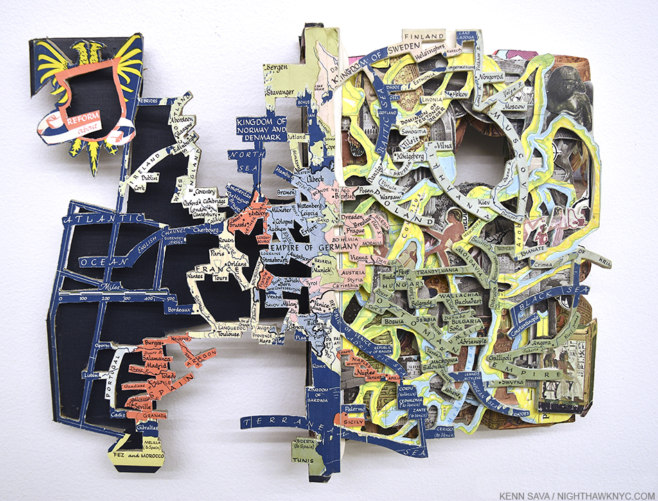
The world looks different…Brian Dettmer’s Western Civilizations 3, 2016. A “Book Sculpture.” More below.

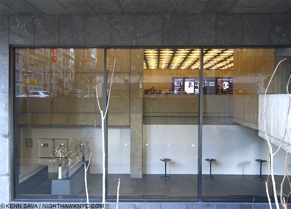
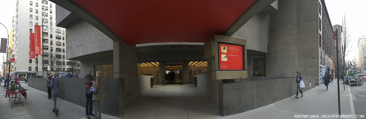
Faberge from the Matilda Geddings Gray Foundation Collection @ The Met- Will the artist in modern history who is a greater craftsman than Carl Faberge please stand up and make yourself known to me? Thank you. While I’m waiting on that, this is the first show of the work of Faberge in New York since 2004. As small as one of the details on his timeless (and priceless) masterpieces, this show in a hallway at The Met is easy to miss (countless thousands do just that as they wait in line for the elevator to the roof, right in front of this very show). Ms Gray began collecting Faberge in 1933, when prices for his work were cheaper than they will ever be again. Money aside, Faberge combines the equally rare gifts of ingenuity, vision, craftsmanship and delight in works that are a century old but have lost none of their grace, beauty or charm. Scheduled to end on November 27, this show has been extended until 2021, giving you plenty of time to see it.

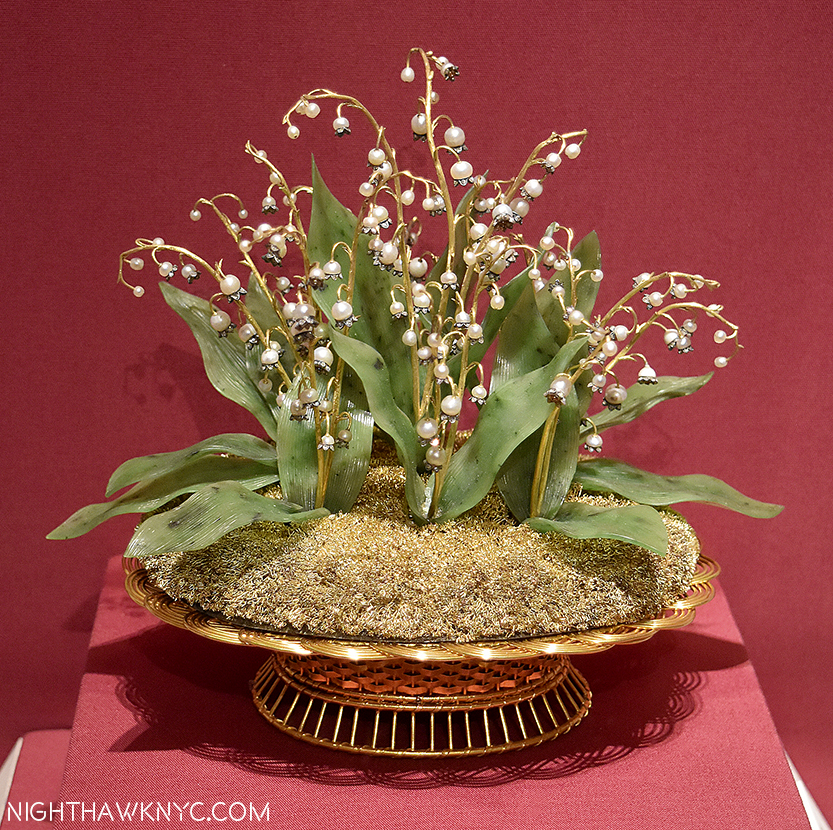
Imperial Lillies of the Fields Basket, 1896, Yellow & green gold, silver, nephrite, pearl, rose-cut diamond. This is considered THE most important Faberge piece in the USA. It was presented to the wife of Czar Nicholas at her visit to the Pan-Russian Exposition in 1896. This is only 7 1/2  x 8 1/2 inches!

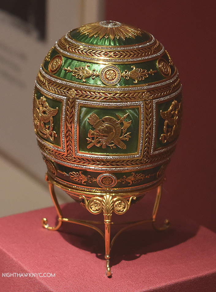
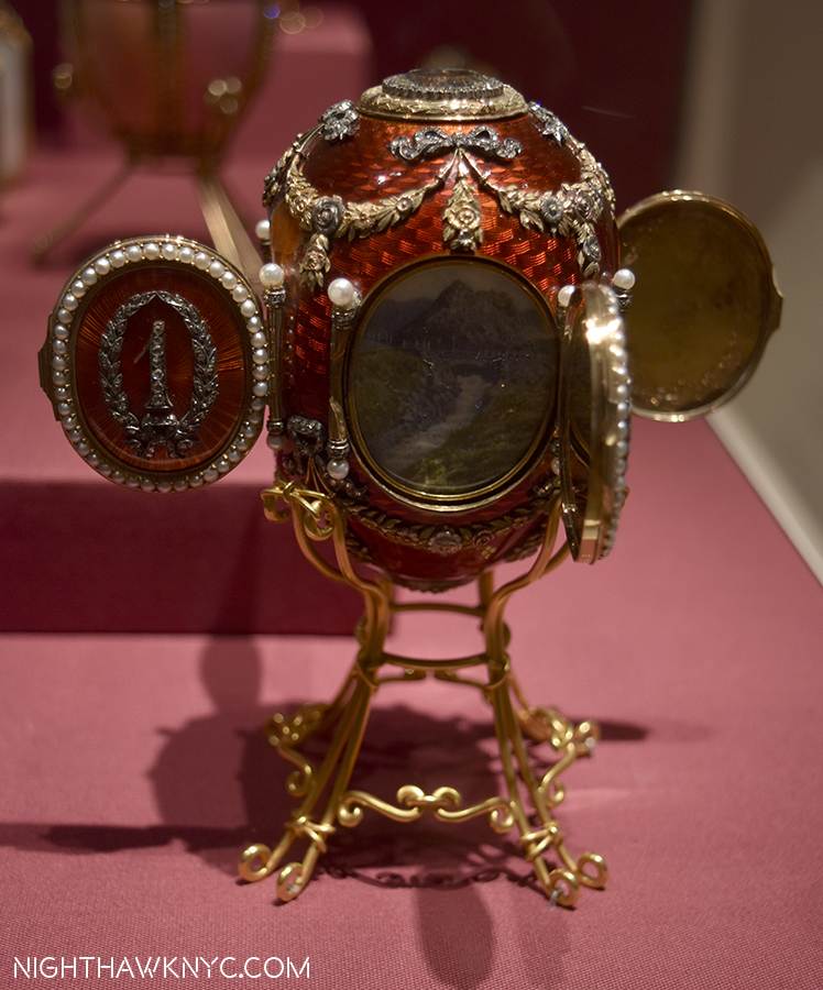
Imperial Napoleonic Egg, 1912, gold, enamel, rose-cut diamond, platinum, ivory, gouache, velvet, silk. One of the infamous “Faberge Eggs,” this was presented by the Czar to his wife for Easter, 1912. Designed to commemorate the 100th Anniv of victory over Napoleon. This is 4 5/8 inches tall! The inside is solid gold, and holds…

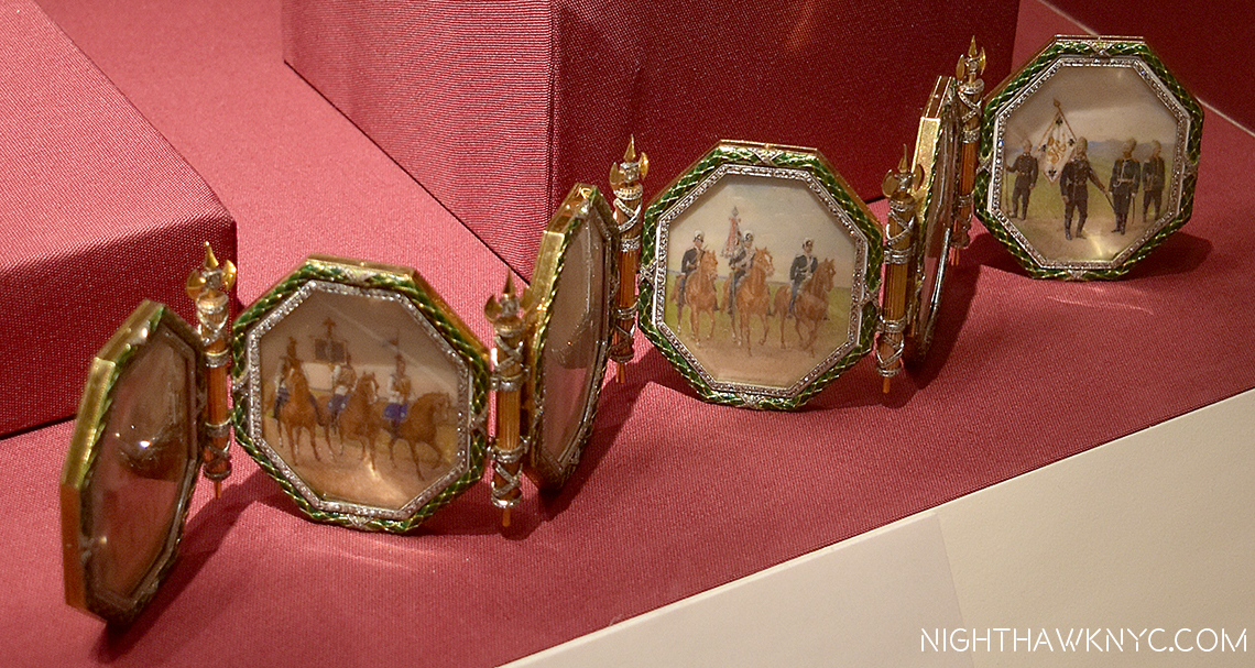
a six-panel screen depicting paintings of six regiments she was an honorary colonel in.

Description in next photo. Click any photo in this Blog to see it larger.

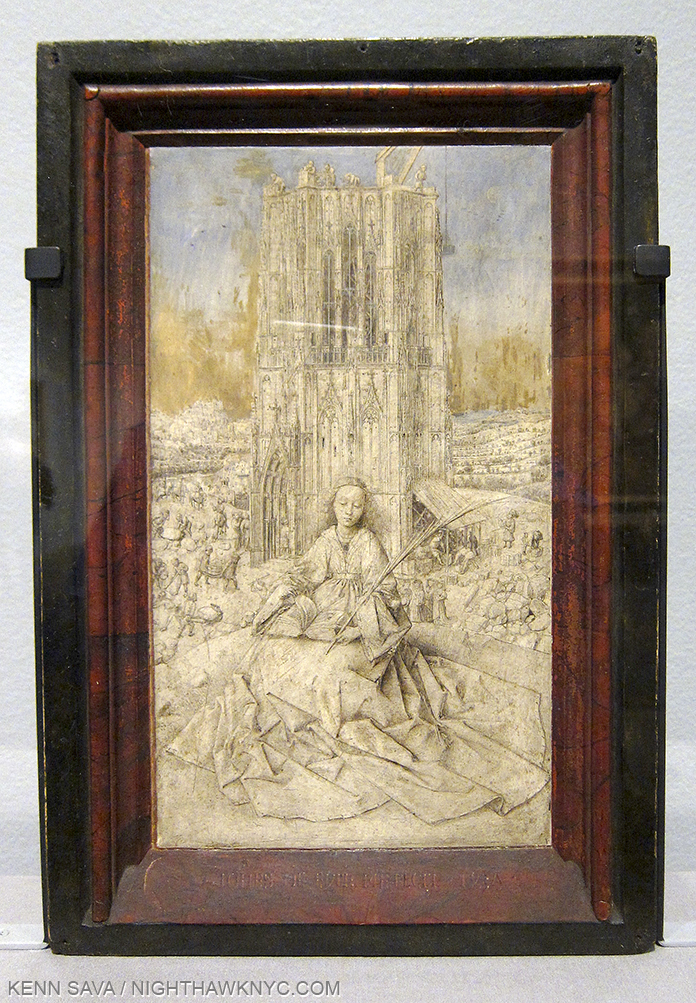
Imperial Caucasus Egg, for Easter, 1893. This is 3 1/2 inches high!

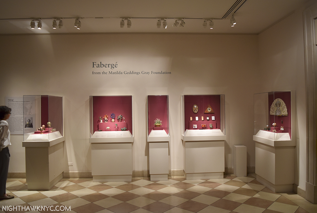
Easy to miss, this is the whole show!

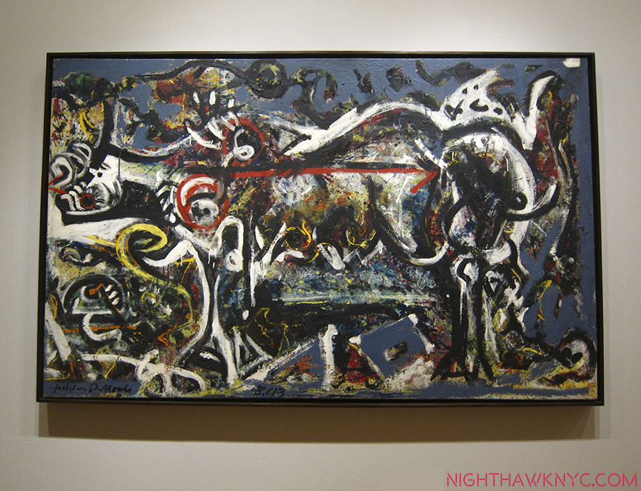
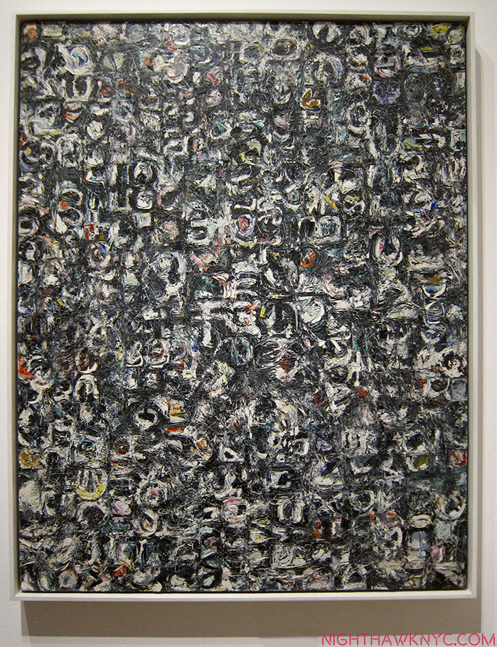
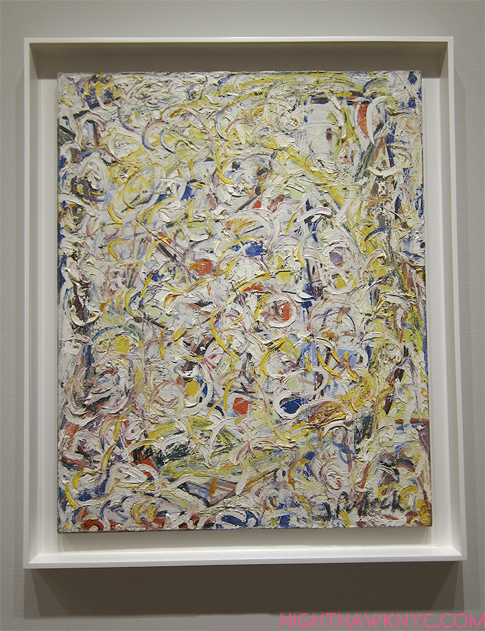
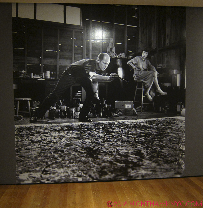
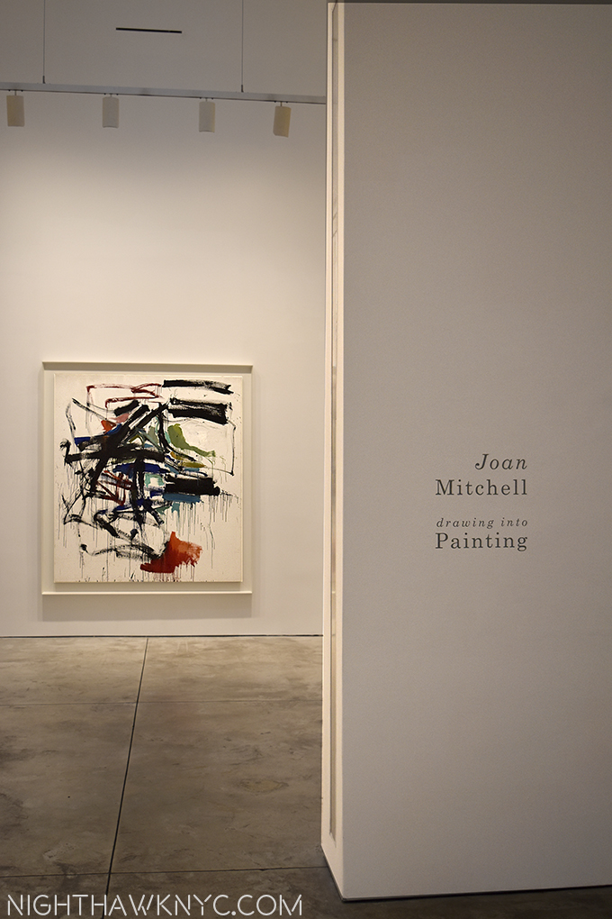
Joan Mitchell: Drawing Into Painting @ Cheim Read- Yet another good sized show of an Abstract Expressionist, “second generation” this time, and the most renowned female (Lee Krasner may be gaining on her) AbEx painter, right down the street from the blockbuster Mark Rothko: Dark Passage Show, it makes the perfect before or after bookend to it. I owned a Joan Mitchell print until a few years ago, so I lived with the energy and lyricism her work is known for. Looking around, her work is in most major museums, though it’s been 12 years since an American museum gave her a show. So, it’s been left to Cheim & Read to fill the gaps, and they’ve mounted Joan Mitchell shows every two years, or so, going back to the late 1990’s. This one does make for fascinating pairing with the Rothko show- they couldn’t be more different, while sharing what the scholars call Abstract Expressionism, I’ve heard some of the Artists, including Philip Guston, say they prefer the term “New York School.”

UNTITLED, 1958, oil on canvas

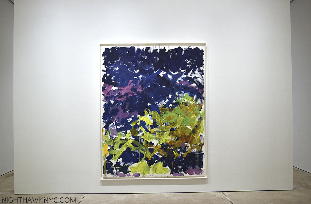
LA GRANDE VALLEE XVI POUR IVA, 1983, oil on canvas

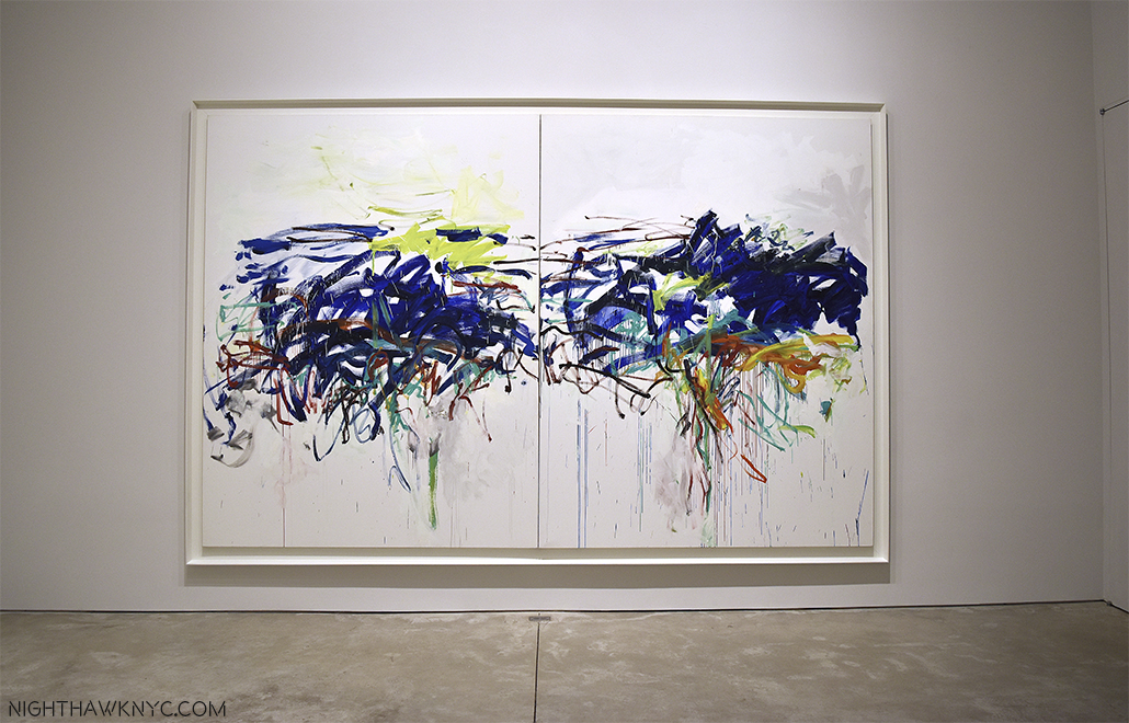
UNTITLED, 1982. oil on canvas

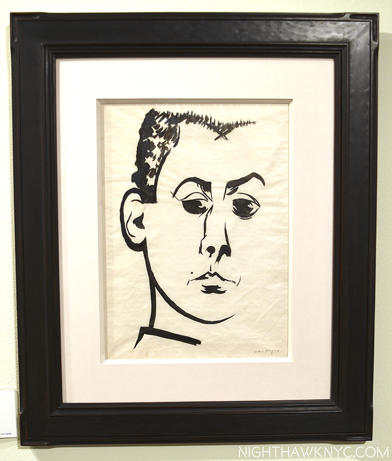
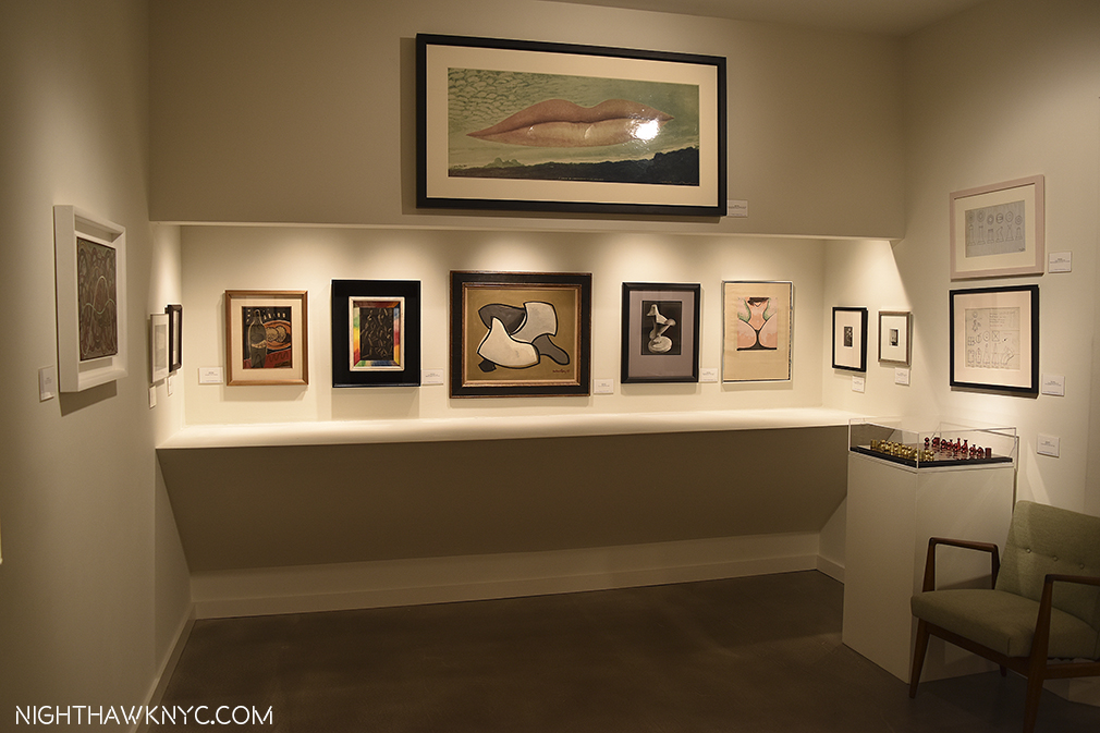
Man Ray: Continued and Noticed @ Francis Naumann- It’s been too long between Man Ray shows. Readers already know my fondness for Man Ray. Francis Naumann Gallery opened 15 years ago with a Man Ray show, so they revisited him for this anniversary show and they did it in style. Man Ray was so prolific, and so prolifically diverse he can be hard to “sum up” in a gallery show, but this one was an out and out winner, a must see, especially for anyone who thinks of Ray as “only” a ground breaking photographer. While featuring a wonderful selection of his photos, portraits and “Ray-o-grams,” it also included his drawing, painting, sculpture, writing, and even no less than 2 Ray designed chess sets.
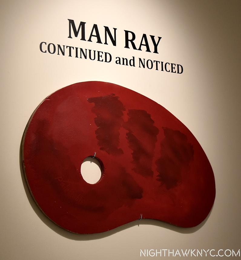
Paletteable, 1969

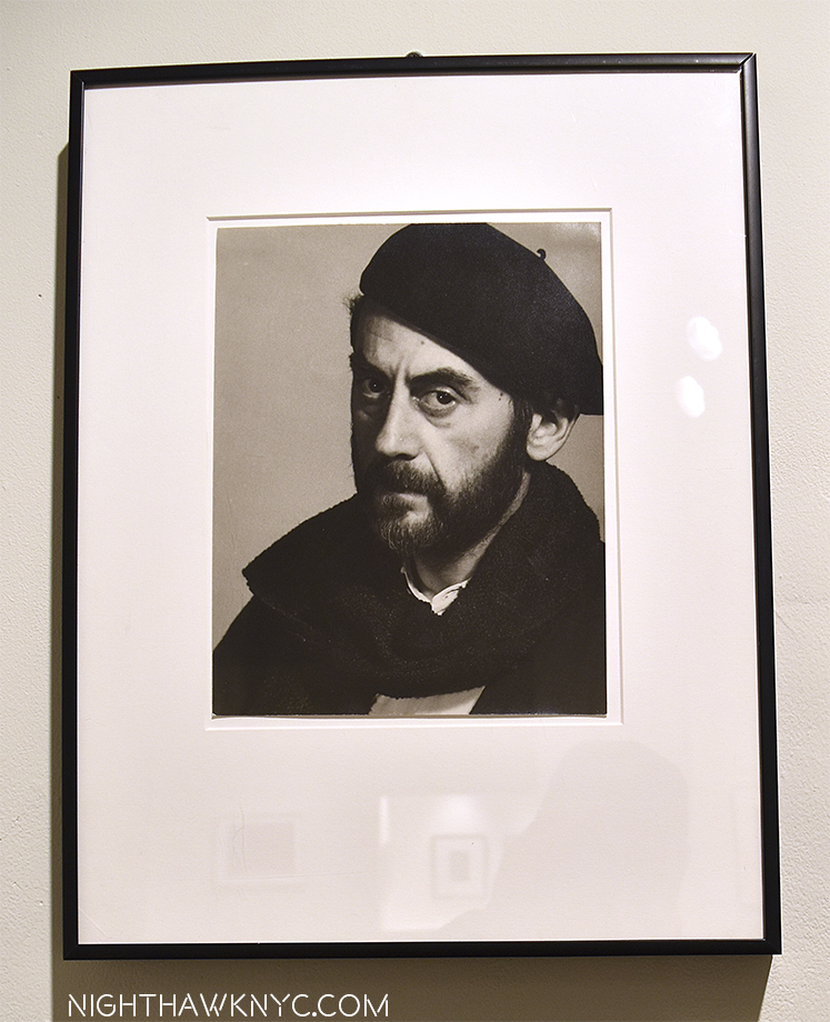
The great Man (Ray). Self-Portrait, 1948. A card under speaks of his concerns in his early work- “1) a defiance of artistic convention replaced by steadfast commitment to absolute freedom in the arts.” That says it all.

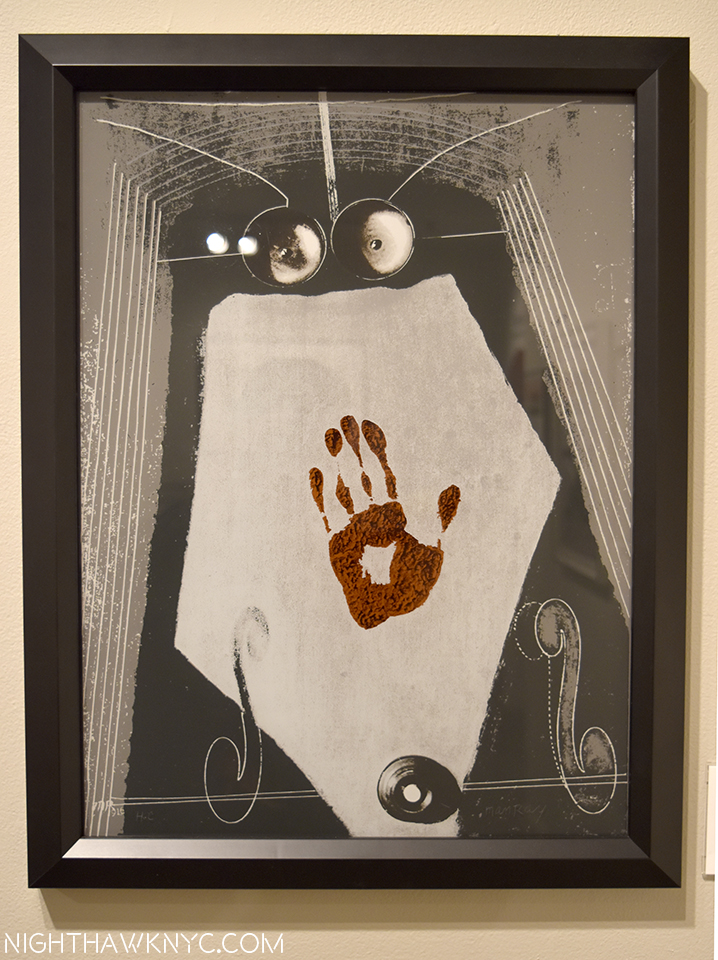
…and seen again. Autoportrait, 1917/70, Screen print on plexiglass. Really? Hmmm…

…and again. Self Portrait, 1914

Yes, that’s one of the chess sets Man Ray designed to the left of the chair.

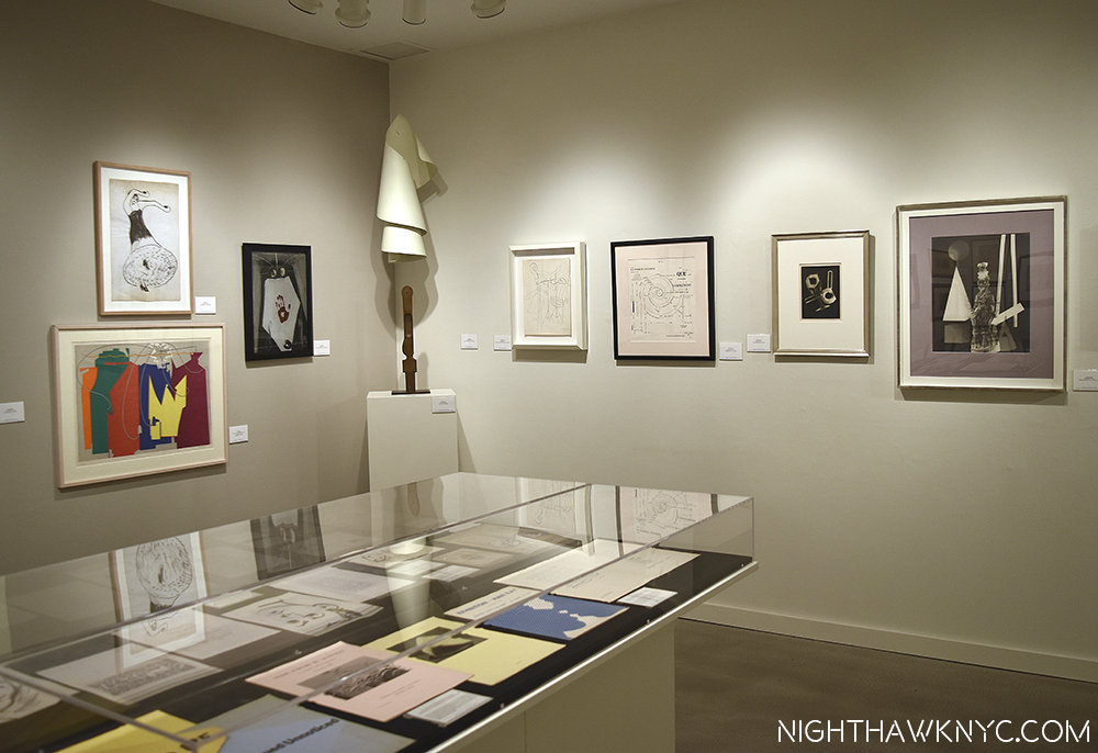
Lampshade, center, surrounded by an astounding range of creativity.

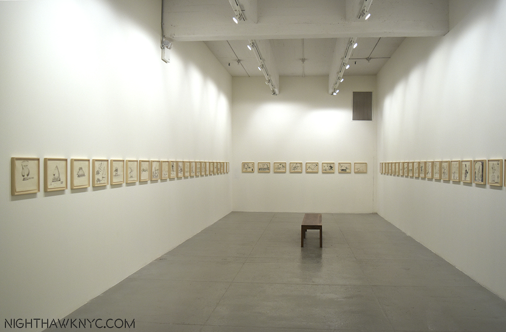
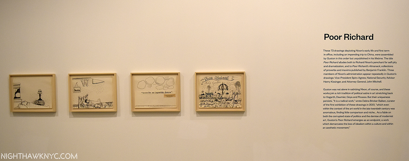
Philip Guston: Laughter in the Dark, Drawings from 1971  & 1975 @ Hauser & Wirth- There was no more auspiciously timed show than this one which not only brings us the 73 drawings Philip Guston selected for his Poor Richard series but 100 additional drawings that didn’t make the cut and 3 wonderful paintings that are related or have relevance to them. Opening exactly 4 months after Hauser’s last Guston show, it would be very very hard to find work more different than those in seen in Philip Guston Painter, 1957-67, which I wrote about here, perhaps the “darkest” of his career, in many ways. Though the show’s title refers to the presence of “laughter” here, make no mistake it is more than tinged with darkness, especially because viewing them now, we know how things turned out for Nixon. These were dark times for the country, and many of these drawings were Guston’s “at the moment” reaction to unfolding events. Even before Watergate, the Nixon Presidency was not without a sizable opposition, for more reasons than the seemingly endless war in Vietnam. Everything about Nixon rubbed many people the wrong way, and provided a brilliant Artist ample fodder for “political satire” of the highest order. Most interestingly, for me, these are works in which Guston turns his focus outwards for, perhaps, the only time in his post 1940’s career. Poor Richard was published in 2001 and is still in print. You can see it here.

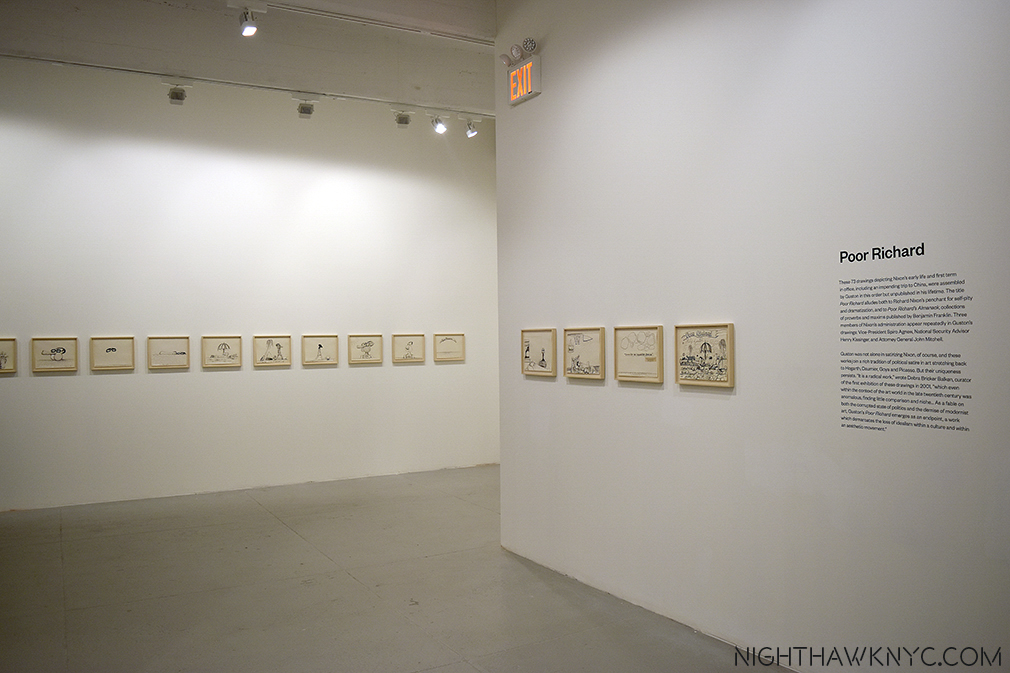
The 73 drawings that Guston selected for Poor Richard are shown, here (and below), together.

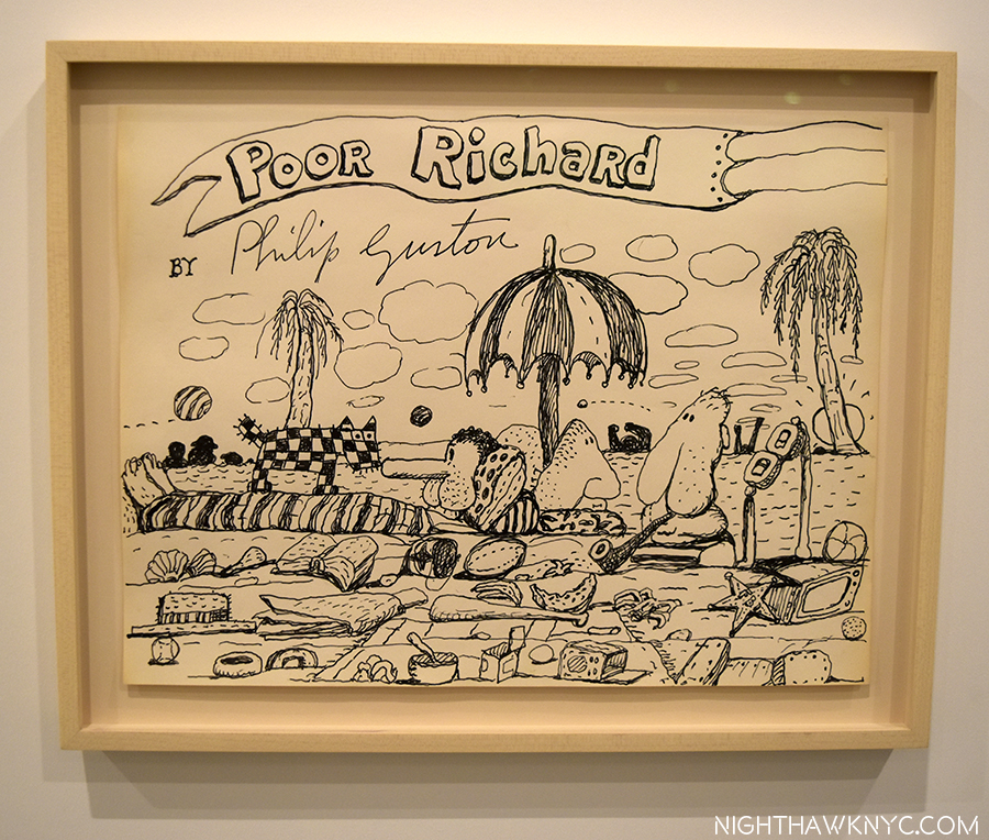
Title Page. Guston Depicts Nixon with VP Spiro Agnew (triangular skull), Attorney General John Mitchell (with his pipe) and Advisor Henry Kissenger (as glasses) as the cast of characters

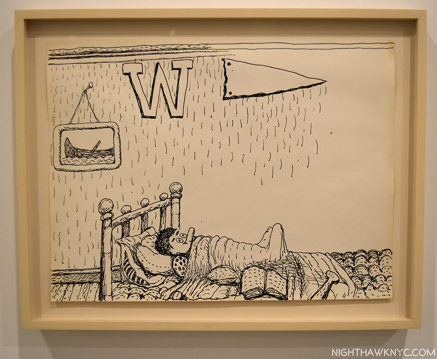
Guston’s series begins with young Richard Nixon.

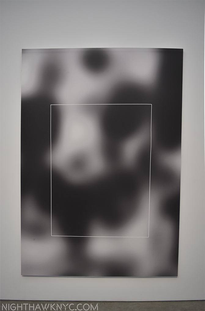
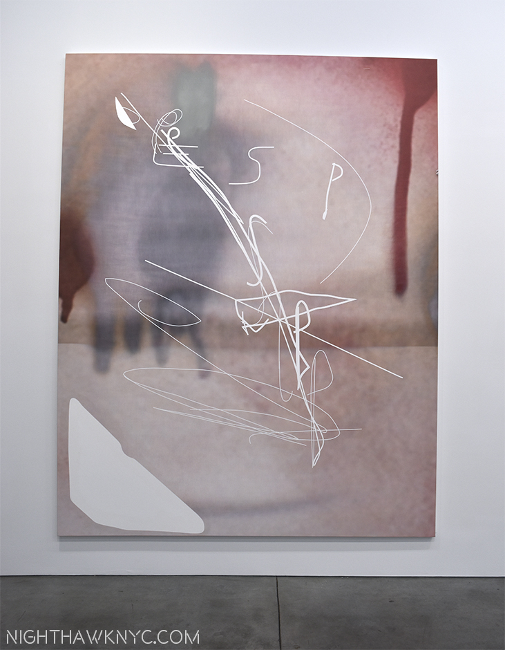
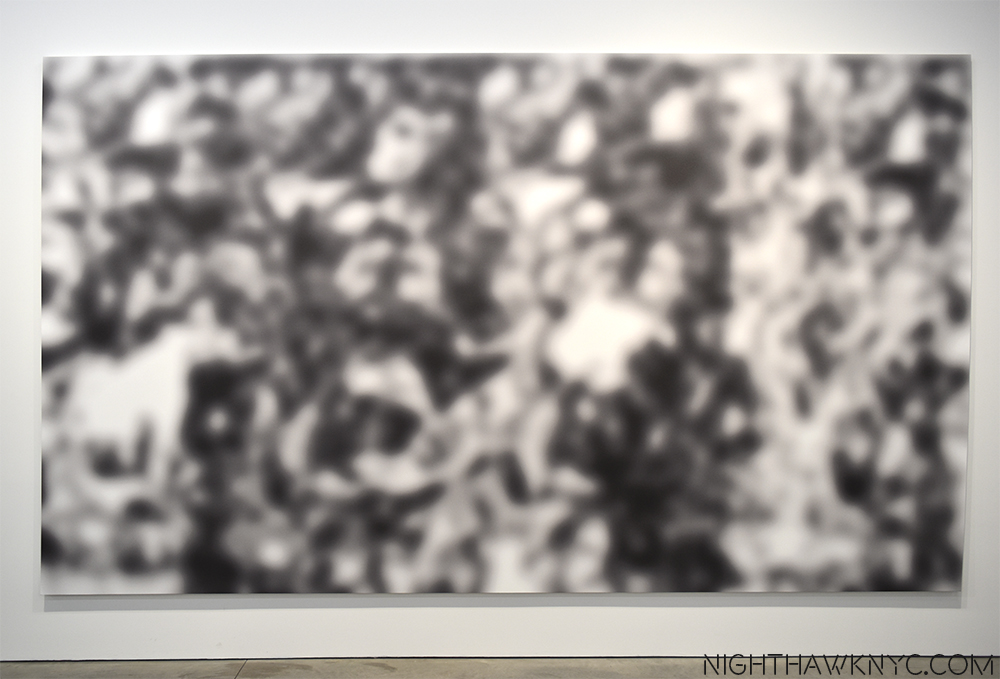
Jeff Elrod: This Brutal World @ Luhring Augustine- Chelsea & Brooklyn Galleries. It pains me not to write a longer piece on this. Jeff Elrod has been at the cusp of reinventing painting by combining digital drawing and computers with the end result of that stage outputted to canvas.where it may, or may not be combined with analog, old fashioned painting (at least those on display here). Dealing with blurriness from my recent eye treatment, my initial reaction was, “Hmmmm…If I close my right eye, my good eye, this is how the world looks to me these days.” But, I was drawn back repeatedly, even compelled to make the (unheard of for me) trip to Brooklyn to see the Bushwick segment of this show. In both locations, the effect was the same- I couldn’t get them out of my mind. They’re like something you see when you’re not really looking, or when you’re not fully awake after dreaming, or about to fall asleep…My initial reaction was “This looks easy to do on a computer. Take a photo, blur the heck out of part of it in Photoshop. Add a layer of a frenzied drawing and output to canvas. Then, I remember people say the same thing about Pollock and Rothko, yet no one else has done them. Some works remind me of passages of Monet, some of Yves Tanguay. But not really. They weren’t created like those were and so they don’t look like anything else. Mr. Elrod’s work commands some fancy prices. Ah well…They’re much too big for my place, anyways. If there’s a “cutting edge” in painting in 2016, Jeff Elrod’s work is the closest I’ve seen to being on it. I’m very much looking forward to seeing where this is going.

Auto-Focus, 2016 UV Ink on Canvas 9064 inches. Mystifyingly alluring.

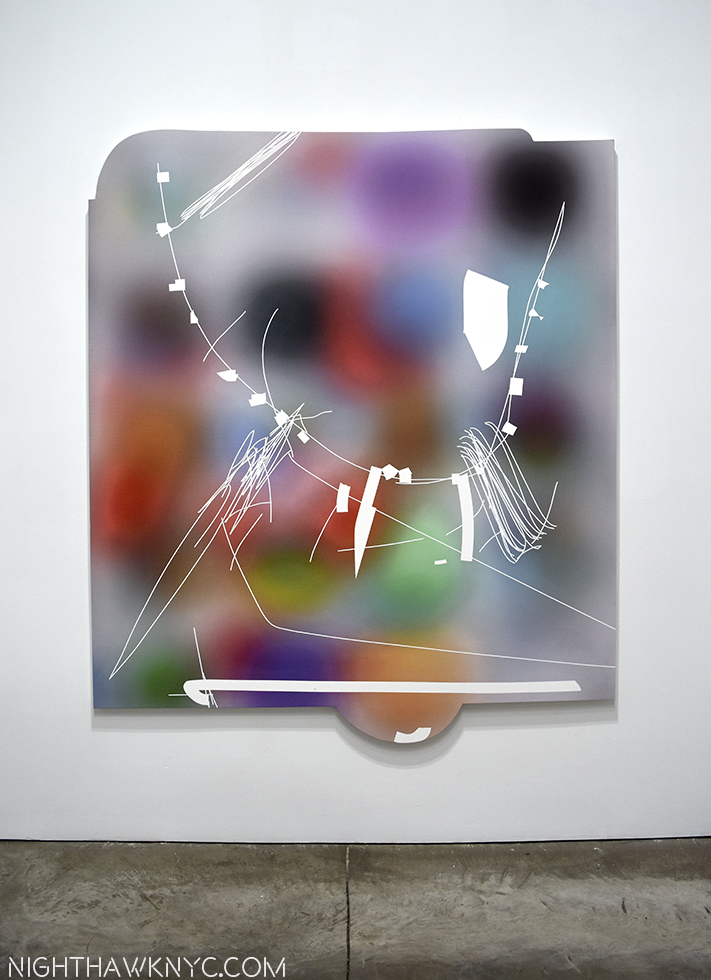
Rubber-Miro, 2015 Acrylic and UV Ink on canvas. His uniquely shaped canvases give the work a different feel from most square/rectangular paintings.

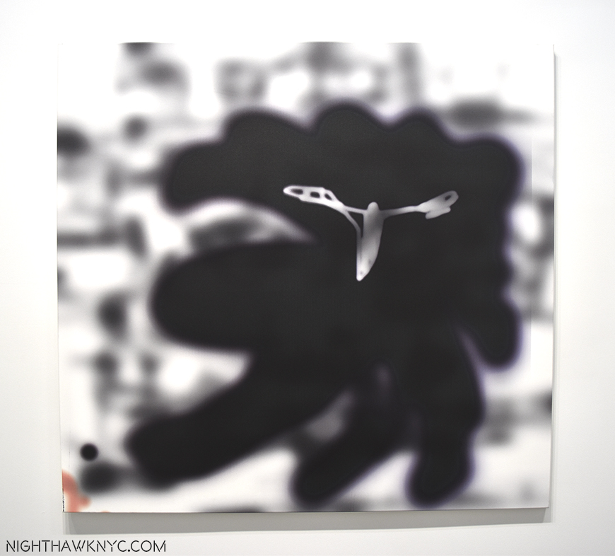
Rake-Adaptable, 2016 UV Ink on FIscher canvas. The ghost of Robert Motherwell? “Haunting” is a word his work brings to my mind most often.

Under The Skin, 2016 UV Ink on canvas, 108 x 84 inches.

Plume, 2016 as seen in Bushwick, Brooklyn. 16 1/4 feet long by 9 1/2 feet tall.

After countless visits, I began to “see” “Jeff Elrods” everywhere I went. Like here-

Life Mirrors Art.

Brian Dettmer: Dodo Data Dada @ P.P.O.W. Mr. Dettmer creates “Book Sculptures,” something new to me. As far as I can tell, he takes a scalpel to a book, or books, and carves away all but what he wants to remain. I’ve never seen anything quite like it.

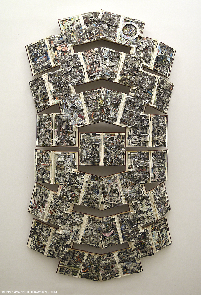
Funk and Wag, 2016. As in, the whole encyclopedia.
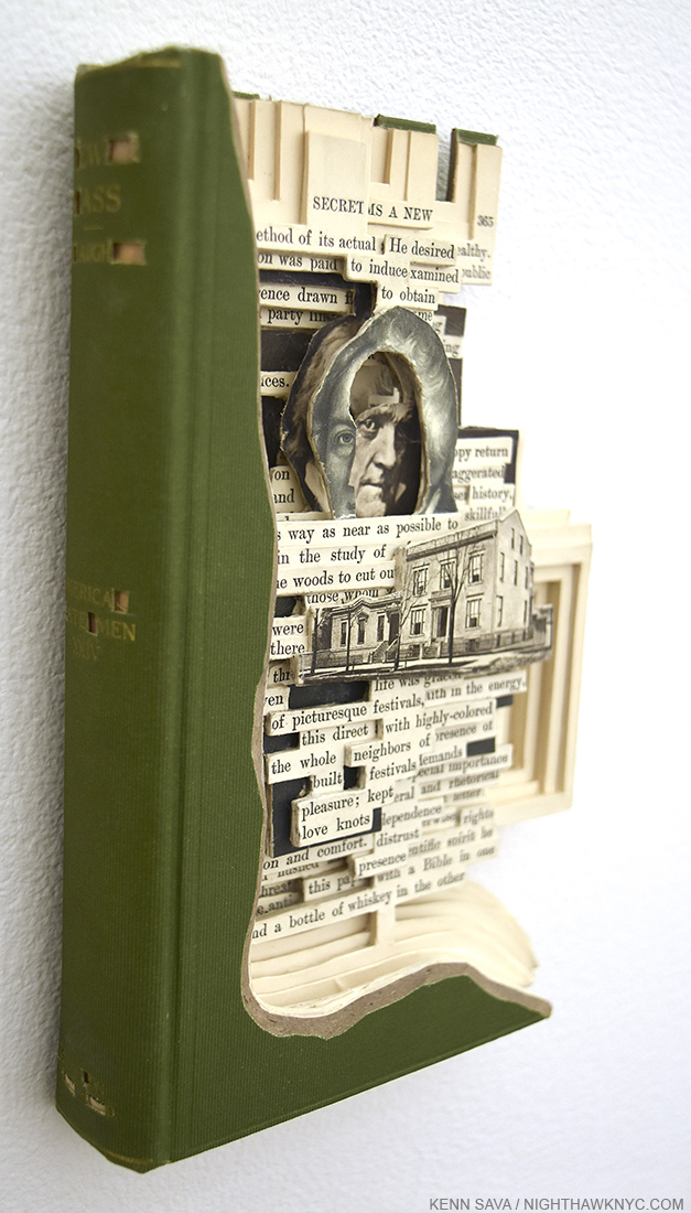
Ew Ass, 2016

PostScript.- And meanwhile, over at Gagosian, Richard Serra’s MASSIVE Every Which Way, 2015, all 16 slabs of it was coming down, making way for the next show there…

Richard Serra, Every Which Way, 2015 @ Gagosian

*-Soundtrack for this Post is “It’s The End Of The World (As We Know It)” by Michael Stipe, Mike Mills, Peter Buck and Bill Berry of R.E.M. and published by Warner/Chappell Music, Inc and Universal Music Publishing Group, from their 1987 album “Document.”

NighthawkNYC.com has been entirely self-funded & ad-free for over 8 years, during which 300 full length pieces have been published! If you’ve found it worthwhile, PLEASE donate to allow me to continue below. Thank you, Kenn.

You can also support it by buying Art, Art & Photography books, and Music from my collection! Art & Books may be found here. Music here and here

Written & photographed by Kenn Sava for nighthawknyc.com unless otherwise credited. To send comments, thoughts, feedback or propositions click here. Click the white box on the upper right for the archives or to search them. Subscribe to be notified of new Posts below. Your information will be used for no other purpose.

How Jackson Became “POLLOCK” 

This site is Free & Ad-Free! If you find this piece worthwhile, please donate via PayPal to support it & independent Art writing. You can also support it by buying Art & books! Details at the end. Thank you.

Written & Photographed by Kenn Sava (*- unless otherwise credited)

Jackson Pollock’s most famous works are so well known that many people think he painted using what’s (inaccurately) known as his “drip technique” his whole career. It seems there is always one of these radical, unprecedented works he created between 1947 through 1952 on display in about every large American Museum, works that garner as strong a reaction today as they did in the 1950’s. More recently, many probably came to him from the 2000 film, “POLLOCK”(all CAPS in red) with Ed Harris and Marcia Gay Harden, a personal labor of love for Mr. Harris that is quite well done, though it won’t give you a real sense of the road Jackson Pollock’s work traversed on the way to becoming “POLLOCK,” the one-name Icon the film takes for granted you know going in is JACKSON Pollock. The film’s poster (an homage to Hans Nemuth’s and Martha Holmes’ classic photos of the real Jackson Pollock at work in those later years) so memorably depicts the Artist hard at work, revolutionarily, on the floor and not at an easel, possibly in the act of creating one of those famous later works, that I often hear referred to as “Pollocks.” If you think that “Pollock” was “Jack The Dripper,” as Life Magazine called him, like most labels applied to Artists, it doesn’t tell the whole story about even those works, let alone what came before, and after.

A Postcard from the film’s release shows it’s poster. From my collection.

To see beyond the Icon, at MoMA’s Jackson Pollock: A Collection Survey, 1934-54, up through May 1, one is able to follow the outline, if not the detail, of his development in the space of only 3 galleries1, and see illuminating works before he achieved worldwide fame when Life Magazine famously asked- “Jackson Pollock: Is he the greatest living painter in the United States?” on August 8, 1949.

He began out west, hanging around with and taking classes with another late 20th Century American Master, Philip Guston2. After Pollock’s brother, Charles, also an aspiring Artist (and later an accomplished Artist in his own right), came to NYC and was studying at the New York Art Student’s League, still on West 57th Street, with no less than Thomas Hart Benton, he told Jackson about it which led to his moving here and joining him with Benton3 at the ripe age of 18.

Untitled (Western Scene), 1930-33. It almost could be by Benton.


Breaking out. Untitled, 1938-41. Still don’t think he could draw?

Benton went from being a fairly well known artist during his life to being eclipsed for most of the past 40 years or so (as was realism in Art in the age of Abstraction and Pop, thanks, in part, to his former student). Recently, Benton seems to be enjoying increased attention, helped by the return to view of his New School Murals after their donation to The Met, where they are now beautifully on display.

Yes, It’s 18 year old Jackson Pollock posing for his teacher, Thomas Hart Benton’s mural, America Today, now at The Met.

Benton was a resolutely figurative painter (I have seen one or two “abstractions” he did that may have been studies, and there are definitely elements of his “stretching” forms the way El Greco did that border on the fantastic if not the abstract. Some of these elements can be seen in the early Pollocks on display here). Pollock became, perhaps, the furthest thing from a Realist, Abstraction being the polar opposite of Realism4. Yet, early on, you can see fascinating traces of Benton’s influence in the developing student as he experiments with both mainstream and  “fantastic” elements of Benton’s work. The two share an interest in the West (JP was born in Cody, Wyoming) and Midwest, themes which occupy many of the early work seen here in the first room. Contrary, also, to the “Pollock myth,” Jackson Pollock was not always a New York City Proto-Beat (if he ever was one) dreamer/visionary. Gradually, the “known world” disintegrates and the figure soon follows. By the time of The She Wolf, from 1943, the last piece in the first room, “representational” Art is on the run to point that very close looking is required to see her.

The She Wolf, 1943.

What’s apparent to me, even early on, is that Pollock had the most amazing, even with Picasso notwithstanding, unprecedented freedom in his approach, and this skill(?), vision(?) became the center of all his future developments. As he broke free from the influence of Benton, he learned to trust his gut more and more, and this extended to virtually reinventing the technique of painting, sometimes from work to work, as he needed to, culminating in the sublime works from 1947-52, where he dripped paint from the can along with a wide range of other techniques- whatever it took to get his desired end.

“Oh I am a lonely painter
I live in a box of paints
I’m frightened by the devil
And I’m drawn to those ones that ain’t afraid”*

Having made so many trips to the New Whitney Museum, I’ve been face to face with the incalculably large debt Art lovers owe to, at least, two women there- founder (and overlooked Sculptor) Mrs. Gertrude V. Whitney, of course, and to Josephine Hopper, Edward’s spouse and widow, who facilitated her husband’s wish that his archives go to the Whitney (she also included hers of her own work). Here, at Moma, I’m struck, again, by a similar feeling- look closely at the tags and you’ll see that many of the works here are “The Gift of,” or from the “Bequest of” another woman, spouse and widow- Lee Krasner.

Thank you, Lee Krasner. Your day better be coming.

All 3 women were artists in their own right. Jo Hopper and to a large extent, Lee Krasner put their own creative lives on hold for their husband’s. Oddly, a wonderful Krasner is on view UPSTAIRS on 5. It’s from 1949, right in the time period of  many of these works.

Lee Krasner, Untitled, 1949. NOT in this show! It’s on view on the 5th Floor. I’m putting it where it belongs.

So? Why isn’t it in this show? Possibly because of space, but they might have mentioned it being on view. At least it hasn’t suffered the fate of (possibly) all of Josephine Hopper’s work that she gave to the Whitney, with Edward’s estate- It was discarded BY THE WHITNEY as being subpar!5 A search for her on the Whitney’s website turns up none of her Art. That’s an incalculably stupid move! Gone is the chance to gain the insights into their relationship they may hold, let alone any ongoing appreciation of her own accomplishment! That’s gratitude for you. Coincidentally, there is a biography of Krasner by Hopper’s biographer, Gail Levin.

I bring this all up because I feel that Lee Krasner is the hidden star of the show. In addition to all the work that’s here largely because of her, it’s tempting to see the effect of Jackson Pollock’s having met her (in 1942) in his work. Turning the corner into Room 2 of the show you see something surprising, even shocking, yet apparent, at least to me- joy, light, happiness, even, even though Pollock’s work has become fully abstract. It’s Pollock’s Shimmering Substance from 1946-

“I met a woman
She had a mouth like yours
She knew your life
She knew your devils and your deeds
And she said
“Go to him, stay with him if you can
But be prepared to bleed”*

After they married in 1945 the two moved to Springs, near East Hampton, Long Island, to get away from the City. Having visited Pollock’s house and studio (an indelible experience) while walking the grounds, I was taken by something I’ve never heard mentioned regarding 1947-1952 Pollock, the so-called “drip” years. When you walk down along the water there and look at the sand, you’ll see the seaweed that’s been washed up on the shore form these black lines. Against the yellow/golden sand, they look uncannily like the “black poles” you see in many of these pieces. And when you walk through the tall grasses in the area, all sorts of seeds, bugs, dust, and who knows what gets disturbed and becomes airborne. To this day, I can’t look at these classic Pollocks and not see something very similar- all those dots and spots in the works so remind me of that experience and what it really looked like.

Being in that studio, about 50 year later, was an experience I can only characterize as spiritual. Oh! And there’s a Lee Krasner sighting! (At the show’s entrance)

What does this remind you of? It’s Pollock’s Studio Floor, as it appeared when I was there in 1999. They provided these plastic booties, but there was no way I was going to walk on it- it’s a work of Art unto itself. Even in this picture (from a postcard I bought there), I think you can feel the aura of the place.

Jackson Pollock, looking Iconic, in his Studio by Arnold Newman, 1949. From a Postcard I got at the big Pollock Retrospective at Moma in 1998, the excellent website for  which is still up..

“I remember that time you told me you said
“Love is touching souls”
Surely you touched mine
‘Cause part of you pours out of me
In these lines from time to time
Oh, you’re in my blood like holy wine
You taste so bitter and so sweet

Oh I could drink a case of you darling
And I would still be on my feet
I would still be on my feet”*

So, for me at least, these Jackson Pollock classics have more of a sense of “realism” than they may for some.

One: Number 31, 1950

“Just before our love got lost you said
“I am as constant as a northern star”
And I said “Constantly in the darkness
Where’s that at?
If you want me I’ll be in the bar”*

Unfortunately, the happiness and tranquility of their new life together wasn’t destined to last. Whatever the demons were (and they will probably be argued about for as long as Van Gogh’s have been), they manifested in his life, and in his work. Selden Rodman is quoted in the Pollock Anthology, Such Desperate Joy, talking about this period and the Artist’s struggles- “He had been trying to freshen up or diversify his style by reintroducing figures, or at least figurative patterns, in the maze of paint.6.” Though represented here with only a few pieces, it seems to me that Pollock “lost his fastball” after 1952. While the most common reaction to his classic period was famously “My 5 year old can do that,” (Really? Try it. It’s not THAT easy), after 1952, even Jackson Pollock seemed not to be able to do them any more. Or? He wanted to move on…but to what?

Easter And The Totem, 1953. Yes, this is also by Jackson Pollock.

Yes, his life ended tragically and far too early. I’m not interested in a tell-all about his demons, or scandals or the nights drinking at the Cedar Tavern, where I’ve spent a few myself. I’m interested in that incredible freedom you can see in almost all of his work. How was he able to make a composition hold together while continually creating new styles and using new techniques? Where did that come from?

“Oh but you are in my blood
You’re my holy wine
You’re so bitter, bitter and so sweet

Oh, I could drink a case of you darling
Still I’d be on my feet
I would still be on my feet”*

In the end, Jackson Pollock strikes me as one of the “most” American of painters in the 20th Century, if not ever. I’m not speaking of patriotism or anything nationalistic. I’m speaking about organically American. His work was born in the freedom of the wide open spaces of the west and midwest, but most importantly speaks to the freedom each of us has…


if we choose not to repress it, but to acknowledge it, nurture it, develop it and use it.

Interesting timing for such a show.

*-Soundtrack for this Post is “Case of You,” by Joni Mitchell, (who is also a Painter- FOR 69 YEARS, according to her website!), from her timeless album, Blue, 1971. Published by Sony/ATV Music Publishing.

NighthawkNYC.com has been entirely self-funded & ad-free for over 8 years, during which 300 full-length pieces have been published! If you’ve found it worthwhile, PLEASE donate to allow me to continue below. Thank you, Kenn.

You can also support it by buying Art, Art & Photography books, and Music from my collection! Art & Books may be found here. Music here and here.

Written & photographed by Kenn Sava for nighthawknyc.com unless otherwise credited. To send comments, thoughts, feedback or propositions click here. Click the white box on the upper right for the archives or to search them. Subscribe to be notified of new Posts below. Your information will be used for no other purpose.

  1. MoMA owns many more Pollocks not on view here.
  2. Their adventures are chronicled in Guston’s daughter’s, the Breast Cancer Activist, Musa Meyer’s book, Night Studio.
  3. For more on Charles & Jackson’s relationship and to see some of Charles’ work, check out American Letters: 1927-47, a collections of letters among the Pollock family. It’s a revealing document of trying to survive as an Artist in the Depression and on.
  4. Which reminds me that I heard Richard Estes say at MAD that “in abstract art there are no mistakes”
  5. “They arranged for some of her paintings to be given away; they simply discarded the rest.” Edward Hopper; An Intimate Biography by Gail Levin p. xvi
  6. p. 49

Live, From the New Met Breuer!

This site is Free & Ad-Free! If you find this piece worthwhile, please donate via PayPal to support it & independent Art writing. You can also support it by buying Art & books! Details at the end. Thank you.

Written & Photographed by Kenn Sava

It doesn’t officially open till March 18 but being The Met (TM) “regular” that I am, of course they let me in 10 days early. I wish. Actually, they’re letting Members in early, starting today March 8. I still feel special.

I can report the layout is unchanged, so muscle memory from visiting this place when it was the Whitney Museum still works just fine. Ah, the Breuer Whitney Museum. I was involved in the debate surrounding it’s proposed expansion/modification way back in 1987, but I’m saving that tale for my upcoming post about the “New” Whitney Museum, almost a year in the making. Stay tuned. In the meantime…

Think about this for a minute.

The Met announced it would take over the Breuer Building as it’s “outpost” for Modern & Contemporary Art in 2011. Seen here on December 18, 2015. I was told that the silver circles on the windows were meant to echo the lighting of the lobby inside.

This place was the entire Whitney Museum until a year and a half ago 1. The Met already runs the biggest Museum in the country at 1000 Fifth Avenue, AND The Cloisters way uptown. Now that the Whitney has moved downtown, TM has taken over the building, which is now known as The Met Breuer (TMB). By itself, TMB is as big as the Dallas Museum. To be operating 1000 5th Ave, the Cloisters and now to open a new, additional location of that size, a few blocks from 1000 5th, I find to be a “WOW!” moment.

They seemed to get it up and open pretty quickly (judging from how it looked when I passed by in December).

December 18, 2015. I was told the “Circle” Motif is a take off on the lobby’s ceiling lights. See next.

The same window. Member’s Preview Opening Day, March 8, 2016.

So? What’s new? What’s old? What’s borrowed? What’s blue?

Actually, nuptial euphemisms are not out of place here, since The Met & The Breuer building are “married” for at least the next 8 years, with an option to extend, which is longer than most marriages last between people, while TM’s contemporary galleries are undergoing complete renovations that will take a few years. I fully expect they will turn out to be as exemplary as the American & Roman Wings have. Though the layout of TMB made it instantly “familiar,” my first visit was not without some major surprises.

Members Only. It won’t look like this for long. Only 1 street vendor apparently got the word.

Apparently, I didn’t get the word, either. Since the contemporary galleries are those closing I was expecting ALL of TMB to be contemporary Art. Nope. 2 Floors are devoted to a superb show, Unfinished: Thoughts Left Visible featuring such well known “contemporary” artists as Rembrandt, Cezanne, Picasso, Van Eyck, Durer and Titian.

?

Apparently, TMB will be a “satellite” featuring Special Exhibitions AND contemporary Art. Hmmm… To say I’m surprised by this and why they’d do it is an understatement. Well? Unfinished is a VERY large show that handsomly fills Floors 3 & 4. Perhaps they see the Shows as the draw for getting a large number of people into the building, while they “also” display contemporary Art? There is a show, which I haven’t seen yet, by contemporary Indian artist Nasreen Mohamedi (1937-1990), but no display of works from the permanent collection of contemporary Art, at least to begin with. A cafe & bookstore will be on the top floor, which wasn’t open today. So? Three full floors can be devoted to shows, the small lobby gallery featured a live performance by Vijay Iyer and his trio today, which was well attended and sounded good throughout the adjacent lobby.

“Wake Up over there on the right!” It’s MacArthur “genius” grant recipient, Vijay Iyer, left on piano, performing with his Trio in the first floor Gallery.

Regardless, Unfinished turns out to be a surprise blockbuster, a wonderful chance to look over the shoulder of some of the greatest Artists in history, both Old & Modern Masters, as they create. Create, not created because for some reason, even death, they never “finished” the works in this show. The reasons vary. TM defines Unfinished as it applies to this show as- “This exhibition addresses a subject critical to artistic practice: the question of when a work of art is finished. Beginning with the Renaissance masters, this scholarly and innovative exhibition examines the term “unfinished” in its broadest possible sense, including works left incomplete by their makers, which often give insight into the process of their creation, but also those that partake of a non finito—intentionally unfinished—aesthetic that embraces the unresolved and open-ended.” However, what is here in nothing short of a chance to experience what it was like to visit the studios of these Artists. Processes and choices are laid bare as an astounding roster of names go by in the course of 197 works. Monet, Manet, Van Gogh, Degas, Turner, Jackson Pollock, Robert Smithson, Rauschenberg, Basquiat, Rodin (yes, there are some sculptures, too), David, Kerry James Marshall, Alice Neel, and of course, the “King of the Unfinished Work”- Leonardo da Vinci.

Unfinished, installation view.

Jan van Eyck, Saint Barbara, 1437. I was shocked to see this masterpiece in Unfinished.

Lucian Freud, Portrait of the Hound, 2011, left unfinished on the Artist’s easel at his death.

My initial reaction is that TMB is great for Art lovers. Another major location to see world class Art in the City, with TM’s unequalled expertise, resources and 2 million or so collected works behind it. Unfinished is a must see show, especially for Artists. it’s chock full loans from major Museums (60% of the show), which is rare these days.

How it will turn out for TM, financially2, though it also remains to be seen what, if anything, will be done with the contemporary Art collection in the interim.

One day in, that’s the big question for me- What TM’s full plans are for contemporary Art at TMB. I’m looking forward to seeing how they unfold. My gut tells me it’s going to surprise a lot of critics and give TM new cred in a realm it’s been denigrated in for years. Oh? But that new Met logo isn’t wearing well on me.

For now, it’s terrific to have Art back at the Breuer, and, Unfinished is an unmitigated why-hasn’t-anyone-thought-of-this-before joy- for lovers of painting, and Art. I’m pleased to be among the first to “Kiss the Bride.”

*-Soundtrack for this Post is “The Art of Fugue” by J.S. Bach, left unfinished at the Master’s death, as recorded by Glenn Gould. You can see Gould perform the final part of  it here, and the entire hour and a half long piece, here.)

NighthawkNYC.com has been entirely self-funded & ad-free for over 8 years, during which 300 full-length pieces have been published! If you’ve found it worthwhile, PLEASE donate to allow me to continue below. Thank you, Kenn.

You can also support it by buying Art, Art & Photography books, and Music from my collection! Art & Books may be found here. Music here and here.

Written & photographed by Kenn Sava for nighthawknyc.com unless otherwise credited. To send comments, thoughts, feedback or propositions click here. Click the white box on the upper right for the archives or to search them. Subscribe to be notified of new Posts below. Your information will be used for no other purpose.

  1. The Whitney Breuer closed on October 19, 2014.
  2. It costs $17M a year to run per the NYT article linked above.}, is going to be something to watch. I’m hearing that by the 2 year mark it will be apparent where this is going long term, so we shall see. Yes, we’ve “lost” a little temporarily with the closing of TM’s contemporary galleries, but unlike when the American & Roman wings were closed for renovation, TM has more than made up for it with TMB[3. While TM didn’t open alternate spaces, beyond showing some works from the American Wing downstairs in the Lehman Galleries.