Rod Penner’s Neighborhood

“It’s a beautiful day in this neighborhood,
A beautiful day for a neighbor,
Would you be mine?
Could you be mine?”*

In 1927, the Painter & Photographer Charles Steeler spent six weeks Photographing the 2,000 acre Ford Rouge plant in Detroit on assignment for an ad agency1. So taken by what he had seen there, over the next 9 years, he produced a series of Paintings of the plant based on the Photos he took. While both his Photos and his Paintings are now seen as classics, that’s perhaps the closest an Artist has come to creating a series of Paintings of a small neighborhood as seen at the same time. Now, the Artist Rod Penner tells me he has completed one such series. “Mr. Penner’s Neighborhood” (with apologies to Fred “Mr.” Rogers) of choice for his series of 2015-17 Paintings is San Saba, Texas, a town of about 3,000, an hour north of Austin, as seen in the source material he collected in various mediums (plural- they consist of more than Photographs he told me), during a trip he took there early one winter Saturday morning. To date, they had numbered 10 Paintings, 9 of which were shown at Rod Penner, at Ameringer McEnery Yohe Gallery, NYC in May2, (which I wrote about here and here. My follow-up “Q & A” with Rod Penner is here.)

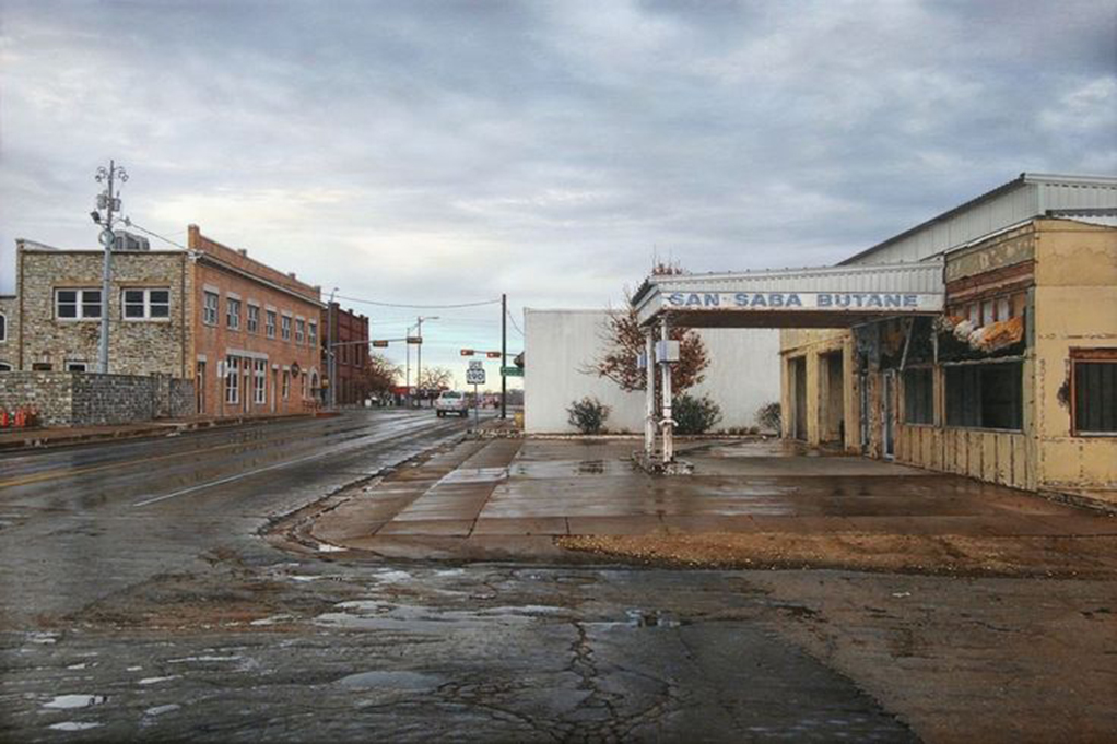
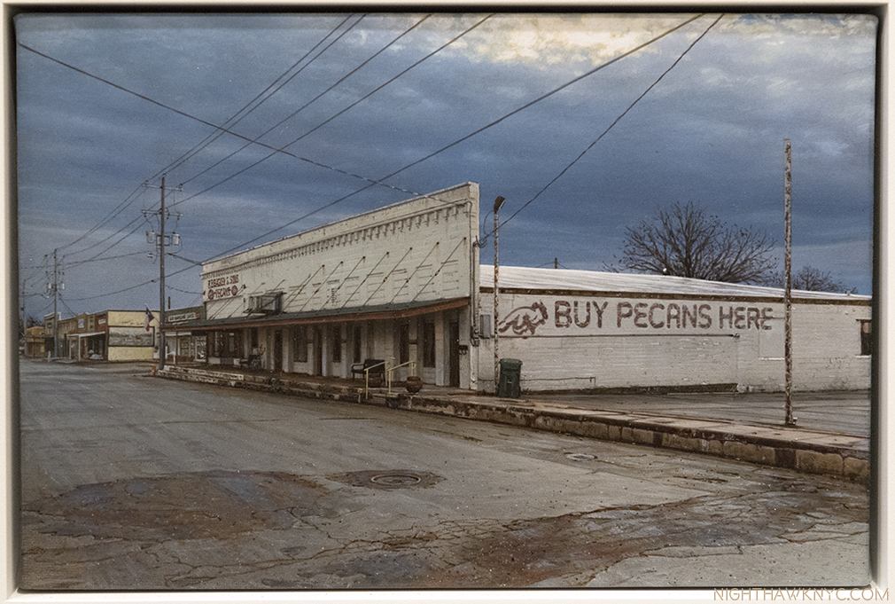
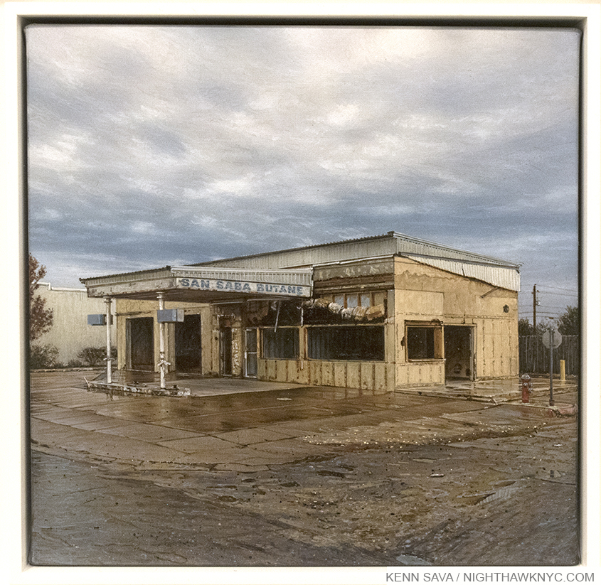
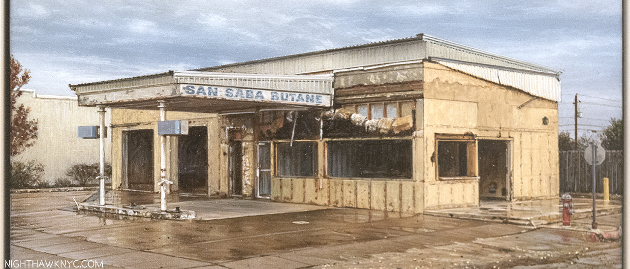
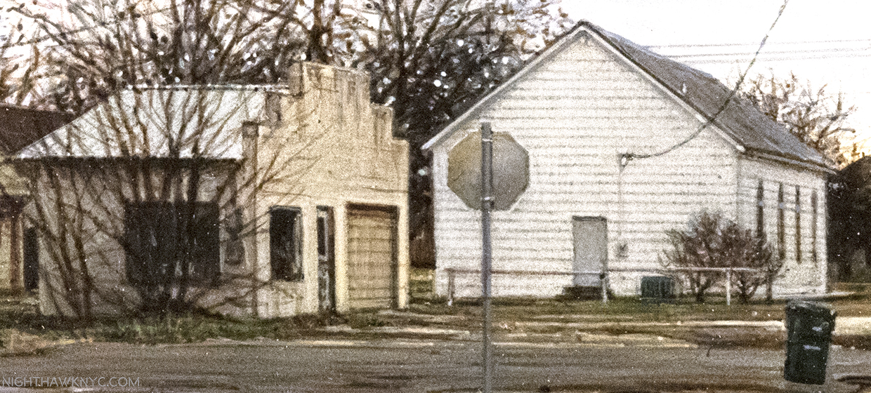
San Saba Butane, 2015, 10 x 15 inches.  All works shown are Acrylic on canvas. The first work in Rod Penner’s San Saba Series, and was not in the AMY show. Comparing this to the smaller work with the same title, I wrote about here, is endlessly fascinating. Photo courtesy Rod Penner and Ameringer McEnery & Yohe.

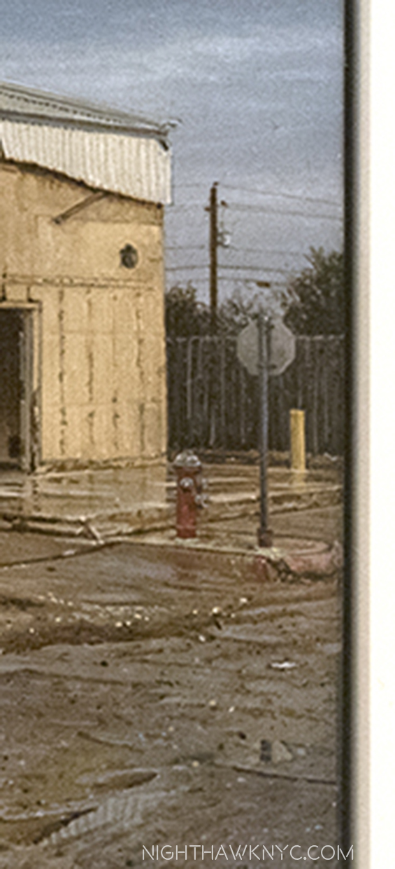
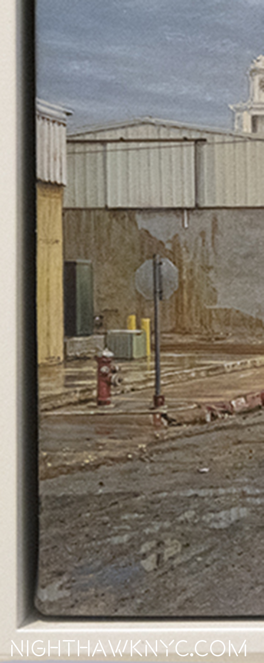
The tenth, (actually, the first to be completed in 2015), above, gives us a view of San Saba Butane seen from the side, which contrasts with the smaller painting of the same title that captivated me at the show where San Saba Butane is seen from the front. This perspective makes it part of a neighborhood, and not seem to be an island. A neighborhood where the other buildings seem to be in better condition, and most likely still in use. Here, it still looks like a relic, just a relic that is part of a large community, something we don’t often think of relics being. Interestingly for me, the lone car is stopped at a light, the only time this occurs in the San Saba series, as if symbolizing time standing still here.

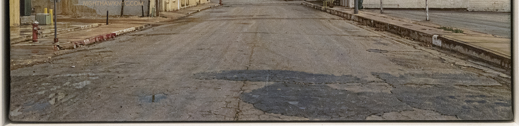
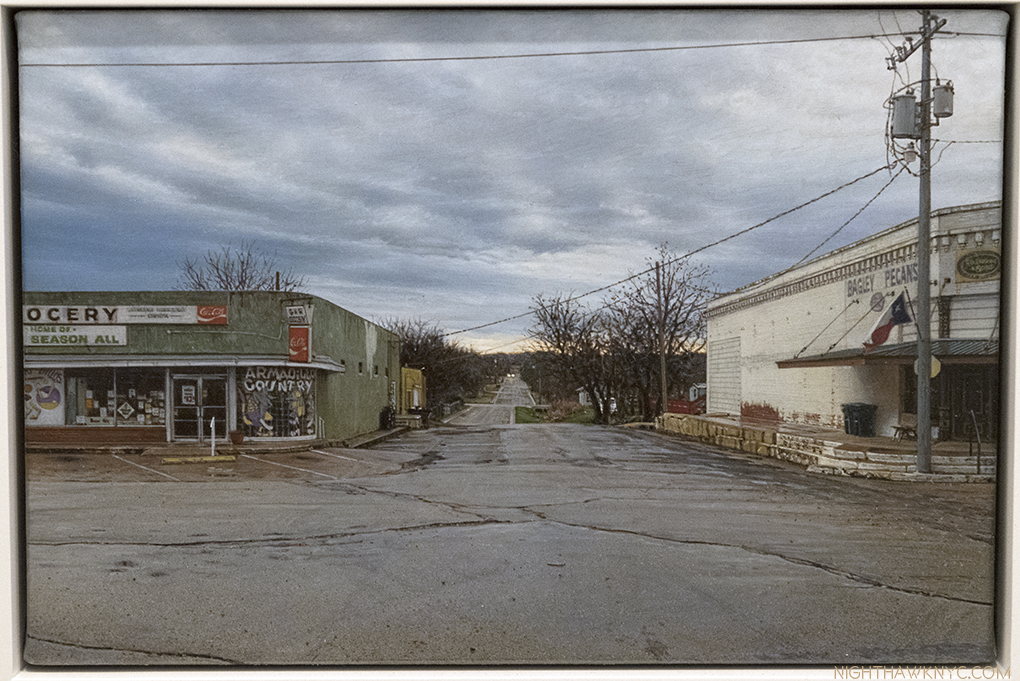
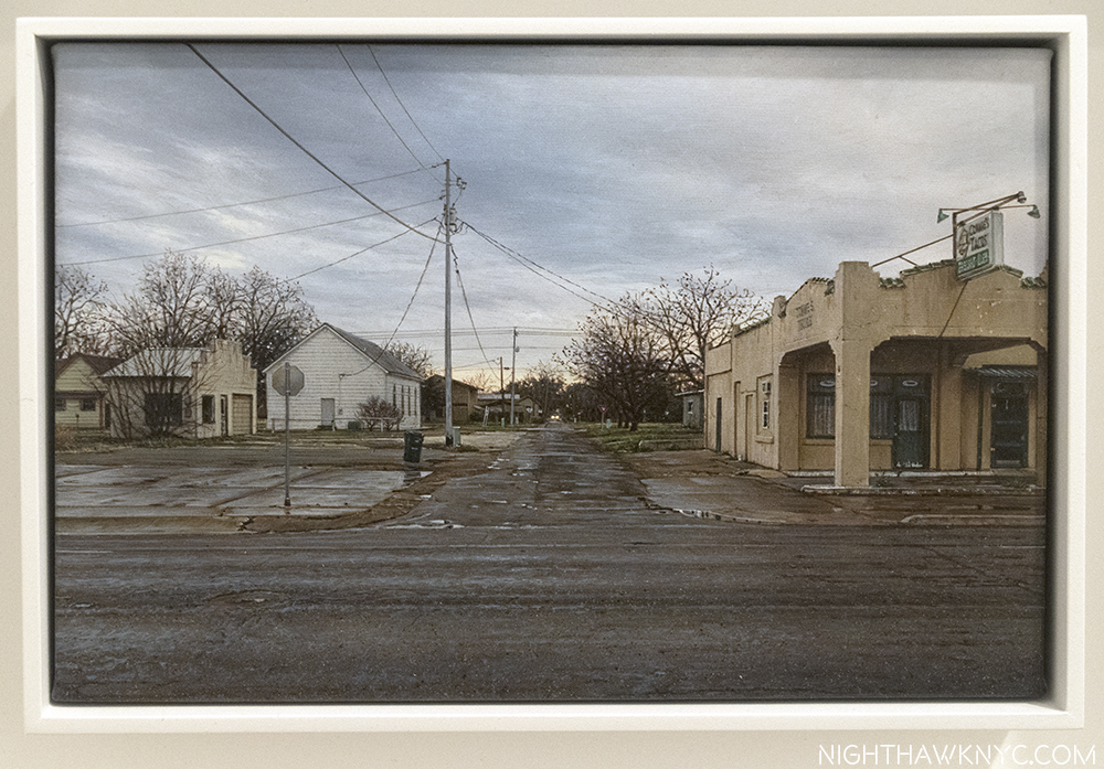
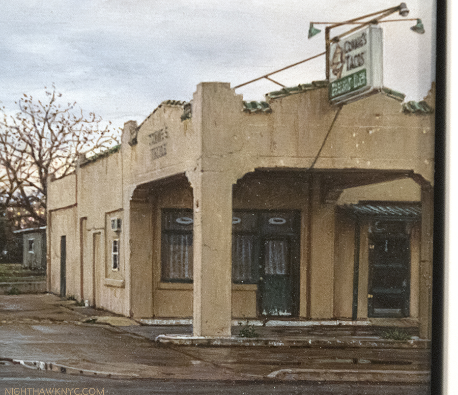
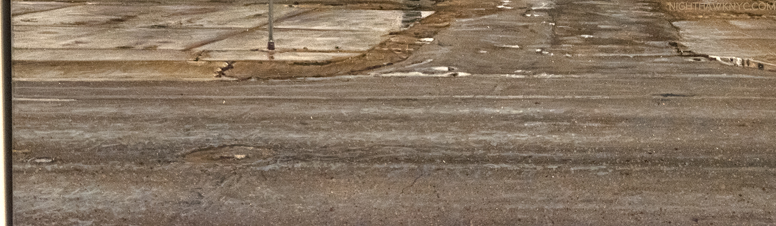
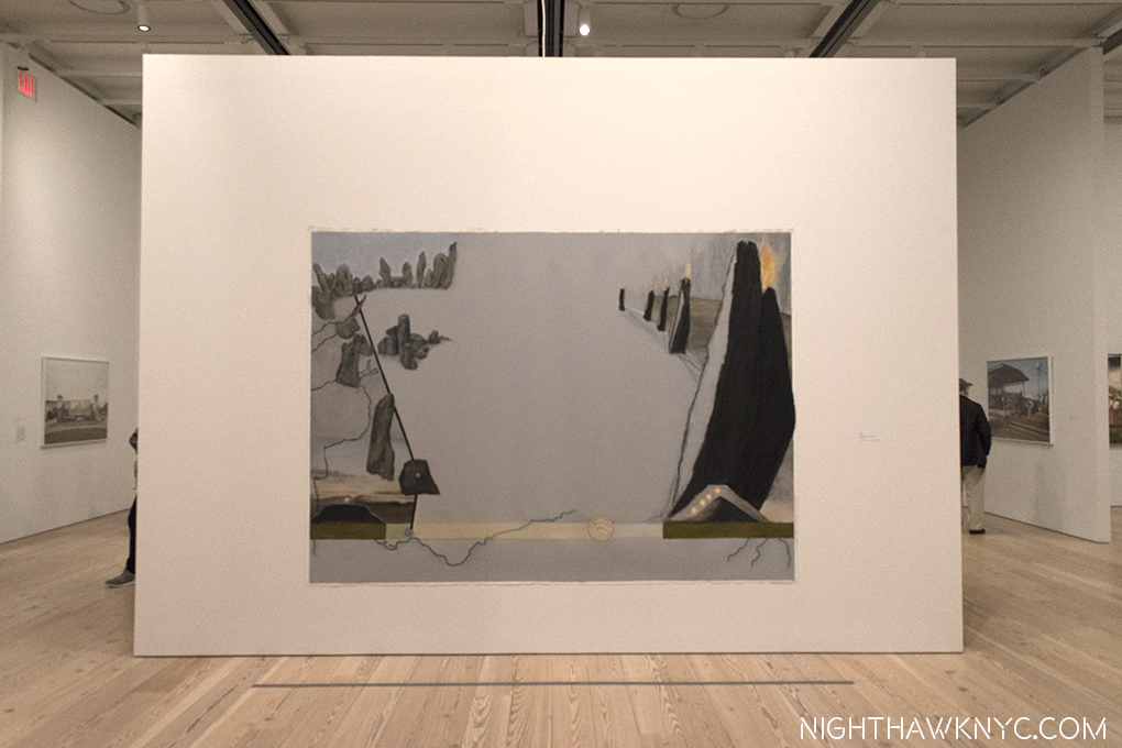
The new 11th, and final, painting in his series is, interestingly, entitled Welcome to San Saba. I quickly moved past the irony of ending a series with a work that would seem to indicate it was the first work in the series to look at this photo of it.

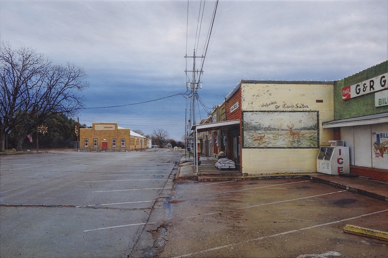
The 11th and final work in Rod Penner’s San Saba Series, Welcome to San Saba, 2017, 10 x 15 inches. Photo by Rod Penner, courtesy of the Artist and Ameringer McEnery Yohe.

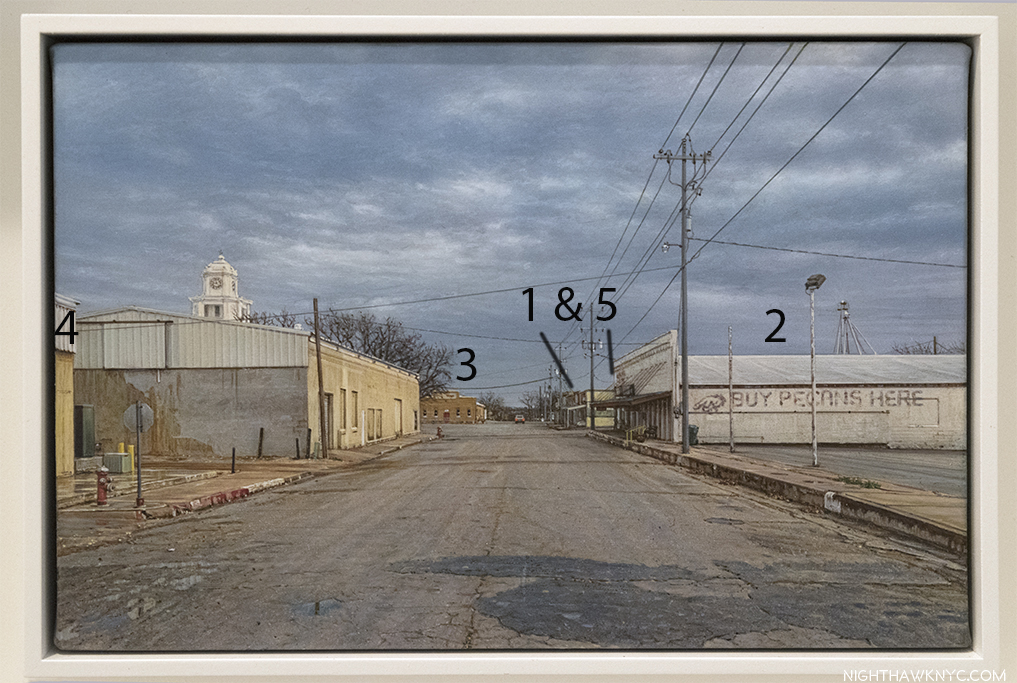
Ah…G & R Grocery (cut off on the right), The Station (dead ahead, left of center)…some familiar sights from their own works in the show…the familiar damp streets… Yet? Much was new to me.  Take the mural on the yellowish wall seen facing us to the right of center, for instance. During the run of the show, I looked long and hard at the miniature version of that mural alongside the G & R in its 5 x 7 1/2 inch painting at AMY, below, where it is seen at a sharp angle, trying, in vain, to see what it depicted.

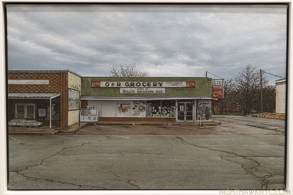
Flashback. G & R Grocery, 2016, 5 x 7 1/2 inches, as seen in the AMY show in May.

Seeing it now, face on, is “another part of the puzzle.” It’s a picture in a picture that adds a surreal element to this work, especially because we can’t really see all of the storefronts along the side of Welcome to San Saba, and so it seems to ask the question “Is THIS San Saba? Or, is what’s in the mural San Saba?” Well, I hear that hunting is second only to pecans as a business in San Saba, so? They both are. Maybe that’s why the deer in the mural has that “in the headlights” look, which mimics the distant car with its headlights on coming down the street. While we’re busy pondering all of that, one thing’s for sure, besides that car, there’s not a heck of a lot going on.

The perspective giving us this view strikes me as brilliantly subtle. We’re not exactly in the street, or on the curb. We’re not looking exactly straight down the sidewalk, or really, right down the street. Only the mural is seen whole, balanced by the facade of The Station, across the street in the distance. The pavement is masterfully done, as usual. It’s astounding, really. Right down to the varying degrees of wetness, and that horizontal crack breaking things up. While we’re admiring Mr. Penner’s technique, other visual pleasures include what can be seen of the facades of the stores seen in perspective, the peeling paint on the mural wall, and of course, the “Penneresque” skies, as I call them, this one different from some of the rest because it lacks any hint of the sun breaking through, or being covered up, as in the larger SS Butane. The bare tree on the left marvelously balances the piece, and is, like everything else, wonderfully done.

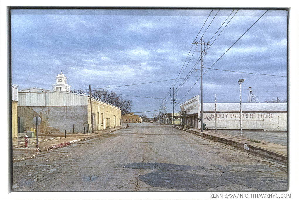
Flashback #2. View of San Saba, 2017, 5 x 7 1/2 inches. Looking down the same street as Welcome to San Saba, which takes place halfway up the road on the right, as seen at Ameringer in May.

Finally, there are the many festive lights, including those that run along the top of all the buildings, reinforcing that it’s the holiday season, which adds more poignancy for the viewer. The lack of people and cars, except for the distant one approaching makes this feel more haunting to me than View of San Saba, above, possibly because we’re not in the middle of the street now, and we’re right among the buildings. Odd for that time of year, there’s almost no activity, no one is shopping, doing errands, etc., save for the headlights of the car approaching in the distance.

It’s more than a terrific Painting. It’s a worthy end to a compelling, unique series.

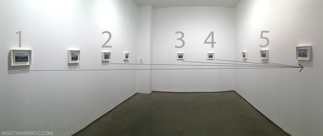
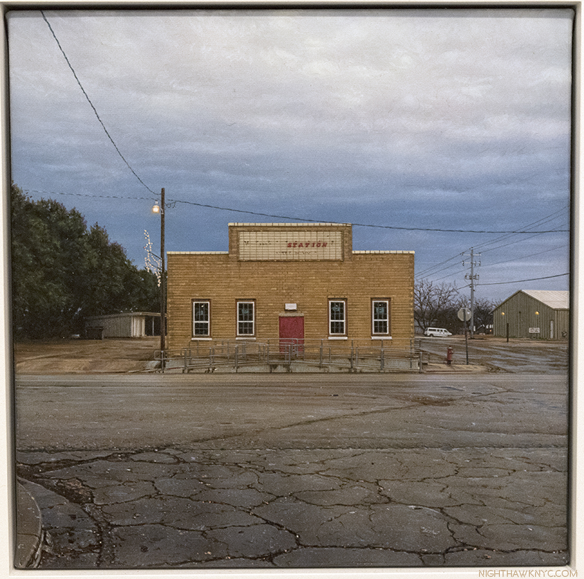
As importantly, the more I looked at it, the more I realized it was effecting some of my thoughts about the rest of the series, and making me see “more” in them. As I mentioned last time, this series presents different views of much of the same small neighborhood in each succeeding work, with each angle presenting new information, and giving a new perspective. A subtly engrossing concept that adds another layer to the already meditative nature of his work, which takes us from pondering individual scenes to assessing the larger community, seen in the first, and last two works in the series. Assessing them, I’m reminded that I paid so little mention to the “Holiday” aspects I just mentioned that, also, recur in some of these works- Yard Inflatables, and The Station, as seen at Ameringer, (a pic of The Station I Posted previously). This combined with the universal absence of people, the often darkening skies lends a sense of isolation, even lonelieness that feels (to me, at least) akin to that in Hopper. But, that is the real joy of looking, and seeing what they say to you. Your results may differ.

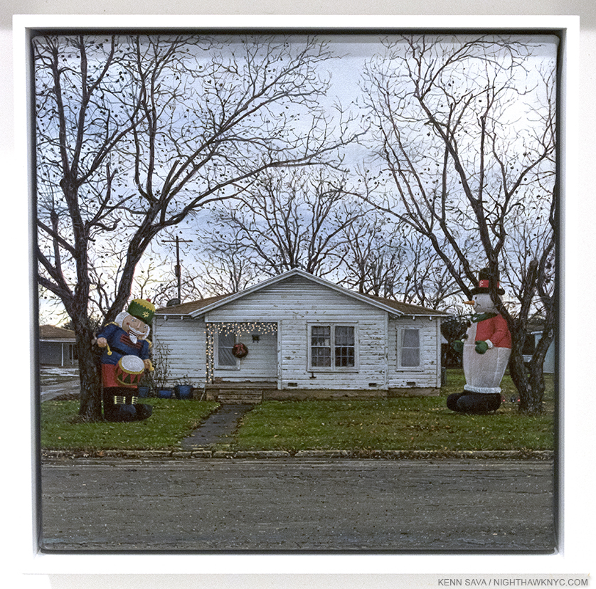
It’s the holidays in the neighborhood. Yard Inflatables, 2016, 6 x 6 inches, seen at AMY.

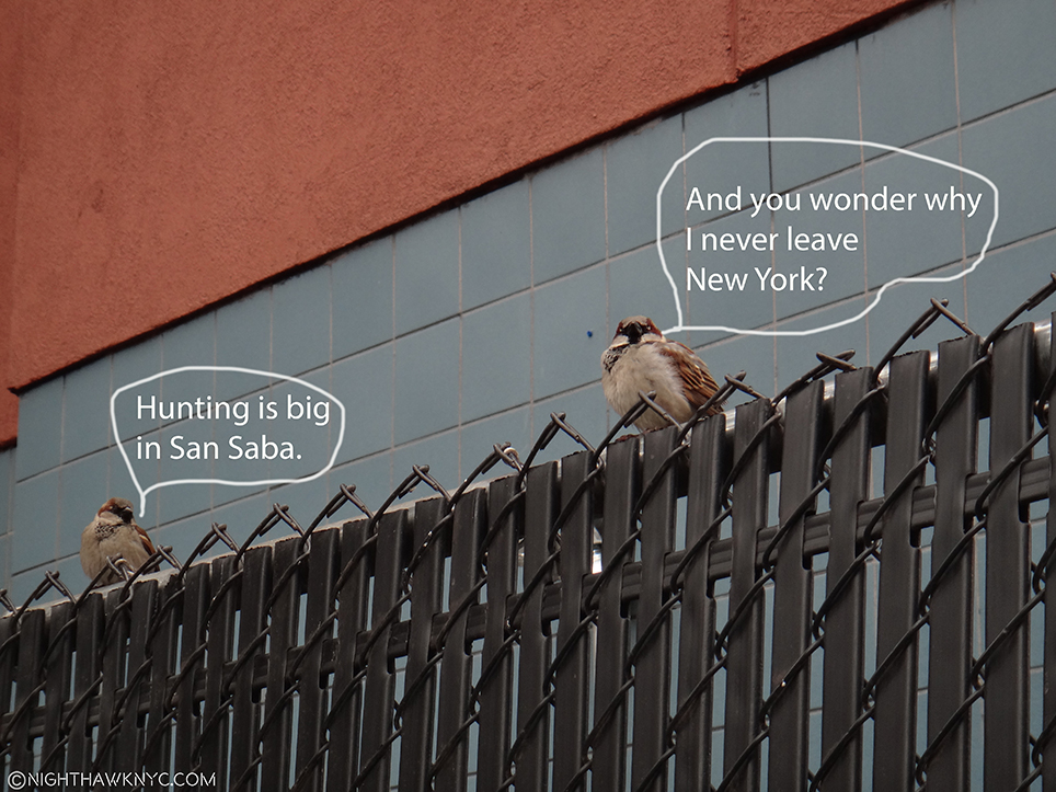
Yard Inflatables is, also, a charming example of Mr. Penner’s subtle humor. Something that also appears, in somewhat subtler form, in Welcome to San Saba, possibly in the title, itself. Mr. Penner, who describes himself as “an avid hunter, big on wildlife management and conservation,” also had to tell  me (because I’d never have guessed) the mural is a bit of a jab at some of his  some of his anti-hunting friends, and sent this photo of the actual mural along. I’m sure most residents disagree, but I like his version of it much better.

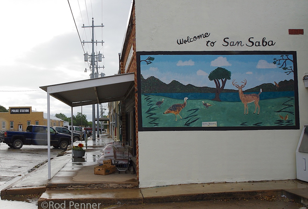
Welcome to San Saba Mural. Photo by, and courtesy of, Rod Penner. Interestingly different perspective than seen in the Painting.

The photo of the mural also puts yet another nail in the coffin of what’s called “photorealism,” something that has less and less to do with Mr. Penner’s work the more I see of it. Just compare it to the mural in the painting. So, if Rod Penner is not a “photorealist,” what is he? He’s an Artist. It’s becoming apparent to me that he is directly in the line of “American Realists”3 that goes all the way back to Gilbert Stuart (1755-1828), and extends up through George Caleb Bingham (1811-1879), the Hudson River School (including Thomas Cole 1801-1848 and Sanford Gifford 1823-1880),  Thomas Eakins (1844-1916), Reginald Marsh (1898-1954), Edward Hopper (1882-1967), and yes, Charles Sheeler (1883-1965) (Thomas Hart Benton, Grant Wood are among others included by many). Not a bad “neighborhood” to be in. Speaking of those “neighbors,” I find myself wishing the whole series had gone to a museum, like the Whitney, where it would look wonderful along side their Hoppers and Sheelers, while showing that tradition is alive and well in 2017.

Rod Penner’s San Saba Series, strikes me as walking that line between intimacy and distance. Standing in front of someone’s house, especially at Christmas, has an intimacy to it that it probably wouldn’t have seen at any other time of the year. The owners are “letting us in” a little bit into who they are through their decorations. So is the town with its “public” holiday decorations, seen in the streets of The Station and Welcome to San Saba. Yet, there is an undeniable distance and an almost foreboding sense of isolation that’s reinforced by the ever-present, slightly ominous “Penneresque” skies. Works like the smaller San Saba Butane are not at all welcoming. Even if you were to venture inside the crumbling building, you wouldn’t really “be” anywhere. View of San Saba, above, the next to last work Mr. Penner completed, is also not welcoming. We may be risking our lives standing in the middle of that street for long with our backs turned. In Welcome to San Saba, some lights are on, but nobody’s out. It’s a bit reminiscent of those old western movies when the bad guys come to town and everyone’s hunkered down indoors.

As the 9 Paintings at Ameringer McEnery Yohe sold, I now feel lucky to have been able to see that many of them in one place, since their “interaction” adds so much, as I’ve tried to show, and since who knows when that might happen again. Walking through these 11 Paintings, in my mind now, “Mr. Penner’s Neighborhood” still fascinates me and still makes me look deeper. I guess I’ve become a neighbor.

*-Soundtrack for this Post is “Won’t You Be My Neighbor?,” by Fred M. (“Mr.”) Rogers.

My previous pieces on Rod Penner-
“Q&A With Master Painter Rod Penner,” June 14, 2017.
Rod Penner: Brilliance, Under Cloudy Skies,” June 10, 2017.
The Vermeer of Marble Falls,” April 28, 2017.
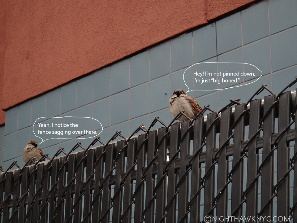
On The Fence, #9, The Sitting Ducks” Edition

NighthawkNYC.com has been entirely self-funded and ad-free for over 6 years, during which over 250 full length pieces have been published. As I face high expenses to keep it going, if you’ve found it worthwhile, please donate to keep it up & ad-free below. Thank you!

Written & photographed by Kenn Sava for nighthawknyc.com unless otherwise credited.
To send comments, thoughts, feedback or propositions click here.
Click the white box on the upper right for the archives or to search them.
For “short takes” and additional pictures, follow @nighthawk_nyc on Instagram.

Subscribe to be notified of new Posts below. Your information will be used for no other purpose.

  1. Some may be seen here.
  2. The show’s site is here.
  3. With all due respect to great Realists the world over.

On Buying Art

This site is Free & Ad-Free! If you find this piece worthwhile, please donate via PayPal to support it & independent Art writing. You can also support it by buying Art & books! Details at the end. Thank you.

Written & Photographed by Kenn Sava (*- unless otherwise credited)

For NighthawkNYC’s 2nd Anniversary, I decided to share some thoughts based on my experiences buying Art over 3+ decades. I hope they’re useful. My thank yous for year 2 appear at the end.

Everyone should have something that speaks to them on their walls or in their space.

It could be something personal, something from your past, or, it could be a piece of Art. If you find both lacking in your space(s), I hope you’ll think about changing that and seeing what it adds to your life. If you choose something personal? You’re on your own. If you would like to try a piece of Art? I’d like to share my experiences and thoughts about it with you, for whatever they’re worth.

Todd Hido Untitled #7910, from House Hunting, 2012, seen at AIPAD, as I mentioned, here. It only took me 2 trips to see it to buy it. It’s me, right? Click to enlarge.

Of course, you could make something yourself. Most people take photos, so it might be worthwhile to get them all together and go through them and see if you have one you’d like to print and display. Or, you could create something from scratch- a Drawing, a Painting, a Sculpture, or…? While almost no one is a brilliant Artist right away, if you’re determined to create something that speaks to you and you feel proud enough of to display? With a bit of work, you might surprise yourself with the results. But, if you decide to buy something, there are some things to consider. Since I don’t know how much readers might be looking to spend on Art, I’m going to take the big picture view of it, to include as many cases as possible. If you haven’t bought Art before, it’s probably something you don’t want to rush right in to. While there could be a virtually endless amount to learn if you want to do this on a “serious” level, there are some essential things to keep in mind when you’re starting out that I think also apply to those with experience buying Art.

Of course, setting an amount you’re comfortable spending of your budget is essential. It’s too easy to spend over your means on Art and that might well mean having to sell it quickly, usually at a loss. I’ll call this budgeted amount “$X” since it varies by person. Once that amount has been determined, over many years, there’s one thing I’ve learned that, as far as I’m concerned, comes closest to being THE #1 “Rule” for buying Art-

ONLY BUY WHAT YOU LOVE.

Buying only what you love establishes your philosophical approach to buying Art. There’s a number of reasons I recommend this approach, most importantly the long term satisfaction with your purchase. If you love something, you’re going to enjoy it more than something you don’t, right?

Should I buy it? Umm…What is it? Is it Art? I think it’s actually an air vent for the 8th Ave Subway under it until some clever fellow decided to try to sell it for a cool 1.2 million. Maybe he was kidding? Well? I’ve been known to laugh at asking prices, too.

Of course, any time you spend more than a few hundred dollars on something, the investment aspect of it comes into play. Before you buy, look at comparable examples of the Artist’s work and see what they have sold for and when. After you buy the work, you should continue to do this- how often is up to you. But, in terms of buying Art purely because of what its value may be in the future? That’s an unknown. NO ONE knows what’s going to happen to Art prices in 5 years, or 50 years, or 200 years. Therefore, this can’t be your main reason for buying Art. Plain and simply, buying Art primarily for investment purposes is nothing but a crap shoot. The Art market has gone up and down during my lifetime, something that those who have only been in it for the past decade of rising prices can’t imagine. IF, heavens forbid, the Art market tanks, again…No. Not “IF.” WHEN the Art market tanks, again, and the piece you own becomes worth less than you paid for it, you can still get real value from it by enjoying it, IF you love it.

“Cos I don’t care too much for money
Money can’t buy me love.”*

They’re a bit more “bullish” on the “Art market” than I am.

I say “When the Art market tanks, again,” because the historical data shows that it’s VERY likely to happen. Sooner, rather than later. NOTHING goes up for ever- not even NYC real estate. Across the board, Art prices are as high right now as they’ve ever been. I look long, hard and generally fruitlessly to find any Artist who is “undervalued” today, and that includes many Artists who are not even in major museum collections yet. Is this sustainable? Very possibly not. Will prices go higher? Maybe. Will they go A LOT higher? I’m not convinced. I’ll put it this way- Right now, in my opinion, in general, there is far more risk that prices will go down than there is the chance they will go a lot higher (an increase of 40%, or more).

As strange as this might sound to say, I also believe that the Art market going through a substantial downturn might not be a bad thing all the way around. Yes, there will be a ton of pain. Many Art galleries and some institutions will no longer be with us, and many jobs will be lost. Many Artists will turn to other fields of endeavors. I may not have anything left to write about. None of these things are good, and I don’t want any of them to happen. Yet, it might also return some semblance of sanity to the Art market. If the investors are out of Art, only Art lovers will be left.

Ok. So now that I’ve gotten the negativity out of the way (i.e. the risk), let’s get back to why you want to buy Art- because you love Art. In the end? I think that people will always love Art. Some/many/most of them will want to have some in their spaces. Those are the people I’m talking to here. If you buy Art you love? Your risk is less than someone who buys it as an investment. As an Art lover, the good news is that even now you don’t have to spend a fortune to buy Art. There is Art for sale at every price imaginable. Set a budget and you’re good to go.

Whether you should, or shouldn’t buy something will rarely be this easy to know.

If you’re buying Art today, or in the future, here are a few things to keep in mind-

First, educate yourself as much as you can about the Artist, the piece, the medium it’s created in (Is it a Painting? A Drawing? A Limited Edition Print? Or…what?). Does it appear in any book on the Artist? If so, what does the author say about it (description, dimensions, year created, size, etc.). Does all of this match the piece you’re considering? If so, this is good, but it may not completely close the question of authenticity, forgery, or being “right” I’ll get to in a moment. The second part is to educate yourself on the Artist’s “market”- what is their work selling for. Selling for. Not what people are asking for it. What are people actually paying for it. People are free to ask whatever they want for it (like our friend with the air vent, above). But? ANYthing is ONLY worth what someone is willing to pay for it. How do you find all of this, and more, out? You have to dig.

Going up to dig. Once a week I climb these stairs to The Strand’s Art Book Dept on the 2nd floor. More often if I’m really stumped.

Second, is it genuine? This is a very sticky question that, unfortunately, rears its head in almost every Art transaction- or, it should. I will say that it seems to me that forgers seem to focus on Artists who have a certain status, and a well-paying market, but you never know. Pieces that are “not right” in some meaningful way (they’re damaged, repaired, mis-identified, stolen, “sketchy” is some other way, etc.) are more common in my experience, but it varies by Artist. You want to know you’re getting what you paid for. What does the Artist’s genuine signature look like? What are the telltale signs of his or her style, and on and on. Is it an original (one of a kind) piece, or is it a limited edition? If it’s a one of a kind- is it signed, dated or titled? Does it appear in the Artist’s Catalogue Raisonne, or other authoritative guide? If so, does it match the work in the picture of it? If it’s a Limited Edition- How many copies are in the edition, how many “Artist’s Proofs” are there, and what was the Artist’s involvement in making the print, are some of what I’d need to know. You may never get to be expert enough to replace the opinion of a real expert but it’s your money and you should know as much as you can about what you’re buying. I stay away from pieces that are not signed by the Artist. Why? Though they are, generally, (much) cheaper, I want to have that connection, and it means less chance of a forgery or an unauthorized edition. I also stay away from prints that are “open editions,” because, in theory, additional prints can be created indefinitely, and the larger number there is of anything out there, the less valuable it generally is1.

I KNOW this Raymond Pettibon Owl sketch & signature are genuine because he drew them right in front of me. “Obtained directly from the Artist,” is, also, the best provenance there is, though the hardest to get.

Third- What condition is it in? You may need an expert’s opinion on this, and you should get one if the work is over 50 years old or you’re spending substantial money on it, but you should look it, and whatever supporting documentation the seller has for it, over carefully yourself. If he doesn’t have it? That’s likely a deal breaker. I think you want to get in the habit of getting complete documentation for the Art you buy which may include a receipt, the provenance, a letter of authenticity from an expert or someone personally involved with the Artist, a condition report, and an appraisal for insurance purposes. Learning the terms of, and some of the ins and outs of the various mediums (Oil Painting, Acrylic Painting, Watercolor Painting, Drawing, etc) will help you and help you understand what the experts tell you. Old paintings may have been subject to restoration, cleaning, or even additional painting added to it by others, and these are very sticky waters for any Art buyer- even museums2. If you’re buying a piece that is already framed, it is possible the frame is hiding damage that could materially effect the value. At some price level, it becomes imperative the work be examined unframed, and the seller may, or may not, be willing to do this.

Pettibon, again. Very rare among Artists, his work is pretty easy to examine unframed at his shows, but any buyer of it should immediately take it to a framer. A view of part of the final room of A Pen of All Works, at the New Museum, includes work he created right on the wall itself!

Fourth- Who am I buying this from? What is their background and area of specialty & expertise, and is this Artist in that area? What is their connection to this piece, and to the Artist? Do they represent the Artist, or their estate? What is the provenance of the piece? I will not buy a piece without a known provenance, and ask it be spelled out in writing by the seller. Why? Whoever buys this piece from you will ask you for it, and it helps assure me the work is not stolen, and lessens the chance it’s a forgery (even knowledgable and reputable dealers, as well as museums, have been duped by forgers). How knowledgable is the seller about this specific work, and its condition? Anyone who knowingly withholds information about damage or something “not right” with a piece is not ethical, and shouldn’t be in business. But? They’re out there. It’s happened to me. They’ll claim they “missed it,” so? Buyer beware. What’s the return policy if something turns out to not be “right?” Ideally. you want to buy from someone who stands behind what they’re selling and what they’re saying about it. There are an unlimited number of people and places selling Art these days. I’m not going to recommend any one. (Oh, and for the record, no one sponsors me). However, I will say that I think if you’re buying Art for the first time, go and look at it in person. Buying Art online that you’ve never seen in person is hard for an experienced Art buyer, very hard for an inexperienced one, and something I highly recommend you avoid. For one thing you can’t get the full effect of the piece, in my opinion, from a photo, and you can’t assess things like condition and damage anywhere near properly enough from one. Terms vary by seller. Look over them closely before you commit to buying anything from anyone. Learn to develop your own terms- what you require and what you won’t accept regarding payment, paperwork, returns & refunds, authenticity, condition, etc. If you see something that doesn’t sound reasonable, or is against your terms, walk away. Keep in mind that where limited edition prints are concerned there’s a chance you can find the same item being sold by someone else, especially if it’s less than 10-15 years old.

Almost every window in this Photo is of an Art gallery on West 26th Street, which is full of them from 10th to 11th Avenues, as are many of the adjoining Chelsea streets.

It’s vital to get out there and look. Books and the internet can provide information, but there’s still no substitute for seeing Art in person, as I said, especially when you are forming your tates. Even if nothing is being offered for sale (as in a museum show), you’ll learn something every time you look. See what’s being shown and how your feel about it. Gradually, your tastes will come into focus. Wait until you get “that feeling.” You know- like when you fell in love. If you don’t? Keep looking, enjoy what you see, and learn about it. Another thing that’s become apparent to me is that I like Art that says something different to me every time I look at it (as I’ve mentioned in prior Posts). This has become an essential element I need to have in anything I actually buy because I’m going to be looking at it a lot for, hopefully, a long time. While I have never bought a piece I didn’t love, as in other types of “love,” I find it’s the piece you can’t live without that may be the piece to buy. Keyword- may be. Obviously, many other things are more important to life than Art- Shelter, food, health, and those things effecting survival come way before one gets to the point of considering buying Art. Art adds to and enhances life. But, no one ever died from not having Art, as far as I know. (Though, some people who live without Art may not be living!) So? Wait until you find a work that gets inside of you and won’t let go.

Looking is hard work. Quick- What do you see? A rabbit facing right, or a duck facing left? From Wittgenstein’s “Philosophical Investigations,” as reprinted in Errol Morris‘ superb Believing Is Seeing, which I recommend to everyone who looks at Art.

Fifth- What other expenses am I going to incur buying this piece? Tax, shipping, framing and insurance are the most usual ones. Packing and appraisal (which you may need for insurance if the value rises above what you paid) may be others.

Professional Art handlers and movers may be needed to handle large, heavy, delicate or unusually sized pieces, like these seen here during an installation earlier this year at Metro Pictures. Doing it yourself may risk damaging it. Damage= lower value.

Deinstalling Richard Serra’s For John Cage series at Gagosian last year. Hopefully your needs won’t be this involved.

Also, once you buy a work, you are then responsible for “curating” it- keeping it in as good condition as you bought it to maintain its value. If you are considering having a work framed? Go to an established pro who regularly does work for museum and gallery shows. I only use City Frame, in NYC. I have used many other framers and since I don’t believe in being negative here, I’ll simply say, call Corinne Takasaki at City Frame if you want something framed. They’re the best I’ve found. No. I don’t get a cut from them for saying that. If you’re buying a work on paper that is from before the days of acid-free paper be aware that you’re going to have yellowing to deal with over time going forward. Consult an expert about what this might entail before buying it.

The first stage of framing at City Frame. A photo about to be measured.

Sixth- So, if you’ve bought what you love? Hang it and enjoy looking at it each time it comes into your view. If, after time has passed, you’ve decided to part with it? Selling is a subject for a whole other Post (or 10). I will say this, though- In general, it takes time to sell Art for what it’s worth. I mention it now because it’s something to keep in mind. BEFORE you buy something. You should ask yourself- IF, and when I decide to sell this, what are my options? One thing many people fail to realize is that new & largely unknown Artists have one market- the dealer who represents them. Most likely, you are buying their work from them. When it’s time to sell it? They may well be your only option. They know the Artist’s market and his/her existing collectors. They’re going to take a piece of the sale price to do so. How much varies by dealer, but it’s something to keep in mind. Auction houses may not accept the work of Artists who don’t have a proven track record of sales. You can search for this online and it’s something you should do before you buy a work that costs more than $X (unless you’re prepared to lose this money). I applaud people who buy the work of “under-known” Artists because they love their work. You are helping that Artist survive, and make more Art. I’ve been able to actually buy Art directly from the Artist, which you might be able to do before they sign with a gallery to represent them and handle their sales. It adds a personal element that’s hard to forget, and hard to equal.

Christie’s, Rockefeller Center. The big auction houses rarely sell the work of Artists who aren’t “established.” On the other hand, living Artists don’t get a percentage of re-sales of their work at auction (though most auction houses get paid by both the buyer and the seller). Look! They have their own flag (center)!

ALL of this being said, you don’t need to spend a fortune on a piece of Art! Art is available at almost any price you can mention. Just remember everything I’ve said above still applies, and that buying even relatively inexpensive Art may require some of the additional expenses I mentioned earlier, or others I didn’t. Everything I’ve said is based on my own experiences over the past 30 some years. I make no “warranty.” This is by no means meant to be “advice” or a “complete guide.” In my opinion, there is no such thing.

It’s a good thing I don’t have one of those stencils.

Another thing I’ve learned from looking at a lot of Art is that I will never own 99.99% of all the Art out there in the world. I’ve come to terms with that. Sure, I want to take Hopper’s “Nighthawks” home and hang it here, though that’s incredibly selfish. Yes, I see things every time I look that I think about buying (with varying degrees of seriousness). But? That’s ok. I’ve learned to use shows as another room in my home. It’s like if I go to a show often it’s a bit like living with the work on display, which is kind of fun-and? It’s as close as I’ll ever get to really doing that.

I still walk around this show in my mind. Nasreen Mohamedi at The Met Breuer, 2016

25 visits was easier than getting one of these home. Ai Weiwei at Lisson Gallery, 2016

Another important consideration in buying Art that you love is timing. As I’ve mentioned, I believe the Art Market is (at, or) near a peak in value. As a result it becomes extremely hard to find Art that is “undervalued.” Far more Art is “overvalued,” in my opinion. Of course, there is no way for anyone to really know what Art is going to speak to, and be valued by, future generations. We can only make assumptions. One of those is- “If it’s spoken to people for x hundred years, why won’t it continue to do so?” Another is, “They’re not making any more Vermeer’s.” So, yes, supply and demand is always the key element. And that brings me to a final point. While “Contemporary Art” has a certain “sex appeal” that comes with being new, as I touched on earlier, most new Artists don’t have an established market. This is very, very risky, in my opinion for anyone buying their work for more than $X, which, apparently, many people are doing. It seems to me that most people, especially those new to buying Art, would be better off buying the work of Artists with (long) track records, which also allow a wider ranger of selling avenues, if/when the need arrises.

Henry Taylor & Deana Lawson shown together at this year’s Whitney Biennial, where they were among the “stars.” Being included, means it’s too late now to “get in at the bottom,” on either, but it’s still no guarantee either will “make it,” and their prices will rise substantially the next 20 years, since both are still in “mid-career.” Therein lies the rub, and the risk, in buying the work of good Artists who are beginning to “make it.” Are you now paying for the quality of their work, or its future price potential? At least the Artists get paid.

Going back to the Master of Delft, it’s hard for us to realize that Vermeer lived in obscurity after his death for many, many decades (like Van Gogh lived during his entire life).

Yes, that really is Van Gogh’s The Starry Night at MoMA, or as close as I could get to it. I often wonder what Vincent would have made of his incredible popularity now.

It’s quite possible “another Vermeer” is out there waiting to be discovered right now. Carmen Herrera, who’s now 102 years young(!), had only one major show (in 1984) before being given a solo show at the Whitney Museum LAST YEAR (2016)!

Carmen Herrera: Lines of Sight at the Whitney Museum, January, 2016.

With all the Art that’s been created in just the past, say, 300 years, I think it’s a virtual certainty that someone major has gone over looked. So? If you get good at this, you go to see enough Art, know what to look for, and you have your eyes open? Who knows what you might find!

But? Don’t buy it if you don’t love it.

*- Soundtrack for this Post is “Can’t Buy Me Love,” by John Lennon & Paul McCartney, of The Beatles, published by Sony/ATV Music Publishing LLC.

Two Years! This Post marks the Second Anniversary of NighthawkNYC.com. I can’t let it pass without saying “Thanks!,” first to Sv for pushing me to start it, to Kitty for research assistance above and beyond the beyond this past year, to all the fine people I’ve met who work in the galleries and museums I haunt who have answered questions, shared insights, helped, and especially for putting up with “him, again,” to all the Artists who have spoken with me this year, and everyone who has taken the time to check out the 150 Posts I’ve done so far. Thank you! Oh! And I almost forgot- to my two fine feathered friends, aka “The Birdies” of “On The Fence.” For those who have wondered “What the heck?”  They represent the random voices I hear commenting at shows, though, unfortunately, only I am to blame for what comes out of their mouths. Don’t worry- No actual Birdies were harmed in the making of that series. But? Their Photo has sure taken a beating!

NighthawkNYC.com has been entirely self-funded & ad-free for over 8 years, during which 300 full-length pieces have been published! If you’ve found it worthwhile, PLEASE donate to allow me to continue below. Thank you, Kenn.

You can also support it by buying Art, Art & Photography books, and Music from my collection! Art & Books may be found here. Music here and here.

Written & photographed by Kenn Sava for nighthawknyc.com unless otherwise credited. To send comments, thoughts, feedback or propositions click here. Click the white box on the upper right for the archives or to search them. Subscribe to be notified of new Posts below. Your information will be used for no other purpose.

  1. I’m not speaking further about buying Photographs in this Post. From what I’ve seen, and learned, this year, that is a whole other topic.
  2. If you want to get an idea of HOW sticky it can get, or you want to see how world-class experts work, check out the Rembrandt Research Project’s controversial findings on all of the Master’s Paintings, here. Well, the ones they accept as being by the Master, himself.

On The Beatles…and Sgt. Pepper’s 50th

This site is Free & Ad-Free! If you find this piece worthwhile, please donate via PayPal to support it & independent Art writing. You can also support it by buying Art & books! Details at the end. Thank you.

Written & Photographed by Kenn Sava.

Today, June 18th, is Sir Paul McCartney’s 75th Birthday. Happy Birthday, Sir Paul, and many more!

When it came out 50 years ago, on June 1, 1967, “Sgt. Pepper’s Lonely Hearts Club Band” was nothing less than the biggest tsunami in popular Music since, well…”Meet The Beatles.” A defining moment in modern music, splitting musical time into before, and after, it’s aftershocks have been so all-encompassing, it’s hard to listen to most of what’s come after and not hear some of it’s influence.

Though Traffic, the Beach Boys, The Who and the Jimi Hendrix Experience (who’s seismic “Are You Experienced?,” the first album I ever bought, was released on May 12, some 19 days before “Sgt. Pepper’s”) were doing wonderously creative things with expanding the boundaries of rock, nothing else sounded anything like it, really. It cut across genres and audiences. No matter what they had listened to before, everyone listened to it when it came out1. When you think about that, it’s downright amazing given how experimental, even avant garde, quite a bit of it was. “Avant garde” and “experimental” is almost always a ticket to popular failure. Producer Sir George Martin was behind some of it- both technically (managing the recording, and facilitating the Beatles’ ideas ), and musically (doing the string and brass arrangements). Drugs, the expansive cultural, spiritual and musical explorations of The Beatles, themselves, were the rest of it. Still, in spite of all the changes going on, personally, and in the music, the whole thing hung together perfectly- from the opening background noises to the final backward voices, ending the unprecedented, all too real/all too surreal “A Day In The Life.”

It was a product of the moment, becoming the soundtrack for the “Summer of Love,” one that, also, took music a big step forward, and showed us the future.

Sir Paul McCartney performing at Yankee Stadium, July 2011, on his original Hofner “Beatle Bass,” one of the most historic musical instruments in the world. He actually remains under-appreciated as a musician, as are some of his projects, like “The Fireman.” Click any image to see it full sized.

The “concept album” had truly arrived (with all due respect to “In the Wee Small Hours,” by Frank Sinatra, 1955, a staple over here at the NHNYC.com offices, “Pet Sounds” by the Beach Boys, released May, 1966, and a few others). As a result, to this day, when you put it on, I think it should be listened to it all the way through.

Now, with the release of the new 50th Anniversary “Deluxe Edition” Box Set, things are getting complicated. So, I need to specify what I mean by “it”- Listen to the 13 songs on the original album all the way through. Which brings me to what I feel is a little bit of a problem. The new “Deluxe Edition” is NOT (I feel) the best way to experience Sgt. Pepper’s for the first time. With all due respect to Giles Martin, who has (partially) remixed Sgt. Pepper’s for the Deluxe Edition, mixing his version from the original 4 track tapes. See footnote 2 for more details on this2 After a listen to the new mix, I prefer to stick with the original mix.

Giles’ Dad, Sir George Martin, was one of the greatest Producers in the history of recorded Music. You could make a very strong case and say he’s The Greatest, but I don’t believe comparing creativity, or creative people. In any event, his mix ain’t broke. Don’t “fix” it. I don’t think the “sonic upgrade” of the new stereo mix is that big to sacrifice something that was an integral part of the finished album, like this part of George Martin’s contribution was3. It was something he created WITH The Beatles. You’re dealing with master tapes that were recorded in 1967. There’s only so much that can be done to “improve them” sonically, and those come with tradeoffs-

Questionably “better” sound quality vs. losing some of the original experience, and, most importantly, the Artist’s intentions.

Sir Paul performs “Something,” on a Ukulele given to him by George Harrison.

Frankly, for those reasons, I prefer to stick with original mixes of just about every album ever made, and as reissues pile up, they get harder to find- you have to know what you’re looking for4. As a producer? I wouldn’t want anyone else messing around with my mix, and I was no Sir George Martin. “Technological advances” are a mixed blessing, bringing good and bad. Just ask anyone who prefers Lp’s to CD’s. (I’m not saying I do.)

Finally, the Deluxe Edition comes with a lot of extras. There are a seemingly infinite number of Beatles’ outtakes that have circulated among fans and traders over the years, and while many of them are fascinating, if you haven’t heard the original album, wait until you have it memorized before listening to them. The “Making of” Doc, included with the Deluxe Edition, sounds fascinating. I’m sure the book is good, too. All in all? It sounds like a supplement to having the original recording. NOT a replacement for it.

“Hey, Sir Paul! What do you think of the new Sgt. Pepper’s Mix?”

In all of this, I have not seen any mention of the involvement of Sir Paul and Ringo (who were directly involved with the original, of course, with due respect to Yoko and the Harrisons) in it. And, I haven’t been able to find out what Sir Paul thinks about the new mix. His website has him only commenting on the passage of time re: “Sgt. Pepper’s” 50th, but I found this comment critical-

“It’s crazy to think that 50 years later we are looking back on this project with such fondness and a little bit of amazement at how four guys, a great producer and his engineers could make such a lasting piece of art.”

I think that tells you all you need to know. He includes Sir George Martin and engineer Geoff Emerick, as part of the creative team5.

“I’m fixing a hole where the rain gets in,
And stops my mind from wandering
Where it will go.”*

I believe the integrity of all of their work should be respected, and preserved.

But? With the passing of time, there’s no way I’m going to win that fight. There’s too much money aligned on the other side in reissuing records- just beware of anyone who tells you it’s “new & improved.” This, unfortunately, goes on in Art, too. After Artists pass away, increasingly their estates are continuing to issue/reissue their work. I have very mixed feelings about this. I’ll go to Photo shows and see “recent prints” that just aren’t up to the level of the quality of prints made by the Artist during their lifetime. This hurts the Artist’s reputation, in my opinion. In music, we now stand at the precipice of whatever will be done regarding Prince’s unreleased Mt. Everest of material. If you don’t think that’s going to materially impact his legacy, think again. Quick- How many albums did Jimi Hendrix release during his lifetime6? I feel for any new listener to his music faced with the dauntless task of looking through the list of COUNTLESS albums with his name on them, which are STILL being released 47 years after his death, and trying to find them.

The message in all of this? Buyer beware. Luckily? After 50 years? Most people already have “Sgt. Pepper’s.” So? On the 50th Anniversary (month) of it’s release put it on and give it a listen. All the way through. It’s an Album. Remember them?

Many since have tried. There’s still nothing like it.

Finally? When all else has been said…Think about this for one minute…

How HARD is it to connect with even one person who becomes special in your life? I still marvel that The Beatles FOUND each other!

Never in the whole history of Western Music (1200 a.d. to 1900) have two musical Geniuses collaborated before (as far as I know).

J.S. Bach was too busy raising 10 sons (each of whom became a noted, or great, composer), writing, rehearsing AND performing a new cantata each week, performing his regular church duties, and writing the rest of his incomparable music to collaborate with Handel. Mozart and Beethoven? Never happened. Brahms and Schumann? Nope. Brahms and MRS. Clara Schumann…? Romance doesn’t count. This is a 20th Century phenomenon. George & Ira Gershwin…Bernstein & Sondheim…Miles Davis & John Coltrane…Miles & Wayne Shorter…My list may be different than your’s. Here you have John Lennon & Paul McCartney, two of the very greatest songwriters in the history of Music. Alongside them? George Harrison, no slouch (and continually under-rated) himself. Heck…Who WOULDN’T be “under-rated” next to those two? I often wonder what George must have felt (from time to time? often?). On the one hand he had people wanting a “better lead guitarist,” his friend, Eric Clapton, perhaps, to replace him in The Beatles. On the other hand, he was lucky to get 1 or 2 songs on each Beatles album, NO MATTER how good his songs were! (Witness the then unheard of THREE Lp set he released soon after The Beatles split, “All Things Must Pass.” Talk about being “pent up!” “Within You, Without You,” was his song on “Sgt. Pepper’s.”) But? He was the “perfect” guitarist for The Beatles, as Ringo was the “perfect” drummer for them. That the four of them found each other?

It’s miraculous, in my book.

If you don’t think so? Point out to me the LAST time this happened in any of the Arts.

The Beatles were a gift from the Universe.

*- Soundtrack for this is “Fixing A Hole,” by Lennon & McCartney, from “Sgt. Pepper’s Lonely Hearts Club Band,” and published by Sony/ATV Music Publishing LLC.

On The Fence,#8, The Birds & The Bees-tles” Edition.

NighthawkNYC.com has been entirely self-funded & ad-free for over 8 years, during which 300 full length pieces have been published! If you’ve found it worthwhile, PLEASE donate to allow me to continue below. Thank you, Kenn.

You can also support it by buying Art, Art & Photography books, and Music from my collection! Art & Books may be found here. Music here and here

Written & photographed by Kenn Sava for nighthawknyc.com unless otherwise credited. To send comments, thoughts, feedback or propositions click here. Click the white box on the upper right for the archives or to search them. Subscribe to be notified of new Posts below. Your information will be used for no other purpose.

  1. Myself included, and I wasn’t into The Beatles until “Strawberry Fields Forever” was released, on February 13, 1967, as a single, presaging “Sgt. Pepper’s”
  2. Sgt. Pepper’s was recorded on 4 tracks, which is astounding when you think about that today. In 1995, my version of “Strawberry Fields Forever” was recorded on 48 tracks. The Beatles would fill up 3 of the 4 tracks, then mix those down to the open 4th track. Then they’d repeat the process until they had filled all four tracks (I’m simplifying. There was more “bouncing” of tracks to open up other tracks involved.), the resulting tape was then mixed down to a final, stereo two track Master, which is what the records were made from- both in Stereo, and yes, in Mono. Both of those have been reissued, in the “Complete” Stereo and Mono Boxsets, and I prefer them, at the moment, among the recent incarnations of The Beatles albums.
  3. Giles Martin also did a 5.1 mix. You’re on you’re own there, since his dad didn’t do one, as far as I know. I have not heard it as yet.
  4. For example- Try finding the original mixes of Miles Davis’ Columbia albums, some of the greatest and most important music of the century, on CD. It’s hard. Early, now rare, Japanese import CD’s had them. Most likely you have to go back to the Lp’s for them, but make sure they’re vintage.
  5.  They did a Q&A with him about Sgt. Pepper’s BEFORE the Deluxe Edition was announced, here. Also, Pepper’s recording engineer Geoff Emerick said he “hadn’t heard it”, the new mix, in an interview
  6. The answer is 3 studio Lp’s- “Are You Experienced?,””Axis:Bold as Love”, and “Electric Ladyland,” and 3 live albums- the other 2 of which, besides “Band of Gypsys,” I’m not sure how much he had to do with.

Rod Penner: Brilliance, Under Cloudy Skies

“Rod Penner” at Ameringer McEnery Yohe is my NoteWorthy Show for May.

“Little darling, it seems like years since it’s been clear”*

It turns out to have been more than worth the wait. The chance discovery of Rod Penner’s rarely seen work in April, 2016, left me eager to see more of it for the past year. Finally, that chance came. Yes, I wrote about this show’s opening, and my first impressions of it, a while back, when I was also lucky to meet Mr. Penner. Having returned to see the 9 remarkable Paintings that made up “Rod Penner” at Ameringer McEnery Yohe through May 26 (his first NYC show since 2013) a number of times after the April 27 opening, I realized I needed to also revisit it here because these are works that do not reveal all their secrets at first glance, and also because so little has been written about the work of Rod Penner, basically, three pieces by John Seed. Given the amazing & consistently high quality of his work, and the fact that he’s been a successful Painter for over 25 years, who’s shows routinely sell out (8 of these 9 were sold before the show opened), that’s hard to believe. This show is a great chance to get a closer look, as it represents most of the work he’s created in the past year, and because the works are related, they form a “series.” When I asked the Artist about this, he told me-

“This show is a first for me in the sense that it is a series of paintings based on photos taken on a single morning of a single town. Most of the locations are in and around the town square of San Saba, TX, and when viewed together they form a more comprehensive “portrait”, both of the town itself, and my personal experiences in this place. That being said, each painting is also meant to stand on its own.”

San Saba is about an hour north of Austin, almost smack dab in the middle of Texas. The resulting works are at once intricate and sublte, so deep, so brilliantly conceived and almost miraculously executed, I now have a feeling they will be revealing their “secrets” indefinitely.

View of San Saba, also 5 x 7 1/2 INCHES. The “center” of Rod Penner’s painted “neighborhood.”All works by Rod Penner, 2017, Acrylic on canvas, unless specified, seen at Rod Penner at Ameringer McEnery Yohe.

When I met Mr. Penner, he spoke about the newest work in the show, View of San Saba. So new, it wasn’t completed in time to appear in the show’s catalog, the first book ever published on Rod Penner (and available from Ameringer McEnery Yohe, as I write this). It’s a work that a quick glance fails. I wondered about the empty spaces in the foreground, left and right. Why is there so much of it in a work that’s supposed to be a “view” of a town? It scrunches the actual town into a narrow band that accounts for maybe one third of the Painting. These empty spaces along the sides give us a sense of perspective, a sense of space that is, after all, a trade mark of Texas, I hear, which would be missing if Rod Penner had cropped the view closer to the “BUY PECANS HERE” sign, and which would also give the sign an importance he, apparently, didn’t want it to have. The feeling would be completely different. Also, doing this “sets a stage” for the rest of the composition, something Mr. Penner seems fond of doing.

And? It turns out the foreground is an extraordinarily interesting part of the work. Ok, that’s coming from a die hard Manhattanite, a true connoisseur of pavement, street, curbs, and sidewalks, someone who never sees grass. Mr. Penner told me that as the work neared completion, he became unhappy with the pavement to the front left, so he redid it. Take that, everyone who thinks he’s a so-called “photorealist,” or “hyper-realist,” someone who paints exactly and only what’s in a reference photo. First, there’s a very unusual (in real life) crack that runs directly down the very middle of the street, which serves to draw us further and further into the painting.

Detail of the pavement in the foreground, larger than actual size, reveals almost endless details, down to the reflection of the back of the Stop sign in the puddle. Interestingly, every Stop sign in these works is seen from the back. Even in reflection.

It’s an old street. The curbs are worn, where they are still there. The pavement has been patched. Well, some of it has. Water pools in holes that still need to be. Yet, for the most part, the concrete is holding together. After all these years. After all these cars, trucks, people, and whatever else travels on the roads of San Saba, Texas have passed over them. Yes. You can still get there from here.

Beyond the technical tour de force of skill on view in this, and in everything in this show, more importantly, every centimeter of it drips with character.

The skies always seem to be ominous. Sometimes a small patch of sun is fighting to make its way through. Maybe it will. Maybe rain is on the way. (I call theses skies “Penneresque” now when I see one). Just as long as it’s not a tornado, right? The old County Court is still standing. You can see its tower to the left, in the first Photo up top. Interestingly, it’s not quite as tall as the phone pole1

When I look at the finished work, the feeling of isolation, life lived, the present time, and time past (as in the patched pavement to the right in the front), and the feeling of being an outsider is reminiscent of that in works by Edward Hopper or Charles Sheeler, but not specific works. Though he has a foot in Art History, Rod Penner is an original.

But we aren’t in San Saba. We aren’t in Texas. We’re 1,744 miles away by car or 1,513 miles as the crow flies at Ameringer McEnery Yohe Gallery on West 22nd Street in Manhattan, NYC. An entirely different world, right? We’re not even looking at Photographs, which seems to be a reaction of some who only see these works online in, yes, Photographs, and have trouble believing someone can really paint THIS well. We’re looking at Paintings. VERY small Paintings that are either 5 by 7 1/2 inches, or 6 by 6 inches each! Acrylics on canvas. In creating these works at paperback book size, I don’t believe the purpose was to show off his extraordinary skill (which happens as a byproduct). The size brings an intimacy that makes the viewer look closely to see, and once you start looking, you’ll see more and more, which can turn the experience into something of a meditation.

View of San Saba is installed on one of 3 walls where the paintings look out, and on to each other. Therein lies an additional element that becomes apparent when seen together. As Mr. Penner said, each work stands alone. Yet being at this show one can’t help noticing that there’s, also, a “little world” in these 9 Paintings that comes together in View of San Saba. Taken as a whole, this gives a feeling of walking around a small neighborhood (typically New York comment, right?), and based on View of San Saba, it is walkable. No less than 5 of the buildings featured in the 8 other works here reappear in it, making it something of a centerpiece of this “series” for me.  I constructed these maps to show what I mean,

Installation View of Rod Penner at Ameringer, McEnery & Yohe shows it’s a small neighborhood. The lines connect 5 individual works with View of San Saba, far right, where the same buildings are seen, again.

“Map” of View of San Saba showing the location of the 5 Buildings also shown in their own Paintings, which follows. The numbers are from the order they appear in the show, as seen in the prior Photo.

So, yes, as I said, “you can still get there from here,” if you walk straight down the street, following that center crack. Along the right, first, Buy Pecans Here, is the subject (and title) of a closer view of the same structure, below. Then, on its corner, and across the street on the right is G&R Grocery, which is seen in no less than two other works here- G & R Grocery, and Armadillo Country. And finally, a few blocks almost dead ahead (slightly left) is the building in The Station. Here are the five Paintings in question. There could be much to be said about each.

#1 in the “Map” above, G & R Grocery, 2016, 5 x 7 1/2 inches. That reminds me. G&R is also the home of Texas’ famous “Bill’s Season All,” as the sign says. I have to remember that when I need to reorder it.

NYC’s & Texas’ finest in the NighthawkNYC kitchen.

#2- Buy Pecans Here, 5 x 7 1/2 inches

#3 The Station, 6 x 6 inches. The foreground pavement endlessly enthralls me.

#5 Armadillo Country, 5 x 7 1/2 inches

#4 does get a section to itself. My personal favorite among all of these works (not an easy call) is one I find endlessly fascinating, on a number of levels- “San Saba Butane.” All 6 by 6 inches of it. The right rear side of it is, also, #4 in the Map, above.

#4- San Saba Butane, 6 x 6 inches. Depending on the device you’re using, this photo may be close to the actual size of the Painting.

On one level, you could look at it and think about hard times, about a business that stood for a long time, carrying the hopes and dreams of its owner, until it finally moved elsewhere, or went under. There’s no indication of which here. What there is, it seems to me, is a masterpiece of realism in which abstract and realistic elements are weaved together so seamlessly, they achieve an almost perfect balance, each supporting the other. After all, when we see the world, our eyes see things that are abstract as well as “real” (be they reflections in windows or water, and on and on- they are everywhere once you look for them). It’a all based on a rectangular box seen at an angle that provides the basis of everything else that Mr Penner hangs on it or adds to it, and around it. One time I looked at this and thought “It’s a Robert Rauschenberg meets Anselm Kiefer structure under a “Penneresque” sky, as I named them last time, maybe with a hint of John Zurier in it, and with Lucian Freud pavement. Another time, I fancied that the historic “Battle of San Saba Butane” had been fought here, leaving Texas another monument, akin to the Alamo. But, alas, history records no such battle (as far as I know). There is, instead, a completely peaceful stillness to the building, though it’s surrounded by turbulent skies and pavement that appears almost liquified in places. To get to its door, you have to cross the rough, wet road in the foreground before arriving on the slightly surer footing of the (wet) pavement, and then to the “safety” of the awning, only to find the building it’s attached to is just an empty shell, and not a real “destination.” This “having to cross questionable or unstable ground in the foreground to get to the heart of the work” is present in many of Rod Penner’s works. It takes the eye on a journey, and makes it work to get to the core of the composition.

This section is about 3 inches tall by 6 inches wide in the Painting, shown here larger than actual size. Even the wear and tear on the sign’s lettering is brilliantly rendered.

Whatever struggle took place here, even the struggle of day to day business survival is over, and all is quiet in the building. In all its brilliantly rendered dilapidated glory, it’s still standing. Though it says “San Saba” on it, if you took the lettering off (but please don’t) this is another scene that can be seen in any state in the USA. Part of the lifecycle of a business- the part where one has ended and a new one may begin. In that sense, it could also stand for life & death, a tombstone for the business that was once here, and all the memories and history that went with it. Now, it’s a space where something new can begin. It’s real and surreal, intimate and repelling, liquid, solid and air, a place that it wouldn’t seem could possibly exist, somehow, except for that sign- “San Saba Butane” anchors the scene to earthen reality. I wondered about that sign at first, in my first Post, then thought- “No. It’s probably a real name. No one could make that up, right?”

One look at San Saba Butane in comparison to how it appears on the extreme left of “View of San Saba” and you realize that there’s no building behind it now! The Artist, himself, pointed this out to me. The whole right side of San Saba Butane shows a different view than what’s behind it in View of San Saba.

Detail of the right side of San Saba Butane.

Detail of the left side of View of San Saba.

Mr. Penner said, “In San Saba Butane, I removed the building you see in View of San Saba. The area right of the station needed to be opened up some… too claustrophobic… in order to allow the eye more room to wander. The stop sign and hydrant are the same ones you see in “View of San Saba.” That sound you heard was a hammer putting the final nail in the coffin of “photorealism” in regards to the work of Rod Penner.

Well? If this is a real place? I don’t care one bit what it “really” looks like. I don’t want to know. Well, I do know this- As much as I dislike qualitatively comparing creative work. I can’t put it any other way- I can’t think of a better Painting I’ve seen in the past year than San Saba Butane.

The next one is right up there, too.

Commie’s Tacos, 5 x 7 1/2 inches.

“Why did we stop here?,” I can hear someone in the backseat saying.

After all, we’re stopped in the middle of the road. “The light’s red up ahead,” might be one reply. “Not much to see here,” might be the new complaint. Hmmm…..The longer I look at this, the more I disagree.

First, there’s the skill involved in depicting this in all of 5 by 7 1/2 inches of canvas.

The same Painting, Commie’s Taco’s, seen from only 6 feet away.

When I looked closely at this one, I marveled at the detail on the two buildings to the left of center. The more I looked at this, the more I see. Every last clapboard is perfectly rendered, but all of it has character. Check out the bands on the back of the Stop sign, and on and on…

Detail of about 2 and 1/2 inches of the left side seen with a zoom lens.

To the right is a tan building, with a Spanish Tile roof, which would be fitting for a business with the name of Commie’s Tacos, the work’s name-sake, which is painted at an angle, and cut off making me wonder if Commie would ever want to buy this work and display it in his/her’s fine establishment, since it’s not even showing the whole restaurant. In fact, we wouldn’t know what the name of it was if it wasn’t the work’s title!

Commie’s, itself, in about 2 inches, with incredibly detailed concrete.

Then, I stared straight ahead, down that beckoning road you see in the first photo, which is what the composition seems to want. The looming street seems a bit more uneven, a bit rougher, than the fairly level ground we’re on now, judging from the masterfully rendered pavement.

Detail of about 4 inches of the foreground. Mr. Penner frequently puts pavement right in the front of his work, which is both daring and serves to set the stage. It’s a stage so well executed it looks real, and used. Notice the wide variety of surfaces.

We’ll pass trash cans, Yield signs and the ever present telephone poles. Further on, past the white house, it’s hard to say what we’ll encounter, well, before that vehicle with its headlights on. If we were standing on either of those corners, maybe we’d think that vehicle was coming for us. But, in the middle of the intersection? All bets are off. It’s hard to tell if Commie’s is even open for business. As in every work here, no one else is around.

As a result? There are none of the distractions people in a painting bring. None of the drama. Uh oh. Speaking of drama…

On the Fence, #6- Crow-No-Lisa

Same with Commie’s. It’s painted at an angle and chopped off which serves to reduce its power and importance. The import, seems to me, to be in the feeling of place- of being here, now. Imagine for a moment what it must feel like to be a new resident to this street, seeing it for the first time, (as most viewers of this work are), and seeing the place you’ll now call home? What would living here be like? The residents are already connected to each other by wires, but you’re not. Would you be welcome? There’s rain on the ground, as there is in a number of these works, but the skies seem to be clearing. Keywords- seem to be. It looks to be a very typical street in a small town in Texas, in or near San Saba, but it could be almost anywhere. This scene could be in just about any one of the 49 states not named Hawaii.

Robert Frost talked about taking the road less traveled, “and that made all the difference.” What would he make of this road? Would he take it? Situated here, as we are, the answer isn’t clear, but if we are going down that side street, we’re in the wrong lane of traffic. Unless, we’re across the street at the other corner, waiting at a Stop sign there. Or, maybe it’s a scene seen in passing, or while stuck at a light to the left or right. One of those things we see for a minute, just long enough to wonder what’s down there? What it like down that street?

Seen from a normal distance, Commie’s Tacos, in its double frame.

Or? You could consider it a mediation on what once was on the corner, perhaps a house you grew up, that’s now gone. The level of detail enhances the “realism” of the work, and so, enhances the viewer’s ability to “experience” whatever he or she thinks and feels when they see it. Beyond the date the painting was done, we don’t know when this scene takes place (as we don’t in any of the works on view). It could be today, last year or 30 years ago. As such, it, and all the works here, are “portraits” of a place that’s beyond time and place. A place frozen in time that portrays an equally frozen moment that, the closer you look at it, you see “more” in. It raises more and more questions, or maybe even reminds you of a place and time, and brings back its feelings. Seeing this on the wall at Ameringer, in its interesting double frame, it’s a portal into a distant place that somehow doesn’t feel all that far away. A place somehow “known.”

Ameringer McEnery Yohe, 525 West 22nd Street, NYC, seen during the run of the show, appropriately, from the middle of the street, with wet pavement, under “Penneresque” skies, that I hear came all the way from Texas.

I don’t know how the 2,783 residents of San Saba (in 2014) feel about these paintings, if they’ve seen them. More than likely, they prefer Mr. Penner paint other locations in their fine community. As someone who’s never been to Texas, when I look at them, as I’ve said, except for a sign here or there, I see places that could exist elsewhere. So, while they’re based on actual places in and around San Saba, as Mr. Penner said, they strike me as much as depicting America- places and things that could be seen anywhere in the country. I’m sure San Saba is a very different place than NYC is in a lot of ways. When I look at these Paintings? Not entirely different.

(My subsequent Q&A with Rod Penner is hereMy experience at this show’s opening and my initial impressions of it are here.)

*- Soundtrack for this Post is “Here Comes The Sun,” by George Harrison from Abbey Road by The Beatles.

NighthawkNYC.com has been entirely self-funded and ad-free for over 6 years, during which over 250 full length pieces have been published. As I face high expenses to keep it going, if you’ve found it worthwhile, please donate to keep it up & ad-free below. Thank you!

Written & photographed by Kenn Sava for nighthawknyc.com unless otherwise credited.
To send comments, thoughts, feedback or propositions click here.
Click the white box on the upper right for the archives or to search them.
For “short takes” and additional pictures, follow @nighthawk_nyc on Instagram.

Subscribe to be notified of new Posts below. Your information will be used for no other purpose.


  1.  Old Mother Pecan, one of the most unique trees in the world (I love trees), is still standing, too (thought not seen), not all that far away, 200 years later! Important for a place that calls itself the “Pecan capital of the world.”

Raymond Pettibon’s Burning Bush

This site is Free & Ad-Free! If you find this piece worthwhile, please donate via PayPal to support it & independent Art writing. You can also support it by buying Art & books! Details at the end. Thank you.

Written & Photographed by Kenn Sava.

Raymond Pettibon: A Pen of All Work, at The New Museum featured a multi-faceted lobby Mural by the Artist that touched on long time themes, and added a few messages.

High above, to the left of center, the Artist painted these words…

“I have been rewriting ‘that modern novel’
I spoke of to you…On th’ whole it is a failure, I think,
tho nobody will know this, perhaps, but myself…iyt is a simple story, simply told. And yet iyt hath no name.”

This show fills THREE FLOORS of a quite prestigious Manhattan Museum. Please define “failure,” Raymond. Unless, you’re pulling our leyg…again?

Raymond Pettibon: A Pen of All Work, a Retrospective that also marked his first major NYC Museum show, closed at the New Museum on April 16. I was there almost to last call, drynking in as much as I could, though I was past being intoxxxicated on the 800 Drawings, fliers, album covers, ’zines, Artist’s Books and his films the museum displayed over those 3 full floors1, plus the fascinating, multifaceted mural he did in the lobby, seen above, and below.

“Beyond it lays everything tht mattered.” That tells you right off how the Artist feels about this, the logo he designed for the legendary band HE named Black Flag, that featured his brother, Greg (who also founded SST Records, who sell Pettibon’s work to this day, without ever mentioning his name). The period it represents really is such a small part of his, now, 40 years of work. It’s (also) the #1 tattoo in the land, here painted on the Museum’s elevator doors. Still on the outs with his brother, he says he rarely draws it any more, so this time, he added very small text above each bar, which reads-“Doors nor windows.””Beyond it lays everything tht mattered.””He isn’t under there, he’s in the woods.” and “The last sentence is somewhat obscured to me.” from left bar to right.

Homage to classic NYC Baseball. Another part of the mural (all since painted over) showed Brooklyn Dodger Jackie Robinson, waving a huge bat, and the Yankee star, Whitey Ford, right, in individual Drawings, not in action against each other.

It might be a while before you see this in a Museum, again. That elevator goes to THREE floors filled with Pettibon. Some “failure.”

Installation View of the 4th floor on its closing day, April 16. In the center is a room with work the Artist created for this show inside.

Barely, had I had time for this buzzz to peak when lo and behold…Here comes A-NOTHER Raymond Pettibon show, “TH’ EXPLOSIYV SHORT T,” at David Zwirner, 19th Street, with NINETY-NINE more, recent works, only a couple of which were in “A Pen…”(they were part of the lobby mural, tacked to the wall)! And? These 99 works were being shown in the very space where Raymond Pettibon had created them. Whoa! So, unless I completely overdose on Pettibon first, you might, as I’ve opted to do three pieces- because I think his work is that important and timely- one on each show, and a third piece that looks at the place Raymond Pettibon’s Art is now. Since the David Zwirner show, where I met Raymond Petitibon on April 29, still has some time to run before it closes on June 24, I’ll start with A Pen of All Work, my “NoteWorthy” show for April, before the trail grows cold on it, though for you lucky folks near Maastricht (correctly spelled), the Netherlands, it just reopened at Maastricht’s Bonnefantenmuseum, on June 2, with 700 works, where it will run through October 29. 2

Try everything, Do everything, Render everything, Ink on paper, date unknown. And? He proceeds to do just that…

Mr. Pettibon is somewhat unique in the Art world because of the way he got here, achieving legendary status through his work for bands before he got a Gallery to represent him. So? The Art world is not as familiar with the early work, while his early fans may not be as familiar with what he’s done lately (though, of course, he has many fans who have been with him the whole way, too). I’ll try to show a mix of work here, while trying to give a sense of what this remarkable show was like.

I have to think back to the Picasso Retrospective which filled ALL of the old MoMA in 1980 to recall a show of comparable size. Still, if there was a common theme to be found it was that “his entire body of work is very much a confrontation against ideologies,” to quote Massimiliano Gioni, the New Museum’s Artistic Director, on the excellent audio guide. Whatever you’ve got? Pettibon will confront it, and given how much confronting he’s done, everyone involved did a superb job of installing it, organizing all of these works by themes.

Timeless. Unfortunately. No Title (Fight for freedom!), 1981(!), Pen and ink on paper

The 2nd floor mostly focused on Pettibon, himself, looking at his early work with an eye on how he created his own “alternate media” in the form fliers, zines, record covers, Artist’s books, films & videos, et al, and how he goes about his craft, including samples from the archive he uses as source material, and to draw inspiration from on a daily basis.

A bit of Pettibon’s never before seen archive of source material includes Iwo Jima, Giuliani, and 9/11.

Also on 2, along with a good part of his past, part of Pettibon’s current legacy was on view in full effect, as seen below. He forged his own way of getting his work seen, first on fliers, then on record covers, zines, Artist’s Books, and then added film and video, all before finding acceptance in the Art world, something he says was delayed by 10 years due to his association with punk. A visit to stores like New York’s Printed Matter feels like visiting the work of many of the “children” of Raymond Pettibon, as his example has been, and is being, followed by countless Artists, Photographers, Musicians and Writers right now. Including thiys one. Though, perhaps not the first Artist to work in any of those media, his methods, and his path, remain most influential.

I had to cross the Framers Union picket line to see this show, who were on strike because Pettibon prefers to tack his work to the walls with straight pins. With 800 works in this show? That’s a LOT of lost work for framers. Ok…I’m kidding. I’m pulling your leyg now. Looking at this photo, you can see how very far Pettibon’s work has come. In the glass case are GORGEOUS copies of his (now rare) early gig fliers that were posted with no thought of posterity in the late 1970s. Behind them, on the wall are 2 tacked up drawings, and one painting(!), left, next to 13 framed drawings of no less than the Manson family. Out of the 20,000 Drawings Pettibon has done, only a small percent have been framed. With the prices being paid for his work? I’d bet that just about every piece that is tacked to the wall here is being seen that way for the last time. Framers? Get ready.

Also on the 2nd floor is the American premier of the virtually complete original art for his first book, Captive Chains, 1978, an homage to comic books/Texas Chainsaw Massacre/ Betty Page that is laced with S&M imagery as well as first rate drawings, different in style than what most of his fans may be familiar with. Pettibon has been quick to downplay/under-play/denigrayte his self-taught Drawing skills- including these! Captive Chains begs to differ. Sorry! No faylure here. These are both terrific, and now classic. Perhaps most interesting, a number of its pages are full page drawings with no text, something almost never seen in Pettibon’s work since. In fact, it seems to me his career has followed the trajectory of his work being more about image primacy early on to now when text and language have come more and more to the forefront. One indication of this is that many drawings lie unfinished in his studio at any given time while they await the inspiration of texts to complete them. Sometimes for years.

The complete original art for Captive Chains, 1978. 68, ink on paper Drawings seen in the USA for the first time, and yes, they’re tacked to the wall.

One page. Ugh…I’m sorry. Putting a tack in this is like putting one in my hand.

Pettibon is fond of recycling old characters from the comics and television, including Batman, Superman, Gumby and the obscure side-kick character, Vavoom. While Batman and Superman are famous, Gumby, a long time personal favorite, is in eclipse. A claymation character created by Art Clokey3, he was able to walk into books and live in them, as well as visit other times in history. Vavoom was a side kick on the Felix the Cat cartoon show, a character, who’s only vocalization was, literally, an earth shattering shout out of his own name. Both Gumby and Vavoom are alter egos of Pettibon, and stand-ins for the Artist. Very interesting choices, to say the least.

The old cartoon side-kick, Vavoom (seen here in No Title (A beautiful, actual…), 1987 ink on paper, only able to say his own name is an interesting alter ego for an Artist who is so intensely literate.

…so is Gumby. No Title (I borrow My…), 1990, Acrylic on board.

In a long, rear gallery on the 2nd floor, was an amazing selection of Pettibon’s superb Baseball Drawings.  Along with surfing, the Artist’s passion for Baseball is lifelong. As with his other work, unless you’re a Baseball Stat expert, like he may well be, it takes some digging to begin to understand why Pettibon is choosing to depict a certain player at a certain point in his career. (More on this in my Post on the Zwirner show.) While his early punk work continues to gets so much attention, other areas of his work live in neglect. If there’a another Baseball Artist in Pettibon’s league? I don’t know of him/her.

Against the world. No Title (1.12 Bob Gibson), 2015, Pen, ink, pencil, acrylic on paper. “1.12” was Bob Gibson’s E.R.A. in 1968, when he won 22 games and lost 9. His St. Louis Cardinals lost in Game 7 of that year’s World Series. Could anything better capture his intimidating presence than this?

The 3rd floor sees Pettibon looking at the various “tribes,” and subcultures in recent American history- surfers, hippies, punks, the Manson family, and musicians.

Even The Beatles “get Pettibon-ed,” to coin a phrase, about who is the “largest” member. No Title (Few know this…), 2015, Ink on paper. Pettibon continually revisits history (usually, American), often years later, as here. In the 2000’s, he began addressing events closer to “real time,” like the War in Iraq. One thing I haven’t figured out yet? His work’s “penis obsession.”

His Surfer and Wave works strike me as living at the center of his work, the heart of it. Beyond punk, Manson, religion, politics, war- all the rest of it. Here’s a world Pettibon knows intimately having grown up near the water in Malibu, where he indeed surfed, though, as he told Dennis Cooper in Raymond Pettibon, (Phaidon), “I don’t surf much any more, but I grew up with it. I was never a card-carrying surfer.” Usually, he depicts a solitary man in the middle of a gigantic wave, testing himself against nature, symbolically against the world, against the nature of things, against chance, and against himself. As his 2005 work, ”Man stands as in the center of Nature, his fraction of time encircled by eternity…”, which wasn’t in this show, sums up perfectly. At moments like those, the “truths” that present themselves (or rather, that Pettibon presents) are often zen-like koans- they’re ineffable. They can’t be distilled further. All but the tiny place where board meets water is out of his control. How long will the ride last? Will he survive? Be maimed? What goes through the mind while it does, and at times like those? It’s not just a man’s game, either. He shows us girls and women surfing, sometimes topless.

Monumental. No Title (As to me…), 2015, Pen ink, watercolor, acrylic on paper 55″ x 113″. Another of his large Surfer Drawings sold for 1.5 million dollars in 2013, “failing” to reach four times the high estimate.

No Title (Don’t complicate…), 1987, Ink and gouache on paper, 24″ x 18″, MoMA. If I could choose one work of his? This might be it…at the moment. You styll have 300 other Pettibons, MoMA.

The 4th floor sees Pettibon’s extensive, long-running, devastating and ever-timely political and war works, along with works relating to the power of media. Brace yourself- Pettibon doesn’t play favorites. Democrats and republicans come in for just about equal poundings- from JFK through Obama. It culminates, and the show concludes, with an inner gallery of work Pettibon created for A Pen of All Work.

Twas ever thus. No Title (You’re supposed to read the green first, Congressman Ford), 1976, Red, blue pencil on paper.  An early work about Gerald Ford by “R. Ginn.” The name “Pettibon” comes from his dad.

The layout of the 4th floor is interesting in the choice of having the most timely, most controversial and most “explosive” work including pieces regarding Ronald Reagan, Gerald Ford, Donald Trump (one from the 1980’s, and one from the 2016 campaign) and atomic explosions….

No Title (“End the war…), 2007, Pen, ink, gouache on paper, 30″ x 22,” left, seen with No Title ( The war, now…), 2008, Pen, ink, gouache,  acrylic on paper. Don’t worry. There was a whole wall about JFK, and yes, Obama got “Pettibon-ed,” as well.

A wall of work on religion, another ongoing theme.

surrounding an inner space, where the feeling is, surprisingly, both personal and intimate, it felt to me. Inside, the Artist pays homage to his mom, talks about his craft, and, apparently, nature, life, some of his wishes at this stage of his life (he turns 60 on June 16), all in works created for this room, and some on its walls.

The show includes some treasures. His mother, 95 as of last December, saved some of his childhood drawings from the 1960’s and 19 of them were on view that Pettibon has now added texts to! Pettibon pays homage to his Mom in a wonderful, Artful, way in this final gallery, which brings the show full circle.

Inside the final room on 4, containing works Pettibon did especially for iyt includes this version of Whistler’s Composition in Black and Grey, the Artist’s Mother, an homage to his own Mother, now 95, who he has says has always been his biggest fan, at times his only fan. The feeling this room gave felt like walking around in his head at the moment. He added the writing above it because, he thought, Whistler’s Mother looks like Mary Baker Eddy.

So…Moms? Hold on to your kids drawings!

A view of another part of the final room.

No Title (Pinned to the Earth), 2017, Ink on paper. In the final room, birds are featured since their feathers are used for quills- drawing instruments. Uh-oh. Someone else wants to chime in on this one…

“On The Fence, #5, Picking-A-Petite-Bone”

Painted on the wall of the final room.

PHEW. Some “failure!” It sounds HUGE, and it was, but it was a mere pittance (4%!) of the over 20,000 Drawings Mr. Gioni says Pettibon has created to date. And counting. He’s already added at least the 99 drawings in the David Zwirner show to the total. And? The one he did for me there.

No Title (When I see…), 2006. Pen, ink, collage on paper. Pettibon has been doing collages since around this time, and says one may include up to 70 drawings. As if his work wasn’t cryptic enough!

Beyond that, in a show that contains work that goes back to the 1970’s, it’s fascinating that nothing here feels “dated,” and virtually all of it holds up. Over 800 of any works is a pretty good indication of quality, even out of a body of 20,000. I’m still looking for a “bad” Pettibon.

No Title …(Do you really believe…), 2006, Pen and ink on paper.

After spending some weeks with these works, and Pettibon’s work in general, I find Mr. Gioni sums up the mystery of “understanding” Pettibon’s work the best I’ve found so far when he says on the audio guide, speaking of his political works, but I think it’s valuable to keep in mind, regardless of subject- “Pettibon plays with a variety of voices, in this case a cacophony of voices. The texts that are inscribed in the works of Pettibon are rarely a direct confessional expression of the Artist’s opinion, and they are instead a collection of what could be defined as the collective unconscious…” Proof of this is that we learn very little about the Artist, himself, from his work. Unless he comes out and tells us, directly, in interviews, and even then? Watch out for his “tall tales!” The point of the work is not personal (about the Artist, himself). It’s more about self, than “himself.”

My Heart Tells Me (Self Portrait), 1990, Ink on paper.

Personally? I felt like I was seeing the work of 800 Mensa members.  If you want to know why he is a major, and in my opinion, crucially important, Artist of our time, the “Pen,” and a pretty nice one, called the New Museum held your your answer. A wall card says the show’s title comes from a poem by Lord Byron. Ok. Another way to look at it is that the New Museums truly was A “Pen” (as in an enclosure) of All (well, A LOT) of his Work “that matters,” as he painted in the lobby.

No Title …(Good prose is…), 2013, has been turned into a styling Tote Bag by MZ Wallace, proceeds go, appropriately, to the New York Public Library.

I must also say that I feel that this show was a huge coup for the New Museum. As far as I’m concerned, this is the show that takes the New Museum to the next level. “Big 4” Museums? That sound you hear is someone breathing down your necks in contemporary Art. As for Mr. Pettibon, himself? I wonder. This show could have been held at MoMA (who, according to their site own over 300 of his works, on say, the whole 6th floor) or  it could have filled The Met Breuer (The Met lists 3 of his works online). Either would have, most likely, given him quite a bit more exposure, which might be critical given the timely nature of his work. I would love to know if either was ever an option, and why they passed if they were. Raymond Pettibon’s time is (still) now. Maybe MORE now than ever. Still, all of that having been said, I’m glad that it happened at all! I mean no disrespect to the New Museum. On the contrary, I heartily applaud them on doing such a superb job, on all accounts. Bravo! While I won’t compare qualitatively, “A Pen of All Work” will be one very hard show to top in NYC in 2017. Meanwhile, his Art continues to find favor elsewhere around the world. If you are anywhere near Maastricht, the Netherlands before October 29, don’t miss iyt! Raymond Pettibon also has a show about to open at the excellent Garage in Moscow, Russia. But? Sadly, this one is over.

“And the only sound that’s left
After the ambulances go
Is Cinderella sweeping up
On Desolation Row.”*

When I left A Pen of All Work as the show closed that last time, I walked out on to the Bowery, the erstwhile “Skid Row,” or “Desolation Row,”(hence, this Post’s Soundtrack), where C.B.G.B. used to stand a few hundred feet away, back in the day before gentrifucation. Yes, punk is long gone, but Raymond Pettibon’s “failed modern novel” gets more and more attention than ever, now worldwide. Pondering all of this, I felt that Pettibon seemed to be akin to a modern day biblical, or zen, prophet- complete with his own burning bush, wandering in the desert, speaking in tongues.

800 works in, I’m listening harder than ever.

*- Soundtrack for this Post is “Desolation Row” by Bob Dylan, from the classic Highway 61 Revisited, and published by Bob Dylan Music Co.

Special thanks to Kitty, who’s research assistance made thiys Post possible.

NighthawkNYC.com has been entirely self-funded & ad-free for over 8 years, during which 300 full length pieces have been published! If you’ve found it worthwhile, PLEASE donate to allow me to continue below. Thank you, Kenn.

You can also support it by buying Art, Art & Photography books, and Music from my collection! Art & Books may be found here. Music here and here

Written & photographed by Kenn Sava for nighthawknyc.com unless otherwise credited. To send comments, thoughts, feedback or propositions click here. Click the white box on the upper right for the archives or to search them. Subscribe to be notified of new Posts below. Your information will be used for no other purpose.

  1. 800 pieces, per the show’s audio guide, which you can still access, as I write this, here.
  2. Update- July 20- You can read my Post on “TH’ EXPLOSIYV SHORT T” here.
  3. (who passed in 2010. I wonder what he thought of these…

The Whitney Biennial Turns The World Upside Down

There’s more than “one way” to select a Biennial, and therein lies my rub…Click any photo to enlarge.

Ahh…The Whitney Biennial. That semi-annual whipping post, “they don’t make Art like they used to” kind of a show of Contemporary American Art by “young and lesser known Artists” that, frankly, I gave up on and stopped going to, missing the last one at the “old” Whitney (now The Met Breuer) in 2014. This new one, the first in their new building, ends on June 11.

Liberty by Puppies Puppies, 2017. “Give me your tired tourists, yearning for a selfie moment, rife with sociopolitical comment,” with an incomparable background. At various times, it’s a real performer, at others, it’s a mannequin. At no time will the Nighthawk go out on that deck.

Oh! What I do in the name of “Art!” Ummm…You need some gel or something for those spikes. That Torch seems to be slipping. And? Where is that big book? Whatever you do? DON’T look down!

If you have any interest in Contemporary American Art you should see it if you can. Is it a “must see?” My initial impression, which I Posted here on March 31 (which this Post replaces) left me feeling there was much to see and impressed by some of what I’d seen. Having made 10 visits thus far, however, my answer is “No.” Unfortunately, though there are a number of memorable pieces on view, and I think it’s highly likely you’ll discover some new names you’ll put on your list that you’ll want to explore further, overall, it’s not a must see, in my opinion. Let’s face it- there are so many really, really good shows going on here now. If you’d ask me what to see that’s up at the moment? I would say about the Biennial, “See it if you have time,” after seeing the others.

As always, it wouldn’t be the Biennial without some hair-pulling, teeth-gnashing, and “Wtf moments.” In this edition’s case they are there, and fairly serious negatives, in my opinion, mostly regarding the choices of what is included and what has been omitted.

True, but I’d at least like to survive this show. In the Wake, 2017, 2 of 16 Banners by Cauleen Smith.

As for my lists, after two visits, the name Samara Golden made mine of Modern & Contemporary Artists- of any age, to keep an eye on. After 10 visits? She’s still there. During each one, my wonder never ceased every time I experienced her work…ummm…installation….ummm….ok…creation, The Meat Grinder’s Iron Clothes, 2017. It is, literally, one of the most astonishing Art works I have seen since…? I honestly don’t know. Maybe, ever.

Check your expectations at whichever side door you choose to go in to enter Samara Golden’s work.

It’s so big with so much to see it may well be un-photographable. Hmmm…where have I heard that before?

“Your looks are laughable
Unphotographable
yet your my favorite work of Art”*

It, literally, turns your world upside down it’s so disorienting. Like I said about the unforgettable Bruce Conner Retrospective when it was at MoMA, “Htf?,” substituting “How” for “What,” this work takes that “How” to the “nth” degree. Unfortunately for me, it’s a work that uses height as a key element, (as does “Liberty,” above). Being deathly afraid of heights I was unable during either visit to get close enough to the preferred viewing areas to really even see most of it and get the full effect. This is as close as I’ve managed to get (thanks to the Whitney staff for nailing me to the floor)-

One little bit of Samara Golden working her magic. Ok. I’m looking down at the sky, and up at the street. Whatever is going on? I’m not sitting in that chair.

During one visit, a viewer turned away and said, “It’s an optical illusion.” I didn’t reply, but thought to myself- “Yeah? So is the Mona Lisa. There’s no real woman up there on that canvas. There’s only oil paint, and whatever Leonardo Da Vinci put under it, and what’s been put over it up there. It’s what the Artist does with his or her materials that makes the miraculous thing called “Art.” I don’t understand exactly how that translation occurs, but I’m always glad when I it does, as with Samara Golden’s “The Meat Grinder’s Iron Clothes.”

Taken as a whole, I heartily applaud the up to the minute, very politically and socially aware bend to the show, which leaves plenty to think about, which both honors, and continues, the Whitney’s long-standing tradition of being involved.

Occupy Museum’s piece, Debtfair, recounts the historic rise of the mounting debt Artist face, as shown in this graph, trying to survive & create.

Samara Golden’s work does this, too, except she gives you very different things to think about. The feeling that came to my mind was the so-called “trip” section of Stanley Kubrick’s 2001: A Space Odyssey, forever my favorite film. I don’t want to say more about it to give readers a chance to experience it for themselves without anyone else’s words in their head (and that’s also why I’m including only one of the photos I attempted at this time). Ok, and also because I still don’t know what to make of it myself. To help me, I bought the brand new MoMA PS1 book for her The Flat Side Of The Knife, 2014 show there (of the same title) for background. After 10 visits, I’m not sure the book, interviews with the Artist, or ANYthing will help me better understand this work. (Note to self- You haven’t even read the information card for this piece. In fact? You don’t even know where it is!) You’re on your own to make of it as you will, and frankly? I prefer it that way. I wish more Contemporary Art “needed” less explaining.

Elsewhere, the other highlights, for me, are- the brilliant choice of having Henry Taylor and Photographer Deana Lawson (who share a real life working dialogue) share a gallery (Mr. Taylor’s biggest work is in the lobby area just off the elevator on the 6th floor, as I wrote about, and pictured, in my Post on Henry Taylor). Deana Lawson is, undoubtedly, one of the stars of this Biennial. For weeks after the show opened,  I heard her name on people’s lips just about every where I went. Amazingly, you can still buy an original work of hers, in a signed and numbered limited edition of 50 on Light Work’s excellent site, here, for $300.00! They also have an excellent edition of Contact Sheet dedicated to her, which was available there for $12.00. Neither will last long.

Installation view of the Deana Lawson-Henry Taylor gallery.

Deana Lawson, Sons of Kush, 2016. Apologies for the glare.

The Artists, KAYA (Painter Kerstin Bratsch and Sculptor Debo Eilers), impressed me with their unique works, as Artists striving to bend boundaries between mediums, possibly following the path of Frank Stella, and they succeed to memorable effect in the works shown here.

SERENE, Processione (ALIMA), Processione (JAKE), Processione (TIN), all 2017, by KAYA (Painter Kerstin Bratsch and Sculptor Debo Eilers)

Painters Jo Baer, Aliza Nisenbaum, Celeste Dupuy-Spencer, and Dana Schulz stood out, for different reasons, but perhaps most importantly as far as I’m concerned, they show the ongoing vitality of Painting in 2017.

Veteran’s Day, 2016, Celeste Dupuy-Spencer, “looks at figures who engaged in meaningful resistance. These include the Abraham Lincoln Brigade, the international volunteers who fought against Franco in the Spanish Civil War, Muhammad Ali, and Karl Marx and Engels,” per the info card.

Paintings outdoors? At night? One of an interesting series of work by Ulrike Muller, yes, seen outside on the 5th Floor, at night.


Jo Baer, Dusk (Bands and End-Points), 2012

The Whitney & the Biennial’s curators have taken a fair amount of heat for the inclusion of Dana Schulz’ Open Casket. Further on the controversy front, an entire gallery was devoted to Frances Stark’s series Censorship NOW, which consisted of a series of huge, painted, double page reproductions (with underscores in blood red paint) from the 2015 book of the same name by musician, writer, D.J., etc. Ian F. Svenonius. While her/their point is fascinating, I was left wondering if she/they chose the right targets. As with the other works I’ve shown thus far, it’s worth seeing for yourself and making your own mind up.

Frances Stark, Censorship NOW, 2017, large, painted reproductions, with notations, of the book of the same name by musician Ian F. Svenonius.

I will say that a good deal of the Biennial I most likely won’t see because I’m not particularly drawn to film & video. As for the negative aspects of this Biennial. I’m quite puzzled by a good deal of what’s installed on the 5th floor. This wouldn’t be so frustrating for me except for the fact that I can’t understand why so many deserving Artists, who I feel should be here, are not.

Yes, there was snow on the ground as the Biennial opened as seen on the 5th floor roof deck. I have nothing to say about anything else in this photo.

In line with my ongoing policy against being negative about Art or Artists, I’m not going to get specific about the latter. With regards to the former, there is a long list of Painters and Photographers, especially, who I feel are serious omissions. Here’s a short list-

Painters (in no particular order)- Where is Andy PiedilatoJeff Elrod? Fahamu Pecou? Hope Gangloff? (Heck, Rod Penner is only 2-3 years older than Henry Taylor.)

Drawings-Ethan Murrow? Emil Ferris?

Photographers (By my count, there are only SIX in the show! Not counting, Artists, like Oto Gillen, who display stills from video. I don’t consider that Photography.)- Where is Gregory Halpern? Mike Brodie? (He’s 32, and though he says he’s “retired,” he deserves to be here.) Matt BlackAhndraya Parlato?

In closing there is one thing I will say about Samara Golden’s “Meat Grinder’s Iron Clothes.” Already, it’s apparent that no matter how many times in the years to come I visit the western end of the Whitney’s 5th floor I will think back to this work having been there, and marvel at how she did it…

“Hey,” I’ll say to no one in particular nearby in the future. “Did you see THAT?”

“Yeah,” someone I haven’t yet met will say. “They don’t make Biennials like they used to.”

On The Fence,” #4- Samara Golden Edition.

*- Soundtrack for this Post is “My Funny Valentine,” written by Rogers & Hart and published by Warner/Chappell Music, Inc.

NighthawkNYC.com has been entirely self-funded & ad-free for over 7 years, during which over 275 full length pieces have been published! If you’ve found it worthwhile, PLEASE donate to allow me to continue below. Thank you, Kenn.

You can also support it by buying Art, Art & Photography books, and Music from my collection! Books may be found here. Music here and here.

Written & photographed by Kenn Sava for nighthawknyc.com unless otherwise credited. To send comments, thoughts, feedback or propositions click here. Click the white box on the upper right for the archives or to search them. Subscribe to be notified of new Posts below. Your information will be used for no other purpose.

The “Other” Russian Revolution

This site is Free & Ad-Free! If you find this piece worthwhile, please donate via PayPal to support it & independent Art writing. You can also support it by buying Art & books! Details at the end. Thank you.

Written & Photographed by Kenn Sava (*- unless otherwise credited)

“I’m back in the USSR
You don’t know how lucky you are, boy
Back in the USSR”*

There was that “big” one…you know…the one that was in all the papers over here one hundred years ago, in 1917 – The “October Revolution,” or the “Russian Revolution.” Whatever you call it, 9 million people died in 5 years, and it resulted in the loss of freedom for countless more millions over the next 74 years, I’m no historian or political writer, but I hear it’s been fading in importance for quite a while now. While that one caused a big stir, meanwhile, off in what was then a quiet, small town (a city of 350,000 today) in the eastern U.S.S.R. (Belarus today), the seeds of another revolution were beginning to sprout. No one was killed in that one, as far as I know. The instigator of a good deal of it is a world famous Artist now, who, though a pioneer of modernism, is not often thought of as a revolutionary.

Today, he’s famous for flying lovers.

Marc Chagall is the most famous native son of that small town- Vitebsk, Belarus. In the early days after the “October Revolution” he accepted the Post of “Commissar of Visual Arts” for Vitebsk. He then founded the Vitebsk Arts College, and in 1919 invited a number of Artists to be its teachers. Among them were Kazimir Malevich, El Lissitzky and Yehuda Pen. Kazimir Malevich would soon become the fountainhead of a movement that crystalized in a group named “UNOVIS” ( or “Exponents of the New Art”), who, in the spirit of the larger revolution, shared credit for the works they created. At the core of this movement was Malevich’s “Suprematism,” a style of work that focused on basic geometric forms and colors, in the service of “pure artistic feeling.” This put him (stylistically) directly at odds with Chagall, who was, at heart, a classicist…

“On The Fence, #2: El We-sit-ski.” Click any image to enlarge, if you dare..

and when Lissitzky, who was on the fence between both camps (sorry!), sided with Malevich, Chagall soon left the school to continue his career elsewhere. 100 years later, Suprematism and the Russian Avant-Garde is still growing in importance and appreciation, as was plain to see in MoMA’s recent exhibition, “A Revolutionary Impulse: The Rise of the Russian Avant-Garde,” 1915-1932,  which featured, and grew out of, Malevich’s “Suprematism” movement. MoMA’s show, consisting exclusively of works from its own collection, is NOT to be confused with a show of a very similar title, “Revolution: Russian Art 1917-1932,” running concurrently at the Royal Academy, London, which included quite a few loans from Russia. While the show, and the movement, includes filmmakers, poets and other visual Artists, I’m focusing on the Painters, Photographers and Graphic Artists included. Many are, surprisingly, multi-threats (i.e. multi-talented). To quote MoMA about these Artists, they were “a group who was fed up with form, the way the “other” revolutionaries were fed up with 300 years of Czarist rule and decided to throw it all out, so to speak, and start over from the basics, giving a new hierarchy to basic forms, and basic (or non) colors, like black and white. (i.e. Suprematism. )1” Stalin’s 1933 decree led to the banishment of the Avant-Garde, in favor of “socialist realism,” which has already been forgotten, as we approach the 100th anniversary of the “Russian Revolution.”

While Chagall, himself, was not included in MoMA’s show (though he was in the Royal Academy’s), the headline highlight was an extremely rare opportunity to see so many works from MoMA’s incomparable (in the West) collection of Kazimir Malevich, the brilliant visionary who died only a few years after the period this show covers ends, 1932, passing in 1935 at 57. That New Yorkers are lucky enough to enjoy this superb collection is due to the foresight of another legend, Alfred H. Barr, Jr, MoMA’s first Director, who in 1929 had the prescience to secure many of Malevich’s works.

Shots across the bow of painting. An entire wall of rarely seen works by Kazimir Malevich, that are at the crux of the Revolution, featuring  “Suprematist Composition: White on White,” 1918, considered his masterpiece, center.

Close-up with Malevich’s “Suprematist Composition: White on White,” 1918.

At 26, in 1927-28, Mr. Barr went to Moscow, where he wrote in his diary, “Apparently, there is is no place where talent of artistic or literary sort is so carefully nurtured as in Moscow. Would rather be here than any place on earth.” This trip stayed with Barr when a year later he became the founding director of MoMA, as part of his vision of MoMA as a lab of critical inquiry analysis and communication1. MoMA went on to compile one of the most outstanding collections of Russian Modern Art outside of Russia under his stewardship, which lasted until 1969, part of which is on view in the 8+ galleries of this surprisingly large, and excellent, show. While I am showing selected highlights, you can see Installation Views and get a different idea of the experience towards the bottom of MoMA’s page for the show, here. To get an idea of the ongoing importance of Mr. Barr’s choices, while I was standing in front of what many consider Malevich’s Masterpiece, “White on White,“ 1918, complete strangers to each other had a moment after each posed for pictures in what they both announced was their “very favorite painting,” 99 years after its creation.

Two total strangers explain to each other why this Malevich is their “very favorite painting of all time.”

A case of early books by Malevich, including “Suprematism: 34 Drawings,” 1920, published by UNOVIS, Vitebsk, left.

Remarkable insights to genius. 4 charts Malevich made as visual aids for his European “Introductions to Suprematism” Lectures.

This blows my mind, so I’m showing a closer view of it. In this chart, we get an incredibly rare insight into how a founder of an Artistic movement (how many of them are there?) sees Art. We get to look over his shoulder as he recaps the development of Modern Art through Cubism and Futurism to Suprematism.

As impressive as Malevich’s works are, which is equalled by the ongoing importance of his ideas, for me the show’s biggest revelation came in two words- El Lissitzky. A student of Yehuda Pen’s at age 13, he then studied to become an Architect, before Chagall’s call summoned him to Vitebsk. There, he became convinced by Malevich (who he had known previously), and this led him to create “Suprematist” works that remain both fresh and incredibly inventive today.

Visionary, and then some. In 1920, UNOVIS staged a utopian opera in Vitebsk titled “Victory Over the Sun.” El Lissiztky created these designs for abstract, electromechanical dolls for it, which were never realized. Seen are 5 Lithographs from a set of 11 he did titled “Figurines: 3 Dimensional Design of the Electro-Mechanical Show ‘Victory Over the Sun,'” 1921.

MoMA owns the only complete copy known of what may be Lissitzky’s masterpiece, “Proun,” from 1920, a Portfolio of 11 lithographs, published in Vitebsk. MoMA’s curator called it a “project for the affirmation of the new.1” The exact definition of “Proun” is not known, or lost to us, but the work itself explores the creative possibilities of Malevich’s theories in startling, and beautiful, (yes, beautiful) ways.

3 photos above- El Lissiztky, “Proun,” 1920, a Portfolio of 11 lithographs, who’s title is untranslatable now. A masterpiece of invention & design, seen in the only complete set that includes the covers (top), detail of 4 prints, center, and the translation of its manifesto, bottom.

While his work is, strangely & unfortunately, absent from MoMA’s fine and surprisingly large show, behind the scenes looms the over-looked Artist, Yehuda Pen. Teacher of both Marc Chagall and El Lissitzky, his work is brilliant in its own right, to my eyes, though different from that of either of his students. Pen went on to teach at Chagall’s School, alongside Malevich, and Lissitzky.

The great Artist & Teacher Yehuda Pen, center, with friends in 1922.

Yehuda Pen’s studio in 1917, a few years after he taught El Lissitzky.

“Portrait of Marc Chagall,” circa 1915, by Yehuda Pen. More of his work is here.

Along with El Lissitzky, Aleksandr Rodchenko, impresses, on a number of fronts, including his attitude- ”I reduced painting to its logical conclusion,” he said, speaking of his three monochrome paintings- “Pure Red Color, Pure Yellow Color, and Pure Blue Color” in 1921, “I affirmed: it’s all over. Basic Colors. Every plane is a plane and there is to be no more representation4.”

Oh yeah? Rodchenko “Non-Objective Painting no. 80 (Black on Black),” 1918, his “answer” to Malevich’s square “White on White.”

Wow. Luckily, 96 years later, painting, itself can quote Mark Twain: “The rumors of my death have been greatly exaggerated,” thank goodness! I’m left to wonder what was in Rodchenko’s Borscht. Having buried his paintbrush, he got into Photography after buying a camera in Paris in 1925, four years after declaring the death of painting. He turned out to be a naturally gifted Photographer, a medium he never formally “studied.” His photography has, also, remained influential ever since.

Avant-Realism? Rodchenko “Pro eto. Ei i men (About This. To Her and to Me),” 1923, showing off his unique approach to photography, and graphic design.

There was a lot to see over 8+ galleries, in spite of the fact there was only one work by Kandinsky on view. It would have been most welcome to see more, but I never missed them, thanks to the many works by Rodchenko, and Lissitzky, who’s Photography was also shown, proving that he was, like Rodchenko, a very gifted (and underrated) Artist in that medium, too.

Remember my name (well, it’s there over the “XYZ”). El Lissiztky was, also, a naturally gifted Photographer. This amazing “Self Portrait,” 1924, Gelatin silver print, was made using SIX exposures.

Other Artists impressed, too (Lyubov Popova, Vladimir Tatlin and Olga Rozanova among them), yet regardless of how impressive this show was, more importantly, the names of many of the Artists on view have been increasingly coming from the lips of today’s important Artists, including Nasreen Mohamedi, hereWilliam Kentridge, and the late, great Architect, Zaha Hadid, who speaks about Malevich, here. Also, amazingly, the legacy lives on in Vitebsk, Belarus, something that astounds me given that the biggest battle of World War II, and possibly EVER fought, was fought in Belarus, with monumental horrific fighting in Vitebsk. Chagall’s former School, after somehow miraculously surviving, has been renovated and is to reopen as the Museum of the History of the Vitebsk People’s Art School later this year. Below is a photo of the restored building, courtesy of myrecentdiscoveries.com, the International Marc Chagall researchers, who visited the building, and wrote about its new life, here. A photo of its new lobby, which appears to pays homage to Malevich, can be seen here.

The Revolution Happened Here. Miraculously, Chagall’s School in Vitebsk, Belarus, survived the biggest battle ever fought, while everything around it was destroyed. Malevich, Lissitzky, Pen & Chagall taught here. UNOVIS was founded here. its being remodeled and reopened as the Museum of the History of the Vitebsk People’s Art School! Photo by, and courtesy of myrecentdiscoveries.com

They were kind enough to also put me in contact with the Director of the Vitebsk Modern Art Center, Andrey Duhovnikov, which includes the new Museum, above, and who is also an Artist in his own right. I asked Mr. Duhovnikov about whether UNOVIS will be represented in the new Museum of the History of the Vitebsk People’s Art School. He told me, “There will be 12 thematic sections, two of which will be dedicated to UNOVIS, where archival documents will be presented.” I’m not surprised by this. Chagall and Malevich’s influence & memory live on in Vitebsk, a city that continues to hold celebrations to mark anniversaries of milestone events, like the 100th Anniversary of Chagall’s wedding in 2015. In response to my question about whether Yehuda Pen is being forgotten, Mr. Duhovnikov explained that Yehuda Pens’ work is too fragile to travel, which prevents it from being better known outside of Belarus, however over 180 works by Pen can be seen today at the Vitebsk Art Museum, and a Museum dedicated to Pen is being discussed. Good news, indeed.

The process whereby Art goes from “Contemporary,” or “Modern,” to “Art” is endlessly fascinating to me as I look at what Artists are creating now, and wonder- “What, if ANY of this, will be considered Art one day?” Certainly influencing major Artists who come after (like Nasreen Mohamedi, William Kentridge, and Zaha Hadid) plays a part in that, so do visionaries, like Alfred Barr, who had the foresight to hand pick 21 works from Malevich’s 1927 Retrospective for MoMA, thereby giving countless future generations, including mine, the chance to see these works in shows like this one, (which is MoMA “showing off,” a bit, like The Met did with “Unfinished“). But, also, in there quietly working away are others, like Mr. Duhovnikov, and his associates, who feel and recognize the value & importance of the work, and are dedicated to sharing it, and making sure this legacy endures to influence more generations.

That’s how “Revolution” becomes evolution, and “Art History.”

My thanks to myrecentdiscoveries.com and Andrey Duhovnikov for their assistance.

*-Soundtrack for this Post is “Back in the USSR,” by John Lennon & Paul McCartney, published by Sony/ATV Music Publishing.

NighthawkNYC.com has been entirely self-funded & ad-free for over 8 years, during which 300 full length pieces have been published! If you’ve found it worthwhile, PLEASE donate to allow me to continue below. Thank you, Kenn.

You can also support it by buying Art, Art & Photography books, and Music from my collection! Art & Books may be found here. Music here and here

Written & photographed by Kenn Sava for nighthawknyc.com unless otherwise credited. To send comments, thoughts, feedback or propositions click here. Click the white box on the upper right for the archives or to search them. Subscribe to be notified of new Posts below. Your information will be used for no other purpose.

  1. From the MoMA LIVE Video- “The Russian Avant-Garde: Scholars Respond”, which can be seen here.
  2. From the MoMA LIVE Video- “The Russian Avant-Garde: Scholars Respond”, which can be seen here.
  3. From the MoMA LIVE Video- “The Russian Avant-Garde: Scholars Respond”, which can be seen here.
  4. //www.moma.org/interactives/exhibitions/1998/rodchenko/texts/death_of_painting.html

AIPAD: The Picture Show

This site is Free & Ad-Free! If you find this piece worthwhile, please donate via PayPal to support it & independent Art writing. You can also support it by buying Art & books! Details at the end. Thank you.

Written & Photographed by Kenn Sava (*- unless otherwise credited)

This is the fourth Post in my series on “The Photography Show, 2017,” aka “AIPAD.” The first three Posts are here. AIPAD was, also, my NoteWorthy Show for March. 

This time, I’m finally going to show some Photographs! After all? Isn’t that why anyone went? I’ve shown some in my prior Posts, and here are some more (with who was presenting it, of course), along with a few shots of Gallery Booths (after all, it’s the work being shown that matters, right?), and one of the Collections, (which were included this year for the first time), that stood out to me. Then, I’ll wrap up all of my coverage with the reaction to the show of the Gallerists I spoke to, as well as my own. Ok. Let’s see pictures!

“Look at that cloud
As high as a tree
At least that’s how it looks to me

How about you?
What do you see?
What if we see things differently?

Show me how the world looks through your eyes
Tell me about the sunrise, let me see the stars shine
Show me how the world looks through your eyes”*

Speaking of “Look at that cloud…,” this is Glenda Leon’s “Between the Air and Dreams,” 2008, from The Plonsker Collection of Cuban Photography (see below). I don’t know if the clouds REALLY aligned like this, but it sums up the global scope of The Photography Show, 2017. Click any image to enlarge.

A world, and 140 years apart, gives an idea of the range seen at AIPAD. Sohei Nishino’s incredibly complex “Diorama Map of New Delhi,” 2013, at Bryce Wolkowitz left, across the hall from Edward Muybridge’s equally incredible 1873 “View of Yosemite” at Robert Koch Gallery, right.

Ashley Gilbertson’s “Refugees Disembark on Lesvos, Greece, 2015,” quickly becoming iconic, at Monroe Gallery, where…

I still can’t believe that really was the legendary Tony Vaccaro. Seen with a wall of his masterpieces to his right. Georgia O’Keefe (below), Picasso, “The Violinist,” Hitler’s Eagles Nest and a fallen GI, from the far right corner, behind him, at Monroe Gallery’s booth.

Living history. Mr. Vaccaro actually knew Georgia O’Keefe (seen in both of these), Jackson Pollock, Frank Lloyd Wright, and on and on.

Want to buy top quality work by major Photographers in signed, limited editions for as little as 300.00? Check out Light Work, at lightwork.org, a non-profit in Syracuse, NY. The money goes to help Photographers. Their astounding list of their Artists In Residence to date, which includes Cindy Sherman, can be seen here.

Wonderfully friendly Gallerists were on hand from all over the world, like Raffaella De Chirico, all the way from Turin, Italy, bringing stunning work…

like that of Fabio Bucciarelli, with her, which she sold shortly after I got this photo.

Tribe came all the way from Dubai, U.A.E. to represent the thriving Photo world in 22 Arab countries.

With Galleries as far as the eye can see (check out the signs up top), you’ll need a plane. This is only one aisle of them.

Collections were a new feature this year, including the Plonsker Collection of Cuban Photography, above, and the renowned Walther Collection.


Intermission. In case you need a rest, here’s a little thing I call “On The Fence, #1- AIPAD Edition,” 2017. The Owl in question was by no less than Masao Yamamoto at Yancey Richardson.


Far & Away THE most amazing book on view, and that’s saying something- “Rijks”. $7,000.00 per, and 55 pounds. Huge! It comes with the table.

Seen the way Rembrandt created it. An immortal “Self Portrait,” as never seen before- UNFRAMED, gives a remarkably different effect.

More workmanship went into the cover of it than I could explain in an entire Post.

I know what you’re thinking- “The ‘Painting guy’ goes to The Photography Show and winds up writing about what else? A PAINTING BOOK- The ONLY Painting book in the place, no less! Well…Yes, and no1. It’s “Rijks: Masters of the Golden Age,” published by Marcel Wanders (Uitgeverij Komma and Magic Group Media), a book of photographs of paintings, but not just any paintings. 64 masterpieces from the Rikjsmuseum, Amsterdam’s “Gallery of Honour,” like you will never see them- UNFRAMED. Yes. You read that right (It STILL blows my mind) with details of each blown up to over 1,000%! Of course, I couldn’t stop looking at it, and just WOW! It may well be the greatest, the most beautiful, and the most well done Art Book I’ve ever seen. I’ve never seen Rembrandt in anything close to this level of detail. I told them that most of it’s pages would make stunning posters. For the “rest of us,” who don’t have the 7 grand, the space, or both for this incredible book, there is a smaller version available for 150.00. It’s cheaper than a plane ticket to Amsterdam!

Forever young. “Two Sisters,” 1850, by Southworth and Hawes at Contemporary Works/Vintage Works, Chalfont, PA.

Interesting to contrast with these hauntingly beautiful portraits of the moment by Ruud Van Empel at Jackson Fine Art

“Washington Merry Go Round,” 1950, by Weegee. An unusual work of his using lens experiments, and a very rare signed piece by the NYC Legend, at Michael Shapiro Gallery.

“Mommy, Are you SURE Kate Moss started out this way?”

Fred Herzog, who began doing color street photography in Vancouver circa 1954, and continued for 50 years, has only been shown since 2007. He has a marvelous eye, and a universal charm that is only beginning to be as recognized in the USA, as he is in Canada. Vancouver’s Equinox Gallery revealed his range over about 25 wonderfully chosen works.

Todd Hido, from his classic series, “House Hunting, 2002,” at ClampArt, NYC. Somebody better buy this before I do!

And, Finally- Summing up AIPAD…

I spoke to approximately 25 Gallerists (out of the 115 or so attending) about their experience at AIPAD starting on Thursday, and followed up on Sunday as the show was about to end. I’ve continued to do so with those I encountered this week as the dust was still settling. (Amazingly to me, most of the NYC Galleries had shows going on WHILE they were at AIPAD!) Of course, there was a range of reactions. Most of the Gallerists I spoke to seemed pleased. Some thought the show was too big, others wondered about the inclusion of the book area. Early on (through Thursday night), most of those I spoke with weren’t happy. “I could have done this from home,” one told me, summing up the general feeling. This was understandable as there was an absolutely torrential rain storm that lasted all day and night Thursday. Given Pier 94’s out of the way location (the trade off for getting it’s generous size), only the very, very dedicated somehow found a way to get to the show (the MTA runs not exactly near it, and cabs in hard rain that far west are as rare as finding a real, signed Diane Arbus at a flea market. There were shuttles, but I never tried them). Friday, the crowds returned, and the show seemed well attended, as far as I could tell, from then on. Activity seemed steady at the Gallery booths, in the book area (aided by a never ending string of book signings), and in the talks. The two cafe areas looked pretty full much of the time. It was hard to judge sales by only looking for red dots on title cards or lists, so I asked. No one dodged my question. On the contrary, most seemed eager to express their experience and feelings. A surprising number had taken the time to wander around and see the show, and were well versed in specifics of what they saw, which was fascinating. Some bemoaned the encroachment of “video,” which I agree with, unfortunately extending to Colleen Plumb’s “Path Infinitum,” a very laudable work about animals in captivity, being out of place in a Photography show. Some felt there was relatively little older/classic work. I found this interesting given that the Art/Painting Gallery world is so skewed towards Modern & Contemporary Art- the number of Galleries showing “classic” works is, relatively, small. I expected to see something similar at AIPAD, especially since I have been to most of the NYC Galleries who were exhibiting. (This was my first AIPAD.) Personally, I was surprised by the number of beautiful classic works by Ansel Adams and Robert Frank, though I was disappointed to see only one William Eggleston, only a handful of Saul Leiters, and no Araki’s (I am sure I just missed them. Many of Araki’s books were present in the book area).

The hair of the dog that bit me. William Eggleston’s “Yellow Market Sign and Parking Lot,” 2001, at Jorg Maass. The only work by the Photographer that I saw. He started all this “trouble” for me back in December, and STILL only continues to grow in my esteem, which surprises the heck out of me, Typically, this work haunts me. What better way to close this chapter?

From the following generation of Photographers, there were only a couple of Bruce Davidsons, and Sebastiao Salgados, though there was a nice group of Ernst Hass, who’s “Route 66, Albequerque, New Mexico,” 1969, seemed to stop everyone who passed it at Atlas Gallery. Personally? I came looking for great Photographers previously unknown to me, and aided by an expert, the man called Jackson Charles, I added about 100 names to my lists. Most of the Gallerists I spoke with agreed that there was an impressive amount of PhotoJournalists on display, a number of who turned their cameras on the refugee crisis, with amazing results. Particularly surprising, and impressive, for me were the Galleries that came the longest distances, like Raffaella De Chirico from Turin, shown above, often showed PhotoJouralism, or other similar work that many deem “difficult” to hang. Others who traveled significant distance, featured Photographers who are not big names here, but who’s work deserves more attention, like Shoot Gallery, Oslo, I wrote about earlier.

Too Much Is Never Enough In New York. That’s Pier 92, seen from half way down Pier 94 (where AIPAD was) to give a sense of size. Pier 92 is SMALLER than Pier 94!

The reaction of the attendees I heard most often later on Saturday was their feet were getting tired. It dawned on me that if there wasn’t so much worth seeing, they would have left before their feet got tired. I heard mixed things in the book area. Some Booth-holders were very pleased with how they did. Others not so much. It seemed to me it drew a lot of visitors, not surprising given how many Photographers were on hand for book signings throughout the show. A number of publishers debuted titles, or brought about to be released books. I think there were quite a few people who went to AIPAD purely for the book area. (Maybe this will lead to a separate PhotoBook show…?) Some of these tables seemed a bit small and crowded together (just like NYC Apartments), but the range of Publishers and Organizations present in this area I found most impressive. I hope they are included next year, and the layout is improved.

Personally? I found AIPAD to be professionally staged, managed and run throughout. I think most visitors were impressed by it. I found little to complain about- and I looked hard. Getting to and fro was the biggest downside, in my opinion. In the end, I hope lessons are learned from this year’s show to make a very good experience even better next year.

Thank You’s-
I can’t leave AIPAD without thanking the following people-

-Jackson Charles- Photography & PhotoBook Expert Extraordinaire, for his guidance and insights above and beyond the call of duty over FOUR days.
-Kellie McLaughlin of the legendary Aperture Foundation for introducing me to Gregory Halpern, and considerations throughout
-Paul Schiek and Lester Rosso of TBW Books for introductions to Jim Jocoy, Raymond Meeks, and other considerations
Jim Jocoy for sharing his extraordinary experiences, and amazing new book with me
Raymond Meeks for sharing his beautiful work, especially his lovingly crafted hand made new release
-Danny who turned me on to Curran Hatleberg
-Forrest Soper of PhotoEye for turning me on to Moises Saman’s “Discordia
-Sophie Brodovitch of Equinox Gallery, Vancouver for her Fred Herzog expertise, and consideration
-All the Gallerists and Organizations who spoke with me and shared their expertise and insights with me.
-Margery Newman of Margery Newman Communication for her help and consideration throughout

And, finally, to Bruce Davidson, and all the great Photographers, past and present, all over the world, who are the reason we went to AIPAD- To see the world through their eyes.

*-Soundtrack for this Post is “Through Your Eyes,” written by Richard Marx and Dean Pitchford, published by Wonderland Music Co., Inc.

This is the 4th and final Part of the most extensive coverage of AIPAD, 2017, available anywhere! The rest of this 4-part series is here.

NighthawkNYC.com has been entirely self-funded & ad-free for over 8 years, during which 300 full length pieces have been published! If you’ve found it worthwhile, PLEASE donate to allow me to continue below. Thank you, Kenn.

You can also support it by buying Art, Art & Photography books, and Music from my collection! Art & Books may be found here. Music here and here

Written & photographed by Kenn Sava for nighthawknyc.com unless otherwise credited. To send comments, thoughts, feedback or propositions click here. Click the white box on the upper right for the archives or to search them. Subscribe to be notified of new Posts below. Your information will be used for no other purpose.

  1. I’ve written about a number of excellent PhotoBooks I saw at AIPAD in the earlier parts of this series.