Henry Taylor: The Art of Empathy

This site is Free & Ad-Free! If you find this piece worthwhile, please donate via PayPal to support it & independent Art writing. You can also support it by buying Art & books! Details at the end. Thank you.

Written & Photographed by Kenn Sava.

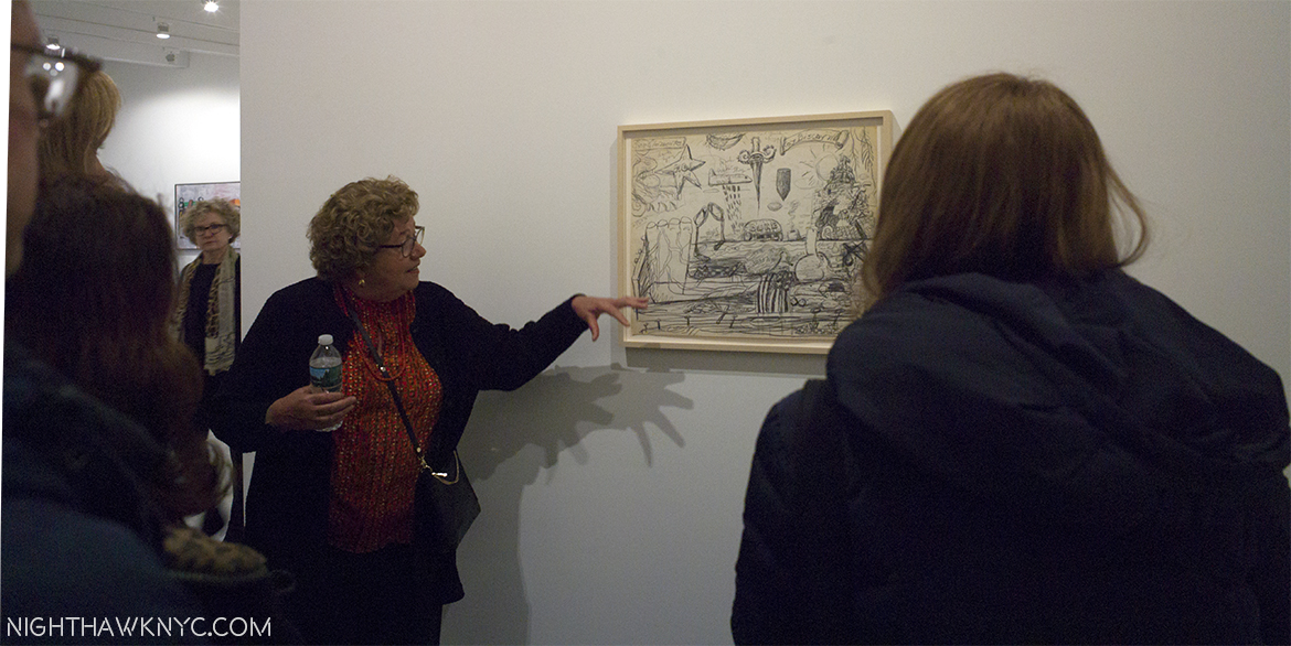
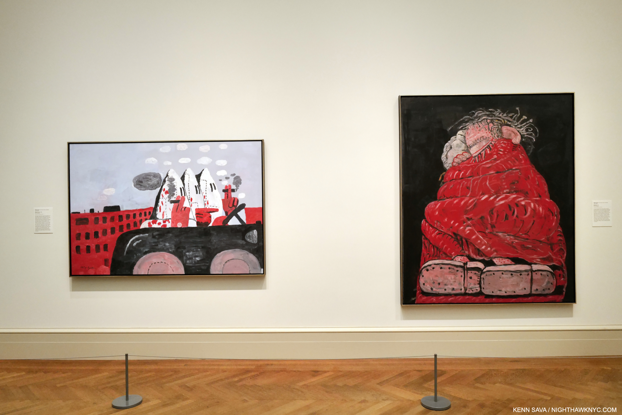
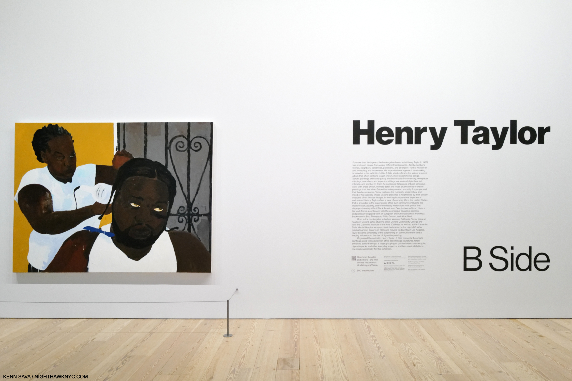
Show seen: Henry Taylor: B Side @ the Whitney Museum

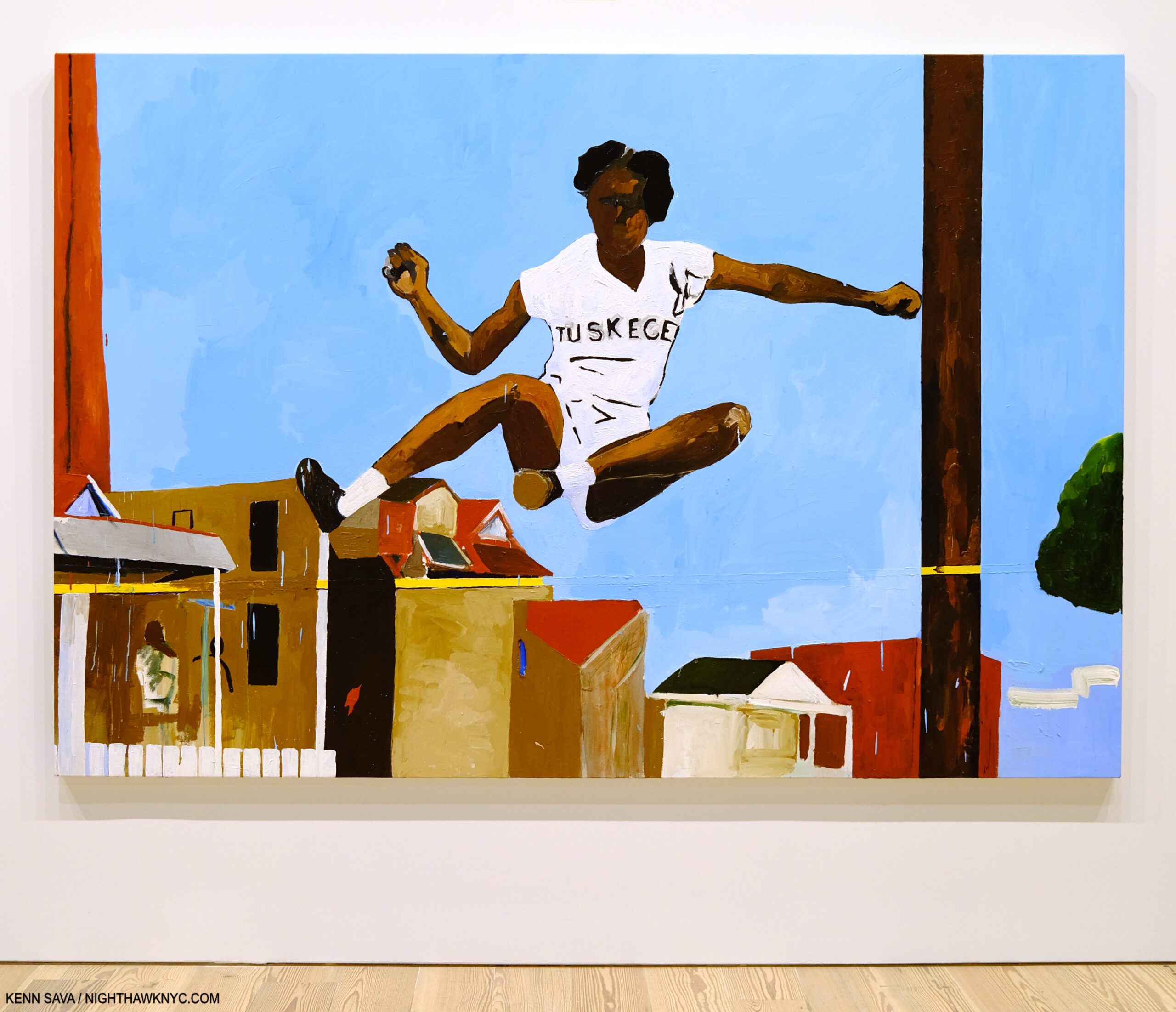
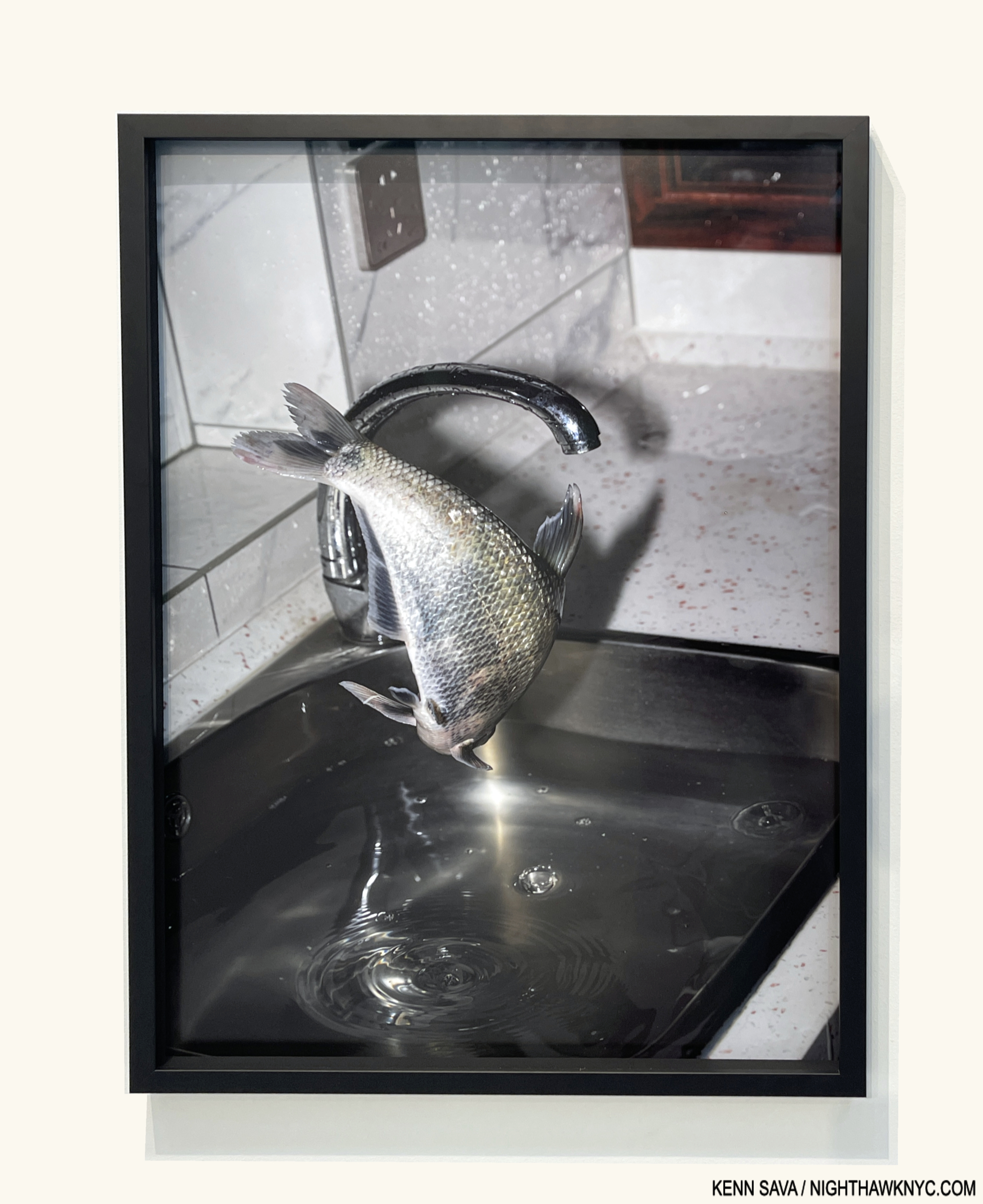
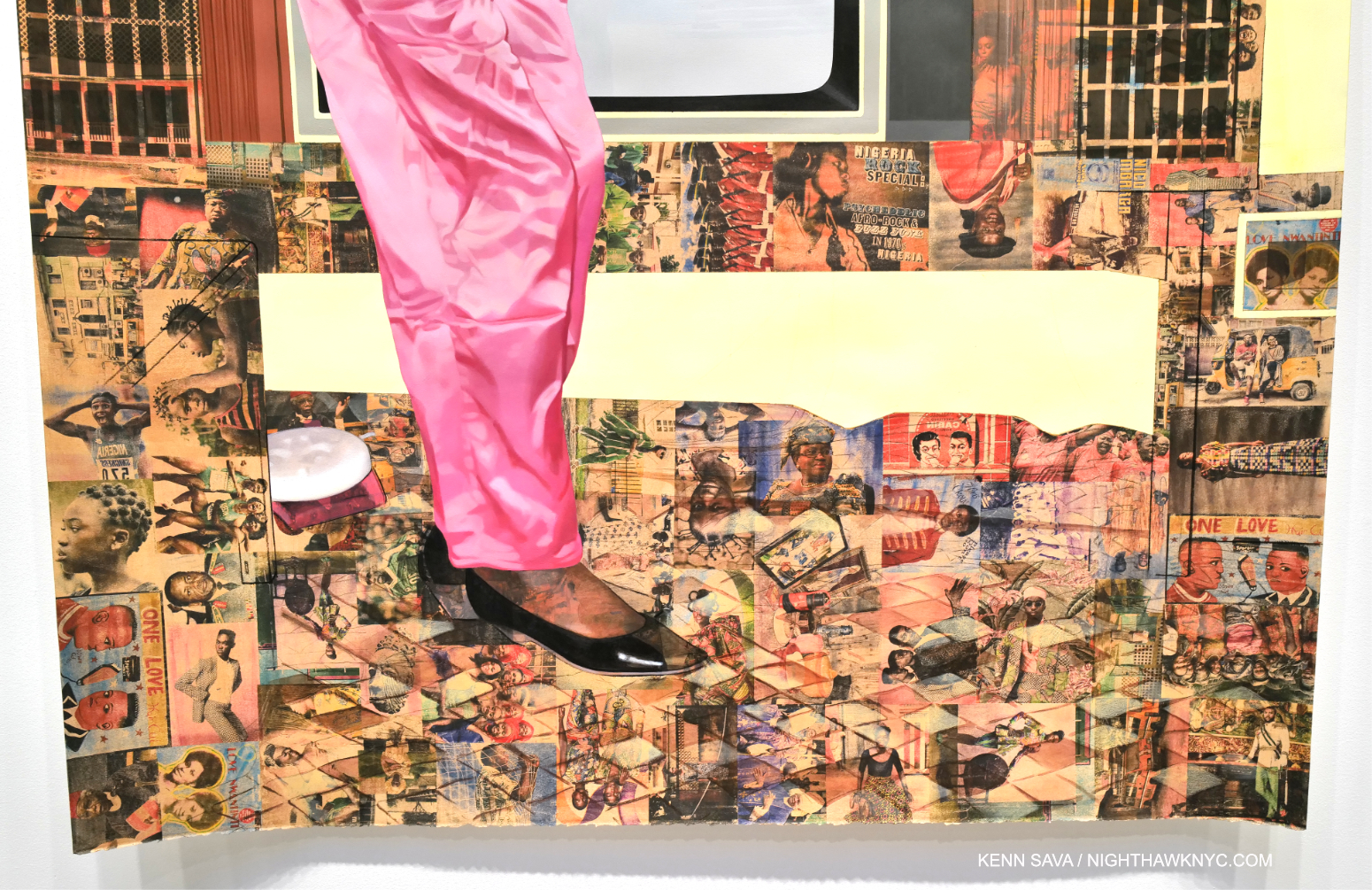
See Alice Jump, 2021, Acrylic on canvas, as are all the Paintings in this piece, unless specified. From the wall card- “The track-and-field legend Alice Coachman, depicted here, set a record in the high jump at the 1948 London games, becoming the first Black woman to win an Olympic gold medal. By altering the photo and positioning Coachman as if she is jumping over houses in a neighborhood, Taylor metaphorically alludes to the social and economic barriers she overcame growing up in the segregated South.” The pictures in this piece are thumbnails. Click any picture for full size.

I’ve had my eye on Henry Taylor since I reported that he was Having a New York Moment,” as I called it in 2017 when he received the High Line Mural Commission simultaneously with being one of the “stars” of the 2016 Whitney Biennial. Okay, both eyes. The Artist returned to NYC in 2019 for a solo show at Blum & Poe, at which I met him.

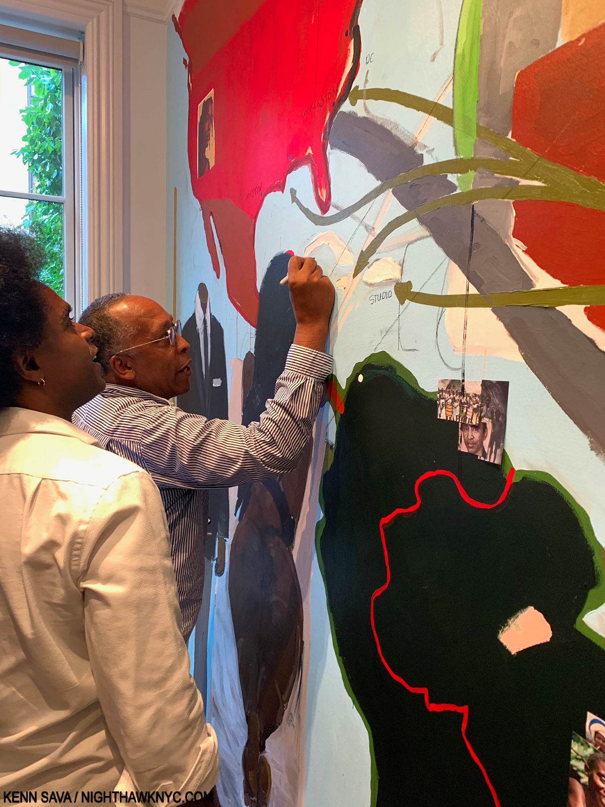
Henry Taylor modifying/ammending his wall-sized Mural with my Sharpie at Blum & Poe, September 24, 2019.

I lent him my Sharpie which he proceeded to use to modify the large Mural that was the centerpiece of his show as I watched with my mouth open. I then followed him to the terrace where he inscribed his outdoor installation with it. I’d never seen an Artist modify a work (or two) hanging in a show in my 40+ years of show-going before.

Needless to say meeting Mr. Taylor that night was an extraordinary experience made unforgettable by his being quite nice to me, and I don’t think it had to do with the pen. I came away feeling Henry Taylor is one very hard not-to-like man. I wondered if that might have been born in the fact that Henry Taylor is a “30-years in the making overnight sensation.” All this being said, everything I express about his Art here I felt before I met Mr. Taylor. Almost exactly four years to the day later, Mr. Taylor’s Art returned to NYC in Henry Taylor: B Side at the Whitney, his mid-career Retrospective, which only expanded my appreciation of the depth of his accomplishment and filled in the gaps.

Gettin it Done, 2016, at the show’s entrance.

B Side is the most powerful Painting show I’ve seen since Kerry James Marshall: Mastry at the lost and lamented Met Breuer in 2017.

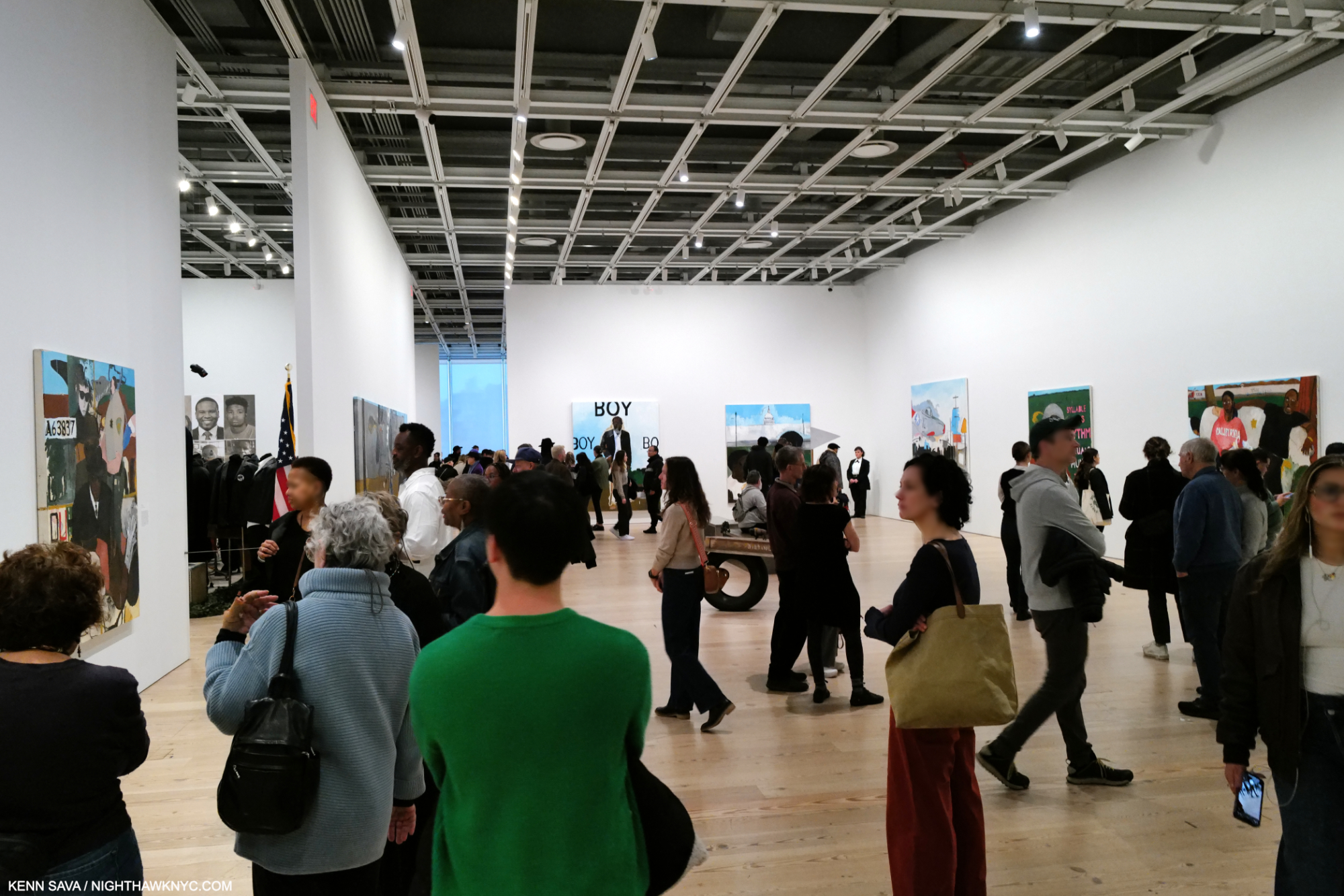
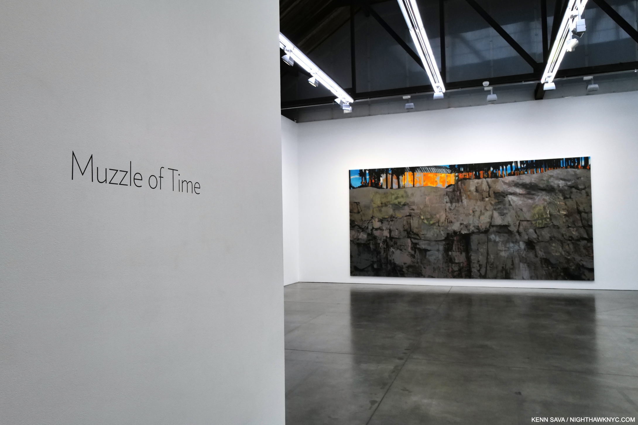
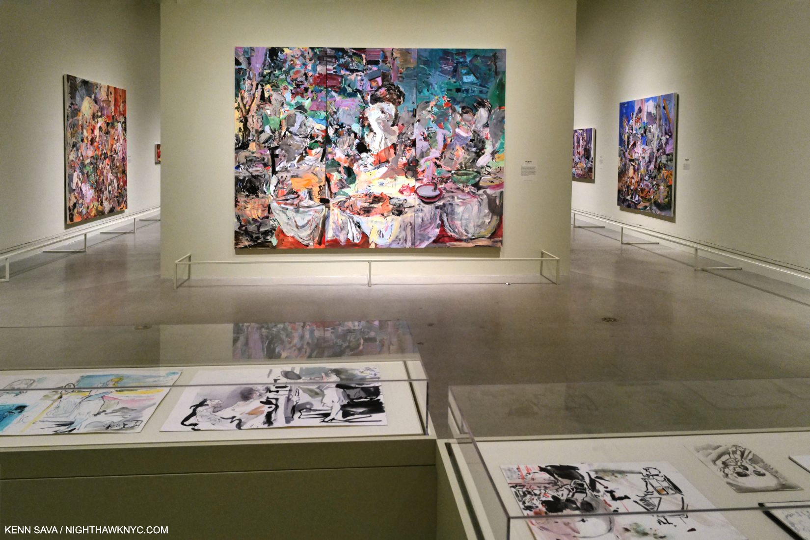
Now, or never! 4:30pm, January 28, 2024. One and one-half hours before Henry Taylor: B Side closed for the last time. Installation view of one of the two, large parallel galleries I mention further below. The other is behind the wall to the left.

This is remarkable because Henry Taylor was so late in getting his Art career started.

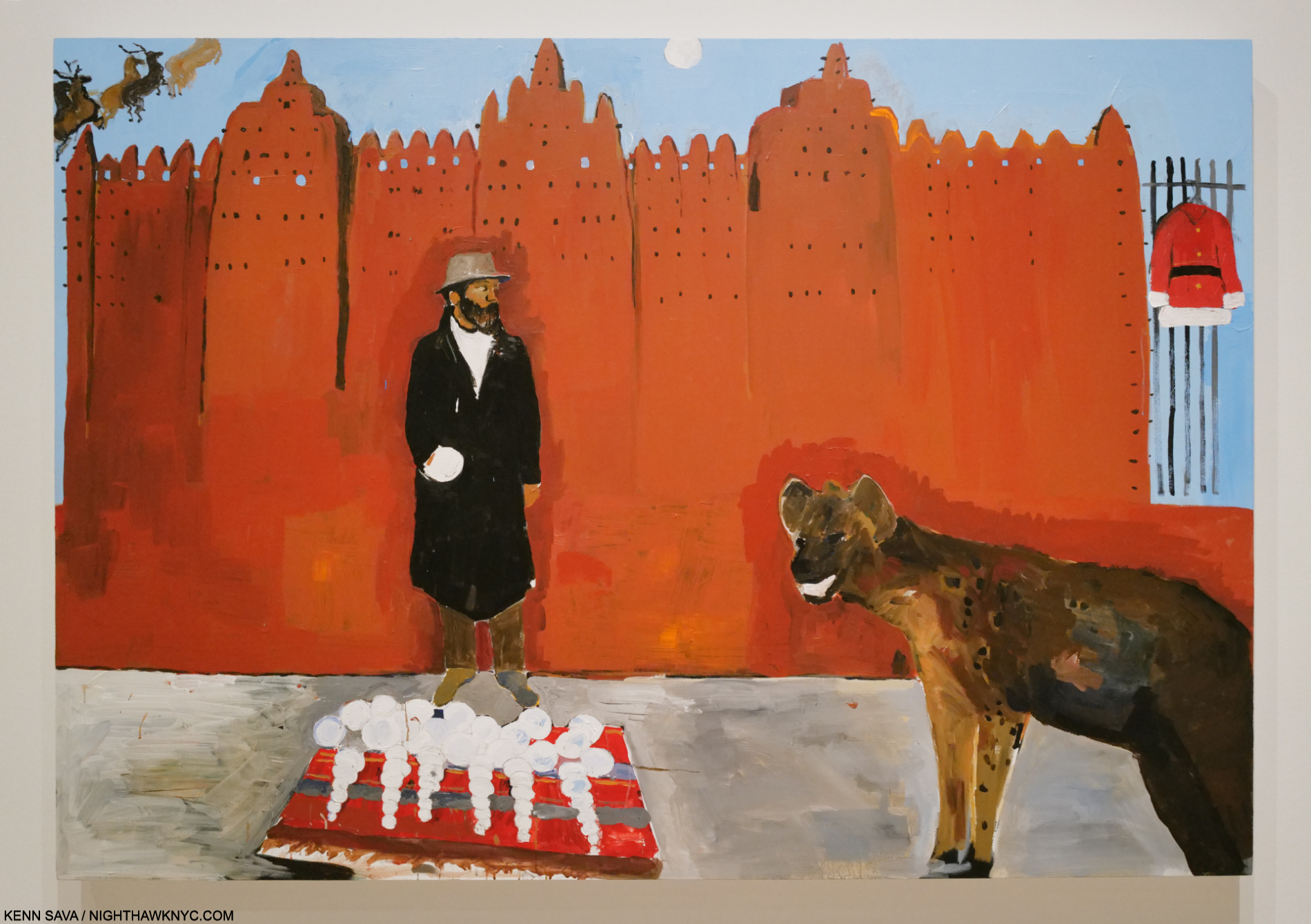
Hammons meets a hyena on holiday, 2016. Henry Taylor is a student of Art history and an entire gallery was devoted to works inspired by the work of other Artists. Here, he riffs on Dawoud Bey’s famous Photo of David Hammons selling snow balls one winter day from 1983.

The first thing that might catch a viewer’s eye is his palette. On a number of occasions his colors caught my eye from hundreds of feet away across large rooms. For that reason alone, a full Retrospective of his work over 6 galleries of the Whitney Museum’s 5th floor this winter, was a thing of beauty.

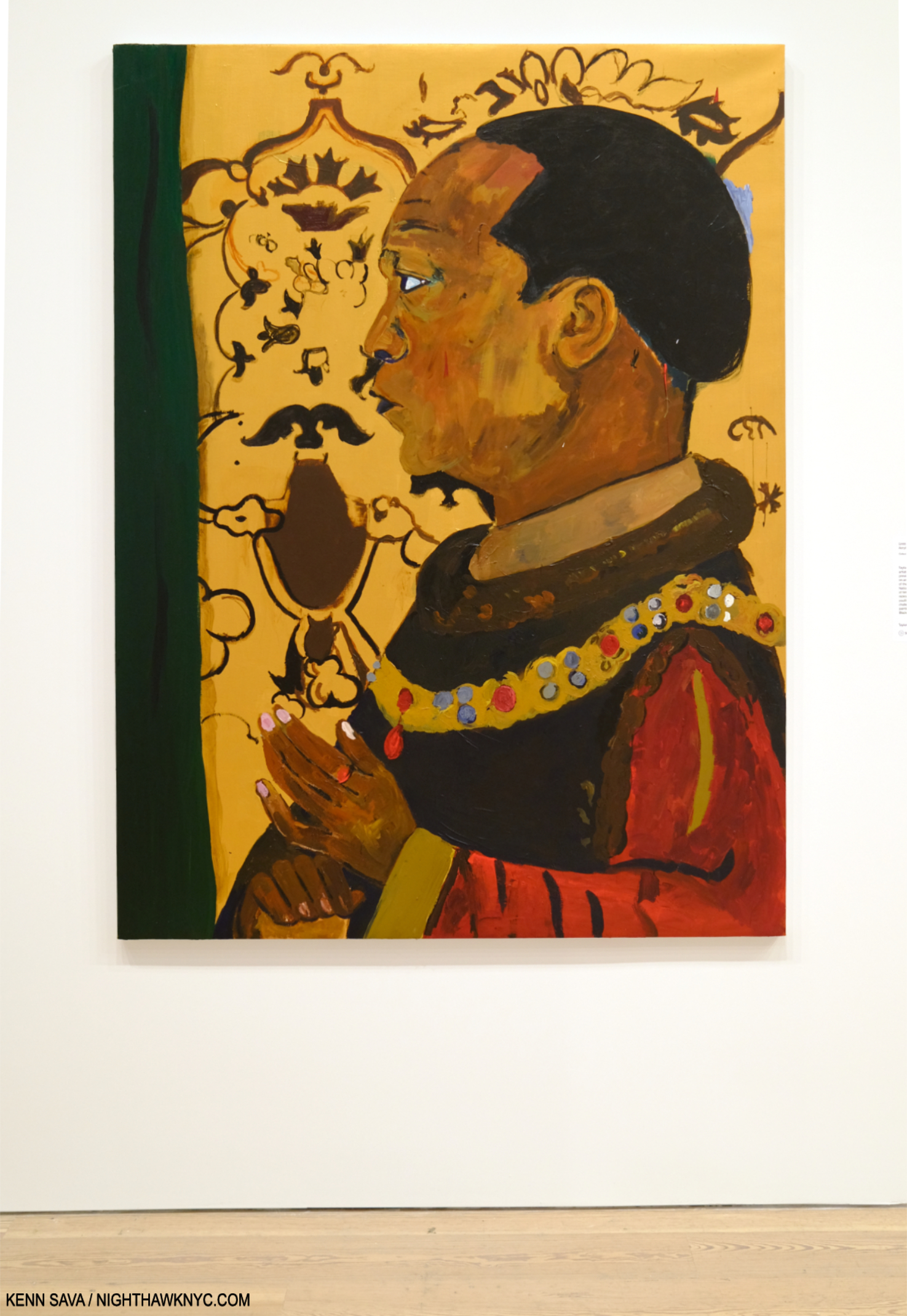
Untitled, 2021, Acrylic on linen. In fitting with the show’s title, here the Artist “covers” a Painting he saw in London’s National Portrait Gallery of King Henry V. This could be a play on his nickname- “Henry the VIII,” being the youngest of 8.

But life is not full of blue skies, roses, or bowls of cherries, and neither is Henry Taylor’s Art. There’s much, much more to be seen in his work. As enchanting as his palette is, it’s the depth of his content and his unique way of presenting it that sets his Art apart.

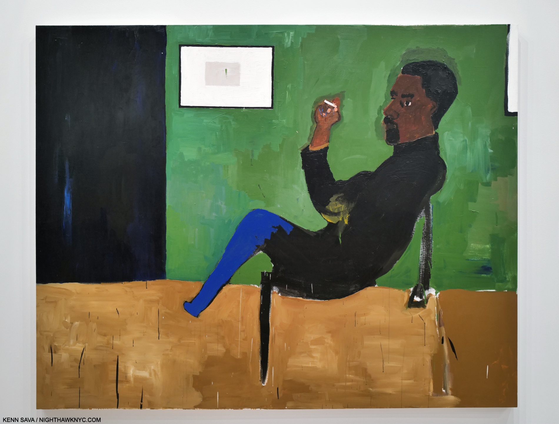
Untitled, 2022. A Portrait of the Artist’s brother, Randy, a former Black Panther (with a large one looming behind him) and now a dog breeder in Texas, depicted looking like he’s about to give a speech as he did in those earlier days.

That content speaks to a very wide range of subjects. Perhaps, most well-known for his Portraits, which as Antwaun Sargent points out, differ from the work of Kerry James Marshall in his preference for “the outcast,” as he calls them1. This is fitting for a show titled B Side, which is a reference to the other side of a single 45rpm record. The B Side of a hit 45 was almost always something overlooked and rarely played, except by devoted fans. It can also be a collection of lesser known or cover songs (like the album B-Sides, by Oasis). Both seem to fit the show. Yet, along with outcasts, B Side contains numerous Portraits of icons- political, Musical, and athletic. Throughout, it seems to me Henry Taylor Paints his subjects from the inside, out. Something quite remarkable. My impression is that he does it through empathy; from connecting and relating to the person he’s depicting in some way- even if he’s never met them, as in the Portrait of Alice Coachman up top. As good as his Art is, in the end, empathy might be what separates Henry Taylor.

Too Sweet, 2016. This extraordinary Portrait is based on a Photo the Artist took from inside his car as this man approached seeking help from passing motorists. A whopping 132 x 72 inches, its monumentality is furthered by viewing the figure from below. It’s also an example of the Artist selectively blurring facial details, in this case his eyes, which occurs off and on in the show, and which I find endlessly fascinating. I wasn’t a bit surprised to find out that MoMA has acquired it.

B Side complements his Portraits with a wide range of scenes from everyday life, with the specter of racism, and its impact, hovering as the omnipresent horror it is and has been, never far away. Of course, Mr. Taylor is well-acquainted with the reality of racism. Some of his Paintings on the subject of his grandfather hint that his 1933 murder in East Texas may be a continuing influence, as could well be expected. In fact, this was the subject of the large Mural, Ancestors of Genghis Khan with Black Man on Horse, 2015-17, which graced one of the lobbies of the 2017 Whitney Biennial, as I showed here.

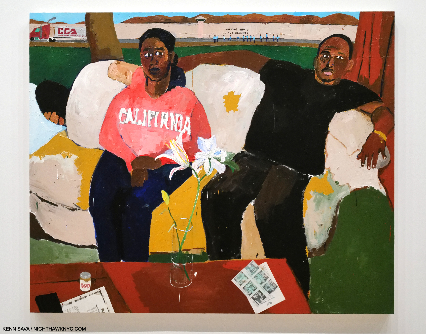
Resting, 2011, Acrylic and collage on canvas. Taylor depicts his niece and nephew sitting on a couch at home with a reclining figure behind them. Further back is a Corrections Corporation of America truck, a line of uniformed men, and a wall with “WARNING SHOTS NOT REQUIRED” stenciled on it. Before the couple are Canteen Correctional Services forms for family members to authorize items prisoners can purchase at the commissary.

Most often, but not entirely, his subjects are Black, and with the body of work he has created over the past 30 years, Mr. Taylor has emerged as “one of the most powerful and poignant observers on what it means to be Black in America working today1.”

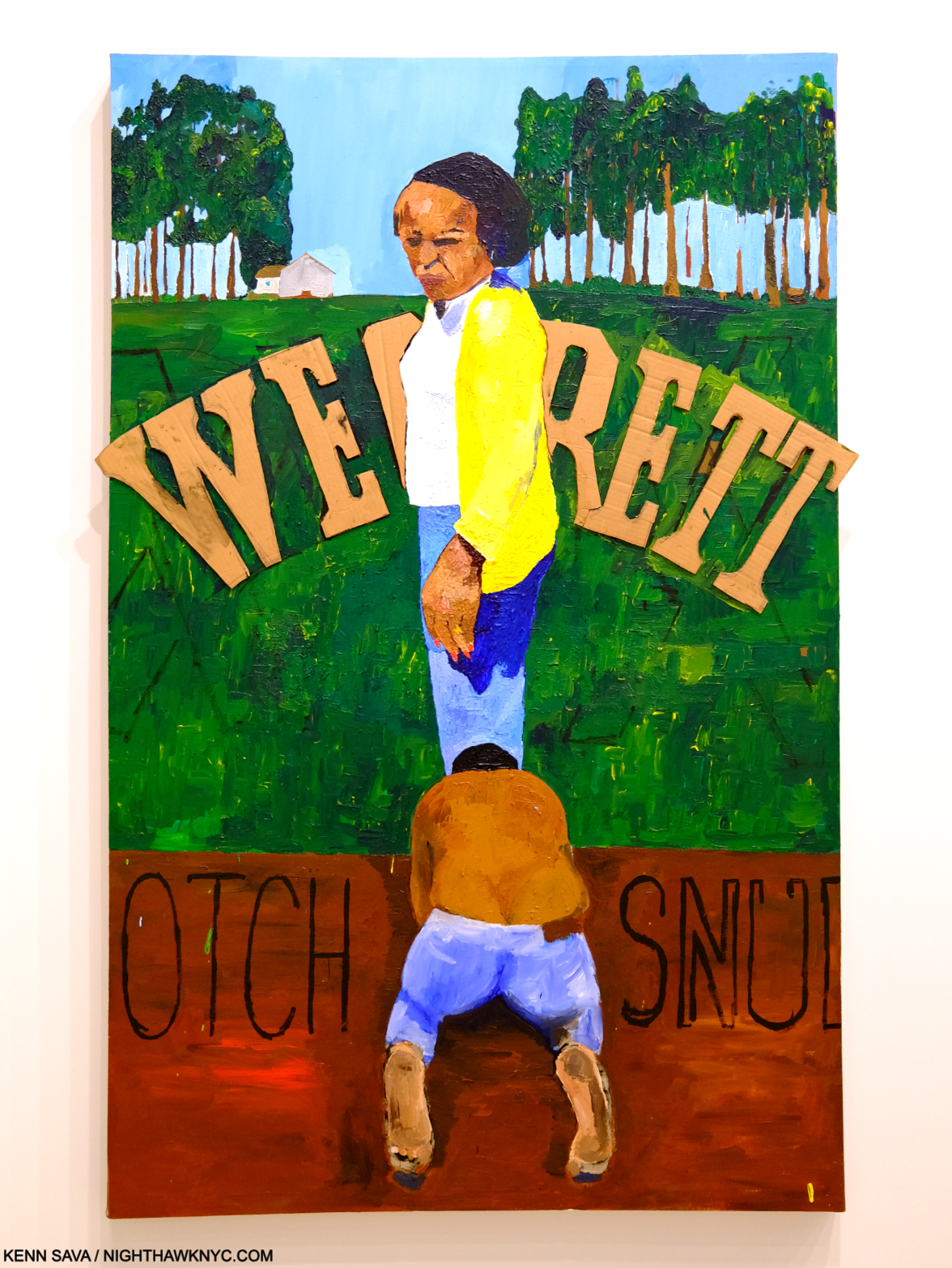
Wegrett, 2006, Acrylic and cardboard collage on linen. One of the most unique Portraits of an Artist with his mother in Art. The collaged cardboard seems to read “WE REGRET.” The wall card says- “Here, the words may allude to the pain he feels about the hardships his mother faced in her life. As Taylor explained, ‘I painted a picture of myself on my knees in front of my mama, and I don’t know why I painted that, but I just did, and I know I cried on that.'”

To complement his range, the show has been arranged by theme. As a result, B Side is a bit like a story with chapters; beginning with family, moving to his early creative days, and then to the subjects that hold his attention as a mature Artist. His current level of success doesn’t seem to have changed him or his Art one iota. Everything he’s done has that feeling of having been cut from the same cloth.

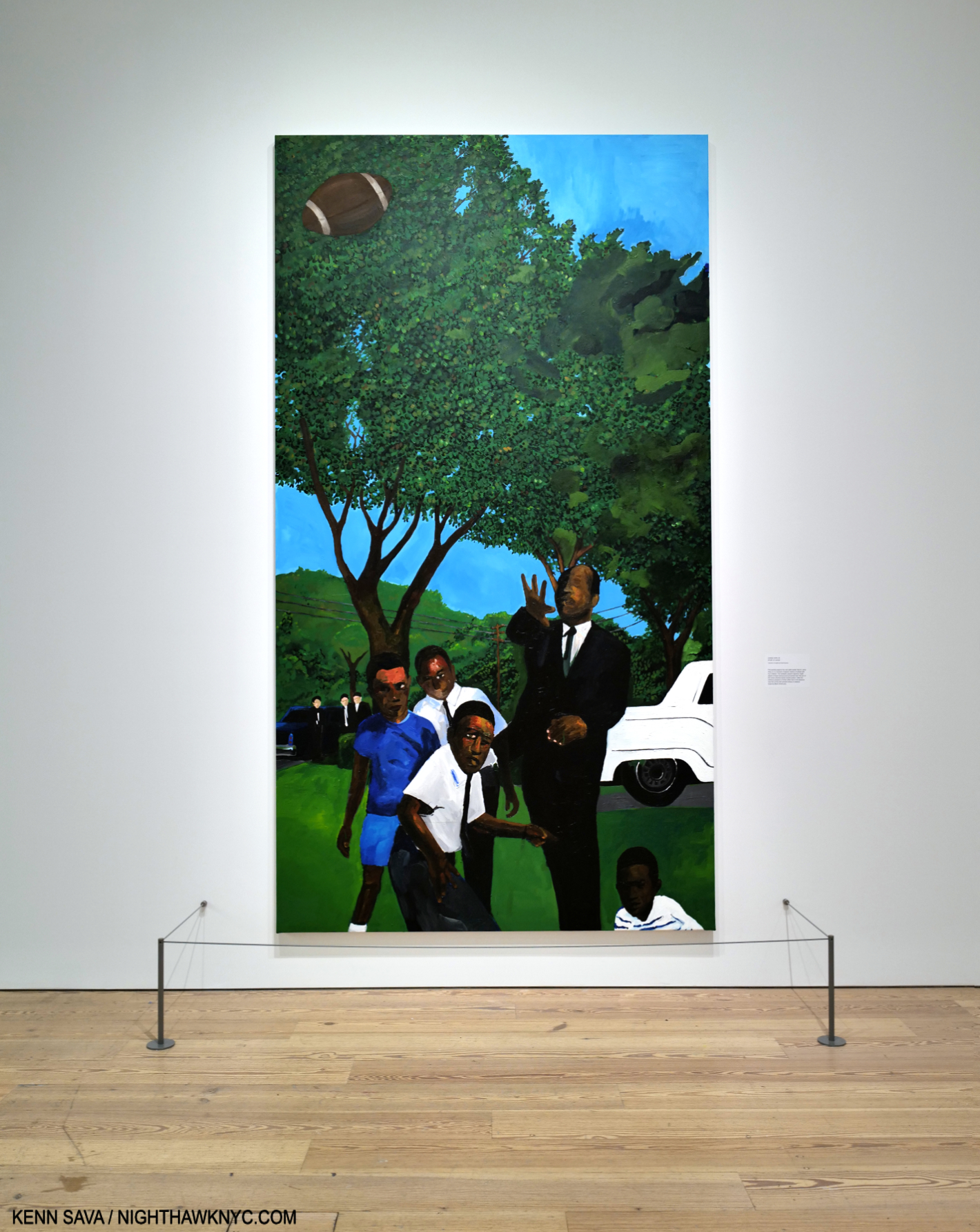
Untitled, 2016–22. Dr. Martin Luther King plays football with some kids while 3 ominous figures watch from the rear.

The first two galleries are devoted to Portraits, with an emphasis on his immediate and extended family, and some Self-Portraits. It’s hard to think of another Artist who has Painted his extended family so often and so strikingly (as in Untitled, 2022, shown earlier, of his brother, Randy- one example). Throughout B Side, I was fascinated by the Artist’s choices in creating his Portraits. Specifically, his choices of when and which facial details to include (as in Untitled, 2016–22, above, and Too Sweet, 2016, earlier). Are these done to cause the viewer to look elsewhere besides the face, or to make them look closer? This is a bit reminiscent of what Edward Hopper did on occasion, as in his Room in New York, 1932, as I discussed here.

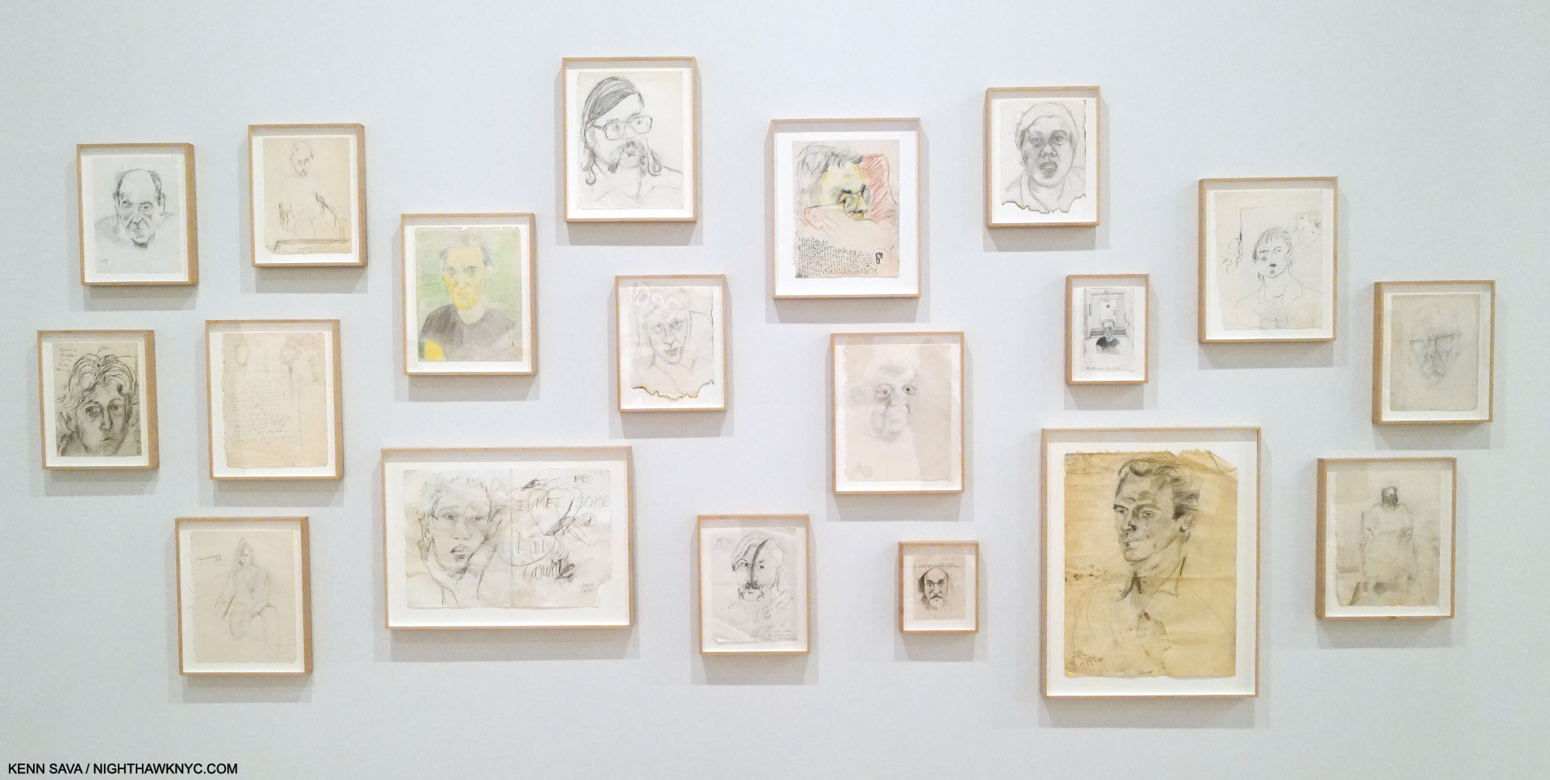
First work. A collection of Henry Taylor’s Portrait Drawings of patients he worked with at Camarillo State Hospital, 1985-95, Graphite on paper. One is Pastel, colored pencil and ink on paper. These date from during his time as a student at Oxnard Community College and then the California Institute of the Arts (aka CalArts).

The third gallery took the viewer back to Henry’s beginnings as an Artist. Born in 1958, he spent the decade from 1984 to 1994 working as a psychiatric technician at Camarillo State Mental Hospital, Camarillo, CA.3. During this time, he created his earliest known work, Drawing and Painting a number of the patients he worked with: adults living with developmental disabilities or mental illness as well as those seeking treatment for substance use disorders, developing close relationships. 

“I learned not to dismiss anybody,” he recalls. “It just made me a little more patient, a little more empathetic. It taught me to embrace a lot of things. A lot of people will avoid a person who doesn’t appear normal, but I’m not like that.” Henry Taylor, in a must-read 2016 interview, here.

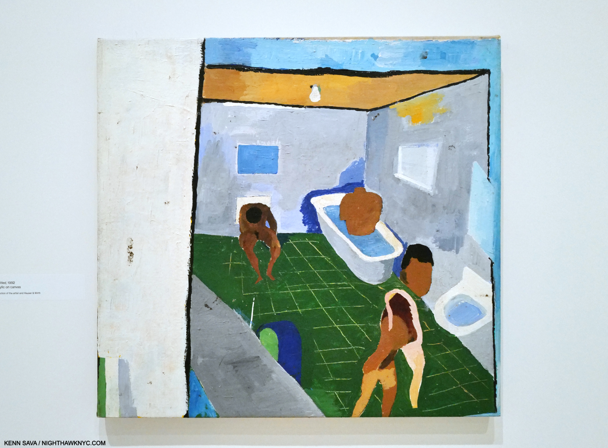
Untitled 1992. One of the earliest Paintings in the show. When B Side opened in October, I was buried in my piece on Van Gogh’s Cypresses which I published in November. Cypresses mostly takes place when Vincent was a patient in an insane asylum. Therefore, it was impossible for me not to make a connection between Henry’s experiences and Vincent’s. When I first saw this Painting, I was immediately reminded of Photos of the bath tubs Vincent was assigned to for therapeutic treatment in the San Remy Asylum almost exactly a century earlier.

For the last half of that decade as a psych tech, he was also a student at CalArts where he was at least a decade older than his fellow students, graduating in 1995 (among numerous others, Ed Ruscha was a 1961 graduate). Henry began his Art career at 37. After struggling to find representation and recognition, the world has gradually caught up with him to the point that 30 years on, he’s now one of our more influential and respected Artists, with a blockbuster Retrospective that appeared at the Museum of Contemporary Art (MOCA), L.A. before moving to the Whitney.

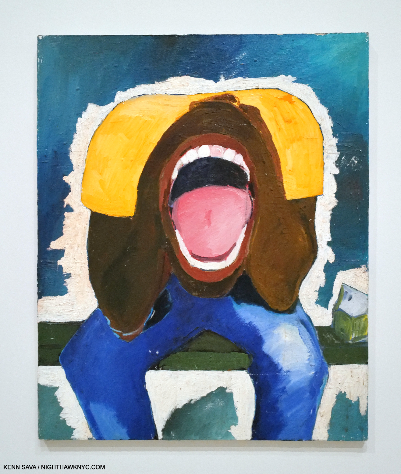
Screaming Head, 1999, Oil on canvas. Just wow.

Working with his patients turned out to have a decisive impact that would continue in everything he’s done. Early on in his career after graduating, Paintings, like this one, continued to speak to his Camarillo experiences. 

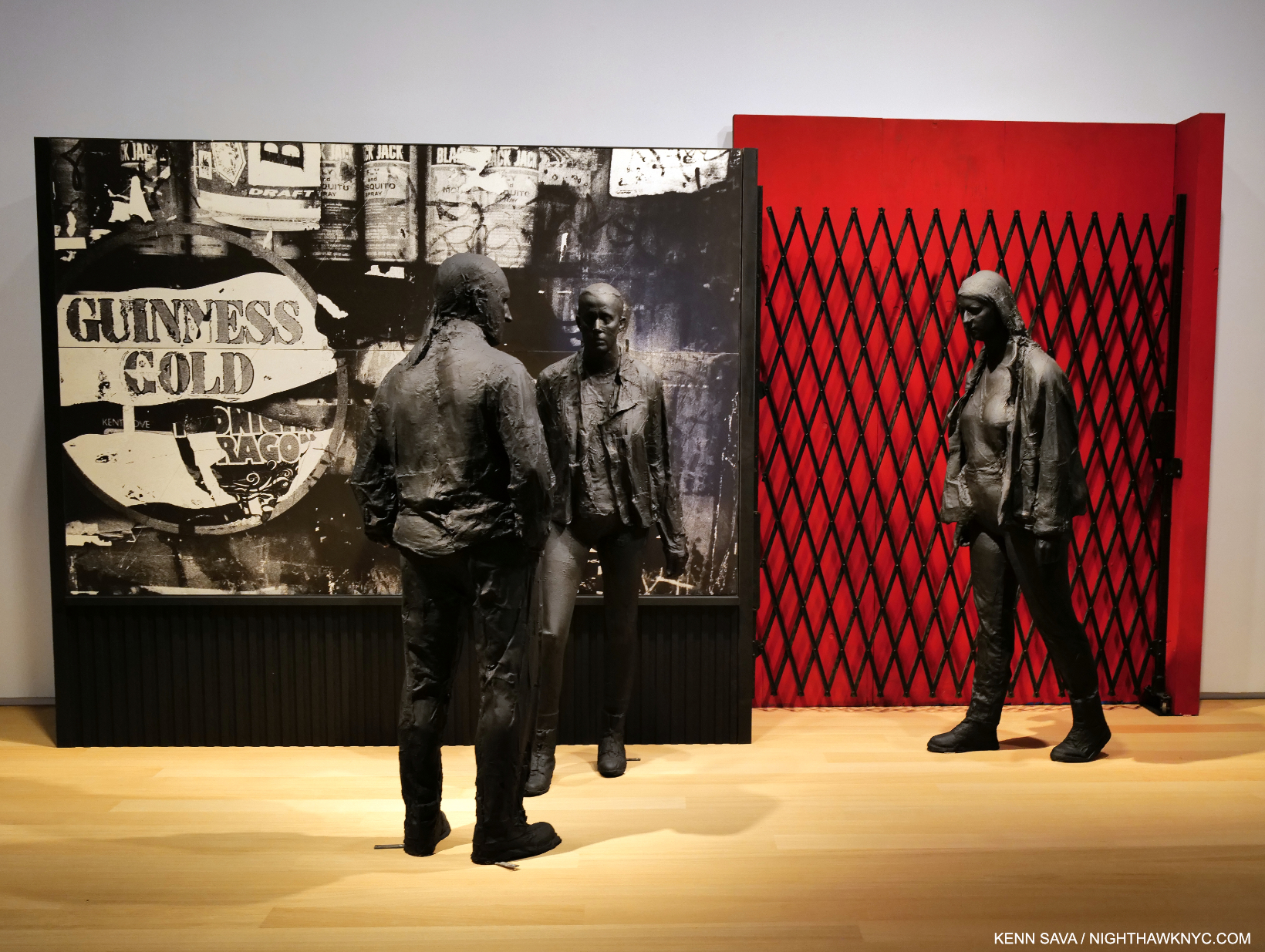
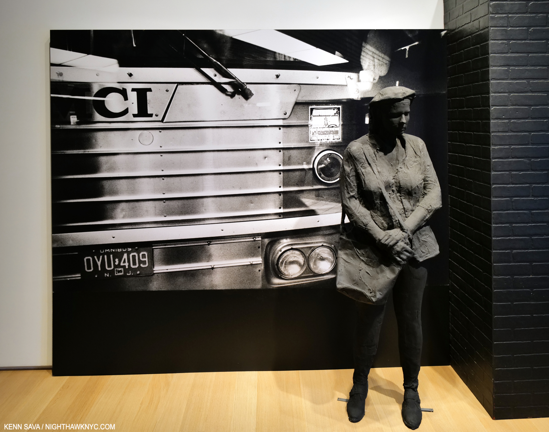
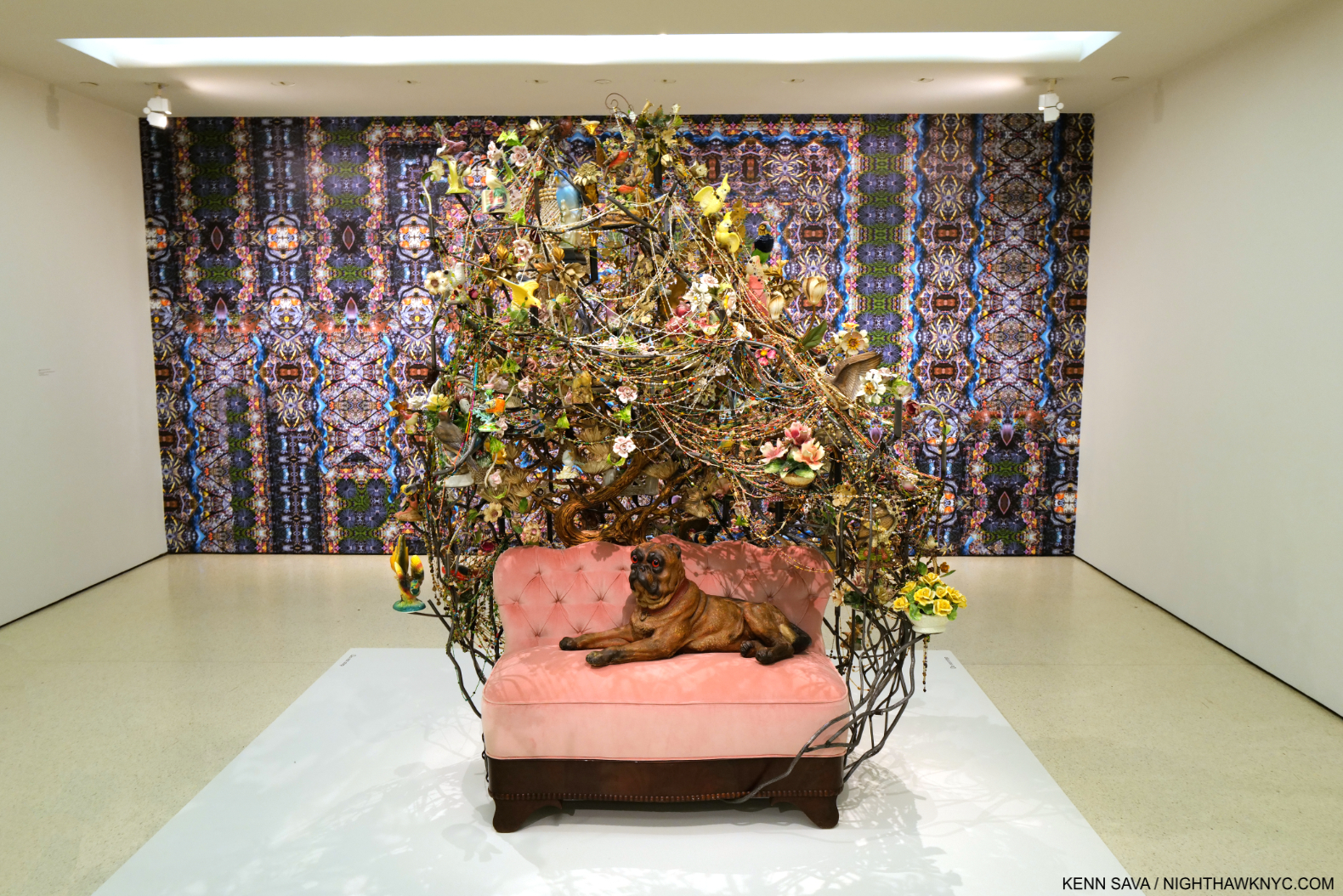
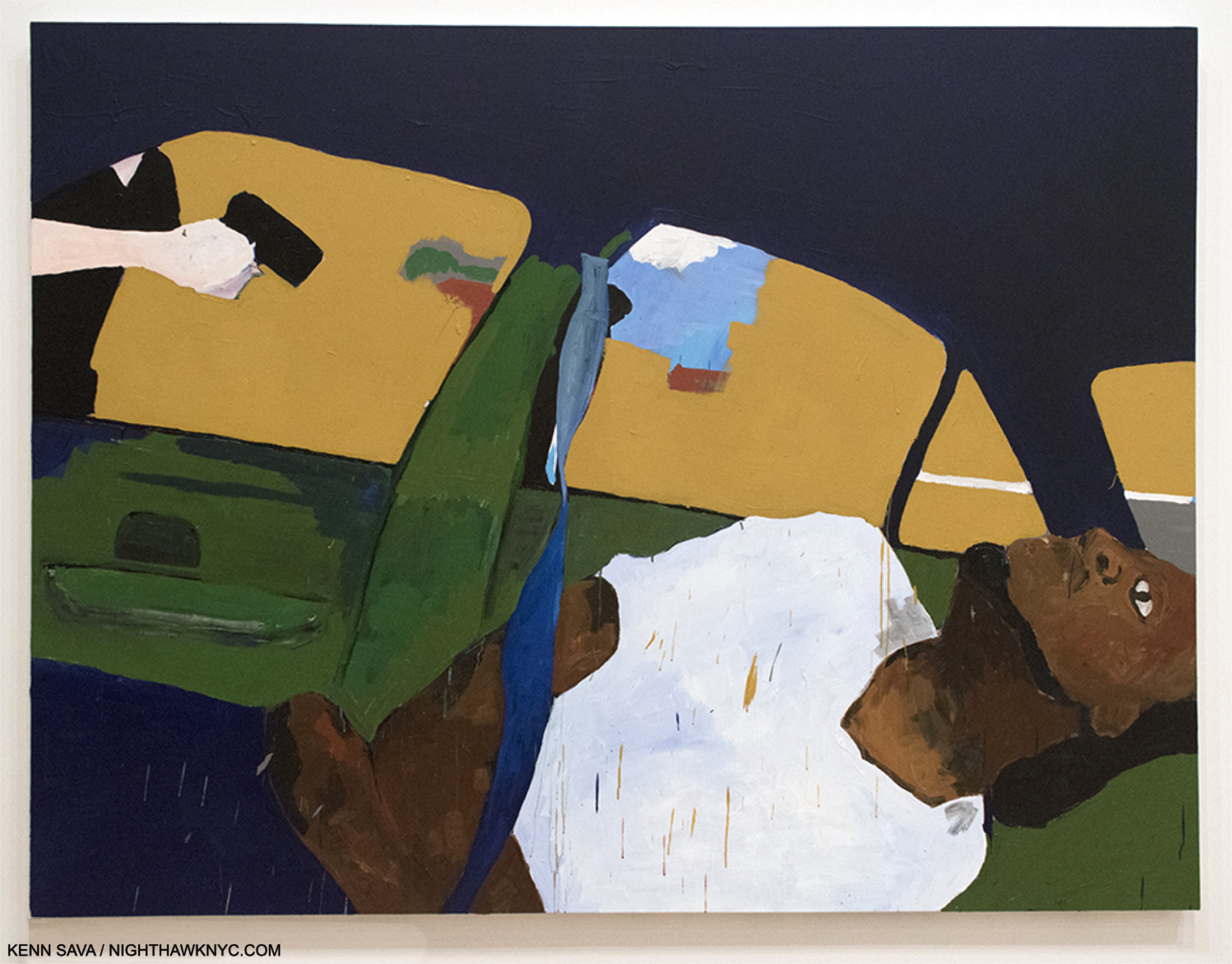
From there the visitor emerged into two large parallel galleries that lie at the center and heart of the show largely focused on being Black in America. The first one ranges from a 4th of July cookout to incarceration to the show-stopping THE TIMES THAY AIN’T A CHANGING FAST ENOUGH, 2017, depicting the murder of Philandro Castile. On the other side of the wall, the other large gallery features Paintings related to the Black Panthers and a large installation recreating a Black Panther speech with appropriately attired mannequins.

THE TIMES THAY AIN’T A CHANGING FAST ENOUGH, 2017. Per the wall card- “Taylor has said that he was motivated to paint this scene immediately upon learning about it- ‘I don’t even think I thought about ever showing that one when I painted it; it was just something I had to get out of my head.'”

THE TIMES THAY AIN’T A CHANGING FAST ENOUGH is the most powerful Painting I’ve seen this century. It’s hard for me to think that history worn’t regard it as akin to a (Goya’s)  The Third of May 1808  of our time.

“Taylor’s paintings occupy a new and different space within Black radical aesthetics,” Charles Gaines, Artist4.

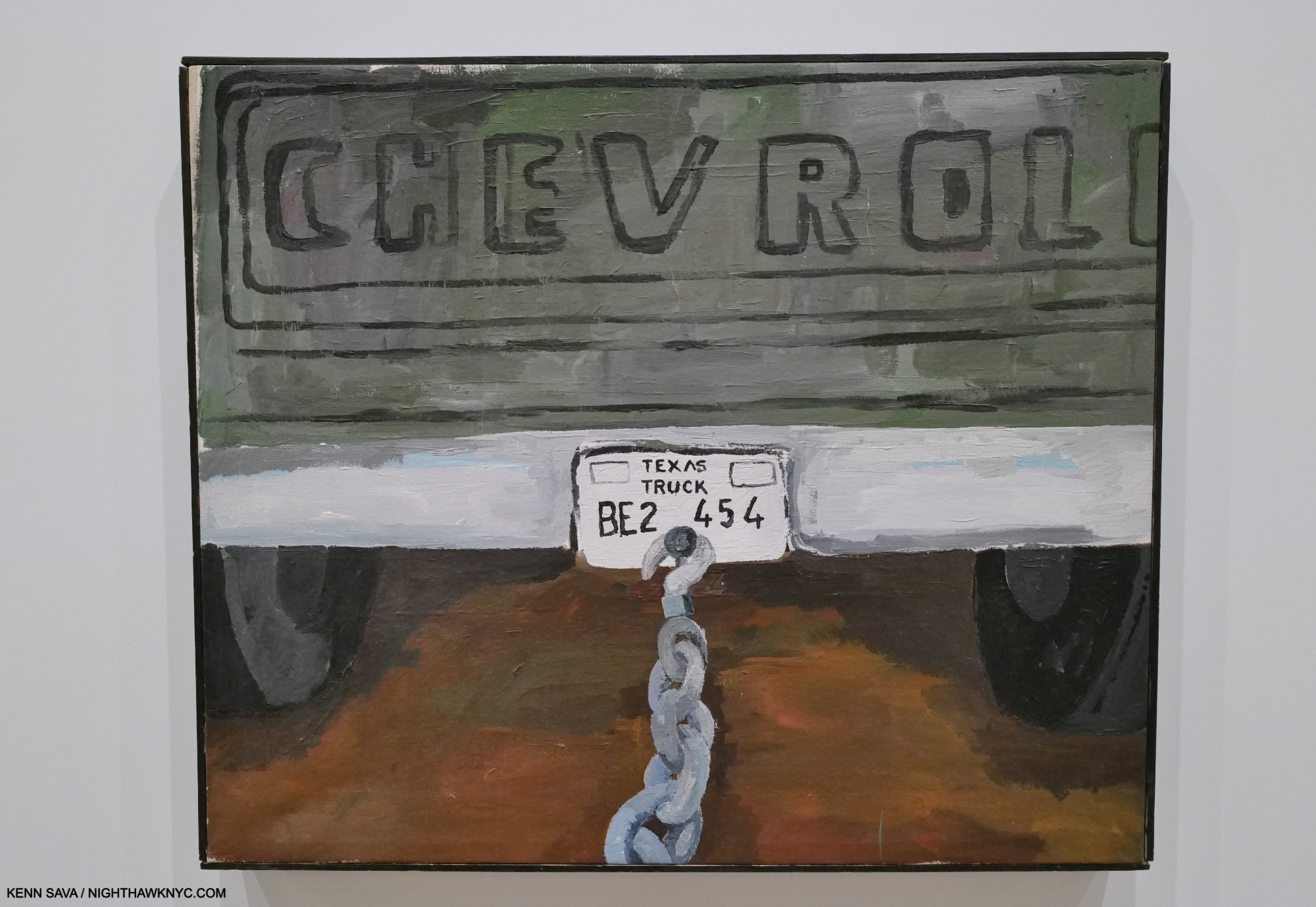
too much hate, in too many state, 2001. From the wall card: “This painting places the viewer in the vantage point of James Byrd Jr., a Black man who was abducted and murdered on June 7, 1998, in Jasper County, Texas, by three white supremacists who chained his ankles to the back of their pickup truck and dragged him to his death. The brutal murder led to a national outcry, prompting calls for stronger hate crime legislation.”

While it’s front and center in  THE TIMES THEY AIN’T A CHANGING FAST ENOUGH, and too much hate, in too many state, “social criticism” in Henry Taylor’s work is often equally subtle, but always sharply on point. On the other side of the wall was a large gallery centered around the Black Panthers, including this remarkable installation-

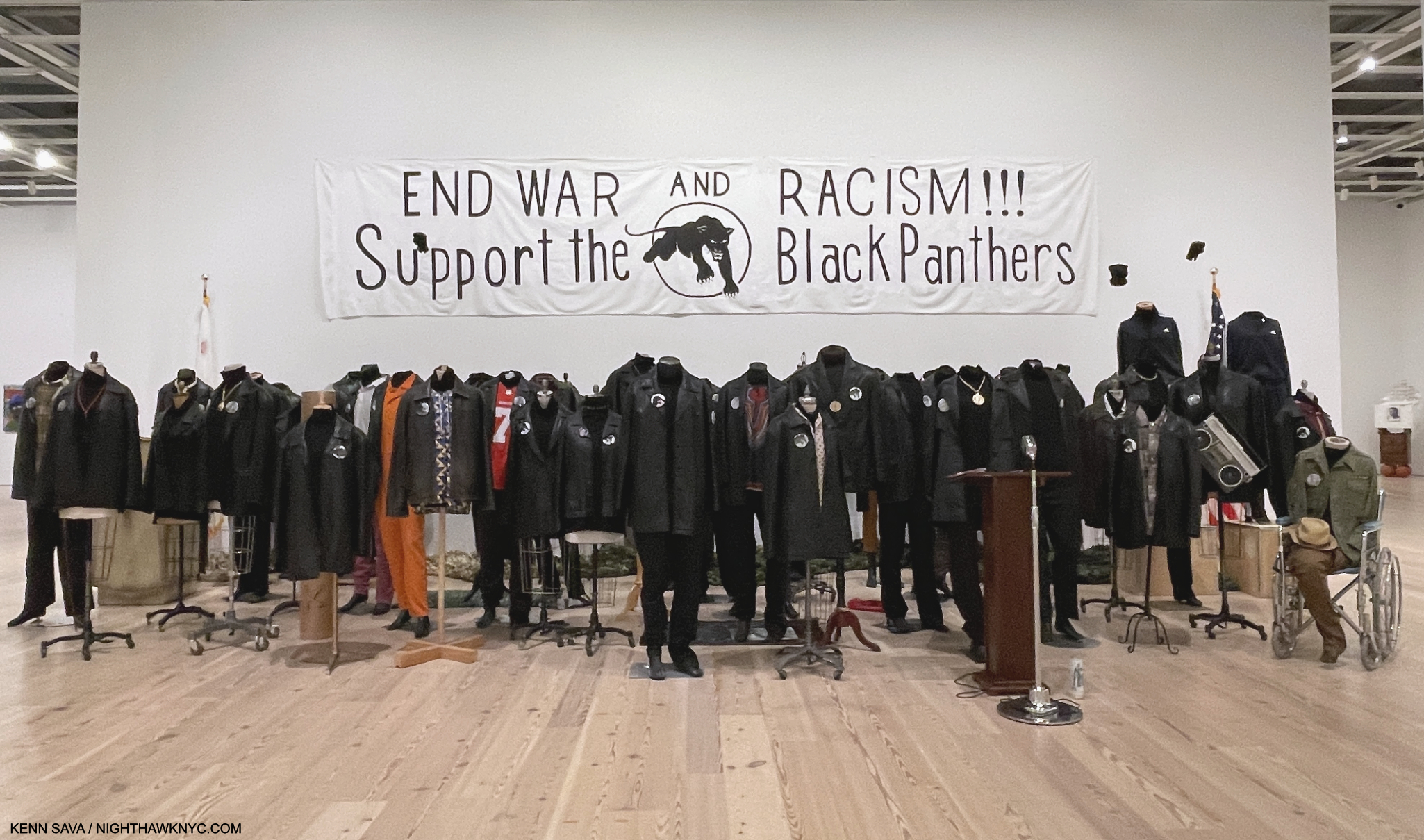
Untitled, 2022, Mannequins, leather jackets, and posters, including a Colin Kaepernick 49ers jersey.

The wall card informs us that Mr. Taylor created this installation to honor the Black Panthers and his brother, Randy, who was active in his local branch. Adjacent to it were Photographs of many of those recently killed by police, bringing past and present together. On the other two walls of the gallery were Paintings of former Panthers Huey Newton, and this remarkable rendering of Eldridge Cleaver, looking like you-know-who out of James Mc Neill Whistler.

Eldridge Cleaver, 2007.

Along with the outcast, B Side also showed figures who have gone on to attain and achieve: quite a few of them.

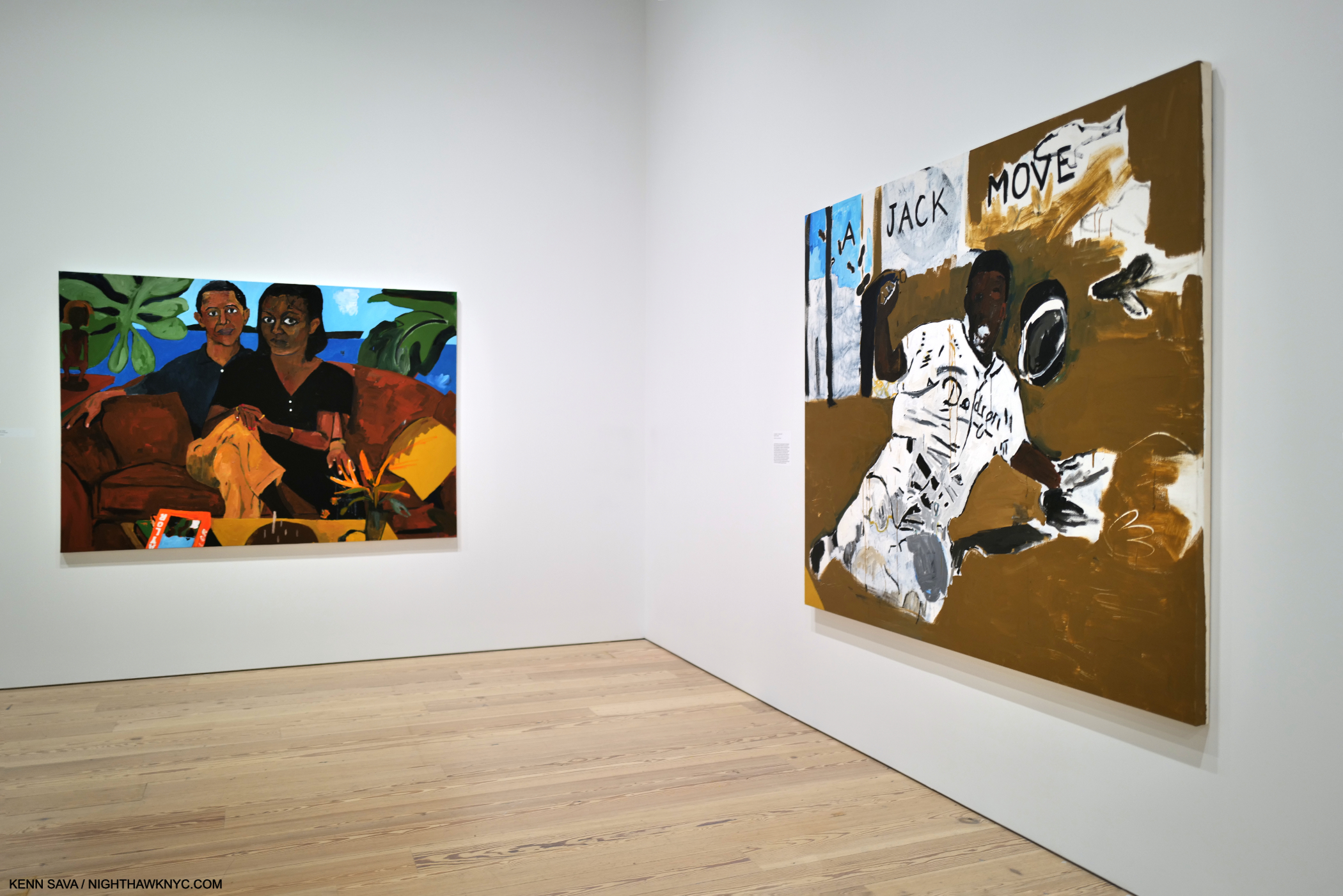
A counterpoint to his Portraits of the overlooked and outcast, was a room of Portraits of celebrities, that included Chuck Berry, Jay Z, and Haile Selassie, were this Portrait of Jackie Robinson, A Jack Move-Proved It, 2011, right, and Michelle & Barak Obama, Untitled, 2020, left, sporting a copy of the Henry Taylor Rizzoli monograph of their coffee table.

And then there was this remarkable pairing-

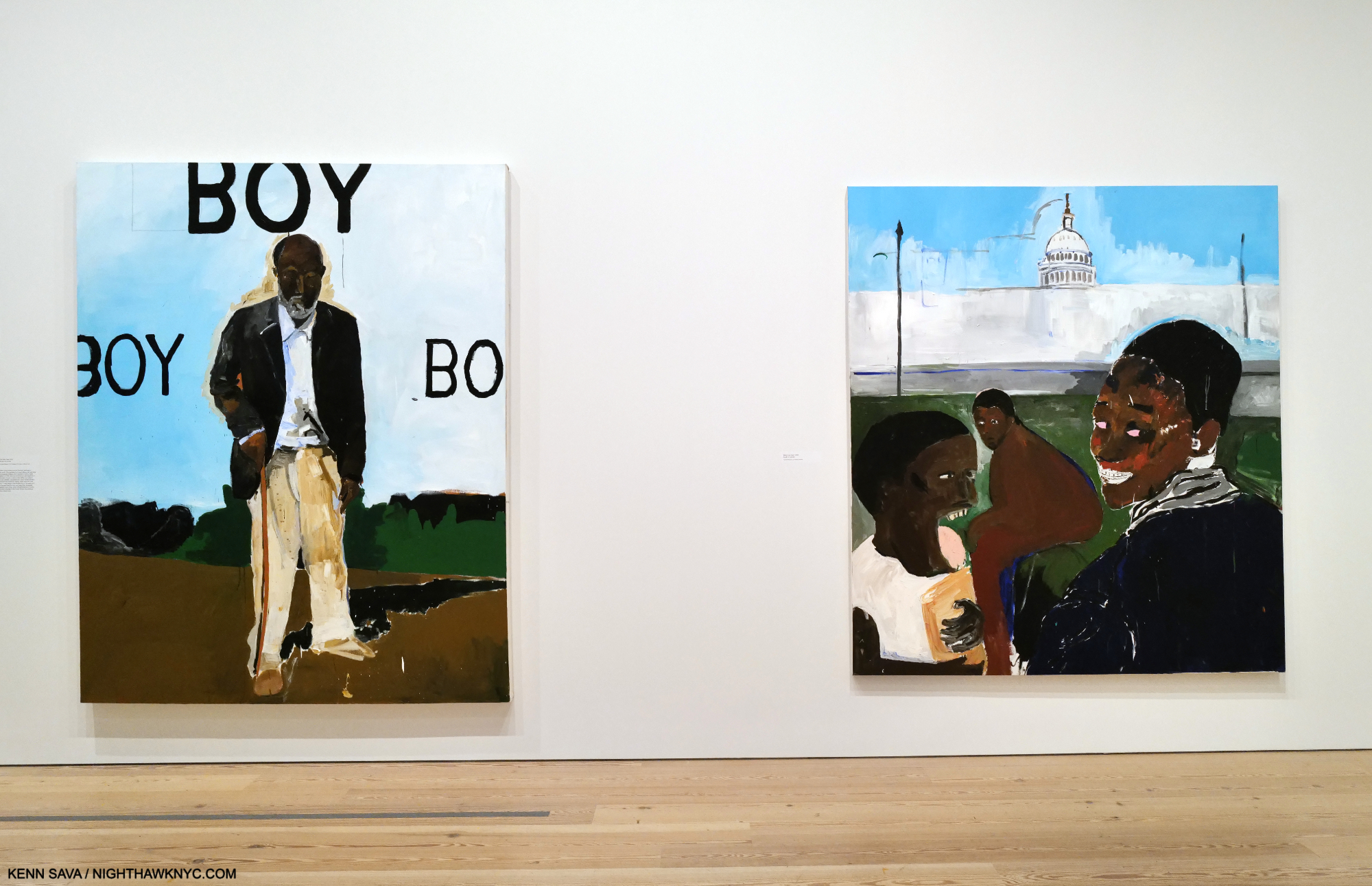
That Was Then, 2013, left, depicts an older Black man who has probably heard the racist slur surrounding him many times, and Watch Your Back, 2013,

Fresh, exciting, bold, beautiful, direct yet mysterious, subtle and powerful, the Art of Henry Taylor has something for everyone, and I suspect that people many years in the future will continue to find that in it. B Side was a show that honored “outcasts” and the inspiring achievements of icons side-by-side, while pulling no punches about the world both of them, and the rest of us, live in.

For all those reasons Henry Taylor: B Side was a landmark show. A near perfect mid-career Retrospective in my view.

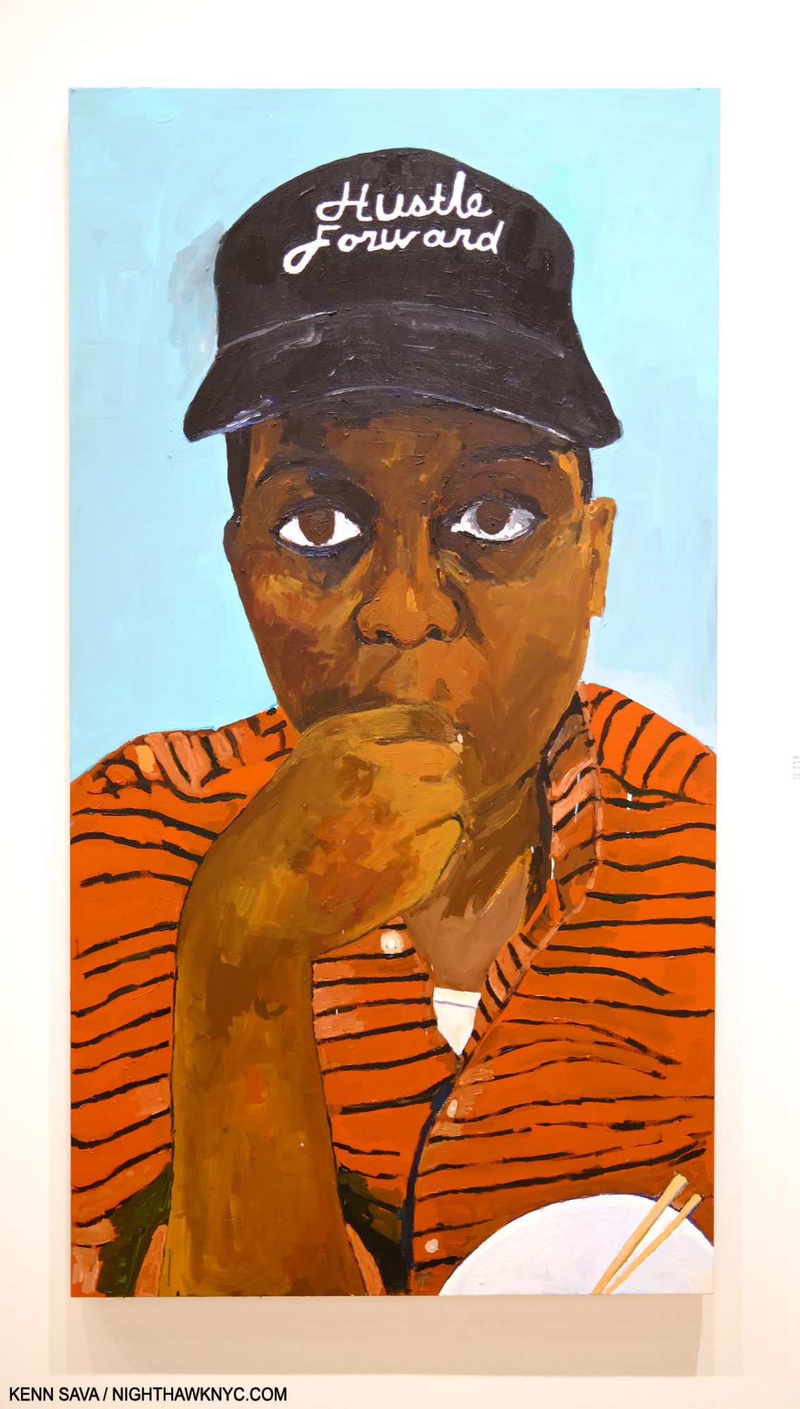
Man, I’m so full of doubt, but I must Hustle Forward, as my daughter Jade would say, 2020. Ladies & gentlemen, the one and only Henry Taylor.

It seems to me that to be able to face ALL of this with dignity and empathy for others is a remarkable thing; something all-too-rare today. As great as Henry Taylor’s Art is, this says even more about Henry Taylor, the man.

*- Soundtrack for this piece is “Sign O’ the Times” by Prince, performed live here in 1987 during Henry Taylor’s Camarillo days-

NighthawkNYC.com has been entirely self-funded & ad-free for over 8 1/2 years, during which 320 full-length pieces have been published! If you’ve found it worthwhile, PLEASE donate by PayPal to allow me to continue below. Thank you,  Kenn.

You can also support it by buying Art, Art & Photography books, and Music from my collection! Art & Books may be found here. Music here and here.

Written & photographed by Kenn Sava for nighthawknyc.com unless otherwise credited. To send comments, thoughts, feedback or propositions click here. Click the white box on the upper right for the archives or to search them. Subscribe to be notified of new Posts below. Your information will be used for no other purpose.

  1. Antwaun Sargent on Artsy in 2018
  2. Antwaun Sargent on Artsy in 2018
  3. Where Charlie Parker was famously sent for six months in 1946, and supposedly immortalized it in “Relaxin’ at Camarillo,” though he hated that title his producer gave it. It’s also rumored to be euphemistically referred to as “Hotel California” in the Eagles song of the same name.
  4. Henry Taylor: B Side Catalog, P.60

Sarah Sze & Frank Lloyd Wright: A Match For The Ages

This site is Free & Ad-Free! If you find this piece worthwhile, please donate via PayPal to support it & independent Art writing. You can also support it by buying Art & books! Details at the end. Thank you.

Written & Photographed by Kenn Sava.

Show seen: Sarah Sze: Timelapse @ The Guggenheim Museum. This is Part 1, an overview. Part 2 looks at details from the show here.

Written on my soul. Frank Lloyd Wright’s signature adorning his trademark red square “cornerstone” on his round building. The dates attest to how long it took to get this building approved & completed, which every other of his many NYC projects weren’t. Seen September 5, 2023. Click any image for full size.

Those who have seen elements of Architectural design in some of the fantastic structures Sarah Sze includes in her impossible to categorize shows over the past few decades might be left with a sneaking suspicion the Artist has a desire to be an Architect. She would actually come by that honestly. Her father was an Architect, and Sarah, who began as a Painter, studied Painting & Architecture in school before graduating with degrees in both from Yale in 1991. After shows and Public Art installations all over the world, this past summer she met her match. To create work that holds its own in Frank Loyd Wright’s iconic Guggenheim Museum has been a standing challenge for Artists since it opened 65 years ago.

“It’s really a building that frames a void….How do you take on the most incredible void created in recent time in Architecture and talk to it in the slightest way?” Sarah Sze.

Installation view of 4 of the 8 Bays that made up the main section of Timelapse on the 6th (top) floor, September 5, 2023. Extra points if you see the very faint black string running from right to left against Wright’s Oculus (the skylight). It’s a unifying element of the show, though I’m not sure how many visitors spotted it as such. I’ll explain.

In Timelapse, Sarah Sze’s Art was installed outside and inside Wright’s masterpiece, the last major work of the Architect’s 7-decade career, and one that stands completely apart from everything else the he created, at least to my eyes. In it, she “dialogues” with Wright in the most innovative ways I’ve seen mounted in the Guggenheim, at least since Danh Vo’s spectacular show in 2018. Though the show “only” consists of projections on the building’s exterior, an installation in the ground-floor pool, 8 more installations in as many Bays on the Rotunda’s top floor, the freight elevator ramp, and the large rear gallery, I was told by a Guggenheim Staff Member it took five and a half weeks to install! That’s a long time for a significant part of the Museum to be closed. I can’t imagine the deinstallation was all that much quicker. Though it was up for only as many months (March 31 through September 10, 2023), it’s a show that’s hard to stop thinking about. Hence, it’s taken this long to complete this piece, which marks where I’m at in pondering it to this point.

“What I love myself about the experience of art is the sense of this moment of discovery when I’m seeing a work of art. And actually, that can happen a year after you see a work of art. You don’t always know how good a work of art is until you see it and you remember it in retrospect.” Sarah Sze.

Time is a river that flows on and on, through our lives. It may be that for most of us images mark time in our lives in any number of ways. We may remember our childhood & youth through a handful of images taken in the distant past, as we do so many significant events in our lives since. As time goes on, the pile of internal images gets edited down to those we feel are most significant. In a sense, this is something akin to “timelapse” Photography or Film/Video by which a succession of images are taken at intervals to record change over a given period, resulting in a simultaneously accelerated and collapsed sense of time. Timelapse considers “how we mark and measure time- constructing our own personal timelines of memory through images and fragments of experiences that are constantly evolving…a contemplation on how we mark time and how time marks us.” Sarah Sze (quoted in the press kit).

Media Lab, 1998, Mixed Media, installed along the wall adjacent to the freight elevator.

As such, it’s a show of Art that is focused on images. That marks an extraordinary transformation in the Art of Sarah Sze over her career. Early on, her work was object based and seemed to qualify as “Sculpture” to many people. Gradually, beginning with Media Lab, 1998, now in the Guggenheim’s collection, and almost hidden here in a corridor for the freight elevator, her work has come to include and feature images more and more, as I saw in her last NYC gallery show in 2019. The images start right away.

Cards without walls. The “wall card” for the video projections on the outside of the Guggenheim.

Timelapse begins with 2 video projections on the Museum’s exterior walls which I missed because the Museum closed at 6 and the sun wasn’t setting until 8 at the time. So, Timelapse started for me inside on the ground floor. The exterior projections turned out to be the first sign that images flow continually through all of Timelapse, showing how central they are to Sarah Sze’s work today. “Sculptor?” Good luck boxing her now!

  “The Renaissance, the Baroque, everyone was doing painting, architecture, sculpture that was Bernini, Michelangelo, that was par for the course,” Sarah Sze1.

“When is there water in a museum?,” the Artist asks on the audio guide. Inside, Timelapse begins in Wright’s pea-pod shaped ground level pool. Diver, 2023, First of two parts, Multimedia installation, and The Night Sky is Dark Despite the Vast Number of Stars in the Universe, 2023, First of two parts, Acrylic paint, string, paracord, and wood. A pendulum hovers over the hammock & the pool with a video projected onto it of Sarah Sze’s finger stroking water (in blue above). Note the string extending up from the pendulum extending into the void. (Gego: Measuring Infinity filled the rest of the Rotunda.)

Installed over Wright’s pool, the “hammock” looks like a restful place from which to ponder the river of images playing continually in your mind. The first video inside is a projection on the pool of Sarah Sze’s hand stroking water, taking “dialoguing” with Frank Lloyd Wright literally and with sublime subtlety! A pendulum “points” to this area, beckoning the viewer to look at it.  The pendulum is attached to a black string that extends up into the void, all the way to the top! Using this simple means of measuring with a plumb line, Sarah Sze at once measures the void, interacts with it, and leads the viewer to the main part of the show.

Sarah Sze, Guggenheim as a Ruin(!), 2009, Ink, string, collage on paper, 50 x 32 inches. (Exclamation mark mine.) An indication that Sarah Sze has been thinking about the Guggenheim for a long time. Notice the red string coming down from the top! It splits in two, and the right part seems to wind up over the ground floor pool, which has spilled on to the floor. Seen in the book Sarah Sze: Infinite Line. Not in the show.

“There is fragility in drawing a line through space; with this one simple powerful gesture, you can occupy an entire space.” Sarah Sze on the wall card.

The more I thought about it, though a mere speck compared to Wright’s huge open space, the string has come to “occupy” it in my mind.

While you’re lying on your back in the hammock, here’s your (approximated) view of Wright’s Oculus. See that small speck just south of 5 o’clock on the white glass (and the faint line running down from it to the right)? That’s the hub where the black string’s rise culminates before sending it off across the void to the main installation of Timelapse on the other side, (as shown in the 2nd picture). There are countless amazing details everywhere you look in the show. Therefore, I’ve decided to present an overview of the show in this piece and show details in a Part 2.

Taking Wright’s unique elevator to the top (as he intended visitors to do) and walking down, (usually, actually up in this case), visitors find the black string already there waiting in front of them. Following it still higher, I noticed it was anchored to a hub that sent it to multiple points all the way across the void to the other side of the 6th floor.

Bay 1. The Night Sky is Dark Despite the Vast Number of Stars in the Universe, 2023, Second of two parts, Acrylic paint, string, paracord, and wood and River of Images, Part two (white circle on the left). The near string holding the hammock is the continuation, and terminus, of the black string from the pea pod pool.

Walking to the beginning of Timelapse on 6, I had the deja vu experience of seeing another blue hammock, one end of which was anchored to the black string. Though dated 2023, the hammock and the one in the pea-pod pool are very similar to one she created in 2015 titled Hammock, down to the “confetti” on top of it (and similar to the one installed on the pool as we saw). Along side is a pile of A/V equipment, “enhanced” with torn analog Photographs, and a wide range of objects that make the viewer think, “Ah, this is not just A/V equipment, it’s part of the piece.” These equipment installations are to be seen at the beginning and end of each Bay, in varying degrees of complexity, and typically, with an inventory of a staggering number of items- generally her trademark common items, seen in most of her pieces, but also small, often very complex “Sculptures.” Since every Bay has a variety of these, they add a sense of unity and continuity to the entire floor as the viewer moves from Bay to Bay. 

Bay 2, Travelers Among Streams and Cascades, 2023, Oil paint, acrylic paint, inkjet prints, acrylic polymers, string, and ink on Dibond, aluminum, wood and paper on 6 panels, 114 x 245 inches. All the pieces on the 6th floor are dated 2023- including the Paintings! Since the show started going in around April, that means Ms. Sze must have been unimaginably busy earlier this year. More than likely, the show was in the works during the pandemic.

In an interview, Ms. Sze hoped that Timelapse would inspire a “I didn’t know you could do that in a museum,” reaction in viewers (especially young Artists)1. Meanwhile, River of Images (Part two), a continuation of the exterior projection, moved along each wall on 6, flowing from Bay to Bay and across all the Art as you stood and looked at it.

Closer to the extraordinary 20 1/2 foot Travelers Among Streams and Cascades, “mounted” on shims and a level, further reinforcing the “off-balance” experience of seeing Art in the Guggenheim. I wondered- Would Wright smile at this, or be offended?

Speaking of its focus on images, one thing I was extremely happy to see was that Sarah Sze has included four of her remarkable Paintings in Timelapse, each of which was dated 2023. Her style seems to have evolved since those seen in her landmark 400-page book, Sarah Sze: Paintings (a NighthawkNYC NoteWorthy Art Book of 2023). Though each Painting in Timelapse was quite strong, Travelers Among Streams and Cascades, in particular, struck me of attaining yet another level.

“The paintings for me are more about how I actually see in my head.” Sarah Sze1.

I was stunned when I heard her say that. In another interview, the Artist spoke of having them be a portal to the world beyond the walls. Given each piece in the show is newly created and site specific, it’s fascinating to ponder that when looking at the Paintings and how they’re installed. Each Painting is displayed in an exceptionally unique way. In fact, over the countless Paintings that have been exhibited in the entire, 65-year, exhibition history of Frank Lloyd Wright’s Guggenheim I seriously doubt that ANY of these installation scenarios have been seen before.  

Bay 3. “Elements of Architectural design,” as I wondered in the first sentence? The massive and incredibly intricate Slice, approached from what turned out to be the back. In Timelapse, Ms. Sze continually plays on the “off-balance” feeling viewers have walking up and down Wright’s angled ramp. Here, notice the “shims” she’s placed under Slice to level it, which she’s chosen to leave visible for emphasis. Another way of dialoguing with Wright. Elsewhere, actual levels are seen are various points in the show. As in the prior picture, and as I show in Part 2.

Speaking of the installation, in spite of the numerous delicate assemblages and many small items installed on the floor, Sarah Sze reported during the run of the show that nothing had been broken, even after a weekend of 15,000 visitors. She attributed this to viewers moving slowly through the show.

Ms. Sze’s Art dialogues with Wright in numerous fascinating ways, while advancing her themes of time and memory in images. For one thing, as anyone who has been to the Guggenheim knows, the Rotunda’s Ramp is on a continual slope. Upward going up, and downward going down, creating a sense of being off-balance. Tripping and catching yourself-a central idea of the Baroque1,” she said. Sarah Sze makes a point of showing the viewer how this affects her work, adding shims under parts of the huge Slice, or filling a large tank part way, making the fairly steep angle of the floor’s slope obvious . She equates this with creating a sense of being “off-balance” for the viewer who also often can’t tell if an image is digital or analog. “Equilibrium” is also reinforced by her use of 3 pendulums hanging from the black string at various points along its journey.


Slice, from its “front,” in dialogue with Wright’s Oculus. Barely visible behind the first step of the near ladder is her model of Slice in this Bay (which I show close-up in Part 2). I found the piece transcendent, and it wasn’t the only one that was. Timekeeper, 2016, installed in the large rear gallery, and displayed for the first time in NYC, seems to mark time on a grand scale. Here, the Artist dialogues with the building while giving us a “slice of time.”

As she has done in a number of recent works (like Crescent (Timekeeper), in her 2019 Tanya Bonakdar show), many of the images in Slice were actually miniature video screens so many of the images changed independently(!) as you watched. As for the images themselves, nowhere in the exhibition catalog, the check list, or the accompanying materials does it specify whose Photography we’re looking at. I’m assuming they’re by Sarah Sze.  

Bay 4, Diver, Second of two parts and Images That Images Beget on the back wall. In this work, there is a torn Photograph of the Sun, attached to the oscillating fan (shown close-up in Part 2). This image is followed by other images of the Sun on a a string  that make a trail to Images That Images Beget, which has a Sun in its center, as you can see below. Note the slope of the water in the tank. “Water in a museum,” part deus. In her Drawing for this piece, the Artist had the water in the tank right up to the top on the right.

All four Paintings were installed uniquely in my experience of 43 years of going to Painting shows. Bay 6 was one of two Bays that used strings with Photos mounted on them as a compositional device that either led to the Painting on the back wall, or referenced it. Installing them this way created an entirely new way of experiencing a Painting as you can see here-

Following the Suns. Images That Images Beget, 2023, 129 x 103 inches, Oil paint, acrylic paint, inkjet prints, acrylic polymers, and ink on Dibond, aluminum, wood and paper, on 4 panels, with a string, containing Photos, leading to it from the tank.

I found this a fascinating way of drawing the viewer into the space and making him or her consider individual elements, like the Sun, and countless small objects installed on the floor, along the way to seeing the Painting. It also occurred to me that it’s a way of both measuring the space, occupying the space, as she said, and dialoguing with Wright. The whole idea of installing objects on the floor, which has been done many times, is taken to a new level here with countless small, even tiny, objects lying on the floor, some you can see in this picture (and more in Part 2). I wonder if that’s been done here before.

Bay 5, Times Zero, 2023, Oil paint, acrylic paint, inkjet prints, acrylic polymers, and ink on Dibond, aluminum, wood and paper, on three panels. Total dimensions, 97 × 120 1/2 × 3 inches.

Regarding the Paintings in Timelapse, and specifically about Times Zero, the exhibition catalog says, “The paintings in this exhibition were created in Sze’s studio in New York, where the artist meticulously replicated the museum’s Bays in 1:1 scale, allowing her to work quasi-in situ. In the case of Times Zero, Sze was struck by the angle at which paint dripped on the sloping shelf that runs from the wall to the floor (familiarly referred to as the “apron”).”

Here the Painting itself is destabilized by having its mirror likeness begin to come apart. The catalog continues, “She later photographed the work and digitally manipulated it in perspective to the incline of the apron. The resulting full-scale print was then ripped and the shards arranged below the painting itself, like a reflection in water or an imprint; the debris was left to overflow at the edge like liquid5.” She will revisit this “overflowing” effect in a subsequent Bay.

Bay 6, A Certain Slant, 2023, Multimedia installation, including two-channel color video projection, with sound, various durations; video projectors; inkjet prints; and metal pendulum. A number of the torn analog Photos lying around the circle are of hands and forearms, as I show close-up in Part 2. Hands being a running theme.

A Certain Slant reminded me of Sarah Sze’s piece Triple Point, which I saw at MoMA a few years back, in that it has a center pendulum suspended over a pile of unspecified material. In Triple Point, however, the pendulum makes a much wider arc seeming to threaten the surrounding objects. In A Certain Slant, it confines its arc to the area of the salt mound.

Sarah Sze, Triple Point, Multimedia, 2013, seen at the opening of the latest “new” MoMA, October 21, 2018. A work that represented the U.S. at the Venice Biennale that year. The title is a reference to the “triple point of water,” a state where it exists simultaneously as steam, ice and a liquid.

Seeing Triple Point at MoMA left me amazed that Sarah Sze’s work can be installed (in Venice in the case of Triple Point), disassembled and reassembled (at MoMA and elsewhere). Given that Timelapse is site-specific for the Guggenheim, however, it would seem extremely unlikely it will ever be reassembled in full again.

Bay 7. Last Impression (on the back wall), 2023, Oil paint, acrylic paint, inkjet prints, acrylic polymers, and ink on Dibond, aluminum, wood and paper
84 × 56 1/4 × 2 inches.

In Bay 7, one of the highlights of the show for me, the strings were installed across the Bay, preventing the viewer from moving past a certain point, as seen below. Along the series of strings, numerous empty frames were hung, which is interesting since the Painting is not framed. This continued on a unique installation on the large blue ladder nearby to the right, which I show in detail in Part 2.

Closer. The strings strung across the bay limit how close the viewer can get to the Painting, which looks like it could contain an enlarged fingerprint. I’ve also never seen a Painting installed on/lying on the ramp, as the small one to the left is.

The Painting, installed on the back wall, was also accompanied by numerous drips and marks that appear to be on the wall, again mimicking a studio situation as in Bay 6. Unlike the “overflow” seen in Bay 5, Times Zero, this time it appears paint runs down the apron and on to the floor. It made me wonder if Ms. Sze was allowed to Paint on the walls and apron, or if this is part of the installation as well, though that is paint on the floor.

The final Bay, 8, Things Caused to Happen (Oculus), 2023, Multimedia installation, including color video projection, with sound, various durations; video projectors; wood; stainless steel; inkjet prints; toothpicks; clamps; ruler; and tripods. The natural light obscures the light from the projection which shines on the central structure then leaks on to the wall on the left, with strings running to it, indicating the breaking up of digital images. I show this in Part 2.

The showstopper was Things Caused to Happen (Oculus), installed in Bay 8, the final Bay on the 6th floor. Seen from a distance, above, it looked like an alien craft hovering in the space surrounded by cameras.

Close up. Each little square and rectangle appears to be a screen with images projected on each independently! How, I don’t know. I show a short video clip of this in Part 2.

Closer up, it seemed to mimic a human head, possibly imitating a number of images continually playing inside of one. I don’t know about you, but I only have one screen playing in my head at any given time. Once again, as in Slice, somehow, these tiny images changed as you watched- independently. Some appeared to be slide shows, some appeared to be video.

In the large rear gallery, which became a gallery as part of the non-Frank Lloyd Wright expansion, Sarah Sze’s monumental and monumentally complex Timekeeper, 2016, was on view.

Also included in the show were two older pieces; Media Lab, the Artist’s first piece to include video was kind of hidden on the ramp of the freight elevator, shown earlier, and the large Timekeeper, 2016, making its NYC debut. It was installed in the large rear gallery off the 6th floor, a space not designed by Wright to be a gallery, and like all the other spaces added in the controversial expansion (which I fought at the time, resulting in my first published Art writing in The New York Times, and which I remain no fan of), I find seriously lacking as gallery spaces. Her huge Timekeeper, now a part of the Guggenheim’s collection, was installed in the center of the darkened room and its video projections moved across all four walls. Between Media Lab, 1998, to Timekeeper, 2017, to Timelapse, 2023, the viewer can trace how long Sarah Sze has been interested in time, how images mark time, and memories, how long she has featured images in her work, and how her work has evolved.

Timekeeper, detail.

When Timekeeper was installed in Brandeis University’s Rose Art Museum in 2016, their Press Release said that it, “blurs the line between organic and mechanical structure, its lifecycle marked by clicking and whirring and flickering images. It keeps a form of eccentric time that is entirely its own, remembering moments over and over again as time slips by. In this sense, Timekeeper has no relationship to the mechanical devices we use to mark the literal passing of time, but instead to the way we recall and replay our lives, in selected fragments that, strung together, account for the passage of years.”

In my February, 2020 piece on her most recent NYC gallery show, I called Sarah Sze a “genius,” the only time I’ve used that term on a living Artist in the 8 1/2 years of NighthawkNYC.com. I should point out that this was BEFORE I saw the Sarah Sze: Paintings book, OR her spectacular recent Laguardia Airport installation. Exactly 4 years since I wrote that, I’ve seen nothing to change my mind.

“I didn’t know you could do that in a museum,” she said, thinking of how viewers, particularly young Artists, might react to Timelapse, before adding, “now you take that ball and run.”

Part 2 of my look at Timelapse looks at some of the countless details in the show, here

*-Soundtrack for this piece is “I’ve Seen It All” by Bjork, another of the world’s most gifted Artists. If I were to use that “g” word on a living Musician, she might well be the one I use it on. She performs it here in Dancer in the Dark

For Lana, whose favorite is building the Guggenheim Museum, and for Ben, a passionate lover & student of Wright’s Art.

NighthawkNYC.com has been entirely self-funded & ad-free for over 8 years, during which 300 full-length pieces have been published! If you’ve found it worthwhile, PLEASE donate to allow me to continue below. Thank you, Kenn.

You can also support it by buying Art, Art & Photography books, and Music from my collection! Art & Books may be found here. Music here and here.

Written & photographed by Kenn Sava for nighthawknyc.com unless otherwise credited. To send comments, thoughts, feedback or propositions click here. Click the white box on the upper right for the archives or to search them. Subscribe to be notified of new Posts below. Your information will be used for no other purpose.

  1. from her interview with Great Women Artists Podcast
  2. from her interview with Great Women Artists Podcast
  3. from her interview with Great Women Artists Podcast
  4. from her interview with Great Women Artists Podcast
  5. Guggenheim Museum, Timelapse Exhibition Catalog, P.129

Sarah Sze: Timelapse- Freeze Frame

This site is Free & Ad-Free! If you find this piece worthwhile, please donate via PayPal to support it & independent Art writing. You can also support it by buying Art & books! Details at the end. Thank you.

Written & Photographed by Kenn Sava

This is Part 2 of my look at Sarah Sze: Timelapse at the Guggenheim Museum. Part 1 is here.

Slice detail with Wright’s Oculus.

As I said in Part 1, there were so many amazing details in Timelapse I decided to devote a separate piece to them. I’m showing 40 as thumbnails. Click on any image for full size. There’s also a short video clip.

…and wonder about Timelapse I continue to…Show posters behind appropriate scaffolding, Seen on 10th Avenue, June 5, 2023.

The hub for the black string.

Following are Photos of details in the 8 Bays on the 6th floor. Please refer to the overall shots of each installation in Part 1 for orientation and where they are installed in each piece.

The following are details from Bay 1, The Night Sky is Dark Despite the Vast Number of Stars in the Universe

Detail of the Hammock in Bay 1. The Hammock over the ground floor pool and the Hammock Sarah Sze created in 2015 had a similar overlay. I believe the material on the floor is part of the installation, and hasn’t fallen through.

Detail of the far left corner of Bay 1, with a shadow from the Hammock and an image from River of Images.

The following are details from Bay 2, Travelers Among Streams and Cascades

Three details from the Painting, Travelers Among Streams and Cascades. This one from the left section…

Detail of the center section…

Detail of the right section.

The following are details from Bay 3, Slice.

Slice. Detail of the front.

Slice. Close up of the front. Shown here are a number of the recurring image “themes”: hands, birds, the Sun, fire, the sky and other aspects of nature.

Detail behind Slice with River of Images.

One of many levels and rulers.

Looking over a rung of a ladder to see the model of Slice in its Bay installed under it displayed next to the final piece.

Throughout Timelapse lamps were used apparently to draw the viewer’s attention to specific images or objects.

The following are details from Bay 4, Diver, Second of two parts and Images That Images Beget

The following are details from Bay 5, Times Zero

Times Zero, 2023.

The following are details from Bay 6, A Certain Slant,

Detail of the center surrounded by images of hands and objects.

Detail of the far right corner looking to the right from the image above. I imagine the salt from those blue containers is what is in the center of the circle.

Detail of part of the installation on the floor further to the right in the previous picture.

The following are details from Bay 7, Last Impression

An alternate, slightly closer view of Bay 5 from what I showed in Part 1. As you can see in the full size image, the empty frames to the right are attached to the strings that run across the gallery.

Some details of the ladder at the right side, front, of the Bay.

The following detail is from Bay 8, Things Caused to Happen (Oculus)

Short clip of Things Caused to Happen (Oculus).

The Artist points out that in the end, the digital images beamed on to Things Caused to Happen (Oculus) break up on the far wall.

*- Soundtrack for this piece is “I’ve Seen It All” by Bjork. This time in the version with Thom Yorke.

NighthawkNYC.com has been entirely self-funded & ad-free for over 8 years, during which 300 full-length pieces have been published! If you’ve found it worthwhile, PLEASE donate to allow me to continue below. Thank you, Kenn.

You can also support it by buying Art, Art & Photography books, and Music from my collection! Art & Books may be found here. Music here and here.

Written & photographed by Kenn Sava for nighthawknyc.com unless otherwise credited. To send comments, thoughts, feedback or propositions click here. Click the white box on the upper right for the archives or to search them. Subscribe to be notified of new Posts below. Your information will be used for no other purpose.

Contemporary Chinese Photography: New Directions

This site is Free & Ad-Free! If you find this piece worthwhile, please donate via PayPal to support it & independent Art writing. You can also support it by buying Art & books! Details at the end. Thank you.

Written & Photographed by Kenn Sava

Many might not associate China with Artistic freedom and free expression, but a number of Contemporary Chinese Photographers are making their mark, creating work that breaks all sorts of boundaries, and quite a bit of it in stunning fashion. (in) directions: queerness in chinese contemporary photography, up through the end of January at Eli Klein Gallery, long a leader in cutting-edge Contemporary Chinese Art & Photography, is nothing if not an eye-opener. Wonderfully curated by Phil Zheng Cai and Douglas Ray, the show includes the work of Artists not well-known, along with some that are better-known, including Ren Hang (1987-2017) and former East Village resident Tseng Kwong Chi (1950-90).

Walking through the show with Mr. Cai, who is a walking encyclopedia of knowledge on Contemporary Chinese Art, much of that knowledge based in personal experience with the Artists, I was again taken by the freshness on view in virtually every piece. It’s so rare to walk into a Photography show and see very little, or virtually no, influence of Western Photography, save for an image or two that echoed Nan Goldin, (but that’s possibly what I’m bringing to seeing it). At almost every turn, I saw things that were new, fresh, and exciting. Actually? That’s what I’ve come to expect from Contemporary Chinese Art. In 2018, after seeing the landmark Guggenheim Museum overview, I began exploring it for the first time. Shortly after, at Eli Klein’s prior gallery, Klein Sun’s, amazing Cai Dongdong: Photography Autocracy I discovered  the work of Mr. Dongdong, now one of the best known Chinese Photographers. It was a wake-up call to what was going on in Chinese Contemporary Photography, and I wrote an extensive look at the show here.

Of course, (in) directions: queerness in chinese contemporary photography revolves around queerness, which I readily admit to not being an authority on. Whether that interests you or not, there is much to discover and enjoy, particularly the range of styles and creativity on display.

Cai Dongdong’s work never fails to surprise or break new ground. From (in) directions, it seems he’s far from alone in bringing that in Contemporary Chinese Photography. See for yourself-

Leonard Suryajaya, Dead Duck, 2020, Arisan, 2017, Gold Condo Room, 2020, Sparrow, 2023 and Salem, 2014 from left. Archival inkjet prints.

Leonard Suryajaya, Gold Condo Room, 2020.

Tommy Kha, Stops (III) Oneonta, NY, 2020, UV print on vinyl.

Fang Daqi, Untitled (Bream), 2020, Archival pigment print

Tseng Kwong Chi, Washington, D.C., 1982, From the “East Meets West self-portrait series 1979-89,  and Tseng Kwong Chi with mannequins, 1980, From the “Costumes at the Met” series, right. Both Silver gelatin prints.

From left- Shen Wei, Bonsai, 2023, Chromogenic print, Blue Cave, 2023, Mixed media, Pixy Liao, Breast Ass, 2019, Digital C-print, Fang Daqi, Untitled (Bream), Untitled (Butterfly 2) both 2023, Shen Wei, Daises, 2022, Chromogenic print, Pixy Liao, Long Sausage, 2016, Digital C-print.

Zhang Zhidong, Object Lesson (II), 2023, Archival pigment print.

Mengwen Cao, Eddy, 2021, Archival pigment print.

From left, Xu Guanyu, SL-06172015-02112022, 2022, and Illumination, 2014, Zhang Zhidong, Reflection (II), 2023, Lumination, 2022 and Object Lesson (II), 2023, All Archival pigment prints.

Co-curator Phil Zheng Cai with two of his favorites in the show by Tseng Kwong Chi.

My takeaway is that, regardless of where they’re from, their age, orientation or medium, it’s always exciting to see Artists doing something different. Doubly so when it’s well done. Japanese Contemporary Photography has been very well-known in the U.S. for decades now, and some of its leading lights, like Daido Moriyama and Araki, are Art stars around the world. Chinese Photography is nowhere nearly as well-known here. With Artists and work like those on view in (in) directions:, I suspect that is about to change.

BookMarks- Books on Contemporary Chinese Photography are hard to come by here. Cai Dongdong’s 4 PhotoBooks (that I’m aware of) were all printed in small numbers (up to 300 copies each) and have all sold out. However, one new book that is available as I write is (in) directions:, the catalog for this show. It’s an excellent introduction to these Artists, often with texts in their own words, and including quite a few images of work not in the show (along with the work that is). Curators Cai and Ray, along with designer Mengyao Zhang, have done a very nice job of succinctly laying out quite a bit of material in a very accessible manner, producing a valuable upto-the-moment survery on 21 Photographers who deserve wider attention. Copies are available through Eli Klein Gallery.

*-Soundtrack for this piece is “Accept Yourself” by The Smiths from their classic Hatful of Hollow, seen here in a rare live, though grainy, video from the Hacienda, Manchester, on 6 July 1983-

NighthawkNYC.com has been entirely self-funded & ad-free for over 8 years, during which 300 full-length pieces have been published! If you’ve found it worthwhile, PLEASE donate to allow me to continue below. Thank you, Kenn.

You can also support it by buying Art, Art & Photography books, and Music from my collection! Art & Books may be found here. Music here and here.

Written & photographed by Kenn Sava for nighthawknyc.com unless otherwise credited. To send comments, thoughts, feedback or propositions click here. Click the white box on the upper right for the archives or to search them. Subscribe to be notified of new Posts below. Your information will be used for no other purpose.

Mohammed Sami: The Power of Invisibility

This site is Free & Ad-Free! If you find this piece worthwhile, please donate via PayPal to support it & independent Art writing. You can also support it by buying Art & books! Details at the end. Thank you.

Written & Photographed by Kenn Sava (*- unless otherwise credited)

Show seen- Mohammed Sami: Muzzle of Time @ Luhring Augustine

Mohammed Sami’s first U.S. show won’t be his last.

Refugee Camp, 2022, on the far wall and seen further below. All works are Mixed media on linen unless specified. Click any picture for full size.

I don’t know if I’m the first to say that, but I say it with confidence. I walked into Mohammed Sami: Muzzle of Time at Luhring Augustine on September 16th and immediately fell under the spell of his mysterious Paintings. I left realizing I’d “discovered” another rising Painter to be reckoned with. Of course, Mohammed Sami had already been discovered by numerous others before I saw his work. It turns out his Art was selected for the 58th Carnegie International in Pittsburgh, followed in March, 2022 by his first solo show in London. This spring, that city’s Camden Art Centre mounted his first solo institutional show, Mohammed Sami: The Point 0, known to me through its excellent catalog. When it opened on September 8th at Luhring Augustine, one of NYC’s most forward-looking galleries, Muzzle of Time announced his arrival on these shores in full effect in his first solo show here.

Meditation Room, 2022, 110 1/4 by 90 1/2 inches. Note the portrait of Sadam, near the upper right.

His road to this point has been long and grueling for someone not even 40. Born in Baghdad in 1984, where he had the misfortune of being raised during Saddam’s regime, and the resulting wars. As a dyslexic schoolboy, he traded Painting murals and portraits of Sadam (which every house was required to have) for passing grades in school. In fact, during Mr. Sami’s life in Iraq, the country was involved in no less than EIGHT wars!1. Art would prove to be his way out. He studied Drawing and Painting at the Institute of Fine Arts in Baghdad, graduating in 2005, before being granted asylum in Sweden in 2007. He lived there until 2015, leaving to continue his studies in the U.K., which he completed in 2018. He currently lives & works in London.

The Weeping Lines, 2022, 114 5/8 by 135 inches. “‘This is the type of signifier I use to hide the traumatic image behind something entirely different, like a cactus or the carpet on the floor, This helps to distract you from the main subject matter, which is trauma and conflict.’ In Arab culture, he says, euphemism and allegory are used as ‘a delusive strategy to not let the authorities understand what we’re saying.2.'”

Filled with Paintings that played it close to the vest, each revealed enough to be powerfully haunting, lingering in my mind to this moment. Since the show contained just 8 works (6 quite large), I needed to see more to get a feel for his accomplishment to this point. So, I went scurrying to find images of every other Mohammed Sami Painting I could locate. I was equally impressed by what I found, so I undertook this piece. Rendered in a similar style, each reinforced the initial impression though some upped the horror quotient.

A barricade against bombs … 23 Years of Night, 2022, Dimensions not known. Not in the show. *Photo by Robert Glowacki

In A barricade against bombs … 23 Years of Night, the reality of the seemingly innocuous scene is only really revealed in its title. In the process, it also provides a bit of insight into what we are seeing in the rest of his work.

Remnants. Reminders. Hidden scars. His Paintings provide small glimpses into his life that he says are born of “triggers” he came across, randomly, in Sweden, or now in London. The results are Paintings that are more like stills from a Film, leaving it to the viewer to fill in what came before in the story. Instead of hitting them over their heads, his work is characterized by a haunting subtlety that belies exquisite taste, and, it seems to me, supreme confidence in his abilities to communicate..

“The things I articulate in my artwork are memories hidden in the brain cells that are waiting for a trigger. So whenever the trigger is available, then the image comes2.”

Emotional Window II, 2023, 17 3/4 x 17 1/2 inches. Mr. Sami’s work is equally effective in mural size, or in easel size, as seen here.

The Artist Mr. Sami’s work comes closest to, for me, would be Thomas Demand, who constructs uncannily real-life recreations of scenes of historic or notorious import out of paper, leaving it to viewers to figure out what happened in these places. But, Mr Demand (as far as I know), did not grow up and live through, the hell and horror of war.

Moises Saman, A meeting room in an underground bunker used as a command center by Qaddafi’s security forces. Tripoli, Libya, 2011, Color ink-jet print. Not in the show.

As such, he’s, perhaps, closer to a conflict Photographer, like Moises Saman, of Magnum Photos, who covered the conflicts in Iraq, and elsewhere, as in this image he shot in Libya.

Electric Chair I, 2019-20, Acrylic on linen, 74 3/4 x 41 1/8 inches. Not in the show. *- Luhring Augustine Photo.

In fact, a few of his images echo a few of Mr. Sami’s. Im not introducing Mr. Saman here to compare their work. It’s interesting to see how their perspectives are different4.

Refugee Camp, 2022, 114 1/4 x 231 1/4 inches. “Several paintings titled Refugee Camp depict a house set deep within fenced woods, which we might be tempted to read as sinister. Sami, however, describes his stay there as ‘the most beautiful days in my life. It was a school of freedom where you’re free to pick your identity.’ He returns there every month. ‘It was a shock,’ he says. ‘You live in dust and deserts with the sound of bullets. And suddenly you open your eyes to gardens like heaven5.'”

Mohammed Sami had to move thousands of miles to have his life. Though Sadam is gone, the war is over, the scars remain, as they do after every conflict. It’s rare that a survivor expresses him or herself and their experiences in paint. Most History Paintings in Art history were done by Artists who were not eyewitnesses6. Even rarer to do so so subtly, relying on the power of the invisible to tell a visual story. Yet, it seems to me, that it is just this approach that allows him to tap into the collective unconscious. Everyone has things in our pasts that we are suddenly reminded of out of the blue by something we come across in the here and now, though they may not be war-related. In Mr. Sami’s work, we are transported by these triggers into what his experiences felt like, or feels like now, if not always the actual representation of events.

I can’t recall seeing this done, and done so effectively, in Painting before.

One Thousand and One Nights, 2022, 112 5/8 by 219 1/4 inches.

I haven’t been able to get Mr. Sami’s work off my mind these past two months. It haunts me the way I imagine his memories have haunted him. I haven’t read anything about whether these works are “therapeutic” for the Artist in some ways, or not. Having released these demons onto linen, I can only hope they exorcised them and help heal the scars. Still, there’s one thing that becoming apparent: his work is resonating with viewers. Mohammed Sami’s star is rising quickly.

*-Soundtrack for this piece is “Only the Dead See the End of the War” by Acrassicauda from Baghdad, who are, perhaps, best known as the subjects of the documentary Heavy Metal in Baghdad, 2007. One night a few years later, Acrassicauda’s guitarist, Tony Aziz, happened to sit down next to me at East of Eighth, on West 23rd Street- like Cecily Brown had a few years before. After I was introduced to him by my friend, Stephen, we had a fascinating, wide-ranging conversation. He was warm, well-spoken and quick to smile. He would leave the band in 2011. I hope he’s well.

NighthawkNYC.com has been entirely self-funded & ad-free for over 8 years, during which 300 full-length pieces have been published! If you’ve found it worthwhile, PLEASE donate to allow me to continue below. Thank you, Kenn.

You can also support it by buying Art, Art & Photography books, and Music from my collection! Art & Books may be found here. Music here and here.

Written & photographed by Kenn Sava for nighthawknyc.com unless otherwise credited. To send comments, thoughts, feedback or propositions click here. Click the white box on the upper right for the archives or to search them. Subscribe to be notified of new Posts below. Your information will be used for no other purpose.

  1. Here
  2. The Guardian 3.21.2022
  3. The Guardian 3.21.2022
  4. A bit like looking at Matthew Brady’s  or Alexander Gardner’s Civil War Photographs and then Winslow Homer’s Civil War Paintings.
  5. The Guardian, 3.21.2022
  6. Goya may be an exception, though I haven’t seen proof that he was actually present at the events he is sometimes credited with witnessing.

Van Gogh’s Cypresses: Art From Hell

This site is Free & Ad-Free! If you find this piece worthwhile, please donate via PayPal to support it & independent Art writing. You can also support it by buying Art & books! Details at the end. Thank you.

Written & Photographed by Kenn Sava (*- unless otherwise credited)

This new decade promptly brought with it the coronavirus pandemic, then a rolling lockdown in response. Isolation followed worldwide to a degree not seen since the equally devastating Spanish flu pandemic, 1918-20. I imagine most of us experienced isolation, or close quarters living, more than we had in our lifetimes. Still emerging from mine, as others are around the globe, it was somewhat ironic and timely that The Met chose Vincent van Gogh (1853-90) as the subject of its 2023’s summer blockbuster show. I also found it fortuitous. There’s spending a few years alone. Then, there’s spending virtually your entire adult life alone. As a momentous day dawned in my life, one I had dreaded spending alone- Who better to spend it with than Vincent van Gogh?

Perhaps no one I know of was more familiar with isolation and being alone than Vincent was. 

Welcome to The Met! In all my years of going to The Museum as I call it, currently 1,800+ visits since 2002, I’ve never seen TWO banners (left & right) up devoted to the same show. And, as I was soon to find out, it’s not like there weren’t other terrific shows going on! And, after all these years, I still get a tingle up my spine when I see this in front of me. Seen on June 2, 2023. Click any image for full size.

The Met’s Van Gogh’s Cypresses, centered on his depictions of the coniferous tree in his Art from March, 1888 through May, 1890, which the curators compare to his iconic sunflowers in his oeuvre. I, however, couldn’t get the backstory out of my mind. Rarely mentioned on the wall cards, was the utter hell Vincent was living through during the final year and a half covered by the show. In a life marked by struggle & loneliness, perhaps nothing he experienced was as bad as the confluence of hardships Vincent van Gogh faced from December 23, 1888 through May, 1890, when the show ends, 2 months before his death by suicide or murder.

The maze-like ticket line. You buy yours, then get on the “virtual line” and wait for a text…

I saw Van Gogh’s Cypresses three times. Each time, I bought my ticket, then waited on the “virtual line” for 2 hours before it was my turn to go in. Well, if I could pick a place on Earth to be “stuck in” with 2 hours to kill, “Oh, PLEASE let it be The Met!” Suffice it to say that during my waits I saw exceptional shows: Cecily Brown: Death and the Maid; Juan de Pareja, Afro-Hispanic Painter; In Praise of Painting: Dutch Masterpieces at The Met; and Philip Guston: What Kind of Man Am I? ! Two I’ve subsequently written about. PHEW. And then, I then spent close to 3 hours in Cypresses each time. 

During my wait I also checked out Vincent in the Permanent Collection upstairs to reconnect with his work that wasn’t in the show. I wrote about this gallery in 2018 when they were reinstalled after the skylight project had been completed here. Notice the light coming in from above.

Along the way, I realized I have been looking at Vincent for over 40 years. Van Gogh’s Cypresses is the FOURTH major Met Van Gogh show I’ve seen. In 1984, I saw Van Gogh in Arles. In 1986, Van Gogh in Saint-Rémy and Auvres (which includes the period covered in Cypresses), and in 2005, Vincent Van Gogh: The Drawings. Each one terrific1. The common denominator of each show is Susan Alyson Stein, who was on the staff of the first two, rose to co-curator of The Drawings, and now curator of Cypresses. Her legacy at The Met is approaching that of Carmen Bambach, Met curator of Drawings & Prints, who has given us the landmark Michelangelo: Divine Draftsman & Designer and Leonardo da Vinci: Master Draftsman, among others. HOW Ms. Stein, her team, & The Met ever got MoMA to part with The Starry Night, perhaps MoMA’s biggest single attraction, for the entire summer amazed me.

You may never see this again. MoMA’s Van Gogh wall on July 4, 2023 with The Met’s Irises, center, in the spot previously (and currently as of October 20, 2023) occupied by The Starry Night. Unfortunately, its original pink background has faded and apparently can’t be restored.

On a visit to MoMA this summer, I discovered The Met had “traded”/lent Vincent’s Irises, 1890, for it, which MoMA hung in The Starry Night’s spot. Interestingly, both it, and the work to its left in the picture above, The Olive Trees- Saint Rémy June-July, 1889, were Painted while Vincent was in the Asylum, the subject of the central, Part II of the show, but are not included in Cypresses because neither depict them.

Meanwhile, at The Met, Cypresses begins in somewhat subdued, though beautiful, fashion.

Drawbridge, May, 1888, All Paintings shown are Oil on canvas unless stated. The cypresses stand off to the side.

Arranged in three Parts, Part I of the show takes place in Arles from March, 1888 to early Spring, 1889. Vincent is hard at work trying to build on all he’d seen in his prior 2 years in Paris, a time that saw his work go from the dark, almost monochromatic, earth tones of works like The Potato Eaters to vibrant color. His palette has opened up, his journey to being “the first great colorist. Great…great colorist,” as David Hockney called him2, has begun. Now, he was after a style of his own. Note the very flat sky in Drawbridge, the first Painting in the show.

Installation view of Part I. The entrance is on the far right. Drawbridge straight ahead.

Throughout this period, and for the rest of his life, he juggled the influence of countless Artists, including the so-called Impressionists, the so-called Post-Impressionists and Japanese Woodblock Prints, all of which can be seen in Drawbridge. He had met and been influenced by Georges Seurat3, Paul Gauguin and Claude Monet (who was represented by his Art dealer brother, Theo, for a time), among others. His mission now was to develop his own style and begin to have his work sell, like theirs was beginning to. Totally dependent on Theo for money to survive, the heat was on.

Garden at Arles, July, 1888. Another flat sky, but notice how everything else is different. It has an almost spontaneous feel to it, until you see the Drawing next to it, now below. It’s endlessly fascinating to compare them both. 

Looking at the Paintings and Drawings in Part I, almost no two share entirely the same style. In Drawbridge, and Garden at Arles, above the skies are fairly flat. That would end. Notice the difference in the landscapes in both Paintings, created 2 months apart. In Part 1 we see the state of flux his style was in, indicative of his efforts to meld all he had seen in Paris and in Japanese Prints into a style of his own.

Garden with Flowers, July-August, 1888, Reed pen and ink over graphite on wove paper. Yes, a reed pen, which is made by cutting and shaping a single reed straw or length of bamboo. In Part I, a Drawing is pared with its resulting Painting a few times. Though some of his work, like Garden at Arles, above, has a “spontaneously dashed off” look to it, this is deceiving. Studying both, it’s striking to me how exact Vincent was when it came to translating his work from Drawing to canvas. Close looking reveals that even the smallest details are faithfully copied over from one to the other. After. you’re done studying that, then ponder his choices of color for each part.

By 1888, his Drawings, on the other hand, needed no additional inspiration beyond what he seems to have learned from his passion for Japanese Prints, which he amassed a sizable collection of. At least, that’s the only explanation I can find for them- there is none in Western Art that I know of. His Landscape Drawings from this time, like Garden with Flowers above, were and are, singular. Ever since I saw them in depth at The Met’s Van Gogh: The Drawings show in 2005, I continuously marvel at how he now saw and rendered fields, trees, and skies, especially since earlier on his Landscape Drawings, like this one, were much more “traditional.” His evolution as a Draftsman was as quick and as stunning as that of his as a Painter, and are among the most remarkable things about Vincent’s Art career.

Theo would convince Gauguin to join Vincent in the Yellow House in Arles, after offering him financial assistance to do so. This would FINALLY be the beginning of the realization of Vincent’s dream of establishing the “School of the South.” Arriving in September, the two co-existed for a while, but their personalities were bound to combust at some point. Very little is said in the show about what happened to Vincent next.

Still Life of Oranges and Lemons with Blue Gloves, January, 1889. The culminating work in Part 1. The prevailing serenity of this work, with cypress branches surrounding the basket, is shattered when you realize that this was Painted a few weeks after the attack that resulted in Vincent cutting off his left ear! In and out of the Arles hospital in January, and caught in an overwhelming fear of another attack (which he would have a few weeks later4)- all of which he was dealing with alone- HOW is it possible he could Paint this?

On that fateful December 23rd, 1888, the stuff hit the fan with Gauguin. Things had been festering while the two passionate & volatile temperaments were largely stuck inside working in close quarters due to the winter weather, until the boiling point made Gauguin announce he was leaving Arles to return to Paris, ending their “experimentation” in the Yellow House and Vincent’s long-standing dream of a “School of the South.” As if this wasn’t upsetting enough, Vincent had just received a Letter announcing that his brother Theo planned to marry, ending his hopes for the two brothers to live & work together. These portents of abandonment, the dashing out of hope (critical for someone as isolated as Vincent was), and the impending Christmas holiday, which reminded the Artist of his horrible falling out with his family one Christmas past, apparently conspired to bring on an attack5. The exact illness Vincent suffered from is still the subject of hot debate 130+ years later. Some say it was due to his drinking. Other theories include syphilis and epilepsy. In the throes of all of this he cut off his left ear, apparently leaving only the earlobe, then wrapped it and took it to a brothel that Gauguin may, or may not, have been in at the time. Barred entrance, he presented it to the “sentry” at the door, then went home and collapsed6. Theo was summoned, but stayed only a few hours before rushing back to Paris(?), with Gauguin! Vincent was hospitalized in Arles, with an initial diagnosis by the 21-year-old medical student on duty as suffering from frontal lobe epilepsy.

Vintage advertisement for the Asylum in Saint-Rémy. Notice the walls around the Asylum. *-Photo from the Van Gogh Museum

He would be in and out of the hospital7 until, steps ahead of his neighbors who had signed a petition to have him removed from their midst, he decided to VOLUNTARILY admit himself  to the insane asylum in nearby Saint-Rémy, in May, 1889, which is the point at which Part II of Van Gogh’s Cypresses begins. Phew…

Installation view of Part II, which is centered on a veritable “murder’s row” of 5 Van Gogh Masterpieces, highlighted by The Starry Night, right of center, with the Met’s Wheatfield with Cypresses partially hidden by the column. In my view, these are some of the most unfathomable Paintings in the entirety of Western Art history given the circumstances of their creation. It’s stunning how The Starry Night breaks up the vibrant sunshine in the others as the only nocturnal work among them.

For the next year, in particular, and for the short rest of his life, his fears of another attack proved well founded. He had had smaller attacks before the December, 1888 attack in which he cut off his ear. He would have four serious attacks in the year he spent in the asylum.

“Each time he hoped would be his last. ‘A more violent attack,” he feared, “could destroy my ability to paint for good.’ But instead, the attacks grew longer and fiercer; the intervals between them, shorter; his behavior, more bizarre and violent. Once, while in the garden, he scooped up a handful of dirt and began to eat it. Another time, he assaulted his asylum escort, accusing him of being a spy for the secret police.”

“With each escalation, the misery between attacks deepened and the leash of restrictions tightened. He was confined to the asylum; then to his dormitory; then to his room; then to his bed. He spent almost two months deprived of “open air.” His throat swelled up with sores. He barely ate or spoke, and wrote no letters. At times, he longed for death, if only the next attack would be his last. ‘I hated the idea of regaining my health,’ he later recalled, ‘always living in fear of relapses … I preferred that there be nothing further, that this be the end.’” Van Gogh: The Life, P.772

When Painting was forbidden, that might have been the hardest for him being the only thing he cared about. Painting was all he had left. (I shuttered as I wrote that.)

A (partial) list of the breakdowns/attacks Vincent suffered as they appear in the Index of Van Gogh: The Life. Arles is where he was in Part I of the show, where the smaller attacks led to the big “ear-cutting attack”. He was in the Asylum in Saint-Rémy in Part II. Only the major, ear-cutting, attack on December 23, 1888 is even mentioned, in passing, in the show.

But, as horrible as all of that must have been, there were still more levels of hell in store for Vincent. Things got worse. 

“Is there a reason for today?
Do you remember?”
*- Cream “World of Pain”

If you love Vincent van Gogh, this woman deserves your thanks. Johanna (Jo) van Gogh-Bonger was Theo’s wife for a year and a half before he died of syphilis, six months after Vincent died. Vincent strongly resented her coming in and “taking” Theo from him. Though she knew nothing about Art she inherited Vincent’s Estate from his brother and went on to make Vincent one of the most popular & beloved Artists in the world today. She did it by realizing Vincent’s Letters were the key to getting people interested in him. She edited & published them, though her edition is out of print, and not the one seen here in The Met’s bookstore, June 2, 2023. Hans Luijten’s biography is extremely detailed and is recommended- after you read Van Gogh: The Life and Vincent’s Letters.

As if his all of that wasn’t enough, during this time, he often went for a month or longer without hearing from Theo, who was busy with his impending marriage to Jo Bonger, finding and preparing an apartment for the new couple, and then for the arrival of their first child- ALL of this pained Vincent greatly, Theo being his lifeline to the world & support in it. As if that wasn’t enough, furthering his intense feeling of abandonment & isolation, Vincent was not allowed to explore the surrounding countryside for the first month in the asylum. A man now regarded among the great Landscape Painters the world has yet seen was forced to settle for the asylum’s enclosed garden and seeing the surrounding countryside from his window- a window with bars on it!

Somehow, NONE of this stopped him from creating masterpieces.

Landscape from Saint-Rémy, June, 1889. June, the month after his arrival, would be the key month in his year at the Asylum.

“I have two landscapes on the go of views taken in the hills. One is the countryside that I glimpse from the window of my bedroom. In the foreground a field of wheat, ravaged and knocked to the ground after a storm. A boundary wall and beyond, grey foliage of a few olive trees, huts and hills.” Letter to Theo (Letter 779, June 9, 1890).

Painted in June, 1889, almost exactly one month after he arrived in the asylum, this is the view from his 2nd floor bedroom window- minus the bars. It’s very interesting to me that he left the bars out. (There is a work in the show of the wall in his studio that shows its window with bars, shown below.) It certainly wouldn’t have been salable at the time if he had included them, but, how much more so is this? This is a Painting about nature- the land (with distant, almost incidental, cypress trees), the hills, the sky- and not a defacto “self-portrait.” Or is it? The wheat has been “ravaged and knocked to the ground after a storm,” confined in a space bordered by “a boundary wall.” Is that an analogy to his condition and situation at the time? There’s nothing more about it in Letter 779, so it would only be my speculation. IF that is not the case, and Vincent’s sole intention is what we see- without the bars that he saw- then I find it utterly transcendent. Note the mountains and the way the huts are situated- they would have another life.

Inside his life in the asylum. Vincent was granted the use of an empty room downstairs from his room as a studio. Window in the Studio, October, 1889, Chalk, brush, oil paint, and watercolor on paper, seen in Part III, shows a window he saw the outside world through- this time with the bars on it. Note the Artwork hanging in the upper right corner.

The opening of Part III: Vincent’s window, left, with the actual work he shows in the upper right corner hanging next to it- Trees in the Garden of the Asylum, October, 1889, right. It shocked and almost overwhelmed me when I realized this work hung in his asylum Studio. As such it’s one of the most extraordinary things I’ve ever seen (even beyond Art). Vincent chose this work to look at while he was living a horror show.

“Outside my window is a tree
Outside my window is a tree
There only for me” *

Here he is, having admitted himself to an insane asylum(!) with an ailment that doctors still argue about, entirely alone, surrounded by the insane, and living in fear of suffering another attack. Still, his Letters reveal he put himself under continual pressure to develop his own style AND create work that was salable to justify the expense Theo was incurring and, possibly, support himself. Yet, in spite of ALL of this he SOMEHOW managed to create 150 Paintings, including any number of masterpieces! Among them, what is now, perhaps, the most beloved Painting in the world- The Starry Night– which he Painted that same June- one month after entering the asylum, during a period when he was not allowed outside at night!

“I can hear all the cries of the city
No time for pity
For a growing tree
There is a world of pain
In the falling rain
Around me” *

Is this the “greatest” Painting in Western Art? While I don’t believe “best” exists in the Arts, a case can certainly be made for just that. I think an even stronger case can be made that it is the most revolutionary Painting of its time and before. It’s unprecedented. In any event, it certainly must be among the most loved today, if it is not THE most loved Painting in the world. But? It twasn’t always thus! There is no Painting I’ve stood in front of more often in my life than The Starry Night, June, 1889. That’s because MoMA owns it, I live here and I make a point of seeing where they have installed it on each visit8. No matter- Every single time I see it, it thrills me. Seen here during the first time of all those I haven’t seen it at MoMA. The Met, June 2, 2023.

That’s right- Perhaps, the most famous night Painting in Art history was Painted indoors because the Artist was not allowed outside at night. (Read that again. I almost typed it twice it’s so hard to believe.) When you compare it to Starry Night Over the Rhone, September, 1888, which he did Paint outdoors at night, the difference becomes obvious. Stuck inside, to create The Starry Night, he combined a few Paintings he had already created into a night scene. He “borrowed” the horizon of hills from the recently completed Landscape from Saint-Rémy shown earlier. Front left is a large cypress, the tree having arrived as a focus after having lived in the background as seen earlier. The Met’s curators make the case of the numerous meanings the tree has had down through the centuries, death among them, given its frequent appearance at cemeteries. Long life, another, given the 1,000 year life of some. It would be central for a few months that summer, then, it suddenly disappeared from his focus, again relegated to the distance. This makes me wonder if the cypress had a connection with Paul Gauguin, who Vincent was eternally trying to win back after the disaster before Christmas the year before. The sky, the stars and the moon, however, are something else entirely- something not based on an earlier Painting he or anyone else did. Here, in all its glory, we finally see Vincent coming into his own!

After he Painted it, Vincent came to regard The Starry Night as a “failure!” He sent it to Theo, as he did all his Paintings. Theo didn’t know what to do with it. He railed against Vincent exploring stylistically, considering efforts like this to be “unsalable.”

“’it is better to attack things with simplicity than to seek after abstractions’, he confessed to having erred in the past with images like La Berceuse and the second Starry Night (i.e. this one, from June, 1889), both of which he dismissed as ‘failures.’ ‘I allowed myself to be led astray into reaching for stars that are too big,’ he wrote, ‘and I have had my fill of that9.'”

Vincent promised to toe the mark and produce more conventional work. That sound you hear is the wind rustling through the trees caused by countless millions of Art lovers today shaking their heads in disbelief.

You’re looking at the reason The Met had to get MoMA to lend them The Starry Night. Under the terms of its acquisition, the Met’s Wheatfield with Cypresses, June, 1889, is not permitted to leave the building. In the show, it was displayed immediately following the immortal nocturnal work. Both were Painted in June, 1889, as was Landscape from Saint-Rémy, shown earlier, making June, 1889 one of the most historic months in Art history. Wheatfield with Cypresses is usually displayed on its own wall in The Met’s Permanent Collection Galleries, signifying how The Museum feels about it, though they have 24 Paintings by Vincent! MoMA has 3. Wonder why I heart NYC?

Let’s think about it for a moment. The Starry Night is a one-Painting revolution that no one followed! Almost every other work of daring has inspired imitators or disciples, from Picasso’s Cubism to Seurat’s “chromoluminarism,” as he called his style (others have called it “pointillism”), to Jackson Pollock’s abstractions. Artists who are or were influenced by Van Gogh (like Edvard Munch) seem to me to be “more generally” influenced by him than influenced by The Starry Night specifically. Vincent, himself, infrequently revisited his Starry Night innovations later. Can you imagine what it would have been like if had taken them from the get-go in June, 1889 and ran with them?

Though it’s a copy of The Met’s Wheatfield with Cypresses, it’s titled A Wheatfield, with Cypresses, September, 1889, now in the collection of the National Gallery, London. The two were hung side-by-side in a once in a lifetime chance to study them together. I spent a few hours over 3 visits just going back and forth between these two masterpieces, comparing a detail in one with that in the other. Vincent’s style at this point bordered on total freedom, yet a close look reveals how amazingly similar these two Paintings are- except for the brushwork (and the clouds). The Met’s Painting is rich with impasto, the London picture is much more refined with a greatly toned down exuberance in the application of paint.

You never hear Vincent mentioned as an “abstract” Painter, yet looking at the “London” version of The Met’s Wheatfield, which Vincent Painted 3 months after the original, it would seem to me the case could be made as elements here border on abstraction. As if The Starry Night wasn’t enough of an indication of it, the two Wheatfields with Cypresses are more examples of how far he was now ahead of his time, in my view, having started out a mere 8 years earlier as a beginner! Just incredible.

One of the very best things about Art shows is the chance to see related pieces now housed in distant corners of the earth reunited for a brief moment, like this.

Yet, despite having this apparent “freedom,” he still stuck to his original composition down to small details, though with modifications. It’s fascinating to notice what he did change and wonder why.

Cypresses, June, 1889. To my eyes, all the forms seem to want to just fly off into what we might call pure abstraction. It’s interesting the taller cypress is cut off.

It seems to me that even more than Seurat, from June, 1889, on, Vincent was pushing the frontier of what would be called “Modern Art” a few years later. I wonder if not having a formal Art education allowed him this freedom to continually break rules he may, or may not, have even been aware of.

Meanwhile, over at the Guggenheim Museum, I saw this- Vincent’s Mountains at Saint Rémy. While not in the show, I’m including it because it was Painted one month after The Starry Night and Wheatfield with Cypresses in July, 1889. While it doesn’t include cypress trees (as far as I can tell), it says much about the direction Vincent’s style was going.

While many credit Manet as the beginning of Modern Art, a case can be made that what became known as “20th Century Painting” really started in the works we see on this wall that Vincent painted from June to September, 1889- while he was in an insane asylum.

Cypresses and Two Women, February, 1890, Oil on canvas. Vincent is back at work on the cypresses, and it all has changed so much. He intended this Painting to go to Albert Aurier, the author of one of the very first reviews of his work, in January, 1890, in appreciation. In it, he called Vincent a worthy successor to the seventeenth-century Dutch masters10. This work speaks volumes of what that meant to him.

After the June whirlwind, cypresses continued in his work, as we see in the remainder of Part II, then in Part III, they almost completely and suddenly disappear.

The final wall shows that by the end of his time in the asylum, in spite of all he had endured, Vincent had indeed created his own style.

The Landscapes in the final gallery are more varied, before the final work brings it all to a rousing climax.

A Walk at Twilight, May, 1890. The penultimate work in the show is a fresh and daring approach to early evening. All the trees, including the cypresses, appear to be vibrating as if trying to shake free of form. The cypresses, though, are now ancillary in the background.

In his Letters while he was there, Vincent speaks about wishing he could stay in the asylum. SOMEHOW, in spite of it everything, he managed to create 150 Paintings, including some of the great masterpieces in Western Art, as I said, while he was there. Then, in May, 1890 he left. Two full months later, he would be dead.

A Walk at Twilight, May, 1890. A cypress stands smack in the middle in an evening work that harkens back to The Starry Night from 11 months earlier, possibly proving that perhaps Vincent didn’t think it was such a “failure” after all. Painted 2 months before his death, it’s a work that can be read in any number of ways. For me, it may be the summation of Vincent’s achievement as a Painter and innovator.

By all accounts Vincent van Gogh was extremely hard to get along with, especially for any length of time. He drank too much. He smoked too much. He was obsessive about everything he cared about and he cared about a good many things. He could be intensely argumentative in defense of what he believed. He had a LOT of trouble finding love, or even real & lasting friendships, and on and on…Then, there’s his Art.

Self-Portrait with a Straw Hat, 1887, my personal favorite work in entirety of The Met, Painted on the raw, unprimed side of the canvas (because he had already Painted on the primed side and apparently couldn’t afford more canvas), which adds to the unique texture of the work. I’ve looked at it countless times over quite a few decades now and every time I see it, I marvel at its unique way of seeing the world. Interestingly, no Self-Portraits are included in the show. This was seen on September 15, 2018 in the Permanent Collection galleries.

“As for himself, he said, ‘as a painter I shall never amount to anything important, I am absolutely sure of it11.”

Vincent was a very astute observer of Art and Artists even before becoming a Painter. So, it’s odd he was so wrong about his own Art. Still, here’s the thing I can NEVER get past-

Beginning at the incredibly late age of 27, Vincent’s Art career lasted exactly TEN YEARS from July, 1880 to July, 1890!12
His entire Painting career lasted barely NINE YEARS, from 1881 to July, 1890!

The fact that one could ask the impossible to answer question “Is The Starry Night the greatest Painting ever?,” as I posited earlier, and have it taken seriously regardless of the outcome, shows me how utterly remarkable what Vincent van Gogh’s accomplished in one decade is. Painters as diverse as Francis Bacon and David Hockney, both astute, lifelong students of Art history, consider him to have been right up there with the very greatest Painters who ever lived! Far be it from me to argue with them, but that they would consider someone who Painted for 10 years in those terms is hard to imagine. The approximately 2,100 Artworks he created, including about 860 Paintings are extraordinary- if only for their stylistic diversity as I’ve found looking at them for 40 years13.

In 2018, I wrote a piece wondering what Vincent would make of his popularity today. For someone who lived without anyone in his life, and so little acceptance & love THIS level of both- worldwide- would have to be both the ultimate irony, and completely overwhelming.

With all he had to face- isolation, loneliness, fights with his parents14, illness, poverty, years of struggle and rejection attempting to find his way in various occupations, and everything else- though a good deal of it (if not all) he brought on himself (could anything make him more human?)- before becoming a beginner Artist at 27(!), HOW is it possible he was able to overcome ALL of it to create many of the most beloved works of Art in the world, including a good many while in an insane asylum?

The only answer I’ve found is that he loved Painting THAT much. No matter what, no matter everything I’ve delineated above, and everything else I haven’t- he overcame ALL of it by Painting.

It just boggles my mind.

*-Soundtrack for his piece is “World of Pain” by Gail Collins & Felix Pappalardi and recorded by Cream on Disraeli Gears, 1967.


(A “Postscript: My Journey to Vincent” follows below, or may be seen here.)

NighthawkNYC.com has been entirely self-funded & ad-free for over 8 years, during which 300 full-length pieces have been published! If you’ve found it worthwhile, PLEASE donate to allow me to continue below. Thank you, Kenn.

You can also support it by buying Art, Art & Photography books, and Music from my collection! Art & Books may be found here. Music here and here.

Written & photographed by Kenn Sava for nighthawknyc.com unless otherwise credited. To send comments, thoughts, feedback or propositions click here. Click the white box on the upper right for the archives or to search them. Subscribe to be notified of new Posts below. Your information will be used for no other purpose.

  1. Each lives on in terrific catalogs, which are all highly recommended.
  2. David Hockney on Vincent van Gogh.
  3. Vincent’s time with Seurat, Paul Signac, Emile Bernard and Charles Angrand in Asnières, a Parisian suburb, which directly precedes the period of Cypresses, was the subject of a fascinating show at the Art Institute of Chicago concurrent with, but otherwise not connected to, Van Gogh’s Cypresses
  4. on February 4, 1890, per vangoghletters.org
  5. In Van Gogh: The Life, the authors, Stephen Naifeh and Gregory White Smith, correlate Vincent’s attacks with the level of stress & strain he was under.
  6. Van Gogh: The Life, P.704
  7. and having the 3rd attack since December on February 26, 1890 per vangoghletters.org
  8. As I’ve written, it’s endlessly puzzling how MoMA can spent 2 BILLION dollars on renovations this century and apparently never consider where they are going to display their most popular pieces- particularly The Starry Night, which has continually been relocated often without ever finding the “perfect” spot.
  9. Van Gogh: The Life, P. 784
  10. Here
  11. Van Gogh: The Life, P.743
  12. Like that of Jean-Michel Basquiat.
  13. Just page through a copy of Van Gogh: The Complete Paintings, one of my Desert Island Art Books, to see for yourself, the “Brick” edition is about $25. new.
  14. His mother, Anna Carbentus, who had Painted and gave him his first Drawing lessons, and who survived him by about 17 years to 1907, 2 years after the first big Van Gogh show mounted by Jo, never warmed to his Art (Van Gogh: The Life, P.795).

Cecily Brown At The Met: Bold, As Love

This site is Free & Ad-Free! If you find this piece worthwhile, please donate via PayPal to support it & independent Art writing. You can also support it by buying Art & books! Details at the end. Thank you.

Written & Photographed by Kenn Sava

Show seen- Cecily Brown: Death and the Maid @ The Metropolitan Museum through December 3, 2023.

The show’s opening brought me to a dead stop. Click any image for full size.

Over the course of its generous run, from April 4th through December 3rd, Cecily Brown: Death and the Maid  has had some VERY serious competition among great Art shows up in NYC’s museums for Art lover’s attention this year. Consider- MoMA had the excellent Georgia O’Keefe: To See Takes Time (April 9th through August 12th), and now the equally excellent Ed Ruscha / Now Then (September 10th through January 13, 2024). The Whitney has Henry Taylor: B Side (October 4th through January 28, 2024). In addition to Death & The Maid, The Met had its summer blockbuster, Van Gogh’s Cypresses (May 22- August 27), and the just opened Manet/Degas (September 24th through January 7, 2024). Phew! While all of them deserve mention as “Show of the Year” candidates, in my opinion, Cecily Brown: Death and the Maid is the biggest breakthrough Painting show in a NYC museum since Jennifer Packer: The Eye Is Not Satisfied With Seeing, 2021-2, which I wrote about here. It provided the first opportunity we’ve had to see an overview of her work outside of books. Seeing 50 of her Paintings, Drawings, and Monotypes in person left me feeling that the show is a game-changer that will rewrite the Art world’s appreciation of Cecily Brown’s Art & her standing in Art– even though both are well-established. Her diligence and continual hard work over the past 25 years has paid off in spades. The fruits of her labors explode on the walls.

Time passes slowly. Painted during the initial outbreak of the pandemic, the stunning Selfie, 2020, Oil on linen, kept me transfixed at the entrance as minutes passed, mirroring in a small way the time the Artist spent creating it. In fact, mirrors are a key, recurring, element in the show. Anchored by the reclining figure to the right, and the vanity with the round mirror to the right rear, the whole has a feeling of claustrophobia, from too much time spent in the same place that every last detail becomes all-too-familiar. It’s perfectly chosen to begin the show in my view (or, end the show, depending on which end of the show you enter from) as it sets the stage for (or culminates) a show that covers about 25 years and includes very recent work.

One night in 2004, I met Cecily (who was born in London in 1969) when she and a date happened to sit down next to me at East of Eighth, the now-lost Chelsea bar/restaurant/Mother Ship on West 23rd Street a few doors west of the legendary Hotel Chelsea. At that point, the buzz around her was just forming. Days earlier, I had read an article about her in the Art press intrigued by the fact that she is David Sylvester’s daughter. Mr. Sylvester will always be remembered by Art history for being the interviewer in what is, perhaps, the most important Artist interview book yet- Interviews with Francis Bacon, (one of my Desert Island Art Books). A book that helped form my long-standing obsession with Mr. Bacon. It was right in the middle of my decade of drawing (small “d”) daily, which I was when she sat down. Recognizing her from the article, I quickly put my sketchbook away. I told her I had read the article and we chatted briefly, then I let her get back to her date.

No You For Me, 2013, Oil on linen. The viewer looks into the mirror on a vanity at a figure in a room. It appears there’s a spanking going on. Perhaps as close as Cecily Brown comes to the realm of Francis Bacon isn’t that close at all.

I regret I didn’t get a chance to ask her if she met Bacon. Cecily’s Art has been influenced by his, I’ve read, and they both seem to me to be on the cutting edge of “abstracting” the portrait, yet the influence might be in spirit as opposed to a direct visual or stylistic influence as far as I can see. As many have pointed out, Cecily Brown lives on the edge between abstraction and figuration, more or less. Whereas “pure abstraction” leaves nothing “familiar” for the viewer to hold on to, Cecily Brown usually does, even if it’s just the title. In the work included in the show I felt there were “handles,” so to speak, in virtually all of the pieces that lead the viewer into her world.

Francis Bacon, Seated Woman, 1961, Oil on canvas, which sold for $28 million in 2015, Oil on canvas, seen at Skarstedt, June 24, 2022.

In Bacon, the world (through his eyes) is represented to an apparent larger extent, but then the figure or figures are rendered with a selective fluidity that allows the Artist to mould them to his intentions. This often makes them seem out of place in their settings. In Cecily Brown’s work, even though many of her works depict interiors, there is no stylistic difference. Everything is rendered as part of the whole.

The moment I realized Cecily Brown had arrived as a Painter to be reckoned with. A Day! Help! Another Day!, 2016, Oil on linen, 109 x 397 inches (that’s just over 33 FEET long!) seen in Cecily Brown, A Day! Help! Help! Another Day!, Paula Cooper Gallery, October 31, 2017.

Since 2004, as I’ve followed her career and gone to her shows, her work has grown, and grown on me, continually. The record shows I’m not alone in that. Though she quickly gained major gallery representation, and shows in European museums, it seems to me the Art world has been slow to fully “get” her, like here, as incongruous as that may be to say for an Artist who has achieved her stature.

Sketchbook, 2004, Oil pastel, ballpoint pen and pencil on paper, from the year I met her. The image on the left is at the heart of the show. A woman embraces a skeletal figure, whose knee is between hers. Possibly a copy of Edvard Munch’s Death and the Woman, 1894-5, a Print in The Met’s collection, here, this motif appears in Cecily’s recent Painting Death & The Maid, 2022, shown below, revealing how long this subject has been on the Artist’s mind.

Early on, her work was quite sexually oriented, then it steadily opened up. As it did, more and more people began to see the breadth of her talent. The real turning point for me came on October 31, 2017l, when I walked into Paula Cooper Gallery and was face to face with A Day! Help! Another Day!, seen earlier, in Cecily Brown: A Day! Help! Help! Another Day!

Death & The Maid, 2022, Oil on linen. The title of the famous String Quartet #14 by Franz Schubert, “Death & The Maiden,” is shortened here to “Maid,” possibly as a reference to Ms. Brown’s time working as a maid to pay for Art school. The center of her Painting shows the titular figures embracing and Death’s leg extending to the left, climaxing the influence of Munch’s Death and the Woman, as seen above. “Death & The Maiden” is also the title of a Painting by Albrecht Dürer’s remarkable student & friend, Hans Baldung, from 1517, which can be seen here. That might be the earliest use of the title.

In April, almost exactly 19 years after I met her, Cecily Brown: Death and the Maid opened in the hallowed halls of The Metropolitan Museum, in the same gallery I saw Louise Bourgeois: Paintings in, an interesting coincidence (two European-born women Artists who settled in NYC for good a half-century+ apart). Having moved to NYC in 1994, after winning a plane ticket, it’s the first show she’s been given by an NYC museum. I think she might say the wait was worth it.

Installation view with The Picnic, 2006, Oil on linen in three parts, center, on the wall.

Brilliantly selected from the past three decades and installed (with the involvement of the Artist), it all hangs together seamlessly. Though her style has evolved over the years of her still-young career, the show really does all look like part of a whole. This is aided to no end by the continuity of themes- vanity, death, interiors, and influences & dialogues with Art history.

Full of Face, Full of Woe, 2008, Oil on canvas in three parts. With a title that comes from the “Monday’s Child” nursery rhyme, it’s the first Cecily Brown Painting in The Met’s Permanent Collection. It captivated me when I first saw it last year in the Modern & Contemporary Galleries, and again in the show. Note what appears to be a woman looking in a vanity mirror in the left panel.

The first thing that was apparent to me is how her work looks like no one else’s. She has achieved a style instantly recognizable as Cecily Brown. A major achievement in its own right. The second thing that stands out for me is how deeply and continually she mines Art history. There are references to Munch, Bruegel, Manet, Rubens, Hogarth, Gilbert, Frans Snyders, Dutch & Flemish Still Lifes, among others here, but the resulting work is completely her own no matter the origin, and provides for an interesting “conversation” over time. Filtered through a different viewpoint, experiences and century into nothing less than a striking personal vision, one that strikes me as unprecedented, though I do see a kinship to the work of her teacher, Maggi Hambling and occasional echoes of the late-50s work of Janice Biala.

Blood, Water, Fruit and Corpses, 2017, Oil on linen.

“My red is so confident he flashes trophies of war
And ribbons of euphoria
Orange is young, full of daring
But very unsteady for the first go ’round
My yellow in this case is not so mellow
If fact, I’m trying to say it’s frightened like me
And all of these emotions of mine keeps holding me from
Giving my life to a rainbow like you.” *-  Jimi Hendrix, “Bold as Love”

The third thing that’s instantly apparent is her color. For the past eight & 1/4 years, I’ve posted a piece of Music as the “Soundtrack” for each piece I’ve written here. As I walked through Death & The Maid, one song screamed at me from the walls: “Bold as Love” by Jimi Hendrix.

“Bold” sums up much of Cecily Brown’s work for me. In her daring and boldness lies energy and excitement.

As for “Bold as Love,” Hendrix “paints a vivid picture of the spectrum of human emotion using colors,” as genius.com puts it. Virtually every color Jimi writes about is powerfully featured at one point or other in the show. I’m not saying this is a literal interpretation, of course. It’s a reflection of the power of color as a language. The choice is not as arbitrary as it might seem. In the early years of the past decade, Ms. Brown was so taken with the cover image for Jimi’s 3rd album, Electric Ladyland, the last album he completed in his lifetime, that she did a series of Paintings based on the original cover Photo for the U.K. release that was banned for its U.S. release.

All is Vanity (After Gilbert), 2006, Monotype

Cecily Brown’s color strikes me as being that of life. Of being alive. As Adrian Piper pointed out in her brilliant MoMA show, A Synthesis of Intuition, in 2018, “Everything will be taken away.” In death, the colors of life are one the of the first things taken away. Here, it runs as a consistent and compelling counterpoint to the theme of death. It’s interesting that in some of the work that seems to be more centered on death (not all), the color is washed out.

Untitled (Vanity), 2005, Oil on linen

The other thread is the the face/the temporality of youth/and the body (which takes many forms, including the frequent “looking in a mirror” works). Of course, any living body must confront the idea and the reality of death. In the show, it’s the central focus, but it has been one of her central themes, among others, virtually all along. This makes her unique among major Contemporary Painters. While many address it, I can’t think of anyone who makes it a main focus. The show is also interesting for a virtually complete absence of her earlier sexual work.

Vanity Shipwreck, 2021-2, Oil on linen

On the technical side, her compositions, she says, come together in the making. In a number of pieces, figures are in the center, and everything else happens around them. The same feeling occurs in Selfie, though the figure is in the lower corner, and in pieces like Carnival and Lent, below, where bits of figures pop up all over, virtually awash in all that surrounds them. “Abstraction?” What could be a more realistic representation of the chaos of contemporary life where everyone is continually bombarded from all sides, by everything?

“You start with something that’s say, a day old, and then you look at the different directions it can go. And in a way, you can argue that you’re never losing anything, because you try and always keep those things in mind. You have to be willing to lose it all. And that really does happen all the time in painting. And I always want to keep that possibility, just to go back to what kind of painter I am. That’s what I call being a painterly painter, and what’s kind of old-fashioned about it is that attitude that you can lose it all….the paint itself telling the story. The idea that paint can carry or contain a sort of life of its own. Paint traps energy1.”

Carnival and Lent, 2006-8, Oil on linen. Cecily Brown’s take on Pieter Bruegel the Elder’s Fight Between Carnival and Lent, 1559.

I’m struck by the fact that Jackson Pollock could only do his so-called “drip” Paintings from 1947-1952. Ms. Brown has been working in, and developing her style for almost 30 years. Then, there’s her technique, her brushwork. Whereas she said that “Paint traps energy,” her brushwork brings it. 

Detail.

It seems to me that the recent pieces included in Death and the Maid (particularly Selfie, the titular work shown earlier, and A Year on Earth, below) show her reaching a new level. Though her work probably looks very abstract to many viewers, including this one, almost all of them have titles that ground them in the “known world,” separating her from many abstract Artists (though she is not one. Cecily Brown’s work only belongs in the Cecily Brown “box“) who use “Untitled” most often. Titles which function as one of the “handles” I referred to earlier,

A Year on Earth, 2020-21, Oil on linen. Begun in the early months of the pandemic.

Mounted near the end of the show, it could be just me and my life these past 4 years, but I found her Painting BFF incredibly moving.

BFF, 2006-15, Oil on linen.

The wall card explains that Cecily’s teacher, the Artist Maggi Hambling, “once told her to make painting her best friend, as it would always be there for her.” It seems to me that’s not only true for the act of Painting for Painters, but also in the act of looking: Painting is always there for everyone!

There’s a feeling Cecily Brown: Death and the Maid gave me that made me just not want to leave it. I’ve thought about what that feeling is and why I had it since I did leave (to go see the gigantic Manet/Degas show- about 12 galleries worth!). One thing I can say is that it’s a feeling I live for. It’s not only being in the presence of great Painting- there’s plenty of that on view in Manet/Degas as well as everywhere in The Met. It’s the excitement of being in the presence of something alive, pulsing with energy and color with a vibrancy that jumps off the wall- and a lot of it! In Death and the Maid we get a first chance here to play catch up and take stock of 25 years of Cecily Brown’s Art and accomplishment, while getting set up to watch where she goes from here. That’s exciting, too.

This May, I ran into Cecily, again, when we were both leaving the opening of Rosa Loy’s wonderful new show (separately, of course), though I didn’t get the chance to speak to her. It said a lot to me that she was out and about seeing Art, even while her own show was up on the walls at 1000 5th Avenue. I took it as a sign she’s not slowing down or resting on her laurels; she remains fully engaged in the Art world around her, which has inspired her all along.

In the end, you just never know when that person who happens to sit down right next to you one night is going to wind up being one of the world’s major Painters less than 20 years later.

*- Soundtrack for this piece is “Bold As Love,” by Jimi Hendrix from his immortal album Axis: Bold As Love.

NighthawkNYC.com has been entirely self-funded & ad-free for over 8 years, during which 300 full-length pieces have been published! If you’ve found it worthwhile, PLEASE donate to allow me to continue below. Thank you, Kenn.

You can also support it by buying Art, Art & Photography books, and Music from my collection! Art & Books may be found here. Music here and here.

Written & photographed by Kenn Sava for nighthawknyc.com unless otherwise credited. To send comments, thoughts, feedback or propositions click here. Click the white box on the upper right for the archives or to search them. Subscribe to be notified of new Posts below. Your information will be used for no other purpose.

  1. Cecily Brown, Phaidon Contemporary, P.38

Philip Guston, George Segal, Jeffrey Gibson, Njideka Akunyili Crosby, Wade Guyton: NoteWorthy Shows, Summer 2023

This site is Free & Ad-Free! If you find this piece worthwhile, please donate via PayPal to support it & independent Art writing. You can also support it by buying Art & books! Details at the end. Thank you.

Written & Photographed by Kenn Sava

What do Philip Guston, George Segal, Jeffrey Gibson, Njideka Akunyili Crosby and Wade Guyton have in common? At least three things. One, they’re all Artists. Second, they each had a NoteWorthy Show up in NYC this summer. Third, I bring them together in my look at each of those shows here as part of my coverage of the busiest summer in the NYC Art world since before the pandemic began.

Philip Guston: What Kind of Man Am I? @ The Metropolitan Museum

Installation view of 5 of the 8 works on view in this gallery gleaming under the just completed skylight project. Another work, one of his “abstractions” from the 1950s, which I wrote about here, was hung outside the door in the corridor to the Modern Wing to my right. Click any Photo for full size.

In Part 3 of my series on Edward Hopper’s New York I wrote about the Whitney Museum’s handling (mishandling?) of the extraordinary Jo Hopper Bequest in 1970. I mentioned that it was a lesson for other Artists going forward. In December, 2022, word came that Musa Mayer, daughter of Philip Guston (1913-80), had decided to donate 220 works by her father to The Met. As an American Artist (born in Canada), there’s little doubt the Whitney Museum of American Art (who currently own 3 of his Paintings, and 6 Drawings) was considered for this gift at some point (I surmise). Did their handling of the Jo Hopper Bequest (in which they the Whitney THREW OUT virtually all of Jo Hopper’s Art, and have recently sold a notable Edward Hopper Painting), enter into her decision?

Musa Mayer, the lady responsible for this extraordinary gift, discusses the finer points of one of her father’s Nixon Drawings @ Hauser & Wirth in January, 2017.

I don’t know. Ms. Mayer opted to make this exceptional & vitally important donation to The Met. 

Riding Around, 1969, left, and Sleeping, 1977, right, both Oil on canvas.

To mark the occasion, The Met mounted Philip Guston: What Kind of Man Am I?, a concise, but powerful show of 8 Paintings. The show focused on the last decade of the Artist’s work from 1969 to 1980 and includes nothing but major works, in my opinion, including one of his “Klan” Paintings (which I wrote about in depth here). His last decade has gotten more and more attention as time has passed, after initially puzzling many viewers. Installed near the Impressionist and Van Gogh galleries, and not in the Modern & Contemporary Galleries across the hall (where at least one Guston is usually on view), I took that as an indication of The Met “saying” that Philip Guston is an Artist for the ages. I bet he’d be proud. 

George Segal: Nocturnal Fragments @ Templon

Guiness Gold, 1995, Plaster, wood, acrylic, silverprint, 96 x 64 x 45 inches.

I can’t remember the last George Segal show I saw- if I’ve ever seen one. In fact, Mr. Segal (1924-2000), a contemporary of Philip Guston, may be best known to many New Yorkers through his Public Art installed in Port Authority Bus Station and his Gay Liberation Monument in Sheridan Square. Otherwise, it seems he has fallen into eclipse since he passed. So, George Segal: Nocturnal Fragments at Templon was a welcome surprise and an eye-opener. 

Bus Station, 1995, Plaster and mixed media, 96 x 175 x 33 inches.

Mr. Segal is, perhaps, best known for his meditative Sculptures, but he was also a Painter and installation Artist. To this point, I’ve only seen his work in public settings, where the Artist places his figures in the existing surroundings. In Nocturnal Fragments we get to experience the full George Segal “effect” in environments of his own creation. It’s something no other Sculptor does and it works wonderfully here.  The show provides a wonderful opportunity to experience the full effect of Mr. Segals’s skill over a generous period of time on two floors. I found it a breath of fresh air.

The Encounter, 1996, Plaster, wood, acrylic, silverprint 96 x 64 x 45 inches.

“Discovered” in a so-called “pop” Art show in 1962, Nocturnal Fragments shows, again, that Mr. Segal is much more and his work long ago outlived that tired box– if it was ever even in it!

Blue Woman Sitting on a Bed, 1996, Plaster, paint and wood, 96 x 96  x 83 inches. A different take on a scene that Edward Hopper mined often.

An influence on Duane Hanson and Ron Mueck, George Segal’s work has a unique mystery that reminds me more of Rodin than it does either of those two fine Artists. It seems to me it has more than held up since his passing, which should lead to his work being seen more often. I think a whole new generation of Art lovers will find much to like in George Segal’s work. 

Jeffrey Gibson: Ancestral Superbloom @ Sikkema Jenkins

Have you ever seen a Painting shaped like this? SOMEONE TO WATCH OVER ME, 2023, Acrylic paint on elk hide inset in custom wood frame, 103 x 69 x 5 inches, hanging on the Artist’s Wallpaper (Untitled, I was told)  which had a 3-D effect up close.

Jeffrey Gibson: Ancestral Superbloom was one of the most beautiful shows of recent memory, and aptly titled. A virtual supernova of color, most of the pieces centered on a quote from a popular song lyric, turning it into something of a mantra. 

THINGS WILL NEVER BE THE SAME, 2023, Acrylic paint on canvas inset in custom frame, acrylic velvet, acrylic felt, glass beads, plastic beads, vintage pinback buttons, druzy crystal, artificial sinew, nylon thread, cotton canvas, cotton rope, 60 x 50 x 5 1/2 inches

His gifts with color are obvious at a glance, but it’s the clarity of his compositional conceptions and how extremely well he executes them that impress me, along with his fresh approach to, well, everything.

Detail of THINGS WILL NEVER BE THE SAME.

His work is incredibly detailed, requiring and rewarding viewers to work their way around each piece, with each detail adding to the richness and intricacy of the experience.

The show coincides with the publication of An Indigenous Present, a NighthawkNYC NoteWorthy Art Book of 2023, , conceived by Mr. Gibson, which features the work of 60 Indigenous Artists. It’s the best introduction to/overview of this work I’ve seen- an amazingly rich collection. 

THE STARS LOOK VERY DIFFERENT TODAY, 2023, Acrylic on canvas, glass beads, artificial sinew, inset to custom wood frame, 88 x 80 inches. A line from David Bowie’s “Space Oddity.”

Meanwhile, Jeffrey Gibson: Ancestral Superbloom continues to add to his stature and importance.

Njideka Akunyili Crosby: Coming Back to See Through, Again @ Zwirner

Blend in – Stand out, 2019 Acrylic, colored pencil, charcoal, and transfers on paper 95 3/4 x 123 3/4 inches

Njideka Akunyili Crosby’s NYC debut, which this was, has been a long time coming. Perhaps best known to most from the series of enthralling books published around shows elsewhere, her work is in the Permanent Collections of The Met, MoMA and the Whitney Museums. Pretty precocious for an Artist only born in 1983 (in Nigeria, living and working in L.A. this century). Her career has been in steady ascent. Her latest work shows an amazing juxtaposition of time and techniques through her use of transfers and paint. Frankly, looking as closely as I could, I couldn’t figure out how she does it.

Potential, Displaced, 2021, Acrylic, colored pencil, and transfers on paper 72 1/4 x 60 inches

Layers of photo transfers are seamlessly combined with layers of paint. Each one increasing the depth and adding countless details to the story. Everything is rendered with such smoothness it was beyond me to discern layers that I knew were there. Her craft is as stunning as her Painting.

“The Beautyful Ones”Series #10: A Sunny Day on Bar Beach, 2022, Acrylic, colored pencil, pastel, charcoal, and transfers on paper, 78 1/2 x 53 3/4 inches.

It’s all in the service of her subjects, some she’s apparently related to, some not. They’re each treated with such compassion and understanding, it’s hard to tell which are which.

Detail.

Ms. Crosby’s work rewards the casual glance, and extended close study, while serving as something of a bridge from her life now (in the US since 1999), to her Nigerian upbringing. In the process, it helps others begin to understand it, as she presents it in a multifaceted memory standing on layers of time, history and place.

Wade Guyton @ Matthew Marks

Installation view. All works are Epson UltraChrome HDX inkjet on linen 84 x 69 inches each.

Wade Guyton’s installations are always an interesting element of his entire show experience. In fact, his book Zwei Dekaden emphasizes just that aspect in over 200 installation views over two decades. It’s now like it wouldn’t be a Wade Guyton show without the installation. And so it was at Matthew Marks. The unique steel rack installation was explained thus- “In 2021 Guyton moved into another floor of his studio building that the previous tenant, a clothing company, had filled with metal hanging racks. Rather than remove the racks, he repurposed them to hang his paintings for storage. In the current exhibition, Guyton has duplicated this set of racks and installed paintings in the same manner,” per the press release.

I couldn’t resist making the installation part of seeing the work.

The work looked handsome on its mounts and the structures themselves provided for interesting “other” views of each piece as a visitor moved through the racks. Cross members added unexpected elements to works on the next row and provided a chance to see pieces at a bit of a distance.

Untitled, 2022, (WG5374)

But all of this is secondary to what’s being displayed. Wade Guyton has been at the forefront of combining Printmaking and Painting in interesting ways for a long time. Admirers will find new takes on some familiar themes, but there is also much that is new. The sense of being “somewhere else” was interrupted by pieces based on New York Times front pages; recent headlines jarring a visitor back to “reality.” I love how he incorporates images/Photos into his work, and some of the printing of others has a “squeegee” look that always reminds me of Jack Whitten. Here, it’s still fresh and it’s nice to see the Artist continue to find new possibilities. As he has, once again, with his installation. Both work extremely well together.

NighthawkNYC.com has been entirely self-funded & ad-free for over 8 years, during which 300 full-length pieces have been published! If you’ve found it worthwhile, PLEASE donate to allow me to continue below. Thank you, Kenn.

You can also support it by buying Art, Art & Photography books, and Music from my collection! Art & Books may be found here. Music here and here.

Written & photographed by Kenn Sava for nighthawknyc.com unless otherwise credited. To send comments, thoughts, feedback or propositions click here. Click the white box on the upper right for the archives or to search them. Subscribe to be notified of new Posts below. Your information will be used for no other purpose.

Gregory Halpern In NYC

This site is Free & Ad-Free! If you find this piece worthwhile, please donate via PayPal to support it & independent Art writing. You can also support it by buying Art & books! Details at the end. Thank you.

Written & Photographed by Kenn Sava

Shows seen- Impressions @ Fotografiska, July 20, 2023 and
Immersion: Gregory Halpern, Raymond Meeks and Vasantha Yogananthan @ ICP, through January 8, 2024

Gregory Halpern, right, giving a brief overview of his career to date as an introduction to his work including this well-known image from his PhotoBook,  ZZYZX, with Magnum Photos President, Photographer, and fellow exhibitor, Cristina de Middel, center, and narrator Jessica Nabongo at Impressions @ Fotografiska, July 20, 2023. Click any image for full size.

Two shows featuring the work of Gregory Halpern provided all-too-rare opportunities to see his work here in what were the NYC debuts of both his newest work, and his most recently published work. While familiar to most from his remarkable series of PhotoBooks this past decade as a “book Artist,” the shows provided the chance to see him as a “wall Artist.” Though neither was a Gregory Halpern solo show, they proved revelatory1.

 Immersions installation view

On September 26th, Immersion opened at ICP, where I was last for William Klein: YES. Immersion is the name of a commission program involving an amalgamation of French and American organizations awarding selected Photographers, called laureates, a sponsorship to create a body of work either in France or the US. Gregory Halpern was a laureate in 2018. Raymond Meeks and Vasantha Yogananthan are the other two laureates included in the show. For his part, Mr. Halpern decided to go to Guadeloupe, a former French colony, a daring and somewhat ground-breaking choice (Raymond Meeks chose two regions in France, and Vasantha Yogananthan chose New Orleans).

So, why Guadeloupe?

 Immersions installation view.

“I think I knew I would find a certain form of Surrealism there,” Mr. Halpern explained in an interview with Curator Clément Chéroux2.

The stage set, after research and a number of trips to Guadeloupe to take the Photographs, he undertook the rigorous selecting and arranging process he outlined during a talk when I saw him last at The Strand Bookstore in September, 2019. Aperture published the resulting body of work, indeed perhaps his most surreal, in Let the Sun Beheaded Be (a NighthawkNYC Noteworthy PhotoBook of 2020). In Immersion NYC finally gets to see the work as Photographs.

The show was concise, typically open-ended, and bookended by the Artist’s first foray into Video(!) and a stunning, leaning, Sculpture3. It opens with one of the most compelling images in the book.

Untitled, as all the images are in the book, is described by Mr. Chéroux- “Shot in a former slave prison in the town of Petit-Canal, northwest of Grande-Terre, it shows the tentacular development, right inside the building, of a tree commonly known as a strangler fig because the strength of its wide roots destroys everything on which it grows4.”

Christ Columb, 2023, Marble, cement, stainless steel, wood and cinderblock. An “exact replica of a bust of Christopher Columbus that currently stands in Guadeloupe,” per the wall card. “Exact” in that it even mirrors the vandalism to the real bust’s face.

It serves to define his terms. In these Photos, Mr. Halpen consciously avoided tourist trappings, saying in the book’s conversation with Stanley Wolukau-Wanambwa that after seeing how the tourists acted and treated the locals, he realized his burden as another white outsider with a camera would be even heavier, especially because he wasn’t fluent in either French or creole. He chose instead to focus on the stormy history, the place, the human, the animal, and the vernacular, in what are the five unofficial “chapters” of the book.

History/the place, the human…”The tattoo is a replica of the 1848 decree abolishing chattel slavery in Guadeloupe (the second, final abolition, after Napoleon reneged on his 1815 abolition,” from the wall card regarding the work on the right.

Surrealism runs throughout all of them, yet in Let the Sun it’s, perhaps, an overriding mood as much as it is actually on view. Possibly, this is due to the inherent surrealism Mr. Halpern said he was expecting to find, or perhaps it was also due to his reading material during his visits. The title “Let the Sun Beheaded be” comes from Soliel cou coupé (or Solar Throat Slashed) by Martinican poet Aimé Césaire, who was influenced by the concluding lines of “Zone,” the first poem in Guillaume Apolliinaire’s Alcools, 1913, “Adieu Adieu / Soliel cou coupé” (Farewell, farewell / Let the Sun beheaded be). Apolliinaire coined the term “surrealism” circa 1917. Césaire’s earlier work found its way into the hands of André Breton, one of the leading surrealist theorists, and the two became long-time friends. Speaking of Solar Throat Slashed curator Clément Chéroux points out in his essay the numerous connections between the guillotine, which was brought to Guadeloupe with the French after the French Revolution and put to extensive use in the colony, and Photography- down to the “guillotine shutter.” Thankfully, the guillotine shutter is the only use of the notorious device in the work, though death takes many forms.

Stills from Triangulation, 2-channel video(!), duration 4:20.

Yet, after finishing his Photography, he subsequently returned to make a 2-channel Video titled Triangulation, which meditates on the coming and going of the cruise ships and their cargo. The Video, his first to be shown in public, startled me for having a different approach than his Photography does! Whereas he goes to great length to speak with his Photographic subjects, even collaborating with them to an extent in his Photo Portraits, in Triangulation, he’s an observer. Highlighting the risks of this, at one point, staged or not, a cruise ship employee with “Photographer” emblazoned on his shirt, ironically moves towards the camera making a “STOP” signal . The Video added a counterpoint to the show. At once showing that side of Guadeloupe most known to the outside world, but showing it not from the standpoint of the tourists, but almost from the viewpoint of the locals if and when they watch these foreigners arriving & disembarking on their island. 

Appropriately hung near the floor. Seeing it this size created a completely different impression than the image in the book.

Another thing that struck me seeing this work was size. Images have a tendency to live in our minds in the size they appear in in a book. Unlike a Painting or Drawing, we may tend to forget Photographs can be printed larger or smaller. I heard from readers when I named Mr. Halpern’s Omaha Sketchbook a NoteWorthy PhotoBook of 2019 who disagreed, saying they were unhappy with the size of all the images in it- each a reproduction of a Photo cut from a medium format contact sheet, done to remain true to his original mockup- a “sketchbook.” Let the Sun returned to full page images to stunning effect (I happened to love the daring in the design of Omaha and the sizes of the Photos therein). At ICP, the Prints ranged from slightly larger than page size to very large, probably 40 inches or larger. The added real estate enabling the images to begin to attain a “life-size” presence. 

“In Guadeloupe, slavery memorials are everywhere, so the weight of that history is much more perceptible than in the United States.” Gregory Halpern in the Conversation.

In my 2019 overview of his work, “Gregory Halpern’s America,” I wrote about his work’s hold on me. I still can’t think of any other living Photographer whose work speaks to me as much as his continues to. Given that his instant classic book ZZYZX is now in its 4th printing, and his three subsequent books have sold out, I’m apparently far from the only one it speaks to. I went in to Immersions believing that Let the Sun is somewhat underappreciated compared to his U.S. based books (i.e. all of his previous books). I came out feeling I may have underestimated it. Let the Sun is a book that could inspire change on a number of levels- from opening the eyes of people who’ve never been to Guadeloupe (like myself), to increased possibilities for the Photographic Portrait, to publishers who have neglected the Caribbean (& it’s Artists) to this point in Art & PhotoBooks, to the shame that the history of slavery in this country has been so ignored. For those reasons, it’s something of a landmark book in my view.

On the road, again. Gregory Halpern looking for subjects in Oklahoma City as he talks in the voice-over about his Instagram announcement seeking Portrait subjects. Still from a fascinating video short about his week in OKC at Fotografiska, July 20, 2023.

A few weeks earlier, at Fotografiska in the Flatiron on July 20th, Mr. Halpern was joined by 3 Magnum Photos Photographers, of which he is now also a full member, in a show sponsored by a hotel chain titled Impressions. The Photographers were ensconced in separate hotels around the world and asked to document what they experienced. Mr. Halpern went to Oklahoma City, and exhibited 4 Photos (as did each of the others- Cristina de Middel, Jonas Bendiksen, and Alessandra Sanguinetti) in what is the first new work I’ve seen of his since Let the Sun Beheaded Be, 2020.

Here is Mr. Halpern’s presentation-

I find the arrangement particularly interesting. We see animals, a Portrait of a young man in a barber’s cloth, some sort of structure, and a torso bearing a tattoo. Looking at these, yes, Let the Sun came back to me. Each of the four images “represents” one of its unofficial themes- animals, a human, the evidence of the land/history, and another human. The surreal is also represented in all four (at least for me).

It would be easy to say they “harken back” to what we saw in Omaha Sketchbook. That book featured images of masculinity (along with images of animals, the land & history and other themes), like Douglas, Army Jurnior Reserve Officer Training Corps, Bellevue, 2005-18, to cite one example out of many; the young man getting a haircut harkens back to those societal expectations and traditions. Ostensibly, it’s a straight-ahead image of an event that parents are fond of documenting during childhood. Yet, there’s an air of mystery around it. The young man stares at the camera with a somewhat stoic look that gives away little. The barber cloth hiding anything the might tell us more about him. His haircut appears to be finished and he’s ready to face the world again. Yet, I’m reminded of Clément Chéroux’s essay in Let the Sun when he speaks about the guillotine, Guadeloupe, and the mechanics of Photography. He mentions Photographers refer to Portraits as “cutting heads.” Here we see just that twice- once with only the head (in a Print mounted on a red background), and once of a torso sans head. Notice how the Print of the young man is mounted higher than the others- at a height where the young man’s head just about “completes” the Portrait of the tattooed torso on the right.

Detail of the far right Photo, showing the tattoo. Speaking of recurring themes, t’s interesting to contrast this with the very first image in this piece from ZZYZX.

It reminds me of some of the games the Surrealists used were fond of playing, like the one Kerry James Marshall based his recent show on.

Mr. Halpern discussing two other images from his OKC series.

Of course, this is only my reading of it- your results may differ, as Mr. Halpern’s intentions may as well. In the end, I’m lucky I never have to leave NYC to find Surrealism. It finds its way here from all over the world.

*- Soundtrack for this piece is “Captains and Cruise Ships” by Owl City.

NighthawkNYC.com has been entirely self-funded & ad-free for over 8 years, during which 300 full-length pieces have been published! If you’ve found it worthwhile, PLEASE donate to allow me to continue below. Thank you, Kenn.

You can also support it by buying Art, Art & Photography books, and Music from my collection! Art & Books may be found here. Music here and here.

Written & photographed by Kenn Sava for nighthawknyc.com unless otherwise credited. To send comments, thoughts, feedback or propositions click here. Click the white box on the upper right for the archives or to search them. Subscribe to be notified of new Posts below. Your information will be used for no other purpose.

  1. As far as I know, there has not been a Gregory Halpern solo show in NYC since the auspicious Gregory Halpern: A at Clamp Gallery from January 5th to February 11th, 2012, as hard as that is to believe. If you know of one subsequently, please let me know.
  2. From 2019, per Clément Chéroux, “GH/971” in Let the Sun Beheaded Be.
  3. Which is not his first. He showed Sculpture for the first time earlier this year in Gregory Halpern: 19 Winters/7 Springs at Transformer Station, Cleveland.
  4. ibid

Nick Cave: Beauty Deeper Than Skin

This site is Free & Ad-Free! If you find this piece worthwhile, please donate via PayPal to support it & independent Art writing. You can also support it by buying Art & books! Details at the end. Thank you.

Written & Photographed by Kenn Sava

Show Seen- Nick Cave: Forothermore @ the Guggenheim Museum

No. Not THAT Nick Cave.

THIS Nick Cave. The Artist standing in front of Tondo, 2018, Mixed media including wire, bugle beads, sequined fabric and wood at the opening of Nick Cave: Weather or Not at Jack Shainman May 17, 2018 . Tondo was also on view in Fororthermore.

Nice Cave, the multi-dimensional Artist, that is, who deserves every bit as much notoriety as the other, rightly very well-known Nick Cave, whose work I also admire. This Nick was born in 1959 in Fulton, Missouri, and now lives & works in Chicago, where he has been creating beautiful heart-rending Art for over 30 years. Art, largely created as his response to the world around him marked by racism, profiling and the murders of unarmed Black men and women.

Arm Peace, 2018, Cast bronze, sunburst and vintage tole flowers 85 × 39 × 12 inches. (One of two pieces in the show named Arm Peace.) In my book, this deserves to be “iconic,” as do a number of other pieces in Forothermore.

Even though I had seen a number of his shows at Jack Shainman, his books, and I have been in his presence twice, I was completely unprepared for Nice Cave: Forothermore his mid-career Retrospective at the Guggenheim. I went in believing Mr. Cave is one of the more important Artists working today. I left speechless.

Rescue, 2013, Mixed media including ceramic birds, metal flowers, ceramic Pug, vintage settee, and light fixture 91 × 78 × 54 1/2 inches, front, Nick Cave in collaboration with Bob Faust Wallpaper Near Rescue Works (New Work), 2021, TBC, Dimensions variable, on the back wall.

As a result, I’ve decided to let Mr. Cave, who has a gift for expressing himself in words, to go with his extraordinary gifts for visual expression, do much of the talking in this piece. In Forothermore, a number of the pieces I’d seen over the years, and many others, came together as a startling whole of 49 pieces over three sections: What It Was, What It Is, and What It Shall Be, in 3 locations in the museum. I must admit that I am not a fan of the side galleries the Guggenheim added during their expansion of Frank Lloyd Wright’s masterpiece (which I fought at the time they announced them, and my argument was published in The New York Times, my first published writing). The newer galleries are oddly shaped, because Wright didn’t design these spaces to be galleries. In my view, they detract and distract from Wright’s original intention and design of Art in the Rotunda. That being said, Nick Cave: Forothermore was one of the more important shows in NYC so far this young decade, if not THE most important show I’ve seen. The Guggenheim deserves kudos for bringing it here.

Untitled, 2018, Mixed media including a bronze head and 13 American flag shirts, 23 3/4 × 15 3/4 × 12 inches

At first glance, much of Nick Cave’s Art, particularly his famous Soundsuits, look otherworldly until a close look reveals virtually all of it consists of everyday or found items used in incredibly imaginative ways. Part Sculpture, part Music, part furniture, part Collage, part fashion, and partially created using textile production and jewelry-making techniques, there seems to be no limit to what Mr. Cave’s pieces are or fixed rules about how they’re made. Still, all of what we see now is part of his extraordinary response to the reality of his life and that of other Black men and women.

It started early…

Penny Catcher, 2009, Mixed media including vintage coin toss, suit, and shoes 74 × 23 × 14 inches

“My mother told me when I was, like, eight years old, the complexity of what I would have to deal with. So knowing made me think, ‘I’ve got to build a thick skin. I’ve got to be able to operate in a world…that could work against me as opposed to for me. What do I do with that?'”1

Sea Sick, 2014. Mixed media including oil paintings, ceramic container, cast hands, and plastic ship 96 × 72 × 10 1/2 inches. At 8 feet tall, with 11 Paintings of the kind of 17th century ships slavers used mounted salon-style, each shown in full sails, almost looking to be going back and forth, at angles to inspire sea sickness among those on board, with a striking head and hands in the center, as if screaming “ENOUGH!” The head was a tobacco holder that was later sold as a spittoon!

“I have been racially profiled. I’m walking home with my portfolio from teaching. I am pulled…surrounded by undercover cops saying, ‘Lie down on the floor’– because the convenience store was robbed down the street. That has been my reality. Get it together up here (points to his head). Psychologically, I have to really get it together. And I just have to get quiet–to put it in perspective and to not lash out into rage. And if I do, lashing out for me is creating this (a Soundsuit). All of that becomes the impulse to create.”2

Soundsuit 2012 Mixed media including embroidery, fabric, vintage toys, rug, and mannequin Soundsuit: 127 × 98 × 93 inches

Best known to this point for his ongoing series of Soundsuits– works that combine all the processes listed earlier in an ultimate manifestation of that “thick skin” he referred to, that a performer then wears as one of many in  one of Mr. Cave’s joyous and bombastic performances. For display, the performer is replaced with a mannequin. The range of materials they have included over the years would fill a Sears Roebuck catalog. In spite of the long history of both fashion and theater, I have seen virtually nothing like them3. The Soundsuits brought him immediate fame. Their origin may be lesser known-

“The first Soundsuit was in ’92 in response to the Rodney King incident, the L.A. riots. I was sitting in the park one day  and just sort of thinking about, What does it feel like to be  discarded, dismissed, profiled?
There was this twig on the ground. And I looked at that twig as something discarded. And then I proceeded to just start collecting the twigs in the park. And I brought them all back to the studio. And then I started to build this sculpture. I started to realize that the moment I started to move in it, it made sound. Then it just literally put everything in perspective. I was building this suit of armor, something that I could shield myself from the world and society. And so out of that came this sculpture-performative kind of work.”4

Detail of a Soundsuit made largely from twigs. Soundsuit, 2011, Twigs, wire, upholstery, basket, and metal armature, 83 × 27 × 40 inches. Seen in full from the side in the next picture.

That “discarded” and “forgotten” twig set a precedent for the materials he’s used in his Art since, a collection of objects and materials that seems encyclopedic, some of which speak to Mr. Cave of his childhood, when objects like figurines were cherished family possessions. This creates a duality whereby even though a number of the objects he incorporates are offensive, even disgusting (like the spittoon in Sea Sick), it’s very hard not to see “beauty” and “Art” in Nick Cave’s work, particularly in how masterfully he combines everything in ways that are reminiscent of Duchamp, Rauschenberg and Betye Saar, among others, though in entirely his own way. In so doing, he’s forged a style without having one style. Along with the beauty, there’s an undeniable joy in a good deal of his work, which reaches its zenith, perhaps, in his live performances with dancers performing in his Soundsuits in a communal celebration.

Soundsuits. From left, Soundsuit, 2022 with vintage bunny, Soundsuit, 2015 with synthetic hair, Soundsuit 9:29, 2021-2022, Soundsuit, 2011 shown in the prior picture, Nick Cave, Soundsuit 9:29, 2021, Soundsuit, 2019, and Soundsuit 8:46, 2021, far right.

Yet, in spite of their outward appearance, all is not joy with his Soundsuits. Mr. Cave reveals how he sees them-

“I don’t ever see the “Soundsuits” as fun. They really are coming from a very dark place. The “Soundsuits” hide gender, race, class. And they force you to look at the work without judgment. You know, we tend to want to categorize everything. We tend to want to find its place. How do we, sort of, be one on one with something that is unfamiliar?”5

“I think after the first Soundsuit, I had a different approach to art making. And I realized that I was an artist with a conscience. The moment I did was the moment that  my life literally turned upside-down. I think it’s just me kind of experimenting. It’s like, you know, a scientist  exploring alternative ideas.”6

TM13, 2015. Mixed media including vintage blow molds, pony beads, pipe cleaners, mannequin, and garments, 89 × 48 × 49 inches. The Trayvon Martin Soundsuit.

Trayvon Martin is a new work  that was shown at Cranbrook. It’s made up of a Black mannequin dressed  in a hoodie and sneakers and jeans. And then surrounding its body  is these plastic blow molds. Which are, like sometimes at Halloween, there are these plastic forms  that are set out in yards. And so they are surrounding this  sort of figure almost as guardians. But then over top of the entire structure is  this web that’s constructed out of pony beads. So from a distance, it looks like this amazing sort of gold  sculptural form until you get up close and you realize that there  is someone trapped inside.” 7

Wall Relief, 2013, Mixed media including ceramic birds, metal flowers, afghans, strung beads, crystals and antique gramophone
4 panels: 97 × 74 × 21 in., each. Perhaps the most complex work on view among many very complex pieces.

“The title (“Forothermore”) is a neologism, a new word that reflects the artist’s lifelong commitment to creating space for those who feel marginalized by dominant society and culture—especially working-class communities and queer people of color. The show both highlighted the development of Cave’s singular art practice and interrogated the promises, fulfilled or broken, that the late 20th and early 21st centuries offered to the ‘other,'” the Guggenheim said.

Untitled, 2018, Mixed media including round table, clay head, piano bench, carved head with vintage tole flowers, child pink chair, 19 carved heads, 1 carved eagle, cast polyurethane hands, 52 1/8 × 52 1/8 × 61 inches

“You know, I think at the end of the day,  it’s me giving back to the community  and being this sort of change agent. I want to change our way of  engaging with one another. I want to use art as a form of diplomacy. That’s why I’m in this state of urgency right now. And I don’t know. I just feel so unsettled. I’m doing what I’m doing, but I’m not sure if it’s happening fast enough.”8

Detail of Tondo, 2022, Metal mesh, hardware cloth, bugle beads, wire, sequin fabric and wood.

Nick Cave is rewriting the power of Art, to paraphrase Simon Schama. He’s doing it by channeling horror and pain- both experienced by others, and by himself, into “lashing out” by creating. And, he’s doing so in ways never before seen. I see a lot of Art, and I see a lot of shows. It’s not often that I am awestruck by an Artist’s creativity, but I am by Nick Cave’s. Still, it’s hard to really get a full sense of Mr. Cave’s extraordinary gifts. If Nick Cave can produce such beautiful and powerful work in a world like this, I can’t help but wonder what he’d create in a world without racism.

*- Soundtrack for this piece is “Peace,” by Gil Scott-Heron, a Bonus track from the 2014 reissue of his 1971 album Pieces of a Man.

Thank you, Maddie.

SPECIAL ADDENDUM- The NYC MTA recently completed the installation of Nick Cave’s monumental, 4,600 square feet, 3-part, permanent Public Art piece, Each One, Every One, Equal All, in the subway under Times Square, the latest in their absolutely stellar on-going series of Public Art projects for the NYC subway. It rivals Sarah Sze’s entire subway station installation (which I showed here) for the largest Art work in the NYC subway system. It took multiple trips to fully see the whole thing, and my look at it can be seen here.

NighthawkNYC.com has been entirely self-funded & ad-free for over 8 years, during which 300 full-length pieces have been published! If you’ve found it worthwhile, PLEASE donate to allow me to continue below. Thank you, Kenn.

You can also support it by buying Art, Art & Photography books, and Music from my collection! Art & Books may be found here. Music here and here.

Written & photographed by Kenn Sava for nighthawknyc.com unless otherwise credited. To send comments, thoughts, feedback or propositions click here. Click the white box on the upper right for the archives or to search them. Subscribe to be notified of new Posts below. Your information will be used for no other purpose.