Richard Estes Art: What I See

Written & Photographed by Kenn Sava

This is Part 2 of my look at the work of Richard Estes on his 90th Birthday, May 14, 2022. Part 1 is above, or here. The final Part 3 is below, or here

Over most of my 35+ years of looking at the work of Richard Estes, I’ve simply enjoyed looking at it, and it certainly lends itself to that. As I’ve already said in Part 1, one result of all that looking is that his Art has come to shape the way I see the world around me. As he turns 90, his Painting career has now spanned more than 55 years1! Recently, I began asking myself “What does it all mean?” This Part looks at what I see.

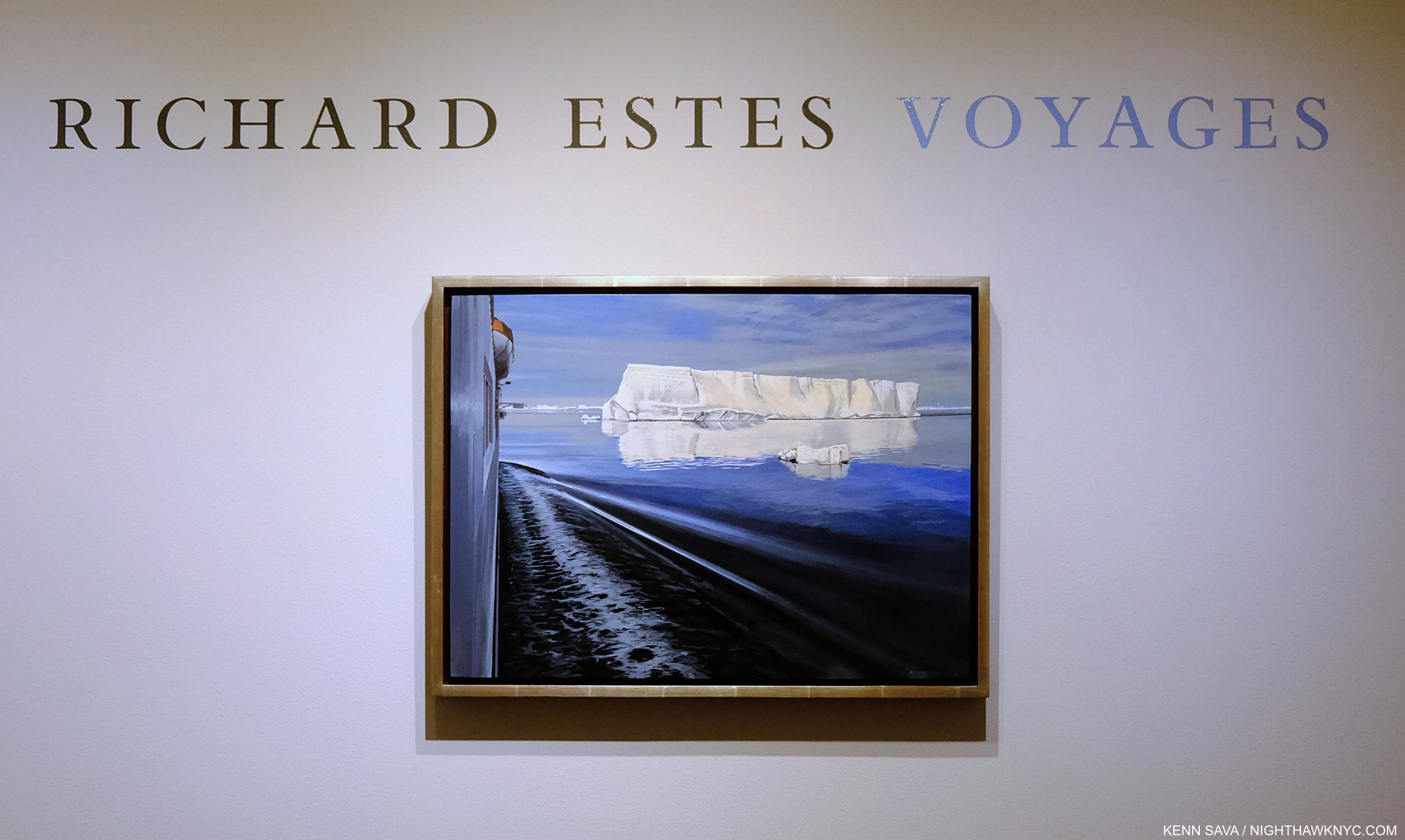
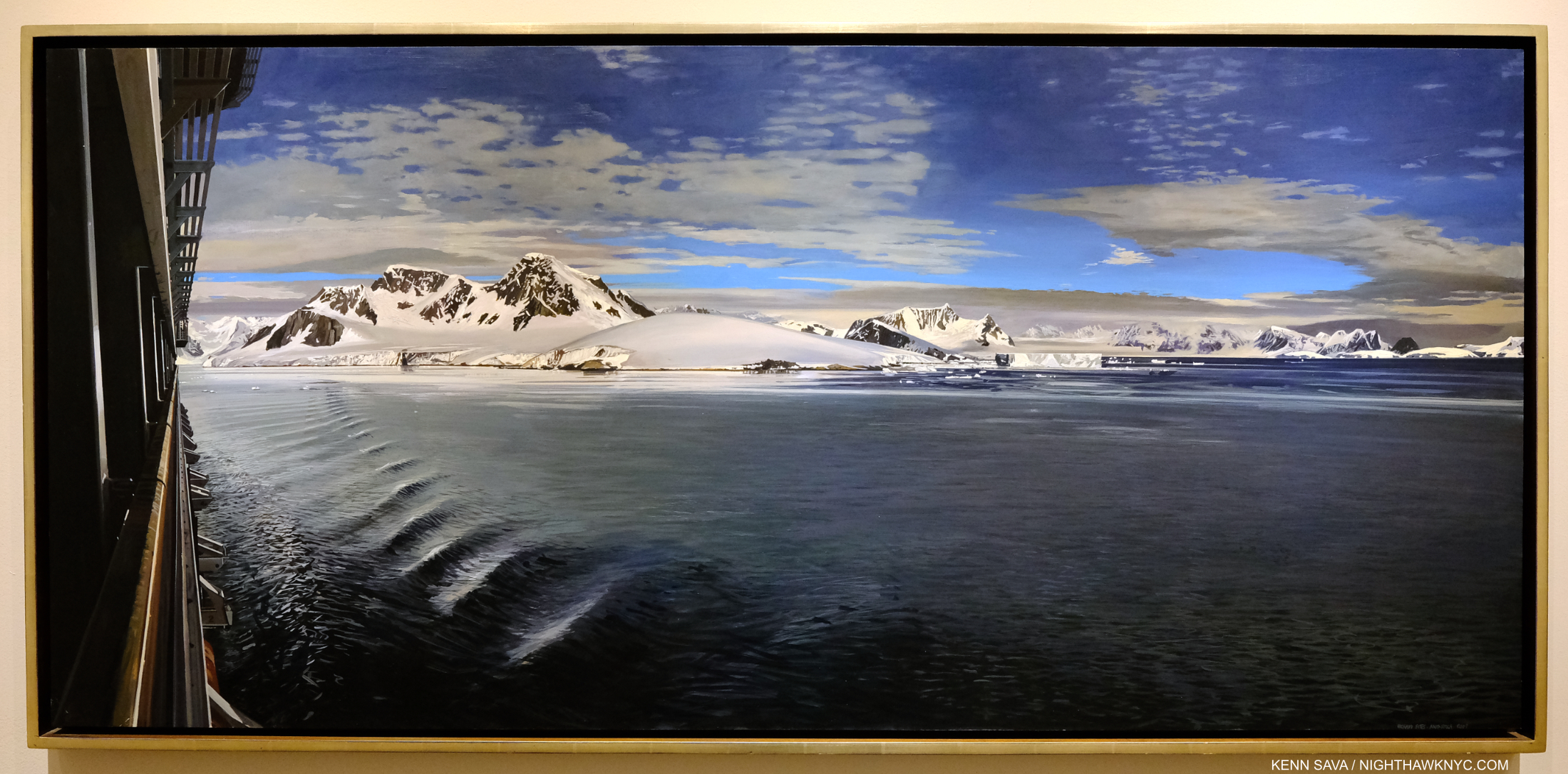
Richard Estes, Antarctica II, 2013, Oil on panel, 16 3/4 x 22 3/4, seen at the show’s entrance. Click for full size.

In Antarctica II from 2013, we see an iceberg floating in a large body of water with a smaller piece of ice, possibly broken off of it, floating on its own. To the left is the hull of the ship apparently containing the Artist on one of his many voyages to a far away land, with the side of a lifeboat visible above. The boat’s wake radiates out towards the berg as the boat moves towards it. One reading of this piece would be man’s impact on Antarctica, which has left it in a precarious state, represented by his alien vessel encroaching on the iceberg’s realm, its wake about to make contact with it.

Not so fast…

“Richard Estes avows that his realism has no hidden meanings, special messages, or stories to tell. Political positions and posturing about the human condition are alien to his art,” in a conversation with Patterson Sims per Patterson Sims, Richard Estes’ Realism2.

Given what I wrote in Part 1 about people disrespecting the Artist’s word on his own Art, though this is not a direct quote (something I address further on), I’m not going back on that now. It is impossible, however, for me not to see the effects of global warming in Antarctica II. How to reconcile this?

Unlike the blockbuster Jasper Johns: Mind/Mirror, which was originally scheduled to coincide with Mr. Johns’s 90th Birthday in 2020, before the virus closed everything, as far as I know at the moment (in early May, 2022), nothing is planned in the Art world to celebrate Richard Estes’s 90th Birthday. My series might be it! Seriously?

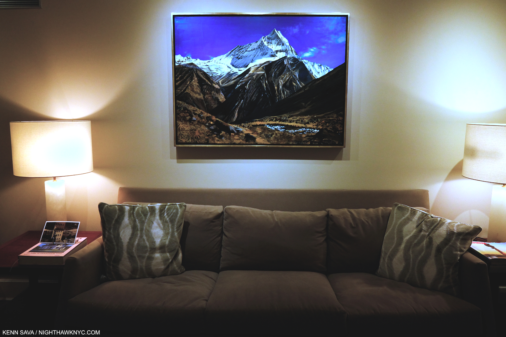
Richard Estes: Voyages installation view of View in Nepal, 2010, Oil on canvas, 32 by 43 inches. Part of the show was very nicely installed in the large office space. In Part 1, I wrote about how I believe this work is conceived. Installed like this makes standing close to it difficult, and so the eye is almost forced to the central, white, peak, causing everything in front of it to be out of focus. It’s really a marvelous and somewhat daring composition for this reason, and a stunning contrast to Richard Estes’s Urban Landscapes, like the one to follow…

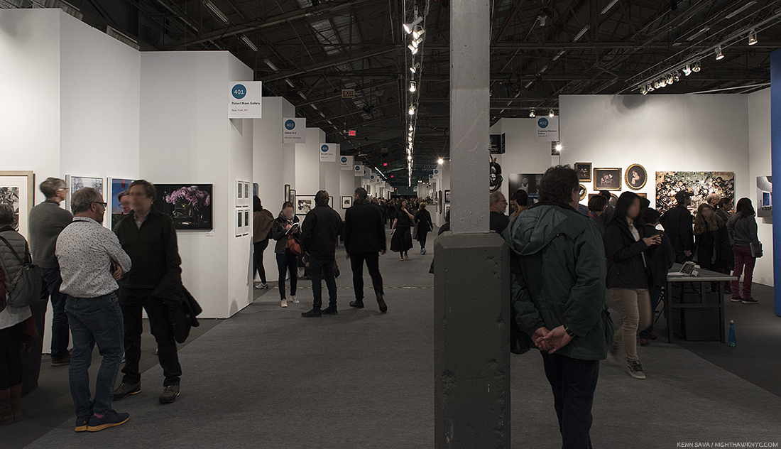
The closest NYC Art event that might qualify was Richard Estes: Voyages at Menconi & Schoelkopf in July, 2021, the first show of his work here since the Museum of Art & Design’s Richard Estes: Painting New York City in 2015, which I looked at here. Containing about 30 pieces covering the range of his subjects, Voyages featured more recent work. The theme of the show was ostensibly the annual trips and voyages Mr. Estes has taken over many years and the Paintings that have resulted from them, though these were juxtaposed with some of his iconic NYC Urban Landscapes3. An experienced world traveler at this point, his journeys have taken him to the far corners of the globe. At first, being completely taken by his views of NYC, I didn’t know what to make of the resulting views of forests, bodies of water, mountains and deserts that began emanating from his hand after his travels, first to Maine, then ever further afield. All the while, he still continued to give us his iconic Paintings of New York City, and other cities. When I walked into Voyages and saw the Urban Landscapes alongside African landscapes, Antarctic vistas, and deserts, I finally decided to sit down and do a reconciliation of his entire career and try and finally understand what, if anything, his whole body of work is saying to me.

First, Voyages reveals Richard Estes has been as busy Painting as ever. In 2021, at age 89(!), he Painted this-

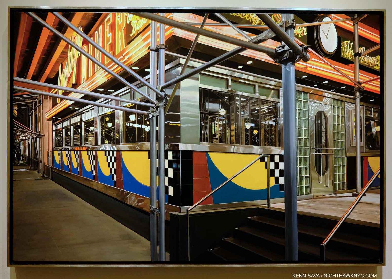
Brooklyn Diner, 2021(!), Oil on canvas, 37 x 55 1/4 inches. I was dumbstruck when I first saw this. I just hope I can still out of bed if/when I’m 89.

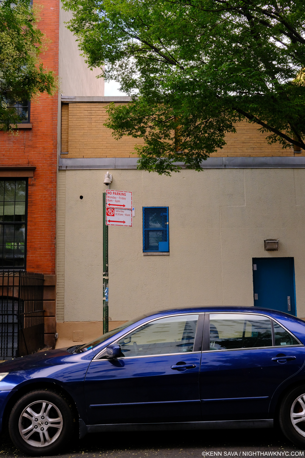
It’s a statement in more ways than one. First, it’s apparent even at a glance that he has lost none of his world-class technique! When I finally finished marveling at that, I began to ponder the unusual composition. I decided to take a look-see for myself. I jumped on the A Train and made a trip to the real Brooklyn Diner, which turned out to be a bit of an outlier on West 57th Street, to see what I could learn from the actual site.

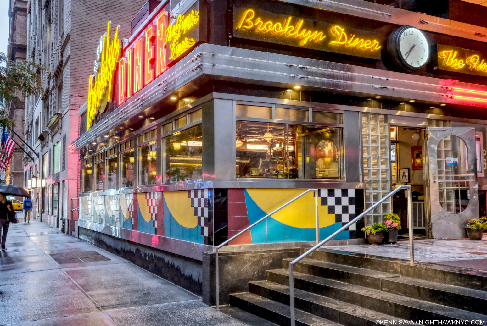
Brooklyn Diner seen from just behind the spot Richard Estes depicts. July 1, 2021. Notice how the “real” view lines up, or doesn’t line up, with the Painting. If I were standing closer, nearer that railing, as in the Painting, I wouldn’t be able to get the same view of the door, without a wider angle lens. The very wide 23mm lens I’m using here barely holds it, and I had to step back to get this! Suffice it to say I wasn’t able to take a Photo that exactly matches the Painting! Therefore, my Photo is not so-called “Paintingrealism,” to coin a box I hope no one uses. See important footnote-4.

Seeing it in person raised all sorts of questions about the Painting. Diner manager Guy told me the scaffolding, not to be seen now, was up from July to around Christmas, 2019, for HVAC work on the roof. Even though the scaffolding is gone, the building is exactly the same as it was. As you can see, I was unable to duplicate the view of the building in Mr. Estes’s Painting in a Photo in spite of using a wide-angle 23mm lens! Being the most colorful place in the area, and that area being Richard Estes’ extended neighborhood, I then wondered why he didn’t render it before or after the repairs. Then, I quickly remembered that over the last decade or so, Mr. Estes has Painted quite a few buildings fronted with scaffolding (another is shown further below).

Booklyn Diner, July 1, 2021. The trees in front of it make its signage a bit less commanding, partially hiding it, like the scaffolding in the Painting does. The trees are our of the frame to the left in the Painting.

Scaffolding adds yet another layer to the countless layers many of his street scenes already had- exterior, reflections, interior, rear exterior, which often adds another level of complexity to the geometry of the whole thing, not to mention another layer of technical difficulty. It also adds mystery. It’s interesting to me that here, the top of the building is cut off. On the main sign to the left, you cannot read “Brooklyn,” and “Diner” is hard to see fully. Neither is legible on the sign to the right. In fact, if he didn’t name the Painting Brooklyn Diner, you wouldn’t know what this place was! This “selective editing” makes me feel that the facade, with its candy color, distantly Art Deco echo, is not the point of the piece, though it’s what catches the eye when you see either the Painting or the actual Diner on the street. The ways he has changed the scene are fascinating. Again, I wonder “Why?” The only conclusion I can make from this is that Mr. Estes is making the scene into what he wants to express.

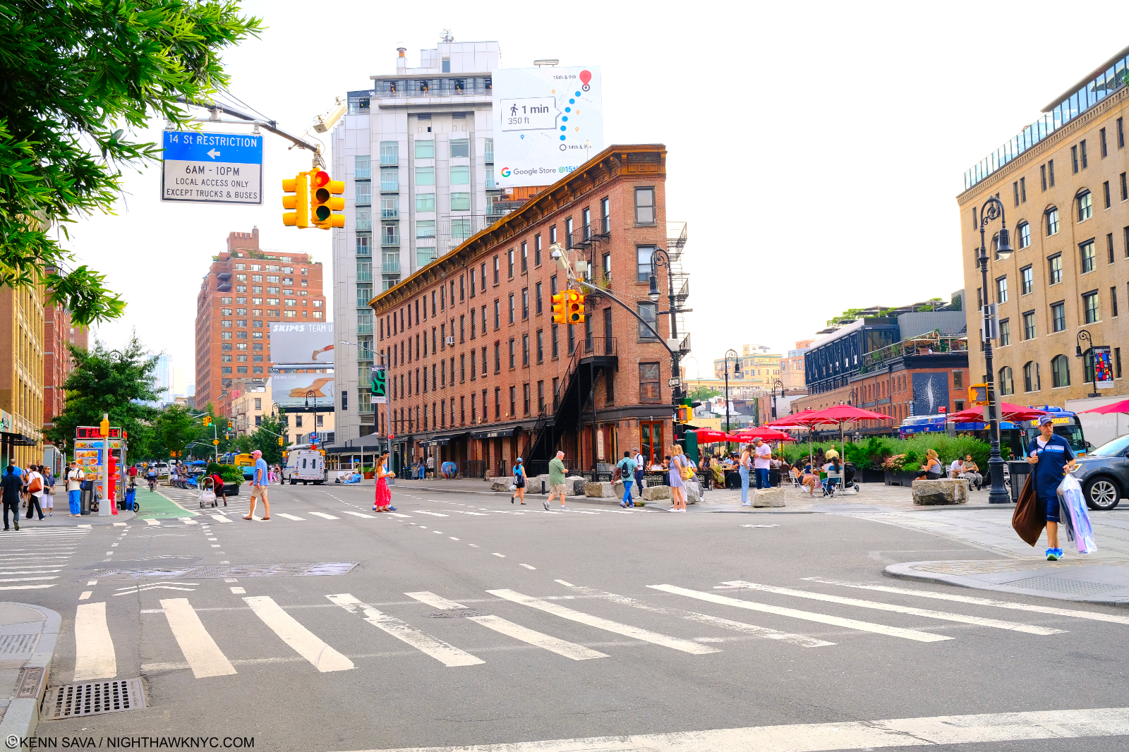
The Diner sits, incongruously, a half a block, but worlds away from, the glitz, glamour and Artistry of, Carnegie Hall, and directly across the street from the legendary & historic Art Students League. This location is not far from Mr. Estes’s NYC apartment, and that fact has led him to render innumerable sites in this neighborhood in Paint over his long career.

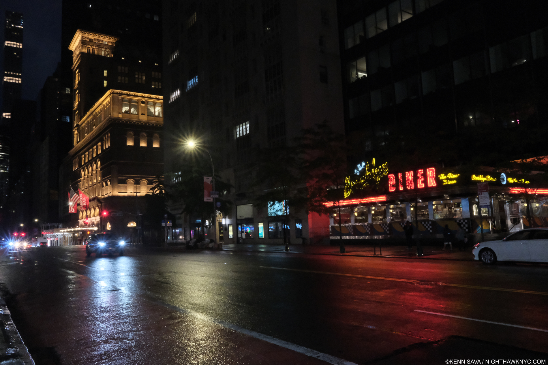
West 57th Street between 7th & 8th Avenues looking east. That’s Carnegie Hall, lit up left, Brooklyn Diner, behind the trees, right. My back is to the Art Students League. July, 2021.

In pondering why he chooses his subjects (which I still often do), I find something quite interesting about this location, and it’s shown in this photo- Richard Estes is a known lover of  Classical Music. Yet, he has never Painted Carnegie Hall, the most famous Classical Music concert hall in the country and one of the most famous in the world! In Brooklyn Diner, a glow of a light may be seen at the far left nearer the top. That may be from Carnegie’s lights as shown here. That’s as close as he’s gotten! It begs the question “With all the buildings he’s depicted in the area, why hasn’t he Painted Carnegie Hall?” As for this subject, he has given un an unorthodox view of Brooklyn Diner, putting the focus of this work in an odd place. I imagine that if 100 other Painters chose to paint the Booklyn Diner, this is not the view we would get. From the street, the neon sign is the most striking thing about the Diner. In Mr. Estes’s Painting, the sign is cut and is far away from the center/focal point of the work. Instead, front and center are details of the scaffolding. What to make of this?

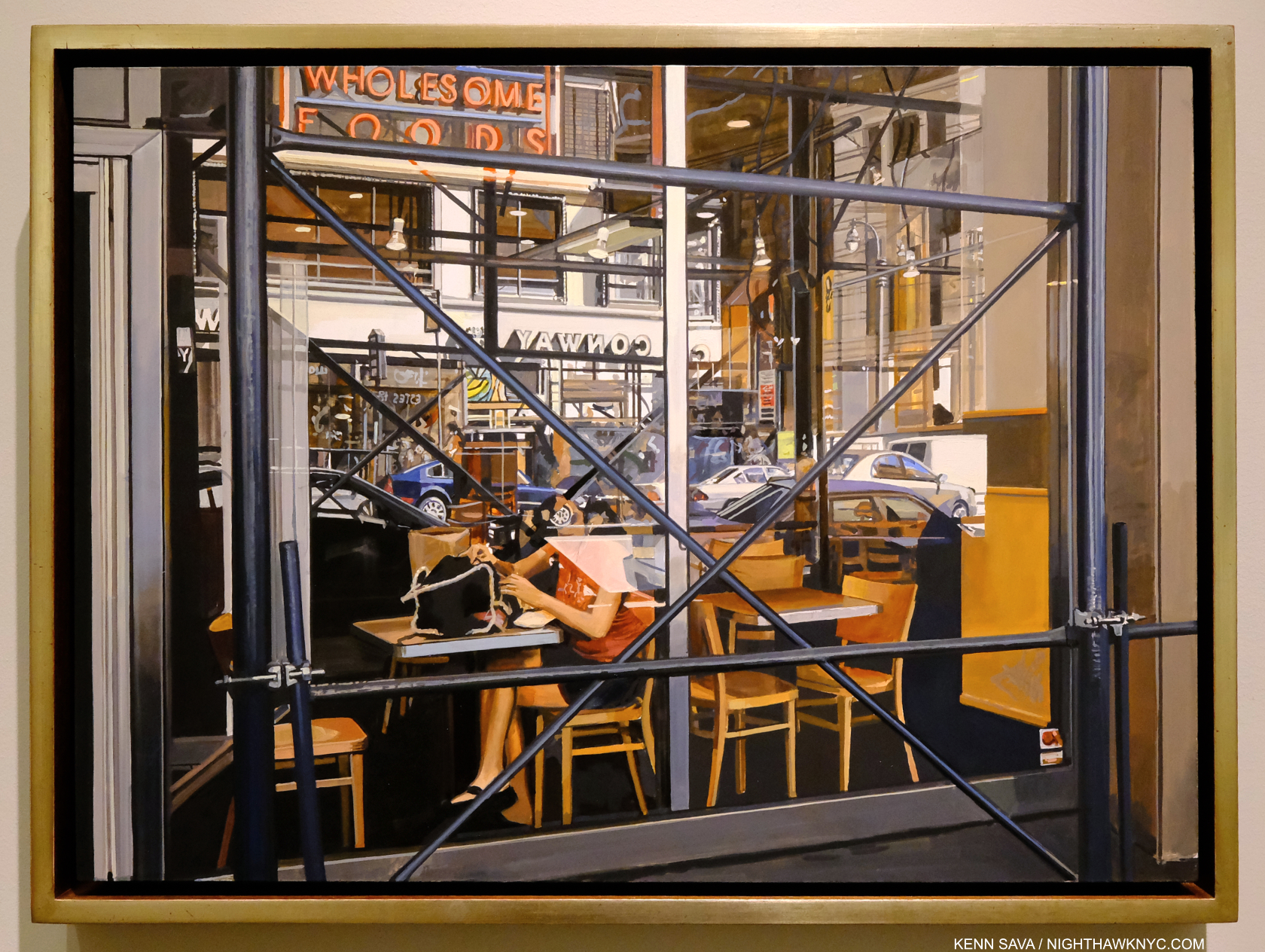
Wholesome Foods, #2, 2018, Oil on panel, 16 x 22 1/4 inches. Another of Richard Estes’s scaffolding Paintings, and another in which the scaffolding is font and center. The woman sitting behind it in the window is engulfed by the detritus of the modern world- glass, steel, wood, paper, cars, buildings, trees, and the materials she’s wearing. In this wonderful composition, which harkens back to, and updates, Edward Hopper’s similar scenes, and a store window reflection Photograph by Eugene Atget, which Mr. Estes has in his collection, she becomes just another element, or someone seen behind glass. I see this as a reminder of how the modern urban world forces its inhabitants to live, a scene that might look as odd to viewers in 300 years as Canaletto’s scenes of Venice look to us today. The geometry and depth of this piece is extraordinarily multi-dimensional, beautiful and ugly at the same time.

 “I don’t enjoy looking at the things I paint, so why should you enjoy it?…I’m not trying to make propaganda for New York, or anything. I think I would tear down most of the places I paint.’” 5.

Those are not idle words. Richard Estes started out to be an Architect before he became an illustrator, and finally a Painter. When I looked at Corner Cafe, 2014-15, from the Painting New York City show, his most recent work at that time, I found that Mr. Estes had not eaten there. I don’t know, but I would imagine the same might be the case for the Brooklyn Diner. So much for a Painting of a place from a personal experience. If we remove personal experience from his choice of subject here (hypothetically) we’re left with something about this site inspiring the Artist creatively. It’s hard for me to look at Wholesome Foods, #2, or Brooklyn Diner, or any of the scaffolding Estes and not think he’s (symbolically) “X”ing out what we’re looking at, given what he said. In the case of Wholesome Foods, #2, possibly with multiple large, literal “Xs.” “… I would tear down most of the places I paint,” leaves it up to the viewer to decide which places he means. Maybe that’s why he hasn’t Painted Carnegie Hall?

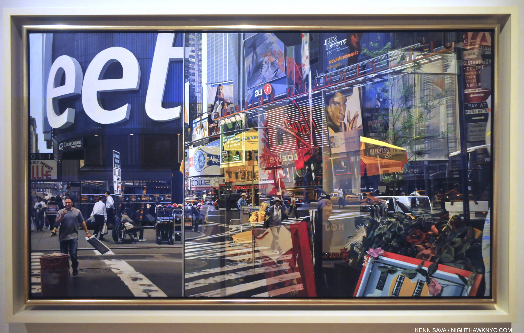
Times Square, 2004, Oil on canvas, 64 1/8 x 37 inches. Click on it to be fully engulfed. Seen at his 2015 Museum of Art & Design show, this may be the most technically astounding Painting I’ve ever seen, along with any Painting by Jan van Eyck. Having stood on this spot before, during and after 2004, I can certainly verify the overwhelming visual noise that still is Times Square, something that has never been more faithfully realized than it is here. Like most New Yorkers, including this one, maybe Richard Estes would like to see it torn down? Still, the Painting would live on as a reminder of how we actually lived here in 2004. “Progress” since the time of Canaletto (1697-1768)? It could also be read as a comment along those lines.

Overall, I see Richard Estes as a direct successor to the Artists he has named as influences- Canaletto, his nephew Bellotto, Thomas Cole, Frederic Church and Thomas Eakins. All of these Artists depicted the world around them without an ostensible “message,” though Thomas Cole also created the series The Course of Empire, in 1833-6, which I looked at here, that do appear to have a message. After the fact, Conservation has come to be seen as one interpretation of Cole, Church and their contemporaries, who were lumped in the Hudson River School box by someone else. That aside, I look at Richard Estes’s work the same way I look at any of theirs.

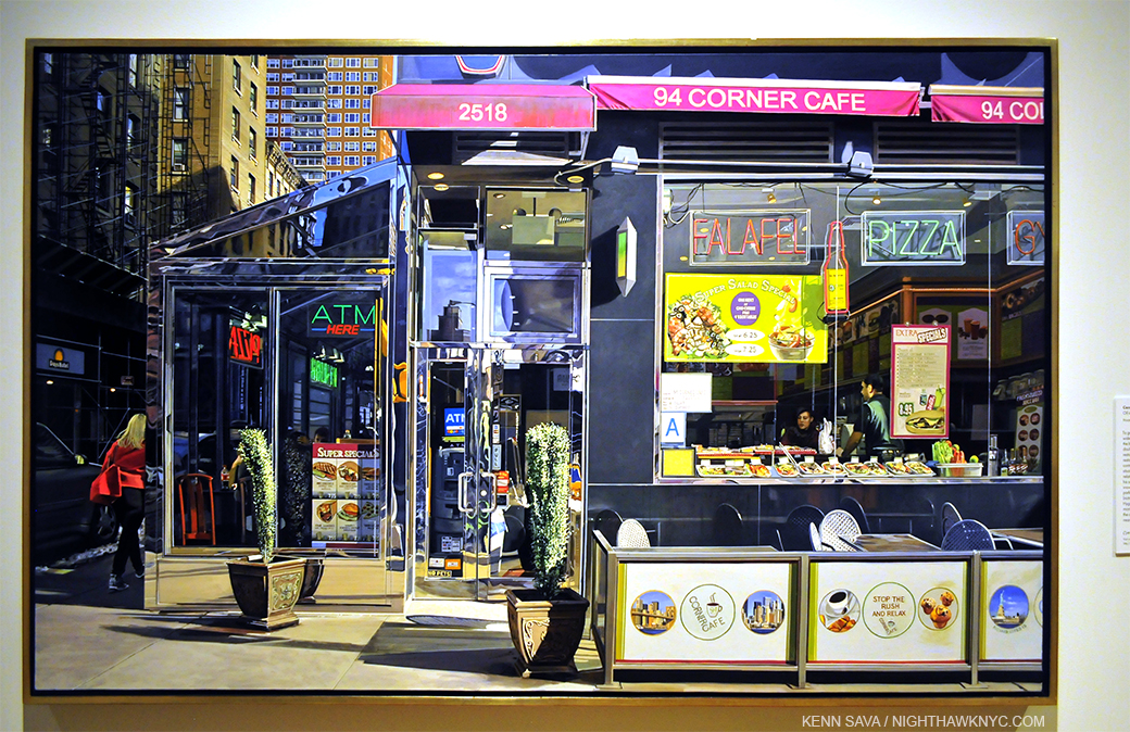
Richard Estes, Corner Cafe, 2014-15, the newest work shown in his Museum of Art & Design Painting New York City show, and seen there in 2015. Oil on Canvas. The Artist was only 83 when he Painted this. I visited the actual Corner Cafe shortly after seeing it. Interestingly, due to a large phone booth in the way, I again had great difficulty trying to duplicate the view seen in the Painting in a Photo!

I get similar feelings looking at some of Mr. Estes’s Urban Landscapes, like Wholesome Foods, #2, Corner Cafe and Horn & Hardart, 1967 that I get looking at Edward Hopper’s urban scenes, including Nighthawks, as I said in my 2016 look at Mr. Estes’s Corner Cafe. This is incredibly rare. Though countless other Artists have tried to emulate Hopper, (which I am not saying Mr. Estes is) I can’t say I’ve felt that from any of them. Seven years after I first saw it, I still get that feeling when I look at Corner Cafe, which I now feel is a masterpiece.

When taken as a whole, the 55 year & counting body of Paintings & Prints he’s created, some interesting things become apparent. Looking back over more than a half century, Richard Estes’s Paintings show us two worlds.

Antarctica II, 2007. Oil on panel, 26 3/8 x 57 inches. Canaletto (1697-1768) lived 300 years ago. In 300 years, will people look at this as something they can relate to in their world, or something from the lost past?

First, the world he lives in and around in NYC, and to a lesser extent, the other cities he has visited & Painted around the world- i.e. his so-called Urban Landscapes6. The second is the world he lives in and around his second home in Maine, and the natural world he has visited on his many trips to other lands. Both groups can be summarized thus- 1) Works depicting the world built by man on the one hand, and, 2) Works depicting the unbuilt, natural world on the other. There is obvious intention in this. Mr. Estes has chosen each and every subject he has Painted. Outside of a handful of Portraits (some commissions, some gifts), I’m leaving nothing out of his oeuvre in saying this. It’s incredibly rare in Art history to find ANY Artist who’s entire body of work fits so neatly into two categories!

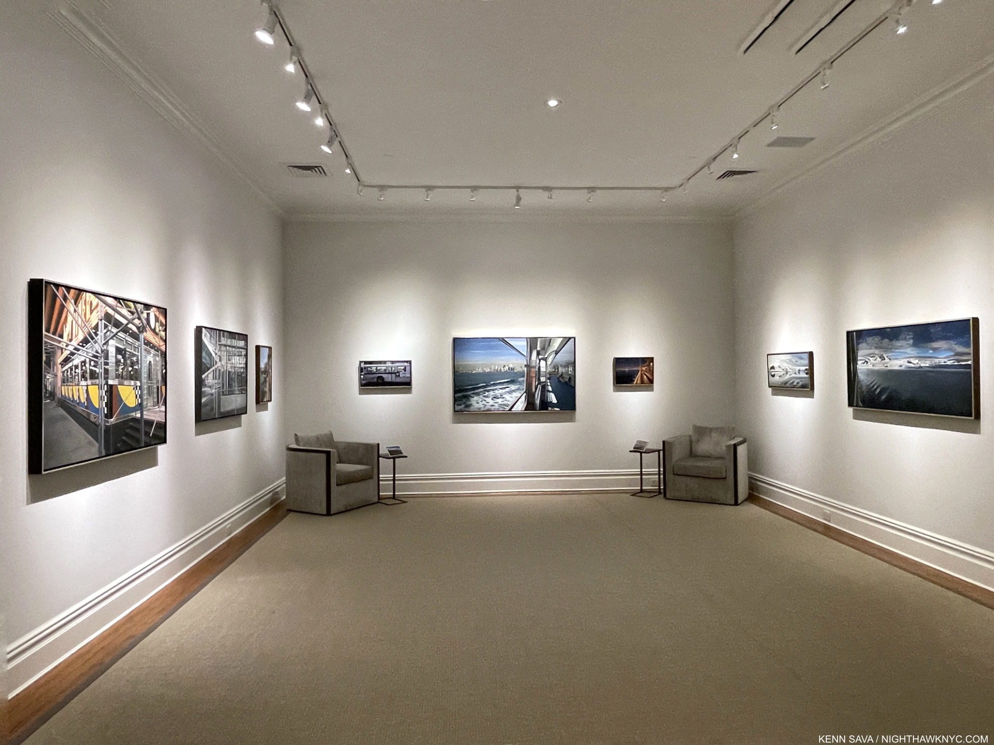
Voyages, installation view of the second gallery. NYC Urban Landscapes on the left wall, Antarctica Paintings on the right, one of each to the far left and far fright is cut off.

Seeing some of each of the categories on view face to face in Voyages brought this duality home for me in a convincing fashion. On one wall in the second gallery, left above, a rotating selection of Paintings of Manhattan faced a selection of Paintings of Antarctica on the opposite wall, right. For me, this summed up his career to date in a nutshell. The city scapes show the city (NYC, London, Paris, Madrid, Tokyo, etc) on typical days, much like the Venice Canaletto and Bellotto show us. Mr. Estes’s Paintings of the natural world seem to follow in the long tradition of landscapes by American Artists, including Thomas Cole, Church, et al, as well as Edward Hopper’s views of Maine (among many other Artists who have preceded Mr. Estes and lived & worked in Maine. Thomas Cole also Painted Mount Desert, Maine, the subject of a number of Mr. Estes’s Paintings).

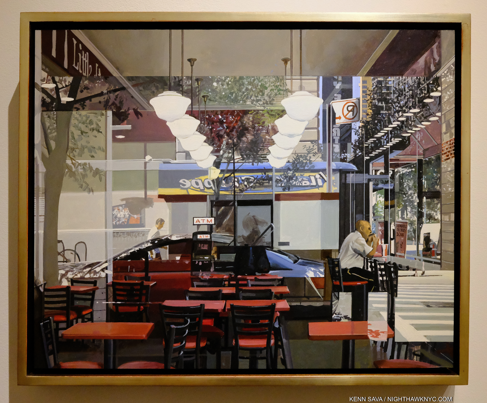
ATM, 2018, Oil on panel, 16 x 20 inches. In this marvelous Urban Landscape, it seems to me that only the three empty chairs in the mid foreground are in sharp focus, doing something Mr. Estes does in many of his pieces- de-emphasizing human subjects to avoid the narrative as I’ve heard him say- even when there are people present in the Painting. No Painter known to me Paints the modern city like Richard Estes. This Painting is hanging to the far left, just out of the frame in the prior picture.

His Paintings of the man-made world (i.e. his Urban Landscapes) might well be called New Topographic if they were Photographs because it seems to me  they see the world through the same lens as the legendary New Topographics Photography show at the Kodak Museum in Rochester in 1975, which focused on the “Man-Altered Landscape,” the show’s subtitle. Mr. Estes’s NYC Paintings predate this show by 7 or 8 years, though the Photographers included in it were working at the same time he was. I have no information that either Mr. Estes knew these Photographers or their work, then or now.

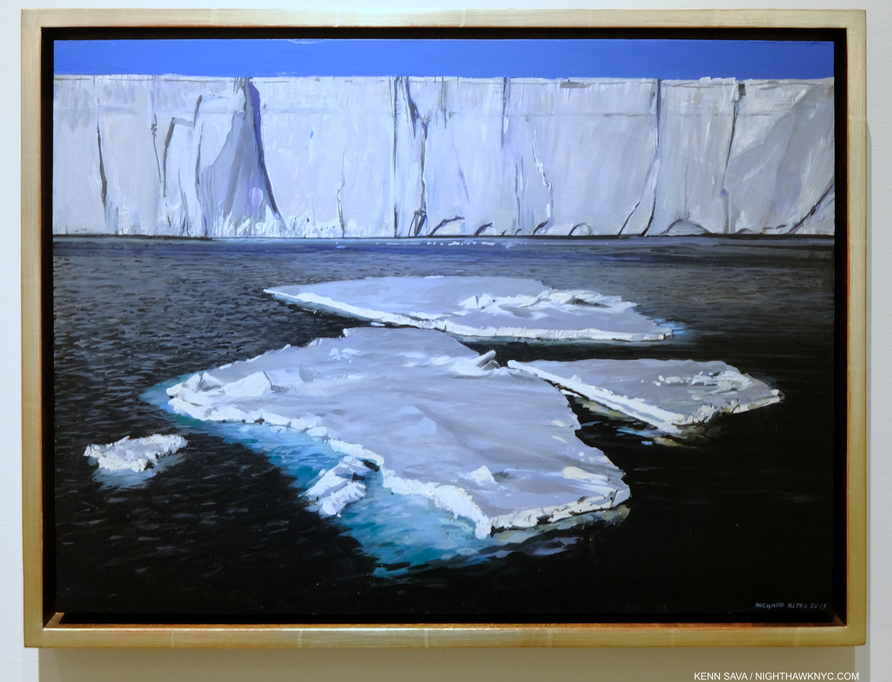
Antarctica I, 2013, Oil on panel, 14 3/4 x 20 inches. Another Antarctica Painting brings me back to what I said I saw in Antarctica II up top.

“Richard Estes avows that his realism has no hidden meanings, special messages, or stories to tell. Political positions and posturing about the human condition are alien to his art,7.”

So, how to reconcile what I said about in the beginning of this piece about Antarctica II with this? Mr. Sims’s words are not an actual quote, and so are less than ideal. As I said, Richard Estes has chosen to show us each and every one of these sites, so there is obvious intention in that. The two facing walls I showed in Voyages were in his show, so there is intention in that, too. Beyond this, he is directly quoted (shown earlier) saying that he would like to see many of the sites he has Painted torn down. Is he fearful of the loss of much of the natural world during his lifetime? He is known to be actively involved in conservation efforts, particularly in Maine. Is he recording both the man-made and the state of the natural world for future generations? Given the time he has spent studying Canaletto and Thomas Cole, even visiting sites they Painted, I would say it is possible. Yet, it must be admitted that Mr. Estes may simply be an observant onlooker at the ever-changing world he’s seen first hand near and far, then creating Paintings that express what he’s experienced. As I’ve demonstrated, these are NOT verbatim depictions. He’s an Artist, not a replicating machine, as I showed in Part 1. Regardless of the nebulous statement from Mr. Sims above, Mr. Estes intends exactly what he shows us, aided by a technique that is the equal of that only a very few Artists in Art history have had to render his intentions as clearly as is humanly possible. He also is well aware that every viewer will see in his work what they will, as he sees, has seen, and is himself influenced by, those he admires who have come before him.

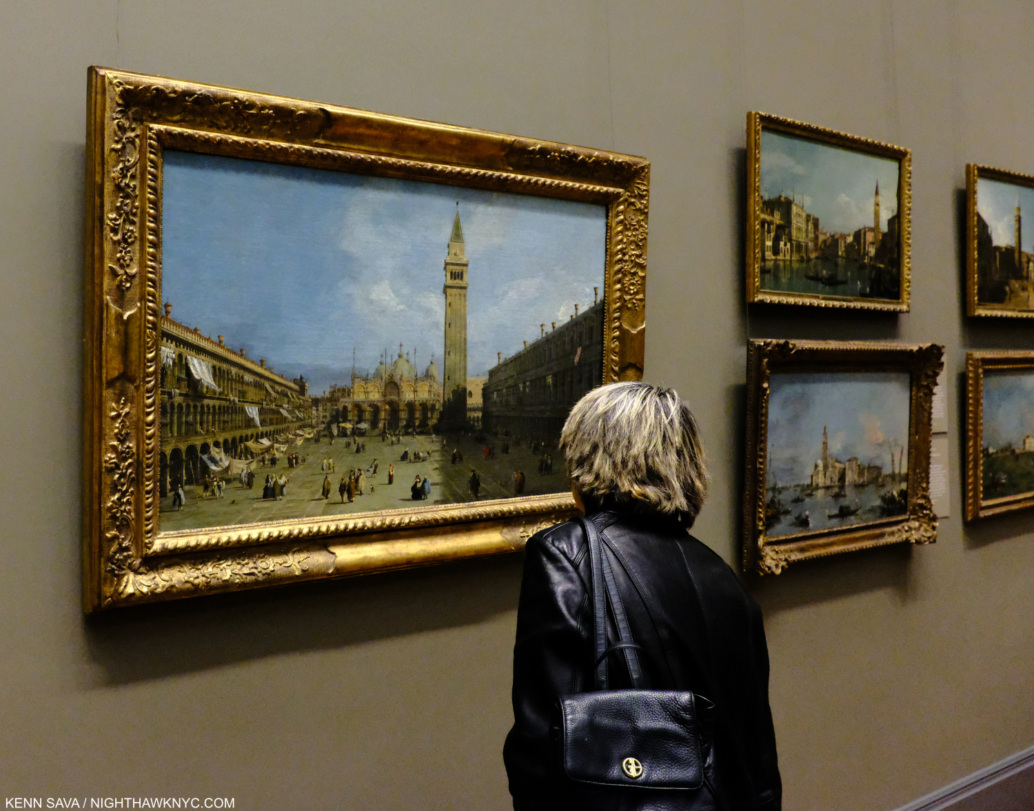
What will our world look like to people 300 years from now? A viewer looks at Canalellto’s Piazza San Marco, 1720s, in 2019, almost exactly 300 years after it was Painted, at The Met. While I have no doubt that Richard Estes, himself, has stood in this spot any number of times, this isn’t just any viewer. This is Lana Hattan, who pushed me to start NighthawkNYC in 2015. Seen here on one of the last times I’ve seen her, December 14, 2019. If you find this site worthwhile, you owe her your thanks. Without her push, it wouldn’t be here.

Richard Estes’s Paintings speak for themselves, and they should be allowed to- beyond boxes or other limitations.  The Artist doesn’t need to stand up and say, “This Painting is about _____.” They are what they are. Look for yourself at them and see what they say to you. 

“I see what I see,” as Frank Stella says. For me, Richard Estes has Painted the most compelling record of the New York City of my lifetime in it. He has also created a beautiful record of much of what’s left of the natural world. It’s a record of the world in his time- what’s been built by man, and and what’s left of the natural world, rendered through the hands and mind of an Artist. I see a “dialogue” going on when I look at both bodies of his work. In the end, intentionally or not, his work shows the condition of the world in his (and our) time. Including (again, intentionally or not), depictions of a number of key issues modern man faces and has created.

I can only wonder what viewers in hundreds of years will make of what he shows us. I have a sneaking feeling that Richard Estes has thought a lot about this, too.

-The 3rd, and final, Part of this series, “Richard Estes: Two Manifestos” is below this one, or here.
-Part 1 is here.
-My piece on Richard Estes’s Corner Cafe, 2013, may be seen here. 
My look at the 2015 Richard Estes: Painting New York City show at the Museum of Art & Design may be seen here.
-My piece “Death to Boxes!” is here.

*-Soundtrack for this Post is “Once in a Lifetime,” by David Byrne & Talking Heads, from Remain in Light, 1980, and performed here In Los Angeles in 1983, extracted from the Film Stop Making Sense

NighthawkNYC.com has been entirely self-funded and ad-free for over 6 years, during which over 250 full length pieces have been published. As I face high expenses to keep it going, if you’ve found it worthwhile, please donate to keep it up & ad-free below. Thank you!

Written & photographed by Kenn Sava for nighthawknyc.com unless otherwise credited.
To send comments, thoughts, feedback or propositions click here.
Click the white box on the upper right for the archives or to search them.
For “short takes” and additional pictures, follow @nighthawk_nyc on Instagram.

Subscribe to be notified of new Posts below. Your information will be used for no other purpose.


  1. From Bus with Reflection of the Flatiron Building, 1967,  shown in Part 1
  2.  P.1. Wait. Shouldn’t it read “Richard Estes avows that his Art has no…?” Substituting the “realism” box for the “photorealism” box isn’t any better, in my view. Richard Estes is a Painter- with no prefixes, in my book, the point of Part 1 of this series. Death to boxes!
  3. Urban Landscapes is the title of 3 series of Screenprints the Artist has created. I showed one from my collection in Part 1. It was also the title of a show of Mr. Estes’s work in 1978 at the Museum of Fine Arts, Boston.
  4. After I finished this Part, I saw the book Richard Estes: Voyages. In it, Mr. Estes says that he now destroys his source Photographs because he doesn’t want them compared to the Painting. I understand and respect his decision. I saw a few of his source Photos in the 2015 M.A.D. Museum show and showed a few in my piece on Corner Cafe. To honor his feelings, I have revised that piece and removed them. I am publishing these because- a) they are not his source Photos, and b) because I feel they highlight the differences between actual locations and his Paintings, showing the lie to some of the hype around Richard Estes’s work, as I outlined in Part 1. It must be noted, and I think it is very interesting, that I was unable to replicate the view seen in both Brooklyn Diner, 2021, and Corner Cafe, 2014-15 when I visited both
  5. ibid, p.1
  6. I’m including his so-called “Still Life” Paintings in this since they depict objects seen in windows or on shelves and are not studio setups.
  7. In a conversation with Patterson Sims per Patterson Sims, Richard Estes’ Realism, P.1

The Met’s Alice Neel Love Letter To NYC

Written & Photographed by Kenn Sava
NYC has seen innumerable rough times. Too many for me to list here. Some of them I’ve lived through. During many of the hardest times the past 151 years The Metropolitan Museum of Art, founded in 1870, has stood at 1000 Fifth Avenue where it remained open allowing countless citizens and tourists the opportunity to walk up its famous staircase and take respite in its hallowed halls among its countless masterpieces, a beacon of culture and a repository of some of the greatest achievements of creative mankind over the past 5,000 years.

Until March 12th, 2020, that is.

Home, again, for the first time in over a year. The Met’s Grand Staircase, March 27, 2021. Up to the left. Down to the right, please.

At 6pm that day The Met closed due to the coronavirus pandemic shutdown1. It remained closed until August 29th. Five and one half months. Unprecedented in its history. Unwilling to risk being indoors until I could be vaccinated I missed the shows The Met held during the first six months after its reopening.

When it announced Alice Neel: People Come First, conceived by Sheena Wagstaff, would open on March 22nd, 2021, I thought back to what I had said about Alice Neel: Uptown, one of my NoteWorthy Shows for March-May, 2017- “…the breath of fresh air it provided only hints at how much pent-up longing I think there is to see more of her work. The time has come!”

The entrance. The show opens with a nude. Pretty daring, but given how often Alice Neel asked her sitters to pose nude, fitting.

On March 27th that time did indeed come. Seeing the show a few weeks later once the vaccine kicked in I had one primary reaction-

What a terrific love letter to New York City! At a time when one may never have been needed more.

March 27, 2021.

Fittingly, when I went in March, only fellow New Yorkers were my fellow visitors. In Alice Neel: People Come First’s parade of over 115 works the endless variety of people from all races, colors, orientations, and occupations that makes New York City great and unique is what is REALLY on view in this show.

“For me, people come first. I have tried to assert the dignity and eternal importance of the human being.” Alice Neel2.

Yes, Alice Neel’s place among the Masters of 20th century Art, established, at long last, in her Whitney Museum Centennial Retrospective in 2000, is reaffirmed. Yes, there are facets of her work that have been overlooked and are now getting attention, like her use of abstraction. But, it’s all secondary to the first theme- as she, and the show’s title says, people come first. Alice Neel Painted “pictures of people,” as she said. She spent about 60 years doing just that and the show draws on her entire career in the generous 115 or so works on view.

Carlos Enriquez, 1926, left, and French Girl, 1920s, right. Mr. Enriquez, a legendary Painter in his own right, was Alice Neel’s first husband and father of her first child, Santillana, who died of diphtheria as an infant daughter, and her second child, Isabetta, to whom she would be estranged for much of Isabetta’s short life.

How was she able to have this career? Born and raised in Pennsylvania, after marrying Carlos Enriquez, who went on to become one of the most renowned Cuban Artists of the century, in 1925, Alice Neel moved with him to Cuba from 1926-7, then returned to Pennsylvania, where they broke up. From there she moved to NYC in 1927. Both of these early, marvelous, works strike me as standing apart from typical student efforts, showing the young, mid-20s, Painter breaking free to seek her own style, finding her essence, and achieving success as captivating works. Phillip Bonosky wrote of her in his Journal in 1957, “She’s worked out her own code of behavior, whose cornerstones are two: 1) her freedom to paint; 2) the well being of her 2 boys. For 1, she will surrender everything else, and what other people place high- the sanctity of one’s flesh in bed- she subordinates to this superior law of her life. And the second also comes lower- but higher than anything else but the first. What other people strive for and cannot live without- good furniture, good clothes, a conventional acceptance by society, etc., etc.- she gives up without any sense of loss whatsoever3.”

On this spot, behind the car, a brownstone stood in the 1930s where Alice Neel lived during the Depression, a few blocks from where I am writing this piece. It’s now part of a school building.

“Lived in a brownstone, lived in the ghetto. I’ve lived all over this town,*” as David Byrne wrote in the lyrics for the Talking Heads song “Life During Wartime,” the SoundTrack for this post.

She spent time living in  the Bronx and a few neighborhoods in Manhattan over 54 years here, including one a few blocks from where I am now, before moving uptown for good, first to East Harlem, and finally to West Harlem. She Painted wherever she was. Street scenes, still lifes, and “pictures of people,” related to her and not. No matter when, where or who she Painted, her work has the remarkable quality of both looking of its time and not looking dated now. That said, never fond of discussing possible influences, her style was always wholly her own and it evolved over her career.

“I sleep in the daytime, I work in the nighttime. I might not ever get home,*” from “Life During Wartime,”

Ninth Avenue El, 1935. Night on West 14th Street at Ninth Avenue Painted at the peak of the Depression, the figures seem to carry the weight of the world with them. Looking at this now, and living in this area today, it’s hard for me, or no doubt most of my neighbors, to believe there was an elevated subway train here 90 years ago. It closed in 1940, only 5 years after this was Painted.

Standing on the same spot today in daylight. West 14th Street & Ninth Avenue, July 28, 2021, looking across to the Meatpacking District. The area is undergoing hard times, again. All the stores to my immediate left are For Rent, a large Apple store stands to my right. Today, there is not a hint that an elevated subway was once here.

“There isn’t much good portrait painting being done today, and I think it is because with all this war, commercialism and fascism, human beings have been steadily marked down in value, despised, rejected and degraded,” she explained in 19504.

Elenka, 1936, is a work that shows the way for much the Artist did the rest of her career with its subtle complexity. It’s a daring picture of a strong woman with an intense gaze reinforced by the strong colors and shapes surrounding her, contrasted with the femininity of what she wears. The background is partially nebulous and partially furniture or building. The somewhat straightforward pose gives the feeling of being caught off guard, which of course Elenka wasn’t.

It’s interesting that during her “today,” Artists including Francis Bacon and Lucian Freud, to name two, were Painting portraits, though not nearly as well-known as they would become. Still, no matter what they, or anyone else was doing, Alice Neel, a humanist to the last, remained true to herself.

Futility of Effort, 1930. Alice Neel described this as one of her most “revolutionary” Paintings. Partily inspired by the death of her young daughter Santillana, partly by a news account of another infant death where the child choked on the bars of the crib while her mother ironed in the next room. It was shown on a wall by itself at the far end of a rectangular gallery.

She was also a survivor who persevered as a Painter as a single mother, virtually unprecedented among major Painters of the 20th century, or before, and a mother who lost an infant child,

Alice Neel, Nancy and Olivia, 1967, left, Vincent van Gogh, Madame Roulin and Her Baby, 1888. One of the highlights of the show was a gallery showing Alice Neel’s work in dialogue with Met Museum masterpieces by other Artists including Jacob Lawrence, Helen Levitt, Mary Cassatt, among others including Van Gogh, here. Alice Neel lost an infant daughter, and Vincent longed for a family fruitlessly his entire life. Knowing that, it’s hard not to read both of these works as autobiography, poignantly hung side by side.

But there were other sides to Alice Neel, the woman, besides the mother.  “I’m cursed to be in this Mother Hubbard body. I’m a real sexy person,” she once said[Met Alice Neel: People Come First Exhibition Catalog, P.2]. One way it came out is her penchant for asking her sitters to undress for their “picture.” A good number of them complied- men, women, pregnant women, and couples. Even Andy Warhol.

“This ain’t no party, this ain’t no disco. This ain’t no fooling around. This ain’t no Mudd Club, or C.B.G.B. I ain’t got time for that now,*” from “Life During Wartime,”

Andy Warhol, 1970, Oil and acrylic on linen. Alice Neel is revolutionary for the consciously “unfinished” look of a number of her Paintings, including this one, one of  masterpieces. Done less than 2 years after the assassination attempt on his life, according to Phoebe Hoban, the two Artists discussed doing the picture this way (half undressed) with eyes closed, making it close to an actual collaboration5.

The show featured a number of the nudes, including Alice Neel’s daring nude Self-Portrait, 1980, at age 80! She also trail blazed Painting pregnant women nude, and some of them were on view as well. Finally, there were numerous pictures of children, both hers, and neighborhood kids, as shown earlier.

“We dress like students, we dress like housewives. Or in a suit and a tie. I changed my hairstyle so many times now, I don’t know what I look like,*” from “Life During Wartime.”

Marxist Girl (Irene Peslikis), 1972, all works are Oil on canvas, unless specified. “This captivating portrait …depicts artist and activist Irene Peslikis—a member of a new generation of revolutionary feminists that Neel began to paint in the early 1970s. Alice Neel’s relationship with second-generation feminism was sometimes strained, but she nonetheless supported—and was supported by—the movement.” @metmuseum.

Further to that quote from @metmuseum, I find the piece daring and free with a power that exudes from Ms. Peslikis’s gaze in a pose that is at once natural and ground-breaking, matched by an extraordinarily daring and free background. Alice Neel had gone on record6, powerfully, against Abstract Expressionism in its heyday. Her views changed over time. Here she is, using its techniques to marvelous effect in the background, as she does in a number of other works of the 1970s. She said then, “I don’t think there is any great painting that doesn’t have good abstract qualities.7.” I’ve been thinking about those words since I read that quote…

“I don’t know what you expect to do in the world, Alice. You’re only a girl.” Alice Concross Hartley Neel (1868-1954), Alice Neel’s mother8

Last Sickness, 1953, left, and City Hospital, 1954, Ink and gouache on paper. Alice Neel’s mother, was no fan of her daughter becoming a Painter, as the quote from her, above, shows, yet Alice never turned her back on her. She died of cancer shortly after the Painted picture. City Hospital shows her mother at the bottom with an overworked nurse looking over other patients at her.

Her mother, who took her to cultural events, Alice describes as “intelligent and well read” continued, “None of us will be remembered.” “Well, I am not so sure about Alice,” Alice remembered her father saying9.

Richard Gibbs, 1968- Everything about this work strikes me as daring. The pose looks like a very casual take on Rodin’s The Thinker. Mr. Gibbs’ shirt is a riot of color with lines that go in the opposite direction to the path laid out for the eye to follow from front to back. That path, itself, is an adventure. We are seemingly inside and outside at the same time. Part of a room or building occupies the right part of the piece, a sudden landscape occupies the left, leading to a shining sun high up top. This inside-outness reminds me a bit of Dali or de Chirico, but for Alice Neel, who is known as being a somewhat traditional Painter of portraits, or pictures of people, as she preferred, it’s quite daring. The shadows under the chair leave me wondering, too. What are they of? Then, there’s the skin tones. Marvelously flat on Mr. Gibbs’ legs, feet, arms and hands, and more layered and nuanced on his face.

Many of Alice Neel’s non-family subjects were people fighting for causes, people who lived what they believed, and that is what comes across in her “pictures” of them. Taken as a whole one of the things her work is is a miniature picture of New York during her lifetime. While there are some cityscapes, Alice Neel’s New York City consists of its people in all their ages, sizes, shapes and variety.

“Heard about Houston? Heard about Detroit? Heard about Pittsburgh, PA?,*” from “Life During Wartime10.

James Farmer, 1964. The year this was Painted, the civil-rights leader was among those arrested at the 1964 World’s Fair for protesting segregation and racial violence.

Mostly an outsider to the big NYC museums and larger Art world during most of her lifetime (though she attended them and marched in protests of some of their more controversial shows), Alice Neel fought for her Art most of her life. She had to. She didn’t find a lot of supporters in the Art word until late in her life (the Whitney held a Retrospective in 1974, when she was 74, and the posthumous Centennial show in 2000, her last big NYC museum show before this one). Phoebe Hoban says that between 1927 and 1964 she had about 6 solo shows. From 1964 to 1984, she had over sixty11. The first full-length monograph of her work was finally published in 1983, a year before she passed (see BookMarks, below).

James Hunter- Where are you? Black Draftee-James Hunter, 1965. One of the most compelling works in Alice Neel’s career, Mr. Hunter appeared for one sitting and never returned. Alice Neel declared the work finished and its gone on to spellbind viewers ever since. (Including me, when I saw it last at Unfinished at The Met Breuer in 2015.) Drafted for Vietnam, his name does not appear on the Wall in Washington, DC. To this day, what happened to him remains unknown.

Listening to her recorded interviews she always makes a compelling case for work and anyone interested in her Art should seek them out online and watch or listen to those first before reading anyone else speak about her work. In this interview, I love how she immediately corrects anything the interviewer says about her Art that she doesn’t agree with!

“Transmit the message, to the receiver. Hope for an answer some day,*” from “Life During Wartime,”

The line for Alice Neel: People Come First on March 27th. I imagine it’s significantly longer now.

Standing in line at The Met, in the very halls she frequented, I couldn’t help wonder what she would have felt seeing the line of visitors stretching all the way down the long hallway waiting to see her work. The same work she mostly kept in her archives, as a picture in the show, below, depicts.

The archive of her work lining the walls of her apartment. Alice Neel hated to part with one of her Paintings and was known to Paint a copy when she did.

“The sound of gunfire, off in the distance. I’m getting used to it now,*” from “Life During Wartime.”

Living in Manhattan these past 30 years, it’s easy to relate to the solitary, single-minded sense of purpose her life exudes. “Tough times don’t last. Tough people do,” the age old quote goes. Alice Neel survived a lot of tough times. Now her Art is helping New Yorkers survive this horrible time by reminding us of who we are and what our strength is.

BookMarks-

The poignant inscription in a signed copy of Patricia Hills’ monograph says it all. Alice Neel died the following year. Photographer unknown.

The Alice Neel bibliography is relatively small but growing. Here are a few recommendations based on living for at least a year with each recommended book, each  used in preparing this piece.

Alice Neel: People Come First, Met Museum Exhibition Catalog, is the most up to date monographic overview of her work and career. It features the most current research and has the most images currently (mostly the works in the show which were exceedingly well chosen) in very good quality on good paper, many in a large size. Recommended as a first, or go-to, monograph on Alice Neel until a more complete look at her whole career is published.

Alice Neel, by Patricia Hills, will always be NoteWorthy for being the first full length hard-cover monograph on Alice Neel and the only one released during her lifetime. Many good sized illustrations in color. It was also done with cooperation with the Artist. It holds up well today and copies in Very Good or better condition are still reasonable. Recommended as a 2nd monograph on Alice Neel, it remains a valuable reference book for the reasons I mentioned.

Alice Neel: The Art of Not Sitting Pretty, by Phoebe Hoban is another Art biography from Ms. Hoban. I found this one better than her Jean-Michel Basquiat bio, particularly when it comes to addressing the Art (a serious weakness of the J-M Basquiat book in my opinion). At the moment, there is no other full-length Alice Neel biography. Given Alice Neel’s steadily increasing popularity, and her increasing stature as an Artist, a woman and an influence, I suspect that will not be true indefinitely and a more definitive biography may be still to come. Done after the Artist’s passing it does not have Alice Neel’s input but it does have quotes from family members. Includes 23 pages of small illustrations in color and black & white. The binding is exceptional- rare for a large 500+ page paperback. Recommended, for now.

*-Soundtrack for this Post is “Life During Wartime,” with lyrics by David Byrne by Talking Heads from Fear Of Music, 1979. Regarding the references used above, check out the annotated lyrics on genius.com. Here it is performed live, at The Mudd Club, LA, of all places, on August 13, 1979-

NighthawkNYC.com has been entirely self-funded and ad-free for over 6 years, during which over 250 full length pieces have been published. If you’ve found it worthwhile, you can donate to keep it going & ad-free below. Thank you!

Written & photographed by Kenn Sava for nighthawknyc.com unless otherwise credited.
To send comments, thoughts, feedback or propositions click here.
Click the white box on the upper right for the archives or to search them.
For “short takes” and additional pictures, follow @nighthawk_nyc on Instagram.

Subscribe to be notified of new Posts below. Your information will be used for no other purpose.


  1. The PBS series Inside The Met shows behind the scenes leading up to, during and after the shutdown.
  2.  Mike Gold, “Alice Neel Paints Scenes and Portraits from Life in Harlem,” Daily Worker, December 27, 1950, p.11
  3. Phoebe Hoban, Alice Neel: The Art of Not Sitting Pretty, P.236
  4. Mike Gold, ibid, p.11
  5. Phoebe Hoban, ibid, P.310
  6.  “I am against abstract and non-objective art because such art shows a hatred of human beings. It is an attempt to eliminate people from art, and as such it is bound to fail.” Mike Gold, ibid, p.11
  7. Met Alice Neel catalog, P. 104
  8. Met Exhibition Catalog, P.12
  9. Met Exhibition Catalog, P.18.
  10. See the annotated lyrics, here.
  11. Phoebe Hoban, ibid, P 254

The Photography Show- AIPAD, 2018

There’s no “swim suit” for this vast sea of images. Just dive right in. Arthur Elgort, “Stella Diving, Watermill, Long Island,” 1995, seen at Staley Wise Gallery at The Photography Show. Click any Photo for full size.

The 2018 edition of “The Photography Show,” (commonly called “AIPAD,” the acronym of The Association of International Photography Dealers, the organization that presents it), was a week later than last year’s blockbuster, though much else was the same. I’m not surprised. As I said in the last of the 4 pieces I devoted to 2017’s show, there was little to complain about from this visitor’s perspective, so I very much anticipated this year’s model.

It did not disappoint.

The highlight of the NYC Photo Year beckons. Don’t let the small entrance fool you. A vast show awaits inside.

It returned to the same familiar, cavernous, space known as Pier 94, on the Hudson River, and it reprised many of last year’s popular features, including a Publisher, PhotoBook Dealer & Photography Organizations area, a dedicated “AIPAD Talks” area, a “PhotoBook Spotlight” area, and new this year, an AIPAD Screening Room featured films by Photographers, or relating to Photography.

“Say Cheese.” The view from above right before the opening bell on Thursday at noon. Even a panorama can’t capture the whole of AIPAD.

Though, by my count, there were about 20 fewer dealers than last year (103 vs 123 comparing this year’s guide to 2017’s. AIPAD, itself, reported 96 this year1), given the enormous size of the show, it’s highly unlikely that anyone who didn’t make a count would have realized it- there was still too much to see in one visit. I made four, spending all of Thursday, Friday, Saturday & Sunday exploring it. Still, I’m sure I missed something. 

The Floor Plan.

What I did see impressed me quite a bit. In the next piece, I’ll take a look at highlights. First, here’s an overview.

“Something for everyone,” the show’s Press Release said.

The best thing about AIPAD for me is that nowhere else in NYC all year long can so many very good, great, and even classic Photographs be seen in one place. You would have to spend weeks walking around the city’s galleries and Big Five Museums to come close. But? Even then, you wouldn’t come close. AIPAD provides the opportunity to see what Artists from around the world are doing; to discover new Artists, and to see beautiful examples of classic Photographs, both familiar and known only through books or legend.

f64. Robert Mann, left, stands outside his renowned gallery’s booth, Catherine Edelman Gallery, equally renowned Chicago dealer, right, with Gallery f5.6, Germany, Gallery 19/21 from Conn., further on the left, and the fascinating Legacy of the Black Panthers 50th Anniversary Exhibition further back on the right.

While Aaron Siskind, Alfred Steiglitz, Edward Weston, Berenice Abbott, Ansel Adams, Atget and Kertesz were among the classic Artists being shown at the most booths (per the guide), there was a very impressive amount of lesser known Artists who presented quite strong work, in an extremely wide range of styles and genres– from the literally unknown, like these-

Unknown Artist, “Selection from a Speedway Photograph Portfolio” on display at Harper’s Books booth.

To some of the most famous Photographs ever taken-

Well? Almost. Ansel Adams, “Moonrise Over Hernandez (Cancelled),” 1941, printed circa 1969. This print was created in Ansel Adams’ darkroom on what turned out to be defective Ilfobrom paper. As a result, they were marked “Cancelled” with a machine used in banking and then sent to Ilford to demonstrate the flaws in the paper. Seen at Scott Nichols Gallery.

Great works by revered names…

Henri Cartier-Bresson, “Rue De Bassano, 8th Arrondissement, Paris, 1953” seen at Contemporary Works/Vintage Works.

Sally Mann, “Naptime,” 1989, seen at Edwynn Houk Gallery is the subject of a current retrospective at the National Gallery of Art, Washington.

Robert Frank, “US 285, New Mexico, 1955,” from his enduring classic PhotoBook, “The Americans.” Seen at Howard Greenberg Gallery.

The Photographs in Painter Ed Ruscha’s “Gasoline Stations Portfolio,” 1962, weren’t even taken as “serious Photography” by the Artist when he took them. 56 years later, they’re some of the most influential Photographs taken since. Seen at Bruce Silverstein.

To surprises from Artists previously seen, like this wonderful wall of work by Jeff Brouws which channels the classic work of Bernd & Hilla Becher…

Jeff Brouws, “Coaling Tower series,” 2013-17, seen at Robert Mann Gallery. Apologies for the glare. Like the Becher’s classic series, Mr. Brouws has Photographed in the same weather and lighting conditions they always used.

To work previously not known to me that impressed…

Gohar Dashti, “Home (series),” 2017, at Robert Klein Gallery

Or…

Omar Imam, “Untitled, 2017 (serene place),” from his powerful “Syrialism” series at Catherine Edelman Gallery.

This year’s show also included special exhibitions, including this one, curated by Sir Elton John, titled “A Time For Reflection”-

Sir Elton John curated this selection from AIPAD member galleries titled “A Time For Reflection.” Included is Gordon Parks’ “American Gothic,” near the right corner, which can be seen in my recent Post about Mr. Parks just concluded shows.

Another special exhibition was “All Power: Visual Legacies of the Black Panther Party,” from the book of the same name, presented by the Photographic Center Northwest, in honor of the 50th Anniversary of the founding of the Black Panther Party’s Seattle chapter.

Installation view of one corner of “All Power.” Work by Robert Wade, Gill Baker, Deborah Willis, and Lewis Watts among those seen here. The words are from Point 7 of the Black Panther Party Platform and Program, 1972.

It featured a very impressive roster of Artists, and I was particularly impressed by the works of LaToya Ruby Frazier’s, including 2 pieces from her poignant “The Grey Area,” about the demolition of the hospital in her home town in spite of efforts, that she was involved in and Photographed, to save it. The work “UPMC Global Corporation, 2011” from her series “The Grey Area,” especially struck me as I have been looking at a lot of work by the so called “New Topographics” Artists Lewis Baltz and Stephen Shore2. This work seems like a culmination of what those Artists were depicting in series like Lewis Baltz’ “New Industrial Parks Near Irving, California,” and “The Tract Houses,” in the 1970s.

LaToya Ruby Frazier, “UPMC Global Corporation, 2011” from her series “The Grey Area,” 2010-12, that documents the demolition of Braddock Hospital in her Pennsylvania home town, which she had been involved in trying to save.

One of the things I look forward to most about AIPAD is the chance to see what galleries from elsewhere in the world bring and display.

see + gallery, Beijing, China, left, Atlas Gallery, London, right, with Laurence Miller Gallery, NYC behind them, and Les filles du calvaire, Paris, France behind on the left.

As they did last year, many showed work completely new to me, and possibly a good many other show goers, like this-

Alfredo Jarr, “The Power of Words,” 1984, at Jean-Kenta Gauthier, Paris, France

Detail.

and this…

Raghu Rai, “A Photographer, The Wall Series, Delhi, 1973,” seen at TASVEER from Karnataka, India

and for the lover of modern vintage prints-

Two gorgeous examples by Eikoh Hosoe, “Ordeal by Roses, #29,” 1962, left and #16, 1961, right. Seen at IBASHO, Japan.

Making the rounds, the first thing that strikes you is the level of seriousness of the work on view. Almost nothing here is frivilous. Given the very significant cost of being here, the travel (some came from down the street, some from, literally, the other side of the world), the logistics, the hours involved in being at AIPAD- every single thing here is something someone significant in the Photography business believes is worthy of being here and being seen along side what everyone else feels should be seen here. So, the show provides fascinating insights into, and a barometer of, what so many leading dealers think about the Photography market and what’s selling, while balancing that with making a statement about the overall identity of their gallery. I find all of this endlessly fascinating. This year there was a distinct absence of the encroachment of “video,” or moving elements incorporated in Photography, which, to my eyes, has thus far come across as gimmicky. I much prefer seeing this-

Made using brand new “technology”… of the 16th century. Abelardo Morell, “Camera Obscura: The Philadelphia Museum of Art East Entrance in Gallery with a de Chirico Painting,” 2005. Light from outside (the exterior of the building) enters the darkened gallery seen above through a small hole, and is “projected” on the opposite wall, where the de Chirico hangs, upside down. At Edwynn Houk Gallery.

As you walk through AIPAD, you’ll find the work that doesn’t hold up to such “company” is in the extreme minority. to the contrary, you’re virtually guaranteed to discover a new Artist of interest you previously didn’t know.

Jean Pagliuso, 4 works from her “Owl” series, at Mary Ryan Gallery. Of course, anyone showing Owls, the Official Bird of NighthawkNYC, let alone these 4 beauties, was bound to catch my eye.

Then, there is the area devoted to Book Dealers, Publishers and Photography based Organizations, including Aperture, which held a steady stream of PhotoBook talks (in the area to the far right, below, with AIPAD Screenings just behind it in the far right corner) throughout the weekend. This area also hosted a steady stream of Booksignings and Book Launches, while also giving book collectors a chance to talk to a number of the world’s leading PhotoBook publishers, from bigger (Steidl, ArtBook DAP, Mack, Damiani, and Nazraeli), to specialty publishers TBW Books and Minor Matters, to Japanese Publishers, Akio Nagasawa and SUPER LABO among a number of others. The organizations also included Light Works, the Photography Collections Preservation Project, and the Florida Museum of Photographic Arts, who told me that their striking home doesn’t have plumbing!

The front of the Publishing and PhotoBook area. The show is so big, this large section of it isn’t even seen to the left of the panorama posted earlier.

Books have long ago secured their place as essential to Photographers and the world of Photography. In many, even most cases, they are the only way to see the work of the vast majority of Artists. Over time, they have become an “Art-form” unto themselves. For both reasons, it’s only natural, and in my opinion, critical, that they be included in AIPAD. The best PhotoBooks publishers (Gerhard Steidl, Chris Pichler of Nazraeli, Michael Mack of MACK, Paul Schiek of TBW Books, among them) are Artists themselves, either literally, or as bookmakers. The beauty and craft they bring to their work enhances the experience exponentially to the point that it’s an essential part of the experience of the work. In addition to these world-class publishers, intrepid book sellers, like Harper’s Books (who showed a spectacular collection of rare books and collectibles, seen in the center glass case in the Photo above) and Photo-eye (who featured the MASSIVE new Taschen book, “Murals of Tibet,” hand signed by H.H. The Dalai Lama, which starts at $12,000.00) were highlights. But, the “stars” of this area were many of the book booths offered exceedingly rare chances to meet, and have a book signed by, Artists including Susan Meiselas, Elliott Erwitt, Paul Graham, Ralph Gibson, Jungjin Lee, Gregory Halpern, Jason Fulford, and Dayanita Singh, among others.

In assessing the “world of Photography,” since AIPAD is so international in scope- in all of it’s dimensions, I’d be remiss if I didn’t make special mention of the renowned, non-profit, Aperture Foundation, who’s founders include Ansel Adams and Dorothea Lange, and who celebrated their 65th anniversary in 2017. In my opinion, through everything they do, they are one of the lynchpins of the Photography world. As is well known, they nurture up and coming Photographers who deserve wider attention, publish important PhotoBooks (“Stephen Shore” was one of the very best PhotoBooks I saw in 2017), put on terrific shows (like their recent “Prison Nation”), and publish often terrific limited edition prints by many of the leading lights of both contemporary and classic Photography at exceedingly reasonable prices.

Aperture’s PhotoBook Spotlight, this one featuring legendary Photographer, Paul Graham, center, who discussed his classic book “A Shimmer of Possibility.”

At the show, they ran a steady stream of PhotoBooks spotlights, which included Paul Graham, who’s “A Shimmer of Possibility,” (winner of the Paris Photo-Aperture Prize for the Best PhotoBook of the Last 15 Years in 2012), spoke about it on the debut of MACK’s third edition. In my opinion, everyone involved in Photography owes a debt to the Aperture Foundation, and I hope they support them through buying their books, prints and magazine, or making a donation. That’s my opinion, and no…they didn’t ask me to say that.

Nico Krijno, “Burning Wicker Chair,” 2011, a Huxley Parlour Gallery, London. The South African Photographer’s fascinating work is something I definitely have my eye on.

With so much to see, I strongly advise getting the multi-day ticket. Thursday is my favorite day to go and get acclimated. The weekend crowds haven’t arrived and you can actually talk to the dealers and booth holders and get some of the fascinating backstories behind what they’re showing. Things have a tendency to germinate in my mind overnight. I’ll see something I don’t know, then go home and research it or the Artist, and go back and see it again. Friday and Saturday things were steady and busy throughout, with the weather cooperating this year. Sunday seemed to me to be surprisingly busy. During my rounds on Sunday, within 2-3 hours of closing, most (not all) of the dealers I spoke with said the show was “Good,” or “Very good” for them, and I was surprised by how few expressed a negative sentiment. What this tells me, beyond how successful The Photography Show was (and there is no doubt it was) is that the Photography market remains robust, and signs of a downturn were not to be seen, as far as I could tell. This is good news for the Artists, particularly, as well as the dealers, of course. After it ended, AIPAD reported record attendance numbering over 15,0003.

Lisa Kereszi, “Gold Curtain, Poconos Resort, PA, 2004,” seen at Yancey Richardson Gallery.

As so? I look forward to the curtain going up on The Photography Show, 2019. But, don’t worry- The curtain is not coming down on my AIPAD 2018 coverage…yet. Stay tuned!

*- Soundtrack for this Post is “Take Me To The River,” by the great Al Green, which I actually said to a cab driver on Saturday. It can be seen in an early performance by Talking Heads here.

Uh-oh…Guess who’s back from their Winter Migration…

On The Fence, #18 – “The Wall Has Eyes” Edition. Celebrating the 1st Anniversary of my fine feathered friends and “On The Fence,” who debuted after AIAD, 2017.

The Photography Show/AIPAD, 2018, is my NoteWorthy Show for April.

Once again, for the second year, I’m proud to bring you THE most extensive coverage of The Photography Show anywhere. The rest of it is here.

My coverage of The Photography Show/AIPAD, 2017 may be seen here.

My previous Posts regarding Photography are here.

My thanks to Margery Newman and Nicole Strauss.

NighthawkNYC.com has been entirely self-funded & ad-free for over 7 years, during which over 275 full length pieces have been published!
I can no longer fund it myself. More on why here.
If you’ve found it worthwhile, PLEASE donate to keep it online & ad-free below.
Thank you, Kenn.

Written & photographed by Kenn Sava for nighthawknyc.com unless otherwise credited.
To send comments, thoughts, feedback or propositions click here.
Click the white box on the upper right for the archives or to search them.
Subscribe to be notified of new Posts below. Your information will be used for no other purpose.

  1. Press release April 12, 2018
  2. I’m not putting them in that box. They were part of a show with that title which spawned the term at the George Eastman House, Rochester, NY in 1975.
  3. Ibid

Winterlude: Ai Weiwei’s “Good Fences Make Good Neighbors”

Written & Photographed by Kenn Sava.

Outdoor public Art in the winter anyone? In February, 2005, Christo & Jeanne Claude presented “The Gates” in Central Park, which combined the 24/7/365 beauty of the Park with a unique vision featuring a gorgeous use of the color saffron. It drew millions of visitors in the dead of winter, and I spent three solid weeks in the Park pondering and documenting it in daylight, at night, in rain and in snow, eventually seeing all of it’s 26 miles. I met the Artists before the show, which consummated a 25 year labor of love, opened, and I was there as they watched the final sunset from a hill in the Park on it’s closing night. Now, 12 years later, another visionary Artist, Ai Weiwei, has chosen the winter for another huge show, this one so big it’s spread out over all 5 of NYC’s boroughs. Luckily, this time, I had 4 months to see it.

“Circle Fence,” “The Hemisphere,” Flushing Meadows, Queens, “The Hemisphere,” built for the 1964 World’s Fair, “as an aspirational image of global unity at the height of the Cold War. During our own period of increasing nationalism and anti-immigrant sentiment, Ai draws renewed attention to its symbolism. His 1,000 foot long Circle Fence uses a series of metal frames with interconnected netting to surround the site, creating a global border that can be seen as both playful and sobering.” Click any Photo for full size.

February has also become a special month for me, the month I celebrate being “reborn.” Last February, I marked the 10th Anniversary with my first “Winterlude” Post, “Remembering ‘The Gates'” in a series of Photos I took on the High Line, where the “Art show” mother nature put on was evocative of the saffron of “The Gates.” The other reason I chose it was it was a look at life in hibernation, on it’s way to being reborn. This year, I’ve chosen to take a meditative look at Ai Weiwei’s show for the Public Art Fund, “Good Fences Make Good Neighbors,” the largest NYC outdoor Art show of 2017, which ended on February 11th, exactly 4 months after it opened. Numbering over 300 pieces, divided into “Structures” (numbering 8), “Bus Shelters” (10), “Ad Platforms” (over 100), and “Lamppost Banners,” (200), they were spread over all five boroughs. I made it to Queens(!), above, but I wound up spending the 4 months focusing on seeing as many of the Manhattan works as I could.

I’ve decided to let the resulting Photos, and the words of the Public Art Fund website, do most of the talking. So, please note- All quotations in the captions to the Photos are from the Public Art Fund.

About the show, they said-

“Ai Weiwei conceived this multi-site, multi-media exhibition for public spaces, monuments, buildings, transportation sites, and advertising platforms throughout New York City. Collectively, these elements comprise a passionate response to the global migration crisis and a reflection on the profound social and political impulse to divide people from each other. For Ai, these themes have deep roots. He experienced exile with his family as a child, life as an immigrant and art student in New York, and more recently, brutal repression as an artist and activist in China….“Good fences make good neighbors” is a folksy proverb cited in American poet Robert Frost’s Mending Wall, where the need for a boundary wall is being questioned. Ai chose this title with an ironic smile and a keen sense of how populist notions often stir up fear and prejudice.”

Lamppost Banner 136, 5th Avenue btw West 17 & 18th Streets. “This portrait depicts a refugee on the island of Lesvos, Greece, which has served as the entry point into Europe for hundreds of thousands of refugees fleeing Afghanistan, Iraq, Pakistan, Senegal, Syria, Somalia, Cameroon and elsewhere. Nearly all have attempted to reach Lesvos by crossing the narrow strait that separates the island from Turkey in overcrowded boats often without lifejackets or with defective ones. Hundreds of migrants, including many children, have drowned while making this perilous journey.” All quotes in these captions are from the Public Art Fund.

“Arch,” Washington Square Park, Washington Square North & 5th Avenue. “Ai opens a passageway through its center in the silhouette of two figures. Their outline takes its form from Marcel Duchamp’s 1937 Door for Gradiva, created to frame the entrance to Andre Breton’s art gallery in Paris. This is fitting to the immigrant conceptual Artist since Duchamp used to play chess in Washington Square Park, and once notoriously made his way to the top of the park’s arch with a group of other bohemian Poets and Artists. There, they spread out blankets, hung Chinese lanterns, tied red balloons to the arch’s parapet, declaring it the “Free and Independent Republic of Washington Square…It is also a fitting tribute to the figure who has had an enormous impact on many immigrant Artists in the years since, who have in turn made New York the hub of world culture that it is today.”

“Ai often visited Washington Square Park when he lived nearby in the 1980’s, drawn to its vitality as a hub for creative and political expression. His 27 foot tall steel cage echoes the iconic form of the marble arch, which commemorates George Washington leading the nation toward democracy. While seeming to create an obstruction, Ai opens a passageway through its center…”

“Five Fences,” Cooper Union, 7 East 7th Street. “The five arch-filling security fences…do not disrupt or confine the customary use of the portico. Yet, they do form a new physical- and metaphorical- barrier. ‘Five Fences’ suggests that the logic of social division is often opportunistic and incremental, emerging from and adapting itself to existing conditions.”

Banner 70. Sullivan St btw West 3rd & Washington Sq. “Ai created this portrait from an image taken during one of the artist’s team’s visits to the Shariya Camp in Iraq, where displaced Christian, Yezidi, Shia’ Turcomen, Arab and Shabak ethnic minority communities and religious groups have been forced to flee after being targeted by ISIS.”

Banner 58, Washington Place btw Washington Sq West & 6th Avenue.”This banner depicts Tina Modotti (1896-1942 b.Udine, Italy), the Photographer, model, actress and revolutionary who immigrated to the United States as a teenager from Italy. She moved to Mexico with her partner Edward Weston to join the Artistic community of Mexico City around Frida Kahlo and Diego Rivera. Photographer: Edward Weston”

Banner 81, MacDougal St btw Washington Sq N and West 8th Street. “Ai created this portrait from an image taken during one of the artist’s team’s visits to the Shariya Camp in Iraq, where displaced Christian, Yezidi, Shia’ Turcomen, Arab and Shabak ethnic minority communities and religious groups have been forced to flee after being targeted by ISIS.”

Banner 194, West 3rd St btw LaGuardia & Mercer Sts. “This portrait depicts a refugee from the Gaza Strip, home to a population of approximately 1.9 million people, including 1.3 Palestine refugees.”

Banner 104, Greene St btw West 4th & Washington. “Ai created this portrait from an image taken during one of the Artist’s team’s visits to the Shariya Camp in Iraq, where displaced Christian, Yezidi, Shi’a, Turcomen, Arab, and Shabak ethnic minority communities and religious groups have been forced to flee after being targeted by ISIS.”

“7th Street Fence,” 48 East 7th Street.”Since the 19th century, successive waves of immigrants have settled on the Lower East Side. Many who landed at Ellis Island made it there home.”

Banner 43, 5th Avenue btw East 18th & 19th Streets. “This banner depicts Marc Chagall (1887-1985, b.Liozana, Belarus), a Jewish-Russian Artist famed for integrating folk culture into his Art, who first emigrated to France to escape the Soviet Union and then in 1941 fled Nazi occupied France to the United States. Photograph by Pierre Choumoff, 1920.”

Banner 145, 3rd Avenue btw East 6th & 7th Street. “This portrait depicts a refugee on the island of Lesvos, Greece, which has served as the entry point into Europe for hundreds of thousands of refugees fleeing Afghanistan, Iraq, Pakistan, Senegal, Syria, Somalia, Cameroon , and elsewhere. Nearly all have attempted to reach Lesvos by crossing the narrow strait that separates the island from Turkey in overcrowded boats, often without life jackets…Hundreds of migrants, including many children, have drowned while making this perilous journey.” Before anyone asks…yes, the moon was really there.

Good Neighbors 76, 14th Street & 1st Avenue. “Location- Syrian-Jordanian Border. The Artist has co-opted spaces city-wide that are generally reserved for advertising on bus shelters…Here, he displays the new Photographic series Good Neighbors, taken during his visits to refugee camps and national borders, where fences are used to divide people and define them as different. These striking images are paired with related information from prominent humanitarian organizations, poetic excepts from writing about these issues, or quotations by the Artist to call our attention to the plight and humanity of the millions of displaced people across the planet.”

Odyssey 3, 14th Street at University Place. “Here, he displays an illustrated Greek-style frieze depicting the many forms of the contemporary global refugee crisis. In a mash-up of historical references, its stylized imagery evokes black-figure vase painting, Ancient Egyptian symbolism, classical Chinese motifs, and Ai’s own iconic imagery to represent a contemporary epic of war, ruins, perilous migration journeys, sea crossings, refugee camps with restrictive fencing, and protest demonstrations. Its compelling imagery highlights the struggle and stark conditions that millions of people worldwide face as they are uprooted and forced to flee their homes.” This work is an excerpt of the wallpaper for Ai Weiwei’s 2016 “Roots and Branches,” show at Lisson Gallery, as can be seen here.

Banner 169, East 18th Street & Broadway. “Location: Nizip Camp, Gaziantep, Turkey”

Banner 149, Bowery btw East 3rd & 4th Streets. “This portrait depicts a refugee from the Idomeni makeshift camp on the Greek-Macedonian border, which was Greece’s largest unofficial camp….the camp was populated by more that 14,000 refugees at its peak. In late May, 2016, the camp was evacuated and the refugees were relocated to other camps.”

“Gilded Cage,” 60th Street & 5th Avenue. “For the entrance to Central Park, Ai has created a giant gilded cage that simultaneously evokes the luxury of Fifth Avenue and the privations of confinement. Visitors are able to enter its central space, which is surrounded by bars and turnstiles. Function as a structure of both control and display, the work reveals the complex power dynamics of repressive architecture.”

“Exodus,” Essex Street Market, 120 Essex Street. “Spanning the flagpoles of Essex Street Market, ‘Exodus’ is a narrative series of banners depicting the flight of refugees. They are depicted escaping warfare and devastation, carrying what they can over vast distances…Since the 19th century, successive waves of immigrants have settled on the Lower East Side. Many who landed at Ellis Island made it there home.”


In addition to the portraits I’ve shown here, the following well-known persons had Lamppost Banner portraits included in the show. The number in parenthesis is their Banner Number, which you can see, and get more information about, on the show’s interactive map

Bela Bartok (Hungarian Composer who fled the Nazis to NYC) (39)
Josephine Baker (38), who emigrated to Paris at 19
Nina Simone (64)
Arnold Schoenberg (63)
Max Born (40)
Robert Capa (42)
Frederic Chopin (44)
Joseph Conrad (45)
His Holiness, The 14th Dalai Lama (46)
Marlene Dietrich (47)
Albert Einstein (48)
Anne Frank (49)
Sigmund Freud (50)
Walter Gropius (52)
Victor Hugo (53)
Wassily Kandinsky (54)
Andre Kertesz (55)
Thomas Mann (56)
Karl Marx (57)
Laszlo Moholy-Nagy (59)
Piet Mondrian (60)
Pablo Neruda (61)
Leon Trotsky (66)
Elie Wiesel (67)
Billy Wilder (68)

One former refugee who’s portrait is conspicuous by it’s absence is Ai Weiwei’s, who grew up in exile after Mao Zedong banished his father, the Poet Ai Qing, a former friend and close ally, to exile. (More on that here.) But, Ai has not forgotten his father, or his horrible experience as a refugee in his own country, beginning 6 months after Ai Weiwei was born. I made a special pilgrimage on a rainy, freezing day just to see this one lamppost, with Ai Qing’s Banner, near Avenue C in the far East Village, a neighborhood where Ai Weiwei lived for 10 years as an immigrant. The weather was somehow fitting.

Banner 69, East 3rd Street btw Avenue B & Avenue C. “The banner depicts Ai Qing (1910-1996, b. Jiang Zhenghan), one fo the foremost Chinese modernist poets who was exiled with his family (including his son, Ai Weiwei) to Shihezi, Zinjiang Province, in northwestern China. During the Cultural Revolution (1966-76), Ai Qing was forced to undertake hard labor and made to clean public toilets.”

Ai Weiwei’s father, Ai Qing. “Photographer: Unknown, Date: 1929”

“And I
-Lying on the river of time,
The waves of bitterness
Have for several times swallowed and involved me-
Vagrancy and imprisonment
Have deprived me
Of my best days of my youth,
My life, too
Wan and sallow
As your lives.”
from “Snow Falling on China’s Land,” by Ai Qing (original Chinese & English translation, here)

Fittingly, Ai Weiwei has chosen to install his father’s portrait on the nearest lamppost to NYC’s legendary Nuyorican Poets Cafe.

Ai Qing, down the street about 200 feet, looks out on the Nuyorican Poets Cafe, a cultural landmark in the East Village since 1973. One of the last remaining bastions of cutting edge creativity left from the days when Ai Weiwei lived in the area.

*- Soundtrack for this Post is “Don’t Fence Me In,” by Cole Porter and performed here by David Byrne-

Ai Weiwei’s “Good Fences Make Good Neighbors” is my NoteWorthy show for January. 

My previous Posts on Ai Weiwei may be found here.

NighthawkNYC.com has been entirely self-funded and ad-free for over 7 years, during which over 275 full length pieces have been published. If you’ve found it worthwhile, PLEASE donate to keep it up & ad-free below. Thank you!

Or-
I’M PLEASED TO ANNOUNCE I’M CURATING A SELECTION OF ART, ARTBOOKS & PHOTOBOOKS FOR SALE! All items are from my collection or specially selected in my travels through the Art world for my readers. The initial selection of over 400 items is here. Either way, all proceed go to support the site. With my thanks.

Written & photographed by Kenn Sava for nighthawknyc.com unless otherwise credited.
To send comments, thoughts, feedback or propositions click here.
Click the white box on the upper right for the archives or to search them.
For “short takes” and additional pictures, follow @nighthawk_nyc on Instagram.

Subscribe to be notified of new Posts below. Your information will be used for no other purpose.

This Summer In “The Era of Rauschenberg”

Everyone thought it was a joke, the gallery owner included, at his first show’s debut in Rome. Then, the respected reviewer of a show of work by a 28 year old Artist at its second stop at the Galleria d’Arte Contemporanea in Florence, Italy, called it a “psychological mess.” But, he wasn’t done. After continuing in biting terms, the reviewer concluded that the work should be “thrown into the Arno (River).” Shortly thereafter, the Artist sent the reviewer a note that read, “I took your advice.” Saving five or six works to bring home to NYC, he threw the rest, discreetly, into the Arno, finding a spot where he wouldn’t be caught in the act, and doing so in a manner to prevent their re-surfacing1.

The Artist’s photos of his hanging works called Feticci personal, or Personal fetishes, displayed in his shows in Rome & Florence. One, left, shown hung on a bust. 9 of them shown hanging in a park, right. They seem to have disappeared since. Click any photo to view it full size.

His story continued…as the esteemed Calvin Tomkins tells it…

So branded an “Enfant Terrible,” “he had come back with two wicker trunks and five dollars in cash, and for a while that spring and summer he lived on the far edge of poverty. He found a loft on Fulton Street, near the fish market, a big attic space with twenty-foot ceilings but no heat or running water; the rent was fifteen dollars a month, but he talked the landlord into letting him have it for ten. A hose and bucket in the backyard served as his basin, and he bathed at friend’s apartments, sometimes surreptitiously, asking to use the bathroom and taking a lightning shower at the same time. His food budget was 15 cents a day, usually spent at Riker’s cafeteria, and supplemented by bananas he picked up on the United Fruit Company’s docks. Living that far downtown, he saw few other artists. Most of the New York artists lived in Greenwich Village then, or further uptown, and he could rarely afford the subway fare (still only a dime) to socialize.2” Shortly after, his NYC Dealer was not overly enthused about his latest paintings, so she dropped him.

So…You say you wanna be an Artist? Somehow, as bad as things got, he persevered when few would have.

44 years later, in 1997, his work filled Frank Lloyd Wright’s Guggenheim Museum Building, spilled over to fill the Guggenheim Soho (its final show ever), the Ace Gallery downtown, and numerous other satellite shows in galleries around town simultaneously, in what was to my eyes at the time, and my mind since, a monumental and utterly overwhelming Retrospective, an effect not unlike seeing the incomparable Picasso Retrospective, which filled all of  MoMA in 1980, or the Rothko show at the Whitney in 1998. 64 years A.A. (After Arno), as I type, his work fills MoMA’s 4th floor (until September 17). No less than Frank Lloyd’s Wright’s just happens to fill the 3rd floor. Be careful walking by MoMA. With that much American creativity on view, the building might just levitate.

The entrance on MoMA’s 4th Floor.

Speaking about his achievement, Artist, and former partner, Jasper Johns once said he “was the man who in this century had invented the most since Picasso3.” In the Catalog for that Guggenheim Retrospective, Charles F. Stuckey wrote-

“Globally speaking artists and their audiences have been living since around 1950 in what might well be called the Rauschenberg Era (his cap). As we look toward the culture of the next millennium, our vantage is from atop his shoulders4.”

Wait. Stop the march of time for one second. WHO has an “Era?”

Michelangelo and Leonardo share the Renaissance, with Raphael, Titian and a host of other “Old Masters.” Rembrandt & Vermeer are part of the Dutch Golden Age of the 17th Century that includes literally hundreds of Artists still fondly considered almost 400 years on. The Impressionists were a group. So were the Surrealists and the first generation Abstract Expressionists (though Rothko had his own name for it). Perhaps Picasso (who, early on, shared Cubism with Braque and Juan Gris) comes closest, especially in recent times. Well, Picasso is Picasso.

How did Robert Rauschenberg get from being told to throw his work into the Arno, to having an “Era” that’s lasted 50 years (to 2000), and may well still be going on, even though he passed away in 2008? This, and other questions, were foremost on my mind, during the first of 17 visits to MoMA’s 250 work retrospective, Robert Rauschenberg: Among Friends, and half as many to the 4 satellite shows around town, in this “Summer of Rauschenberg,” as I saw a writer call it. The other questions included- Does the show finally make the “case” for his later work? Does it finally make one for him as a major Photographer? First, putting off a look at the other shows, let’s take a look at Robert Rauschenberg: Among Friends. Outside, on the entrance wall, Photos of Rauschenberg & his friends, seen above, reinforce the message that the show features his interactions, mutual influence and collaboration with his friends, many of who happened to be brilliantly talented Artists, themselves. This is the view immediately inside those Star Trekian automatic sliding glass doors. Beam me up, Bobby.

Partial installation view of the first gallery.Untitled (Double Rauschenberg), c.1950, Monoprint; Exposed blueprint paper, a collaboration with Sue Weil, center, White Painting (Seven Panel), 1951, left and Untitled (Black Painting), 1952-3, right, examples of the two bodies of work that were to come shortly after, once Rauschenberg had decided to become a Painter, not a Photographer. The White Paintings would inspire John Cage. Of the Black Paintings, which had newspaper collaged on them, painted over with black paint, he said- “I was interested in getting complexity without their revealing much. In the fact that there is much to see but not much showing. I wanted to show that a painting could have the dignity of not calling attention to itself, that it could only be seen if you really looked at it5.”

Untitled (Black Painting), 1952-3, Oil and newspaper on canvas, affixed to screen door.

The first room contains his earliest work (unlike the 1977 Rauschenberg Retrospective, which came to MoMA, and started with his newest work). On either side of the door, and facing it, are 3 of the Blueprint images he created with Artist, and future ex-wife, Sue Weil in 1950 & 51. They were as attention getting then as they are now, garnering the couple a 3 page spread in Life Magazine in April, 1951, in which they demonstrated their process. To the right, a wall of his early Photographs are collected, mostly done in his days at Black Mountain College, including two that were the first works by Rauschenberg to be acquired by MoMA, in 1952, six years before it would acquire anything else by the Artist.

To the right of the door, a wall of early Photographs, and the Blueprint, Sue, c.1950, make it easy to see why he had a hard time deciding whether to be a Photographer or a Painter. I’m not entirely sure he ever truly chose one.

To the left are his earliest non-photographic works, including his earliest surviving painting, 22 The Lily White, c.1950, one of very few survivors from his very first show at Betty Parsons Gallery in May, 1951.

22 The Lily White, c.1950, Oil and graphite on canvas. The earliest surviving Rauschenberg Painting. The red star mimics those galleries put near sold items. This one didn’t sell. Perhaps viewers thought it had already been sold.

Untitled, 1952, Mirrors and objects in Coca-Cola box. The shape of things to come..Perhaps his first effort at blurring the lines between Painting & Sculpture he would revisit in his “Combines.” Believe it or not, at this point, he had not seen the boxes of Joseph Cornell.

Behind the pillar displaying Double Rauschenberg, is a Seven Panel White Painting, left, and 3 of the Black Paintings, one shown above, which came next. In the center of the space is a vitrine containing, among other artifacts, the original “score” for John Cage’s infamous 4’33, which the “White Paintings,” which Cage was a vocal, and poetic, admirer of, were one of the inspirations for.

The most avant-garde piece of “music” ever “written”. The manuscript John Cage’s 4’33 1952-53,, partly inspired by Rauschenberg’s White Paintings. The cover is seen, left, and the actual “score,” right. Go ahead. Try it at home.

The first “performance” of Cage’s 4’33 consisted of pianist David Tudor walking on stage and sitting at the piano for 4 minutes and 33 seconds. Then, he got up and walked off. It’s hard to imagine a more “avant-garde” piece of “music.” Rauschenberg’s exploration of the possibilities of materials, beyond painting, now took center stage in his work. “He thought of his work as a collaboration with materials, as he put it. He was not interested in expressing his own personality through art- ‘I feel it ought to be be much better than that,6‘”

Dirt Painting (For John Cage), 1953, Dirt and mold in wood box. “Painting” doesn’t get more avant-garde than this (or, his White Paintings.). More on this subject later.

More of the second gallery showing “Elemental Sculptures,” Scatole Personali 0r Personal Boxes, both on pedestals, the Erased de Kooning Drawing, right, another White PaintingTiznit, 1953, Oil on canvas, by Cy Twombly, left corner, and the Automobile Tire Print, with John Cage, 1953, in the back.

At this point, he went to Italy with Cy Twombly, culminating with the shows mentioned at the beginning, after which he returned to NYC. He decided to commence a series of Paintings using red, because white, and then black “impressed  a lot of people as aggressive, ugly, and full of the anger of negation. So, Rauschenberg “thought he had better find out whether there was any truth to these charges. He would test his own motives by turning from black and white to red, for him almost aggressive, the most difficult, the least austere color in the spectrum. [7, “Off the Wall,” P.78]” These are featured in the 3rd gallery, which includes some of his most well-known and influential works.

Charlene, 1954, a “Combine Painting,” and the last Red PaintingBed, and Rebus, both 1955, left to right, with a column of 3 Untitled Drawings, 1954 by Cy Twombly in between.

On the facing wall is Minutiae, 1954, a Combine, created as a set for the Merce Cunningham Dance Company, which Rauschenberg served as set, costume and lighting designer for at the time.

Something happened to Robert Rauschenberg in 1954. A number of writers have tried to explain exactly what it was. I’m not sure I understand. Whatever it was, it led to a breakthrough. He started adding more to his collages, anything was game, he said, as in Bed, 1955, which uses an old comforter since he had run out of canvas. Then, Red went out and was replaced with the the more neutral tones seen in Rebus, 1955. He had been including newspapers in his works going back to the Black Paintings, in 1951-2. At some point, around this time, he also began including photographs- found images from magazines and newspapers, etc.7 As time went on, however, he started incorporating large found objects, including an Angora goat and a Bald eagle, which, of course, grab your attention before you get to any of the details the works also include. Among Friends, is a very rare chance to see the two famous works that feature them, Monogram and Canyon, together. 8

Reinventing Painting, Sculpture & Drawing. Monogram, 1955/59 on loan from the Moderna Museet, Stockholm, front, with Gift for Apollo, 1959, right, Winter Pool, left, both 1959, and 34 Illustrations for Dante’s Inferno, 1958-60, on the far wall. Some of the most revolutionary Art of the past 60 years.

Canyon, 1959, Combine. One of the masterpieces of post WW2 Art. Rauschenberg on the Ganymede myth, with a Bald Eagle standing in for Jupiter’s Eagle, and fascinating to compare with Rembrandt’s Abduction of Ganymede, 1635, down to the inclusion of Rauschenberg’s Photograph of his son Christopher, on the left.

Canyon, 1959, is my personal favorite among his Combines (the word denotes a work that is a “Combination” of Painting and Sculpture, or as Jasper Johns said, “It’s painting playing the game of sculpture9.”) The controversial American Bald eagle’s very strange “pose,” standing on the sides of an open cardboard box, notwithstanding. It audaciously revisits the Ganymede myth, as he was doing in the Dante Illustrations (bringing a contemporary interpretation to an ancient tale) and, creating something of his own mythology, enhanced by the presence of a Rauschenberg Photo of his young son, Christopher (now a Photographer and head of the Rauschenberg Foundation), and including the cardboard box, which would become a staple Rauschenberg material (from the days before acid-free papers, adding to the conservator’s nightmare this works is). It takes the concept he realized in his 34 Illustrations for Dante’s Inferno one step further, into a 3-D Combine. 58 years later, it’s still a thrilling, unique experience, that’s every bit as audacious as it must have been in 1959.

As they hadn’t in Italy in 1953, a sizable amount of the viewing public still didn’t take Rauschenberg seriously by the late 1950’s, and the Combines actually served to reinforce that. Standing near Monogram for 15 minutes on 3 different occasions, I noted the immediate reaction of at least 75% of viewers were smiles, or outright laughs. I don’t know what they wound up thinking of it after taking a closer look. Increasingly “troubled10”  by this reaction 60 years ago, in 1958, he decided to illustrate Dante’s Inferno. To do so would require nearly 3 years. The resulting series of “34 Illustrations,” displayed at the Leo Castelli Gallery in December, 1960, finally served to alter the public, and critical, perception of Rauschenberg. The complete series lines the back wall of this gallery, where they loom as something of a “spiritual center.” For me, their Artistic importance in his entire oeuvre cannot be overstated- so much of what was to follow can be seen in them. Including his use of Photographs, now as independent elements, standing in for many of the characters in the Inferno, in Rauschenberg’s unique, contemporary imaging of the story. I take a closer look at them in the “Highlights” Post, following.

The Combines and Combine Paintings lead us to a “central” gallery containing his classic Silkscreen Paintings of 1962-64, and Oracle, a five-part found object assemblage integrated with technology that he created with engineer Billy Klüver and 4 others between 1962-5. Rauschenberg discovered silkscreening during a 1962 visit to the studio of Andy Warhol, who had been working with the technique since 1961. Silkscreening provided the answer he had long sought- how to transfer images to canvas in good resolution. His Transfer drawing technique only taking him part of the way (though he would continue to use it when he felt it was needed through the years).

Oracle, 1962-65,a five-part assemblage, with wireless microphone system, concealed radios & speakers, washtub with running water, surrounded by 10 of his groundbreaking Silkscreen Paintings, 1962-64

His silkscreens look nothing like Warhol’s, as can be seen below. Especially early on, Warhol took a single image and replicates it and/or varies it, using a grid. While Rauschenberg may repeat the same image up to 4 times in a work (usually varying it), he never allows it to become the central “point” of the work.

Warhol’s Let Us Now Praise Famous Men (Rauschenberg Family), 1962, Silkscreen on canvas, along side Rauschenberg’s early Silkscreen Painting, Crocus, 1962

Rauschenberg’s insatiable creativity led him to move forward, so the period he made these Silkscreen Paintings lasted only from 1962-64. Though he used Abstract Expressionist techniques (his work is characterized by his use of everything & all techniques), they complete his moving beyond the style of Abstract Expressionism, something he began working towards doing in the early 1950’s, to Painting wholly in his own style, and along the way, freeing Art to move on. While these works include some of his own Photographs, the featured images are, primarily still found images. As such, as great as they are, they are another step, an important one, to what his work would eventually become.

Persimmon, 1964, Oil and silkscreen on canvas. There’s much to say about this revolutionary work, but notice the mirror in Ruben’s Venus, which I’ll get to. Interestingly, Ruben’s Venus appears in a number of the silkscreen paintings, and curator Roni Feinstein noted they seem to be a female counterpart to JFK, who appears many times.

After becoming the first American to ever win the grand prize in Painting at the 1964 Venice Biennale, he would soon largely stop painting and turn his focus to performances, and the marrying of Art & Technology.

Scaling the heights of Art. Rauschenberg performing in his Elgin Tie, in 1964 in Stockholm. From the Hardcover edition of the show’s excellent catalog.

The latter took place in both stand alone works, and in performances, particularly “9 Evenings,” which is marvelously explored here11, and includes Rauschenberg’s contribution, Open Score. (See my look at Early Networks in Part 3 of this series, here.) The massive Mud Muse, which I’ve seen described as an experience akin to a visit to Yellowstone, is one stand alone work that is certainly popular with younger viewers. A monumental feat of installation considering the work holds 8,000 pounds of “listening” Bentonite mud,  with embedded sensors that cause the mud to react with the music being played on the control unit nearby. On loan from the Moderna Museet, Sweden, it’s one of the most ambitious and technologically complex works Rauschenberg ever made, and is making its first NYC appearance since Rauschenberg completed it here in 1971.

Now, I’ve seen everything. Mud Muse, 1968-71, 8,000 pounds of Bentonite mixed with water, in action.

From there, the show moves through his Cardboards (sculptures made from found cardboard boxes), the famous Son Aqua (Venetian), 1973, with its water filled bathtub, and works inspired by trips to India, before getting to the penultimate, large gallery of later works.

Sor Aqua (Venetian), 1973, Water-filled bathtub, rope, metal, wood and glass jug. Rauschenberg continued to use found objects, like these, his entire career, even after he could afford traditional supplies. “Gifts from the Street,” he called them. After a while of looking at this, it hit me- There’s no drain in the bathtub. Maybe that’s why its owner threw it out, to become a Rauschenberg found object. A guard told me he called the metal on wood structure above, “The Angel.”

The large gallery of later works includes Hiccups, 1978, the horizontal rows, left & right, joined by zippers,Glacial Decoy, the collaboration with Trisha Brown (black and white photos, left), Triathlon, 2005, from Scenarios, the color painting, left of center, the latest work here, and For A Friend And Crazy Kat (Spread), 1976, along with a few examples from his Gluts series of found metal objects & signs. I will long wonder about what was omitted from this gallery.

The large gallery of later work, above, includes a very wide range of pieces that attest to some of the incredibly wide range of materials and styles Rauschenberg worked in. It highlights the fact that he continued to use found materials even when he could well afford art store materials. This was one of his ways of bringing “life” into his work, which he felt was essential in Art. Though not nearly as well known as the earlier periods of his work, there are a number of major works on view here, too. To my eyes, Mirthday Man, from his Anagrams series, Inkjet dye and pigment transfer on polylaminate (center, on the wall in the photo below), created on the Artist’s 72nd Birthday, in 1997, is one. Booster, a print from 1967, to its right, is as well.

Urban Katydid, (Glut), 1987, Riveted street signs on stainless steel,, front, Mirthday Man, 1997, Inkjet dye & pigment transfer created on his 72nd Birthday, center, and Booster, 1967, Lithograph & screen print, right, end the gallery of late works. The latter two feature almost life size X-rays of Rauschenberg. Both are among his major works in my opinion.

Partially seen in the last gallery photo, on the back wall to the left, and below, are black & white photos that form the backdrop for Rauschenberg’s collaboration with the late Trisha Brown called Glacial Decoy, 1979, in an installation by Charles Atlas, who worked with Rauschenberg. The piece comes closest to showing Rauschenberg’s later Photography, cleverly getting 620 examples of it in the show, though the images move one space from left to right every 4 seconds. The smaller color screen hanging in front shows video of a performance of the work from 2009 at BAM. All the way around, this is a terrific work, though if you want to focus on the Photos, you have 16 seconds to ponder each one before it disappears. The performance is, also, amazing. The installation? I’m not so sure. Sitting directly in front of the transparent hanging color screen, it’s a bit hard to make out everything that’s going on onstage since the large black and white photos on the back wall shine through. Though they are in the same sequence as they  are in the background of the performance, they’re in a different scale and so it serves to make it hard to see the screen. The resulting effect is somewhat strange. I found it better to see, standing quite a bit off to the side, as below.

Glacial Decoy, 1979, with 620 Photographs that scroll from left to right in 4 second segments & costumes by Rauschenberg, choreography by Trisha Brown. Interestingly installed by Charles Atlas, who worked with Rauschenberg.

The view directly in front of Glacial Decoy. The background of the on-screen performance is synched to the large Photos on the back wall, but they’re in a different scale, and they are both moving to the right every 4 seconds.

As with his fondness for found objects and Photography, Rauschenberg continued to refine and develop his techniques from the beginning to the end, as we see in Holiday Ruse (Night Shade), 1991, a captivating work, which has a look that seems to harken back to his “Black Paintings” (like Untitled (Black Painting), 1952-3, shown near the beginning), bringing them full-circle, with black images layered under black paint requiring a very close look to make them out.

Holiday Ruse (Night Shade), 1991, Screenprint chemical-resistant varnish, water and Aluma-Black

Also noteworthy, among the Gluts, works made of found street signs and other metal objects, Mercury Zero Summer (Glut), 1987, an electric fan with metal “wing,” an ecology-themed work, stood out. Finally, Triathlon (Scenario) 2005, Inkjet pigment transfer on polylaminate, from one of his final series, Scenarios, immediately “looks different,” than all that’s come before, with each of its Photos given their own place, and not being layered as earlier, with added prominence intriguingly given to white space, the overall effect is striking. Finally, Photos, in stunning clarity, stand to speak on their own as “characters” in the whole. The three images of the hand with the sphere, left, remind me of the repeated/slightly altered birds in Overdrive, and other Silkscreen Paintings, and masterfully unify the composition horizontally. Interestingly, since his right (Painting & Photographing) hand had been paralyzed in a stroke a few years earlier, and he could no longer take Photos, he had to, again, use the Photos of others (possibly under his direction at times), as he had done when he first started to use Photos, in the 1950’s.

Triathlon (Scenario), 2005, from 3 years before his passing is the latest work in the show.

The show concludes with a room dedicated to R.O.C.I., the Rauschenberg Overseas Culture Interchange, “a tangible expression of Rauschenberg’s long-term commitment to human rights and to the freedom of artistic expression,12,” a self-funded collaboration with Artists in 10 countries that Rauschenberg was extremely dedicated to, even mortgaging his homes, and selling his vaunted Art collection to fund. Rauschenberg took the term “action painting,” first coined to describe the technique of abstract expressionists Jackson Pollock, and others, literally. For him, it meant ethical action, as well. Thist took many forms during his career. As Barbara Rose said about him, he was “among the last artists to believe that art can change the world.13

The final gallery contains 12 Posters for R.O.C.I.- the Rauschenberg Overseas Culture Interchange, 1985-91, along with 3 videos shot in Mexico, Cuba and China. 10 countries are represented here.

Though work by Rauschenberg has been in 152 shows at the Museum, only ONCE before has MoMA presented a retrospective of his work- FORTY years ago, in 1977. That show originated at the National Collection of Fine Arts (associated with the Smithsonian) and was curated by its Walter Hopps. Among Friends, is co-produced by MoMA and the Tate Modern, London, where it appeared under the title Robert Rauschenberg. So, this is the FIRST large show devoted to Rauschenberg that MoMA has been credited with creating. In fact, of those 152 shows I mentioned, only 4 had his name in the title- this is number five14. For someone so important and influential, I find this most puzzling. In fact, it’s only been fairly recently that MoMA has begun to fill in some of the substantial gaps in their Rauschenberg holdings, acquiring Rebus, one of his most important Combine Paintings, Canyon, in 2012, one of the most important Combines, and the now classic Silkscreen Painting, Overdrive, 1963, (seen in far left in the photo of the Silkscreen Paintings with Oracle, above) in 2013.

Rebus, 1955, Combine painting. The info label says its a “promised gift,” but Calvin Tomkins says MoMA paid 30 million dollars for it. (Off the Wall, P.282) This would be most interesting as MoMA’s Alfred Barr was offered Rebus in 1963 but he declined. (ibid.).

My reaction to Among Friends was tinged with a bit of disappointment- Though the early galleries, up through the Mud Muse/’9 Evenings,” 1965, are extraordinary. Stories abounded of curators bringing in “people who were there” to recreate how works had been originally displayed, complimenting major loans, like Charlene, Monogram, among many more. After 1965, I felt the show “thinned out.” The huge, penultimate gallery of his late works (a period I believe is very under-appreciated), left me wondering why it had so much empty space. In fact, I can’t quite recall seeing anything like it in a major show. Part of the reason is Among Friends attempts to integrate larger videos of performances right in the show, as opposed to having separate rooms for them (as MoMA did with Bruce Conner: It’s All True, last year). The spot chosen for Glacial Decoy’s installation left a large corner completely dark and empty. As nice as it is to see all of Hiccups, 1978, a beautiful work consisting of 97 solvent transfers (an “update of his “Transfer Technique”) on paper panels held together by zippers, so it can be endlessly rearranged. (Rauschenberg may have employed his mother, Dora, to attach the zippers, David White told me.) Taking up the better part of 2 long walls, I was left feeling that space could have been put to better use, and Hiccups displayed in another manner, as it has been in the past.

Another view of the later works gallery shows a lot of open floor space, and on the middle right, behind Charles Atlas hanging video screen for Glacial Decoy, which is in the center of the room, a dark, empty corner. An interesting installation, I’m not sure was entirely successful, but should it have been mounted elsewhere?

Rauschenberg, perhaps more than any other Artist, established what it was to be an American Artist around the world, continually going seemingly everywhere, beginning in the early 1950’s, but his travel during his later years is not mentioned in the later works gallery, including his trip to China in 1982, where he collaborated with local paper makers, and others, the trip resulting in a typically large creative output, entirely absent here. That’s one example. The travel thread is picked up in the next, and final, R.O.C.I. gallery.

Whereas the show to this point had been chronological, this room is a bit all over the map, with works ranging from 1967-2005 on view. With the only large placard, the show uses to give context, next to Mirthday Man, one of the last works in the show all the way on the other side of the gallery, visitors here were left a bit hanging about what was going on in Rauschenberg’s Art and the path its development was taking, which its non-chronological display didn’t help. It’s a bit of a shame. While what’s included in this gallery may serve to pique the interest of viewers to investigate it further, the overall result, I feel, is a “sketch” of what the Artist created, achieved and accomplished in this period. The result is the show feels like it progressively winds down in the later galleries, and ends on somewhat “quiet” notes. A chance to shine new light on Rauschenberg’s late period was, I feel, missed. It should be noted that, not unlike Picasso, Rauschenberg’s later works have been largely overlooked by the Art world to this point, save for a few gallery shows (including this one I wrote about in 2015)15. (Though, they have not been overlooked by Artists.) So, the other possibility is, of course, that the show’s curators do not feel the rest of his later work is important enough to be here.

With the catalog for the 1997 Guggenheim Retrospective, one of the greatest shows I’ve ever seen, listing 480 items, almost double the amount here, I prefer to think of this show as an “overview,” being as it wonderfully selects key works from key periods through 1965. With an Artist as prolific as Rauschenberg was (Calvin Tomkins says he created over 6,000 works by 2005, not counting multiples), it’s probably not likely a full retrospective is even possible. But? I would LOVE for someone to try!

Still, Among Friends is, caveats aside, important in its own right because it does include so many works created at key moments in his career, and because it shines a light on the importance to his work, and accomplishment, of collaboration- with other Artists, Engineers & Performers, and with the materials he was working with16 It also allows a very rare chance to see, and experience, rarely seen works involving technology (collaborations with engineers), putting OracleMud Muse, and “9 Evenings” front and center, each one a major feat of museum installation. Alas, it, also leaves, until another day, a complete assessment of both his late period and his Photography (i.e. the body of Photographs he created). Regardless of what isn’t here, a careful examination of what does comprise the 250 works in Among Friends reveals there is no doubt whatsoever that this is an important show, a major event in Rauschenberg scholarship and appreciation, and one of the best shows of 2017.

In the early 2000’s, Rauschenberg suffered a stroke which paralyzed his right (Painting & Photography) arm. Nonetheless, he continued creating, having others take the photos, and signing his works, with difficulty, with his left hand, as here, on Triathlon, 2005, from Scenarios, one of his last series.

Speaking of friends and collaborators, another question lingers with me- As Among Friends beautifully details, Rauschenberg was friends early on with John Cage, Merce Cunningham, Morton Feldman, among others, who were among the most avant-garde creators of the 20th Century. HOW was it possible that Robert Rauschenberg, alone among them, escaped the “avant-garde ghetto” to achieve both fame and fortune, while holding on to his integrity? I well remember when avant-garde composer Pierre Boulez was named Musical Director of the New York Philharmonic, succeeding no less than Leonard Bernstein, and how audiences voted with their feet and voices in displeasure when he performed a modern & contemporary work, as you can plainly hear on recordings of the Philharmonic broadcasts at the time. Rauschenberg, as I mentioned earlier, was actually an inspiration for the most avant-garde work of music ever “written”- John Cage’s 4’33,” 65 years later, Cage is highly respected, but, still his music is sparsely performed. Among his other friends, Morton Feldman (a major composer who remains under-known, and who Rauschenberg gave his first public performance at one of his early shows), is a cult figure who shows signs of becoming more. Even Pierre Boulez, who passed last year, is, mostly, remembered for creating the most “definitive” body of recordings of 20th Century music we have thus far, while his own music is still sparsely performed. Meanwhile…during all of this, Robert Rauschenberg had, or has, an “Era,” and had a long career that was marked with a good deal of success, however you’d care to define it, including financial. Given the “edginess” of much of his work, a fair percentage of its components coming from the trash, and not art supply stores, I find it absolutely remarkable.

How was Rauschenberg able to avoid the “Avant-garde ghetto?” Walking through the show, I think it is possible to “experience” the answer. As Among Friends highlights, collaboration may well have been key to his success. Beyond collaborating with so many gifted Artists, across realms, and collaborating with his materials, as Calvin Tomkins said- “All his work, Rauschenberg increasingly felt, was a form of collaboration with materials. He wanted to work with them, rather than to have them work for him17.”

There is more. One of his most famous quotes is “Painting relates to both art and life. Neither can be made (I try to act in the gap between the two)18.” That gap also includes life being lived now…i.e. the viewer’s experience.

Have a seat. (No, Don’t!) Rauschenberg understood that his ultimate collaboration was with his viewers. He continually strove to bring them in to his works. Pilgrim, 1960, Combine Painting.

Rauschenberg’s most important collaboration may be with his viewers. He never forgot the experience of the viewer, something, it seems to me, most other avant-gardists of the period seemed to ignore, if not take a polar opposite approach to. Therein may lie the key. As one of them, John Cage, himself, wrote in Silence, “The real purpose of art was not the creation of masterpieces for the delectation of an elite class, but rather a perpetual process of discovery, which everyone could participate19.” It seems to me that this, as much as anything else, was at the heart of Rauschenberg’s approach during his entire career. As he said, “I don’t want a painting to be just an expression of my personality. I feel it ought to be much better than that20.” What’s “better than that?” He said that he wanted to create a situation  “in which there was as much room for the viewer as for the artist21.” This collaboration  takes an exceedingly wide range of forms. The “White Paintings” were intended to allow the shadows of viewers, and the atmosphere of the room to be “reflected” on their surfaces. Numerous other works, from  Charlene, in 1954, right through the late “Gluts” have reflective mirrors or surfaces that reflect whatever is in front to it, even the viewer themselves. This goes way back to the mirrors in the upper left corner of Untitled, 1952, pictured early on. And, in Persimmon, Ruben’s Venus holds a mirror so she can look out at us, though her back is turned.  Once you look for ways that Rauschenberg includes the viewer in his work, you’ll see it more and more- throughout his career. Like that welcoming chair in Pilgrim, 1960, above. But, don’t really sit in it. You know…

Another thing that becomes apparent- The more work of Robert Rauschenberg’s I look at, one thing strikes me above all others- While I loathe comparisons of anyone creative, I don’t think I’ve ever seen any Artist with a better “eye” than Robert Rauschenberg. “I have a peculiar kind of focus,” he once told an interviewer. “I tend to see everything in sight22.” He was, also, one of the most creative people I’ve ever come across. He broke all the rules, and used that eye to create his own world out of ours.

Collaboration with his viewers, itself, led to more. Some of those viewers became Artists, themselves. From what I see in the shows I attend, and have attended, particularly over the past 15 years, I would say we are still in the “Rauschenberg Era.” His influence is all around. “Bob is the wind, blowing through the art world for almost a century now, pollinating everything,” Arne Glimcher, founder of Pace Gallery said in the BBC Documentary “Robert Rauschenberg: Pop Art Pioneer.”

Regardless whether you think we are still in the “Rauschenberg Era,” or not, one thing strikes me as undeniable- Nearly 10 years after his 2008 passing, the full assessment of the achievement of Robert Rauschenberg is no where near finished. Among Friends is another piece, one that will be long rememeberd, towards that end.

*- The soundtrack for this Post is “Moon Rocks,” by Talking Heads, from Speaking in Tongues, 1983, which Robert Rauschenberg did the artwork for the limited edition release of, seen below. Another classic collaboration. NASA invited Rauschenberg to witness the launch of Apollo 11, in July, 1969.

Robert Rauschenberg’s Cover for the limited edition of Talking Heads’ Speaking in Tongues. No, it wasn’t in Among Friends, but it is in my collection.

“Robert Rauschenberg: Among Friends” is my NoteWorthy Show for August. 

A second Post, which follows below, looks at highlights from Among Friends. Between the satellite shows- Robert Rauschenberg: Rookery Mounds, and Selected Series from the 60s & 70s, at Gemini G.E.L. at Joni Moisant Weyl Gallery, Robert Rauschenberg: Early Networks at Alden Projects, Robert Rauschenberg: Outside the Box, at Jim Kempner Fine Art, and Susan Weil at Sundaram Tagore Gallery, there were, also, many highlights. The third Post, further below, focuses on them. 

January 8, 2018-All three Posts are dedicated to the memory of my friend, the late Artist Tim Rollins. Tim and I spoke about and compared notes on these shows both of the last two times I saw him. He told me that he knew Rauschenberg, and he agreed to give me a quote about Rauschenberg for this series. But, I never got around to getting one from him. R.I.P., my friend. I hope you like them.

“On The Fence, #10, The Rausch-and-Bird Edition.” (Sorry, Bob.)

NighthawkNYC.com has been entirely self-funded and ad-free for over 6 years, during which over 250 full length pieces have been published. If you’ve found it worthwhile, you can donate to keep it going & ad-free below. Thank you!

Written & photographed by Kenn Sava for nighthawknyc.com unless otherwise credited.
To send comments, thoughts, feedback or propositions click here.
Click the white box on the upper right for the archives or to search them.
For “short takes” and additional pictures, follow @nighthawk_nyc on Instagram.

Subscribe to be notified of new Posts below. Your information will be used for no other purpose.


  1. The story in this section is excerpted and paraphrased from Robert Rauschenberg’s work, Autobiography, and from Calvin Tomkins’ excellent biography of Robert Rauschenberg, Off The Wall, 2005, P. 72-4.
  2. “Off the Wall,” P.76
  3. Paul Schimmel Robert Rauschenberg: Combines, P.9
  4. Charles F. Stuckey in Robert Rauschenberg: A Retrospective, Guggenheim Museum, 1997, P. 31
  5. Tomkins Off The Wall, P.65
  6. Calvin Tomkins- “Master of Invention,” The New Yorker, Oct 13, 1997 P.92
  7. the Combine, Untitled, ca.1954, not in the show is the earliest work I’ve seen this in so far.
  8. MoMA had a chance to acquire Monogram early on, but Alfred Barr passed, fearing it might harbor vermin, among other reasons. Off the Wall, P. 282.
  9.  Everything In Sight,” Calvin Tomkins, The New Yorker, May 23, 2005
  10. Off the Wall, P.143
  11. and it’s also wonderfully displayed in Robert Rauschenberg: Early Networks at Alden Projects
  12. raushcenbergfoundation.org
  13. Barbara Rose, Rauschenberg, P.4
  14. Two of the those featured the 34 Illustrations for Dante’s Inferno as a set, in 1966 and 1988, the other featured his work Soundings, in 1969.
  15. To this point, the best overview of the later period works I’ve seen is in the Guggenheim Retrospective Catalog, one of the greatest exhibition catalogs- for any show, ever produced. The caveat to that is that when it was published in 1997, he would still work for a further 11 years.
  16. Guggenheim Retrospective Catalog, P.36-7.
  17. Tomkins in Off The Wall, P.79
  18. Rauschenberg’s statement in 16 Americans, MoMA Exhibition Catalog, 1959
  19. Off The Wall, P.62
  20. Off The Wall, P.66
  21. Off The Wall, P.xv
  22. “Dore Ashton, Art News, Summer, 1958, quoted in “Off The Wall,” P.8

Noteworthy Shows, December, 2016 (Updated)

This site is Free & Ad-Free! If you find this piece worthwhile, please donate to support it & independent Art writing. Thank you. 

Written & Photographed by Kenn Sava

William Eggleston- The Democratic Forest @ David Zwirner. It’s impossible for us to “see” Eggleston’s work now the way the way it was seen in 1976 when 69 images were presented at MoMA in the legendary show, Photographs by William Eggleston (which you can relive, here, in glorious black & white). In that black & white world, it was received as “shocking,” and widely panned (famously by The Times). If anything, today, there are “too many cameras and not enough food,” as Sting sang, and too many pictures in the world, so, perhaps I shouldn’t be surprised to read a number of comments on Eggleston’s books, shows and works where commenters say they don’t see what’s special about it, or, that, as has often been said about Jackson Pollock, they could do it. Hmmm…Many, many have tried, and are still trying. What’s lost in translation in seeing Eggleston in 2016 is how many photographers have “gone to school” on his work, over the past 40 years, learned from it, and yes, copied it 1, so that much of what he is famous for is now omnipresent. Yet, it’s barely 40 years since his breakthrough at MoMA.

Depth of Field. Untitled, 1983-86, as each work here is so named and dated. Leica can’t buy advertising like this, and the rest of what is on the walls of this show. Note the endless mirror Self Portraits, that mimic all the bottles, jars and cans.

Countless professionals and amateurs shoot “the everyday,” the seemingly mundane now. Who’s to say what’s good, what’s bad, and what’s “Art?”

The road less traveled…It doesn’t exist in Manhattan.

As always? Time will. In the meantime, what about the work of William Eggleston in 2016?

On the left, a classic shot of the so-called “mundane.” On the right, possibly a color Homage to Robert Frank’s The Americans, an early influence.

William Eggleston, now 77, has been making photographs since his college days, closing in on 60 years ago. He’s often called “the father of color photography,” which puzzles me. He was not close to being the first Photographer to shoot in color, nor the first to create a substantial body of work in color. Nor was he, as has often been reported, the first Artist to have a solo show of color Photography at MoMA. Ernst Haas beat him to that honor by 14 years with Ernst Haas: Color Photography at MoMA in fall, 1962! It can be seen here. Still, it’s enough passage of time for some things to be known. For one thing, his work still seems to be gaining in popularity. For another, it still garners a lot of respect from both his fellow Photographers, and Museums, judging how widely they hold and show his work. William Eggleston Portraits at the National Portrait Gallery, London this fall, drew raves. Millions of dollars are being spent on his work at auction. He, and his Eggleston Artistic Trust2, left the Gagosian Gallery this past June and signed with the equally prestigious David Zwirner Gallery for representation, (this being their first show), and this century has already seen a steady stream of stunning books and huge box sets by Steidl, which have the look and feel of monuments, that sell out and some then command a thousand dollars a copy, and more, on the aftermarket.

Famous for his very vivid colors, I found the shot on the left, with it’s pastel colors, equally effective.

In October, The New York Times featured him as one of their six “Greats,” along with superstar (my term) Artist, Kerry James Marshall, and Michelle Obama. William Eggleston is big time. Ok. So, back at David Zwirner on West 20th Street, how’s the show?

The shot on the left (who’s  location is unknown to me) makes me yearn to see shots of his taken in NYC.

30-odd years after these works were created they retain a surprising freshness and resonance that’s not easy to explain. I’m not sure it’s entirely the famous(ly) bright colors that are solely responsible for this, either. They’re undoubtedly a hook, but there’s far more going on, and there are works that don’t feature “knock your eyeballs out” colors that are equally compelling. Following in the tradition of Cartier-Bresson and Robert Frank, he has taken their ideas someplace else. Someplace subtle, or very subtle, mundane, often easily overlooked. A place decidedly “American” (in these works), that American viewers instinctively recognize, and one that must look like Mars to the foreign eye. Heck, in a few more years, it’s going to look like Mars to ANY eyes. Yes, so many others have tread this ground since Eggleston’s work became widely seen. They shoot similar subjects, using the same camera. But, in the hands of a visionary master of the medium, the results are truly unique. Seeing 40 works together reinforces all of this, and reveals intimacies about his approach and style. Seen in isolation this sense is harder to glean. His work has a feeling of spontaneity that is, also, often copied, perhaps, increasingly. Watching him at work in documentaries, we see this spontaneity is not contrived. Frankly? I marvel at it. What is going on in his mind as he approaches his spot? As he composes and frames? Untold millions walk around with cameras, raise them and take a photo. None are these. How is this possible? Also an Artist (his book Paris featured his Art alongside his photos), as well as a musician, it should be no surprise that he has one hell of an eye for composition (which can be seen in even his earliest black and white work), and which I feel is under-appreciated given how rarely I hear anyone mention it. It may be as big a part of his impact as color. His is, also, a painter’s eye, which also sets him apart as a photographer. Perhaps it is this that gives him his eye for the “secret life” of what most overlook in the world. All of these things work together to make a composition of random “things” a personal statement, even without people present in most of his photographs, and they seemingly come together in the instant the exposure takes. With a master technician of photography who’s also an Artist behind the shutter, I think his results are going to intrigue viewers for a very long time no matter how many try to copy and imitate him.

A wall of the smaller, 20 3/4 x 28 3/4 inch, prints for comparison. The work in the center is also in the Whitney, though smaller.

Eggleston said he has over a million and a half images in his archives. They ALL can’t be classics, can they? According to the press release, the show includes 40 works, “the majority of which have not been exhibited previously.” The “Democratic” in the show’s title speaks to the camera’s ability to “render equally what is in front of the lens.” What is rendered in these 40 works includes very few people.


Each work here bears the same title and dating- Untitled, 1983-86. Very democratic, indeed. Not mentioned is that these works are recent prints in a larger size, somewhat controversially, (about 65 x 45 inches, though a few are 20 x 28) Digital Pigment Prints, instead of the  Dye Transfer Prints that Eggleston is renowned for, which his works in the collections of MoMA, The Met, and many other places are. For me, the larger size (the original sizes were of the order of 16 x 20 inches), seem to reach for a “painterly” impression. This struck me as soon as I walked in, not surprising, perhaps, since I have looked at mostly Painting in my life. Some succeeded larger, some didn’t. Interestingly, I found images I’ve long struggled with to be among those I am still struggling with larger.

One I’ve struggled with.

This one continues to haunt me with it’s unique blend of a photograph that “borrows” much from painting, then takes it somewhere else.

Another thing that most impresses me…no…blows my mind, is that Eggleston does it taking only a single shot. While he would, no doubt, prefer his work remind me more often of Degas (who, among many other things, was a photographer, as well as a master print maker and immortal Painter), I found myself thinking of him as being somewhere between Edward Hopper/Charles Sheeler and Ed Ruscha/Richard Estes. To study the individual photos in this show closer, check out the exhibition’s catalog. I’ve mostly opted to show the very interesting combinations in which they were hung, which I assume Mr. Eggleston, himself (who was in NYC for the opening, also making rare appearances at The Strand and at Aperture), was involved with, since those won’t be widely documented.

“Well I hope you’re happy with what you’ve made
(Puzzling evidence)
In the land of the free and the home of the brave
(Puzzling evidence)”*

William Eggleston’s worldwide reputation as an important American Artist of our times increases seemingly daily. While his Artistic Trust, which his sons are involved in, seems to have it’s own ideas about the future of his work, it seems assured that his work is going to be seen far and wide for a very long time. With that 1.5 million photos he guesstimated are in his archives, he must have taken some in NYC, as he memorably did of Paris, right? Maybe those will be in a future show called “The Democratic City.”

Francis Picabia @ MoMA- (Note- March 3, 2017. I went back to see this show, again, before it ends March 19, and so I update my Post on it, in hopes of doing it more justice.) Picabia first got me into Abstract Art as a teenager with this work-

Let’s Get Lost. Picabia’s masterpiece I See Again in Memory My Dear Udnie, 1914. Worth the price of admission by itself.

I bought the postcard of it, which I still have. It sucked me into it- almost literally, it’s grip on my mind, and my eyes, was so intense. It’s a work that looks like you could walk inside and climb around in and explore it’s unprecedented landscape. But, it was it’s title that hooked me…”I See Again in Memory My Dear Udnie.” When I finally climbed back out of it and got around to pondering the name of the work…Well? I’m still pondering it. Most of the other Abstractionists (Pollock, Rothko, Duchamp, even Kandinsky) didn’t usually title their works. This proved a vital “way in” for me. From this, and Picabia’s other works of this period, I discovered Pollock, Kandinsky, Miro, then the Surrealists, Dada, and the Abstract Expressionists. Seeing it, again, in this very well done retrospective brought all of that back to me. I was, initially, startled because I’d forgotten how large it is- over 8 feet high by 6 and a half feet wide. Talk about making a statement. It’s presence, and impact, is still every bit as strong. For me, at least, it’s a central work in his oeuvre. His early abstractions are, still, breathtaking, unique and just gorgeous.

Front row seat to genius. Ecclesiastic, left and Udnie, Young American Girl, both 1913, right. The now immortal Udnie was a dancer named Stacia Napierkowska, who’s on-ship performances Picabia was taken with on his voyage to NYC for the famous 1913 Armory show, a triumph for him. Meanwhile Stacia/Udnie was arrested by the NYPD for “indecent” performances. (Here in the NY Times.).

While Cubism was all the rage at the time (c.1914), I think it’s a shame that other Artists didn’t follow Picablia down this road. Then again? Where else was there left to take it? Perhaps this is why, Picabia, himself, turned his back on this style and adapted others. The man is one of the ultimate chameleons of his time.

It’s not “Cubism,” or “Futurism,” or “Geometric Abstraction.” So? What do you call The Spring, 1912? How about beautiful?

This is a long overdue show, and a big one. It surprised me with Picabia’s endless evolution throughout his career, much of which, post-1925 seems to be a bit in the shadows compared to his early, seemingly endless inventions.

Down in front. The Animal Trainer, 1923, (inscribed “1937”). Fear not- I’ve been assured by MoMA that no Owls were harmed in the making of this Retrospective. Actually? I’m not sure just who is being trained in this work.

It points out that there remains much to see and study in the long career of this defiantly original, prolific and continually surprising individualist. I found myself a bit lost by what came after 1925, but he called me back with his somewhat surprising evolutions during WW2.

Moving on. The Lovers (After The Rain), 1925. Picabia painted over an earlier, abstract work in creating this. I’d love to see an x-ray and see what he chose to paint over.

Good luck trying to stick Francis Picabia in a style hole. He didn’t stand still, as we see here in The Wandering Jew, interestingly, from 1941. A period that features quite a few nudes.

In the end, Picabia is, like I See Again in Memory… one of those Artists who’s work demands, and rewards, repeated viewing. His formidable technique, and endlessly creative & inventive mind gave us an Artist who wasn’t content to stay with one style for very long. When you have that kind of talent? Why would you want to? He was, as he famously said, “a monster.” A monster talent.

Portrait of the Artist, 1934, a collaboration with Bruno Eggert. A bit of Christian Schad, perhaps? Schad was 40 in 1934, though pretty obscure.

Paths To The Absolute: Kandinsky, Malevich, Mondrian, Newman, Pollock, Rothko and Still @ Di Donna Galleries- A small wonder. All of those big names in one gallery show. Beautifully hung, in fascinating combinations that created wonderful inner dialogues, and one that offered a nice different perspective on Rothko from that going on in the “big” show, concurrently, at Pace, Chelsea. A show I almost missed and long will be grateful I did not.

Pollock and Malevich. I don’t believe I’ve ever see them together! Why not?

Franz Kline, Malevich, Barnett Newman and Mondrian. And, that bench!

As good as that show was, one Artist was not included…

Richard Pousette-Dart: The Centennial @Pace Gallery, East 57th Street, and Altered States: The Etchings of Richard Pousette-Dart @Del Deo & Barzune. This past June 8th would have been the 100th Birthday of Richard Pousette-Dart (RP-D for short), who died in 1992 at 76. An Artist who, I feel, has not yet been fully appreciated. June 8, 2016 would slip quietly by, but it turned out his 100th had not been forgotten. Pace Gallery 57th Street, opened a Centennial Show on September 6, (with RP-D’s wife and well known son, the musician, Jon Pousette-Dart in attendance). A symposium was held at the Whitney a few weeks later, a restored public work was unveiled downtown, and a revelatory show of his etchings at Del Deo & Barzune in the Flatiron District opened on October 6.

RP-D: The Centennial @ Pace, Uptown

Phew…My fears he’d be forgotten were assuaged. RP-D has become something of a “cause” for me. The more I see of his work, the more I’m baffled that he’s not (often) spoken of with his long time compatriots Jackson Pollock, Mark Rothko, Willem de Kooning, et al. I just don’t get it. For my money (and I have none personally invested), he’s every bit as good, and important, as any of them.

Altered States: The Etchings of RP-D @ Del Deo & Barzune

The show at Pace Uptown was nicely concise, giving a taste of the range of his stylistic development, which, for me, were a feast for the eyes. There is something wonderful about his work that allows it to work just as well in a small space (as the etchings prove), or in a large gallery at The Met’s newly rehung M&C Galleries. It’s so easy to get endlessly lost in either close study of his work, or at a distance. His compositions are among the most complex of the AbEx Artists, and his attention to detail borders on the staggering. You wonder how he ever finished one work, let alone as many as he did.

White Silence, 1974, 14 feet long, above. Hurry up and grab a seat before I sit there until they close.

Detail. “…it’s full of stars.”

Astoundingly, RP-D was, also, one of Ai Weiwei’s teachers at The Art Student’s League (on West 57th Street, down the street from where Pace is now) from 1983-86. I have yet to hear, or read, him (AWW) speak about the experience.

Installation view- Pace Gallery

Visiting the wonderful satellite show, with the prefect name, Altered States: The Etchings of Richard Pousette-Dart at Del De & Barzune in the Flatiron, the impression (sorry) is amended (as it always seems to be when one sees a work by RP-D he previously hadn’t seen), enhanced and refined. Here, his attention to detail is in just as full effect, and the results are even more (and even more sadly) unknown. The work on view is uniformly marvelous. They give the same effect as his larger painted masterpieces- ponder them from afar, or get lost in them up close. These are works you will look at for an entire lifetime and still see something new in them.  Long live Richard Pousette-Dart.

Just in time for RP-D, 100- Symphony No. 1, The Transcendental, 1942-42, now on view in the newly rehung Modern Galleries at The Met, 5th Avenue.

And, finally…a show I planned to write more about but haven’t, and just can’t let get away- Rembrandt’s First Masterpiece @ The Morgan Library. Worth the price of admission to see the figure of Judas in the 1629 painting, Judas Returning the Thirty Pieces of Silver, The Master did at age 23(!), the work that sealed his status as a “Master,” and which I haven’t as yet found an antecedent for in the prior history of Painting3

While you were waiting for a slight opening in the throng surrounding it, you were blessed with the rest of this one, large, room being chocked full of some of the greatest impressions of Rembrandt’s prints to be seen in this hemisphere.!

One half of the show.

I could think of worse ways of spending my time “waiting.” Like doing anything else, short of making love. So overwhelming were they that you were 3/4 of the way home before you realized you saw “only” one painting.

Murderer’s Row. If I could only have one work of Art for the rest of time? I’d take a Rembrandt painted Self-Portrait. So, I was floored to walk into this show and see no less than FIVE Rembrandt Self-Portrait etchings.

And then? The seas parted and lo and behold? THERE IS WAS! QUICK! SHOOT!!!

Judas Returning The 30 Pieces of Silver, 1629. Private collection. (i.e. Someone has this hanging on their wall. I felt a twinge typing that.)

Where was I? Oh yeah…”only” one painting here…That was immediately followed by the realization that with Rembrandt? The medium is not the message- The message is the message. it matters not which medium he chooses to work in. He created timeless Art in many mediums, Painting, drawing and prints, here. From what is called his “First Masterpiece,” (I didn’t say that)4, he lets it be known that he is someone that is, and will be, unprecedented in Art History, and earned the admiration of the diplomat, poet and great Art connoisseur Constantijn Huygens, who’s original diary, containing Huygens’ now immortal words about Rembrandt and “Judas,” which put the young Artist on the map, is here as well. Remarkable! Of “Judas,” Huygens writes in THIS very book(!)-

The Legend of Rembrandt begins here.

his Autobiography, written between 1629-31-

“Compare this with all Italy, indeed, with everything beautiful and admirable that has been preserved from the earliest antiquity. The singular gesture of the despairing Judas-leaving aside the many fascinating figures in this one painting-that one furious Judas, howling, praying for mercy, but devoid of hope, all traces of hope erased from his countenance, his appearance frightening, his hair torn, his garment rent, his limbs twisted, his hands clenched bloodlessly tight, fallen prostrate on his knees on a blind impulse, his whole body contorted in wretched hideousness. Such I place against all the elegance that has been produced throughout the ages.”

One of the most auspicious, calling cards in Art History…even 388 years later.

This “such” retains every bit of it’s power to awe onlookers nearly 400 years later as it did Mr. Huygens shortly after he created it, to the extent that it’s possible to see so much of what’s come after in this one figure, right up to Lucian Freud and Francis Bacon.

I give this show my award for the exhibition that went the furthest beyond above and beyond delivering on the advertised expectations. Any show that elicits an “Oh My God,” from it’s doorway as I first entered and it dawned on me what awaited and how undersold this show was has to be, at least, NoteWorthy, and at most, unforgettable.

As the new year begins? To any show with designs on winning that award this year, I say  “Bring It On!”

*- Soundtrack for this Post is “Puzzling Evidence” by David Byrne and recorded by Talking Heads on True Stories, which was accompanied by a movie and a book of the same name. The book contained photographs by William Eggleston, among others.

NighthawkNYC.com has been entirely self-funded & ad-free for over 7 years, during which over 275 full length pieces have been published!
I can no longer fund it myself. More on why here.
If you’ve found it worthwhile, PLEASE donate to keep it online & ad-free below.
Thank you, Kenn.

Written & photographed by Kenn Sava for nighthawknyc.com unless otherwise credited.
To send comments, thoughts, feedback or propositions click here.
Click the white box on the upper right for the archives or to search them.
Subscribe to be notified of new Posts below. Your information will be used for no other purpose.

  1. Continuing the continuum. Eggleston learned from Cartier-Bresson and Robert Frank, among others.
  2. holders of all of his copyrights
  3. “Agony” seems to be something avoided in Painting. To this time, Christ on the Cross was depicted “transcending” the physical agony, and Paintings of the so-called “Agony In The Garden,” invariably show Christ lost in meditation, prayer and deep, though possibly, pained, thought. If you know of an ancestor or influencer, please let me know.
  4. His early work is pretty darn stellar in my book. I’ve long had a love of this one in Boston, from 1628, one year before “Judas”, that is only 9 inches by 12 inches. Don’t be fooled by it’s apparently “simplicity.” Much is going on.