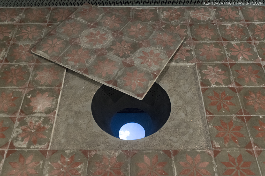
Talk about “digging a hole to China.” This one’s right through the Guggenheim’s ground floor! Wang Gongxin, “Sky of Beijing,” 2017, Color video installation with sound.
“MIRANDA:
O, wonder!
How many goodly creatures are there here!
How beauteous mankind is! O brave new world,
That has such people in’t!
PROSPERO:
‘Tis new to thee.”
(Shakespeare, The Tempest, Act 5, Scene 1)
The International world of Chinese Art is a dichotomy, it seems to me. On the one hand you have record prices being paid for Chinese Art all over the planet (particularly in the tightly controlled domestic Chinese market), to the point that China is now the largest, or second largest, Art market in the world, depending on who you read (as of the latest figures, 12/31/2016). Meanwhile, a large part of the Western world is sitting back with absolutely no idea what is going on, who these Artists, not-named Ai Weiwei, are, and what all the fuss is about. Some of this market explosion may be due to a slumping Chinese stock market, some due to limited investment options in China, and some is good ol’ interest in Art. (Of course, prices being paid for any Art, or anything, are no indication of quality or “importance.” Regarding buying Art, my thoughts are here.)
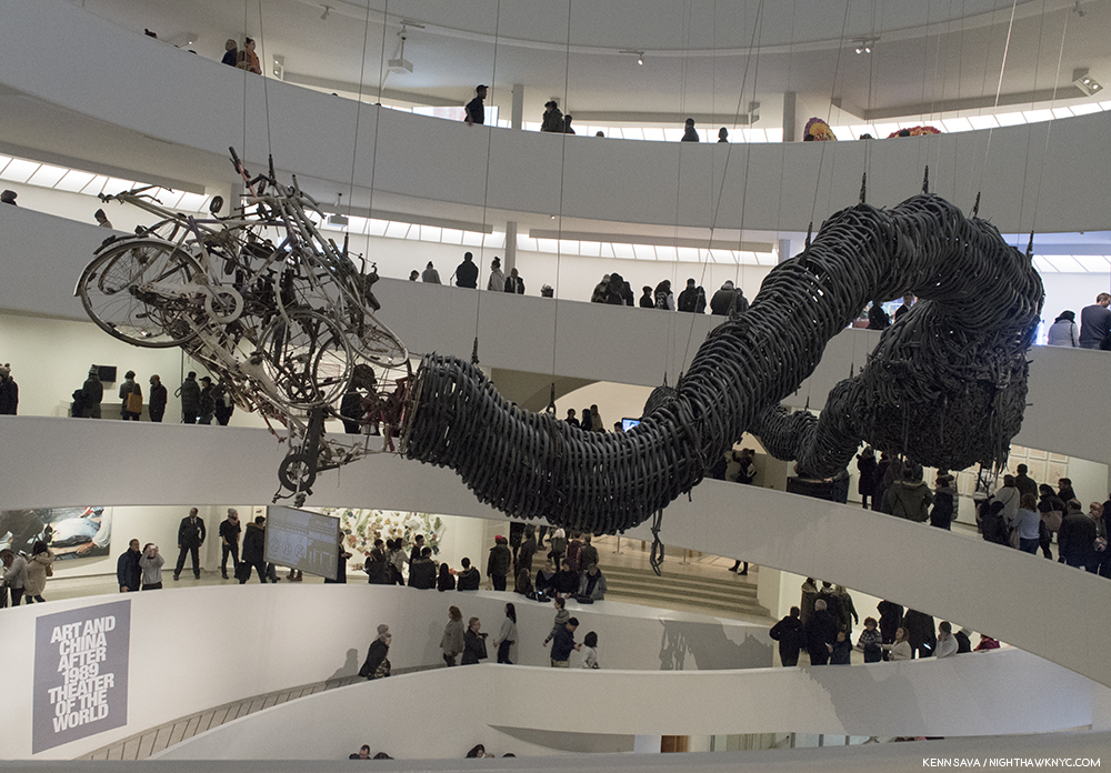
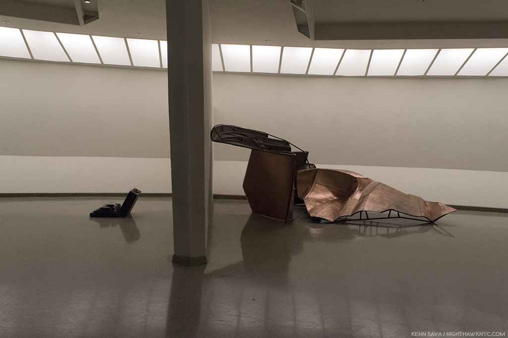
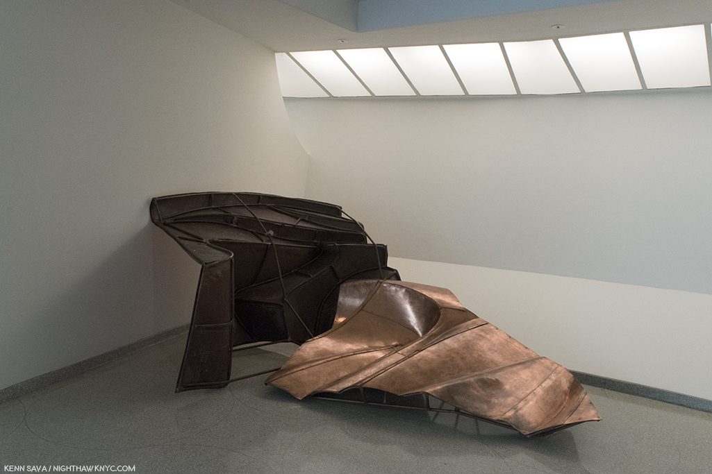
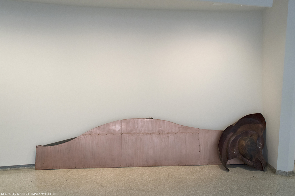
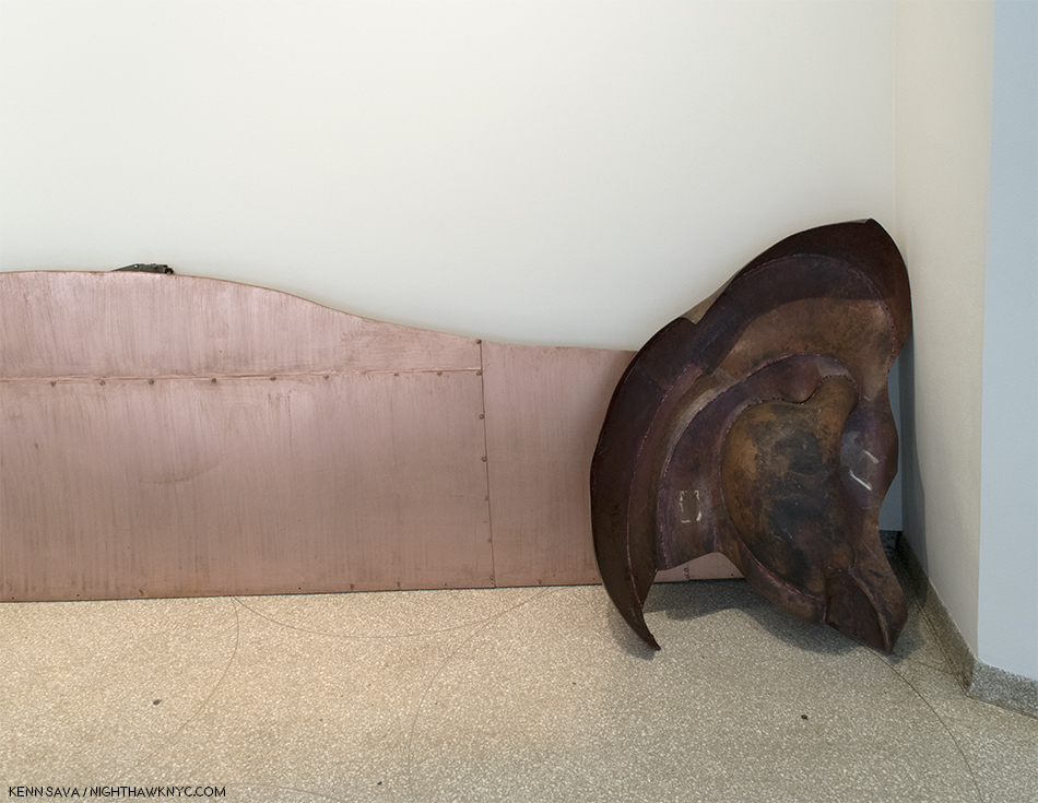
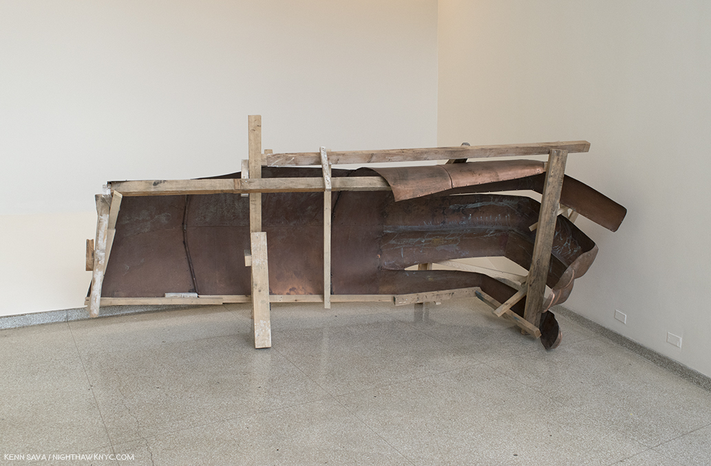
Chen Zhen, “Precipitous Parturation,” 1999, Rubber bicycle inner tubes, fragments of bicycles, toy cars, aluminum, silicone and paint. Though living in Paris, Chen returned to his native Shanghai in 1999, one year before he passed away, where he saw signs that read “By the year 2000, 100 million people will have their own cars.” In response, he created this huge snaking dragon, largely from bike parts, especially the countless rubber bike tires that form it’s body. It’s pregnant belly is opening to reveal a load of toy cars. One older mode of transportation giving birth to the next.
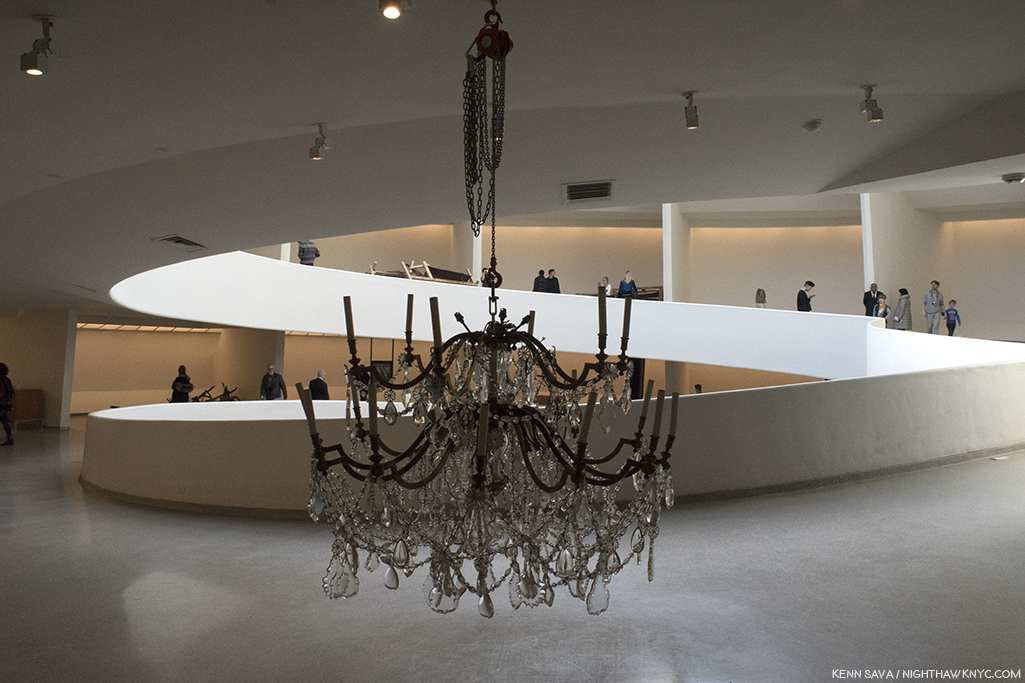
That crack in the iceberg of the lack of broad Western exposure you heard on October 6th was not another artifact of global warming. It was the opening of the Guggenheim Museum’s monumental, and already historically important, show “Art and China after 1989: Theater of the World,” the long-overdue comprehensive NYC Museum introduction to what’s been going on in the Art of China since that apocryphal year of 1989. It’s the biggest show of Contemporary Chinese Art yet in the U.S.A.
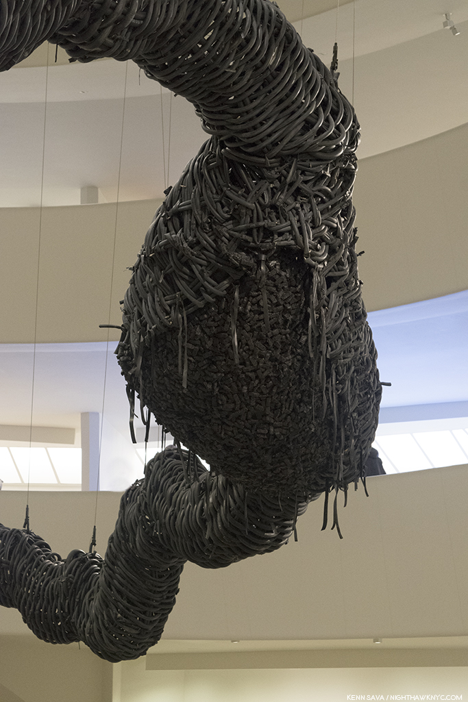
Detail of the “bursting belly” full of tiny toy cars. I can’t help but recall that both Marcel Duchamp and Robert Rauschenberg featured bicycles in their works. They are the two Western Artists I was reminded of the most in this show- whether or not they were influences on the Artists.
“Apocryphal” may be putting it mildly to characterize 1989…Empires fell (the communist’s in Eastern Europe). New ones were born (the first commercial internet service & the first written proposal for the world wide web), and other empires trembled- 1989 was the year of a protest involving 1 million Chinese calling for “government reforms and accountability” that lasted 6 weeks and 6 days centered in Beijing’s Tiananmen Square, (which means “Gate of Heavenly Peace,” named after the Tiananmen to it’s north, separating the Square from the “Forbidden City”). The protests (Plural. They took place in many cities in China) culminated in the “Tiananmen Square Massace” (or “June Fourth Incident,” locally), in which 10,000 people are said to have been killed, with many more injured.
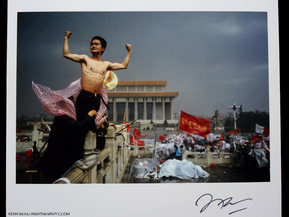
“It crystallized the spirit of the revolt,” Stuart Franklin, says on the verso of this 2015 Print issued by Magnum of his 1989 Photo, “Protestor in Tiananmen Square,” which he signed on the front. “It was a movement for freedom of expression, for basic rights, and against the outrage of official corruption,” he added. From my collection.
The iconic “Tank Man” Photo was taken by Magnum’s Stuart Franklin on June 5th. A tragic end to the decade of the relaxed “Reform-era,” begun in 1978, 2 years after the death of Mao Zedong. Marked by the “lifting China’s long-closed borders on the world and allowing for socialism’s planned economy to adapt to limited free-market principles,” it served to stimulate both experimental and avant-garde Artists as well as students to question the status quo and seek other possibilities. Smack dab in the middle of this period, Robert Rauschenberg arrived in China in 1982, his experience inspired him to return and mount the “ROCI CHINA” show (for Rauschenberg Overseas Cultural Initiative), in the country’s most prestigious venue, Beijing’s National Art Gallery, in 1985, which more than 300,000 people visited in the three weeks between November 15th and December 5th!
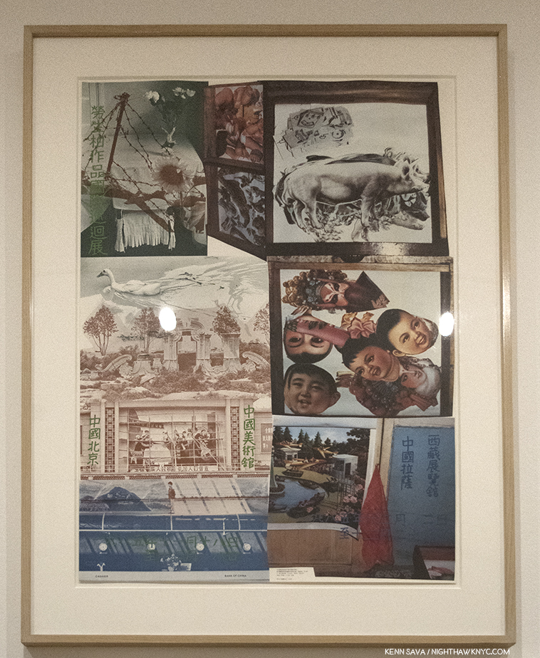
Robert Rauschenberg, Poster for “ROCI CHINA,” 1985, Offset lithograph, featuring Photos Rauschenberg took in China, as seen at “Robert Rauschenberg: Among Friends,” at MoMA, 2017 (apologies for the glare). The show moved to Lhasa, Tibet after Beijing.
The exhibition “confounded and inspired viewers, whose exposure to Western Art had been limited to reproductions within catalogs, and whose understanding of art had largely been confined to academic Painting, Sculpture, and Printmaking.” For me, at least, it’s hard to not see that there may be at least some influence of that show here. At the very least, Robert Rauschenberg (Duchamp, etc.) may have inspired Artists with a broader range of possibilities, as he has countless other Artists in the West. At the same time, however, many Chinese Artists were rejecting the “New Wave,” and all outside influences, focusing on finding their own answers and their own way forward. After June 4th in Tiananmen Square, radical economic reform came in, experimental Art was no longer “sanctioned,” all backed by strong suppression of any mention of what had happened on June 4th in the press, media, online, or in history books, that continues to this day, as do the international sanctions that the rest of the world responded with.
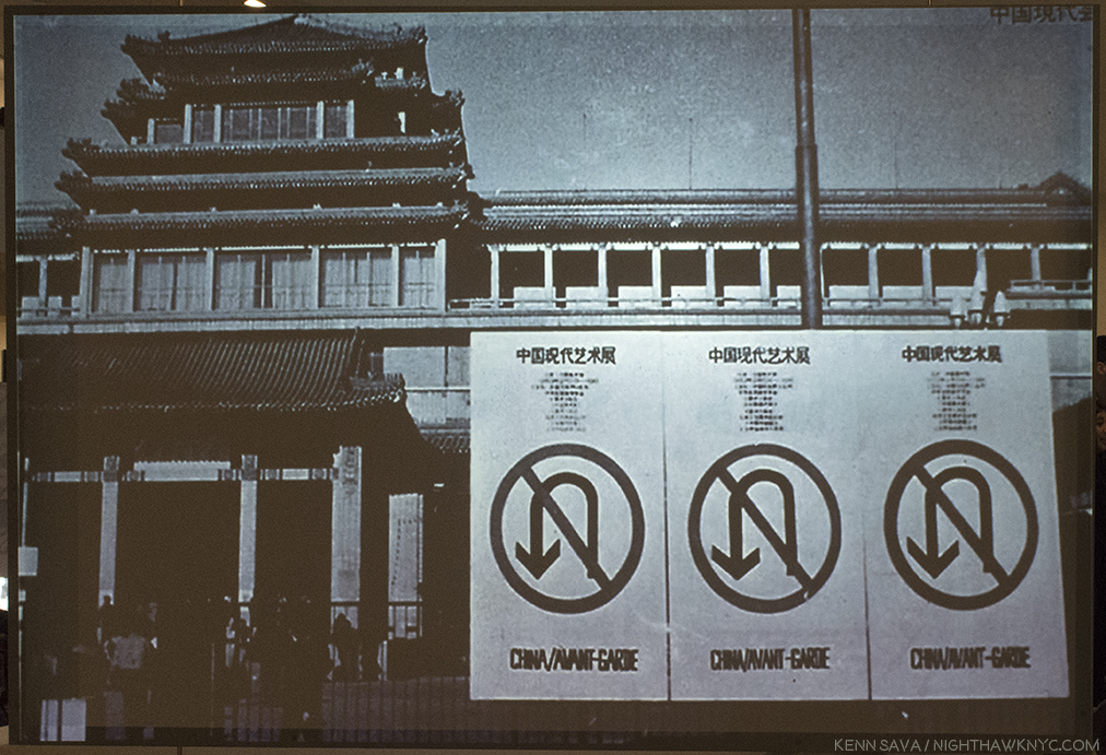
The scene outside the National Art Gallery during “China/Avant Garde,” with it’s famous “No U-Turn” Sign. From this moment on, there would be “no turning back.”
Four months before that horrible end, another event took place that has had lasting impact-inside and outside of China. The “China/Avant-Garde” Art Show opening on February 5th, 1989, which is seen to be the “official” start of Contemporary Chinese Art in some quarters, and marks the beginning of the period covered by this show. “China/Avant-Garde” was “official,” in more ways than one. First, it was officially sanctioned, as hard as it may be for most Westerners to believe, as the “China Modern Art Exhibition,” on one condition- that there would be no performance Art, and second, it was held in the National Art Gallery, Beijing, where Rauschenberg’s show had been 4 years before.
The “Official sanction” didn’t last long. Two hours after it opened, Artist Xiao Lu fired a gun at her own work, “Dialogue,” and the police shut the show down for breaking the ban on performance Art. It opened and closed a few times (once for a bomb scare, which might have been a “performance”), before running it’s scheduled allotted length of time. By then it had made history- Artistically, culturally, historically, and influentially. While many Artists wound up leaving the country after the climate changed, a good deal of that experimental creative spirit and energy remains. Regardless of where the Artists may be now, the range of creativity on view at the Guggenheim was unceasing, eye-opening, and a good deal of it was operating on multiple levels simultaneously.
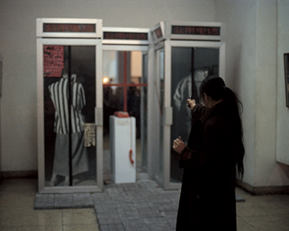
Xiao Lu fires a pistol at her work “Dialogue,” Custom-made telephone booth, Photograph, red telephone, glass, mirror, on February 5, 1989, 2 hours after “China/Avant-Garde” opened causing the immediate shutting down of the show. Photo from xiaoluart.com
With so many Artist options and so much time to cover (27 years), any number of alternate shows could’ve been mounted, but I think that what made it into Frank Loyd Wright’s rotunda and the two adjoining galleries, was, on the whole, exceedingly well chosen, with the caveats that, yes, that with 71 Artists included there should’ve been more than nine female artists included- a little under 8%, and, it felt to me that there was a plethora of video and installation Art, at the expense of other mediums, like Painting and Photography.
Lead curator Alexandra Munroe sums up the “post-Reform” environment- “Historical turbulence has given rise to an intelligentsia with a profound sense of skepticism towards governing ideologies and a predisposition to pragmatism in the absence of enduring meaning.” This extended to Artists working post-1989. “They produced works that questioned systems of truth and ideological formations…Eschewing Western humanist avant-garde ideals…experimental Artists approached ‘contemporary art’ as a new ‘other’ space outside the Western and Chinese Art words.”
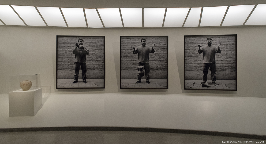
Ai Weiwei, “Dropping a Han Dynasty Urn,” 1995, 3 Gelatin silver prints and “Han Dynasty Urn with Coca-Cola Logo,” 1993, left, Paint on earthenware.
For me, a classic example of this is Ai Weiwei’s “Dropping a Han Dynasty Urn,” 3 Gelatin silver prints, from 1995, is a prime example of letting go (sorry) of the past, it’s influence, and the “baggage” the past brings with it for Artists to “live up to,” or to continue what has been done before.
Many are undoubtedly familiar with those Ai Weiwei works. Not being able to include everything else on view in this piece, I’m going to focus on what stood out to me in Painting, Drawing & Photography, along with a few other works in other mediums I just have to include. The works are not listed in any particular order.
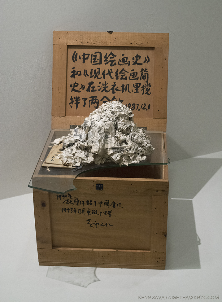
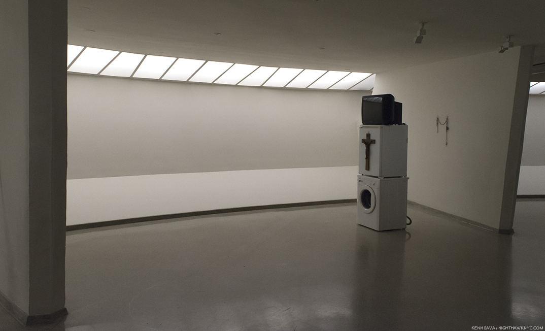
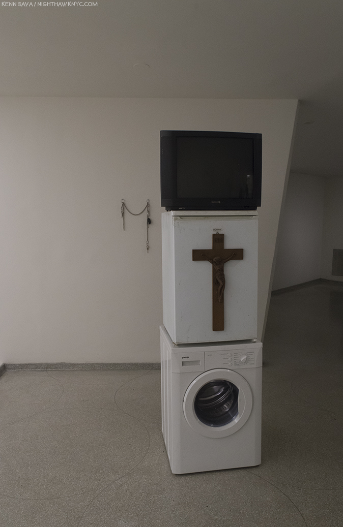
Huang Yong Ping, “The History of Chinese Painting And A Concise History of Modern Painting Washed in a Washing Machine for Two Minutes,” 1987, reconstructed in 1993, Ink on wooden crate, paper pulp and glass. The original was a work displayed at “China/Avant-Garde,” in 1989.
Huang Yong Ping, “The History of Chinese Painting And A Concise History of Modern Painting Washed in a Washing Machine for Two Minutes,” 1997, Ink on wooden crate, paper pulp and glass, begins this show with a strong statement that the past is over. History, as written in these two Chinese Art History Books, needed to be cleansed. The result is illegible, and so stands as a metaphor. Here is an Artist struggling with the question of how to become “modern” without becoming Western. Will studying Art History lead to something truly new, or will it just be recycling what’s been done? On one hand, the pulp though having been washed, is dirty. But, the slate has, also, been wiped clean since the books are now illegible. As Joe Strummer said, “The future is unwritten.” After this work, (which was shown in the 1989 “China/Avant-Garde” show), it was. As such it stands as an ideal starting point for this show. Let’s see what was “written” after.
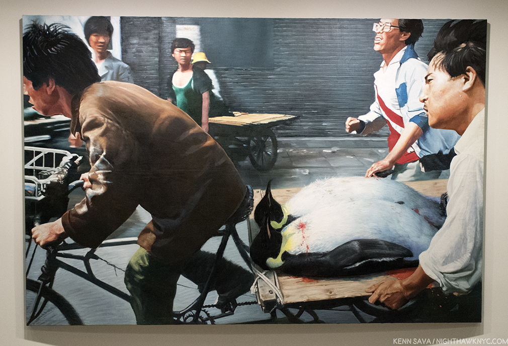
Wang Xingwei, “New Beijing,” 2001, Oil on canvas. In this work Wang Zingwei reimagines a well known Associated Press news photo by Liu Heung Shing, “Beijing- Rushing students to hospital,” 1989, taken on June 4th during the Tiananmen Square tragedy, where heroic bicyclists were shown rushing off with some of the wounded/injured, or deceased. Everything is as it is in the Photo, except Wang Xingwei has substituted 2 Emperor Penguins- animals not native to China, and therefore devoid of the political import Painting 2 wounded (or dead?) students would have had, while those helping are pulling together in ways that Chairman Mao espoused.
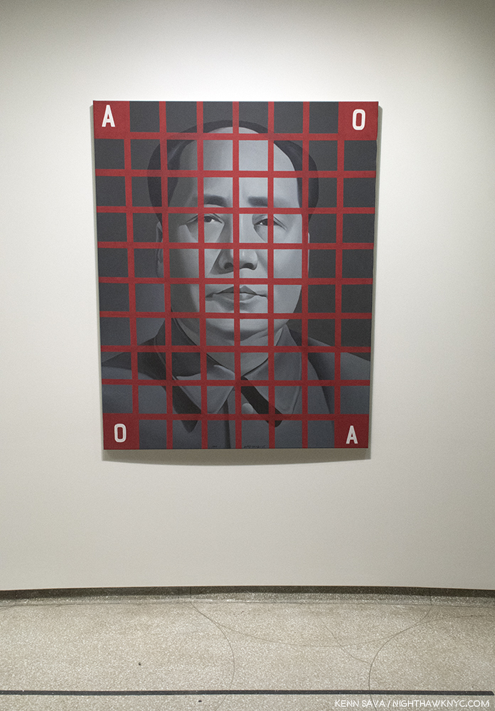
Wang Guangyi, “Mao Zedong, Red Grid No. 2,” 1988, Oil on canvas. Daring, and shocking, even 12 years after the death of Mao, given the omnipresence and power of his image in China. Unlike Andy Warhol’s “Mao as celebrity” series on the early 1970’s, Wang Guangyi has placed the former Chairman in a grid. It almost looks like he’s behind bars. It looks like it was done by (or influenced by) Chuck Close. The grid being one way Artists, including Close, have traditionally transferred images from one medium to another, but here it feels like there’s a different kind of transferring going on. Wang Guangyi painted this in 1988, 12 years after the subject’s passing, when it’s “meaning” is something else, something less fearful, something almost as neutral as the color he’s painted in, where it looks more like an old black and white Photo, and as such, it’s an image now locked in the past.
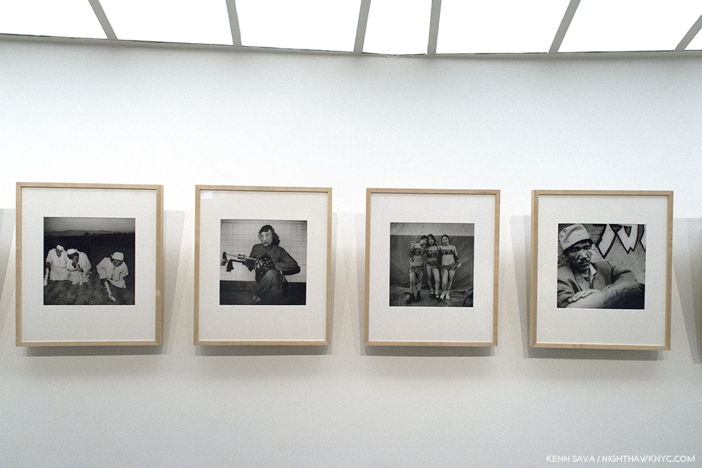
Liu Zheng, “The Chinese,” 1994-2002, 120 Gelatin silver prints. Among the Photography on display, these examples from the series of 120 stood out. Having worked on the state-run “Worker’s Daily” newspaper, his images go beyond the social realism they favored into a realm that isn’t quite “Street Photography,” and is significantly different from Robert Frank or Diane Arbus’ work, though the title is reminiscent of Frank’s “The Americans,” 1958. The rawness of the image is matched by the Photographer’s approach, which varies in each memorable shot.
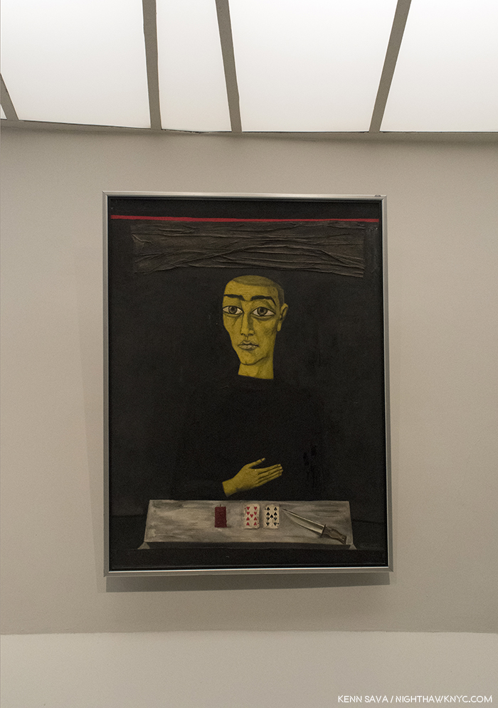
Zhang Xiaogang, “New Year’s Eve, 1990,” Oil on canvas with collage of cloth and playing cards. After being hospitalized due to a bout with alchoholism, Zhang emerged from a dark period in his life in 1985 and joined the New Wave movement. This work has a haunting isolation to it. All we can really see are the figure’s left hand and his head/face. It’s as if he’s disembodied. In front of him lie 2 playing cards an unlit candle and a knife. Has the candle gone out? Is the knife for protection or self harm? This work was Painted after Tiananmen Square and refers to the beginning of the New Year. A black cloth hangs over the subject’s head, like a black cloud, with a red lining, possibly referring to additional raining of blood. The eyes stare straight out from the canvas, but not at the viewer. His glance doesn’t seem to make it out of his eyes.
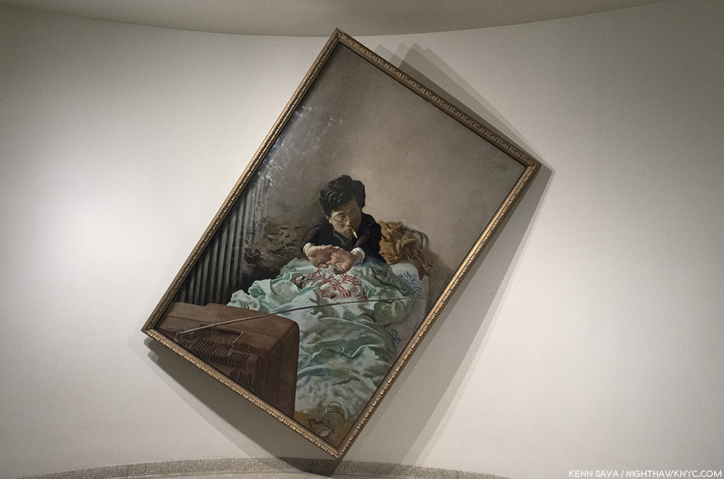
Zhao Bandi, “Young Zhang,” 1992, Oil on canvas. One of the more popular Paintings in the show, judging by how many selfies I’ve seen taken in front of it online. It’s effect goes beyond it’s unorthodox off center hanging. Zhao shows us a young worker, living in a cramped space with few belongings beyond his embroidered comforter and a TV. Rising from sleep, he puts on his glasses and grabs a cigarette and stretches as he begins his day in his life in post-Reform China, where the economy is now booming, though the fruits of that may be slow to reach all levels of the workers. This work was painted with a model in the Artist’s small room, on his bed. The title “Young Zhang” could really be “Young Everyman,” with Zhang being one of the most popular surnames in China.
Lin Yilin, “Safely Maneuvering Across Linhe Road,” 1995, Still from Performance video, CITIC Plaza, June 3, 1995
Lin Yilin, “Safely Maneuvering Across Linhe Road,” 1995, Color video with sound 36 minutes 45 seconds. Living in Manhattan, where pedestrian safety is an ever-increasing concern, there was no way I could leave this work out.
].”
Here, the Artist constructs a wall of cinder blocks on a road, then moves it block by block, column by column, across all 4 lanes until he reaches the other side, safely. At the show, all 36 minutes of it were looped. While I immediately related to the issue of trying to cross any street safely, Katherine Grube, who spoke with the Artist, said “Mr. Lin’s objective was to create a ‘movable wall,’ animated by his own efforts that would interrupt the steady flow of traffic…and call attention to the unnatural, inhuman pace of urbanization and the human dislocations necessary to, and inseparable from such monumental environmental change.”
Ai Weiwei, “June, 1994,” Gelatin silver print
Ai Weiwei, “June, 1994,” Gelatin silver print- A while back in these pages I called Ai Weiwei the “Artist of the Decade,” even though there were three years left to run in it. I still feel good about my choice. He was named the #1 “Most Influential Photographer in the World,” among 50 selected in 2013, and by now he is, or will soon be, the most Photographed Artist in Art history. Still, it’s now obvious that he’s not the only important Chinese Artist of the past, let’s call it 3 decades. While his works, “Fairytale,” 2007, and “Citizen’s Investigation,” 2009-10, both “multi-media,” for lack of a better term, were also included, I picked this one because Ai Weiwei was in New York in June, 1989, when Tiananmen Square happened. He took this in Tiananmen Square on the 5th anniversary. It features his future wife, Lu Qing, center, while two soldiers walk casually behind her, another woman has her back to her right behind her, and, at the moment Ai shot this, a pensioner driving a powered cart, with his or her crutches visible, drives into the frame. Mao overlooks the whole scene. in the distance. What I haven’t seen mentioned, either on the wall card, or in the show’s catalog is that beginning the next year, 1995, Ai Weiwei began his famous “Study of Perspective” Photograph series, that lasted until 2003, where he flipped off important monuments around the world, including Tiananmen Square. Perhaps, learning from his experience with “June, 1994,” he opted to create a similar “affront” to “power” through means that required less “production,” and therefore, allowed him more control over the final result. Yes, it can be said he, therefore, stripped it down, even further than here, to it’s bare essentials.
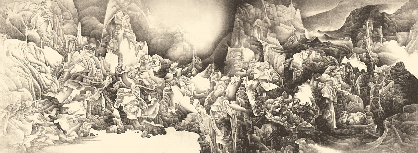
Liu Dan’s “Splendour of Heaven and Earth,” 1994-95, Ink on paper. 196 by 75 inches. Photo- Liu Dan, Guggenheim Museum.
Liu Dan, “Splendour of Heaven and Earth,” 1994-95, Ink on paper. Besides Ai Weiwei, Liu Dan is the other Contemporary Chinese Artist that has captivated me since I discovered him at The Met’s “Ink Art: Past as Present in Contemporary China” show in 2013. A close look at the incredible detail in his (often) huge works, reveals the man is a magician. I have since tracked down every book of his work I can find. Each of his larger works have the look and feel of being part of a giant scroll, with no “beginning” and no “end.” They seem to be influenced by ancient Chinese landscape Painting and the study of “Gongshi,” or “scholar’s rocks,” which have the abstract qualities of fantastic 20th Century sculpture. Still, I have absolutely no idea how he creates such incredible Paintings/Drawings, this one is almost 16 1/2 FEET long! Now living in the USA, he is gradually receiving the attention he richly deserves (witness “Ink Unbound: Paintings by Liu Dan,” where he reimagines classics of Western Art, which closes on January 29th at the Minneapolis Institute of Art). It might be too late for latecomers, though. His work already fetches large sums at auction, making it hard for it to find it’s way into public collections.
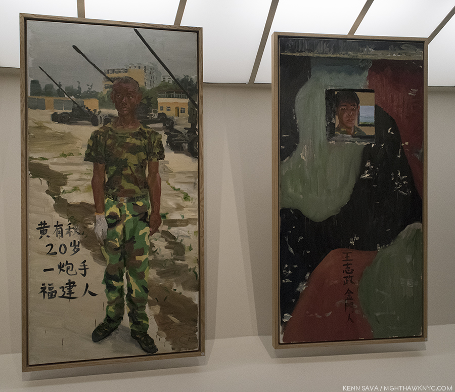
Liu Xiaodong, Two works from “Battlefield Realism: The Eighteen Arhats,” 2004, Oil on canvas.
Liu Xiaodong, “Battlefield Realism: The Eighteen Arhats,” 2004, Oil on canvas, 18 panels. Liu Xiaodong created a series of 9 diptychs of portraits of soldiers stationed on islands that are contested by China and Taiwan, Painting one soldier in each army in a pair. After Painting each portrait, he asked the subject to Paint their name, age and birthplace on the work. The result makes it hard for outsiders to know which army each soldier represents, and brings home the fact that though the soldier on the left, above, is 20, they all look very young, and the series quickly becomes a powerful meditation on…well, that’s up to you. For me, the two sides look indistinguishable. I can’t tell which side is which. About all that’s obvious is that these are young people with their whole lives ahead of them…unless war cuts them short.
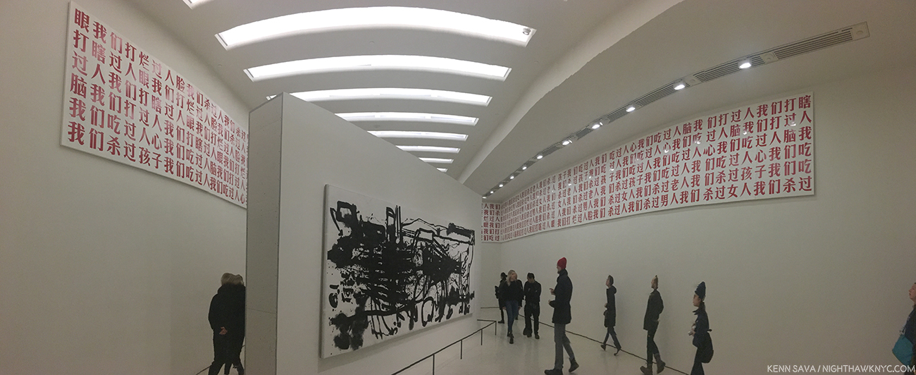
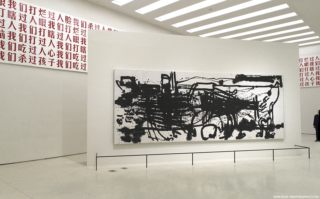
Gu Dexin, 2009-05-02, 2009, Mounted on the top of the surrounding walls, Paint on 72 wood panels, Yang Jiechang, Lifelines I, 1999, On center pillar (and below), Ink and acrylic on paper mounted on canvas, as seen at the Guggenheim.
Gu Dexin, “2009-05-02,” 2009, Paint on wood, (Originally consisting of ) 74 panels, concrete and red lacquer, color video installation. Its’ fitting the show ends with Gu Dexin’s work, “2009-05-02,” At the Guggenheim, it consisted of a frieze surrounding the space who’s panels contain 11 sentences, unbroken, unpunctuated and repeated, which read, “We have killed people we have killed men we have killed women we have killed old people we have killed children we have eaten people we have eaten hearts we have eaten human brains we have beaten people we have beaten people blind we have beaten open people’s faces.” These sentences are said to evoke the revolutionary writer Lu Xun’s “A Madman’s Diary,” from 1918. The work bears the same title as the show at which it debuted, as seen below, where it consisted of three components- a video of white clouds in a blue sky looped on video screens mounted over the gallery’s windows, above the 74 Painted panels. At the center of the gallery’s floor was a concrete plinth bearing a single sentence: “We Can Ascend To Heaven.” The show was up during the 20th Anniversary of the June 4th Incident in Tiananmen Square.
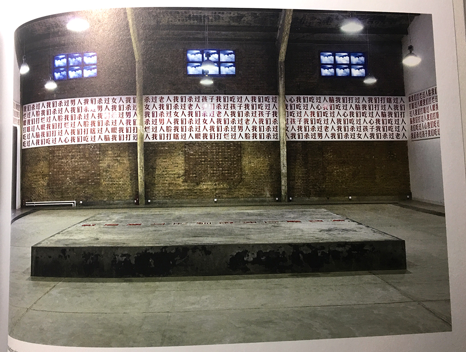
Gu Dexin, “2009-05-02,” installed at it’s premiere, Galleria Continua, Beijing, May, 2002, with the concrete plinth with red lacquer, below, and the video screens, above, from the show’s catalog.
During the run of the “2009-05-02” show, “Gu Dexin declared that ‘2009-05-02’ would be his last Artwork. He then proceeded to retreat entirely from Art and the Art world, which he understands as having become complicit in a political, cultural, and moral system which he refuses to accept. This refusal, more than any single object or image, may be his most enduring work of Art…He is, in singular ways, the conscience of his generation.”
Yang Jiechang, “Lifelines 1,” 1999, Ink and acrylic on paper mounted on canvas. 236 x 91 inches.
At the Guggenheim, Gu Dexin’s “2009-05-02” panels were installed surrounding Yang Jiechang’s “Lifelines 1,” 1999, in the final gallery at the top of the 6th floor. Of “Lifelines 1,” which Yang Jiechang created for the 10th Anniversary of Tinananmen Square, Alexandra Munroe says, “”It recalls the pathways volunteers made in Tiananmen Square during the demonstrations to ferry hunger-striking students to the hospital.”
I’ve never been to China so I have to see this show through Western eyes. Overall, I find Chinese Contemporary Art to be one of the most interesting and fresh realms of Contemporary Art anywhere. I’m not sure exactly why, but it seemed to me that even the most “avant-garde” works were not as obtuse as much of what I see around NYC, and most of what I’ve seen in my lifetime. While I’m not big on Art that meeds to be “explained,” given the differences in language and culture, I took a different approach here in an effort to “meet the work halfway.” Almost every time I did, I found the work not only made sense, I became aware of different levels the Artist was working on. Of course, it should be said that though Shakespeare’s “Tis new to thee” applied to me, with the two noted exceptions, most of these Artists have been long established both in China and Internationally. As I said, however, it would have been possible to mount any number of alternate shows given the universe of Artists to choose from. As a result, the only possible way to look at this show is that it represents “the tip of the iceberg” of Contemporary Chinese Art.
Therefore, trying to sum up this show is as pointless as trying to sum up China itself. The strength of the show lies in the diversity of its vision, that so many unique, strong voices are at work creating impressive, and interesting, work right now is what counts. At those times when I wonder where the next big breakthrough will come from I see I need to cast a much wider net. It’s out there. And it’s probably going on right now out of the gaze of most of us.
“It’s new to thee,” indeed.
If this work can come out of/be born of repression? There may be more hope for the world than I feared.
“Art and China after 1989: Theater of the World” is my NoteWorthy show for December.
My previous Posts on Ai Weiwei, covering his NYC shows in Brooklyn in 2014 and four Manhattan shows in 2016 may be found here.
My look at Cai Dongdong’s recent show at Klein Sun Gallery may be found here.
*- Soundtrack for this Post is “Brave New World” by Iron Maiden, released in 2000 on the album of the same name, which was inspired by Aldous Huxley’s novel.
NighthawkNYC.com has been entirely self-funded & ad-free for over 7 years, during which over 275 full length pieces have been published!
I can no longer fund it myself. More on why here.
If you’ve found it worthwhile, PLEASE donate to keep it online & ad-free below.
Thank you, Kenn.
Written & photographed by Kenn Sava for nighthawknyc.com unless otherwise credited.
To send comments, thoughts, feedback or propositions click here.
Click the white box on the upper right for the archives or to search them.
Subscribe to be notified of new Posts below. Your information will be used for no other purpose.

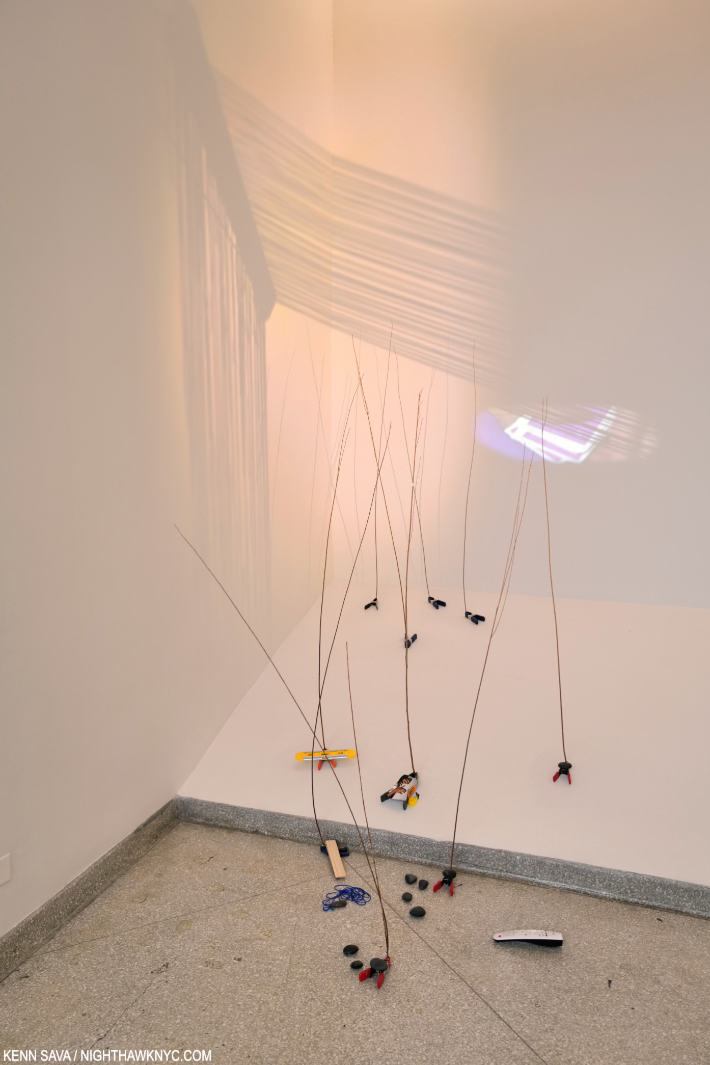
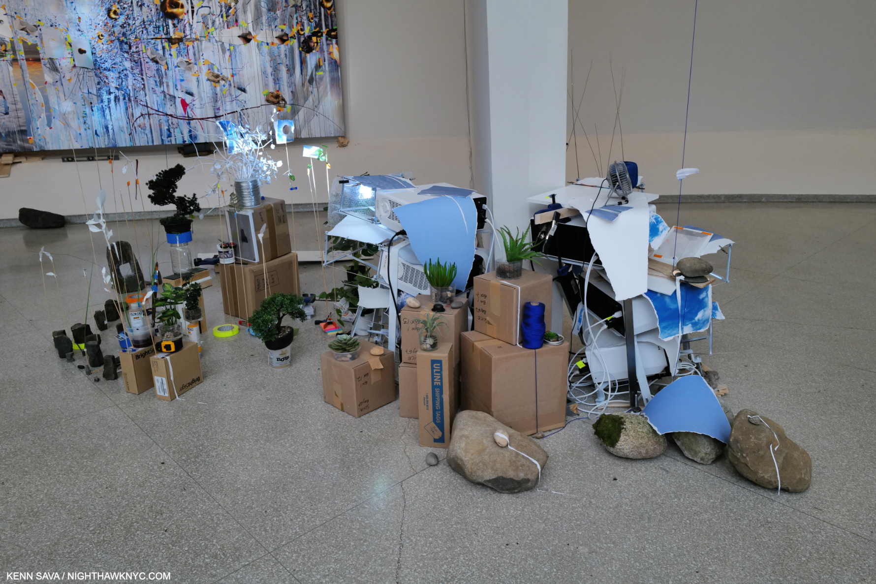
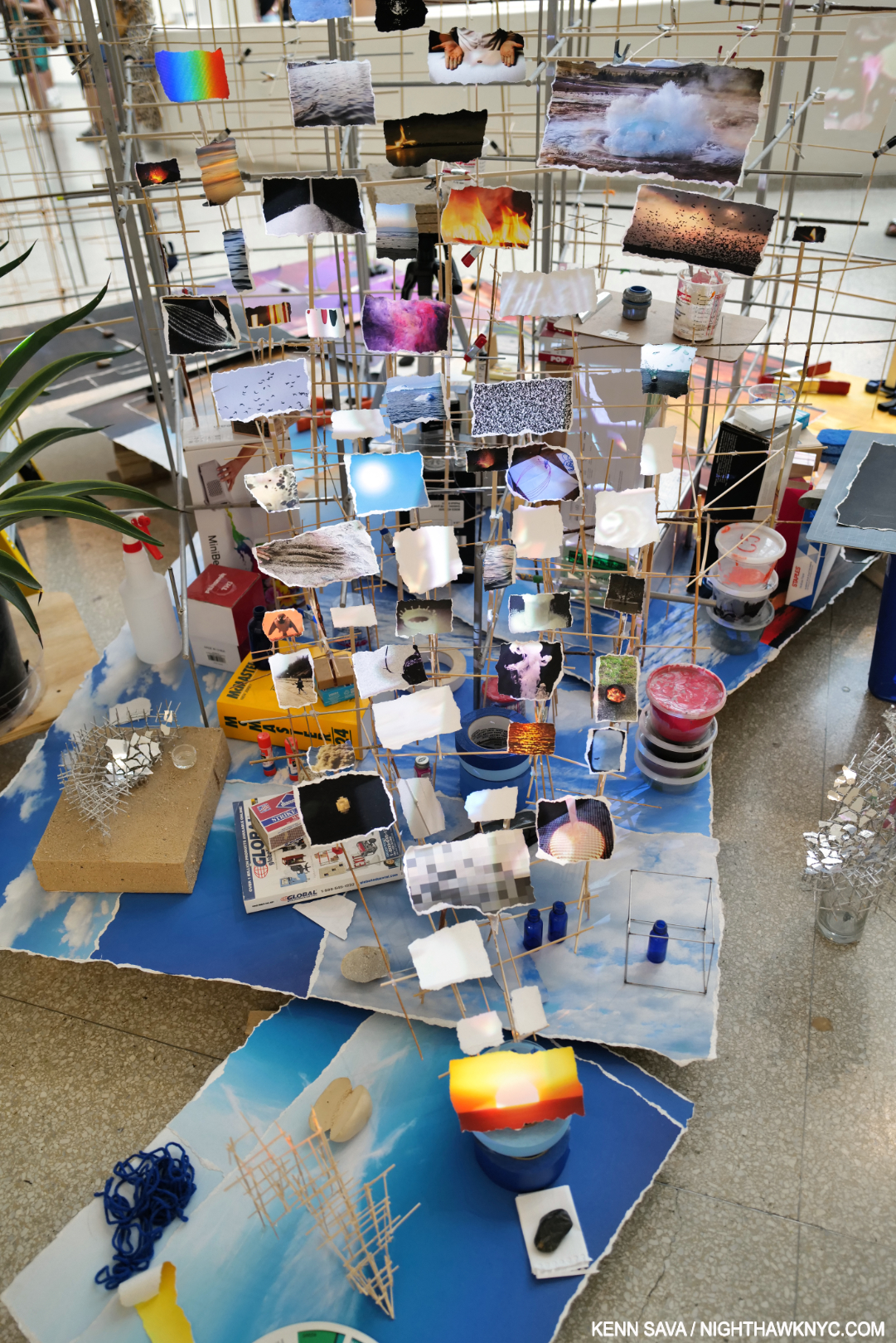
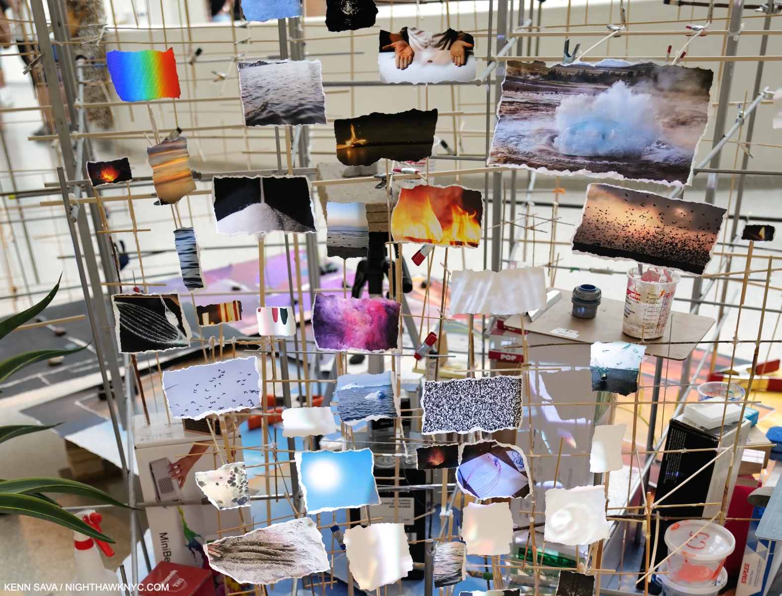
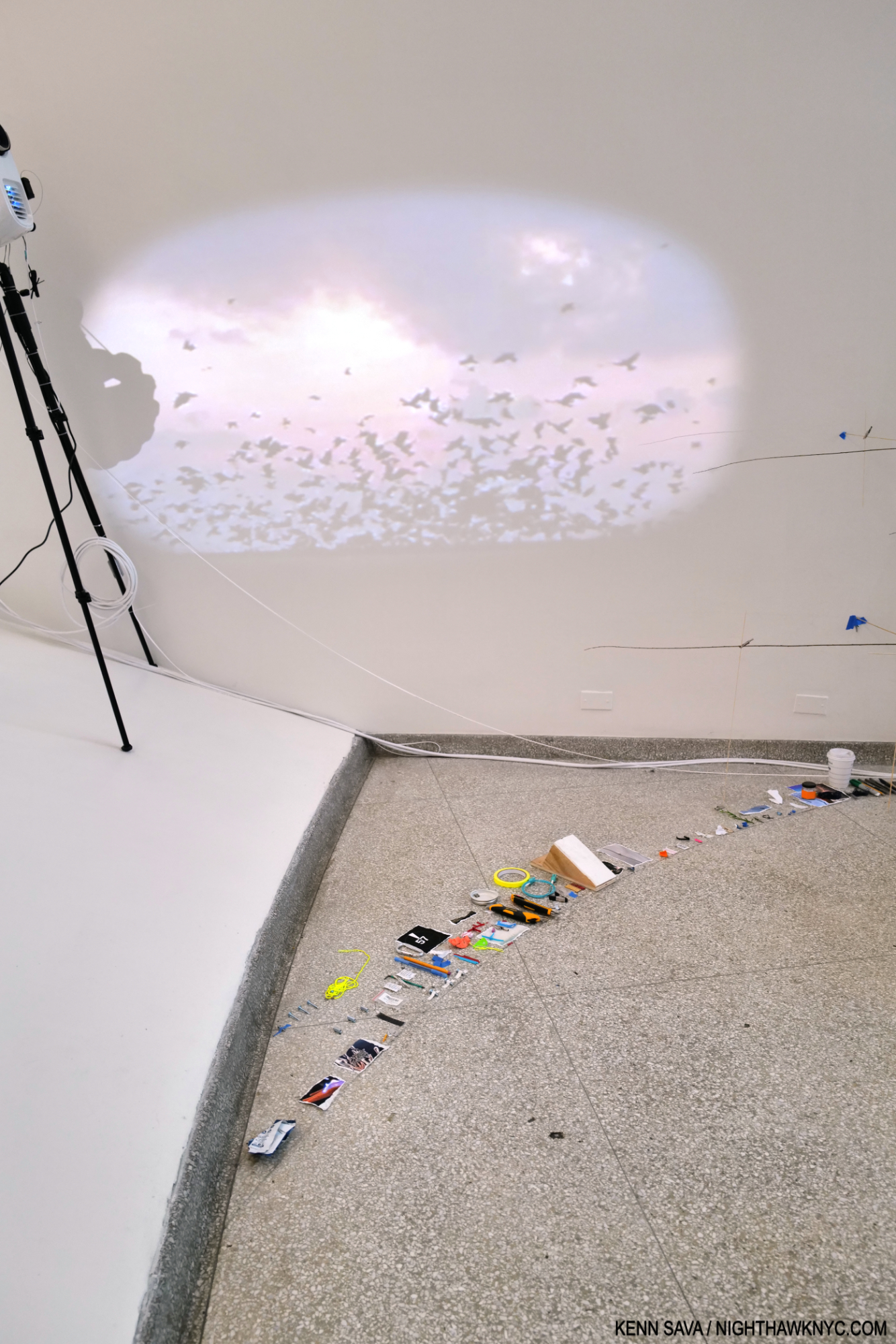
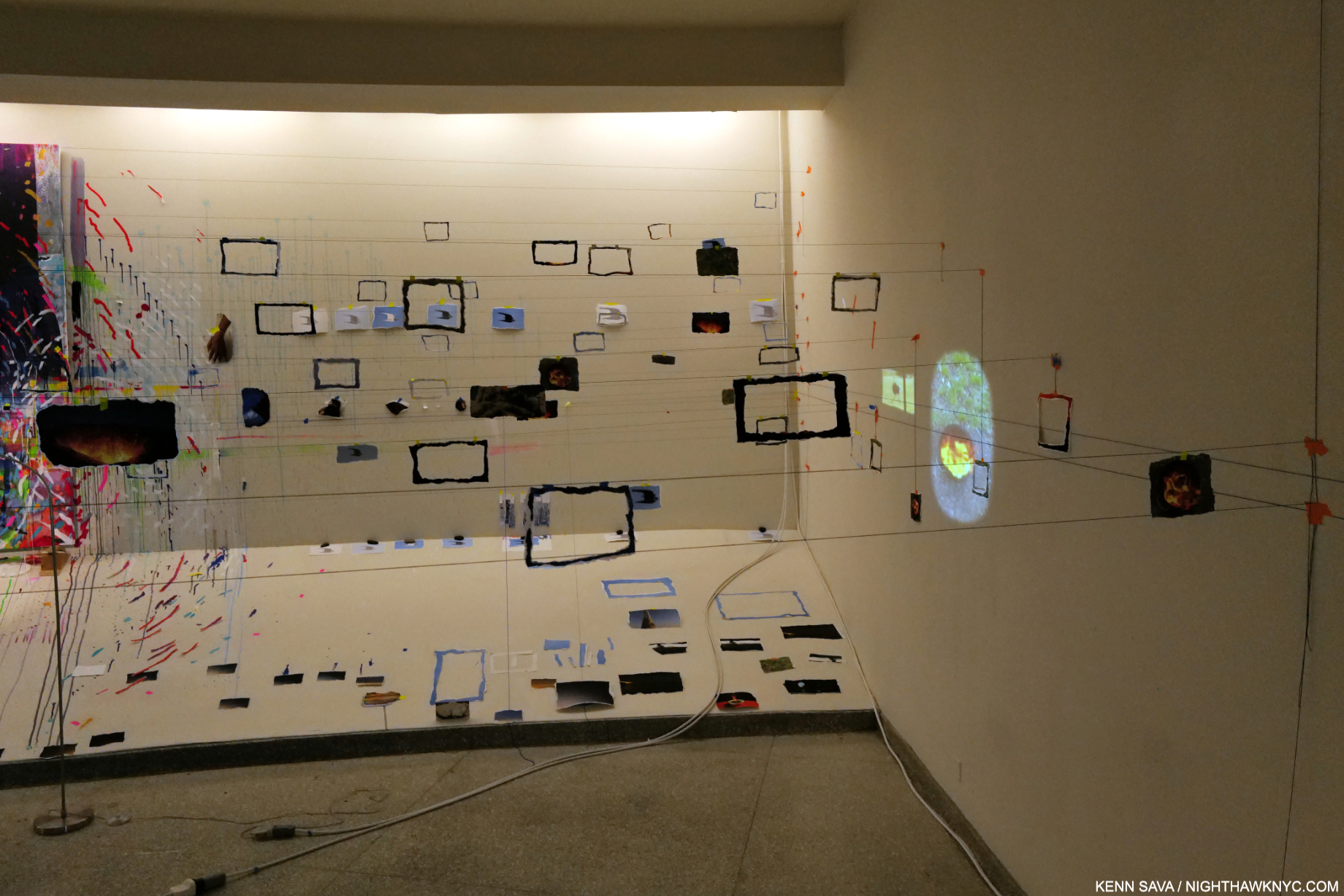
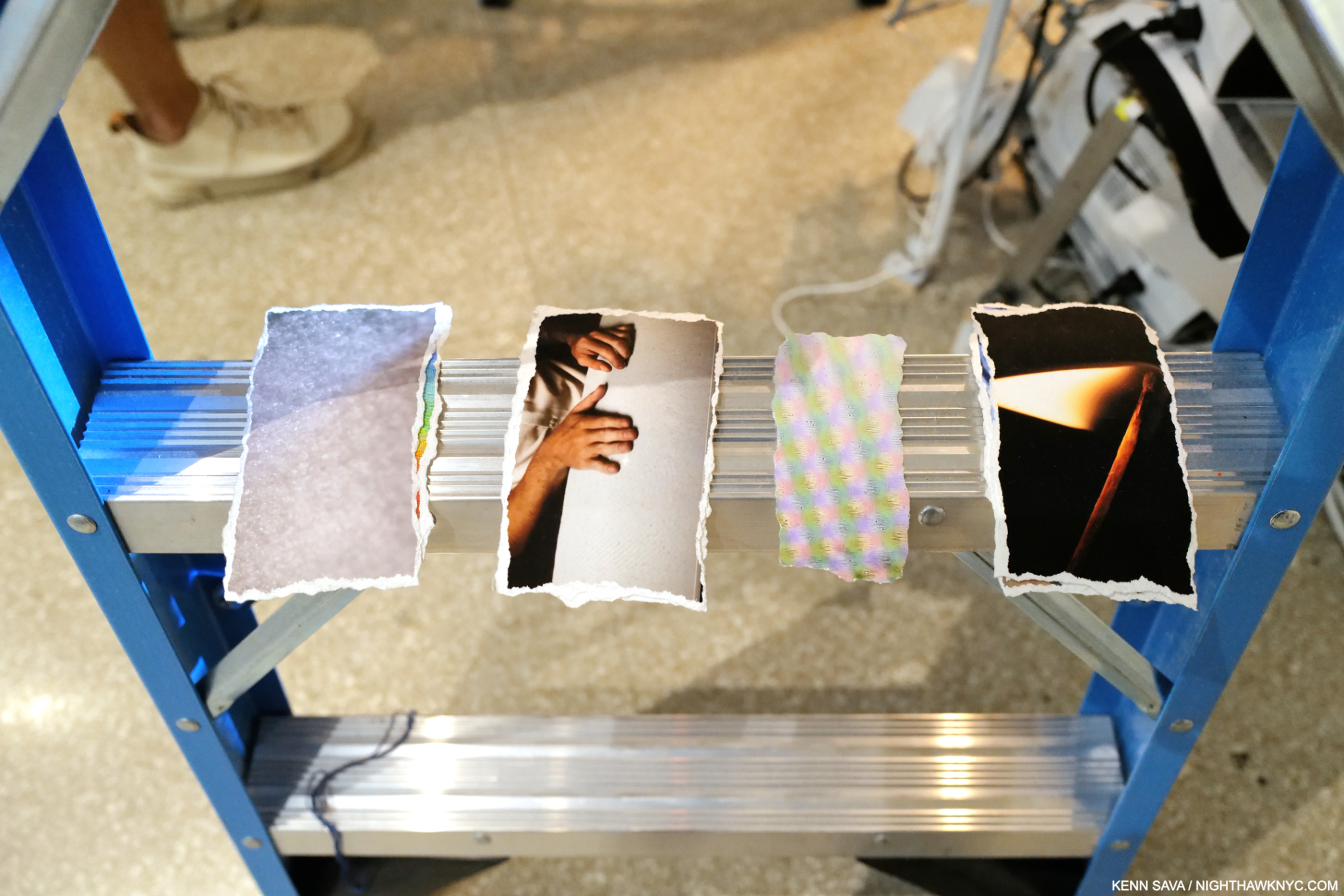
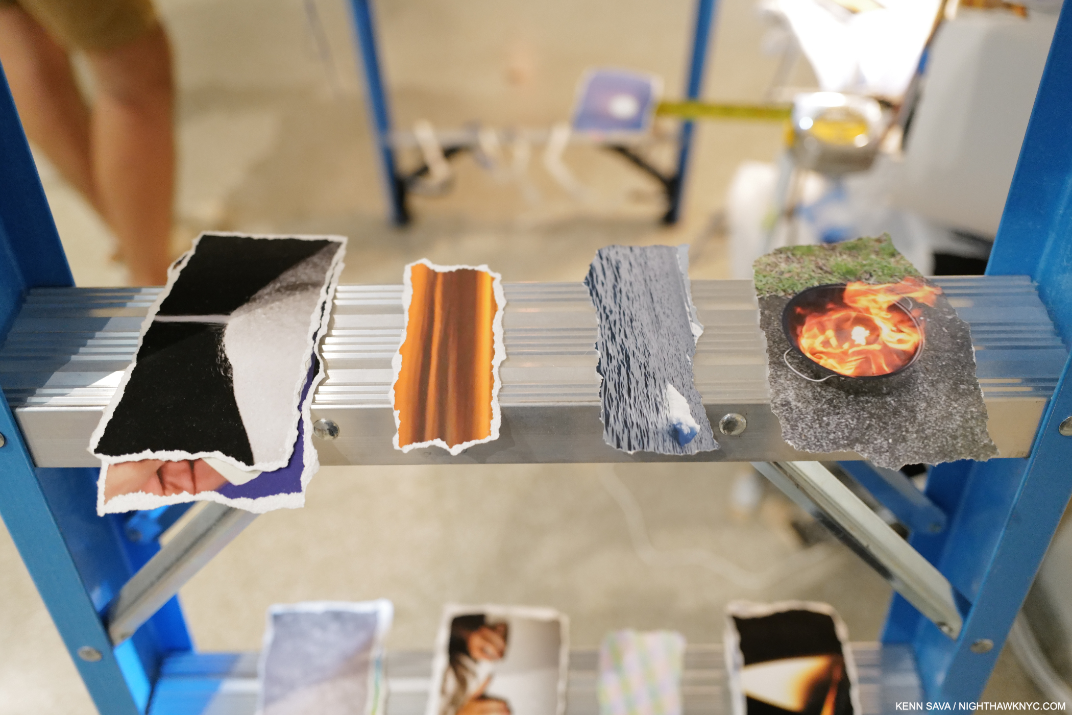
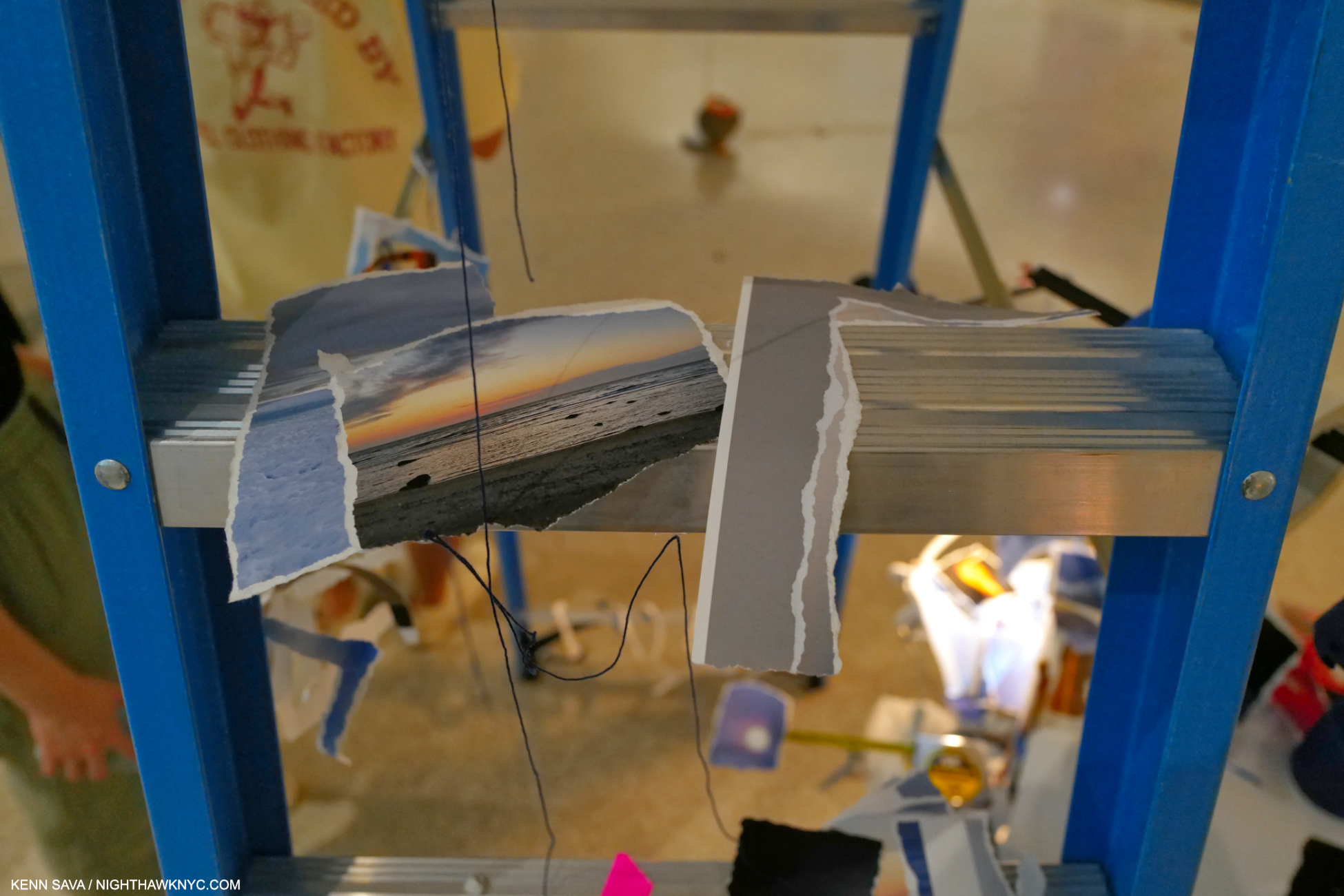
 The following are details from Bay 5, Times Zero