NighthawkNYC.com Is Seven! A Year In The Life Of…

Written & Photographed by Kenn Sava.

In honor of its 7th Anniversary, July 15, 2022, I decided to take a look back at Year Seven of NighthawkNYC.com, my most challenging year yet.

Lying in the hospital in November, I seriously doubted I’d be able to continue NighthawkNYC.com and get through Year Seven. Then, things got a bit worse…

During Year 7-
-The galleries that survived (alongside the countless galleries, stores, restaurants and businesses that didn’t) reopened, with restrictions, after the covid shutdown.
-The museums moved closer to full schedules (though not completely), with restrictions.
-Cézanne, Alice Neel, Jennifer Packer, Jasper Johns were each given blockbuster shows. Richard Estes, who like Jasper Johns also turned 90 this past year, was not. I wrote about all of them this year.

Along with this, this past year was a very hard year for me, personally. I hit year 15 free of cancer, but dealt with a mysterious illness that I still don’t have an answer for, then suffered a devastating financial setback. In spite of ALL of it, I created & published TWENTY-FIVE full-length pieces in those 52 weeks! 20 of them while I was working on the 3 Richard Estes pieces that took me 11 months to finish.
See for yourself-

Published on NighthawkNYC.com between July 15, 2021 and July 14, 2022, Year Seven, interspersed with personal “highlights” of my year-

August 1, 2021- “The Met’s Alice Need Love Letter To NYC” (Clicking on the title in each white box below opens the piece so you can revisit it.)

The Met’s Alice Neel Love Letter To NYC

August 21- “Don’t Call Chuck Close A ‘Photorealist'”

The last time I saw Chuck Close, I ran into him while we were both out gallery crawling late one Thursday eve in October, 2017, here in a small basement gallery in Chelsea. It was fascinating to watch him study Art he (or I) had never seen before and hear his comments.

Don’t Call Chuck Close A “photorealist”

September 10- “Remembering 9/11”- For the very first time, to commemorate the 20th Anniversary of that that horrific, indelible day, I shared my memories of 9/11 and the Photos I took before, on 9/11, and immediately after.

Just unimaginable. The view from my window shortly after 9:05am on 9/11/2001 showing the North Tower, 1 World Trade Center, on fire. I’ve never shared any of the Photos in this piece before.

Remembering 9/11

On September 15th, I began having spells of lightheadedness. I immediately went to the doctor, who tested me and couldn’t find anything wrong. 

September 21- “Cézanne’s Other Revolution”

The Murder, 1874-75, Pencil, watercolor, and gouache on paper. In this tiny work, the knife is held high amidst an idyllic scene, with an ominous cross lurking above.

Cézanne’s Other Revolution

October 23- “Art Is Back In Chelsea”

Metro Pictures on West 24th Street. I have seen many memorable shows here, including the fine Louise Lawler show that’s up now. They said they decided to close because of the globalization of the Art market, which doesn’t suit their model. I’ll miss it.

Art Is Back In Chelsea

November 7- “Tyler Mitchell: Bringing Joy Back To Art”

Tyler Mitchell

Tyler Mitchell: Bringing Joy Back To Art

At 4:30pm on November 9th, I nearly fainted crossing 8th Avenue. Wearing all black in the dark, I’m sure I would have been killed if the light had changed. I staggered to the other side then managed to get in a cab and go to the Emergency Room. After 10 hours, they decided to admit me. I was in the hospital for 3 days and saw 27 doctors. None could tell me what was wrong. I walked home (about 2 miles) after being released feeling just like I did when I went to the E.R. .

November 19- “John Chamberlain’s Twisted Dreams.” A nurse chastised me for working on this piece while I was in the hospital.

John Chamberlain’s Twisted Dreams

At 4:30pm on November 20th, the day after I published the John Chamberlain piece, I had another near fainting spell. I went back to the Emergency Room where I spent another 7 hours. Again, they couldn’t find a cause. This time I was released and walked home. To this minute, I still don’t know what was wrong. I was subsequently put on medication for a heart problem discovered during testing. The lightheadedness seemed to largely get better. The doctors I informed of this said it didn’t make any medical sense. 

November 27- “NoteWorthy PhotoBooks, 2021”

Zanele Muholi, the catalog for her show at, and published by, the Tate, London.

NoteWorthy PhotoBooks, 2021

December 28- “NoteWorthy Art Books (And Bricks), 2021”

Toyin Ojih Odutola, The UmuEze Amara Clan and the House of Obafemi

NoteWorthy Art Books (and Bricks), 2021

January 14, 2022- “NoteWorthy Music Book, 2021- Paul McCartney: The Lyrics”

From The Lyrics: Throughout the text Sir Paul regularly registers a very wide range of literature. Art is not left out. Left, we see him visiting Willem de Kooning, and right, one of his own Paintings from 1991.

NoteWorthy Music Book, 2021- Paul McCartney: The Lyrics

On January 20th, I suffered a devastating financial loss that leaves me having to focus on my survival full-time. To that point, I had worked on NighthawkNYC full-time for 6 1/2 years for no money, while other costs, besides my labor, have been quite substantial. 

February 4-  “Jasper Johns: Contemporary Art Begins Here”

Jasper Johns, Untitled, 2021, Acrylic and graphic over etching on paper. As strong as ever- at 90!

Jasper Johns: Contemporary Art Begins Here

February 19- “Cancer, +15”  Going in to cancer treatment, I had a 20% chance of getting through year 1 without additional treatment. Hard to believe I’m alive 15 years later…There are no words to express my Thanks. I hope sharing my experiences may help others…

Cancer, +15

February 21- “Jennifer Packer Arrives”

Jennifer Packer @ The Whitney. The word is out. The crowds are beginning to show up. December 28, 2021.

Jennifer Packer Arrives

March 21- “The Sculptural Photography of Vik Muniz”

Vik Muniz with his Nameless (Woman with Turban) after Alberto Henschel, 2020, Archival inkjet print, 90 by 59 inches, One of a kind.

The Sculptural Photography of Vik Muniz

April 4- “Nick Sethi’s PhotoBook Release In Canal Street”

Mind the meter. Nick Sethi takes it to the streets.

Nick Sethi’s PhotoBook Release In Canal Street

April 7- “The Brutal/Smells Like Teen Spirit Mashup” (Olivia Rodrigo meets Kurt Cobain)

Screencap of “Good 4 u,” Directed by Petra Collins.

The Brutal / Smells Like Teen Spirit Mashup

April 14- “Highlights of the Whitney Biennial: Matt Connors”

Matt Connors, One Wants to Insist Very Strongly, 2020

Highlights of the 2022 Whitney Biennial: Matt Connors

April 22- “Caslon Bevington’s Counterfeit Weather”

Caslon Bevington, Frictions (Variations A), 2022, Acrylic on panel, 16 x 20″

Caslon Bevington’s Counterfeit Weather

May 9- “Alec Soth: A Pound of Pictures”

Alec Soth: A Pound of Pictures

May 16- “Ahndraya Parlato: Magic, Mystery, Love & Death”

The cover of Who Is Changed and Who Is Dead

Ahndraya Parlato: Magic, Mystery, Love & Death

May 22- “Richard Estes: Painter. With No Prefixes”

Richard Estes even took over my banner for his 90th. Double Self-Portrait, 1967, from near the beginning of his mature career, seen here behind me.

Richard Estes: Painter. With No Prefixes.

June 6- “Richard Estes Art: What I See”

Richard Estes, Times Square, 2004, This may be the most technically astounding Painting I’ve ever seen, along with any Painting by Jan van Eyck. Having stood on this spot before, during and after 2004, I can certainly verify the overwhelming visual noise that still is Times Square, something that has never been more faithfully realized than it is here.

Richard Estes Art: What I See

June 19- “Richard Estes: Two ‘Manifestos'”

Self-Portrait, 2013

Richard Estes: Two “Manifestos”

June 29- “Learning to Think like David Byrne”

Learning To Think Like David Byrne

July 11- “Thank You, Sheena Wagstaff” I’ll miss the recently departed Chair of The Met’s Modern & Contemporary Department. I close out Year Seven of NHNYC with a look at what she’s given me, NYC, and the world this past decade.

Sheena Wagstaff looking at a very large work by Ursula von Rydingsvard at Galerie Lelong & Co., April, 2018, when I happened upon her when we were both making the rounds of galleries one afternoon (independently, of course).

Thank You, Sheena Wagstaff

P H E W!
I can’t begin to tell you how much work all of that was. Oh, and I got through it all, and spent all of the year, alone. Every minute of it for the second year in a row. Trust me. You don’t want to try it.

On July 15, 2015, I started this site to share my passion for Art and what I’ve seen in the NYC Art world with those everywhere else. In the past 7 years, I’ve published about 275 full-length pieces- 275 in 364 weeks! I have created everything you see on this site for free, and it’s been FREE to access for all!

Well, sooner or later something had to give. Nothing is truly “free” on the internet, though. It means that all the expenses incurred in creating, running  and maintaining NighthawkNYC.com have fallen on me. For the past 7 years, I’ve managed to keep this site ad-free. To defray some of the high costs, I experimented with Amazon links for 3 pieces, then abandoned them. I’ve considered using Patreon, I’ve been told I should put up a pay-gate like other similar sites use.

I’ve decided that first, I should see how much support there is for what I’ve been doing.

If you like what I’ve been doing, if you find this site useful, if you’ve discovered an Artist you previously didn’t know and now are interested in, or a book you’ve taken to, or you want to support Independent Art writing- your support has never been needed more than it is right now. THIS is the time to help.

Donate to keep it up & ad-free below. Thank you!

As always- Thank You for reading my pieces.

*-Soundtrack for this Post is “New York Minute” by Don Henley from The End of the Innocence, 1989 performed here by Eagles, unplugged in 1994-

Written & photographed by Kenn Sava for nighthawknyc.com unless otherwise credited.
To send comments, thoughts, feedback or propositions click here.
Click the white box on the upper right for the archives or to search them.
For “short takes” and additional pictures, follow @nighthawk_nyc on Instagram.

Subscribe to be notified of new Posts, if any, below. Your information will be used for no other purpose.

For L.

Learning To Think Like David Byrne

Show Seen: David Byrne: How I Learned About Non-Rational Logic at Pace Gallery

David Byrne has never been bashful about stepping out. First, as the the very strange, gangly, guy you couldn’t take your eyes off of with the legendary band Talking Heads, then by himself as a solo, or in collaborations with Brian Eno, Twyla Tharp, and St. Vincent, among others; in Films along the way (as an actor, director, or Oscar-winning composer), as a Photographer in his overlooked PhotoBook, Strange Ritual, and most recently in an acclaimed & successful one-man Broadway show, American Utopia.

Phew!

Me too. I spent a decade drawing every day and going to The Met to draw 3 times a week, even though I had a full-time job nowhere close to The Museum. It’s solitary, but rewarding in more ways than one.

As if that’s not enough, while American Utopia was still running on Broadway, came something else- a “mini retrospective” of his Drawings titled David Byrne: How I Learned About Non-Rational Logic, that ran from Feb 2 through March 19th, already his 8th show at Pace. The show included a selection of work dating back about 20 years, including a group of his Tree Drawings from the early 2000s, as seen in his book Arboretum, a group of Chair Drawings from 2004-7, and a group of Dingbat Drawings Mr. Byrne did during the pandemic. Some of his Dingbats were shown in a 2020 online show of that title. Always interested in what Mr. Byrne is doing, and what I can learn from it, and an eternal lover of the Art & essential skill that is Drawing, I took the elevator to the top floor of Pace’s new mega gallery on West 25th to take a look.

The show coincided with the release of his latest book, the astonishingly popular A History of the World (In Dingbats); a collection of 100 Drawings. Not to be confused stylistically with his earlier Drawings, the Dingbats are more “traditional” Drawings that range across a wide variety of subjects, IF you can call ANYTHING David Byrne does “traditional.”

Swim Inside My Head, 2020, Ink on paper.

The show’s title, How I Learned About Non-Rational Logic, sounds like an open invitation to learn how to think like Mr. Byrne. The range of styles on view gave the viewer the chance to approach that from a few directions that ranged from the apparently quite accessible to obtuse. I guess that’s saying there was something for everyone. On a wall near the entrance was something of an Artist’s Statement, quoted in part-

Installation view.

Cloud Chair, 2006, Ink on paper.

Installation view of 3/4 of the show.

I Dreamed of the Art Trap, 2007, Ink on paper.

A series of “Chair” Drawings from 2006, Ink on paper. The piece on the far right, Cloud Chair, is shown earlier.

A fascinating way to think. If you’re intrigued by it, check out Arboretum.

“I’m an ordinary guy
Burning down the house1

After all he’s done to this point, it appears that David Byrne is David Byrne’s greatest creation. So, how to think like he does? I think you start by taking the essence of yourself, then throw out everything that’s too derivative of what someone else has done (“Stop Making Sense?”), and then emphasize what makes you unique. Along the way you can put down in Music, Film, on stage or on paper, things you see that no one else does. At least not in your own unique way!

Like these-

The Evolution of Eating Utensils, 2003, Pencil on paper.

Consensual Absurdities, 2003, Pencil on paper

Between his Music, his Films, his Photography, his stage work, and now his Art, as time has gone on, we’re continuing to see there is more…much more, to David Byrne than anyone could ever imagine when that very strange, gangly guy walked on stage with Talking Heads at CBGB in 1977. I hope he continues to amaze and puzzle us for decades to come.

BookMarks-

The most succinct thing to say about David Byrne is that I can think of nothing he has done to not recommend. Some may not be as big fans of The Catherine Wheel, or his album The Forest, but that’s splitting hairs. As the late, great Jaco Pastorius once told me when I told him I liked his work with Joni Mitchell “better” than her earlier work- “Hey man. You either like an Artist or you don’t.” The man has had an important career and written innumerable great songs. Since the surprise hit show American Utopia is introducing him to many new fans, I’ll just give a quick rundown here-

The 8 Talking Heads studio albums chronologically.

Starting from the beginning, ALL the Talking Heads albums are classics in my book. I gave it some thought and really couldn’t pick one to start with. Remain in Light? Fear of Music? The Dual Disc reissues with added tracks are particularly recommended, if you can find them reasonably priced. The complete Dual Brick of all 8 studio Lps on CD/DVD Dual Disc currently goes for $200 to $250 being out of print. Though you’ll gain more Music, the sanctity of the original album should be kept firmly in mind (which is included on the DVD in 5.1 Surround Sound, overseen by Jerry Harrison), though it’s hard to replicate the impact it had when each were released, now. In the midst of punk, Talking Heads seamlessly walked the line between punk and New Wave, if they did not singlehandedly define the latter. I remember it well. I wound up in a New Wave band the year after Talking Heads ’77 came out!

Stop Making Sense is a must-see concert Film. True Stories…I haven’t seen in a while, but it’s on my list to see again.

His work with Brian Eno has many fans.

I thought his collaboration with St. Vincent, Love This Giant. was wonderful. After they got it out on the road with punchy arrangements (I started out as a horn player, and there’s still nothing like the sound of live horns for me!), it sounds even better-

And then there are his countless solo albums. I’m still working my way through them. One thing I can say is those I’ve heard don’t sound dated.

Personally, I really like his PhotoBook Strange Ritual, though I advise you to take a look through it before deciding to buy. It’s not for everyone.

Arboretum is Artistic while showing a different way of thinking. I think the concept, a sample shown above and in other works in the show, works very well throughout. I think it’s a book that’s going to remain sought after.

How Music Works is a uniquely down to earth look at Music & the business of. As much a “field guide” for the working Musician as it is a book for listeners and his fans. Most books like it are written by Music business people or lawyers. Uggh. This one is written from the REAL inside by someone who counts- a Musician who’s done it all AND succeeded at all of it!

It includes sketches of CBGB’s, a club that Mr. Byrne helped make immortal, seen here before, left, & after its remodeling, right. I spent many, many a night on the right, a few on the left..In the mid-1990s, I booked Music into CB’s Gallery, another Music club CBGB later opened in the space to the right where the Drawing is labelled “CBGB” and “CBGB “Remodeled'”

A History of the World (In Dingbats) is one of those Art Books that may seem easy to write off at first, but then keeps surprising & intriguing you. I’ve been amazed watching it sell out everywhere. Say what you will about it- it’s speaking to a wide range of folks. Almost ANY book of Drawings that reaches people these days is probably going to be a book I am fond on. This one counts.

*-Soundtrack for this Post is “Born Under Punches” by David Byrne & Talking Heads from their album Remain in Light, 1980.

NighthawkNYC.com has been entirely self-funded and ad-free for over 6 years, during which over 250 full length pieces have been published. As I face high expenses to keep it going, if you’ve found it worthwhile, please donate to keep it up & ad-free below. Thank you!

Written & photographed by Kenn Sava for nighthawknyc.com unless otherwise credited.
To send comments, thoughts, feedback or propositions click here.
Click the white box on the upper right for the archives or to search them.
For “short takes” and additional pictures, follow @nighthawk_nyc on Instagram.

Subscribe to be notified of new Posts below. Your information will be used for no other purpose.

  1. “Burning Down The House,” Speaking in Tongues, 1983

John Chamberlain’s Twisted Dreams

Written & Photographed by Kenn Sava

After seeing innumerable shows of Art that doesn’t speak to me, seemingly from out of the blue, comes a John Chamberlain show that feels like a pipe cleaner going from ear to ear, right through my brain. It’s happened three times thus far, actually. First, in 2012, when John Chamberlain: Choices rocked me at the Guggenheim. Then, in 2019, John Chamberlain: Baby Tycoons, which I wrote about, was a breath of fresh air at Hauser & Wirth uptown, and now with John Chamberlain: Stance, Rhythm, and Tilt, at Gagosian, West 21st. The effect of each was similar, though the work was different- Baby Tycoons featured Mr. Chamberlain’s rarely seen smaller works, which proved every bit as wonderful as his familiar larger pieces, Choices was a Retrospective, and Stance, Rhythm, and Tilt, a selection ranging from 1957 to 2010, by Susan Davidson, the same curator who brought us Choices. 

I’m not sure what this says about the plethora of shows I’ve seen these past 9 years (I haven’t written about) that silently built up this numbness in me that it took wildly bent steel with factory, or added, paint mostly from junk cars to wash away, but it’s now been three times his work has served to cleanse my system. 

Each time, it has also looked fresh to me, even shockingly so, regardless of the date the work was created. A byproduct of living in the big city? Perhaps. Wrecked or damaged cars are here to be seen on the streets fairly often, where a close look reveals the incredible force they suffered was extreme. Too often, horrific. There is violence, too, in the work of John Chamberlain. The metal in his work has been bent, 3, perhaps 4, times. Once to create the original vehicle, once, possibly if it was damaged or destroyed in an accident, once if was compressed it when it was junked, and finally, when it was reshaped by the Artist, to which he adds the key differences between mayhem and Art- finesse and vision. It is these latter that I choose to focus on when I see them, and not their possible history. This, and the poetry Mr. Chamberlain permeates them with along the way.


Though he works in steel, his work often reminds me of Painting. For that matter, so do the Photographs of Aaron Siskind, a Chamberlain contemporary, particularly those of found walls that have seen a variety of forces work on them, which were somehow branded “abstract expressionist” by some (not by me). Though Mr. Chamberlain’s pieces are round, squarish, somewhat rectangular, or hung on a wall (coming as close to two-dimensional as his work gets), his compositions work in the same way that the best Abstract Paintings do- Kandinsky, Rothko, Pollack, De Kooning, whoever you’d care to put on the list, though in 3 dimensions. Throughout, they defiantly speak their own language. A language that John Chamberlain, with acknowledgements to Picasso and Surrealism, owns. Wait. How many Artists, particularly Contemporary Artists, “own” a visual language? Mondrian…Basquiat…Keith Haring? John Chamberlain, 1927-2011, outlived both of the latter. I am sure there are others, but not many. 

Seeing his work now, I wonder…Is Mr. Chamberlain “commenting” on the disposability of cars or other vehicles? The violence in modern life? The disposability of so much of our “stuff?” (or, the unintended permanence of it). That there is beauty in destruction? Or, is he just after new ways of creating and expressing himself? I haven’t wanted to stop my imaginings long enough to read the texts in the books I have on him- John Chamberlain: Choices, the catalog from that Guggenheim Retrospective by curator Susan Davidson, and John Chamberlain: A Catalogue Raisonne of the Sculpture 1954-85. Frankly, I’m just enjoying having those jaded metallic edges scrape the insides of my brain clean as I ponder new shapes, jarring combinations and tastefully wild color combinations. I’m still lost just looking at his work to have spent any time reading what the Artist has said about it or what he wants us to know about it. I’ll get there. 

These works in found metal by Robert Rauschenberg, from his late Gluts series, were on view at the same moment 4 blocks away at Pace.

I’ve wondered if that other titan of his time, along with Picasso, Robert Rauschenberg, himself a master of the found object, was influenced by John Chamberlain with his late, metallic, Gluts, series, examples from which were coincidentally on view 4 blocks away simultaneously.

One thing that struck me looking at  John Chamberlain: Stance, Rhythm, and Tilt was that I’ve also become jaded in other ways. As time has gone on, it’s become increasingly hard for me to find Art I REALLY want to hang on my walls (whether or not I could actually afford to do so- I always assume I can’t). I need Art that will continue to speak to me, or say something different to me each time I look at it. I so rarely get that feeling making the rounds of shows, increasingly these past 10 years, that it suddenly hit me that John Chamberlain is one such Artist. Of course, I can’t afford to own a John Chamberlain, nor do I have anything close to the space it deserves, but it was nice to see something and say, “I could live with that.” 

Mostly, I’ve come to think that the reason John Chamberlain’s work hits me as it does is because it’s unexpected and it’s freshness speaks to more possibilities- no matter the medium, or no medium- everywhere. Reminiscent of what John Cage said, who was also associated with Black Mountain College, like Mr. Chamberlain- there is Music everywhere. Art can be made out of anything, if one has the vision and the skill to realize it. Just when you, or I in this case, think you’ve seen it all, and everything has already been done, John Chamberlain reminds me that there’s still a universe of “stuff” out there with untapped, even infinite, possibilities.

Thanks, John. 

NighthawkNYC.com has been entirely self-funded & ad-free for over 7 years, during which over 275 full length pieces have been published! If you’ve found it worthwhile, PLEASE donate to allow me to continue below. Thank you, Kenn.

You can also support it by buying Art, Art & Photography books, and Music from my collection! Books may be found here. Music here and here

Written & photographed by Kenn Sava for nighthawknyc.com unless otherwise credited. To send comments, thoughts, feedback or propositions click here. Click the white box on the upper right for the archives or to search them. Subscribe to be notified of new Posts below. Your information will be used for no other purpose.

Tyler Mitchell: Bringing Joy Back To Art

Written & Photographed by Kenn Sava

Born in Atlanta in 1995, Tyler Mitchell gained recognition when he became the first Black Photographer to shoot the cover of Vogue in 2018. Last year, he released the PhotoBook, I Can Make You Feel Good, one of my NoteWorthy PhotoBooks of 2020, which was, as he has said, his exploration of a “Black visual utopia1.” This fall his work was the subject of no less than two simultaneous shows filling both of Jack Shainman’s Chelsea galleries.

Both galleries were full of work showing people doing things that seemed alien to me, and alien to much of the Art I’ve seen these past many years- People enjoying every day life…living life…and experiencing joy! Both the book and the shows ooze joy.

Perhaps unintentionally, as I continued through the shows, they are also a reminder of what life was like, “before” the pandemic hit, or what life is like at its best. I was struck by how different life looked “before,” and reminded by what it can and should look like, and feel like. A remarkable thing for an Art show or a PhotoBook to do. Yes, I actually had to be reminded of it.

The shows also left me wondering why more Artists don’t express joy in their work. Then again, times are hard everywhere.

Joy may seem very hard to find right now, but is often found in the simple things in life as Mr. Mitchell reminds us. Joy IS a kind of utopia. For anyone.

*-Soundtrack for this post is “Joy To The World,” by Hoyt Axton.

NighthawkNYC.com has been entirely self-funded & ad-free for over 7 years, during which over 275 full length pieces have been published! If you’ve found it worthwhile, PLEASE donate to allow me to continue below. Thank you, Kenn.

You can also support it by buying Art, Art & Photography books, and Music from my collection! Books may be found here. Music here and here

Written & photographed by Kenn Sava for nighthawknyc.com unless otherwise credited. To send comments, thoughts, feedback or propositions click here. Click the white box on the upper right for the archives or to search them. Subscribe to be notified of new Posts below. Your information will be used for no other purpose.

  1. https://www.tylermitchell.co/about

William Buchina’s Stream

Written & Photographed by Kenn Sava

“What’s the matter with me
I don’t have much to say
Daylight sneakin’ through the window
And I’m still in this all-night café
Walkin’ to and fro beneath the moon
Out to where the trucks are rollin’ slow
To sit down on this bank of sand
And watch the river flow”*

William Buchina, Low Information Settings #1. 48 x 72 inches. Redacted documents, things being dug up, cryptic symbols, protest signs, places that almost look familiar (Is that a WWII Berlin Flak Tower upper left?), welcome to just some of the mysterious recurring images in Mr. Buchina’s work. All works 2020, Acrylic on canvas, unless specified.

Roaming your eye over one of William Buchina’s pieces feels a bit like watching an image stream. There’s so much going on in any of them, as seen in William Buchina: Low Information Setting, at Hollis Taggart, on West 26th Street, Chelsea, it’s a daunting task to unpack it all. His ideas seem endless, and they look back as much as they seem to look at “now” (well, it sure feels like now), or a time undetermined. While you look, there’s also a stream of names that run through your mind as possible “influences” for such work. For me, they range from Max Ernst to Bruce Conner to R. Crumb and Neo Rauch. Then, the next time you look, all of that starts all over again.

Low Information Settings, #7, 24 x 36 inches. Deserted stores or malls are another recurring element. All too real-world right now.

I’ve only been looking, and looking again, for about 2 months so I’m not going to claim any special insight into what his work “means,” but I will say it certainly resonates with the moment. This led me to look at his prior work, and see if to see if he had found serendipity in 2020-21. His website shows work going back to 2012 and a fascinating evolution. I found similar intrigue, complexity and depth. A soft touch for an Artist who Draws well, judging from what he shows there, Drawing has been central to William Buchina’s Art for quite a long time. His older works, like Lust, Crime & Holiness #30, 2013, shown further below, are every bit as complex, if not even more so. The stream of images that populate his older pieces, too, has now become a river.

Installation view. Low Information Settings #10, 2021, 96 x 72 inches, center, features a composition that reminds me of the ground-breaking layouts of George Herriman, Charlotte Salomon and Chris Ware.

Detail of the lower two thirds of L.I.S. #10. Unlike the Artists just mentioned, Mr. Buchina’s horizontal sections seem to add more mystery to the work. Looking at this section, the death and mouring (and lack of mourning in some quarters) of Princess Diana came to mind.

At first glance, his pieces often seem to be a chaotic jumble of people, places & things, but order is miraculously achieved through a number of compositional devices, brilliantly handled, the horizontal layers in this composition being only one. In pieces this complex they become fascinating to spot. How they hold the work’s wildly disparate images and multiple sections together is something of a tour de force.

Low Information Settings #3, 2020, 75 x 48 inches.

Though his images are often fantastic, unique amalgamations, the unexpected melded to something seemingly mundane, their inspiration appears to be more surrealistic than the fantastic work from the drug saturated 1960s as seen in Robert Williams or the early R. Crumb of Zap Comics. Yet, among the Surrealists, Mr. Buchina is closer to the Max Ernst of La Femme 100 Tetes (The Hundred Headless Women) or Duchamp than to Dali or Miro. Behind the curtain, it turns out that Mr. Buchina keeps a trove of found Photographs and other images, some of which he displayed in a prior show, that serve as inspiration/jumping off points for the streams of images he shows us that have a habit of looking vaguely familiar but you just can’t quite place it, or he adds other, usually unexpected elements to it, making it his own. Regardless the source, the imagination is his. It’s stunning and it never lets up.

Mask up! Detail of Low Information Settings #5. Full work is 72 x 48 inches.

Heightening this, remarkably, the times have caught up with some of what he has shown us. Though masks are seen regularly in the Low Information Settings pieces, as in the detail from #5 from 2020, above, the viewer might take it for granted these are covid19 pandemic references, until you realize masks have appeared in his work for years as his archive shows.

Lust, Crime & Holiness #30, 2013 India ink on paper 72 x 108 inches (hexaptych) shows a wide variety of masks 7 years before covid, and is just one of his pieces that show them pre-2020. Photo from williambuchina.com

Going back in time to look at work like this, I was struck by how the new works (Low Information Settings & the Scenery series) seem to be set in large buildings, complexes, or malls, which serves to provide a setting and a unifying element. The earlier works are more “free form,” with sections often hanging in pictorial space. Low Information Settings strikes me as a real breakthrough for Mr. Buchina. Not better. Different.

As for echoes of the recent political and social past in his work? According to the show’s catalog, “Mr. Buchina never views his imagery as overtly political.” Words to bear in mind, particularly when looking at a work like this-

Low Information Setting #6, 2021, 72 x 96 inches.

Detail. According to the show’s catalog, this work was finished days before the Washington insurrection. When I look at this work, I wonder if the setting isn’t a museum given all the Art on view in the background and on the upper levels, as seen in the prior image. After all, 2019 was a year when museum boards came under intense scrutiny, and 2020 a year when the museums came under fire for inequality, predjudice and exclusion.

“People disagreeing everywhere you look
Makes you wanna stop and read a book
Why only yesterday I saw somebody on the street
That was really shook
But this ol’ river keeps on rollin’, though
No matter what gets in the way and which way the wind does blow
And as long as it does I’ll just sit here
And watch the river flow”*

It doesn’t end there. In William Buchina: Low Information Setting, unrest, protests (of an unspecified kind), deserted/abandoned stores & malls, and any number of other things that are to be seen on a walk through any city probably anywhere in the world in 2020-21, appear in almost all of the pieces on view. The only thing missing are ambulances rushing people to treatment centers.

Low Information Settings #8, 2021, 24 x 36 inches. While the colors are exaggerated to an almost Day-Glo extent, these three complementary colors (red-yellow-blue based)harmonize a number of other works and set an atmospheric tone for the series.

But, then it was the surreal colors, the reds, yellows and blues particularly, that stopped me. What if you didn’t take all of this literally?

Scenery in Blue #8, 2021, Ink on paper, 30 x 44 inches.

Who was it who first said that all Art is really Self-Portraiture? These could all be inner portraits. Could they be scenes from the inner life of the Artist as he navigates both his world and the world of Art & image history? Could these be portraits of an imagination that’s image based and has a gift for stringing together disparate snippets that somehow manage to not only hold together, but do something far more difficult in today’s image oversaturated world- hold the viewer’s attention, and hold it long enough to get them to think about what they’re seeing?

Low Information Settings #2, 2020, 44 x 44 inches.

Then, of course, they could all “mean” nothing. But where’s the fun in that? Personally, I doubt it. Perhaps William Buchina’s Art strikes the raw nerve of navigating and surviving a “new norm” that’s anything but “normal.” The world in 2021 feels surreal in so many ways. Even things we thought we knew well are different or changed (like waiting in lines to buy food). And, there are a lot of people fed up with that “old norm” that are demanding to be heard. It’s possible to read all kinds of things into these works, but 2 months in, it seems you might have to look long and hard for specific references. And that leaves me continuing to think about them.

The moment I discovered William Buchina. 7pm, March 6, 2021. I was walking up West 26th Street when I saw this in the almost dark (closed) Hollis Taggart Gallery through their window. That was all it took. Immediately intrigued, it would be a month before I could go back and actually see the show.

At Hollis-Taggart, the show was rapidly selling out by the time I finally got to see it after being vaccinated. That’s evidence that some images in the endless stream still have the power to stick for longer than the moment they take to flash by.

Detail of Low Information Settings #5. The full piece, seen above, is 72 x 48 inches.

“Wish I was back in the city
Instead of this old bank of sand
With the sun beating down over the chimney tops
And the one I love so close at hand
If I had wings and I could fly
I know where I would go
But right now I’ll just sit here so contentedly
And watch the river flow”*

*-Soundtrack for the Post is “Watching The River Flow” by Bob Dylan from Bob Dylan’s Greatest Hits Volume II

NighthawkNYC.com has been entirely self-funded and ad-free for over 6 years, during which over 250 full length pieces have been published. If you’ve found it worthwhile, you can donate to keep it going & ad-free below. Thank you!

Written & photographed by Kenn Sava for nighthawknyc.com unless otherwise credited.
To send comments, thoughts, feedback or propositions click here.
Click the white box on the upper right for the archives or to search them.
For “short takes” and additional pictures, follow @nighthawk_nyc on Instagram.

Subscribe to be notified of new Posts below. Your information will be used for no other purpose.


A Visit To Macy’s Spring Flower Show

Written & Photographed by Kenn Sava
As I ventured back out into the world, I received a request to go and see Macy’s Flower Show. A piece about a Flower Show on an Art site? The reader told me that the show is being held in conjunction with the Fashion Institute of Technology, aka F.I.T., in Manhattan, the renowned fashion school1. Ahhh…Ok. Long time readers will recall that I covered the China: Thought the Looking Glass fashion show at The Met in 2015 in depth here. Before that, I drew my own designs for a number of years. Actually, fashion is a realm I’ve always kept an eye on. ; )

Click any image for full size. The two week show begins across the street in Herald Square where two majestic Owls always stand watch on top of the pillars. Oof!

I’m also posting this is to offer some support to Macy’s and their iconic Herald Square store, long a hub of shopping in NYC, for New Yorkers and tourists from all over the world- the anchor of the entire West 34th Street area.

Flashback- Dark times. June 7, 2020, the evening after the break ins and looting at Macy’s and in the area finds the store boarded up and security guards on duty. Of course, during the pandemic, the store was closed for months.

In 2020, they were hit by vandals during the lockdown, and they were already facing hard times as many shop online. NYC would not be the same if we were to lose them. And so, I bring you a look at Macy’s Spring Flower Show which features fashion designs and installations by some talented F.I.T. students to offer some support. Enjoy!

The light of spring. You can enter Macy’s from any number of points but the Herald Square entrance shown here, and in the picture above, is the most famous and the one I consider the “main” entrance. It directly faces the Empire State Building, on the next block east.

The view of the Flower Show just in side the main entrance.

I was there about 4pm on a weekday. As I walked through the store, I noted there were shoppers though not as many as usually.

A look at the F.I.T. students installations, the highlight of what I saw-

Caption for the above installation.

Caption for the above installation.

Caption for the above installation. .


Caption for the above installation.

A closer look at the top section…

…and the lower part.

Caption for the above installation.

If you need some shoes to go with these outfits, hit the 2nd floor. ; )

The 7th Avenue entrance on the northeast corner of West 34th Street was where I exited. The store occupies an entire NYC block. Just amazing.

A well-worn plaque on the ground out front belies how many soles have come here since 2002 when it was put here for the store’s 100th.

The architectural details still take you back in time. It always amazes me to walk through a store so big, with countless sections, right in the middle of Manhattan.

Lookin’ good! Hang in there, Macy’s! Like the rest of us.

*-Soundtrack for this Post is “F Me Pumps” by Amy Winehouse from Frank, 2003.

For Sv.

NighthawkNYC.com has been entirely self-funded and ad-free for over 6 years, during which over 250 full length pieces have been published. If you’ve found it worthwhile, you can donate to keep it going & ad-free below. Thank you!

Written & photographed by Kenn Sava for nighthawknyc.com unless otherwise credited.
To send comments, thoughts, feedback or propositions click here.
Click the white box on the upper right for the archives or to search them.
For “short takes” and additional pictures, follow @nighthawk_nyc on Instagram.

Subscribe to be notified of new Posts below. Your information will be used for no other purpose.


  1. Who also have a Fashion Museum which regularly runs interesting shows. Currently, it’s only open online.

Hiroki Tsukuda: Drawings From Another World

Written & Photographed by Kenn Sava

Drawing is the beating heart of Hiroki Tsukuda’s Art. Hear, hear.

Voice from the O 05 2020. All works are Charcoal, acrylic ink, and pencil on paper, wood panel, with silkscreen printed acrylic frame, and dated 2020, unless otherwise stated. This work is 24.09 x 30.39 1.54 inches.

Even better, what he does with his Drawing is what makes his Art NoteWorthy, in my view. As I wrote recently, I worry about the decline of Drawing in today’s world. I mentioned the paucity of Drawing shows by contemporary Artists as being one symptom. So, I was pleasantly surprised when I walked into Petzel on West 19th Street on March 6th to see They Live, Hiroki Tsukuda’s second NYC show. Part inspired by the natural world, part seemingly by Architectural Drawing, part by visionary sci-fi, and the rest by his wide-ranging imagination, his work doesn’t stay in one place. Instead, each piece is a mixture of many parts that would seem to be at odds with each other until they came together in the Artist’s mind, and then under his hand.

Very few people got to see They Live, which was open publicly for nine days. I was able to see it twice.

So impressed was I by what I saw on March 6th, I returned on March 7th. Unfortunately, due to the coronavirus pandemic, which has now left over 23,000 people dead in the City alone!, the show, which opened on March 5th, was forced to close on March 14th. I have learned it will not reopen, a fate shared by innumerable shows around the world, a minor thing, in the scope of the incalculable loss suffered by so many.

Wasteland 01, 2020, Charcoal, acrylic ink, and pencil on paper, wood panel, with silkscreen printed acrylic frame.

They Live is nicely installed in the foyer + 3 room Petzel space, which is a somewhat unforgiving for some work, and smaller pieces have a tendency to be swallowed up by it. Mr. Tuskuda has come up with a wonderfully creative workaround for his smaller pieces, installing them in settings with natural objects including tree branches, small plants, and rocks, creating environments for the work that, often, echo the composition, with the work mounted on richly patterned wood walls and shelves that created an effect not unlike that of small “shrines.”

From Wasteland 02, 2020, The text elements along the bottom harken back to Architectural Drawings.

As you look, you may find yourself repeatedly reaching for the checklist. Next to each work therein, the description reads “Charcoal, acrylic ink, and pencil on paper, wood panel, with silkscreen printed acrylic frame,” and almost all are dated 2020, Yes, these are Drawings! They look like collaged elements printed out on sheets and mounted together. But, no. “I have drawings and different calligraphic elements that I’ve created over time, as well as pictures that I’ve personally taken and saved as well. I also collect images form the web. From there, I collage together different elements on the computer where 80% of the work is done. Then, it’s just drawing the work out,” the Artist said in 2016. Mounted in acrylic frames, a number of them have layers to them of varying transparency, adding to the pleasure of repeated looking.

Wasteland 02, 2020, left, Voice from the O 05, right.

The terrain his works encompasses is vast, and so he works in a few different styles. On first look, his pieces are often jarring, rendered in monochrome so the emphasis is on line and shape rather than color. Some, particularly his larger works, speak to the chaos of modern life, while others, mainly the smaller ones, seemed to me to have a foot in the natural world, echoed by their installation.

Neon Demon, 2019, Charcoal, ink and pencil on paper, wood panel, with acrylic frame 94.49 x 141.73 inches. The shape of the pieces adds yet a “false” perspective that marvelously makes it feel that this flat piece is falling away from you, or that you’re looking into a vast space, though perspective inside Mr. Tsukuda’s work is often “false.”

One of the most remarkable things about Hiroki Tsukuda’s work is his sense of composition. Each work, no matter how diverse its elements, somehow manages to come together in a unified whole. In the more abstract works…well, that’s one of the tricks to making “good” abstract Art, right? A composition that manages to hold together, something evident in the work of all of the masters of abstraction from Kandinsky through Pollock and Rothko to Jack Whitten and Mark Bradford. Mr. Tsukuda adds elements seen in some of the surrealists, like Miro and Dali, In the ostensibly more representational works, “objects” are treated as geometric elements in the whole composition, which frees the Artist to not be bound by their traditional meaning. Instead, he is now free to explore with them, and the viewer’s preconceptions.

When I reached the third and final gallery, things took a decided turn. I suddenly came face to face with a group of 4 pieces that screamed Hajime Sorayama’s “Gynoids,” works featuring beings that are part female, part robot, to me. Though Mr. Tsukuda’s are more “female,” and less robot, than Mr. Sorayama’s.

The legendary Hajime Sorayama stands in front of one of his newer works, seen at the opening to his last NYC show in October, 2016.

Sure enough, in researching him later, Mr. Tsukuda lists the famous Japanese Artist among his many influences. I had the pleasure of meeting Mr. Sorayama in 2016, and since I owned one of his works at the time, we quickly bonded, though the language barrier was never in danger. If imitation is the sincerest form of flattery, Mr. Sorayama has found an Artist who fully understands his “Gynoids” and has the facility and vision to take them in his own direction. Quite daring considering Mr. Sorayama is alive and working away. While they were a bit jarring with the “natural” feel of the first two rooms, (compared with the steel frame “cells” here) the Artist made it work, as characteristic traits of Mr. Tsukuda’s own style became familiar as one look further at them.

Vol. 31, left, with Vol. 13, Wasteland 03, right of center, and Your God, 2019, far right.

The show’s title, They Live, reverberates as you move through it. Among the installations, only the few plants included are actually “living.” Does ink on paper “live?” Not in the biological sense, but in the sense that Art continues to speak to people, it “lives” on in other ways. They Live, also, has a sci-fi ring to it (think of films like Them!), and in that sense serve to make us feel that Mr. Tsukuda’s creations, perhaps particularly the “enhanced females” seen in the third gallery, live. These are probably his “ultimate” manifestation of this combination of the natural and the technological fantastic.

Vol. 44, right, Vol. 91, Abyssal Grid, left of center, Your God, 2019, far left.

The “designs of nature” beautifully enhance, reinforce and dialogue with Mr. Tsukuda’s Drawing style, which borrows techniques seen in Abstract Expressionism and the rigor of Architectural Drawing, like those of Zaha Hadid, as displayed in her marvelous Guggenheim Retrospective in 2006, combining them in fresh and exciting ways.

Wasteland 02

The natural settings also reinforce Mr. Tsukuda’s upbringing “surrounded by abundant nature,” he told freundevonfreunden in 2013. This serves to ground his work, which quickly and effortlessly takes flight to…somewhere else. “You only start to appreciate its beauty once you’ve grown up and experienced city life. Always had a strong desire to travel to another realm outside of this world, even from a young age. It’s not that I hated reality and wanted to escape; it was more like I wanted to take a peek into the parallel universe that exists on the other side of this world. So hen seeing a landscape or buildings, I always imagined that there was a spacecraft launching pad in the mounters or was convinced that the building was actually a secret research lab.” I came across those words after getting that exact feeling seeing work like this-

In 2018, MoMA purchased Hiroki Tsukuda’s work Great Distortion, 2016, Ink and charcoal on paper, believe it, or not. 86 5/8 x 159 7/16 inches. MoMA Photo (not in this show).

While I may be new to Mr. Tsukuda’s work, his star has been rising on a number of fronts. In fact, Uniqlo is currently selling a T Shirt that features one of his Drawings, and in researching this piece, I discovered that in 2018, MoMA acquired one of his larger works, Great Distortion, 2016. While I have been harsh on MoMA’s acquisitions, here is an instance of the kind of vision that made MoMA the leader in Modern Art, a title NYC’s “big 4 museums” have relinquished to L.A., Chicago and elsewhere when it comes to collecting Contemporary Art1. It hasn’t been on view yet when I’ve been there (well, they’ve been closed for 10 months since 2018), so I look forward to seeing it in person.


Abyssal Grid

There are elements of the fantastic seen in Surrealism. the joy of patterns found in industrial design, like we’re lost in some fantastic industrial junk yard of the future. Ominous. Possibly threatening, without a clue as to how to get out, or how to “get” anywhere. Or even where we are. Here and there something looks vaguely familiar, but it’s promptly lost in a wash of other elements. I was left with only questions like these, and few answers. I find his Art fresh, very daring, and yes, spectacular. His work feels completely free and entirely unpredictable. They don’t look like the Drawings of many Artists I’ve seen.

Hiroki Tsukuda continues to expand the boundaries of what Drawing is and where it can take us. “Science fiction” is about giving us a vision of the future. Seeing They Live did that, too.

*-Soundtrack for this post is “Yoshimi Battles The Pink Robots Pt. 1” by The Flaming Lips from the 2002 album of the same name.


NighthawkNYC.com has been entirely self-funded and ad-free for over 6 years, during which over 250 full length pieces have been published. If you’ve found it worthwhile, you can donate to keep it going & ad-free below. Thank you!

Written & photographed by Kenn Sava for nighthawknyc.com unless otherwise credited.
To send comments, thoughts, feedback or propositions click here.
Click the white box on the upper right for the archives or to search them.
For “short takes” and additional pictures, follow @nighthawk_nyc on Instagram.

Subscribe to be notified of new Posts below. Your information will be used for no other purpose.


  1. The fifth of Manhattan’s Big 5, the New Museum, has no permanent collection.

Gerhard Richter’s Met Blockbuster: Open For Just 9 Days!

Written & Photographed by Kenn Sava

UPDATE- July 16, 2020- The Met now lists Gerhard Richter: Painting After All on its “Past Exhibitions” page1, meaning it will NOT reopen!

After checking every day, the show appeared on the “Past Exhibitions” page on July 17th. I’ve enlarged the date section for legibility and added the red text…My original look at the show follows-

What if they mounted a blockbuster and nobody got to see it? 

Ahhhh….A major show covering TWO whole museum floors with about 100 Paintings? My idea of heaven…

As I write this in early June, 2020 what is known is that Gerhard Richter: Painting After All will be remembered as the last major show to be mounted at The Met Breuer (TMB) before The Met’s lease on the Marcel Breuer’s Madison Ave at East 75th Street building ends in July and The Frick Collection moves in while the renovations of their 1 East 70th Street home take place. What’s still unknown is how long the show ran for. It opened on March 4th, then “temporarily closed” after I saw it on March 12th, due to the coronavirus shutdown. That’s all of NINE days! The Met’s site says “Closing Date To Be Announced” on its listing, but what are their options for reopening it? With The Met’s lease on the Breuer Building ending in July, reopening it there would seem to have to come in June, which we are half-way through. On May 19th, Met CEO Daniel Weiss said that The Met “hoped” to reopen on August 15th, “or a few weeks later.” His announcement made no mention of TMB, but that timeframe would seem to rule out a TMB reopening. Moving it to 1000 Fifth Avenue might seem to be an option, terms of loans and space requirements for shows previously planned permitting. That might also put any number of employees at risk of the virus, though. Then, there’s this-

The X Factor. The show’s listing in the coming attractions section of MOCA’s site with a start date of August 15th.

This show was scheduled to open at MOCA, LA, on August 15th. So, there remains a chance Gerhard Richter: Painting After All (GR:PAA, henceforthwon’t reopen in NYC. IF that does come to pass, its 9 day run will be the shortest for a major show at a major museum here in my memory. That would be a shame considering the last major Gerhard Richter show in NYC was 20 years ago, a chance missed to assess how his older work looks now and see his more recent work. I started looking closely at Mr. Richter shortly after that NYC show, so in the past 20 years I’ve seen his gallery shows (of mostly new and recent work), but I’ve never seen 100 of his Paintings in one place. Being that Mr. Richter is 88, this may be the last major show of his work during his lifetime. The Artist did not attend the opening, though members of his family did, I was told by Met staffers.

Installation view, showing part of Strip, 2013, in the final gallery, seen on March 12th- hours before the show “temporarily closed.”

SPOILER ALERT! Since The Met’s site still says “Closing Date to be Announced” for this show, my hunch is that they will find a way to reopen it, especially because The Met originated GR:PAA (which is co-curated by Met Modern & Contemporary Art Chairman Sheena Wagstaff), and so has a sizable investment in it. My bet is that they will get an extension on the Breuer lease and use that to give this show a proper run, and The Met Breuer the fitting end I think it deserves. So, if you don’t want a peek at it yet, you may want to wait before proceeding. This piece will still be here when it doesn’t reopen! In which case, you’ll have to go to L.A. to see it, and I will be among the very few to have seen it here.

Installation view of the lobby on the 3rd floor, the concluding floor of the show. Surprisingly for a show called “Painting After All,”  works in glass greet the visitor on both floors. Mirror, 1986, shown here, right.

Installed on the 3rd and 4th floors of the Breuer, and beginning on 4, GR:PAA is not a retrospective and not a “greatest hits.” It lies somewhere between the two. It covers the whole of his career and juxtaposes many very familiar works, alongside some that are barely known to many here. I can’t help but wonder about the Artist’s involvement in GR:PAA, because the selection and arrangement of it has a bold feel to it. For a show that covers such a long period of time, it also has a bit of a sparseness, the work is not crowded together. Each piece has space to breathe. In the documentary Gerhard Richter: Painting, the Artist and his staff are shown using mockups of exhibition spaces and miniatures of each Painting as they work out and assess the placement of each. It’s hard for me to think that something similar didn’t take place with GR:PAA, though Ms. Wagstaff and her staff have repeatedly shown they are more than capable of mounting extraordinary shows without the Artist’s involvement, so in wondering, I mean to take nothing away from their achievement here, which is yet another Met Breuer show that will live on in memory and in discussion. Here, you have a major, living Artist. If you can get his involvement in your show, why wouldn’t you use it2? Whatever the case is, the selection and arrangement of the work take GR:PAA to another level.

“Art requires freedom…in dictatorships there is no art, not even bad art.” Gerhard Richter.

He would know. Gerhard Richter has lived in two countries where there was no freedom. He was born in Dresden in 1932, 11 months BEFORE Adolf Hitler became chancellor of Germany. His father was drafted into the Wehrmacht in 1938 and sent to the horror of the Eastern Front. The elder Richter didn’t return to Germany until 1946. Gerhard finished growing up in East Germany before managing a crafty defection to West Germany in 1961. He’s lived in Nazi Germany, Communist East Germany, West Germany and (the Federal Republic of) Germany in his lifetime.

Table, item #1 in the Gerhard Richter Catalogue Raisonne, though not his first work. In the Catalogue, this is listed under “Household Icons” in the “Photo Paintings” section of his site, yet, with its abstract elements it seems to straddle the fence between the two categories of Paintings his work is broken down into there.

These experiences have continually informed his work3 be it in the people, places and things he’s encountered in them, or in things that went on while he was living there that he didn’t personally encounter (like the Holocaust) in a career that is closing in on 60 years. Officially, the first work listed in his Catalogue Raisonne (CR 1), Table, is dated 1962, 58 years ago. Among works that pre-date Table are a Mural he Painted in 1955, and the work Elbe, included in this show in a Print version, was created in 1957.

September, 2005, Oil on canvas, 20 1/2 x 28 3/8 inches. Painted four years after 9/11, it’s one of the more haunting works done relating to the tragedy I’ve seen, perhaps because it mimics the view I had of 9/11 from my window. Placed in the show’s first gallery, it greeted this viewer like a cold smack in the face. It’s also the only work that references NYC in the show. Mounted on the same wall with Table, it’s another work that abstracts reality, from 40+ years later, reinforcing the fact that Photographs have been one source of Mr. Richter’s Paintings for at least 5o years.

In the intervening years, Gerhard Richter’s work has been marked by a variety in output that has ranged from Prints, Drawings, Artist’s Books, Sculptures, Films and Paintings. On his website, his Paintings are broken down into two main groups- “Photo Paintings” (further broken down to 36 categories!), and “Abstracts” (in 8 groups by date and 6 other groups).

Self-Portrait, 1996, Oil on linen, 20 1/16 x 18 1/8 inches. It’s been a while since I’ve looked at Gerhard Richter’s work. Now, his Photo-Paintings, to use his term, like this one, look fresher to me than I had remembered and fresher than a number of his Abstracts.

“To talk about painting is not only difficult but perhaps pointless, too. You can only express in words what words are capable of expressing, what language can communicate.
Painting has nothing to do with that.” Gerhard Richter, 1966, quoted in the Documentary Gerhard Richter Painting.

Eight Student Nurses, 1966, Oil on canvas, refers to the mass murder of 8 young women by Richard Speck in Chicago, 1966. These are from his Grays, which evoke the effect of black & white Photographs.

As I walked through Painting After All, I was struck by how fresh the Photo Paintings looked…

S. with Child, 1995, (both)

which I didn’t get from a number of the Abstracts.

Seven Abstract Paintings, 2016, Oil on wood, each 15 3/4 x 11 13/16 inches. In these later abstractions, it looks like the Artist is using other techniques besides only the “squeegee” to modify the paint he had applied.

Part of the latter feeling may stem from the discovery that the late Jack Whitten had been extensively mining the squeegee technique Mr. Richter’s Abstracts are known for a full decade before he did. I’ve seen reference to Mr. Whitten using a squeegee in 19694, but he may have started before that5. The earliest Gerhard Richter squeegee work I seem to be able to find is from the mid 1980s.

Jack Whitten, Siberian Salt Grinder, 1974, Synthetic polymer paint on canvas, seen at MoMA in 2019.

Still, some of the Abstracts did stand out.

Three of the six Cage Paintings, 2006, each Oil on canvas, 9 1/2 feet square, which get their own room, the other three facing these.

The legendary Cage Paintings were much more stunning in person than in the book of the same name, especially in a group of all six of them, set off in a central gallery of their own on the 4th floor. Seeing them, and being able to be able to walk right up to them and see the details of their layers was one of the highlights of the show.

Four Birkenau Paintings, 2014, Oil on canvas, each 8′ 6 3/8 x 78 3/4 inches faced four Prints made from them in the next to last room of the show.

The other highlight, among the Abstracts, and of the whole exhibition, was the chance to see his recent Birkenau series of Paintings and the Prints he made after them. Installed in the show’s penultimate room along with the only four existing Photographs taken by Sondernkommandos surreptitiously in the titular Nazi Birkenau death camp, Gerhard Richter had wanted for decades to do something regarding the Holocaust. He originally started by using the Photographs as the basis for his work, but soon started over from scratch, abstractly. The results are remarkable and unforgettable. They, literally, drip with pain, bloodshed and horror.

4,900 Colors, 2007, Enamel paint on aluminum.

And there were other “kinds” of abstractions, like 4,900 Colors…

Strip, 2013, Inkget print on fine art paper between acrylic and aluminum.

And Strip, 2013.

Strip began here. Abstract Painting, 1990, seen on the 4th floor, was digitally manipulated in Photoshop hundreds, maybe thousands of times until the thin bands of color we see in Strip are achieved. These would have to be magnified to see an actual image.

This version of Strip, seen in the show’s last gallery on the 3rd floor, began life as Abstract Painting, 1990, seen on the 4th floor. The process Mr. Richter used to create the works in his Strip series is outlined in the Artist’s book, Patterns, in which he took his Abstract Painting (CR: 724-4) and manipulated it in Photoshop, using a mirroring process, he then repeated over and over until the results were reduced to the fine lines of color seen in Strip.

My results after Step 1.

Using his process, I took Abstract Painting, 1990, which I just showed, and began to create my own Strip from it.

My results after Step 2.

I got to the third stage.

My results after Step 3.

Already you can see where this is going, given a few hundred, or more, steps. Even these preliminary results made me feel that this exercise was fascinatingly making some sort of order out of the seeming “chaos” of abstraction.

Installation view of the 4th floor, with the lobby, where the show begins to the right.

Or course, it will be a long time before the final assessment of Gerhard Richter’s work is done, and hopefully, a long time before he stops creating it.

Early, and recent work. Here, early, Four Panes of Glass, 1967 in front of Elbe, 1957/2012, along the back wall, Originally paint roller on paper, 1957, eprinted as inkjet prints in 2012.

“In 2020, art can be made from literally anything. So why still paint?” Met Museum Primer for GR:PAA

Recent. Installation view showing House of Cards (5 Panes), 2020, Glass and steel, the most recent work in the show. That’s the view across Madison Avenue coming in through Marcel Breuer’s window to the left, reflected in the glass.

Though works in other medium are included, as seen above, even with these forays, his Painting have continued, and continued to be the main focus of his work. Highlights from many of the major categories of Painting that Mr. Richter has worked in are included, including his hugely influential landscapes, like Seascape, 1975.

Seascape, 1975, Oil on canvas, 78 3/4 inches by 9 feet 10 1/8 inches. I was stopped by this work when I came across it.  It spoke to me of so much going on at that moment- the looming covid shutdown, which would begin for Art in NYC a few hours later, and along with it, the status of this show. How the world would be different after…Are the clouds clearing, or is a storm coming? Is that light a dawn, or a sunset?

For me, the title Gerhard Richter: Painting After All  has multiple meanings. It can be read as a statement that Gerhard Richter has continued to Paint, or gone back to Painting, after exploring other mediums, his entire career. It can also be read as a statement about all the tumult that has gone on in the Arts over his lifetime, during which time Painting has received unprecedented challenges from Photography and other mediums which have attempted to take it’s prime place among the visual Arts. Regardless of how I, or anyone, feels about a work here or there, the one thing that remains is that Gerhard Richter has consistently shown what Painting can do, what it’s capable of giving us, that other mediums can’t- including Photography, to this point. In doing so, he has set signposts for other Painters to follow to continue to mine what Painting is uniquely capable of.

It can, also, be read as a statement about the survival, and ongoing importance of Painting. After all.

Particularly after my 3+ year immersion in Modern & Contemporary Photography, I’ll go with that one.

*- Soundtrack for this Post is the album Richter 858 by Bill Frisell, that was originally released along with a volume of Gerhard Richter’s Abstract Pictures 858-1 through 858-8. In 2005, then rereleased on Soundlines.

NighthawkNYC.com has been entirely self-funded and ad-free for over 6 years, during which over 250 full length pieces have been published. If you’ve found it worthwhile, you can donate to keep it going & ad-free below. Thank you!

Written & photographed by Kenn Sava for nighthawknyc.com unless otherwise credited.
To send comments, thoughts, feedback or propositions click here.
Click the white box on the upper right for the archives or to search them.
For “short takes” and additional pictures, follow @nighthawk_nyc on Instagram.

Subscribe to be notified of new Posts below. Your information will be used for no other purpose.


  1. Here
  2. This is probably discussed and clarified in the show’s catalog. Due to the shutdown, which has closed all bookstores, I have not seen the catalog. I may update/correct this when I do.
  3. In works in the show, like Uncle Rudi and others, and work that are not here, like the intriguing October 18, 1977 series.
  4. Here
  5. In his remarkable book, Notes From The Woodshed, Mr. Whitten, a master woodworker, writes about  the making of the tools he used to make them- “The Developer” he called a large one.

Vida Americana: Revolutionizing American Art

Written & Photographed by Kenn Sava

The museums and galleries will reopen.

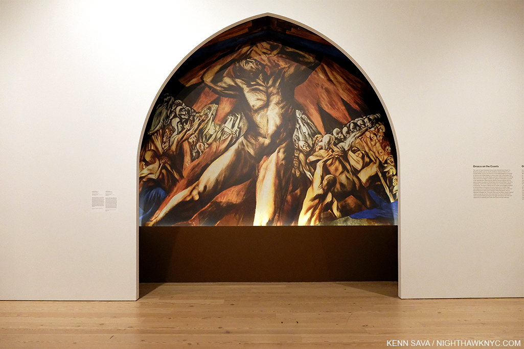
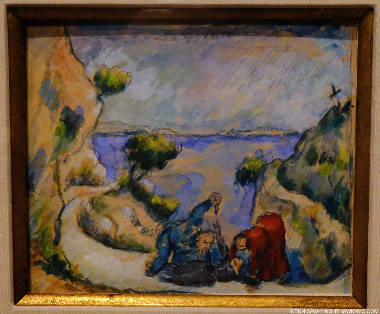
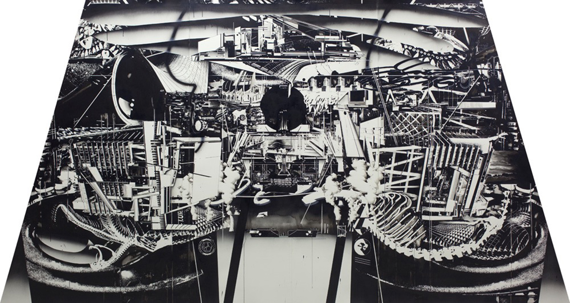
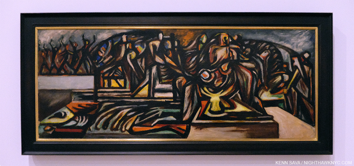
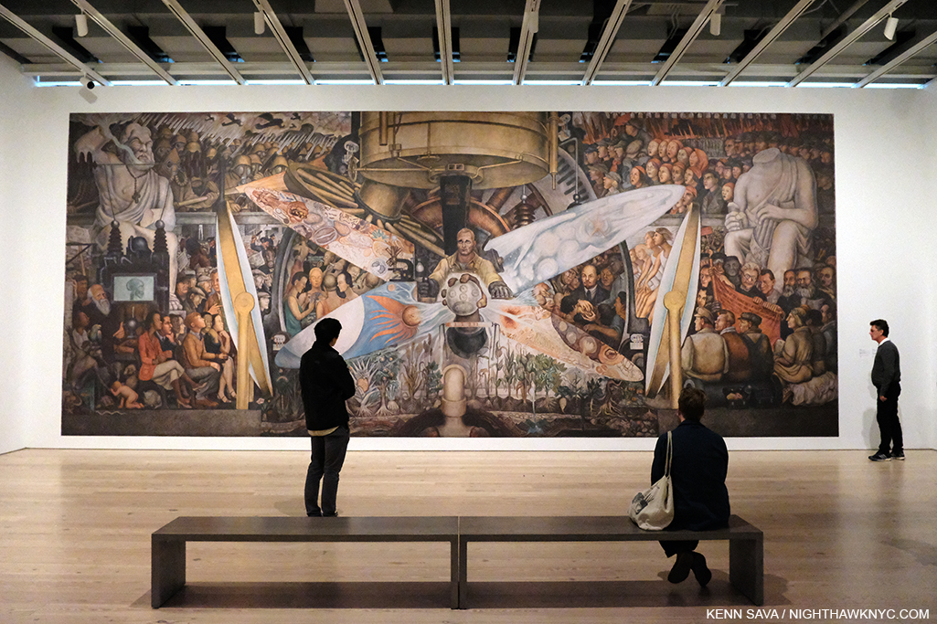
The revolution comes north. The first major work by one of Los Tres Grandes in the USA. José Clemente Orozco, Reproduction of Prometheus, 1930. Jackson Pollock made a trip to see it, then called it “The best painting in the contemporary world.” He  kept a picture of it on the wall in his studio throughout the 1930s1.

Exactly when that will be in NYC is unknown at moment. Near the end of the voluminous list of unfortunate and tragic occurrences resulting from the pandemic in NYC is that the Year in Art shows, 2020, had gotten off to an exceptionally strong start here. A number of very good and important shows were forced to close early in their run, meaning relatively few got to see them. Unfortunate, not tragic. I’ve already looked at the most NoteWorthy, as I’m fond of saying, gallery show I’ve seen thus far this year- 
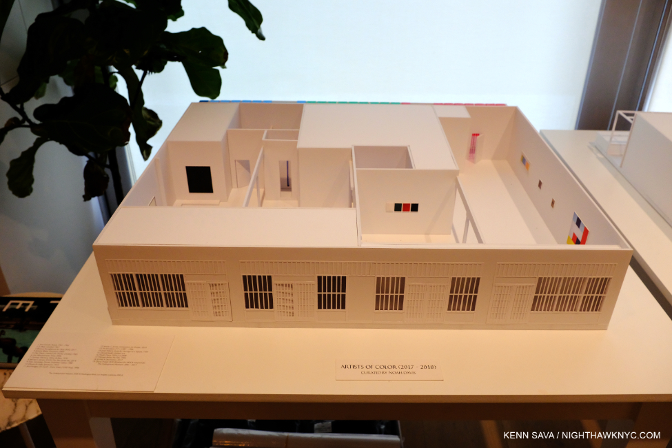
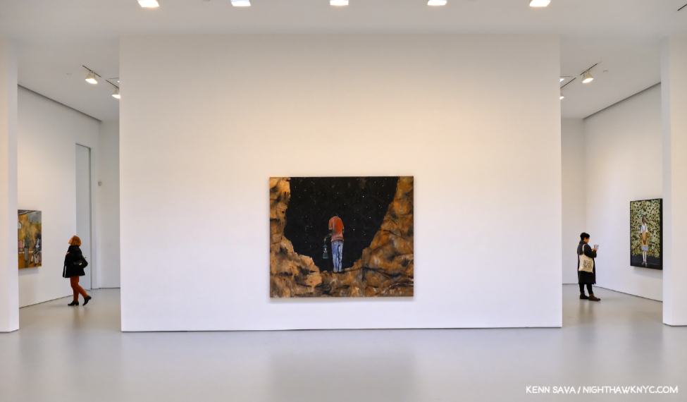
Noah Davis at David Zwirner. The most NoteWorthy museum show I’ve seen in 2020 is the landmark 
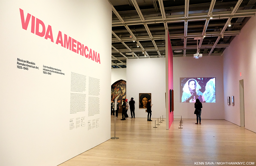
Vida Americana: Mexican Muralists Remake American Art, 1925-1945 at the Whitney Museum, which opened on February 17th and “temporarily closed” on March 12th.

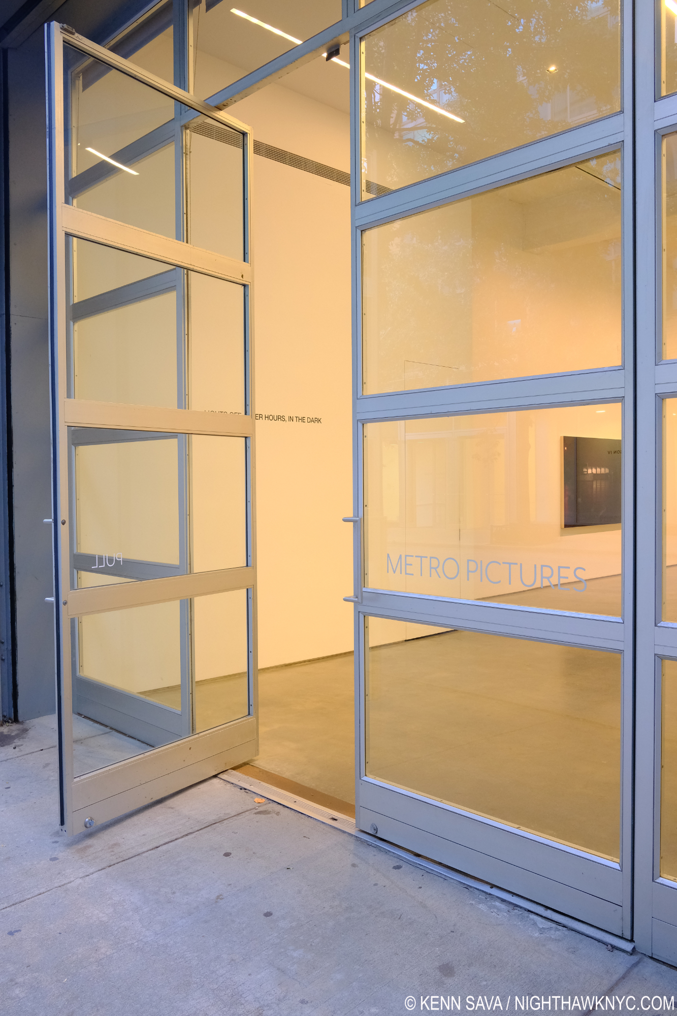
The entrance of Vida Americana (“American Life”), seen on March 11, 2020, the day before it “temporarily closed” for the coronavirus pandemic.

With over 200 works by 60 Artists, Vida Americana makes the heretofore overlooked case for the influence the Mexican Muralists, particularly Los Tres Grandes (“The Big Three”), Diego Rivera, José Clemente Orozco, and David Alfaro Siqueiros, had on American Artists & American Art between 1925 to 1945. It does so convincingly in side by side installations and bringing to the fore little studied connections a number of major American Artists had with their Mexican counterparts. 10 years in its planning and 4 in creation, Vida Americana succeeds in making its case in resounding fashion with wonders seen now and likely never again according to the show’s curator, the inimitable Barbara Haskell, who’s been at the Whitney since 1975 2.

Times are hard everywhere as I write this as April, 2020 comes to a close. In researching Vida Americana, I was reminded that a little over 100 years ago, in 1918, the “deadliest pandemic in history” (according to John M. Barry’s book The Great Influenza) left 100 million people dead worldwide. A sobering thought at this moment.

Things can always be worse.

300,000 Mexicans died. Luckily, the three Artists at the center of Vida Americana, Diego Rivera, José Clemente Orozco, and David Alfaro Siqueiros, were not among them.

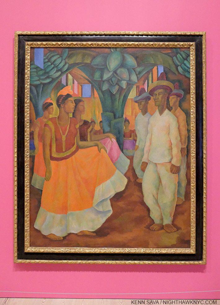
The first work in the show. Diego Rivera, Dance in Tehuantepec, 1928, Oil on canvas. Rightly famous for his incredible Murals, he was also a terrific easel Painter for his entire career, work that has yet to receive the attention on the level of his Murals. Are those some remnants of his passion for Cezanne, particularly in the clothes worn by the lead gentleman?

Though the decade-long Mexican Revolution ended 100 years ago in 1920, the final death toll may never be known. Today, estimates range between one million and three million, (not including that 300,000 who died in the 1918 pandemic). Diego Rivera spent the entirety of the Mexican Revolution studying in Europe on a grant from the governor of Veracruz to further his Art education. He precociously devoured the work of the great European Painters of the time, as can be seen in his easel Paintings that wonderfully echo El Greco and Cezanne, around 1913, and his adoption of Cubism, from 1914-18 or so. He knew Picasso and Georges Braque and was something of a competitor of theirs as he tried to make his own name, before finding his own style. In 1919, towards the end of his European period, Diego Rivera met David Alfaro Siqueiros, who was also in Europe on an Art scholarship. Vida Americana (American Life) takes its name from the sole issue of the journal Vida Americana that contained a manifesto of sorts written by Diego Rivera and David Alfaro Siqueiros.

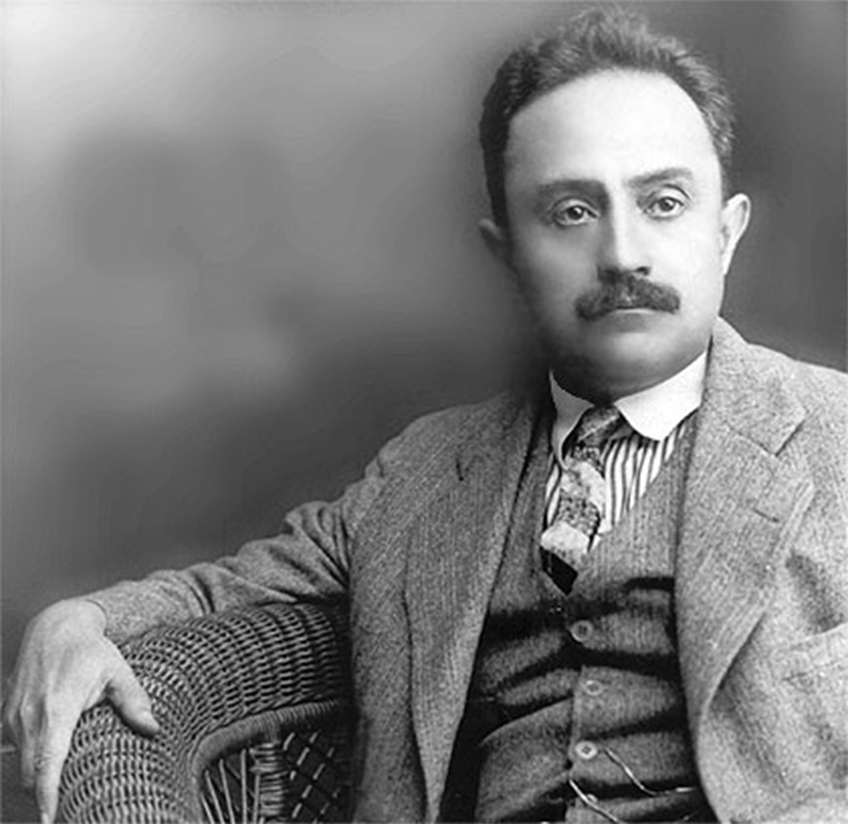
José Vasconcelos, date unknown. As minister of education, he commissioned Artists, including Los Tres Grandes, to Paint Murals. And so, he had a major influence on Mexican history, and unintentionally, American Art history,

Meanwhile, back in Mexico, after the Revolution ended in 1920,  a profound change swept across Mexican society. New president Alvaro Obregon’s government enacted progressive social reforms that empowered workers and farmers. This transformative project wasn’t so simple. “There was no shared culture. No sense of a Mexican national identity,” Barbara Haskell said3. “The Mexican Revolution led to the need for Art that depicted the history and everyday life of the people.” President Obregon appointed José Vasconcelos as director of the Universidad Nacional de Mexico (National University of Mexico). He reached out to Diego Rivera in Europe in hopes of recruiting him for the campaign to create a new national culture. Backed by a Mexican government stipend, Diego Rivera, took a trip to Italy to study the great Italian Renaissance frescoes during the winter of 1920 in Verona, Padua, Venice, Ravenna, Florence, and Rome, where he saw Michelangelo’s Sistine Chapel. After he was sworn in as Mexico’s minister of education in the fall of 1921, José Vasconcelos commissioned Artists, including Diego Rivera, José Clemente Orozco, and David Alfaro Siqueiros, to create grand public Murals depicting the history and everyday life of the nation’s people, and “Los Tres Grandes” were born. They rose to the challenge, and in the process, reintroduced the Mural to Western Art.

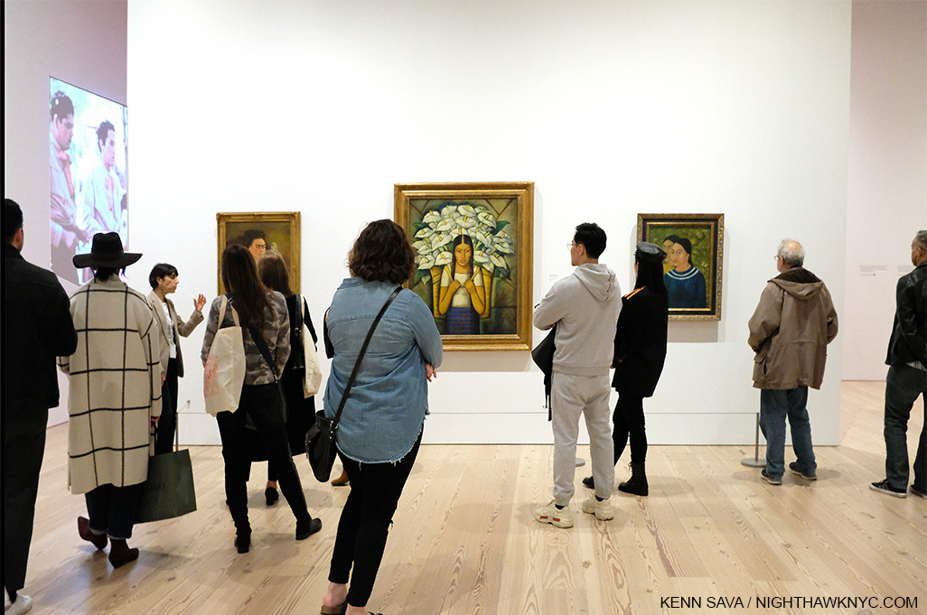
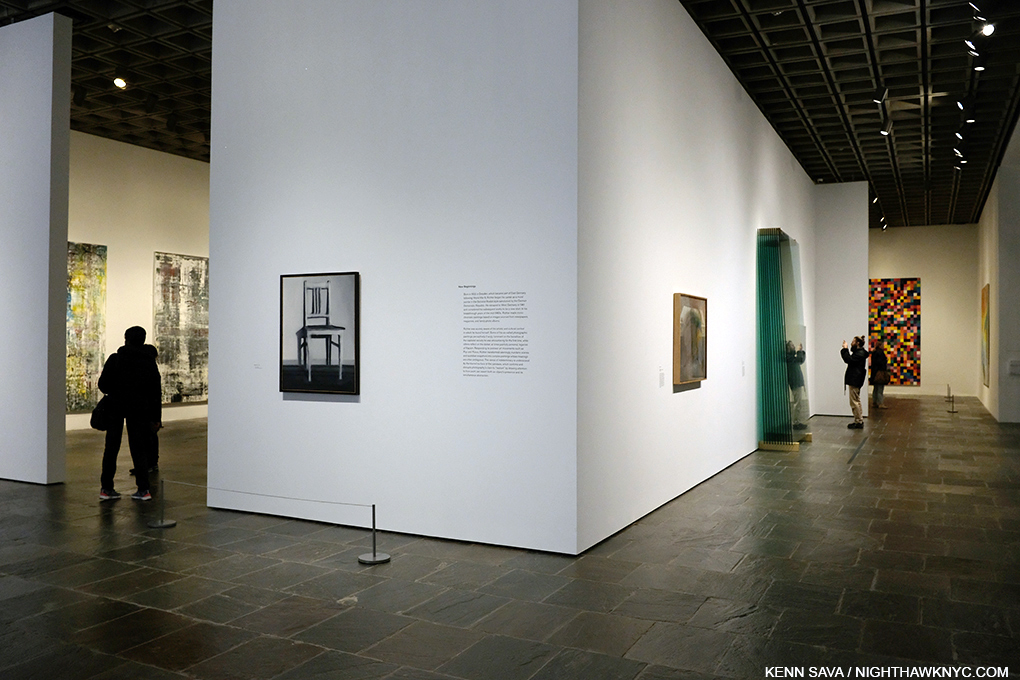
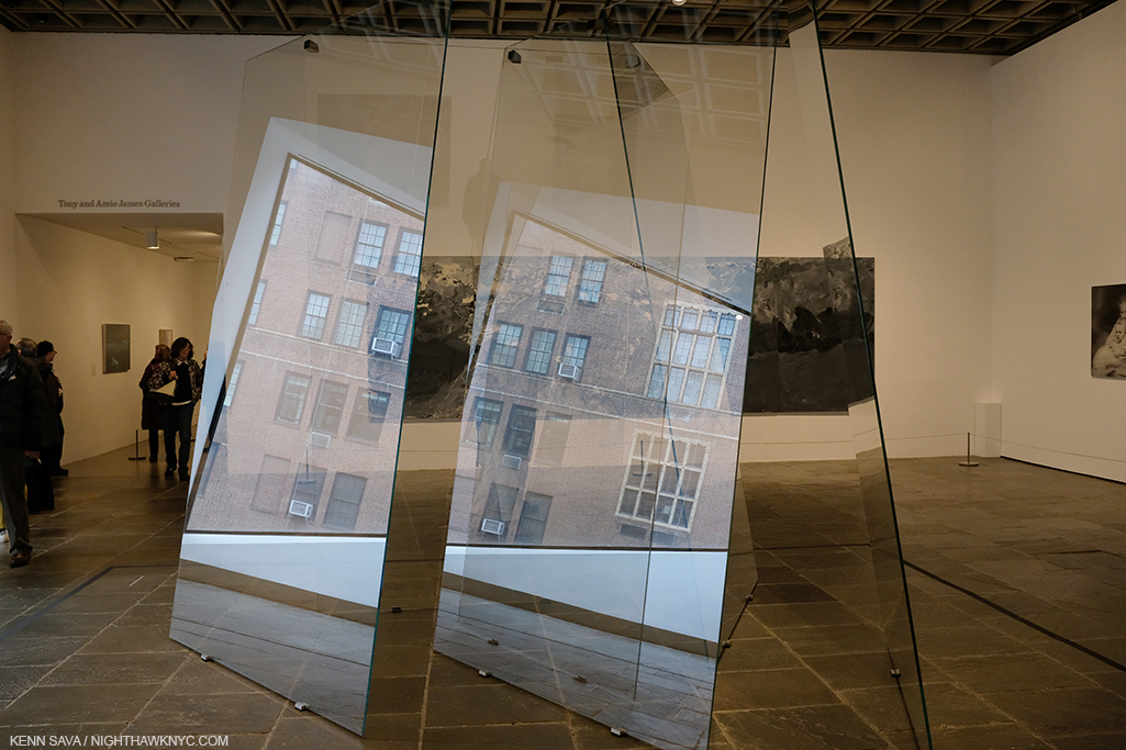
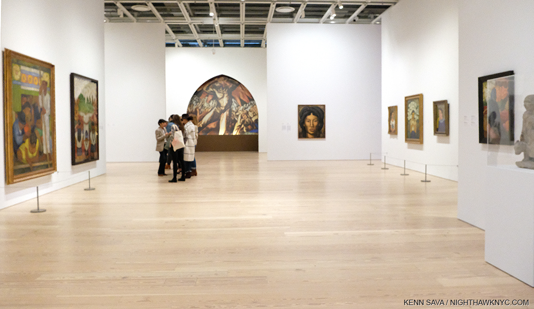
Installation View. My mission? Get this shot without people in front of the Art, which includes two rarely seen works by Frida Kahlo.

Vida Americana is so big, with so many pieces drawing one’s attention, so many connections leaving much to study and ponder, in the one visit I was able to make I had to focus on, first, seeing it all, and second, on how the Mexican Muralists directly influenced Jackson Pollock and Philip Guston, two Americans who’s paths have long intrigued me.

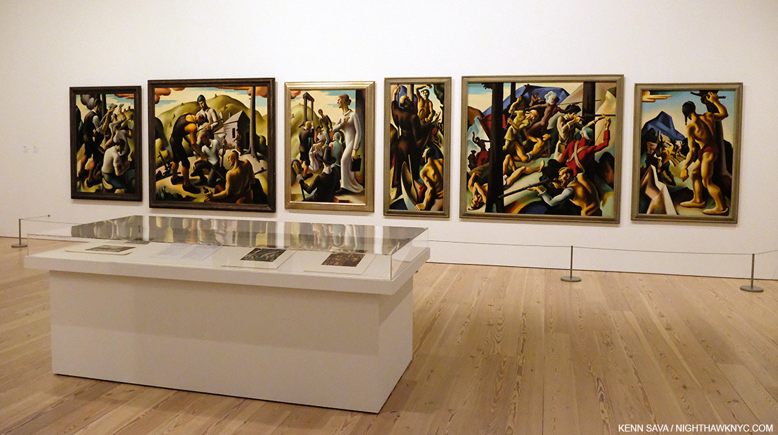
One example of how extraordinarily this show was hung throughout. Jackson Pollock, Untitled, c1938-41, Oil on linen, 22 1/4 x 50 1/4 inches, David Alfaro Siqueiros, War, 1939, Nitrocellulose on composition board, 48 5/8 x 63 7/8 inches, Jackson Pollock, Composition with Flames, 1936, 26 1/2 x 21 1/2 inches, David Alfaro Siqueiros, Our Present Image, 1947, 87 3/8 x 68 11/16 inches, Pyroxylin on fiberglass, 87 3/8 x 68 11/16 inches, left to right.

Fast forwarding from 1920 to my own teen years, Jackson Pollock and Edward Hopper were the two Artists who planted stakes in my mind for modern American Art, after centuries of European domination that culminated at the time with the all-encompassing brilliance of Picasso. Of course, they had come on the backs of almost 200 years of earlier American Artists before my time, yet American Art seemed to be playing second fiddle the Europeans until the post-Second World War years. It was easy to get lost in the Americanism of Messers Pollock and Hopper and easy for me to relate to them particularly since both spent most of their career in NYC. Greenwich Village was home for Edward Hopper for about 50 years, and Jackson Pollock legendarily frequented the Cedar Tavern and other bars in the area, while living with his wife, Lee Krasner, in Springs, Long Island, where I indelibly visited his studio in 1999. In looking through his career, it was well-known that he came here to study at the Art Student’s League with Thomas Hart Benton. “He drove his kind of realism at me so hard I bounced right into non-objective painting,” Jackson Pollock later said reflecting on studying with Thomas Hart Benton4.

Jackson Pollock, Untitled, 1938-41. This “pre-drip” period fo the Artist’s work remains understudied and under-appreciated in my view. Whereas the journey Mark Rothko took from figuration to abstraction is interesting, Jackson Pollock’s is downright fascinating. Here, in this stunning work, the figures break up with such intense rigor and stunning color, it really does make you wonder where it was all going to lead. It also makes me wonder how many other Artists would have been content to continue Painting just like this, a very brief period in Jackson Pollock’s brief career.

After leaving Thomas Hart Benton, what always mystified me was how Jackson Pollock became “POLLOCK” to quote the title of the film made some years back- the Artist who burst on the scene, with a never before seen style that revolutionized what Painting could be in the late 1940s and early 1950s before his tragic death on August 11, 1956 at 44. I even wrote a piece with that title after the most recent MoMA Jackson Pollock show in 2016, Jackson Pollock: A Collection Survey 1934-54. Truth be told, looking back on it, though there were some clues in that show, I remained puzzled at how the Artist came up with his style, which has been called everything from “dripping,” to “splash and dash” to fill in your own, here. We know now that all of these terms sell Jackson Pollock’s formidable technique very short, as is demonstrated here.

“I simply paint the life that is going on at the present—what we are and what the world is at this moment. That is what modern art is.” José Clemente Orozco

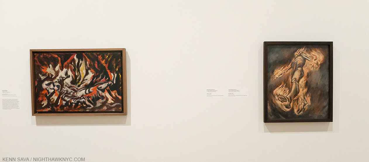
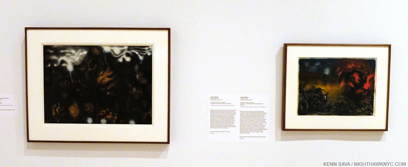
Jackson Pollock, The Flame, 1934-38, Oil on canvas mounted on fiberboard, left, and José Clemente Orozco, The Fire, 1938, Oil on canvas, right. Seeing these works side by side was an eye-opening revelation for me.

José Clemente Orozco was the first of Los Tres Grandes to visit the USA in 1917-19, living in NYC and San Francisco. In 1930, he was commissioned by Pomona College in Claremont, California to paint a mural in the student cafeteria. Prometheus became the first true fresco ever painted in the USA.  Jackson Pollock made a special trip to see it. He called it, “The best painting in the contemporary world5,” and kept a picture of it on the wall in his studio throughout the 1930s. At the Whitney, there is a large, though reduced, reproduction of Prometheus (see the first picture in this piece), along with a few other, smaller, works by José Clemente Orozco that are hung next to early works by Jackson Pollock. HERE was the long-awaited first eureka moment in my quest for insights into Mr. Pollock’s work. The similarities in elements, even styles, between  them when seen side by side were beyond compelling. They were revelatory.

Jacob Lawrence, Selections from The Migration Series, 1940-1, Casein tempera on hardboard. On the wall card, it says, “Lawrence credited Orozco in particular with inspiring his ambition and his use of bold colors and architectonic forms.”

On an adjacent wall was an installation of selections of the work by Jacob Lawrence that seemed to take Mr. Siqueiros’ ideas in different and unique directions. I looked up to see if there was a now lit lightbulb hanging over my head. It wouldn’t be the last time.

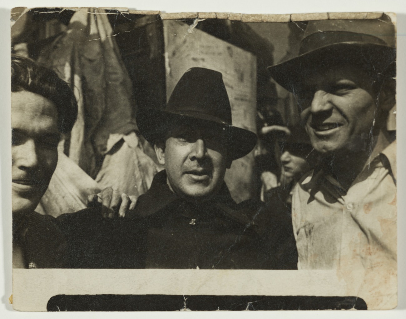
David Alfaro Siqueiros, center, and Jackson Pollock, right, in Union Square, NYC, 1936, Archives of American Art/Smithsonian Institution Photo.

David Alfaro Siqueiros was the last to arrive in the USA. While each of Los Tres Grandes were on the cutting edge, if not the edge, socially and politically, he took it further. He believed that revolutionary ideas required revolutionary materials and techniques. In 1936 he established the Siqueiros Experimental Workshop in Union Square, a stone’s throw from where I sit writing this, which he referred to as a “Laboratory of Modern Techniques in Art.” Some 30 years later another Artist would explore “new materials and techniques” when Andy Warhol moved his Factory to Union Square. Among the students at the Siqueiros Experimental Workshop was Jackson Pollock, who was about 24, and who had been without a teacher since Thomas Hart Benton moved from New York to Missouri in 1935. “One anecdote recalls Siqueiros constructing something resembling a Lazy Susan, filling it with paint, and spinning it atop a horizontal canvas ”a predecessor to Pollock’s later drip technique6.”

David Alfaro Siqueiros, The Electric Forest, 1939, Nitrocellulose on cardboard, 28 x 35 inches, left, Jackson Pollock, Landscape with Steer, c.1936-7, Lithograph with airbrushed lacquered additions, 15 7/8 x 22 7/8 inches.  It’s interesting that while David Alfaro Siqueiros’s works are often political, Jackson Pollock’s don’t appear to be.

Later in the show, Gallery 11 is devoted to the Siqueiros Experimental Workshop. Here, a David Alfaro Siqueiros was hung next to a Jackson Pollock, and now I could feel the figure breaking down even more. Complete abstraction is not far away. The technique was getting wilder and more experimental. Now, it wasn’t that big a jump at all in my mind from works like Landscape with Steer to a work like his 20 foot long Mural, 1943, in a genre that itself would appear to be a nod to the influence of Los Tres Grandes. For me, this was the biggest takeaway among many, from Vida Americana. But, the joys of the show weren’t solely technical or historical.

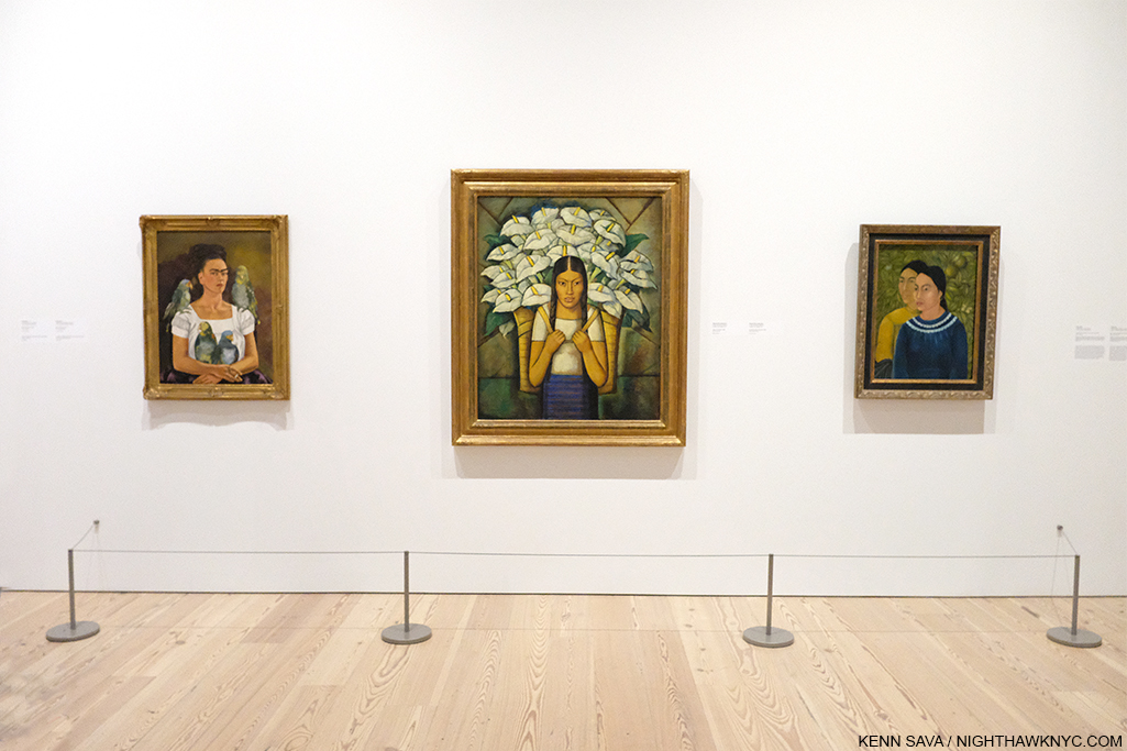
Finally! The scene shown earlier, sans viewers. Frida Kahlo, Me and My Parrots, 1941, 32 5/16 x 24 3/4, left, Alfredo Ramos Martinez, Calla Lily Vendor, 1929, 45 13/16 x 36 inches, center, and Frida’s Two Women, 1928, 27 3/8 x 21 inches, right. All three are Oil on canvas.

Walking through the show, all three Artists are well represented, as are a number of other lesser-known Mexican Artists of the period. Frida Kahlo is not one of them. Perhaps as popular, if not more popular, than any other Artist represented in the show, her possible influence on American Artists from 1925-45 is curiously not touched on. Perhaps, it’s taken for granted that her example and influence have never stopped influencing Artists and the general public?

Out of focus shot of the installation showing the 2 Fridas, far right, facing 2 works by Diego Rivera.

Even not as well known is that it was an American who was Frida Kahlo’s first important collector. In 1938, when she was still an unknown in the US, the actor and Art collector Edward G. Robinson visited Diego Rivera in Mexico City. After selecting some works by Mr. Rivera, the Artist led him into Frida’s workspace. He bought 4 Paintings from her for $200.00, each(!), her first major sale7. To that point she had often given her work away. After Edward G’s purchases she said, “This way I am going to be free.” She didn’t have to ask Diego for money. This American had had a real influence on this great Mexican Artist. 

Frida is represented here by two beautiful examples of her work, including the stunning Self Portrait Me and My Parrots, 1941, beautifully installed facing two large works by the husband she married twice, Diego Rivera.

In looking at the work of Diego Rivera, it’s interesting to me that his figures seem to vary between the stereotyped and the specific and you’re likely to encounter either as you move from work to work of his. In both of these works, depicting specific people doesn’t seem to be his point. In many other works, including Man at the Crossroads, 1933, which he Painted for Rockefeller Centers, his inclusion of a portrait of Lenin, and his refusal to remove it, led to the work’s destruction. Elsewhere, he includes a number of his lovers, his wife, Frida Kahlo, and numerous other known persons, including Charlie Chaplin, and self-portraits.

Diego Rivera, Man Controller of the Universe, 1934, reproduction of the Mural at the Palacio de Bellas Artes, Mexico City.

None of the three members of Los Tres Grandes were strangers to controversy, with, perhaps, Diego Rivera’s Man at the Crossroads, 1933, Rockefeller Center commission being the most legendary incident. Man at the Crossroads was produced in a revised version as Man Controller of the Universe or Man in the Time Machine, at the Palacio de Bellas Artes (Palace of Fine Arts), Mexico City, in 1934. A stunning reproduction of it occupies the entire wall, and windows, that face the High Line, and is accompanied by a huge study.

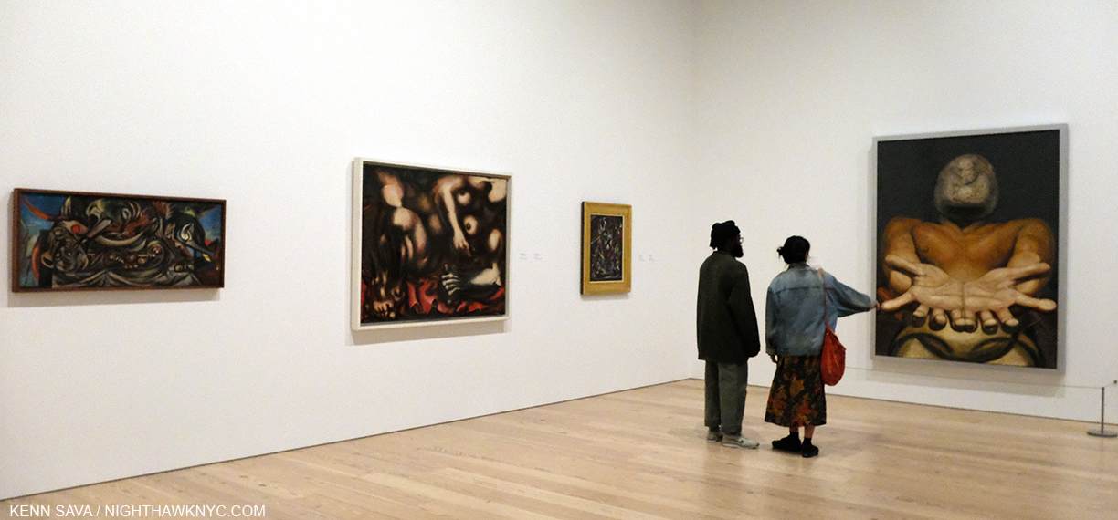
In Gallery 3, titled “Siqueiros in Los Angeles,” another of the highlights for me were two loans of major works by the great Philip Guston.

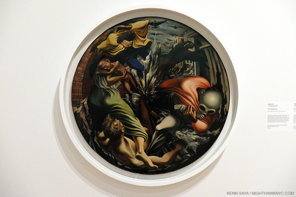
Philip Guston, Bombardment, 1937-8, Oil on canvas, 42 inches.

Bombardment, 1937-8, one of the Artist’s masterpieces, from the Philadelphia Museum It’s as near to a “perfect Painting” as one can imagine, unique in Art history, and a work that deserves even more attention than it already has, if one can say that about a masterpiece. Securing the loan of it for this show was a major coup. My look at Philip Guston: Painter at Hauser & Wirth a few years back proved a bit controversial, but I make no bones of my admiration for his work before and after his “abstract period,” which I have continued to try find a way in to. It’s gotten easier. But here, in Bombardment, we have a work that is a one of a kind. A rare modern circular Painting (harkening back to the Tondo in the Renaissance, one of Philip Guston’s favorite periods of Art) in which motion, energy, death and destruction find no resting place in a brilliantly orchestrated “explosion” of paint. A work like this would be impossible in a Photograph. It’s also hard for me to look at and not think of Picasso’s Guernica, a mural, also from 1937, and both inspired by the Spanish Civil War, though they couldn’t be more stylistically different. Stylistically, it does make one think about the possible influence of David Alfaro Siqueiros, who Philip Guston had served as an assistant for. Looking at it closely, though it’s “only” 42 inches in diameter it feels a bit like a mural, not unlike another major work by the Artist nearby. 

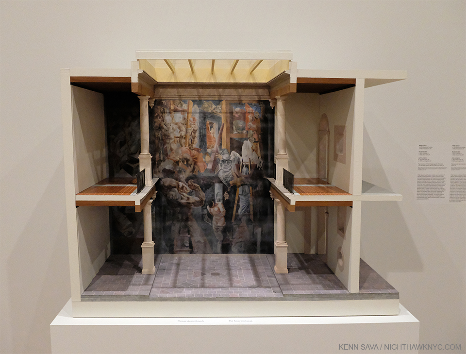
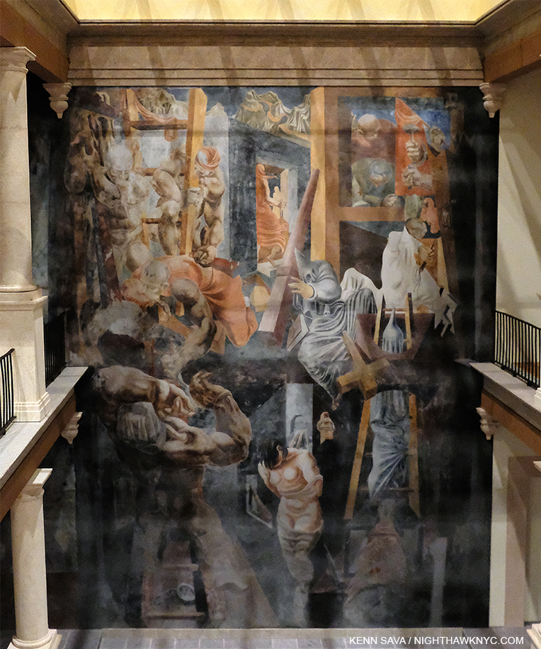
Philip Guston, Reuben Kadish, Jules Langsner, Reproduction of The Inquisition also known as The Struggle Against Terrorism, 1934-5, Dimenseions and materials not stated.

Here was an amazing model for Philip Guston’s legendary early Mural collaboration with Reuben Kadish and Jules Langsner, The Inquisition also known as The Struggle Against Terrorism, 1934-5, something I never even knew existed. Murals on walls are not tranportable. Yet, throughout this show the curators continually find innovative ways of “bringing” them here and making them a part of the show- like this, and like Prometheus, shown up top, and the study for one of Diego Rivera’s “Portable Murals” for MoMA seen further below. Amazing. 

Detail. I would guesstimate this space is about 12-14 inches tall. The real one is over 1,000 square feet.

Philip Guston and Reuben Kadish were both about 23 when David Alfaro Siqueiros called them “the most promising young painters in either the US or Mexico.” He urged them to come to Mexico where he helped them secure a 1,000 square foot wall where they Painted The Inquisition also known as The Struggle Against Terrorism in the courtyard of the University of Michoacan, Morelia. Due to controversy over its depiction of the catholic church, the Mural was hidden from view for 40 years until it was accidentally discovered in 1973, yet it languished for a further 30 years until efforts began to restore it. Though very small, the model gives the viewer a sense of wonder that the Artists could envision the daring and monumental composition they created.

Thomas Hart Benton, Six Panels from American Historical Epic, 1920-28, Oil on canvas mounted on wood, varying sizes. Though panels, these terrific works were begun before Los Tres Grandes created their Murals, yet they share much in common, particularly its depiction of history. On the wall card it states, “Believing that art’s role was to tell the truth, Benton refused to sanitize history. Thus this mural cycle celebrates American history while also drawing attention its environmental and social injustices.” Exactly what we see in the work of the Mexican Muralists.

Diego Rivera, with his wife Frida Kahlo arrived in the US in November, 1930 to open a retrospective of his work in San Francisco, which was followed by one at the newly opened MoMA, NYC the following year. By that point, he was considered “the hero of the Western world, who embodies the spirit of the Mexican revolution8.” “His idea about creating a national epic (in his Murals) was something that would also be very influential on American artists,” Barbara Haskell added9.

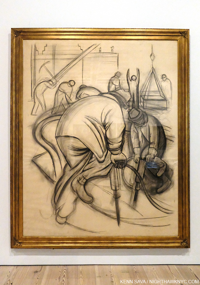
Diego Rivera, Pneumatic Drilling, 1931-2, Charcoal on paper, 97 1/4 x 76 7/8 inches. Apparently a full size Drawing for one of the Portable Murals the Artist did for MoMA in 1931. About this work, MoMA said in 2012, “The day after Rivera arrived in New York City, the New York Herald Tribune reported on his plans to “paint the rhythm of American workers.” Rivera later identified this scene as depicting preparations for the construction of Rockefeller Center, which was still in its early stages when he arrived in New York10.” These are the kinds of scenes many American Muralists would do in their WPA FAP Projects, commencing a few years later.

The influence of the Mexican Muralists on the WPA Federal Art Project, 1935-43 is another revelation of Vida Americana. Reintroducing the Mural in Western Art brought it out of the church and into the realm of Public Art. At its peak in 1936, the Federal Art Project employed 5,000 Artists, possibly double that over the 8 years it existed, producing 2,566 Murals and more than 100,000 easel Paintings. It’s obvious, to me, that in looking at the Murals they produced many of them seem to follow in the footsteps of their Mexican counterparts, stylistically, and in their content, many of the Murals belied the influence of the Mexican Artists who’s works were steeped in history and the life of everyday people and workers.

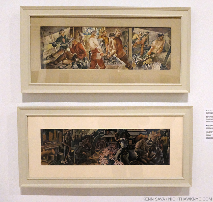
Michael Lenson, Mining (Mural Study for Mount Hope, West Virginia Post Office), c. 1933-34, Tempera on wood, top, Xavier Gonzalez, Tung Oil Industry (Mural Study for Covington, Louisiana Post Office), 1939, Gouache, pen and ink, on pencil on paper mounted on cardboard.

Once you start looking for the influence of the Mexican Artists included in Vida Americana, particularly that of Diego Rivera, José Clemente Orozco, and David Alfaro Siqueiros, you begin to find it turning up all over and in surprising places. Add to this the incalculable influence of Frida Kahlo, as an Artist, as a woman, and as an unconquerable human being, it turns out, as Vida Americana finally demonstrates, the influence of Mexican Art on American Artists from 1925-45 rivals that of any other.

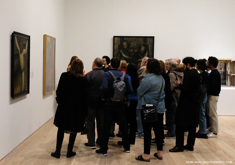
March 11, 2020. A Whitney staff member speaks about “Siqueiros in Los Angeles.” It might be a while before we see this again.

It will be very interesting to see how the Whitney, and all the museums, handle their schedules, and the virus, when they reopen. Will shows that were up when they temporarily closed be extended? What will that do to their future exhibitions and loans? It all remains to be seen.

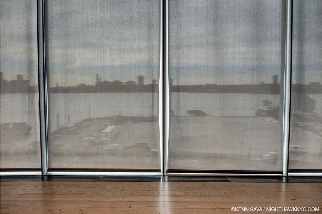
The curtains have been drawn. For how long? A view of the Hudson River from the fifth floor behind the show. The former Department of Sanitation complex directly across the West Side Highway, which I mentioned in my piece on the Whitney building, has now been dismantled in preparation of…? What will the future bring?

As I write this in early May, it looks like Vida Americana will reopen giving others a chance to see this landmark show, in my view, the first one mounted in the Whitney’s new building (Thus far, I’ve written about their new building, Andy Warhol, Frank Stella, Stuart Davis, Grant Wood, Laura Poitras, the 2017 Whitney Biennial, and other smaller shows). In the meantime, having the chance to see it once has given me much to think about during this pause. While the world on the other side of the pandemic will be different, so too will be the way I henceforth look at 20th century American Art history.

*-Soundtrack for this Post is “Mexico” by Morrissey from You Are The Quarry.

NighthawkNYC.com has been entirely self-funded and ad-free for over 6 years, during which over 250 full length pieces have been published. If you’ve found it worthwhile, you can donate to keep it going & ad-free below. Thank you!

Written & photographed by Kenn Sava for nighthawknyc.com unless otherwise credited.
To send comments, thoughts, feedback or propositions click here.
Click the white box on the upper right for the archives or to search them.
For “short takes” and additional pictures, follow @nighthawk_nyc on Instagram.

Subscribe to be notified of new Posts below. Your information will be used for no other purpose.


  1. Whitney Museum introductory video
  2. Comments from Ms. Haskell in this piece are excerpted from her remarks at the Press Preview, unless otherwise noted.
  3. Here.
  4. Here
  5. per Barbara Haskell
  6. Here
  7. Here.
  8. Whitney Museum video
  9. Here
  10. Here.

Noah Davis: The Art of Vision

Written & Photographed by Kenn Sava

Art & Artists can come from anywhere at any time. Even from unexpected places, like a housing project. Pueblo del Rio: Arabesque, 2014, Oil on canvas, 48 x 72 inches. Pueblo del Rio, 1941-2,  is a housing project designed by Paul Williams at 52nd Street and Long Beach Avenue, Los Angeles, one of two works in the show set there. African-American Architect Paul Williams was a big influence on Noah Davis, according to his chosen curator Helen Molesworth, and he set other Paintings among Paul Williams buildings.

There is, sadly, no shortage of brilliant younger masters who left us far before their time. The tragedy endures but their Art prevails, and in the end, assumes a life of its own. In Contemporary Art, perhaps no one known to me seemed to do more as an Artist, curator, and visionary in as short a time as the late Noah Davis did before he passed from a rare soft tissue cancer at just 32 on August 29, 2015. Now thirteen years out from my own cancer treatment, the variety of cancers I hear and read about never ceases to astound me. One thing my journey through it taught me was that no two journeys are alike. Unlike mine, in Noah Davis’ case, cancer ran in his family, claiming his dad a few years before it took him. For some perspective (no comparisons intended)- Mozart died at 35. Raphael was 37. More recently, Jean-Michel Basquiat was 27. Music has Jeff Buckley, at 30, Jimi Hendrix, Kurt Cobain, both 27, among a long list of others. Photography has Francesca Woodman, at 22. Literature, and humanity, has Anne Frank, at just 15, and on and on…

Untitled, 2015, Oil on canvas, 32 x 50 inches. Of this late work, show curator Helen Molesworth spoke about the line between the two women on the couch in her gallery talk. The separation and isolation between two so close together on barely half of the couch is compelling in a Hopperesque way, yet, I haven’t been able to summarize everything this fascinating piece says to me because every time I look at it, I see something else. I see some of what I see in Deana Lawson’s work, some of what I see in Kerry James Marshall’s, Francis Bacon, and there’s a Rothko-with-a-difference in the background, yet what strikes me most is that in this work, as in any number of other works on view Noah Davis is entirely on his own. He has studied, learned, assimilated, and then staked out his own turf as a wholly formed Artist to be reckoned with does. In the moment I shot this picture, the feeling that I was standing in front of a masterpiece was undeniable.

I’ve been blessed with knowing some, and working with some others, who left far too soon. I met the incandescent Jaco Pastorius in 1976 at the release of his now classic debut solo album at Peaches Records Store in Fort Lauderdale, Florida. I watched as he put his hands in wet cement on the store’s “walk of fame” outside along Sunrise Boulevard (which I believe is still there) that evening never imaging he would leave us a scant 11 years later. I spoke to him a number of times over those years and we both wound up (independently) in NYC shortly before his tragic murder at just 35. I worked with the late, brilliantly talented, Mark Ledford, and worked with the equally brilliant Thomas Chapin, on three albums, both of who passed at, or before, 40 in the early stages of the prime of their careers, and their lives. I think of all three of them every single day. Though the passage of time eases some of the pain, in my experience, loss is something that does not go away.

Waiting Room, 2008, Oil and acrylic on canvas, 80 x 65 inches. In many of his works, a space opens up that sometimes seems to be an abyss. Here, the abyss is above us and two figures in the upper distance appear to be looking down on the scene below. Is the Waiting Room an “abyss,” where the outcome (possibly to be revealed  behind those large white doors) is unknown as is the effect it might thave on life to come? It can also have that surreal, “Is this really happening?” feel to it. Like any work of Art, it’s open to whatever the viewer may see in it. This was, however, Painted at about the time Noah Davis was diagnosed with cancer, after his father was.

But, thank goodness we have what they created- their Art, their Music, their words, and what they taught us. Us. Everyone whose lives were touched by all of these Artists are part of their legacy.

I never had the good fortune to meet Noah Davis, who was born in Seattle, and studied at Cooper Union in Greenwich Village, becoming something of a sensation here about a decade ago before leaving without graduating around 2004 (because he felt that his education was no longer pushing him, it is said), and moving to L.A.. I was only casually familiar with his work until I walked into David Zwirner on 19th Street, where his Art and his legacy filled no less than three entire galleries.

Imaginary Enemy, 2009, Oil on wood panel, 84 x 98 inches. Does the figure in white on the right, with what appears to be a cup on his head, have one foot on a portal? Or? The figure approaching on the left appears to be n flames. The strange, angular plane behind him has the effect of another dimension, as in Cubism. I’m still enjoying wrestling with this one, too, but I will say there are elements that remind me of Neo Rauch.

My mind was blown by all I saw. Noah Davis was, and is, a major figure in the Art of our time- in more ways than one.

Untitled (Birch Trees), 2010, Oil on canvas, 54 1/2 x 36 1/2 inches. Many of Noah Davis’ Paintings include nebulous, mysterious faces and heads. Maybe I’ve been looking at too much Francis Bacon this past year, but I find them unique and surprisingly compelling, given their frequent lack of features.

My perception had been that at 32 he was still developing, pursuing his own style- as most Artists in their early 30’s are. Ha! As I moved from work to work, I saw an Artist who was completely in control of a full range of styles, which he could dip into at will and which only hinted at influences in tantalizing and intriguing ways, while being wholly his own. Work after different work. How is this possible? The range. The depth. The power. It was all there in the service of his vision.

The Last Barbecue, 2008, Oil on canvas, 60 x 52 inches. Here, the faces are more defined. The group portrait on the left in countered by the odd triple portrait on the right behind the lid of the barbecue, and the scene in the center is surreal, disturbing and puzzling. It is an explosion, or? Looking at it, it was hard not to think of Kerry James Marshall’s Bang, 1994, a 4th of July barbecue scene.

Flashback- November 12,2016 at Kerry James Marshall: Mastry at The Met Breuer. KJM’s Bang, 1994, Acrylic and oil on unstretched canvas(! Notice that it’s tacked to the wall.), 103 x 114 inches.

Before he passed, Mr. Davis asked Helen Molesworth (who, a few years ago gave us the landmark Kerry James Marshall: Mastry Retrospective that I wrote about after its Met Breuer stop) to be his curator. The Zwirner show, which Ms. Molesworth has brilliantly selected and installed, is not arranged chronologically, which I am thankful for. It serves to downplay the “end” and the tragedy of Mr. Davis’ early loss and put the focus squarely on his Art and his accomplishment, where it belongs. (By my count, only 3 of the works did not have owners listed on the checklist.) Each work dialogs with other pieces from a few years later or earlier in ways only someone intimately familiar with the Artist and the work could bring us, which, by itself, sets this apart from most gallery shows of deceased Artists. Her work hasn’t ended here. Ms. Molesworth, who was controversially fired from her post at MOCA in 2018, has also been busy creating an upcoming monograph on Noah Davis, interviewing those who knew the Artist, due to be published this fall, which should be a slam dunk candidate for one of the most important Art books of the year, if not the decade.

1975 (8), 2013, Oil on canvas in artist’s frame, 49 q/w x 73 1/2 inches.

The show featured “fantastical” work, like Imaginary Enemy, alternated with domestic and family scenes. 1975 (8), 2013, was based on a Photograph from the 1970s Davis Family Photo Archives. It reminds me of the mural his mentor and friend Henry Taylor did a few years ago for NYC’s High Line.

Single Mother with Father Out of the Picture, Date unknown, Oil, acrylic, and graphite on canvas, 40 x 30 1/4 inches. There’s an elegance and a timeless, haunting, beauty to this work, which though all too common in our world, I can’t recall having been the subject of a Painting before.

Mr. Taylor has written eloquently about his friend who was 30 years his junior and the effect and influence Noah had on him, his work and his career. One of the more important Painters of our time, reading his words is eye opening, an important testament to Noah Davis’ legacy.

Untitled (Moses), 2010, Oil on linen on wood panel, 8 x 10 1/4 inches.

Perhaps none of these familial works is more poignant than the smallest Painting in the show, Untitled (Moses), 2010, 8 x 10 1/4 inches, showing his son, which may be based on another Photo from his family archives. In this remarkable, small, work, unique among Artist’s portraits of their children known to me, His son Moses has one foot in the water in the sink and one out, as if already leaving. The world shown in the window is dark.

But, as the remarkable, both precocious and fully formed mature works his Paintings are, there was more. Much more.

The Underground Museum is an ongoing Monument to the legacy of Noah Davis. Here, a model of it, showing its facade, with a mockup of the show ARTISTS OF COLOR, 2017-8, curated by Noah Davis. Mr. Davis left the plans for 18 shows for the UM, as it’s known, when he passed. After finding the space, Noah, his wife, Karon, and their baby, Moses, lived in the UM while it was under construction.

Having dealt with galleries early on, Noah Davis was one of those who came to feel the gallery model doesn’t work for them (something I’ve heard in innumerable conversations). Not an “established” Artist with big resources by any means, he nonetheless then dared to set out to forge his own path. With his wife, Sculptor Karon Davis, he took over 3 storefronts at 3508 West Washington Boulevard in the West Adams section of L.A., and opened what they christened the “Underground Museum” to bring museum quality Art, for free, to an area that was “underserved” by existing institutions.

“Noah wanted a space where he could show the work of himself and his friends. He wanted a space that could exist outside of the gallery/museum matrix,” Helen Molesworth said in a talk she gave at the opening.

The daring of that is only topped by his vision.

Noah Davis speaking in front of LA Nights, 2008, Oil on wood panel, 25 1/2 x 19 1/2 inches, which was also in this show. Photo by Alberto E. Rodriquez/WireImage.

In the first show he mounted at the Underground Museum, Imitation of Wealth, Noah recreated well-known works of Art by Marcel Duchamp, Jeff Koons, On Kawara, Robert Smithson and others that he wasn’t able to borrow the originals of so that the people in this underserved area could experience them. For me, it’s another indication of wide-ranging his knowledge of Art history and his taste was. Robert Rauschenberg famously erased a De Kooning Drawing, but I can’t think of any other Artist who has done such a thing and created an entire show of “pseudo reproductions.” As a first show, Imitation of Wealth was both an auspicious “Hello,” and a shot across the bow of the Art world.

Noah Davis’ first Underground Museum show, Imitation of Wealth, reinstalled at MOCA’s Storefront space in 2015.  The imitation of a “date” Painting, Imitation of Om Kawara. Oct 7, 1957, left, happens to be his father’s birthday. Noah Davis’ Imitation of Marcel Duchamp, 2014 (Bottle Rack) is in front of it, Imitation of Don Flavin (lamp) behind the door, and on the far right, behind his Imitation of Jeff Koons (vacuum on a vitrine), and his Imitation of Robert Smithson with sand and mirrors to the far right LACMA Photo by Fredrick Nilsen.

Helen Molesworth, at the time, Chief Curator of MOCA was impressed enough with his idea to make a three year arrangement with UM to collaborate! An arrangement like this is unheard of. Tell me the other case where a world class museum has made an arrangement like this with an Artist in his early 30s to lend Art and work together to present shows in THEIR space. MOCA reinstalled Imitation of Wealth in their Storefront space in 2015, where it opened the day he passed away. He did live to see works from MOCA lent to the Underground Museum.

Noah Davis knew what was “right” for his Art, and as part of that he also had a vision of the future, of bringing Art to the people, for free. But even by 32, he moved past the vision to create the reality. Today, the UM is an important venue, one that has featured the work of Kerry James Marshall, William Kentridge, Henry Taylor, Kara Walker, and Deana Lawson, Kahlil Joseph, Noah Davis’ brother, among others.

Of all the works in the show, Painting for My Dad, 2011, is the most haunting for me- perhaps the most unforgettable Painting I’ve seen in years. It was Painted while his father was in hospice with terminal cancer. We see his Dad about to embark into an unknown, dark, land with a lantern. The landscape, which strikes me as being distantly descended from Cezanne (which I also felt in Imaginary Enemy, shown earlier) in Noah Davis’ own way, is typical of how Mr. Davis took influences from across Art history and made them his own.

It’s fascinating (and something you can’t help but notice) to spot the possible influences from Art history in Noah Davis’ Paintings, and where he’s taken them. Kerry James Marshall’s Paintings set in projects, Henry Taylor’s way with figures, Francis Bacon’s nebulous portraits, Surrealism, and on and on. Every time I look at his work I see more of them, but in each and every instance he has made them his own. He’s not showing off a copious knowledge of Art history, he’s building on what others have done in the service of expressing himself with his own voice. Henry Taylor, Kerry James Marshall, Francis Bacon- these aren’t mentioned by way of comparison- I don’t believe in qualitatively comparing Artists, but just the fact that you can mention Noah Davis in the same sentence with those older masters says quite a bit about the man’s work. Walking through these rooms and looking at his work, even the selection of it shown here, I see someone who was, already, a master Painter, who’s work is going to remain important, in my view. Not only that, Noah Davis hung their work in his shows! In fact, he was one of those who take credit for “discovering” the now renowned Photographer Deana Lawson in 2009, when Mr. Davis served on a jury for a prize that Ms. Lawson submitted for. Ms. Lawson was subsequently featured in the show Deana Lawson: Planes at the UM.
The world not only lost a great Artist when he passed, it lost a budding brilliant curator, one who might have help fill the huge gap that exists in bringing Art out of the galleries and museums to the people. It also lost someone who broke the mould of the Artist/gallery matrix and found his own way. Whatever you think of his Paintings, his example is an enduring, important model for Artists today and in the future. That he was able to make his own way at such a young age has got to inspire countless people who come after him- maybe not to establish their own museum, but to find what works for them1. In the end, that on its own is an amazing, and major, legacy.

February 22, 2020. Closing day in the third gallery, designed to look a bit like the office at the UM, visitors watch videos and films by Kahlil Joseph, Noah’s brother, and others. I’m holding the camera above my head. Such were the crowds, it took me five minutes to navigate from this spot to the door to the right.

As I sit here now that this unforgettable show has closed, I’m left to wonder. What will last longer…what will have the bigger impact on the future- Noah Davis’ Art, or his example, manifested in the Underground Museum? His vision is their common thread. In the example he set, it seems to me that there is much for Artists to learn-now and in the future.

Letting the UM flag “fly high,” as Jimi Hendrix once said on the closing day in gallery 3. Long may it wave.

You can support the Underground Museum here, or by visiting it. The Noah Davis show is scheduled to open there “soon.”

*- Soundtrack for this post is “Bold As Love,” From Axis: Bold As Love, by Jimi Hendrix.

NighthawkNYC.com has been entirely self-funded and ad-free for over 6 years, during which over 250 full length pieces have been published. If you’ve found it worthwhile, you can donate to keep it going & ad-free below. Thank you!

Written & photographed by Kenn Sava for nighthawknyc.com unless otherwise credited.
To send comments, thoughts, feedback or propositions click here.
Click the white box on the upper right for the archives or to search them.
For “short takes” and additional pictures, follow @nighthawk_nyc on Instagram.

Subscribe to be notified of new Posts below. Your information will be used for no other purpose.


  1. As many are, and have been doing in their own ways, all around the world.