NoteWorthy Art Books, 2023

This site is Free & Ad-Free! If you find this piece worthwhile, please donate via PayPal to support it & independent Art writing. You can also support it by buying Art & books! Details at the end. Thank you.

Written & Photographed by Kenn Sava

Art books were one of my first passions. I was about 8 when I first fell under their spell. The chance to see an Artist’s whole body of work in one portable object enthralled me then as much as it still does. For the next decade they were the only way I could see and explore Art. When the pandemic hit they were, once again, the only way I could see and explore Art. Now, between researching for an upcoming piece, checking out new and older Art & PhotoBooks, and discovering Artists I previously didn’t know, I’m in bookstores on an almost daily basis. Suffice it to say I see a lot of Art & PhotoBooks…

This past year, which isn’t nearly over yet, four books stood out for me among all the Art Books I saw in 2023. Since I don’t believe the “best” exists in the Arts, I prefer to call them “NoteWorthy,” i.e. books I most highly recommend among all those I saw in 2023. These books would be on my list for 2023 whether the year was 9 months or 13 months long so I’ve decided to announce my list early.

My criteria are the importance of the work shown and how well the book has been executed. All four of the subject Artists are among the more note worthy in Contemporary Art. Two of the four books are the first in-depth look at their subject, hence their importance, and all four are likely to remain the “go-to” references on their subject for the foreseeable future. They are listed in no particular order.

NoteWorthy Art Books, 2023

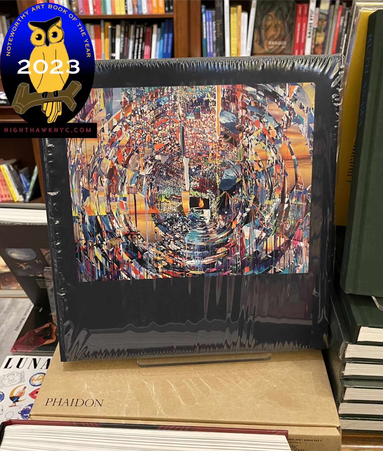
Sarah Sze: Paintings. A sealed copy of the hardcover sitting on top of its brown shipping box. Click any image for full size.

Sarah Sze: Paintings, Phaidon
I’d been going to Sarah Sze’s one-of-a-kind “Sculpture” (which is too small a word for what she creates) shows for a few decades when, in 2020, I was astonished to discover that not only is she also a Painter, but she started out as a Painter (and then was a Painting and Architecture student in school). When I first saw her Paintings in person, which I wrote about here, I was stunned. She sprang an accomplished, fully formed and revolutionary style on me. Whoa! Here she was already one of the foremost Artists of our time, now, she’s also one of our major Painters.

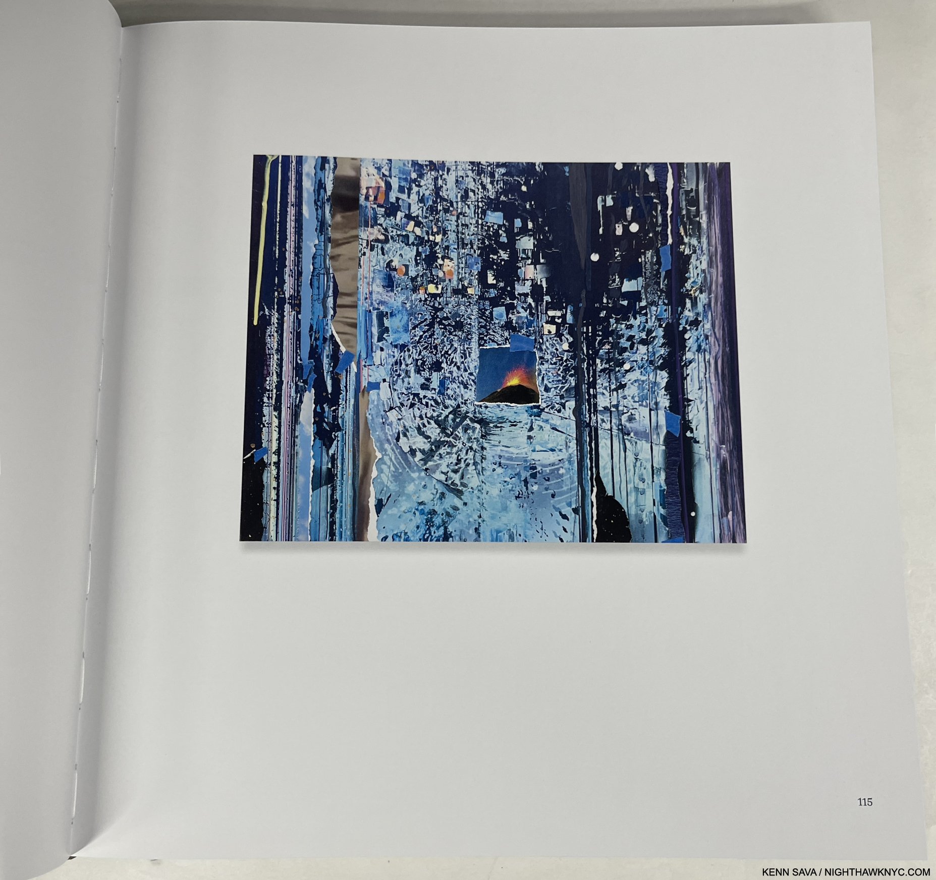
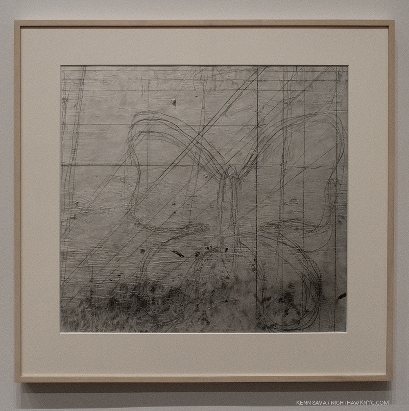
Ghost Print (Black Ripple), 2019, Oil, acrylic, acrylic polymers, ink, aluminum, archival paper, diabond and wood, 16 x 20 inches.

This year, Phaidon, the leading Contemporary Art book publisher among the major Art book publishers, immortalized her accomplishment in an absolutely gorgeous huge book, the best designed Art book I saw this year from the major Art book publishers. When I heard rumors of it coming, I wondered- Does she have enough Paintings to do a book of them? Seeing it in person left me dumbfounded. Inside the slipcase was a FOUR HUNDRED PAGE hardcover, the whole weighing 10 pounds! Paging through I was quickly lost. From the infinite, to the minute, is something that runs through Ms. Sze’s installations and now through her Painting.

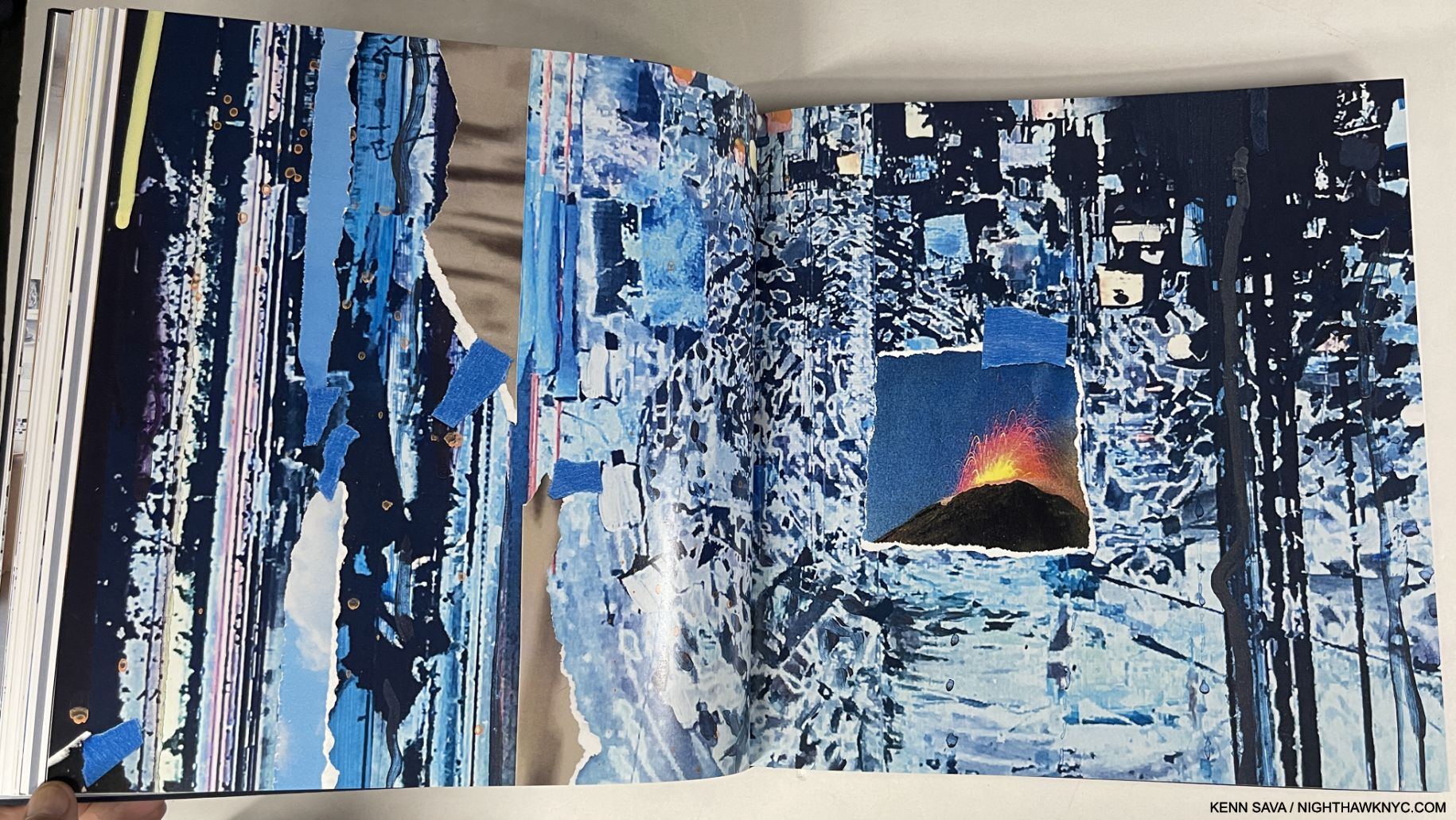
Gutters are one of the biggest problems with physical Art & PhotoBooks, one that an eBook should be able to solve. However, the vastly superior resolution of the printed page is still the only way to see Fine Art in print- decades after the invention of the eBook. Detail of Ghost Print (Black Ripple). Though I NEVER fully open a book and lay it flat, to preserve the binding. Even 3/4 open, as here, very little is lost to the gutter when compared with the Photo of the full piece, above.

Having Photographed her Paintings myself a number of times in two shows, even though the work is incredibly intricate, it’s hard to imagine the Photography of it in the book being improved on. It’s accompanied by a rock-solid binding, and top-notch attention to production detail throughout. Every copy is signed by the Artist & numbered. ALL of this I take as a sign of how closely Sarah Sze was involved in the making of this book. What more can anyone ask? Sarah Sze: Paintings is a state-of-the-Art Painting monograph.

Sarah Sze remains the only living Artist I’ve called a “genius” in the 8+ years of NighthawkNYC.  I did so in my look at her most recent NYC gallery show in 2020, here. My look at her mesmerizing Summer, 2023 Guggenheim Museum show, Timelapse, is in preparation. If I hadn’t called her a genius in 2020, I’d call her one now.

Martin Wong: Malicious Mischief, Walther Konig
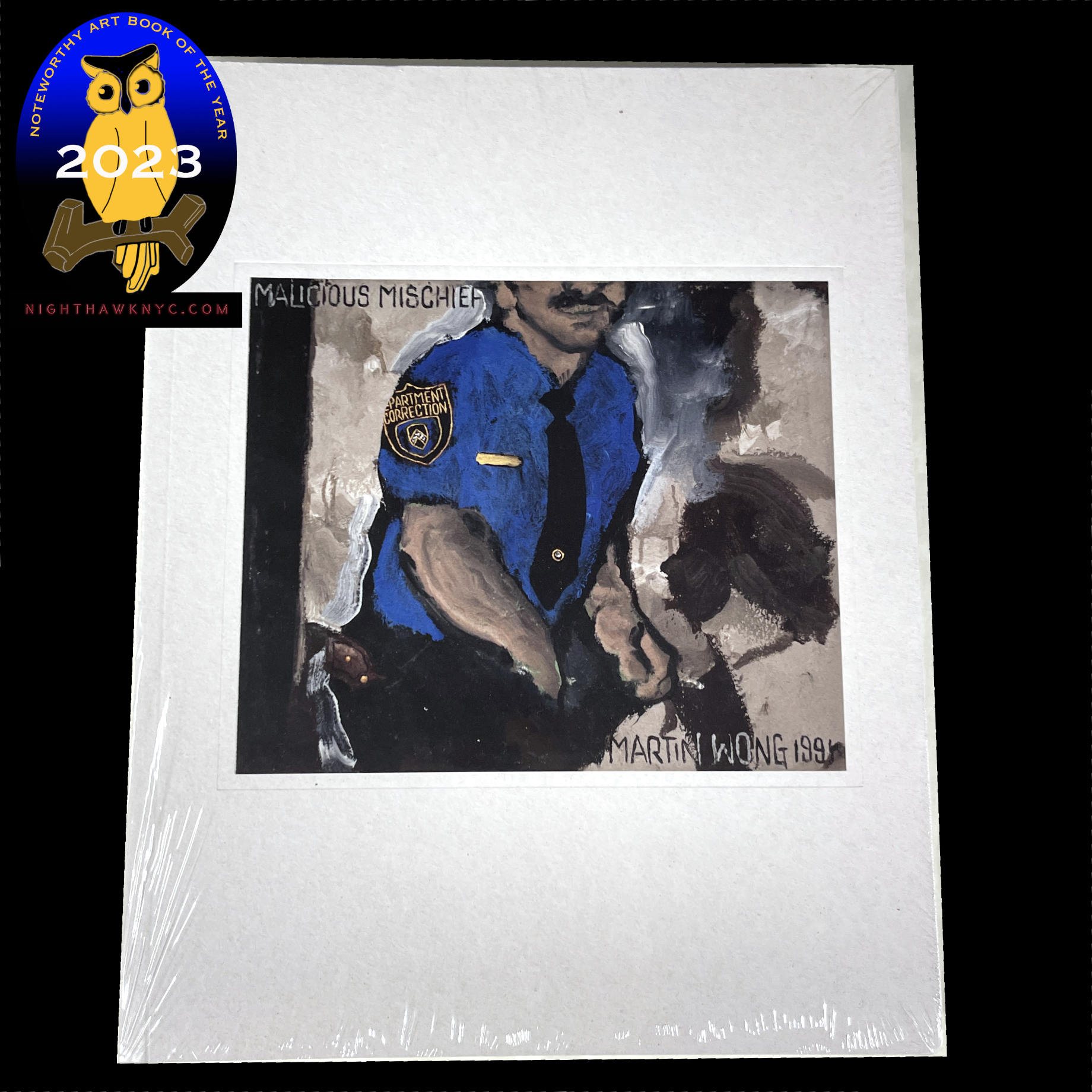
Is Martin Wong (1946-99) the most overlooked Painter of the later 20th century? A very strong case could be made that he is. The museums are wising up. More and more of his work is showing up in their hallowed halls. Now, from 2022 through February, 2024, three European museums- The Camden Art Centre, London; Museo Centro de Arte Dos de Mayo (CA2M), Móstoles, Madrid, and the Stedelijk Museum Amsterdam are hosting a traveling exhibition, Martin Wong: Malicious Mischief, of over 100 works, the largest show of his work so far. The Met had the spectacular Martin Wong shown further below up in the Contemporary Wing where I saw it this past year, which I believe they have now lent to the show. As far as I know, he never saw a book published on his work during his lifetime.

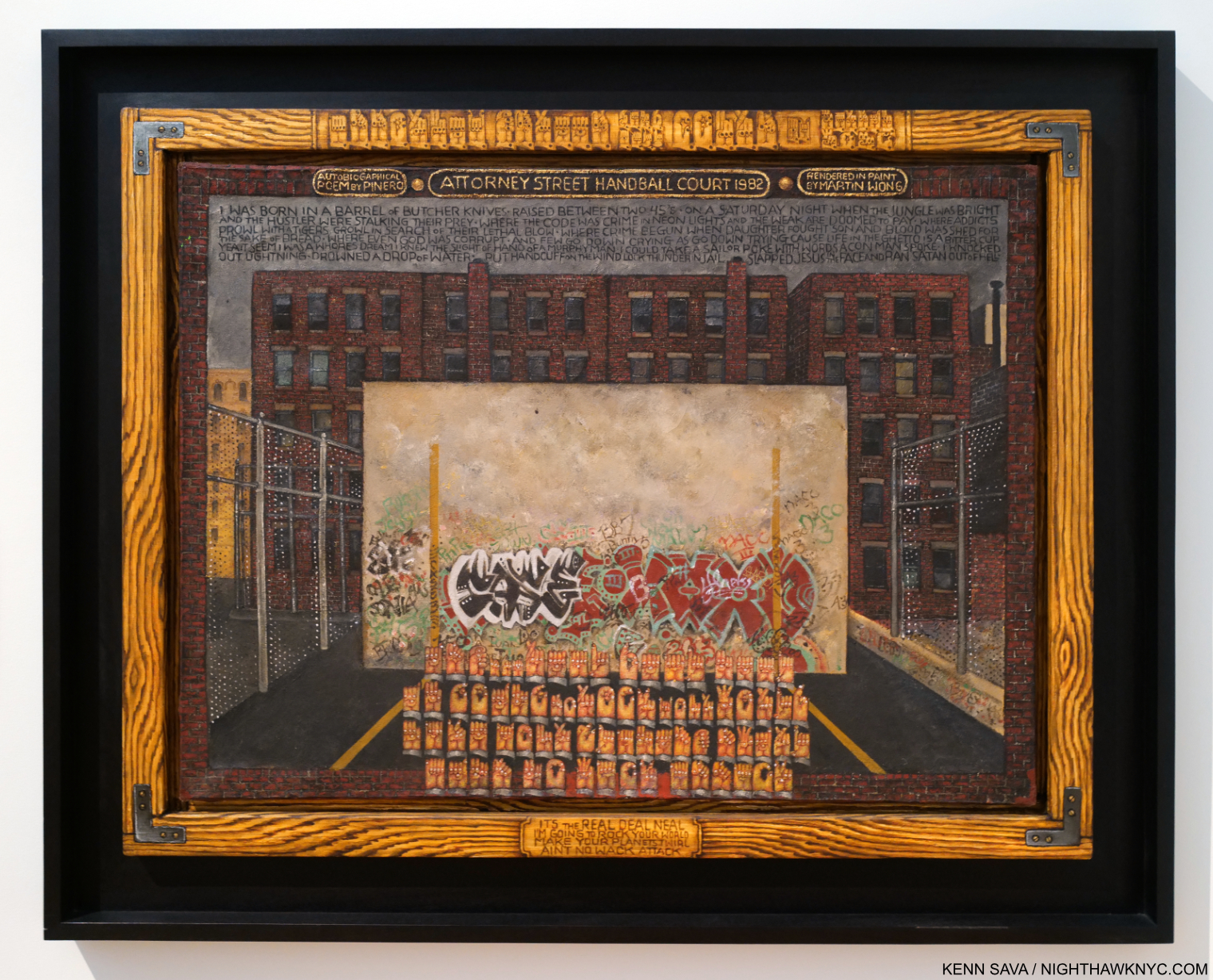
Martin Wong, Attorney Street (Handball Court with Autobiographical Poem by Piñero), 1982-4, Oil on canvas, 35 1/2 x 48 inches. Seen at The Met in June, 2022, Though he didn’t live to see a book on his work, he did live to see his work in The Met, who acquired Attorney Street in 1984, just after he finished it. Those hands along the top of the faux frame and near the bottom are speaking in American Sign Language.

Now, there have been two. Martin Wong: Malicious Mischief, the book, published to accompany the show, is the largest and most comprehensive book on his work so far. The only other one known to me, Martin Wong: Human Instamatic, published to accompany the show of the same name at the Bronx Museum in 2016, is long out of print, i.e. “expensive.” I have it, but I recommend Malicious Mischief. Here, his case has never been more completely and more beautifully made.

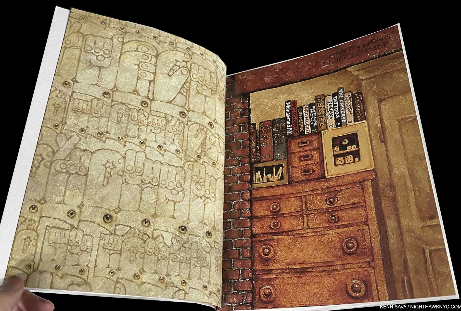
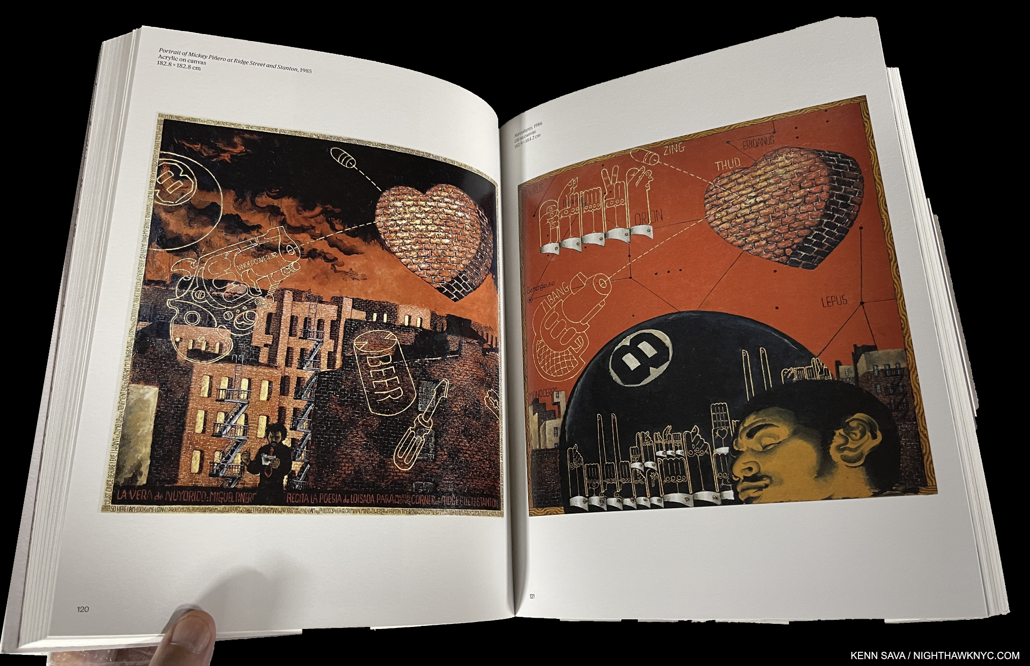
The second and third page of the book, showing details from his Paintings by way of introduction.

Martin Wong was something of the unofficial “Poet of the Lower East Side,” but never got the recognition or attention his contemporaries Jean-Michel Basquiat or Keith Haring did even though he outlived both. Still, twenty-four years after his passing, his work has continued to hold up and fascinate. It’s, also, every bit as timely, now, as it was when he Painted it. Blessed with being able to work in a wide range of styles, his work is characterized by its freedom from piece to piece. Throughout, his Draftsmanship forms a rock-solid base, which he carries through with an extremely high level of attention to detail.

It’s a paperback, unfortunately, a cardinal sin in my view for a book this important, and the cover is a bit on the malleable side; the paper stock could be thicker. Still, its importance outweighs these drawbacks. At 339 pages and over 3 pounds it’s a good-sized book with 8 1/2 by 11 inch pages which show the copious and fascinating detail in Mr. Wong’s work to advantage. Imported catalogs for shows, like this, have a habit of not staying available indefinitely. So act soon to “avoid disappointment and future regret” as the informercials say. Which reminds me- the next time I regret not buying something from an infomercial will be the first time.

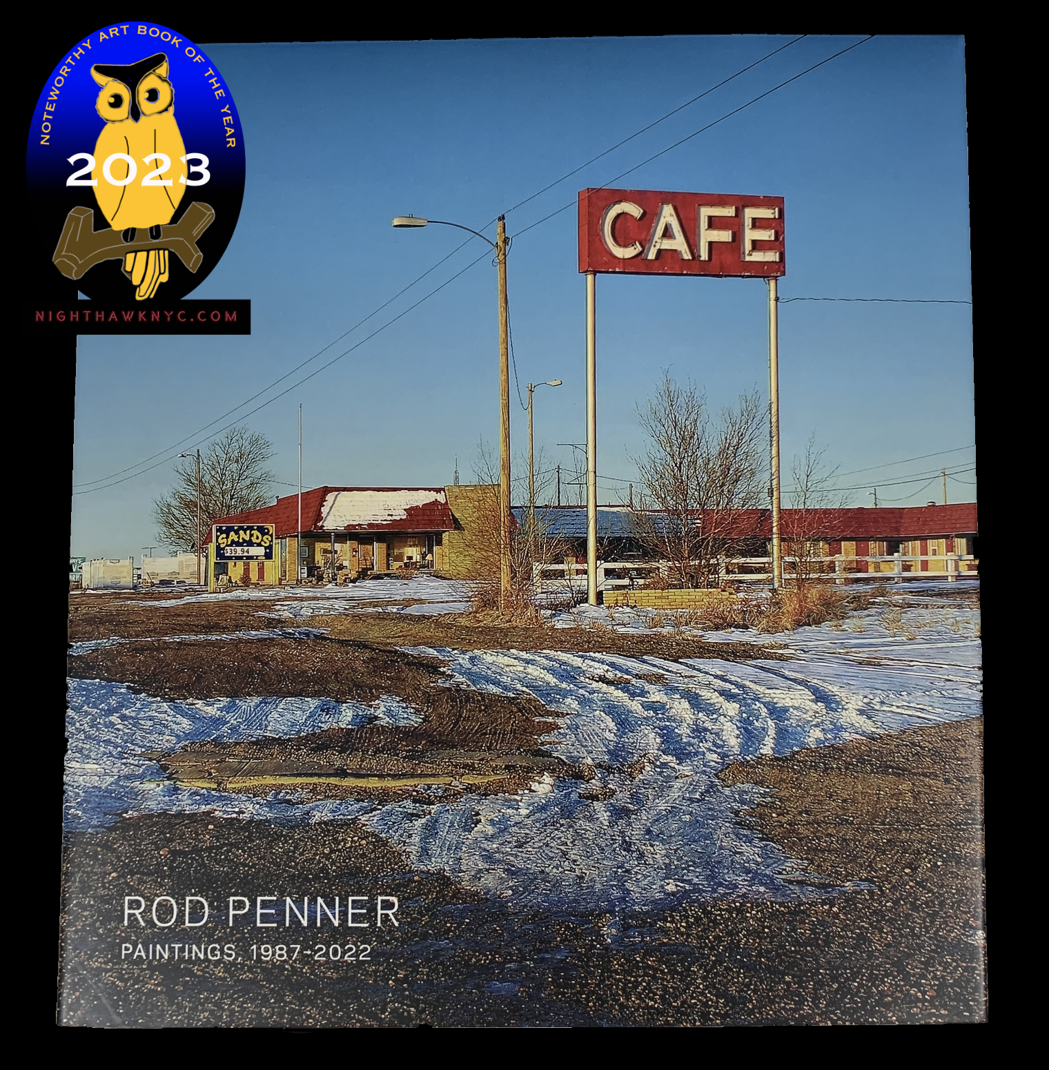
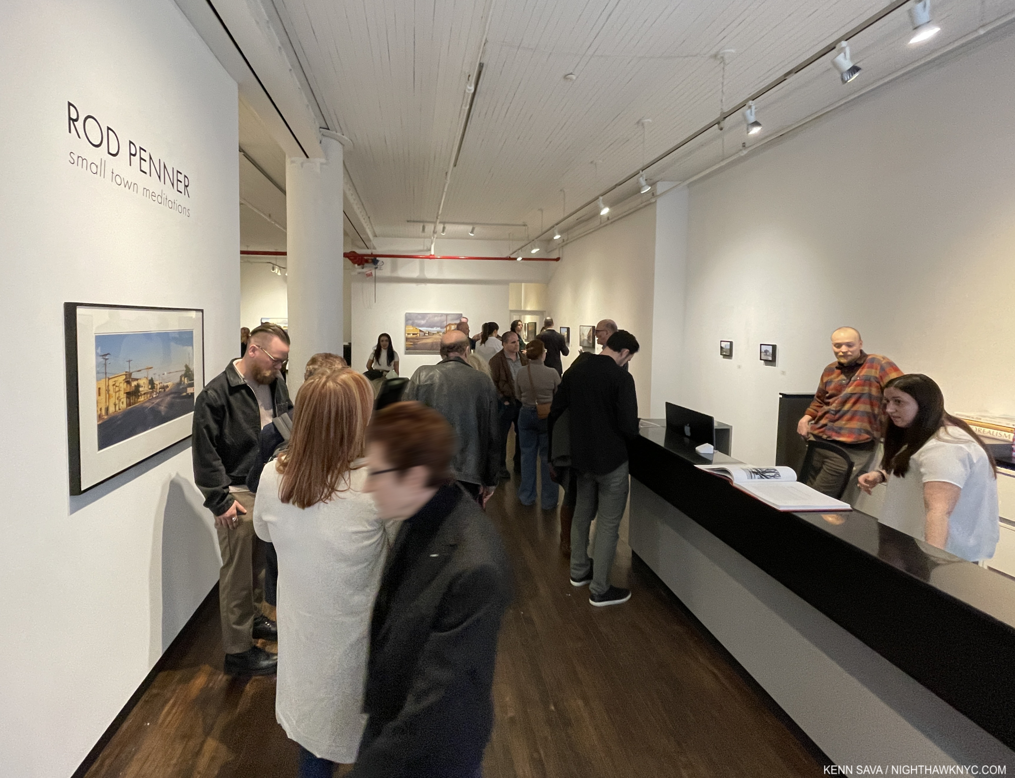
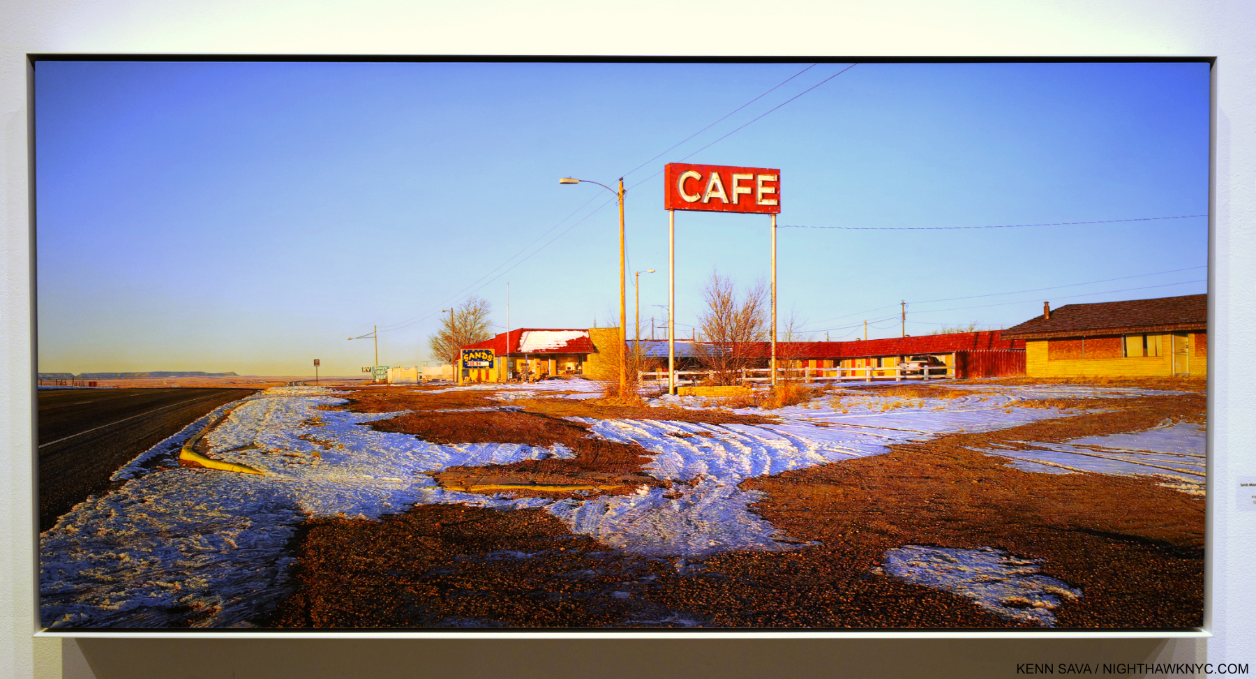
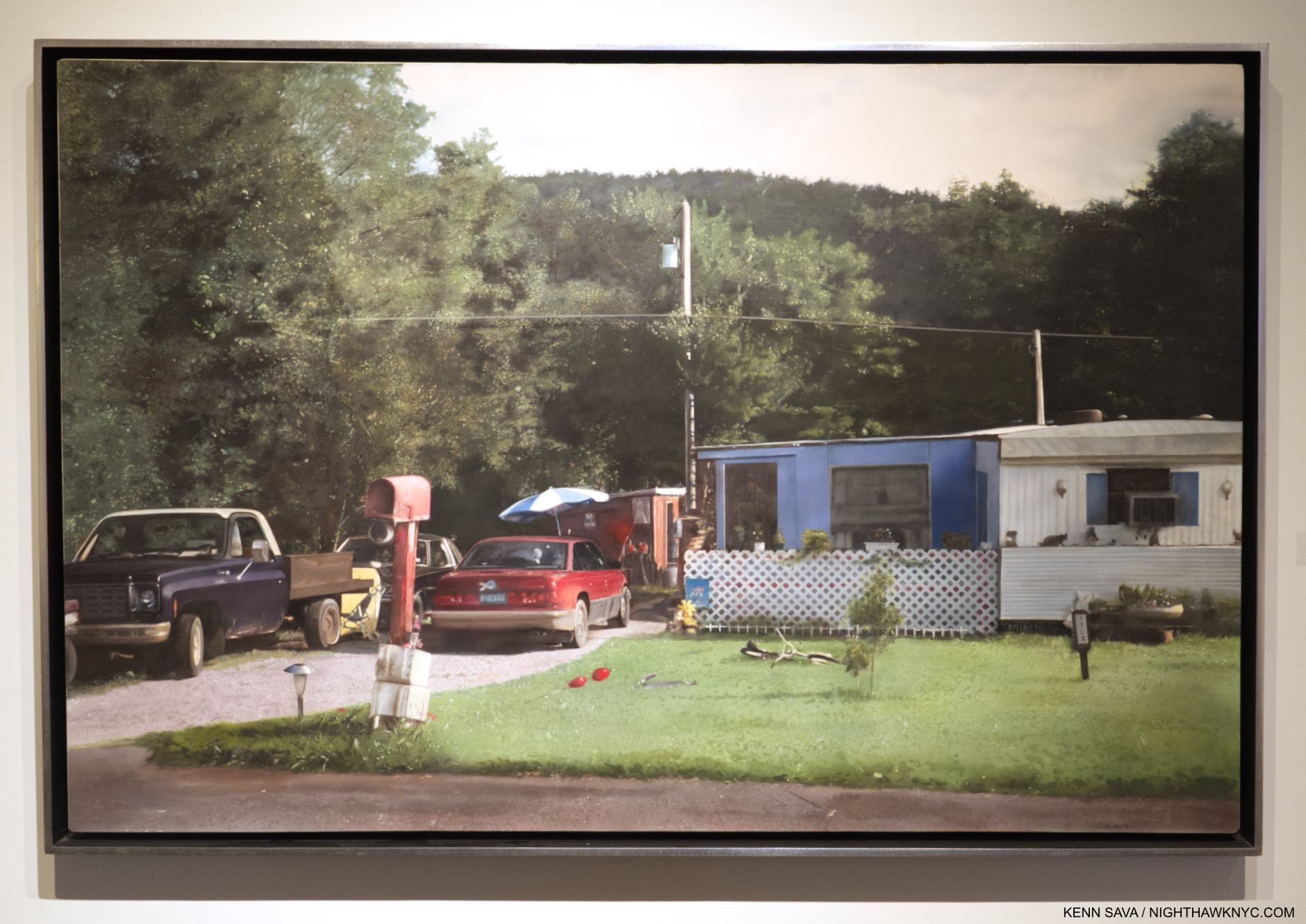
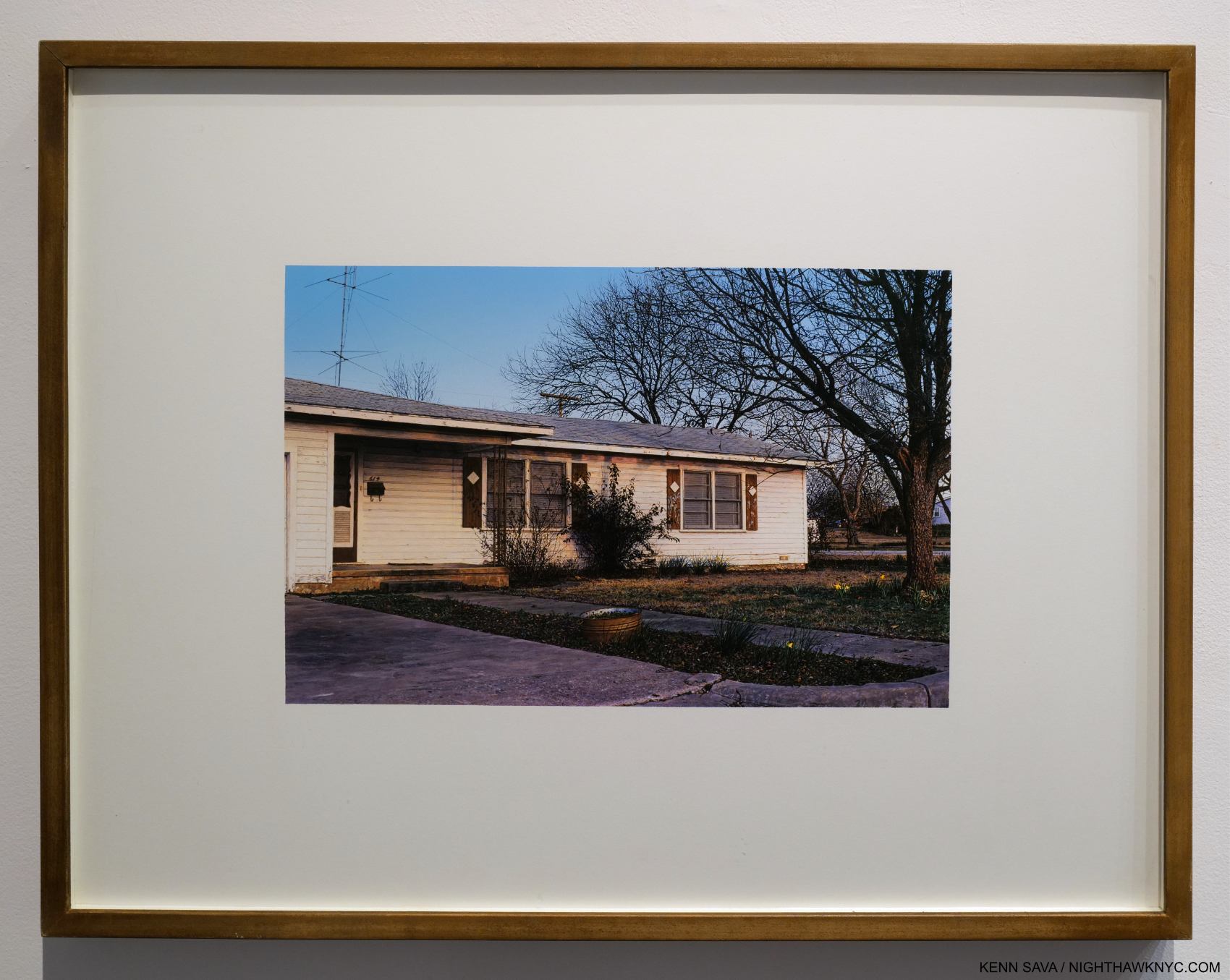
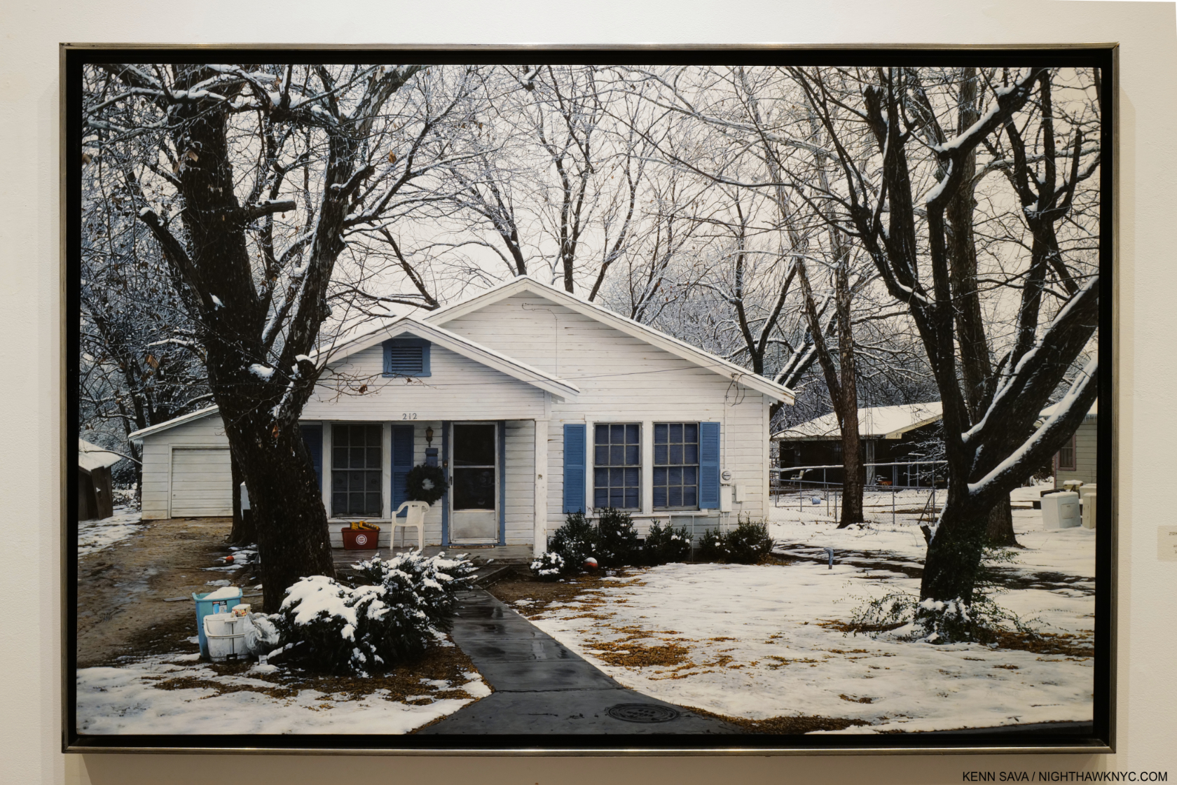
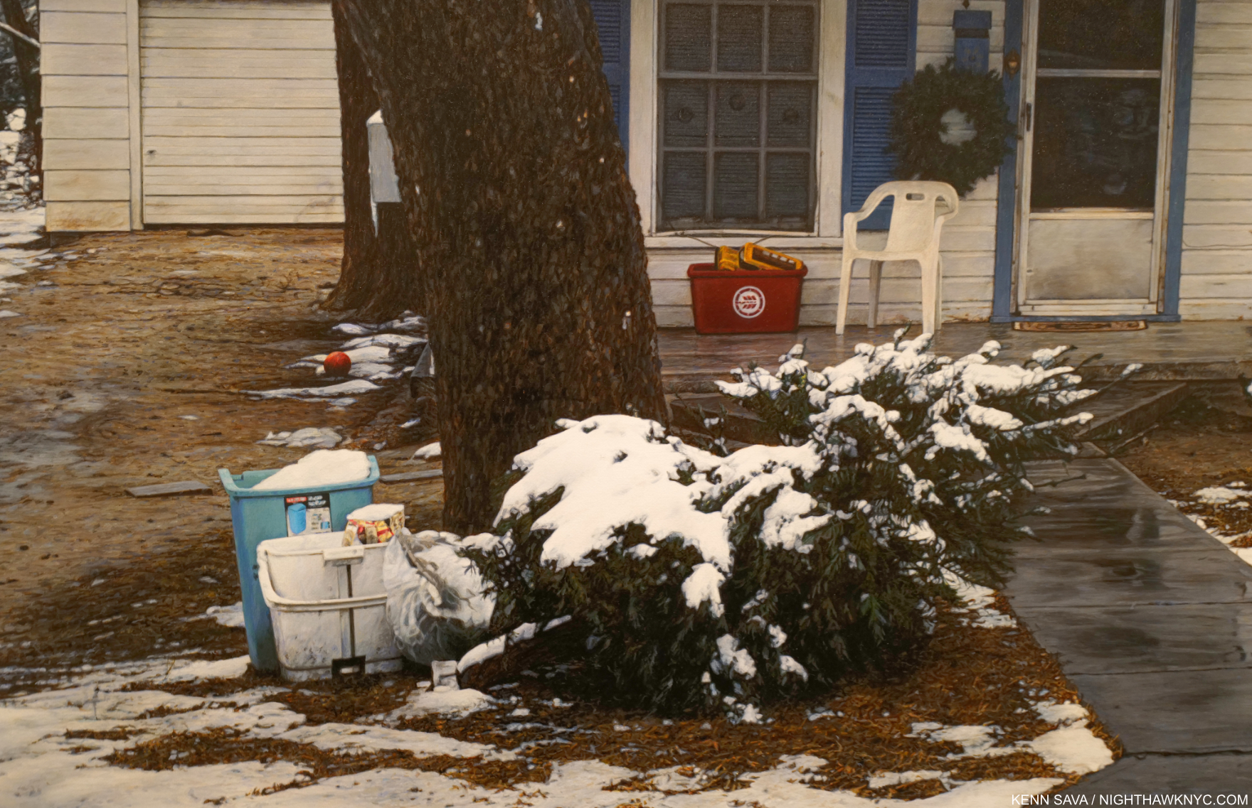
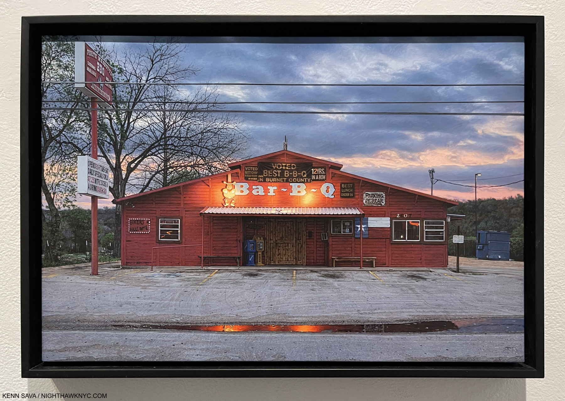
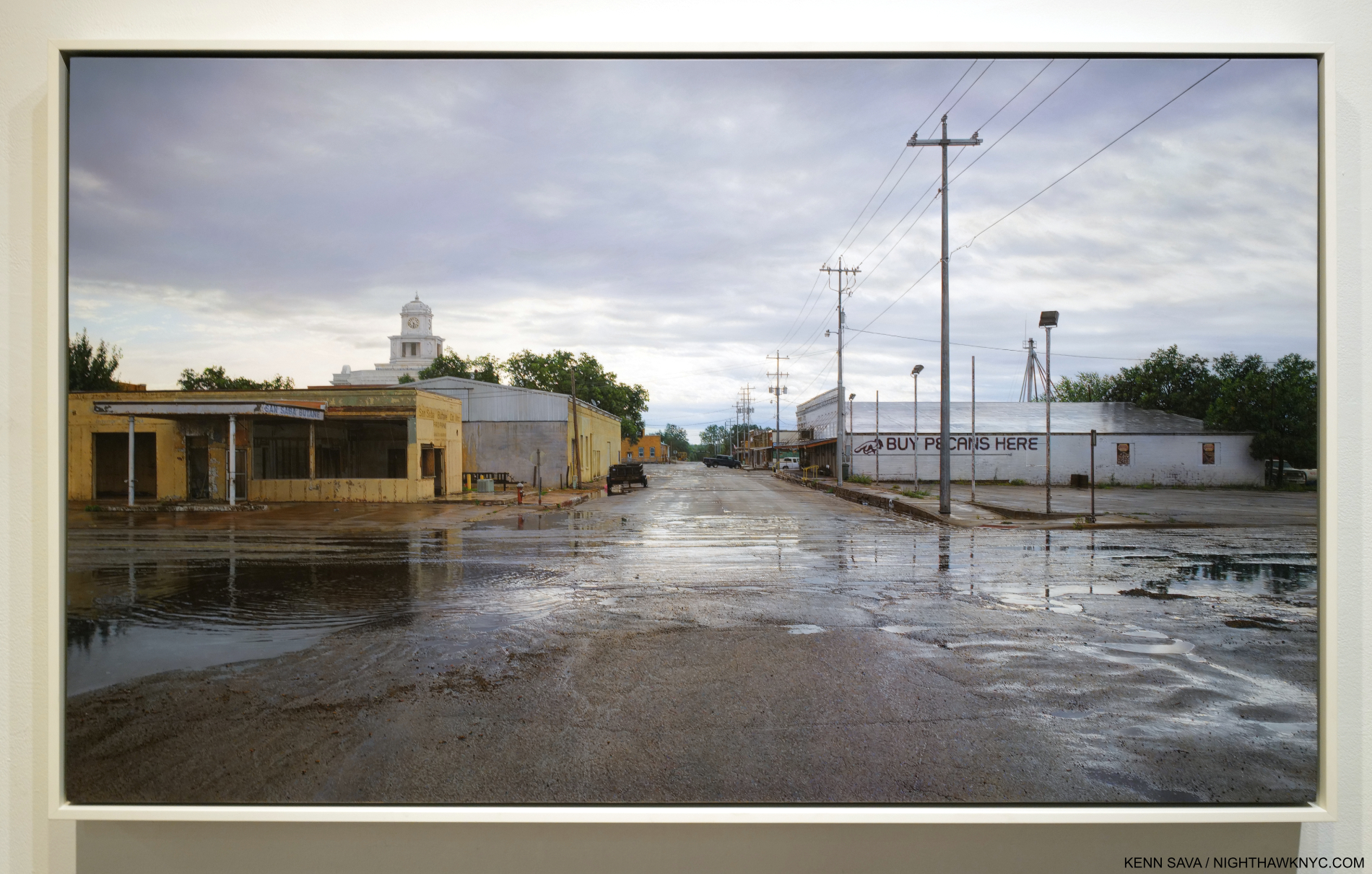
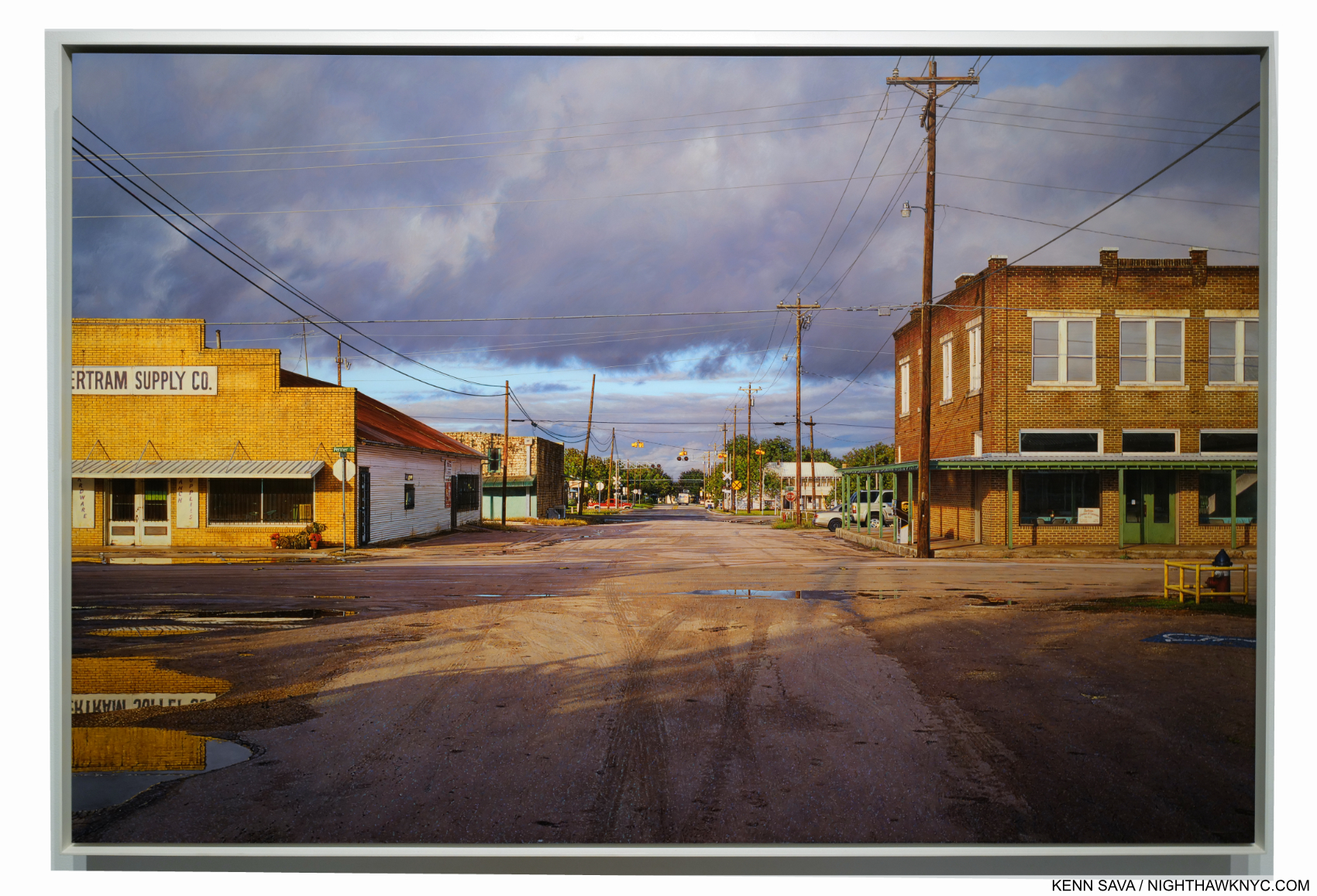
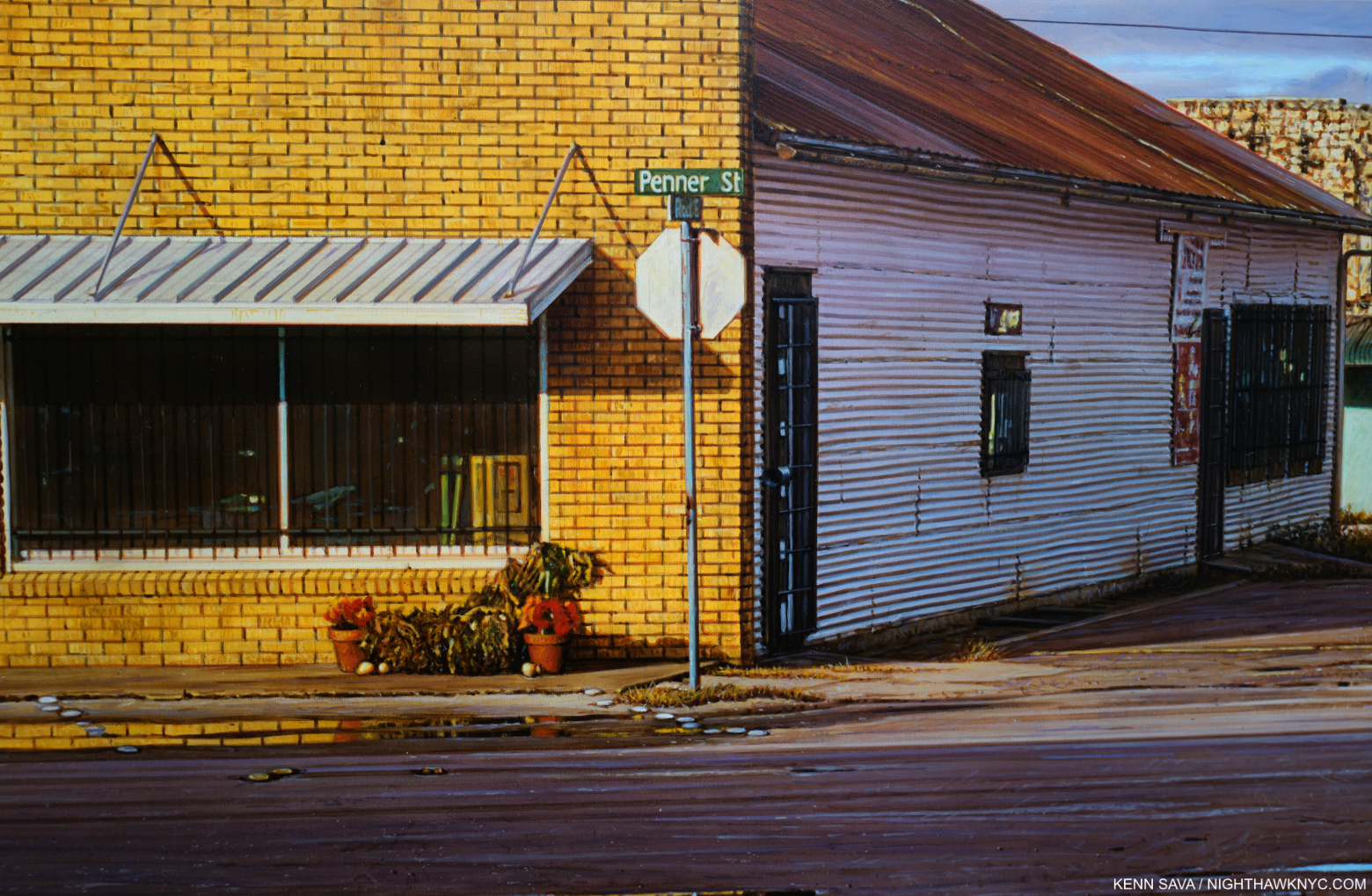
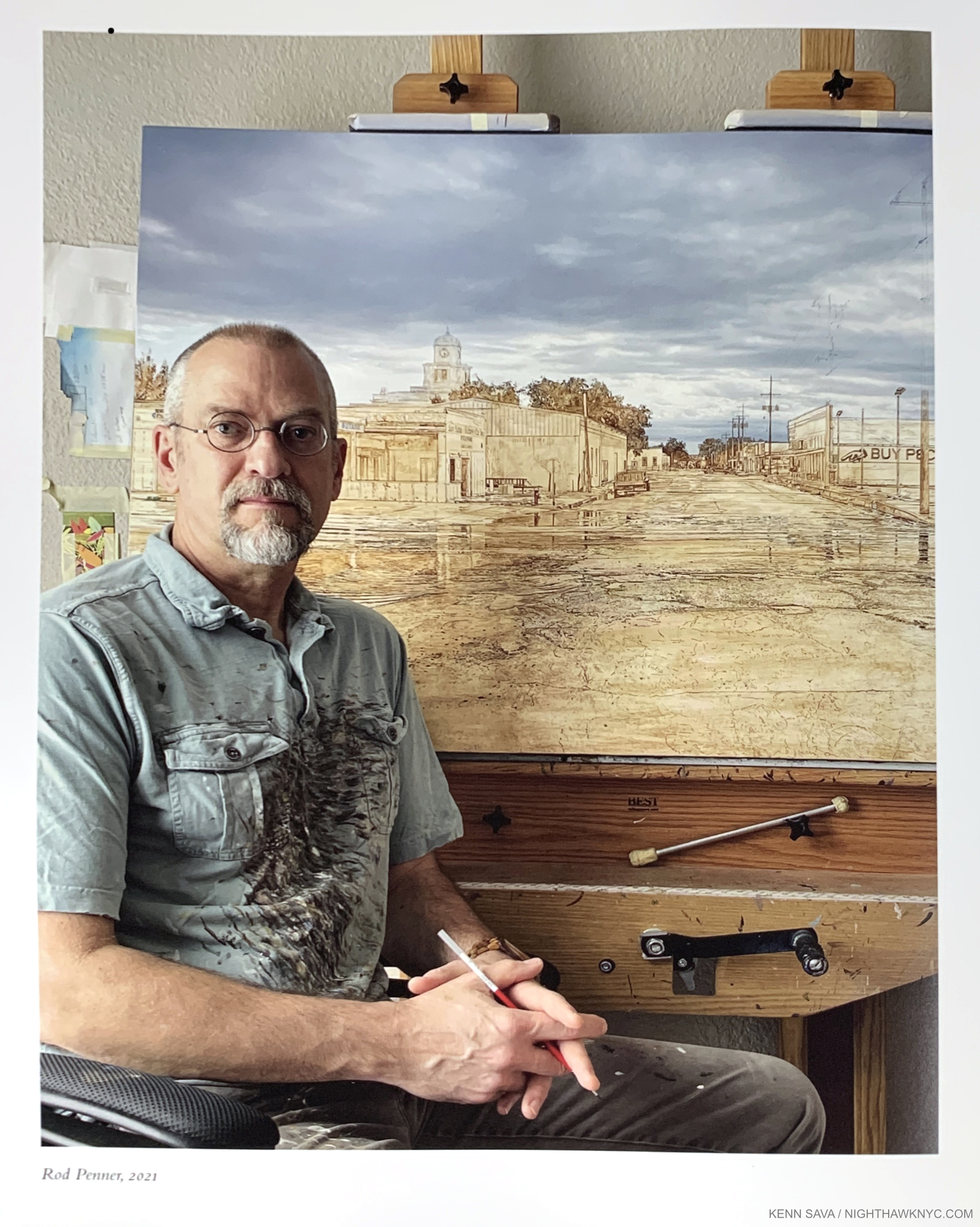
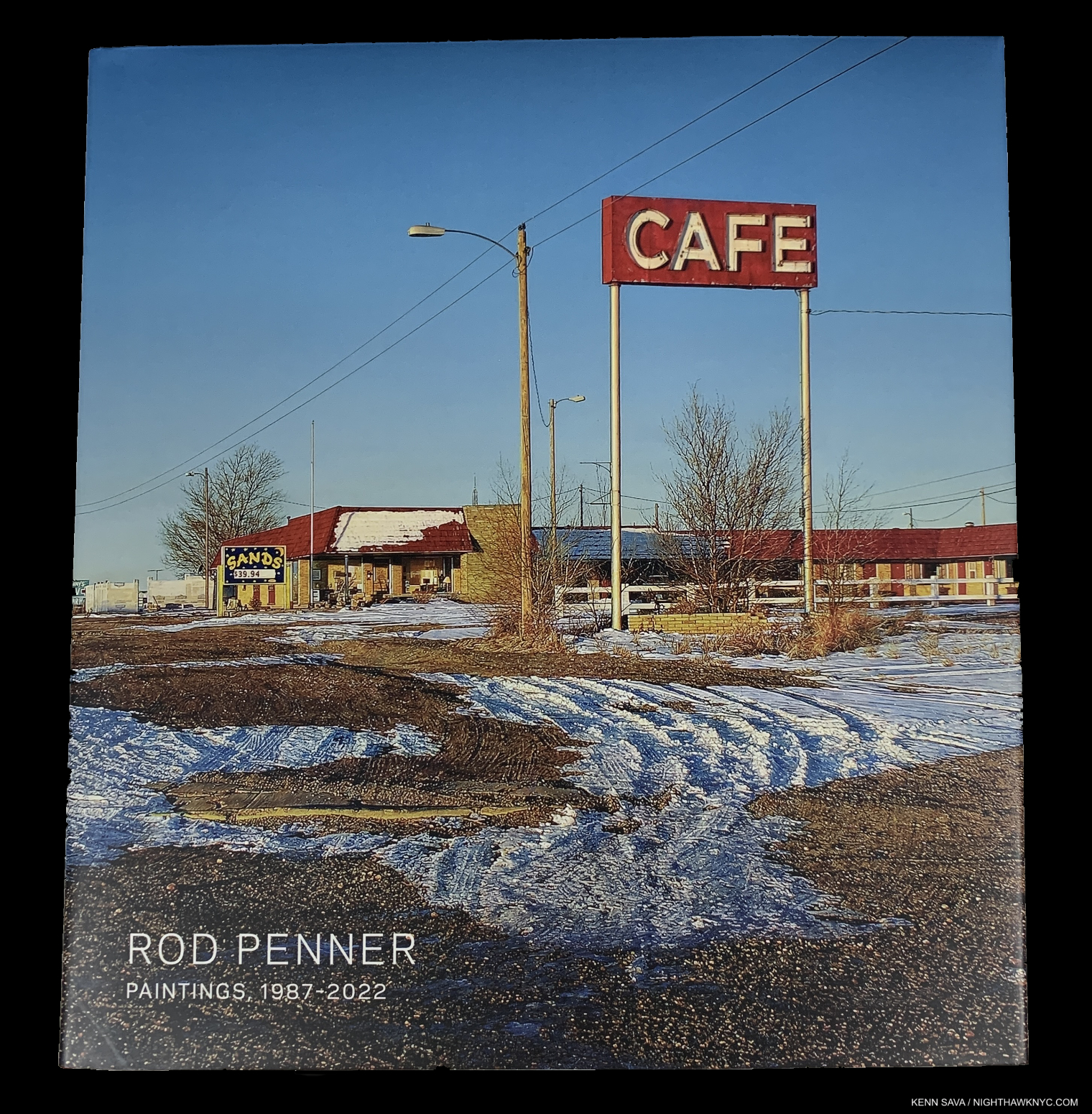
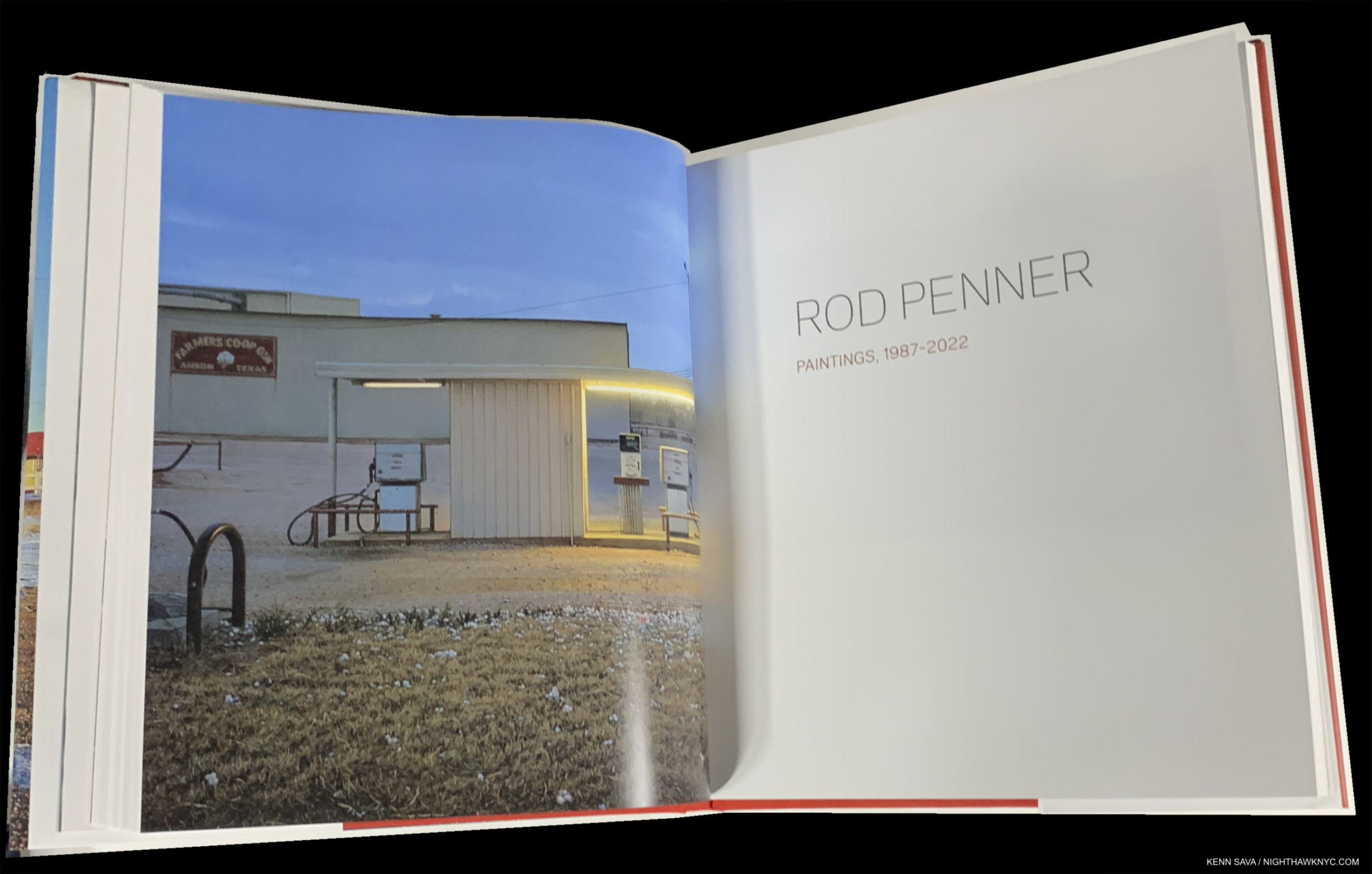
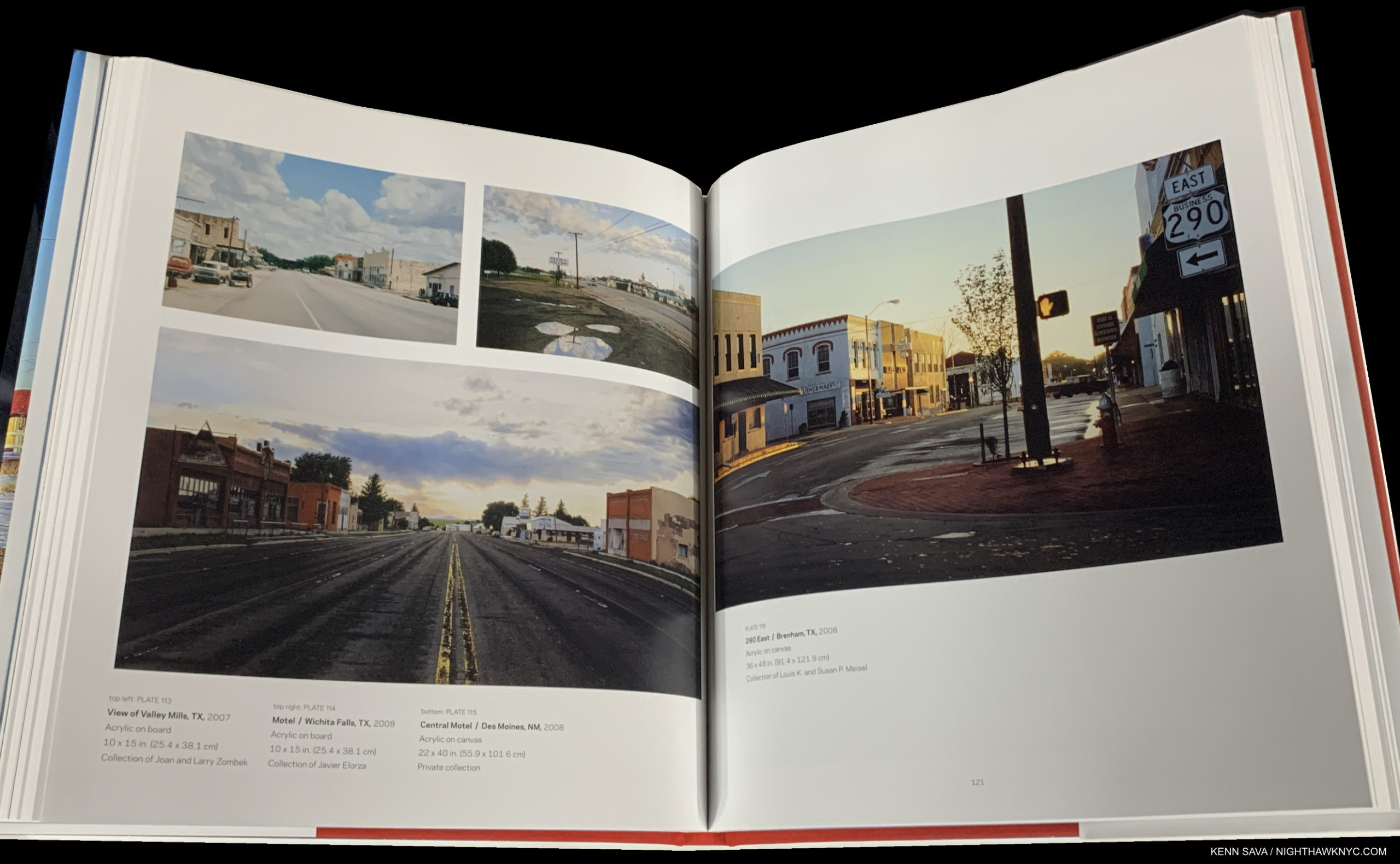
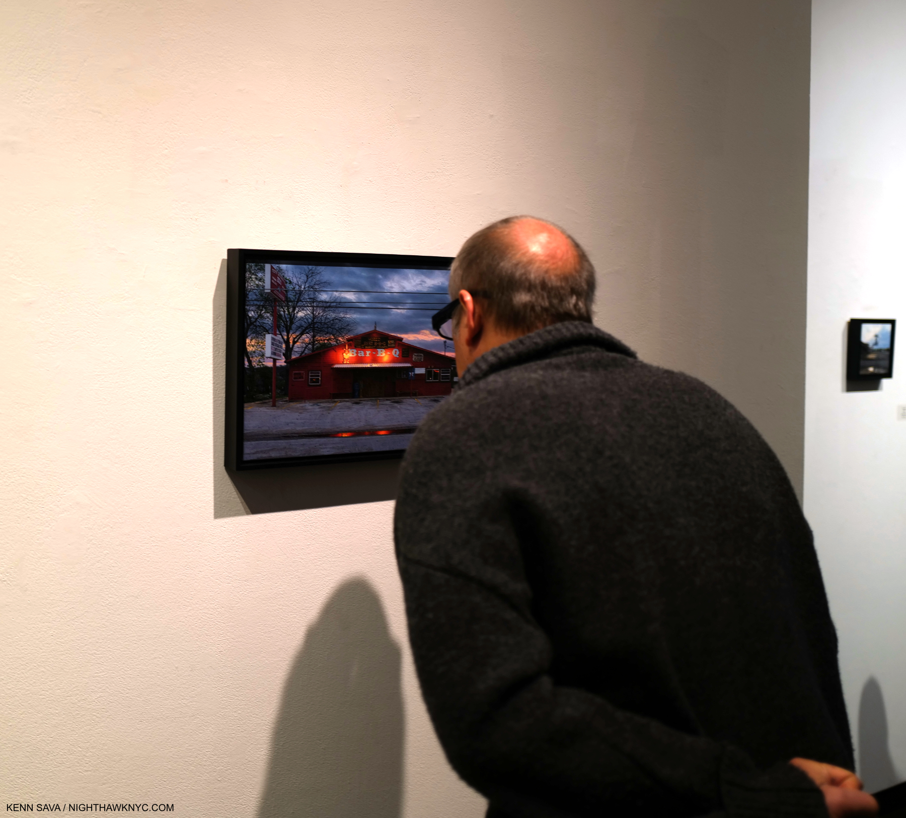
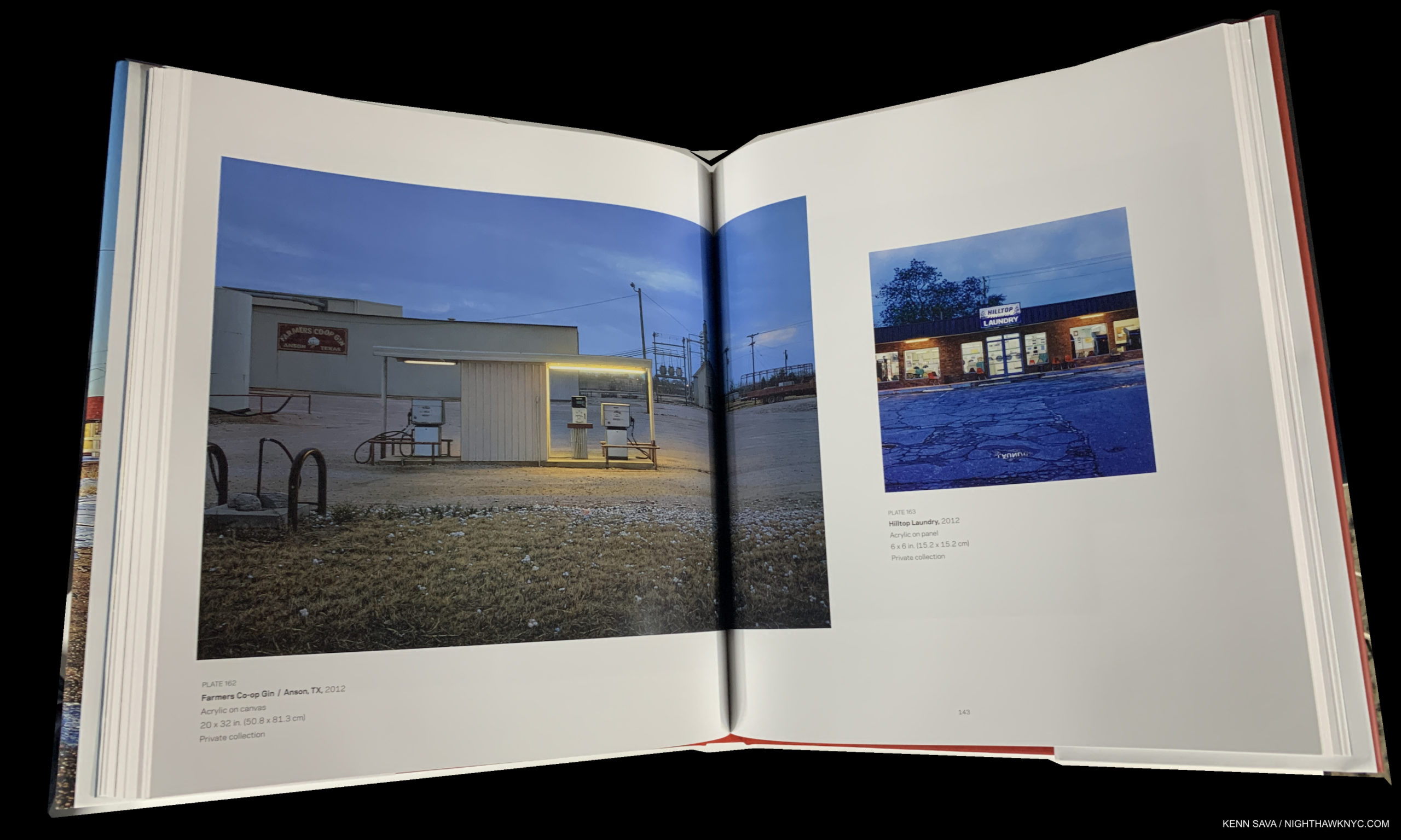
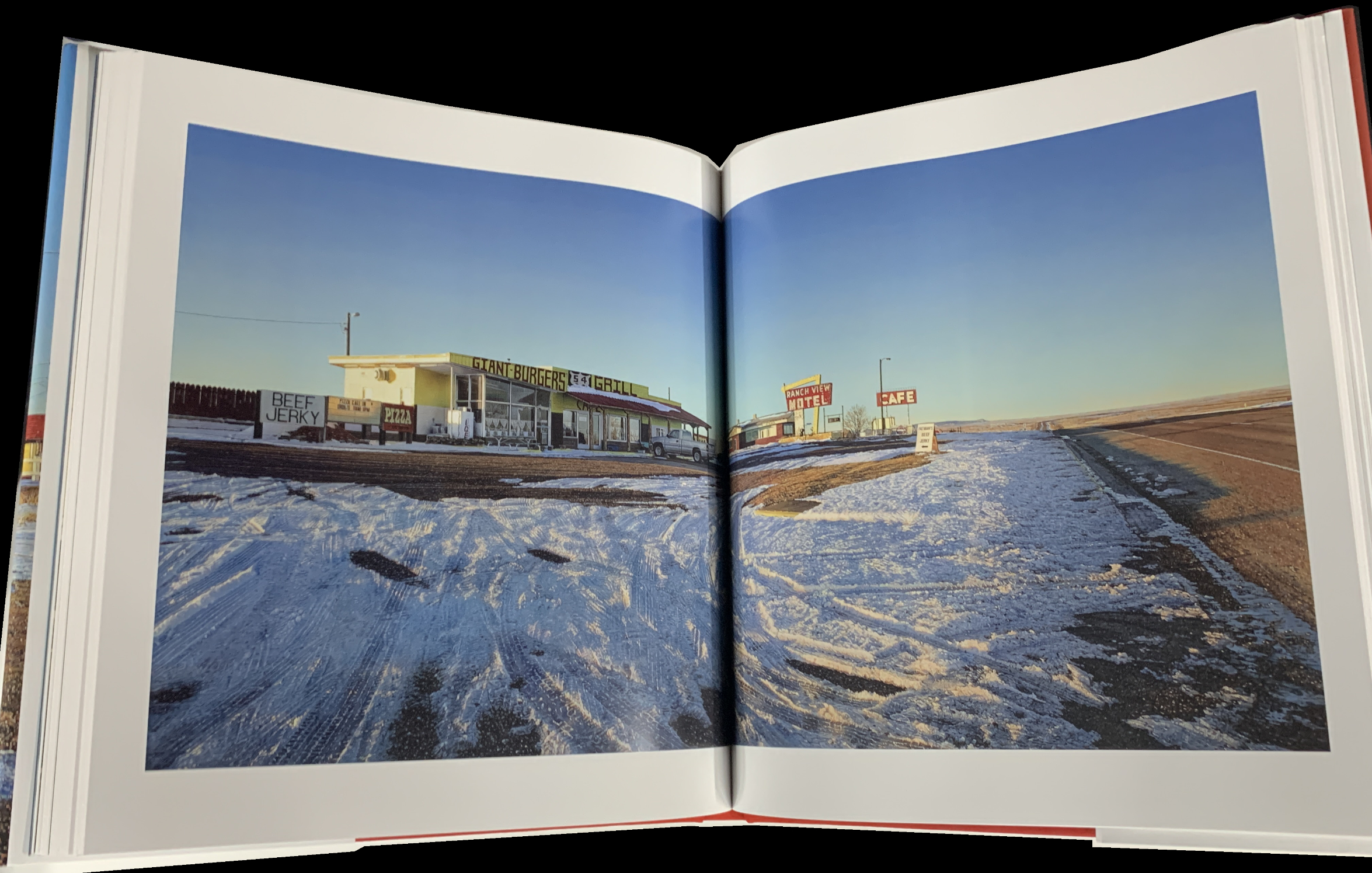
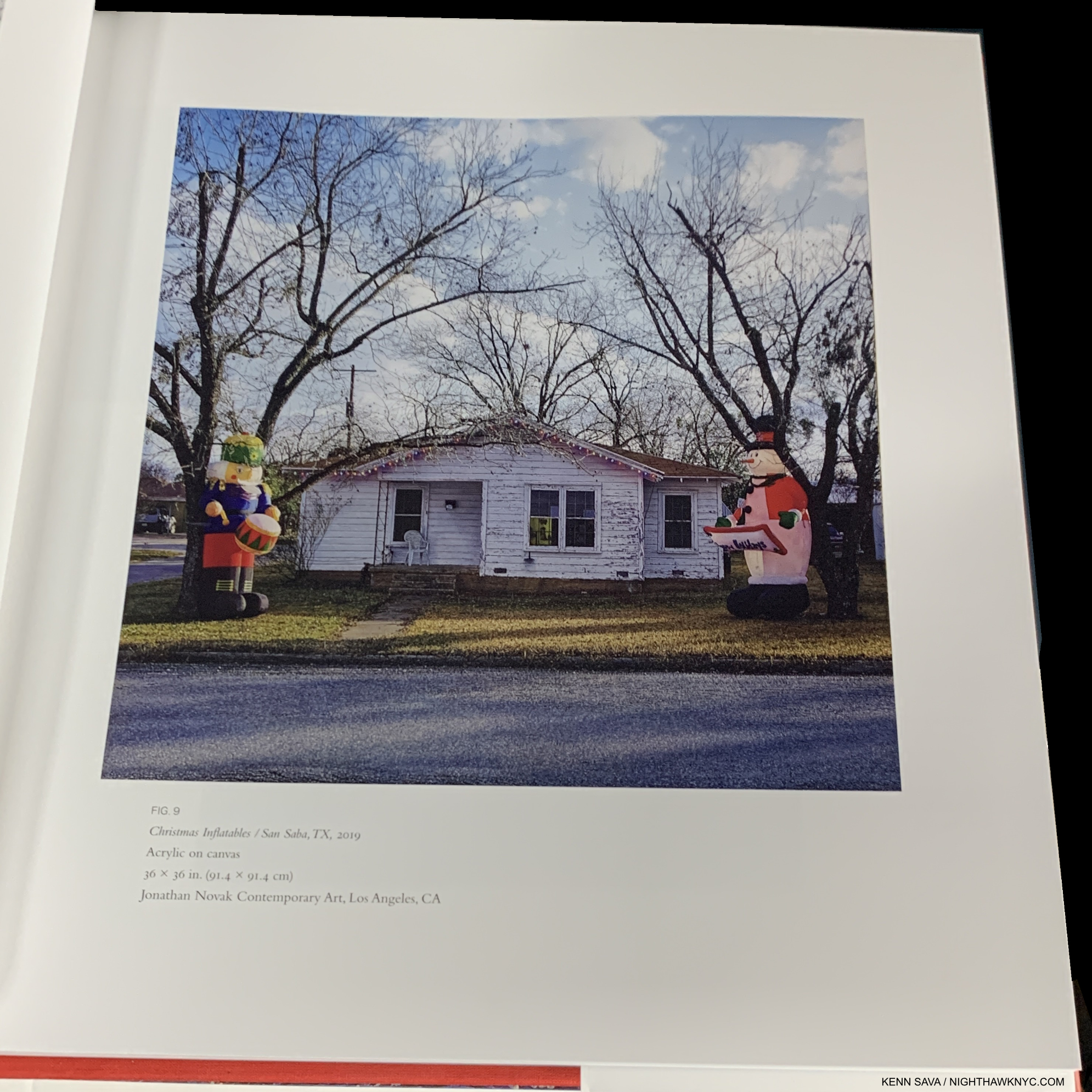
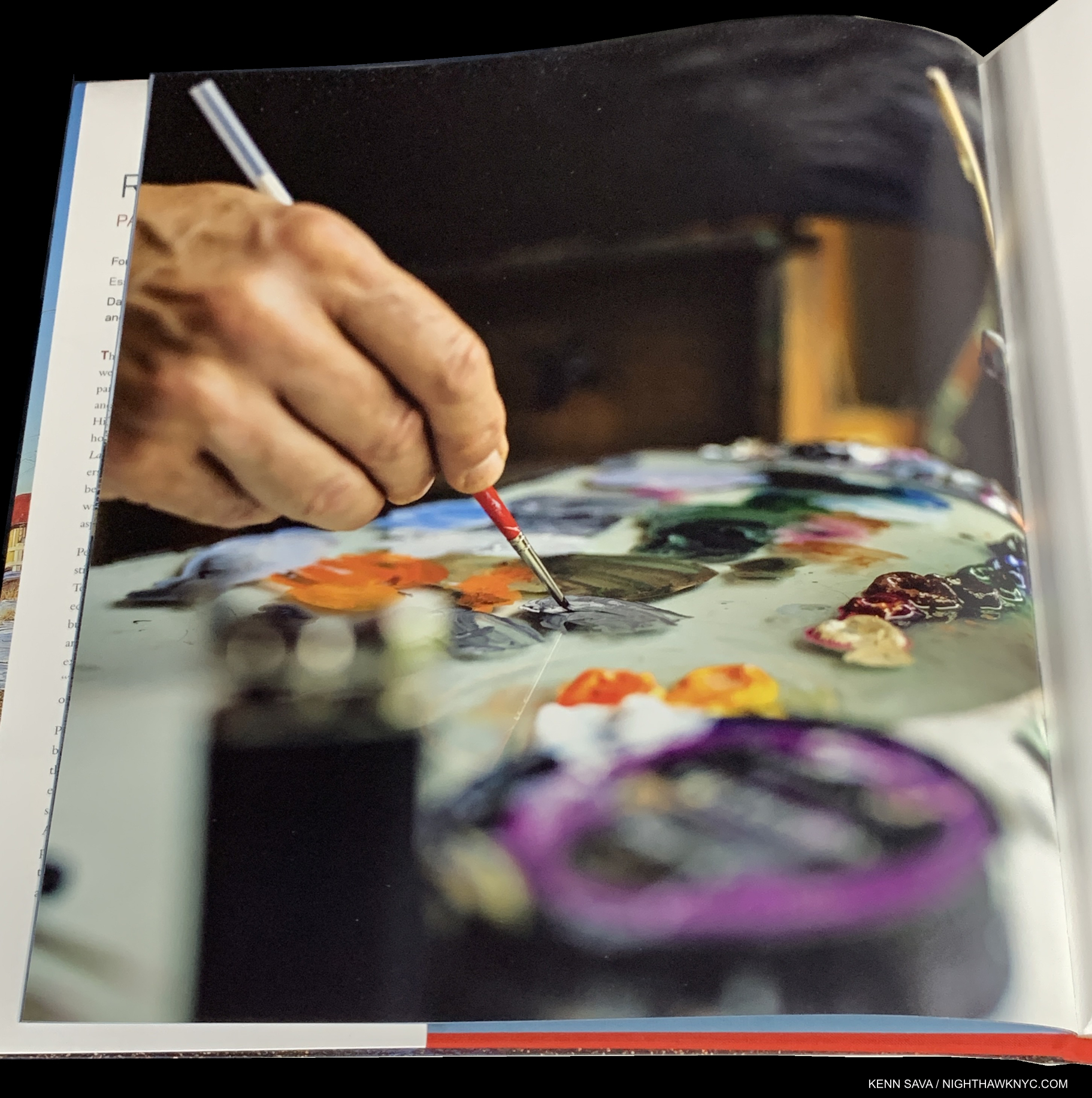
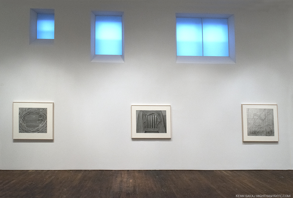
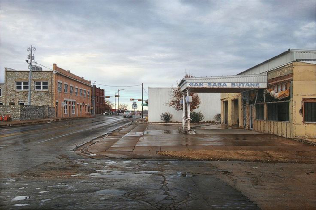
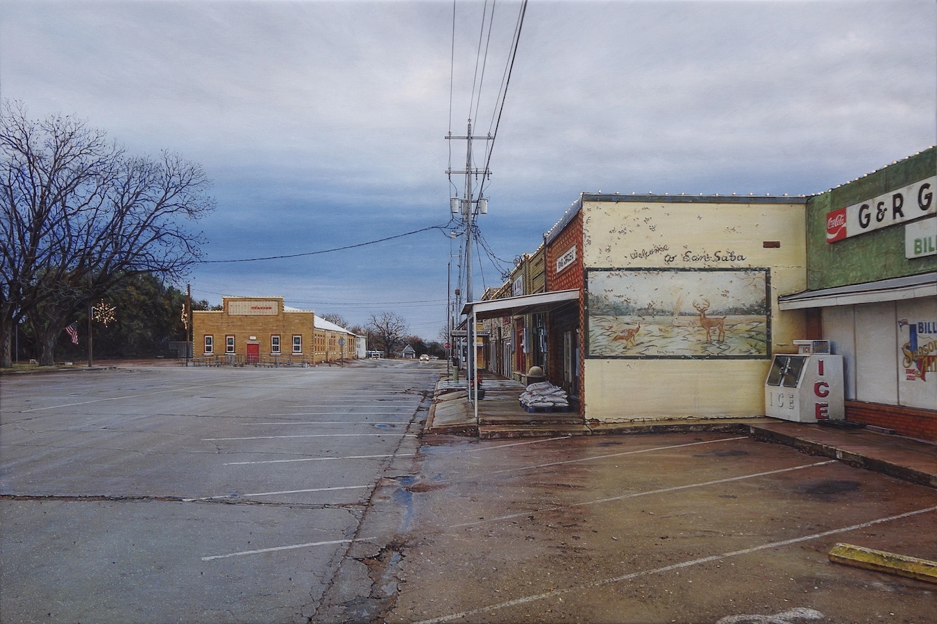
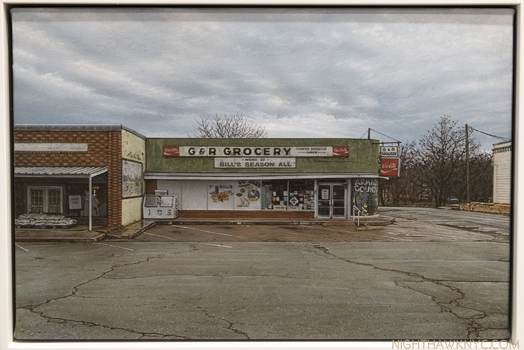
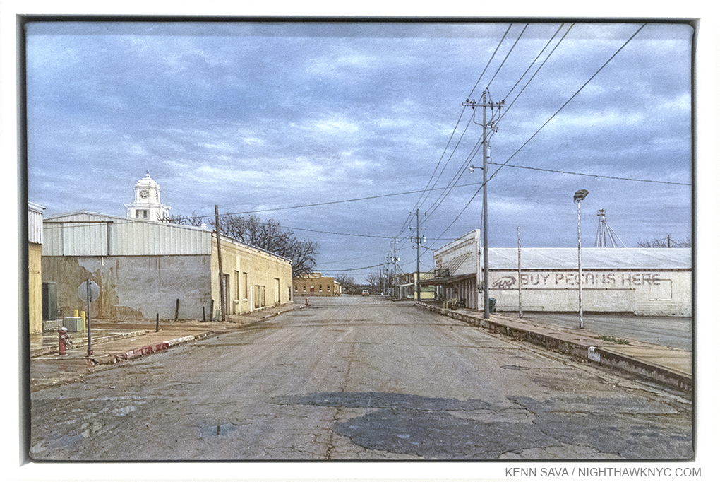
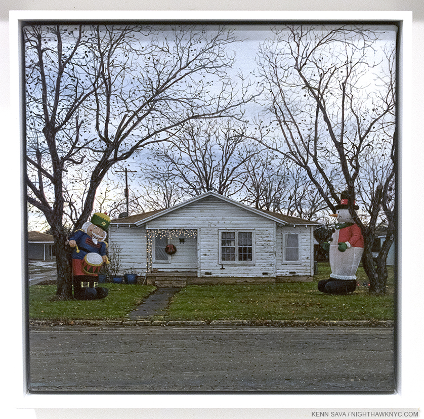
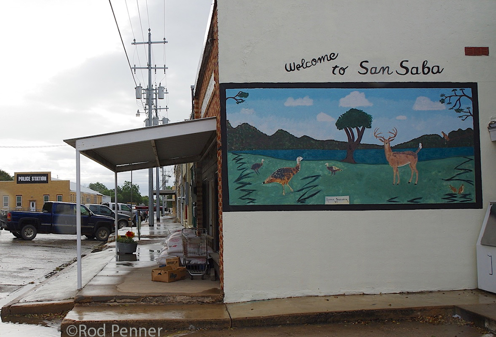
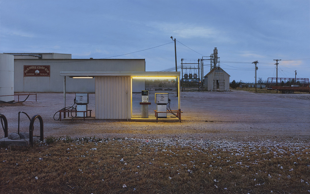
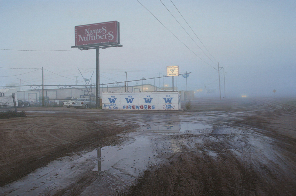
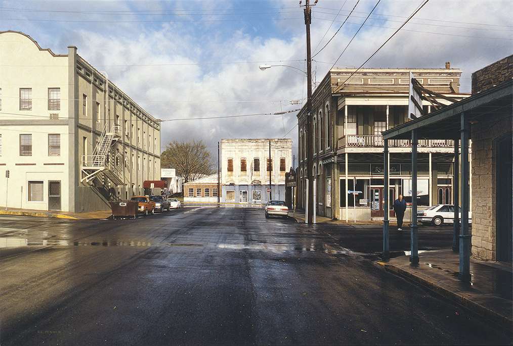
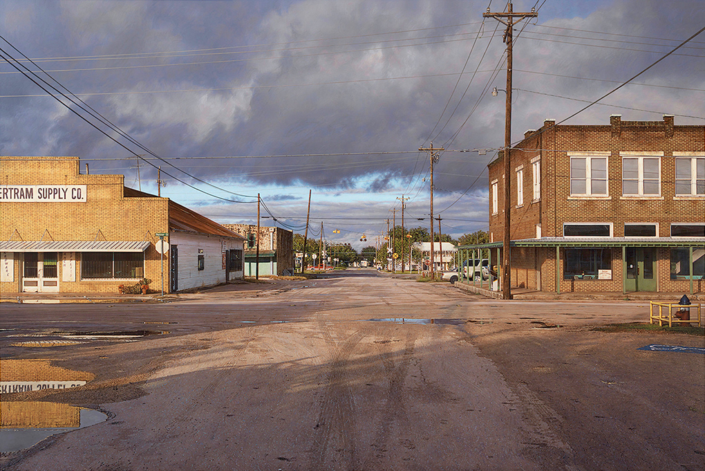
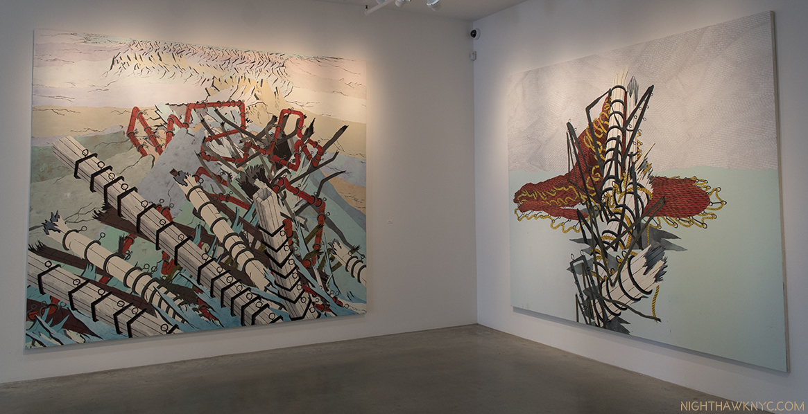
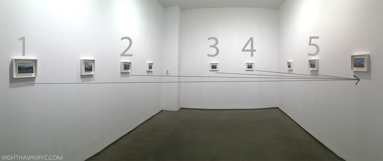
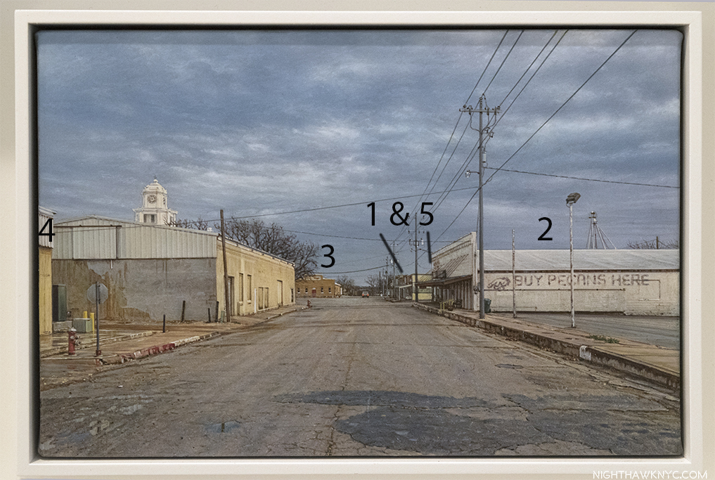
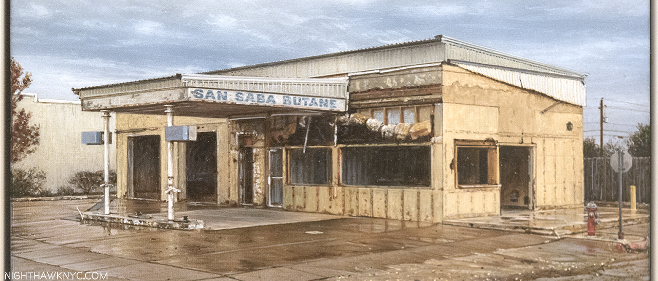
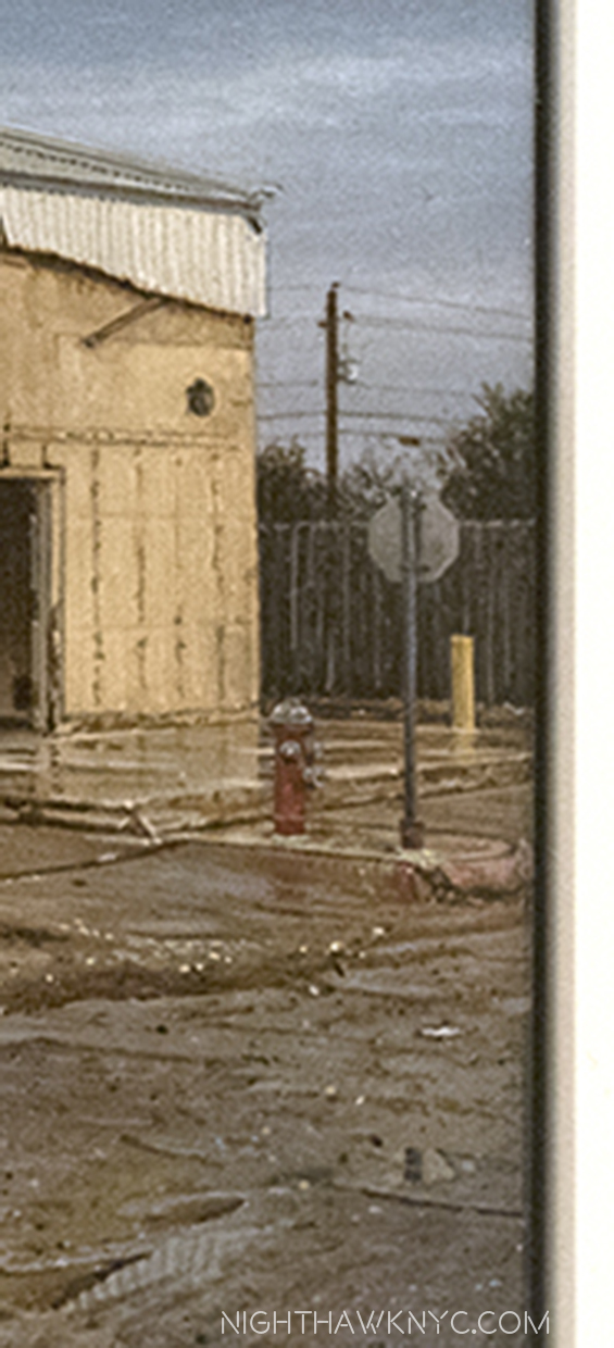
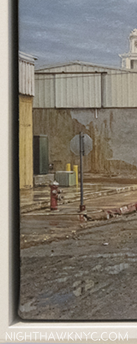
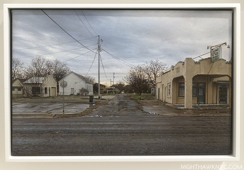
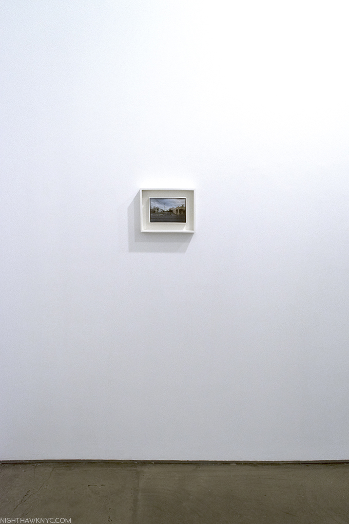
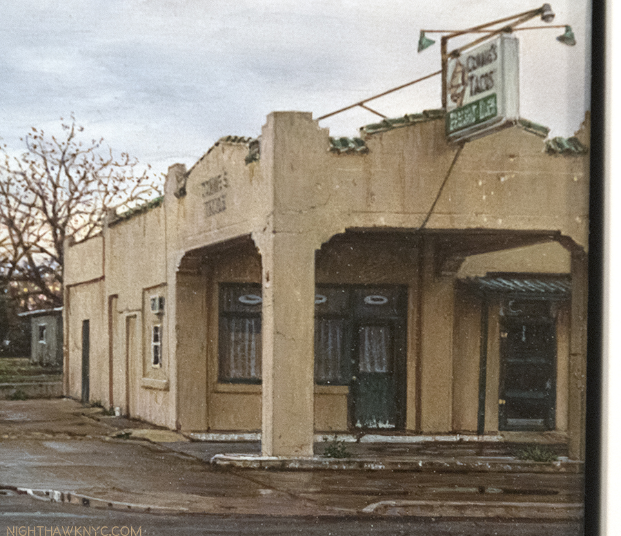
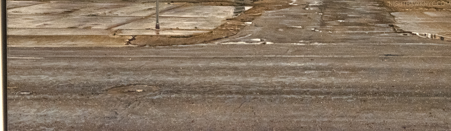
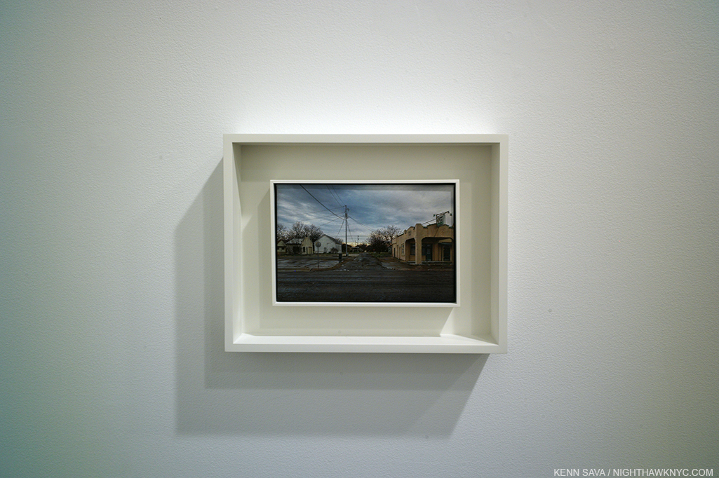
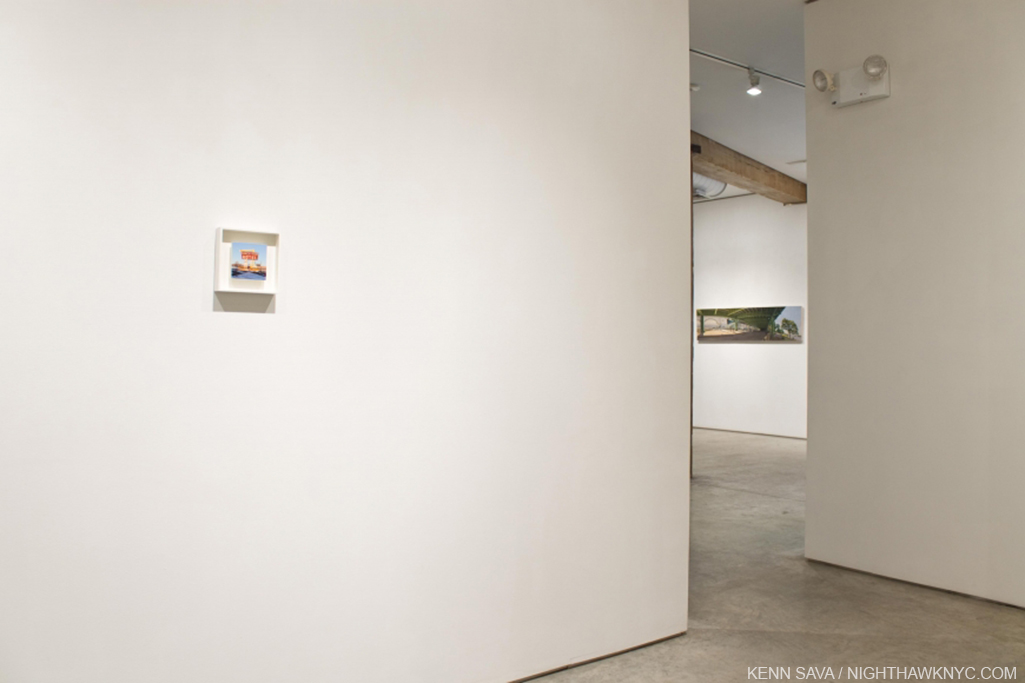
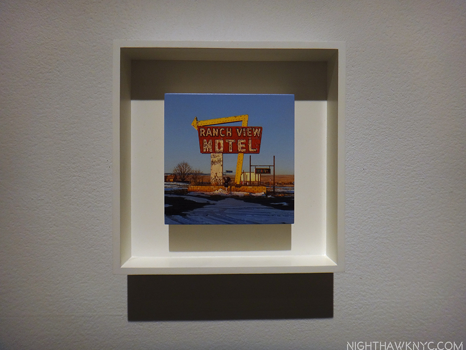
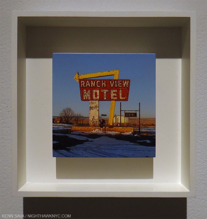
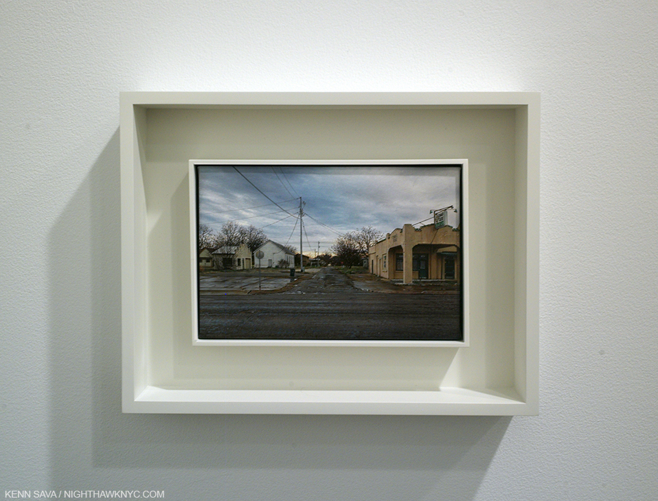
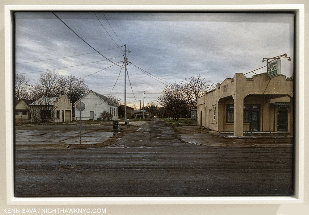
Rod Penner: Paintings, 1987-2022, The Artist Book Foundation
What more/else can I say about Rod Penner: Paintings that I didn’t say in my in-depth review of it is here? Actually, I can say that it was on my original draft of my Desert Island Art Books, along with the Martin Wong, above. Pretty remarkable when you look at the publishing dates for the books on the final list. Realizing my draft list was too long, I made the hard choice of focusing on older books that have stood up for me for years, and left off the two that were less than one-year old. While I didn’t put them on that list, they deserve to be on this one.

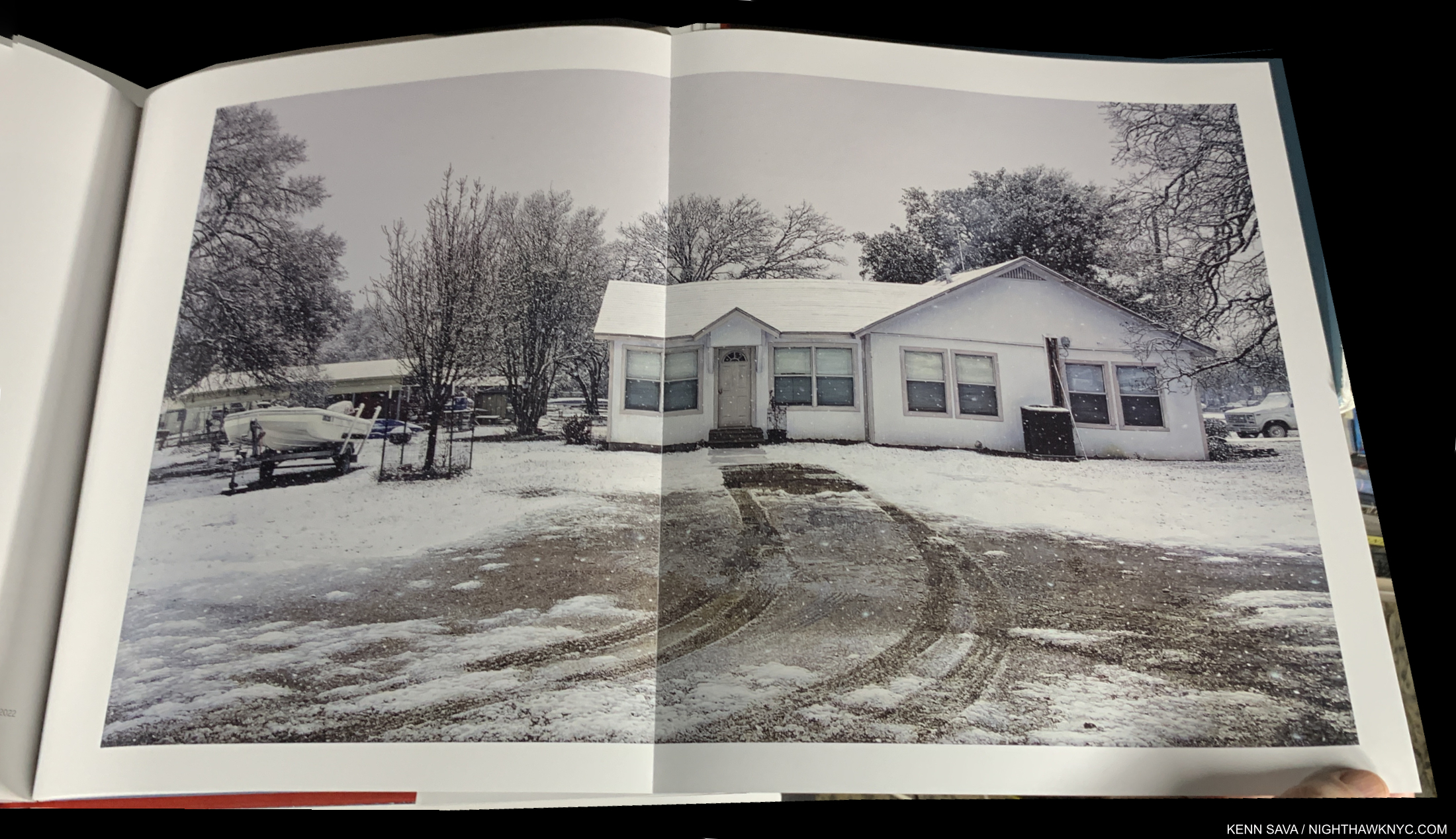
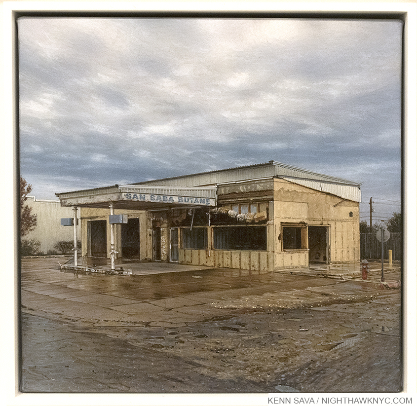
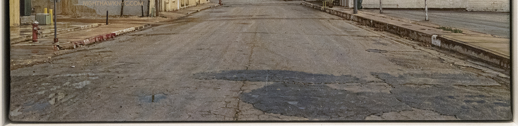
House with Skiff/Marble Falls,TX, 2022, Acrylic on canvas, 32 x 54 inches. The most recent work in the book shows that Rod Penner is still at the very top of his considerable game.

A full-length book on Rod Penner has been a long time coming. What we got is something unusual in my 50 years of Art book experience: a book that serves the dual purposes of being both a monographic overview of the Artist’s work these past 35 years, AND a Catalogue Raisonné containing everything the Artist has Painted through 2022. As such, it will serve those new to Rod Penner’s work, as well as collectors, curators and Art historians, well indefinitely.

My pieces on Rod Penner are here, including my recent look at his Spring, 2023 NYC show, where I said that Rod Penner is “the foremost Painter of small-town America working today.” I believe that after the distracting hype surrounding his remarkable technique dies down, and more people get down to looking at what he’s Painted, that that’s how this work will be thought of.

Nick Cave: Forothermore, Museum of Contemporary Art, Chicago/DelMonico
Nick Cave’s books are always gorgeous, and important. With only 10 published on his work so far (he says, though I’ve only seen 5), all are worthy of his extraordinary talent, and all worth seeking out. This is indicative of his involvement in them. Forothermore, the catalog accompanying his landmark mid-career retrospective at the Museum of Contemporary Art, Chicago, which traveled to the Guggenheim Museum earlier this year, is now my go-to choice among the 5 I’ve seen, a very hard choice to make. Of the show, I wrote, “I went in believing Mr. Cave is one of the more important Artists working today. I left speechless.”

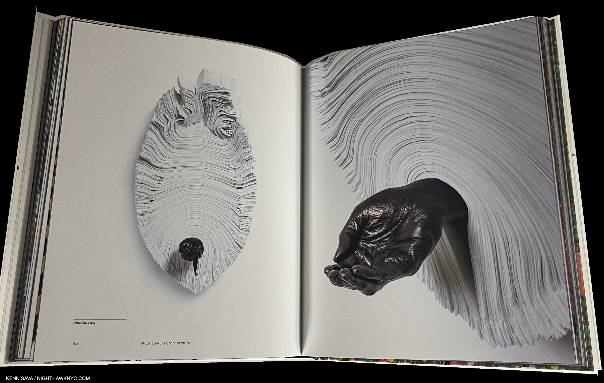
I wrote extensively about Nick Cave’s famous Soundsuits, in my piece on the show and they are featured throughout the book. Here is some of his other work, Untitled, 2014. As for the wonderful design, I love how he’ll often get around the problem of the gutter by putting the full work on one side, and a compelling detail on the other.

Luckily, exhibition catalogs live on indefinitely after their subject show, and some enhance their value to readers by serving more than one purpose. This is one example. It’s gorgeously & lovingly produced and features large Photos of Mr. Cave’s work throughout his career, which allows for closer study & appreciation of the incredible amount of detail and subtlety in his work (just look at the cover and remember that is all hand-made).
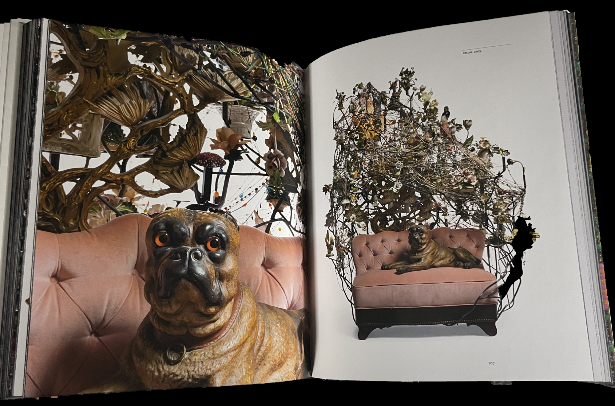
Rescue, 2013

All of this makes Forothermore doubly important as both the exhibition catalog for the show and the go-to book with beautiful reproductions of the most comprehensive collection of Nick Cave Art over all of his career, including his recent work, among his excellent books. Speaking of them, if you want one Nick Cave book, I’d choose Forothermore right now, but do at least take a look at Until (2017); Epitome (2014); Meet Me at the Center of the Earth (2010); and Greetings From Detroit, (2015) if you want to see just how hard the choice is!

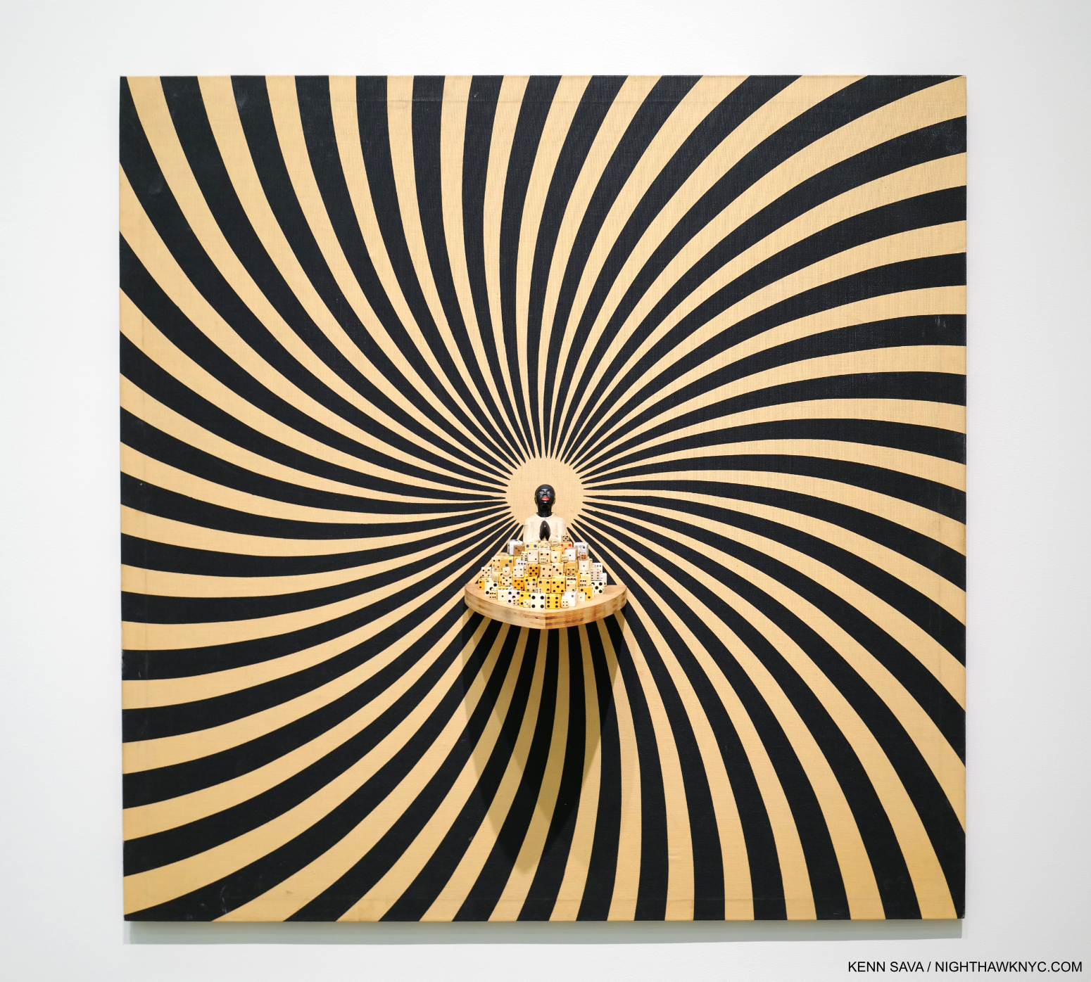
I Wouldn’t Bet Against It, 2007, Mixed media including vintage fabric, dice, and objects, 48 by 48 by 6 inches, as seen in the show, though it also appears on pages 154-5 of the Furthermore catalog.

Nick Cave is so unique, and so important, I can’t help thinking that we’re looking at someone who could very possibly become an Art “superstar.” Can you imagine his impact on the fashion world, if he chose to get involved in it? I also have the feeling that if and when “stardom” does happen for him, Mr. Cave would handle it with every bit as much class and purpose as he has everything else in his career.

My look at Forothermore, the show, is here. My look at Nick Cave’s just completed large NYC Subway Public Art Installation is here.

Also Recommended-

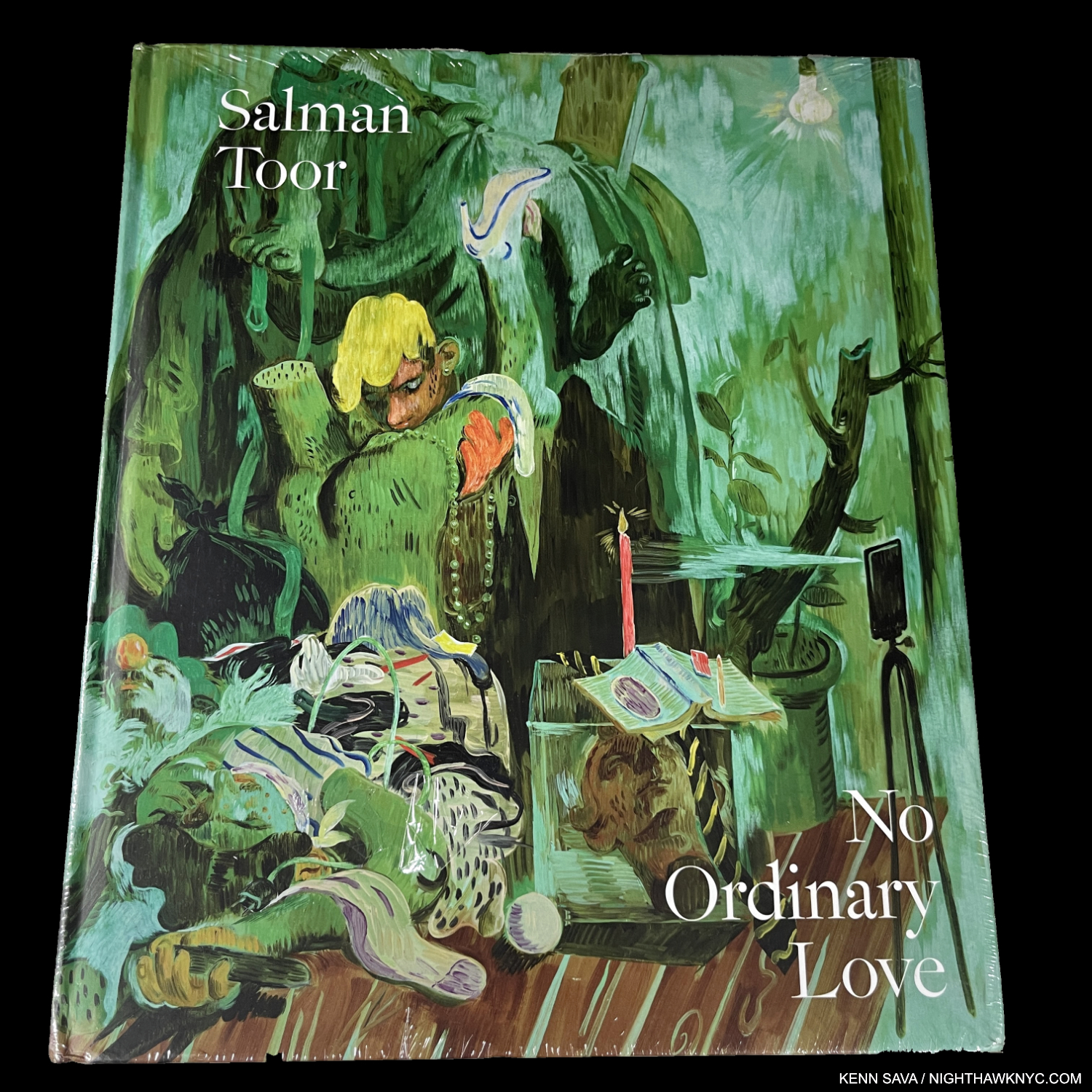
Salman Toor, No Ordinary Love, Baltimore Museum/Gregory Miller

I saw Salman Toor’s first solo museum show, How Will I Know, at the Whitney Museum in 2021, and put his name on my list. Still, I was not prepared for the depth and level of accomplishment his first book, No Ordinary Love, reveals. Published to accompany a show of the same name at the Baltimore Museum, both struck a nerve because the book evaporated (i.e. it’s already sold out). I’m really not surprised. His work is fresh, bold, sensual & beautiful with a unique sense of color, and in a style completely his own. His work echoes Paul Cadmus’s for me, but looks nothing like it. Stylistically, he seems closer to early and late Philip Guston and Lisa Yuskavage, but none of this is said in comparison. Salman Toor is, deservedly, the 2023 Art world phenomenon that previously touched Jordan Casteel and Jennifer Packer these past few years.

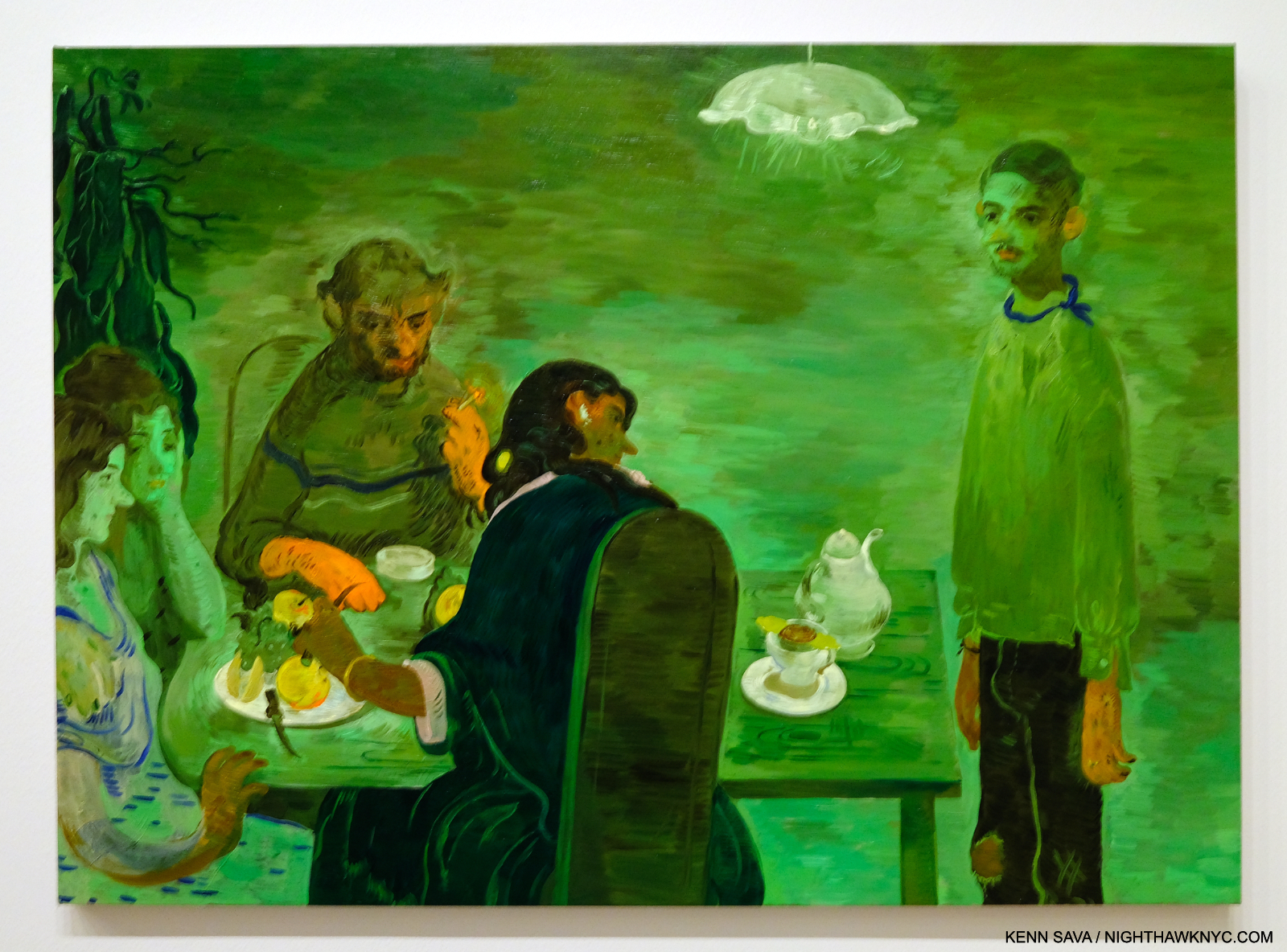
Tea, 2020, Oil on canvas. Seen at Salman Toor: How Will I Know, at the Whitney Museum on March 26, 2021.

Born in Lahore in 1983, and now American, Mr. Toor must have had (or will have) a terrific 40th Birthday after The Met bought one of his Paintings this year.

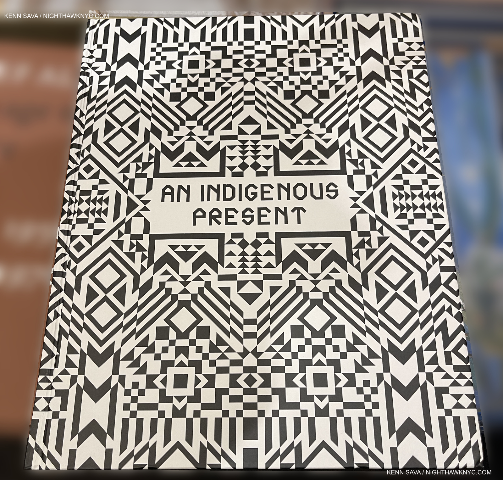
Jeffrey Gibson, et al, An Indigenous Present, DelMonico

Indigenous Artists have finally begun to get the attention they deserve.

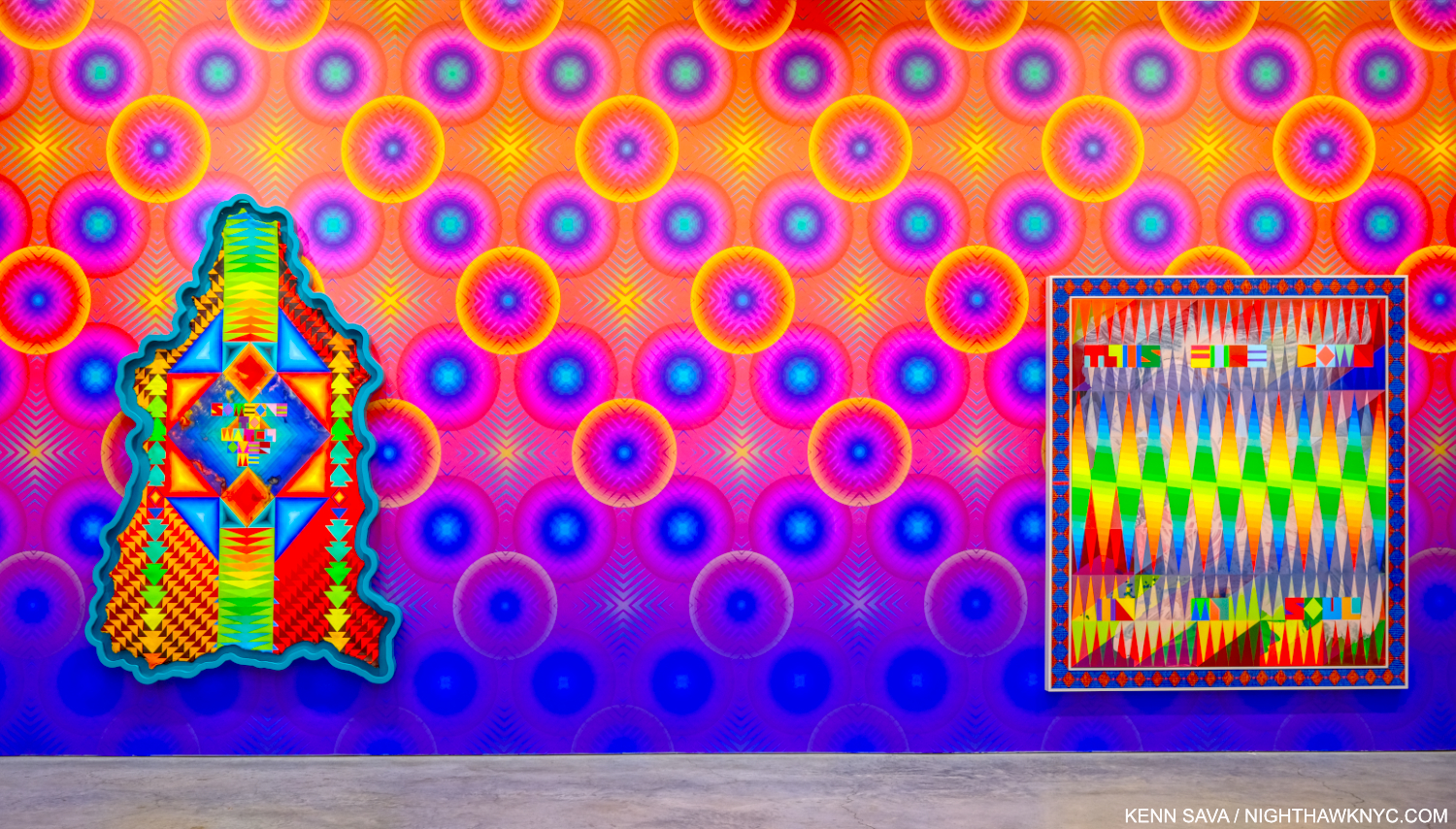
Have you ever seen a canvas shaped like this? Jeffrey Gibson, SOMEONE TO WATCH OVER ME, 2023, Acrylic paint on elk hide inset in custom wood frame, 103 x 69 x 5 inches, left, THIS FIRE DOWN IN MY SOUL, 2023, Acrylic on canvas, glass beads, artificial sinew, inset to custom wood frame, 88 x 80 inches, right. “Wallpaper” by the Artist. Seen in Jeffrey Gibson: ANCESTRAL SUPERBLOOM at Sikkema Jenkins, September 22, 2023.

Jeffrey Gibson, who has a beautiful show up as I write at Sikkema Jenkins, NYC, Jeffrey Gibson: ANCESTRAL SUPERBLOOM conceived this collection/overview of 60 of his fellow Indigenous Contemporary Artists. What an eye-opener! What impresses me is the vast depth of Artists who are doing their own thing, seemingly working outside the traditional model of Western Art, and instead basing their work on their traditions, heritage and experiences. “Ancestral,” to quote Mr. Gibson’s show title, is the key, apparently.

I find it a gust of fresh air.

I recently wrote about one Artist included, Jaune Quick-to-See Smith’s Witney Museum retrospective, and another, Wendy Red Star, in passing after Kris Graves published her first book in his Lost II set. What An Indigenous Present tells me is that we’re going to see much more from many other Indigenous Artists soon.

My final Also Recommended NoteWorthy Art Book of 2023 is Hughie Lee-Smith, published by Karma. I wrote about it here.

*-Soundtrack for this piece is “Conquistador” by Procol Harum from their great live album Live: In Concert with the Edmonton Symphony Orchestra, one of the first (if not the first) live albums paring a rock band with an orchestra, from around the time I first fell under the spell of Art books.

Also see the companion piece- NoteWorthy PhotoBooks, 2023, which includes a book by an Artist.

My previous NoteWorthy Art Book lists-

NoteWorthy Art Books (and Bricks), 2021

NoteWorthy Art Books, 2020

THERE ARE NO AFFILIATE LINKS IN THIS PIECE!

NighthawkNYC.com has been entirely self-funded & ad-free for over 8 years, during which 300 full-length pieces have been published! If you’ve found it worthwhile, PLEASE donate to allow me to continue below. Thank you, Kenn.

You can also support it by buying Art, Art & Photography books, and Music from my collection! Art & Books may be found here. Music here and here.

Written & photographed by Kenn Sava for nighthawknyc.com unless otherwise credited. To send comments, thoughts, feedback or propositions click here. Click the white box on the upper right for the archives or to search them. Subscribe to be notified of new Posts below. Your information will be used for no other purpose.

Rod Penner’s America: Small Town Nation

This site is Free & Ad-Free! If you find this piece worthwhile, please donate via PayPal to support it & independent Art writing. You can also support it by buying Art & books! Details at the end. Thank you.

Written & Photographed by Kenn Sava

Show Seen- Rod Penner: Small-Town Meditations – Traveling exhibition seen in NYC @ Meisel Gallery

“America: A Nation of Small Towns”
Title of the 2020 United States Census Report.

Small towns in the big town. The opening, NYC, March 18. 2023.

I’ve already written as much, and maybe more, than anyone else has about Rod Penner’s Art over the past six years. Most recently, I wrote my fifth Penner piece, an extensive look and the first anywhere, at the first full-length book on his work, Rod Penner: Paintings, 1987-2022. If Mr. Penner’s work speaks to you and you haven’t seen a copy, make a point to. It accomplishes the rare double feat of being equal parts long-awaited full-length Monograph and Catalogue Raisonne, containing everything he’s Painted through 2022, in one volume. All of this being said, my pieces on his Art were based on seeing one show of smaller Paintings in 2017 and two works in a prior group show. This spring, I finally had a chance to see a show with a more representative overview of his work going back to 1998. I came away feeling I saw much in his work I hadn’t seen before.

My only previous Rod Penner solo show, in 2017, consisted solely of 6 by 6 inch and 5 by 7 inch Paintings, each jam-packed with detail. Though Sands Hotel & Cafe/Vaughn, MN, 2019, Acrylic on canvas, is a huge 31 by 64 inches (almost 5 1/2 feet long!), the detail is every bit as stunning, representing a staggering amount of work. I continually get lost looking at the fore and mid-ground in what strikes me as a bit of an unusual composition. But, of course, there’s much more to it. Click for full size.

Rod Penner: Small-Town Meditations consisted of a group of 17 Paintings that establish Mr. Penner as the foremost Painter of small town America working today, inheriting the mantle from John Salt, and Charles Sheeler & Edward Hopper before the late Mr. Salt (1937-2021).

John Salt, Red Mailbox #2, 2015, Casein on linen, 45 x 65 inches. Seen in 2018 in the same space occupied by Rod Penner: Small-Town Meditations. Casein is a water soluble medium that derives from milk casein, and is used masterfully here to create such a rich, yet mysterious, atmosphere.

Rod Penner was born & raised in Canada before marrying his wife, Debbie, and relocating to Texas in 1988, where the majority of his work is set. In the Q&A I did with him in 2017, the Artist said this about the beginning of his Painting career-

“Shortly after arriving in the Lone-Star State, I rediscovered the work of John Salt and felt an instant connection. I couldn’t drive past a trailer home (and there are many in Texas) without thinking “Salt.” At this point, I wanted to spend more time in the studio and less time searching out subjects to paint, so I started driving around the town we lived in and took photos of these tract houses that were everywhere. I found them visually interesting. As with all the streets and buildings that I paint, these homes, under certain weather and lighting conditions, became transformed. I painted my first tract house in 1989 and it sparked a series of paintings that were later shown at O.K. Harris in NY.”

614/House with Daffodils, 1998, 10 1/4 x 15 inches, Acrylic on board.

While people appear in very few of his Paintings, right from the beginning, virtually every piece he’s created is rich with their presence. First, there’s what people have built on the land that signifies them. Then there’s the condition of these structures, which are steeped in individual modifications and adornment. Some are in need of attention; perhaps a new coat of paint or repairs. It seems that the occupants are too busy living in them to do them right now. In addition to the building, we often see the evidence of human habitation: toys, tools or lawn implements in the yard; though vehicles are not seen nearly as often as they are in John Salt’s homestead works where they are one of his trademarks. Combined with the lived-in condition of the house all of this makes for a de facto “Portrait” of its inhabitants, in my view. His work is rich in character, one thing that sets him apart. Character adds an incalculable amount of depth to his Paintings. In a larger sense, his work is a “Portrait” of how, and where, many Americans lived in the last half of the 20th and early parts of the 21st centuries.

212/House with Snow, 1998, 36 by 54 inches, From here on, all works shown are Acrylic on canvas unless noted.

The idea of “home” looms large in Rod Penner’s oeuvre, striking me as one of his main themes, be it in actual houses or motels (temporary homes), like Sands Hotel & Cafe/Vaughn, MN, 2019, shown earlier. None of his homes are palatial. Rather, they are all well lived-in. The roofs and paint look weather-worn, as if they’ve survived countless storms or harsh winters. It’s easy to make this fit the “Portrait” analogy. A number of his Texas scenes include snow- something the rest of us may have trouble associating with one of America’s southern-most states, but the terrible storms they’ve had these past years are changing that. Snow makes these scenes look they could have been seen in many other places in the country. Yet, in spite of it all, they’re still standing, and much of the same can no doubt be said of whoever lives in them.

212/House with Snow, 1998, a masterpiece in my view, sums up so much about the broad and vague idea of “home.” For me, that doesn’t necessarily mean a place; A person could be “home” for someone, and much of what I see here, and the feelings it generates, would still apply. Like virtually all of Rod Penner’s Paintings 212 cries out to be seen up close.

How much you see in a Rod Penner Painting is only limited by how long you look at it.

A number of his House Paintings are set during the Holidays. In this detail from 212/House with Snow, we see the Christmas tree lying diagonally in front ready to go out with the trash & recycling. A poignant image by itself. It’s been there a little while given it’s snowed since it was put there. A toy bus (maybe a Xmas present?) pokes out from a red box with an intricate logo on it- all in this stunning little section, which is typical of all of Rod Penner’s Paintings. Oh! That’s before you get around to admiring the incredible detail on the Christmas tree branches, the tree trunk behind it, or the condition of the paint on the house and garage! Then, there’s the ground…

Yet here, as in all Rod Penner’s work, in my opinion, he puts the detail at the service of Art. The detail is revelatory, like a well-turned sentence in a great novel, or like the floor in Jan van Eyck’s The Annunciation in Washington. It never preaches. It never gives too much away, leaving it all to the viewer. In fact, when I first met Mr. Penner, he was reluctant to speak about his Art. He told me he wanted his Art to speak for itself. Personally, I’m glad he has softened that stance a bit and has spoken about his work, especially in his Artist’s Statement in his book. I only wish the Art media respected what the Artist says about his/her own work more than what anyone else says about it.

Bar-B-Q/Marble Falls, TX, 2022, 12 x 18 inches. The latest in a long and memorable series of roadside eateries and gas stations. Those foreshortened signs to the left must have been fun to Paint.

Another theme in his work is life on the move: gas stations and roadside eateries loom large here, in addition to motels.. This makes it apparent that the Artist gets around since every scene he renders he has visited in person. Sometimes, it’s hard to look at these and not smile. What may be Mr. Penner’s subtle sense of humor can be at once poignant, and again tack sharp. In person, the Artist is quick to smile, so it’s hard not to see that coming across in his work at times. At the March opening, two visitors were present who had traveled all the way from Marble Falls, TX for it. Well-familiar with the real-life Bar-B-Q back home, it must have been a strange, but welcoming, feeling to see its likeness hanging on the wall in a SoHo gallery thousands of miles from home.

Buy Pecans Here/San Saba, Tx, 2021, 31 by 52 inches.

Buy Pecans Here/San Saba, Tx, 2021 marks Rod Penner’s return to large Painting after his series of small San Saba pieces I saw in his last NYC solo show. When I look at this, I see an early 21st century “History Painting.” The Old Masters famously rendered scenes from history, usually in suitably large scale. Here, Rod Penner shows a number of stages of San Saba’s history in one scene in the recent past (2021). In the back, San Saba County Courthouse, 1911, peaks out of the trees and rooftops, surrounded by what man has built in the area in the following 110 years, including telephone poles and power wires, which may now carry the internet, including NighthawkNYC. San Saba is known as the “Pecan Capital of the World,” so the appropriately sized Pecan store sits stolidly on the earth occupying much of the right side as if anchoring that reputation. Further down the block on that side is G&R Grocery, behind the white pickup. Across the street in the rear the red brick of “Station” peaks out- that’s the only word left on its sign. Mr. Penner featured both of these buildings in his San Saba Series of small Paintings in 2016-7, which I showed here. Buy Pecans Here also got its own Painting. In the front left is another one, the former San Saba Butane Co., which he immortalized in a show-stopping small Painting of the same name, looking a bit more the worse for wear than it does even here. Yet, it’s still standing, seemingly waiting for what’s coming next. The ground weather and the skies add incalculably to the mood. An unfathomable amount of work must have gone into this Painting.

Like San Saba Butane, a number of the places he Paints are out of business. I don’t have to tell anyone how prevalent that is, wherever you are, in the age of the pandemic, before and “after.” Yet, it’s something rarely seen in Painting. Businesses opening, being active, and going out of business are part of the business cycle. That is the “history” I see in Buy Pecans Here/San Saba, Tx.

Bertram Supply Co., 2015-6, 31 by 52 inches.

Rod Penner Paints democratically. I’m not referring to politics. I’m using the word in its original meaning. That is that Rod Penner Paints everything he shows us with equal weight. Virtually everything, front to back, is in focus, like it is in many of Richard Estes’s Paintings. Everything is shown at the hyperlocal distance, as Photographers say1. Therefore, it’s up to each viewer to decide what’s important to the narrative they weave in their mind. It also allows for different scenarios at each viewing with different things standing out each time.

Compositionally, it seems to me that many, if not most, of Mr. Penner’s Paintings, and all those shown here, consist of three horizontal “bands” or areas. He presents the sky in a top band, the buildings/main subjects in the center band, and the ground weather in the lower/foreground band. One of the subtler joys of Rod Penner’s work is that he is a master of rendering the ground effects of weather (i.e. rain, snow, graupel, mud, or the baked naked earth), a bit like JMW Turner was a master or rendering skies (in a completely different way, of course). The ground weather is a unique, and often stunning, part of most of his Paintings, easy to overlook, but not to be missed. The detail they contain is astonishing and in addition to adding so much to the “narrative,” they also hint at how much time and thought went into every inch of his Paintings- regardless of size.

Welcome to PennerVille. A close look at Bertram Supply Co., reveals the Artist’s name on the street sign, with “Rod E.” foreshortened for the cross street sign under it, indicative that he’s put his name on this scene. It’s becoming his genre.

Rod Penner: Small-Town Meditations sums up in capsule form Rod Penner’s accomplishment. To me, that is nothing less than preserving the lives that countless Americans have lived these past 40 years in paint. Rod Penner is creating a body of work that defines and preserves what a good deal of America- small town America (which most of America consists of)- is and has been like these past 4 decades as much, if not more, than any other Artist has.

Having said that, I would also add that I’m not sure that that’s his point! It may be. Or, it may simply be what I’m seeing in his work. His Art is open-ended enough so that everyone is free to see in it what they will.

Rod Penner discussing how he created some of the detail in Yellow Light/Brenham, TX, 2004-5, 15 x 25 inches with a visitor behind him at the opening, March 18, 2023.

Saying all of this would seem to overlook the most obvious characteristic of Rod Penner’s Paintings: his world-class technique. His technical skill (readily seen in the details from Bertram Supply Co., or 212/House with Snow, above) approaches the level of the Old Masters. Yet, technique, by itself, does not make Art. In Rod Penner’s case, his technique is only the beginning of the story. Every time you look at his work, you get to write your own ending for it. 

*- Soundtrack for this piece is “Small Town” by John Mellencamp.

My prior pieces on Rod Penner are-

The Vermeer of Marble Falls, Texas,”April 28, 2017

“Rod Penner: Brilliance, Under Cloudy Skies,” June 10, 2017

Q&A With Master Painter Rod Penner,” June 14, 2017

Rod Penner’s Neighborhood,” August 3, 2017

and- “NoteWorthy Art Books- Rod Penner: Paintings, 1988-2022,” April 7, 2023.

NighthawkNYC.com has been entirely self-funded & ad-free for over 8 years, during which 300 full-length pieces have been published! If you’ve found it worthwhile, PLEASE donate to allow me to continue below. Thank you, Kenn.

You can also support it by buying Art, Art & Photography books, and Music from my collection! Art & Books may be found here. Music here and here.

Written & photographed by Kenn Sava for nighthawknyc.com unless otherwise credited. To send comments, thoughts, feedback or propositions click here. Click the white box on the upper right for the archives or to search them. Subscribe to be notified of new Posts below. Your information will be used for no other purpose.

  1. The focus distance at a given aperture on a lens where everything after that point is in focus, and somethings before are as well, depending on the settings and the lens.

NoteWorthy Art Books- Rod Penner: Paintings, 1987-2022

This site is Free & Ad-Free! If you find this piece worthwhile, please donate via PayPal to support it & independent Art writing. You can also support it by buying Art & books! Details at the end. Thank you.

Written & Photographed by Kenn Sava.

Book review- Rod Penner: Paintings, 1987-2022, published by The Artist Book Foundation.

Rod Penner at his easel at work in the early stages of what would become Buy Pecans Here/San Saba, TX, in 2021, as seen in the book. Click any image for full size.

Rod Penner is best known for his Paintings of small-town America that combine his unique Artistic sensibility with a seemingly other-worldly level of technical mastery. Small-towns being most of what America is made up of, the scenes he renders resonate with the shared experience of life in America in Paintings that are open-ended allowing the viewer to create their own narratives and outcomes. Whenever they’re through basking in the sheer delight just looking at them brings, that is. Born and raised in Canada, the Artist settled in Texas in 1988, where he finds most (but not all) of his scenes. In spite of how detail-rich they are and time-consuming to make, he’s amassed a sizable body of work while still in mid-career. Yet, a Rod Penner monograph has been a long time coming. This month, with the publication of Rod Penner: Paintings, 1987-2022, the 36-year wait is over. It’s finally here.

Rod Penner: Paintings, 1987-2022 is a book that makes a real attempt to cover a lot of bases. It’s an introduction to his work, a monograph on his career to date, and a Catalogue Raisonne. That makes it fairly unique among Art books I’ve seen in my half century of buying Art books. Most books set out to be one of those things. In pondering that, keep this in mind- it’s hard for a Painter to get a book published. The great Alice Neel didn’t see her first monograph published until the year before she died at 84! Therefore, it’s not surprising that the first full-length book on Rod Penner is one that strives to check a lot of boxes and fill a lot of needs.

Whether you’re new to the Paintings of Rod Penner, or not, expect to be immersed in what the Artist has created because EVERYTHING Mr. Penner has Painted through 2022 is in it (along with a few stellar Drawings)! The #1 complaint I hear from Art book buyers is- “Not enough pictures!” Complaint #1A is “Not enough pictures in color.” With 268 color images over 200 pages, that’s not going to be the case here. However, Rod Penner: Paintings is not a pure monograph, per se, where sections of an Artist’s career are broken down and analyzed, which some new to his work might miss. The Paintings flow continuously from the beginning of the Paintings section,  shown above, to the end of it (pages 52 through 183). The benefit of this is that one is able to follow the Painter’s development on a work by work basis, right from the start, without interruption through 2022, which is unheard of in a monograph.

As a result, in my book, Rod Penner: Paintings scores highest as a Catalogue Raisonne, which is where it will probably have the longest-lasting importance, immediately becoming the standard reference on his Paintings through the end of last year. Though it doesn’t include a catalog numbering system usually seen in a Cat Raisonne, the pertinent information is provided for each piece. Works are referred to by their title, which will now remain their official reference point. Interestingly, nowhere in the book, or on The Artist Book Foundation site, is the term “Catalogue Raisonne” mentioned. Perhaps, someone feared it would scare off general Art book buyers. Yet, all his Paintings are included, so that’s indeed what it is. A rose by any other name…

In Mr. Penner’s case, a book containing all his work is particularly welcome, a dream for his staunchest admirers, and those wanting to see more. Shows have been infrequent, making the chances to see his Paintings in person precious. Rod Penner’s work always sells. When it does, it disappears into a private collection where chances for the public to see it are rare at best. So, Rod Penner: Paintings is a chance for the rest of us to see all of what the Artist has created. I, for one, am happy that this is the path that was chosen, though a “greatest hits” book might have been more marketable. Marketable, maybe. But, having watched visitors over multiple visits to three shows of his work, it seems to me viewers either like it right off, of they don’t. If they like it, why not show them more, even all, of it?

Two earlier works that will surprise those familiar with the “small-town” work. The top piece, El Greco’s Head of Christ, 1991, is one of his rarely seen Drawings.

Content determined, the next questions are- what’s the format of the book? How’s the design and how are the images laid out? What are the materials used? And, perhaps most importantly, how are the Photos of the Paintings? For Paintings as detail-rich as Rod Penner’s are, high-quality Photos are, possibly, the most important element in any book on his work. In a book covering over 3 decades of work, the early work might suffer from inferior Photography when compared with the more recent Paintings, particularly because these pieces “disappeared” into private collections after leaving his easel in the late 1980s and 1990s. A drop off in the quality of the Photos of the earlier work is not noticeable here. The Photos are of a consistently good quality of reproduction, with accurate colors and sufficient detail, assuaging what was a large concern going in. However, deciding to include all of his Paintings in one book temps my “law of more.” That is, “More of one thing means less of something else.” Welcome to the realm of the trade-off.

The book clocks in at 11 by 12 inches, an unusual format as Painting books go in my experience. If it had been any smaller in this format, I think the book may have failed. I was surprised it’s not a landscape format book to match the format of most of Mr. Penner’s Paintings. In any event, with 268 color plates and 200 pages, not all of them are going to be full-page. The Artist and the book designer appear to have worked together to carefully decide how big each Painting should be reproduced, instead of just making each image the same size. Since Mr. Penner was so involved with the making of this book, the relative sizes could be taken as an indication of which he feels are his most important works. But, that’s conjecture. I can quibble with some of their size choices, but overall, the results are surprisingly good. So, if all the Paintings are here, what’s missing?

The two Paintings in the upper left are about as small as I’d want to see a Rod Penner Painting reproduced.

The trade-off appears to be details. As anyone who has seen Mr. Penner’s Art knows it’s characterized by extraordinary details- everywhere you look, virtually ad infinitum. Watching visitors to those shows I mentioned, I see a familiar pattern.

The “Penner Neck Crane.” Something first-time and long-time Rod Penner viewers are very familiar with. The charming work under consideration here is Bar-B-Q/Marble Falls, TX, 2022, the most recent work in his current show, Rod Penner: Small Town Meditations in NYC.

First, the jaw slackens, then the mouth opens in disbelief at what the eyes are seeing. These are hallmarks of a first-time Penner experience. Then, the neck cranes, to look closer and closer. Then, the slight shuffle of the feet. This to look closer at another part of the piece. Rinse and repeat. Unfortunately, steps 2 & 3 are not particularly possible with a book. Here, the reader will find there are only a handful of details of Paintings, which is a sizable disappointment, but one that I, for one, will accept in order to see more Paintings. 

The Artist and the editors present a surprisingly wide range of image sizes. Luckily, the book is a good size so that most of the images are larger than you would see in a typical monograph. And they are tastefully placed, chronologically, on the page with not too big of a border. Inevitably, with a book like this representing 30 years of work, there will be some wailing that such and such a work is shown smaller than one would wish and you can’t study the detail. When that happens, ask yourself which Paintings you would have omitted. That’s the trade off. Yes, at 200 pages, perhaps another 50 of details could have been added. I would love to see details (plural), but not at the expense of a single Painting. Welcome to the world of budgetary considerations! The book lists for $65., which is $5 to $10 below most similar Art books I see, and as such is a very good value.

The #2 complaint Art book buyers make is that works go over the gutter. Before you ask, seven Paintings are shown large enough so that they go over the gutter by my count in the book (two them are shown here). I always feel I haven’t really seen a work that goes over the gutter when one appears in a book, in spite of the chance to see details. That is the case here, but, thankfully, it’s kept to a minimum. I really can’t blame them for doing this. Rod Penner’s work wants to be seen as close to life size as possible to give that effect they have in person. Without ANY large reproductions, you’re not showing that, and you’e doing Mr. Penner’s work a real disservice.

Overall, I find the design is tastefully minimal. Meaning it doesn’t get in the way. The book is a red cloth covered hardcover with a sewn binding and a dust jacket featuring Sands Motel & Cafe/Vaughn, MN, 2019, currently on view in Rod Penner: Small Town Meditations in NYC, wrapped around it. The red boards, (with the title appearing in white), are a bit of a surprise, red being a bit of an outlier in terms of frequency of appearance in his palette, but they work. The flaps don’t mention how many images are included, which I know book buyers consider when making a purchasing decision. The book is printed on 150gsm archival Garda Matt made by Lecta, a quality stock that should hold up to the book being used more than the average Art book given its comprehensiveness. When considering how sturdy gsm 150 is, consider that a gsm of 170 or over is considered board.

Among the included text, most importantly, Rod Penner has authored an Artist’s Statement, essential reading from an Artist who prefers to let his work speak for itself. Essays by David Amfan and Terrie Sultan, are also included as are a Foreword by Louis Meisel, a Chronology and a Bibliography where you will find my name with a list of the pieces I’ve written on Mr. Penner (which also appears below).

Rod Penner: Paintings will be an automatic acquisition for Rod’s collectors and admirers. For all other Art lovers- particularly lovers of Painting who’ve never seen a Rod Penner Painting- it’s a book you should make a point of seeing. You’ll know instantly if Rod Penner’s work is for you, or not. If it is, don’t hesitate to buy a copy. Books like this tend to go out of print, or sell out, quickly and then sell for substantial sums on the aftermarket.

With the publication of this book, and everything he’s created for the last 35 years now a matter of record, the real work can begin – assessing Rod Penner‘s place among his peers, and those who have preceded him, in Art history.

As I said in the beginning of this piece, Rod Penner: Paintings is a book that is many things. Given the Artist’s close involvement in each step along the way, it’s the definitive reference book for the collector, buyer or seller of his Art.  Yet, it’s also a treasure trove of the sheer beauty and skill a supremely gifted Artist can create that will endlessly delight lovers of Art and Painting.

Any page of the book shows how masterful a Painter Rod Penner is. As you page through it, moving through the years and decades of his work, the consistency of the very high level of quality of his Painting becomes every bit as impressive.

In the end, therefore, among everything else it is, Rod Penner: Paintings, 1987-2022 is also a personal testament.

*- Soundtrack for this piece is “On The Road Again,” by Willie Nelson from the Honey Suckle Rose Soundtrack album, 1980.

As far as I know, to this point, I have written more extensively about Rod Penner’s Art than anyone else has. My previous pieces on Rod Penner are-

The Vermeer of Marble Falls, Texas,” April 28, 2017

Rod Penner: Brilliance, Under Cloudy Skies,” June 10, 2017

Q & A With Master Painter Rod Penner,” June 14, 2017, and

“Rod Penner’s Neighborhood,” August 3, 2018

My previous BookMark pieces are here.

My thanks to Leslie Pell van Green and and Amanda Romanelli of The Artist Book Foundation.

NighthawkNYC.com has been entirely self-funded & ad-free for over 7 1/2 years, during which almost 300 full length pieces have been published! If you’ve found it worthwhile, PLEASE donate to allow me to continue below. Thank you, Kenn.

You can also support it by buying Art, Art & Photography books, and Music from my collection! Art & Books may be found here. Music here and here

Written & photographed by Kenn Sava for nighthawknyc.com unless otherwise credited. To send comments, thoughts, feedback or propositions click here. Click the white box on the upper right for the archives or to search them. Subscribe to be notified of new Posts below. Your information will be used for no other purpose.

Catherine Murphy’s Dreams

After months of Photography shows…Hark! I see a flag and a light that portends some State of the Art American Painting & Drawing in 2018 within.

Fellow lovers of Painting, fear not. I’ve surfaced from my year long deep-dive into the world of Contemporary Photography, finding equilibrium just as the New Year is continuing the holiday spirit, bearing Art gifts of it’s own. First, there were the unexpected wonders of “Edvard Munch: Between The Clock and the Bed,” at The Met Breuer, the fascinating “Figuratively Speaking” at Michael Rosenfeld Gallery, and now with “Catherine Murphy,” the long awaited show of recent Paintings & Drawings by the singular and influential Artist and Educator1 at Peter Freeman, Inc., I can positively feel the wind of great Painting blowing through my hair once again. Well, at least my eyebrows. “Long awaited” as Ms. Murphy’s last show, “Catherine Murphy: Working Drawings” at Sargent’s Daughters, was in 2016, but the last show of her Paintings and finished Drawings, also at Peter Freeman, Inc., was back in 2013.

Over a career that now extends more than 50 years, though her style, focus, and her choice of subjects have evolved, there is one constant- an extraordinarily high level of accomplishment. It’s hard to think of another Artist who’s Paintings AND Drawings are among the finest created in each medium over that time. Both bodies of work are marvels. And, at least her more recent pieces are inspired by her dreams. Her new show, which focuses on this more recent work, is a visual tour de force- in more ways than one. No less than Artist Rod Penner told me in the Q&A I did with him last year that, in his opinion, Catherine Murphy “is in a class of her own,” among Artists he feels have been overlooked and/or are “important” today.

Installation view of part of the first gallery. All Photos by Kenn Sava, courtesy of the Artist and Peter Freeman, Inc. Click any Photo for full size.

As I moved through the galleries I was struck by something I hadn’t noticed as a focus of her work before. Unlike, say, her early landscapes, many of the pieces on view shared the common theme of seeing & perception. Take for example the first Painting in the show, “Cherry Pie,” from 2104. It’s obviously a pie, yet even a quick look reveals it’s a Painted pie, not a “photorealistic” pie.

“Cherry Pie,” 2014, Oil on canvas, 38 x 45 1/4 inches

No matter how close, or far, you stand from it, the work remains just out of focus, as if seen at a glance or in a slightly blurry photograph, but the level of artistry brought to bear in the entire work is staggering. The crust is open, missing one section. Strange. You’d expect a slice to be missing. Looking closer I was enraptured by what I saw.

The cherries, for instance, seem to have taken Cezanne’s immortal still lives to a different level. (Not “better,” I don’t believe in those kinds of comparisons. Different.) Look at how finely the highlights and the shading are done on each one. Then look at the broken edge of the pie crust to the left- each flake is carefully and sharply delineated in a way that is positively surreal. When have you seen real pie crust look like this? Their sharpness is in contrast to the overall blurriness, as if they are the point of focus for the absent camera. Then, there’s the pie tin. It’s countless folds appear to be almost individually colored as the light plays off them so magnificently, echoed in the wonderfully realized cast shadows underneath. If we take the pie tin for a “ground,” the work strikes me as a Painting that strives to go beyond two dimensions. It wants to, at once, lie above the surface, on it, and under it- all while drawing us inside of it. These questions of seeing (What do you see? What do you expect to see?) and looking into, though a painting is a flat, thin surface, recur repeatedly in this show.

“Shift,” 2016, Oil on canvas in two parts, each 37 7/8 x 45 1/8 inches.

Directly across the room from it is another pie-related work, in two parts. This time, what is apparently the top of the crust is an entirely separate work, displayed next to the empty pie crust. If these were hung separately, Would we think they are a pie crust and it’s top? They could be one of Edward Burtynsky’s aerial landscape Photographs of some distant land and an aerial shot of a crater in an icy land. Still, even in this context, shown together, it seems strange. It’s hard to not see the apparent top being on a pie. I kept thinking about what’s under it. Nothing but the surface it’s laid on. As for the pie crust, itself, we’re left to imagine what’s going to go inside, while we ponder the top now being a surface instead of a top and the empty space of the pie drawing us into a space, which is in reality, flat.

“Flat Screen,” 2016, Oil on canvas, 35 1/2 x 19 1/4 inches.

Adjacent to the previous two works is “Flat Screen,” a work that depicts a lovely, Painted, sunny, outdoor scene on the titular flat screen monitor. Perhaps, it’s a screen saver given the partial text on the lower right. The window behind it is blank being mostly covered by what appears to be a window shade. The light that does come through around the shade mimics the black border around the monitor’s screen. I wonder…wouldn’t we expect see the reverse- a blank, or grey, computer screen, and the sunny outdoor scene outside of the window?  It might be technology taking the place of experiencing nature via a live feed from outdoors, except that we see it’s a Painting. Is it the scene outside the window? We’ll never know. Continuing the spacial relationships, it also reminds us a monitor is flat and presents us with the illusion of 3 dimensions, like a Painting does.

“Float,” 2015, left, “Becalmed,” 2017,  right, both Oil on canvas, 72 x 54 inches and 54 x 72 inches ,

In the main gallery, are two works that might seem descendants of late Monet- both depict scenes taking place on bodies of water with trees nearby. In both, we are left to ponder, and admire, the surface, what’s on top of it, and what’s being reflected on it- all handled masterfully.

“Float,” 2015, Oil on canvas, 54 x 72 inches.

The one above, “Float,” 2015, is over the top, literally and figuratively. It continues the line of her early landscapes, which were painted outdoors. In 2013, she said, “Any Painting that you see is outdoors is a really slow Painting. Because I have to wait for the sun. I have to wait for the weather…2” “I got very interested in things that look spatial, but are not spatial,” she said in 2014. As you look at “Float,” it’s a bit like looking down the rabbit hole. I almost wondered if I was underneath the water looking up at the surface and the foliage above it, but the yellow leaves would seem to indicate we’re looking down on it. The floats and the leaves floating on the water provide a fulcrum between the two worlds- outer and inner. Again, she has created a scene of extraordinary depth on a simple, flat canvas, a bit like the feeling I got from “Cherry Pie.”

Don’t fall in. It’s only an inch or so “deep” and there’s a concrete wall behind it.

Then, “…I started dreaming Paintings, and thinking about Paintings differently. It was the beginning of a whole thing, giving myself permission to do it in a new way. that is really what stops everyone in the world: because of an idea of who you are you’re afraid to break your rules3.” So, more recently, she’s moved to scenes that are “smaller” closer, or more intimate, like those seen in most of this show. She says that after being inspired by her dreams, she then sets up the scene in her studio.

Half the show is devoted to Catherine Murphy’s amazing Drawings, all of which are these indoor scenes. And, I mean amazing. Like this one-


“Studio Floor,” 2015, Graphite on paper, 28 3/4 x 31 3/16 inches.

Again, the mastery of rendering surfaces is just stunning- the shading of each wire mezmerizes. Then, there’s the beautiful wooden floor- all Drawn in graphite. Once again, the feeling of depth is present. We can’t tell how high the pile of wire is from that floor. Is it one insanely long cable, or more? If it’s more, despite the yards of spare cable lying around, those two ends are never going to reach each other. It’s a very daring piece. If you want to test your technique, and your eye? Take a shot at Drawing something like this.

Catherine Murphy, long seen as a champion of figurative/representational Art, surprisingly said she’s “a compulsive Abstract Expressionist.” While I think she may have been referring to the technique of applying paint, I filed that in the back of my mind, though yes, there are passages here and there in this show that do qualify. Perhaps, none more so than “Studio Wall,” 2014, Graphite on paper. Without it’s title or the name of the Artist, one might think it’s by Cy Twombly. The more I looked at it the more I couldn’t believe it’s ONLY graphite on paper.

“Studio Wall,” 2014, Graphite, yes, Graphite on paper, 32 3/8 x 34 3/8 inches.

Standing in front of it for the longest time, it looked for all the world to have been Painted. So, I asked Catherine Murphy through the gallery how the background was done. She said, “I just keep adding graphite until the tone is correct.  There is not much actual “white” (although the wall I was drawing from was painted white).  What “white” there is, is the paper.” The fact that there is so little white of the paper left is what amazes me. The shading is so brilliantly done that no matter how close you get to it, the background looks like Paint.

Since she said that her dreams inspire many of her works these days, I asked her if she dreams in color, or black & white, as the resulting works are in both. She replied, “In the dreams the color suggests itself, but I could be dreaming color for all I know. Some things have to be in color and some things have to be in black and white.  But one way or another they are both about color.” Her Drawings are unique, whole works unto themselves that have nothing to do with her Paintings. They stand alongside her Paintings as “different but equal,” so to speak. Well? Except for this one-

“Painting Drawing Painting,” 2017, Oil on canvas, 51 x 72 inches.

In “Painting Drawing Painting,” 2017, she seems to be playing with that, though, blurring the boundaries between the two medium. Again, making us question what we’re seeing- What’s “Drawn?” What’s Painted?” Being oil on canvas, it’s all Painted, but much of it “looks” Drawn. It’s also fascinating that she’s left part of it, apparently, unfinished, while another part, along the right white border, appears to have been erased or removed, something she doesn’t do in her “real” Paintings.  My takeaway was that in this work, she’s giving Drawing the same “status” as Painting, which is traditionally the more valued medium, which also serves to reinforce their importance in her oeuvre as equals.

“Stacked,” 2017, Oil on canvas, 60 x 60 inches.

“Stacked,” 2017, one of the three newest Painting on view (“Painting Drawing Painting” being another, “Becalmed,” seen further on, the third), creates the optical illusion that the stacks of books are suspended in mid-air. When I saw this, I wondered if Catherine Murphy had seen my apartment in her dreams. Then, alas, mine haven’t levitated. Yet.

“Floribunda,” 2015, Oil on canvas, 66 1/16 x 41 1/8 inches.

“I’m avoiding the comfort of realism. The pillow you know. The bottle you know. The landscape you know…I want to confront,” she said in 2013. The masterful, knock-out, “Floribunda,” 2015, is a classic example of that. It also speaks to what we see. What, exactly, are the broken dishes lying on, or seen against? The two patterns of whatever it is and the dishes are so similar it takes effort to see where one ends and the other begins as the eye moves across the canvas. It’s almost M.C. Escher-esque. Yes, they, positively confront each other. A detail that caught me in this, among so many others, is the “marrow” of the broken yellowish cup in the lower left corner.

Catherine Murphy has always followed her own star, regardless of what the rest of the Art world was doing or favoring. Marketing ploys, like “photorealism,” have proved to be an albatross around the necks, and careers, of any number of Artists, which has only served to delay (hopefully not permanently) the proper assessment of their work and accomplishment. Modern & Contemporary Realistic, Representational and Figurative Art has been slowly coming back, mostly in the galleries, and in museums elsewhere, but not the NYC museums, beyond, Kerry James Marshall in late 2016, early 2017.

Looking at their websites, Catherine Murphy is in, at least, 3 of NYC’s “Big Five” Museums (as I called them recently). The Met’s site shows 2 Paintings (acquired in 1986 and 1991), The Whitney’s shows 1 Painting (acquired in 1973), and 2 Drawings (acquired in 1993), and MoMA’s shows 2 Drawings, (acquired in 1987 and 2004). It’s a start, but one that hasn’t been followed up on in 14 years, plus. Of those three, only MoMA lists Catherine Murphy’s work as having appeared in an exhibition, both times in group shows, once when she was selected by Artist Vic Muniz, the show’s curator.

“Studio Floor,” 2015, left, “Chairback,” 2016, Graphite on paper, center, “Studio Wall,” 2014, right.

Yes, many have put her in the category of “Realism,” “Representational” and “Figurative” Art, I know, but Catherine Murphy’s work seems to me to stand aside of all of those categories because there are bits and pieces of any number of influences, periods, and styles going on in her work. Interestingly, she said in 2013 that there isn’t a style of Art she doesn’t like, because there is always someone doing something good in it. Elsewhere she has shown a familiarity with contemporary Photographers Jeff Wall and Gregory Crewdson (both of whom meticulously set up their shots, as Catherine Murphy sets up the scenes she Paints). I have a feeling along with not being afraid “to break your own rules,” as she said, it’s that range that helps her stand apart.

While shows like the Whitney Biennial and the New Museum “Triennial” are major events in the Art world that draw big crowds and gain instant recognition for a number of their younger participants, it seems to me that the time has come for such a show that features established Artists that have, as yet, not received their due in a major Museum show. The point is not to “shame” the Museums, but to give these Artists some of the exposure, attention and recognition, I for one, feel is long overdue.

Casting around for recommendations to be included in such a show (not to mention a Retrospective of her own), you need to look no further than Catherine Murphy.

*-Soundtrack for this Post is “Time Passes Slowly,” by Bob Dylan from “New Morning.” Catherine Murphy has said that her Paintings are about the passing of time. In lieu of the album version I would like to include, Mr Dylan may be seen and heard performing an early version of it, with George Harrison, here.

My thanks to Catherine Murphy, and Alexander Whitehead of Peter Freeman, Inc.

The Archive of previous Posts related to Painting & Drawing may be found here.
NighthawkNYC.com has been entirely self-funded & ad-free for over 7 years, during which over 275 full length pieces have been published! If you’ve found it worthwhile, PLEASE donate to allow me to continue below. Thank you, Kenn.

You can also support it by buying Art, Art & Photography books, and Music from my collection! Books may be found here. Music here and here.

Written & photographed by Kenn Sava for nighthawknyc.com unless otherwise credited. To send comments, thoughts, feedback or propositions click here. Click the white box on the upper right for the archives or to search them. Subscribe to be notified of new Posts below. Your information will be used for no other purpose.

  1. Catherine Murphy was the Senior Critic in Painting & Printmaking at Yale’s School of Art for 22 years, followed by being the Tepper Family Endowed Chair in Visual Arts at Rutgers Mason Gross School of the Arts, where she was followed by Kara Walker.
  2. Here.
  3. Here.

Rod Penner’s Neighborhood

“It’s a beautiful day in this neighborhood,
A beautiful day for a neighbor,
Would you be mine?
Could you be mine?”*

In 1927, the Painter & Photographer Charles Steeler spent six weeks Photographing the 2,000 acre Ford Rouge plant in Detroit on assignment for an ad agency1. So taken by what he had seen there, over the next 9 years, he produced a series of Paintings of the plant based on the Photos he took. While both his Photos and his Paintings are now seen as classics, that’s perhaps the closest an Artist has come to creating a series of Paintings of a small neighborhood as seen at the same time. Now, the Artist Rod Penner tells me he has completed one such series. “Mr. Penner’s Neighborhood” (with apologies to Fred “Mr.” Rogers) of choice for his series of 2015-17 Paintings is San Saba, Texas, a town of about 3,000, an hour north of Austin, as seen in the source material he collected in various mediums (plural- they consist of more than Photographs he told me), during a trip he took there early one winter Saturday morning. To date, they had numbered 10 Paintings, 9 of which were shown at Rod Penner, at Ameringer McEnery Yohe Gallery, NYC in May2, (which I wrote about here and here. My follow-up “Q & A” with Rod Penner is here.)

San Saba Butane, 2015, 10 x 15 inches.  All works shown are Acrylic on canvas. The first work in Rod Penner’s San Saba Series, and was not in the AMY show. Comparing this to the smaller work with the same title, I wrote about here, is endlessly fascinating. Photo courtesy Rod Penner and Ameringer McEnery & Yohe.

The tenth, (actually, the first to be completed in 2015), above, gives us a view of San Saba Butane seen from the side, which contrasts with the smaller painting of the same title that captivated me at the show where San Saba Butane is seen from the front. This perspective makes it part of a neighborhood, and not seem to be an island. A neighborhood where the other buildings seem to be in better condition, and most likely still in use. Here, it still looks like a relic, just a relic that is part of a large community, something we don’t often think of relics being. Interestingly for me, the lone car is stopped at a light, the only time this occurs in the San Saba series, as if symbolizing time standing still here.

The new 11th, and final, painting in his series is, interestingly, entitled Welcome to San Saba. I quickly moved past the irony of ending a series with a work that would seem to indicate it was the first work in the series to look at this photo of it.

The 11th and final work in Rod Penner’s San Saba Series, Welcome to San Saba, 2017, 10 x 15 inches. Photo by Rod Penner, courtesy of the Artist and Ameringer McEnery Yohe.

Ah…G & R Grocery (cut off on the right), The Station (dead ahead, left of center)…some familiar sights from their own works in the show…the familiar damp streets… Yet? Much was new to me.  Take the mural on the yellowish wall seen facing us to the right of center, for instance. During the run of the show, I looked long and hard at the miniature version of that mural alongside the G & R in its 5 x 7 1/2 inch painting at AMY, below, where it is seen at a sharp angle, trying, in vain, to see what it depicted.

Flashback. G & R Grocery, 2016, 5 x 7 1/2 inches, as seen in the AMY show in May.

Seeing it now, face on, is “another part of the puzzle.” It’s a picture in a picture that adds a surreal element to this work, especially because we can’t really see all of the storefronts along the side of Welcome to San Saba, and so it seems to ask the question “Is THIS San Saba? Or, is what’s in the mural San Saba?” Well, I hear that hunting is second only to pecans as a business in San Saba, so? They both are. Maybe that’s why the deer in the mural has that “in the headlights” look, which mimics the distant car with its headlights on coming down the street. While we’re busy pondering all of that, one thing’s for sure, besides that car, there’s not a heck of a lot going on.

The perspective giving us this view strikes me as brilliantly subtle. We’re not exactly in the street, or on the curb. We’re not looking exactly straight down the sidewalk, or really, right down the street. Only the mural is seen whole, balanced by the facade of The Station, across the street in the distance. The pavement is masterfully done, as usual. It’s astounding, really. Right down to the varying degrees of wetness, and that horizontal crack breaking things up. While we’re admiring Mr. Penner’s technique, other visual pleasures include what can be seen of the facades of the stores seen in perspective, the peeling paint on the mural wall, and of course, the “Penneresque” skies, as I call them, this one different from some of the rest because it lacks any hint of the sun breaking through, or being covered up, as in the larger SS Butane. The bare tree on the left marvelously balances the piece, and is, like everything else, wonderfully done.

Flashback #2. View of San Saba, 2017, 5 x 7 1/2 inches. Looking down the same street as Welcome to San Saba, which takes place halfway up the road on the right, as seen at Ameringer in May.

Finally, there are the many festive lights, including those that run along the top of all the buildings, reinforcing that it’s the holiday season, which adds more poignancy for the viewer. The lack of people and cars, except for the distant one approaching makes this feel more haunting to me than View of San Saba, above, possibly because we’re not in the middle of the street now, and we’re right among the buildings. Odd for that time of year, there’s almost no activity, no one is shopping, doing errands, etc., save for the headlights of the car approaching in the distance.

It’s more than a terrific Painting. It’s a worthy end to a compelling, unique series.

As importantly, the more I looked at it, the more I realized it was effecting some of my thoughts about the rest of the series, and making me see “more” in them. As I mentioned last time, this series presents different views of much of the same small neighborhood in each succeeding work, with each angle presenting new information, and giving a new perspective. A subtly engrossing concept that adds another layer to the already meditative nature of his work, which takes us from pondering individual scenes to assessing the larger community, seen in the first, and last two works in the series. Assessing them, I’m reminded that I paid so little mention to the “Holiday” aspects I just mentioned that, also, recur in some of these works- Yard Inflatables, and The Station, as seen at Ameringer, (a pic of The Station I Posted previously). This combined with the universal absence of people, the often darkening skies lends a sense of isolation, even lonelieness that feels (to me, at least) akin to that in Hopper. But, that is the real joy of looking, and seeing what they say to you. Your results may differ.

It’s the holidays in the neighborhood. Yard Inflatables, 2016, 6 x 6 inches, seen at AMY.

Yard Inflatables is, also, a charming example of Mr. Penner’s subtle humor. Something that also appears, in somewhat subtler form, in Welcome to San Saba, possibly in the title, itself. Mr. Penner, who describes himself as “an avid hunter, big on wildlife management and conservation,” also had to tell  me (because I’d never have guessed) the mural is a bit of a jab at some of his  some of his anti-hunting friends, and sent this photo of the actual mural along. I’m sure most residents disagree, but I like his version of it much better.

Welcome to San Saba Mural. Photo by, and courtesy of, Rod Penner. Interestingly different perspective than seen in the Painting.

The photo of the mural also puts yet another nail in the coffin of what’s called “photorealism,” something that has less and less to do with Mr. Penner’s work the more I see of it. Just compare it to the mural in the painting. So, if Rod Penner is not a “photorealist,” what is he? He’s an Artist. It’s becoming apparent to me that he is directly in the line of “American Realists”3 that goes all the way back to Gilbert Stuart (1755-1828), and extends up through George Caleb Bingham (1811-1879), the Hudson River School (including Thomas Cole 1801-1848 and Sanford Gifford 1823-1880),  Thomas Eakins (1844-1916), Reginald Marsh (1898-1954), Edward Hopper (1882-1967), and yes, Charles Sheeler (1883-1965) (Thomas Hart Benton, Grant Wood are among others included by many). Not a bad “neighborhood” to be in. Speaking of those “neighbors,” I find myself wishing the whole series had gone to a museum, like the Whitney, where it would look wonderful along side their Hoppers and Sheelers, while showing that tradition is alive and well in 2017.

Rod Penner’s San Saba Series, strikes me as walking that line between intimacy and distance. Standing in front of someone’s house, especially at Christmas, has an intimacy to it that it probably wouldn’t have seen at any other time of the year. The owners are “letting us in” a little bit into who they are through their decorations. So is the town with its “public” holiday decorations, seen in the streets of The Station and Welcome to San Saba. Yet, there is an undeniable distance and an almost foreboding sense of isolation that’s reinforced by the ever-present, slightly ominous “Penneresque” skies. Works like the smaller San Saba Butane are not at all welcoming. Even if you were to venture inside the crumbling building, you wouldn’t really “be” anywhere. View of San Saba, above, the next to last work Mr. Penner completed, is also not welcoming. We may be risking our lives standing in the middle of that street for long with our backs turned. In Welcome to San Saba, some lights are on, but nobody’s out. It’s a bit reminiscent of those old western movies when the bad guys come to town and everyone’s hunkered down indoors.

As the 9 Paintings at Ameringer McEnery Yohe sold, I now feel lucky to have been able to see that many of them in one place, since their “interaction” adds so much, as I’ve tried to show, and since who knows when that might happen again. Walking through these 11 Paintings, in my mind now, “Mr. Penner’s Neighborhood” still fascinates me and still makes me look deeper. I guess I’ve become a neighbor.

*-Soundtrack for this Post is “Won’t You Be My Neighbor?,” by Fred M. (“Mr.”) Rogers.

My previous pieces on Rod Penner-
“Q&A With Master Painter Rod Penner,” June 14, 2017.
Rod Penner: Brilliance, Under Cloudy Skies,” June 10, 2017.
The Vermeer of Marble Falls,” April 28, 2017.

On The Fence, #9, The Sitting Ducks” Edition

NighthawkNYC.com has been entirely self-funded and ad-free for over 6 years, during which over 250 full length pieces have been published. As I face high expenses to keep it going, if you’ve found it worthwhile, please donate to keep it up & ad-free below. Thank you!

Written & photographed by Kenn Sava for nighthawknyc.com unless otherwise credited.
To send comments, thoughts, feedback or propositions click here.
Click the white box on the upper right for the archives or to search them.
For “short takes” and additional pictures, follow @nighthawk_nyc on Instagram.

Subscribe to be notified of new Posts below. Your information will be used for no other purpose.

  1. Some may be seen here.
  2. The show’s site is here.
  3. With all due respect to great Realists the world over.

Q&A With Master Painter Rod Penner

During the recent show, Rod Penner, at Ameringer McEnery Yohe, I was fascinated watching visitor’s reactions to the work.

While it was hard to know if they were familiar with Rod Penner’s work, most seemed taken, startled & impressed with his incredible technique. But then, they lingered. Often for quite a while. I well know that feeling. How well the Paintings are done is a hook that grabs your attention and pulls you in. What happens then? Well…That’s up to the individual viewer.


When you finally step back, you marvel that all of that took place in a space that’s 6 by 6 inches or 5 by 7 1/2 inches. When this first happened to me, in April, 2016, I was left with wonder. I wanted to know more about him and his art. Since I’ve now written about him and this show twice, perhaps others are curious, too. The AMY show answered some of my questions, primarily- Yes. He is THAT good. But, it raised others. I am very pleased to report that, after the show ended, and he arrived safely back in his now long time home in Texas, Rod Penner graciously agreed to answer some of my questions in a very rare Q&A. (For those interested in exploring his work still further, I’ve appended a list of resources known to me at the end of this Post. I welcome hearing about others I don’t know of.) What I’ve learned thus far has confirmed, at least to me, his place as a major Artist. That leaves the other question…

Who is Rod Penner?

“It’s your last chance
To check under the hood
Last chance
She ain’t soundin’ too good,
Your last chance
To trust the man with the star
You’ve found the last chance Texaco”*

Having previously shown his recent, small Paintings, here’s one of his larger works. Farmers Co-op Gin/Anson, TX, 2012, 20 x 32 inches.  All works by Rod Penner, Acrylic on canvas, and are from rodpenner.com and amy-ny.com, unless otherwise noted.

Every work in virtually every show of Rod Penner’s work these past 25 years sold. Remarkable. Those owners are not parting with those pieces, which can be seen in his work not coming up at auction (as far as I know). 8 of the 9 pieces in this recent show were sold before the show opened. I believe the time has come for a closer look at what’s going on here.

Joker Coffee Shop, 2016, 6 x 6 inches.

What’s going on here, succinctly, is that Rod Penner is quietly creating a remarkably excellent body of Paintings, one that provides all the proof needed that he is a Master Painter.

Ranch View, Vaughn MN, 2013, 12 x 18 inches. Compare this with the next two.

Not wanting to take up too much of Mr. Penner’s valuable time, with repetition of things John Seed has addressed in his 3 pieces about the Artist, my questions serve as supplements to those articles (linked at the end). What follows is about his life, and his Art, but I also felt it was important to ask this Master Painter about Art- What he looks for when he looks at Art. Mr. Penner has a deep knowledge of Art History and he is very open minded to styles & periods, perhaps surprisingly so to some. Typically, when I met him at the show’s opening, he told me he was off to The Met while he was in town to see “The Mysterious Landscapes of Hercules Segers.” So? Having a great interest in all of this, I also had to ask him which Painters and periods he feels go under-appreciated these days.

54 Grill, Vaughn, MN, 2016, 30.5 x 64 inches.

Ranch View, Vaughn MN, 2013, 4 x 4 INCHES! These three works show 3 views of the same place, something Mr. Penner would revisit, in a way, in his recent show. This is the work that hooked me- the first piece of Mr. Penner’s I saw in April, 2016. Previously, I associated scenes like this with William Eggleston. Now? I think of Rod Penner.

Kenn Sava (KS)- In reading about your background, you’ve mentioned your folks being supportive of your skill and development, but I haven’t been able to learn if you studied with someone, if you studied Art in school, or if you are self-taught, as well as what road your education and development as an Artist took. Were you Painting when you arrived in Texas? If so, were they the same (general) style as the work we see on your site from 1992, or did you ever work in a different style?

Rod Penner (RP)- Growing up, our family enjoyed camping, hunting, and fishing. I painted wildlife during this time, emulating the work of Robert Bateman and other Canadian wildlife artists.

After graduating from high school, I attended a local community college for one year and then transferred to Oral Roberts University in Oklahoma where I graduated with a B.A. degree in Studio Art, and while I found myself at odds with certain aspects of the theology, overall it was a positive experience. It was at ORU where I met my beautiful wife, Debbie, and we both made lifelong friends among the students and faculty.

Following college, we married in 1986 and moved to British Columbia. when I started intensely studying the work of Canadian realist painters, Christopher Pratt and Alex Colville. I had a lot of wildlife art commissions at this time and even started selling through a well-known gallery in Denver but the animals became less and less important in my paintings. In 1988, Debbie’s brother was killed in a biking accident, so we moved down to Texas to spend time with her family. We ended up staying and I welcomed the change as a way to start over with my art and break away completely from what I was doing. I got a part-time job teaching, but Debbie worked full time so I could paint. She has always believed in me and supported my efforts. The same year that our second child was born in 1991, my youngest brother died in a plane crash. Nine months later, I gained representation by Ivan Karp and his O.K. Harris gallery, allowing Debbie to quit work in order to stay at home to raise our children. I’ve supported our family ever since solely on the sales of my paintings.

American Inn, 2011,  6 x 6 inches.

KS- What inspired you to get into Art? Who were the Artists you liked early on, and which influenced you early on?

RP- Shortly after arriving in the Lone Star State, I rediscovered the work of John Salt and felt an instant connection. I couldn’t drive past a trailer home (and there are many in Texas) without thinking “Salt.” At this point, I wanted to spend more time in the studio and less time searching out subjects to paint, so I started driving around the town we lived in and took photos of these tract houses that were everywhere. I found them visually interesting. As with all the streets and buildings that I paint, these homes, under certain weather and lighting conditions, became transformed. I painted my first tract house in 1989 and it sparked a series of paintings that were later shown at O.K. Harris in NY.

Pink House with Big Wheels, 1992, 36 x 54 inches, is the earliest work in his online Archive.

KS-Your last show at AMY was in 2013. Two of these pieces are dated 2016, the rest 2017. How do you feel your work has changed/evolved since your last show?

Mr W, Lubbock, TX, 2013, 12 x 18 inches, which appeared in his 2013 AMY, NYC show

RP- Up until 2016, all my previous “micro” paintings were square in shape, but for this show, most of the canvases have a 2:3 size ratio.

I’ve also been exploring more towns in New Mexico.

KS- The work on the catalog’s cover, which is dated 2015 (and is not in this show) appears to be part of this series- a fascinating, alternate view of San Saba Butane. Are there others works in this series?

San Saba Butane, San Saba, TX, 2015, 12 x 18 inches, which appears on the recent show’s exhibition catalog’s cover, but which was not in the show. The Painting that was in the show is below.

RP- The painting you’re referring to measures 12 x 18 inches and is based on the photos I took for the series in my show. I’m currently working on a 10 x 15 inch painting of San Saba which will be my final painting in this series. These two paintings will be included in my next exhibit.

KS- I’ve seen you’ve done two views of a same scene in the past, but is this the first “series” of Paintings you’ve done (I know of 10 that are a part of it) of a relatively small area (which feels like it’s within a few blocks), with source material from the same time? Was this a conscious decision- to do a series? Or, is it just coincidental, and the works should be considered independently of each other. (I’m not sure I can do that!)

RP- This show is a first for me in the sense that it is a series of paintings based on photos taken on a single morning of a single town. Most of the locations are in and around the town square of San Saba, TX, and when viewed together they form a more comprehensive “portrait”, both of the town itself, and my personal experiences in this place. That being said, each painting is also meant to stand on its own.

KS- How is your work received locally? Especially in San Saba, if these have been seen there?

RP- I sent a news release for the exhibit, along with some jpegs of my paintings, to a local paper in San Saba but never heard back. Since I don’t show in my hometown of Marble Falls, and rarely in the state of Texas, my work is largely ignored and/or misunderstood. Texas residents have an understandable pride in their communities and my paintings don’t always portray these towns in a cheerful light. However, I’m not interested in painting a romanticized and sanitized version of small-town America. San Saba, along with every town I paint, has its own character, its own curiosities and quirks, its own grit, as well as its own beauty…

So many good memories have been made in this town, but it’s taken almost 16 years for everything to come together in order for me to paint it.

KS- I’m fascinated by San Saba Butane. Without giving away its mystery, is this a place you’re at all familiar with, or is your interest in it purely pictorial?

San Saba Butane, 2017, 6 x 6 inches, as seen in this show.

RP- I first photographed San Saba Butane around 15 years ago and have witnessed its slow deterioration over the years. Who owned it and what it was used for doesn’t interest me.

KS- We’ve discussed people calling your work “photorealism,” yet there is a lot of abstraction in your work- the clouds, the cracks in the pavement, the tree branches, patterns of bricks, peeling paint, and on and on. Of course you know its there. What role do you feel abstraction plays in so-called realistic or representational Art? Do people ever notice it? I also saw you mentioned John Zurier, and that makes me wonder if he’s influenced your skies.?

RP- The formalist qualities in my paintings are important. The placement and shapes of clouds, pavement cracks, branches, etc, is always intentional. I’m good at arranging these components within a picture plane while photographing, but afterward, I edit, so that these elements ultimately serve my purpose which is to create a certain mood and a strong composition. Also, you’ll find smaller engaging areas of abstraction within the paintings which I enjoy incorporating. I think this comes from studying and appreciating a range of different styles of painting.

Regarding Zurier, I’m not consciously thinking of his work while painting my skies, but I’m sure he’s influenced certain elements of my art. He creates this terrific sense of light and weather with just pure pigment and the mood in his paintings elicit a certain quiet meditative self-reflection.

Commerce St, Brenham TX, 2002, 24 x 36 inches. One of two Paintings I’ve seen of his with an actual person in it.

KS- You’ve been in Texas just about 30 years now, would you have been shocked if someone told you in 1988 you’d be here for (at least) 30 years? Does being originally from somewhere else (a city, no less) help you in Painting these scenes you’ve been doing all these years?

RP- The Texas Hill Country is a wonderful place to raise a family. Moving here from Canada allowed me to observe my surroundings with the objectivity of an outsider. I don’t have any memories of these locations before the age of 22; however, they do evoke memories from my childhood, but it has little or nothing to do wth a specific building or street. On the flip-side, living here for almost 30 years has endeared me to Texas, and prevents me from patronizing my subject matter.

KS- In the introduction to the show’s catalog, Mr. Seed mentions your reacting against big (large) Painting by others in these quite small works. What is it about big Paintings that you don’t like?

RP- I don’t dislike large paintings per se, only pretentious, self-serving large paintings that tell me what to think and feel, and much of the current art world seems to embrace that kind of work.

Bertram Supply Co, Bertram, TX, 2016, 36 x 54 inches. One of Mr. Penner’s larger works.

KS- Your taste in art is wonderfully eclectic, ranging from the Dutch & Flemish Masters to the Hudson River School to contemporary Artists including Andy Piedilato. Is there a common thread to the Art you like? When you look at Painting, what do you look for? What makes someone an excellent or great Painter in your book?

Ice Spine, 2015, 102 x 126 inches, left and Pinched Red Sail, 2016, 100 x 117 inches, right, by Andy Piedilato, seen at Danese Corey, NYC, in October, 2016

RP- Someone who has command of their medium and uses it to express mature ideas.

KS- What do you think of NYC? Has anything you’ve seen here ever grabbed you to paint it?

RP- NYC is our favorite place to visit but no, I have never felt an urge to paint it.

KS- Finally, if you were going to suggest to Art Lovers they look at one thing, one style, period or (I’m not a big fan of this word- “school”- unless the Artists themselves put themselves in that group), or the work of one Artist, that you feel has been overlooked, or is especially “important” today, what, or who, would it be?

RP- Perhaps the Tonalists; John Francis Murphy, Bruce Crane, and Birge Harrison are three of my favorites. Contemporary painter Catherine Murphy is in a class of her own. John Salt definitely deserves more attention and credit.

For anyone interested in knowing more about Rod Penner’s Art, as I write, the current resources are-
-Rod Penner has a website, which includes an Archive of his work that goes back to 1992, and includes links to his FB and Instagram pages.
-Ameringer McEnery Yohe has additional info, and details on the past shows they’ve held for Rod Penner here. They also published a catalog for this recent show, and copies of it may (keyword “may”) still be available through them. I’d hurry.
-John Seed’s two pieces may be found here, and here. He also wrote a piece for the AMY catalog.
(And, I have written about him twice previously so far, here and here.)

I’m grateful to Rod Penner for taking the time to answer my questions, for speaking with me at the very hectic opening of his show, and to his wife, Debbie, and their family, for allowing him to take some time away from them to do so. They’ve been married 31 years. I should have asked him what the secret to that is!

*-Soundtrack for this Post is “Last Chance Texaco,” by Rikki Lee Jones, from the classic album of the same name, and published by Rikki Lee Jones. You can see her perform it here.

NighthawkNYC.com has been entirely self-funded and ad-free for over 6 years, during which over 250 full length pieces have been published. As I face high expenses to keep it going, if you’ve found it worthwhile, please donate to keep it up & ad-free below. Thank you!

Written & photographed by Kenn Sava for nighthawknyc.com unless otherwise credited.
To send comments, thoughts, feedback or propositions click here.
Click the white box on the upper right for the archives or to search them.
For “short takes” and additional pictures, follow @nighthawk_nyc on Instagram.

Subscribe to be notified of new Posts below. Your information will be used for no other purpose.


Rod Penner: Brilliance, Under Cloudy Skies

“Rod Penner” at Ameringer McEnery Yohe is my NoteWorthy Show for May.

“Little darling, it seems like years since it’s been clear”*

It turns out to have been more than worth the wait. The chance discovery of Rod Penner’s rarely seen work in April, 2016, left me eager to see more of it for the past year. Finally, that chance came. Yes, I wrote about this show’s opening, and my first impressions of it, a while back, when I was also lucky to meet Mr. Penner. Having returned to see the 9 remarkable Paintings that made up “Rod Penner” at Ameringer McEnery Yohe through May 26 (his first NYC show since 2013) a number of times after the April 27 opening, I realized I needed to also revisit it here because these are works that do not reveal all their secrets at first glance, and also because so little has been written about the work of Rod Penner, basically, three pieces by John Seed. Given the amazing & consistently high quality of his work, and the fact that he’s been a successful Painter for over 25 years, who’s shows routinely sell out (8 of these 9 were sold before the show opened), that’s hard to believe. This show is a great chance to get a closer look, as it represents most of the work he’s created in the past year, and because the works are related, they form a “series.” When I asked the Artist about this, he told me-

“This show is a first for me in the sense that it is a series of paintings based on photos taken on a single morning of a single town. Most of the locations are in and around the town square of San Saba, TX, and when viewed together they form a more comprehensive “portrait”, both of the town itself, and my personal experiences in this place. That being said, each painting is also meant to stand on its own.”

San Saba is about an hour north of Austin, almost smack dab in the middle of Texas. The resulting works are at once intricate and sublte, so deep, so brilliantly conceived and almost miraculously executed, I now have a feeling they will be revealing their “secrets” indefinitely.

View of San Saba, also 5 x 7 1/2 INCHES. The “center” of Rod Penner’s painted “neighborhood.”All works by Rod Penner, 2017, Acrylic on canvas, unless specified, seen at Rod Penner at Ameringer McEnery Yohe.

When I met Mr. Penner, he spoke about the newest work in the show, View of San Saba. So new, it wasn’t completed in time to appear in the show’s catalog, the first book ever published on Rod Penner (and available from Ameringer McEnery Yohe, as I write this). It’s a work that a quick glance fails. I wondered about the empty spaces in the foreground, left and right. Why is there so much of it in a work that’s supposed to be a “view” of a town? It scrunches the actual town into a narrow band that accounts for maybe one third of the Painting. These empty spaces along the sides give us a sense of perspective, a sense of space that is, after all, a trade mark of Texas, I hear, which would be missing if Rod Penner had cropped the view closer to the “BUY PECANS HERE” sign, and which would also give the sign an importance he, apparently, didn’t want it to have. The feeling would be completely different. Also, doing this “sets a stage” for the rest of the composition, something Mr. Penner seems fond of doing.

And? It turns out the foreground is an extraordinarily interesting part of the work. Ok, that’s coming from a die hard Manhattanite, a true connoisseur of pavement, street, curbs, and sidewalks, someone who never sees grass. Mr. Penner told me that as the work neared completion, he became unhappy with the pavement to the front left, so he redid it. Take that, everyone who thinks he’s a so-called “photorealist,” or “hyper-realist,” someone who paints exactly and only what’s in a reference photo. First, there’s a very unusual (in real life) crack that runs directly down the very middle of the street, which serves to draw us further and further into the painting.

Detail of the pavement in the foreground, larger than actual size, reveals almost endless details, down to the reflection of the back of the Stop sign in the puddle. Interestingly, every Stop sign in these works is seen from the back. Even in reflection.

It’s an old street. The curbs are worn, where they are still there. The pavement has been patched. Well, some of it has. Water pools in holes that still need to be. Yet, for the most part, the concrete is holding together. After all these years. After all these cars, trucks, people, and whatever else travels on the roads of San Saba, Texas have passed over them. Yes. You can still get there from here.

Beyond the technical tour de force of skill on view in this, and in everything in this show, more importantly, every centimeter of it drips with character.

The skies always seem to be ominous. Sometimes a small patch of sun is fighting to make its way through. Maybe it will. Maybe rain is on the way. (I call theses skies “Penneresque” now when I see one). Just as long as it’s not a tornado, right? The old County Court is still standing. You can see its tower to the left, in the first Photo up top. Interestingly, it’s not quite as tall as the phone pole1

When I look at the finished work, the feeling of isolation, life lived, the present time, and time past (as in the patched pavement to the right in the front), and the feeling of being an outsider is reminiscent of that in works by Edward Hopper or Charles Sheeler, but not specific works. Though he has a foot in Art History, Rod Penner is an original.

But we aren’t in San Saba. We aren’t in Texas. We’re 1,744 miles away by car or 1,513 miles as the crow flies at Ameringer McEnery Yohe Gallery on West 22nd Street in Manhattan, NYC. An entirely different world, right? We’re not even looking at Photographs, which seems to be a reaction of some who only see these works online in, yes, Photographs, and have trouble believing someone can really paint THIS well. We’re looking at Paintings. VERY small Paintings that are either 5 by 7 1/2 inches, or 6 by 6 inches each! Acrylics on canvas. In creating these works at paperback book size, I don’t believe the purpose was to show off his extraordinary skill (which happens as a byproduct). The size brings an intimacy that makes the viewer look closely to see, and once you start looking, you’ll see more and more, which can turn the experience into something of a meditation.

View of San Saba is installed on one of 3 walls where the paintings look out, and on to each other. Therein lies an additional element that becomes apparent when seen together. As Mr. Penner said, each work stands alone. Yet being at this show one can’t help noticing that there’s, also, a “little world” in these 9 Paintings that comes together in View of San Saba. Taken as a whole, this gives a feeling of walking around a small neighborhood (typically New York comment, right?), and based on View of San Saba, it is walkable. No less than 5 of the buildings featured in the 8 other works here reappear in it, making it something of a centerpiece of this “series” for me.  I constructed these maps to show what I mean,

Installation View of Rod Penner at Ameringer, McEnery & Yohe shows it’s a small neighborhood. The lines connect 5 individual works with View of San Saba, far right, where the same buildings are seen, again.

“Map” of View of San Saba showing the location of the 5 Buildings also shown in their own Paintings, which follows. The numbers are from the order they appear in the show, as seen in the prior Photo.

So, yes, as I said, “you can still get there from here,” if you walk straight down the street, following that center crack. Along the right, first, Buy Pecans Here, is the subject (and title) of a closer view of the same structure, below. Then, on its corner, and across the street on the right is G&R Grocery, which is seen in no less than two other works here- G & R Grocery, and Armadillo Country. And finally, a few blocks almost dead ahead (slightly left) is the building in The Station. Here are the five Paintings in question. There could be much to be said about each.

#1 in the “Map” above, G & R Grocery, 2016, 5 x 7 1/2 inches. That reminds me. G&R is also the home of Texas’ famous “Bill’s Season All,” as the sign says. I have to remember that when I need to reorder it.

NYC’s & Texas’ finest in the NighthawkNYC kitchen.

#2- Buy Pecans Here, 5 x 7 1/2 inches

#3 The Station, 6 x 6 inches. The foreground pavement endlessly enthralls me.

#5 Armadillo Country, 5 x 7 1/2 inches

#4 does get a section to itself. My personal favorite among all of these works (not an easy call) is one I find endlessly fascinating, on a number of levels- “San Saba Butane.” All 6 by 6 inches of it. The right rear side of it is, also, #4 in the Map, above.

#4- San Saba Butane, 6 x 6 inches. Depending on the device you’re using, this photo may be close to the actual size of the Painting.

On one level, you could look at it and think about hard times, about a business that stood for a long time, carrying the hopes and dreams of its owner, until it finally moved elsewhere, or went under. There’s no indication of which here. What there is, it seems to me, is a masterpiece of realism in which abstract and realistic elements are weaved together so seamlessly, they achieve an almost perfect balance, each supporting the other. After all, when we see the world, our eyes see things that are abstract as well as “real” (be they reflections in windows or water, and on and on- they are everywhere once you look for them). It’a all based on a rectangular box seen at an angle that provides the basis of everything else that Mr Penner hangs on it or adds to it, and around it. One time I looked at this and thought “It’s a Robert Rauschenberg meets Anselm Kiefer structure under a “Penneresque” sky, as I named them last time, maybe with a hint of John Zurier in it, and with Lucian Freud pavement. Another time, I fancied that the historic “Battle of San Saba Butane” had been fought here, leaving Texas another monument, akin to the Alamo. But, alas, history records no such battle (as far as I know). There is, instead, a completely peaceful stillness to the building, though it’s surrounded by turbulent skies and pavement that appears almost liquified in places. To get to its door, you have to cross the rough, wet road in the foreground before arriving on the slightly surer footing of the (wet) pavement, and then to the “safety” of the awning, only to find the building it’s attached to is just an empty shell, and not a real “destination.” This “having to cross questionable or unstable ground in the foreground to get to the heart of the work” is present in many of Rod Penner’s works. It takes the eye on a journey, and makes it work to get to the core of the composition.

This section is about 3 inches tall by 6 inches wide in the Painting, shown here larger than actual size. Even the wear and tear on the sign’s lettering is brilliantly rendered.

Whatever struggle took place here, even the struggle of day to day business survival is over, and all is quiet in the building. In all its brilliantly rendered dilapidated glory, it’s still standing. Though it says “San Saba” on it, if you took the lettering off (but please don’t) this is another scene that can be seen in any state in the USA. Part of the lifecycle of a business- the part where one has ended and a new one may begin. In that sense, it could also stand for life & death, a tombstone for the business that was once here, and all the memories and history that went with it. Now, it’s a space where something new can begin. It’s real and surreal, intimate and repelling, liquid, solid and air, a place that it wouldn’t seem could possibly exist, somehow, except for that sign- “San Saba Butane” anchors the scene to earthen reality. I wondered about that sign at first, in my first Post, then thought- “No. It’s probably a real name. No one could make that up, right?”

One look at San Saba Butane in comparison to how it appears on the extreme left of “View of San Saba” and you realize that there’s no building behind it now! The Artist, himself, pointed this out to me. The whole right side of San Saba Butane shows a different view than what’s behind it in View of San Saba.

Detail of the right side of San Saba Butane.

Detail of the left side of View of San Saba.

Mr. Penner said, “In San Saba Butane, I removed the building you see in View of San Saba. The area right of the station needed to be opened up some… too claustrophobic… in order to allow the eye more room to wander. The stop sign and hydrant are the same ones you see in “View of San Saba.” That sound you heard was a hammer putting the final nail in the coffin of “photorealism” in regards to the work of Rod Penner.

Well? If this is a real place? I don’t care one bit what it “really” looks like. I don’t want to know. Well, I do know this- As much as I dislike qualitatively comparing creative work. I can’t put it any other way- I can’t think of a better Painting I’ve seen in the past year than San Saba Butane.

The next one is right up there, too.

Commie’s Tacos, 5 x 7 1/2 inches.

“Why did we stop here?,” I can hear someone in the backseat saying.

After all, we’re stopped in the middle of the road. “The light’s red up ahead,” might be one reply. “Not much to see here,” might be the new complaint. Hmmm…..The longer I look at this, the more I disagree.

First, there’s the skill involved in depicting this in all of 5 by 7 1/2 inches of canvas.

The same Painting, Commie’s Taco’s, seen from only 6 feet away.

When I looked closely at this one, I marveled at the detail on the two buildings to the left of center. The more I looked at this, the more I see. Every last clapboard is perfectly rendered, but all of it has character. Check out the bands on the back of the Stop sign, and on and on…

Detail of about 2 and 1/2 inches of the left side seen with a zoom lens.

To the right is a tan building, with a Spanish Tile roof, which would be fitting for a business with the name of Commie’s Tacos, the work’s name-sake, which is painted at an angle, and cut off making me wonder if Commie would ever want to buy this work and display it in his/her’s fine establishment, since it’s not even showing the whole restaurant. In fact, we wouldn’t know what the name of it was if it wasn’t the work’s title!

Commie’s, itself, in about 2 inches, with incredibly detailed concrete.

Then, I stared straight ahead, down that beckoning road you see in the first photo, which is what the composition seems to want. The looming street seems a bit more uneven, a bit rougher, than the fairly level ground we’re on now, judging from the masterfully rendered pavement.

Detail of about 4 inches of the foreground. Mr. Penner frequently puts pavement right in the front of his work, which is both daring and serves to set the stage. It’s a stage so well executed it looks real, and used. Notice the wide variety of surfaces.

We’ll pass trash cans, Yield signs and the ever present telephone poles. Further on, past the white house, it’s hard to say what we’ll encounter, well, before that vehicle with its headlights on. If we were standing on either of those corners, maybe we’d think that vehicle was coming for us. But, in the middle of the intersection? All bets are off. It’s hard to tell if Commie’s is even open for business. As in every work here, no one else is around.

As a result? There are none of the distractions people in a painting bring. None of the drama. Uh oh. Speaking of drama…

On the Fence, #6- Crow-No-Lisa

Same with Commie’s. It’s painted at an angle and chopped off which serves to reduce its power and importance. The import, seems to me, to be in the feeling of place- of being here, now. Imagine for a moment what it must feel like to be a new resident to this street, seeing it for the first time, (as most viewers of this work are), and seeing the place you’ll now call home? What would living here be like? The residents are already connected to each other by wires, but you’re not. Would you be welcome? There’s rain on the ground, as there is in a number of these works, but the skies seem to be clearing. Keywords- seem to be. It looks to be a very typical street in a small town in Texas, in or near San Saba, but it could be almost anywhere. This scene could be in just about any one of the 49 states not named Hawaii.

Robert Frost talked about taking the road less traveled, “and that made all the difference.” What would he make of this road? Would he take it? Situated here, as we are, the answer isn’t clear, but if we are going down that side street, we’re in the wrong lane of traffic. Unless, we’re across the street at the other corner, waiting at a Stop sign there. Or, maybe it’s a scene seen in passing, or while stuck at a light to the left or right. One of those things we see for a minute, just long enough to wonder what’s down there? What it like down that street?

Seen from a normal distance, Commie’s Tacos, in its double frame.

Or? You could consider it a mediation on what once was on the corner, perhaps a house you grew up, that’s now gone. The level of detail enhances the “realism” of the work, and so, enhances the viewer’s ability to “experience” whatever he or she thinks and feels when they see it. Beyond the date the painting was done, we don’t know when this scene takes place (as we don’t in any of the works on view). It could be today, last year or 30 years ago. As such, it, and all the works here, are “portraits” of a place that’s beyond time and place. A place frozen in time that portrays an equally frozen moment that, the closer you look at it, you see “more” in. It raises more and more questions, or maybe even reminds you of a place and time, and brings back its feelings. Seeing this on the wall at Ameringer, in its interesting double frame, it’s a portal into a distant place that somehow doesn’t feel all that far away. A place somehow “known.”

Ameringer McEnery Yohe, 525 West 22nd Street, NYC, seen during the run of the show, appropriately, from the middle of the street, with wet pavement, under “Penneresque” skies, that I hear came all the way from Texas.

I don’t know how the 2,783 residents of San Saba (in 2014) feel about these paintings, if they’ve seen them. More than likely, they prefer Mr. Penner paint other locations in their fine community. As someone who’s never been to Texas, when I look at them, as I’ve said, except for a sign here or there, I see places that could exist elsewhere. So, while they’re based on actual places in and around San Saba, as Mr. Penner said, they strike me as much as depicting America- places and things that could be seen anywhere in the country. I’m sure San Saba is a very different place than NYC is in a lot of ways. When I look at these Paintings? Not entirely different.

(My subsequent Q&A with Rod Penner is hereMy experience at this show’s opening and my initial impressions of it are here.)

*- Soundtrack for this Post is “Here Comes The Sun,” by George Harrison from Abbey Road by The Beatles.

NighthawkNYC.com has been entirely self-funded and ad-free for over 6 years, during which over 250 full length pieces have been published. As I face high expenses to keep it going, if you’ve found it worthwhile, please donate to keep it up & ad-free below. Thank you!

Written & photographed by Kenn Sava for nighthawknyc.com unless otherwise credited.
To send comments, thoughts, feedback or propositions click here.
Click the white box on the upper right for the archives or to search them.
For “short takes” and additional pictures, follow @nighthawk_nyc on Instagram.

Subscribe to be notified of new Posts below. Your information will be used for no other purpose.


  1.  Old Mother Pecan, one of the most unique trees in the world (I love trees), is still standing, too (thought not seen), not all that far away, 200 years later! Important for a place that calls itself the “Pecan capital of the world.”

The Vermeer of Marble Falls, Texas

“Warm winds blowin’
Heat ‘n’ blue sky
And a road that goes
Forever…
I’m goin’ to Texas.”*

See the little square on the left? That’s Rod Penner’s Ranch View Motel, seen in an Installation View of a group show at George Adams Gallery in April, 2016.

Here, in the Big Apple, where there is ALWAYS too much Art for any one person to see, Rod Penner hasn’t been part of that problem. That’s because his work is almost never seen, or offered for sale, here. As a result, I only discovered him a year ago at the George Adams Gallery when I saw a tiny little painting that was smaller than a paperback book of a large hotel sign.


Rod Penner, Ranch View Motel, 6 x 6 INCHES!, 2013.

Right away I was enthralled by it. I enquired. But? It was not for sale. Once I saw it? I had to know more. It turned out that this little work is the veritable tip of a sizable iceberg of equally excellent paintings he’s done going back to 1992 (as can be seen here.) Rod Penner became mythic to me. I waited like the Titanic adrift on the Gallery seas of Manhattan to run into more of his ‘berg.

Seen a little closer still.

Tonite, a year later, under clear skies, completely by chance, I accidentally crashed into it. I happened to walk in to Ameringer McEnery Yohe in Chelsea just as a solo show of his work, Rod Penner,  was opening, without knowing it was there. Women & children, first! Too late. 8 of the 9 works on view had been sold before the opening bell.

What?

Small wonders. Installation View of all of Rod Penner at Ameringer, McEnery, Yohe, tonite. ALL of it! The “larger” works are 5 x 7 1/2 inches. The square ones are only 6 x 6 inches!

The only one available was a work he had just finished and had to overnight to the gallery so it could be framed in time for the opening. No doubt it’s been sold, too, by now. Ok, let me get this straight- Here’s an Artist, who lives and works in Marble Falls, Texas (pop. 7,154 in 2016), that very few seem to have even heard of. There were no books about him until the gallery released one today for this show. There’s very little about him online. His work is so rarely shown, that his last NYC solo show was in 2013! Still? His new work is virtually pre-sold. What’s going on?

Looking for insight, I stood watching visitors to the opening come in and listened to their reactions. Most responded like I did, with astonishment, and only a few seemed to know his work previously. Two or three asked out loud about the prices and availability of the paintings, something I just don’t see happening at shows (where business is generally conducted quietly), even though there was a printed price list at the desk. Hmmm…

Commie’s Tacos, 2017, all of 5 x 7 1/2 inches of it. Seen from afar, its streets and buildings.

Full of desolation, empty streets, crumbling, or abandoned buildings, or oddly decorated houses, all under grey skies and fronted by cracking pavement, these latest works all depict scenes the Artist observed in San Saba, Texas (the erst-while “Pecan Capital of the World,” which is a bit north of Marble Falls, which, in turn, is north of San Antonio). It’s a bit odd to find this work speaking to New Yorkers. I, for one, have never been anywhere near Texas, yet it speaks to me.

Close-up. Like peering through the looking glass, more and more details emerge, allowing the viewer to imagine a narrative.

Is it the isolation that’s an inherent part of modern living? The foreboding of our times? The nostalgia for small town life, or times gone by, many transplanted urban dwellers retain? Or? Is it they just appreciate amazingly good painting? I still can’t say. I probably fall into all of those groups. From my earliest days looking at Art Books when the uncanny micro-imagery of Jan Van Eyck astounded me (and still does), to Durer, Goltzius, Richard Estes and on and on, I’ve looked at a lot of work that has a level of technique some would label super-human. No one can deny that his “Oh my gosh” astonishment inducing level of technique is part of the charm of Rod Penner’s work. But, it goes much deeper.

The size of his work, which he speaks of being a response to large works he sees proliferating, is also a way of putting the world around us, and by extension even our own worlds, in perspective. Seen from a distance? The abandonment of some of the failed businesses is undiscernible, and hence, it’s impersonal, a bit like passing through a town in a moving car. Move closer and all of a sudden detail after detail after even more detail comes into focus. From then on, it’s up to you to decide. The effect of looking closely at such small paintings is not unlike looking closely through old family albums, where the photos are small, what’s in them looks “old,” even though, Mr. Penner is painting scenes that may still exist. It’s work that stands up to, and demands, repeated viewings. Up close viewing.

The gallery handout speaks of the “hope” in these works. I never see construction or new building going on. The skies look ominous to me. There is virtually no activity to be seen in any of these works, save for a lone car in the distance in a few of them. It’s hard to tell if people are even home in the house depicted below, with its two huge inflatables out among its Christmas decorations. Yes, humor, usually a little subtler, is in these works, too. Yet, the peeling paint on the house’s walls gives the feeling of “times are hard, but we’re celebrating Christmas anyways.” I don’t know if that’s hope, but it’s at least perseverance.

Yard Inflatables, 2016, 6 x 6 inches. Mr. Penner includes  humor surprisingly often. You can see “in-progress” shots of this work, here.

While William Eggleston shows details of southern scenes that grab him, Rod Penner takes a step back. Or 50 steps back, usually half way into the street. He casts a wide angled lens (figuratively, not photographically) on a tiny canvas. Many hundreds of years ago works this size by Duccio and others were meditation objects. In works like these, they still are.

Ok. But, Vermeer, Nighthawk? Perhaps THE most desired, and one of the most revered Artists in Art History? Seriously? Well, I don’t believe in comparing Artists qualitatively, but I see some similarities. Mr. Penner speaks in interviews about being into the Hudson River School and the early Flemish Masters, himself,  but consider this- Though Vermeer is famous to us, mostly, for his interior scenes, there are two outdoor works of his that we have- View of Delft, which is thought to have been painted when  the Artist was 28 or 29, relatively early in his short career, his last outdoor work known to us, now in Mauritshuis, The Hague, and his The Little Street, which is in the Rijksmuseum, painted a year or two before. Both, but especially the latter, remind me of Rod Penner.

Vermeer, The Little Street, 1657-58, Rijksmuseum, Amsterdam. It looks like Vermeer liked to stand in the middle of the street, too. Rijksmuseum Photo

The Little Street shows us what seems to be a typical doorway scene of daily life, with one door and one passage way open to show us the inside, turning this into a classic Vermeer “tease,” among another closed door and 19 windows that are either boarded up or dark preventing our seeing inside. Removing the two women leaves the cloudy (“Penneresque,” to copyright a term) sky, the similar state of the well lived-in buildings, and the cobblestone streets (roughly equivalent to Mr. Penner’s ever-present cracked pavement, which, as seen below, resembles cobblestone), are among the similarities I find between this Vermeer and Rod Penner’s new works at Ameringer, McEnery, Yohe. They’re an echo, let’s say, across 350 years and thousands of miles. Here’s one example, but I see elements in the other works by Mr. Penner on view here.

On another “little street.” Boarded up windows, a closed door (with “For Lease” sign), an “aged” brick building, the cracked street resembling cobblestones, under a “Penneresque Sky,” all rendered with exquisite skill. Rod Penner’s, The Studio, 2017, 5 x 7 1/2 inches, also speaks to hard times for the Arts everywhere.

But yes, there are no people in any of these Penners. In that sense, he may be part of another part of Art History, that of American 20th Century Artists Edward Hopper, Charles Sheeler, Ralston Crawford and Richard Estes, who painted many scenes without people, though, of course, Hopper painted many with them as well.

Who knew butane was ever that popular? Or? Is he pulling our leg? Rod Penner, San Saba Butane, 2017 6 x 6 inches

Another thing that Mr. Penner has in common with Vermeer is that his amazing technique is always painterly, it’s always put in the service of his message, and that message is NOT to replicate a photo. In addition to seeing more of the “iceberg,” I also had the equally unexpected privilege of spending a few moments speaking with the mythical Artist, himself, at the show’s opening tonite, and he spoke of waking a few weeks ago and feeling unhappy with the foreground pavement in his most recent work, View of San Saba, seen below, and so he changed it- In ways that had nothing to do with the reference photos he had of it. Then he mentioned that he also uses sketches, video and other mediums to capture his thoughts of his subject, though he doesn’t paint “en plain air,” or paint on the spot.

I hope not. These works take him weeks to complete, and that’s part of why there are so few of them being offered. This show represents this year’s work. The other part is that current owners are holding on to them.

I also asked him how he felt about the term “photorealism,” which gets applied to him, and others, like Richard Estes. He said he doesn’t like it, which I was happy to hear. He prefers “Photo-influenced.” There’s only one term to apply to Rod Penner’s work- Art. His work is masterful. It speaks to so much going on right now in our country, and in our world, yet it, also, speaks every bit as much to the past, and it’s all done in ways that are uniquely his own, though many people seem to relate to.


Rod Penner’s just completed View of San Saba, 2017, 5 x 7 1/2 inches, with its new foreground.

“He says he’s been to Texas
And that’s the only place to be
Big steaks, big cars, no trouble here
That’s the place for me.
I’m going to Texas (yeah, yeah)
I’m going to Texas”*

It’s interesting to me that Mr. Penner is a transplant to Marble Falls, Texas from Vancouver, (which must be as different as Marble Falls seems to a Manhattanite), because that reminds me of the work of another Vancouverite- Photographer Fred Herzog‘s, which I just saw at AIPAD. Is it a coincidence that both of these past & present (Herzog) Vancouver resident’s work has a universality that surmounts the place it depicts, and where it is seen?

He’s real! Rod Penner, in person, left, introduces his most recent work, View of San Saba, 2017, 5 x 7 1/2 inches, at Ameringer tonite.

Though the world is a very big place, Rod Penner’s work shows us that it’s really made up of a lot of small places.

My subsequent Q&A with Rod Penner is here. Further thoughts about this show are here.

*- Soundtrack for this Post is “Texas,” by Chris Rea, published by Warner/Chappell Music, Inc.

NighthawkNYC.com has been entirely self-funded and ad-free for over 6 years, during which over 250 full length pieces have been published. As I face high expenses to keep it going, if you’ve found it worthwhile, please donate to keep it up & ad-free below. Thank you!

Written & photographed by Kenn Sava for nighthawknyc.com unless otherwise credited.
To send comments, thoughts, feedback or propositions click here.
Click the white box on the upper right for the archives or to search them.
For “short takes” and additional pictures, follow @nighthawk_nyc on Instagram.

Subscribe to be notified of new Posts below. Your information will be used for no other purpose.