NoteWorthy Art Book, 2024- Es Devlin…Lady Gaga, Kiss & Me

This site is Free & Ad-Free! If you find this piece worthwhile, please donate via PayPal to support it & independent Art writing. You can also support it by buying Art & books! Details at the end. Thank you.

Written & Photographed by Kenn Sava (*-unless otherwise credited)

Though I just teased some big names, I begin with the least known. There I was, in year 2 of my 5 on the road with a band, refugees from the disco mania which was sweeping all live Music and Musicians aside, all the way down in the Cutler Ridge section of Miami, FL. We pulled into the parking lot outside of this good sized venue, the Esquire Club, went it, met Al the owner, and began bringing in our gear. As we set up for what would be an extended stay, the assistant club manager came up, saw our stage clothes and my platform boots (Handmade by Jumpin’ Jack Flash, NYC, who had made Kiss’s legendary boots. Mine were a half-size too small, leading to permanent foot damage, an ever-increasing problem. Another Rock n’ Roll suicide.). Realizing that we were something different from what they had been presenting, he chatted me up about our “stage show.” Then, he suggested we add “flash pots” to our presentation.

Flash pots? 

He went away and came back with 3 pieces of wood, each about a foot and a half long by about 3 inches wide and 2 inches deep, some electrical cord and a few plugs. First, a rectangular cup about 3 or 4 inches long by a little less than 2 inches wide was cut into the top center of the wood. Next, he attached the the wire so the stripped bare end was in the hole. Then, he had me cut one side of the wire and install an on/off switch. Electricity, with a bare wire on a dark stage? Hmmmm… Then he showed me a grey, cylindrical container. Gunpowder. 

Gulp.

He scooped some of it and put it in the cutout. Plug in the wire and when I flip the switch? WHAM. Flash pot! The band covered by a cloud of smoke, and hopefully, only smoke! Ooohs and aahhs all around.

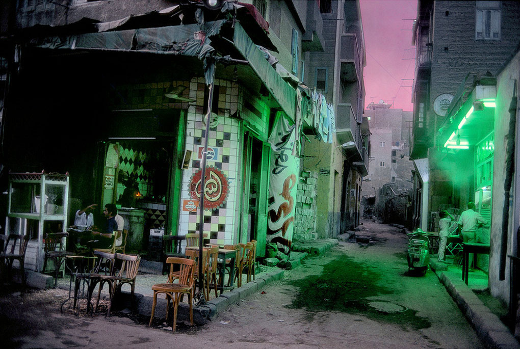
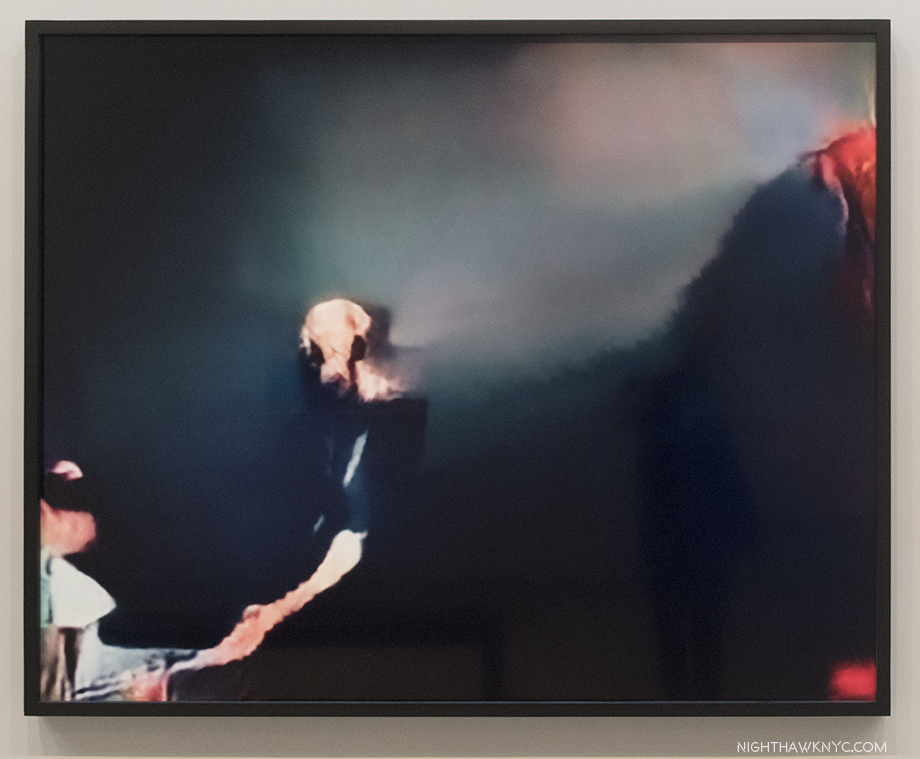
“Messiah,” Live at the Esquire Club, Miami, 1977. Left to right, T. Lavitz, keyboards, who would go on to fame after he joined The Dixie Dregs (aka The Dregs) the year after this was taken, before launching a successful solo career, Steve Smith, guitar, Bob Donzella, sax & vocals, Mark Smith, drums & vocals, and yours truly, Kenn Sava, bass & vocals. It’s about at this moment that I’d be tripping the flash pots. Gee, I wonder if that carpeting was fireproof… *-Photographer unknown. The pictures in this piece are thumbnails. Click any for full size.

We made three of them, each laid 1/3 of the way across the stage, all under my control, to be tripped at particularly “dramatic” moments during our set. Needless to say, never having done anything like this, especially while playing, it was a bit unnerving. Luckily, I managed to set them off a few times, without disastrous result. Phew! After a week or so, the regulars had gotten to know us, and everybody relaxed, so we dispensed with the “special effects,” or, they ran out of gunpowder, I forget. (The Esquire Club was destroyed by Hurricane Andrew in August, 1992.)

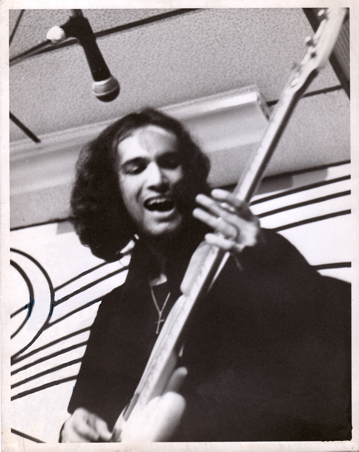
Yours truly, Kenn Sava, lve at the Esquire Club, Miami, FL. This is the first time I, or a former I, have appeared in the pages of  NighthawkNYC.com in its 8 1/2 years! *-Photographer unknown- a friend of Mark’s. I’ve grown quite fond of this picture as it shows me about as happy as I’ve ever been in my life, in spite of all we were dealing with at the time, including the poverty typical of bands like ours.

Such was “stage craft” in prehistoric times. Fast forward to January 20th, 2010.  

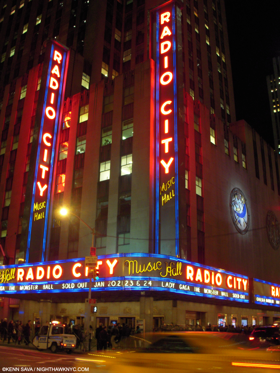
The Big Time. Radio City Music Hall, NYC, January 20, 2010. The night of Lady Gaga’s homecoming; her first NYC concert. Prior to this, she’d performed in clubs & bars, like I did.

There I am in the balcony for the NYC concert debut of an up and coming Artist who’s new hit singles, “Just Dance” and “Poker Face,” were all the rage, and her album, The Fame, was screaming up the charts. Intrigued, I managed to get a ticket for Lady Gaga’s New York homecoming show of her Monster Ball Tour at Radio City Music Hall, January 20, 2010, her first concert in her hometown1.

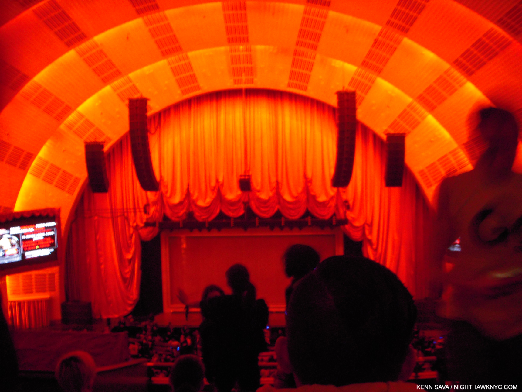
Down in front! Seated as far away as I was wasn’t ideal for picture-taking. Before it started, I took this because I was fascinated by the stage. Looking around the standees, you’ll notice a box-like frame and there’s a screen in front of it. Both things I hadn’t seen to that point.

As far as I know there hasn’t been an officially released video of what was the Monster Ball Tour, 1.0 that this show was a part of. I can only find pictures and videos shot by my fellow concert-goers, like this one of the opening. Poor quality, but it gives you a sense of it. ( Someone has posted a complete video of another stop on the tour. Again, it’s a far from ideal audience recording, but until something better appears, it’s the only record I know of of the complete show.)

The show began with a matrix-like grid on that screen shown earlier with a filmed Lady Gaga (LG) projected on it revolving while warping time and space, apparently free of gravity, along with a 1 minute countdown clock to the show’s beginning. As it ticked down, the crowd amped up by the second. 00:00:00:00, and there she was behind the matrix screen, live, alone on the big stage in her hometown, wearing an outfit with lights on it and performing her classic, “Dance in the Dark.” Quite a moment. “Find your Kubrick,” indeed. Stefani Germanotta had escaped the clubs & bars and arrived in the big time, in full effect. 

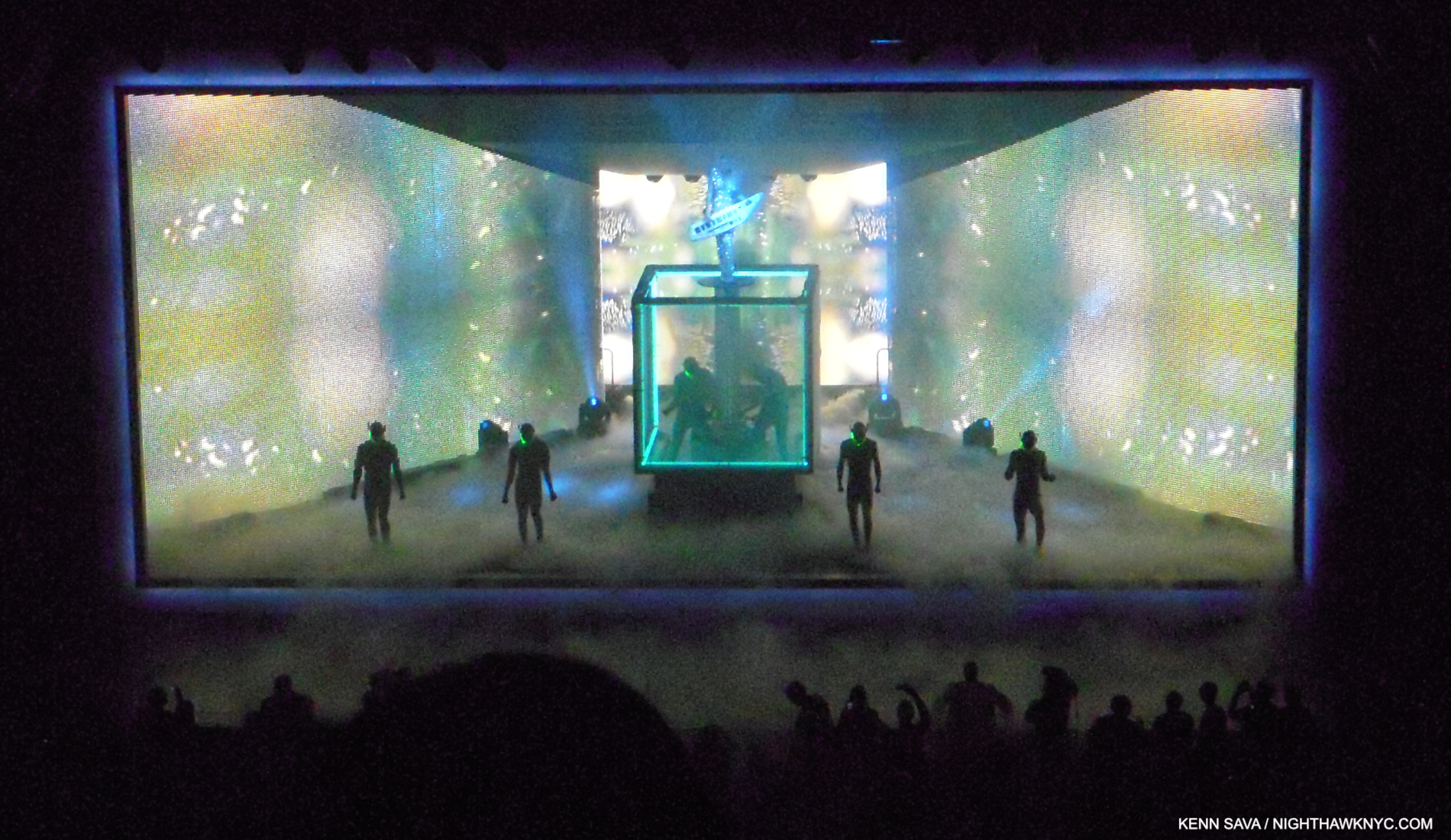
“Just Dance.” LG performs with a Roland Shoulder Synth (I believe) on a riser extending to about 10 feet over the base of a rotating cube. The area around the black disc she’s standing on is open. Watch your step! Note the frame-like border.

“Dance in the Dark” segued into her mega-hit, “Just Dance,” without pause. The screens on the sides seen above covered the band, something I’d never seen before, leaving a large performing area. Looking back from 2024, it might be easy to look at this show and not see it as all that “revolutionary” given what’s come since. At the time, I’d seen nothing remotely like what I saw that night. It still remains a unique experience. Meanwhile, the irresistible “Just Dance” got the balcony moving up and down so wildly as hundreds of concert goers jumped in time that I was worried it might well come down! How do they test for that kind of stress? When the show ended without catastrophe, as I was walking to the subway to the sound of my fellow concert-goers bursting out in spontaneous chants of “Oh oh oh oh oh…Caught in a bad romance,” over and over and over from near and far…the one thought on my mind was “SOMEONE involved in staging that show has a DEEP knowledge of Art history!”

“Paparrazzi” with LG’s hair fastened to the overhead pole on both sides by rings while two dancers hold the ends of the pole.

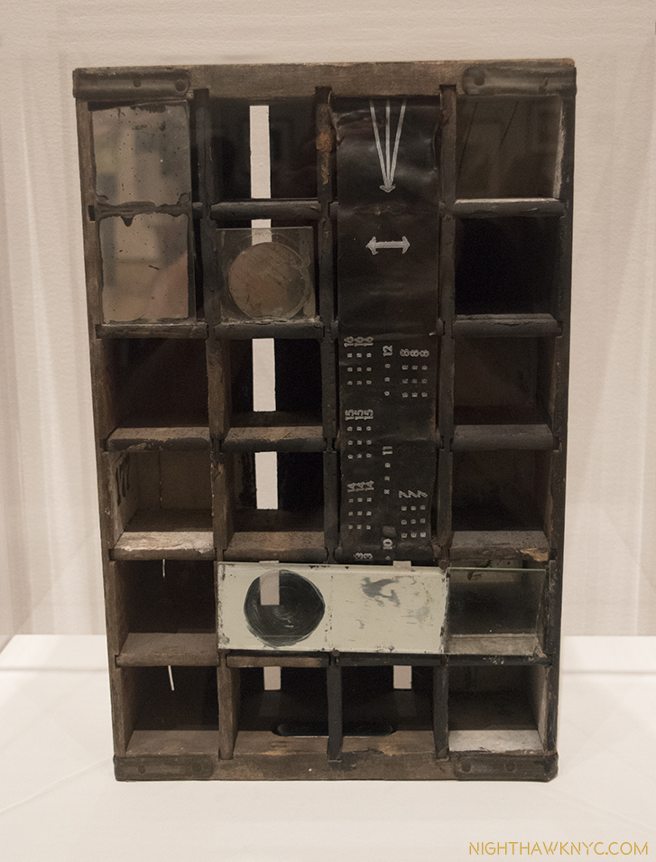
Time and again, I felt the influence of numerous Artists and Paintings. First, and foremost, the great Joseph Cornell was channeled as the entire stage was framed creating a box-like setting for the performance, as I show in “Just Dance.” Mr. Cornell, a revolutionary in a number of Artforms, is, perhaps, best known for his “Boxes.” The Cornell references continued during “Paparazzi” where Gaga’s hair was fastened to a horizontal pole with rings(!) while the dancers holding the ends moved/danced in step with the slightly helpless LG as she sang, right out of numerous Cornells that include a horizontal pole with rings attached, like Lunar Level #1, and Sun Box, below, among others. Joseph Cornell at a Lady Gaga show? Dali, Giorgio de Chirico, Magritte and Leonardo da Vinci also came to mind as the show went on. Of course, being Lady Gaga’s show, first and foremost, the credit goes to her.

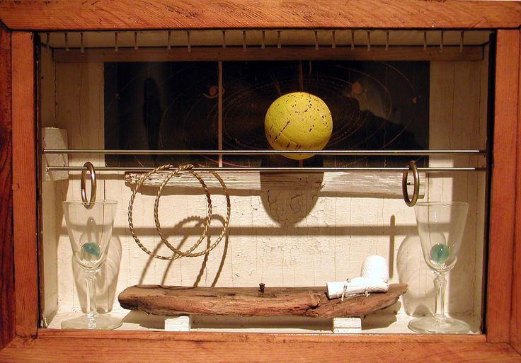
Sun Box, (1956) by the incomparable Joseph Cornell, 1903-1972. One of many Cornell Boxes that include a horizontal bar (or two) with rings attached. Lady Gaga’s entire show felt to me like it was taking place inside a box.

Then, I saw her,  again, in July, 2010, at her Monster Ball Tour 2.0 at Madison Square Garden (her first MSG show); another big deal. It was a completely different show! It was very nice, very effective, but minus all the Art references. I assume that having a stage in a huge indoor arena called for a completely different presentation. Still, I missed the show I saw at Radio City, and at that point it made me realize how special it was. I was determined to find out more about it.

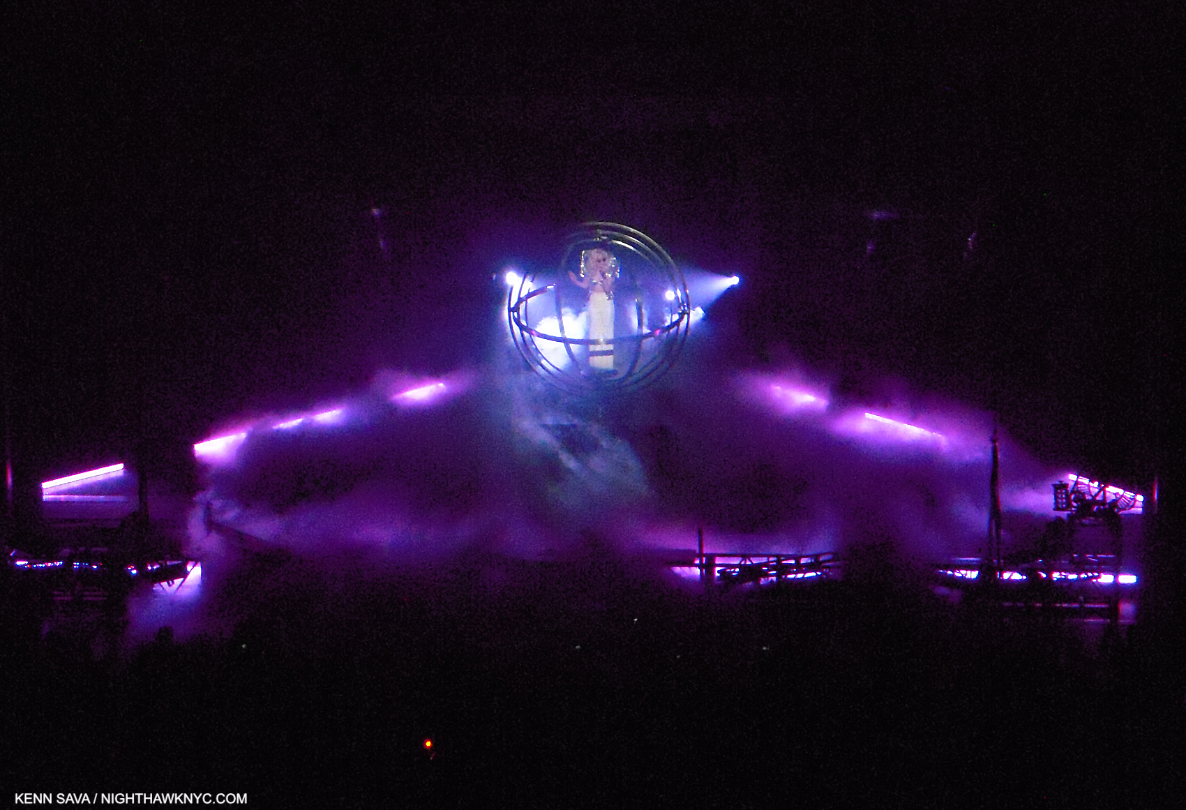
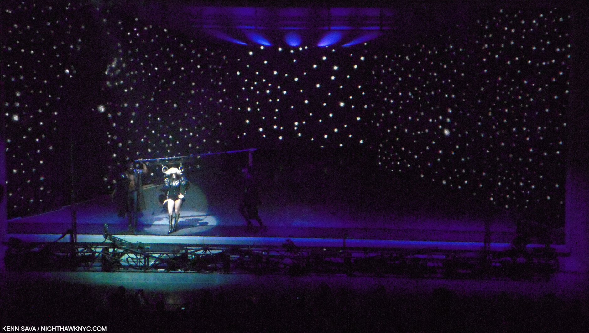
“Eh, Eh (Nothing Else I Can Say),” at Radio City. LG in a quasi-“gyroscope.” All those bars were continually in motion around her. A bit like Leonardo’s Vitruvian Man?

I found out that Lady Gaga had worked on the Radio City show, and her Monster Ball 1.0 Tour it was a part of, with a stage designer named Es Devlin. 

Who?

It tuns out that Esmeralda (“Es”) Devlin, born in London in 1971, is nothing short of a polymath, who, apparently, never sleeps. While I had been sleeping on her, in the interim, her reputation grew, then exploded. Meanwhile, the press had upped the hype quotient to seemingly impossible levels-

“Modern Britain’s answer to Leonardo da Vinci,” The Sunday Times (of London).

Leonardo?? I can’t say that in all my years of looking at and studying Art and Art history I’ve ever heard that said of ANY Artist.

Perusing her website, I discovered the roster of world-famous Musicians, bands, opera companies, playwrights, and corporations who have entrusted her with their stages is about as “A List” as it gets, and extraordinarily long. Oh, and the Super Bowl Halftime and the Olympics are on it, too. As for those Artistic deep waters, she’s staged a number of Shakespeare’s plays, including Hamlet, and a few of Mozart’s operas, including Don Giovanni, perhaps his ultimate opera. Snippets of all of these and more can be seen on esdevlin.com. I also discovered that Ms. Devlin did not do the stage design for that 2010 Lady Gaga Monster Ball Tour 2.0 MSG show. Hmmm…

But, Leonardo? One of the supreme geniuses in Art and world history, and one of my personal “Ultimate Artists?”

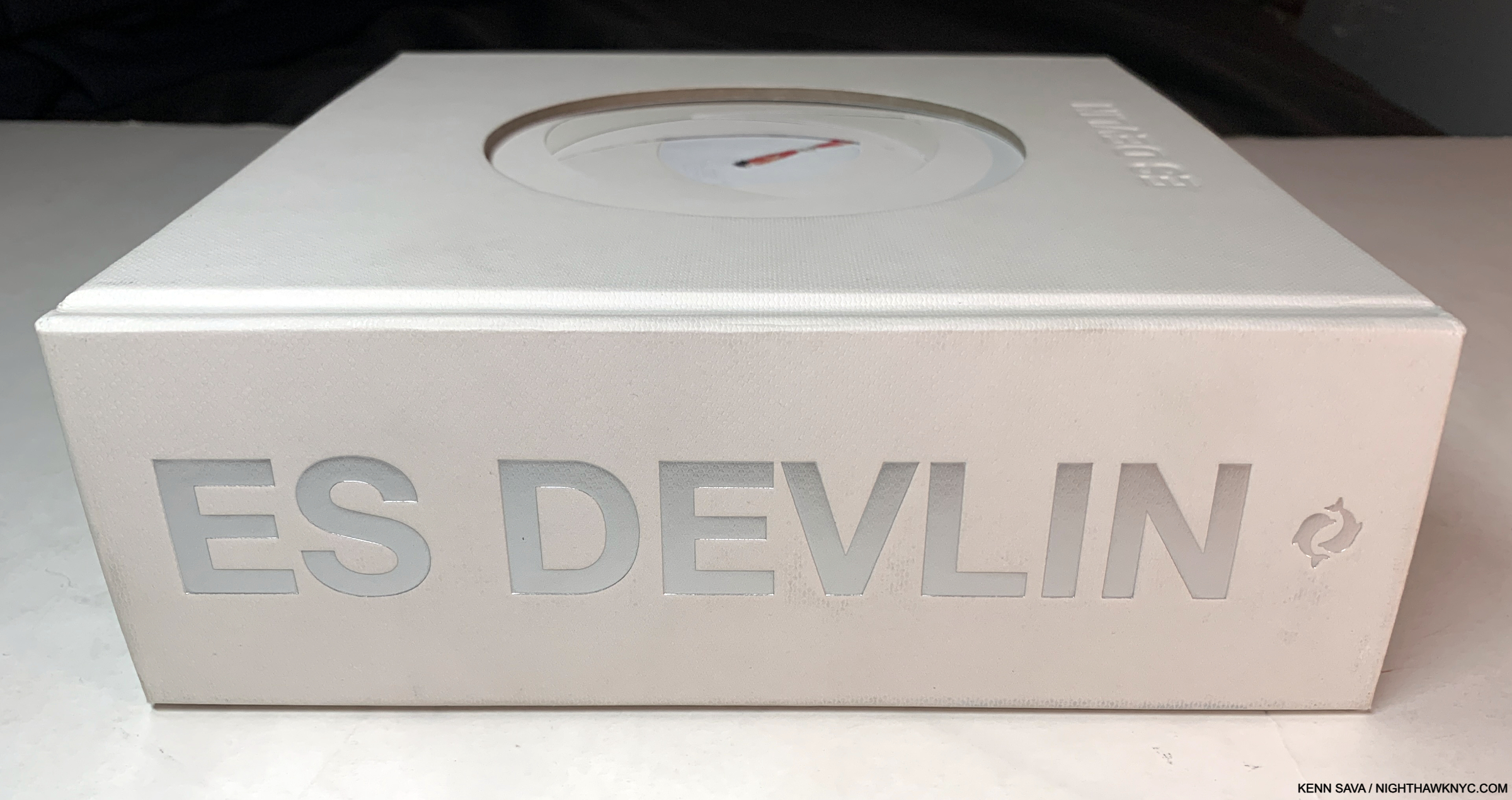
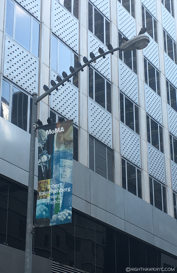
Back into the fast forward machine to 2024, Es Devlin is now the subject of a mid-career Retrospective at NYC’s Cooper Hewitt, Smithsonian Museum of Design. To accompany it, she, Cooper Hewitt and Thames & Hudson have combined to use the show as an opportunity to publish her first book, An Atlas of Es Devlin. When I first spotted a copy on a shelf with only “ES DEVLIN” in silver on its 2 1/2 inch thick(!?) white spine, I felt a tingle of anticipation. Suffice it to say, given all I’ve seen- in person and via research, and the weight of that Leonardo reference, my expectations couldn’t have been higher.

What we have is, well… I’ll let the Thames & Hudson PR staff tell you-

An Atlas of Es Devlin is a unique, sculptural volume of over 900 pages, including foldouts, cut-outs, and a range of paper types, mirror and translucencies, with over 700 color images documenting over 120 projects spanning over 30 years, and a 50,000 word text featuring the artist’s personal commentaries on each art work as well as interviews with her collaborators including Hans Ulrich Obrist, Bono, Benedict Cumberbatch, Pharrell Williams, Carlo Rovelli, Brian Eno, Sam Mendes, Alice Rawsthorn, and Abel “The Weeknd” Tesfaye. Each book is boxed and includes a die-cut print from an edition of 5,0002.”

PHEW!

HERE was the moment of truth. Will her body of work hold up to the close scrutiny such a comprehensive book provides?

“The instinct to fill a void with art is, to me, fundamental.” Es Devlin, hand-written reproduction inside the cover.

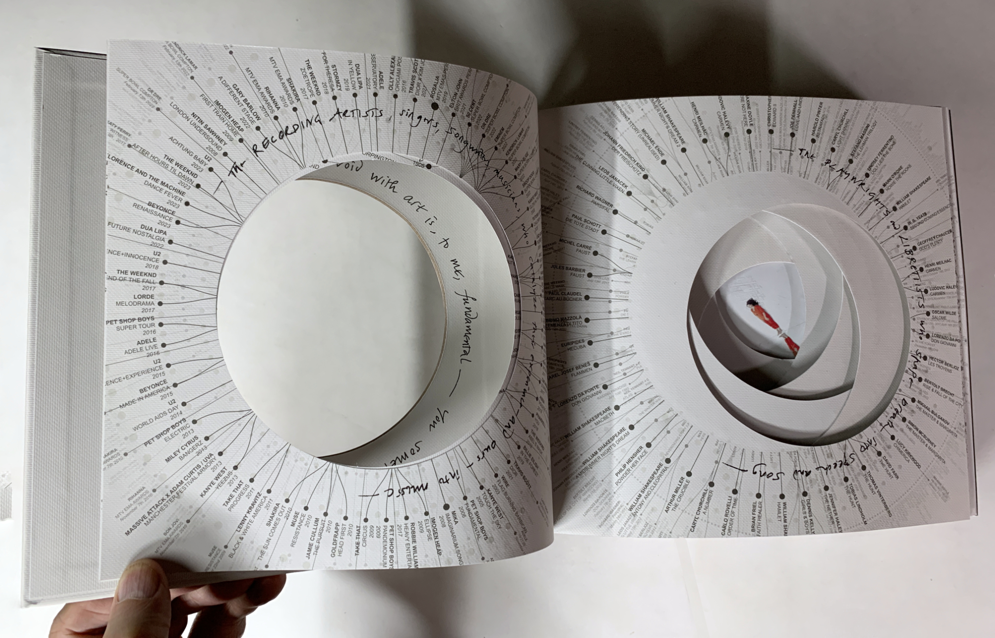
Ever see a resume like this? Inside the cover, the list of Musicians she’s worked with, left, and Playwrights & Librettists, right, surrounding Es in the middle after more pages of credits and thank yous.

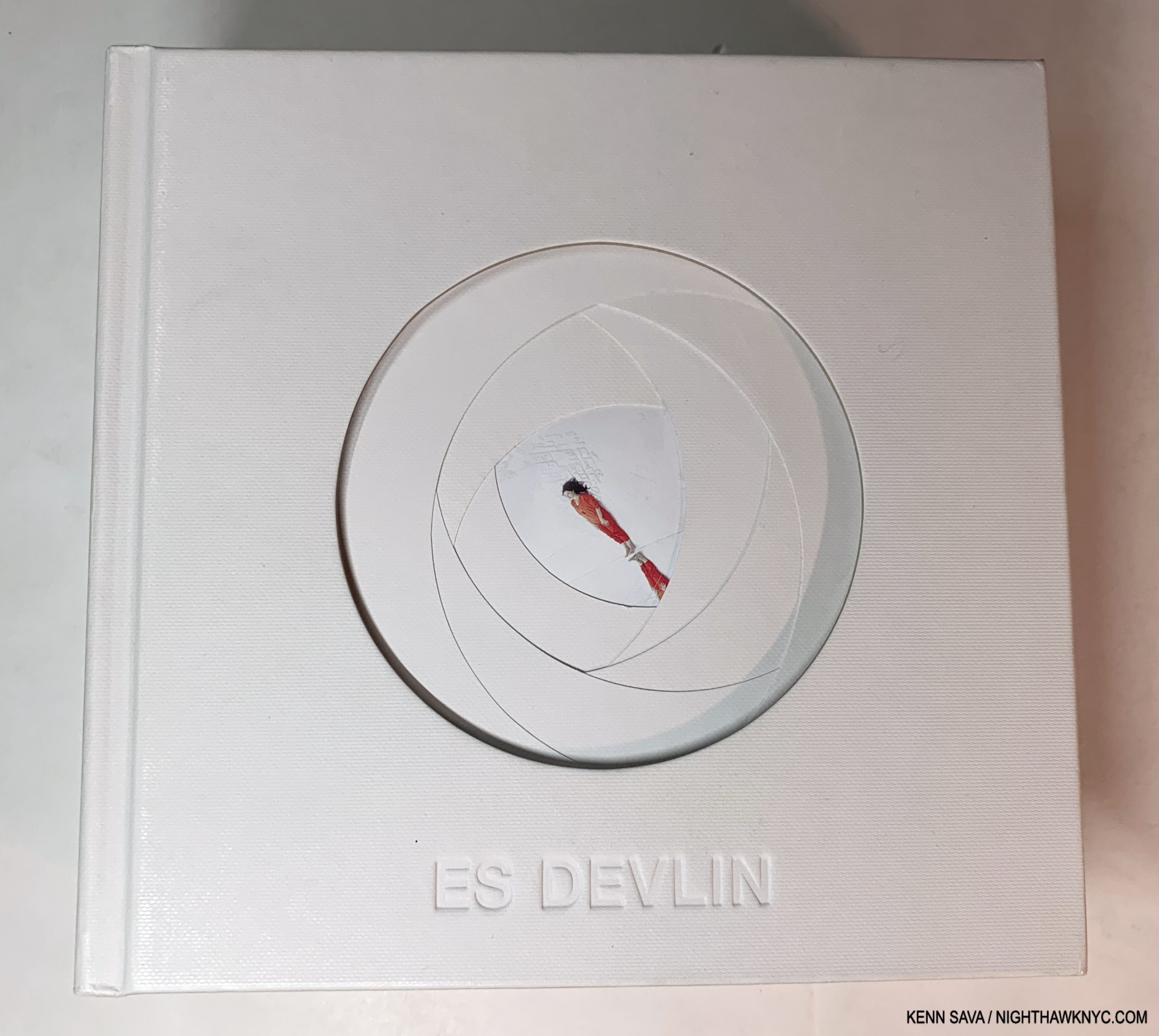
Holding a copy in my hand, it was immediately obvious that the book is a duality. At once it feels crafted with care at every turn, mirroring the personal feel of a very limited edition, yet it’s a mass-produced object published by a big publishing company. The cover, shown earlier, and the first 8 pages are die-cut to look like we’re peering into a camera lens. On each of these the opening is surrounded by credits, and there are many of them. They lead to a picture in the center (the aperture) of the Artist, herself, on the 9th page, standing obliquely between a white cityscape and white clouds, dressed in red; the “focus” of her own show, for once!

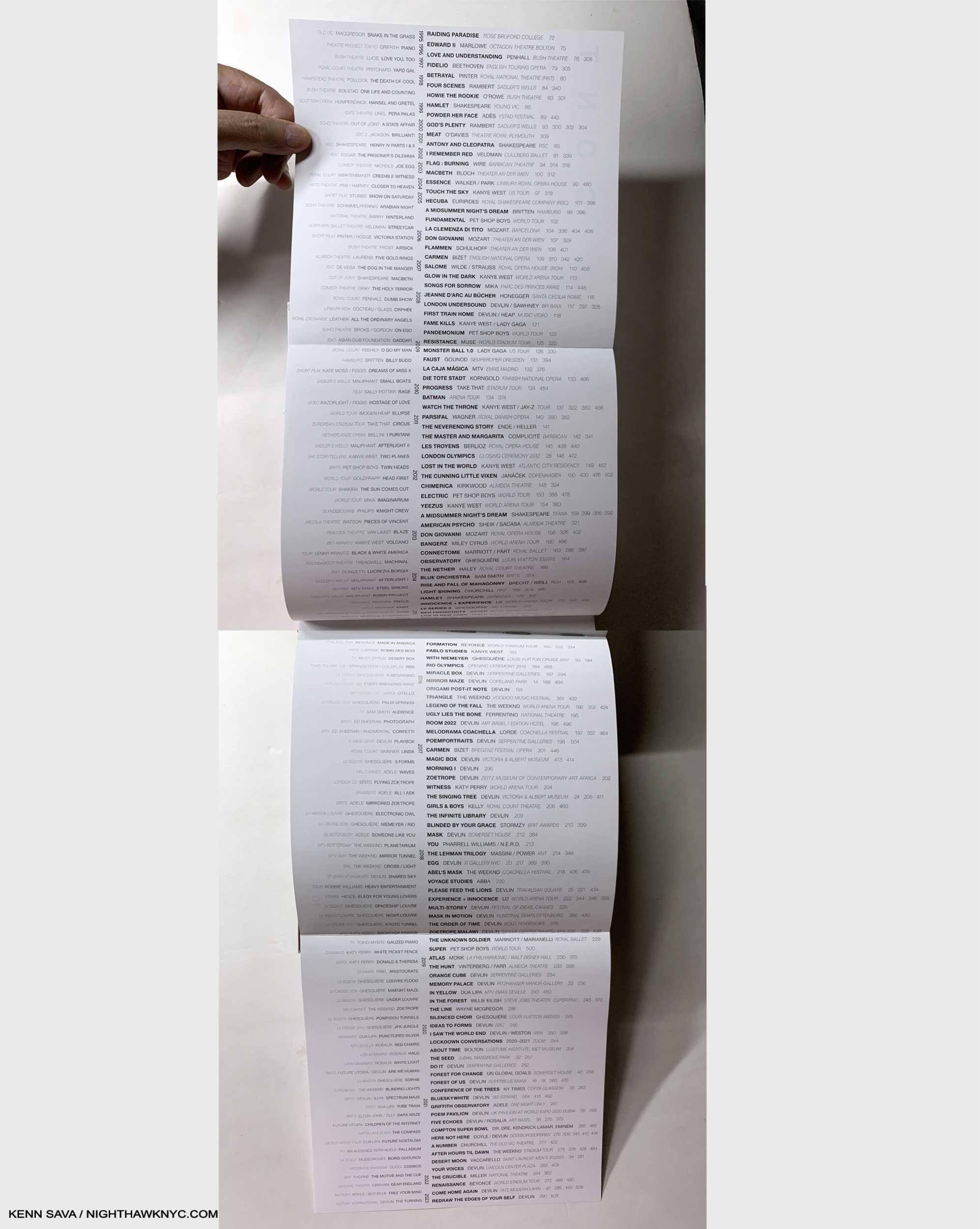
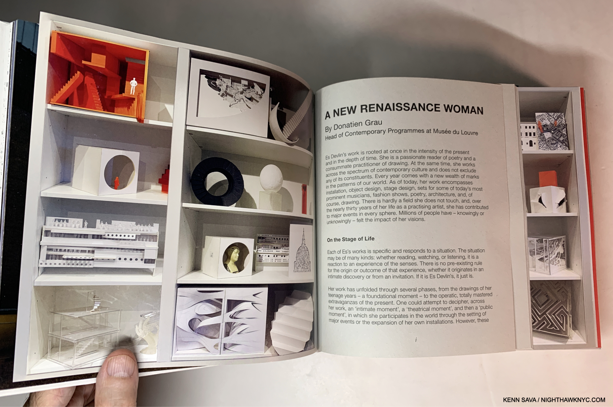
The Table of Contents opens up to the 4 page list of projects arranged chronologically- 1995 at the top, 2023 on the bottom. Those in the center in black are included in the book. Others, to the left in grey, are omitted. It’s shocking how many projects are listed. It took two pictures to get them all in.

Then we get the title page, the table of contents, which opens to a double gatefold listing her projects from 1993-2023. (Has she really been creating for THIRTY YEARS already?) Moving forward into the book proper, I quickly realized that the design was, yes, unique, and yes, stellar. Impressive for a first book, but, I’m here for more.

Each project typically get 2 full pages delineating its genesis, though many have inserts that range between 2 and 40 additional pages.

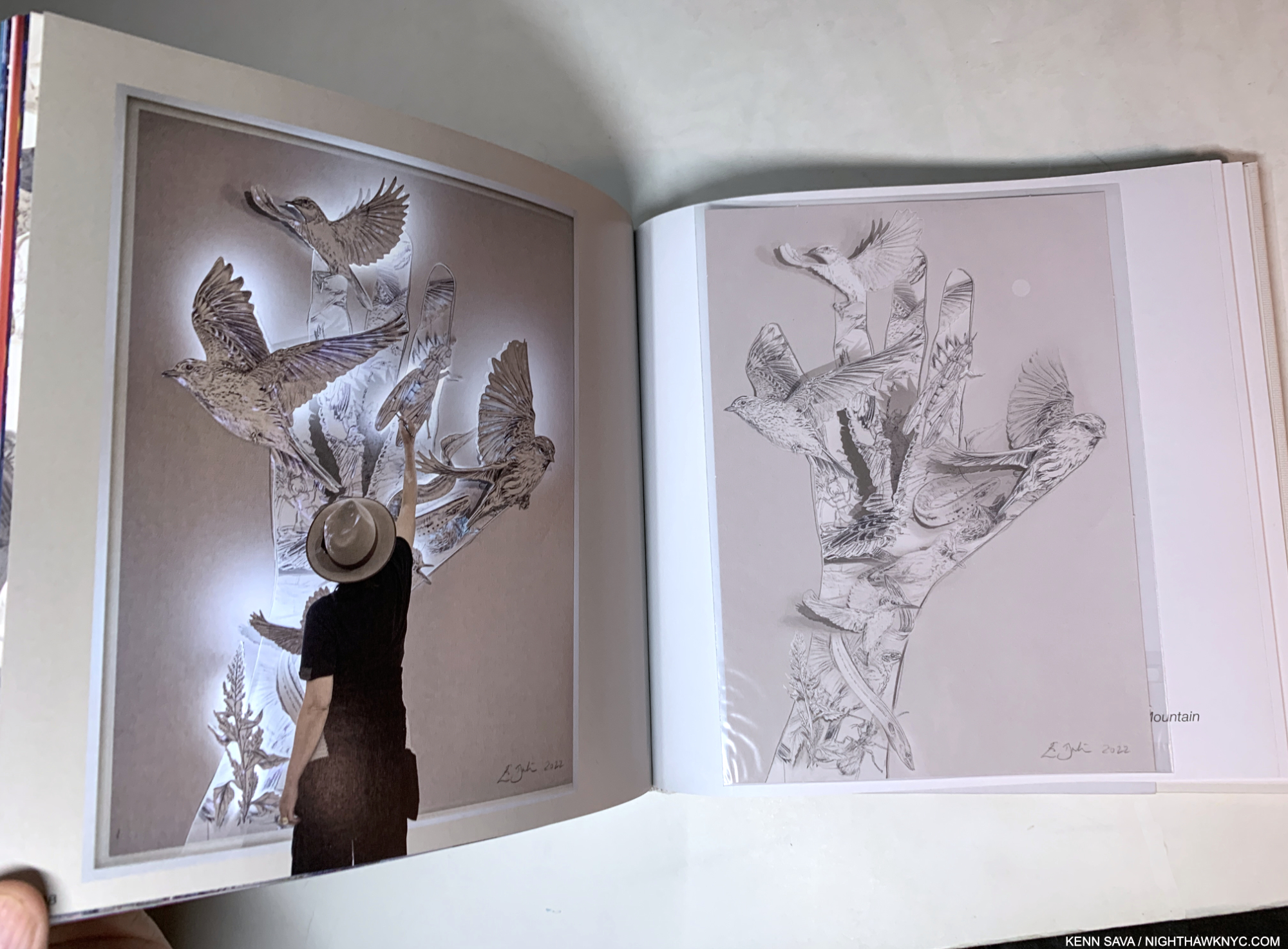
Her innumerable projects get small chapters of their own (small because there are A LOT of them), and many feature a variety of half pages, fold outs, inserted booklets, and what have you, making them different and fresh from each other. Then, there is a large section of color Photos of the actual performances, followed by the texts mentioned by Thames & Hudson earlier.

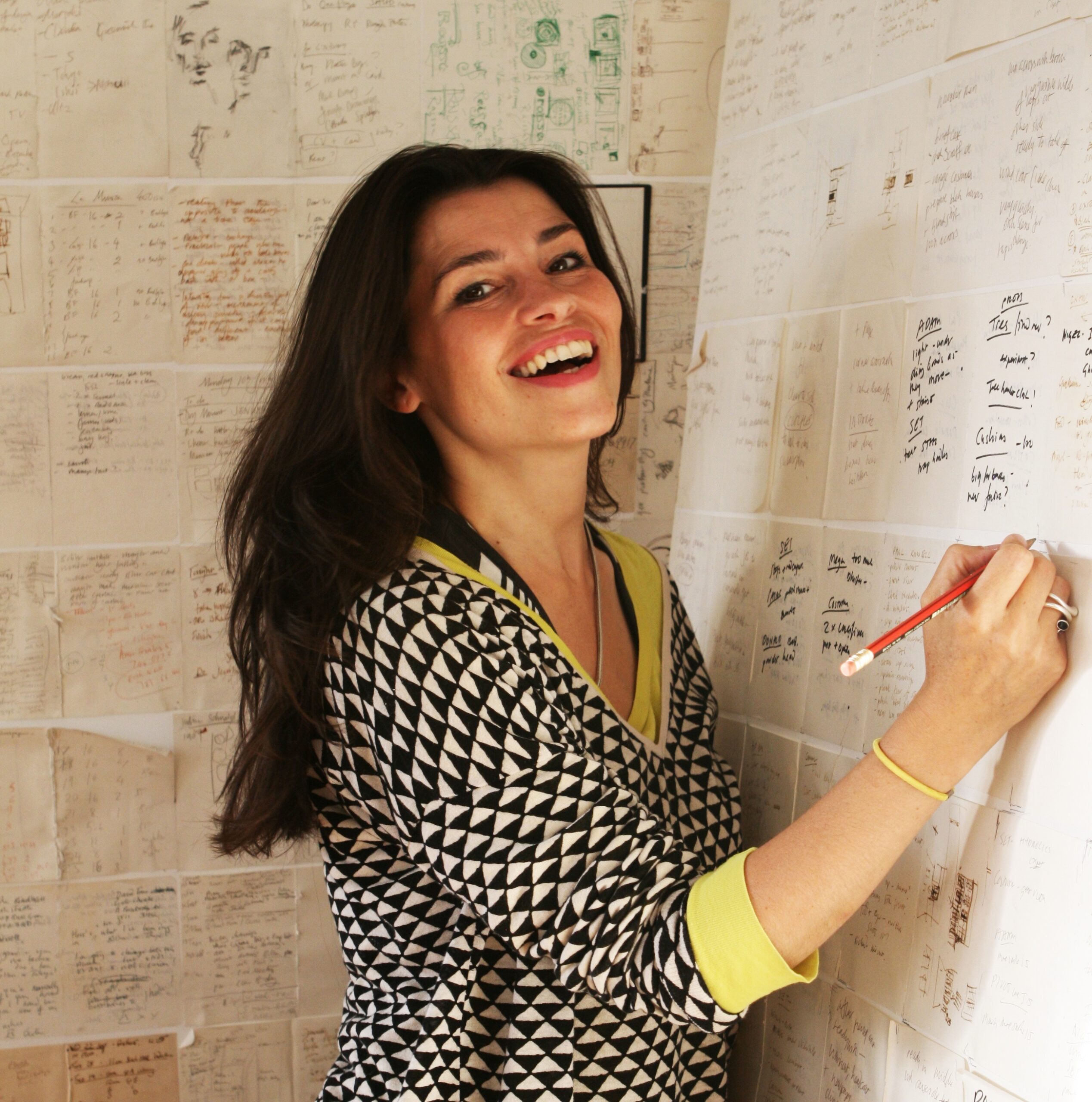
One of the world’s most remarkable Artists. What srtikes me about this Photo of Es Devlin in her studio is that she’s virtually surrounded by hand-written notes & Drawings. *-Photo by Tibby762

I was shocked to see that reproductions of countless Drawings on paper are included, which showed me that even Artists who’s work involves cutting-edge and innovative technologies continue to rely on Drawing on paper (something I have long considered to be an essential life-skill for everyone- whether it be on paper or digitally. I’m serious.) Then, another reveal- she relies on handwritten notes, which also fascinates me. When Sheena Wagstaff, the former Met Chair of Modern & Contemporary Art at The Met sat down next to me during a Nareen Mohammedi Symposium, I couldn’t help but notice that she, too, was taking notes by hand. Both commit their important notes and sketches to paper- not to a digital medium. (This is not mentioned as a criticism in any way of either highly esteemed lady.)

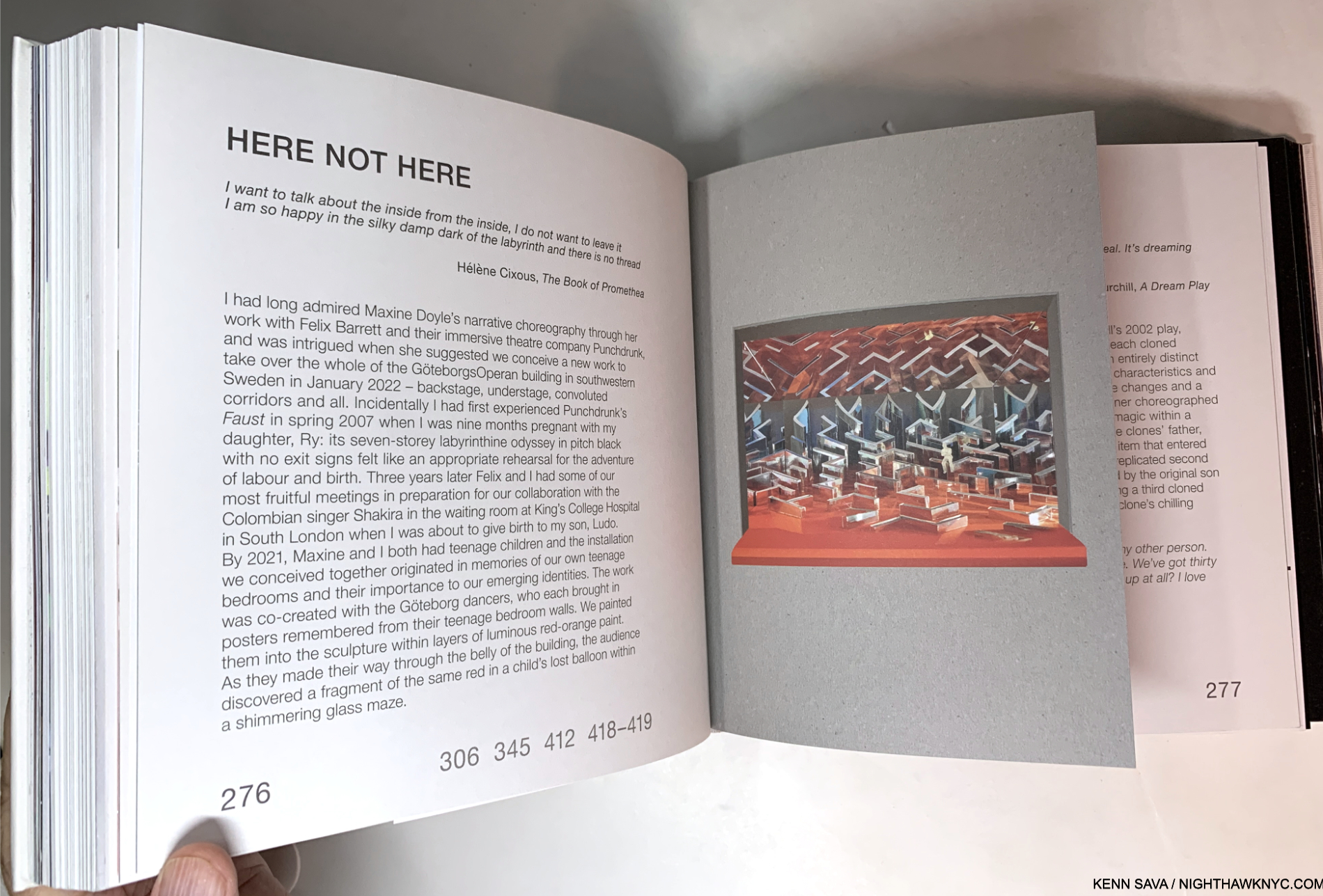
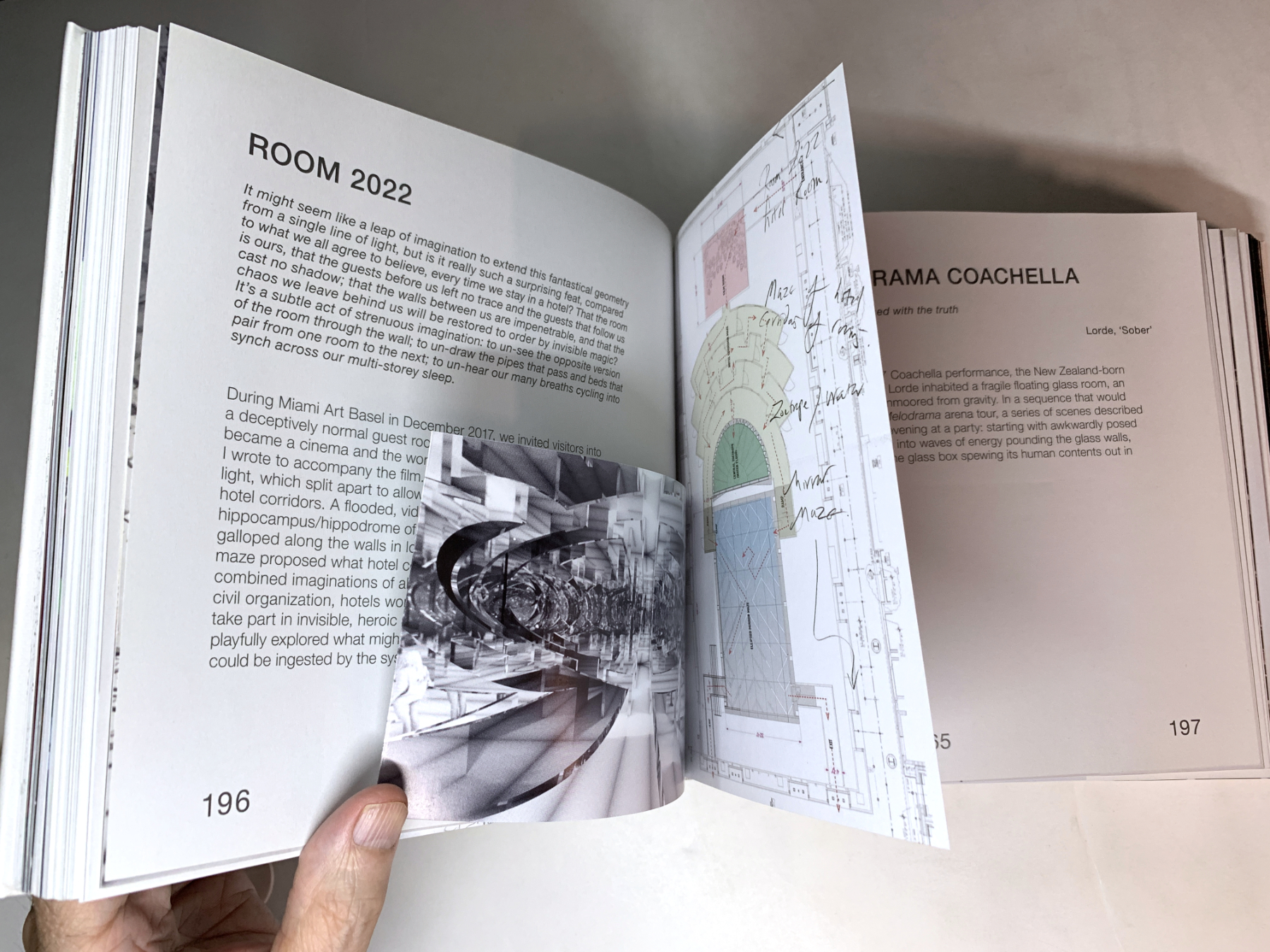
In the projects section inserts of all kinds are the norm, as in a hand-made book. The numbers “306 345 412 418-9” reference pages in the color Photos section where the realized project is pictured in its live performance.

That’s not all. In addition to her devotion to Drawing, another pillar of her craft is reading. Page after page of An Atlas references something she read inspiring that project in some way. Reading this, I was struck with one overriding question-

“The woman is so incredibly prolific, creating project after seemingly impossible project steeped in infinitely complex details (in addition to having a family and a life): WHERE DOES SHE FIND THE TIME TO READ, and read so much?”

Deep into the concept section, titled “A Selection of Works, 2012-2022,” as my mind is melting over as each project passes in the form of sketches, models or in-progress images as I page turn, I begin to wonder- “Did she really get this made? What did this look like for real?” After the concepts, the large section of color photos shows each project as it was realized. Historic proof each existed. Oh! And get this- MOST of the Photographs included in this NINE HUNDRED page magnum opus are by, you guessed it: Es Devlin, herself.

Taking it all in, the thing that strikes me is that stage design is fleeting. It takes an immense amount of work to conceive, design, and create, but once the performance is over, it’s gone, probably for good, living on in the memory of those, like me, who witnessed one of her productions. There aren’t even that many videos circulating of them! In creating An Atlas, Es Devlin has struck back against this impermanence with a lasting record of her process in creating these works and their singular results.

Taken as a whole, An Atlas of Es Devlin is a staggering achievement- like many of her productions are. Es Devlin has burst forth onto the Art Book world with a debut monograph that will be hard to top: on many levels. It’s destined to find itself on the reference book shelves of Artists, Playwrights, Authors, Opera Directors, Stage Designers, Graphic Designers, Book Designers, as well as Art historians and her fans, for years to come.

“A New Renaissance Woman.” Donatien Grau of the Louvre, no less, is on to something, I think.

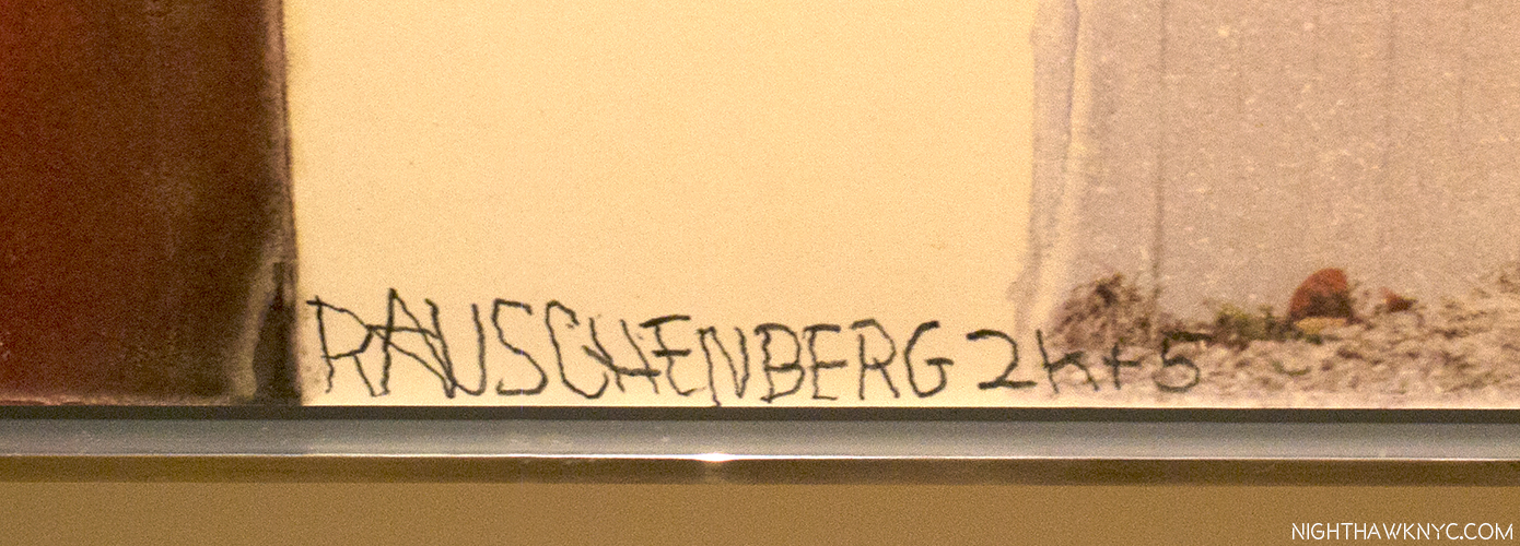
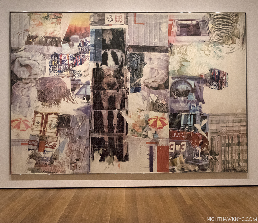
Of his almost innumerable areas of exploration and invention, stage design was not one of Leonardo’s skills (as far as I know. Far be it from me to put ANYthing past him!). So, I wonder what he would make of Ms. Devlin and the Sunday Times’s comparison. We’ll never know. But, I can make this comparison- Leonardo did leave us some of the most astounding books any human ever created: his Notebooks. Though unpublished in his time, and no doubt created for his own use, they have subsequently become eternally important, extraordinarily prophetic and endlessly influential. Es Devlin has now published her Atlas. While I would never compare Arists, or say one is “greater” than any one else (such comparisons are meaningless), it would be endlessly fascinating to have Leonardo’s Notebooks next to a copy of Es’s Atlas, so one could page through both. While you would certainly feel the passage of time going back and forth, I have a feeling that you might still find some commonalities between Leonardo’s “books” and Es’s book. Endless imagination, endless creativity, the fruits of handmade marks on paper, and endless beauty, to name four; each steeped in a study of the craft of Art making and an insatiable curiosity to know more, to explore what’s possible and to take that next step forward. For those reasons, instead of Leonardo, if I were to compare Es Devlin to any Artist, living or dead, it would be Robert Rauschenberg. Each of her creations is THAT unique, one work from the next (and from what anyone else has done), and also THAT endlessly creative and innovative.

So, how’s THAT for a first book?

Es Devlin in the midst of creating, left, and a sealed Die-cut Print seemingly based on it, or a similar work, included with the first edition, right.

And, oh? The Lady Gaga show I saw at Radio City 14 years ago that wowed me so barely gets 4 pages of coverage out of the 900 in the book. THAT’S how vast Es Devlin’s work and achievement is. And she’s only in her mid-career.

Watch out, Leo!

An Atlas of Es Devlin is a NighthawkNYC.com NoteWorthy Art Book of 2024.

NighthawkNYC.com has been entirely self-funded & ad-free for over 8 1/2 years, during which 320 full-length pieces have been published! If you’ve found it worthwhile, PLEASE donate by PayPal to allow me to continue below. Thank you, Kenn.

You can also support it by buying Art, Art & Photography books, and Music from my collection! Art & Books may be found here. Music here and here.

Written & photographed by Kenn Sava for nighthawknyc.com unless otherwise credited. To send comments, thoughts, feedback or propositions click here. Click the white box on the upper right for the archives or to search them. Subscribe to be notified of new Posts below. Your information will be used for no other purpose.

  1. Prior to this, her two 2009 shows at Terminal 5 were her largest NYC shows
  2. Apparently, two printings of it have now sold out, so the total edition size remains unknown to me. It’s also to be re-released in the USA in May so put those edition size numbers down in pencil.

Jaune Quick-to-See Smith’s Survival Map

This site is Free & Ad-Free! If you find this piece worthwhile, please donate via PayPal to support it & independent Art writing. You can also support it by buying Art & books! Details at the end. Thank you.

Written & Photographed by Kenn Sava

Show Seen: Jaune Quick-to-See Smith: Memory Map @ The Whitney Museum

Indian Madonna Enthroned, 1974, Mixed-media.

It took 83 years for Jaune Quick-to-See Smith to get her first NYC retrospective. As if that’s not notable enough, Jaune Quick-to-See Smith: Memory Map is also the “largest and most comprehensive show of her work to date,” the Whitney says of its installation of 130 of her Paintings, Drawings, Prints, and Sculptures covering almost 5 decades of her career on its 5th floor, where it follows Edward Hopper’s New York, and 3rd floors.

Self-Portrait, 1974, Pastel, graphite pencil and charcoal on paper. The Artist showing herself with 6 arms.

Born in 1940, a citizen of the Confederated Salish and Kootenai Nation, the show reveals Jaune Quick-to-See Smith to be an Artist of her time, one that is fluent with contemporary Art styles and techniques. An Artist, and a person, passionate about the well-being of her people and the world in which they, and we all, live. Yet, she’s also been ahead of her time in bringing many issues her people face to the Art world, which has only recently begun to be more open to Indigenous Artists.

Homeland, 2017, Oil and acrylic on canvas, radiates from the Confederated Salish and Kootenai Nation’s Flathead Reservation in Montana.

Indian Map, 1992, Oil, paper, newspaper and fabric on canvas.

Survival Map, 2021, Acrylic, ink, charcoal, fabric, and paper on canvas

As a result, it seems to me that her work has been on the line between being of its time and ahead of its time throughout her career, both in terms of style and content. She proves herself fluent in moulding the language developed by her peers to her purposes over her career while also creating as many of her own innovations.

Jasper Johns, Flag, 1954-55, Encaustic, oil, and collage on fabric mounted on plywood, three panels, seen at MoMA, 2017.

McFlag, 1996, Oil, paper and newspaper on canvas with speakers and electrical cord

Among the numerous Artists she references, including Magritte and Picasso, two names repeatedly came to mind, both at the forefront of the developments in American Contemporary Art of her time. Maps and Flags play a central role in the work on view, echoing Jasper Johns (B. May 15, 1930). Whereas Mr. Johns’s intentions for using the flag and maps remains, like most of his work, ambiguous, Ms. Quick-to-See Smith uses them to powerfully present the lives and issues faced by Indigenous People. 

Robert Rauschenberg, Gull (Jammer), 1976, Sewn silk, rattan poles, and twine, 1976, seen at MoMA in 2017.

Other works echo Robert Rauschenberg (Oct 22, 1925- May 12, 2008).

Ronan Robe #4, 1977, Oil, beeswax, charcoal and soot on canvas with lodgepole.

In 1985, the Artist got involved in efforts to save Petroglyph Park in New Mexico, creating what would become her Petroglyph Park Series, 1985-7, and marking the beginning of the appearance of current events in her Art.

Trade (Gifts for Trading Land with White People), 1992, Oil, paper, newspaper, and fabric on canvas with found objects on a chain. Perhaps a history of exploitation with “trinkets” being exchanged for land. A number of the sports teams whose ephemera hangs above the Painting, have subsequently changed their names, some have not. Other items shown remain in production, including children’s toys which cheaply knock-off Native American culture.

Historic events don’t escape her attention, either.

9 Monotypes from the Custer Series, 1993. The work next to the lower right is after Magritte. The text reads, “This is not a peace pipe.”

Wall card for the Custer Series.

The Confederated Salish and Kootenai Nation’s Flathead Reservation is located in Montana, site of the Little Bighorn. Canoes, often labelled “Trade Canoes” (except for the one above), are a recurring theme, each one rendered strikingly differently.

Trade Canoe: Making Medicine, 2018, Mixed media, foreground, Green Flag, n.d., on the back wall.

Detail.

Trade Canoe: Forty Days and Forty Nights, 2015, Oil, acrylic, oil crayon, paper and charcoal on canvas, introduces the show, and is seen to the left in the picture of the show’s lobby, seen further below.

In addition to having her eye on what’s going on around her, her Art also has a wonderful way of looking back to the rich history of her culture. Messages of protest are side by side with sage wisdom. Her Chief Seattle Series (or C.S. Series), 1989-91, does this wonderfully and adds a timeless element to her work. The Wall Card says-

The Garden (C.S. 1854), 1989, Oil, rubber hose, crushed tin and aluminum cans, and nails on canvas. C.S. is Chief Seattle and The Garden is part of Chief Seattle Series from 1989-91. It reads, “WE are part of the EARTH and it is PART of US, C.S., 1854.”

Jaune Quick-to-See Smith has created an important, innovative and powerful body of work that somehow all manages to remain of the moment no matter when she created it. On the one hand, that’s a sign the country hasn’t evolved faster and how much remains to be done. 

Memory Map shares the 5th floor with Josh Kline: Project for a New American Century, which is compelling in its own right. The shows overlap as both express concern over climate change and the impact of social, economic and technological change on the labor force.

On the other hand, it’s a testament to the Artist’s range, humanity, and perhaps above all, her perseverance. 

Celebrate 40,000 Years of American Art, 1995, Collagraph. A reminder that the ancient, original Art of our land has yet to be fully appreciated.

In some ways, the case of Jaune Quick-to-See Smith reminds me of Alice Neel, who didn’t see her first full-length monograph published until she was 83, the year before she died. Shows of, and books on, her work have increased ever since. I expect Ms. Quick-to-See Smith to also receive increasing attention as time goes on, and hopefully, she will still be around to see, and enjoy, it. Memory Map proves she deserves every bit of it. 

*- Soundtrack for this piece is “Now That the Buffalo’s Gone” by Buffy Sainte-Marie, who was born on the Piapot 75 Reserve in Saskatchewan, Canada. She announced her retirement from live performance earlier this month after 60 years of performing.

NighthawkNYC.com has been entirely self-funded & ad-free for over 8 years, during which 300 full-length pieces have been published! If you’ve found it worthwhile, PLEASE donate to allow me to continue below. Thank you, Kenn.

You can also support it by buying Art, Art & Photography books, and Music from my collection! Art & Books may be found here. Music here and here.

Written & photographed by Kenn Sava for nighthawknyc.com unless otherwise credited. To send comments, thoughts, feedback or propositions click here. Click the white box on the upper right for the archives or to search them. Subscribe to be notified of new Posts below. Your information will be used for no other purpose.

NoteWorthy Art Shows: Spring, 2023

This site is Free & Ad-Free! If you find this piece worthwhile, please donate via PayPal to support it & independent Art writing. You can also support it by buying Art & books! Details at the end. Thank you.

Written & Photographed by Kenn Sava.

As I celebrate the 8th Anniversary of NighthawkNYC.com on July 15th, my thoughts turn to some excellent shows I saw but didn’t get a chance to write about! I’ll take a brief look at a few I call NoteWorthy here…

Robert Rauschenberg: Spreads and Scales @ Gladstone Gallery-

Robert Rauschenberg has been one of my favorite Artists since I discovered his work in the 1980s. In 2017, I wrote an extensive series on the plethora of shows going on around town then during what I termed “The Summer of Rauschenberg.” Spreads and Scales was a concise but very interesting show of work I’ve never seen before reinforcing my belief that no matter how much of his work you’ve seen, even 15 years after his passing in 2008, there’s work of his that you more than likely still haven’t seen.

William Christenberry & RaMell Ross: Desire Paths @ Pace-

RaMell Ross, Sleepy Church, 2014, left,  and William Christenberry, Church, Sprott, Alabama, 1981, both Pigment print mounted on dibond.

An interesting, unexpected paring of the work of the late Photographer, William Christenberry, perhaps best known for his association with William Eggleston, and the Academy Award Nominated Filmmaker & Artist, RaMell Ross, who I last saw in a solo show at Aperture Foundation in June, 2018. Interesting became compelling in its final gallery.

RaMell Ross, Return to Origin, 2021. From the upper left- the Artist working away while in transit, sealed in the box; two video stills- the truck after unloading the box, simultaneous shot of RaMell inside; one of the panels showing the Artist’s inscriptions during transit; the box labelled “DRY GOOD.”

There, sitting on the floor was a very large box cryptically labelled “DRY GOODS” in a large stencil on the exterior, I looked at it, noticed there was writing all around the inside and then when I was about to move on I saw the accompanying video. It turns out RaMell Ross created & used the box to reenact Henry Brown’s legendarily daring act of mailing himself out of slavery to freedom in 1849! Mr. Ross shipped himself, sealed in this box, from Rhode Island to Hale County, Alabama. The trip took 59 hours, all the while the contents were unknown to the contracted truck driver whose gooseneck rig was carrying the crate. The journey, captured on the video, was being shown on that nearby monitor. In addition to reminding today’s viewers of Mr. Brown’s incredible feat (in a smaller box), it also reminds me of the preciousness of freedom. Something not fully appreciated, until it’s gone.

Uta Barth @ Tanya Bonakdar-

Frozen poetry. …and to draw a bright white line with light (Untitled 11.10), 2011, Inkjet Prints.

Compositions 5, 12 & 7, left to right, each Inkjet Prints from 2011, seen next to a street-facing picture window. Uta Barth’s work has had me deeply under its spell for the past three years.

Sundial (07.6), 2007, Mounted color Photographs.

In my opinion, Uta Barth is one of the most under-appreciated Photographers working today. I came across a copy of her retrospective The Long Now a few days before the pandemic shutdown and its poetry captivated me. With empty streets and empty rooms everywhere for the following months on end, I saw “Uta Barths” everywhere. Her spell has continued ever since. Artists who change the way I see the world are few and far between.

Installationv view of one section of ...from dusk to dawn, 2022, Mounted color Photographs with single-channel video monitor, includes an embedded video on one of these pieces that changes frames so subtly you may not see it change.

Finally having a chance to see her work in person @ Tanya Bonakdar Gallery, Uta Barth presented one, large, new piece, …from dusk to dawn, 2022, in multiple sections that nearly wrapped around the entirety of the downstairs main gallery and a curated selection of “classic” Uta everywhere else in the gallery. The new piece showed one location of Richard Meier’s Getty Center, L.A., over the course of a year, as it changed with time. Being in California, we don’t see the variety of weather we might in some other place, but with Uta Barth it’s always about the light. 

Tauba Auerbach: Free Will @ Paula Cooper Gallery-

One of the rising stars of the Art world, Tauba Auerbach’s latest, her first NYC show since her acclaimed early mid-career retrospective S v Z @ SF MoMA, 2021, didn’t disappoint while offering the usual surprise.

Foam, 2023, Acrylic on dibond. One of a series of Paintings(!) of foam as seen through a microscope.

“The exhibition is an expression of curiosity about spontaneously emergent structure, tendency and habit, and their intersection with the notion of free will. The work brings together historical rendering techniques like pointillism and midtone drawing with microscopy, algorithmic image processing, off-loom weaving, spraying techniques and mathematical surface modeling,” per the Press Release.

Org, 2023, Glass, nylon coated steel cord, 2 x 80 1/2 x 41 3/8 in.

New were incredibly detailed “pointillistic” (her term) Paintings accompanied by tables of intricate objects and a number of equally interesting sculptural works in the adjoining gallery. Both the objects in the main gallery and these “sculptures” reminded me that Tauba Auerbach has her own publishing company, Diagonal Press, which produces fascinating and intricate books and multiples.

Spontaneous Lace, 2023, Kiln-formed glass in aluminum

It might be premature for me to say this, but Tauba Auerbach reminds me a bit of Frank Lloyd Wright, to me one of the great Artistic geniuses of all time. Ms. Auerbach is not an Architect, as far as I know, but her work reminds me of the brilliance of Wright’s “ancillary” designs for his buildings: his fabric designs, dishwear, furniture and rugs. Frank Lloyd Wright continually pursued “building the way nature built,” i.e. “organically,” as he called it. Much of Tauba Auerbach’s work is inspired by nature and carries forward some of its techniques, as seen here in Free Will. Barely in her 4th decade, the high esteem attached to her name is well-deserved in my view, and she is definitely an Artist to keep a close eye on.

Ruby LaToya Frazier @ Gladstone Gallery-

Steadily, Ruby LaToya Frazier has been building a remarkable oeuvre, equal parts documentary and Art, in her own, unique, way. Her latest show, Ruby LaToya Frazier at Gladstone consisted of one major work– More Than Conquerors: A Monument for Community Health Workers of Baltimore, Maryland 2021-22, 2022 made up of 66 archival inkjet prints mounted on 18 stainless steel I.V. poles, which amounted to stations.

At each stop her Photographs were accompanied by personal statements from the subject that were every bit as riveting as Ms. Frazier’s work- no small feat. The show was a wonderful table-setter for Ms. Frazier’s mid-career retrospective set to open shortly at MoMA. An Artist & Activist who has focused so much of her work on groups and communities deserving wider attention it’s my hope the show will do just that for her work and career.

Nicole Eisenman Prince @ Print Center New York-

Beer Garden, 2012-7, Etching, acquatint, and drypoint with chine colle, A stunning 44 3/8 by 51 3/4 inches!

A fascinating and insightful retrospective of yet another side of her work: her seldom-seen prints. A wonderful presentation of 40 works, including new and rare works. A plethora of unique styles and compositions kept the show fresh and exciting, and I imagine would prove new even to those who know her Painting and Sculpture, which were seen to terrific effect in her New Museum survey in 2016, for which this show offered a marvelous, if delayed, addendum.

Machine Learning Kiss, 2018 Collagraph, 19 3⁄4 × 20 inches. *-unknown Photographer.

NighthawkNYC.com has been entirely self-funded & ad-free for over 8 years, during which 300 full length pieces have been published! If you’ve found it worthwhile, PLEASE donate to allow me to continue below. Thank you, Kenn.

You can also support it by buying Art, Art & Photography books, and Music from my collection! Art & Books may be found here. Music here and here.

Written & photographed by Kenn Sava for nighthawknyc.com unless otherwise credited. To send comments, thoughts, feedback or propositions click here. Click the white box on the upper right for the archives or to search them. Subscribe to be notified of new Posts below. Your information will be used for no other purpose.

Kenn Sava’s Desert Island Art Books

This site is Free & Ad-Free! If you find this piece worthwhile, please donate via PayPal to support it & independent Art writing. You can also support it by buying Art & books! Details at the end. Thank you.

Written & Photographed by Kenn Sava (*- unless otherwise credited)

A BookMarks Special. 

A reader writes, “Hey, Kenn. Leaving cost as a secondary concern, what are the Art books you’d take with you to that desert island?”

Wow…one of the hardest questions you could ask me. First, I’d never go to a desert, or any island without a museum, but I’m game. I’ll take “Art” to mean Paintings, Drawing, Sculpture, leaving Photography aside. (That way I’d get to take more books! Ha!) Well, cost is a PRIMARY concern for me, but I’ll make it secondary here. My criteria are 1) the importance & quality of the Art and 2) how well is it presented? Ok. After months of pondering it, here they are! (In no particular order…)

SPOILER ALERT! There are NO AFFILIATE LINKS in this piece! If you buy one of these somewhere, how about making a donation so I can keep helping you discover Art and books? 

Kenn Sava’s Desert Island Art Books

Filled with a lifetime’s fruits of observations, insights, and revelations. No Art lover should be without it, in my opinion.

The Story of Painting, Sister Wendy Beckett, DK Publishing.
The first book I simply must mention is one that had a bit to do with inspiring me to start NighthawkNYC.com, which is about to begin its ninth year: Sister Wendy’s The Story of Painting. A phenomenal accomplishment, covering the history of Painting right up to very recent times, her observations are based in what she sees in the work itself! In so doing, Sister Wendy showed the world how to look at Art without the noise surrounding it from those who would tell you what you “should” see so you can see Art for yourself. I first read Sister Wendy Beckett back in her days as a contributor to the excellent Modern Painters Magazine, before her BBC & PBS TV Series make her world-famous. Still, at the moment, if you look for it (it’s out of print), The Story of Painting can be had reasonably. I prefer the hardcover, mine shown above, because I wore out my softcover copy years ago. Yes, some of the blown up details are out of focus, making me wonder about the editors, but’s that’s no reason for the slightest hesitation- most of the 450 images over 800 pages are fine. This is a book that should always be in print, so it’s past time for a new edition! There is an exceptionally well done TV Series of the same name that is available on DVD, and her other, lesser-known TV Series, like Sister Wendy’s American Collection, in which she visits 6 U.S. museums are also amazing. Seeing her in the same halls of The Met that I frequent always gives me chills. All her shows are essential and should be rerun as often as any show is. Luckily, there is a Complete Collection of her TV Series in a DVD box set. I missed her when she retired to live in seclusion in her trailer, as I wrote here, and more so since her passing, which I mourned here, but what she left us lives on in me, which I try and share here, and countless others. I hope it continues to inspire countless millions indefinitely.

Van Gogh: The Complete Paintings, Taschen
If I were to take only one Art monograph, you might be looking at it. I’ve looked at it more than any other Art book besides The Story of Painting. Vincent became an Artist late in life, at about 28, and his career barely lasted 9 years. Yet, the intensity of his dedication to his craft saw him create about 2,100 works, including about 860 Paintings! The evolution of his style is continual after his earliest, “dark” period. Meanwhile, his life was full of tumult, disappointment, and unimaginable pain & suffering. Currently the “Brick” edition, which measures about 6 by 8 inches, $25. list, and/or XL edition, $60. list, are in print. Virtually the exact same book in 2 different sizes. Large or small, either is an incredible value. I’ve got both and each sees steady use. Choose small, shown above, if you want a ready reference, perfect for your bedside or backpack. Choose XL if you want to see the Art in a larger size. My look at the reinstalled Van Gogh Paintings at The Met, pondering what Vincent would think, is here. I’ve begun a piece on Van Gogh’s Cypresses, currently at The Met.

With its NoteWorthy Art Book of 2020 designation.

Rembrandt: The Complete Paintings, Taschen XXL
The canon of the Master’s Oils seems to be changing daily, even 354 years after his death! It has already changed since this was published in 2019. Still, unless you hit the Mega Millions, or are able to fly around the world and see all the Rembrandts on view in the world’s museums, this is as close as you’ll ever get to seeing them all. Even if you were able to do that, you’d only see some of them because museums rotate/lend their collections and those in private hands are probably inaccessible to you. Still, even if you were somehow able to see all of them, you’ll never see them this close. Nuff said. My hope is they update it in a few more years. In selecting this, I must mention my other go-to Rembrandt book- The Rembrandt Book by the legendary Dutch Art specialist, NYC-born, Gary Schwartz. Aptly titled. Essential. My look at Rembrandt’s First Masterpiece at the Morgan Library in 2016 is here.

My sealed XXL before being “touched.” In this case, “XXL” equals 19 pounds!

Michelangelo: Complete Works,  Taschen XXL
Michelangelo’s canon doesn’t change nearly as often as Rembrandt’s does, but it does look different when his Art is cleaned or restored (like the Sistine, which looks incredible now, as seen in here, though I hope no damage was done to it in the cleaning). But as I mentioned for the Rembrandt XXL, you’ll never seen all of it, and never this close. Trust me- The Vatican is NOT letting you up on a scaffold in the Sistine! The XXL is out of print and goes for $500. and up in VG or better condition. The $60. XL is almost as good and is still in print as are the two Bricks that include this material- Michelangelo: The Complete Paintings, Sculpture and Architecture and Michelangelo: The Graphic Work for his Drawings, My look at the monumental Michelangelo Divine Draftsman and Designer, at The Met in 2018 is here. One of the top 3 or 4 Art shows I’ve ever seen, it brilliantly revealed for all-time that Michelangelo, the Draftsman and Designer, may be the most overlooked aspect of his super-human genius, and just possibly his most under-rated talent. The Met’s catalog accompanying Divine Draftsman and Designer is one of the very best books on Michelangelo there is- and I’ve owned a lot of them.

Pablo Picasso: A Retrospective, Museum of Modern Art
HOW could I do a list like this and NOT include a Picasso book? In 1980, I made two trips back to NYC while I was on the road with a band, just to see MoMA’s Picasso Retrospective. The hype leading up to it called in a “once in a lifetime, must-see show.” The reality was just WOW! It marked the beginning of my Art show-going life. If my Art-going career had ended then and there I really couldn’t complain; it’s never been topped by anything I’ve seen since. The show, which filled ALL of the “old” MoMA,  was just overwhelming…mind-boggling. Almost ONE THOUSAND Paintings, Sculptures, Drawings, Collages, Prints, Ceramics, etc., etc. MoMA lent 230 works to other institutions to make room for it. I’ll never forget seeing his earliest works, which the show began with, including Science and Charity, which he Painted at 15(!), and and already being staggered by his talent TWO GALLERIES in, with the entirety of MoMA (THREE FULL FLOORS!) still ahead of me! The catalog published to accompany the show is a classic as well. It’s still to be had quite reasonably in hardcover, like mine above, which I bought at the show, or softcover (check it for yellowing first. It’s 43 years old and my copy makes no mention of acid-free paper). It’s endlessly staggering to page through it and realize that ONE PERSON created ALL of this! If you said of it, “THIS was the ultimate testament of man’s creative accomplishment in the 20th century,” I, for one, couldn’t argue with you.

Kerry James Marshall: Mastry, Skira Rizzoli
THE Painting show of the 2010s among all those I saw lives on in the terrific catalog that accompanied it. It’s still one of the two best books on Mr. Marshall, one of the most important Painters working today, along with the Phaidon Contemporary Kerry James Marshall book. You need both, but in a pinch I’ll take Mastry. I wrote about the show here.

I bought my copy used so it was pretty much like this. Out of print for a long time, it’s very hard to find now in VG condition for less than $200.

Neo Rauch, Taschen XXL
Perhaps the world’s most enigmatic living Painter, Neo Rauch’s work continues to both baffle me and hypnotize me in equal measures. Leave it to Taschen to create the most stunning book on his work published so far, even though his bibliography is ever-expanding and the track is fast. 12-years-old at this point it sorely needs to be updated with the work he’s done since added though the essay remain excellent. Long out of print and commanding big bucks, I’d advise holding off on it now and hope Taschen gives us a new edition with all of his work for the past decade+ added. In fact, I spoke with Neo Rauch this spring about just that and he told me another Painting book is coming out next year. It didn’t sound like it would be an Updated Taschen Neo Rauch.

*- Estate of Francis Bacon Photo

Francis Bacon: Catalogue Raisonne, Martin Harrison, The Estate of Francis Bacon
It seems like the Francis Bacon bibliography gets bigger every few months, but this will ALWAYS be THE place to begin, and end, when it comes to seeing his work. Especially ALL of it! His 584 Paintings are beautifully shown in 800 illustrations over 1,500+ pages in five volumes. Text by the world’s foremost living Francis Bacon authority, Martin Harrison (who also contributed to Saul Leiter’s Early Color, one of THE essential PhotoBooks of the 21st century). Here’s the thing- the Estate has said that once it’s sold out, “it will never be reprinted.” Gulp.

The Complete Oil Paintings of Edward Hopper & The Complete Watercolors of Edward Hopper, both Norton
The 4-volume Edward Hopper Catalogue Raisonne by Gail Levin and published by the Whitney in 1995 is more well-known, but it sold out and copies currently BEGIN at $1,000. per. Lesser-known is that the Whitney then sold the two volumes of The Complete Paintings & The Complete Watercolors from the set as stand-alone volumes. At this point, they’re actually probably harder to find. Recently a reader asked me for a Hopper recommendation. It’s really strange that there isn’t a comprehensive book on Hopper’s Art over his whole career currently in print. (The Whitney’s catalog for Edward Hopper’s New York is good, but it’s focused on his NYC work.), as I recommended in Part 2 of my recent look at Edward Hopper’s New York, seek out Gail Levin’s Edward Hopper: The Art & The Artist, the catalog for the last Edward Hopper Retrospective at the “old” Whitney Museum in 1981. Just beware the book is 42 years old now. Look at it before you buy a copy and make sure the pages haven’t yellowed, which this book is very prone to, since that drastically affects the color of the Art.

Robert Rauschenberg: A Retrospective, Guggenheim Museum
By far the most comprehensive look at almost all of Robert Rauschenberg’s career to 1997. A show I saw and will never forget. Mr. Rauschenberg was involved in its making (there’s a great video online of a brief interview with him as he stands on Frank Lloyd Wright’s ramp). The Artist would go on to live & work for another 11 years, and I am particularly a fan of his late work. Still, this is a glorious book, one I have gone through 3 copies of. The essential visual reference to Robert Rauschenberg’s Art. He remains one of THE most influential Artists on the Art I see in 2023. My look at what I called “The Summer of Rauschenberg” in 2017 is here.

*-National Gallery of Art Photo

Georgia O’Keefe: Catalogue Raisonne, National Gallery of Art, Washington
A “name” here at home, Ms. O’Keefe is only beginning to be better known around the world. I believe her stature is only going to grow and grow from here on. This book shows why. Her work is singular, always based in nature with her one-of-a-kind vision, and just plain gorgeous. As we’re seeing right now in her terrific MoMA show, Georgia O’Keefe: To See Takes Time– her work holds up gloriously!

Rothko by Christopher Rothko & Kate Rothko Prizel, Rizzoli Electa
Runs, doesn’t walk, to the head of its class. Some may still prefer Yale’s Mark Rothko: The Works on Canvas, but it’s 25 years old now. Who better to write a book on their father than Mark Rothko’s son and daughter? They know whereof they speak on all things Rothko after spending their lives as closely involved with his work as anyone- not to mention actually living with the Artist. This all came home to me in spades when I met Kate and got to speak to her about a number of things Rothko-related. She thinks this is the better book, and when she told me that I didn’t get the feeling she was speaking out of bias. The handsome book in a slipcase includes an extremely wide range of work- on canvas and paper, from all periods. The 1999 Rothko Retrospective at the “old” Whitney changed my life, turning me back to being Art-centric from Music and made me a fan for life. My look at Mark Rothko: Dark Palette, 2016, is here.

Ralston Crawford by William C. Agee, Twelvetrees Press
Ralston Crawford is one of the most overlooked Artists I can think of, and I’ve been obsessed with his work since the Whitney Retrospective more years ago than I care to think about. Though shows have been scarce, books have begun to appear over the past decade. This is still the best comprehensive overview, but I hope a REALLY worthy Ralston Crawford book will be coming. Oh, he was also a very talented Photographer, as Keith Davis’s fine book The Photographs of Ralston Crawford reveals.

Vermeer: The Complete Works, Taschen
There are other excellent books of Vermeer’s complete Paintings, including those by Arthur Wheelock of the National Gallery, DC, and the late, lamented Walter Liedtke of The Met who was tragically killed in a train accident a while back. Both of those are excellent for their texts, the Taschen book is essential for its Photography. There hasn’t been an XXL-sized edition, but Vermeer: The Complete Works is now available in either the Brick size, pictured, or the XL size. You can’t go wrong either way- see my comment on Van Gogh: The Complete Paintings for why, though when it comes to Vermeer, you can’t get TOO close!

Caravaggio: The Complete Works, Taschen
The XXL is long out of print but seeing his work THAT large is an amazing experience if you can find one. The Brick and XL remain in print, and both work well. Caravaggio’s chiaroscuro has been infinitely influential, from Rembrandt on down, no less so today. And so his work remains essential for Photographers, those interested in Film, and of course Painters.

Dali: The Paintings, Taschen
Dali seems to be in a bit of eclipse these days, but anyone who saw the huge Dali Centennial Retrospective at the Philadelphia Museum in 2004-5 knows this is temporary. This remarkable book contains all his Paintings from a very long and very productive career that was marked by almost as many styles as his contemporary Picasso. Originally published as a Volume 1 & 2, now in one volume, available in the Brick or XL size. If you don’t think Salvador Dalí belongs on this list, look through a copy of this book and then tell me he doesn’t.

Getting harder to find- Frida Kahlo: The Complete Paintings, sealed, in its shipping box.

Frida Kahlo: The Complete Paintings, Taschen
Unless you’re besties with Madonna, this is likely to remain THE very best place to see the astounding, indelible work of the Mexican genius. What else is there to say? Oh! My money is that Taschen will re-release it in smaller sizes, but if you want to see her work in FULL effect, the XXL, the only edition of it thus far, which seems to be disappearing, is likely to remain THE BEST place to do that. I wouldn’t wait long.

Diego Rivera: The Complete Murals, Taschen
Completing the only husband/wife team on this list, this is a terrifically important concept beautifully realized. It’s hard to feel now what a revolution Diego Rivera and the other Mexican Muralists created when they began making Murals in Mexico. They later created them elsewhere and along the way influenced many of the great Artists of 20th and now 21st century Art, including Jackson Pollock. Available in the XL size, I would have my doubts about how good it would be as a Brick.  But in the XL you can study all the marvelous detail on each Mural in a generous size.

Basquiat XXL seen here in its original, printed, shipping box, which has been replaced with an all brown box in recent printings.

Basquiat, Taschen XXL
The XXL is likely to forever be THE best place to see the most Basquiat Art as close to life size. There is a Brick edition, part of Taschen’s 40th Anniversary series, which is slightly edited, but that’s the tradeoff for the deep savings ($30 for the Brick vs $200 for the XXL). Neither can be beat among ANY Basquiat book currently in print, in my opinion, and I’ve owned or seen most of the books published on his work to date while I was doing research for the numerous pieces I’ve written on the Basquiat shows in NYC in 2019 and 2022, which can be seen here.

UPDATE, July 15, 2023- In response to my list, a reader wrote, “Basquiat? Could you tell me why he’s on your list?” Sure. Jean-Michel Basquiat is the most compositionally diverse and compositionally inventive Artist I can think of- besides Robert Rauschenberg. As I pointed out in my piece, his compositions alway surprise me, and virtually no two are alike. That’s remarkable. Jean-Michel was ahead of his time in addressing many issues that are now foregrounded in Art, and in the world, today. This is the best book to experience all of that.

Yes, my choices are books that contain Art. As an Art writer, I want to see the Art- as much as I can by any particular Artist I’m interested in. I’m also interested in his or her biography and the circumstances surrounding the creation of the Art. I don’t read Art criticism for 2 reasons. 1) I’m planning on writing my own take on the work, and 2) with all due respect, I don’t want to be influenced by what anyone else says about it. I need to see the Art for myself and I encourage (and have always encouraged) everyone to see Art for themselves. That being said, among Art books that are primarily text (well, the Sister Wendy is both), three stand out for me-

*-Van Gogh Museum/Thames & Hudson Photo

Vincent van Gogh: The Letters: The Complete Illustrated and Annotated Edition (6 volumes), Thames & Hudson
A long time ago I was gifted the 3-volume set of Van Gogh’s Letters edited by Johanna (“Jo”) van Gogh-Bonger who, also wrote a Preface/Rememberance of Vincent. I still have them. This will forever be a very special set. If you love Van Gogh’s Art and don’t know the name Jo van Gogh-Bonger, get thee to a nunnery! Mrs. Van Gogh-Bonger was Theo’s bride, then quickly his widow when he died 6 months after Vincent in 1891. She inherited Vincent’s estate (i.e. virtually all his Art and Letters) after his tragic suicide or murder (in spite of everything, I remain unconvinced he wasn’t ((accidentally?)) murdered. See below..). She is THE person responsible for making Vincent van Gogh the world-wide phenomenon he is today. She believed his Letters were the key to understanding his Art. She was proved right. She edited a collection of them, which has stood until this expanded edition. Her passion for Vincent’s Art led to the creation of the Van Gogh Museum, after her son donated their collection to the Dutch state who agreed to build the building. The VG Museum undertook an updated edition of Vincent’s immortal Letters in 2009, an unparalleled body of writing in Art history, and authorized the publication of Vincent van Gogh: The Letters: The Complete Illustrated and Annotated Edition in six volumes. WORD!- It’s ALL available for free online, with updates, which the books don’t get! (I just saved you the thousands of dollars the set goes for on Amazon right now! PLEASE donate so I can keep turning you on to things like that. Thanks.)

An older edition with black & white illustrations inside. Get the current edition. It has color illustrations.

Conversations with Francis Bacon by David Sylvester, Thames & Hudson
I’ve never read better interviews with an Artist. Period. Mr. Sylvester is Cecily Brown’s dad. I’ve met Cecily, but didn’t get to ask her if she met Francis…

Van Gogh: The Life by Steven Naifeh and Gregory White Smith, Random House
There are a lot of great Artist’s biographies out there, and some terrific Autobiographies, too. However, I just can’t put Van Gogh: The Life down. Like so many others, I grew up believing the fiction written by Irving Stone (Lust for Life, which became the equally fictionalized Film, though it was shot in some actual places, and his Dear Theo.). It’s way past time the record on Vincent’s life was set straight! After I discovered his Letters I began to get the picture. Here the gaps are completely filled in. The decade of research, with the help/permission of the Van Gogh Museum, shows on every page. There’s also a website especially for the book’s footnotes(!), and, unlike many/most Art biographies written by non-Artists, the Art commentary is spot on. Not an easy thing to do with someone like Van Gogh. BRAVO!  I recommend looking for the hardcover, which is out of print. The cover of the paperback is a little thin for an almost 1,000 page book, and this book is almost guaranteed to be the definitive Van Gogh biography for, at least, the foreseeable future. It includes an appendix in which the authors lay out their theory that Vincent DID NOT COMMIT SUICIDE- he was accidentally murdered!!! They followed this up with an equally insightful supporting article in Vanity Fair. I find their case compelling.

The big takeaway of all this will no doubt be that I’m a big fan of Taschen. When it comes to Art books, I’ve said as much before. TEN books listed here are published by the German firm. Their Photography books, however, are VERY hit or miss, and could use a few more “hits.” I’ve said a few times that the Taschen small “Brick” sized books (with the newest releases bearing the “40th Anniversary Edition” moniker) are THE best value in Art books today. You could build a terrific Art library out of just Bricks, to coin a phrase. Taschen books consistently feature the most color illustrations of the Art in the highest quality Photographs and publication using excellent paper and always have a rock solid binding. From the Bricks to the XL to the XXL editions (of almost the exact same book, but, be aware, though Taschen doesn’t mention this: my side-by-side comparisons reveal the Bricks may be edited down subtly from the XXL in places- that’s the trade off for saving 85% of the price!), you pick your price point, and the size you want, and you’re good to go on so many of the Artists they include. In fact, only Phaidon can compare with them in terms of the roster of Artists they have published in-depth monographs on. Phaidon stands alone when it comes to their superb Contemporary Artists monograph series. Taschen’s roster is mostly older Artists, though more Contemporary Artists are being included. 

*-Soundtrack for this Piece is “Desert Island Disk” by Radiohead from A Moon Shaped Pool, 2016, the title of which is a play on the BBC Radio show Desert Island Discs.

This piece is dedicated to The Strand Bookstore, where I’ve discovered more great Art (& Photography) Books than anywhere else the past 45 years. This year, The Strand celebrates their 96th year. My previous BookMarks pieces are here.

THERE WERE NO AFFILIATE LINKS IN THIS PIECE!

NighthawkNYC.com has been entirely self-funded & ad-free for over 8 years, during which 300 full length pieces have been published! If you’ve found it worthwhile, PLEASE donate to allow me to continue below. Thank you, Kenn.

You can also support it by buying Art, Art & Photography books, and Music from my collection! Art & Books may be found here. Music here and here.

Written & photographed by Kenn Sava for nighthawknyc.com unless otherwise credited. To send comments, thoughts, feedback or propositions click here. Click the white box on the upper right for the archives or to search them. Subscribe to be notified of new Posts below. Your information will be used for no other purpose.

John Chamberlain’s Twisted Dreams

Written & Photographed by Kenn Sava

After seeing innumerable shows of Art that doesn’t speak to me, seemingly from out of the blue, comes a John Chamberlain show that feels like a pipe cleaner going from ear to ear, right through my brain. It’s happened three times thus far, actually. First, in 2012, when John Chamberlain: Choices rocked me at the Guggenheim. Then, in 2019, John Chamberlain: Baby Tycoons, which I wrote about, was a breath of fresh air at Hauser & Wirth uptown, and now with John Chamberlain: Stance, Rhythm, and Tilt, at Gagosian, West 21st. The effect of each was similar, though the work was different- Baby Tycoons featured Mr. Chamberlain’s rarely seen smaller works, which proved every bit as wonderful as his familiar larger pieces, Choices was a Retrospective, and Stance, Rhythm, and Tilt, a selection ranging from 1957 to 2010, by Susan Davidson, the same curator who brought us Choices. 

I’m not sure what this says about the plethora of shows I’ve seen these past 9 years (I haven’t written about) that silently built up this numbness in me that it took wildly bent steel with factory, or added, paint mostly from junk cars to wash away, but it’s now been three times his work has served to cleanse my system. 

Each time, it has also looked fresh to me, even shockingly so, regardless of the date the work was created. A byproduct of living in the big city? Perhaps. Wrecked or damaged cars are here to be seen on the streets fairly often, where a close look reveals the incredible force they suffered was extreme. Too often, horrific. There is violence, too, in the work of John Chamberlain. The metal in his work has been bent, 3, perhaps 4, times. Once to create the original vehicle, once, possibly if it was damaged or destroyed in an accident, once if was compressed it when it was junked, and finally, when it was reshaped by the Artist, to which he adds the key differences between mayhem and Art- finesse and vision. It is these latter that I choose to focus on when I see them, and not their possible history. This, and the poetry Mr. Chamberlain permeates them with along the way.


Though he works in steel, his work often reminds me of Painting. For that matter, so do the Photographs of Aaron Siskind, a Chamberlain contemporary, particularly those of found walls that have seen a variety of forces work on them, which were somehow branded “abstract expressionist” by some (not by me). Though Mr. Chamberlain’s pieces are round, squarish, somewhat rectangular, or hung on a wall (coming as close to two-dimensional as his work gets), his compositions work in the same way that the best Abstract Paintings do- Kandinsky, Rothko, Pollack, De Kooning, whoever you’d care to put on the list, though in 3 dimensions. Throughout, they defiantly speak their own language. A language that John Chamberlain, with acknowledgements to Picasso and Surrealism, owns. Wait. How many Artists, particularly Contemporary Artists, “own” a visual language? Mondrian…Basquiat…Keith Haring? John Chamberlain, 1927-2011, outlived both of the latter. I am sure there are others, but not many. 

Seeing his work now, I wonder…Is Mr. Chamberlain “commenting” on the disposability of cars or other vehicles? The violence in modern life? The disposability of so much of our “stuff?” (or, the unintended permanence of it). That there is beauty in destruction? Or, is he just after new ways of creating and expressing himself? I haven’t wanted to stop my imaginings long enough to read the texts in the books I have on him- John Chamberlain: Choices, the catalog from that Guggenheim Retrospective by curator Susan Davidson, and John Chamberlain: A Catalogue Raisonne of the Sculpture 1954-85. Frankly, I’m just enjoying having those jaded metallic edges scrape the insides of my brain clean as I ponder new shapes, jarring combinations and tastefully wild color combinations. I’m still lost just looking at his work to have spent any time reading what the Artist has said about it or what he wants us to know about it. I’ll get there. 

These works in found metal by Robert Rauschenberg, from his late Gluts series, were on view at the same moment 4 blocks away at Pace.

I’ve wondered if that other titan of his time, along with Picasso, Robert Rauschenberg, himself a master of the found object, was influenced by John Chamberlain with his late, metallic, Gluts, series, examples from which were coincidentally on view 4 blocks away simultaneously.

One thing that struck me looking at  John Chamberlain: Stance, Rhythm, and Tilt was that I’ve also become jaded in other ways. As time has gone on, it’s become increasingly hard for me to find Art I REALLY want to hang on my walls (whether or not I could actually afford to do so- I always assume I can’t). I need Art that will continue to speak to me, or say something different to me each time I look at it. I so rarely get that feeling making the rounds of shows, increasingly these past 10 years, that it suddenly hit me that John Chamberlain is one such Artist. Of course, I can’t afford to own a John Chamberlain, nor do I have anything close to the space it deserves, but it was nice to see something and say, “I could live with that.” 

Mostly, I’ve come to think that the reason John Chamberlain’s work hits me as it does is because it’s unexpected and it’s freshness speaks to more possibilities- no matter the medium, or no medium- everywhere. Reminiscent of what John Cage said, who was also associated with Black Mountain College, like Mr. Chamberlain- there is Music everywhere. Art can be made out of anything, if one has the vision and the skill to realize it. Just when you, or I in this case, think you’ve seen it all, and everything has already been done, John Chamberlain reminds me that there’s still a universe of “stuff” out there with untapped, even infinite, possibilities.

Thanks, John. 

NighthawkNYC.com has been entirely self-funded & ad-free for over 7 years, during which over 275 full length pieces have been published! If you’ve found it worthwhile, PLEASE donate to allow me to continue below. Thank you, Kenn.

You can also support it by buying Art, Art & Photography books, and Music from my collection! Books may be found here. Music here and here

Written & photographed by Kenn Sava for nighthawknyc.com unless otherwise credited. To send comments, thoughts, feedback or propositions click here. Click the white box on the upper right for the archives or to search them. Subscribe to be notified of new Posts below. Your information will be used for no other purpose.

A Conversation With Photographer Harry Gruyaert

Written by Kenn Sava. Photographs by Harry Gruyaert.

Harry Gruyaert is a mystery to me.

I wonder…HOW does he get such miraculous, beautifully atmospheric Photographs, over and over, again? It doesn’t matter what time of day,

Los Angeles, California, USA, 1981. Photo by Harry Gruyaert/Magnum Photos. I came across a print of this work in June and realized that I hadn’t done a deep dive into Harry Gruyaert’s work. Well? It’s summer. Into the pool!  Three months later, I’m still immersed in the sheer joy of looking. Click any Photo for full size.

or night it is.

Launderette. Town of Antwerp, Flanders Region, Belgium 1988. Photo by Harry Gruyaert/Magnum Photos.

What the weather is,

Ostende, Belgium, 1988. Photo by Harry Gruyaert/Magnum Photos.

or even what’s going on.

Commemoration of the Battle of Waterloo, 1981, Village in the Province of Brabant, Belgium. Photo By Harry Gruyaert/Magnum Photos.

And, he’s been doing it for going on 50 years now.

His Photographs will make you stop and wonder- What’s going on here?

Rue Royale, 1981. Brussels, Belgium. Photo by Harry Gruyaert/Magnum Photos.

Or, marvel at the almost magical combination of elements coming together in a split second of time,

Parade, 1988.Flanders region, Province of Brabant, Belgium. Photo by Harry Gruyaert/Magnum Photos.

any time,

Galway, Ireland, 1988. Photo by Harry Gruyaert/Magnum Photos.

any where.

National Communist party congress, Trivandrum, India, 1989. Photo by Harry Gruyaert/Magnum Photos.

But, the biggest mystery of all, for me, is WHY is he still so relatively little known in the USA?

His name is heard nowhere nearly as often as his fellow contemporary Masters of color Photography- William Eggleston, Saul Leiter, Stephen Shore, and the rest. As I write this, there are only TWO books of his work in print here (see BookMarks at the end). Yet, I find, his work has a richness and subtlety, those gorgeous colors he’s legendary for, all in the service of a mystery, like an untitled still from a movie (sorry, Cindy), that brings me back to have another look, again and again. His work can stand right alongside that of his peers, and it will hold its own alongside any of them. Even beyond contemporary Photography, Harry Gruyaert’s work, also, speaks to the lover of Painting in me. His is that rarest of work that touches some of the same nerves that Edward Hopper is, perhaps, most renowned for- the insular loneliness that defines modern life.

Covered market, Bairritz, France, 2000. Photo by Harry Gruyaert/Magnum Photos.

Born in Antwerp, Belgium in 1941, he joined Magnum Photos in 1981, as admittedly, and somewhat controversially, the first and only, non-PhotoJournalist in the legendary group. 37 years later, he’s still a member, and is it only a coincidence that the current roster may be the most diverse in its 71 year history? Still going strong, 2018 is turning out to be a big year for Harry. First, the Harry Gruyaert – Retrospective at FOMU Foto Museum in Antwerp, Belgium, from March 9th to June 9th, 2018, while the feature length documentary, Harry Gruyaert Photographer, premiered this summer. Meanwhile, this past Saturday, September 8th, saw the opening of his new show at Antwerp’s renowned Gallery Fifty One. The show is titled Roots, and features work Mr. Gruyaert created in his native Belgium, where his “roots” are.

I’m thrilled to say I had the privilege of speaking with Mr. Gruyaert in France after he just returned home from attending the opening of Roots, and in a far ranging interview, I was fortunate to ask him every question I could think of that I have yet to see asked of him thus far. What follows is not a blow by blow biography. It’s meant to fill in the gaps in what’s been written about Harry Gruyaert thus far. And so, it’s meant to intrigue, to inspire you to delve further into his long and rich career. I quickly discovered that he is not one to mince words. Hold on to your seats, and prepare to meet a living legend, who’s bursting with passion in his mid-70s. Ladies and gentlemen, my conversation with Harry Gruyaert on September 11th, 2018…

Before I could get a word out, he said…

Harry Gruyaert- I liked what you did on Saul Leiter, so…

Kenn Sava- Oh, you did? Thank you very much. It’s interesting…I notice there’s a couple of things you seem to have in common with Saul. Early on, his father, also, was adamantly against his becoming a Photographer, and eventually disinherited him. He was also really loved Pierre Bonnard, as I mentioned. I note that you are as well. Saul who was known for his color work, did most of his intimate work in black & white, as you have.

Pierre Bonnard, View of the Old Port, Saint-Tropez, 1911, oil on canvas, seen at The Met.

Pierre Bonnard is not somebody who comes up all that often, I’ve had him come up twice with such great Photographers recently. What is it about Bonnard that particularly speaks to you?

Pierre Bonnard, The House of Misia Sert, 1906, Oil on canvas.

HG- It’s extremely sensual, you know. It’s amazing. His cropping is really amazing. I really like so much the feeling he has towards his life, and his wife. It’s quite amazing.

Town of Jaisalmer, State of Rajasthan, India, 1976. Photo by Harry Gruyaert/Magnum Photos. I couldn’t resist pairing this with Bonnard’s House above, without any input from Mr. Gruyaert. The more I look at them, the more I find coincidentally in common. Down to the animals just inside each door.

A funny thing about Saul Leiter. When I arrived in Paris in April, 1962, I went to Elle Magazine, which is a fashion magazine, and I showed my work to the art director, Peter Knapp, and he said, “Oh, you are the little Saul Leiter. “ I had no idea who Saul Leiter was. It took me 40 years to realize who was Saul Leiter, and strangely enough in the last Paris Photo, my work was hanging next to his in the booth of Gallery Fifty One, run by Roger Szmulewicz, and  believe it or not, who walks by as I was standing in the booth ? Peter Knapp ! It’s amazing. So I asked him, “Why did you tell me that all those years ago?” He said, “It’s because of the way you work with color, obviously.” I really find it exciting  when things like that happen. 

KS- So, his work had no influence on you. You weren’t aware of it.

HG- No. No. I found out much later when his first Steidl book came out and when I saw his show at the Foundation Cartier-Bresson in Paris, which was only a couple of years ago.

KS- This has been a big year for you with the FOMU Retrospective, the Documentary Harry Gruyaert Photographer, and now the Gallery Fifty One show, Roots, I wanted to congratulate you on all of that.

Harry Gruyaert, in the red slacks facing the camera, at the opening for his new show, Harry Gruyaert: Roots, September 8th. Photo by Gallery Fifty One..

HG- Thank you. 

KS- I came across your work in the Magnum Square Print sale and realized I hadn’t done a deep dive into your career. Part of the reason is there aren’t a lot of books of your work in print here. The Retrospective, with the red cover, and East/West being two. It seems that you’re slowly reissuing your books, right?

HG- Sure. You know I accumulated so much work. And the good thing about making books now, is that you have much more control than before. The quality of printing is much better and my new books look better than the ones I published before.

Moscow, Russia, USSR, 1989. From East in the 2 volume set, East/West. Photo by Harry Gruyaert/Magnum Photos.

KS- East/West is a fascinating book in that regard. I’m interested in why you chose to group the two books together. I know you’ve said many times you’re not a journalist, but looking at this work now from so many years later, it almost has a journalistic feel to it- A commentary about the materialism in America and the fall of the USSR at the time you were taking the pictures. Was that any part of the intention in issuing them together now in a slipcase? 

Freemont Street. Las Vegas, Nevada, USA, 1982. From West in East/West. Photo by Harry Gruyaert/Magnum Photos.

HG- Yes, that was part of the idea of publishing these two series of pictures together. Don’t forget, I’m a documentary Photographer, and in that sense I feel quite close to somebody like Cartier Bresson whose work is always about a particular place at a particular time. We have both travelled a lot and taken pictures in many different countries and share that same openness to different world and different cultures. Though I am a great admirer of american photographers, I sometimes feel that the work they have done in the states is more interesting than their work in other countries. I don’t know why that is. 

KS- You were involved with Henri Cartier-Bresson and I read the story of him asking you to color his prints. For everyone who wasn’t able to know him, what would you like them to know about him? Is there any one thing that particularly stands out?

Henri Cartier-Bresson, Hyeres, France, 1932

HG- (Laughs)…Oh boy. I was very lucky to have known him. He was very provocative. He was full of energy. Very provocative, and at the same time, he wanted to be a zen buddhist. (Laughs) Very interesting person. Complex. It’s such a lesson that he gave up Photography and went back to his old passion, Painting and Drawing, when he felt he had nothing more to say through photography. It was not on the level of what he did before, but it’s such a lesson. Then, he’d come and ask you, “What do you think of my Painting or Drawing?” He started all over again, questionning himself instead of relying on his reputation.

Shaded streets of the medina (old district), Near “Jemma el Fna” square, Marrakech, Morocco, 1986. Photo by Harry Gruyaert/Magnum Photos.

KS- That’s quite a compliment to you that he’d ask you to Paint his prints. 

HG- It all started when he came to see my first show about Morocco at the Delpire Galerie in Paris. My C. prints were far from perfect and he started making comments. He took bits of paper or little objects and put them on my prints to explain to me what he meant.Amazing. Then he sent me his book about Andre Lhote, who was his teacher in Painting and  called me up two weeks later, and said «  I have a suggestion to make.I will send a couple of my prints and I will send you a big box of pastels and you can try and color them.” I said, “Henri, it’s nice to think about it, but I’m not a Painter. I can’t even make a drawing.”

He had a problem with color photography. He felt it was only used for commercial reasons and was not really interested. And I think he really didn’t like the fact that many Magnum Photographers moved to color because that’s what magazines were asking for when they were better doing black & white. But some became very good magazine photographers and were very successful. 

In 2017, 174 Harry Gruyaert Photographs were on view in 11 stations of the Paris Metro at the invitation of RATP, the Paris public transport operator. Seen here are two images from his beach series, “Rivages,” (shores, or “Edges” as it’s called here), images that speak of the insignificance of man in the scope of nature, the Artist has said, while at the same time, showing a sense of humor, particularly on the left. Seen here in a still from the Harry Gruyaert Photographer Documentary.

KS- Was there a single moment or an event that got you first interested in Photography?

HG-Different things…I wanted to travel. I went to an exhibition in ’58 at the World’s Fair in Brussels. I saw the different pavilions : America, Russia, Japan, India… I was looking at the globe which I had at home. And I thought, I want to go to all these places. And I was also interested in fashion. I loved  Fashion magazines which were much better at the time, like Harper’s Bazar and Vogue, and photographers like Avedon and Irving Penn. And there were all these beautiful girls…

KS- So, it came out of your desire to travel.

Still from Harry Gruyaert Photographer.

HG- To travel, to discover things…I was always interested in Paintings. I always went to Museums. 

I never even thought about doing anything else. I was Director of Photography for a couple of television Film. I had a big admiration for the directors of photography who worked with  Italians film directors like Antonioni, I through they were really fantastic. I could have made a profession out of that, but I wanted to do my own stuff, my own Films and it meant working with a large crew of people and you needed a lot of money. The good thing about photography is that you can work on your own. If the digital small cameras of the quality we have now had existed at the time, things might have been different.

KS- When I look at your work I see elements of both- they seem like stills from a movie but then when it comes to printing, it’s some of the same techniques that come to bear that Painters would use, so you’ve almost married the two. Do you see it that way at all?

HG- Yeah, sure. The funny thing is that the directors I know in Paris, I’m friendly with some of them, have told me they’ve been inspired by some of my photographs…So it’s wonderful that it works both ways. 

Edward Hopper, New York Movie, 1939, Oil on canvas.

KS- I’ve read a couple of your interviews over time talking about Edward Hopper. I think in one interview you said you didn’t really look at his work early on, but you can kind of see what people say when they talk about the similarities in the loneliness and isolation in your work. Since it didn’t come from Hopper, that sense that is in some of your work, where do you think that came from? Those isolated figures, that sense of loneliness and isolation that occurs in your work? 

Trans-Europe-Express, 1981. Belgium. Photo by Harry Gruyaert/Magnum Photos.

HG- I don’t really know. It’s not the person that interests me most. It’s the person in its environment. To me, all the elements are important. I don’t have any particular intention. It’s just what I see.

Bay of the Somme River in the town of Fort Mahon, Picardie, France, 1991. Photo by Harry Gruyaert/Magnum Photos.

I think humans have such a great idea about ourselves but nature is so much more powerful.

The Flemish House, by George Simenon. Cover Photo by Harry Gruyaert/Magnum Photos.

Talking about loneliness in the city…A funny thing that came up. Do you know (Georges) Simenon, the Belgian Writer of detective stories ? Inspector Maigret is the name of the detective. They translated them into english and they had trouble finding covers for them. Peter Galassi said to them, “Look at Harry’s work. I think you can find something there.” So, the guy from the publishing company sent me some lay-outs and I didn’t think it could work because the cover is vertical and 90% of my work is horizontal. But, the way he cropped it, it was really quite interesting and I asked him to print the full frame image on the back cover. 

The full frame source Photo for the cover. Bar, Antwerp, Belgium. Photo by Harry Gruyaert/Magnum Photos.

Then, Penguin Books in London picked it up. Believe it or not, we’ve done 65 covers.

KS- You’ve done 65 covers for them?

HG- Yes. Just from my archive. My archives are not only Magnum, only a small percentage is Magnum. So, she comes to Paris and looks through mainly my old work. When I did my show at FOMU at Antwerp, there was a big wall with all the covers of the books and small pictures of the full frame.

The strange thing is Simenon is Belgian. He’s from Liege. I’m from Antwerp. I met his son and he showed me some Photographs that Simenon did himself, and you find this kind of thing of a small figure in an urban landscape. With a certain lonelieness. Which you find often in my work. It’s really quite funny.

KS- You’ve spoken about a number of the places you’ve worked- Moscow, Belgium, California & the American West. How do you feel about New York?

It’s a small world. New York City. USA, 1996. The 23rd Street Subway station, across from the Met Life Building. It’s immediately recognizable to me because it’s in my neighborhood. Photo by Harry Gruyaert/Magnum Photos.

HG- Extremely exciting. I’ve done lots of work in New York. The first time I came to New York was in ’68. I was friends with people like Gordon Matta-Clark. All those Artists were important to me, in terms of the energy, in terms of what they were doing. 

National Road 1,near Mechelen, Antwerp Province, Belgium, 1988

Pop Art taught me to look at a certain banality with interest, a visual interest and a certain sense of humor.That changed the nature of the work I was doing in Belgium at the time.  In the beginning it was only in black & white. For two years, I didn’t see any color there. But Pop Art taught me to look at things in a different way and then I started to work in color.

So for two years there I only shot black & white.

Near Bruges, Belgium, 1975. Photo by Harry Gruyaert/Magnum Photos.

KS- I don’t really consider Robert Rauschenberg a Pop Artist but he was obviously very important at that time, and since. Has he had any influence on you at all?

Robert Rauschenberg, Black Market, 1961, seen at MoMA’s Robert Rauschenberg: Among Friends show, 2017.

HG- Oh, I love his work. I mean the personality… the openness, trying other things. There’s more sensuality in Rauschenberg. It’s more fun as well. 

KS- In looking at someone like Robert Rauschenberg, and there’s others, too, who were Painters, but also were Photographers, it seems to me that their Photography doesn’t get any attention at all. Have you seen Rauschenberg’s Photography, and if so, what do you think of it?

Robert Rauschenberg, Anchor, from Studies for Chinese Summerhall, China, 1983. Photo by Graphicstudio, USF.

HG- Oh, sure. It’s interesting. Sometimes it takes time to discover things. So many Photographers are being discovered…look at Saul Leiter.

Excerpts from T.V. Shots, Photos taken between 1969 and the early 1970s. From the publisher- “Gruyaert’s break from television wasn’t all peaceful, though: his first serious body of work contained photographs of distorted TV images. By following events such as the 1972 Munich Olympics from home, he created a distressed parody of the current-affairs photo-story. The work caused controversy, both for its disrespectful assault on the culture of television and for its radical challenge (both formally and in terms of content) to the conventions of press photography. Gruyaert views it as the closest thing to journalistic photography he has ever made.” Photos by Harry Gruyaert/Magnum Photos, as seen in the 2007 Steidl book of the same name.

Imitation is the sincerest form of flattery, someone said. This is NOT by Harry Gruyaert. NYC Subway ad for Maniac, September, 2018

KS- Speaking of that…another Photographer who is also a Painter, is William Eggleston. You were able to see the legendary 1976 show at MoMA, Photographs by William Eggleston, and you spoke about being impressed with his dye-transfer prints. I’m wondering- What did you think of his work when you first saw it?

HG- It was amazing to see that, especially the quality of the printing. The first book is one of his best and one of my favorites. 

KS- So you think William Eggleston’s Guide would be among his best work?

HG- Sure. Yes. Definitely. There are other good things too. But the problem now is that publishers want to publish too many books. Some are good, some are not so good. Banality can be interesting, but sometimes, it’s just banal!

KS- In the Gallery Fifty One show you have 41 works in black & white and 19 works in color, though they are large. I notice there seems to be more surrealism in the black & white works, where it’s more subtle in the color work. Does that seem to be the case for you?

Belgium, Hofstade, Carnival (Superimposition), 1975, is included in the Gallery Fifty One show. Photo by Harry Gruyaert/Magnum

HG- Black and white and color are two different approaches. I took pictures of my daughters in black & white because I felt I got closer to them. Shooting in black and white I feel less preoccupied by the way people dress, the background or things that could distract me. I concentrate on the human quality of the person. Color is more complex. With color, the color really has to be the main thing…the most important thing…

A normally very busy street deserted by citizens for the first meal of the day. During the Ramadan. Cairo. Egypt, 1987. Photo by Harry Gruyaert/Magnum Photos.

KS- It’s said that Roots was, at one point, basically a “farewell” to Beligum, after your difficulties with your father…

HG- That was not so much the problem as the lack of a cultural environment.

“Midi” train station district, Brussels, Belgium, 1981, is included in the Gallery Fifty One show. Photo by Harry Gruyaert/Magnum Photos.

KS- But, it seems that you’ve made peace with Belgium. Have you done work in Belgium since Roots? 

HG- I do all the time. At the show I gave Roger (Gallery Fifty One’s Director) about 15 prints I did very recently, to show whoever’s interested that things change. Nothing stays the same. The colors are different now. The mentality’s different. Belgium is more like the rest of Europe, I guess…the same clothing…the same advertisements. It’s actually much more colorful, but in a more capitalistic driven way. It’s more fashionable somehow, and It’s more alike. Before, in Holland and Belgium, which are very near to each other, things were very different in the color aspect and all that. And now, things have become much more the same, like in the States.

KS- So you were saying that some of the American Photographers influenced you more than the Europeans. Who were those American Photographers who influenced you?

HG- (Lee) Friedlander, definitely. (Irving) Penn, (Richard) Avedon. Helen Levitt is wonderful, sure, Bruce Davidson and others…

Stephen Shore, Merced River, Yosemite Park, CA, 1974, Seen at the Stephen Shore Retrospective at MoMA, 2018

When I look at Stephen Shore’s work, I have the feeling that I am traveling with him. It’s really important in Photography to get to the person and have the feeling of being with him. That’s really important. Stephen Shore, but other Photographers as well. It’s physical. It’s the experience they have that appeals to me. It’s a physical thing. That’s why I don’t care much for conceptual work. It comes from the brain. For me, it has to come more from the stomach. It’s physical. It’s experience, which someone has at a given time, and through the experience I get contact with the person who did it.

A visitor spends quality time with Rembrandt(s). At The Met, February, 2015.

To me, Art is…When I look at Rembrandt, I’m with Rembrandt. When I look at Bonnard, I’m with Bonnard. When I look at conceptual work, I’m with the brain of somebody. If they have to write a lot of stuff before we’re able to understand what it’s all about, I’m not interested in the exhibition. I have to first look at the work and it should mean something. It has to appeal to me visually. 

KS- Have there been any Directors or Painters that have spoken to you more recently?  Anyone that’s come along since Antonioni, Magritte? Anything that’s more contemporary? Anything that you’ve really been impressed with?

HG- Recently? I’m a movie fan. I go to movies all the time. In the past I went to the cinema every day. I learned more from movies than anywhere else…movies and paintings…

About Antonioni. What’s really interesting…In 2009, 10 Magnum Photographers had a show at the Cinematheque Francaise in Paris, exploring  the relationship between still Photography and Film. My part was to show how much I was inspired by Film, and mainly, by Antonioni. So, I did a projection, which lasts about 25 minutes, with extracts of his movies – l’Avventura, The Eclipse and the Red Desert –  and some of my Photographs next to them.

Province de Brabant, Belgium, 1981. One of my personal favorite Harry Gruyaert Photos reminds me of the scene in Antonioni’s La Notte when Jeanne Moreau sits in the car in the rain. Photo by Harry Gruyaert/Magnum Photos.

There are three Antonioni Films I was limited to1. So, I was able to use certain things. …. But, when they saw the thing produced, the review were very happy about it.

KS- I would love to see that. You have a new book, Rivages about to come out, (to be released in the USA as Edges later this year). I’ve read that you’ve been enjoying using today’s technology to make better prints. Are you also involved with the selecting of the images for the books and the way they are sequenced, or does somebody else do that?

HG- Completely. It’s team work. I’m the first person, obviously. I’ve been working with the same people the past 4 or 5 books. It’s like teamwork. 

The English edition of Rivages (Edges) is coming out at the end of September. The French edition is earlier. I’m very happy with them. The printing and everything. 

KS- So, you’re selecting the images for the books. 

HG- Sure. There’s some discussions, obviously…yeah, teamwork.

KS- Are you working on another version of Morocco?

HG- No plans for the moment, but everything is sold out. 

I want to do a book about street photography in the different cities I’ve been to. You know like New York, Brussels, or whatever And also a book on India and Egypt, a book about my industrial work, about airport, about my daughters… So many things… I also want to redo It’s not about cars, which was first published with  Roger Smulewicz of Gallery 512, but in a larger and more complete version. 

KS- Was Luigi Ghirri an influence?

HG- I discovered him later. I like some of his work…I think lots of his …He’s more of an intellectual. He has a real concept, I think. And I’m kind of… I think more in terms of color and I don’t think that’s his main interest. We have a very different approach

KS- There’s a couple of images that kind of remind me of yours. The shot of Versailles from the distance…

HG- Those are the ones I prefer. 

Still from the Harry Gruyaert Photographer Documentary showing the Artist on the corner of West 42nd Street and 7th Avenue.

KS- What did you think of the final documentary, Harry Gruyert Photographer? Did you have a chance to see it?

HG- Sure.

KS- What was your reaction? Were you pleased with it?

HG- I’m pleased with it. It’s not my Film. Well, it’s the Film of the director. It became very personal. You know, the thing is my father had about 25 hours of family films. The director knew that and he used a lot of that in the Film, comparing what my father did and what I did, and talking about my upbringing, so it became a very family kind of Film, which is fine, I think it’s a bit over done…it’s his Film.

Harry Gruyaert in action in Times Square, NYC. He has spoken about how taking Photos is like a “dance” for him, which is obvious, here, in this shot from the Harry Gruyaert Photographer Documentary website. While other Photographers bring full Hollywood movie making gear to bear in making their Photos look “cinematic.” Mr. Gruyaert does it the old fashioned way, as you can see.

KS- Are there any plans to release it in America? Are we going to get to see it over here?

HG- Who knows. It’s just the beginning. 

Gallery Fifty One, Antwerp, Belgium.

KS- You just returned form Gallery Fifty One and the opening of your show in Antwerp. How did you feel about the show? How did the installation look to you?

HG- We tried something I had never done before. We set two screens, one on top of the other, very close. On one we showed black and white photographs and on the other color photographs.

Installation view of Roots at Gallery Fifty One showing dual video monitors. Photo by Gallery Fifty One.

Sometimes the relationship between them worked, sometimes it did not. But it was an an interesting experience. There’s much more black and white stuff (included in the show) than I have ever showed. The color photographs are the ones published in the new edition of Roots.

The Gruyaert family at dinner in a peaceful moment. Harry’s father, left, worked for the AGFA Film Company. His feelings about his son becoming a Photographer have been written about elsewhere. Still from Harry Gruyaert Photographer.

KS- Did your father ever come to accept you being a Photographer? Did he come to appreciate your work at all?

HG- Oh yes. He became very proud. (laughs) Once I was vice-president of Magnum, that was it for him. I think it was more about my position at Magnum than about my work.. 

KS- No one’s ever mentioned that anywhere. They always talk about how adamant he was against your becoming a Photographer. They never mention that he did finally come to accept it. Unlike Saul Leiter, who’s father disinherited him. So, at least, that’s good to hear.

HG- No, no no. My father was very proud at the end. He was. Whenever he would tell others how great his son was, it was special for him.

Our conversation ended there. A few days later in an email, Harry added this-

“I am just a photographer. If people look at my work and think it’s art, I am happy about it. But it is not for me to decide.”

Count me in that group of “people.”

While the mystery in Harry Gruyaert’s work will enthrall me for years to come, I hope the mystery surrounding his lack of recognition here will be history in the near future. After all, I’d rather leave the mystery writing to Simenon.


BookMarksMorocco is Harry Gruyaert’s most renowned book, winning the 1975 Kodak Prize. As he said, it’s been out of print since the last French edition, Maroc, published by Textuel in 2013. At the moment, two books are in print in the USA, Harry Gruyaert, with a red cover, a retrospective, published by Thames & Hudson in 2015, is likely to remain the most comprehensive overview of his work for the foreseeable future, particularly because, as he said, it has the Artist’s direct involvement.

It’s gorgeous, in my view, and the place to start exploring Harry Gruyaert’s work and achievement among books currently in print in the USA.

Harry Gruyaert: East/West, a two volume set in a slipcase, contains East, Photos taken in Moscow near the very end of the USSR in 1989, and West, Photos taken in the American West (including Los Angeles and Las Vegas) in 1981, was published in 2017 by Thames & Hudson. It’s a fascinating look at both places decades ago, and intentionally, or not, provides a powerful visual contrast between capitalism and communism.

East/West

Equally compelling is how much Mr. Gruyaert’s color palette changes between the two bodies of work.

Just released by Editions Xavier Barral this past May (2018) is the new edition of Harry Gruyaert – Roots, a book “about” the Artist’s relationship with his native country, Belgium. It adds over 20 additional Photos to the 2012 edition, which quickly went out of print. As the Artist said in the conversation, he finds today’s printing far superior to what he was able to achieve in the past, making this the edition to get.

Coming soon will be Edges (or Rivages in French), another new edition of an out of print beautiful collection. In visual poetry, Mr. Gruyaert explores the relationship of man to nature, the land to the sea, and the earth to the sky in 144 pages. Soon to be published by Thames & Hudson.

While I recommend starting with the red Retrospective, all of these books are excellent and recommended.

Cover image cropped from an original by Harry Gruyaert/Magnum Photos.

And, for lovers of detective novels, Harry’s images appear as covers on 65 Simenon novels published by, and available in the USA through, Penguin Books.

*- Soundtrack for this Post is “I Should Watch T.V.” by David Byrne & St. Vincent from “Love This Giant.” Lyrics, here. Video, here-

My thanks to Harry Gruyaert and Gallery Fifty One.

My prior Posts on Photography may be found here.

NighthawkNYC.com has been entirely self-funded and ad-free for over 6 years, during which over 250 full length pieces have been published. If you’ve found it worthwhile, you can donate to keep it going & ad-free below. Thank you!

Written & photographed by Kenn Sava for nighthawknyc.com unless otherwise credited.
To send comments, thoughts, feedback or propositions click here.
Click the white box on the upper right for the archives or to search them.
For “short takes” and additional pictures, follow @nighthawk_nyc on Instagram.

Subscribe to be notified of new Posts below. Your information will be used for no other purpose.


  1. In 2009 the Cinematheque Francaise presented Images to Come, an exhibition exploring Magnum photographer’s take on the relationship between cinema and photograhy. The works are displayed alongside still from L’Avventura, The Eclipse and the Red Desert.
  2. Harry Gruyaert: It’s Not About Cars, published by Gallery Fifty One in 2017.

Art In China Since 1989: O Brave New World

Talk about “digging a hole to China.” This one’s right through the Guggenheim’s ground floor! Wang Gongxin, “Sky of Beijing,” 2017, Color video installation with sound.

“MIRANDA:
O, wonder!
How many goodly creatures are there here!
How beauteous mankind is! O brave new world,
That has such people in’t!
PROSPERO:
‘Tis new to thee.”
(Shakespeare, The Tempest, Act 5, Scene 1)

The International world of Chinese Art is a dichotomy, it seems to me. On the one hand you have record prices being paid for Chinese Art all over the planet (particularly in the tightly controlled domestic Chinese market1), to the point that China is now the largest, or second largest, Art market in the world, depending on who you read (as of the latest figures, 12/31/2016). Meanwhile, a large part of the Western world is sitting back with absolutely no idea what is going on, who these Artists, not-named Ai Weiwei, are, and what all the fuss is about. Some of this market explosion may be due to a slumping Chinese stock market, some due to limited investment options in China, and some is good ol’ interest in Art. (Of course, prices being paid for any Art, or anything, are no indication of quality or “importance.” Regarding buying Art, my thoughts are here.)

Chen Zhen, “Precipitous Parturation,” 1999, Rubber bicycle inner tubes, fragments of bicycles, toy cars, aluminum, silicone and paint. Though living in Paris, Chen returned to his native Shanghai in 1999, one year before he passed away, where he saw signs that read “By the year 2000, 100 million people will have their own cars.” In response, he created this huge snaking dragon, largely from bike parts, especially the countless rubber bike tires that form it’s body. It’s pregnant belly is opening to reveal a load of toy cars. One older mode of transportation giving birth to the next.

That crack in the iceberg of the lack of broad Western exposure you heard on October 6th was not another artifact of global warming. It was the opening of the Guggenheim Museum’s monumental, and already historically important, show “Art and China after 1989: Theater of the World,” the long-overdue comprehensive NYC Museum introduction to what’s been going on in the Art of China since that apocryphal year of 1989. It’s the biggest show of Contemporary Chinese Art yet in the U.S.A.

Detail of the “bursting belly” full of tiny toy cars. I can’t help but recall that both Marcel Duchamp and Robert Rauschenberg featured bicycles in their works. They are the two Western Artists I was reminded of the most in this show- whether or not they were influences on the Artists.

“Apocryphal” may be putting it mildly to characterize 1989…Empires fell (the communist’s in Eastern Europe). New ones were born (the first commercial internet service & the first written proposal for the world wide web), and other empires trembled- 1989 was the year of a protest involving 1 million Chinese calling for “government reforms and accountability2” that lasted 6 weeks and 6 days centered in Beijing’s Tiananmen Square, (which means “Gate of Heavenly Peace,” named after the Tiananmen to it’s north, separating the Square from the “Forbidden City”). The protests (Plural. They took place in many cities in China) culminated in the  “Tiananmen Square Massace” (or “June Fourth Incident,” locally), in which 10,000 people are said to have been killed, with many more injured.

“It crystallized the spirit of the revolt,” Stuart Franklin, says on the verso of this 2015 Print issued by Magnum of his 1989 Photo, “Protestor in Tiananmen Square,” which he signed on the front. “It was a movement for freedom of expression, for basic rights, and against the outrage of official corruption,” he added. From my collection.

The iconic “Tank Man” Photo was taken by Magnum’s Stuart Franklin on June 5th. A tragic end to the decade of the relaxed “Reform-era,” begun in 1978, 2 years after the death of Mao Zedong. Marked by the “lifting China’s long-closed borders on the world and allowing for socialism’s planned economy to adapt to limited free-market principles3,” it served to stimulate both experimental and avant-garde Artists as well as students to question the status quo and seek other possibilities. Smack dab in the middle of this period, Robert Rauschenberg arrived in China in 1982, his experience inspired him to return and mount the “ROCI CHINA” show (for Rauschenberg Overseas Cultural Initiative), in the country’s most prestigious venue, Beijing’s National Art Gallery, in 1985, which more than 300,000 people visited in the three weeks between November 15th and December 5th!

Robert Rauschenberg, Poster for “ROCI CHINA,” 1985, Offset lithograph, featuring Photos Rauschenberg took in China, as seen at “Robert Rauschenberg: Among Friends,” at MoMA, 2017 (apologies for the glare). The show moved to Lhasa, Tibet after Beijing.

The exhibition “confounded and inspired viewers, whose exposure to Western Art had been limited to reproductions within catalogs, and whose understanding of art had largely been confined to academic Painting, Sculpture, and Printmaking4.” For me, at least, it’s hard to not see that there may be at least some influence of that show here. At the very least, Robert Rauschenberg (Duchamp, etc.) may have inspired Artists with a broader range of possibilities, as he has countless other Artists in the West. At the same time, however, many Chinese Artists were rejecting the “New Wave,” and all outside influences, focusing on finding their own answers and their own way forward. After June 4th in Tiananmen Square, radical economic reform came in, experimental Art was no longer “sanctioned,” all backed by strong suppression of any mention of what had happened on June 4th in the press, media, online, or in history books, that continues to this day, as do the international sanctions that the rest of the world responded with.

The scene outside the National Art Gallery during “China/Avant Garde,” with it’s famous “No U-Turn” Sign. From this moment on, there would be “no turning back.”

Four months before that horrible end, another event took place that has had lasting impact-inside and outside of China. The “China/Avant-Garde” Art Show opening on February 5th, 1989, which is seen to be the “official” start of Contemporary Chinese Art in some quarters, and marks the beginning of the period covered by this show. “China/Avant-Garde” was “official,” in more ways than one. First, it was officially sanctioned, as hard as it may be for most Westerners to believe, as the “China Modern Art Exhibition,” on one condition- that there would be no performance Art, and second, it was held in the National Art Gallery, Beijing, where Rauschenberg’s show had been 4 years before.

The “Official sanction” didn’t last long. Two hours after it opened, Artist Xiao Lu fired a gun at her own work, “Dialogue,” and the police shut the show down for breaking the ban on performance Art. It opened and closed a few times (once for a bomb scare, which might have been a “performance”), before running it’s scheduled allotted length of time. By then it had made history- Artistically, culturally, historically, and influentially. While many Artists wound up leaving the country after the climate changed, a good deal of that experimental creative spirit and energy remains. Regardless of where the Artists may be now, the range of creativity on view at the Guggenheim was unceasing, eye-opening, and a good deal of it was operating on multiple levels simultaneously.

Xiao Lu fires a pistol at her work “Dialogue,” Custom-made telephone booth, Photograph, red telephone, glass, mirror, on February 5, 1989, 2 hours after “China/Avant-Garde” opened causing the immediate shutting down of the show. Photo from xiaoluart.com

With so many Artist options and so much time to cover (27 years), any number of alternate shows could’ve been mounted, but I think that what made it into Frank Loyd Wright’s rotunda and the two adjoining galleries, was, on the whole, exceedingly well chosen, with the caveats that, yes, that with 71 Artists included there should’ve been more than nine female artists included- a little under 8%, and, it felt to me that there was a plethora of video and installation Art, at the expense of other mediums, like Painting and Photography.

Lead curator Alexandra Munroe sums up the “post-Reform” environment- “Historical turbulence has given rise to an intelligentsia with a profound sense of skepticism towards governing ideologies and a predisposition to pragmatism in the absence of enduring meaning.” This extended to Artists working post-1989. “They produced works that questioned systems of truth and ideological formations…Eschewing Western humanist avant-garde ideals…experimental Artists approached ‘contemporary art’ as a new ‘other’ space outside the Western and Chinese Art words5.”

Ai Weiwei, “Dropping a Han Dynasty Urn,” 1995, 3 Gelatin silver prints and “Han Dynasty Urn with Coca-Cola Logo,” 1993, left, Paint on earthenware.

For me, a classic example of this is Ai Weiwei’s “Dropping a Han Dynasty Urn,” 3 Gelatin silver prints, from 1995, is a prime example of letting go (sorry) of the past, it’s influence, and the “baggage” the past brings with it for Artists to “live up to,” or to continue what has been done before.

Many are undoubtedly familiar with those Ai Weiwei works. Not being able to include everything else on view in this piece, I’m going to focus on what stood out to me in Painting, Drawing & Photography, along with a few other works in other mediums I just have to include. The works are not listed in any particular order.

Huang Yong Ping, “The History of Chinese Painting And A Concise History of Modern Painting Washed in a Washing Machine for Two Minutes,” 1987, reconstructed in 1993, Ink on wooden crate, paper pulp and glass. The original was a work displayed at “China/Avant-Garde,” in 1989.

Huang Yong Ping, “The History of Chinese Painting And A Concise History of Modern Painting Washed in a Washing Machine for Two Minutes,” 1997, Ink on wooden crate, paper pulp and glass, begins this show with a strong statement that the past is over. History, as written in these two Chinese Art History Books, needed to be cleansed. The result is illegible, and so stands as a metaphor. Here is an Artist struggling with the question of how to become “modern” without becoming Western. Will studying Art History lead to something truly new, or will it just be recycling what’s been done? On one hand, the pulp though having been washed, is dirty. But, the slate has, also, been wiped clean since the books are now illegible. As Joe Strummer said, “The future is unwritten.” After this work, (which was shown in the 1989 “China/Avant-Garde” show), it was. As such it stands as an ideal starting point for this show. Let’s see what was “written” after.

Wang Xingwei, “New Beijing,” 2001, Oil on canvas. In this work Wang Zingwei reimagines a well known Associated Press news photo by Liu Heung Shing, “Beijing- Rushing students to hospital,” 1989, taken on June 4th during the Tiananmen Square tragedy, where heroic bicyclists were shown rushing off with some of the wounded/injured, or deceased. Everything is as it is in the Photo, except Wang Xingwei has substituted 2 Emperor Penguins- animals not native to China, and therefore devoid of the political import Painting 2 wounded (or dead?) students would have had, while those helping are pulling together in ways that Chairman Mao espoused.

Wang Guangyi, “Mao Zedong, Red Grid No. 2,” 1988, Oil on canvas. Daring, and shocking, even 12 years after the death of Mao, given the omnipresence and power of his image in China. Unlike Andy Warhol’s “Mao as celebrity” series on the early 1970’s, Wang Guangyi has placed the former Chairman in a grid. It almost looks like he’s behind bars. It looks like it was done by (or influenced by) Chuck Close. The grid being one way Artists, including Close, have traditionally transferred images from one medium to another, but here it feels like there’s a different kind of transferring going on. Wang Guangyi painted this in 1988, 12 years after the subject’s passing, when it’s “meaning” is something else, something less fearful, something almost as neutral as the color he’s painted in, where it looks more like an old black and white Photo, and as such, it’s an image now locked in the past.

Liu Zheng, “The Chinese,” 1994-2002, 120 Gelatin silver prints. Among the Photography on display, these examples from the series of 120 stood out. Having worked on the state-run “Worker’s Daily” newspaper, his images go beyond the social realism they favored into a realm that isn’t quite “Street Photography,” and is significantly different from Robert Frank or Diane Arbus’ work, though the title is reminiscent of Frank’s “The Americans,” 1958. The rawness of the image is matched by the Photographer’s approach, which varies in each memorable shot.

Zhang Xiaogang, “New Year’s Eve, 1990,” Oil on canvas with collage of cloth and playing cards. After being hospitalized due to a bout with alchoholism, Zhang emerged from a dark period in his life in 1985 and joined the New Wave movement. This work has a haunting isolation to it. All we can really see are the figure’s left hand and his head/face. It’s as if he’s disembodied. In front of him lie 2 playing cards an unlit candle and a knife. Has the candle gone out? Is the knife for protection or self harm? This work was Painted after Tiananmen Square and refers to the beginning of the New Year. A black cloth hangs over the subject’s head, like a black cloud, with a red lining, possibly referring to additional raining of blood. The eyes stare straight out from the canvas, but not at the viewer. His glance doesn’t seem to make it out of his eyes.

Zhao Bandi, “Young Zhang,” 1992, Oil on canvas. One of the more popular Paintings in the show, judging by how many selfies I’ve seen taken in front of it online. It’s effect goes beyond it’s unorthodox off center hanging. Zhao shows us a young worker, living in a cramped space with few belongings beyond his embroidered comforter and a TV. Rising from sleep, he puts on his glasses and grabs a cigarette and stretches as he begins his day in his life in post-Reform China, where the economy is now booming, though the fruits of that may be slow to reach all levels of the workers.  This work was painted with a model in the Artist’s small room, on his bed. The title “Young Zhang” could really be “Young Everyman,” with Zhang being one of the most popular surnames in China.

Lin Yilin, “Safely Maneuvering Across Linhe Road,” 1995, Still from Performance video, CITIC Plaza, June 3, 1995

Lin Yilin, “Safely Maneuvering Across Linhe Road,” 1995, Color video with sound 36 minutes 45 seconds. Living in Manhattan, where pedestrian safety is an ever-increasing concern, there was no way I could leave this work out.

].”

Here, the Artist constructs a wall of cinder blocks on a road, then moves it block by block, column by column, across all 4 lanes until he reaches the other side, safely.  At the show, all 36 minutes of it were looped. While I immediately related to the issue of trying to cross any street safely, Katherine Grube, who spoke with the Artist, said “Mr. Lin’s objective was to create a ‘movable wall,’ animated by his own efforts that would interrupt the steady flow of traffic…and call attention to the unnatural, inhuman pace of urbanization and the human dislocations necessary to, and inseparable from such monumental environmental change6.”

Ai Weiwei, “June, 1994,” Gelatin silver print

Ai Weiwei, “June, 1994,” Gelatin silver print- A while back in these pages I called Ai Weiwei the “Artist of the Decade,” even though there were three years left to run in it. I still feel good about my choice. He was named the #1 “Most Influential Photographer in the World,” among 50 selected in 2013, and by now he is, or will soon be, the most Photographed Artist in Art history. Still, it’s now obvious that he’s not the only important Chinese Artist of the past, let’s call it 3 decades. While his works, “Fairytale,” 2007, and “Citizen’s Investigation,” 2009-10, both “multi-media,” for lack of a better term, were also included, I picked this one because Ai Weiwei was in New York in June, 1989, when Tiananmen Square happened. He took this in Tiananmen Square on the 5th anniversary. It features his future wife, Lu Qing, center, while two soldiers walk casually behind her, another woman has her back to her right behind her, and, at the moment Ai shot this, a pensioner driving a powered cart, with his or her crutches visible, drives into the frame. Mao overlooks the whole scene. in the distance. What I haven’t seen mentioned, either on the wall card, or in the show’s catalog is that beginning the next year, 1995, Ai Weiwei began his famous “Study of Perspective” Photograph series, that lasted until 2003, where he flipped off important monuments around the world, including Tiananmen Square. Perhaps, learning from his experience with “June, 1994,” he opted to create a similar “affront” to “power” through means that required less “production,” and therefore, allowed him more control over the final result. Yes, it can be said he, therefore, stripped it down, even further than here, to it’s bare essentials.

Liu Dan’s “Splendour of Heaven and Earth,” 1994-95, Ink on paper. 196 by 75 inches. Photo- Liu Dan, Guggenheim Museum.

Liu Dan, “Splendour of Heaven and Earth,” 1994-95, Ink on paper. Besides Ai Weiwei, Liu Dan is the other Contemporary Chinese Artist that has captivated me since I discovered him at The Met’s “Ink Art: Past as Present in Contemporary China” show in 2013. A close look at the incredible detail in his (often) huge works, reveals the man is a magician. I have since tracked down every book of his work I can find. Each of his larger works have the look and feel of being part of a giant scroll, with no “beginning” and no “end.” They seem to be influenced by ancient Chinese landscape Painting and the study of “Gongshi,” or “scholar’s rocks,” which have the abstract qualities of fantastic 20th Century sculpture. Still, I have absolutely no idea how he creates such incredible Paintings/Drawings, this one is almost 16 1/2 FEET long! Now living in the USA, he is gradually receiving the attention he richly deserves (witness “Ink Unbound: Paintings by Liu Dan,” where he reimagines classics of Western Art, which closes on January 29th at the Minneapolis Institute of Art). It might be too late for latecomers, though. His work already fetches large sums at auction, making it hard for it to find it’s way into public collections.

Liu Xiaodong, Two works from “Battlefield Realism: The Eighteen Arhats,” 2004, Oil on canvas.

Liu Xiaodong, “Battlefield Realism: The Eighteen Arhats,” 2004, Oil on canvas, 18 panels. Liu Xiaodong created a series of 9 diptychs of portraits of soldiers stationed on islands that are contested by China and Taiwan, Painting one soldier in each army in a pair. After Painting each portrait, he asked the subject to Paint their name, age and birthplace on the work. The result makes it hard for outsiders to know which army each soldier represents, and brings home the fact that though the soldier on the left, above, is 20, they all look very young, and the series quickly becomes a powerful meditation on…well, that’s up to you. For me, the two sides look indistinguishable. I can’t tell which side is which. About all that’s obvious is that these are young people with their whole lives ahead of them…unless war cuts them short.

Gu Dexin, 2009-05-02, 2009, Mounted on the top of the surrounding walls, Paint on 72 wood panels, Yang Jiechang, Lifelines I, 1999, On center pillar (and below), Ink and acrylic on paper mounted on canvas, as seen at the Guggenheim.

Gu Dexin, “2009-05-02,” 2009, Paint on wood, (Originally consisting of ) 74 panels, concrete and red lacquer, color video installation. Its’ fitting the show ends with Gu Dexin’s work, “2009-05-02,” At the Guggenheim, it consisted of a frieze surrounding the space who’s panels contain 11 sentences, unbroken, unpunctuated and repeated, which read, “We have killed people we have killed men we have killed women we have killed old people we have killed children we have eaten people we have eaten hearts we have eaten human brains we have beaten people we have beaten people blind we have beaten open people’s faces.” These sentences are said to evoke the revolutionary writer Lu Xun’s “A Madman’s Diary,” from 1918. The work bears the same title as the show at which it debuted, as seen below, where it consisted of three components- a video of white clouds in a blue sky looped on video screens mounted over the gallery’s windows, above the 74 Painted panels. At the center of the gallery’s floor was a concrete plinth bearing a single sentence: “We Can Ascend To Heaven.” The show was up during the 20th Anniversary of the June 4th Incident in Tiananmen Square.

Gu Dexin, “2009-05-02,” installed at it’s premiere, Galleria Continua, Beijing, May, 2002, with the concrete plinth with red lacquer, below, and the video screens, above, from the show’s catalog.

During the run of the “2009-05-02” show, “Gu Dexin declared that ‘2009-05-02’ would be his last Artwork. He then proceeded to retreat entirely from Art and the Art world, which he understands as having become complicit in a political, cultural, and moral system which he refuses to accept. This refusal, more than any single object or image, may be his most enduring work of Art…He is, in singular ways, the conscience of his generation7.”

Yang Jiechang, “Lifelines 1,” 1999, Ink and acrylic on paper mounted on canvas. 236 x 91 inches.

At the Guggenheim, Gu Dexin’s “2009-05-02” panels were installed surrounding Yang Jiechang’s “Lifelines 1,” 1999, in the final gallery at the top of the 6th floor. Of “Lifelines 1,” which Yang Jiechang created for the 10th Anniversary of Tinananmen Square, Alexandra Munroe says, “”It recalls the pathways volunteers made in Tiananmen Square during the demonstrations to ferry hunger-striking students to the hospital8.”

I’ve never been to China so I have to see this show through Western eyes. Overall, I find Chinese Contemporary Art to be one of the most interesting and fresh realms of Contemporary Art anywhere9. I’m not sure exactly why, but it seemed to me that even the most “avant-garde” works were not as obtuse as much of what I see around NYC, and most of what I’ve seen in my lifetime. While I’m not big on Art that meeds to be “explained,” given the differences in language and culture, I took a different approach here in an effort to “meet the work halfway.” Almost every time I did, I found the work not only made sense, I became aware of different levels the Artist was working on. Of course, it should be said that though Shakespeare’s “Tis new to thee” applied to me, with the two noted exceptions, most of these Artists have been long established both in China and Internationally. As I said, however, it would have been possible to mount any number of alternate shows given the universe of Artists to choose from. As a result, the only possible way to look at this show is that it represents “the tip of the iceberg” of Contemporary Chinese Art.

Therefore, trying to sum up this show is as pointless as trying to  sum up China itself. The strength of the show lies in the diversity of its vision, that so many unique, strong voices are at work creating impressive, and interesting, work right now is what counts. At those times when I wonder where the next big breakthrough will come from I see I need to cast a much wider net. It’s out there. And it’s probably going on right now out of the gaze of most of us.

“It’s new to thee,” indeed.

If this work can come out of/be born of repression? There may be more hope for the world than I feared.

“Art and China after 1989: Theater of the World” is my NoteWorthy show for December. 

My previous Posts on Ai Weiwei, covering his NYC shows in Brooklyn in 2014 and four Manhattan shows in 2016 may be found here.
My look at Cai Dongdong’s recent show at Klein Sun Gallery may be found here

*- Soundtrack for this Post is “Brave New World” by Iron Maiden, released in 2000 on the album of the same name, which was inspired by Aldous Huxley’s novel.

NighthawkNYC.com has been entirely self-funded & ad-free for over 7 years, during which over 275 full length pieces have been published!
I can no longer fund it myself. More on why here.
If you’ve found it worthwhile, PLEASE donate to keep it online & ad-free below.
Thank you, Kenn.

Written & photographed by Kenn Sava for nighthawknyc.com unless otherwise credited.
To send comments, thoughts, feedback or propositions click here.
Click the white box on the upper right for the archives or to search them.
Subscribe to be notified of new Posts below. Your information will be used for no other purpose.

  1. diplomat.com “China’s Art Market Is Booming…”
  2. time.com Tiananmen Protester Wang Dan
  3. “Art and China after 1989: Theater of the World,” Exhibition catalog, p. 23. The show’s exceptional catalog is one of the best I’ve seen, for any show, in many years. It’s much more than a guide to this show. It also includes extensive documentation on the history of Contemporary Art in China, including an in-depth look at all previous larger shows of Chinese Contemporary Art, internationally, biographies of Chinese Artists & Artist Groups, and a guide to reference texts on the subject by year, all of which will make it a standard reference on the subject in the USA for the foreseeable future.
  4. UCCA, “Rauschenberg in China,” 2016
  5. Exhibition Catalog P.25
  6. Exhibition catalog, P. 157
  7. Alexandra Munroe, Philip Tinari, Exhibition catalog for this show, P. 286.
  8. Exhibition catalog, P.35
  9. While keeping an eye on Africa.

On The Frontiers of Photography: Trevor Paglen, Willa Nasatir, Caslon Bevington

Written & Photographed by Kenn Sava (*-unless otherwise credited)

While I’ve spent much of this year exploring the world of Photography, my focus has largely been on the period beginning with Robert Frank’s universally revered book The Americans, 1958. Most of those I’ve encountered work in fairly “traditional” realms- “Find a subject and shoot it.” Ah…the good old days. Of course, the world isn’t going to stand still for me while I look back, thank goodness, a point brought home by 3 concurrent shows this fall.

Unprecedented times call for extlraordinary means. Trevor Paglen at work on a prior project using equipment originally designed to see distant galaxies. Photo from his website.

Trevor Paglen (B. 1974), who holds both an MFA from the Art Institute of Chicago’s School and a PhD in geography from Berkley is, perhaps, best known for his Photos of “black sites”- classified defense department/CIA/NSA installations. Those pictures are usually murky, because of the haze from the extreme distances he has to work from because of security, and legal, restrictions to shoot many of these places. He prefers them that way, usually foregoing clearer images because, as he told the New Yorker in 2012, his “aim is not to expose and edify so much as to confound and interest1.” In the same piece, he said that a clearer image would say “a little less, really,” adding “that blurriness serves both an aesthetic and an ‘allegorical’ function2.” “It makes his images more arresting while providing a metaphor for the difficulty of uncovering the truth in an era when so much government activity is covert,” writer Jonah Weiner concluded3. As a result, some of his more “atmospheric” work have been compared to Painters, including J.M.W. Turner and Gerhard Richter, by some.

So, I was somewhat surprised when I walked into his new show, A Study of Invisible Images, at Metro Pictures. Robert Longo’s The Destroyer Cycle had recently been up on these walls, featuring huge charcoal drawings deep with socio-political imagery. I was expecting more of the same from Mr. Paglen given his books of “black site” Photos.

That’s not quite what we get.

Installation view, with a still from his video, Behold These Glorious Times, 2017. Click any image for full size.

It’s about something different, though not entirely unrelated. It turns out that Mr. Paglen has, also, been deeply involved in studying computer learning, specifically, how computers see the world. As he explains in the “Artist’s Notes” for the show-

 “Over the past decade or so, something dramatic has happened to the world of images: they have become detached from human eyes. Our machines have learned to see. Without us.”

He goes on to talk about how smart airports, smart homes, even smart cities are becoming ubiquitous, with self-driving cars possibly on the way, before adding, “Most images these days are made by machines for other machines, with humans rarely in the loop. I call this world of machine-machine image making ‘invisible images,’ because it’s a form of vision that’s inherently inaccessible to human eyes. This exhibition is a study of various kinds of these invisible images.” They break down to three groups- “machine readable landscapes (landscape images overlaid with marks that show how they’re being interpreted by machines), training images (made by humans for machine eyes), and things that we might call ‘ghosts.'”

It Began as a Military Experiment, 2017, ten pigment prints

While the new iPhone X uses facial recognition technology instead of passwords or fingerprints, this technology is nothing new. The military wanted it developed back in the mid-1990’s, so the Defense Advanced Research Projects Agency (DARPA) began funding research. They quickly realized they needed to create a gigantic database of facial images and these folks, above, mostly military employees, were among the first of tens of thousands of photos it took and compiled into what was called the FERET database. Mr. Paglen then combed this database to arrive at this selection of faces. He then ran them through an algorithm to locate the key features of their faces. “One of the ways I think about these portraits is as a kind of super-structuralism in the sense that they are images not made for human eyes. They are meant for machine eyes. What’s more, these photos represent the original faces of human facial recognition- the ‘Adam and Eves’ that nearly all subsequent facial recognition research has been built upon,” he says in the “Artist’s Notes.”

Closeup of the fifth Portrait, shows the key points on his face.

Recognizing one face out of this gigantic database first requires a “faceprint,” made out of all of the faces of a particular subject, aligned so their eyes and mouths are in the same place. Once you “average” them, you subtract the average image of all the other people in the database from the average of your subject. You’ll end up with a faceprint of your subject showing what distinguishes him form everyone else in the group. This portrait translates the faceprint of philosopher Frantz Fanon into an image that looks like a face to human eyes.

We’ve gone from the images seen just above- images that humans would recognize as people and faces, to this, an image constructed from computer to computer images so humans can recognize it as a face. Fanon”(Even the Dead Are Not Safe) Eigenface, 2017, Dye sublimation metal print. The Afro-Carribbean psychiatrist Frantz Fanon is the subject.

It gets stickier from there. The Artist’s Notes continue, “A.I.s (artificial intelligences) are taught how to recognize objects by giving them training sets….(which may) consist of thousands or even millions of images organized into pre-sorted classes that correspond to each of the kind of objects that the A.I. will eventually be able to distinguish. For example, if you want to train an A.I. to recognize all the objects in a kitchen, you might give it a thousand pictures of a fork, a spoon, a knife, a countertop, etc…Once that A.I. is trained, you can give it a picture of a fork it has never seen before and it should be able to recognize it as a fork. ” After mentioning that “every image posted to Facebook or other social media sites undergoes powerful artificial intelligence algorithms that can recognize the identities of people, the objects, the products, and even the place depicted in those images,” Mr. Paglen created his own “massive” training sets, “based on literature, philosophy, folk-wisdom, history, and other ‘irrational’ things, and taught the A.I. to recognize things from those ‘corpuses.'” The last half of the show consists of the results of these experiments, which are much more ethereal and evocative than literal, at least to this human’s eyes.

A Man (Corpus: The Humans) Adversarially Evolved Hallucinations, 2017, Dye sublimation print.

Mr. Paglen has groups this part under the broad heading of Hallucinations, or Adversarilly Evolved Hallucinations. These further break down into the subcategories, or Corpuses, which includes-
Corpus: Eye Machines (Fittingly)
Corpus: American Predators (The Artist’s notes include Mark Zuckerberg, who he lists as a “predatory machine,” reminding viewers that computers mine every image loaded to his site and are capable of reading a tremendous amount of information from them.)
Corpus: The Humans (As seen in the image above. Porn was included in the training sets, and another image depicts it as seen by a computer…or so the title says.)
Corpus: Omens and Portents
Corpus: Interpretations of Dreams (Examples of both are seen below.)

Rainbow (Corpus: Omens and Portents), left, False Teeth (Corpus: Interpretation of Dreams) both from Adversarially Evolved Hallucinations, 2017, Dye sublimation prints.

Trevor Paglen seems to like to push the boundaries of our perception while avoiding the sharp detail most Photographers live by, which, indeed, ventures into the domain of Painting. Now, he has gone beyond what humans can perceive, and into the realm of what is only “seen” by computers to create Art for humans. I wonder how long it will be before computers get around to doing that for us on their own.

Installation view, with another still from his video, Behold These Glorious Times, 2017.

These images are haunting, nightmarish, and beautiful, at the same time. In his Art Basel Conversation with Jenny Holzer, Mr. Paglen said the basis of his work can be summed up as- “How do you see the historical moment that you live in?” This show certainly provides answers to part of that question, though it raises others. Mr. Paglen’s new work is no less unsettling than his “black sites” and drone Photos. Perhaps most unsettling is not what’s in these images. It’s what they portend for the future.

Willa Nasatir,R.V., The Green Room, Bird, Blue Girl, Sunbather, Conductor, 2017, Chromongenic print mounted on wood, from left to right. Installation view, Whitney Museum.

Unlike the other Artists featured in this piece, Willa  Nasatir (B. 1990) doesn’t use digital techniques to create her Photographs. That might be hard to believe after seeing her work. Her analog process involves creating props, often from found objects, shooting them, and then reshooting the resulting Photographs, which has sometimes been modified by fire, water, and any number of other things. The results, as seen in her revelatory Whitney Museum show, “Willa Nasatir,”achieve something of a 3D effect in a 2D work. Fresh from a show at the Knox-Albright Art Gallery, Buffalo, who owns one of her most stunning images, Ms. Nasatir shows herself to be at once a throwback, and a visionary.

The Red Room, 2017, Chromongenic print mounted on wood. The-Albright-Knox Art Gallery owns this one. They chose well.

Ms. Nasatir created the 6-part work, shown first in this section, especially for the Whitney’s long gallery wall, the unifying feature of which seems to be the color grey with green or blue. All of the works on view are dated 2017 and show a remarkably consistent unity of style and vision, and a somewhat daring use of color.  As for what’s going on in these, or any of her work? You’re on your own. The Whitney’s introduction to the show says, in part, “The resulting works are hand-manipulated images that become psychologically charged and difficult to discern; the viewer is left to parse out unresolved narratives that the image only implies.”

The Green Room, 2017. When I look at this, with it’s mirror reflection, even some of it’s props, I can’t help but recall Samara Golden’s work in this year’s Whitney Biennial.

Hmmm…Where have I heard that recently? Her style shares some similar props and some of the effect of Samara Golden’s work, particularly The Meat Grinder’s Iron Clothes, 2017, which I felt was the show-stopper of this year’s Whitney Biennial. Ms. Golden’s work can look like “sets” that Willa Nasatir might base one of her Photographs on. Whereas I called Ms Golden’s astounding work in this year’s Whitney Biennial “unphotographable,” (as a whole), Ms. Nasatir’s Photographs are often impossible to locate in the real world. Both Artist’s works features elements of the “known world,” but place them in contexts which are unknown, mysterious, ominous.

Samara Golden’s The Meat Grinder’s Iron Clothes, (detail), 2017, at the Whitney Biennial earlier this year.

In thinking about precedents for Ms. Nasatir’s work, Man Ray once again comes to mind. Ray, of course, didn’t use digital techniques, either. He pre-dated them. The Dadaists, Marcel Duchamp, the German Expressionist filmmakers also come to mind, as do Robert Rauschenberg’s found objects. But, as with Samara Golden, it’s what these image stir in the mind, and the mind’s eye, that overcomes any attempt at reference- in the real world, or the historical one.

Willa Nasatir, Street Sweeper, right, Half Heart, Bus Depot, both 2017, Gelatin silver prints.

It all fades away as you ponder “What happened here?” Or, “What is about to happen?,” and then feel resonances in your mind and life. Oh, and by the way, there’s the beauty of her work, which I say as almost an afterthought, though it’s not, to their main impact- mystery.

Butterfly, 2017, Chromongenic print mounted on wood.

With two museums shows to her name by her mid-20’s, Willa Nasatir is an Artist who’s stock is rising pretty quickly. It will be interesting to see how her work evolves from here.

Caslon Bevington (B. 1992) is an up and coming NYC Artist I met during the run of the Raymond Pettibon show at David Zwirner. Her reaction to that show struck me, so I became interested in seeing her work. To this point, I had only seen what’s on view on her gallery’s, Apostrophe NYC’s, website.

One of the earlier pieces by Csalon Bevington I saw on Apostrophe NYC’s site. When I saw it in person, I guesstimated it at 12 feet tall. Photo courtesy of the Artist & Apostrophe NYC

My shock was palpable when I walked into her show, A Home for Formless Creatures: The Charisma of Fragmentation, at Apostrophe NYC’s studio & gallery space at Mana Contemporary in Jersey City, NJ. (Yes…I went to N.J.) to find she had spent the summer creating a new body of work that, at first look seemed quite different from what had come before. When I looked at the show of new work one word summed up the experience.

Qucksilver…

Installation view of Caslon Bevington’s show A Home for Formless Creatures: The Charisma of Fragmentation, shows her new, Translation, series, 2017. Photo by Roman Dean, courtesy of the Artist and ApostropheNYC

As fast as lightning, her work had altogether changed and, low and behold, there was an entire show of new work that was largely unlike any of her work I’d seen thus far. The show centered on a series of 10 works in which the Artist takes found and original images and processes them using more software programs than she could list for me, including some involving sound waves. The results were outputted to paper and then mounted on wood blocks with resin to create a series of black and white works titled “Translation” that are quite mezmerizing.

Caslon Bevington, Translation #8,, 2017. Photo by Roman Dean, courtesy of the Artist and Apostrophe NYC

They have the glossy surface of gelatin prints, but the images are mounted on blocks that extend 2 and a half inches out from the wall, jutting into the viewer’s space. Their rectangular shape and size (7 x 11 inches) is different from the usual sizes of Photographs, making them feel like something else. In them, images are juxtaposed- sometimes recognizable images (like fire escapes), with unrecognizable images, or repeating lines or waves, or abstract patterns or circles, leaving the viewer somewhere between reality and…?

Translation #10, 2017. Photo by Roman Dean, courtesy of the Artist and Apostrophe NYC.

They have a presence as a group, like a visit to another world that exists in multiple visual dimensions. Images explode out of some, interrupt others, or dialogue with each other, or mirror each other, while sharing not quite half of the work. There’s an elegance, an other-worldliness, and a haunting presence to these new works, especially, when seen in a group of them.

As for Quicksilver…What are the processes in an Artist’s mind that leads to such radical changes in their direction? Changes that seem “quick” to outsiders?

The Artist’s statement in the lovely catalog she produced, in conjunction with Apostrophe NYC, for the show.

Later, she gave me a tour of her studio, and we looked at, and discussed, her earlier work. I was very surprised at the journey her work has taken. Having studied at the Art Student’s League and Parsons, the drawings she showed me were by no means academic. They explored geometric possibilities of color in abstraction. Later works all around were often complex weaves (literally) of painted cut strips of fabrics and canvas, in a square or rectangular grid. She then explored the possibilities of rope in patterns that freed the composition from the grid, and made the picture plane transparent, including one fascinating and intricate rope work of many layers on a large rectangular frame that looked to me to be about 12 feet tall (shown earlier). Ms. Bevington has also worked in metals bending strips of them onto a frame, delicately weaving each piece, and in fashion, creating a very cool T Shirt for the show.

Flying Saucer Archive, 2017, Photo Transfer on Linen. Photo by Roman Dean, courtesy of the Artist and Apostrophe NYC.

Along with these works, were some works, that also involved Photographs, on woven grids, that seem to bridge the woven grids seen in some of her prior work. One features found images of UFO’s, or what might be UFO’s. Two others featured images of sunsets shot from moving vehicles.

Photos of Sunsets Taken From Moving Cars #1 & 2, 2017, left to right. Photo by Roman Dean, courtesy of the Artist and Apostrophe NYC.

Whereas earlier she took abstract painted canvas cut into strips and imposed “order” on them by subjecting them to being woven into a rectangular or square grid, now she does the same thing using images. Along with these, also on view was an Artist’s Book she created from found images using all kinds of search algorithms- closeups of fabrics, rugs, and she only knows what else. Caslon tried to explain the process of finding and selecting it’s images to me, but I was lost looking at the pages go by as she turned them. Besides, knowing too much often steals some of the mystery. This beautiful object was produced in an edition of 9, while the other works shown were unique.

Yes, there was Painting, too. Static Painting, 2017, Oil on Wood. Photo by Roman Dean, courtesy of the Artist and Apostrophe NYC.

The Translation pieces struck me, among other things,  as creating successful, new, compositions out of the juxtaposition of existing images. Thinking about her new and earlier work, while she makes something “else” out of unexpected combinations (of materials or images), for this viewer, they share the common thread of having a “new order” brought to them.

Caslon Bevington seen with Translations #10, 11, 12, 13 and 14, 2017, left to right, at Apostrophe NYC’s gallery at Mana Contemporary, Jersey City.

Caslon Bevington is part of “Base 12,” “an experimental project…(that) groups together 12 emerging artists in a quasi-collective,” represented by Apostrophe NYC, which is run by the brothers Sei and Ki Smith, and has been in residency at Mana Contemporary. Given how rapidly Caslon’s work is evolving, seemingly like quicksilver, she’s an Artist who will be fascinating to watch. It will be interesting to see what she does next, and if she continues to explore this new realm of her work, or moves to another new frontier.

Bonus Show- Lucas Samaras (B. 1936) may be as familiar to many Art lovers as a subject for Chuck Close (like this one) as he is for his own work. At his new show, New York City, No-Name, Re-Do, Seductions, at Pace, 510 West 25th Street, all the works on view were digitally modified Photographs. The show  concluded with a large gallery of what he calls Kastorian Inveiglements, works that began as Photographs that depict “every day objects” subsequently manipulated in Photoshop into symmetrical abstractions.

Lucas Samaras, NO NAME (Kastorian Inveiglements), 2017, Pure pigment on paper mounted on Dibond

Detail of lower left quadrant.

Having seen other Artists experiment with these, though not to this level of complexity or accomplishment, I decided to try one myself to gain an understanding of the process. Here is my first experiment-

Kenn Sava, Symmetrical Abstraction 1, 2017, based on one of my Photos.

It shows that I’ve got a ways to go to match Mr. Samaras, as I do in getting up to speed on the frontiers of Photography, and Photo-based Art. Before it moves, again.

“Willa Nasatir” is my NoteWorthy show for October, though it ended on October 1.
*- Sundtrack for this Post is “X-Ray Visions,” by Clutch, from the appropriately titled album Psychic Warfare.

NighthawkNYC.com has been entirely self-funded & ad-free for over 7 years, during which over 275 full length pieces have been published!
I can no longer fund it myself. More on why here.
If you’ve found it worthwhile, PLEASE donate to keep it online & ad-free below.
Thank you, Kenn.

Written & photographed by Kenn Sava for nighthawknyc.com unless otherwise credited.
To send comments, thoughts, feedback or propositions click here.
Click the white box on the upper right for the archives or to search them.
Subscribe to be notified of new Posts below. Your information will be used for no other purpose.

  1. New Yorker, October 22, 2012, P.56
  2. ibid P.57
  3. ibid P.56-57

This Summer In “The Era of Rauschenberg”

Everyone thought it was a joke, the gallery owner included, at his first show’s debut in Rome. Then, the respected reviewer of a show of work by a 28 year old Artist at its second stop at the Galleria d’Arte Contemporanea in Florence, Italy, called it a “psychological mess.” But, he wasn’t done. After continuing in biting terms, the reviewer concluded that the work should be “thrown into the Arno (River).” Shortly thereafter, the Artist sent the reviewer a note that read, “I took your advice.” Saving five or six works to bring home to NYC, he threw the rest, discreetly, into the Arno, finding a spot where he wouldn’t be caught in the act, and doing so in a manner to prevent their re-surfacing1.

The Artist’s photos of his hanging works called Feticci personal, or Personal fetishes, displayed in his shows in Rome & Florence. One, left, shown hung on a bust. 9 of them shown hanging in a park, right. They seem to have disappeared since. Click any photo to view it full size.

His story continued…as the esteemed Calvin Tomkins tells it…

So branded an “Enfant Terrible,” “he had come back with two wicker trunks and five dollars in cash, and for a while that spring and summer he lived on the far edge of poverty. He found a loft on Fulton Street, near the fish market, a big attic space with twenty-foot ceilings but no heat or running water; the rent was fifteen dollars a month, but he talked the landlord into letting him have it for ten. A hose and bucket in the backyard served as his basin, and he bathed at friend’s apartments, sometimes surreptitiously, asking to use the bathroom and taking a lightning shower at the same time. His food budget was 15 cents a day, usually spent at Riker’s cafeteria, and supplemented by bananas he picked up on the United Fruit Company’s docks. Living that far downtown, he saw few other artists. Most of the New York artists lived in Greenwich Village then, or further uptown, and he could rarely afford the subway fare (still only a dime) to socialize.2” Shortly after, his NYC Dealer was not overly enthused about his latest paintings, so she dropped him.

So…You say you wanna be an Artist? Somehow, as bad as things got, he persevered when few would have.

44 years later, in 1997, his work filled Frank Lloyd Wright’s Guggenheim Museum Building, spilled over to fill the Guggenheim Soho (its final show ever), the Ace Gallery downtown, and numerous other satellite shows in galleries around town simultaneously, in what was to my eyes at the time, and my mind since, a monumental and utterly overwhelming Retrospective, an effect not unlike seeing the incomparable Picasso Retrospective, which filled all of  MoMA in 1980, or the Rothko show at the Whitney in 1998. 64 years A.A. (After Arno), as I type, his work fills MoMA’s 4th floor (until September 17). No less than Frank Lloyd’s Wright’s just happens to fill the 3rd floor. Be careful walking by MoMA. With that much American creativity on view, the building might just levitate.

The entrance on MoMA’s 4th Floor.

Speaking about his achievement, Artist, and former partner, Jasper Johns once said he “was the man who in this century had invented the most since Picasso3.” In the Catalog for that Guggenheim Retrospective, Charles F. Stuckey wrote-

“Globally speaking artists and their audiences have been living since around 1950 in what might well be called the Rauschenberg Era (his cap). As we look toward the culture of the next millennium, our vantage is from atop his shoulders4.”

Wait. Stop the march of time for one second. WHO has an “Era?”

Michelangelo and Leonardo share the Renaissance, with Raphael, Titian and a host of other “Old Masters.” Rembrandt & Vermeer are part of the Dutch Golden Age of the 17th Century that includes literally hundreds of Artists still fondly considered almost 400 years on. The Impressionists were a group. So were the Surrealists and the first generation Abstract Expressionists (though Rothko had his own name for it). Perhaps Picasso (who, early on, shared Cubism with Braque and Juan Gris) comes closest, especially in recent times. Well, Picasso is Picasso.

How did Robert Rauschenberg get from being told to throw his work into the Arno, to having an “Era” that’s lasted 50 years (to 2000), and may well still be going on, even though he passed away in 2008? This, and other questions, were foremost on my mind, during the first of 17 visits to MoMA’s 250 work retrospective, Robert Rauschenberg: Among Friends, and half as many to the 4 satellite shows around town, in this “Summer of Rauschenberg,” as I saw a writer call it. The other questions included- Does the show finally make the “case” for his later work? Does it finally make one for him as a major Photographer? First, putting off a look at the other shows, let’s take a look at Robert Rauschenberg: Among Friends. Outside, on the entrance wall, Photos of Rauschenberg & his friends, seen above, reinforce the message that the show features his interactions, mutual influence and collaboration with his friends, many of who happened to be brilliantly talented Artists, themselves. This is the view immediately inside those Star Trekian automatic sliding glass doors. Beam me up, Bobby.

Partial installation view of the first gallery.Untitled (Double Rauschenberg), c.1950, Monoprint; Exposed blueprint paper, a collaboration with Sue Weil, center, White Painting (Seven Panel), 1951, left and Untitled (Black Painting), 1952-3, right, examples of the two bodies of work that were to come shortly after, once Rauschenberg had decided to become a Painter, not a Photographer. The White Paintings would inspire John Cage. Of the Black Paintings, which had newspaper collaged on them, painted over with black paint, he said- “I was interested in getting complexity without their revealing much. In the fact that there is much to see but not much showing. I wanted to show that a painting could have the dignity of not calling attention to itself, that it could only be seen if you really looked at it5.”

Untitled (Black Painting), 1952-3, Oil and newspaper on canvas, affixed to screen door.

The first room contains his earliest work (unlike the 1977 Rauschenberg Retrospective, which came to MoMA, and started with his newest work). On either side of the door, and facing it, are 3 of the Blueprint images he created with Artist, and future ex-wife, Sue Weil in 1950 & 51. They were as attention getting then as they are now, garnering the couple a 3 page spread in Life Magazine in April, 1951, in which they demonstrated their process. To the right, a wall of his early Photographs are collected, mostly done in his days at Black Mountain College, including two that were the first works by Rauschenberg to be acquired by MoMA, in 1952, six years before it would acquire anything else by the Artist.

To the right of the door, a wall of early Photographs, and the Blueprint, Sue, c.1950, make it easy to see why he had a hard time deciding whether to be a Photographer or a Painter. I’m not entirely sure he ever truly chose one.

To the left are his earliest non-photographic works, including his earliest surviving painting, 22 The Lily White, c.1950, one of very few survivors from his very first show at Betty Parsons Gallery in May, 1951.

22 The Lily White, c.1950, Oil and graphite on canvas. The earliest surviving Rauschenberg Painting. The red star mimics those galleries put near sold items. This one didn’t sell. Perhaps viewers thought it had already been sold.

Untitled, 1952, Mirrors and objects in Coca-Cola box. The shape of things to come..Perhaps his first effort at blurring the lines between Painting & Sculpture he would revisit in his “Combines.” Believe it or not, at this point, he had not seen the boxes of Joseph Cornell.

Behind the pillar displaying Double Rauschenberg, is a Seven Panel White Painting, left, and 3 of the Black Paintings, one shown above, which came next. In the center of the space is a vitrine containing, among other artifacts, the original “score” for John Cage’s infamous 4’33, which the “White Paintings,” which Cage was a vocal, and poetic, admirer of, were one of the inspirations for.

The most avant-garde piece of “music” ever “written”. The manuscript John Cage’s 4’33 1952-53,, partly inspired by Rauschenberg’s White Paintings. The cover is seen, left, and the actual “score,” right. Go ahead. Try it at home.

The first “performance” of Cage’s 4’33 consisted of pianist David Tudor walking on stage and sitting at the piano for 4 minutes and 33 seconds. Then, he got up and walked off. It’s hard to imagine a more “avant-garde” piece of “music.” Rauschenberg’s exploration of the possibilities of materials, beyond painting, now took center stage in his work. “He thought of his work as a collaboration with materials, as he put it. He was not interested in expressing his own personality through art- ‘I feel it ought to be be much better than that,6‘”

Dirt Painting (For John Cage), 1953, Dirt and mold in wood box. “Painting” doesn’t get more avant-garde than this (or, his White Paintings.). More on this subject later.

More of the second gallery showing “Elemental Sculptures,” Scatole Personali 0r Personal Boxes, both on pedestals, the Erased de Kooning Drawing, right, another White PaintingTiznit, 1953, Oil on canvas, by Cy Twombly, left corner, and the Automobile Tire Print, with John Cage, 1953, in the back.

At this point, he went to Italy with Cy Twombly, culminating with the shows mentioned at the beginning, after which he returned to NYC. He decided to commence a series of Paintings using red, because white, and then black “impressed  a lot of people as aggressive, ugly, and full of the anger of negation. So, Rauschenberg “thought he had better find out whether there was any truth to these charges. He would test his own motives by turning from black and white to red, for him almost aggressive, the most difficult, the least austere color in the spectrum. [7, “Off the Wall,” P.78]” These are featured in the 3rd gallery, which includes some of his most well-known and influential works.

Charlene, 1954, a “Combine Painting,” and the last Red PaintingBed, and Rebus, both 1955, left to right, with a column of 3 Untitled Drawings, 1954 by Cy Twombly in between.

On the facing wall is Minutiae, 1954, a Combine, created as a set for the Merce Cunningham Dance Company, which Rauschenberg served as set, costume and lighting designer for at the time.

Something happened to Robert Rauschenberg in 1954. A number of writers have tried to explain exactly what it was. I’m not sure I understand. Whatever it was, it led to a breakthrough. He started adding more to his collages, anything was game, he said, as in Bed, 1955, which uses an old comforter since he had run out of canvas. Then, Red went out and was replaced with the the more neutral tones seen in Rebus, 1955. He had been including newspapers in his works going back to the Black Paintings, in 1951-2. At some point, around this time, he also began including photographs- found images from magazines and newspapers, etc.7 As time went on, however, he started incorporating large found objects, including an Angora goat and a Bald eagle, which, of course, grab your attention before you get to any of the details the works also include. Among Friends, is a very rare chance to see the two famous works that feature them, Monogram and Canyon, together. 8

Reinventing Painting, Sculpture & Drawing. Monogram, 1955/59 on loan from the Moderna Museet, Stockholm, front, with Gift for Apollo, 1959, right, Winter Pool, left, both 1959, and 34 Illustrations for Dante’s Inferno, 1958-60, on the far wall. Some of the most revolutionary Art of the past 60 years.

Canyon, 1959, Combine. One of the masterpieces of post WW2 Art. Rauschenberg on the Ganymede myth, with a Bald Eagle standing in for Jupiter’s Eagle, and fascinating to compare with Rembrandt’s Abduction of Ganymede, 1635, down to the inclusion of Rauschenberg’s Photograph of his son Christopher, on the left.

Canyon, 1959, is my personal favorite among his Combines (the word denotes a work that is a “Combination” of Painting and Sculpture, or as Jasper Johns said, “It’s painting playing the game of sculpture9.”) The controversial American Bald eagle’s very strange “pose,” standing on the sides of an open cardboard box, notwithstanding. It audaciously revisits the Ganymede myth, as he was doing in the Dante Illustrations (bringing a contemporary interpretation to an ancient tale) and, creating something of his own mythology, enhanced by the presence of a Rauschenberg Photo of his young son, Christopher (now a Photographer and head of the Rauschenberg Foundation), and including the cardboard box, which would become a staple Rauschenberg material (from the days before acid-free papers, adding to the conservator’s nightmare this works is). It takes the concept he realized in his 34 Illustrations for Dante’s Inferno one step further, into a 3-D Combine. 58 years later, it’s still a thrilling, unique experience, that’s every bit as audacious as it must have been in 1959.

As they hadn’t in Italy in 1953, a sizable amount of the viewing public still didn’t take Rauschenberg seriously by the late 1950’s, and the Combines actually served to reinforce that. Standing near Monogram for 15 minutes on 3 different occasions, I noted the immediate reaction of at least 75% of viewers were smiles, or outright laughs. I don’t know what they wound up thinking of it after taking a closer look. Increasingly “troubled10”  by this reaction 60 years ago, in 1958, he decided to illustrate Dante’s Inferno. To do so would require nearly 3 years. The resulting series of “34 Illustrations,” displayed at the Leo Castelli Gallery in December, 1960, finally served to alter the public, and critical, perception of Rauschenberg. The complete series lines the back wall of this gallery, where they loom as something of a “spiritual center.” For me, their Artistic importance in his entire oeuvre cannot be overstated- so much of what was to follow can be seen in them. Including his use of Photographs, now as independent elements, standing in for many of the characters in the Inferno, in Rauschenberg’s unique, contemporary imaging of the story. I take a closer look at them in the “Highlights” Post, following.

The Combines and Combine Paintings lead us to a “central” gallery containing his classic Silkscreen Paintings of 1962-64, and Oracle, a five-part found object assemblage integrated with technology that he created with engineer Billy Klüver and 4 others between 1962-5. Rauschenberg discovered silkscreening during a 1962 visit to the studio of Andy Warhol, who had been working with the technique since 1961. Silkscreening provided the answer he had long sought- how to transfer images to canvas in good resolution. His Transfer drawing technique only taking him part of the way (though he would continue to use it when he felt it was needed through the years).

Oracle, 1962-65,a five-part assemblage, with wireless microphone system, concealed radios & speakers, washtub with running water, surrounded by 10 of his groundbreaking Silkscreen Paintings, 1962-64

His silkscreens look nothing like Warhol’s, as can be seen below. Especially early on, Warhol took a single image and replicates it and/or varies it, using a grid. While Rauschenberg may repeat the same image up to 4 times in a work (usually varying it), he never allows it to become the central “point” of the work.

Warhol’s Let Us Now Praise Famous Men (Rauschenberg Family), 1962, Silkscreen on canvas, along side Rauschenberg’s early Silkscreen Painting, Crocus, 1962

Rauschenberg’s insatiable creativity led him to move forward, so the period he made these Silkscreen Paintings lasted only from 1962-64. Though he used Abstract Expressionist techniques (his work is characterized by his use of everything & all techniques), they complete his moving beyond the style of Abstract Expressionism, something he began working towards doing in the early 1950’s, to Painting wholly in his own style, and along the way, freeing Art to move on. While these works include some of his own Photographs, the featured images are, primarily still found images. As such, as great as they are, they are another step, an important one, to what his work would eventually become.

Persimmon, 1964, Oil and silkscreen on canvas. There’s much to say about this revolutionary work, but notice the mirror in Ruben’s Venus, which I’ll get to. Interestingly, Ruben’s Venus appears in a number of the silkscreen paintings, and curator Roni Feinstein noted they seem to be a female counterpart to JFK, who appears many times.

After becoming the first American to ever win the grand prize in Painting at the 1964 Venice Biennale, he would soon largely stop painting and turn his focus to performances, and the marrying of Art & Technology.

Scaling the heights of Art. Rauschenberg performing in his Elgin Tie, in 1964 in Stockholm. From the Hardcover edition of the show’s excellent catalog.

The latter took place in both stand alone works, and in performances, particularly “9 Evenings,” which is marvelously explored here11, and includes Rauschenberg’s contribution, Open Score. (See my look at Early Networks in Part 3 of this series, here.) The massive Mud Muse, which I’ve seen described as an experience akin to a visit to Yellowstone, is one stand alone work that is certainly popular with younger viewers. A monumental feat of installation considering the work holds 8,000 pounds of “listening” Bentonite mud,  with embedded sensors that cause the mud to react with the music being played on the control unit nearby. On loan from the Moderna Museet, Sweden, it’s one of the most ambitious and technologically complex works Rauschenberg ever made, and is making its first NYC appearance since Rauschenberg completed it here in 1971.

Now, I’ve seen everything. Mud Muse, 1968-71, 8,000 pounds of Bentonite mixed with water, in action.

From there, the show moves through his Cardboards (sculptures made from found cardboard boxes), the famous Son Aqua (Venetian), 1973, with its water filled bathtub, and works inspired by trips to India, before getting to the penultimate, large gallery of later works.

Sor Aqua (Venetian), 1973, Water-filled bathtub, rope, metal, wood and glass jug. Rauschenberg continued to use found objects, like these, his entire career, even after he could afford traditional supplies. “Gifts from the Street,” he called them. After a while of looking at this, it hit me- There’s no drain in the bathtub. Maybe that’s why its owner threw it out, to become a Rauschenberg found object. A guard told me he called the metal on wood structure above, “The Angel.”

The large gallery of later works includes Hiccups, 1978, the horizontal rows, left & right, joined by zippers,Glacial Decoy, the collaboration with Trisha Brown (black and white photos, left), Triathlon, 2005, from Scenarios, the color painting, left of center, the latest work here, and For A Friend And Crazy Kat (Spread), 1976, along with a few examples from his Gluts series of found metal objects & signs. I will long wonder about what was omitted from this gallery.

The large gallery of later work, above, includes a very wide range of pieces that attest to some of the incredibly wide range of materials and styles Rauschenberg worked in. It highlights the fact that he continued to use found materials even when he could well afford art store materials. This was one of his ways of bringing “life” into his work, which he felt was essential in Art. Though not nearly as well known as the earlier periods of his work, there are a number of major works on view here, too. To my eyes, Mirthday Man, from his Anagrams series, Inkjet dye and pigment transfer on polylaminate (center, on the wall in the photo below), created on the Artist’s 72nd Birthday, in 1997, is one. Booster, a print from 1967, to its right, is as well.

Urban Katydid, (Glut), 1987, Riveted street signs on stainless steel,, front, Mirthday Man, 1997, Inkjet dye & pigment transfer created on his 72nd Birthday, center, and Booster, 1967, Lithograph & screen print, right, end the gallery of late works. The latter two feature almost life size X-rays of Rauschenberg. Both are among his major works in my opinion.

Partially seen in the last gallery photo, on the back wall to the left, and below, are black & white photos that form the backdrop for Rauschenberg’s collaboration with the late Trisha Brown called Glacial Decoy, 1979, in an installation by Charles Atlas, who worked with Rauschenberg. The piece comes closest to showing Rauschenberg’s later Photography, cleverly getting 620 examples of it in the show, though the images move one space from left to right every 4 seconds. The smaller color screen hanging in front shows video of a performance of the work from 2009 at BAM. All the way around, this is a terrific work, though if you want to focus on the Photos, you have 16 seconds to ponder each one before it disappears. The performance is, also, amazing. The installation? I’m not so sure. Sitting directly in front of the transparent hanging color screen, it’s a bit hard to make out everything that’s going on onstage since the large black and white photos on the back wall shine through. Though they are in the same sequence as they  are in the background of the performance, they’re in a different scale and so it serves to make it hard to see the screen. The resulting effect is somewhat strange. I found it better to see, standing quite a bit off to the side, as below.

Glacial Decoy, 1979, with 620 Photographs that scroll from left to right in 4 second segments & costumes by Rauschenberg, choreography by Trisha Brown. Interestingly installed by Charles Atlas, who worked with Rauschenberg.

The view directly in front of Glacial Decoy. The background of the on-screen performance is synched to the large Photos on the back wall, but they’re in a different scale, and they are both moving to the right every 4 seconds.

As with his fondness for found objects and Photography, Rauschenberg continued to refine and develop his techniques from the beginning to the end, as we see in Holiday Ruse (Night Shade), 1991, a captivating work, which has a look that seems to harken back to his “Black Paintings” (like Untitled (Black Painting), 1952-3, shown near the beginning), bringing them full-circle, with black images layered under black paint requiring a very close look to make them out.

Holiday Ruse (Night Shade), 1991, Screenprint chemical-resistant varnish, water and Aluma-Black

Also noteworthy, among the Gluts, works made of found street signs and other metal objects, Mercury Zero Summer (Glut), 1987, an electric fan with metal “wing,” an ecology-themed work, stood out. Finally, Triathlon (Scenario) 2005, Inkjet pigment transfer on polylaminate, from one of his final series, Scenarios, immediately “looks different,” than all that’s come before, with each of its Photos given their own place, and not being layered as earlier, with added prominence intriguingly given to white space, the overall effect is striking. Finally, Photos, in stunning clarity, stand to speak on their own as “characters” in the whole. The three images of the hand with the sphere, left, remind me of the repeated/slightly altered birds in Overdrive, and other Silkscreen Paintings, and masterfully unify the composition horizontally. Interestingly, since his right (Painting & Photographing) hand had been paralyzed in a stroke a few years earlier, and he could no longer take Photos, he had to, again, use the Photos of others (possibly under his direction at times), as he had done when he first started to use Photos, in the 1950’s.

Triathlon (Scenario), 2005, from 3 years before his passing is the latest work in the show.

The show concludes with a room dedicated to R.O.C.I., the Rauschenberg Overseas Culture Interchange, “a tangible expression of Rauschenberg’s long-term commitment to human rights and to the freedom of artistic expression,12,” a self-funded collaboration with Artists in 10 countries that Rauschenberg was extremely dedicated to, even mortgaging his homes, and selling his vaunted Art collection to fund. Rauschenberg took the term “action painting,” first coined to describe the technique of abstract expressionists Jackson Pollock, and others, literally. For him, it meant ethical action, as well. Thist took many forms during his career. As Barbara Rose said about him, he was “among the last artists to believe that art can change the world.13

The final gallery contains 12 Posters for R.O.C.I.- the Rauschenberg Overseas Culture Interchange, 1985-91, along with 3 videos shot in Mexico, Cuba and China. 10 countries are represented here.

Though work by Rauschenberg has been in 152 shows at the Museum, only ONCE before has MoMA presented a retrospective of his work- FORTY years ago, in 1977. That show originated at the National Collection of Fine Arts (associated with the Smithsonian) and was curated by its Walter Hopps. Among Friends, is co-produced by MoMA and the Tate Modern, London, where it appeared under the title Robert Rauschenberg. So, this is the FIRST large show devoted to Rauschenberg that MoMA has been credited with creating. In fact, of those 152 shows I mentioned, only 4 had his name in the title- this is number five14. For someone so important and influential, I find this most puzzling. In fact, it’s only been fairly recently that MoMA has begun to fill in some of the substantial gaps in their Rauschenberg holdings, acquiring Rebus, one of his most important Combine Paintings, Canyon, in 2012, one of the most important Combines, and the now classic Silkscreen Painting, Overdrive, 1963, (seen in far left in the photo of the Silkscreen Paintings with Oracle, above) in 2013.

Rebus, 1955, Combine painting. The info label says its a “promised gift,” but Calvin Tomkins says MoMA paid 30 million dollars for it. (Off the Wall, P.282) This would be most interesting as MoMA’s Alfred Barr was offered Rebus in 1963 but he declined. (ibid.).

My reaction to Among Friends was tinged with a bit of disappointment- Though the early galleries, up through the Mud Muse/’9 Evenings,” 1965, are extraordinary. Stories abounded of curators bringing in “people who were there” to recreate how works had been originally displayed, complimenting major loans, like Charlene, Monogram, among many more. After 1965, I felt the show “thinned out.” The huge, penultimate gallery of his late works (a period I believe is very under-appreciated), left me wondering why it had so much empty space. In fact, I can’t quite recall seeing anything like it in a major show. Part of the reason is Among Friends attempts to integrate larger videos of performances right in the show, as opposed to having separate rooms for them (as MoMA did with Bruce Conner: It’s All True, last year). The spot chosen for Glacial Decoy’s installation left a large corner completely dark and empty. As nice as it is to see all of Hiccups, 1978, a beautiful work consisting of 97 solvent transfers (an “update of his “Transfer Technique”) on paper panels held together by zippers, so it can be endlessly rearranged. (Rauschenberg may have employed his mother, Dora, to attach the zippers, David White told me.) Taking up the better part of 2 long walls, I was left feeling that space could have been put to better use, and Hiccups displayed in another manner, as it has been in the past.

Another view of the later works gallery shows a lot of open floor space, and on the middle right, behind Charles Atlas hanging video screen for Glacial Decoy, which is in the center of the room, a dark, empty corner. An interesting installation, I’m not sure was entirely successful, but should it have been mounted elsewhere?

Rauschenberg, perhaps more than any other Artist, established what it was to be an American Artist around the world, continually going seemingly everywhere, beginning in the early 1950’s, but his travel during his later years is not mentioned in the later works gallery, including his trip to China in 1982, where he collaborated with local paper makers, and others, the trip resulting in a typically large creative output, entirely absent here. That’s one example. The travel thread is picked up in the next, and final, R.O.C.I. gallery.

Whereas the show to this point had been chronological, this room is a bit all over the map, with works ranging from 1967-2005 on view. With the only large placard, the show uses to give context, next to Mirthday Man, one of the last works in the show all the way on the other side of the gallery, visitors here were left a bit hanging about what was going on in Rauschenberg’s Art and the path its development was taking, which its non-chronological display didn’t help. It’s a bit of a shame. While what’s included in this gallery may serve to pique the interest of viewers to investigate it further, the overall result, I feel, is a “sketch” of what the Artist created, achieved and accomplished in this period. The result is the show feels like it progressively winds down in the later galleries, and ends on somewhat “quiet” notes. A chance to shine new light on Rauschenberg’s late period was, I feel, missed. It should be noted that, not unlike Picasso, Rauschenberg’s later works have been largely overlooked by the Art world to this point, save for a few gallery shows (including this one I wrote about in 2015)15. (Though, they have not been overlooked by Artists.) So, the other possibility is, of course, that the show’s curators do not feel the rest of his later work is important enough to be here.

With the catalog for the 1997 Guggenheim Retrospective, one of the greatest shows I’ve ever seen, listing 480 items, almost double the amount here, I prefer to think of this show as an “overview,” being as it wonderfully selects key works from key periods through 1965. With an Artist as prolific as Rauschenberg was (Calvin Tomkins says he created over 6,000 works by 2005, not counting multiples), it’s probably not likely a full retrospective is even possible. But? I would LOVE for someone to try!

Still, Among Friends is, caveats aside, important in its own right because it does include so many works created at key moments in his career, and because it shines a light on the importance to his work, and accomplishment, of collaboration- with other Artists, Engineers & Performers, and with the materials he was working with16 It also allows a very rare chance to see, and experience, rarely seen works involving technology (collaborations with engineers), putting OracleMud Muse, and “9 Evenings” front and center, each one a major feat of museum installation. Alas, it, also leaves, until another day, a complete assessment of both his late period and his Photography (i.e. the body of Photographs he created). Regardless of what isn’t here, a careful examination of what does comprise the 250 works in Among Friends reveals there is no doubt whatsoever that this is an important show, a major event in Rauschenberg scholarship and appreciation, and one of the best shows of 2017.

In the early 2000’s, Rauschenberg suffered a stroke which paralyzed his right (Painting & Photography) arm. Nonetheless, he continued creating, having others take the photos, and signing his works, with difficulty, with his left hand, as here, on Triathlon, 2005, from Scenarios, one of his last series.

Speaking of friends and collaborators, another question lingers with me- As Among Friends beautifully details, Rauschenberg was friends early on with John Cage, Merce Cunningham, Morton Feldman, among others, who were among the most avant-garde creators of the 20th Century. HOW was it possible that Robert Rauschenberg, alone among them, escaped the “avant-garde ghetto” to achieve both fame and fortune, while holding on to his integrity? I well remember when avant-garde composer Pierre Boulez was named Musical Director of the New York Philharmonic, succeeding no less than Leonard Bernstein, and how audiences voted with their feet and voices in displeasure when he performed a modern & contemporary work, as you can plainly hear on recordings of the Philharmonic broadcasts at the time. Rauschenberg, as I mentioned earlier, was actually an inspiration for the most avant-garde work of music ever “written”- John Cage’s 4’33,” 65 years later, Cage is highly respected, but, still his music is sparsely performed. Among his other friends, Morton Feldman (a major composer who remains under-known, and who Rauschenberg gave his first public performance at one of his early shows), is a cult figure who shows signs of becoming more. Even Pierre Boulez, who passed last year, is, mostly, remembered for creating the most “definitive” body of recordings of 20th Century music we have thus far, while his own music is still sparsely performed. Meanwhile…during all of this, Robert Rauschenberg had, or has, an “Era,” and had a long career that was marked with a good deal of success, however you’d care to define it, including financial. Given the “edginess” of much of his work, a fair percentage of its components coming from the trash, and not art supply stores, I find it absolutely remarkable.

How was Rauschenberg able to avoid the “Avant-garde ghetto?” Walking through the show, I think it is possible to “experience” the answer. As Among Friends highlights, collaboration may well have been key to his success. Beyond collaborating with so many gifted Artists, across realms, and collaborating with his materials, as Calvin Tomkins said- “All his work, Rauschenberg increasingly felt, was a form of collaboration with materials. He wanted to work with them, rather than to have them work for him17.”

There is more. One of his most famous quotes is “Painting relates to both art and life. Neither can be made (I try to act in the gap between the two)18.” That gap also includes life being lived now…i.e. the viewer’s experience.

Have a seat. (No, Don’t!) Rauschenberg understood that his ultimate collaboration was with his viewers. He continually strove to bring them in to his works. Pilgrim, 1960, Combine Painting.

Rauschenberg’s most important collaboration may be with his viewers. He never forgot the experience of the viewer, something, it seems to me, most other avant-gardists of the period seemed to ignore, if not take a polar opposite approach to. Therein may lie the key. As one of them, John Cage, himself, wrote in Silence, “The real purpose of art was not the creation of masterpieces for the delectation of an elite class, but rather a perpetual process of discovery, which everyone could participate19.” It seems to me that this, as much as anything else, was at the heart of Rauschenberg’s approach during his entire career. As he said, “I don’t want a painting to be just an expression of my personality. I feel it ought to be much better than that20.” What’s “better than that?” He said that he wanted to create a situation  “in which there was as much room for the viewer as for the artist21.” This collaboration  takes an exceedingly wide range of forms. The “White Paintings” were intended to allow the shadows of viewers, and the atmosphere of the room to be “reflected” on their surfaces. Numerous other works, from  Charlene, in 1954, right through the late “Gluts” have reflective mirrors or surfaces that reflect whatever is in front to it, even the viewer themselves. This goes way back to the mirrors in the upper left corner of Untitled, 1952, pictured early on. And, in Persimmon, Ruben’s Venus holds a mirror so she can look out at us, though her back is turned.  Once you look for ways that Rauschenberg includes the viewer in his work, you’ll see it more and more- throughout his career. Like that welcoming chair in Pilgrim, 1960, above. But, don’t really sit in it. You know…

Another thing that becomes apparent- The more work of Robert Rauschenberg’s I look at, one thing strikes me above all others- While I loathe comparisons of anyone creative, I don’t think I’ve ever seen any Artist with a better “eye” than Robert Rauschenberg. “I have a peculiar kind of focus,” he once told an interviewer. “I tend to see everything in sight22.” He was, also, one of the most creative people I’ve ever come across. He broke all the rules, and used that eye to create his own world out of ours.

Collaboration with his viewers, itself, led to more. Some of those viewers became Artists, themselves. From what I see in the shows I attend, and have attended, particularly over the past 15 years, I would say we are still in the “Rauschenberg Era.” His influence is all around. “Bob is the wind, blowing through the art world for almost a century now, pollinating everything,” Arne Glimcher, founder of Pace Gallery said in the BBC Documentary “Robert Rauschenberg: Pop Art Pioneer.”

Regardless whether you think we are still in the “Rauschenberg Era,” or not, one thing strikes me as undeniable- Nearly 10 years after his 2008 passing, the full assessment of the achievement of Robert Rauschenberg is no where near finished. Among Friends is another piece, one that will be long rememeberd, towards that end.

*- The soundtrack for this Post is “Moon Rocks,” by Talking Heads, from Speaking in Tongues, 1983, which Robert Rauschenberg did the artwork for the limited edition release of, seen below. Another classic collaboration. NASA invited Rauschenberg to witness the launch of Apollo 11, in July, 1969.

Robert Rauschenberg’s Cover for the limited edition of Talking Heads’ Speaking in Tongues. No, it wasn’t in Among Friends, but it is in my collection.

“Robert Rauschenberg: Among Friends” is my NoteWorthy Show for August. 

A second Post, which follows below, looks at highlights from Among Friends. Between the satellite shows- Robert Rauschenberg: Rookery Mounds, and Selected Series from the 60s & 70s, at Gemini G.E.L. at Joni Moisant Weyl Gallery, Robert Rauschenberg: Early Networks at Alden Projects, Robert Rauschenberg: Outside the Box, at Jim Kempner Fine Art, and Susan Weil at Sundaram Tagore Gallery, there were, also, many highlights. The third Post, further below, focuses on them. 

January 8, 2018-All three Posts are dedicated to the memory of my friend, the late Artist Tim Rollins. Tim and I spoke about and compared notes on these shows both of the last two times I saw him. He told me that he knew Rauschenberg, and he agreed to give me a quote about Rauschenberg for this series. But, I never got around to getting one from him. R.I.P., my friend. I hope you like them.

“On The Fence, #10, The Rausch-and-Bird Edition.” (Sorry, Bob.)

NighthawkNYC.com has been entirely self-funded and ad-free for over 6 years, during which over 250 full length pieces have been published. If you’ve found it worthwhile, you can donate to keep it going & ad-free below. Thank you!

Written & photographed by Kenn Sava for nighthawknyc.com unless otherwise credited.
To send comments, thoughts, feedback or propositions click here.
Click the white box on the upper right for the archives or to search them.
For “short takes” and additional pictures, follow @nighthawk_nyc on Instagram.

Subscribe to be notified of new Posts below. Your information will be used for no other purpose.


  1. The story in this section is excerpted and paraphrased from Robert Rauschenberg’s work, Autobiography, and from Calvin Tomkins’ excellent biography of Robert Rauschenberg, Off The Wall, 2005, P. 72-4.
  2. “Off the Wall,” P.76
  3. Paul Schimmel Robert Rauschenberg: Combines, P.9
  4. Charles F. Stuckey in Robert Rauschenberg: A Retrospective, Guggenheim Museum, 1997, P. 31
  5. Tomkins Off The Wall, P.65
  6. Calvin Tomkins- “Master of Invention,” The New Yorker, Oct 13, 1997 P.92
  7. the Combine, Untitled, ca.1954, not in the show is the earliest work I’ve seen this in so far.
  8. MoMA had a chance to acquire Monogram early on, but Alfred Barr passed, fearing it might harbor vermin, among other reasons. Off the Wall, P. 282.
  9.  Everything In Sight,” Calvin Tomkins, The New Yorker, May 23, 2005
  10. Off the Wall, P.143
  11. and it’s also wonderfully displayed in Robert Rauschenberg: Early Networks at Alden Projects
  12. raushcenbergfoundation.org
  13. Barbara Rose, Rauschenberg, P.4
  14. Two of the those featured the 34 Illustrations for Dante’s Inferno as a set, in 1966 and 1988, the other featured his work Soundings, in 1969.
  15. To this point, the best overview of the later period works I’ve seen is in the Guggenheim Retrospective Catalog, one of the greatest exhibition catalogs- for any show, ever produced. The caveat to that is that when it was published in 1997, he would still work for a further 11 years.
  16. Guggenheim Retrospective Catalog, P.36-7.
  17. Tomkins in Off The Wall, P.79
  18. Rauschenberg’s statement in 16 Americans, MoMA Exhibition Catalog, 1959
  19. Off The Wall, P.62
  20. Off The Wall, P.66
  21. Off The Wall, P.xv
  22. “Dore Ashton, Art News, Summer, 1958, quoted in “Off The Wall,” P.8

Highlights From Rauschenberg At MoMA

Written & Photographed by Kenn Sava (*unless otherwise credited)

They flew in from all over for this one. Click any image for full size.

With upwards of 300 works by Robert Rauschenberg on view over 4 shows of his work, and a show of work by early collaborator and ex-wife, Susan Weil, there was too much that lingers in the mind to fit into one Post. My overview of MoMA’s Among Friends is above (here). Part 3, below (or here), looks at the 4 “satellite” shows going on around town. This Post will feature some works that struck me as important, both in terms of Art, and in terms of Rauschenberg’s Art, at Robert Rauschenberg: Among Friends, at MoMA.

Helado Negro,” with Roberto Carlos Lange, and…? outside in MoMA’s Sculpture Garden on August 31 are hoping there’s no lightning. No, Rauschenberg didn’t design those costumes. I headed upstairs to see what he did create after taking this.

Even on my 17th trip to the show, as with most great Art, I saw something new, and wondered how I missed it before. I’ll explain below. Apparently, I’m not the only one this happens to. In 1961, John Cage wrote this about looking at Rauschenberg. “Over and over again I’ve found it impossible to memorize Rauschenberg’s paintings. I keep asking, “Have you changed it?’ And then noticing while I’m looking it changes1.” His friend, Marcel Duchamp, once said about Paintings- “A painting had an active life of about 30 years; after that it died- visually, emotionally and spiritually2.” Try as I might, I don’t see that at all in Rauschenberg’s work. While I do see an evolution of styles, over the years,  a good deal of it looks like it could have been made this past month. Also, Mr. Rauschenberg’s career not only lasted over 60 years, he was one of the most prolific Artists of our time. Not having seen everything he did, it’s a given that some/many works I previously hadn’t known will seem revelatory. I can’t remember ever feeling, “That’s dated.” Discovery was the joy of these 5 shows for me (and, in looking at Art, in general). And, it was also a very rare chance to see works housed in distant collections, galleries and museums. Still, it was very hard to narrow down the works to those in this Post.

Sue, ca.1950, with Susan Weil, Exposed blueprint paper.

Sue, ca.1950, with Susan Weil, the first work in the show, continuously captivated viewers, as it has for over 65 years. Created with his first collaborator, later his wife and mother of his son, Christopher, and eventually his ex-wife. Early on, they used blueprint paper to create one of a kind works, where the subject would lie on the paper, while the Artist moved over them with a lamp exposing the paper and recording the image. The pair then moved to the bathroom they shared with others to fix the image in the shower. Unique and beautiful, it’s an early example of Rauschenberg’s love of found objects, as they got the paper for free because it came from rolls that had been partially exposed. The works quickly found an audience, being the subject of a 1951 Life magazine photo spread detailing their process, and even resulting in their inclusion in a 1951 MoMA show called Abstraction in Photography. Rauschenberg went on to passionately explore Photography, and Painting, before deciding to be a Painter. Susan Weil is still creating and her show at Sundaram Tagore Gallery this summer will be part of the next Post.

Monogram, 1955-59, Multi-media. Fascinating. From any angle.

Monogram, 1955-59, seen at MoMA, from the Moderna Museet, Stockholm. Ok. It’s famous. Everyone’s seen Photos of it. Seeing it in person is an entirely different animal. An animal that’s rarely seen on this side of the pond. It was last seen here 12 years ago at The Met’s excellent 2005 Rauschenberg Combines show. What made it even more special was it being displayed at MoMA near two survivors of the earlier “states” of the work, as Rauschenberg tried to find the ideal composition in which to incorporate the Angora goat he bought from a second hand store for 35 dollars. He put 15 dollars down on it, and according to Calvin Tomkins, intended “to go back and pay the balance, one day3.” The chance to imagine Rhyme, 1956, and the central panel of Summerstorm, 1959, as part of the work shows he made the right choice, though both are interesting on their own- particularly the inclusion of an image of animals at pasture near the top of that center panel of Summerstorm.

Rhyme, 1956, Combine Painting. In the first state of Monogram,”the goat was mounted right above the red circle. At that point, there was another part of it that extended higher from there.

Summerstorm, 1959. Originally, in the second state of Monogram, its center panel stood in back of the Goat. Later, it was reworked and became a part of this. Yes, that’s a zipper in the middle of the right side.

On my 17th visit I finally noticed this! Near the top of Summerstorm’s central panel, there’s a small image of animals grazing. Rauschenberg went from grazing animals in the second state of Monogram, to his Angora goat “grazing” on Art in the final work.

Then, I used this rare opportunity to study the Combine Painting the goat is mounted on, which is hard to do from photos of it in most books. Each angle of the base reveals new details- the sleeve of a white shirt, to the left of the Goat’s head, a heel from a shoe, part of signs that just can’t quite be pieced together into a word, images of a man looking up, astronauts (a new thing in the world beyond science fiction in 1959), and three small human footprints.

So, how does it feel to be an icon of Modern & Contemporary art? Rauschenberg added the paint on the face to cover damage.

Rolling down his sleeves and walking the high wire of Art. The view of the left front corner as seen from the left side.

View of the center back. Interesting placement of that tennis ball, right under the rump of the Goat, where it can be “read” as leaving a comment on Art. Also notice the two helmeted figures to the right that could possibly be astronauts.

Another thing about seeing Monogram in MoMA- It’s hard not to wonder about the possible influence Picasso’s famous She-Goat may have had on it. Created in 1950, out of found materials, it appeared in the May, 1953 Magazine of Art, which makes it possible Rauschenberg could have seen it. Also coincidentally, one of the two bronze casts Picasso subsequently made of it were acquired by MoMA in 1959, the year Rauschenberg decided to mount his on top of the Combine Painting it rests on to this day.

Pregnant with possibilities. Picasso’s (expectant) She-Goat, 1950, cast 1952 as seen outside in MoMA’s Sculpture Garden. Picasso’s original, coincidentally, was made of found objects, and now grazes in the Musee Picasso.

Ok. What does it “mean?” The goat was worshipped by the Ancient Egyptians, where the horns represented Gods & Goddesses, while also symbolizing fertility. In mythology the he-goat was Pan. The goat became the symbol of satanism. Take your pick there. “Animal energy” people say that the goat represents independence, stubbornness, a wild nature, and sexuality4. This last resonates with me. While I don’t know what was on Rauschenberg’s mind when he created it, reading what I have about his personality, journey and perseverance, the “independence” and “stubbornness” parts fit. The “wild nature” fits Rauschenberg’s work to this point as he broke every law of Painting, Sculpture, and Art he could. Beyond that, the best comments on Monogram I’ve seen thus far comes from critic Jerry Saltz who said, “Allegorically, Rauschenberg is a bull in the china shop of art history, a satyr squeezing through the eye of an esthetic/erotic needle. In early Christian art goats symbolized the damned. This is exactly what Rauschenberg was as a gay/bisexual man and an artist, at the time. “Monogram” is Rauschenberg’s credo, a line drawn in the psychic sands of American sexual and cultural values. It is a love letter, a death threat, and a ransom note. It is Rauschenberg carving his monogram into art history5.” As for that “eye of the needle,” the famous tire, Mary Lynn Kotz, a Rauschenberg biographer, points out that the tire is made of rubber, which is made from crude oil, which Port Arthur, Texas, where Rauschenberg was born and raised, was known for6. (If you’re wondering about Rauschenberg’s use of taxidermied animals in his work, he speaks about it here.) Finally, on page 17 of Rauschenberg’s book Photos In +  Out City Limits New York C. there’s a photo of what could be an East Village, or Lower East Side bar (given the beer sign in the window). Gina Guy of the Rauschenberg Foundation told me that “Bob didn’t title Photographs, he simply located them,” so this one is “titled”  New York City, and was taken in 1981. Intriguingly, it includes a fire hydrant with a tire wrapped around it.

New York City, 1981

34 Illustrations for Dante’s Inferno, 1958-60, seen at MoMA. For me, these are the key works in his Artistic evolution. Besides the new ground they break on their own, I believe it’s possible to see in them much of what came after in his work. Though Dante’s “Divine Comedy” has been illustrated by many Artists down through the centuries (including William Blake, Gustave Dore, Botticelli and Salvador Dali), Rauschenberg was the first to stage the 14th century classic in modern times. Here, he begins to incorporate Photographs culled from magazines and newspapers, not in collage, but by using the “Transfer Drawing” technique he had developed a few years earlier on a trip to Cuba. It’s a technique where an image is soaked with lighter fluid, placed face down on a piece of Strathmore 14.5 x 11.5 inch Drawing paper, and then rubbed with an empty ballpoint pen, which enabled him to get a shadowy copy of the Photo on to his paper, that he then enhanced using a variety of techniques. Rauschenberg described the end results as “Combine Drawings7.”He created them because he was feeling “increasingly troubled by those who saw his work as a joke8.” “The problem when I started the Dante illustrations was to see if I was working abstractly (previously) because I couldn’t work any other way or whether I was doing it by choice,” the artist explained to Dorothy Gees Seckler. “So I insisted on the challenge of being restricted by a particular subject where it meant that I’ve have to be involved in symbolism… Well, I spent 2 1/2 years deciding that, yes, I could do that9.”

Rauschenberg’s 34 Illustrations for Dante’s Inferno, 1958-60, Transfer drawing on paper, foreshadow much of what was to come. They are rarely seen as a group.

What he created was a way of bringing Dante’s tale of a man “midway in the journey of our life,” into the 20th century, using images he found in newspapers and magazines. They include contemporary figures, (including JFK and Adlai Stevenson), current events, and possibly, gay love. Rauschenberg cloistered himself for the better part of 3 years studying John Ciardi’s “Inferno” translation, communing with the muse, and crafting his remarkable, unique “Illustrations.” The entire set being on view was a highlight of Among Friends10. In the gallery where they were displayed, as I showed in the last Post, they were accompanied by other works with mythological references, including Canyon.

The narrator, Dante himself, is represented by a man with just a towel wrapped around his waist, which Rauschenberg found in an ad in Sports Illustrated for golf clubs. The narrator was 35. Rauschenberg turned 35 on October 22, 1960.

34 Illustrations for Dante’s Inferno, Canto II: The Descent, 1958, Transfer drawing on paper. Our hero, Dante, is at the top, slightly to the right, with a towel around his waist. Interestingly, many of the Illustrations are done in three sections, giving a feeling of being on a journey, and a reminder of the three levels of the afterlife, each given a volume in Dante’s Divine Comedy, The Inferno, being Volume 1..

Halfway through, he began to struggle with certain aspects of Dante’s narration. He decided he needed to work away from the distractions of NYC in the isolation he found in a storage room on Treasure Island, Florida, where he spent 6 months completing the set. “I was so irritated by his morality-the self-righteousness, the self-appointed conscience imposing guilt on old friends. He was the hero and the author….I wanted to show Dante the character in the story, and that forced me into isolation11.” Particularly troublesome for the Artist was reading Cantos XIV and XV, where Dante and his guide, the ancient Roman poet Virgil, encounter the Sodomites in Hell. Among them was an old teacher of Virgil. Virgil responds by taking it personally. “His (Dante’s) morality I treat objectively- the self-righteousness, the self appointed conscience imposing guilt on old friends. He was the author, the hero, and the man who made the world described. He ran into his teacher, and couldn’t imagine what he was doing in hell: It might not have bothered Dante, but it bothered me12.” Rauschenberg found a powerful way of expressing his feelings about this in his Illustration for Canto XIV.

34 Illustrations for Dante’s Inferno, Canto XIV That’s Rauschenberg’s foot traced in red, possibly indicating solidarity with the Sodomites who are condemned to wander hell eternally on burning sands.

In December, 1960, the set debuted at Leo Castelli Gallery, and their reaction served to, finally, establish Rauschenberg’s reputation as a serious Artist. Subsequently, Alfred Barr steered their acquisition by MoMA through an “anonymous” donation, that Calvin Tomkins says came from an architect undergoing a divorce in 1963. Seeing them now, their effect is akin to looking at glimpses of events unfolding through a misty glass, which perfectly fits the distance of 600+ years from the original. Rauschenberg makes the story contemporary, and it’s hard not to think that he might have identified with the central character being “midway in the journey of our life,” though the search for “autobiographical references” in it would be, it seems to me, largely conjecture. Subsequently, he continued to search for new and better ways to get these Photographs, and then his own Photographs, on to canvas, beginning with his Silkscreen Paintings in 1962, and through much of his subsequent career, eventually leading to his use of digital processing of images with computers in his series, Anagrams, through his final works.

Ace, 1962, Combine Painting. There are some objects attached to the painting, but, unlike in the Combines, they don’t dominate it.

Ace, 1962, Combine painting. After doing Combines for 8 years, Rauschenberg, not surprisingly, felt the urge to move on. As Calvin Tomkins put it, “his methods had become too familiar to him13.” On loan from Albright-Knox Gallery in Buffalo, Ace may be his Painted masterpiece. It’s certainly his most painterly work in the show, it also stands apart, first, for its size (108 x 240 inches, or 20 feet long), and because it was done right before the Silkscreen Paintings took him in a completely different direction. It, apparently, relates to the dancer Steve Paxton, his partner at the time, Ace being Mr. Paxton’s nickname. Though, it also includes some collaged elements, most notably cardboard, here he largely leaves the elements of Combine Painting behind.

The far left panel feels all about motion, told with Abstract Expressionistic/action brushstrokes and drips. That “R” on the bottom is a long way from the “auschenberg,” the rest of his signature, in the far right panel.

Still, almost all of the left-hand 4 panels have the feel of motion, yes, like a dancer in any one of a variety of movements, before we reach the 5th and right hand panel, which seems entirely without motion. Interestingly, it does feature a torso-like cardboard box, a material that would become more prominent in his work. That’s one interpretation. Take from it, as with everything else he created, what you will. In spite of the fact that as Roy Lichtenstein said, “the Combines marked the end of Abstract Expressionism and the return to the subject14,” Rauschenberg continued to use AbEx techniques throughout his career, consistent with his physical, “action” based manner of working.

Mirthday Man, (Anagram, A Pun), 1997, features an x-ray of Rauschenberg done 30 years before, which he called a “self-portrait of inner man.”

“I was the ‘charlatan’ of the art world. Then, when I had enough work amassed,
I became a ‘satirist’ – a tricky word – of the art world, then ‘fine artist’,
but who could live with it? And now, ‘We like your old things better’.”  Robert Rauschenberg, 197215

Not me.

Mirthday Man, (Anagram, A Pun), 1997, Inkjet dye and pigment transfer on polylaminate. (There’s that “transfer” word, again.) Rauschenberg’s later works are the most overlooked part of his career, in my opinion. Maybe it’s because he was so prolific (Calvin Tomkins estimated he had created 6,000 works by 2005, not including multiples16), or maybe it’s because some critics seemed to feel he ran out of ideas earlier on and stopped paying attention. Whatever the reason, the feeling seems to reach into Museums. In New York, it’s rare to see a later Rauschenberg on view in a museum. I think this will all change. To my eyes, his later works are among his most beautiful. While he still loves to finesse an image, and modify it in countless ways, he’s finally perfected getting Photographs into his works in excellent color & resolution-when he wants them that way. He began using Apple Macintosh computers circa 1991 or 1992, back in the day when they were still called “Macintosh.” He was an early adaptor of using digital technology with photographs, though the results of his earlier processes shows that he was getting some of the same layering and modification effects that many Artists now achieve in Photoshop, etc. back in the late 1950’s. In fact, what many Artists do today in Photoshop, etc. looks to me like what Rauschenberg was doing years before digital Photo manipulation. It’s interesting that in his very late work (like the series Scenarios,(an example from which I showed last time, and Runts, 2005-08) the photos are left entirely on their own to dialogue with each other. Mirthday Man, from his Anagram, A Pun series, (which I wrote about here), is a masterpiece of his later period. Created on a single day, the Artist’s 72 birthday in 1997, its images occupy their own spaces and are not layered. While he “modifies” them, the clarity of the base image still shines through. Because they seem scraped or cut up and used in sections, they have a collaged look. Slightly to the left of center is a full x-ray of Rauschenberg’s body from 30 years earlier. (It’s the common denominator with Booster, 1967, which hangs adjacent to it in the large later works gallery.) The images seem impossibly random, and white space is also beginning to come in. The front of an NYC Firetruck (taken near his studio on Lafayette Street), a spoked wheel and an umbrellas (images he’s used frequently), sports jerseys (with a lot of 9’s, 2’s, and 1’s. I looked long and hard, but I couldn’t make out his birthday out of these numbers- 10/22), Botticelli’s Birth of Venus (near the upper right corner. Strangely faded here, it’s an image he also used in Rebus, 1955. The Botticelli is as close as I got to a “birth day” reference…so far! Since most of them are Photographs he took, perhaps the work is a bit of a personal scrapbook, looking back on an extraordinarily eventful & productive 71 years in a way that looks like the way memory often works- in fragments. Whereas he called the x-ray a “self-portrait of inner man,” the rest of the composition is something akin to a portrait of where that man has been, seen in seemingly random moments in dream-like fragments.

He would still have 10 more birthdays to show us the inner man, and everything he saw outside of himself.

*- Soundtrack for this Post is “I’m Looking Through You,” by John Lennon & Paul McCartney of The Beatles.

Thanks to Gina Guy & David White, of the Robert Rauschenberg Foundation, for their assistance.

Oh! One final work…by request. It was in the show, but it’s not by Rauschenberg…

Bob Rauschenberg in Birdo, 1973, by Oyvind Fahlstrom. Per MoMA- “In this work, Fahlstrom affectionately reimagined Rauschenberg’s name in “Birdo,” a language he invented based on American bird sounds….”

I wonder who could have requested it…

On the Fence #11, Among (Feathered) Friends” Edition

This is Part 2 of my 3 Part series on the shows in this “Summer of Rauschenberg.” Part 1 is above this Part (or here). Part 3, which looks at the 4 “satellite” shows going on around town is below this one, here

NighthawkNYC.com has been entirely self-funded and ad-free for over 6 years, during which over 250 full length pieces have been published. If you’ve found it worthwhile, you can donate to keep it going & ad-free below. Thank you!

Written & photographed by Kenn Sava for nighthawknyc.com unless otherwise credited.
To send comments, thoughts, feedback or propositions click here.
Click the white box on the upper right for the archives or to search them.
For “short takes” and additional pictures, follow @nighthawk_nyc on Instagram.

Subscribe to be notified of new Posts below. Your information will be used for no other purpose.

  1. John Cage, “On Robert Rauschenberg,” in Silence. You can hear him read it here.
  2. Calvin Tomkins Off The Wall, P. 116
  3. Calvin Tomkins Off the Wall, P.124
  4. http://wildspeak.com/animalenergies/goat.html
  5. http://www.artnet.com/magazineus/features/saltz/saltz1-11-06.asp
  6.  https://www.nga.gov/content/ngaweb/audio-video/audio/rausch-ritch2.html
  7. Glenn Lowry in Robert Rauschenberg: 34 Illustrations for Dante’s Inferno, MoMA P.7
  8. Off the Wall, P.143
  9. Quoted in “Robert Rauschenberg: 34 Illustrations for Dante’s Inferno,” MoMA P.9
  10. It’s, apparently, a big deal even to MoMA, itself, who released a limited edition complete set of prints of them in 500 copies for as many dollars, in honor. Unfortunately, as nice as the limited edition is, comparing its prints to the real thing reveals the extremely subtle colors of the originals to be slightly off in the prints to my eyes.
  11. Off the Wall, P.146
  12. Calvin Tomkins Archives at MoMA.
  13. Off the Wall, P. 181
  14. https://www.villagevoice.com/2006/01/03/still-rabble-rousing/
  15. Independent Obituary, 5/14/2008.
  16. “Off the Wall,” P.283