This site is Free & Ad-Free! If you find this piece worthwhile, please donate via PayPal to support it & independent Art writing. You can also support it by buying Art & books! Details at the end. Thank you.
Written & Photographed by Kenn Sava (*- unless otherwise credited)
A BookMarks Special.
A reader writes, “Hey, Kenn. Leaving cost as a secondary concern, what are the Art books you’d take with you to that desert island?”
Wow…one of the hardest questions you could ask me. First, I’d never go to a desert, or any island without a museum, but I’m game. I’ll take “Art” to mean Paintings, Drawing, Sculpture, leaving Photography aside. (That way I’d get to take more books! Ha!) Well, cost is a PRIMARY concern for me, but I’ll make it secondary here. My criteria are 1) the importance & quality of the Art and 2) how well is it presented? Ok. After months of pondering it, here they are! (In no particular order…)
SPOILER ALERT! There are NO AFFILIATE LINKS in this piece! If you buy one of these somewhere, how about making a donation so I can keep helping you discover Art and books?
Kenn Sava’s Desert Island Art Books
Filled with a lifetime’s fruits of observations, insights, and revelations. No Art lover should be without it, in my opinion.
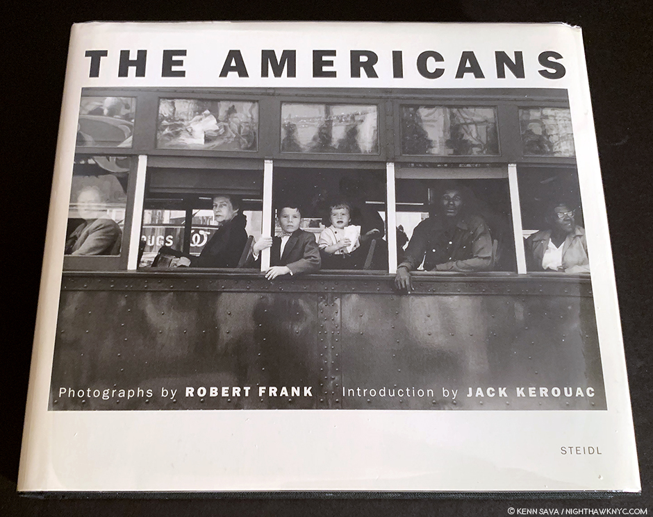
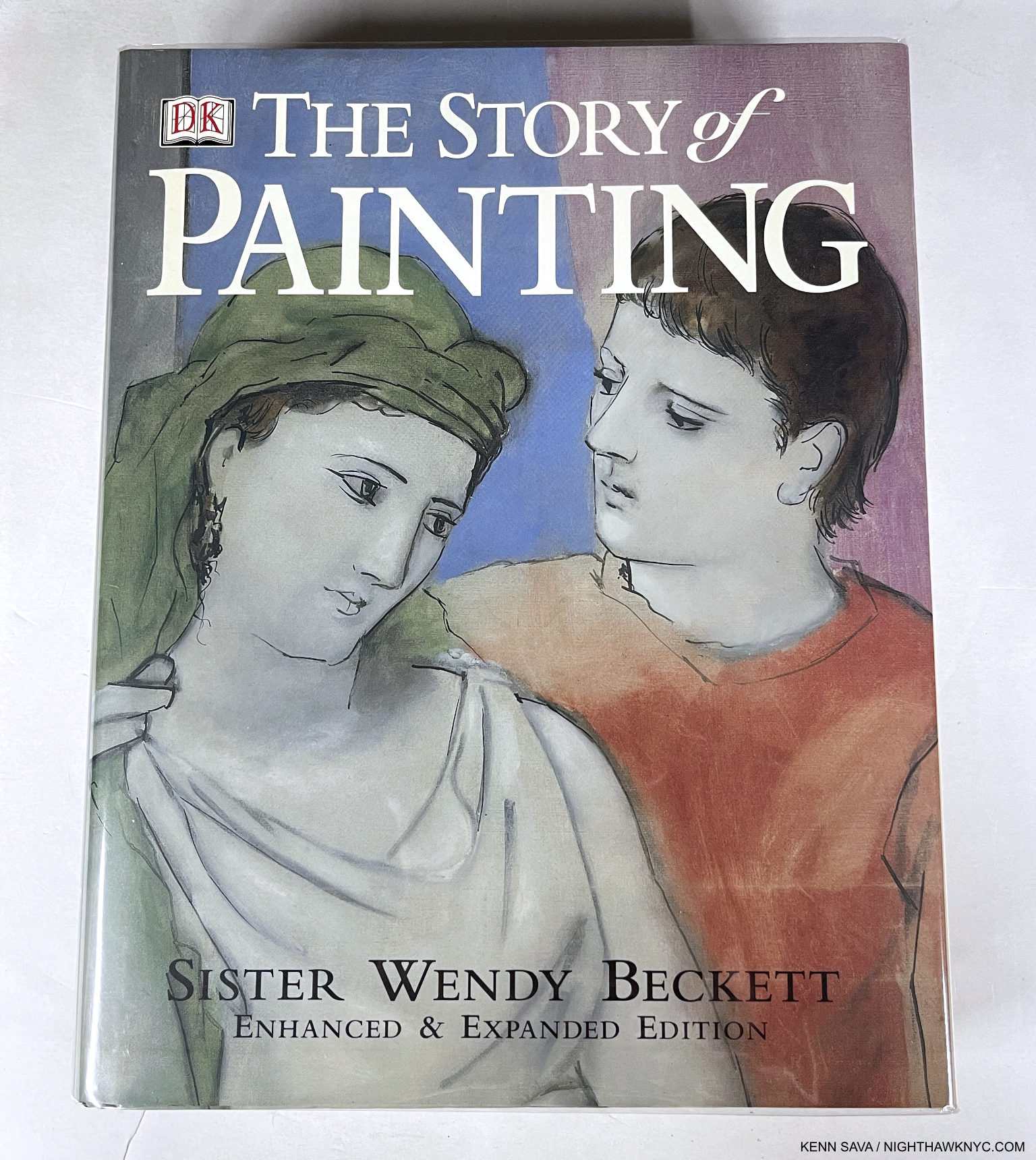
The Story of Painting, Sister Wendy Beckett, DK Publishing.
The first book I simply must mention is one that had a bit to do with inspiring me to start NighthawkNYC.com, which is about to begin its ninth year: Sister Wendy’s The Story of Painting. A phenomenal accomplishment, covering the history of Painting right up to very recent times, her observations are based in what she sees in the work itself! In so doing, Sister Wendy showed the world how to look at Art without the noise surrounding it from those who would tell you what you “should” see so you can see Art for yourself. I first read Sister Wendy Beckett back in her days as a contributor to the excellent Modern Painters Magazine, before her BBC & PBS TV Series make her world-famous. Still, at the moment, if you look for it (it’s out of print), The Story of Painting can be had reasonably. I prefer the hardcover, mine shown above, because I wore out my softcover copy years ago. Yes, some of the blown up details are out of focus, making me wonder about the editors, but’s that’s no reason for the slightest hesitation- most of the 450 images over 800 pages are fine. This is a book that should always be in print, so it’s past time for a new edition! There is an exceptionally well done TV Series of the same name that is available on DVD, and her other, lesser-known TV Series, like Sister Wendy’s American Collection, in which she visits 6 U.S. museums are also amazing. Seeing her in the same halls of The Met that I frequent always gives me chills. All her shows are essential and should be rerun as often as any show is. Luckily, there is a Complete Collection of her TV Series in a DVD box set. I missed her when she retired to live in seclusion in her trailer, as I wrote here, and more so since her passing, which I mourned here, but what she left us lives on in me, which I try and share here, and countless others. I hope it continues to inspire countless millions indefinitely.
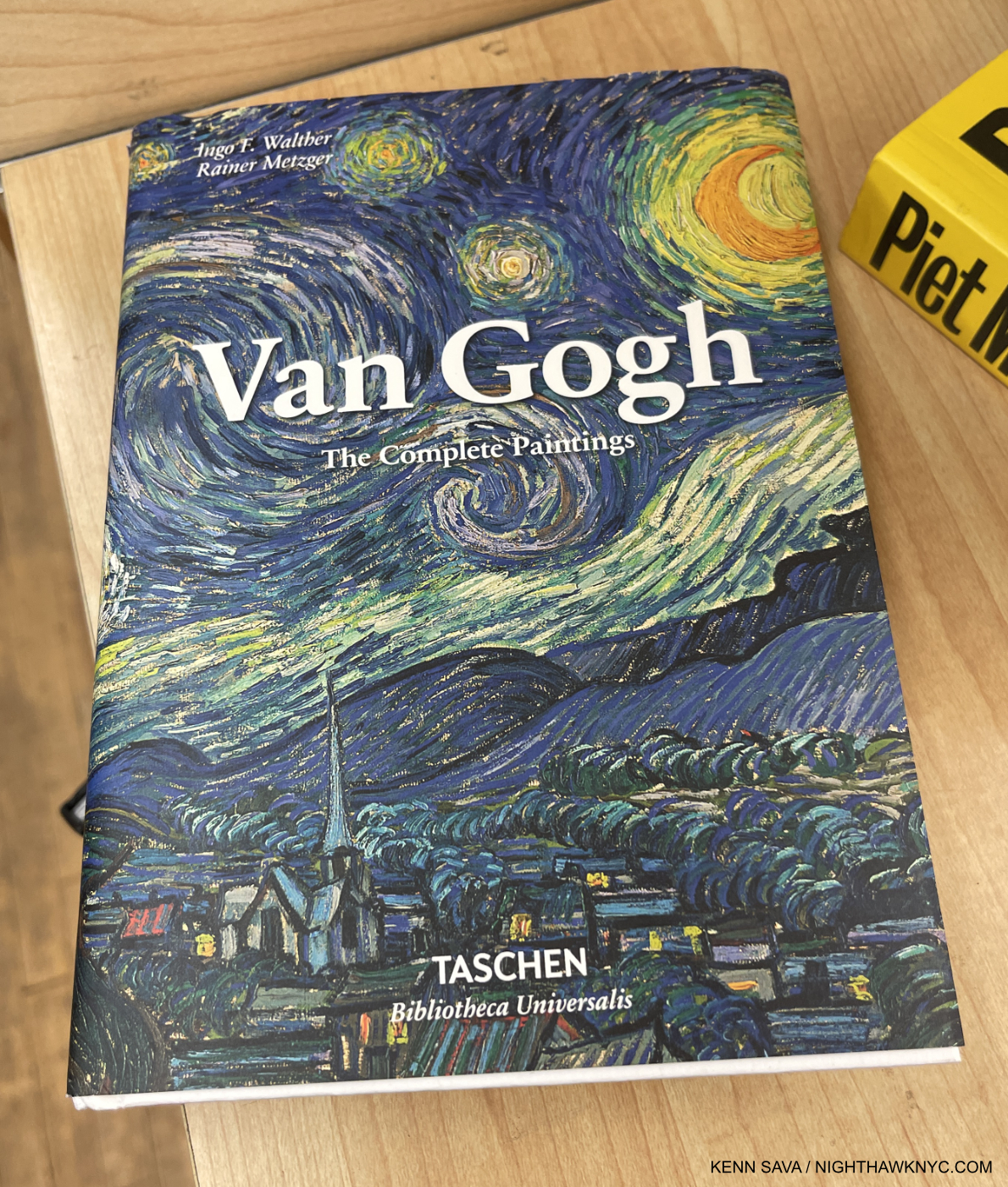
Van Gogh: The Complete Paintings, Taschen
If I were to take only one Art monograph, you might be looking at it. I’ve looked at it more than any other Art book besides The Story of Painting. Vincent became an Artist late in life, at about 28, and his career barely lasted 9 years. Yet, the intensity of his dedication to his craft saw him create about 2,100 works, including about 860 Paintings! The evolution of his style is continual after his earliest, “dark” period. Meanwhile, his life was full of tumult, disappointment, and unimaginable pain & suffering. Currently the “Brick” edition, which measures about 6 by 8 inches, $25. list, and/or XL edition, $60. list, are in print. Virtually the exact same book in 2 different sizes. Large or small, either is an incredible value. I’ve got both and each sees steady use. Choose small, shown above, if you want a ready reference, perfect for your bedside or backpack. Choose XL if you want to see the Art in a larger size. My look at the reinstalled Van Gogh Paintings at The Met, pondering what Vincent would think, is here. I’ve begun a piece on Van Gogh’s Cypresses, currently at The Met.
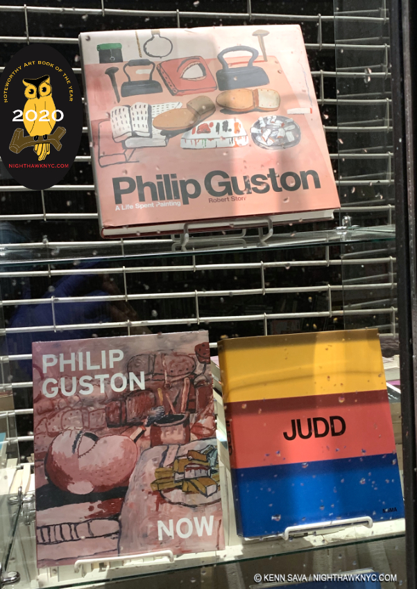
With its NoteWorthy Art Book of 2020 designation.
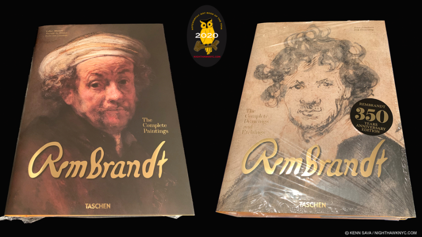
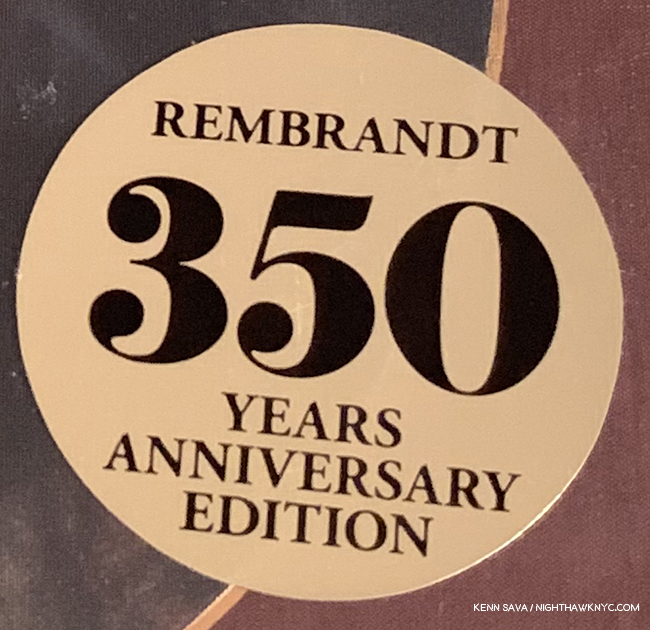
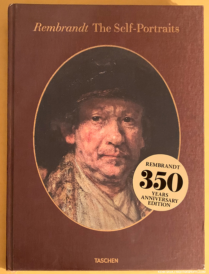
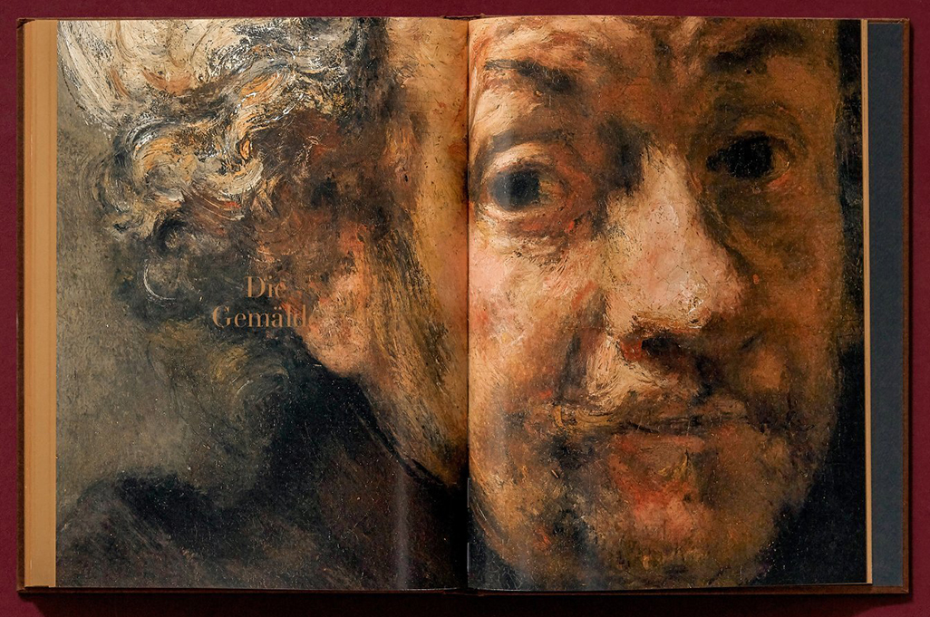
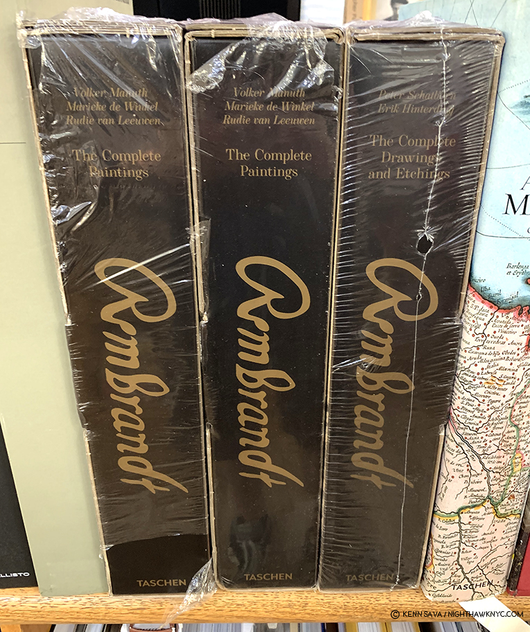
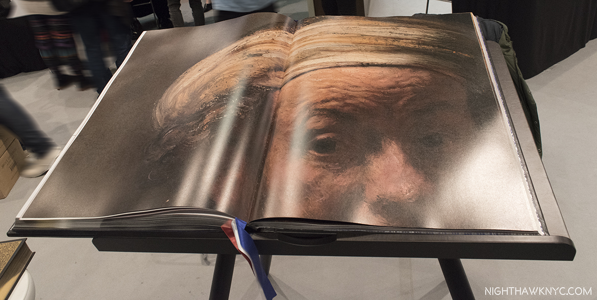
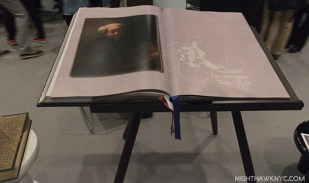
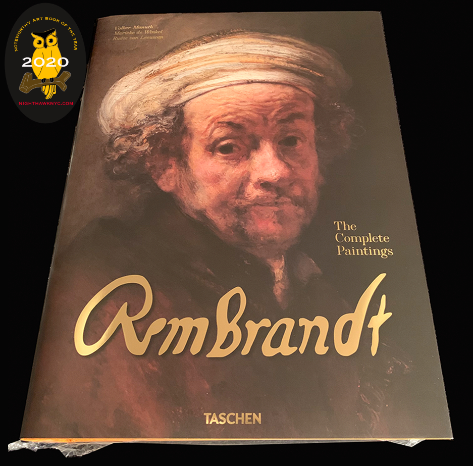
Rembrandt: The Complete Paintings, Taschen XXL
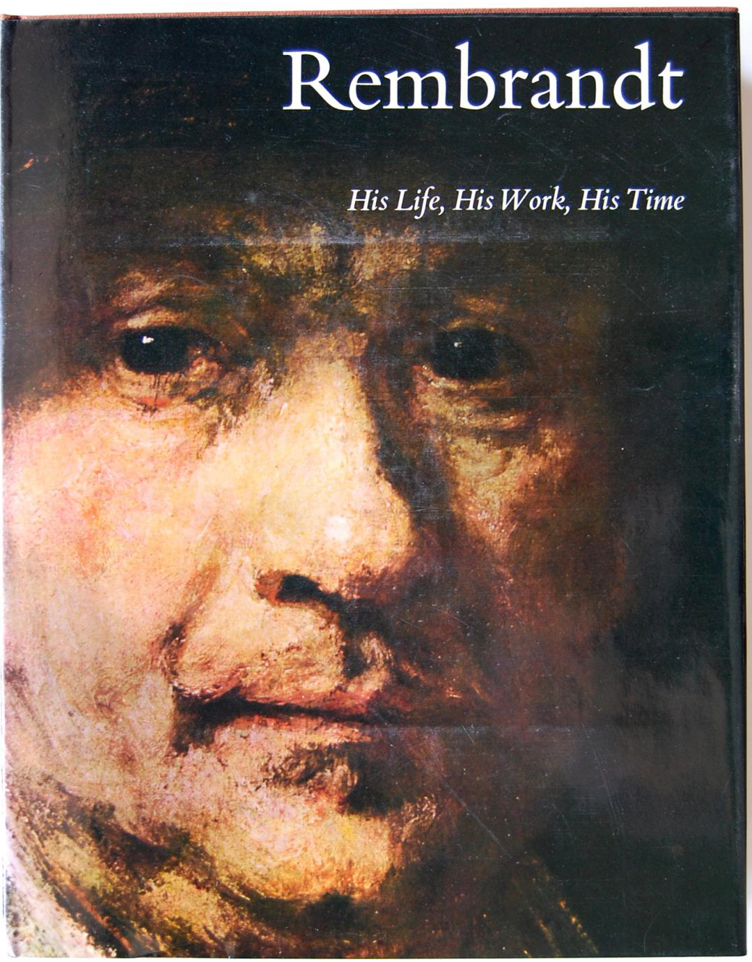
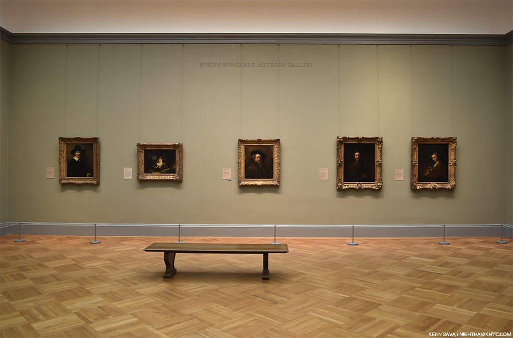
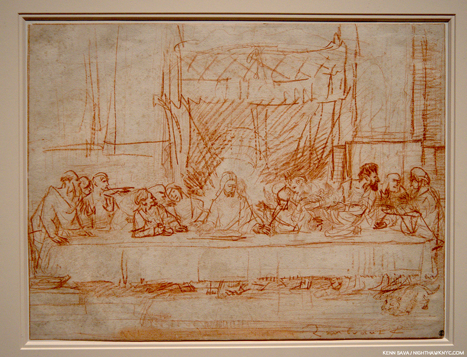
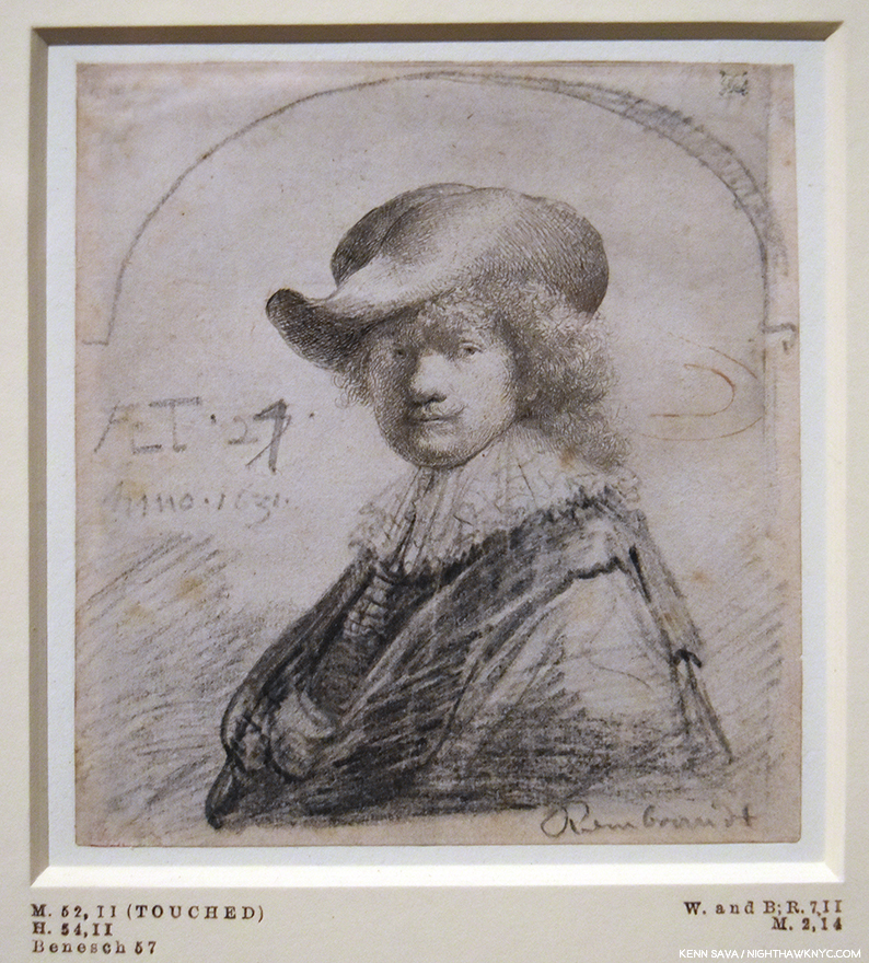
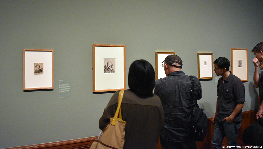
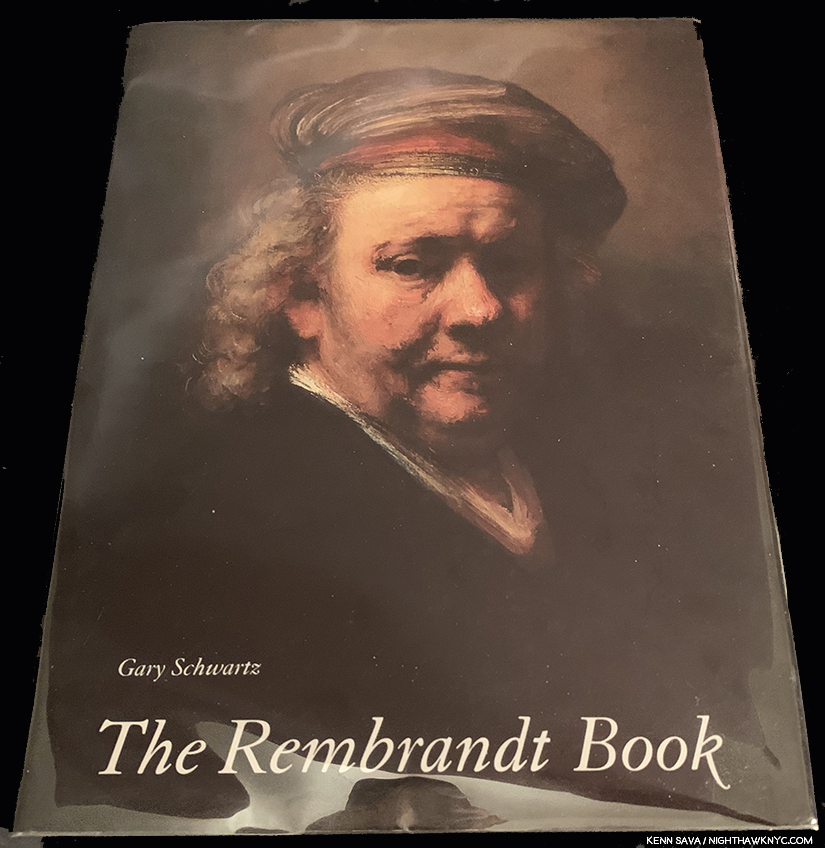
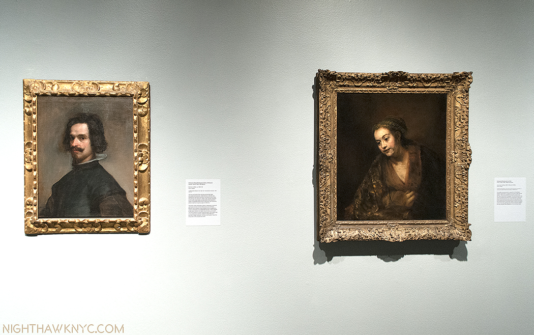
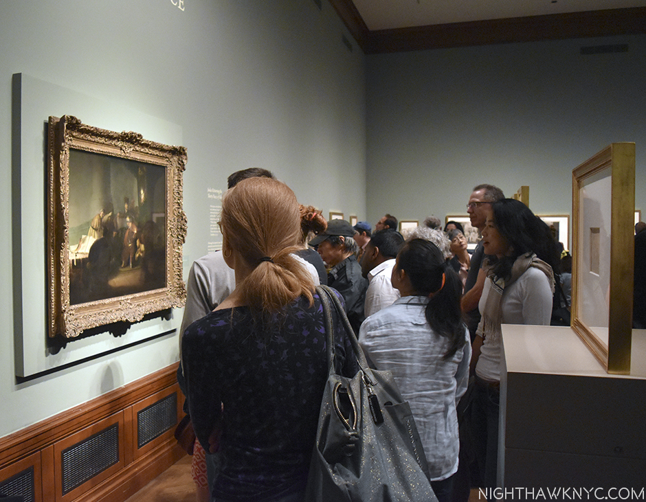
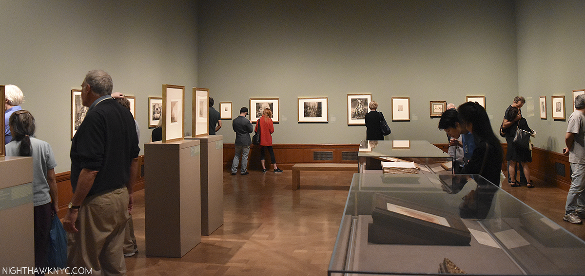
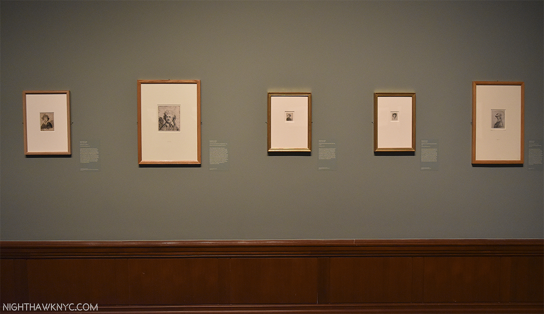
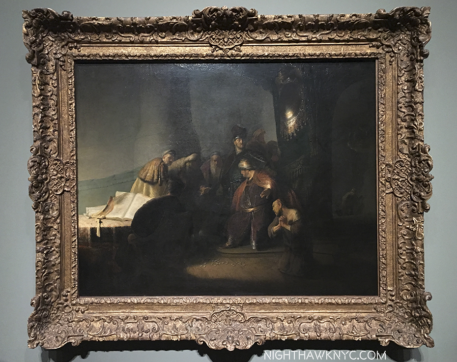
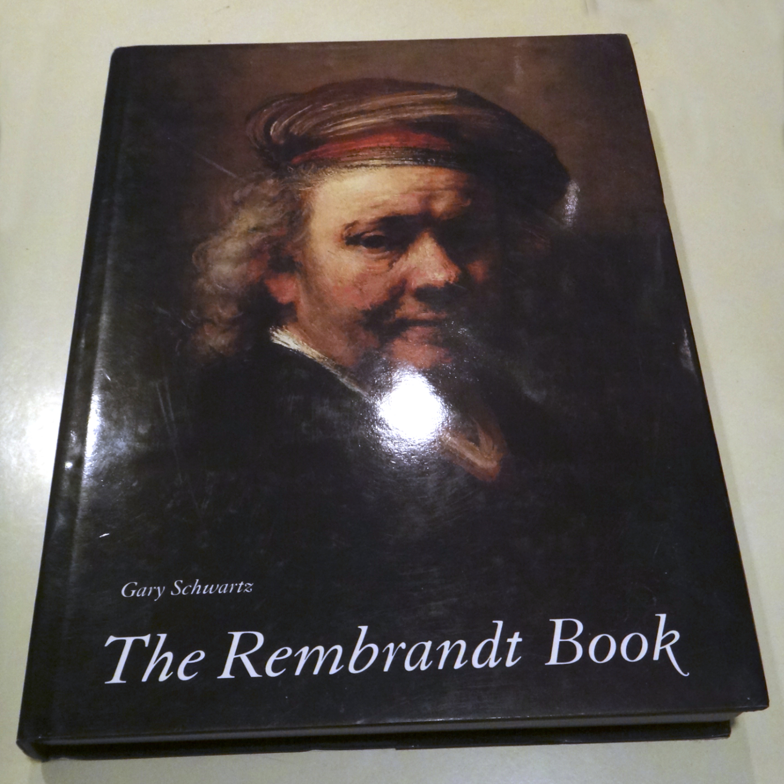
The canon of the Master’s Oils seems to be changing daily, even 354 years after his death! It has already changed since this was published in 2019. Still, unless you hit the Mega Millions, or are able to fly around the world and see all the Rembrandts on view in the world’s museums, this is as close as you’ll ever get to seeing them all. Even if you were able to do that, you’d only see some of them because museums rotate/lend their collections and those in private hands are probably inaccessible to you. Still, even if you were somehow able to see all of them, you’ll never see them this close. Nuff said. My hope is they update it in a few more years. In selecting this, I must mention my other go-to Rembrandt book- The Rembrandt Book by the legendary Dutch Art specialist, NYC-born, Gary Schwartz. Aptly titled. Essential. My look at Rembrandt’s First Masterpiece at the Morgan Library in 2016 is here.
My sealed XXL before being “touched.” In this case, “XXL” equals 19 pounds!
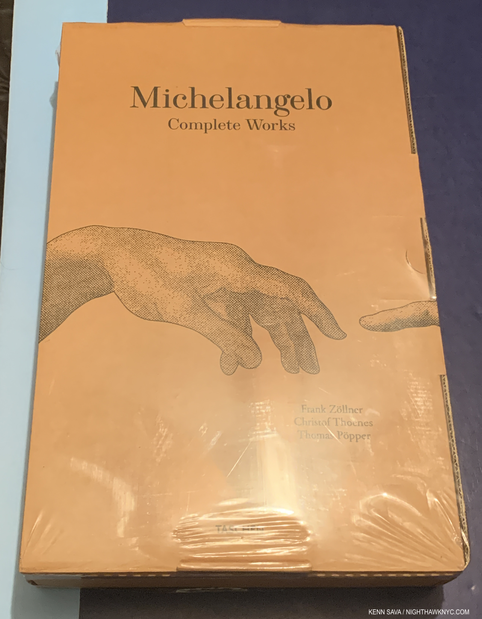
Michelangelo: Complete Works, Taschen XXL
Michelangelo’s canon doesn’t change nearly as often as Rembrandt’s does, but it does look different when his Art is cleaned or restored (like the Sistine, which looks incredible now, as seen in here, though I hope no damage was done to it in the cleaning). But as I mentioned for the Rembrandt XXL, you’ll never seen all of it, and never this close. Trust me- The Vatican is NOT letting you up on a scaffold in the Sistine! The XXL is out of print and goes for $500. and up in VG or better condition. The $60. XL is almost as good and is still in print as are the two Bricks that include this material- Michelangelo: The Complete Paintings, Sculpture and Architecture and Michelangelo: The Graphic Work for his Drawings, My look at the monumental Michelangelo Divine Draftsman and Designer, at The Met in 2018 is here. One of the top 3 or 4 Art shows I’ve ever seen, it brilliantly revealed for all-time that Michelangelo, the Draftsman and Designer, may be the most overlooked aspect of his super-human genius, and just possibly his most under-rated talent. The Met’s catalog accompanying Divine Draftsman and Designer is one of the very best books on Michelangelo there is- and I’ve owned a lot of them.
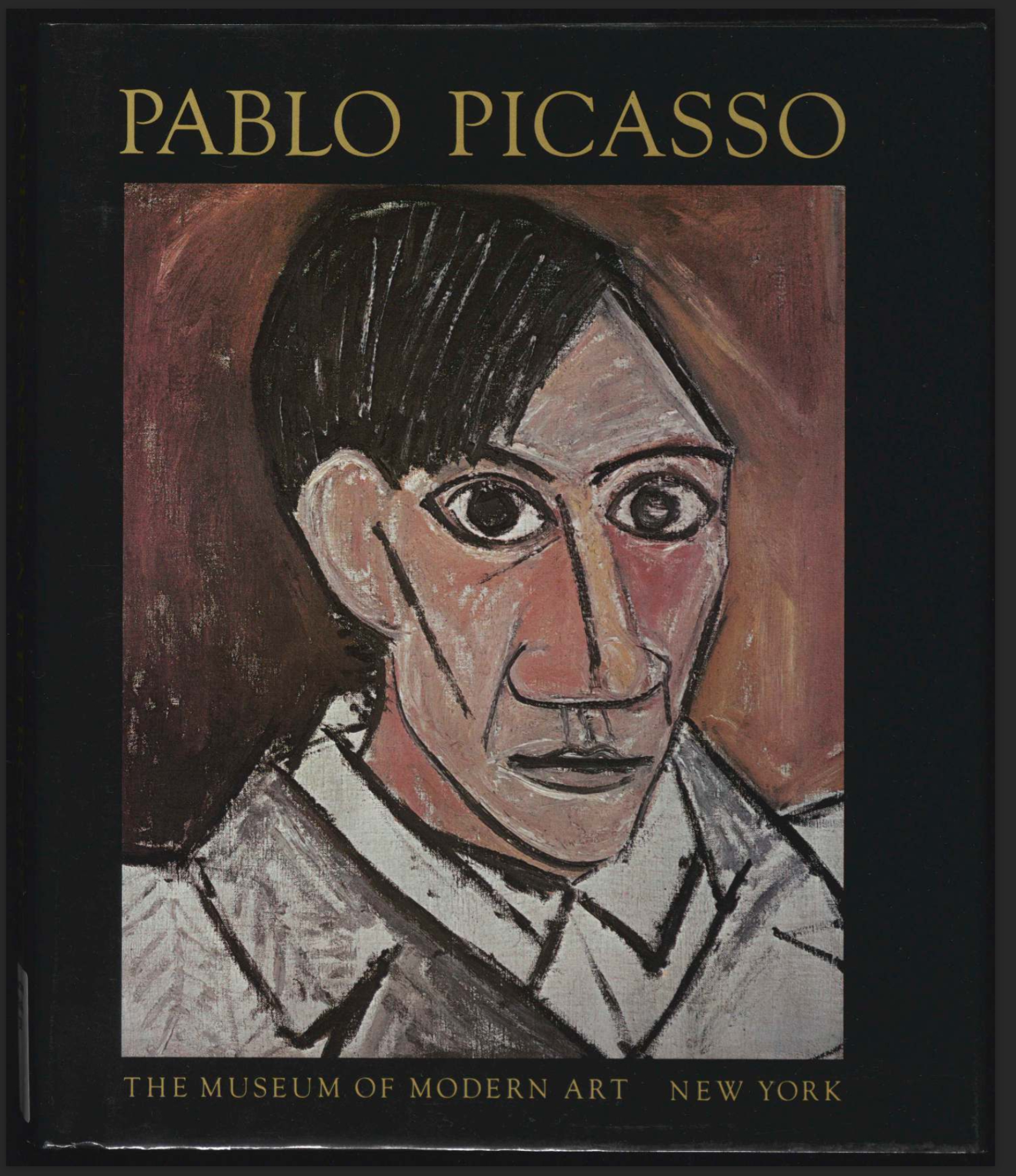
Pablo Picasso: A Retrospective, Museum of Modern Art
HOW could I do a list like this and NOT include a Picasso book? In 1980, I made two trips back to NYC while I was on the road with a band, just to see MoMA’s Picasso Retrospective. The hype leading up to it called in a “once in a lifetime, must-see show.” The reality was just WOW! It marked the beginning of my Art show-going life. If my Art-going career had ended then and there I really couldn’t complain; it’s never been topped by anything I’ve seen since. The show, which filled ALL of the “old” MoMA, was just overwhelming…mind-boggling. Almost ONE THOUSAND Paintings, Sculptures, Drawings, Collages, Prints, Ceramics, etc., etc. MoMA lent 230 works to other institutions to make room for it. I’ll never forget seeing his earliest works, which the show began with, including Science and Charity, which he Painted at 15(!), and and already being staggered by his talent TWO GALLERIES in, with the entirety of MoMA (THREE FULL FLOORS!) still ahead of me! The catalog published to accompany the show is a classic as well. It’s still to be had quite reasonably in hardcover, like mine above, which I bought at the show, or softcover (check it for yellowing first. It’s 43 years old and my copy makes no mention of acid-free paper). It’s endlessly staggering to page through it and realize that ONE PERSON created ALL of this! If you said of it, “THIS was the ultimate testament of man’s creative accomplishment in the 20th century,” I, for one, couldn’t argue with you.
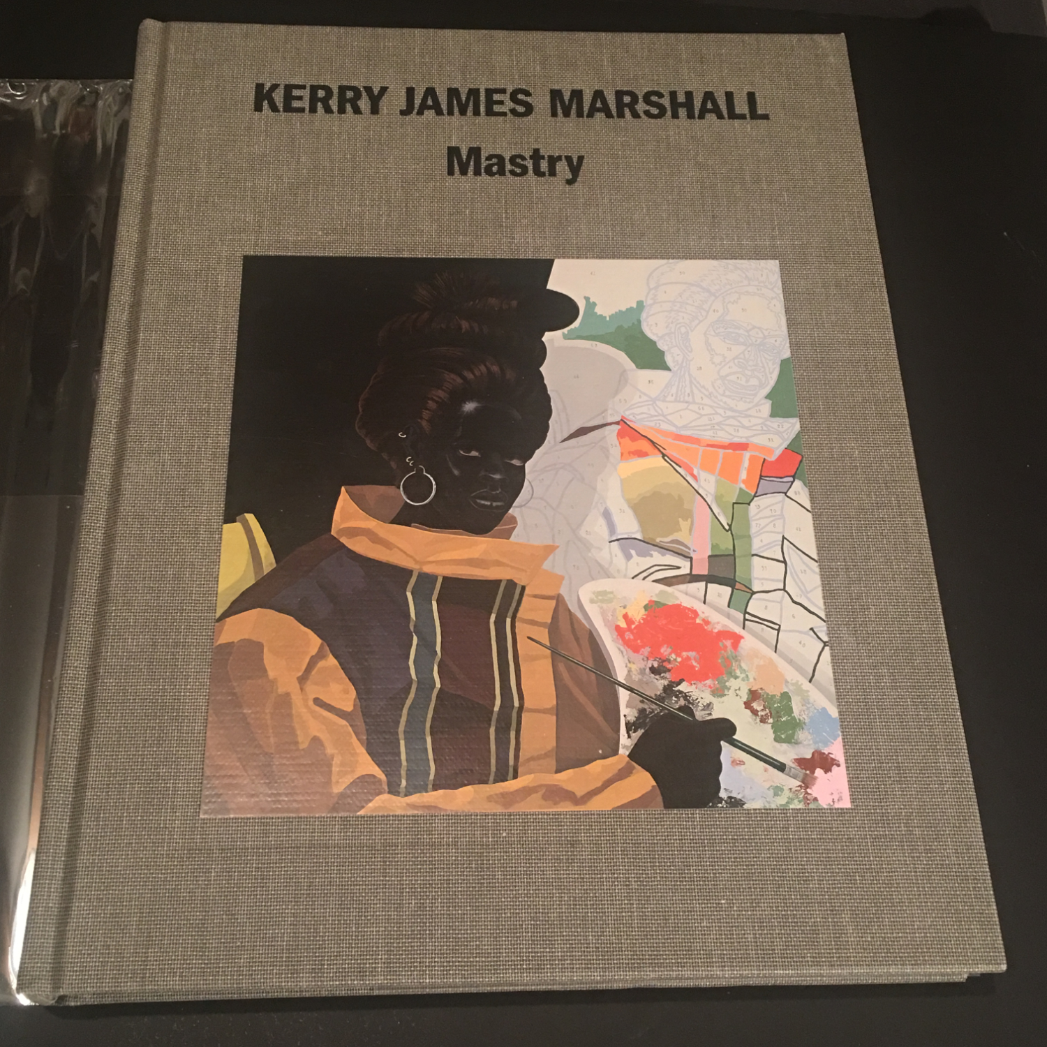
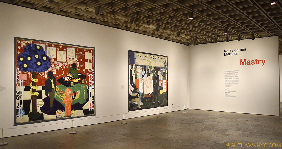
Kerry James Marshall: Mastry, Skira Rizzoli
THE Painting show of the 2010s among all those I saw lives on in the terrific catalog that accompanied it. It’s still one of the two best books on Mr. Marshall, one of the most important Painters working today, along with the Phaidon Contemporary Kerry James Marshall book. You need both, but in a pinch I’ll take Mastry. I wrote about the show here.
I bought my copy used so it was pretty much like this. Out of print for a long time, it’s very hard to find now in VG condition for less than $200.
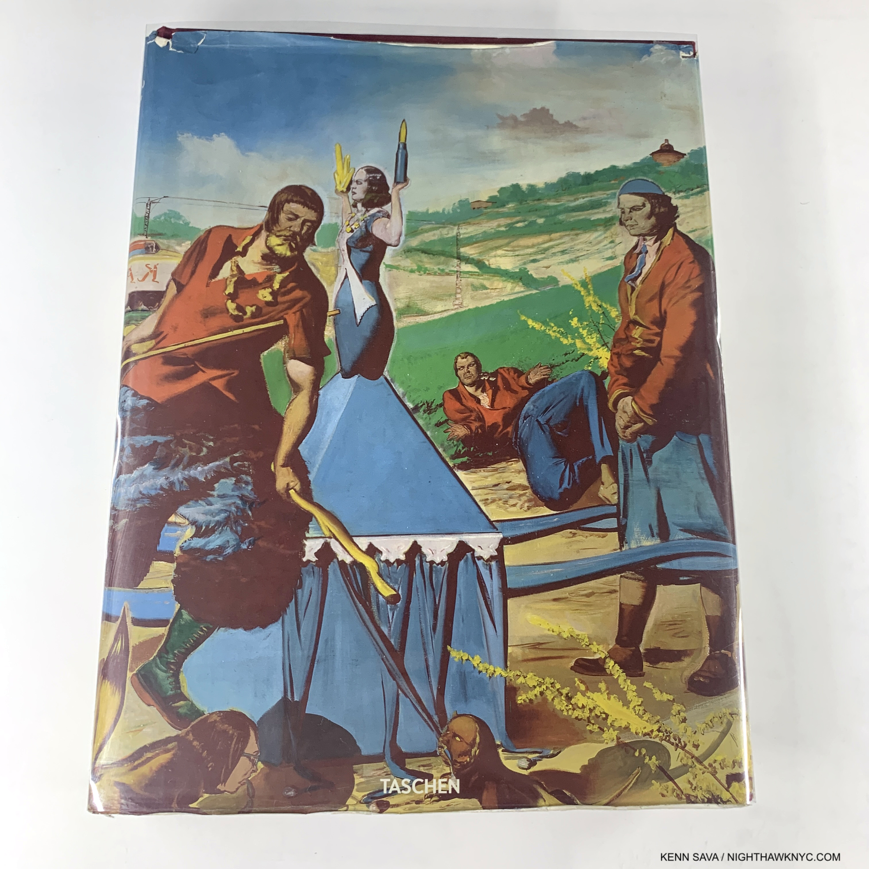
Neo Rauch, Taschen XXL
Perhaps the world’s most enigmatic living Painter, Neo Rauch’s work continues to both baffle me and hypnotize me in equal measures. Leave it to Taschen to create the most stunning book on his work published so far, even though his bibliography is ever-expanding and the track is fast. 12-years-old at this point it sorely needs to be updated with the work he’s done since added though the essay remain excellent. Long out of print and commanding big bucks, I’d advise holding off on it now and hope Taschen gives us a new edition with all of his work for the past decade+ added. In fact, I spoke with Neo Rauch this spring about just that and he told me another Painting book is coming out next year. It didn’t sound like it would be an Updated Taschen Neo Rauch.
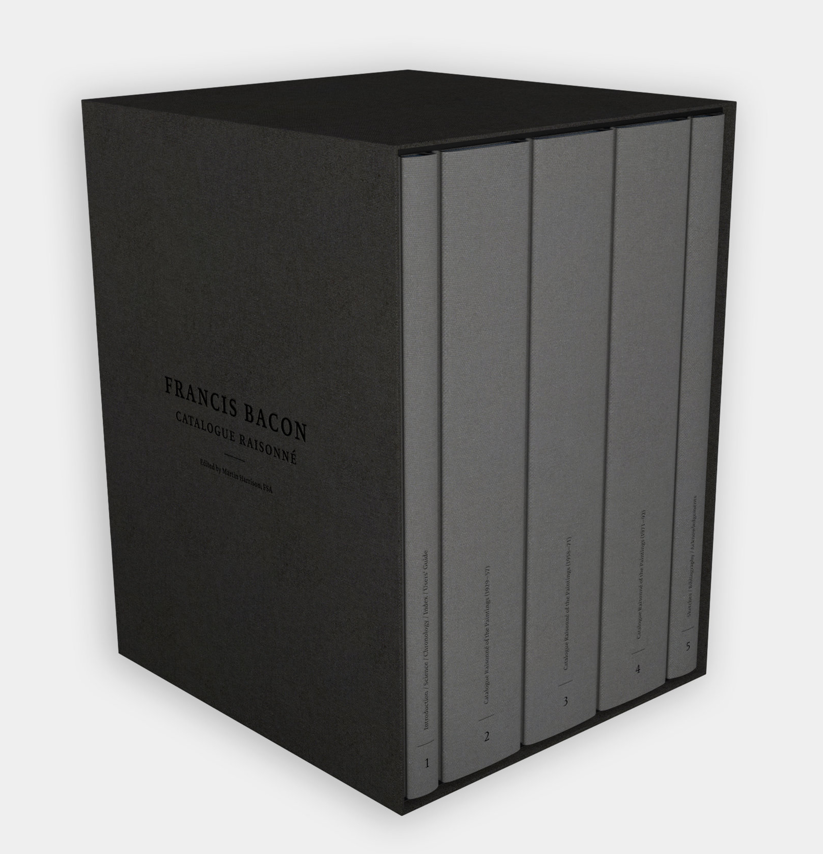
*- Estate of Francis Bacon Photo
Francis Bacon: Catalogue Raisonne, Martin Harrison, The Estate of Francis Bacon
It seems like the Francis Bacon bibliography gets bigger every few months, but this will ALWAYS be THE place to begin, and end, when it comes to seeing his work. Especially ALL of it! His 584 Paintings are beautifully shown in 800 illustrations over 1,500+ pages in five volumes. Text by the world’s foremost living Francis Bacon authority, Martin Harrison (who also contributed to Saul Leiter’s Early Color, one of THE essential PhotoBooks of the 21st century). Here’s the thing- the Estate has said that once it’s sold out, “it will never be reprinted.” Gulp.
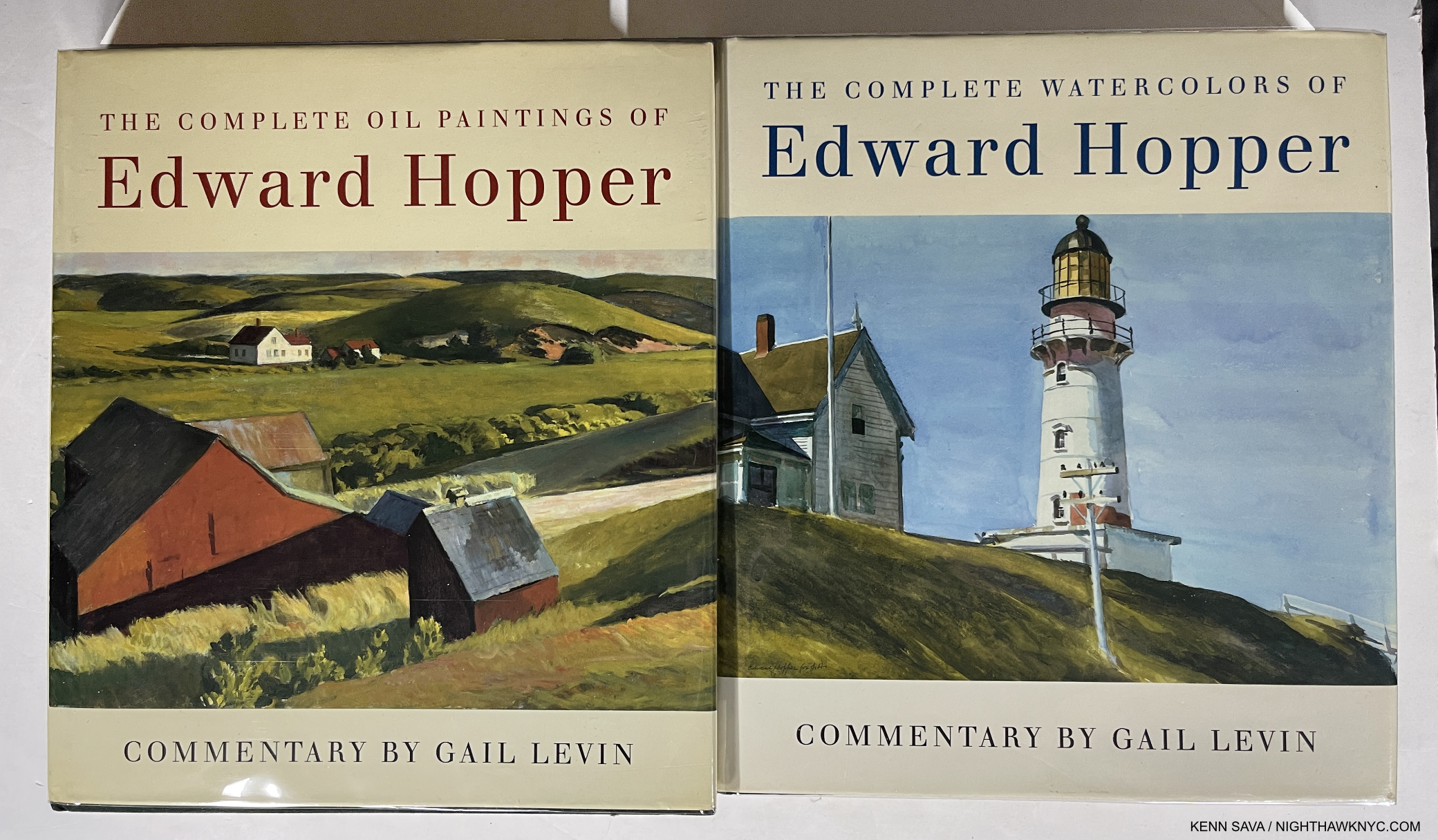
The Complete Oil Paintings of Edward Hopper & The Complete Watercolors of Edward Hopper, both Norton
The 4-volume Edward Hopper Catalogue Raisonne by Gail Levin and published by the Whitney in 1995 is more well-known, but it sold out and copies currently BEGIN at $1,000. per. Lesser-known is that the Whitney then sold the two volumes of The Complete Paintings & The Complete Watercolors from the set as stand-alone volumes. At this point, they’re actually probably harder to find. Recently a reader asked me for a Hopper recommendation. It’s really strange that there isn’t a comprehensive book on Hopper’s Art over his whole career currently in print. (The Whitney’s catalog for Edward Hopper’s New York is good, but it’s focused on his NYC work.), as I recommended in Part 2 of my recent look at Edward Hopper’s New York, seek out Gail Levin’s Edward Hopper: The Art & The Artist, the catalog for the last Edward Hopper Retrospective at the “old” Whitney Museum in 1981. Just beware the book is 42 years old now. Look at it before you buy a copy and make sure the pages haven’t yellowed, which this book is very prone to, since that drastically affects the color of the Art.
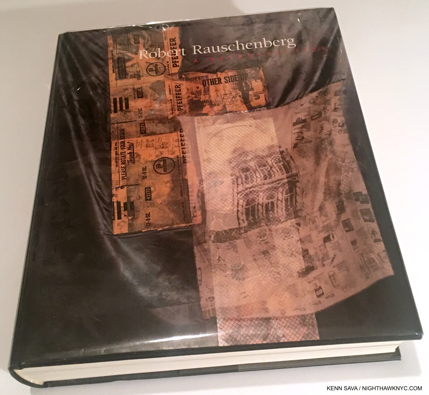
Robert Rauschenberg: A Retrospective, Guggenheim Museum
By far the most comprehensive look at almost all of Robert Rauschenberg’s career to 1997. A show I saw and will never forget. Mr. Rauschenberg was involved in its making (there’s a great video online of a brief interview with him as he stands on Frank Lloyd Wright’s ramp). The Artist would go on to live & work for another 11 years, and I am particularly a fan of his late work. Still, this is a glorious book, one I have gone through 3 copies of. The essential visual reference to Robert Rauschenberg’s Art. He remains one of THE most influential Artists on the Art I see in 2023. My look at what I called “The Summer of Rauschenberg” in 2017 is here.
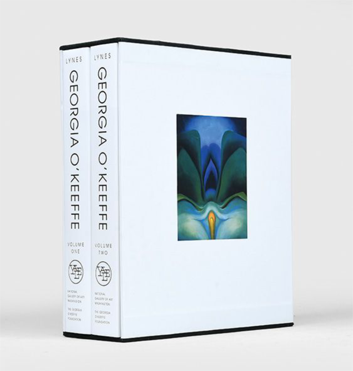
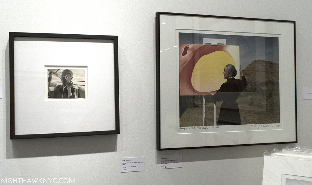
*-National Gallery of Art Photo
Georgia O’Keefe: Catalogue Raisonne, National Gallery of Art, Washington
A “name” here at home, Ms. O’Keefe is only beginning to be better known around the world. I believe her stature is only going to grow and grow from here on. This book shows why. Her work is singular, always based in nature with her one-of-a-kind vision, and just plain gorgeous. As we’re seeing right now in her terrific MoMA show, Georgia O’Keefe: To See Takes Time– her work holds up gloriously!
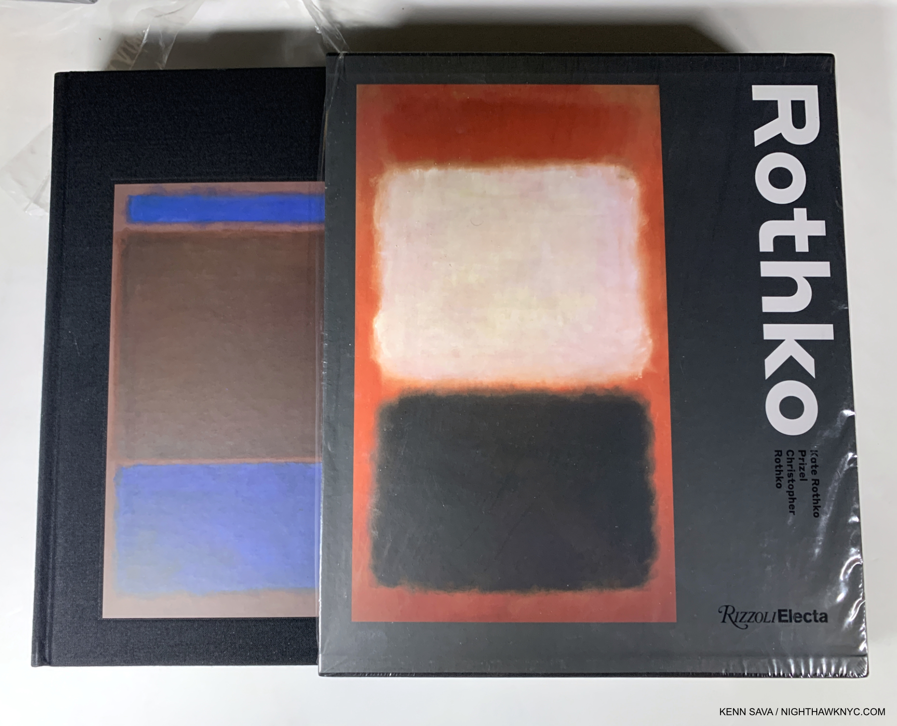
Rothko by Christopher Rothko & Kate Rothko Prizel, Rizzoli Electa
Runs, doesn’t walk, to the head of its class. Some may still prefer Yale’s Mark Rothko: The Works on Canvas, but it’s 25 years old now. Who better to write a book on their father than Mark Rothko’s son and daughter? They know whereof they speak on all things Rothko after spending their lives as closely involved with his work as anyone- not to mention actually living with the Artist. This all came home to me in spades when I met Kate and got to speak to her about a number of things Rothko-related. She thinks this is the better book, and when she told me that I didn’t get the feeling she was speaking out of bias. The handsome book in a slipcase includes an extremely wide range of work- on canvas and paper, from all periods. The 1999 Rothko Retrospective at the “old” Whitney changed my life, turning me back to being Art-centric from Music and made me a fan for life. My look at Mark Rothko: Dark Palette, 2016, is here.
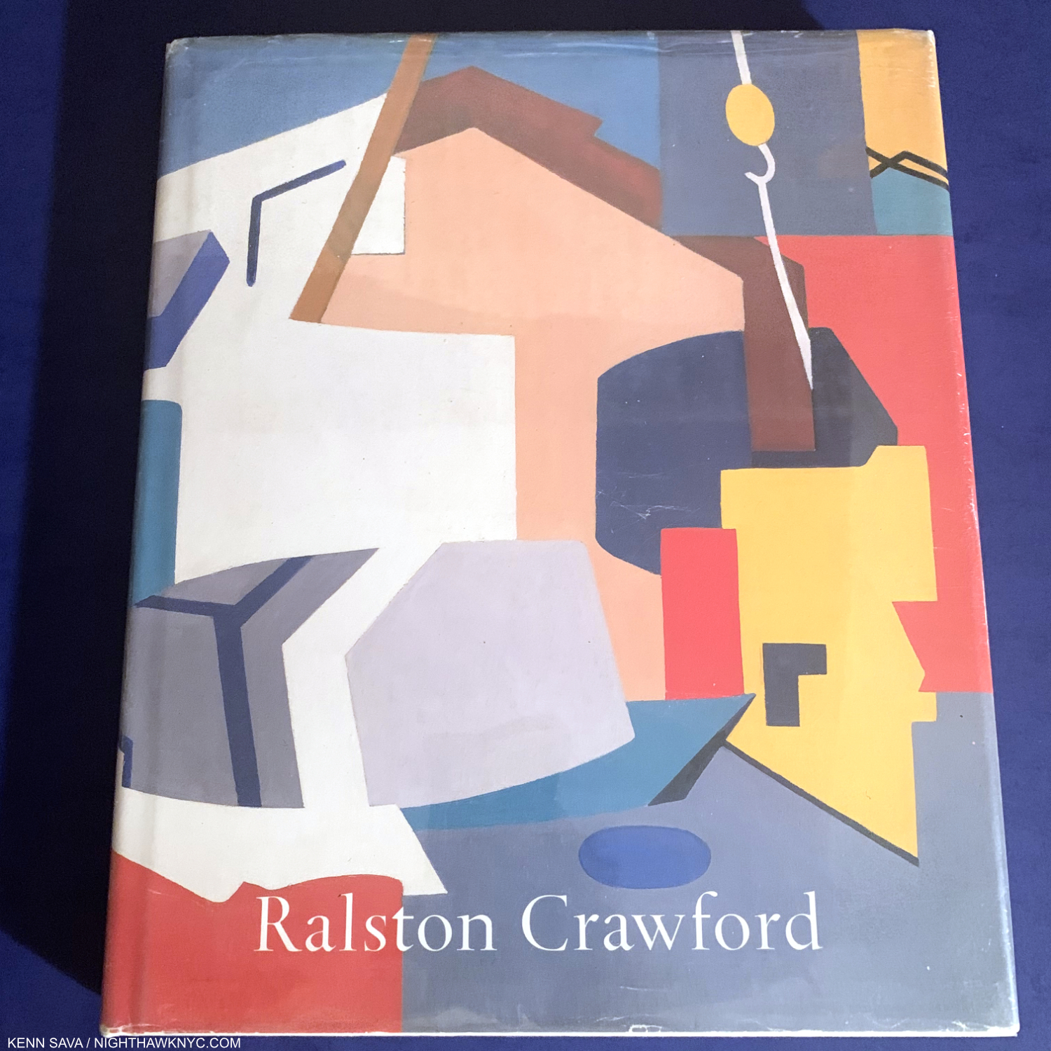
Ralston Crawford by William C. Agee, Twelvetrees Press
Ralston Crawford is one of the most overlooked Artists I can think of, and I’ve been obsessed with his work since the Whitney Retrospective more years ago than I care to think about. Though shows have been scarce, books have begun to appear over the past decade. This is still the best comprehensive overview, but I hope a REALLY worthy Ralston Crawford book will be coming. Oh, he was also a very talented Photographer, as Keith Davis’s fine book The Photographs of Ralston Crawford reveals.
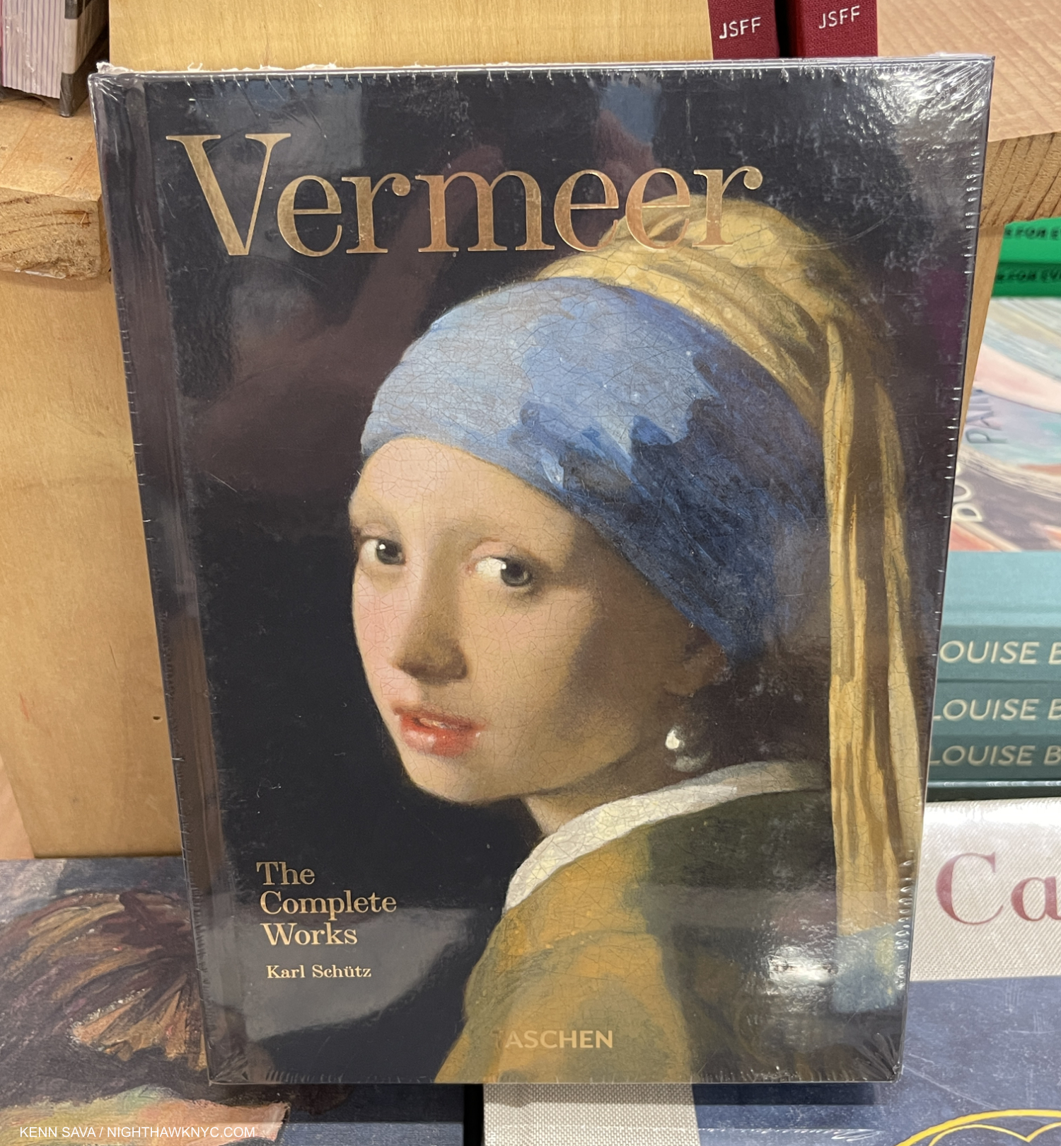
Vermeer: The Complete Works, Taschen
There are other excellent books of Vermeer’s complete Paintings, including those by Arthur Wheelock of the National Gallery, DC, and the late, lamented Walter Liedtke of The Met who was tragically killed in a train accident a while back. Both of those are excellent for their texts, the Taschen book is essential for its Photography. There hasn’t been an XXL-sized edition, but Vermeer: The Complete Works is now available in either the Brick size, pictured, or the XL size. You can’t go wrong either way- see my comment on Van Gogh: The Complete Paintings for why, though when it comes to Vermeer, you can’t get TOO close!
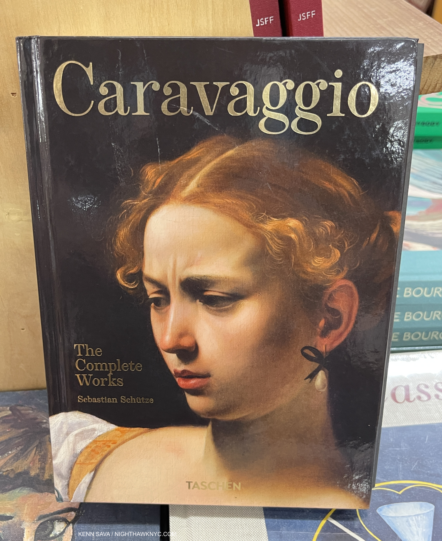
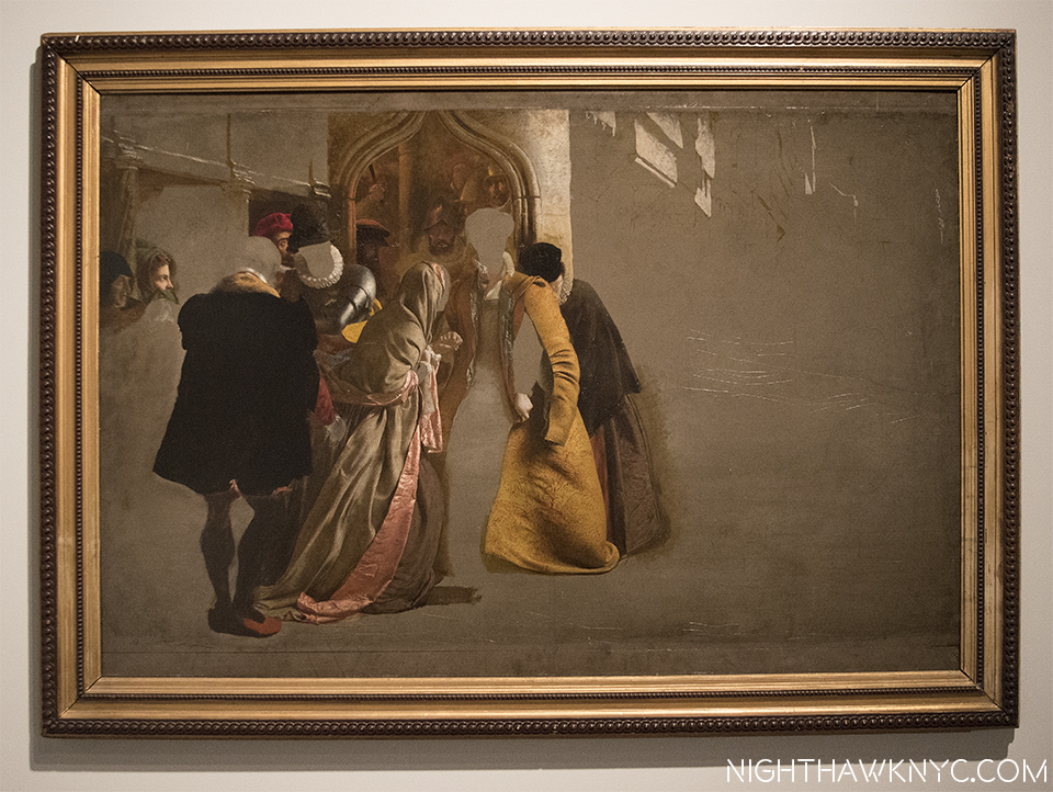
Caravaggio: The Complete Works, Taschen
The XXL is long out of print but seeing his work THAT large is an amazing experience if you can find one. The Brick and XL remain in print, and both work well. Caravaggio’s chiaroscuro has been infinitely influential, from Rembrandt on down, no less so today. And so his work remains essential for Photographers, those interested in Film, and of course Painters.
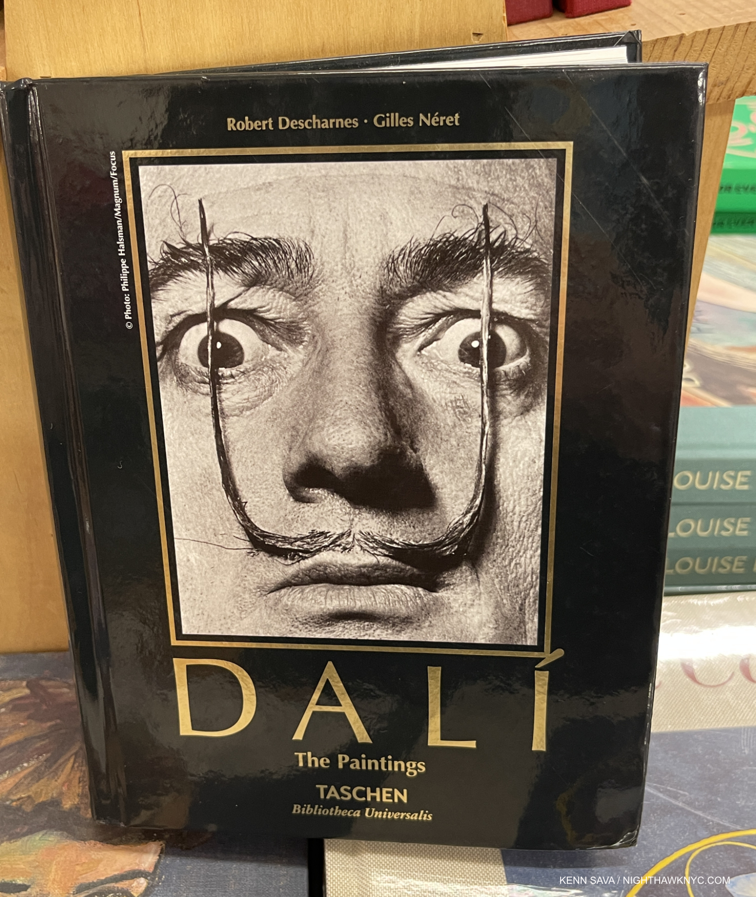
Dali: The Paintings, Taschen
Dali seems to be in a bit of eclipse these days, but anyone who saw the huge Dali Centennial Retrospective at the Philadelphia Museum in 2004-5 knows this is temporary. This remarkable book contains all his Paintings from a very long and very productive career that was marked by almost as many styles as his contemporary Picasso. Originally published as a Volume 1 & 2, now in one volume, available in the Brick or XL size. If you don’t think Salvador Dalí belongs on this list, look through a copy of this book and then tell me he doesn’t.
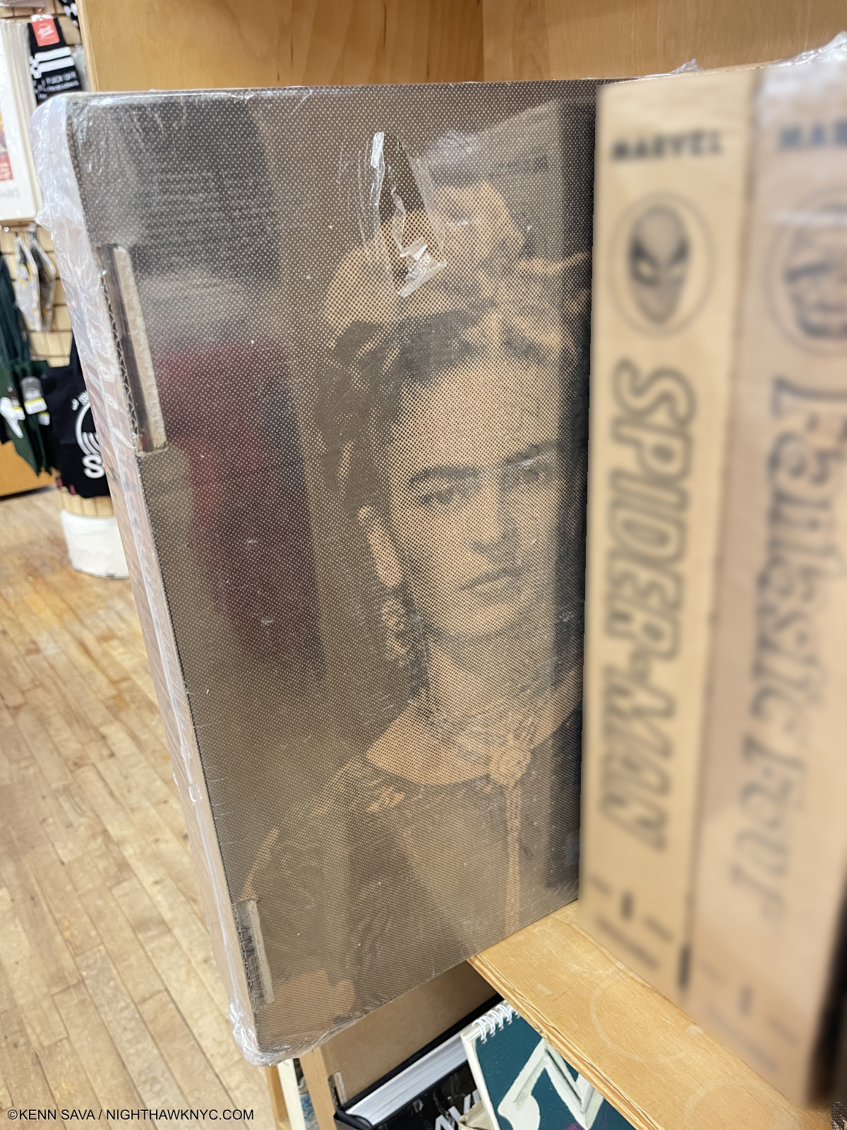
Getting harder to find- Frida Kahlo: The Complete Paintings, sealed, in its shipping box.
–Frida Kahlo: The Complete Paintings, Taschen
Unless you’re besties with Madonna, this is likely to remain THE very best place to see the astounding, indelible work of the Mexican genius. What else is there to say? Oh! My money is that Taschen will re-release it in smaller sizes, but if you want to see her work in FULL effect, the XXL, the only edition of it thus far, which seems to be disappearing, is likely to remain THE BEST place to do that. I wouldn’t wait long.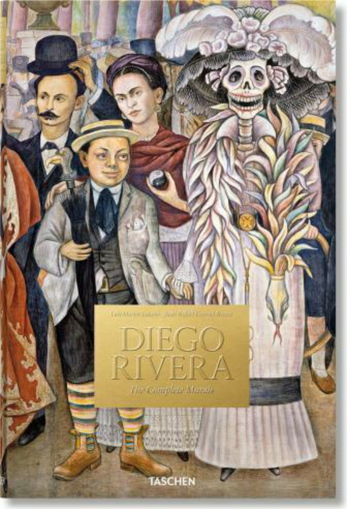
Diego Rivera: The Complete Murals, Taschen
Completing the only husband/wife team on this list, this is a terrifically important concept beautifully realized. It’s hard to feel now what a revolution Diego Rivera and the other Mexican Muralists created when they began making Murals in Mexico. They later created them elsewhere and along the way influenced many of the great Artists of 20th and now 21st century Art, including Jackson Pollock. Available in the XL size, I would have my doubts about how good it would be as a Brick. But in the XL you can study all the marvelous detail on each Mural in a generous size.
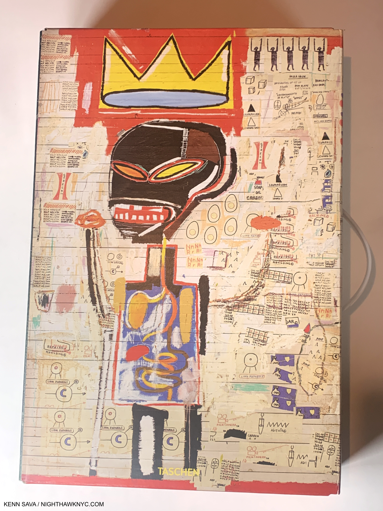
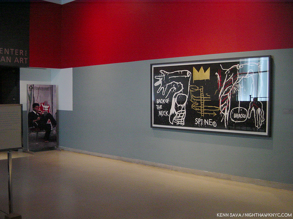
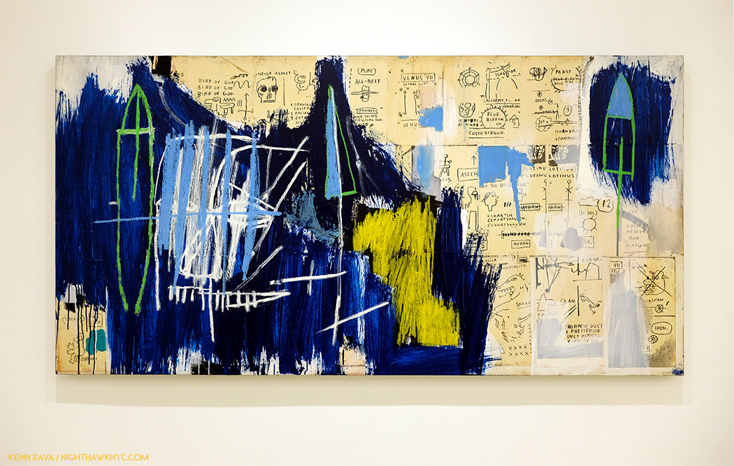
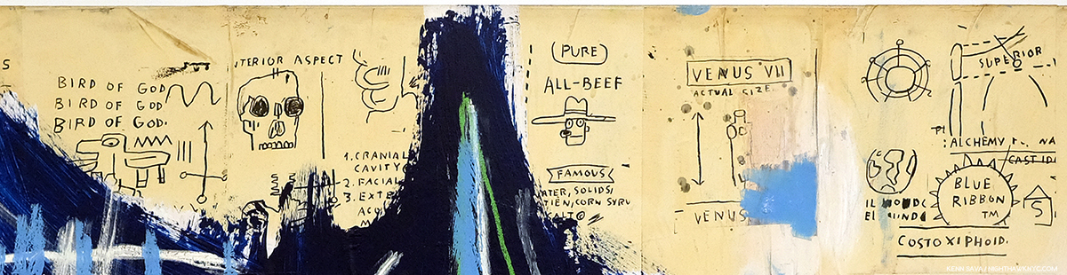
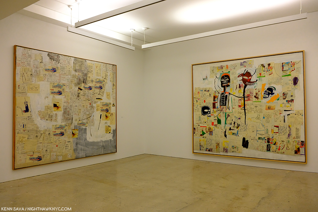
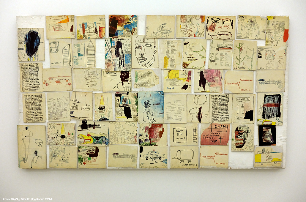
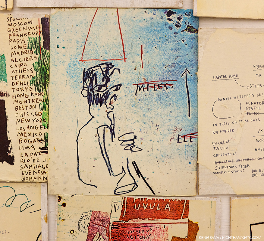
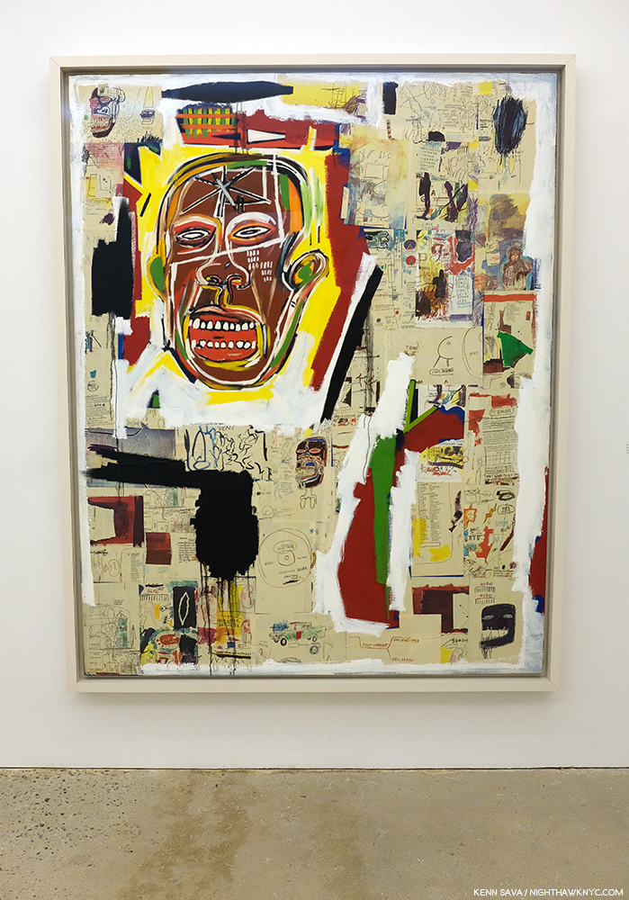
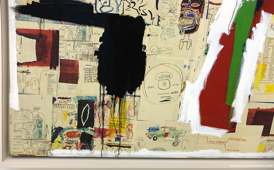
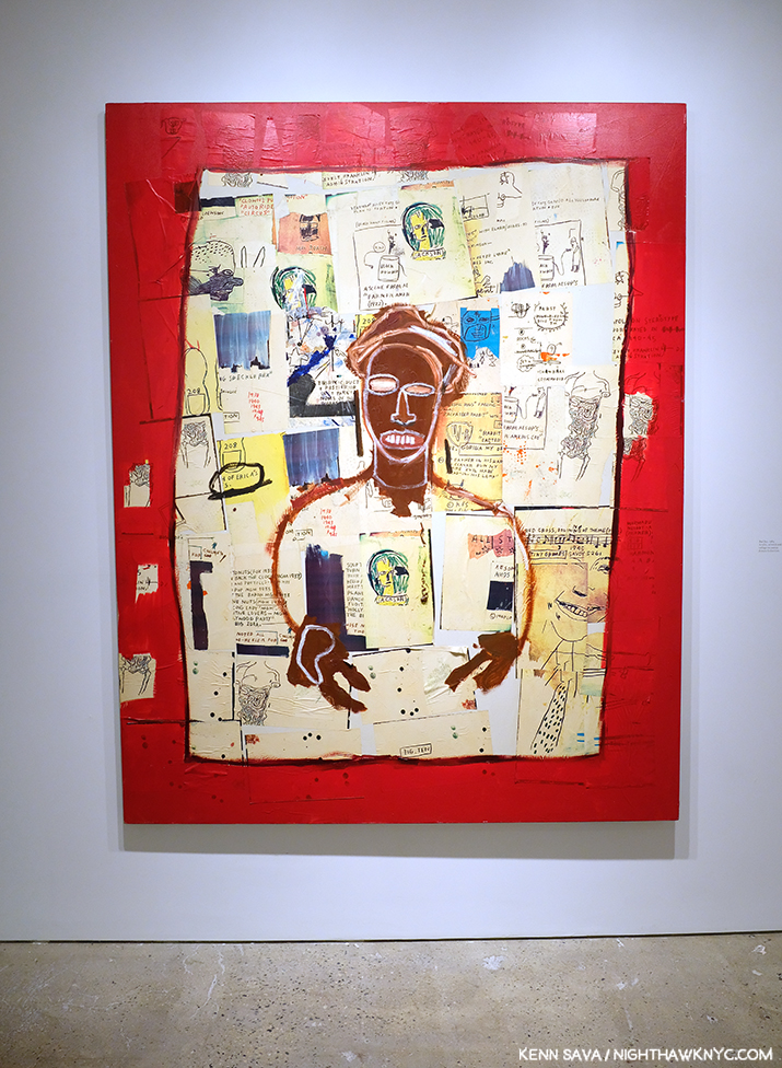
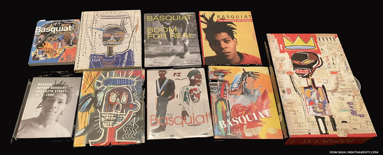
Basquiat XXL seen here in its original, printed, shipping box, which has been replaced with an all brown box in recent printings.
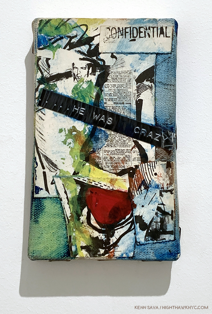
Basquiat, Taschen XXL
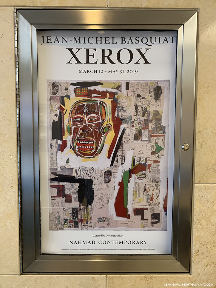
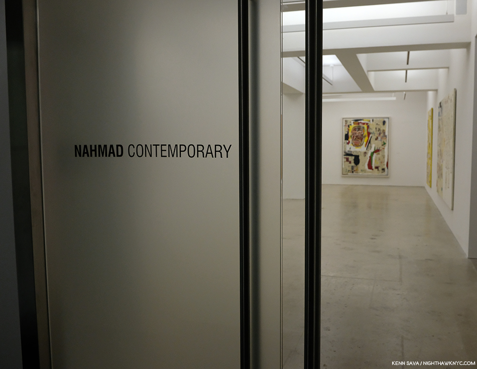
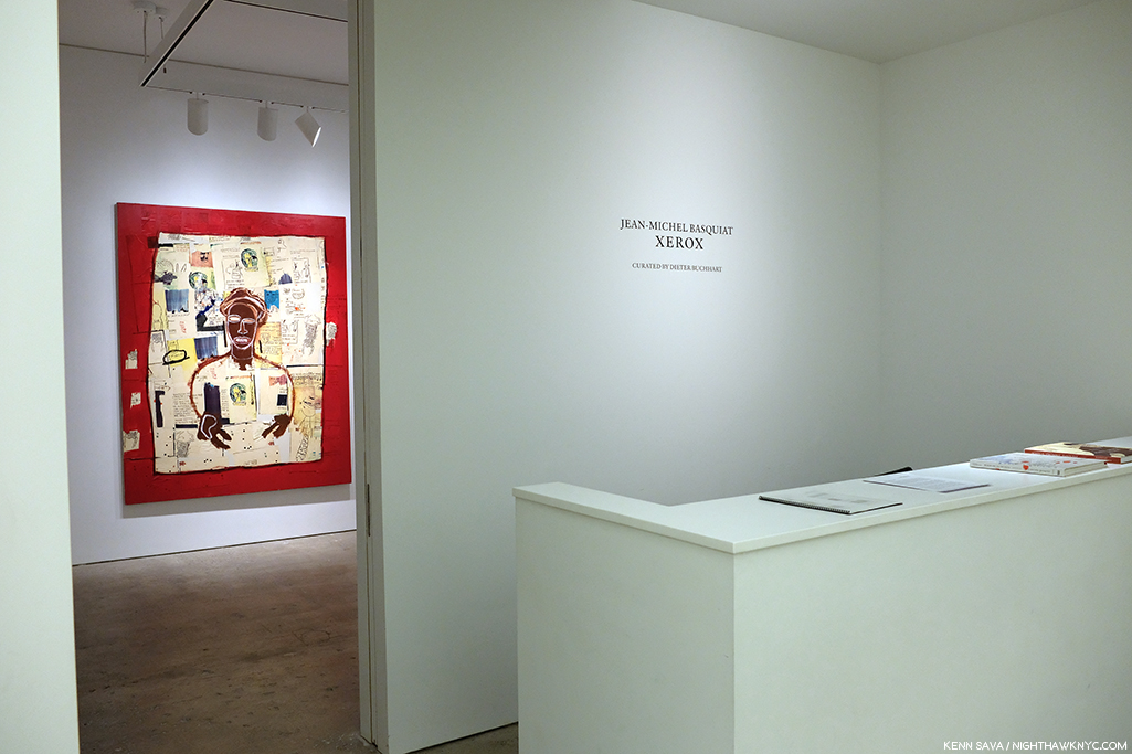
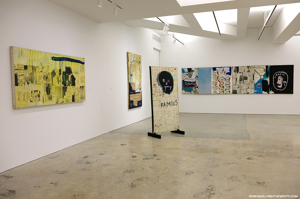
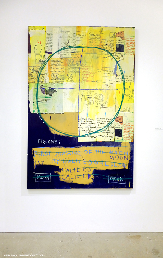
The XXL is likely to forever be THE best place to see the most Basquiat Art as close to life size. There is a Brick edition, part of Taschen’s 40th Anniversary series, which is slightly edited, but that’s the tradeoff for the deep savings ($30 for the Brick vs $200 for the XXL). Neither can be beat among ANY Basquiat book currently in print, in my opinion, and I’ve owned or seen most of the books published on his work to date while I was doing research for the numerous pieces I’ve written on the Basquiat shows in NYC in 2019 and 2022, which can be seen here.
UPDATE, July 15, 2023- In response to my list, a reader wrote, “Basquiat? Could you tell me why he’s on your list?” Sure. Jean-Michel Basquiat is the most compositionally diverse and compositionally inventive Artist I can think of- besides Robert Rauschenberg. As I pointed out in my piece, his compositions alway surprise me, and virtually no two are alike. That’s remarkable. Jean-Michel was ahead of his time in addressing many issues that are now foregrounded in Art, and in the world, today. This is the best book to experience all of that.
Yes, my choices are books that contain Art. As an Art writer, I want to see the Art- as much as I can by any particular Artist I’m interested in. I’m also interested in his or her biography and the circumstances surrounding the creation of the Art. I don’t read Art criticism for 2 reasons. 1) I’m planning on writing my own take on the work, and 2) with all due respect, I don’t want to be influenced by what anyone else says about it. I need to see the Art for myself and I encourage (and have always encouraged) everyone to see Art for themselves. That being said, among Art books that are primarily text (well, the Sister Wendy is both), three stand out for me-
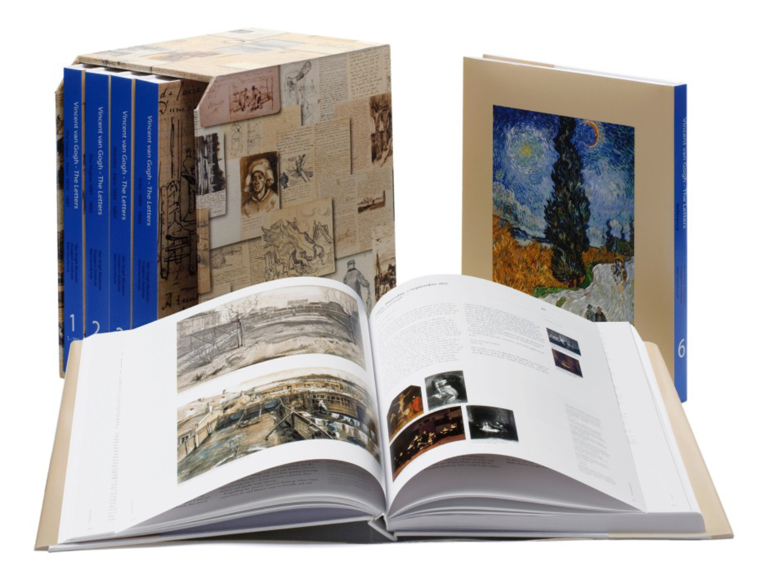
*-Van Gogh Museum/Thames & Hudson Photo
Vincent van Gogh: The Letters: The Complete Illustrated and Annotated Edition (6 volumes), Thames & Hudson
A long time ago I was gifted the 3-volume set of Van Gogh’s Letters edited by Johanna (“Jo”) van Gogh-Bonger who, also wrote a Preface/Rememberance of Vincent. I still have them. This will forever be a very special set. If you love Van Gogh’s Art and don’t know the name Jo van Gogh-Bonger, get thee to a nunnery! Mrs. Van Gogh-Bonger was Theo’s bride, then quickly his widow when he died 6 months after Vincent in 1891. She inherited Vincent’s estate (i.e. virtually all his Art and Letters) after his tragic suicide or murder (in spite of everything, I remain unconvinced he wasn’t ((accidentally?)) murdered. See below..). She is THE person responsible for making Vincent van Gogh the world-wide phenomenon he is today. She believed his Letters were the key to understanding his Art. She was proved right. She edited a collection of them, which has stood until this expanded edition. Her passion for Vincent’s Art led to the creation of the Van Gogh Museum, after her son donated their collection to the Dutch state who agreed to build the building. The VG Museum undertook an updated edition of Vincent’s immortal Letters in 2009, an unparalleled body of writing in Art history, and authorized the publication of Vincent van Gogh: The Letters: The Complete Illustrated and Annotated Edition in six volumes. WORD!- It’s ALL available for free online, with updates, which the books don’t get! (I just saved you the thousands of dollars the set goes for on Amazon right now! PLEASE donate so I can keep turning you on to things like that. Thanks.)
An older edition with black & white illustrations inside. Get the current edition. It has color illustrations.
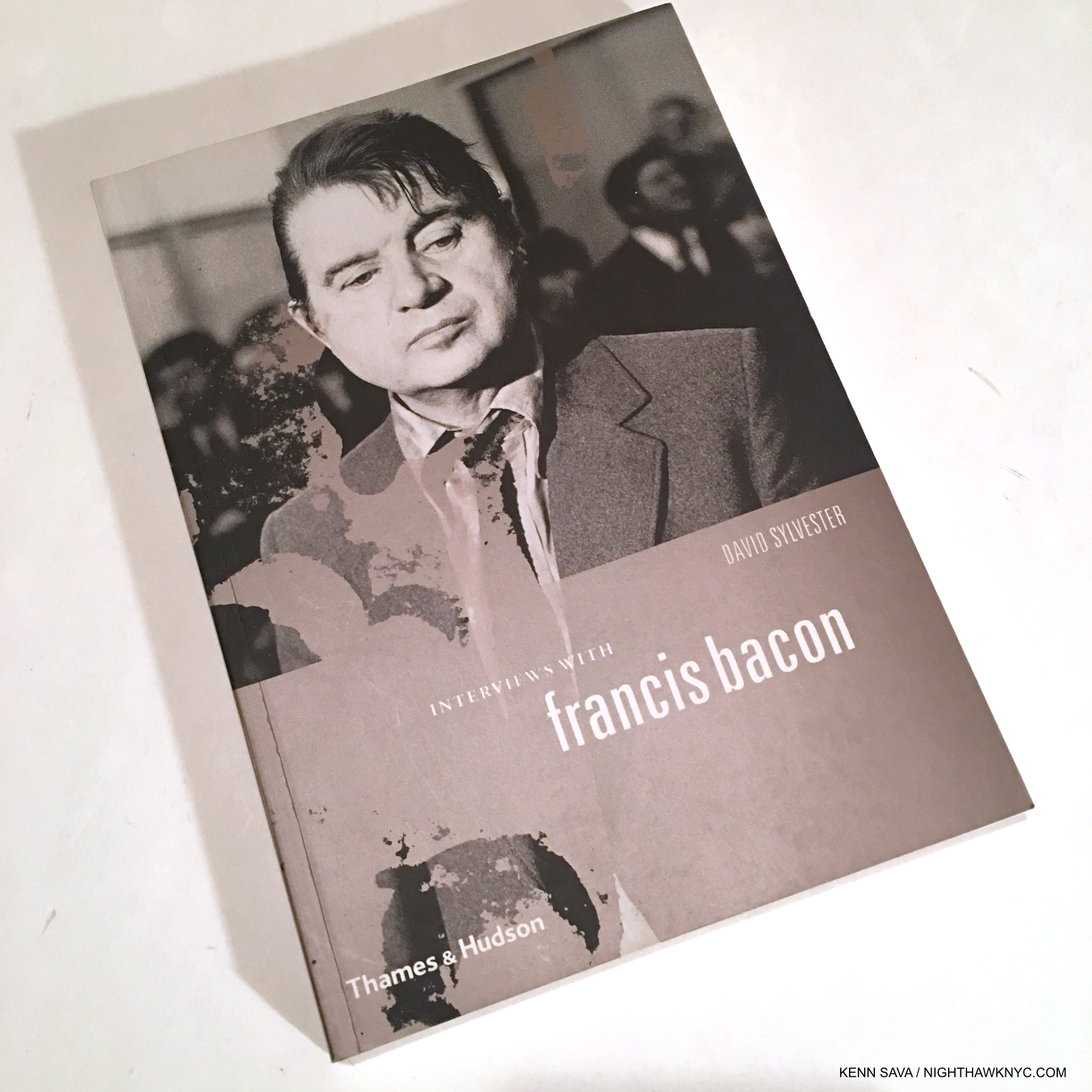
Conversations with Francis Bacon by David Sylvester, Thames & Hudson
I’ve never read better interviews with an Artist. Period. Mr. Sylvester is Cecily Brown’s dad. I’ve met Cecily, but didn’t get to ask her if she met Francis…
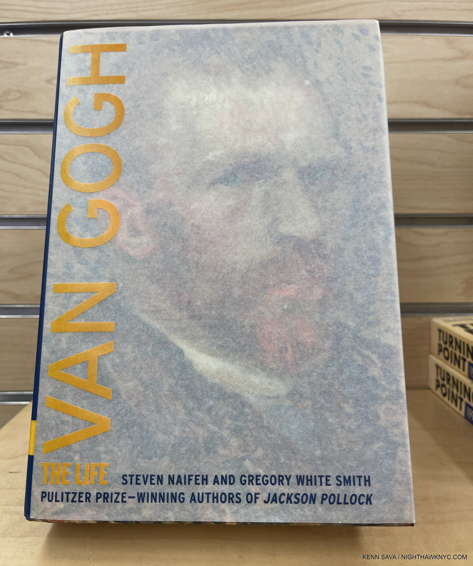
Van Gogh: The Life by Steven Naifeh and Gregory White Smith, Random House
There are a lot of great Artist’s biographies out there, and some terrific Autobiographies, too. However, I just can’t put Van Gogh: The Life down. Like so many others, I grew up believing the fiction written by Irving Stone (Lust for Life, which became the equally fictionalized Film, though it was shot in some actual places, and his Dear Theo.). It’s way past time the record on Vincent’s life was set straight! After I discovered his Letters I began to get the picture. Here the gaps are completely filled in. The decade of research, with the help/permission of the Van Gogh Museum, shows on every page. There’s also a website especially for the book’s footnotes(!), and, unlike many/most Art biographies written by non-Artists, the Art commentary is spot on. Not an easy thing to do with someone like Van Gogh. BRAVO! I recommend looking for the hardcover, which is out of print. The cover of the paperback is a little thin for an almost 1,000 page book, and this book is almost guaranteed to be the definitive Van Gogh biography for, at least, the foreseeable future. It includes an appendix in which the authors lay out their theory that Vincent DID NOT COMMIT SUICIDE- he was accidentally murdered!!! They followed this up with an equally insightful supporting article in Vanity Fair. I find their case compelling.
The big takeaway of all this will no doubt be that I’m a big fan of Taschen. When it comes to Art books, I’ve said as much before. TEN books listed here are published by the German firm. Their Photography books, however, are VERY hit or miss, and could use a few more “hits.” I’ve said a few times that the Taschen small “Brick” sized books (with the newest releases bearing the “40th Anniversary Edition” moniker) are THE best value in Art books today. You could build a terrific Art library out of just Bricks, to coin a phrase. Taschen books consistently feature the most color illustrations of the Art in the highest quality Photographs and publication using excellent paper and always have a rock solid binding. From the Bricks to the XL to the XXL editions (of almost the exact same book, but, be aware, though Taschen doesn’t mention this: my side-by-side comparisons reveal the Bricks may be edited down subtly from the XXL in places- that’s the trade off for saving 85% of the price!), you pick your price point, and the size you want, and you’re good to go on so many of the Artists they include. In fact, only Phaidon can compare with them in terms of the roster of Artists they have published in-depth monographs on. Phaidon stands alone when it comes to their superb Contemporary Artists monograph series. Taschen’s roster is mostly older Artists, though more Contemporary Artists are being included.
*-Soundtrack for this Piece is “Desert Island Disk” by Radiohead from A Moon Shaped Pool, 2016, the title of which is a play on the BBC Radio show Desert Island Discs.
This piece is dedicated to The Strand Bookstore, where I’ve discovered more great Art (& Photography) Books than anywhere else the past 45 years. This year, The Strand celebrates their 96th year. My previous BookMarks pieces are here.
THERE WERE NO AFFILIATE LINKS IN THIS PIECE!
NighthawkNYC.com has been entirely self-funded & ad-free for over 8 years, during which 300 full length pieces have been published! If you’ve found it worthwhile, PLEASE donate to allow me to continue below. Thank you, Kenn.
You can also support it by buying Art, Art & Photography books, and Music from my collection! Art & Books may be found here. Music here and here.
Written & photographed by Kenn Sava for nighthawknyc.com unless otherwise credited. To send comments, thoughts, feedback or propositions click here. Click the white box on the upper right for the archives or to search them. Subscribe to be notified of new Posts below. Your information will be used for no other purpose.