Thomas Cole- Ahead of His Time. And Ours

Written & Photographed by Kenn Sava (*unless otherwise credited)

And then? There is beauty… 

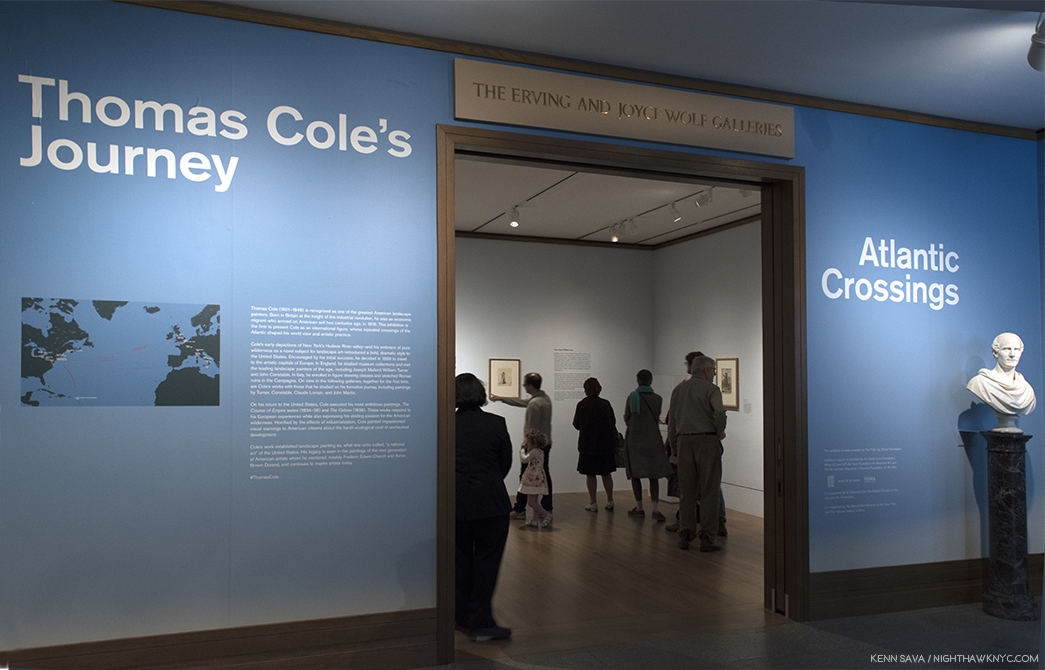
The entrance. Not seen to the right, an intro video narrated by none other than Sting. Click any Photo for full size.

With all the recent talk about the Art world loving “ugly” Art, including Painting1, along came The Met’s Thomas Cole’s Journey: Atlantic Crossings. It’s an homage to “beautiful” Painting- to American Landscape Painting, to the birth of the Hudson River School that Mr. Cole is often credited with being a co-founder of (the first Art movement to form in America), and, it’s a testament to some very great Painters who expressed their passionate love of nature and it’s beauty on canvas and paper. Tucked away in galleries in the back of the first floor of the renovated American Wing, it was fitting that it was installed as close to the (man-made) natural glory of Central Park as is possible in American Wing. After closing at The Met on May 13th, it’s now been reinstalled, and added to, at London’s National Gallery, where it’s called Thomas Cole: Eden to Empire.

A hard act to follow. This is how the show begins- with a text intro accompanied by TWO amazing works by no less than JMW Turner.

The beauty it contains is (at least) three fold. First, there is the beauty of Thomas Cole’s Painting. We get to watch the Artist develop over time and travels, from his native England (where he was born in 1801), to America after his family emigrates here in 1818, to return trips to England and on to Italy, until he finds his voice, a voice that resonates as powerfully today as it ever has. Proof of that can be seen in expected and unexpected places, ranging from his direct disciples to contemporary masters, like Ed Ruscha and Rod Penner. Since influence is a continuum, we also get to see work by other Artists who influenced Thomas Cole, and who he learned from. This second kind of beauty, in the form of beautiful works by these influences and contemporaries, who’s presence caught me completely by surprise in the show. In fact, as soon as I entered, I was immediately bowled over by not one but two masterpieces by no less than the man many consider to be THE supreme landscapist, JMW Turner. And? There would be more!

Talk about setting the bar high.

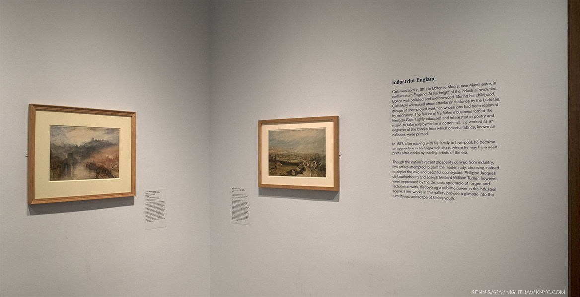
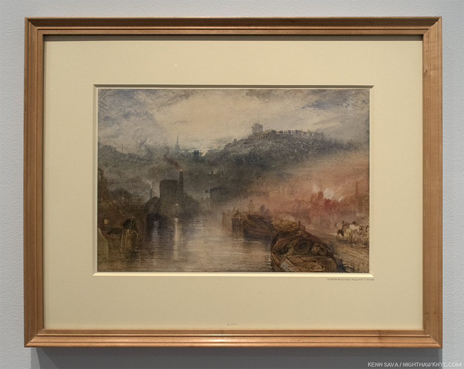
J.M.W. Turner, Leeds, 1816, Watercolor, scraping out, pen and ink on paper. “One of the earliest and most sophisticated depictions of an industrial city, ‘Leeds’ was painted when Cole was 15 years old and living 60 miles away in Chorley, another center of textile production. Turner…chronicles the pollution and chaos of the growing city,” paraphrasing the wall card.

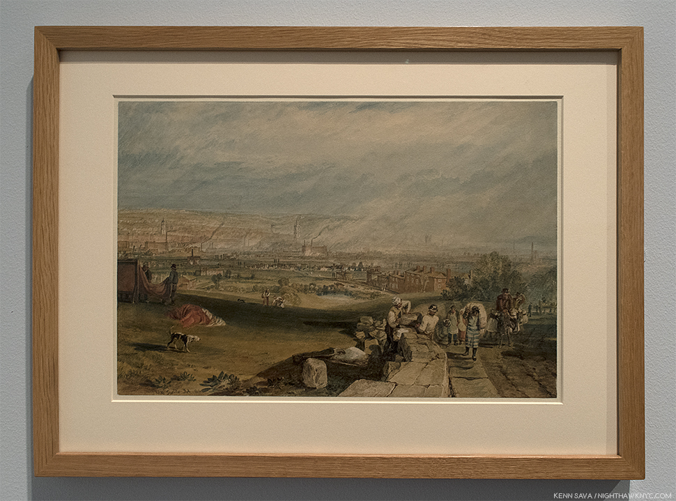
J.M.W. Turner, Dudley, Worcestershire, 1832, Watercolor and body color on paper. “Dudley lies in ‘the Black Country,’ an area characterized by smoke and soot from hundreds of forges, furnaces and hearths. Topographical features present a sharp contrast of ancient and modern: on top of the hill, the ruins of Dudley Castle, echoed by the recently rebuilt neo-Gothic tower of Saint Thomas’s Church, allude to the town’s history, while industrial mills vent dark smoke into the air in the foreground. The scene offered Turner the opportunity for a meditation on change over time, and for a solemn commentary on the industrial sublime.” Per the wall card, paraphrased.

Staggered, but not felled, by these bodyblows, my head cleared long enough to think about how Turner brilliantly uses two different styles sixteen years apart to convey similar messages. Whereas his later works strike us now as almost “impressionistic,” here he’s showing us real scenes. Already a lot to take in, I was ready to go home. Ah, but fear not. The “star” of our show would not be eclipsed. Thomas Cole hit the ground running.

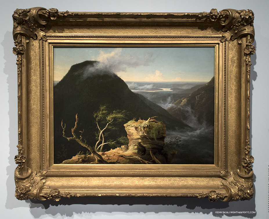
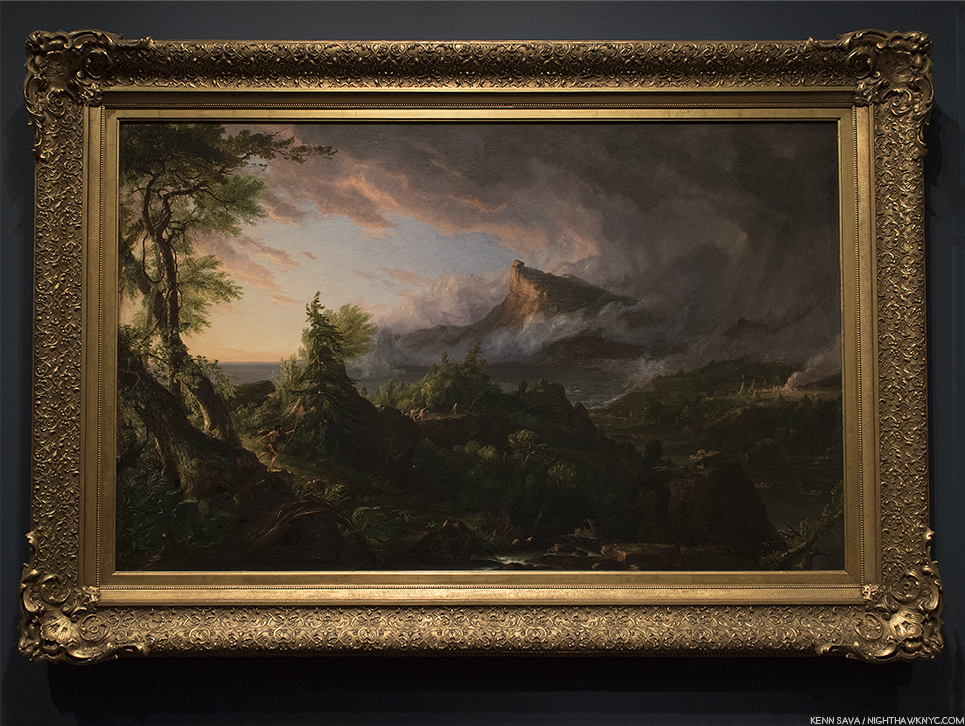
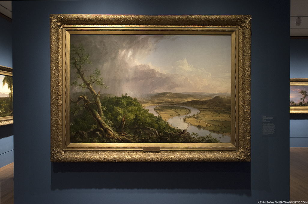
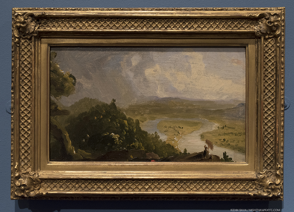
View of Round-Top in the Catskill Mountains, 1827, Oil on panel. Cole discovered the Catskills in 1825, and he was about 26 when he Painted this masterful mix of landscape, realism and the sublime, as it was called at the time, in an American setting. This breathtaking vista was  one of his favorite spots.

The third kind of beauty on view is the beauty of nature that all of the works on view- by Cole, Turner, John Trumbull, Claude Lorrain, John Constable, John Martin, and the others included depict. The works included focus on natural beauty, what man has done with and to that natural beauty, and the possible ramifications of that.

The Garden of Eden, 1828, Oil on Canvas. Thomas Cole, the “romantic” is on view here, though in the service of the “message,” or “warning,” of paradise about to be lost. A theme that will recur.

The Hudson River School spent decades in eclipse in the 20th century as abstraction took center stage, but they’ve never failed to influence Artists, and their “popularity” has seemed to be on the upturn over the past 20 years. Upstairs in the American Wing, The Met’s Hudson River School permanent galleries are one of the lesser known glories of The Museum, judging by the fact that I’ve yet to see them crowded. While Art history has moved on, giving us countless styles, schools and movements since, no where else can the glories of original America be seen (pre-landscape Photography). Though the names of many of the places they Painted are familiar we longer can largely not recognize them. Beyond that, the Hudson River School includes some of the great Artists in 19th Century Painting. While they have enjoyed a “cult” following lo these many years, it’s high time they gain the wider acceptance and appreciation their work deserves. There’s no better place to start that than with a closer look at Thomas Cole.

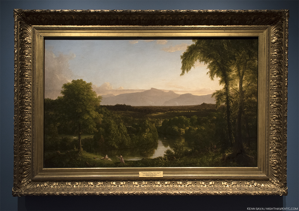
View on the Catskill- Early Autumn, 1836-37, Oil on canvas.

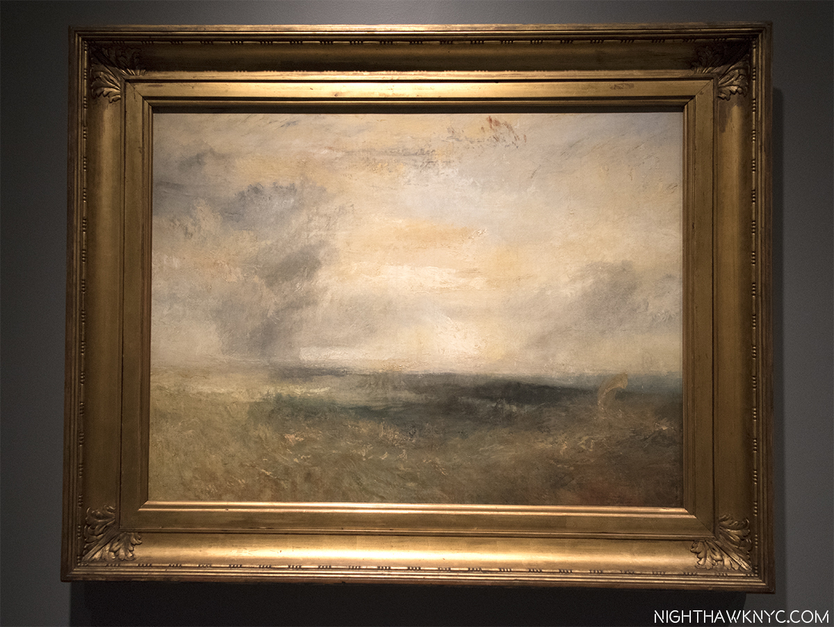
Thomas Cole, who was born in England and emigrated to the U.S. in 1818, was 28 when he met JMW Turner on a return visit to London after a decade here. He visited Turner’s Gallery2. There, he saw, and was deeply impressed by, Turner’s Snow Storm: Hannibal and His Army Crossing the Alps. The Met’s wall card tells us Thomas Cole was not taken with Turner’s later work.

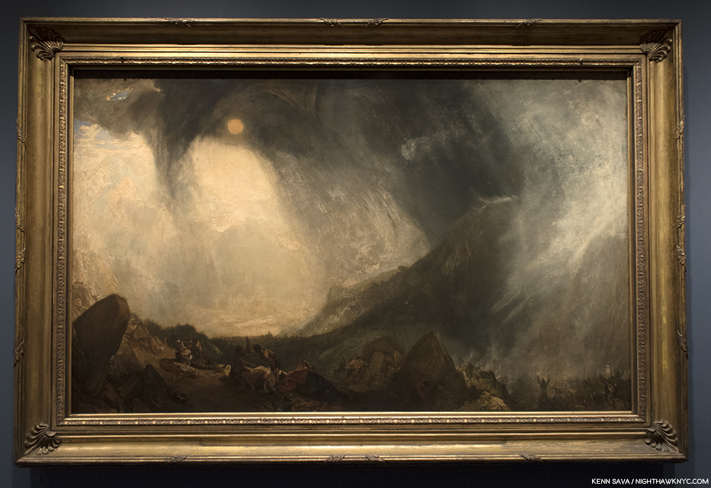
JMW Turner, Snow Storm: Hannibal and His Army Crossing the Alps, 1812, Oil on canvas.

At London’s newly opened National Gallery, he discovered Claude Lorrain and John Constable’s Hadleigh Castle, which haunted him for the rest of his life. He and Constable became friends.

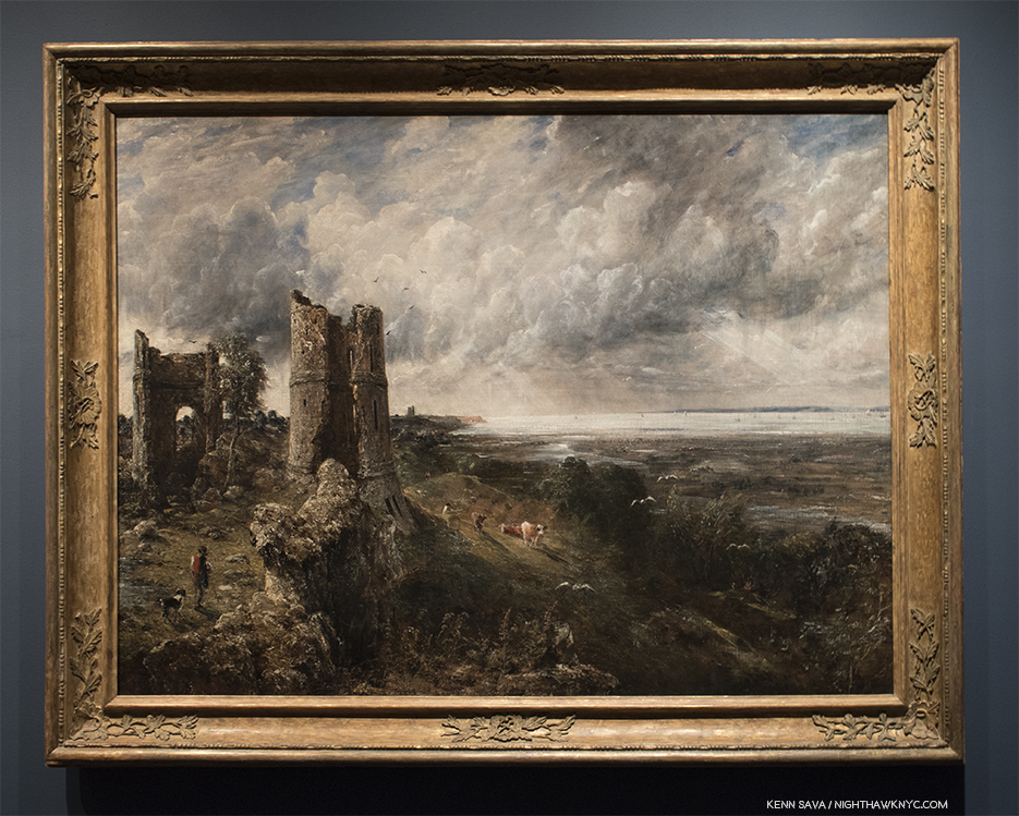
John Constable, Hadleigh Castle, The Mouth of the Thames-Morning after a Stormy Night, 1829, Oil on canvas

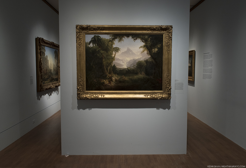
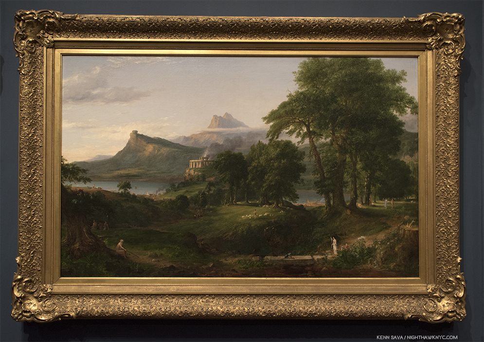
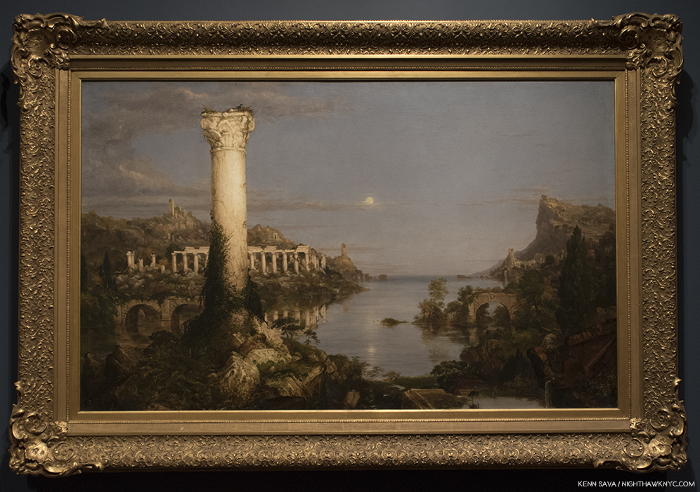
In 1831, he went to Italy, where he painted this-

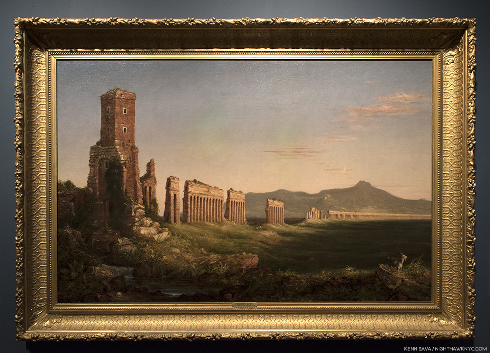
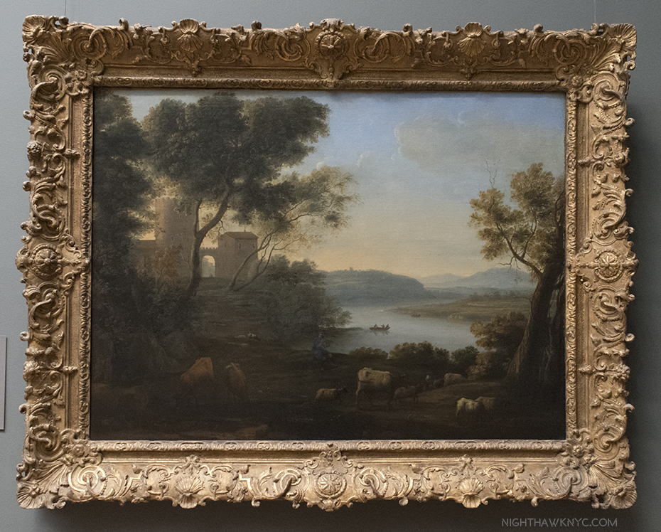
Aqueduct near Rome, 1832, Oil on canvas. Intriguingly, both of these work show ruins, in this case, that left by a great empire.

In Aqueduct near Rome, 1832, we see the ruins of a once great civilization, seen by Cole during his Italian trip and Painted from sketches he made of it. Among the ruins, we see a shepherd and his flock, a human skull, reminders of the passing of time and life going on. Looking at it in hindsight, it’s hard not to see it as something of a precursor for his masterwork, the 5 Painting series, The Course of Empire, 1934-36, the inclusion of which, on loan from the New York Historical Society, is one of the highlights of the show. Originally intended to hang over and around a fireplace by the gent who commissioned them, they seem much better hung as they are here, in a semi circular row where the endless detail in each can be better considered and appreciated. Interestingly, the largest of the five, designed to go in the center directly over the fireplace surrounded by the other four in vertical rows of 2 on each side, may well be the least “important.” At least, that’s a Met curator who spoke about the show in the galleries said.

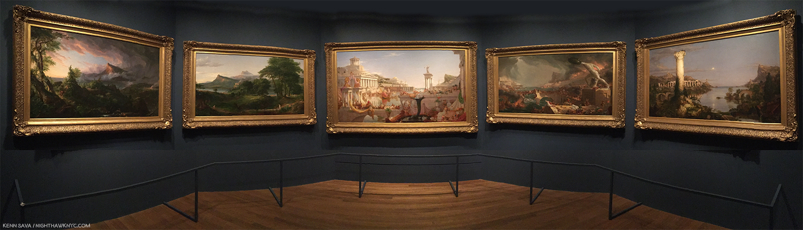
Course of Empire, 1834-36, The rise and fall of civilization as seen from the same place. Notice the same distinctive mountain peak appearing in each Painting.

From The Course of Empire – The Savage State, 1834

From The Course of Empire – The Arcadian or Pastoral State, 1934.

Detail. In the center foreground, the Artist has included a Self-Portrait as a young man, Drawing, also showing the place of Art in this “ideal” world.

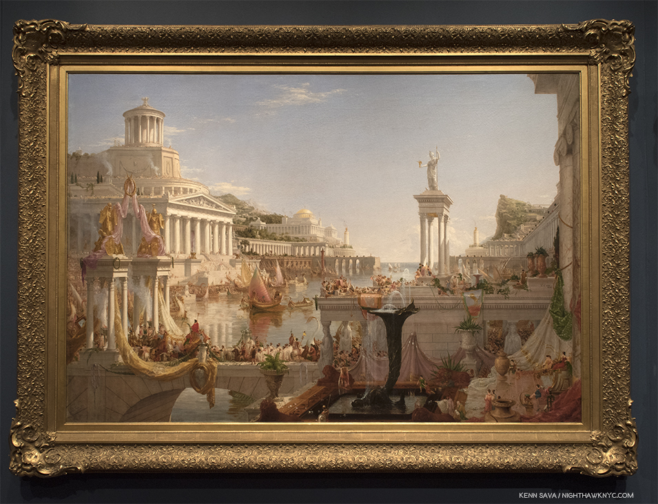
From The Course of Empire – The Consumation of Empire, 1836.

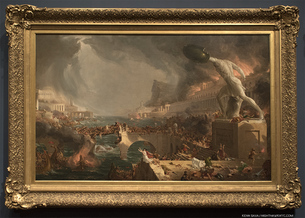
From The Course of Empire – Destruction, 1836.

From The Course of Empire – Desolation, 1836.

After Thomas Cole died in 1848, he was remembered by a number of Artists, including Frederic Church and Asher Durand, but his influence is ongoing. The London reinstallation of this show, at the National Gallery, is accompanied by a show of the work of the American Artist, Ed Ruscha, one of the most influential Artists of our time, who personally installed his own renowned Course of Empire series in a dialogue with one of his great influences. Mr. Ruscha traveled to NYC to speak about Thomas Cole at The Met on April 8th, and that fascinating conversation may be seen and heard here. In it, he speaks about visiting the New York Historical Society (“and not MoMA”) during his visits to the City because he wanted to see Cole’s The Course of Empire, who own the series, repeatedly.

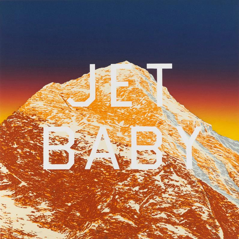
Ed Ruscha, Jet Baby, 2011, lithograph. *Photo by Hamilton Press.

Many of Mr. Ruscha’s recent Paintings and prints have featured a mountain peak, often in snow, a constant reminder of the beauty and wonder of nature that was so close to Thomas Cole’s heart, and possibly a reference to the peak that recurs in each work of Cole’s The Course of Empire series. At The Met, Mr. Ruscha spoke about his love of nature in terms reminiscent of Thomas Cole. It speaks volumes that Mr. Ruscha would go to such lengths to bring Thomas Cole to a wider audience. But, he’s not alone. The string of Artists who’s work would seem to bear at least some debt to Thomas Cole is a very long one. Then there’s the line of Artist’s who’s work contrasts with Thomas Cole’s as they show us what man has done to the landscape in the years since, as he saw this beginning to happen in View from Mount Holyoke, 1836, below.

View from Mount Holyoke, Northampton, Massachusetts, after a Thunderstorm- The Oxbow, 1836, Oil on canvas.

Landscape Painting was joined by Landscape Photography, from about the 1850’s culminating in the work of Ansel Adams and Edward Weston in the first half of the 20th century. They were followed by Stephen Shore3, Lewis Baltz, Robert Adams, Joe Deal and others who were given a landmark show in 1975-76 at the George Eastman House, Rochester, called New Topographics: Photographs of a Man-Altered Landscape. The show’s theme was that the American landscape was no longer what it once was in the days of Ansel Adams,  Weston and Cole, that industrialization, commercialization and development had changed the landscape, and so, this new generation of Artists were bent on depicting the American Landscape they saw all around them.

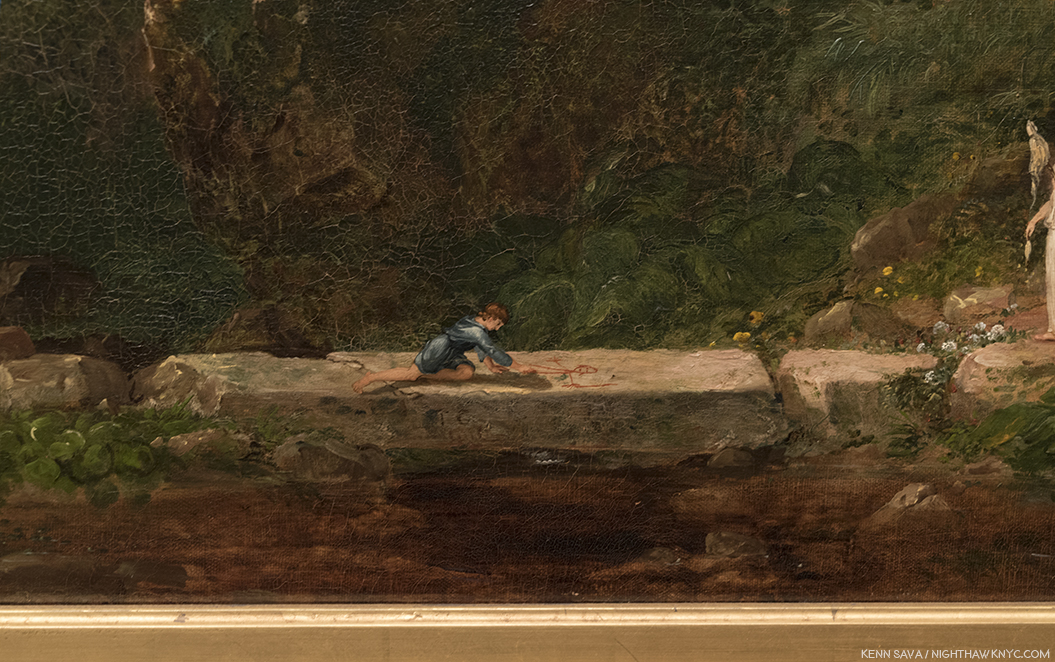
Sketch for View from Mount Holyoke, Northampton, Massachusetts, after a Thunderstorm (The Oxbow), 1936. Thomas Cole masterfully lays out his conception of the composition with a remarkable sparseness of brushstrokes, which only seems to lack the self portrait he included in the final masterpiece seen above. Instead, there is what appears to be a female figure to the lower right. Though in it’s permanent collection, I’ve never seen this remarkable 5 1/2 by 9 1 /2 inch Sketch on display in The Met before.

Painters, too, were hard at work doing the same thing- Painting the world they saw around them. Thomas Eakins painted the encroachment of the industrial world in The Champion Single Sculls (Max Schmitt in a Single Scull, 1871. In the 20th Century, the Regionalists, including Thomas Hart Benton and Grant Wood did their best to focus on the beauty of nature and the American Landscape, but even in their work, the modern world is encroaching. This was all presaged in Thomas Cole’s View from Mount Holyoke, Northampton, Massachusetts, after a Thunderstorm- The Oxbow, 1836, in which the Artist shows us undeveloped land, left, developed land to the right, as he, himself, looks back at the viewer from a crevice right in the lower center, a man caught between the past, the present and the future. In this work he gives us at least the first two installments of The Course of Empire, and, with his turned look at the viewer seems to be directly asking us “Whither to from here?”

“Nature has spread for us a rich and delightful banquet.
Shall we turn from it?
We are still in Eden;
the wall that shuts us out of the garden is our own ignorance and folly.”
(Quotes by Thomas Cole from the introductory video.)

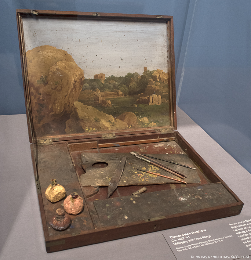
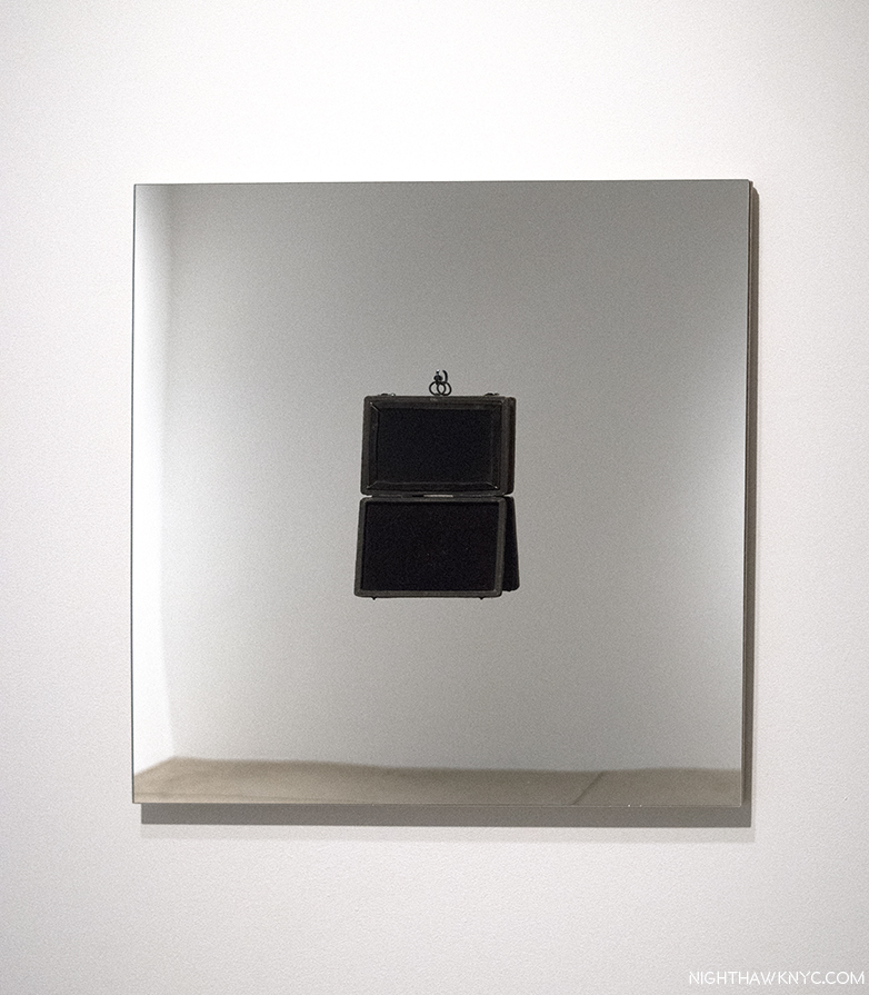
Thomas Cole’s Sketch Box, with added Italianate landscape, perhaps used for the Sketch, above.

The “Ash Can” School painted the harsh reality of American urban life as it rapidly expanded. Meanwhile, Georgia O’Keefe and Charles Sheeler were two Artists who walked the line between the traditionalists and the modern world, with the former gradually disappearing in Sheeler’s work (as both a Photographer and a Painter) as time went on, while Ms. O’Keefe added abstraction to her images of the natural world, while also Painting the city. Edward Hopper lived in both worlds for most of his life, splitting time between Manhattan and Maine. Hopper has been followed by Richard Estes, who also splits his time between Manhattan and Maine, and like Hopper, paints works that show the beauty of nature, in one thread, and the extremes of human development in his Paintings and “Urban Landscape” print series. 

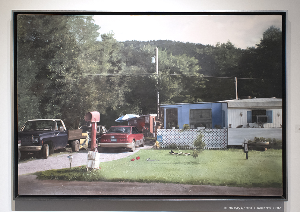
John Salt, Red Mailbox #2, 2015, Casein on linen, seen at Meisel Gallery, 2018.

Along with Mr. Estes, other Painters, including John Salt and Rod Penner, like Thomas Cole, were born elsewhere, yet give us landscape Paintings of contemporary American scenes, as do many Photographers, including Catherine Opie, below, while others, including Emmet Gowin, Edward Burtynsky and David Maisel, have taken to the air to create works based on some of the most extreme uses man has made of the earth…so far.

Catherine Opie, Untitled #7 (1999), 1999, C-print, seen at Lehmann Maupin, 2018.

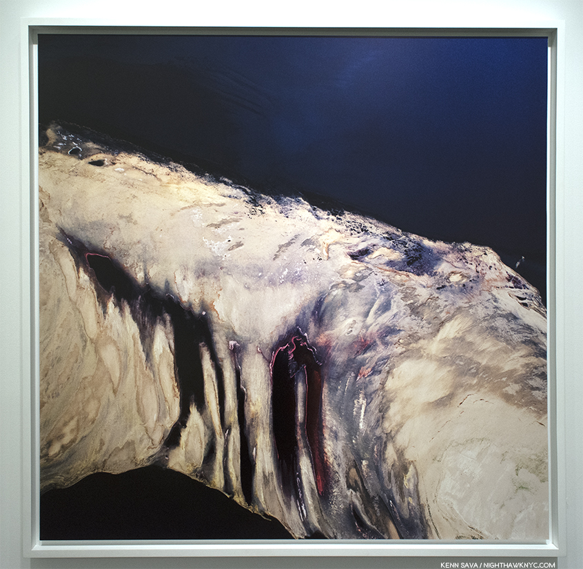
David Maisel, Termiinal Mirage 2, 2003, seen at Yancey Richardson Gallery. An aerial shot taken at the Great Salt Lake. The Artist calls the appeal of works like this “the apocalyptic sublime.”

Whether they have been influenced by Thomas Cole, or their work stands in contrast to his, somewhere in all of it lies a message (intentional or not) that is not all that dissimilar to that of Thomas Cole in one of the stages of The Course of Empire. The overriding question becomes- Which stage are we in?

*- Soundtrack for this Post is “Message in a Bottle,” by Sting and the Police.

NighthawkNYC.com has been entirely self-funded and ad-free for over 6 years, during which over 250 full length pieces have been published. If you’ve found it worthwhile, you can donate to keep it going & ad-free below. Thank you!

Written & photographed by Kenn Sava for nighthawknyc.com unless otherwise credited.
To send comments, thoughts, feedback or propositions click here.
Click the white box on the upper right for the archives or to search them.
For “short takes” and additional pictures, follow @nighthawk_nyc on Instagram.

Subscribe to be notified of new Posts below. Your information will be used for no other purpose.


  1. Like this piece in the New York Times
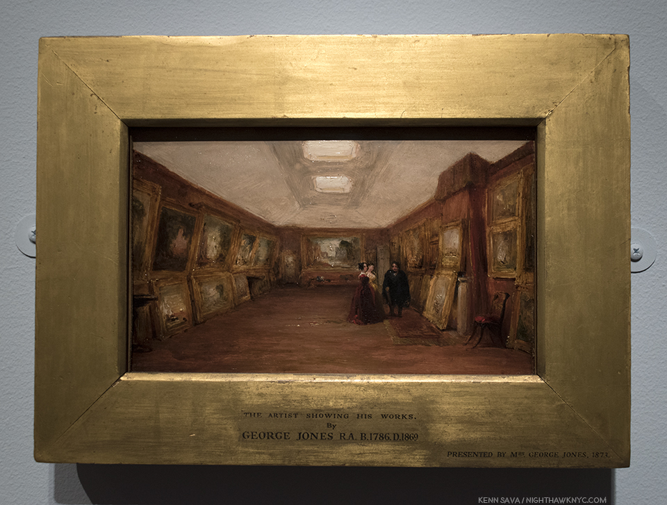
  2. George Jones Interior of Turner’s Gallery: The Artist Showing His Works, 1852, Oil on millboard, is here in this show on loan from the Ashmolean. My Photo of it appears in my Post on Ellen Harvey’s recent shows since her wonderful work, Arcadia is somewhat based on it. It may be seen here.
  3. The only one to show color work.

Ellen Harvey’s Global Beautification Project

A few weeks back, I walked across West 22nd Street after visiting Gary Hume’s show, “Mum” at Matthew Marks, lost in the whirlwind of emotions, past and present, it elicited, barely cognizant of the traffic, weather, or time. Luckily, Thanksgiving week in NYC tends to be on the quiet side. As I crossed the street, bright lights, like those seen in a carnival, beckoned from inside the front window of Danese/Corey Gallery. Reaching the sidewalk, I could see the lights made a sign that was attached to the frame of a wooden shack. They read “ARCADIA.”

The view from the sidewalk outside Danese/Corey. Click any Photo for full size.

Hmmm…”Arcadia.” A word that evokes simple pleasures. In need of some cheer, I stepped inside. While I can’t say I found “cheer,” I found Art.

Installation view from inside the “shack.” An extraordinarily imaginative vision, stunningly well realized.

The show was “Ellen Harvey: Nostalgia.” Inside the wooden framed shack, the carnival-like atmosphere of the sign outside quickly faded into darkness, pierced with lines of white light. Looking closer, the lines turned out to be etched on mirrors lit from the back. The light they emitted was reflected back by more back lit mirrors on the opposite side of the shack, as was the viewer, which made the design they held frustratingly hard to see. It was like “seeing” through a haze, a bit like walking around Times Square (I hear). Taken by the beauty I knew was there, I wandered around the space, enthralled and puzzled. Scenes of buildings, waves, and sky lined both sides culminating in a large panel showing the moon over the sea. Making my way to the gallery’s desk, I found that the work, titled “Arcade/Arcadia,” 2011, contains 34 hand engraved mirrors mounted on light boxes to form a 360 degree panorama of the town of Margate, England as seen from the beach. Hmmm…

Intentionally hard to see the amazing engraving on the mirrors.

Then same mirror, without anything in front of it. From the show’s catalog.

Unable to get the work out of my mind while I was looking at other shows, I went back to Danese/Corey later and bought the monograph, “ Ellen Harvey: The Museum of Failure1,” which has the backstory and images of the mirrors without reflections, (which, while defeating the point of the installation, allows appreciation of her amazing technique). I learned that the project was commissioned by the Turner Contemporary Gallery in Margate, England for it’s opening in 2011. The shed is a remimagining of JMW Turner’s London gallery (in 3/4 size) and the mirrors are arranged in the way Turner displayed his work- “salon” style, as seen in George Jones  “Interior of Turner’s Gallery: the Artist showing his Works,” 1852. Along with another Painting George Jones did of it after Turner died, they are the only records we have of what JMW Turner’s gallery looked like.

George Jones “Interior of Turner’s Gallery: the Artist showing his works,” 1952, Oil on canvas, Ashmolean Museum.

Turner loved Margate and lauded it’s natural beauty. So inspired, he is believed to have created around 100 Paintings of it, possibly including this one, given that he began using Margate as a second home around 1830.

JMW Turner, “Margate(?), Seen From the Sea,” c.1835-40, on loan from the National Gallery, London and seen in The Met Breuer’s “Unfinished” show in 2016, which I wrote about, here. Possibly one, of hundreds, of works he did depicting Margate.

In addition to finding inspiration, he, infamously, “shacked up” with his landlady there. The town eventually became a tourist mecca which led to it’s (over?) commercialization. When it fell on hard times, the amusement park, called “Dreamland,” (who’s sign Ms. Harvey pays homage to in her “Arcadia” sign, using the same font), closed and became a blight on the natural beauty which led so many to want to come there in the first place. In the piece, Ellen Harvey depicts a more recent view of Margate as seen from the beach, in apparent complete desolation.

The work is like an onion in it’s many layers. There’s the Turner layer, the Margate/nature layer, the Dreamland/commercialization layer, the mirror layer (with it’s funhouse effect, seen earlier), and the layer of light being distorted, which could be a reference to the light that Turner loved, and what’s become of it, with the addition of so many electric lights and buildings blocking sunlight. There’s, also, the layer of the styles of the two Artists, Ellen Harvey and JMW Turner, in dialogue. With the large shadow of no less than Turner looming, this is, certainly, a daring undertaking. Ms. Harvey’s mirrors contain many passages of sky and sea, crescendoing in the large center rear panel, that can’t help but remind today’s viewer of the English Master, though in decidedly her own style. Though “Dreamland” has recently reopened, the metaphor, and the warning, in the work is powerful, and both specific and universal. Experiencing it was a highlight among all the Art I’ve seen in 2017.

The rest of the show impressed me just as much. Adjacent to “Arcade/Arcadia,” was a Painting that depicted what looked to be a rough surface that seemed like it should be in relief, but was, in fact, flat. Hmmm…Is this the same Artist who just gave us all those meticulously engraved lines on those 34 mirrors2? It was closer in style to the Photographs of Aaron Siskind than the style I’d just seen. When I saw the title, I got it. “Crack/Craquelure.” Craquelure is a term referring to the cracking patterns seen in many old Paintings. “Nostalgia,” in another sense.

‘Crack/Craquelure,” 2017, Oil on wood panel.

There are other instances of “nostalgia” for the craft of Art in the show, like “Picture(esque),” 2017, Antique “Claude Glass,” float glass mirror, hook and plywood. A “Claude Glass,” (or “Black Mirror”) is an 18th & 19th century device, which Ms. Harvey is fond of.

“Picture(sque),” 2017. The “Black Mirror” was, also used for magic, particularly for seeing the future. Ellen Harvey’s work often contains images of ruins & destruction…images of a dark future.

They have been used by landscape Artists aiming for that special quality achieved by the great landscape Painter, Claude Lorrain (c.1604-1682), who it’s named after.

Claude Lorrain, “Pastoral Landscape: The Roman Campagna,” 1639, seen at The Met. A classic example of the much admired, and copied, “dark” landscape, which inspired the “Claude Glass.”

Beyond the other themes present in this diverse show, there is the theme of mirrors. Since Robert Rauschenberg, I can’t think of another Artist who uses mirrors as frequently to such wonderful effect. Hand-engraved, without engraving, or with “Black Glass,” above. I asked the Artist about her use of mirrors, and specifically when it started. She replied, “I’ve always loved mirrors — but the first mirror piece I really made was in 2005 for the Pennsylvania Academy — aptly titled “Mirror” because I wanted to show the space and comment on their collection of paintings…and then I got hooked. Before that, I was all about Polaroids.” She’s referring to her monumental installation where she reinvisioned the entrance hall of the landmarked Furness and Hewitt Pennsylvania Academy of Fine Art Building, Philadelphia, as a ruin, using video and four 9 by 12 foot hand-engraved mirrors. Ruins are part of the “dark future” Ellen Harvey believes we are destined for. Rogier van der Weyden’s “The Last Judgement” was the first painting she fell in love with. “That red-hot sword is coming for us all,” she said3, referring to what looms above Christ’s left hand. If it’s coming, I hope it gets here before I have to file my “new” taxes.

Further on, “Nostalgia” takes on more of a traditional meaning in “Ghost of Penn Station,” 2017, Oil on wood panel, where we see the tragically lost Architectural masterpiece, rendered in oil, as if seen through a haze or in a dream. Whereas Ms. Harvey has created a number of works showing existing buildings (even creating an “Alien’s Guide to the (future) Ruins of Washington DC“) in ruins, this is a rare case where a building that was ruined is shown before, in all it’s glory. In the rear gallery, “New Forest (The I.R.S. Office Reforested),” 2013, Gesso, oil, acrylic, and varnish on wood,  about 13 1/2 feet long, shows a part of the I.R.S. offices (speaking of taxes) in a deserted state with the area in the process of being reclaimed by nature. Interestingly, the I.R.S. bought a sister work on the same subject, titled “Reforestation,” that, also, depicts their new offices in ruins, being reclaimed by nature, rendered in mirrors which, now installed, reflect those very offices! Fact is stranger than Art. When I asked Ms. Harvey about this, she replied to the effect that they have a, surprisingly, good sense of humor.

“New Forest (The I.R.S. Office Reforested),” 2013, Black gesso, oil, acrylic, varnish on 20 wooden panels. Overall- 13 1/3 feet long by 7 3/4 feet high. There is a social/political/economic conscience, or awareness that runs through Ellen Harvey’s work that I find most tastefully handled.

Finally, there is another, spectacular, engraved mirror work, the fascinating “On the Impossibility of Capturing a Sunset,” 2017, 16 Hand-engraved plexiglass mirrors, 16 Lumisheets, plywood. Ms. Harvey lets the wires for the light boxes dangle down in front…Yes. In front of the work,  another way of adding an obstacle to the “pure” appreciation of her image. They fall to a jumble of power strips on the floor, where they look as intricate as the engraving above them. Perhaps they’re a metaphor for the huge effort it took to get this close to the “impossible” task she refers to. (In earlier engraved mirror works (like “Destroyed Landscape (Cloudy Moon),” 2012, she scratched over the finished engraving, graffiti-like, making it almost impossible to see the underlying composition.)

“On the Impossibility of Capturing a Sunset,” 2017, 16 Hand-engraved plexiglass mirrors, 16 Lumisheets, plywood.

Close-up.

As I considered “Nostalgia,” over multiple visits, this work became something of a touchstone for me as I learned (and still learn) about her work. In it, her gorgeous technical achievement becomes subservient (in a way) to her “larger point.” Across her career, it seems to me that that “larger point” is her vision. About this, she said-

“What is it that all these viewers might want in this situation? That’s really where all of this work comes from. It comes from my desire to take particular situations, either physical or social, and say, ‘What is it that people want from Art in this situation?  What can Art do here?’ And of course the answers are often completely ridiculous. When you think about it what people dream of, it’s like falling in love with someone, it’s all projection. It’s a sort of mad fantasy that’s very hard to understand.” 4

“495 West 37th Street at Ninth Avenue, Hell’s Kitchen, Manhattan, From The New York Beautification Project,” February, 2001, Oil on Wood(?) Wall. Close-up, right. Photos from ellenharvey.info, which has it’s backstory.

This “What can Art do here?” approach can be seen all the way back in 1999, in her remarkable “New York Beautification Project.” In it, the Artist hand painted 40 five by seven inch oval oil paintings on top of existing graffiti, over the course of 2 years! During the project, she was mugged once, and had encounters with the NYPD. While her remarkable Paintings were influenced by classic (and classical) landscape Paintings (WHAT could be MORE out of place in the world of NYC graffiti?), what floors me is the map of the locations she created them.

Map of locations of the Paintings in Ellen Harvey’s “New York Beautificalion Project,” 1999-2001. From ellenharvey.info

She almost circled the entire City! Ok, she did this without permission, or renumeration, as the works were affixed to non-movable locations, to the displeasure of gallerists, which might make you wonder…”WHY???” I chalk it up as an early sign of the scale of, the dedication to, and persistence of her vision. It was a taste of things to come.

Her “What is it that people want from Art in this situation?” reached, perhaps, it’s ultimate expression when only a short time later she got a chance to do public art “for real.” Actually? Two chances. The NYC MTA commissioned her to create the Art for TWO NYC Subway stations. She is one of the very few (perhaps, the only one?) to have been commissioned to do more than one. In 2005, she created “Look Up, Not Down,” in 2,000 square feet of the Queens Plaza Subway Station. This MTA video provides a look at it, and the backstory, and also includes rare glimpses of the NY Beautification Project’s Paintings, which are now long lost.

Then, in 2009, she was commissioned to do the Art for the (new) Yankee Stadium Metro North Station. Typically, she took a Yankees ad logo, “The Home of the Stars,” and flipped it in a way everyone could relate to- Yankee fan, or not.

Someone once said that mosaics are the most durable medium. There are gorgeous examples in The Met from 200 AD. So, it seems fairly likely that her work in the subway (at least) will last for at least the next 100, if not 1,000 years. I’ve lauded the MTA on their choices of Artists to create Art for the Subway before. Here is another case where I think they made an excellent choice. Both of these works are related to the sky and stars theme that continues in “Nostalgia.” Well? I’m not sure even Ellen Harvey is going to find a bigger stage than the stars.

Regarding her statement about giving the viewers what they want, I remain to be convinced that many, if anyone else, sees the world as Ellen Harvey does. It seems to me that she takes spaces (or materials) and reimagines them in ways visitors might enjoy, but, perhaps, don’t quite expect, and I doubt anticipated. Her work seems to cut across and through periods, schools, styles- abstract or realistic, to speak to people, and so, it “gives the people what they want.” That’s a pretty rare gift. Christo & Jeanne Claude come to mind as Artists who are/were capable of similar things. Her projects often require her to bring an extremely wide range of talents to bear, in an equally wide range of mediums and scale, to create her visions, though like Rauschenberg, she has said she considers herself a Painter. A Painter, who loves Painting dearly, though she has real doubts about it’s ongoing relevance given many of it’s original functions having been replaced by other mediums. For my part, it seems Painting was in trouble in the 90’s, but I’ve seen any number of very good (and relevant) Painting shows recently, especially this past year. Since Painting is, still, my favorite medium, I remain hopeful.

Looking through the 300 plus pages of “Museum of Failure” it’s very hard not to be amazed at the daring of her work, it’s diversity, as well as the consistent quality of it. In two instances she has taken on Painting reproductions of the bulk of the collections of two museums(!)- the Whitney and the nudes in the Bass Museum, Miami, and rendered them exceedingly well- regardless of the style or period. Yet Painting is just one of the many mediums she works, and excels, in.

With “Nostalgia,” one of the best shows of the fall season, you might think that Ellen Harvey would be satisfied. But, no. On December 13, ANOTHER show, including new work, “Ellen Harvey: Ornaments and Other Refrigerator Magnets,” opened at the Children’s Museum of Art downtown.

The CMA show continues her exploration of ornamentation (a subject near and dear to my heart), which, gets it’s own section on her website, showing work going back to at least 2002. It’s a show that, hopefully, will inspire and instill a love of ornament in a young audience that will grow up to bring it back to a world that sorely needs it. In it, another of her themes, seen in her 2014 installation, “The Unloved,” at the Groeninge Museum, Bruges, Belgium, comes to the fore- the forgotten/overlooked/yes, unloved, in Art. These days? Not much is more unloved than ornamentation in Architecture.

“Those days are recalled on the gallery wall
And she’s waiting for passion or humour to strike

[Chorus]
What shall we do, what shall we do with all this useless beauty?
All this useless beauty”*

Appropriately, and prominently, placed around the show were various editions of Austrian Architect Adolf Loos’ essay collection, “Ornament & Crime,” as if saying “Ornament is NOT a crime!”

Adolf Loos’ “Ornament and Crime,”a collection of essays, including the title piece, a lecture given in 1908, appropriately displayed on a lovely, ornate pedestal.

Featured is her 2015 “Metal Paintings for Dr. Barnes,” in which she painted every piece of metal work installed at the Barnes Foundation, Philadelphia, on 826 wood panels with magnets inset then mounted on steel panels so they could be endlessly rearranged, unlike those in the Barnes.

“Metal Paintings for Dr. Barnes,” 2005, Oil on 826 wood panels with inset magnets, steel panels, overall, 25 by 15 feet, left, and “Mass Produced,” 2017, Metal hardware, screws, plywood, and plastic frame.

More recently, much of her work with ornaments has been inspired by her visits to the  American Wood Column Company, in Brooklyn, founded in 1916, and their collection of over 6,000 antique molds. On view was a 48 part visual catalog of samples of their work, which Ms. Harvey had photographed by accomplished Photographer Etienne Frossard, who has been working with her since 2012, in a new work titled “Mr. Lupo’s Collection,” in honor (in a sense) of this man and his company’s devotion to currently unloved work that may be on the verge of being lost.

“Mr. Lupo’s Collection,” 2017, 48 Framed Photographs, individually photographed by Etienne Frossard. (Apologies for the glare in my photo of them.)

Ornaments made by American Wood Column Company were featured in a large, new work that brings them right into the 21st Century. Not being satisfied with creating Art in two Subway stations, here, “Ornaments for the Subway,” 2017, goes further. It attempts to beautify that universal blight of all Subway stations- the ads. The card says, “It used to be that public spaces were covered with architectural ornaments rather than advertising….Here the Artist imagines taking back the public space from which they have been removed.” Bravo.

“Ornaments for the Subway,” 2017, Pressed glue ornaments made by the American Wood Column Co., plywood panels with inset magnets, subway posters and 20 steel panels.

Detail.

I spoke with Ellen Harvey at the opening, and she turned out to be exceedingly gracious, generously walking this complete stranger around her new show, pointing out all kinds of subtle detail that would take me many visits to discover. Here again, some of the themes I’ve seen in her other works are on display- a critique of Art, museums, and the rich, her passion for giving the viewers what they want, more use of mirrors (as mirrors this time!) and yes, “nostalgia,” is a theme, here, too. This work with mirrors includes people I know I’ve seen somewhere before.

“All That Glitters,” 2017. Card and detail below.

Detail of the lower right corner of the right side shows Mr. Putin, right, and Mr. Trump, above to the left of center, who’s wife appears elsewhere.

I titled this piece “Ellen Harvey’s Global Beautification Project,” because looking through her projects to date, they’ve taken place around the world, from California, to Miami to Philadelphia to Ghent, Bruges, Margate, Vienna, Warsaw, and of course, NYC, including the 2008 Whitney Biennial and the two Subway Stations. Together, they make part of a map of the world that will soon start to look like a global version of the map of her New York Beautification Project.

Before I left CMA, I came across “Walk In,” 2005, Oil on plywood and gilded frame, a booth to allow visitors to pose in glamorous surroundings, as if walking into a painting.

“Walk In,” 2005, 005, a work designed to be a background and frame in one for a do it yourself portrait.

Inspired by her work, and her approach, it was at that point that I decided to be a visionary, myself. “Hmmm….What does this picture need? What would the people like to see here?,” I asked myself.

The very gracious Artist graciously poses for yours truly in her “Walk In,” 2005.

And so, “My Portrait of Ellen Harvey” ends…with one.

“Ellen Harvey: Nostalgia” is my NoteWorthy show for November. 

*- Soundtrack for this Post is “All This Useless Beauty,” by Elvis Costello from the 1996 album of the same title, publisher not known to me. It’s rendered here.

NighthawkNYC.com has been entirely self-funded & ad-free for over 7 years, during which over 275 full length pieces have been published! If you’ve found it worthwhile, PLEASE donate to allow me to continue below. Thank you, Kenn.

You can also support it by buying Art, Art & Photography books, and Music from my collection! Books may be found here. Music here and here.

Written & photographed by Kenn Sava for nighthawknyc.com unless otherwise credited. To send comments, thoughts, feedback or propositions click here. Click the white box on the upper right for the archives or to search them. Subscribe to be notified of new Posts below. Your information will be used for no other purpose.

  1. A new edition, which features “Arcade/Arcadia” on it’s cover, is the most complete book on her work and is recommended. Ellen Harvey’s website, ellenharvey.info is, also, a goto resource.
  2. The first question I asked Ellen Harvey was about engraving those mirrors- “What happens when you make a mistake?” “It happens often. I press on,” she said!
  3. “Ellen Harvey: Museum of Failure,” P. 299.
  4.  https://youtu.be/juIqarKNAGY