NoteWorthy Shows: March Through May, 2017

This site is Free & Ad-Free! If you find this piece worthwhile, please donate via PayPal to support it & independent Art writing. You can also support it by buying Art & books! Details at the end. Thank you.

Written & Photographed by Kenn Sava.

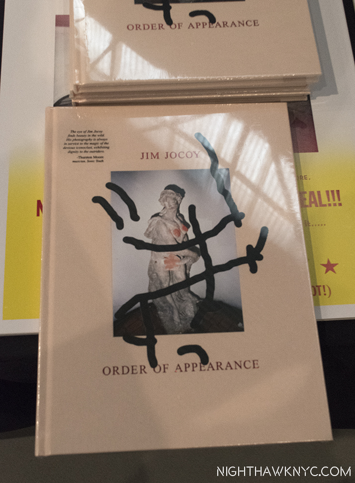
Catching up from my March computer meltdown. To recap, AIPAD-The Photography Show, was my NoteWorthy Show for March, “Raymond Pettibon: A Pen of All Work” at the New Museum for April, “Rod Penner” at Ameringer McEnery Yohe for May. Here are some other “NoteWorthy Shows” I saw from March through May (in no particular order). Better late than never…especially where these fine shows are concerned. 

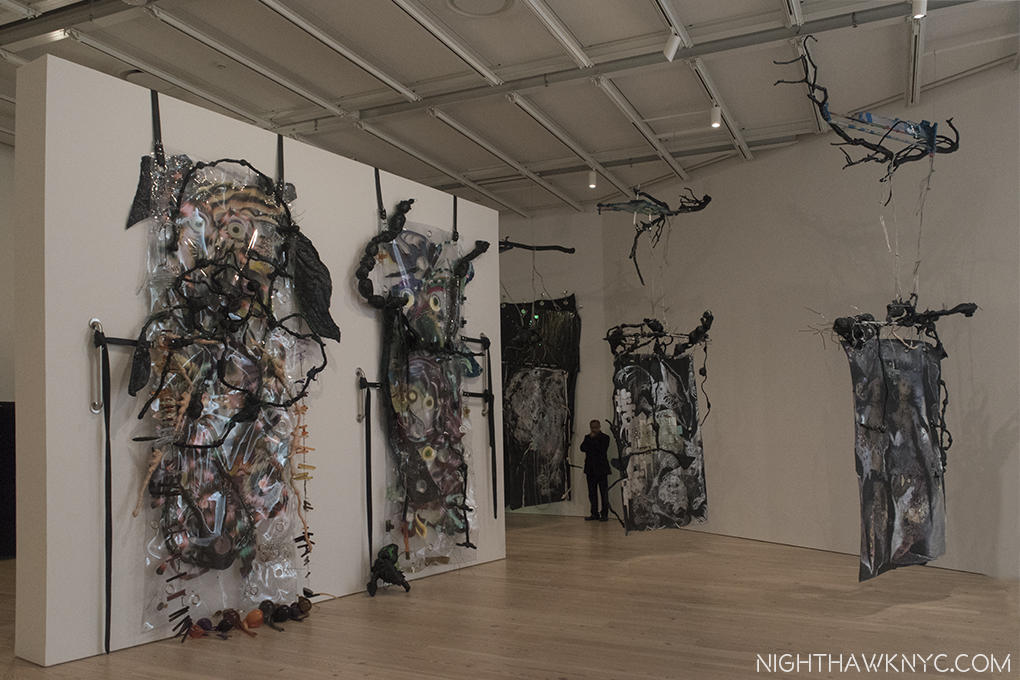
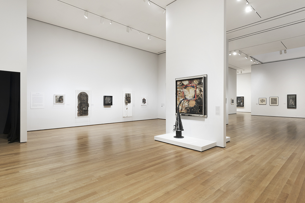
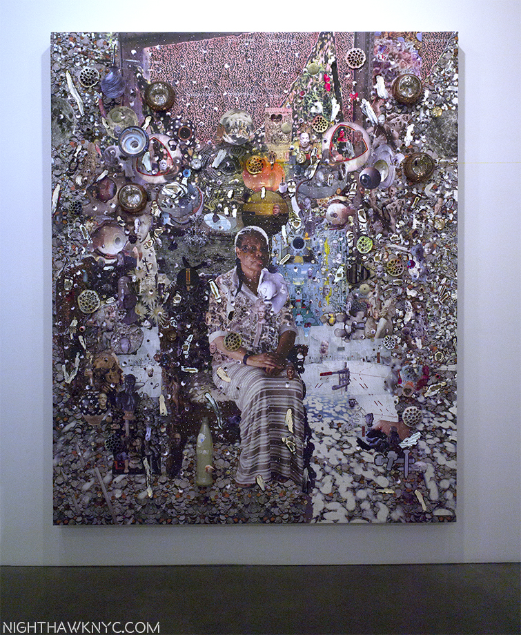
“Elliott Hundley: Dust Over Everything” (@ Andrea Rosen Gallery)- According to Siri there were 41 days between January 1 and February 10, during which Elliott Hundley must have been THE busiest man on the planet creating the 22 works for this show, which opened on February 10. He must not have eaten, slept, or gone to the food store, saving every second of every day to create what are the most intricate works I’ve seen in years, each one of which is dated “2017.”

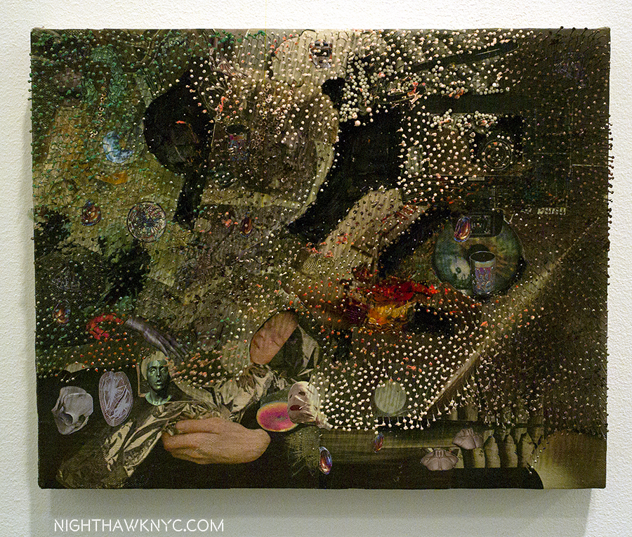
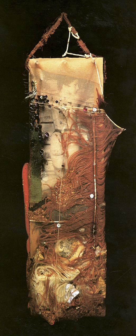
“the song dissolves,” Paper, oil, pins, fabric, foam and linen over panel, 11 3/8 x 14 3/8 x 2 3/4 inches. Click any image to enlarge.
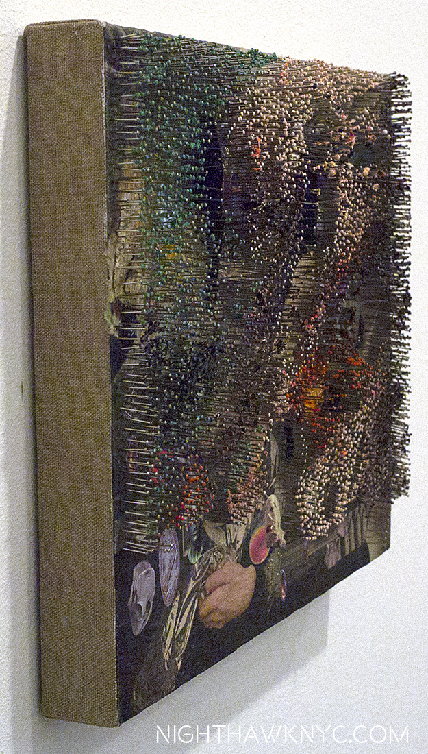
Side view.

Theatrical…Intimate…Grand…Microscopic…Bombastic…Quotidian…There are as many styles as there are works, and almost as many materials listed having been used on them. Ok. He probably had (some) help creating these. Practically? I get that. But, you can’t see it. Every single detail seems to spring from the same source- a seemingly boundless imagination that shows us a different side of it in each piece.

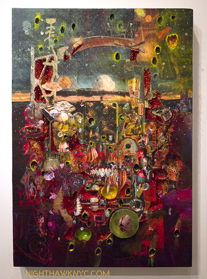
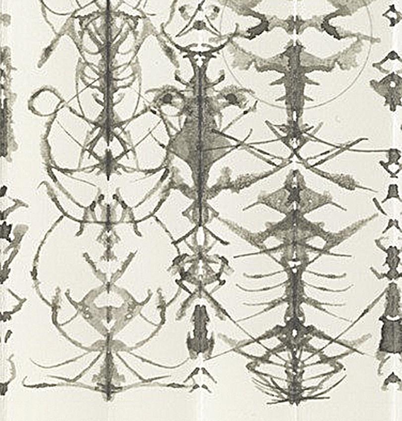
“Dust Over Everything,” Paper, oil, plastic, fabric, pins, foam and linen over panel. 36 1/4 x 24 1/4 x 6.

And the pins! I feel for whoever has to count them when these works wind up in Museums. “Countless” is how I’d describe them. It must have taken an army of acupuncturists a week to do even one of these works, because they are so extraordinarily well placed I found myself continually looking at the works from a 45 degree angle so I could appreciate them all. They’re such a tour de force as to be, a bit, distracting. I wondered what order they were placed in, which took away valuable moments I should have spent pondering the work as a whole (before getting to the details.) They are a bit like veil on a stage that you have to look through (after you’re done appreciating them) to ponder all that’s under them. But, they are not present in every work here. What’s under them struck me as being a whole life told in episodes, glimpses, memories and relics.

“Gallows Bird,” Oil and paper on linen, 80 1/8 x 96 1/4 x 1 7/8

Suffice it to say there’s, also, a life time’s worth of looking ahead for whoever buys these obsessive works- some of the freshest work I’ve seen in the first 65 days of this year, and among the densest work I’ve ever seen.

“Until the end,” Paper, oil, pins, glass, lotus, plastic, foam and linen over panel, 96 1/2 x 80 1/4 x 8 1/2

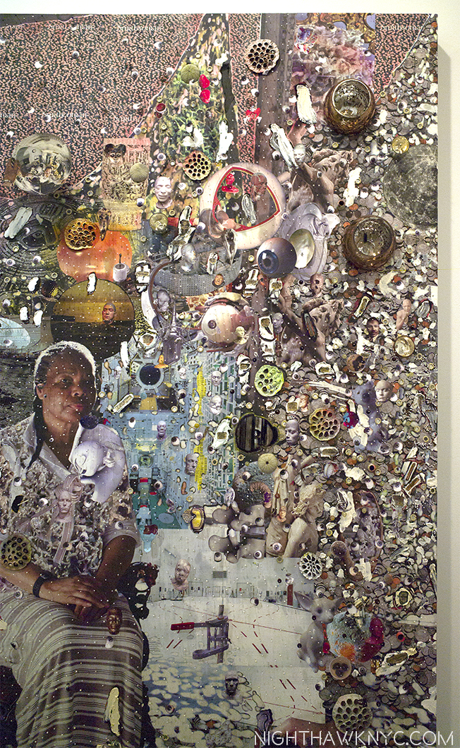
Detail of the right side. Mr. Hundley features friends & family in his work, giving them a personal depth he feels comes across to the viewer.

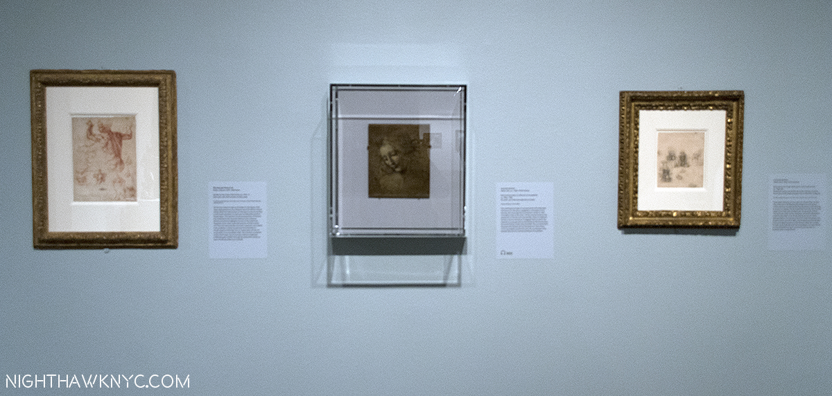
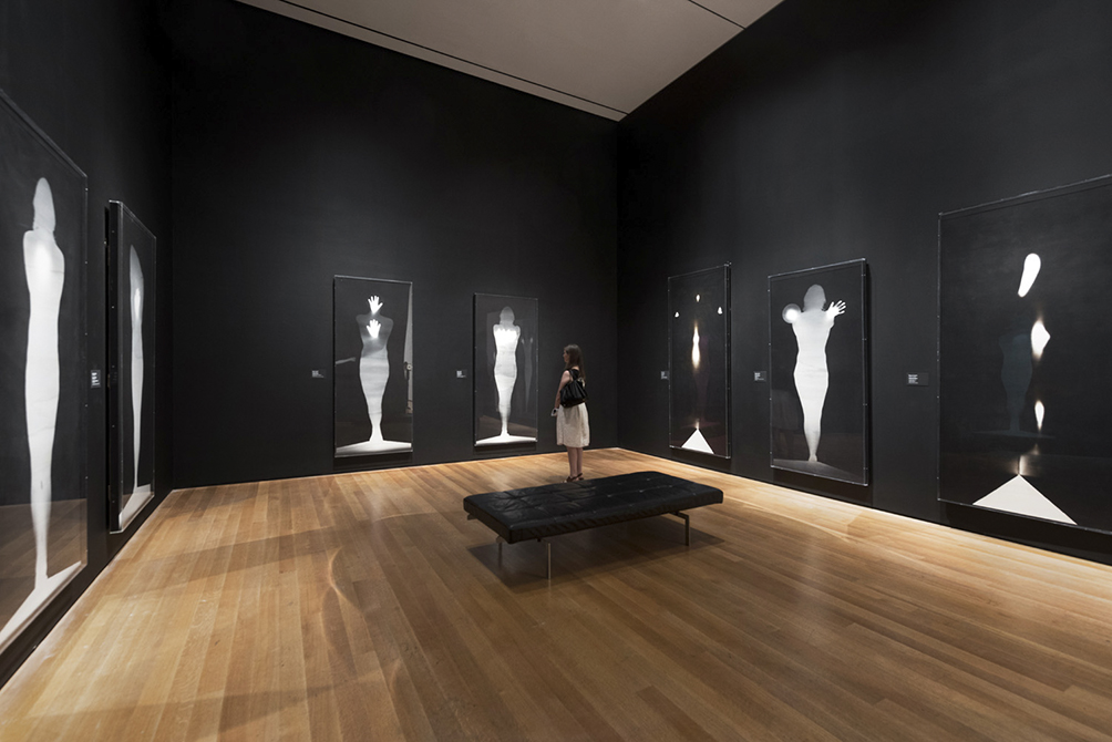
“Seurat’s Circus Sideshow” (@ The Met)- From the first time prehistoric man made a mark on a surface, countless billions of people down through the intervening millennia have drawn. Where is the OTHER one among them who draws, or drew, like Georges Seurat? Seurat only lived 31 years, so he didn’t get the chance to create either a lot of drawings, or a lot of paintings, so this was a very rare chance to see (mostly) his drawings, along with 2 paintings, and works by others, all more or less related to the theme of the circus, with Seurat’s “Circus Sideshow,” from The Met’s collection, as the centerpiece. How fascinating it must have been to watch him make one of these unique Drawings, let alone one of his even more remarkable paintings? So, even the otherworldly presence of Rembrandt’s “Christ Presented to the People” wasn’t enough to distract from focusing on the extremely rare opportunity to see a number of Seurat’s drawings in one place.

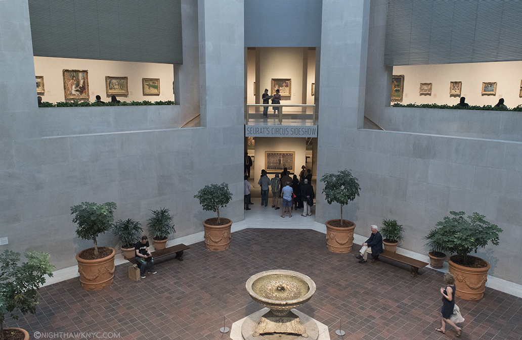
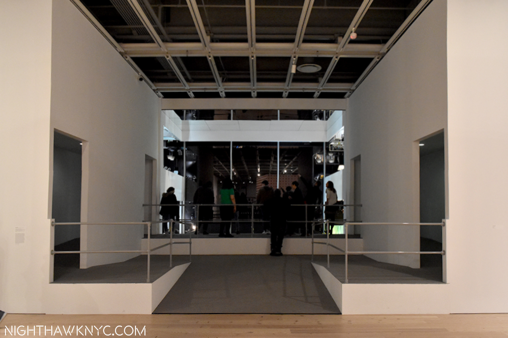
Looking down at the entrance for “Seurat’s Circus Sideshow”. Exactly one year ago this Robert Lehman Wing Courtyard was full of scaffolding for the false floor of the “Ghost Cathedral” of the Manus X Machina Fashion Show sat at the level of the upper floor here- a few hundred feet in diameter! Amazing.

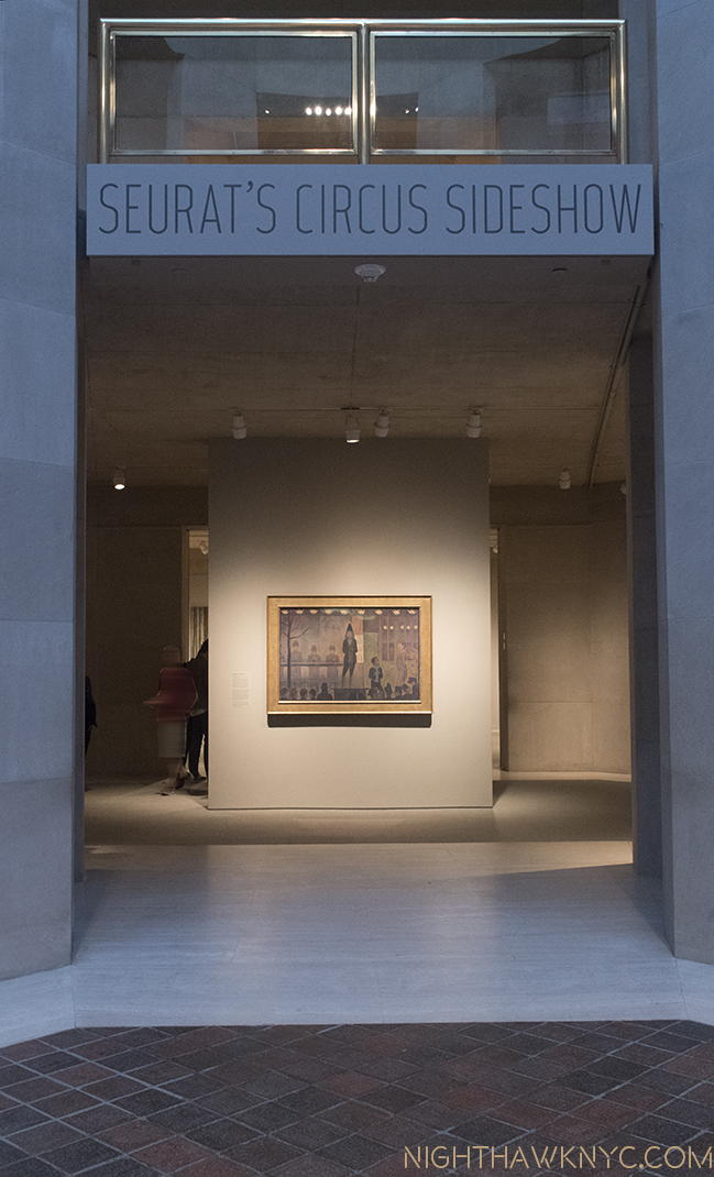
“Seurat’s Circus Sideshow” entrance, features the titular work.

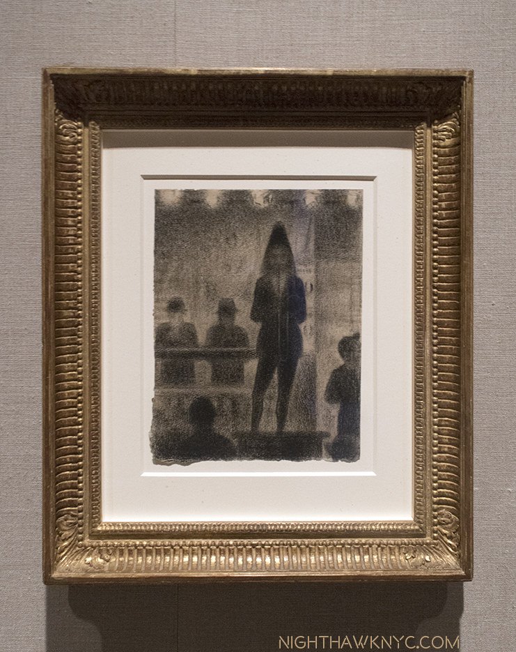
“Trombonist,” 1887-88, Conte crayon with white chalk

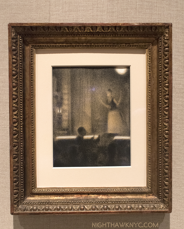
“At the Gaiete Rochechouart,” 1877-78, Conte crayon with gouache

“Lygia Pape: A Multitude of Forms,” & “Marsden Hartley’s Maine” (@ The Met Breuer)-

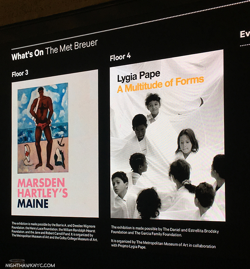
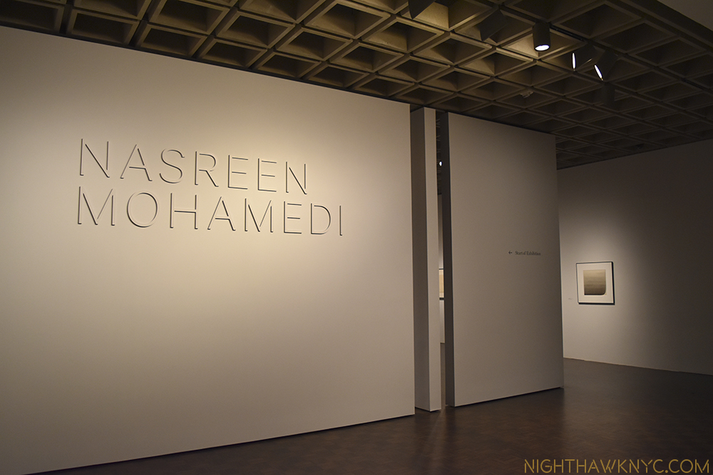
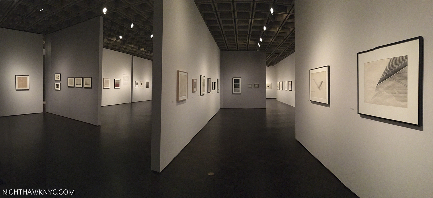
Meanwhile, across town, Sheena Wagstaff , The Met’s Modern & Contemporary Art Chairwoman, continues to give us unexpected shows of M&C Art at TMB, this time focusing on the late Brazilian female Artist, Lygia Pape (1927-2004), and American Painter Marsden Hartley (1877-1943)- two Artists who have almost nothing in common, except, perhaps, Ms. Wagstaff as a champion, and that neither has had a substantial show in NYC, for at least anytime in the recent past (as far as I know). I couldn’t escape the feeling that Ms. Pape has a style not all that unlike the great Nasreen Mohamedi, who Ms. Wagstaff chose to be the very first show of M&C Art at TMB. Mr Hartley, however, does not. “The Painter from Maine” has a strong, muscular style that is worlds away from the from the geometric abstraction Ms. Pape’s and Ms. Mohamedi’s works may seem to be at casual view. His in another part of the story of American 20th Century Art, one that is often, unfortuatley, overlooked, perhaps because it’s rare to see more than one of his works at a time. His place in the long line of important Maine Artists that runs from Thomas Cole to Winslow Homer (a key influence on Hartley) through Edward Hopper to the Wyeths and Richard Estes is assured. While the opportunity to see more of these interesting Artists was most welcome, for me, these shows were equally interesting for what “more” they might reveal of Ms. Wagstaff’s direction, which, given the state of flux The Met is in at the moment, I believe in supporting.

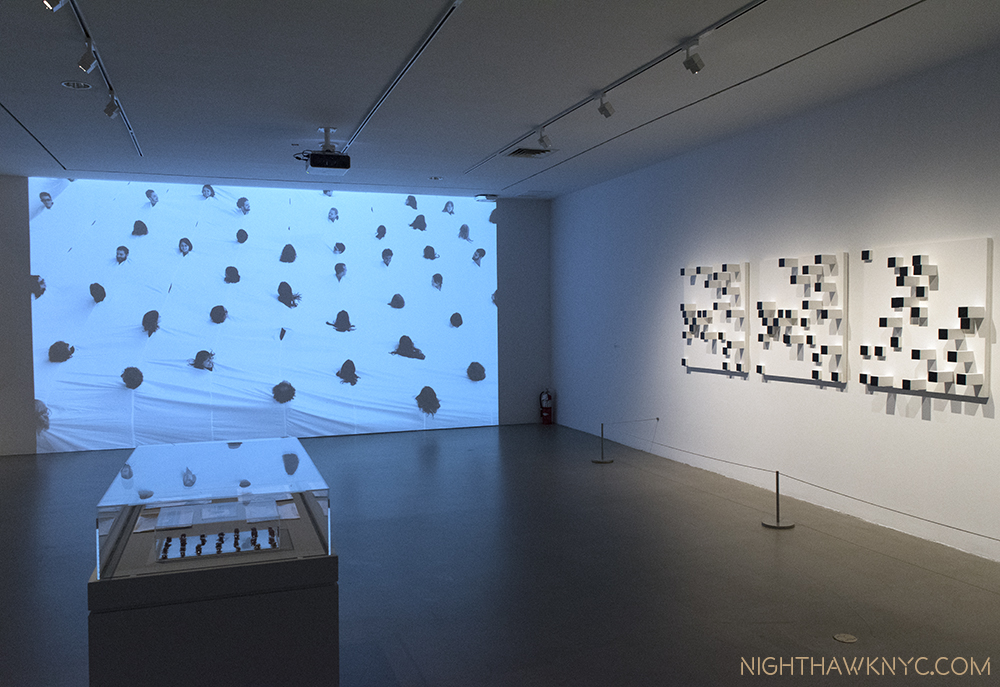
Lygia Pape’s vision extended from paintings to sculpture to people, as seen on the screen on the left,”Divisor (Divider), 1968, performed in 1990,, which seems to mimic the effect of the wall sculpture, “Livro dos caminhos (Book of paths),” 1963-76, paint on wood,  on the right.

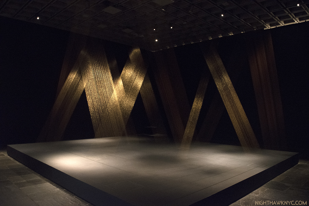
Lygia Pape, “Tteia, 1, C,” 1976-2004, Gold thread, light and a few staples create a haunting, shimmering vision.

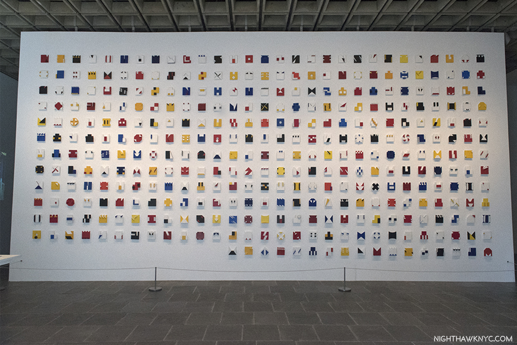
Lygia Pape, “Liver do tempo (Book of time),”1961-63, A tour de force of almost endless creativity & variety in 365 tempera and acrylic on wood pieces in relief.

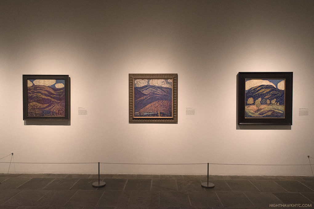
I particularly admire these 3 early Landscapes by Marsden Hartley done between 1907-09, with their unique, almost “Pointilistic” technique, (26 years after the Seurat’s death), which is much “softer” than his “muscular,” later landscapes, like the next one.

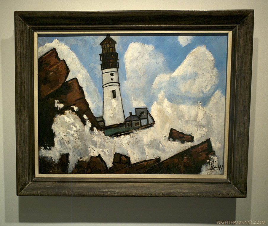
“The Lighthouse,” 1940-41, Oil on masonite

Perhaps the most “muscular” painting since the Mannerists.

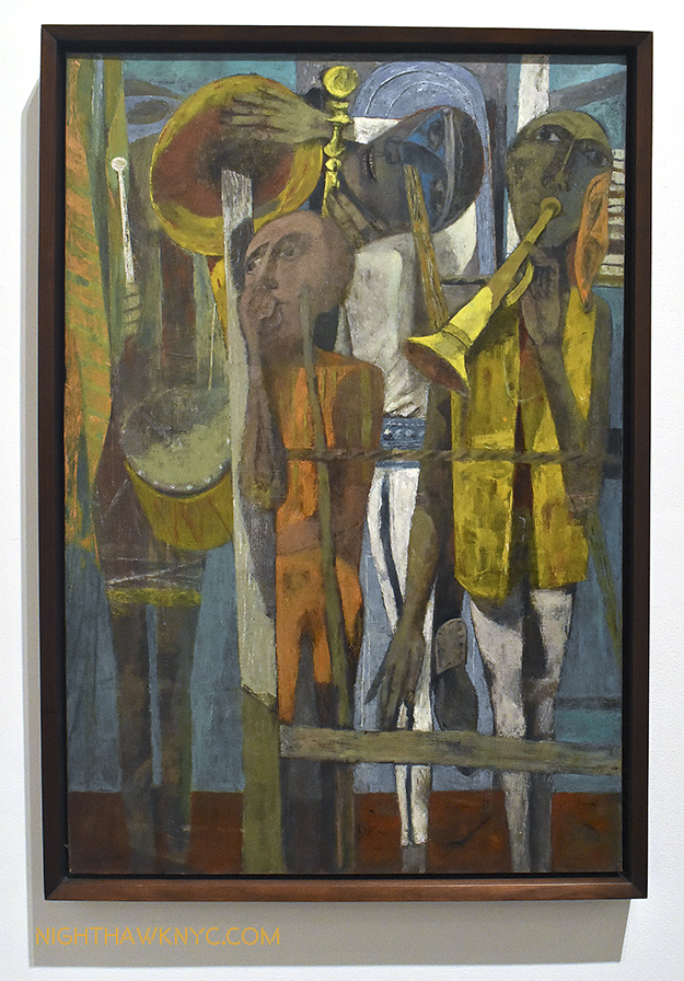
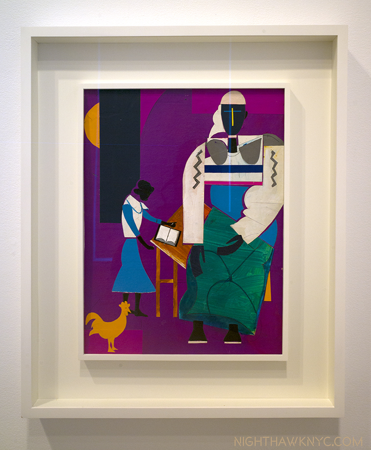
“Romare Bearden: Bayou Fever and Related Works” (@ DC Moore Gallery)- Highlighted by 21 collages from 1979 Romare Bearden (1911-88) created for a ballet entitled “Bayou Fever” that he hoped Alvin Ailey would choreograph, they confirm Mr. Bearden’s place as a master of collage who was ahead of his time. While some works have an overt Matissean influence, everything here is uniquely Bearden, an Artist who is not seen nearly often enough and never seems to fail to impress when he is seen. I mentioned him in in my Post on his friend, Stuart Davis, and my Post on Kerry James Marshall, who selected a piece by Bearden for his “KJM Selects” section of his excellent TMB Retrospective.

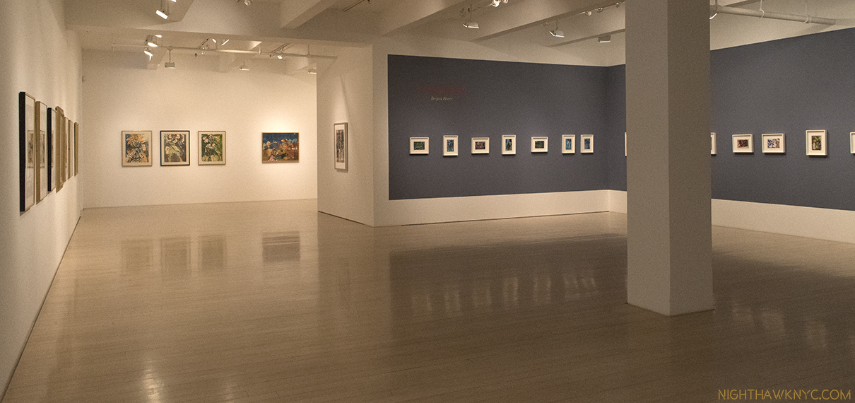
Installation view. The 21 collages from “Bayou Fever,” 1979, are seen to the right.

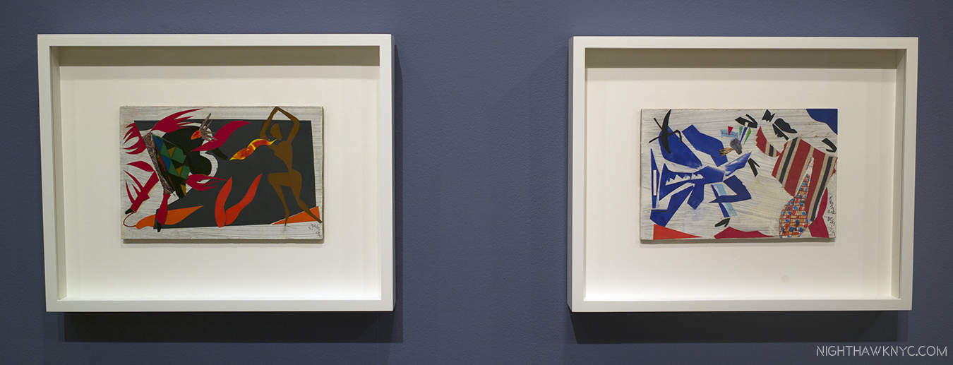
2 works from “Bayou Fever”- “Untitled (The Conjur Woman),” left and “Untitled (The Swamp Witch, Blue-Green Lights and Conjur Woman), both Collages from 1979

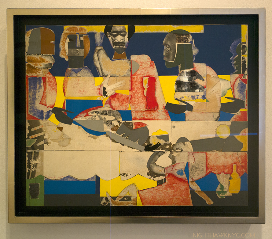
“Feast,” 1969 21 x 25,” Collage

“Noah Means A New Day,” No date, Collage

“Prevalance of Ritual/Tidings,” 1964, Gelatin silver print

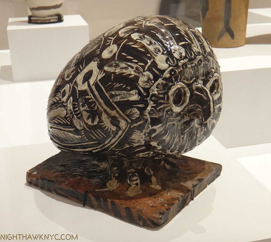
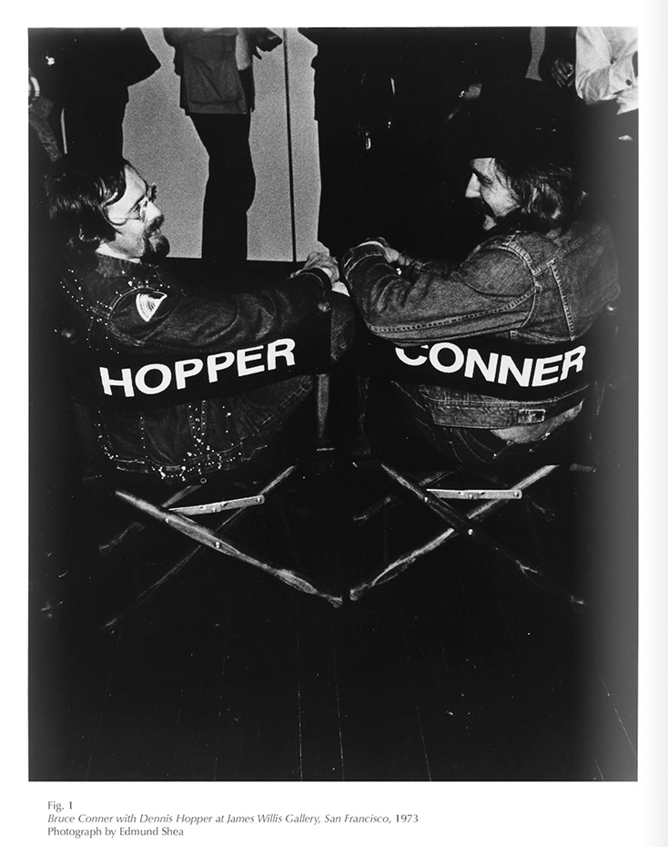
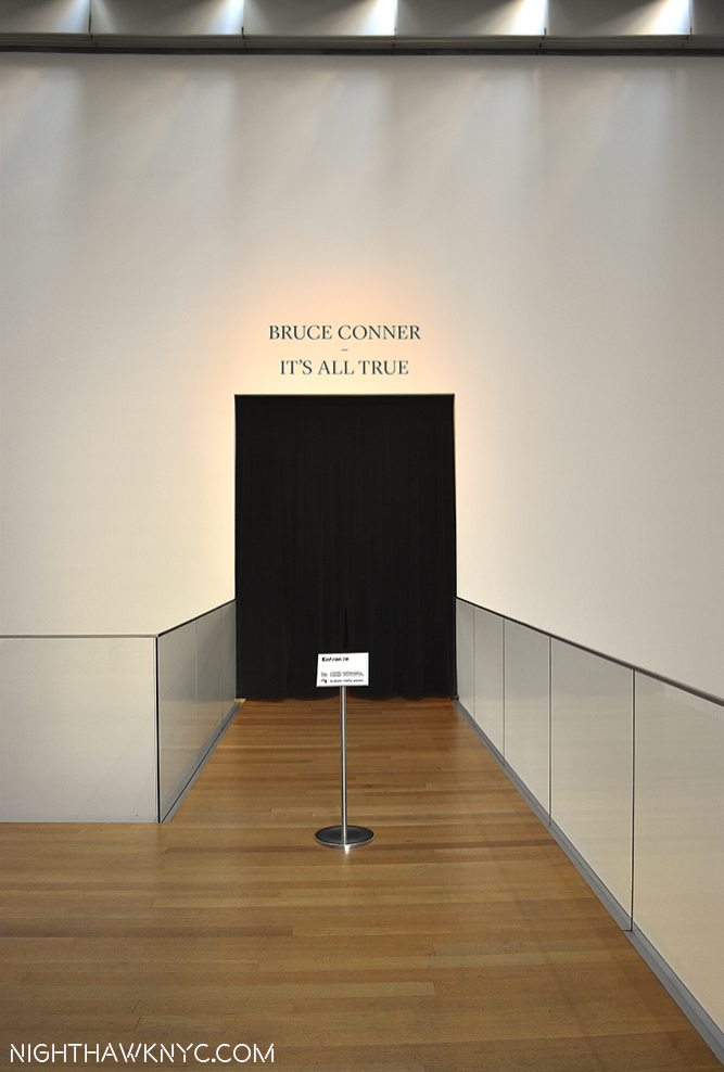
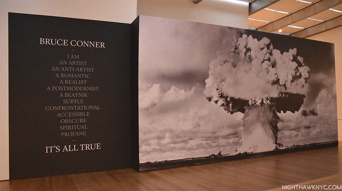
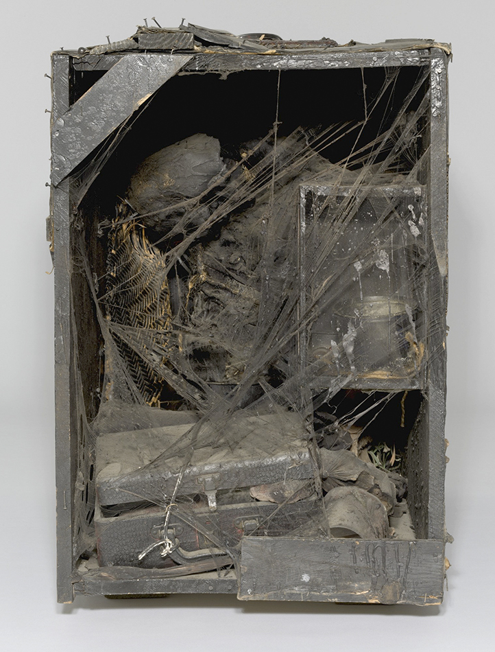
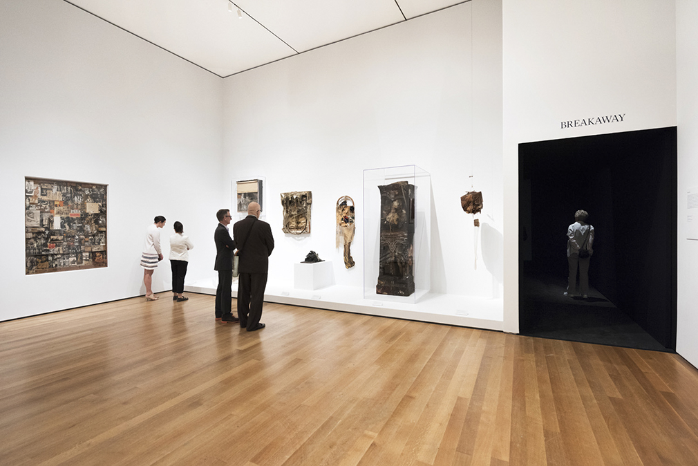
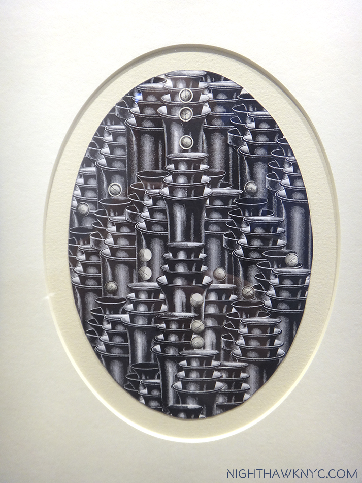
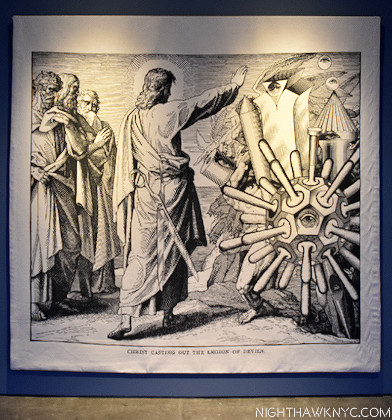
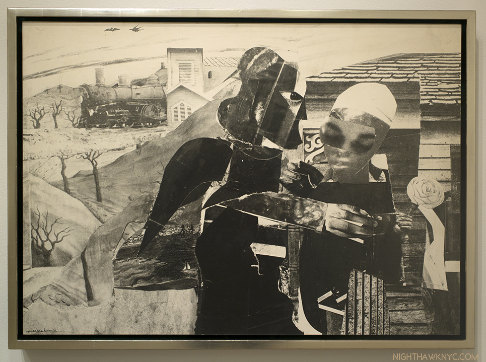
“Rat Bastard Protective Association” (@ Susan Inglett Gallery)- Who? The RBPA was “an inflammatory, close-knit community of Artists and Poets who lived and worked together in a building they dubbed ‘Painterland,'” in San Francisco, to quote the press release. As I wrote about last year, Bruce Conner was, somehow, new to me when I first walked through the black curtain at the entrance of the utterly amazing “Bruce Conner: It’s All True” at MoMA last year but, Susan Inglett had a long history with Bruce Conner, as I learned in speaking with her briefly, earlier this year. So, her (always excellent) gallery’s show of works by “The Rat Bastard Protection Association,” a group of San Fran Artists that included Mr. Coner was something special, and quite rare. In addition to the chance to see amazing work by Bruce Conner I’d never seen before, the show marked my first chance to see work by his Artist wife, Jean Conner, an important Artist in her own right. Add Jay DeFeo, Wallace Berman, Michael McClue to the roster and this was a small show that packed a punch, and pointed out, once again, that the East Coast needs to become much more familiar with this whole group of San Francisco based Artists, who were associated in the Rat Bastard Protection Association from the late 1950’s to early 1960’s. Up from April 27 to June 3, it anticipated the Robert Rauschenberg show now at MoMA and provides a reminder that these Artists were working strikingly similar veins at the same time, 2570 miles, as the crow flies, apart1.

Bruce Conner, “THE EGG,” 1959, Mixed media assemblage in a convex brass frame. Even his extraordinarily wide-ranging MoMA Retrospective didn’t prepare me to see this.

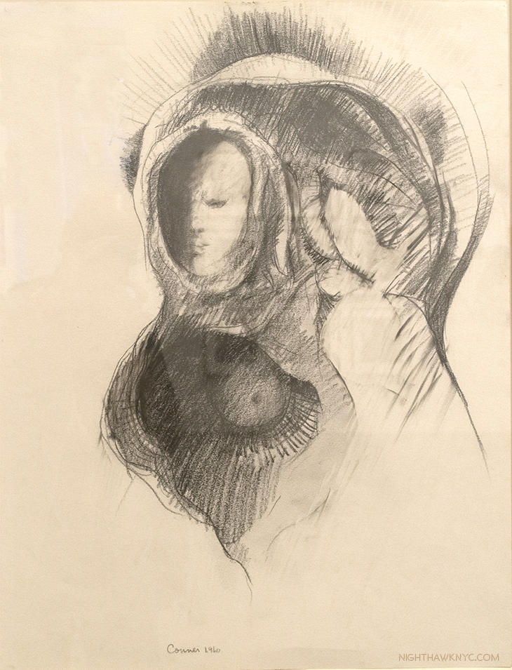
Bruce Conner “MARY, MOTHER OF GOD,” 1960, Charcoal on paper. Almost “conventional,” it shows little sign of the revolutionary drawings to come.

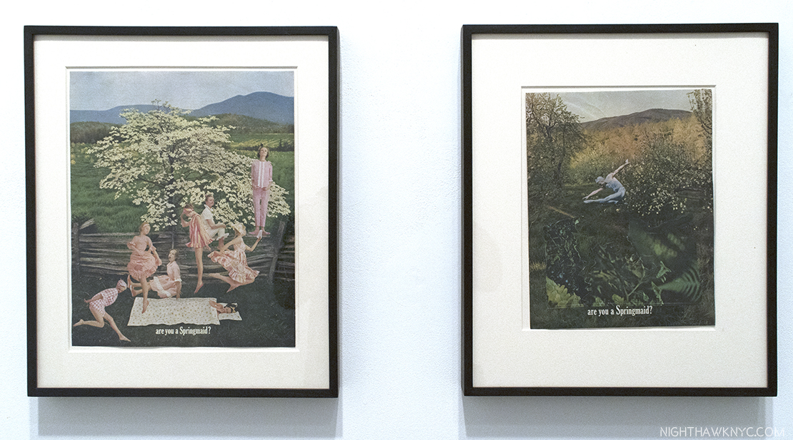
Two collages from 1960 by the overlooked Jean Conner, both titled “(ARE YOU A SPRINGMAID)

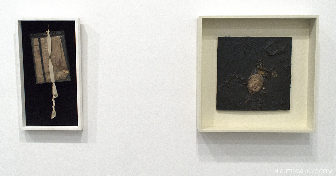
Two assemblages by Bruce Conner, “UNTITLED (DO NOT REMOVE),” 1960 and “FLOATING HEAD,” 1958-59

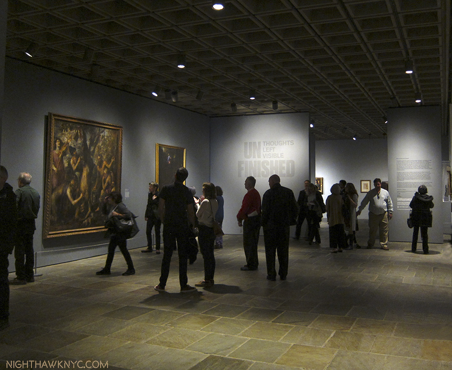
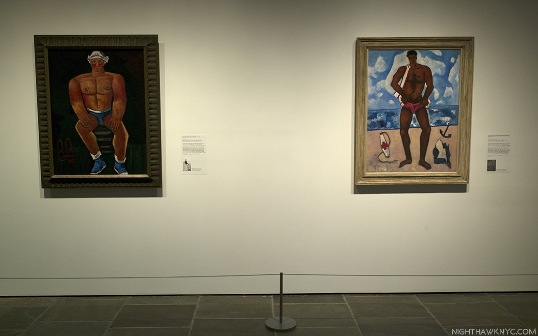
“Alice Neel, Uptown” (@ David Zwirner Gallery)- An increasingly beloved and respected New York Artist (she settled here at age 27, and lived here for over 50 years), her star continues to rise, though it’s taken a long time (she passed in 1984, at age 84). She always leads with her humanity, and it seems to me that that’s something that makes New York proud of her. Though one of her works was the featured/poster image for The Met Breuer’s 2016 blockbuster “Untitled: Thoughts Left Unfinished,” a perfect choice, IMHO, there hasn’t been an Alice Neel show all that recently, as far as I can recall. This one would still prove itself different even if there had been a few. For one thing it focused on work Ms. Neel did while she was living “Uptown,” in East Harlem (aka Spanish Harlem), from 1938 to 1962, and, as the press release says, it focuses on portraits of her family, friends and neighbors. The results are classic Alice Neel. Though not everything here is a major work, the breath of fresh air it provided only hints at how much pent-up longing I think there is to see more of her work.

The time has come!

The show has moved to Victoria Miro, London, where it can be seen through July 29.

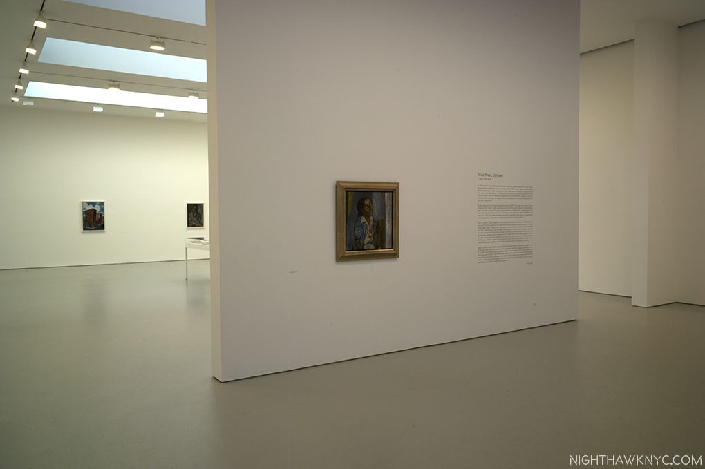
Shown in two adjoining David Zwirner locations, this is one of the two entrances.

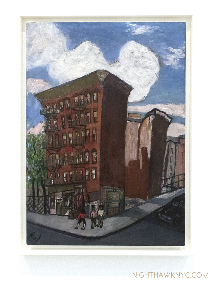
“Building in Harlem,” 1945, Oil on canvas. Ms. Neel lived in East (Spanish) Harlem from 1938-62.

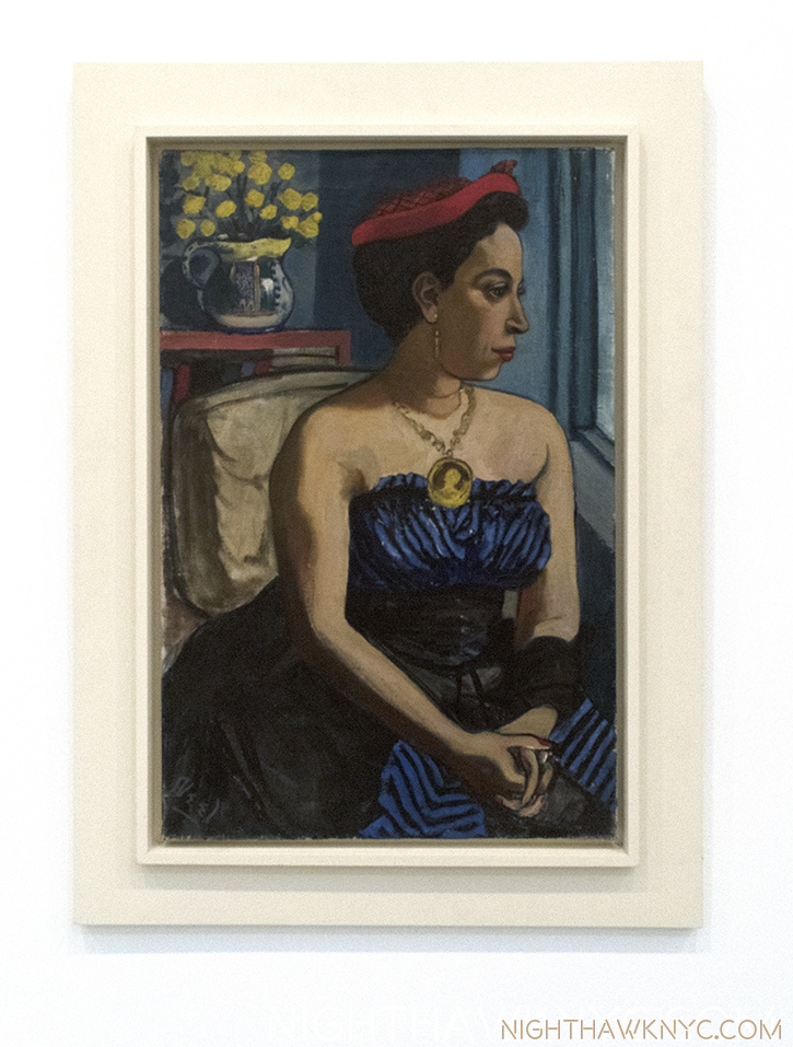
“Alice Childress,” 1950, Oil on canvas. An actor who became a playwright and novelist when she found “little dramatic material that represented the lives of black women she knew,” per the show’s curator, Hilton Als.

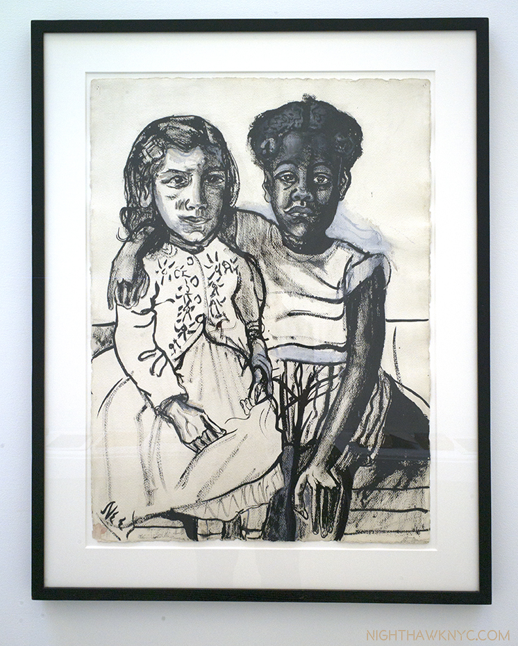
“Two Girls,” 1954, Ink and gouache on paper.

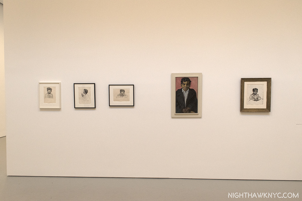
Georgie Acre, a young Puerto Rican boy who often ran errands for Ms. Neel, seen in 4 Drawings and a Painting from 1950-58. In 1974, Mr. Arce was convicted of murder. He’s shown praying in the second Drawing from left.

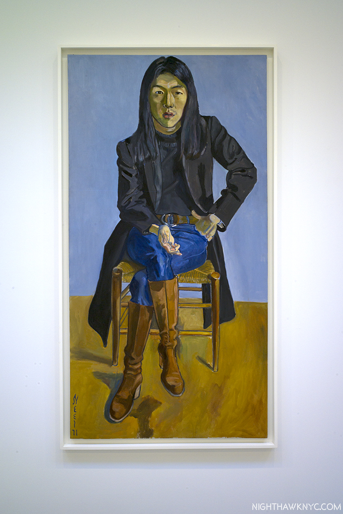
“Ron Kajiwara,” 1971, Oil on canvas. A son of Japanese immigrants, he was detained in a California internment camp during WW2. He later became a design director for Vogue before dying of AIDS in 1990.

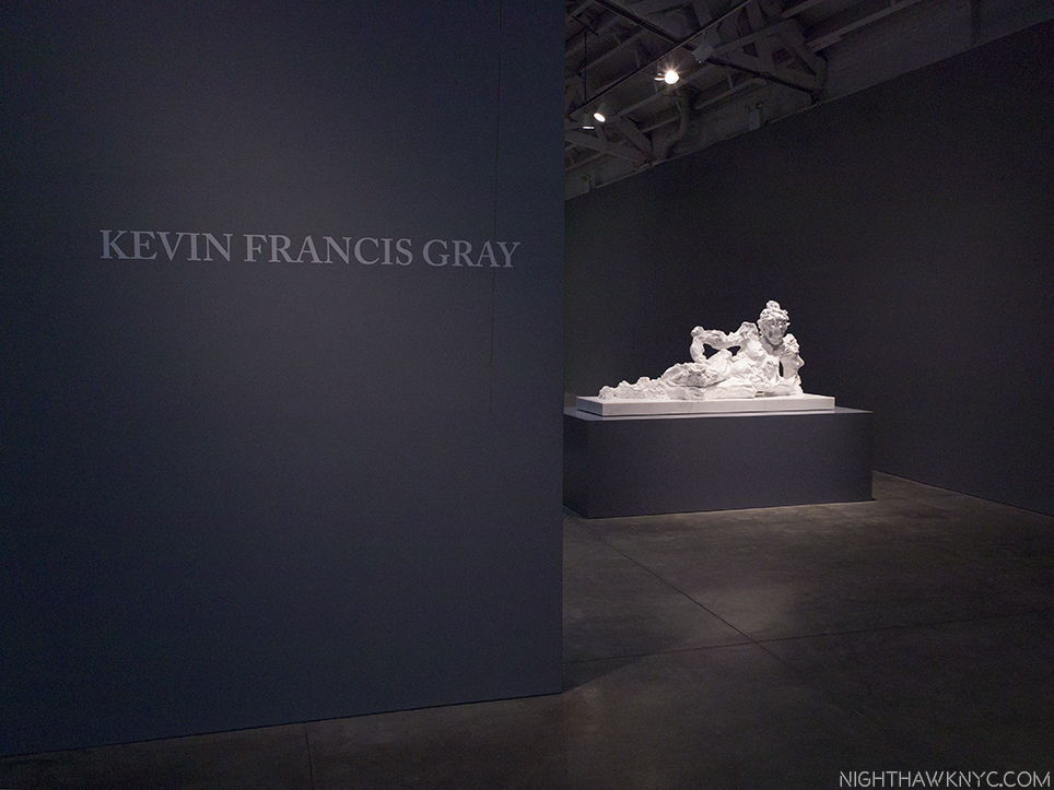
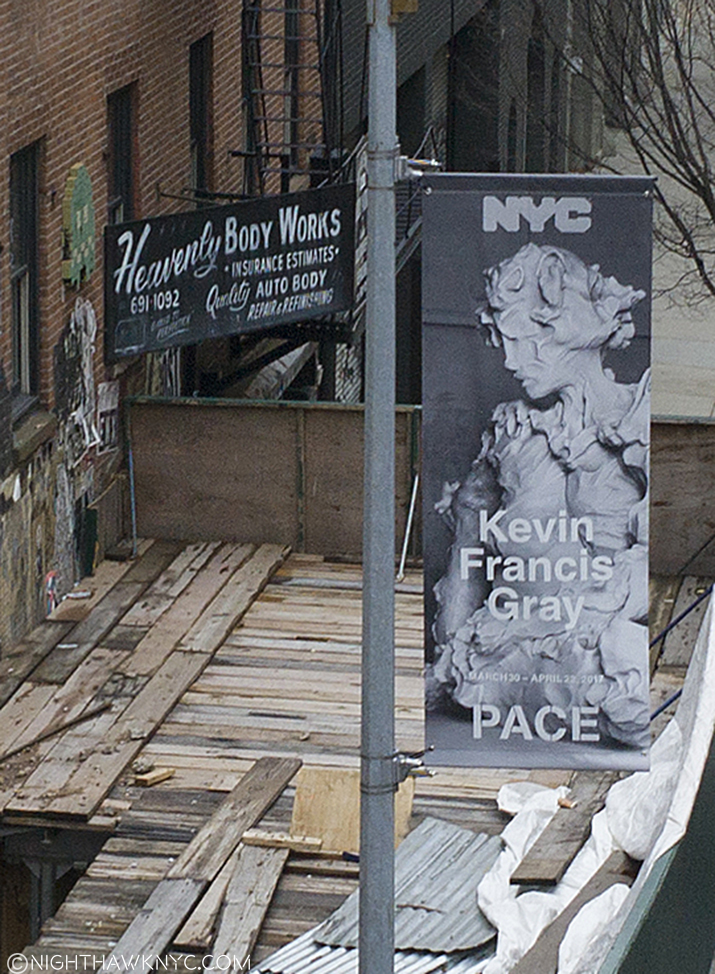
And finally, Kevin Francis Gray (@Pace, West 24th Street)- I can’t recall encountering anyone who’s doing what Mr. Gray is with “figurative” sculpture.

“Reclining Nude 1,” 2016, All works are Carrara Marble

Does he use a secret laser ray? Has he discovered how to melt marble, then work it in it’s molten state? Somehow, he’s able to make Carrara marble attain the properties of clay!
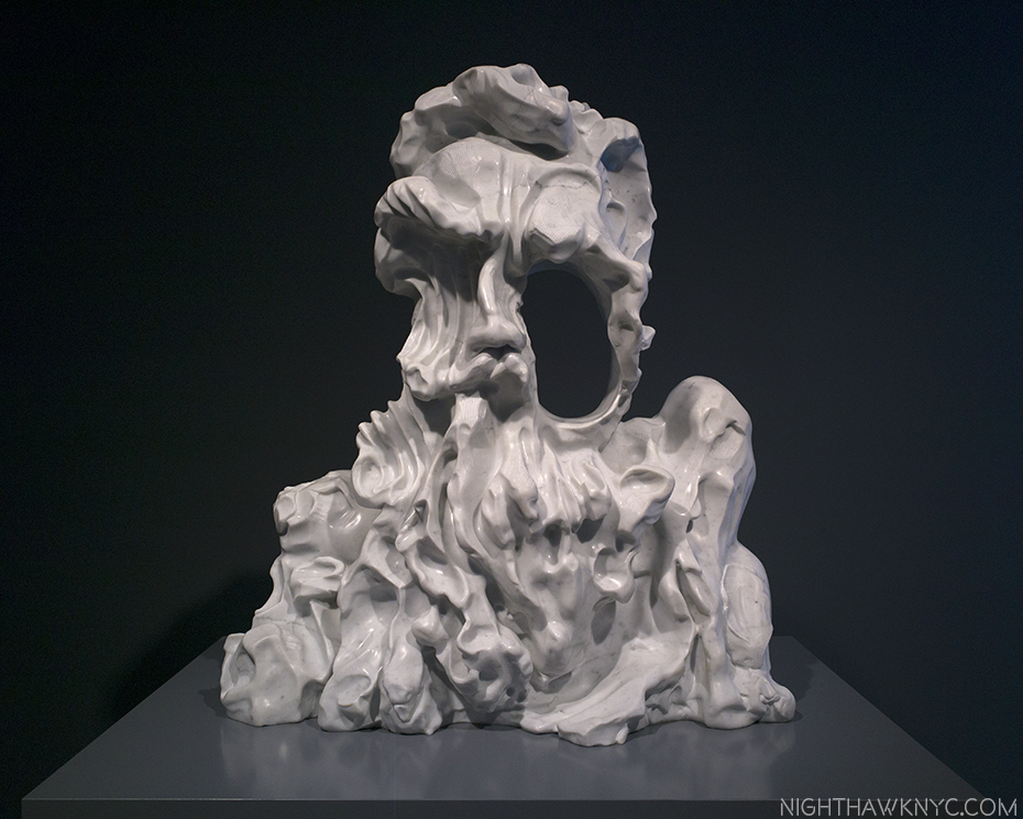
“Salamander,” 2017

Ummmm…Yes, I had to remind myself continually, after tying my hands behind my back so I wouldn’t touch them to appease my wonder… These are MARBLE!

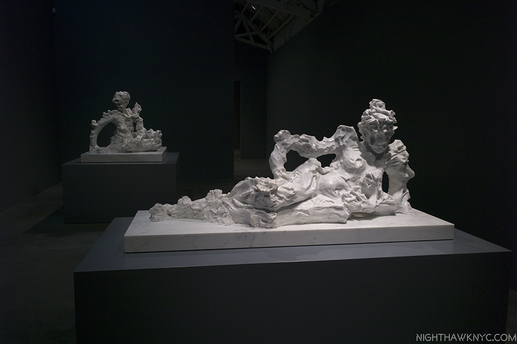
“Reclining Nude 1,” 2016, front, and “The Aristocrat,” 2017

I find it daring, exciting, and revolutionary. Along the way, he blurs the lines between the representational and the abstract, while adding all sorts of new levels of appearance, meaning, and possibilities to “portraiture.”

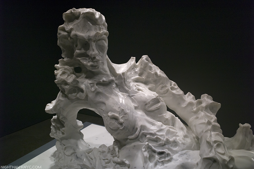
Detail of “Reclining Nude II,” 2017

While some of his past works, especially his “Twelve Chambers,” 2013, group of 12 life-sized figures vaguely reminded me of Rodin’s “Burghers of Calais“, these recent works appear, to me, to be a breakthrough. Is Kevin Francis Gray the successor to Rodin? He’s only 45. We’ll see where his new developments lead him. Stay tuned…he said, with bated breath.
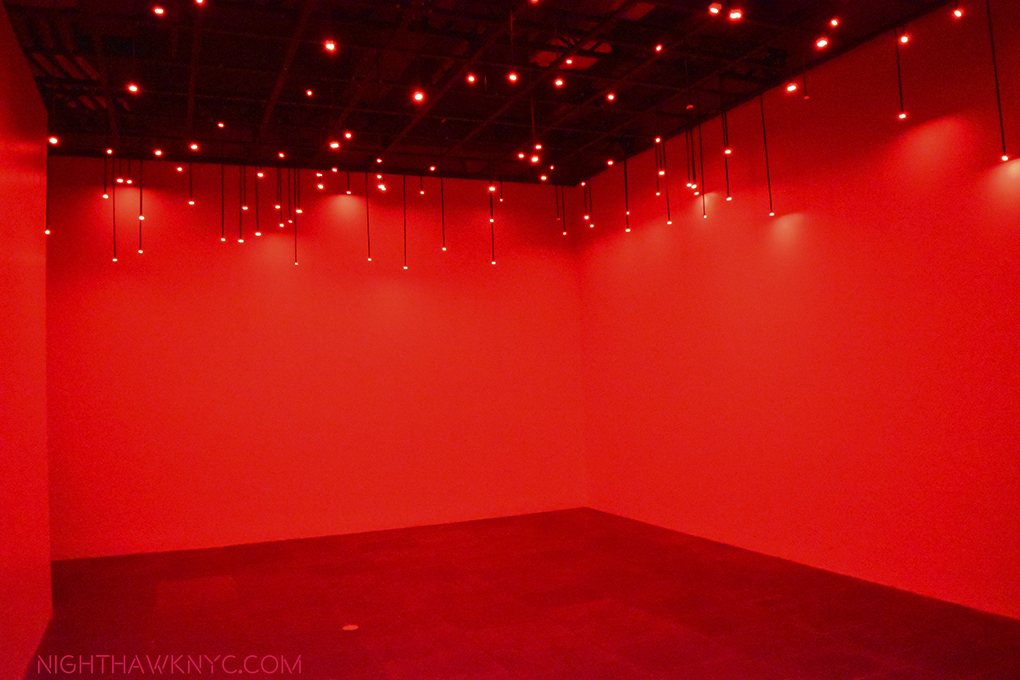
“Heavenly bodies…”

*-Soundtrack for this Post is “It’s Quiet Uptown,” by Lin-Manuel Miranda, from “Hamilton.”

NighthawkNYC.com has been entirely self-funded & ad-free for over 8 years, during which 300 full length pieces have been published! If you’ve found it worthwhile, PLEASE donate to allow me to continue below. Thank you, Kenn.

You can also support it by buying Art, Art & Photography books, and Music from my collection! Art & Books may be found here. Music here and here

Written & photographed by Kenn Sava for nighthawknyc.com unless otherwise credited. To send comments, thoughts, feedback or propositions click here. Click the white box on the upper right for the archives or to search them. Subscribe to be notified of new Posts below. Your information will be used for no other purpose.

  1. My fine feathered friends (aka “The Birdies”) just smirked when I said that, again, and said they stand by their prior comment on the matter, here.

The Whitney Biennial Turns The World Upside Down

There’s more than “one way” to select a Biennial, and therein lies my rub…Click any photo to enlarge.

Ahh…The Whitney Biennial. That semi-annual whipping post, “they don’t make Art like they used to” kind of a show of Contemporary American Art by “young and lesser known Artists” that, frankly, I gave up on and stopped going to, missing the last one at the “old” Whitney (now The Met Breuer) in 2014. This new one, the first in their new building, ends on June 11.

Liberty by Puppies Puppies, 2017. “Give me your tired tourists, yearning for a selfie moment, rife with sociopolitical comment,” with an incomparable background. At various times, it’s a real performer, at others, it’s a mannequin. At no time will the Nighthawk go out on that deck.

Oh! What I do in the name of “Art!” Ummm…You need some gel or something for those spikes. That Torch seems to be slipping. And? Where is that big book? Whatever you do? DON’T look down!

If you have any interest in Contemporary American Art you should see it if you can. Is it a “must see?” My initial impression, which I Posted here on March 31 (which this Post replaces) left me feeling there was much to see and impressed by some of what I’d seen. Having made 10 visits thus far, however, my answer is “No.” Unfortunately, though there are a number of memorable pieces on view, and I think it’s highly likely you’ll discover some new names you’ll put on your list that you’ll want to explore further, overall, it’s not a must see, in my opinion. Let’s face it- there are so many really, really good shows going on here now. If you’d ask me what to see that’s up at the moment? I would say about the Biennial, “See it if you have time,” after seeing the others.

As always, it wouldn’t be the Biennial without some hair-pulling, teeth-gnashing, and “Wtf moments.” In this edition’s case they are there, and fairly serious negatives, in my opinion, mostly regarding the choices of what is included and what has been omitted.

True, but I’d at least like to survive this show. In the Wake, 2017, 2 of 16 Banners by Cauleen Smith.

As for my lists, after two visits, the name Samara Golden made mine of Modern & Contemporary Artists- of any age, to keep an eye on. After 10 visits? She’s still there. During each one, my wonder never ceased every time I experienced her work…ummm…installation….ummm….ok…creation, The Meat Grinder’s Iron Clothes, 2017. It is, literally, one of the most astonishing Art works I have seen since…? I honestly don’t know. Maybe, ever.

Check your expectations at whichever side door you choose to go in to enter Samara Golden’s work.

It’s so big with so much to see it may well be un-photographable. Hmmm…where have I heard that before?

“Your looks are laughable
Unphotographable
yet your my favorite work of Art”*

It, literally, turns your world upside down it’s so disorienting. Like I said about the unforgettable Bruce Conner Retrospective when it was at MoMA, “Htf?,” substituting “How” for “What,” this work takes that “How” to the “nth” degree. Unfortunately for me, it’s a work that uses height as a key element, (as does “Liberty,” above). Being deathly afraid of heights I was unable during either visit to get close enough to the preferred viewing areas to really even see most of it and get the full effect. This is as close as I’ve managed to get (thanks to the Whitney staff for nailing me to the floor)-

One little bit of Samara Golden working her magic. Ok. I’m looking down at the sky, and up at the street. Whatever is going on? I’m not sitting in that chair.

During one visit, a viewer turned away and said, “It’s an optical illusion.” I didn’t reply, but thought to myself- “Yeah? So is the Mona Lisa. There’s no real woman up there on that canvas. There’s only oil paint, and whatever Leonardo Da Vinci put under it, and what’s been put over it up there. It’s what the Artist does with his or her materials that makes the miraculous thing called “Art.” I don’t understand exactly how that translation occurs, but I’m always glad when I it does, as with Samara Golden’s “The Meat Grinder’s Iron Clothes.”

Taken as a whole, I heartily applaud the up to the minute, very politically and socially aware bend to the show, which leaves plenty to think about, which both honors, and continues, the Whitney’s long-standing tradition of being involved.

Occupy Museum’s piece, Debtfair, recounts the historic rise of the mounting debt Artist face, as shown in this graph, trying to survive & create.

Samara Golden’s work does this, too, except she gives you very different things to think about. The feeling that came to my mind was the so-called “trip” section of Stanley Kubrick’s 2001: A Space Odyssey, forever my favorite film. I don’t want to say more about it to give readers a chance to experience it for themselves without anyone else’s words in their head (and that’s also why I’m including only one of the photos I attempted at this time). Ok, and also because I still don’t know what to make of it myself. To help me, I bought the brand new MoMA PS1 book for her The Flat Side Of The Knife, 2014 show there (of the same title) for background. After 10 visits, I’m not sure the book, interviews with the Artist, or ANYthing will help me better understand this work. (Note to self- You haven’t even read the information card for this piece. In fact? You don’t even know where it is!) You’re on your own to make of it as you will, and frankly? I prefer it that way. I wish more Contemporary Art “needed” less explaining.

Elsewhere, the other highlights, for me, are- the brilliant choice of having Henry Taylor and Photographer Deana Lawson (who share a real life working dialogue) share a gallery (Mr. Taylor’s biggest work is in the lobby area just off the elevator on the 6th floor, as I wrote about, and pictured, in my Post on Henry Taylor). Deana Lawson is, undoubtedly, one of the stars of this Biennial. For weeks after the show opened,  I heard her name on people’s lips just about every where I went. Amazingly, you can still buy an original work of hers, in a signed and numbered limited edition of 50 on Light Work’s excellent site, here, for $300.00! They also have an excellent edition of Contact Sheet dedicated to her, which was available there for $12.00. Neither will last long.

Installation view of the Deana Lawson-Henry Taylor gallery.

Deana Lawson, Sons of Kush, 2016. Apologies for the glare.

The Artists, KAYA (Painter Kerstin Bratsch and Sculptor Debo Eilers), impressed me with their unique works, as Artists striving to bend boundaries between mediums, possibly following the path of Frank Stella, and they succeed to memorable effect in the works shown here.

SERENE, Processione (ALIMA), Processione (JAKE), Processione (TIN), all 2017, by KAYA (Painter Kerstin Bratsch and Sculptor Debo Eilers)

Painters Jo Baer, Aliza Nisenbaum, Celeste Dupuy-Spencer, and Dana Schulz stood out, for different reasons, but perhaps most importantly as far as I’m concerned, they show the ongoing vitality of Painting in 2017.

Veteran’s Day, 2016, Celeste Dupuy-Spencer, “looks at figures who engaged in meaningful resistance. These include the Abraham Lincoln Brigade, the international volunteers who fought against Franco in the Spanish Civil War, Muhammad Ali, and Karl Marx and Engels,” per the info card.

Paintings outdoors? At night? One of an interesting series of work by Ulrike Muller, yes, seen outside on the 5th Floor, at night.


Jo Baer, Dusk (Bands and End-Points), 2012

The Whitney & the Biennial’s curators have taken a fair amount of heat for the inclusion of Dana Schulz’ Open Casket. Further on the controversy front, an entire gallery was devoted to Frances Stark’s series Censorship NOW, which consisted of a series of huge, painted, double page reproductions (with underscores in blood red paint) from the 2015 book of the same name by musician, writer, D.J., etc. Ian F. Svenonius. While her/their point is fascinating, I was left wondering if she/they chose the right targets. As with the other works I’ve shown thus far, it’s worth seeing for yourself and making your own mind up.

Frances Stark, Censorship NOW, 2017, large, painted reproductions, with notations, of the book of the same name by musician Ian F. Svenonius.

I will say that a good deal of the Biennial I most likely won’t see because I’m not particularly drawn to film & video. As for the negative aspects of this Biennial. I’m quite puzzled by a good deal of what’s installed on the 5th floor. This wouldn’t be so frustrating for me except for the fact that I can’t understand why so many deserving Artists, who I feel should be here, are not.

Yes, there was snow on the ground as the Biennial opened as seen on the 5th floor roof deck. I have nothing to say about anything else in this photo.

In line with my ongoing policy against being negative about Art or Artists, I’m not going to get specific about the latter. With regards to the former, there is a long list of Painters and Photographers, especially, who I feel are serious omissions. Here’s a short list-

Painters (in no particular order)- Where is Andy PiedilatoJeff Elrod? Fahamu Pecou? Hope Gangloff? (Heck, Rod Penner is only 2-3 years older than Henry Taylor.)

Drawings-Ethan Murrow? Emil Ferris?

Photographers (By my count, there are only SIX in the show! Not counting, Artists, like Oto Gillen, who display stills from video. I don’t consider that Photography.)- Where is Gregory Halpern? Mike Brodie? (He’s 32, and though he says he’s “retired,” he deserves to be here.) Matt BlackAhndraya Parlato?

In closing there is one thing I will say about Samara Golden’s “Meat Grinder’s Iron Clothes.” Already, it’s apparent that no matter how many times in the years to come I visit the western end of the Whitney’s 5th floor I will think back to this work having been there, and marvel at how she did it…

“Hey,” I’ll say to no one in particular nearby in the future. “Did you see THAT?”

“Yeah,” someone I haven’t yet met will say. “They don’t make Biennials like they used to.”

On The Fence,” #4- Samara Golden Edition.

*- Soundtrack for this Post is “My Funny Valentine,” written by Rogers & Hart and published by Warner/Chappell Music, Inc.

NighthawkNYC.com has been entirely self-funded & ad-free for over 7 years, during which over 275 full length pieces have been published! If you’ve found it worthwhile, PLEASE donate to allow me to continue below. Thank you, Kenn.

You can also support it by buying Art, Art & Photography books, and Music from my collection! Books may be found here. Music here and here.

Written & photographed by Kenn Sava for nighthawknyc.com unless otherwise credited. To send comments, thoughts, feedback or propositions click here. Click the white box on the upper right for the archives or to search them. Subscribe to be notified of new Posts below. Your information will be used for no other purpose.

AIPAD SnapShots: The Photographers- Jim Jocoy

This site is Free & Ad-Free! If you find this piece worthwhile, please donate via PayPal to support it & independent Art writing. You can also support it by buying Art & books! Details at the end. Thank you.

Written & Photographed by Kenn Sava (*- unless otherwise credited)

This is the second of my Series of 4 Posts on “The Photography Show, 2017,” aka “AIPAD.”  This part is a close up of one of the Photographers I encountered at the show, Jim Jocoy. More soon…

“…no hard chords on the car radio we set the trash on fire and watch
outside the door men come up the pavement under the marquee
there’s laughing outside we’re locked outside the public eye…”*

If you love Rock n Roll, and/or great Photography, Jim Jocoy is a name you should know. That’s easy for me to say now. Up until Thursday at 3pm, I had never heard of him.

Then, aiding me in my recent efforts to get up to speed on the world of Contemporary Photography, Paul Schiek, Owner of TBW Books, one of the most respected imprints in the PhotoBook world, handed me a copy of “Order of Appearance,” TBW’s just released collection of his 1977-1980 punk rock photos. It’s only Mr. Jocoy’s second book after the initial collection of his work from this period, 2002’s “We’re Desperate,” which included an interview with the Photographer by Thurston Moore of Sonic Youth, and a preface by Designer Marc Jacobs. It’s now a collector’s item going for $300.00 and up online.

One look through “Order of Appearance” and I was mezmerized.

Having been a musician in a band on the road at the same time Mr. Jocoy has immortalized, though on the East Coast, while was he busy on the West Coast, I’d lived through this, too, but only seen photos that captured both the essence of what it was like as well as the moments that defined the scene in the extraordinary shots taken by the late, great Bruce Conner, some on view at MoMA this past year, as I mentioned, here.

Until now.

Speaking with him a few hours later, Mr. Jocoy told me actually saw Bruce Conner in the clubs quite often, and came to know him, but, he said that he never once saw Bruce Conner with a camera! In fact, he initially thought he was just an odd guy who danced funny.

Jim Jocoy’s “Order of Appearance,” a brand-new release from TBW Books, features a cover design by Paul Schiek that lifted the black lines of a design on a shirt worn in the book and placed it on top of one of a statue in true punk fashion. Click any image to enlarge.

As I looked through “Order of Appearance,” I was struck by the thought that here, Mr. Jocoy has gone even Bruce Conner one better. He captures more of what it was like, taking you, on, but also off stage, and back stage, and only he knows where else, continually providing the feeling that you are right there- seeing things that only happen late at night when there’s an excess of excess, except that you also happen to be a terrific photographer, so indescribable moments that no one who wasn’t there would ever believe happened, are magically frozen in time for you, at the “peak of their freshness” as they say. The resulting body of work, hidden away in Mr. Jocoy’s archives for these past almost 40 years (or, “locked outside the public eye,” as X sings in “The Unheard Music,” on their album “Los Angeles,” I quoted up top) is many things- a work that captures a musical and social movement in time, and, as I was to find out a short while later when the Photographer, himself, gave me a guided walk-through of the book, a very personal remembrance for him, as a number of those pictured are no longer with us. Yet, Mr. Jocoy turned this precious body of work over to Paul Schiek and Lester Rosso of TBW who then created this book out of it. Mr Schiek, in addition to being the Owner/Publisher of TBW Books is also a Photographer of renown in his own right, and so was a serendipitous collaborator for this project, bringing the sensitivity only a fellow Artist could bring to the project, and the results are stunning, often down right uncanny.

I was so much older then. Jim Jocoy poses with a 1980 Portrait of his 37 years younger self!

Right from the first image in the book.

Muriel Cervenka with bruised knees. Photo by Jim Jocoy, the first image in “Order of Appearance.”

Mr. Jocoy explained to me that this lady, sitting next to a road case that once belonged to dancer Twyla Tharp, and who’s knees are bruised in this photo (as a dancer’s might be), and who’s feet look like they are “on pointe” in her red shoes, no less, is Muriel Cervenka, the sister of Exene of the band “X.” Muriel was killed in a hit and run just days after this photo was taken, and on the night of X’s debut for their first album, “Los Angeles.” What a unique photo it is- I’ve never seen a “portrait” like it- in Paint or in a Photo. Exene actually went on just after getting the news, he told me. While that adds incaclulable levels of poignancy to seeing it, the fact that it was placed first by Messers Schiek & Rosso, where it sets a tone for the rest of the book’s three sections astonished me.

Already, I knew this was a special book.

As he continued, reminiscing with such immediacy that I felt like these things had happened this past week, the passing images were equally remarkable, whether they were of members of bands I’d heard of, or not, or people who just happened to be there, including Allen Ginsberg. I felt that many of the portraits in this book were “ideal” portraits- THE image someone would want to be remembered by. They encapsulated them so well, you got a sense of who they were, though they’re total strangers to me, and probably most of us. Mr. Jocoy seems to have been everywhere at once, but no matter where he is, his personal connection to everything in this book takes it light years beyond being a party book, or even an amazing document of the time and a moment in music and culture, to make it a beautiful & moving personal testament, and all of that is what makes it special1. And, did I mention that Jim Jocoy is, also, one of the nicest guys you will ever have the pleasure to meet?

“Woman reclining on car,” 1977. Something similar happened to me, and only lives in my memory. Luckily, Jim Jocoy beautifully captured his for the ages.

Then we spoke about that passage of time. I asked him about these slides sitting in his archives for so long. He mentioned looking at them a little while after he took them and feeling they were good, and they “would still be good,” after even more time passed. Well now, almost FORTY YEARS have passed, and these images are not just “good.” They’re very, very good, and as lovingly presented as they are in “Order of Appearance?”

“D.N.A. and Sharon,” a miraculous double exposure that every other bass player on earth, starting with me, is jealous of. Sharon was lying on the street, which you can barely make out. Sorry for the poor pic- I didn’t want to open my book too far.

“Guy passed out,” 1978. If this doesn’t sum the whole thing up, perfectly, I don’t know what does. My photo is poor, so pick up a copy and see it in all it’s glory.

“Friends in a Gold Car,” 1978, by Jim Jocoy.

With only 1,000 copies printed, I think it’s destined to be as sought after as “We’re Desperate” is now.

Book Artists. Paul Schiek, Owner of TBW Books, left, with Lester Rosso, Program Director, designers of “Order of Appearance,” with the finished book, the poster for it, and some of Jim’s work at AIPAD.

Don’t take my word for Mr. Jocoy’s talent. No less than that huge fan of rock n roll, Shepard Fairey, used one of Jim Jocoy’s other images, his classic shot of Sid Vicious, in an Obey Giant print in 2004 called “Sid Jocoy.”

Jim Jocoy’s now iconic Polaroid of Sid Vicious in January, 1978, after the Sex Pistols last performance together. Photo by Jim Jocoy. (Not in his new book)

Then, Mr. Jocoy spoke about releasing these photos now, partly, out of a “responsibility” to those he photographed who have passed. While “Order of Appearance” is a beautiful tribute to his departed friends, who will continue to live on through his work, it also cements Jim Jocoy’s legacy among both the great music photographers, and portraitists, of our time.

Jim Jocoy holding TBW’s poster for his new book. As it says, THIS is the real deal.

*-Soundtrack for this Post is “The Unheard Music,” written by Exene Cervenka and John Doe, from “Los Angeles,” by X, published by The Bicycle Music Company.

This is Part 3 of the most extensive coverage of AIPAD, 2017, available anywhere! The rest of this 4-part series is here.

NighthawkNYC.com has been entirely self-funded & ad-free for over 8 years, during which 300 full length pieces have been published! If you’ve found it worthwhile, PLEASE donate to allow me to continue below. Thank you, Kenn.

You can also support it by buying Art, Art & Photography books, and Music from my collection! Art & Books may be found here. Music here and here

Written & photographed by Kenn Sava for nighthawknyc.com unless otherwise credited. To send comments, thoughts, feedback or propositions click here. Click the white box on the upper right for the archives or to search them. Subscribe to be notified of new Posts below. Your information will be used for no other purpose.

  1. Mr. Jocoy includes a page of captions, most including names, near the end of the book.

NYC Art Shows 2016- Sheena Wagstaff Rules The Waves

This year past, Manhattan Art was largely dominated by two themes. There was a seemingly continual string of shows by many of the bigger names in Abstract Expressionism (i.e. AbEx), one after the other, and I wrote about every one of them, beginning with Jackson Pollock @MoMA, Lee Krasner, Philip Guston (two- here and here), Richard Pousette-Dart, Joan Mitchell and Mark Rothko, along with a few excellent satellite compilation shows, each in a different venue, which, apparently is continuing into 2017 with Jackson Pollock set to open at the Guggenheim, completing the circle, for now. It was also a year of Women Artists getting important shows. Patti Smith, Nasreen Mohamedi, Diane Arbus, Cindy Sherman, Marilyn Minter1, June Leaf, Carmen Herrera, Nan Goldin, Mary Bauermeister, Carrie Mae Weems, Latoya Ruby Frazier, Krasner and Mitchell were only some of the highlights. Still? Artists weren’t the only women making a big impact on the NYC Art Scene in 2016. In fact, for my money, the biggest impact of all was made by another woman, The Met’s Chairwoman of Modern & Contemporary (M&C) Art, Sheena Wagstaff.

As far as I’m concerned, no other single person had the impact on NYC Art, all year long, that Ms. Wagstaff and her department did.

Sheena Wagstaff was named Chairwoman of TM’s M&C Department on January 20, 2012. Four years later, her 2016 began with putting finishing touches on TM’s new “branch Museum,” The Met Breuer (TMB), the first “branch” The Met has opened since The Cloisters in 1926! No pressure there. As it was about to open, ostensibly as the showcase for The Met’s “new” M&C Art iniatative, The Times’ Roberta Smith put the situation perfectly into perspective, speaking about the task Ms. Wagstaff faced/faces-

“But the Met is huge and old, with a history of treating contemporary art as an afterthought. Getting it to change is like turning around an ocean liner.” Roberta Smith, NYT, March 3, 2016.

It sailed into it’s mid- March opening with 2 shows- Unifnished: Thoughts Left Visible, a veritable Museum in itself covering 2 full floors (the third and fourth), and, easy to overlook, tucked away on the second floor, Nasreen Mohamedi, the first American Retrospective of the Indian woman artist who passed away in 1990, aged 53. Wait…Who? Yeah. Me, too.

Met Breuer, Opening Lineup, March 8, 2016. 11 months on? The 5th Floor is now gallery space, the 1st Floor Gallery is now the Gift Shop. Those 2 shows? They live on, indelibly. Notice that for all of Art History that’s represented in Unfinished, the signature image chosen is by Alice Neel, a woman, of James Hunter Black Draftee.

Vijay Iyer (piano, left) performs with his trio. Met Breuer, Member’s Opening Day, March 8, 2016.

The first members of the public get to see Unfinished on March 8, 2016. That tiny drawing on the far opposite wall is by Michelangelo.

After over 15 visits later, to my eyes, “Nasreen Mohamedi” was nothing less than 1) an epiphany. Here was an Artist who was a Major figure in Art in the 20th Century who’s name exists in not one Art History survey that I know of.

I now haunt these galleries, in my memory.

2) Therefore, it was easily one of the best shows of the year, and 3) the more I think about it, for many reasons, it was one of the best shows I’ve seen in years.

Most Memorable Art Work of the Year. Nasreen Mohamedi Untitled, circa 1970. When I first saw it, I thought it was a piece of fabric. Nope. This is a DRAWING.

Detail (about 10″ x 6″). Two amazing things about this- 1- The superhuman focus & manual skill on display. 2- The disease that would kill her would take these incomparable motor skills first, and shortly.

The subtlety, uniqueness and micro/macro impact of Nasreen Mohamedi’s drawings is seemingly without precedent. They speak to the “grand design” of the universe, while also giving the feeling that they are somehow familiar, though they are not.

Some call this work The Seven Planes of Existence. All her works were left untitled and undated, only 5 here were signed. Many were given to friends as gifts. She created most while dealing with an illness that would kill her family members, then rob her of her skills, and eventually kill her, as well.

Also an accomplished photographer, I find her photos every bit as wondrous as her work in other mediums. Each Untitled, ca. 1970

Closeup of the photo on the right. What exactly are we looking at?

I spent an hour sitting right next to Sheena Wagstaff at a “Nasreen Mohamedi Symposium,” at The Met 5th Avenue in June. After it was over, I had the chance to speak to her. All I could say to her was “Thank you,” for Nasreen Mohamedi, which gave me the chance to discover her. Then, I told her she had made “the perfect choice” to begin M&C Art at TMB.

Sheena Wagstaff, right, Met curator Brinda Kumar, center, and an Artist who’s name I didn’t get, left, at the Nasreen Mohamedi Symposium, June 3 at The Met. Ms. Wagstaff then sat down immediately to my left.

Six month later, I stand by those words.

Think about how much guts it took to make that call. How daring it was. TMB famously costs The Met 15 million dollars a year to operate. The Met, reportedly, ran a deficiet in 2016, costing jobs.  To say “a lot” was, and is, riding on the success of TMB would be an understatement. Not to mention TM’s world leading prestige. Nasreen Mohamedi was followed by diane arbus: in the beginning. Perhaps it would have been “safer” to have run Diane Arbus first. Maybe. Probably. I’m glad it was Sheena Wagstaff’s call (along with the rest of TM’s powers that be), and they chose Nasreen Mohamedi.

A page from one of her diaries. She blotted out much of what she had written. I wonder why. They left these patterns, reminiscent of her drawings.

The show was, apparently, a labor of love for Ms. Wagstaff. Hidden away in the very last gallery, in an iPad on the tables where visitors could peruse the now out of print and rare catalog, were some of the few extant photos from Ms. Mohamedi’s life. One of the last photos was a photo of Nasreen Mohamedi’s unmarked grave. I marvelled that someone had found it and photographed it. I looked for the credit to see who the photographer was. Sheena Wagstaff.

Nasreen Mohamedi was more than a terrific show. It was a statement. What was as easy to miss as the show itself was, as visitors made a bee line to see the copious treasures upstairs, it was more. It was the “answer” to the question about where Ms. Wagstaff was likely to steer The Met’s “new M&C initiative” going forward. As such, it was a shot over the bow of the future.

The future of M&C Art at The Met, and The Met Breuer, appears to be international, and inclusive. I expect more of the unexpected, more of the unknown and under-known. Bring it on. MoMA is running on all cylinders, putting on shows that are spectacular. It’s good for them, the Whitney, The Guggenhim, et al, to have some competition in M&C Art from The Met, and for us.

While Nasreen Mohamedi was blowing my mind on the 2nd floor, upstairs on 3 & 4, Unfinished was blowing everyone’s who saw it. Right off the elevator on 3, you make a right and in a small gallery you’re confronted by Leonardo da Vinci AND Michelangelo (all too rarely seen together in this hemisphere), AND Jan Van Eyck, and a few other works I can’t even remember because my mind was already overloaded. Oh yeah, some guy named Dürer did one. This was TM “showing off,” as I read Ms. Wagstaff say in an interview. Boy, did they. The rest of the show had a roster that would make 90% of all other whole Museums in the USA jealous.

For a New York Minute, Michelangelo, left, and two Leonardos were on display in “Unfinished,” as the show opened. The triumvirate was soon broken up, no doubt due to the fragility of the works.

So? Ok. This was a “fail safe” show. Ms. Wagstaff was by no means finished.

Rembrandt & Velazquez- the two greatest Painters who ever lived, according to many, very rarely seen side by side.

After Nasreen closed, diane arbus: in the beginning came in on 2, with an installation unique in art & photography shows in my experience. Every piece got it’s own wall. Yup. You read that right. Over 100 pieces. Over 100 walls. Amazing. No beginning. No ending. The point being that it was all her beginning.

A rare shot of Tatsuo Miyajima’s Arrow of Time, on view in TMB’s first floor gallery. The only show to take place there before it became the gift shop.

After “Unfinished,” the year at TMB ended with another blockbuster success- Kerry James Marshall: Mastry. This is the kind of show that makes you wonder WHY it took so long for Mr. Marshall to be so recognized. He’s been creating at a very high level for a long time. It was only 3 years ago that he was showing at the always excellent Jack Shainman Gallery in Chelsea. But? Not everyone was sleeping on KJM. Walking through this show it’s a sad feeling for a New Yorker to read the tags and see great work after great work that belongs to Chicago or Los Angeles. Not even MoMA has stepped up to a large degree with Kerry James Marshall. TM FINALLY got a major work of his last year.

The beginning of Kerry James Marshall: Mastry. In many ways, this was the show of the year.

Now? It’s probably too late.

This, unfortunately, highlights one area where much work remains to be done. The Met’s collection is sorely lacking the work of M&C Masters. As I recently pointed out, as far as I know, they own no work by Ai Weiwei. no work by Nasreen Mohamedi, and only one work (albeit a very, very good one) by Kerry James Marshall (and this was only acquired in 2015), to name but 3 cases. Frankly? I find this shameful. TM recently elected three new trustees, two of which are M&C specialists, so hope springs eternal for a little more wind to be added to those sails.

New York had until January 29 to enjoy seeing a lot of KJM in one place. (My piece is coming soon.) Now? It’s going to be a long wait. Los Angeles? You get your chance beginning March 12.

So? By my scorecard, that’s 4 shows in 9 months that will be remembered and talked about for a very long time, including no less than TWO that were major breakthroughs for the Artists- Nasreen Mohamedi and Kerry James Marshall2, putting both in the pantheon of the Artists who belong in our greatest Museums.

But? Ms. Wagstaff, who struck me as having so much energy, downtown NYC could have used her during the Hurricane Sandy Blackout, still wasn’t finished. Over at 1000 Fifth Avenue…(remember The Met’s Main Building?), she and her staff have also rehung TM’s M&C Galleries there, and done an amazing job.

While at sea, mind the lighthouse! Edward Hopper’s iconic The Lighthouse at Two Lights, 1929, receives pride of place in TM’s newly rehung M&C Galleries. Which reminds me- Sheena Wagstaff edited the Tate’s 2004 Edward Hopper Show catalog.

Works have come out of storage that haven’t been seen there in…?, and some, thankfully, have gone there in their stead. The arrangements are new, too. Themes take the place of chronological arrangements in many rooms, while the AbEx Galleries still remain largely together, but subtly ammended. We get to see, what I consider to be, a major work by Philip Guston that I never knew TM owned! Other works are given new prominence, notably Edward Hopper’s famous The Lighthouse at Two Lights, and Richard Pousette- Dart’s Symphony No. 1- The Transcendental, (photo, here, further down the page.)

In this one gallery, I was shocked to discover works by Pousette-Dart (Path of the Hero, 1950, right) and Philip Guston (left, and below) that I didn’t even know The Met owned because they haven’t shown them!

Philip Guston, Performers, 1947. WHERE has this been? With one foot in his past, and one in his future, for my money, this is one of the most important periods of Guston’s career, and very few works from it exist, after he destroyed most. A major Guston.

The result is a veritable breath, no, wind of fresh air throughout. More wind for the sails of that S.S. Met Roberta Smith wrote about.

Sheena Wagstaff had a great year, in my book. Here’s to her. May the wind be at her back. That sound you heard in January was my giving a major sigh of relief at the news that we didn’t lose her when the Tate Museums chose a new Director (Ms. Wagstaff was Chief Curator at Tate Modern before she joined The Met).

P H E W…

Elsewhere, in the big City…

Other Museums and Galleries, of course, put on shows that linger in the memory, and I would be remiss in not including them. In addition to Nasreen Mohamedi’s, another Retrospective tried to make the case for it’s Artist’s place in the canon on 20th Century Art History, and wildly succeeded, in my opinion- Bruce Conner: It’s All True @ MoMA  Though he spent some time early in his career in NYC3, he, and his work, were rarely seen here after, and as a result, seeing this broad & in-depth look at his accomplishment over a mind-bending number of mediums was nothing less than a bombshell in it’s impact on myself, and I suspect many other New Yorkers. The depth, the staggering detail in the work (most famously in his films, but we see here it was carried over in most of his other work in other genres.), the mediums he probably invented, (like the music video), techniques he created or mastered, and on and on. This show was a capstone on a great year for shows at MoMA. Picasso Sculpture, Edgar Degas: A Strange New Beauty, were must see/won’t soon forget in their own right. Bravo, MoMA. Now? About that building and the new one on the way…

Picasso, Owl, seen in Picasso Sculpture. One sure way to make this list? Include an Owl in your show. ; – )

In the galleries, what lingers with me were Ai Weiwei’s return to NYC at long last with 4 concurrent shows, Mark Rothko: Dark Passage, Patti Smith: 18Stations, Philip Guston: Laughter in the Dark, Stuart Davis: In Full Swing, at the Whitney, and William Eggleston: The Democratic Forest (mostly for the chance to study his work at length, which only made me want to look again). And, I always enjoy the chance to be captivated by someone I previously didn’t know, like the amazing Sydney Cash at Heller Gallery, or the up and coming Robert Currie at Bryce Walkowitz- both of who share a fascinating ability to make you see things that aren’t really there.

Sydney Cash’s Split Selfie, 2016, oversees two of his other works that no photo can “capture,” at Heller Gallery. See them better here. When you watch, remember all that’s happening is the viewer moves slightly side to side.

And finally, personally, the chance to meet Patti Smith and Sheena Wagstaff, or run into Chuck Close, were things that remain rich, as much for the opportunity to speak with them as for what I learned from each encounter.

All of these experiences reminds me that in the final analysis? Art is personal. For every one of us.

*-Soundtrack for this Post is “Andy Warhol” by David Bowie (who we lost this year, and who is Ms. Wagstaff’s fellow countryman, and an Art collector), from his classic album Hunky Dory.

NighthawkNYC.com has been entirely self-funded and ad-free for over 6 years, during which over 250 full length pieces have been published. As I face high expenses to keep it going, if you’ve found it worthwhile, please donate to keep it up & ad-free below. Thank you!

Written & photographed by Kenn Sava for nighthawknyc.com unless otherwise credited.
To send comments, thoughts, feedback or propositions click here.
Click the white box on the upper right for the archives or to search them.
For “short takes” and additional pictures, follow @nighthawk_nyc on Instagram.

Subscribe to be notified of new Posts below. Your information will be used for no other purpose.

  1. in 3 shows- 2 in Manhattan, 1 at the Brooklyn Museum, as part of their “Reimagining Feminism” Series
  2. It must be noted that KJM: Mastry is a show organized by The Museum of Contemporary Art, L.A. the Museum of Contemporary Art, Chicago, and The Met.
  3. when legend has it he was denied entrance to MoMA for the opening of a show that included one of his works.

Bruce Conner- “The Most Important Artist of the 20th Century”

This site is Free & Ad-Free! If you find this piece worthwhile, please donate via PayPal to support it & independent Art writing. You can also support it by buying Art & books! Details at the end. Thank you.

Written & Photographed by Kenn Sava (*- unless otherwise credited)

“In my opinion, Bruce Conner is the most important Artist of the 20th Century.”

And all this time I thought it might have been Picasso. Before you put fingers to keyboard to email me- I didn’t say that. Dennis Hopper did. Here-

In addition to being a fine Actor, Director and Photographer, Hopper was a major, and an astute, collector of Contemporary Art. Sharp enough to attend Andy Warhol’s first show and buy one of his “Soup Can” Paintings for 75.00. He was also a long time friend of Bruce Conner.

You've got to have friends. Bruce Conner, left, with Dennis Hopper.

You’ve got to have friends. Bruce Conner, left, in Hopper’s chair, with Dennis Hopper from the Senior & Shopmaker show catalog.

Still? That’s a pretty big statement, Mr. Hopper.

The Magic Curtain. Like a black hole to new universes within.

The entrance. Walk through this black curtain and it’s like entering a black hole to new universes within.

Though I don’t believe in qualitatively comparing Artists, there are, no doubt, many other differing opinions on the question of who was the most important 20th Century Artist. But, there was some quite compelling evidence in favor of Mr. Hopper’s opinion on view over 20 rooms at “Bruce Conner: It’s All True,” the first posthumous retrospective of the Artist, at MoMA from July 3 through October 2, and now at SFMOMA until January 22, 2017. (You can revisit MoMA’s Show  in amazing detail here.) In fact, it makes Hopper’s case about as well as it is possible to make it. With 250 pieces this show is one mind bend after another after another and after another that doesn’t stop until you’re back outside of it, in the lobby of MoMA’s 6th Floor. It’s like Groucho Marx’ joke delivery style- You don’t like that one? Here’s another. And another, and another, and another until he finally gets you. Having never even heard of Bruce Conner, he got my attention pretty quickly on my first visit.

How my head felt after. Show's Lobby.

“It’s All True’s” Lobby. The show’s title comes from a letter Conner wrote in 2000, paraphrased on the left.

By my third visit, I was obsessed. For me, “Bruce Conner: It’s All True” sets a bench mark for Retrospectives of a Contemporary Artist. Pick a genre- drawing, painting, collage, photography, film, assemblage, Bruce Conner’s work in it can hang with anyone else’s. Here are some things I noticed that could be used to support Mr. Hopper’s claim-

-He was an assemblage Artist every bit as inventive and creative as the great Robert Rauschenberg during the same period. In fact, one of Conner’s assemblages was selected for the 1961 Moma show, “the Art of Assemblage,” when he was 28, where it was shown alongside works by Malevich, Magritte, Miro, Man Ray, Picasso and Rauschenberg. Conner, himself, was denied entry to MoMA on opening night, but that’s a story unto itself.

"THE BOX," 1960 Photo ©MoMA

“THE BOX,” 1960. Dennis Hopper actually preferred this work to Picasso’s “Guernica” as an anti-war statement because it is “not cloaked in pleasing forms.”1 Photo ©MoMA

-While he drew for much of his career, with fascinating results, he created an entirely new and unprecedented type of drawing, made out of inkblots (yes, you read that right) that contain from 1 or 2  upto 494 inkblots in a single work that, I believe, people will spend years trying to figure out how he did them. Even once they do, they are going to have a very hard time achieving his level of mastery with their manipulation.

inkblot-drawing-8-17-1991p

HTF? “INKBLOT DRAWING,” August 17, 1991. See a Detail of this further down. Photo ©MoMA

-His groundbreaking first film, “A MOVIE.” was a work that was hugely influential, credited by the same Dennis Hopper with inspiring the acid scene in his own film “Easy Rider.”

Blowing Minds. "Crossroads," 1976 at Moma. Photo ©Moma

“CROSSROADS,” 1976. Mushrooms, of all kinds, even atomic clouds as here, are a running theme. Yes, all of his titles are in CAPS. *-Photo ©MoMA

“CROSSROADS,” 1976, a 36 minute film that struck me as being part horror film, part meditation on the power of the unseen forces in the universe, showing the unimaginable devastation an atomic explosion unleashes, while at the same time showing it as a force of nature to which it gradually melts into, as we watch the surrounding clouds become indistinguishable from the atomic cloud. The end result is summed up in what writer William C. Wees calls the “Nuclear Sublime2.” Showing multiple views of the atomic blast at Bikini Atoll on July 26, 1947, which Conner selected from the over 500 cameras that filmed the event (some at speeds of up to 8,000 frames per second), and juxtaposes the images with, first, actual sounds of the event, and then soundtracks created by synth master Patrick Gleeson and avant garde composer Terry Riley. Forty years later it’s hard to see this film becoming irrelevant any time soon. It’s a film that everyone involved in the military or government of any nation around the world, or those with the power to vote for or select them should see. Conner’s other films (totaling over 20) were no less creative or groundbreaking, and are increasingly being studied, and recognized.

-He took some of the greatest photos of punk musicians and punk bands ever taken.

MoMA_Bruce Conner_June 2016

Up against the wall! A wall of his punk photos shot at the Mabuhay Gardens Club in L.A. *-Photo ©MoMA

Frankie Fix of "Crime," 1977. Photo ©Moma

FRANKIE FIX of the band “Crime,” 1977. *-Photo ©MoMA

-He created unique portraits he called “photograms” using his own body that are unlike any “selfie” ever taken (actually, Edmund Shea photographed them) and are so ethereal he titled them “Angels.”

Spiritual Side "Sound of One Hand Angel," 1974, Photo ©MoMA

“SOUND OF ONE HAND ANGEL,” 1974, *-Photo ©MoMA

"Angels" by Bruce Conner. Photo courtesy of Moma.

A Room full of “ANGELS.” *-Photo ©MoMA

-His collages are every bit as surreal as any by Max Ernst, the Surrealist Master of the Collage.

"PSYCHEDELICATESSEN OWNER," 1990 collage from engravings. Photo ©MoMA

“PSYCHEDELICATESSEN OWNER,” 1990, collage from engravings. *-Photo ©MoMA

-Being as he was the first Artist to put film to contemporary music, he is considered to be the “Father of Music Video,” with his “COSMIC RAY,” in 1961, then “BREAKAWAY,” with Toni Basil (see above). His subsequent work with David Byrne and Brian Eno on videos for their 1981 album “My Life In The Bush of Ghosts” presaged and anticipated MTV’s “Music Videos.” Having his innovations and techniques aped without credit was not something he accepted well. I put this lower on the list because the music video seems to be fading in importance.

And, he ran for office (a seat on the Board of Supervisors in San Francisco), in 1967, actually garnering a few thousand votes.

So?

Why haven’t more people heard about Bruce Conner? Why isn’t he listed and discussed in 20th Century Art History Books?

"Untitled" from Mandalla Series, 1965, felt tip pen on paper. 10x10 inches

“UNTITLED” from MANDALA SERIES, 1965, felt tip pen on paper. 10×10 inches. *-Photo ©MoMA

Detail of left side

Detail of left side

Bruce Conner was something of af an “anti-artist.”  He didn’t like the art establishment, and that came out in his dealings with galleries and museums, including a bizarre encounter with the Security staff at MoMA, at that opening in 1961, alluded to above. In this show he is quoted questioning the need for an Artist to put his name on a work, and near the end of his career works that are undeniable Bruce Conners began appearing with other names, like “Emily Feather,” or “Anonymouse” attached to them. It seems it was a conscious effort to avoid inclusion. He claimed he hired these Artists, but today, they are assumed to all be by him. He once said having work out in the public under his own name made him nervous.

Women's World. Form Left- Pinups on the back of "Untitled," 1954-61, "Spider Lady," & "Spider Lady Nest," 1959, Homage to Jean Harlow," 1963,

Women on his mind. Form Left- Pinups on the back of “UNTITLED,” 1954-61, “SPIDER LADY,” & “SPIDER LADY NEST,” 1959, “HOMAGE TO JEAN HARLOW,” 1963, “WEDNESDAY,” and “LADY BRAIN,” both 1960. Entrance to “BREAKAWAY,” right. *-Photo ©MoMA

Contemporary Art of any time is supposed to break all the rules that had been set in place before it. In Bruce Conner’s case, he broke the rules in every medium he created in, and he broke the rules for being an Artist in the “Art World,” which he loathed. It’s interesting to me that there is so much craft in his films- including dripping ink on them, punch holes seemingly randomly, that make them Art Pieces in themselves. This is part of a duality in his nature that sees him pay attention to the minutest of details like these films, his collages, or his ink drawings where countless minute lines are drawn in pen that somehow never intersect with each other, contrasted with the hugeness of “Crossroads,” horrible, yet strangely beautiful, and contrasted with the “spirituality” of works like the “Angels” and his final work, “Easter Morning.” Bruce Conner may have been many things, it’s all true (as he says in a letter that is the basis for the show’s title), but one thing he was not is easy to categorize. Unless that word is “Artist.”

The first gallery featuring Assemblages. Photo ©MoMA

After seeing “A MOVIE,” you exit the door at left and enter the first gallery featuring Assemblages. *-Photo ©MoMA

Walking around “It’s All True,” as well as no less than three very good satellite shows going on around town, of Conner’s trippier collages and tapestries at one Paula Cooper, unique works at the other, and prints and drawings at Senior & Shopmaker Gallery. I found that every time I look at one of his works, I’m left with the same question-

"Tocatta & Fugue," 1986, engraving collage

“TOCATTA & FUGUE,” 1986, engraving collage

"Christ Casting Out The Legion Of Devils," Tapestry from engraving collage. Both seen at Paul Cooper Gallery

“CHRIST CASTING OUT THE LEGION OF DEVILS,” Tapestry from engraving collage. Both seen at Paula Cooper Gallery

“HTF?”

That’s “How” inserted instead of the W in WTF? As in- HOW did he do that?” No matter which genre of his work I’m considering, that question hits me. I stare at his drawings, for example, including one with hundreds of lines where no two intersect (like “UNTITLED,” above) and wonder “How did he do that?” I’m face to face with a pseudo Max Ernst collage, like the one above, and wonder “I can’t see anything cut out and applied on top of something else. It’s all seamless, and this was before scanning, photoshop and all the rest. How did he do that?” I look at his movies, “BREAKAWAY,” (above) and wonder the same thing. “How? The editing and the way it’s complied is beyond the technology of the time.” I’m not alone in saying this. In fact, no less than Harvard put on a film series of Bruce Conner’s films in 2008 that THEY called “Bruce Conner, the Last Magician of the 20th Century.” (Mr. Conner passed away in 2008). Then, there’s the “Inkblot” drawings, in which each inkblot is a perfect, unique, miracle of beauty, like a snowflake.

Detail of "INKBLOT DRAWING, August 17, 1991" seen above in full. Photo ©MoMA

Detail of “INKBLOT DRAWING, August 17, 1991” seen above in full. *-Photo ©MoMA

“How the…” Don’t ask.

As near as I can tell, Conner folds the paper (vertically in the image above) then applies the drop of ink. How he manipulates it after that to get these seemingly miraculous results is the mystery. Artist David Hockey wrote a fascinating book titled “Secret Knowledge,” about the lost techniques of the Great Masters of Painting going back to the mid 1400’s. He makes a downright riveting case, via reverse engineering, for some of the optical “tricks” and methods some of the greatest Painters ever used. I think someone is going to need to do a Volume 2 of “Secret Knowledge” and include Bruce Conner. MoMA’s curator, Laura Hoptman, said at the Press Opening, “For Bruce Conner there is always the acknowledgement of the viewer, especially in the drawings you can not only admire the steady hand and the attention to detail but it’s also on us to look so carefully and closely as possible to divine the meaning and also the intensity of the work.” While I agree that looking closely reveals wonders, I also wonder how much Conner really wanted us to see and understand3, how much of Bruce Conner, the Artist, was about making (some) works for himself, works that defy understanding by others because they aren’t meant to be. Unless his wife, Jean, also a very fine Artist, tells us, it looks like we’ll never know.

"Black Dahlia," 1960 Photo © Moma

“BLACK DAHLIA,” 1960. Inspired by an unsolved sex-murder case in L.A. His Assemblages require, and reward, very close looking. You’ll even see a nude, from the back. *-Photo ©MoMA

One of the themes of some bigger NYC Art Shows this year has been a revisiting of the Art History of the 20th Century. “It’s All True” does it again and makes such an emphatic case, as “Nasreen Mohamedi” did earlier this year inaugurating TMB, that I would be shocked if either Artist is omitted going forward.

From the "Dennis Hopper One Man Show," Print after engraving collage as seen at Senior & Shopmaker Galleri

From the “Dennis Hopper One Man Show,” at Senior & Shopmaker Gallery, a partial reconstruction of a Bruce Conner show honoring Dennis Hopper. Limited Edition print after engraving collage.

Beyond that, Dennis Hopper’s opinion will live on. I’m glad he expressed it before he passed of prostate cancer in 2010. Is Bruce Conner “The most important Artist of the 20th Century?” I don’t know if it matters. What matters is that his Art is being seen more and more, and so it will grow in appreciation and influence. Bruce Conner may have had reasons for being an “Anti-Artist,” and “Anti Art World” during his life, but one thing that is apparent- Now that he’s unfortunately no longer with us, his work is going to continue to speak for him, while it is seen far and wide in the 21st Century. Where he will continue to blow minds…like mine.

"BOMBHEAD," 2002

“BOMBHEAD,” 2002. Based on a Self Portrait. *-Photo ©MoMA.

*-Soundtrack for this Post is “In C” by Terry Riley, the soundtrack for Bruce Conner’s final film, the gorgeous masterpiece, “EASTER MORNING,” 2008, which struck me as a farewell to life, and is the final work in “It’s All True.”

NighthawkNYC.com has been entirely self-funded & ad-free for over 8 years, during which 300 full length pieces have been published! If you’ve found it worthwhile, PLEASE donate to allow me to continue below. Thank you, Kenn.

You can also support it by buying Art, Art & Photography books, and Music from my collection! Art & Books may be found here. Music here and here

Written & photographed by Kenn Sava for nighthawknyc.com unless otherwise credited. To send comments, thoughts, feedback or propositions click here. Click the white box on the upper right for the archives or to search them. Subscribe to be notified of new Posts below. Your information will be used for no other purpose.

  1. SFWeeky
  2. Wees’ excellent piece on “CROSSROADS,” in which he coins the term, is here.
  3. Very very few are going to get to examine the film strips of his movines to see the attention to detail he lavished on them.