Written by Kenn Sava. Photographs by Ahndraya Parlato.
Photographer & Professor Ahndraya Parlato is also a mom to two young daughters and a wife. That’s more to juggle than I can even begin to imagine. Yet, somehow, through it all, she’s managed to create, and co-create, three PhotoBooks that linger in the mind and place her among the more interesting Photographers to emerge in the past decade. In fact, these past five years, any time someone has asked me who was either a very over-looked Photographer, or the Photographer deserving wider recognition, her name was the first I mentioned.
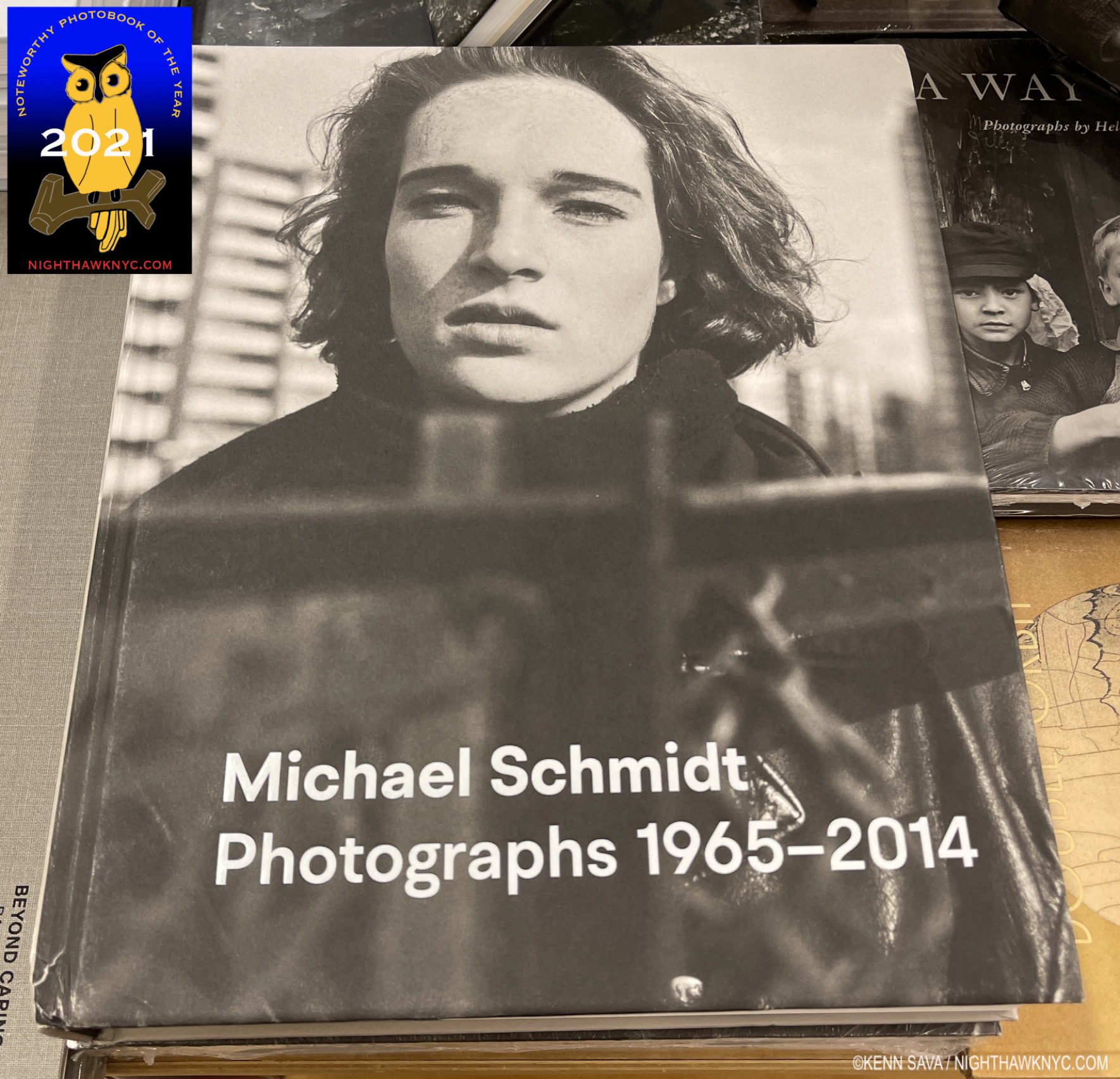
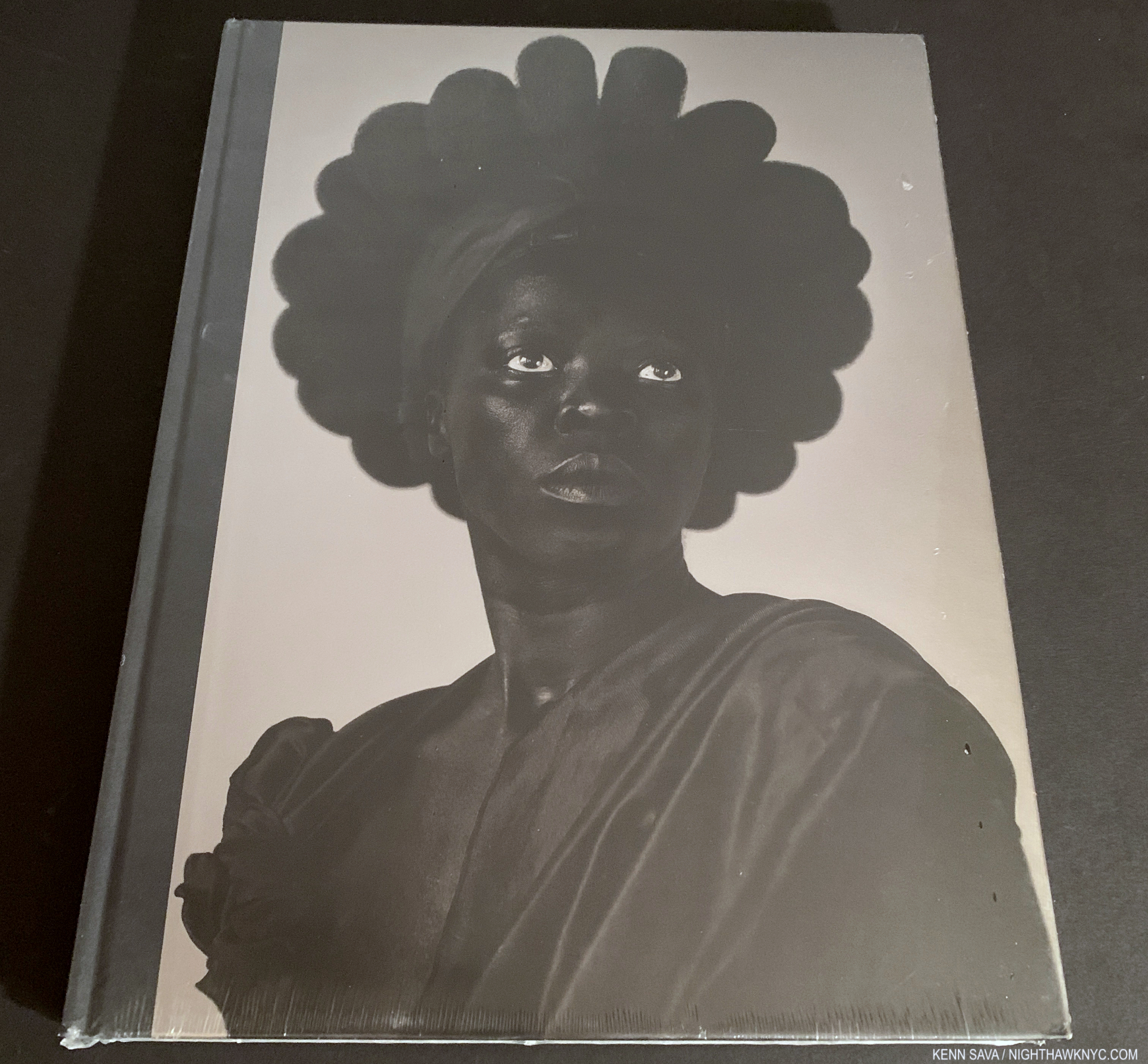
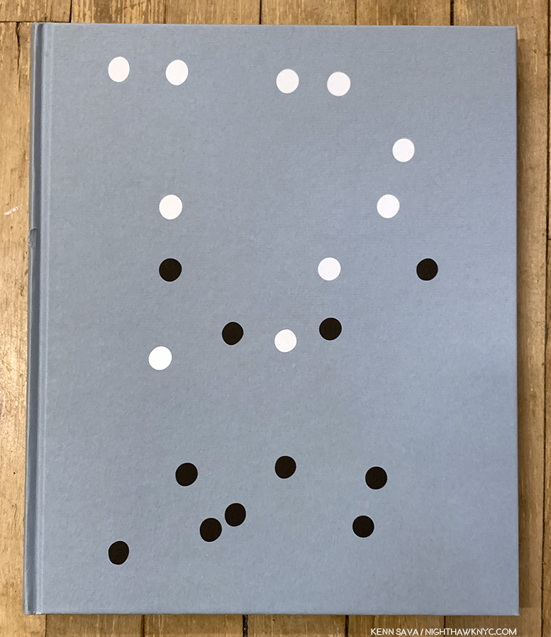
The cover of Who is Changed and Who is Dead
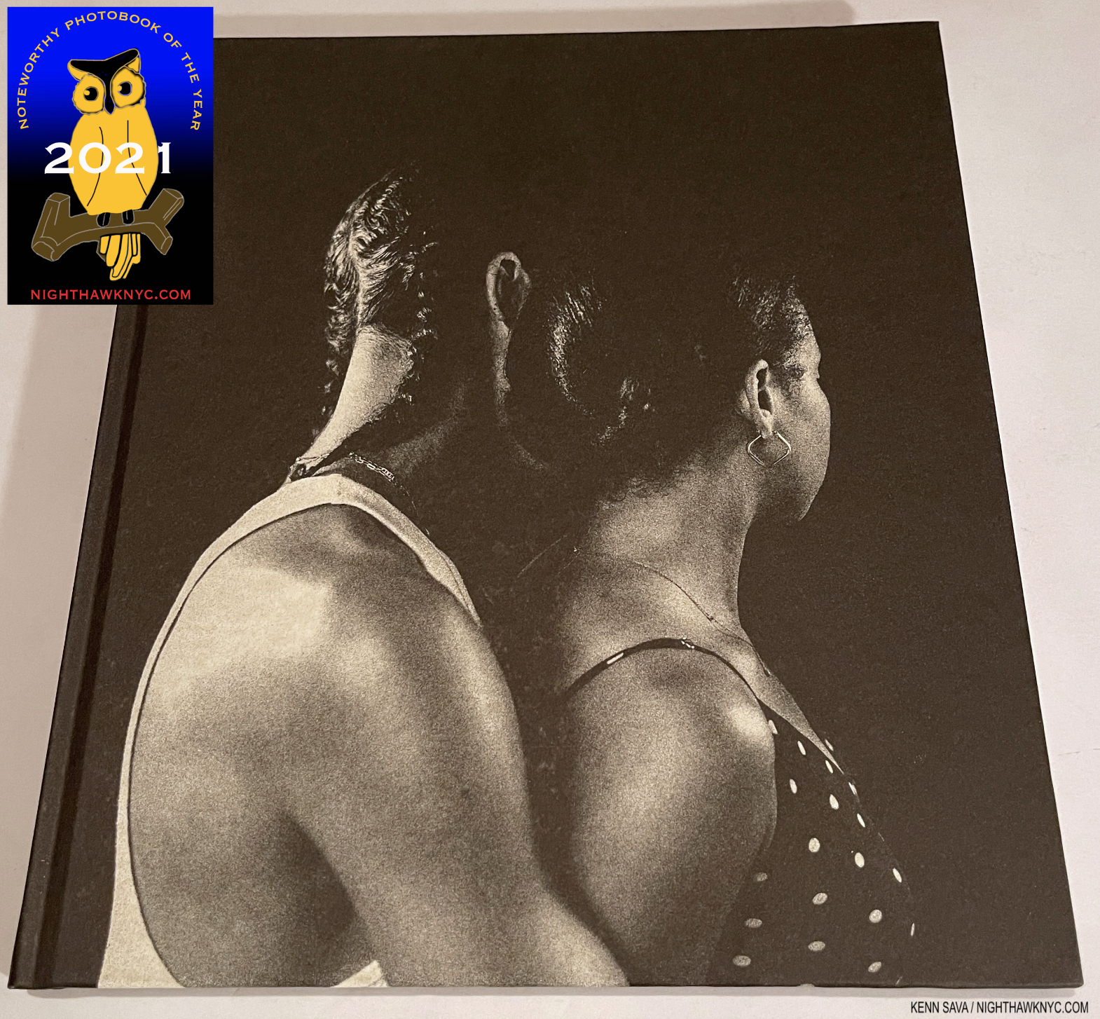
In 2021, she released her third PhotoBook, Who is Changed and Who is Dead, a NighthawkNYC NoteWorthy PhotoBook of the Year, published by Mack Books, her second monograph following 2016’s A Spectacle and Nothing Strange, published by Kehrer. They were preceded by a collaboration with Mr. Parlato, Gregory Halpern, published by Études Books in 2014 titled East Of The Sun, West Of The Moon. Ostensibly, the subject this time is Ms. Parlato’s mom’s suicide. A victim of parental suicide myself, somewhat amazingly, her’s is the first book I have come across to address the subject. She deserves much credit for daring to broach this topic few are apparently willing to speak about (understandably). All three of Ahndraya’s books have two part names. In the case of Who is Changed and Who is Dead, the subject has three parts: her late mother, herself, and her 2 young daughters (most frequently addressed as a pair, even when she starts out referring to one of them. Ava and Iris Halpern-Parlato are the only two of the three to actually appear in person in the book’s Photos, though all three subjects appear equally in Ahndraya’s extremely personal & revelatory text.
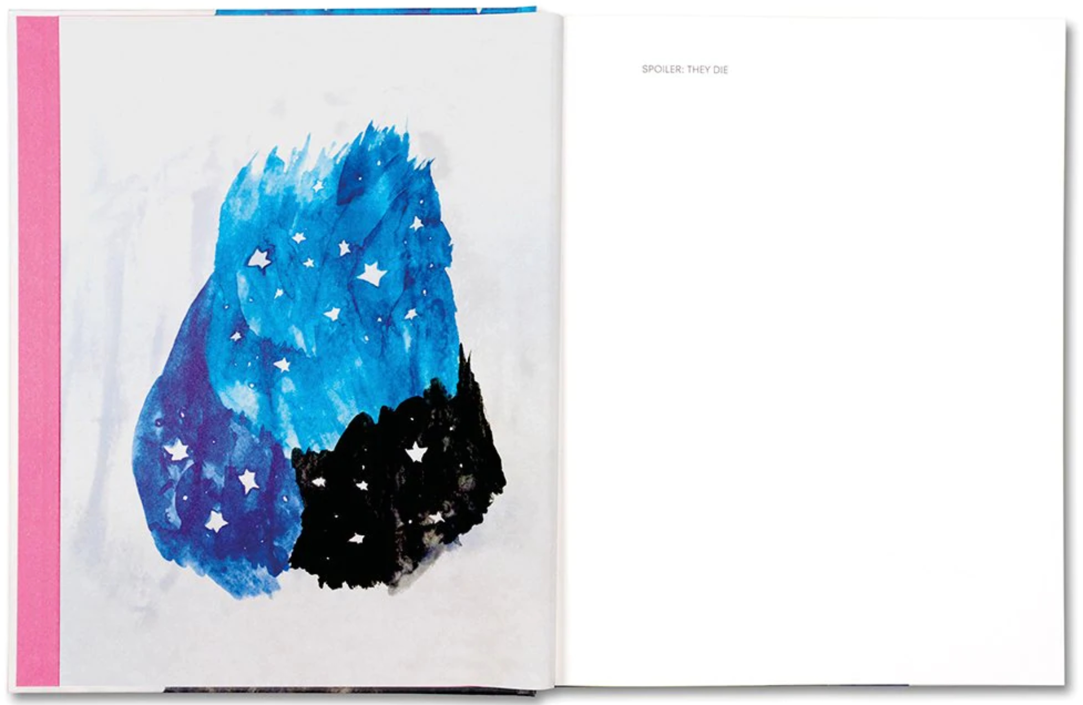
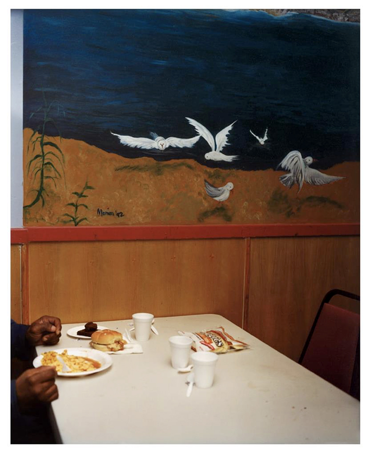
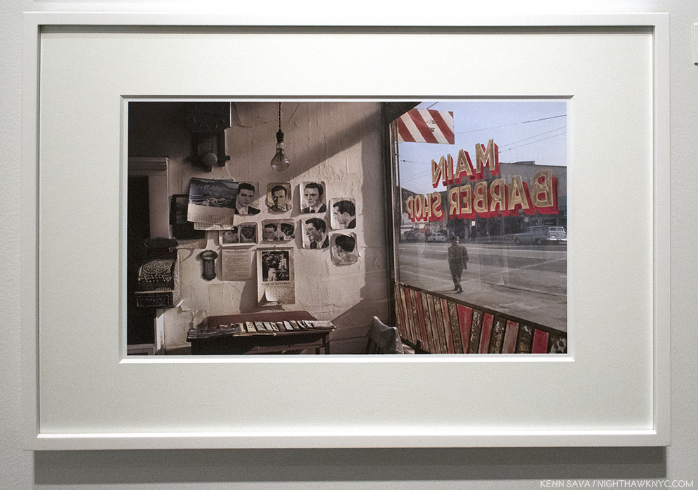
From Who Is Changed and Who Is Dead. “SPOILER: THEY DIE,” the text reads…
When I first got Who is Changed, I delved right into the text, the first Ahndraya has written in one of her books. The fellow victim in me was looking to see how her mother’s suicide effected her and how she handled it. (Disclaimer- Of course, the book is not intended or designed to be read this way. It’s a PhotoBook!) Reading the text as a whole gave me the chance to hear her voice without interruption.
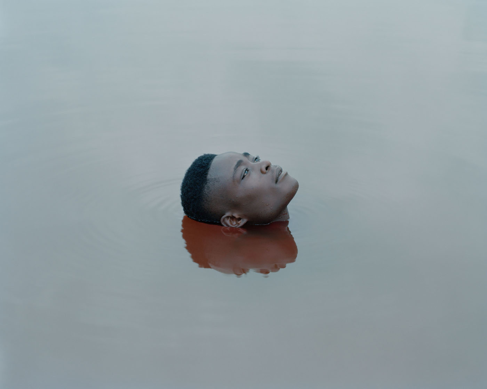
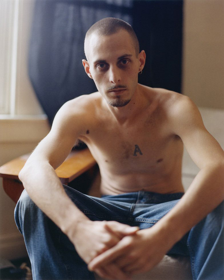
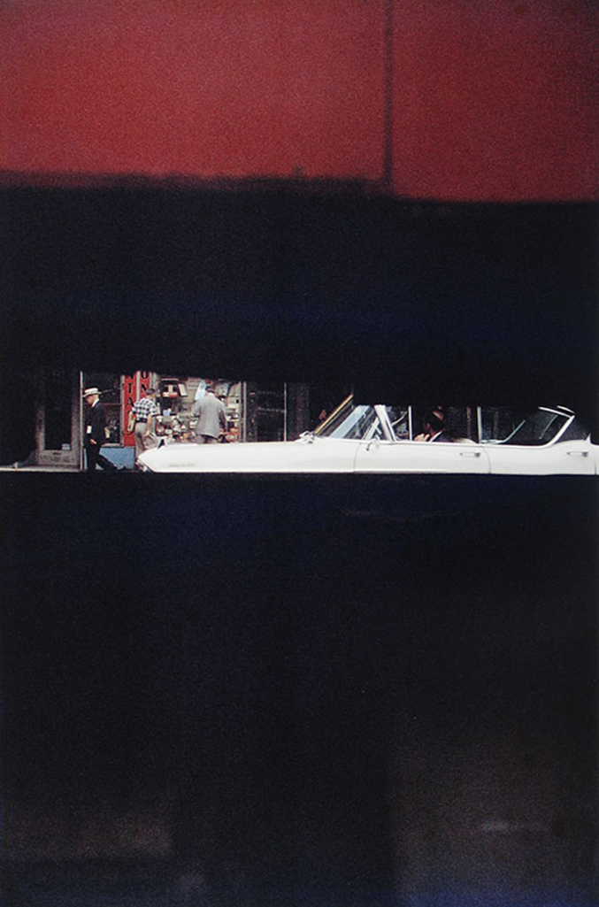
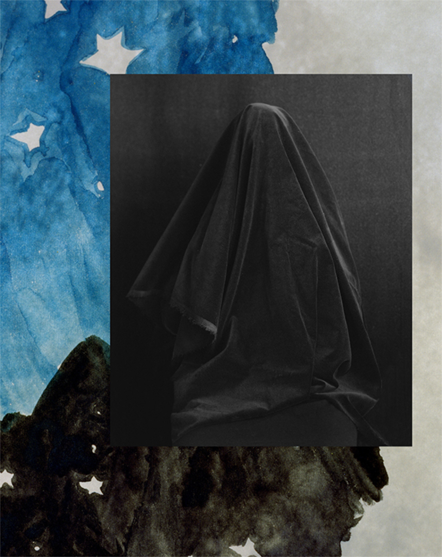
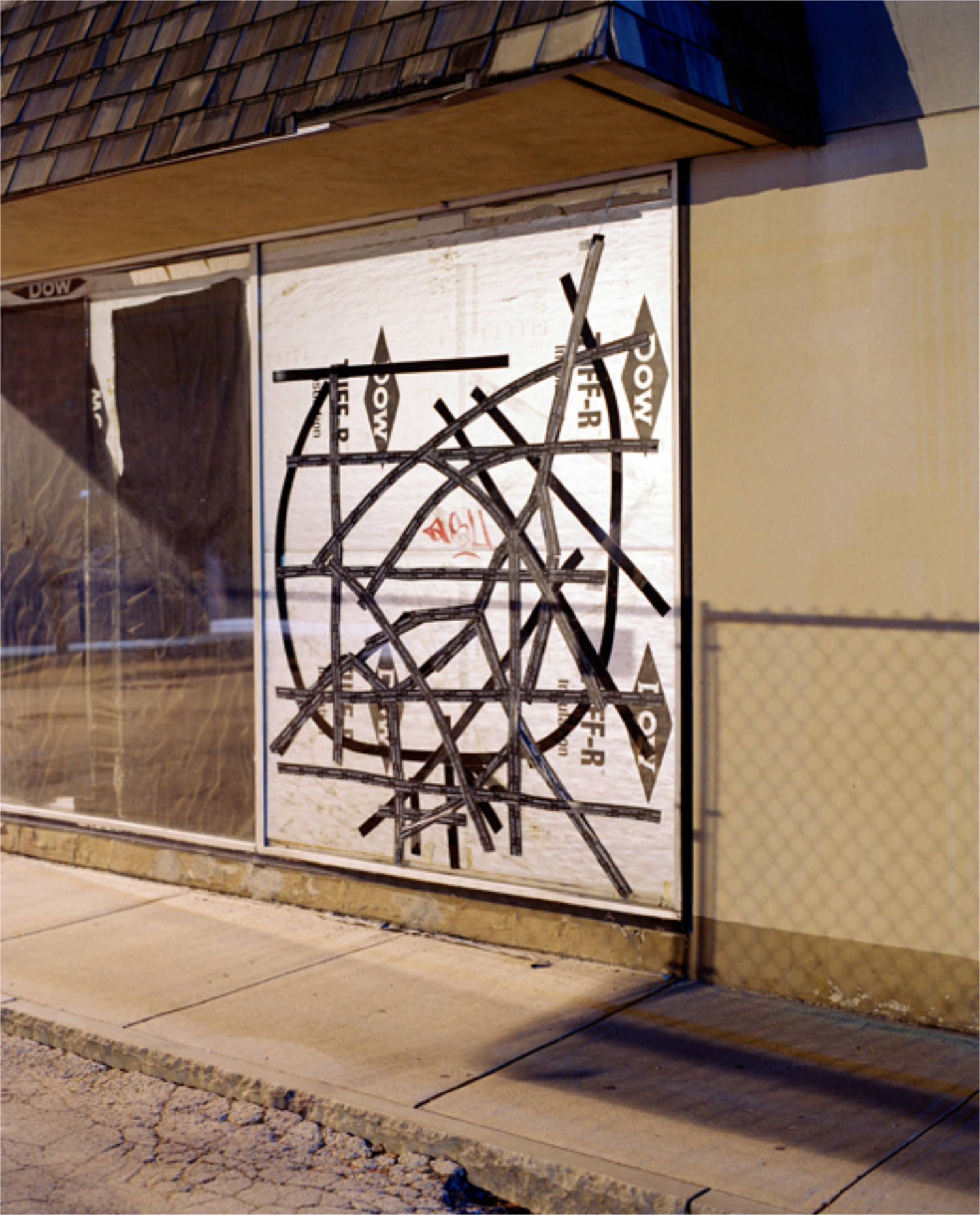
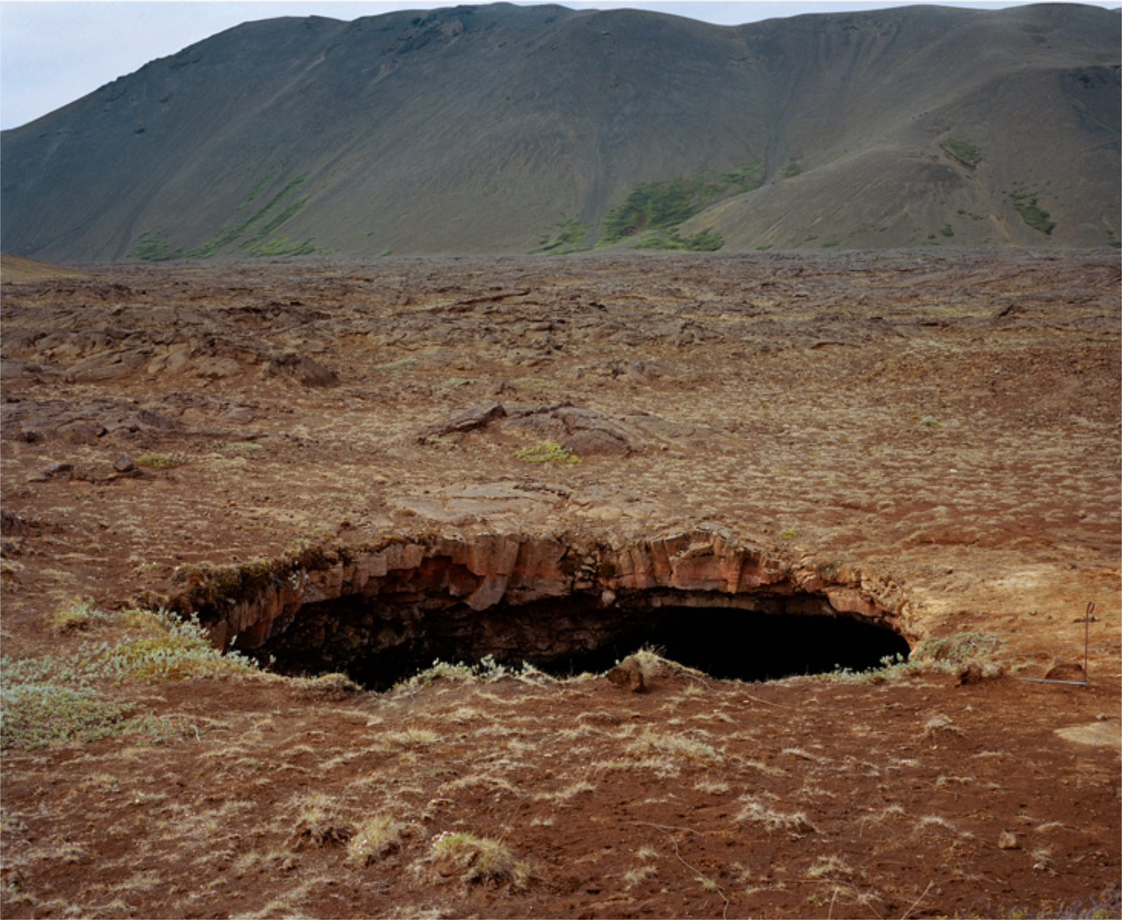
From Who Is Changed and Who Is Dead
It turns out the book is more a “snap shot” of Ahndraya in 2021: her life to this point, and her life with her children. As such, it’s a book that will provide comfort and reassurance to new moms, particularly those who are also Artists. Though the text is written in compact sections, there is a lot to unpack, and more to process. Part 1 is titled “To My Children,” and starts with a wish for a long and happy life for both of them followed, after a coma, by an acknowledgement of understanding the “desire to go out together,” apparently born in her mother’s suggestion that the two of them jump out of a window of a NYC building when Ahndraya was in 3rd grade! It’s in moments like this that the subject of suicide bubbles to the surface, like it quite possibly does in the lives of other suicide victims. Tender reminiscences of her grandmother and mother follow, before she goes on to reveal her own fears of dying-
“I want to be alive. I need to be alive. I’m scared of dying because you need me.”
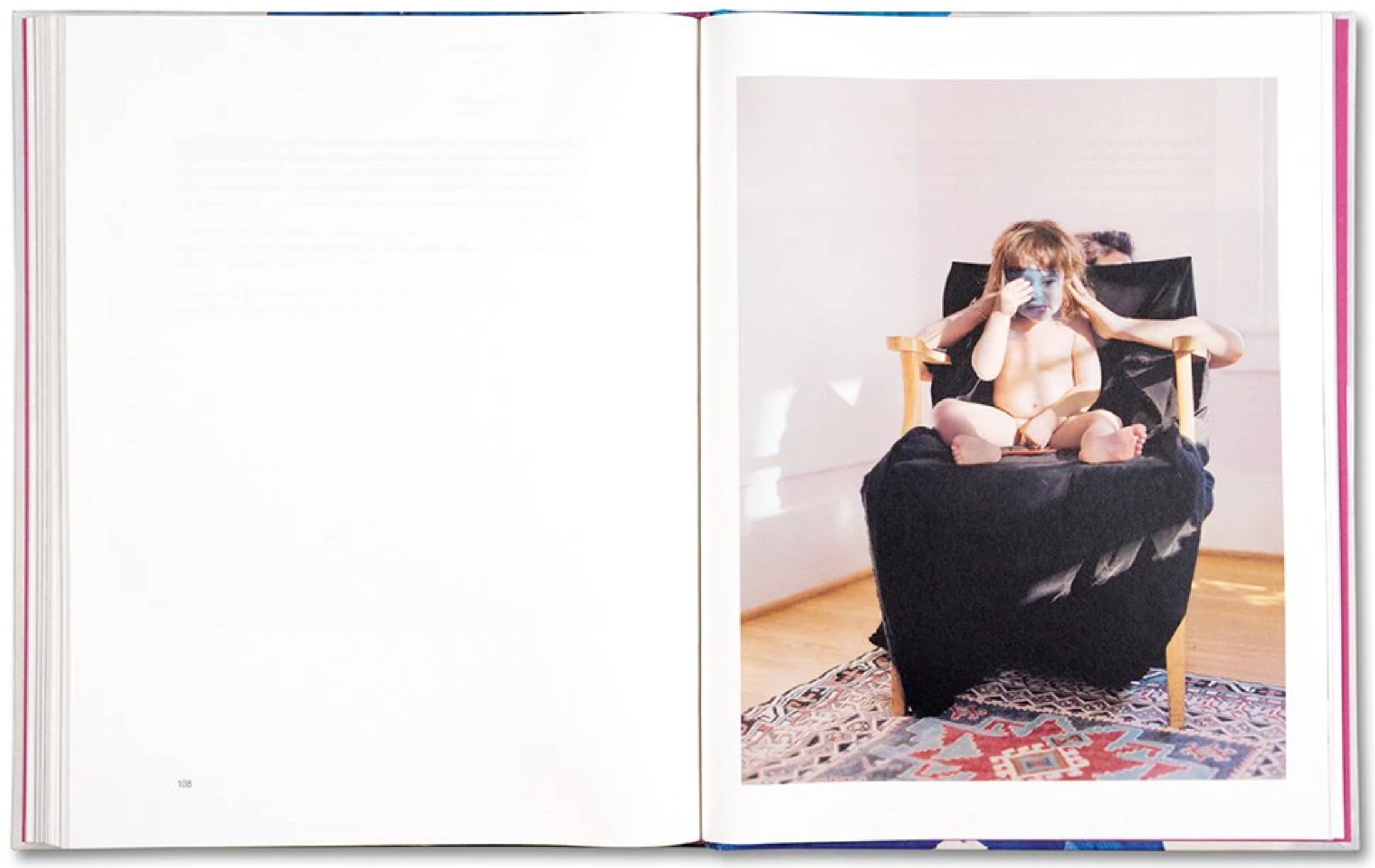
Part 2 is titled “To My Mother,” but both parts quickly revert back to the thing that is always on her mind (understandably): her children’s well-being. Ava and Iris appear, singly, in a number of her Photos, in at least one instance the appearance was unplanned1. They add hope (and stress), to the aftereffects of tragedy, and a reminder that life is a continuum. Life is also incredibly precious and incredibly fragile, and perhaps there is no one more vulnerable than the very young, or the very old. This comes through on virtually every page of her text.
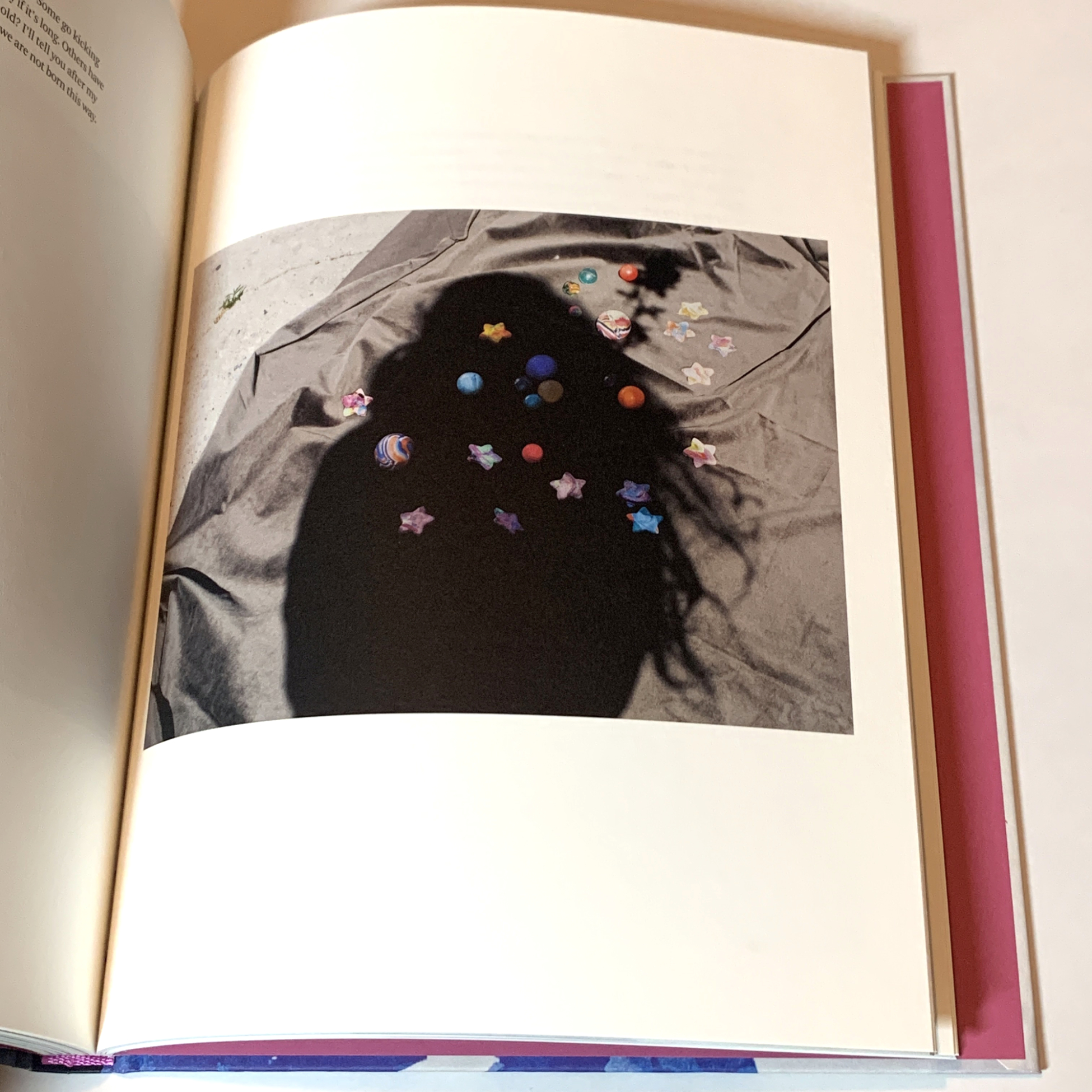
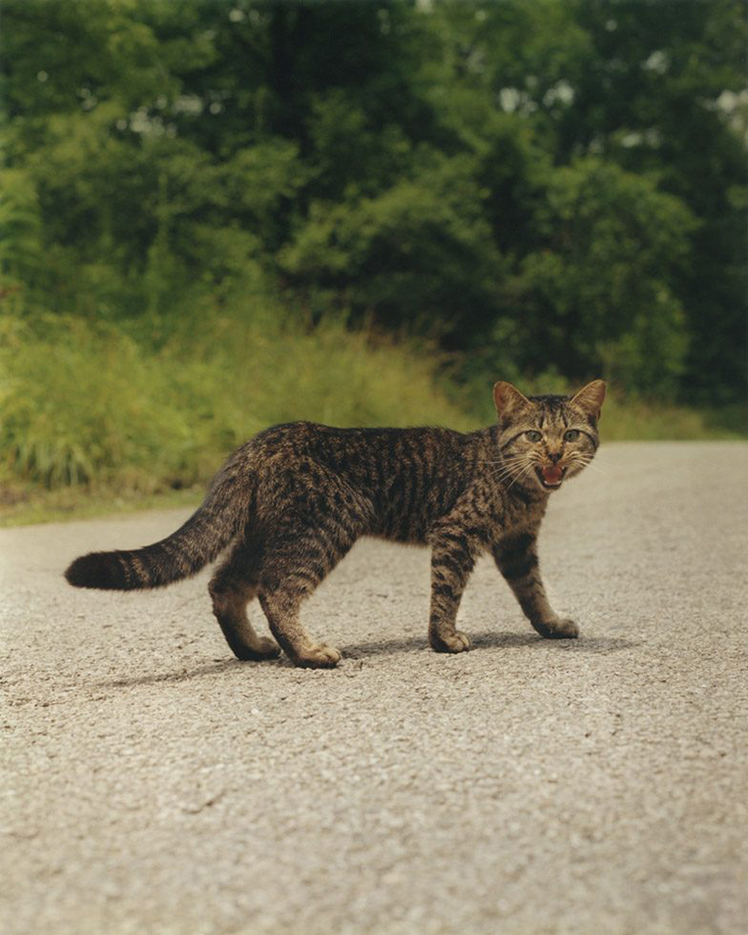
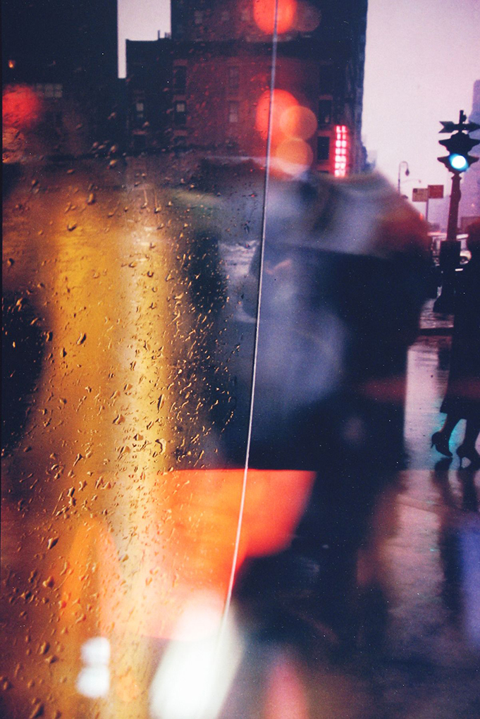
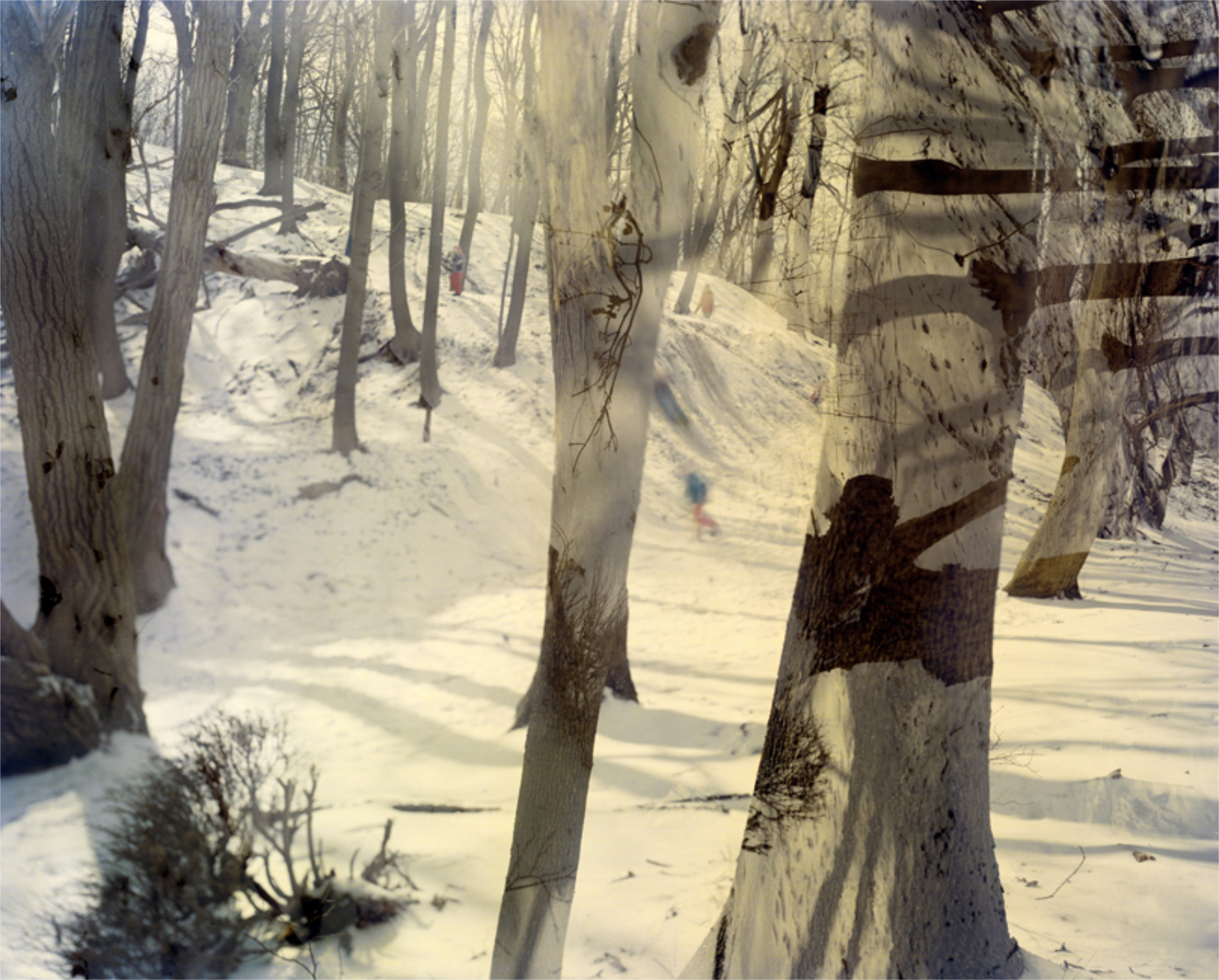
From Who Is Changed and Who Is Dead
In my reading, it turns out that her mom’s suicide is more of a subtext that is always there, yet, her book offers much more than the reassurance that we victims are not alone, as valuable as that is. In it, we learn that Ahndraya’s mom’s mom (Ahndraya’s grandmother) also died horrifically, murdered by someone she knew, and we get glimpses of life with a mother who was sent to a psychiatric hospital after drinking ammonia, when Ahndraya was in 3rd grade, and then was diagnosed as a as a paranoid schizophrenic. As she weaves episodes from her own biography into the text, never far from her mind are her worries are her fears for her young daughters, understandably. Reading them, I was struck by how she never mentions her own mother’s worries and fears for her, at how she ALWAYS appears to be an adult, and usually the parent. Even when she addresses us at age 3. Perhaps, this is because there is almost nothing of her mom in her own younger years here. When we meet her, she is already suffering from the illness that may have led to her death. The text is not linear and flows across time as it will, and reads in ways that are partially reminiscent of a diary, partially as conversations in thought with the subject. Her own chronology gets disjointed as a result, and I gave up trying to plot her geographical life’s course, yet the point is always, firmly, in the immediate moment. Born in Kailua, Hawaii, Ahndraya went on to earn a B.A. in photography from Bard College and an M.F.A. from California College of the Arts, where she studied with Todd Hido, in who’s class she met Gregory Halpern (Mr. Hido told me with obvious pride).
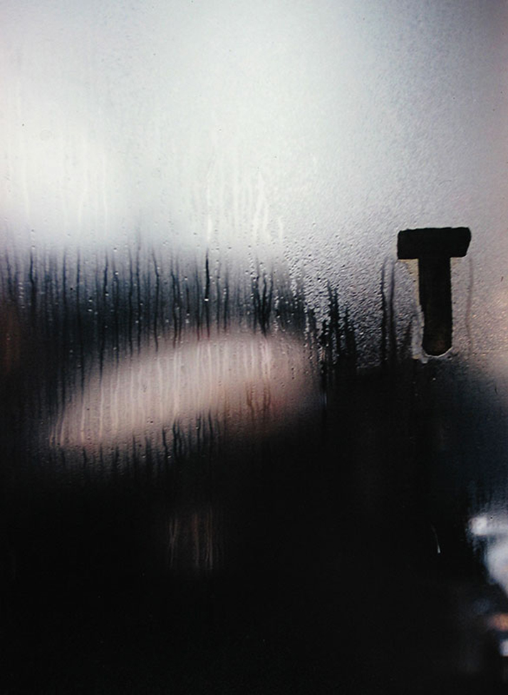
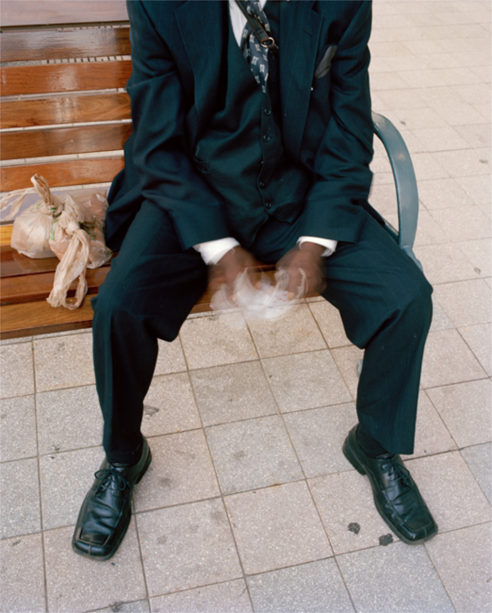
From Who Is Changed and Who Is Dead
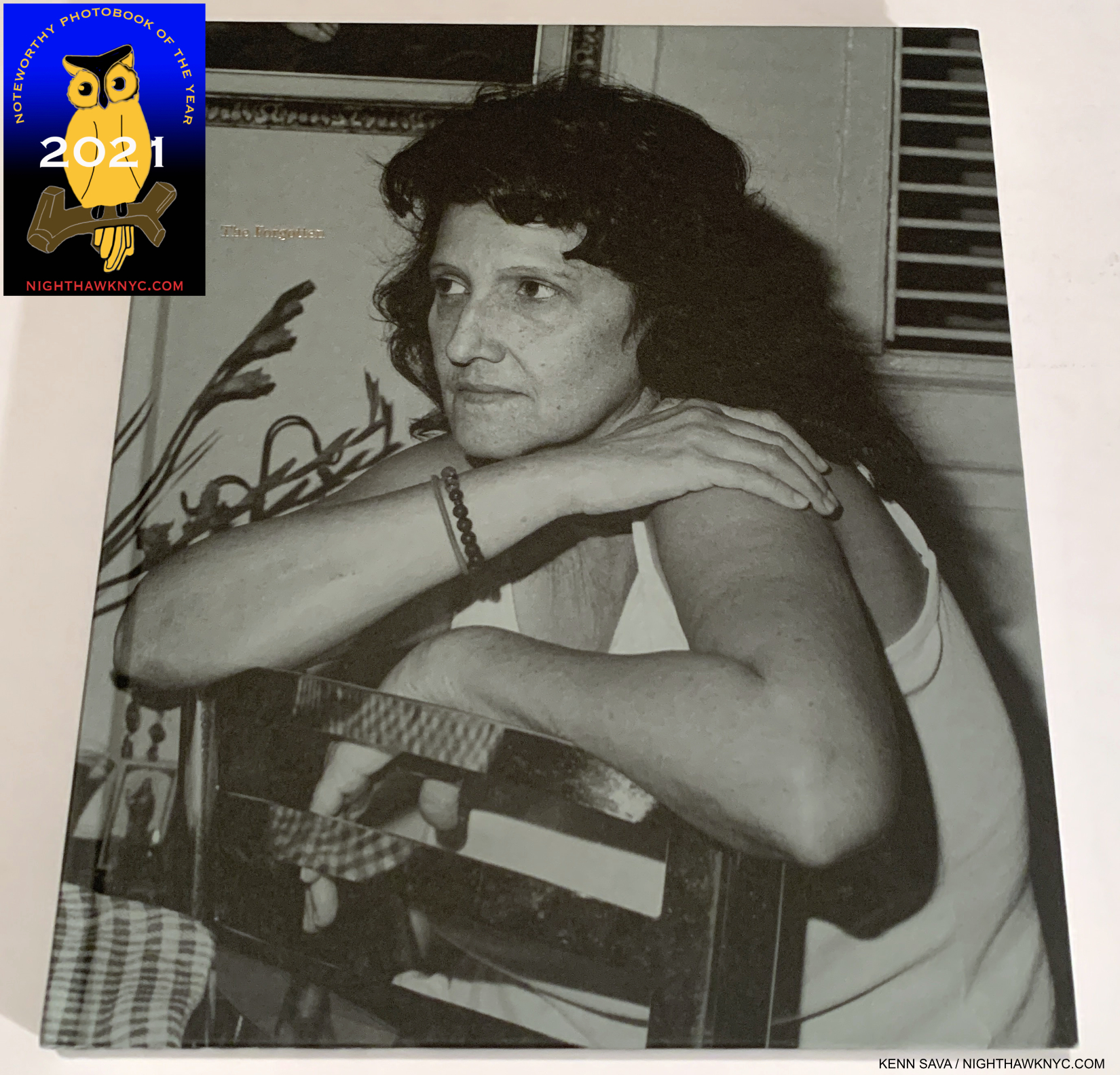
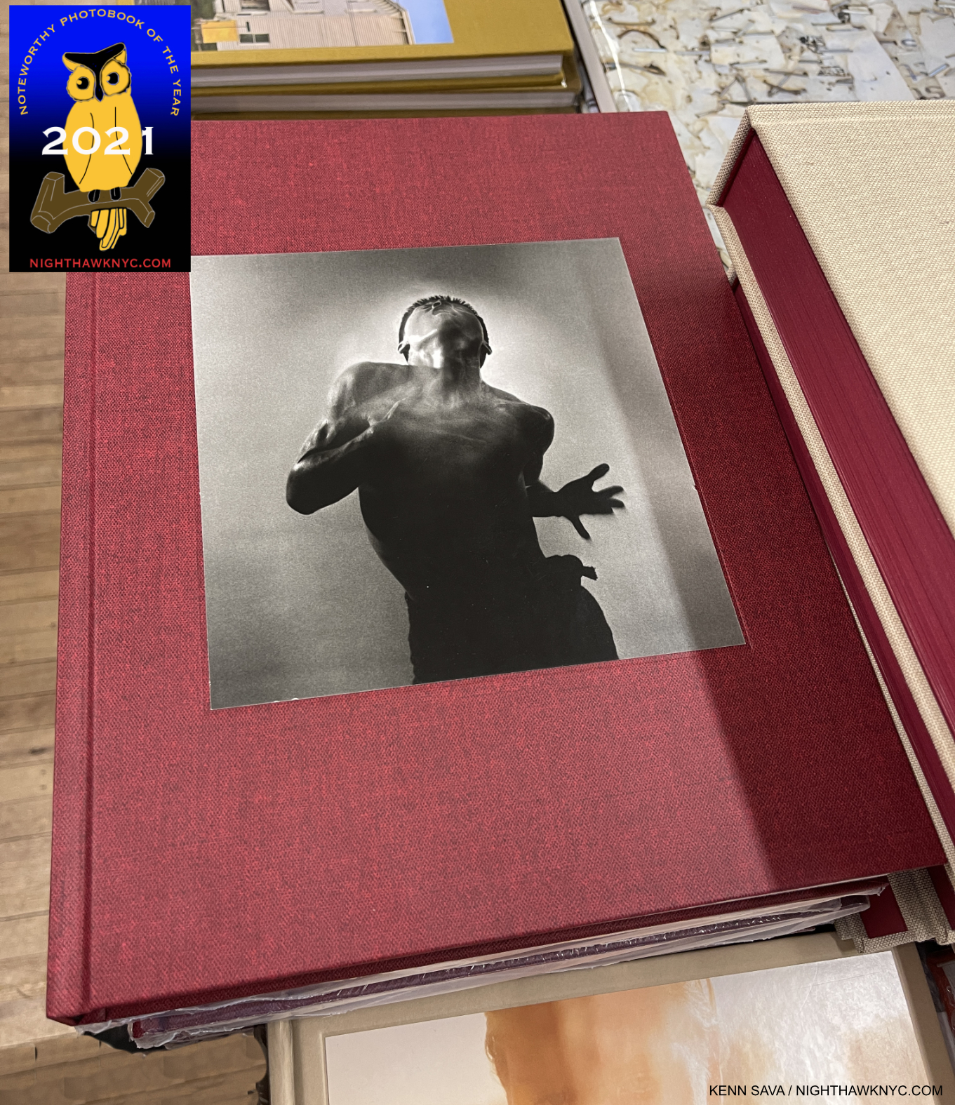
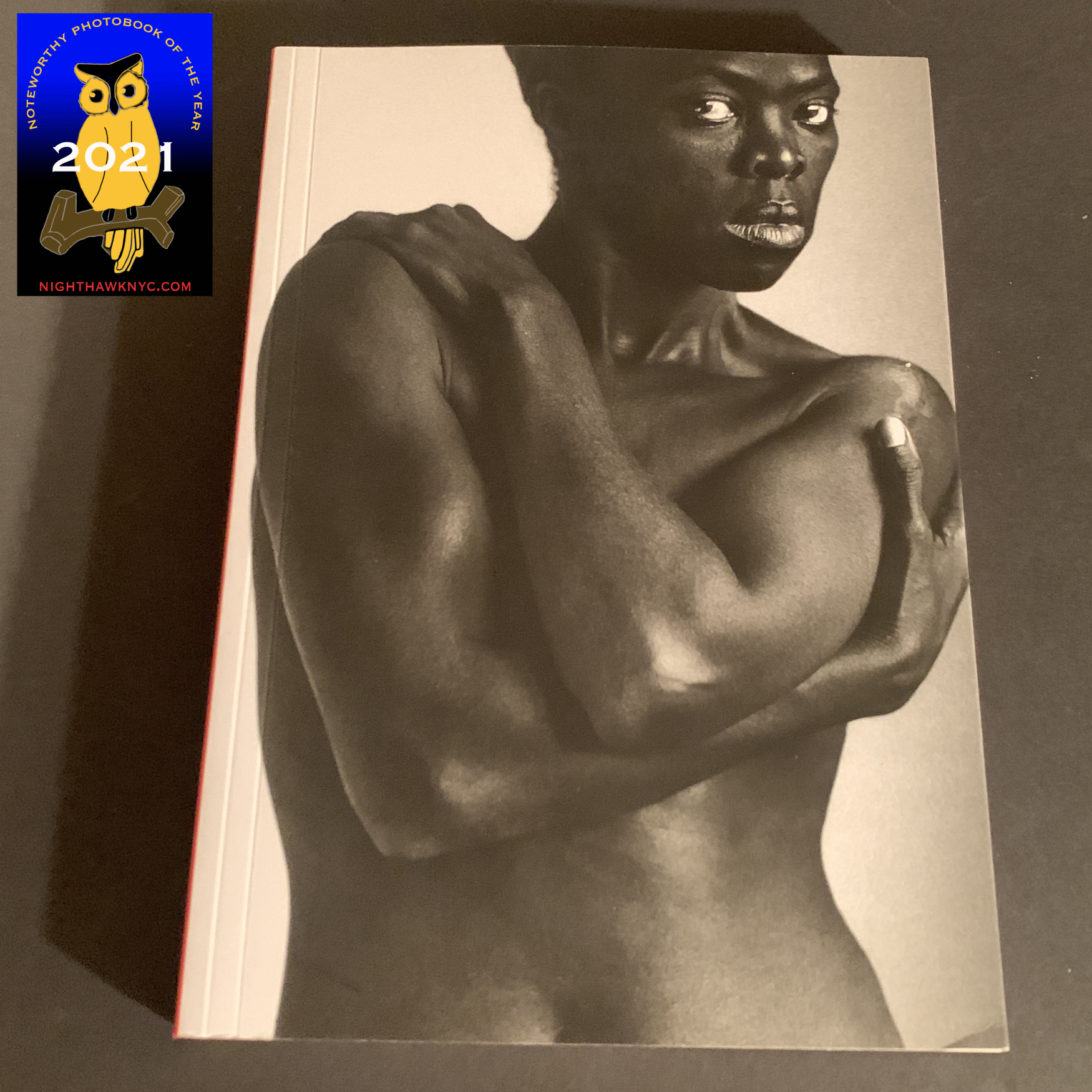
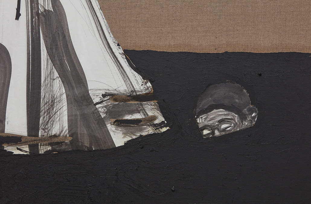
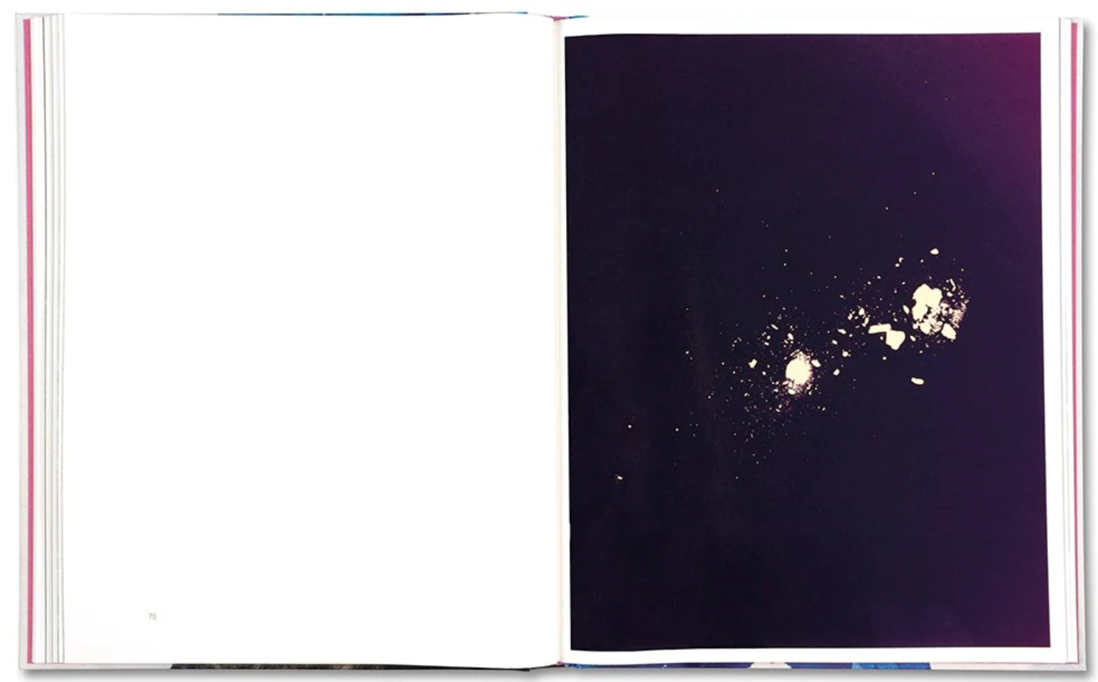
I got so lost in the text that weeks, then months, went by before I actually looked at her Photographs! When I did, I quickly found that many are striking and linger indefinitely in the mind. Nothing Strange there. I’ve been taken with her Photography going back to her first monograph, A Spectacle And Nothing Strange, published in 2016. The Photos include images of her mom’s ashes sprinkled on photo paper, printed glossy, to show-stopping effect as shown above. Elsewhere, her daughters pose by themselves or with plants, in ways that look nothing like Sally Mann’s iconic images of her children.
The end result is a unique book that allows the reader to begin to piece together the Artist’s life’s journey from childhood, through difficult years with a mother who was ill before her suicide, to the struggles to process her mother’s death (part of which never ends), to her own motherhood and the worries and fears omnipresent in the crazy world we live in now. It’s hard enough to survive today without, also, trying to raise, care for, and protect children!
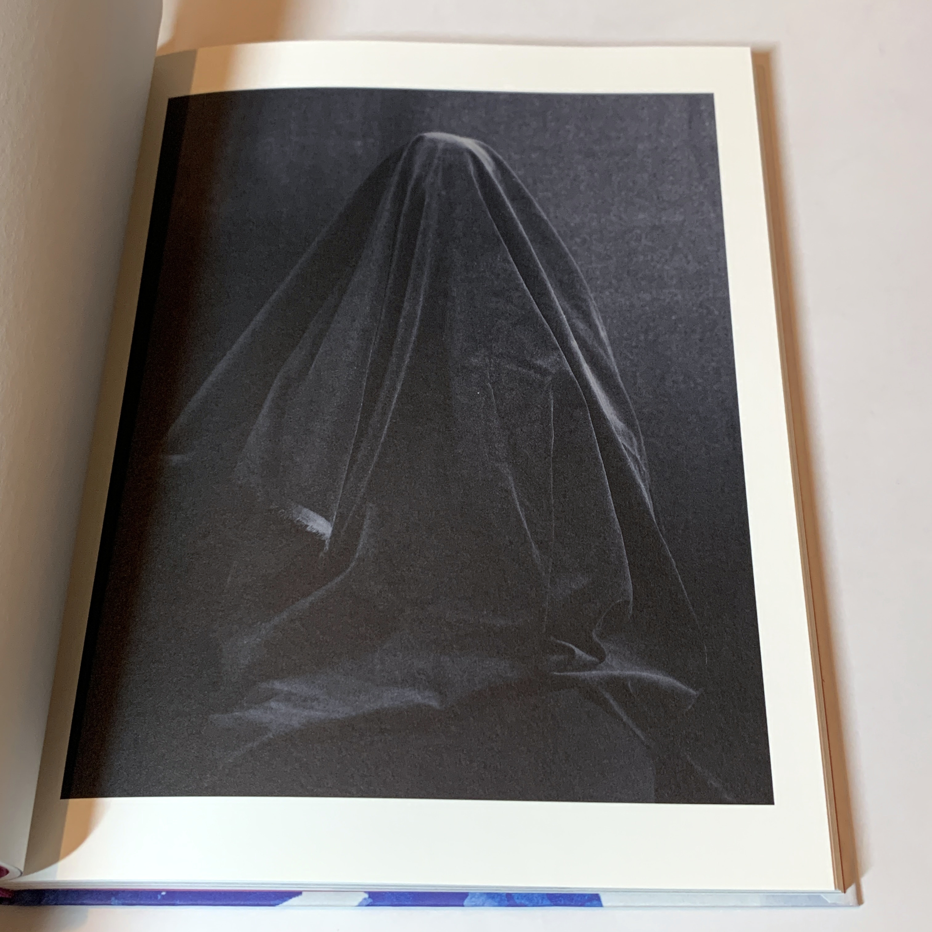
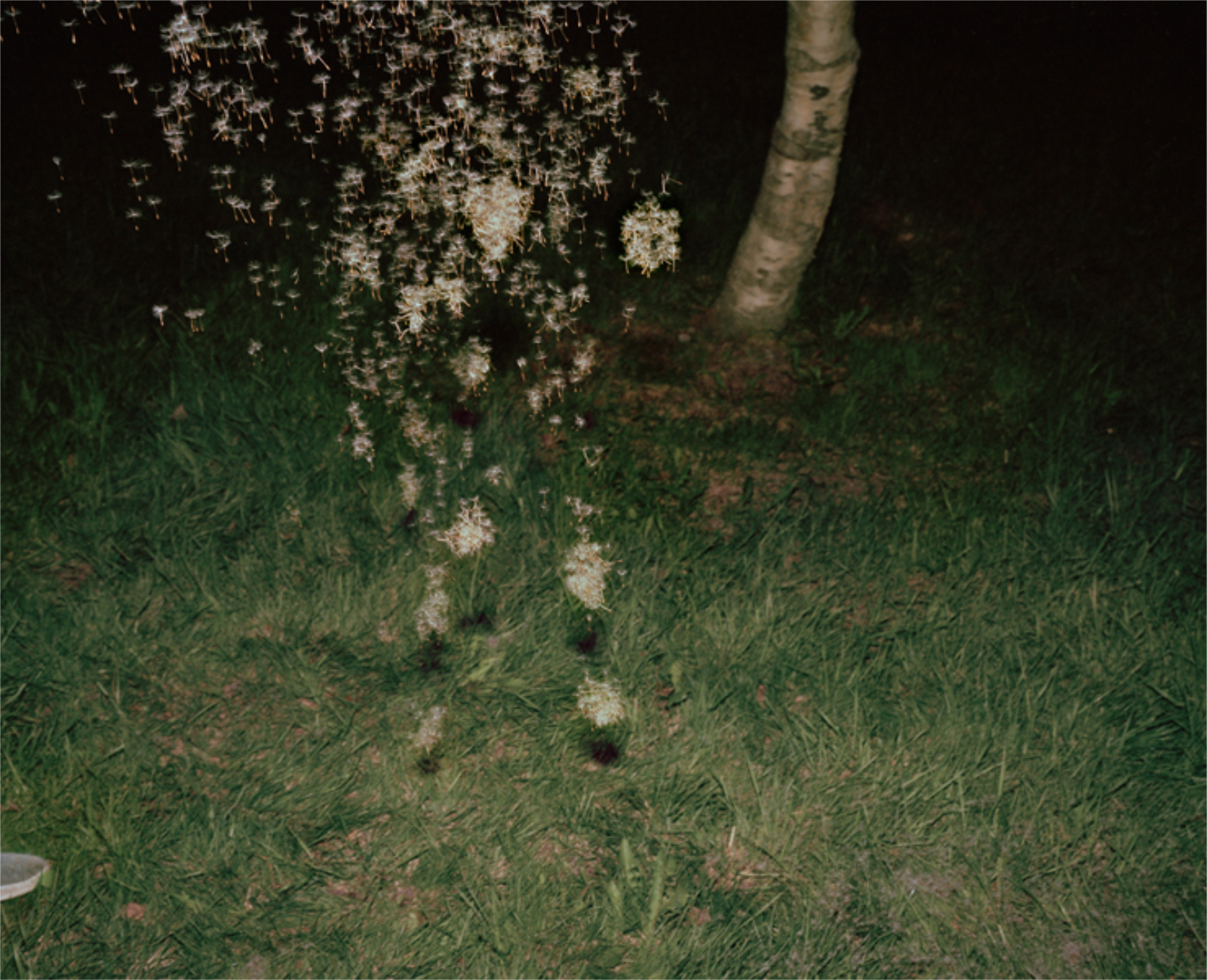
From Who Is Changed and Who Is Dead
And ALSO be an Artist! Reading Who Is Changed took me back to my readings on Alice Neel, who was able to keep her Art career going, though at the cost of her personal life, in very hard times and difficult circumstances. In some ways, she was a role model for Contemporary female Artists. In other ways, perhaps she’s not an ideal role model. At least, by having children and having a long Art career, she proved it CAN be done. Today, Artists like Ms. Parlato have found ways to achieve a healthier balance between Art & family, even in these insane times, which makes them all the more admirable.
The other sub theme of Who Is Changed is the author’s verbal and visual efforts to make peace with her mom and her death. This is the real work for all survivors, and something, I for one feel, the person committing suicide probably never thought about how long and hard the road ahead would be for their victims- those who loved them they leave behind. In Ahndraya’s case, I only hope it helped.
As I mentioned, Who is Changed is not the only wonderful PhotoBooks Ahndraya has published.
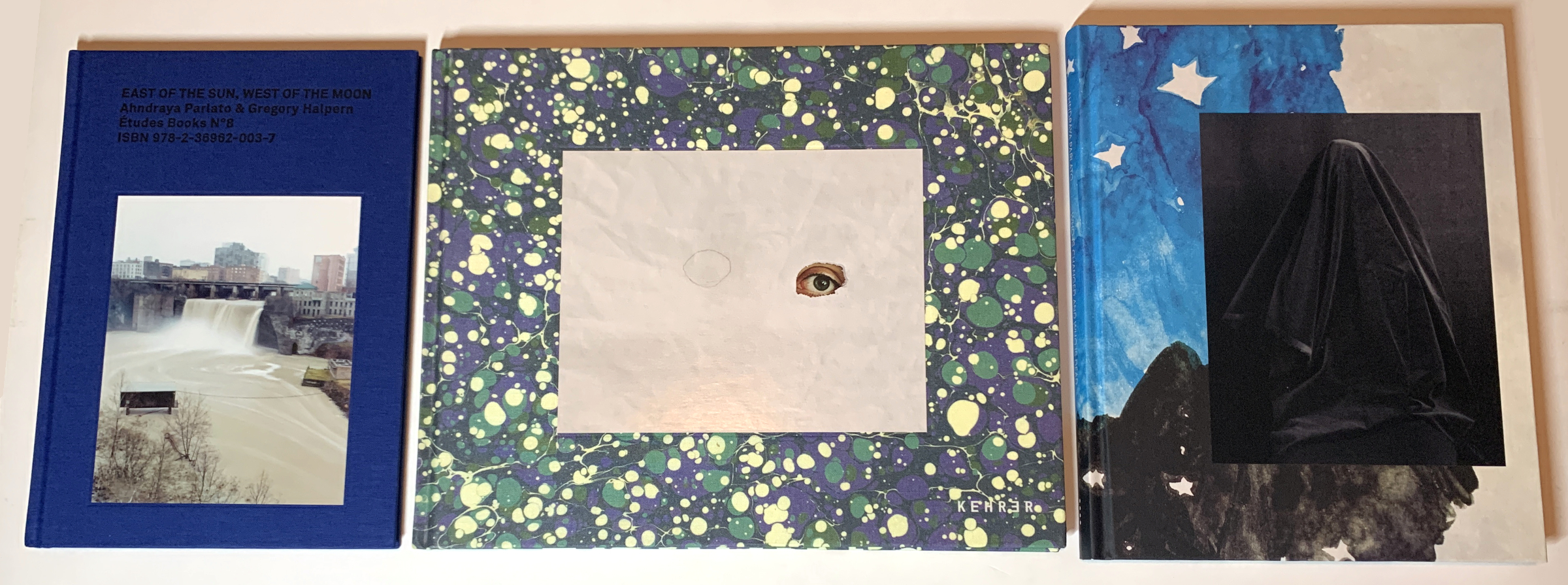
East of the Sun, West of the Moon, A Spectacle and Nothing Strange, Who is Changed and Who is Dead, left to right.
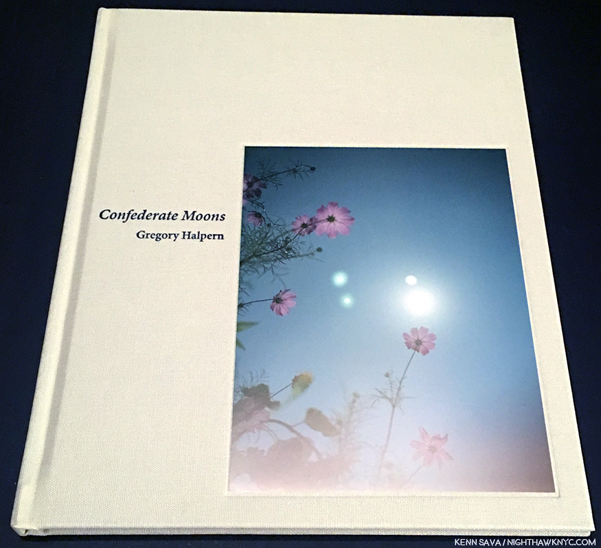
Her initial release, the collaboration East Of The Sun, West Of The Moon, published in France by Etudes in 2014, saw its 300 copies disappear before I became aware of it and started looking for it. Luckily, in late 2021, the publisher found some unsold copies and I was able to finally see it. It turned out to be worth every moment of the anticipation.
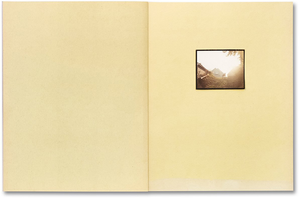
From *East of the Sun, West of the Moon, by Ahndraya Parlato & Gregory Halpern
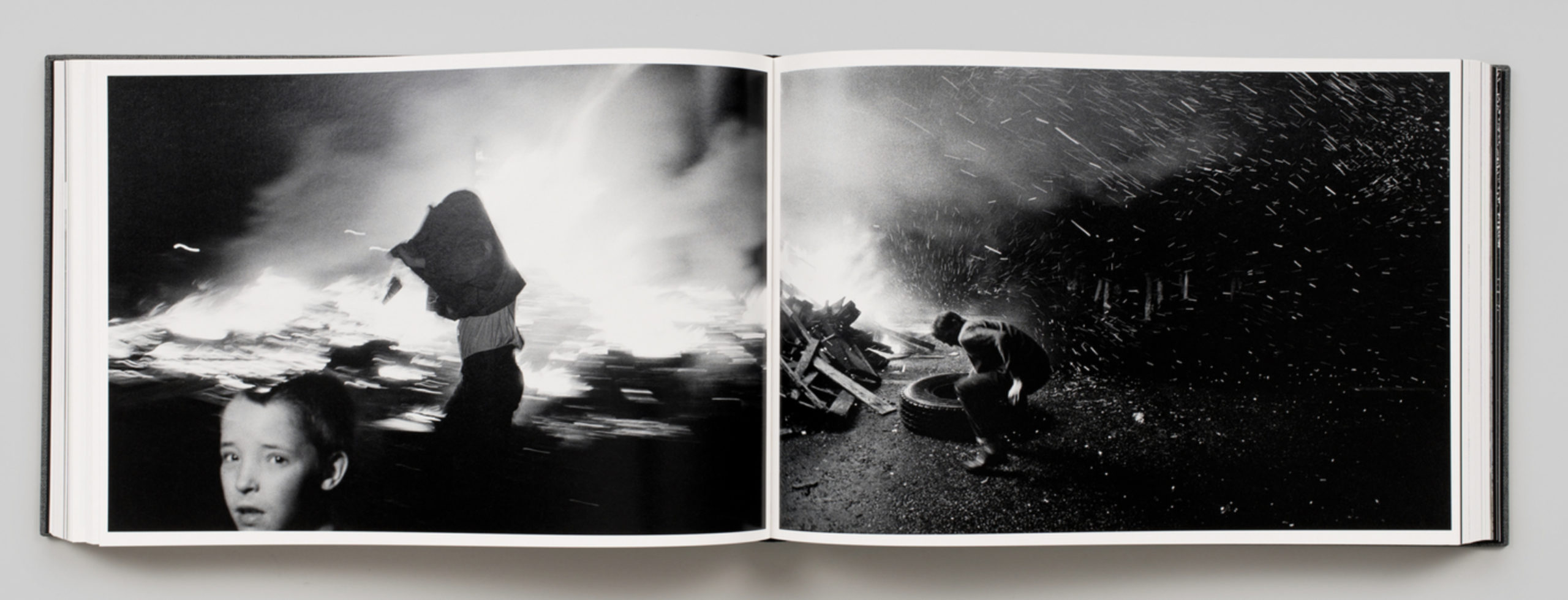
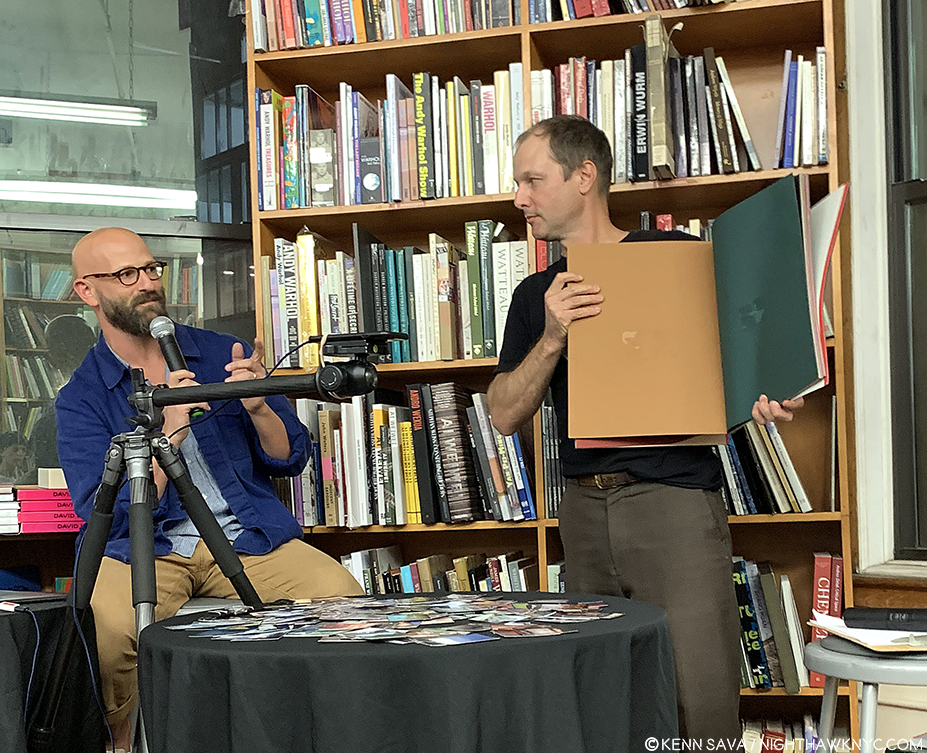
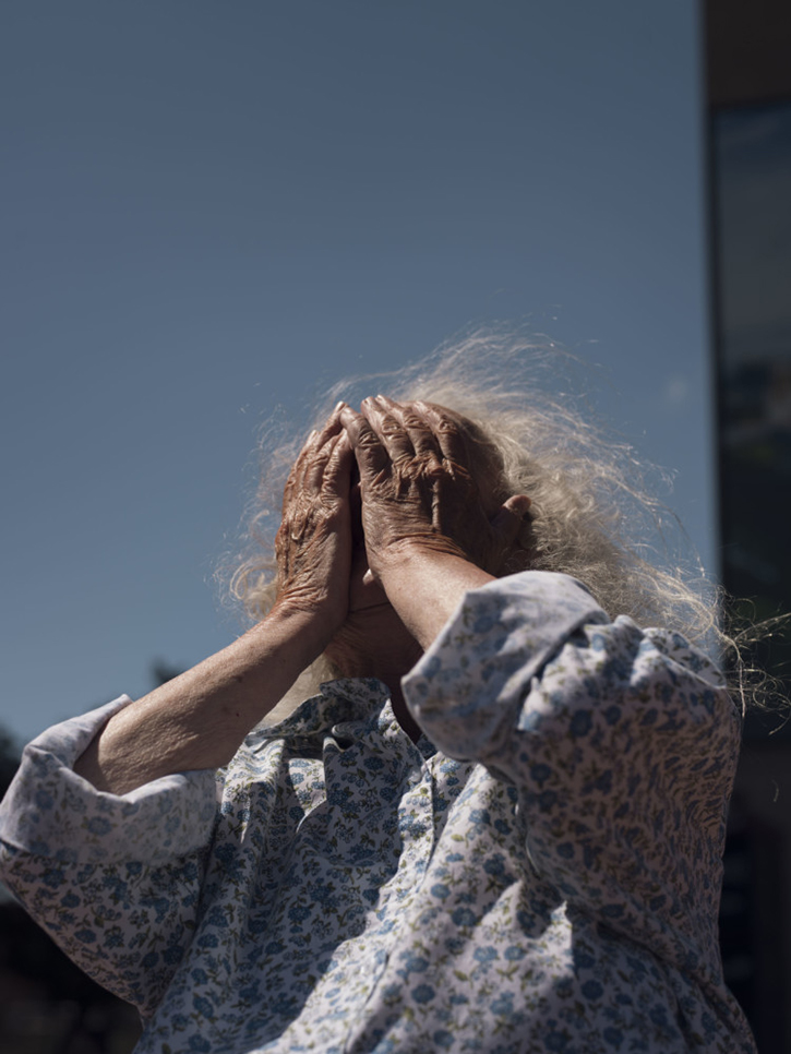
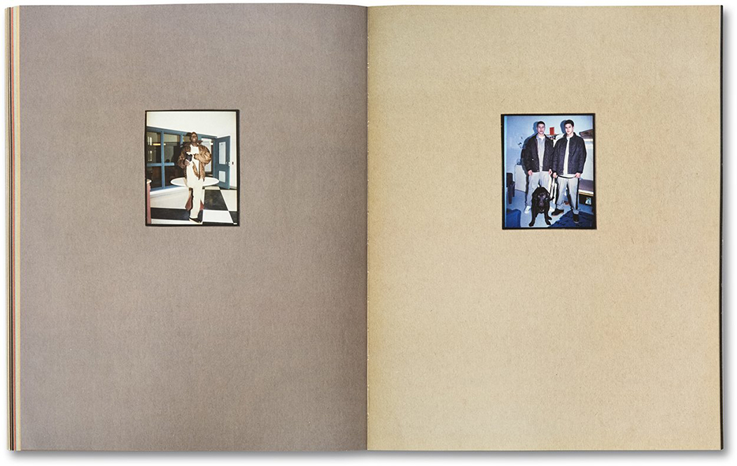
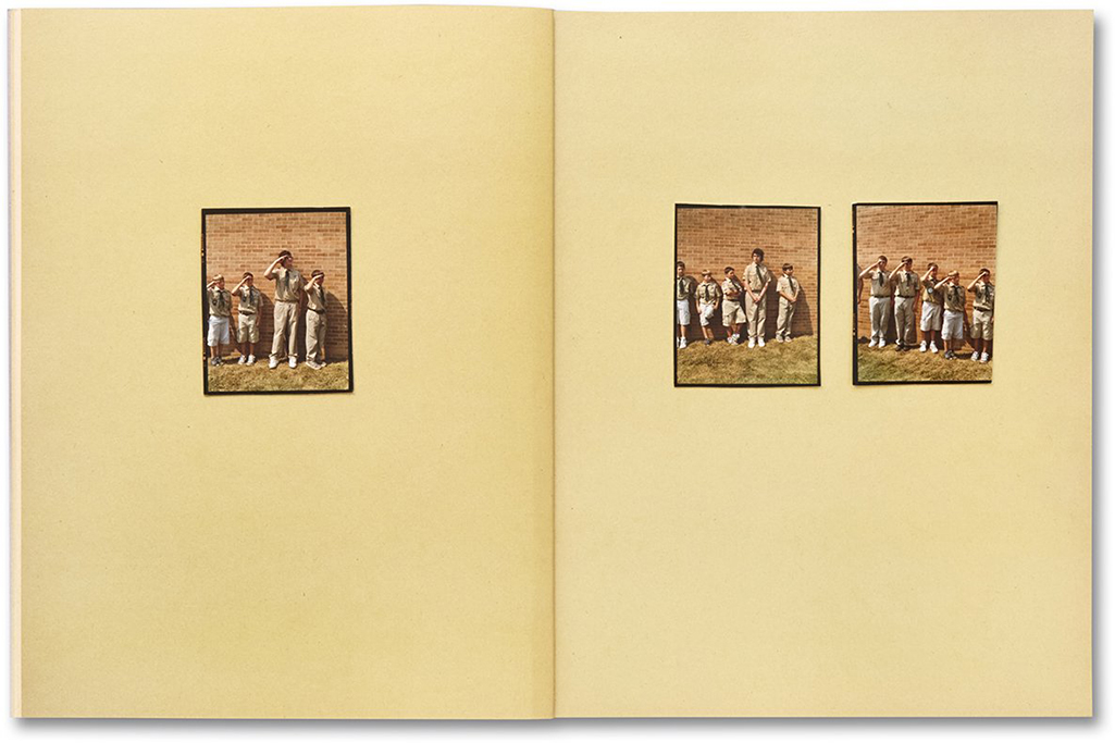
At the time they collaborated, Gregory Halpern had already released Harvard Works, the first, small edition, of Omaha Sketchbook, and A. East Of The Sun is a magical book full of mystery. I quickly gave up trying to figure out its biggest mystery- attempting to determine which image bore more of the mark of one or the other- it’a a true, and seamless, collaboration. East Of The Sun loves to present straight forward Photos with a twist.
Of course the city boy would particularly like this one…*From East of the Sun, West of the Moon, by Ahndraya Parlato & Gregory Halpern
Every single image is chocked full of questions for the viewer to get lost in. So far, I haven’t found a narrative, and the Photographers provide no written insights in the book itself. Elsewhere, I’ve read comments about it being shot on the Solstices and Equinoxes in 2012 and 2013, wherever they happened to be. Far be it for me to be able to tell from the Photographic evidence.
From *East of the Sun, West of the Moon, by Ahndraya Parlato & Gregory Halpern
I’m only left to think I sure missed a lot of mystery going on around me on those days.
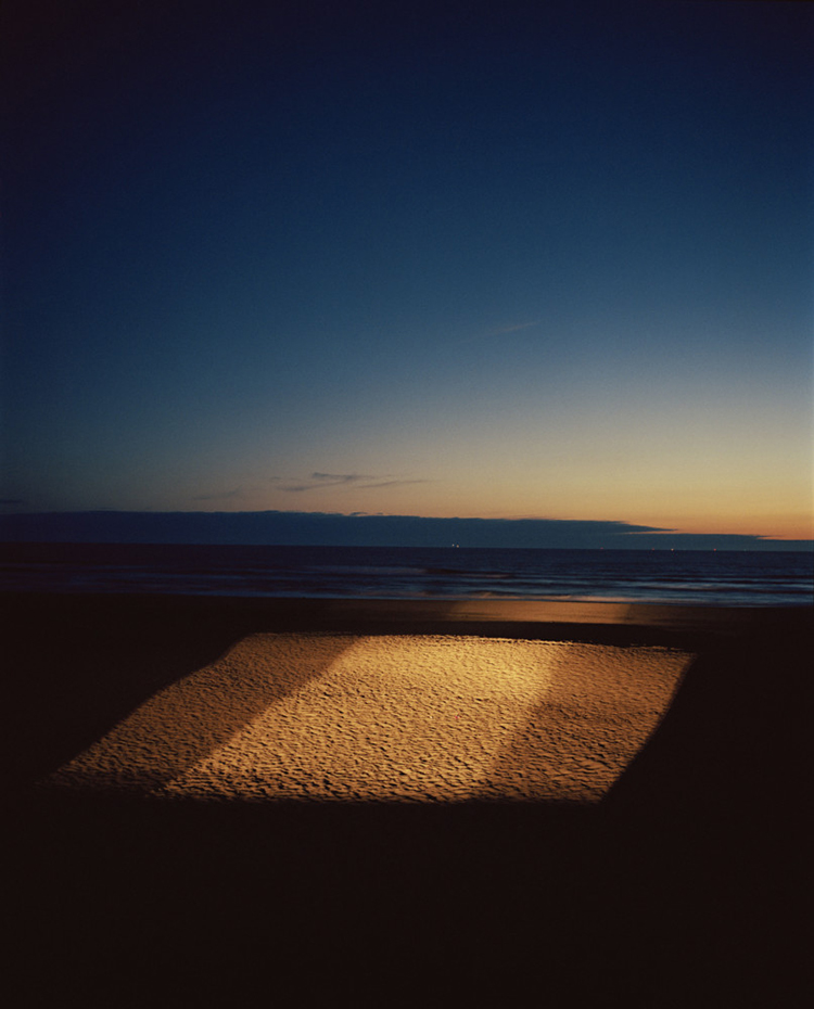
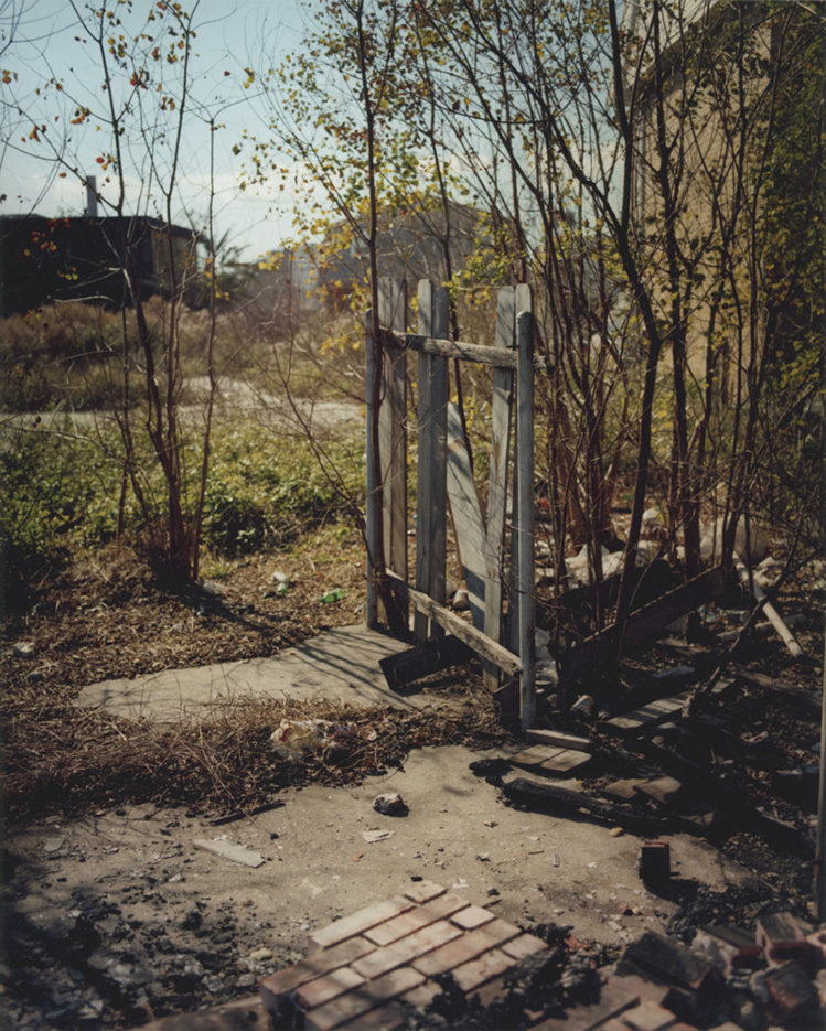
From A Spectacle and Nothing Strange
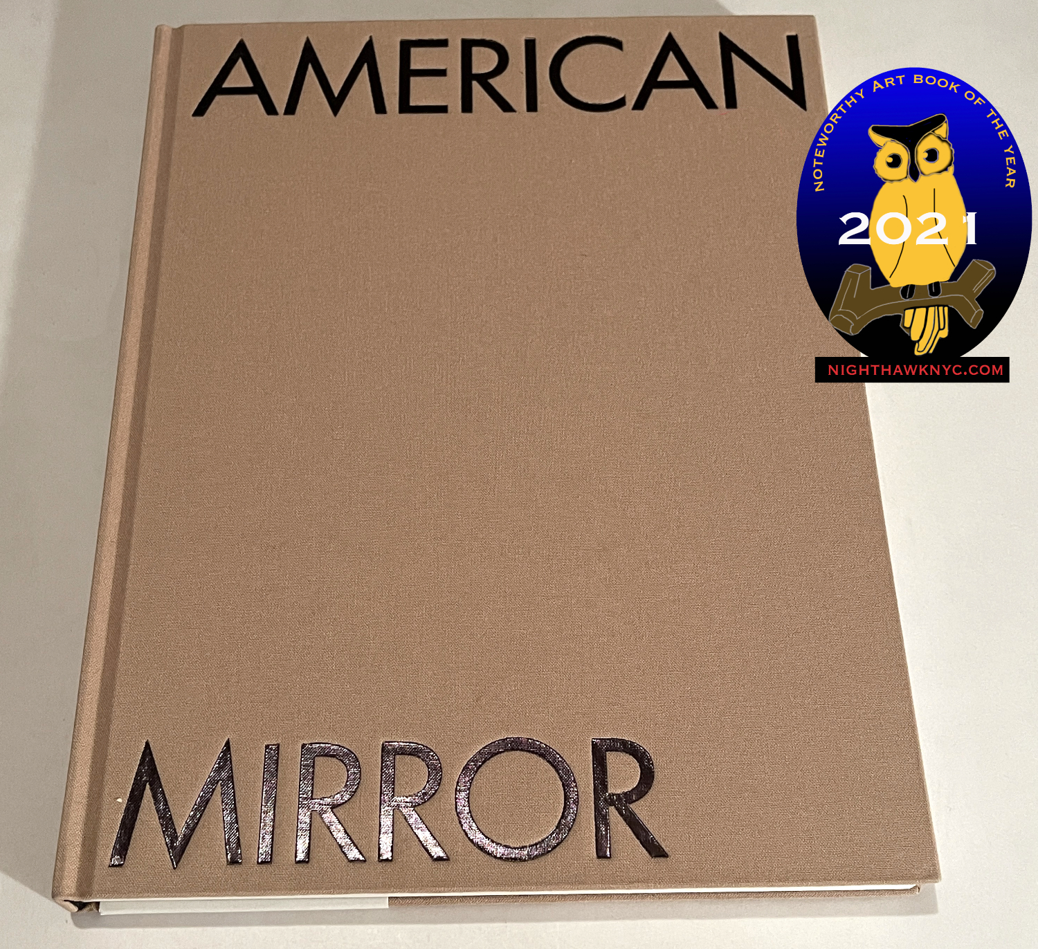
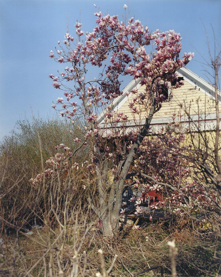
A Spectacle and Nothing Strange, Kehrer Verlag, 2016, was my introduction to Ahndraya Parlato. A terrific book, It’s another book of magic and mystery though this one is firmly grounded in the earth, regardless of what may be going on in the calendar or the heavens above. Though it consists of Portraits, Landscapes and Sill Lifes, every image is a Still Life of life: moments that are not “decisive” in the Cartier-Bresson sense but are decisive in the sense of capturing the moment that linger in the mind: the stuff of memories. Both alien and familiar, they are the kind of images that remain in the mind as souvenirs of an experience. I’m sure there’s a story to each one, but I’m glad I don’t know them so each becomes new to me, again, every time I page through it, as I have often, particularly during the past two years I’ve spent in isolation.
From A Spectacle and Nothing Strange
The past few years have seen the Artist receive quite a bit of well-earned recognition. In 2017, Ahndraya was a Nominee for the prestigious ICP Infinity Award. In 2013, she was a New York Foundation for the Arts grant recipient, Magenta Foundation Emerging Photographer Award winner, and was also shortlisted for the MACK First Book Award. She has also been a Light Work grant recipient and a nominee for the Paul Huf Award from the FOAM Museum in Amsterdam, as well as the SECCA Award from the San Francisco Museum of Modern Art2.
While Ahndraya Parlato has received well-deserved recognition from the powers that be in the world of Photography, I still believe there is a bigger audience for her work out there.
My piece on Gregory Halpern’s PhotoBooks may be found here.
*- Soundtrack for this Post is “Sacrifice” by Björk, track 8 from her classic album, Biophilia, 2011. In the Biophilia app, the presentation for “Sacrifice” reads-
“Inspired by animal magic rituals and female sacrifice, Björk’s lyrics urge the listener to recognize the sacrifice made by all women for the sake of love.”
NighthawkNYC.com has been entirely self-funded and ad-free for over 6 years, during which over 250 full length pieces have been published. As I face large expenses to continue it, if you’ve found it worthwhile, you can donate to keep it going & ad-free below. Thank you!
Written & photographed by Kenn Sava for nighthawknyc.com unless otherwise credited.
To send comments, thoughts, feedback or propositions click here.
Click the white box on the upper right for the archives or to search them.
For “short takes” and additional pictures, follow @nighthawk_nyc on Instagram.
Subscribe to be notified of new Posts below. Your information will be used for no other purpose.