Art- With A Capital “A”

For The Record #1. First part of a series.

Written & Photographed by Kenn Sava

Back at The Met, May 6, 2018. The Museum, as it’s referred to, is one of the world’s great repositories of Art with a capital “A” with collections covering 5,000 years of it from all cultures in all its forms. It’s also one of the very best things about living in NYC. No. It’s THE best thing in my opinion. 1,700+ visits in since August 1, 2002, every time I turn the corner and see the building looming in front of me, I still get a chill down my spine. I touch the corner as I go in each time as a way of saying “Hello” to an old friend and to give thanks for each and every opportunity I get to do so.

To mark the 4 and a half year Anniversary of NighthawkNYC, during which I’ve published 225 pieces in 240 weeks (Phew…), I thought I’d take the opportunity to set the record straight on a few things that I feel are at the core of what I believe, and what I’ve written here. Perhaps I should have “explained” them at the beginning instead of letting those who’ve read these pieces (for which I Thank You) wonder, “What the heck?” Well, better late than never. Herewith the first installment in a brief series called For The Record. Consider them “footnotes” or “addendums” to every piece I’ve written.

Michelangelo’s Sistine Chapel Ceiling reproduced as part of The Met’s staggering Michelangelo: Divine Draftsman & Designer, 2017-8, one of the sublime experiences of my life.

First- Art is of one of man and womankind’s supreme accomplishments in my view. I believe there should be some distinction between the Art of someone like Michelangelo and, say, the art of someone learning (said with all due respect).

Various young artists, unknown titles. A display of children’s art beautifying an NYC public school under renovation.

That’s why I capitalize Art and its associated terms (Artist, Painter, Sculptor, Musician, Painter, Photographer, et al.). It’s my way of showing these people the respect I think they’ve earned and deserve. I’ve done this here since Day 1- July 15, 2015, and I’m sure there are some who frown at me for doing it, and some who disagree with me for doing it. Along the way, I’ve seen a few others doing it this way and frankly, I’m surprised it hasn’t become more widely adopted. I hope it does soon.

The terrific, and terrifically overlooked, Honore Sharrer’s, Workers and Paintings, 1943, Oil on board, seen at MoMA. Some of the Art she includes are Grant Wood’s American Gothic, Picasso’s Girl before a Mirror, and others by Jean-Francois Millet and Diego Rivera. Though this work and the originals of most of what she includes in it are 100 years old, +/-, for me, this and all of them are Art. Will the future agree? Time will tell…

“What makes a work of art? I don’t know. There are lots of people who tell you they are making art. Maybe some of them are, but I’m not sure that’s true for all of them. Perhaps I’m old fashioned, but that’s not a phrase I would use. I’d prefer to say I’m making pictures – depictions.” David Hockney, A History of Pictures, with his capitalization, eBook P.2.

I’ve held David Hockney’s writings, and ideas, in the highest regard since his revolutionary, and eternally controversial, book Secret Knowledge came out in 2001, but I find it cumbersome to use the word “pictures” here in place of “Art.” Regarding what “makes a work of art?,” as he asks, it seems to me that it takes hundreds of years for the dust to settle on what’s being created in our time and for something, a “picture,” as Mr. Hockney says, to be considered “Art” (IF it continues to speak to people). None of us will be around when that bell rings. So, in the meantime, I’ve opted to use the term Art, capital “A,” respectfully, applying it to all working Artists, present or past.

Thanks, Twyla. I couldn’t have said it better. And so, this scene has appeared in my Banner, sans moving truck, for the past year. If that truck is waiting for me, it may have a long wait. I haven’t been out of Manhattan overnight since February 4, 2012. The Joyce Theater, December, 2019.

The other reason I do it is because Art is my religion. Frank Lloyd Wright, who I consider to be an “ultimate Artist,” capitalized Nature since it was his religion. Art is mine.

Reach out and touch faith. For me, going to The Met is going to church, as I said early on. At this point in my life, it feels like Home. Back Home, again, late on December 22, 2018. Weather be damned. It’s always beautiful inside.

*-Soundtrack for this Post is ”Personal Jesus” by Martin L. Gore of Depeche Mode, from their 1990 album Violator. They perform it here on Letterman

For The Record is a series of pieces that are about key/core subjects & beliefs that underly everything else I’ve written here.

NighthawkNYC.com has been entirely self-funded and ad-free for over 6 years, during which over 250 full length pieces have been published. If you’ve found it worthwhile, you can donate to keep it going & ad-free below. Thank you!

Written & photographed by Kenn Sava for nighthawknyc.com unless otherwise credited.
To send comments, thoughts, feedback or propositions click here.
Click the white box on the upper right for the archives or to search them.
For “short takes” and additional pictures, follow @nighthawk_nyc on Instagram.

Subscribe to be notified of new Posts below. Your information will be used for no other purpose.


A Year of Art: 2019

Written & Photographed by Kenn Sava

Detail of Leonardo Drew’s Public Art project, City in the Grass, 2019, seen in August in Madison Square Park, where it was on view from June through December. In conversation, Mr. Drew spoke of the influence of Indian Stupas, though the Empire State Building 10 blocks behind, might be one as well.

A strange year in Art in NYC ended a few weeks ago. A year that saw one of Manhattan’s “Big 5” museums (MoMA) close for four months, including the entire summer, while it remodeled, then reopen to mixed reviews (mine among them), while another one (The Whitney) faced an Artist revolt mid-Biennial, another (The Met) had what seemed to me to be a fairly “quiet” year on the show front as it adapted to the first full year under its new Director, Max Hollein, while the other two, the New Museum and particularly the Guggenheim, chugged along presenting top notch show after top notch show. Meanwhile, no less than 5 shows of the work of Jean-Michel Basquiat were mounted around town, and though I wrote a series of pieces on them I still don’t know “Why now?” While I’ve written about a number of other shows I found particularly NoteWorthy in 2019, already, there were some other excellent shows that linger in my mind, in the space freed up by the plenty of others that do not. If I were to sum of the year in Art seen, I will remember it as a year where Sculpture, long a very overlooked medium, though not here, struck back and broke through.

NoteWorthy Sculpture Shows-

Lingering closest to the front of my mind is the incredible Sarah Sze at Tanya Bonakdar Gallery, which I just wrote about, along with Jean-Michel Basquiat at The Brant Foundation, the most unforgettable shows I saw in 2019.

Leonardo Drew poses in front of Number 217, 2019, Wood, plaster and paint, on the last day of his show at Galerie Lelong, August 2, 2019

Leonardo Drew at Galerie Lelong and City in the Grass at Madison Square Park. Mr. Drew has achieved substantial success around the world, with work in the Permanent Collections of any number of museums, including The Met’s, yet he still seems to be something of a “well-kept secret” to the larger Art public. One of the most original, interesting and visionary Sculptors working today, I thought his show at Galerie Lelong was close to perfect.

Number 215, 2019, Wood, paint and sand.

As with Sarah Sze, the show marked the introduction of Painting by the Artist, though not in the “traditional” sense. The Artist told me Number 215 began as a Painting (his), which he then deconstructed as if it had exploded.

Detail. The show also introduced color into Leonardo Drew’s work.

One monumental work in the large gallery accompanied by five others in the remaining space, each one selected with supreme taste to provide a wonderful group. While his show was up, Mr. Drew also debuted his first Public Art piece, a work commissioned for Madison Square Park.

City in the Grass seen on a day when the lawn was closed to be rested from the non-stop traffic it had been receiving. At the base of each of the three “Stupa”-like structures were wooden “cities” rendered in Mr. Drew’s typically extensive detail to the point that, up close, you could literally spend hours moving through them with your eyes.

In all my years of living in the City, and living here with Public Art, I’ve never seen a piece that was so quickly adopted by the public. Kids endlessly climbed all over it while their parents and other adults languished on other parts of the gigantic piece, as can be seen in the first picture above. Mr. Drew appeared in the Park at least twice to speak about the work and proved to be an extremely thoughtful speaker.

Such was the public acceptance of City in the Grass that even one of the Park’s permanent residents came by to hear the Artist speak about it in a public talk, with renowned writer (and Miles Davis Autobiography co-author) Quincy Troupe, right, on September 11, 2019.

In terms of precedents or influences, Thornton Dial and Jack Whitten (who rented space to Mr. Drew early on the Artist told me) come to mind, but not really. Leonardo Drew is an original. Before he’s done, many decades hence, I believe his work is going to wind up in as many museum as just about any other Sculptor of his generation. 

Nari Ward, Homeland Sweet Homeland, 2012, Cloth, plastic, megaphones, razor wire, feathers, chains and silver spoons, 96 x 60 inches. Along with everything else going on in this, the detail is incredible.

Nari Ward: We The People at the New Museum- Since the 1990s Nari Ward has been repurposing a very wide range of mundane, even humble, materials, often in staggering amounts, in new, surprising and exciting ways. We The People was another long overdue retrospective of the work of this exceedingly creative Artist.

Installation view of part of one of the three floors the show filled.

Occupying multiple floors of the building each work was strong, different from the one before, and shared an uncommon ability to linger in the mind. Another blockbuster show mounted by the terrific team of Massimiliano Gioni and Gary Carrion-Murayari for the New Museum, which continues to rise in stature in my eyes.

Installation view of the 2nd of 3 galleries.

John Chamberlain: Baby Tycoons (with Eva Hesse Drawings) at Hauser & Wirth, East 69th Street- Lesser known work by two ground breaking, unique Artists/Sculptors, both no longer with us were paired in a beautifully installed show at Hauser & Wirth’s uptown outpost. While Ms. Hesse’s Drawings provided a fascinating insight into her career and process, Mr. Chamberlain’s gorgeous small works completely enthralled me.

While his classic larger pieces can look completely “accidental,” his smaller work shows the incredible attention to detail that he brought to bear in all of them. 

Wangechi Mutu, The NewOnes, will free Us, The Facade Commission outside The Met, 5th Avenue- The 5th Avenue Richard Morris Hunt Facade has long been a sore point for me. We’ve been living with it as it is for so many of its 117 years that most visitors fail to realize it remains unfinished! Being Landmarked, having neighbors and being in Central Park has kept TM from finishing what was started back 150 years ago and reached this form in 1902. I pray that one day they’ll be allowed to. It’s not like sticking a brand new pyramid in front of it! It’s just completing the existing facade. So, this year I was pleasantly shocked to see they found an extremely creative and Artful partial workaround. The Facade Commission as they call it bring us 4 terrific bronze Sculptures by Wangechi Mutu titled The NewOnes, will free Us that look superb in the heretofore empty niches outside facing 5th Avenue. On view 24/7 through this June 8th, don’t miss them on your next visit. 

As the year ended, all of this left me wondering- Are we in a “Golden Age of Contemporary Sculpture”?

Elsewhere, among the shows I haven’t written about-

NoteWorthy Painting Shows-

Lorna Simpson, Darkening, 2018, Ink and screen print on gessoed wood, 108 x 96 inches.

Lorna Simpson: Darkening at Hauser & Wirth, West 22nd Street- To this point I’ve been familiar with Ms. Simpson’s Photographs, works on paper and collages, but these Paintings came as a shock. Innovative, fresh, haunting, beautiful, the show felt like it came out of the blue, but I’m sure it didn’t. It struck me as a breakthrough. I returned to see it a few times and when it was over I was surprised it hadn’t received more attention than it got, and left me very much looking forward to see where she’s taking this next.

Jasper Johns, After Larry Burrows, 2014, India ink and water-soluble encaustic on plastic, 32 x 24 inches, one of a series of terrific works by the Artist based on this Photograph.

Jasper Johns: Recent Paintings & Works on Paper at Matthew Marks- Though he turns 90 in May, and a Retrospective is on the Whitney calendar, don’t begin to think Jasper Johns is done. One of the last Artists left to us (along with Susan Weil) from his group that included Robert Rauschenberg, Cy Twombly, Merce Cunningham, John Cage, Willem deKooning, et al, I didn’t know what to expect when I walked into Matthew Marks to see this show of recent works. I left determined to return as often as I could before it closed. I’ll admit that I haven’t followed Mr. Johns career as closely as I followed his one time close associate Robert Rauschenberg, who has had a major influence on the way I see the world, but it sure seems his work has continued to evolve and I, for one, found new surprises in this remarkable show. Too old to be drafted for the Vietnam War he was nonetheless deeply effected by it, as everyone living in this country at the time couldn’t help but be. A number of the works Mr. Johns showed were based on an extraordinary Photograph taken by Larry Burrows in Vietnam, a war that tragically produced too many indelible images, called Farley Breaks Down. Among countless others, Larry Burrows, also, lost his life in the war in 1971. While Photography has been the basis of countless Paintings, in these it was most subtle, almost like a memory, complete with the “haze” of camouflage-like coloring, yet its power was undiminished. Seeing these brought to my mind that one of the things that brought Mr. Johns wide attention early on were his Flag Paintings in the late 1950s.

Henry Taylor’s Mural at Blum & Poe, September 24th- before he modified it.

Henry Taylor: NIECE COUSIN KIN LOOK WHO LONG IT’S BEEN at Blum & Poe- It’s been 2 years since Mr. Taylor’s “New York Moment,” as I called it, when his mural debuted on the High Line concurrently with his being one of the “stars” of the 2017 Whitney Biennial, given both his prominent placement with a large work in the lobby on the 6th floor and an entire gallery he shared with his friend, Deana Lawson. His first solo show since showed that not even hip trouble, which sounded serious, could keep the Artist from traveling and continuing to work.

Henry Taylor uses my pen to modify his mural seen above, September 24, 2019.

The opening was highlighted, for me, by meeting Mr. Taylor, who proceeded to borrow my pen to modify the largest works in the show right in front of my eyes, and later proceeded to inscribe a message on the wall in the garden. Mr. Taylor seemed in fine form, not showing any lingering effects of his ailment and the work on view was classic Henry Taylor. A number of visitors approached Mr. Taylor asking for him to sign his recent monograph. I couldn’t help notice that he seemed to Draw in each book, something that indicated to me he’s another Artist who can’t stop Drawing. Of course, in my copy, he appended a sketch of my pen.

The social revolution… Installation view.

Meleko Mokgosi The social revolution of our time cannot take its poetry from the past but only from the poetry of the future and Pan-African Pulp at Jack Shainman Gallery, West 20th, West 24th Street, and The School, Kinderhook, NY- The now Brooklyn-based Artist is so prolific his latest work occupies no less than THREE of Jack Shainman’s spaces, including the entirety of The School in Kinderhook, NY, out of reach for this writer.

Pan-African Pulp installation view. In this series, Mr. Mokgosi uses source images from the 1960s South African photo-novel Lance Spearman “to examine the history of pan-Africanism.”

The two Chelsea shows I was able to see are marked by remarkable, continued, growth leading me to feel that Mr. Mokgosi is yet another Jack Shainman Artist, like Kerry James Marshall before him, on his way to museum collections. 

Lucian Freud: Monumental at Acquavella Gallery and Francis Bacon’s Women at Ordovas- Two shows that barely made the cut, with both ending in early January, served as a reminder that I didn’t really need of the fact that both Painters, one time friends, are towering figures in 20th century Art who’s influence remains strong. I couldn’t help wonder how the Freud show benefitted by the presence of legendary former Metropolitan Museum Director, Philippe de Montebello, now a Director of Acquavella Gallery, right across the street from his former and long-time 1000 Fifth Avenue home.

The show featured Mr. Freud’s nudes, emphasizing his extraordinary way of Painting flesh, the aspect of his work that has long fascinated me as much as any other. Here, the only clothed figure in the show.

Regardless, it was an exemplary, concise, museum quality gallery show of the work of an Artist who hasn’t had a show here in too long.

Among many other things, Francis Bacon reintroduced the Triptych to Painting.

Nearby, Bacon’s Women, a subject I can’t say I’ve ever heard broached before, was a revelation. The surprising concept was beautifully executed and mounted in Ordovas’ classic East 77th Street townhouse. Francis Bacon has proved to be an Artist who’s accomplishment has only grown more and more interesting and relevant as time has passed, and so, the rare chance to see some of his lesser seen work was not to be missed.

NoteWorthy Drawings Shows-

Installation view.

William Kentridge: Second-hand Reading at Marian Goodman- The legendary South African Artist returned to NYC with what seemed to me to be more innovations in his unique and powerful Drawings, along with a selection of his equally unique Sculpture, and Film, shown in the room behind his Projector Sculpture, above.

Installation view of 3 of the 7 monumental charcoal Drawings, yes Drawings, in the show by a contemporary master of the medium. Mr. Longo  told me it took 6 months to create the one on the right, 8 months for the one on the left.

Robert Longo: Fugitive Images at Metro Pictures- During his Artist’s talk in the gallery on January 11th, Mr. Longo broke down discussing one of his pieces with Nancy Spector, Artistic Director of the Guggenheim Museum. I came away even more impressed with the Artist, who’s work I already hold in high esteem.

Robert Longo in conversation with Nancy Spector, Artistic Director of the Guggenheim Museum in front of a Drawing of North Korean soldiers.

Not one to miss a perfect segue…If I had to single out one person who had a great year in NYC Art in 2019, it would be Nancy Spector, who, along with her team, produced a steady string of very good shows at the Guggenheim, continuing their run these past few years, a number of which I’ve written about.

NoteWorthy Photography Show

Vik Muniz: Surfaces Installation View. These are called multimedia. A close look reveals the numerous layers of each work in which Mr. Muniz reinterprets 20th century abstract Paintings to fascinating effect. Garden Design, after Roberto Burle Marx, Pierrot, after Willys de Castro, Composition/Space, after Cicero Dias, Surfaces, 2019, Multimedia, left to right.

Vik Muniz: Surfaces and Museum of Ashes at Sikkema Jenkins & Co- Looking through the two volume Vik Muniz Catalogue Raisonne, the first thing that strikes me is that it’s arranged in sections according to the technique he used, something I can’t say I’ve seen before, and something even more remarkable when you consider that a good number of these techniques he invented. Along the way, he’s already created a substantial body of memorable pieces, which have gained him worldwide recognition.

Detail of the layers of Garden Design, after Roberto Burle Marx. As a result, each piece is unique.

He was at it, again, adding yet two more innovations, in his remarkable two part show at Sikkema Jenkins & Co. Beyond his endless inventiveness, technique being a means to an end, the results have continued to resound. No mean feat when you consider that one part of his show was based on famous masterpieces of Painting, above, in the Surfaces section of the show, the other based on “resurrecting” Art works lost in a fire, turning their very ashes into recreations, in the Museum of Ashes section. Surfaces was based on Paintings by Arthur Dove, Hans Hoffman, Stuart Davis, Carmen Herrera, Ellsworth Kelly, Marsden Hartley and Romare Bearden, among others, adding a new dimension to the perception of each of these works. Daring!

Vik Muniz recreated works from the Museu Nacional from their very ashes! Here he recreates its facade. Museu Nacional, Museum of Ashes, 2019, Archival inkjet print.

On September 2, 2018, the entire Museu Nacional in Rio de Janeiro burned to the ground, including all its collections amassed over the past 200 years. The museum was Muniz’ favorite cultural institution in the city, a place he visited often with his children. On the wall card to this section, Mr. Muniz said, “I cried upon learning of the fire as if I had lost something personal, some kind of string that held the insanity of my present together.”  The Artist proceeded to work with the archeologists sifting the ashes of the building and its contents and was provided with ashes and the exact location they were found.

Beetle, Museum of Ashes, 2019, Archival inset print.

He proceeded to reconstruct some of the objects that had been lost- in ash, which he then Photographed. The results speak for themself, and, amazingly, echo what has been lost.

As 2020 gets underway, there would seem to be a bit more stability on the horizon, but not entirely. Change, after all, is the only constant in the universe. The protests at the Whitney resulted in board resignations, and MoMA plans to be open for the full year, as far as I know now. Art in NYC, 2020, however, will already be remembered for two memorable events. The Met marks the 150th Anniversary of the opening of its iconic 5th Avenue location this year- with a closing. 2020 will also be remembered as the year the short-lived Met Breuer closed.

*- Soundtrack for this Post is “Restless Farewell” by Bob Dylan from the timeless The Times They Are A-changin’, 1964.

NighthawkNYC.com has been entirely self-funded and ad-free for over 6 years, during which over 250 full length pieces have been published. If you’ve found it worthwhile, you can donate to keep it going & ad-free below. Thank you!

Written & photographed by Kenn Sava for nighthawknyc.com unless otherwise credited.
To send comments, thoughts, feedback or propositions click here.
Click the white box on the upper right for the archives or to search them.
For “short takes” and additional pictures, follow @nighthawk_nyc on Instagram.

Subscribe to be notified of new Posts below. Your information will be used for no other purpose.


Sarah Sze: Creativity, Unbounded

Written & Photographed by Kenn Sava

“I bring together the materials I find around me. I gather them to try and create immersive experiences that occupy rooms, that occupy walls, landscapes, buildings, but ultimately I want them to occupy memory.” Sarah Sze, TED Talk.

Crescent (Timekeeper), 2019, Mixed media

In the 4 1/2 years of NHNYC I’ve never yet called a Contemporary Artist a genius. Until now. [Drum roll]

Sarah Sze is a genius in my opinion.

As I take stock of the Art I saw in 2019, along with Jean-Michel Basquiat at The Brant Foundation (which I looked at here), the most unforgettable show I saw this past year was Sarah Sze at Tanya Bonakdar Gallery. As I write this three months after it closed, it’s at the front of my memory of everything I saw last year.

Overflowing. Sarah Sze began on the outside(!) of the gallery’s doors and windows.

Detail of part of Images in Refraction (West) on the western part of the facade of Tanya Bonakdar Gallery (to the left in the previous picture) reveals the multimedia nature of what’s on view inside, and the multi-dimensional talent of the Artist. Painting, Sculpture, Collage, Engineering & Architecture, Photography, Film, Installation- you name it. You get it. And then some.

I’ve seen her gallery shows over the past decade, and each time, I left shaking my head. Part sculpture, part installation, part construction project, part hardware store free-for-all, they were always impossible to fully take in at one look. You saw their shape from a distance and admired the overall composition, and then learned the devil was in the detail, and the detail, and the seemingly endless detail. Still, I wasn’t prepared for her expansion into multi-media, including the debut of her Paintings, she presented on West 21st Street this fall where not even two floors, the reception area, the ancillary walls, both sides of the galleries windows, doors, or the space under the stairs were enough to contain her seemingly boundless creativity.


Looking out at the view seen previously of Images in Refraction (West), with installation on the wall, right, leading to the first gallery.

Not to mention 4 galleries filled with her trademark seemingly infinite detail.

Detail of the ever-changing projection that filled the walls surrounding Crescent/Timekeeper.

After the lead-in provided by entering the gallery and passing through the prelude in the reception area, Crescent (Timekeeper), 2019, turned the large gallery into a fully immersive experience from the moment you entered the space and tried to take it all in from about 25 feet away, as may be seen in the very first image above, like some alien craft in a pre-2001:A Space Odyssey 1960s sci-fi movie. “Yes. Something landed…and…it’s glowing! Moving in for a closer look. Tell Lana I love her…” Situated near one far corner allowed embedded rotating projectors to have much of the surrounding walls to themselves engulfing you as you enter the space.

Close up/Details of the center section of Crescent (Timekeeper). Stepladders are a recurring motif in Sarah Sze’s work. As she’s said, “Everything you need to make the piece is in the piece.”

As you approach between two “arms” extending out on the floor, you realize that the center section contains about 50 screens of varying size. Standing there for a few moments reveals each one of those screens contains projected images moving independently of each other. Yet, tracing them back, you find only a few overhead projectors. ? On one visit the work struck me as an almost nostalgic look at life on earth. Suffice it to say, you need to experience it for yourself.

To the stars…Gazing at the top of the “superstructure” of Crescent (Timekeeper), 2019, Mixed media.

With so much to see in just this work, I was somewhat shocked when I realized Crescent (Timekeeper) wasn’t the only “monumental” work on view!

Detail, part of one of 4 walls that makes up After Studio, 2019, with the work Surround Sound (After Studio), 2019, Oil paint, acrylic paint, acrylic polymers, ink, aluminum, archival paper, disband and wood, 103 1/4 x 130 inches, center. No Photo can begin to covey what it was like to be in this work, which is what visitors to this space were, but looking at the piece on the wall, center, the first “Painting” by Sarah Sze I’ve seen, might begin to.

In a smaller, rear, gallery on the first floor, I encountered one of the most amazing things I’ve ever seen in an Art show- what looked to be a complete (re)construction of one of her studios down to the last detail. A work titled After Studio, 2019. It appeared to me to center around a series of Paintings by Sarah Sze, the first I’ve ever seen, though they are as much Collage as Painting. ”In the age of the image, a painting is a sculpture,” Sarah Sze said in 2019.

Details of details from the right of center section of Surround Sound (After Studio) seen above.

That sentiment puts her in the direct line of Picasso & Braque’s Cubism, Marcel Duchamp, Joseph Cornell, Robert Rauschenberg, Jasper Johns, Jack Whitten, Frank Stella and, more recently, Mark Bradford and Julie Mehertu. With everything Sarah Sze includes in her Paintings, two things struck me as particularly interesting- her use of Photography (apparently her own), and her “use” of words. They’re there, if you look closely, but they almost exclusively appear to be “notes to self” rather than to others on “post-it” like notes. I was told that the Artist went back and replaced each one with archival equivalents as she completed the work. Yes Surround Sound (After Studio) is complete, and some very astute museum bought it.

The corner of the opposite and adjacent walls. Remind yourself- You’re in a gallery.

I returned to experience After Studio again and again and it felt to me like I was walking around in the Artist’s mind. Often when I see Art, especially landscapes, I close my eyes to feel the presence of place in the piece in my mind’s eye. Here was one “landscape,” I couldn’t keep my eyes open long enough to drink in. Nary a foot of After Studio, save for the center space to move around it, lacked vision or wonder. When I left if for the last time on October 17th, I was fully in awe1.

Another detail, this one interesting for showing some of the Photographs the Artist may, or may not, use, along with what may happen to them on the way.

On the 2nd floor, the large back gallery contained more Paintings, and a Painted floor. All told, nine Paintings were in the show. I guess I shouldn’t be surprised by the appearance of her Paintings, after all Sarah Sze studied to be a Painter for a decade before turning her attention to “make meaning of the things around us through materials2.” For me, as amazing as the installations are, the Paintings linger with me every bit as much. No small feat.

I am thrilled to see her interest in Painting return in stunning works like this. 12 Landscapes (After Object), 2019, Oil paint, acrylic paint, acrylic polymers, ink, aluminum, archival paper, disband and wood (triptych), 73 1/2 x 110 1/4 inches.

Detail of 12 Landscapes (After Object).

I was told the show took 2 1/2 weeks to install- for a show that only ran for 6 weeks!

Images in Translation, 2019, Mixed media.

Finally, upstairs in the Project Room, Images in Translation, 2019, was installed in the dark, making it very hard to get a shot of that comes close to doing it justice.

Detail.

Time to head downstairs and back outside.

Looking down from 2 flights above at Images in Refraction(East) under the stairs.

I then immediately started scrambling down West 21st Street to find the pieces of my exploded mind that had wound up on the ground. On September 21st, the opening day of the “New” MoMA, two days after Sarah Sze ended, I discovered this installed on the 6th floor-

Sarah Size, Triple Point (Pendulum), 2013, seen at MoMA, Opening day, September 21, 2019

Sarah Sze’s Triple Point (Pendulum), a work that was originally shown at the 2013 Venice Biennale when the Artist represented the USA, was on display, front and center, in the exhibition Surrounds: 11 Installations.

The immersive experience Sarah Sze gives us in Blueprint for a Landscape in the 96th Street 2nd Avenue Station is based on a fantasy of the construction of Hudson Yards, which is no where near it.

Though that show, too, has now ended, New Yorkers are able to see Sarah Sze’s work anytime- 24/7/365. Ms. Sze created the Art in the 96th Street Subway Station on the new 2nd Avenue line, which opened in 2017, making her one of a handful of Artists who’s work was installed during the creation of the brand new Subway Station it will be seen in permanently. I’ve lauded before the taste of those charged with selecting Art for the Subway, and here’s yet another instance of brilliant vision, in my opinion. Here’s a look for readers without a MetroCard. I can’t help thinking that in 100 years, people will treasure this remarkable video of both the construction of the Station and the Artist actually there, giving a walkthrough-

Sarah Sze is moving between Sculpture, Painting, Photography, Film, Installation and collage in new ways, creating results that have never been seen before. Her work is like the city, like the forest, like a home, and filled with elements, reminders, and the detritus of each. And, in a work like Crescent (Timekeeper), it’s full of what will be memories and associations in the form of images. To what end? As in all great Art, that’s left to each viewer to decide.

More details of After Studio

In my view, though the show marks something of a new “period” in her work, it’s seamless with what’s come before. Already a world famous Artist, could it be that she’s only scratched the surface of her talent? A year ago I’d be shocked to have said that about her work. Now? I’m ready to bet on it.

I have no idea how she conceives her pieces, but in each one of Sarah‘s shows- literally, never more than in her most recent show, I felt like I was walking around inside of her brain.

Ah…so this is what it’s like to be a genius…

*Soundtrack for this Post is “Aurora” by Bjork from Vespertine.

NighthawkNYC.com has been entirely self-funded and ad-free for over 6 years, during which over 250 full length pieces have been published. If you’ve found it worthwhile, you can donate to keep it going & ad-free below. Thank you!

Written & photographed by Kenn Sava for nighthawknyc.com unless otherwise credited.
To send comments, thoughts, feedback or propositions click here.
Click the white box on the upper right for the archives or to search them.
For “short takes” and additional pictures, follow @nighthawk_nyc on Instagram.

Subscribe to be notified of new Posts below. Your information will be used for no other purpose.


  1. I returned on October 19th, the show’s closing day, but there was a line to get into After Studio. I passed and left feeling fortunate to have spent a few hours in it by myself over the run of the show.
  2. Ted Talk

2018: The Year In Art Seen, And Met

Written & Photographed by Kenn Sava

Will Art ever be more popular than it is now? On January 4th, 2019,  The Met announced another attendance record was set in 2018 when almost 7.4 million visited The Met Fifth Avenue, The Met Breuer or The Cloisters1.

On this late summer day, I’ll be lucky if I can figure out a way to get up the stairs to get in! Click any Photo for full size.

Simply put, when I think back on 2018, I’ll remember the extraordinary number of truly great shows I saw at The Met and The Met Breuer this past year, among those 7.4 million. While I certainly spent quality time at the other Museums and saw wonderful shows at each of them (not to mention countless galleries and a few Art & Book fairs), it’s almost impossible to top the list of shows The Met, collectively, mounted this year- especially when you consider that I didn’t even see the biggest show of them all- biggest by attendance that is, the show that drew 1,659,647 visitors- Heavenly Bodies: Fashion and the Catholic Imagination (I saw the parts of it that were installed outside of the show proper).

Heavenly Bodies: Fashion and the Catholic Imagination– A view of part of the show installed to the south of the Great Staircase.

I chose to skip it. My friend, the fashion Blogger extraordinaire, Magda, saw it and did a terrific piece on it, here.  As for the Art I saw in 2018? I’ll remember most standing on this spot near the south west corner of the 2nd floor of The Met, and marveling at the sight in front of me in a 270 degree range.

I’ve never seen the likes of this before. A 270 degree panorama from “the spot.” 2nd Floor, Metropolitan Museum.

Before my eyes, there were no less that 4 major and/or historic shows going on within yards of each other AT THE SAME TIME!

A fortnight of heaven. From right to left- 1- Rodin At The Met, 2- Michelangelo: Divine Draftsman & Designer, 3- David Hockney 80th Birthday Retrospective, 4- Birds of a Feather: Joseph Cornell’s Homage to Juan Gris. This photo was taken on February 4th, 2018. The last day all four of these shows were open at the same time.

Behind me, to the far right in the panorama, above, was Rodin At The Met (1, above), which I had just walked through to get to this spot.

Rodin, The Tempest, before 1910, Marble, seen in Rodin In The Met.

Just to my right was the once in a lifetime Michelangelo: Divine Draftsman & Designer (2), containing 133 of the Master’s Drawings and 3 Sculptures. Just to the left of that was the David Hockney 80th Birthday Retrospective (3). Down the hall to the left, Birds of a Feather: Joseph Cornell’s Homage to Juan Gris (4) recently opened. The run of all four overlapped from January 23rd to February 4th, when I took the above, just 13 days.

Had enough? C’mon. This is NYC!

Thomas Cole, The Course of Empire, Oil on canvas, 1833-36, on loan from the New York Historical Society. Installation view of Thomas Cole’s Journey: Atlantic Crossings. 170 years later, they would inspire Ed Ruscha to create a contemporary version that was shown in conjunction with the National Gallery, London, incarnation of this show.

ALSO going on at that very moment down in the American Wing, Thomas Cole’s Journey: Atlantic Crossings was a quite pleasant surprise, AND, over at The Met Breuer, the revelatory Edvard Munch: Between The Clock And The Bed was closing that very day! The Met, typically, has up to 25 shows up at any one given time. But, SIX MAJOR Shows up at the same time is extraordinary. WHERE else in the world does that happen?

Edvard Munch, Self-Portrait: Between the Clock and the Bed, 1940-43, Oil on canvas. His last significant “self-scrutiny” as he referred to his self-portraits, he stands before the faceless clock and bed, in front of his Paintings.

Thus far, I’ve written about 3 of them-

Michelangelo: Divine Draftsman & Designer

Thomas Cole’s Journey: Atlantic Crossings

Edvard Munch: Between The Clock And The Bed

Given all of this, even before January, 2018 was over, I knew nothing was going to top The Met in Art in NYC this year. But? Keep an open mind, right? Let em try! Well, now that the year is over, and I take stock at all that happened, nothing changed my mind. In fact, there were more great shows at The Met as the year unfolded. So much happened that in spite of all of my coverage, there are other shows and Artists I feel the need to show and talk about. I’ve decided to focus on 3 Artists here I encountered or discovered in Met shows in 2018- one, very famous, another, who recently passed without receiving as much acclaim as I feel he deserves, and a third who, I feel, is one of the most important Artists of our time.

First, a spot quiz- Before you read the caption, who is this by?

Tyger Painting No 2, by David Hockney, 1960, when the Artist was about 22, Oil and mixed media on board.

When I saw that David Hockney was installed right next door to all the treasures by no less than Michelangelo, the Artist called “Il Divno,” I couldn’t help but wonder what that initial phone call was like…a Met executive reaching out to Mr. Hockney by phone, saying something like, “David, this is _______ from The Met. We have some good news for you, and, maybe, some not as good news for you. The good news is The Metropolitan is giving you an 80th Birthday Retrospective! Congratulations! The not as good news is it’s being mounted right next to a once in a lifetime Michelangelo show containing 133 of the master’s Drawings and 3 of his Sculptures…” And you say you want to be a famous Artist? Stay humble. Fame is relative, possibly fleeting.

The Met reported 702,516 people visited the Michelangelo show, and 363,877 attended David Hockney.

I haven’t spent much time looking at the Art of David Hockney, but I have with his exceptional books, particularly the now classic, Secret Knowledge, and the fascinating History of Pictures: From the Cave to the Computer Screen. Secret Knowledge, which has made a real contribution to Art History, was nothing less than a bombshell when it was released in 2001. His, and physicist Charles Falco’s, theory that the Old Masters (including Jan van Eyck, my first personal God of Painting) used optics, recently developed in Van Eyck’s time, to get the incredible realism they achieved was deemed heresy. Until you looked at the “evidence” they presented, including a huge wall Hockney created of postcards of Paintings created before 1400 and up to modern times that showed a sudden sharpening of their realism occurring about the beginning of the fifteenth century.

Upon closer look, their theory made perfect sense. I wished it had come years earlier when I was struggling to learn how to draw by “eyeballing” my subjects, which, of course, continues to have its place. Secret Knowledge became a superb BBC TV Documentary, and then a television series, and its impact is being felt to this day. The 2016 Film Tim’s Vermeer shows inventor Tim Jenison using these techniques to “re-create” how Vermeer might have done his Paintings. Of course, Secret Knowledge is a theory, not history, though as I said, it’s one that makes sense. Perusing it and A History of Pictures, released in late 2016, I was led to Cameraworks and his interviews on Photography, which I’ve found equally compelling. So, the David Hockney Retrospective gave me a long-delayed chance to consider his long, prolific and restless Art career. Afterall, since the passing of Lucian Freud and Francis Bacon, he is oft referred to as “England’s foremost living Painter.” 

Arizona, 1964, left, Portrait Surrounded by Artistic Devices, 1965, right.

Though his popularity would be a while coming, requiring a move half way around the world to California, David Hockney showed a remarkable tenacity early on, Painting in styles that were, well, “different” from that of any other Painter of the time. He moved from abstraction to works that were somewhere between abstract and figurative, generally including a figure, before landing on a style that retained his use of color while becoming even more representational.

A Bigger Splash, 1967, Acrylic on canvas. Without the unseen swimmer, the splash becomes a passage out of Abstract Expressionism, jarring the all too peaceful scene.

Moving to LA, his style exploded into color, a sudden taste for representationalism in a style that came to epitomize upper class California living to the point that its now sparked something of a “response,” from Ramiro Gomez, who focuses on the workers maintaining these places-

Ramiro Gomez, No Splash, 2013, 96 x 96 inches, after David Hockney’s A Bigger Splash, 1967, focuses on the pool workers instead of the residents. Photo: Osceola Refetoff for Charlie James Gallery

David Hockney could have continued to paint these ad infinitum and, no doubt, sell every single one he produced. But, he’s far too restless, and curious, to stand in any one spot for too long.

The Twenty-Sixth Very New Painting, 1992. Picasso and Cubism have never been very far from David Hockney’s mind- to this day.

He then revealed his own take on portraiture in single subjects and couples before exploring, and breaking the boundaries of, Photographic perception with his “joiners,” which explored his belief that we don’t see the way the camera sees- with a fixed, single, viewpoint.

In Pearblossom Highway, 11-18th April, 1986, #1, 47 x 64 inches, a “joiner” composed of hundreds of Photographs, David Hockney explores his belief that a camera has a fixed viewpoint and a single vanishing point. So, putting hundreds of Photos together creates many. He’s said he considers this work “a panoramic assault on Renaissance one-point perspective2.”

All along he drew, and he drew and he drew. There were times when I admit looking at his work and wondering how well he could draw but being well acquainted with the difficulties involved in mastering the line, as the show moved through his Drawings, its seminal and central place in his practice becomes clear as he relentlessly forged ahead. As the Drawing section ended, he seemed to me to have finally made peace with Drawing, having taken it from graphite on paper to the use of the Camera Lucida and more recently, to the iPhone and the iPad.

Three iPad Drawings, shown in-progress side by side in the final room.

His painting, too, continually evolved over the years and decades.

A Closer Winter Tunnel, February-March, 2006.

He left LA to return to the home his late mother had lived in and turned his attention to a little known area called the Yorkshire Wolds and created a remarkable series of landscapes, including some multi-panel monumental works, along with multi-channel videos that show this area that no Artist had previously “discovered” to be full of picturesque wonders.

Mr and Mrs Clark and Percy, 1971. The “coolness” here can be partially explained by the fact that this was a rare commission the Artist accepted and so, he didn’t have a personal relationship with them.

Mr and Mrs Ossie Clark, 1970, Photograph. Not mentioned anywhere in the show, and not very well known, is that David Hockney used Photographs, usually his own, as source material for years. Later, he finally created Photographs as stand-alone works. It’s fascinating to see what’s changed in the finished Painting. (From David Hockney on Art, Conversations with Paul Joyce, P.14, hence the curve.)

Personally, I find a cool distance in most of David Hockney’s work (felt most clearly in his double portraits, but present in everything from his landscapes to his single portraits) that the bright colors and the often undeniable beauty do not hide. This works to his advantage during the period he spent immortalizing the Yorkshire Wolds, beginning in 2005, until about 2013, near where he grew up, seen before. It’s hard for me to look at these beautiful works without being a little bit reminded of the work of another of his long time influences, Vincent van Gogh. Particularly because Mr. Hockney chose to largely create these works on the spot, en plein air, during all four seasons, late winter seen above. The passage of time looms large in this series of works, as it has in the intervening years since Mr. Hockney worked in these fields as a  young man. Yet, in them we see everything change- the seasons, the weather, individual trees, everything except the Artist. That we can only see through surveying his work through the years.

Ordinary versus Reverse Perspective.

David Hockney revealed an Artist who doesn’t get enough credit for his progressiveness, the resistance of his work to current fads, and its individuality. From the beginning he turned a deaf ear to trends and norms, rejecting both Abstract Expressionism and Pop while somewhat brazenly, and frankly, featuring homosexuality (which was illegal in England until 1967). After the tragic death of an assistant, Mr. Hockney sold the Yorkshire house in 2015 and returned to L.A. “Reverse perspective,” as he refers to it, has taken full hold in his most recent work, as seen in the final gallery at The Met, and at Pace on West 25th Street in David Hockney: Something New in Painting (and Photography) (and even Printing), in April and May.

Here, in David Hockney: Something New in Painting (and Photography) (and even Printing) at Pace, spring, 2018, Mr. Hockney cleverly manages to include all the works on the surrounding walls in the Pace show in this Photographic Drawing, as he calls it, which forces the eye to move around the work, each stop becoming a new perspective.

Taken to another level, I think, he’s also comparing Photography to Painting. In addition to his fascinating thoughts on perspective and how cameras see versus how humans see, I found he had already put down in print quite a few things I was feeling about Painting versus Photography a year and a half into my deep dive into “post-The Americans” Photography. I’ll save those for another piece.

Mr. Hockney has been first a number of times, so far, in a rage of realms, including Photography. Being first is not something history often rewards. David Hockney’s popularity seems to know no bounds, and his influence is there to be seen in the work of any number of Artists. Yet, as with every other Artist, posterity will decide where David Hockney’s Art belongs, and time will tell if it will be as popular in hundreds of years as it is now, or not. In the meantime? I’m interested to see what this Artist who lives to create does next.

Coincidentally, and fortuitously, 10 days after I took that panorama from “the spot,” The Met’s William Eggleston: Los Alamos opened, giving me a chance to revisit the work of the Artist who’s show at David Zwirner in December, 2016 led to my deep dive into the world of Contemporary Photography. I wrote about Los Alamos here.

Exit/Entrance installation view of History Refused to Die, showing the recto of the titular work, the recto  is seen below, center.

After the six major shows ended, I returned to The Met to see History Refused to Die, a sleeper of a show publicity-wise, that honored the recent gift to The Museum by the Souls Grown Deep Foundation by featuring a selection of 30 Paintings, Sculptures, Drawings and Quilts from it by self-taught contemporary African American Artists, highlighted by a number of truly amazing works by the late Thornton Dial (1928-2016).

Thonton Dial, History Refused to Die, 2004, Okra stalks and roots, clothing, collaged drawings, tin, wire, steel, Masonite, steel chain, enamel and spray paint, front, center. Verso of the work seen above.

Mr. Dial created a body of work after having watched the events of 9/11 on television. It, and the subsequent war were the subjects of a few works seen here, among others.

Thornton Dial, 9/11: Interrupting the Morning News, 2002, Graphite, charcoal, and watercolor on paper.

Thornton Dial, Victory in Iraq, 2004, Mannequin head, barbed wire, steel, clothing, tin, electrical wire, wheels, stuffed animals, toy cars and figurines, plastic spoons, wood, basket, oil, enamel, spray paint and two-part epoxy putty on canvas and wood.

Thonton Dial, The End of November: The Birds That Didn’t Learn How to Fly, 2007, Quilt, wire, fabric, and enamel on canvas on wood.

While I returned a few times to see Mr. Dial’s work again, I was also impressed with that of Ronald Lockett (1965-1995), a cousin of Thornton Dial.

Ronald Lockett, The Enemy Amongst Us, 1995, Commercial paint, pine needles, metal and nails on plywood.

One of the great things about this show was the complete freedom the Artists worked with. It’s hard for me not to believe that that was one of the benefits of being self-taught in their case. Yes, even today, you can be a self-taught Artist and still get in to The Met’s Permanent Collection.

Over my 1,500+ visits to The Met, I’ve spent countless hours sitting there in front of Jackson Pollock’s Autumn Rhythm (Number 30), 1950, Enamel on canvas, 105 x 207 inches, dating back to before I started counting my visits. Seen here on August 31st, at the entrance to what was then the Abstract Expressionist galleries.

Just to the left of one of the two entrances/exits to History Refused to Die, I paused to revisit an old friend.  Almost 30 years ago, I sat on those benches for hours on end staring at and contemplating one of the most remarkable and revolutionary Paintings in Western Art, Jackson Pollock’s Autumn Rhythm (Number 30), 1950, at the time my favorite Painting in The Met (“favorite” does not mean “the best.” I don’t believe in that), and, perhaps, the crown jewel of The Met’s Abstract Expressionism collection. In my opinion, this is a key wall in The Met. Its the entrance to the Abstract Expressionist galleries behind it, and it looks out to visitors passing the “corridor” I’m standing in going to the stairs. Over all these intervening decades, its never been moved from this spot. Little did I know when I took this Photograph on August 31st, it would be the last time I would see it here.

Fall brought the revelation that was Odyssey: Jack Whitten Sculpture 1963-2017, which opened at The Met Breuer just before History Refused to Die closed. Finally, and currently, back at 1000 Fifth Avenue, while the very good Delacroix show was going on down the hall, Epic Abstraction, opened on December 17th, a show I also find somewhat remarkable. It’s an “ongoing” show, meaning it has no end date at this point, largely because it and Reimagining Modernism, downstairs on the first floor, are reinstallations of works from The Met’s Permanent Collection, along with a few loans (in the case of Epic Abstraction).

Immediately adjacent to the sign, mere steps into the show, lookie here! It’s my old friend Autumn Rhythm! 

When I walked in the first time, I was startled to see that the show begins with Autumn Rhythm! Wow. They moved it! While I admired it at the beginning of this “epic” show, questions immediately flooded into my mind. An Abstraction show that BEGINS with Autumn Rhythm? That’s incredibly bold. Talk about throwing down a gauntlet for all that’s come after. Well, the subtitle of the show is Pollock to Herrera, so, chronologically, this is the beginning. That Sheena Wagstaff, Randall Griffey (credited with organizing Epic Abstraction & Reimagining Modernism- kudos) and the Modern & Contemporary Staff chose to move Autumn Rhythm and give it pride of place in this show I take as a “sign” they may agree with me about its importance. While I wondered what is going to maintain this level in the rest of the show to come, my mind then turned to the inevitable question- WHAT did they choose to hang in that prime spot where Autumn Rhythm hung for the past few decades?

Epic. Jackson Pollock, 3 Drawings, each, Untitled, 1938-41, Colored pencils and graphite on paper.

The first room is entirely devoted to the work of Jackson Pollock, except for one work- Kazuo Shiraga’s Untitled, 1958! Highlights, besides the reinstalled Autumn Rhythm include 3 spectacular colored pencil Drawings that should permanently quiet anyone who thinks that Jackson Pollock couldn’t draw. As remarkable as this start was, the second gallery is entirely devoted to Mark Rothko, save for a central sculpture by Isamu Noguchi! This is sure to stagger any long time Met goer. For decades, only 2 or 3 Rothkos have been on view at any given time. What museum on earth, besides the National Gallery in Washington, has enough Mark Rothkos sitting in storage to fill an entire gallery? Talk about an embarrassment of riches. I couldn’t believe it. Instantly, my fears about how they were going to keep the pace of this show going disappeared. Of course. They topped themselves.

Finally, making it through the first two galleries, still in shock, I turned the corner to finally see what was now in the spot Autumn Rhythm occupied. A sharp right turn, and my eyes alighted on this-

Mark Bradford, Duck Walk, 2016, Mixed media on canvas. Taking its title from Chuck Berry’s strut across the stage strumming his guitar, now hangs where Jackson Pollock’s Autumn Rhythm (Number 30) hung for decades.

If you don’t think a lot of thought went into this, Untitled, 1950, by Clyfford Still, one of Mark Bradford’s influences, hangs directly adjacent to it on the wall to the right, with the Sculpture, Raw Attraction, 2001, by Chakaia Booker, Rubber tire, steel, and wood, between them, behind the lady in red, and Tanktotem II by David Smith, barely seen at the far left.

Mark Bradford’s Duck Walk, 2016, a Mixed media on canvas diptych floored me the minute I saw it. It’s every bit as daring as Autumn Rhythm, in my opinion, done in a completely unique way, as Pollock’s was 66 years earlier in 1950. Mark Bradford uses layers of colored paper that he cuts through using a very wide range of techniques. Of course, Mr. Bradford didn’t do it in a vacuum. He’s had influences, including David Joseph Martinez and Clyfford Still, who’s been somewhat overlooked it seems to me among Abstract Expressionists. But not by Mark Bradford.

Detail of the center where the two canvases meet. Interestingly, the two pieces are shown in the opposite configuration on The Met’s website.

“Abstraction for me, I get it-you go internal, you turn off the world, you’re hermetic, you channel something. No. I’m not interested in that type of abstraction. I’m interested in the type of abstraction where you look out at the world, see the horror-sometimes it is horror-and you drag that horror kicking and screaming into your studio and you wrestle with it and you find something beautiful in it. That’s what I was always determined to do. I have never turned away.” Mark Bradford3.

Mrs. N’s Palace, 1964-77, by Louise Nevelson. Notice the black line on the floor going off to the left. That was left by a wall The Met took down to install this monumental work, the back of which is to the left. I’ve never seen this space, the room behind the Mark Bradfordls Duck Walk open like this before.

Now? Four visits in to Epic Abstraction, I can think of no other work in the show that deserves to be hung in this spot more. It not only holds its own with anything else in the show, which is a who’s who of Modern & Contemporary Abstractionists that includes de Kooning, Motherwell, Louise Nevelson, Franz Kline, Carmen Herrera, Cy Twombly, Dan Flavin, Alexander Calder, Joan Mitchell (including some pieces I’ve never seen on view), along with Pollock, Rothko and Noguchi. I was also very pleased to see that The Met managed to get a great work by a great contemporary Artist before the Artist’s prices made it possible only by donation. (Recently, tennis star John McEnroe sold a Painting by Mr. Bradford for over 12 million dollars at auction-to the Eli Broad Museum, in LA). It now joins single Paintings by Kerry James Marshall4 and Jack Whitten in The Met’s Modern & Contemporary Art collection, a collection that, unfortunately, can’t compare with the collections of museums in Chicago, L.A. or San Francisco in works by these Artists, at this point, due to…? I don’t know why. The Met owns 2 Paintings and a set of 6 prints, which are currently on display in the Drawings & Print Gallery, by Mark Bradford, seen below, with the accompanying card-

On the heels of Tomorrow is Another Day (named for the last spoken lines in Gone With The Wind), the show he mounted at the 2017 Venice Biennale after being chosen to represent the USA5, and his current installation, Pickett’s Charge, his largest work to date, currently on view at the Hirshhorn Museum in Washington (well, if and when the government re-opens, through 2021), I believe Mark Bradford is one of the world’s most important living Artists. He is an Artist who has been speaking truth about the reality of the world and the issues it faces from early on in his career and doing so in his own ways, developing unique techniques in a variety of medium. “The world is on fire,” he said in a 2017 interview in the catalog accompanying Pickett’s Charge, “whether we like it or not.” “I do feel there are moments in history when the intensity of the world in which you live comes to your door. We are at that moment now. There’s no way around it. Politically and socially we are at the edge of another precipice. I’m standing in the middle of a question about where we are as a nation6.”

Anselm Kiefer, Bohemia Lies By The Sea, 1996, 75 1/4 inches x 18 feet 5 inches, left, Kerry James Marshall, Untitled (Studio), 2014, Acrylic on PVC panels, 85 5/16 x 119 1/4 inches, right.

It’s also hard for me to not look at the choice of installing Duck Walk in this spot as a statement. Has the baton been passed to the next generation? Mark Bradford was born in 1961, 5 years after Jackson Pollock’s tragic early death. This baton passing might have also be happening downstairs in the Modern & Contemporary Mezzanine, Gallery 915, The Met’s large Anselm Kiefer, Bohemia Lies by the Sea, which for many, many years has occupied an end wall, has been moved to a side wall, and its former spot is now occupied by Kerry James Marshall’s Untitled (Studio). (Note- Anselm Kiefer was the subject of Provocations: Anselm Kiefer at The Met Breuer in early 2018).

If you continue further down the stairs to the first floor, you’ll discover the early Modern Art galleries have, also, been completely reinstalled, as Reimagining Modernism 1900-1950. It’s endlessly fascinating to me to see which pieces have come on display and which have gone into storage, (or loan?)

The signs they are a-changin’

Times are changing at The Met, in the Modern & Contemporary Galleries, and in the rest of the Museum, as new Director Max Hollein now takes charge (though I imagine Epic Abstraction & Reimagining Modernism were being planned prior). Along with The Met as a whole, the Modern & Contempoaray Department had another remarkable year. The list of memorable and/or important shows that have already appeared at The Met Breuer continues to grow. This is the second time in three years I’ve singled out Sheena Wagstaff and her Modern & Contemporary Department for having great years in NYC Art. Yes, the New Museum, who I singled out last year, continue to impress and grow, and yes MoMA had a number of memorable shows this year, including Stephen Shore  and two featuring the work of Charles White, the Guggenheim impressed with Danh Vo and Hilma af Klint, but none of them had the year The Met had, in my view, particularly in Modern & Contemporary Art.

They started from so far behind compared to the other Museums. I wonder how many others are now noticing.


BookMarks- I only list items in BookMarks that I strongly believe in and personally recommend. If you like what you see here, you can make a donation to help keep NHNYC.com ad-free through PayPal by clicking on the box to the right of the banner at the top of the page that will take you to the Donation button. Your support is VERY much appreciated. Thank you!

David Hockney’s Secret Knowledge (New and Expanded Edition): Rediscovering the Lost Techniques of the Old Masters is one of the most revelatory Art History books of the century thus far and is recommended to the Art History buff and the Art student. The Expanded Edition is only available in paperback, but it is the version I recommend. Keep an eye out for the excellent 2 part BBC Documentary, too.

His A History of Pictures: From the Cave to the Computer Screen, is a wider look at Art History, seen from an Artist’s perspective, which makes it somewhat unique, and is recommended for the general Art History student and buff. There is also a version for children.

Hockney’s Cameraworks is a remarkable book, unlike any other Photography monograph I know of. It includes a look at his Photography through 1984, along side a fascinating interview. Currently out of print, it’s highly recommended to Photographers, Hockney fans, and those interested in this sticky debate about perspective in Art, and definitely worth looking for. Copies in very good condition (minimal wear to the book or dust jacket, without marks of any kind or writing) may still be found for less than 100.00.

The best overview of Thornton Dial’s work, currently, is Thornton Dial in the 21st Century published by Tinwood Books in 2006. The time has come for a complete, comprehensive monograph on his life and work, and this, the best we currently have, is recommended until it arrives.

Mark Bradford (Phaidon Contemporary Artist Series) is the best and most current introduction to Mr. Bradford career. After that, it’s a toss up between 2010’s Mark Bradford published by Yale U. Press or Tomorrow Is Another Day, one of Michelle Obama’s “personal favorites.”  The Yale book is the most comprehensive book on his work to 2010, with the best images of his work to that date, while Tomorrow is an in-depth look at the work Mr. Bradford created for the US Pavillion at the 2017 Venice Biennale.

*- Soundtrack for this Post is “Coming Up” by Paul McCartney fromMcCartney II, 1980, seen here performing it with Wings, and Linda McCartney, Live in Kampuchea, 1979-

NighthawkNYC.com has been entirely self-funded and ad-free for over 6 years, during which over 250 full length pieces have been published. If you’ve found it worthwhile, you can donate to keep it going & ad-free below. Thank you!

Written & photographed by Kenn Sava for nighthawknyc.com unless otherwise credited.
To send comments, thoughts, feedback or propositions click here.
Click the white box on the upper right for the archives or to search them.
For “short takes” and additional pictures, follow @nighthawk_nyc on Instagram.

Subscribe to be notified of new Posts below. Your information will be used for no other purpose.


  1. Met attendance numbers quoted in this piece are from this press release.
  2. //www.getty.edu/art/collection/objects/106006/david-hockney-pearblossom-hwy-11-18th-april-1986-1-british-1986/
  3. Mark Bradford: Phaidon Contemporary Artists Series, Interview with Anita Hill, P.18
  4. The Met also owns a woodcut (a print) by Mr. Marshall
  5. Containing work that is now on view at the Baltimore Museum, under its Director, Christopher Bedford, long one of the leading Mark Bradford champions
  6.  //hirshhorn.si.edu/exhibitions/mark-bradford-picketts-charge/

Jack Whitten- Secrets From The Woodshed

Written & Photographed by Kenn Sava (*unless otherwise credited)

Dead Reckoning I, 1980, Acrylic on canvas, 73 x 73 inches. Click any Photo for full size.

When Jack Whitten left us, far too soon, this past January 20th, his hard earned, long-time-coming place among the most important and innovative Painters of his time was assured. This was most recently brought home for me in Spring, 2017 with the excellent Jack Whitten at Hauser & Wirth, where I was completely enthralled by the selection of 19 Paintings, all from 2016, save one each from 2015 and 2017.

Quantum Wall (A Gift for Prince), 2016, Acrylic on canvas with tivar. 190 x 84 inches(!), seen at  Jack Whitten, at Hauser & Wirth, February 7, 2017.

Jack Whitten often said his Paintings were “made,” not “Painted1.” In creating these Paintings, he worked with what he called “tesserae,” a chunk of acrylic that had been cut from a large slab of acrylic poured into a mould that were then applied to the canvas like mosaics. Walking through Jack Whitten last year, each Painting was so meticulously “made,” I couldn’t believe he could make so many of them in one year, in his late 70s.

Installation view of the first gallery of Jack Whitten at Hauser & Wirth, February 7, 2017. Quantum Wall (A Gift for Prince), seen above is on the back wall.

Standing front and center in the main gallery, the Paintings were accompanied by something I never saw before- a Jack Whitten Sculpture(!)- Quantum Man (The Sixth Portal), 2016. I wasn’t sure what to make of it. Surrounded by the Paintings, I came away struck by how different it seemed from them. During the run of the show, the Art documentarians, Art21, created this short piece on Jack Whitten. It serves as a wonderful introduction-

Earlier this year, the collected journals, essays and public talks of the Artist were published in the massive 500+ page book, Jack Whitten: Notes from the Woodshed (see BookMarks at the end). But, there was more…MUCH more hidden in that woodshed. It turned out the Artist had been creating a body of Sculpture going back to 1963 that he kept to himself, only having shown them twice in Crete, where he had a home and where he created many of his Sculptures. Except for that one work included in his last Hauser & Wirth show in 2017, he had never shown his Sculpture in this country (as far as I know).

Until now.

I’ve never seen the likes of this before. Lichnos, 2008, named after a somewhat dangerous Greek fish, at the entrance at The Met Breuer, November 23, 2018.

A few years ago he finally decided to show them. Unfortunately, he didn’t live to see the resulting show, Odyssey: Jack Whitten Sculpture 1963-2017 (henceforth, Odyssey), when it opened at the Baltimore Museum of Art on April 22nd, before moving to The Met Breuer on September 6th.

To say it’s a revelation is a huge understatement. Odyssey isn’t “A” revelation- It’s a revelation in so many ways, I can’t count them.

The meaning of my life- in one Photo. Installation view of the first gallery shows Jack Whitten’s earlier Sculpture surrounded by five of his Paintings. I was filled with wonder each and every time I entered this space.

When I entered the 3rd Floor at The Met Breuer to see it for the first time on October 5th, I had walked no more than 100 feet into the first gallery, when I realized, “THIS is why I go to Art shows.” Meaning, I live for the chance to discover something new and great. Standing in a spot where I could take in the whole room, I felt like I was, truly, in a different world- a world that, somehow, had managed to synthesize the past and the present in a completely unique and fresh way that pointed straight ahead. That visit, I never made it out of the first room shown above. So transfixed was I by every work it contained, it took me 3 subsequent visits to see all of the show. Each of my eventual eight visits left me filled with wonder at this wider view of the sheer scope and range of Jack Whitten’s creativity and talent. I felt that I was standing in a space that was somehow sacred. Each work reverberated with a deeper essence greater than the sum of its parts or its stunning design. Each has a spirit of its own.

As I moved through the show, at the pace of a frozen glacier (remember them?), I was struck by the feeling that it’s so sad that having overcome so much in his life Jack Whitten didn’t live to see this utter triumph- a show mounted by two of this country’s great Museums that once and for all establishes him as a Master Artist of our time.

And then, another revelation hit me, in the form of a question- WHEN was the last time a great Artist who had worked his entire life creating a major body of work in one medium (in this case, Painting) passed away and then ANOTHER major body of his work, in a completely different medium (Sculpture) was discovered? If you can think of one, let me know.

While Jack Whitten’s Sculpture feature wood, that’s not all they consist of. His brilliance extended to his taste, evidenced in the materials he carefully selected for these works. A partial list includes lead, copper, a wide range of wood (see this list-2), fishing line, various bones, and Gorilla Glue & saw dust are combined with any number of more common objects. Yes, those “blades” seen in the 3 striking works in the foreground are marble.

Moving through the show, it became apparent that the style of Jack Whitten’s Sculpture evolved every bit as much as his style of Painting did. New materials came into the mix, creating a vocabulary that extended dramatically beyond wood, but the essence of their spirit remained consistent.

The White House, September 22, 2016. *Photo by Cheriss May arts.gov

Jack Whitten was born (in 1939) and raised in Alabama before becoming discouraged by the racial turmoil he had encountered and seen first hand, particularly in the demonstrations he took part in3. He moved to NYC in 1960 to study at Cooper Union. Here, he was able to learn from “both sides,” he put it, encountering some of the most well known white and black Artists of the time, including Mark Rothko, Willem de Kooning, Jacob Lawrence, Philip Guston, Romare Bearden, Franz Kline, Andy Warhol and many others4. In fact, throughout his life, Jack Whitten met many of the great figures of his time, from Dr. Martin Luther King to John Coltrane to President Obama, seen above awarding him a National Medal of Arts for 2015. More importantly, he felt he learned from each one. He also saw some of the great cultural and societal events of our times- including Dr. King’s “I have a dream” speech, after having met him a few years earlier. Jack Whitten was, also, an eyewitness to the first plane flying into the World Trade Center on 9/11 from 14 blocks away! Incredibly, his voice is heard on the only video there is of that plane impacting the North Tower, by the Naudet brothers who were making a documentary on the New York Fire Department. Following them around, that morning they answered a call about a gas leak at the building Jack Whitten owned on Lispenard Street. The Naudets happened to be filming the firemen who were trying to find it when the plane flew right over their heads! Jack Whitten’s voice is the one heard making the expletive as it crashes into the North Tower5. He subsequently made one of his most powerful and important Paintings, in my opinion, 9.11.01, in 2006.

9.11.01, Acrylic on canvas, 20 x 240 inches. Not included in Odyssey. Photo- Hauser & Wirth

I’m not the only one who thinks so. Earlier this year, the Baltimore Museum of Art, who had sold works by Andy Warhol and Franz Kline (both of whom Jack Whitten knew) to fund new acquisitions astutely used some of that money to buy 9.11.01. The Museum’s Director, Christopher Bedford called it, “the most significant acquisition I’ll ever make for a museum.” He went on to say that he feels that “in 100 years it will be regarded as highly as Matisse’s Blue Nude, 1907, currently considered the crown jewel of the Museum’s holding6.”

All throughout his life, he followed his own path. Shortly after arriving in NYC, he visited the City’s Museums, where he saw the work of African Artists in The Met and the Brooklyn Museum that had the biggest and longest lasting influence7 on his Art, especially his Sculpture, which he began about 1963.

Power Figure: Male (Nkisi), 19th century, Angola or Democratic Republic of the Congo.

“All of this stuff was inspired by those figures. All of it. That’s the source,” Jack Whitten said of his Sculpture and these early African figures he saw in NYC museums (per the Audio Guide).

Homage to Malcolm, 1965, front, Homage to the Kri-Kri, 1985, left, the Painting, Black Monolith III For Barbara Jordan, 1998, rear center and Power Figure: Male (Nkisi) 19th century from Angola, via The Met’s permanent collection, right, one of the possible influences on Jack Whitten’s Sculpture, who visited The Met after moving to NYC in 1960, to study its collection of African Art.

Finding inspiration, (Odyssey includes some of the African, early American and Mycenaean Art from The Met’s permanent collection that may have influenced him), he also honored the purpose of many of these older works. And so, we see works that are “Power Figures,” “Guardians” (including one for wife, his daughter as well as himself), “Totems,” or “Reliquaries,” while others reference animals, including Owls, Scorpions, Orfos, Lichnos and Sharks. Two reference contemporary figures (something his Paintings do more often)- the then recently deceased Malcolm X, created in 1965, above, and the fascinating John Lennon Altarpiece created in 1968 (seen further below). In discussing his Homage to Malcolm, I was struck by the Artist’s comment on the Audio Guide regarding the “rough to smooth” character of the work, explaining, “The man had many stages to his personality. It’s another example of white folks trying to squeeze black people into one dimensional people. But, we’re not that.”

The Afro-American Thunderbolt, 1983-84

It then became apparent that a number of other Sculptures in this show also move from “rough to smooth,” each with exquisite craftsmanship.

Detail.

One of the reasons I think Mr. Whitten may have kept his Sculpture to himself is that many of the works are personal. He created a series of Guardian figures for his family, and this one for himself. As he said on the Audio Guide, “Growing up in the South, we had no protectors, so I built that one for myself, and it has served me well.”

The Guardian III, For Jack, 1986. Notice the blue section underneath, made from coiled fishing line. These “hidden” colors appear in a number of his Sculptures, where they seem to glow from underneath.

With, apparently, only those closest to him knowing, Jack Whitten managed to rewrite Sculptural history for the 20th and 21st centuries, beginning by forging his own way with African Art that by-steps the influence of the European modernists and Cubism, (including no less than Picasso, who’s own monumental 2015 Sculpture show at MoMA I wrote about here) of the early 20th century8.

Even though he studied at Cooper Union, looking at his career, it becomes obvious he learned every bit as much, if not more, from his conversations with other Artists, his observations and through discovering his own techniques- in both Sculpture and Painting.

Black Monolith II (For Ralph Ellison), 1994, Acrylic, molasses, copper, salt, coal, ash, chocolate, onion, herbs, rust, eggshell, razor blade on canvas, 58 x 52 inches.

Detail of the center of the “head.”

If Odyssey only consisted of Jack Whitten’s Sculpture, it would still be a major show. That it ALSO contains 16 major Paintings provides an unprecedented opportunity to see works from the same periods in different medium side by side. The whole is brilliantly installed, bringing different combinations of work into view at the same time as the visitor moves around. The sum of its parts takes Odyssey to an entirely different level into the realm of historic, in my opinion, where it now joins the list of truly great shows to have appeared at The Met Breuer. It’s becoming a formidable list, possibly unequalled in NYC since it opened on March 15, 2016. Imagine that.

Bush Woman, 1974-5, in front of Delta Group II, 1975, the only work by the Artist in The Met’s collection, as far as I know. The superb installation of Odyssey is apparent in the juxtaposition of these two works, where the similarities and the differences are apparent and striking. Given both, it’s endlessly fascinating to me that Jack Whitten finished these two pieces in the same year.

“My inspiration for painting comes from the wood. All of my ideas in painting come from the wood. My head is bursting!” he said, referring to his Sculpture9.

John Lennon Altarpiece, 1968, seen in front of Black Monolith VIII (For Maya Angelou), 2015, 84 x 63 inches, left and The Guardian I, For Mary, 1983, right.

I bore those words in the front of my mind as I looked closer. During the last 3 of my 8 visits, I tried hard to see what he meant, and, truth be told, I am still trying to connect his Sculpture to his Painting. Then again, that’s the nature of the mystery of inspiration.

This is NOT by Gerhard Richter. Its Slberian Salt Grinder, 1974, Synthetic polymer paint on canvas, 72 x 50 inches, by Jack Whitten that predates the German Painter’s “Squeegee Paintings” by about 15 years! Displayed “In Memoriam – Jack Whitten” at MoMA, seen on October 26, 2018.

He’s said this connection begins with his Slab series of Paintings, like Slberian Salt Grinder (on view at MoMA at the moment, “In Memoriam – Jack Whitten,” and so not included in Odyssey), above. “Painters use paint. I am a painter. My years of carving wood have been the single most important influence on my painting. The Slab paintings from the 1970s are elementary form derived directly from my sculptures10.” These works may have been a visual “response” to Jazz immortal John Coltrane’s famous “sheets of sound.” Jack Whitten created these “planes of light,” as he called them11. Interestingly, Jack Whitten’s Slab works pre-date Gerhard Richter’s work in a not dissimilar style, done with a squeegee, by over a decade12, something he has rarely been given credit for. Whitten created a 12 foot long tool he called the “developer,” that looked like a long wooden rake, to create the Paintings in this period, as he spoke about in the Art21 piece earlier.

The Saddle, 1977. A title with a few interpretations, including sexual.

Regardless how they directly influenced his Sculpture, as he didn’t in his Paintings, it quickly became obvious that Jack Whitten wasn’t going to stand still here, either. The sizes and shapes continued to be completely unpredictable and, taken as a whole, often without recognizable precedent. Still, the craftsmanship is always masterful, the combination of elements surprising and fresh, and the result unique. Added to all of this, over my visits, I found they don’t give up all their secrets quickly, or easily.

Detail revealing the tiny women’s portraits among the metal work, possibly referencing the sexual interpretation of the work’s title? As I took this Photo, a visitor next to me said, “The woodwork is beautiful…it’s insane.”

The visitor was right, of course. In fact, Jack Whitten earned his living for years using his masterful woodworking skills, until he was finally able to support himself through his Art. His feelings about his struggles and lack of greater acceptance and recognition are poignantly revealed in Notes From The Woodshed.

Anthorpos #1-3, 1972-4, three of the earlier Sculptures in Odyssey flanked by two of his Black Monolith Series of Paintings- VII Du Bois Legacy: For W.E. Burghardt, 2014, left, and VI Mask (Updated Version for Terry Adkins), 2014 right. (That’s a covered Breuer window in the back)

In August, 2017, the Artist said- “Wood is elemental matter; it is alive, organic and waiting for someone to release its spirit…that’s my job. When I find an interesting log, I study it and wait for the subject to reveal itself. I have logs that have been resting in my storage space for more than forty years. I do not impose the subject, it is within the log13.”

Memory Container, 1972-3, left, with Black Monolith, V Full Circle: For LeRoi Jones A.K.A. Amiri Baraka, 2014, Acrylic on canvas, 84 x 63 inches. Jack Whitten and LeRoi Jones (at the time) used to go and hear Jazz together at The 5 Spot Cafe (which I wrote about recently). About him, Jack Whitten said, “He made this full circle in life. He had a strong center anchor. It was very important for me to meet a black person who could be that outspoken.” (Audio Guide)

Mr. Whitten may have been influenced by Ancient Art and African Art but he took his own approach to it- “Whitten’s private logbooks show him pointing to the need to relate to African objects without the interfering filter of earlier modernisms (“Picasso’s European interruptions,” he called them14.”) He proceeded to do this in any number of ways, from creating his own forms, to adding a plethora of personal and found items to a number of these works, including Memory Container, 1972-3.

Detail of the right side of container of Memory Container as seen in the prior Photo.

All the while, he was Painting. “The point I want to make with painting is that abstraction, as we know it, can be directed towards the specifics of subject- a person, a thing, an experience. My goal is to use painting to build abstraction as symbol15.” His Black Monolith series of Paintings, dating back to the 1980’s are stunning examples of what he was speaking about.

Black Monolith, IX (Open Circle For Ornette Coleman), 2015, Acrylic on canvas, 84×63 inches. Mr. Coleman, who Jack Whitten met at the 5 Spot Cafe decades earlier,  is the only Artist Mr. Whitten memorialized who I met. He was extraordinarily nice and unforgettably generous to me.

As remarkable as seeing the previously unknown body of Sculpture is, perhaps equally remarkablly ALL 11 Black Monliths are included in Odyssey! In my view, they may be his supreme achievement in Painting.

Black Monolith IV For Jacob Lawrence, 2001, Acrylic on canvas, 96 x 96 inches.

Detail.

There are worlds in each work.

Gray Matter, 2010, stands in front of Atopolis: For Edouard Glissant, 2014, Acrylic on 8 canvas panels, 124 x 248 inches, on loan from MoMA.

Just when I was convinced of the abstract nature of Jack Whitten’s Sculpture, I happened on this Photo hanging on a wall in the Chelsea Restaurant, The Dish!

Taken as a whole, Odyssey presents a body of work that is so wondrous, so singular, so strong, so endlessly creative that it continually astounds.

Technological Totem Pole, 2013. Jack Whitten refers to the marble base as “the charger,” and he spoke about seeing totems from Alaska and elsewhere at the Brooklyn Museum. “Later on I began to think of them as computer based. Information is stored in them, about the tribe, the history of the people…When I use modern technology, it’s a way of connecting the present to the past.” (Audio Guide). And yes…the clock is telling the correct time.

Take the final Sculpture in the show for example, Technological Totem Pole, 2013. In place of all the items Jack Whitten had included on his earlier work that may be seen as having been influenced by work from the past, here he adds artifacts of the current time to a pole in a work that can be seen as a “tribute” to our time, or maybe a statement about what we will leave behind- it’s up for each viewer to decide.

Detail.

For me, like every piece that proceeds it, it’s another example of Jack Whitten’s endlessly creative mind, as well as being a testament to how far his Sculpture came in 50 years.

On a personal level, Jack Whitten’s work moves me greatly. When I first realized it, I wasn’t quite sure why. Is it his story of staying true to his vision and constantly creating fresh, unique, and innovative work? That’s part of it, I’m sure. So is that he didn’t live to see the wide acclaim this Odyssey has received. The other part is that his Painting, and now his Sculpture, both comprise bodies of work that embody our time, I feel, witnessed in the range of people he tributed as much as by how. Even more than that, having never had the chance to meet Jack Whitten, when I listen to him speak and see him on video, I’m always taken by what a “regular guy” he was, yet he was someone who responded to many of the things that speak to me- from his taste in Jazz (including Thelonious Monk and John Coltrane- neither of who I got to see perform live as he did), to his feelings about life and the world around him. Then, there’s the other side of Jack Whitten- a mystical, spiritual side combined with a visionary. In that sense he reminds me of Jazz’ Sun Ra or Ornette Coleman- you’ve never heard anything like them before. At first listen you might think they’re nuts, but closer inspection reveals an extraordinary rigor to every single note the write or play. While countless Musicians pick up an instrument, very very few can play it like no one else can.

In an Art age dominated by “movements” from Abstract Expressionism to Pop to Minimalism and beyond, Jack Whitten’s Art looks like no one else’s. He is his own movement. An Artist who literally “made” his own way, and kept going, kept moving ahead, no matter what. Even through serious illness towards the end.

“That painting came out of a lot of pain,” Jack Whitten said in the Art21 piece earlier. Black Monolith XI (Six Kinky Strings: For Chuck Berry), 2017. Jack Whitten speaks about the “battle” he fought with illness to create this amazing work, one of his final pieces, in the Art21 video Posted earlier.

With Odyssey, we get to finally see one of the great “secrets” in Modern and Contemporary Art. It’s almost as if there is suddenly now a “second act” to Jack Whitten’s career- over 50 years in the making. But, being able to finally see his Sculpture in concert with his Painting, we also get a bit of a sense of his full accomplishment- for the first time. The result is it’s going to demand a complete rewriting of Mr. Whitten’s achievement and accomplishment in the Art history books. They will now begin with the words-  “Jack Whitten was one of the most important Painters and Sculptors of his time.” EITHER one of those would be more than enough to make him a major figure in Art. Both? That brings to mind the names of Duchamp, Man Ray, Barnett Newman, Burgoyne Diller, Cy Twombly, Louise Bourgeois, Ellsworth Kelly, Eva Hesse, Sol LeWitt, Lee Bontecou, Jasper Johns, Robert Rauschenberg, Andy Warhol, fellow Alabamian Thornton Dial, and Picasso, among contemporaries. Rarified air.

In February, 2017 the Brooklyn Rail published an interview with Jack Whitten which ended with interviewer Jarrett Earnest asking him “What do you see as  the role of art today?”

He replied- “I use the word antidote. There is so much shit going on in society that I don’t believe in—the only thing I believe in is art. I have nothing else. Art is the only thing I’ve got to go on, and I see it as being able to provide an antidote to all this evil shit that is going on. And it is evil—I cannot stress that enough. Obviously, it’s going to get much worse too. We haven’t seen nothing yet. All of us will be tested—that I can promise you.”

Phoenix for the Youth of Greece, 1983

Detail. In the circular compartment, Jack Whitten placed an artificially aged handwritten note that reads- “Using the bones from the past, we can understand the present and foresee the future.”

It’s always sad for me when a truly great Art show ends. As Odyssey closed, I consoled myself by looking forward to the opening of another (as yet, unannounced) show- the long overdue, full scale, Jack Whitten Retrospective. Because, If Odyssey: Jack Whitten Sculpture 1963-2017  doesn’t make the case that NOW is finally the time for it? Nothing will.


BookMarks-

2 books. About as big a selection of Jack Whitten books as you are likely to find these days.

Jack Whitten: Odyssey: Sculpture 1963–2017 – With the closing of Odyssey, the real work of studying, appreciating and learning from this newly discovered body of work can begin. It’s gotten off to a great start with the exceptional catalog for the show. Given how few books are in print about Jack Whitten, it’s easily the best place to start exploring his Art and learning about him. I first saw it at the NYABF in September, before the show opened. I knew right then this would be a major, unforgettable show. Highly recommended.

As I mentioned earlier, Jack Whitten: Notes from the Woodshed, released earlier this year, is over 500 pages of journals and other writings by the Artist that have an effect not unlike that of reading a diary. While it includes technical detail regarding his work  in progress at whatever time, already completed, or to come, the Artist’s writings are also full of feelings, anecdotes, realizations and exhortations. As such, it’s a fascinating glimpse into both the Art world of his time and a record of his journey, and often, his struggle. Particularly recommended to Artists, it’s very readable for the general reader (it does not include any illustrations of his Art) and will serve as an invaluable reference book and exceedingly valuable historical document going forward.

If you can find it, Jack Whitten: Five Decades of Painting, published in 2015 by the Museum of Contemporary Art, San Diego, is the catalog for the last, great Jack Whitten traveling museum show of the same name, the largest show of his Paintings to date. Now out of print and becoming harder to find, it’s very well done, with both valuable essays and a decade by decade selection of the Paintings, the only overview of his Paintings published to date.

It’s my hope that the study and appreciation of Jack Whitten’s work is only beginning, which should be the case for an Artist I feel will be one of the more influential figures in Painting & Sculpture going forward. There are, fortunately, some excellent video interviews with him currently up online. As good as the available books are, there’s nothing like hearing him speak.

My thanks to Leah Straub of the Museum of Contemporary Art, San Diego, for her assistance.

*-Soundtrack for this Post is Lonely Woman by Ornette Coleman, from the prophetically titled The Shape of Jazz to Come, recorded in 1959, around the time Jack Whitten met him at the 5 Spot Cafe, which I recently wrote about.

NighthawkNYC.com has been entirely self-funded and ad-free for over 7 years, during which over 250 full length pieces have been published. If you’ve found it worthwhile, you can donate to keep it going & ad-free below. Thank you!

Written & photographed by Kenn Sava for nighthawknyc.com unless otherwise credited.
To send comments, thoughts, feedback or propositions click here.
Click the white box on the upper right for the archives or to search them.
For “short takes” and additional pictures, follow @nighthawk_nyc on Instagram.

Subscribe to be notified of new Posts below. Your information will be used for no other purpose.


  1. Odyssey: Jack Whitten Sculpture 1963-2017 Exhibition Catalog (henceforth Odyssey Catalog), P.39
  2. Woods used by Jack Whitten in his Sculpture include-American white oak
    Black mulberry (a staple throughout his Sculptural career)
    and white mulberry
    Cretan walnut
    Olive wood
    Wild cypress
    Carob wood
    Serbian oak
  3. Graphically described in this 2017 interview.
  4. Jack Whitten: Five Decades of Painting, P.19
  5. Jack Whitten: Five Decades of Painting, P.43-4.
  6. //news.artnet.com/art-world/baltimore-deaccessioning-proceeds-1309481
  7. //brooklynrail.org/2017/02/art/JACK-WHITTEN-with-Jarrett-Earnest
  8. See the discussion beginning on p.20 of the Odyssey catalog.
  9. Jack Whitten: Notes from the Woodshed, P.395.
  10. Odyssey Catalog, P. 38
  11. //prod-images.exhibit-e.com/www_alexandergray_com/Whitten_Walker_Blog_9_22_20150.pdf
  12. //www.tate.org.uk/art/artworks/richter-abstract-painting-809-3-ar00027
  13. Odyssey catalog, P.38
  14.  Odyssey catalog, P.21
  15. Jack Whitten, Alexander Gray Associates Exhibition Catalog, 2013, P. 3.

Yoko Ono: With All Due Respect

Written & Photographed by Kenn Sava

A new occasional series. Last year, I ran “Words to Live By By Man Ray,” which featured selections from the wonderful book, “Man Ray: Writings on Art,” by this unique, multitalented Artist. This year, I’m going to feature examples from the book, “Yoko Ono: Lumiere de L’aube,” the catalog for a 2016 retrospective at the Museum of Contemporary Art Lyon (macLYON), France, newly released in the USA. This is the most up to date and comprehensive look at Yoko Ono’s multifaceted career yet released. As such, it’s a terrific place to meditate on her achievement. 

A large and important 50+ year oeuvre deserves a beautiful, large book. Mind the binding, though.

As time has gone on, I’ve gotten further and further away from the Music side of my passion in these pages, but it doesn’t take any Musical background to know that Yoko Ono was (and might still be in some quarters) one of the most loathed figures in the entire history of popular Music since her name first became well known in the late 1960’s, as the partner of John Lennon. As the world was to find out over these intervening 50 years, NOTHING stops her. Now, as we approach the 60 year mark of her career, as the millennium has progressed, the public has been coming around to appreciating her Art and her Music.

I’ve made no secret of my admiration for Yoko in these pages. I realize that her Music is a tough nut for many to crack, but even if you want to leave that side of her work aside, in my view, her Art (and total achievement) remains under appreciated.

How is this possible, Nighthawk? She’s incredibly famous, incredibly rich (I imagine), a legend, and has been the subject of the traveling retrospective, “YES Yoko Ono” which toured the USA and Japan in 2000-01, and at MoMA, where she was only the 10th woman given a one-woman show by 20151, as well as having numerous gallery shows. What I’m talking about is her accomplishment. Her place in the history of the Art of our time.  

Yoko Ono is one of the most important Artists of the second half of the 20th Century. Her accomplishment is staggering, as Yoko Ono: Lumiere de L’aube, shows. Yes, staggering. And, wonderful…beautiful. As time goes on, I firmly believe her stock is only going to rise in the eyes of “Art History.”

I’m going to delve into exactly what I mean and attempt to back this big statement up with examples in future installments, but for this one, I want to start at the beginning…the first page in this huge 500 page, 10 pound book, who’s title, “Lumiere de L’aube,” translates as “Light of Dawn.”

Yoko Ono, age 2, with her father, Yeisuke, and mother, Isoko, in 1935.

The book begins with Yoko’s revealing Introduction. Opposite this photo of her family  from 1935, she has written the following-

The two page Introduction by Yoko Ono in Lumiere de L’aube.

I will say for now, that if I chose one word to sum of her work, it would be “alive.” Ms. Ono’s work is, almost always, fully alive.

I wonder if ANY Art could accomplish, or has accomplished, more than that.

———————————————————————————–

BookMarks (a series that looks at books relevant to each Post)- Yoko Ono: Lumiere de L’aube, by Thierry Raspail, was published by Somogy Art Publishers, in a bilingual English/French edition on June 1, 2018, with texts by the Artist, Annie Claustres, Mathie Copeland, Stephane Davet, Jon Hendricks, Emma Lavigne and Olivier Lussac, and countless new and historic Photos. It augments, and updates, the two prior standard references to her work, Y E S, cowritten with Alexandra Monroe (one of the chief curators of the brilliant Guggenheim Museum Chinese Contemporary Art Retrospective, 2017-18, which I wrote about here), in 2000, the catalog for her traveling retrospective that year, and Yoko Ono: One Woman Show, 1960-1971, the catalog for her MoMA show in 2015, and supplements her own books, Grapefruit, Instruction Paintings, Memories of John Lennon, and Acorn, among them. I’d recommend her books before getting to the retrospectives. In my view, Yoko Ono: Lumiere de L’aube, is the best place to get an overview. Given its French origin, it may be hard to find. MoMA’s Bookstore is where I got my copy.

*- Soundtrack for this Post is “Born in a Prison,” by Yoko Ono, from the album John Lennon: Some Time in New York City, 1972. It includes the lyrics-

“Wood becomes a flute when it’s loved
Reach for yourself and your battered mates
Mirror becomes a razor when it’s broken
Look in the mirror and see your shattered fate.”*

NighthawkNYC.com has been entirely self-funded and ad-free for over 6 years, during which over 250 full length pieces have been published. If you’ve found it worthwhile, you can donate to keep it going & ad-free below. Thank you!

Written & photographed by Kenn Sava for nighthawknyc.com unless otherwise credited.
To send comments, thoughts, feedback or propositions click here.
Click the white box on the upper right for the archives or to search them.
For “short takes” and additional pictures, follow @nighthawk_nyc on Instagram.

Subscribe to be notified of new Posts below. Your information will be used for no other purpose.


  1. By my, unofficial, count. There doesn’t seem to be an “official” list. My list is-
    Louise Bourgeois 1982
    Lee Krasner 1984
    Helen Frankenthaler 1989
    Lee Bontecou 2004
    Elizabeth Murray 2006
    Marina Abramovic 2010
    Cindy Sherman 2012
    Isa Genzken 2013-14
    Bjork Opened 3/8/2015
    Yoko Ono Opened 5/17/2015
    Adrian Piper 2018 (Currently up on the whole 6th Floor)
    If you know of any I’ve missed, please let me know.

    Yoko put on a “conceptual show,” also called One Woman Show, at MoMA for 2 weeks in December, 1971. “Put on” being the operative term. It was conceptual, and as such, it didn’t really happen,

Danh Vo: Awakening From The Nightmare

“‘History,’ Stephen said, ‘is a nightmare from which I am trying to awake.’”
James Joyce, Ulysses, Episode 2.

Museum Mile, late winter, 2018. Guggenheim Museum ahead on the right. Click any Photo for full size.

A typewriter sits almost alone on the floor of a gallery on the Guggenheim Museum’s 5th floor.

I stood opposite it for a few minutes over multiple visits, considering the installation of this gallery and watching other visitors pass by.

Only a few stopped to read the wall card, above it to the right. For those that didn’t, I couldn’t help wonder what they were thinking. “A typewriter? What? Why? Is this “Art?”

The wall card.

A few days later, about 50 blocks south, I saw another typewriter sitting alone on display.

Tennessee Williams’ Olivetti Typewriter seen at Tennessee Williams: No Refuge but Writing, at The Morgan Library, April, 2018.

This one was one of the great Tennessee Willams’ two most cherished possessions, along with a copy of Hart Crane’s PoemsA typewriter can be a weapon of murder, of Art, and now in both cases, an “Art object,” with completely opposite impacts. At the Guggenheim, Danh Vo’s placing of the Unabomber’s typewriter, (with it’s keyboard turned towards the side, and so, not an invitation to the viewer to use it, but to look at it as an object), is rife with irony, and very subtle power. Seeing both machines reminded me that a typewriter is a typewriter is a typewriter- it’s the person using it that makes it a tool for timeless beauty, or for catastrophic destruction. 

Therein lies the crux of Danh Vo: Take My Breath Away, which fills Frank Lloyd Wright’s iconic rotunda. Along with Art that he (or his calligrapher father) makes by hand, to a large extent Danh Vo’s Art relies on carefully selected actual historical items who’s significance fit the three primary threads that run through his Art- the history of Vietnam (dating back to it’s colonial past), American history, and his personal & family history. The Artist chooses objects for their ongoing power to speak to us through the history they witnessed or participated in. They are now mute witnesses, but like possessions in one’s home, their sum a portrait of where the Artist “lives,” so to speak. Combined, and seen over a large show, these three histories (Vietnamese, American and personal) interweave and dialogue with each other. The national and global becomes personal. For viewers, they are pieces of histories that speak to us still, like events that happened before our birth are “pieces” that have real and lasting effects on our lives many years after.

Then, I moved to the right, and saw what was installed along the intervening gallery wall in the next gallery.

On the wall behind the Unablomber’s Typewriter, left, is part of We The People, 2011-16, Copper, right. Installed (ironically, or coincidentally) so they mirror each other.

It’s a work called We The People,. Well, it’s part of the work called We The People, which totals over 300 pieces in all, each one part of a full size replica of the Statue of Liberty!

Every American “knows” the Statue of Liberty. How many would recognize one of her hands if seen by itself? The front of her left hand, minus her thumb (which is lying on the floor just behind me).

Vo’s parents idolized the U.S. as a land of political freedom and economic power, values their son couldn’t help but pick up, though later he suffered from disenchantment. Danh Vo was inspired after finally visiting the Statue in person to have it painstakingly replicated in copper. Press two pennies together between your fingers. That’s how thick the skin is on both sculptures! He and his team used the same techniques used to craft the original (though in China, instead of France), each of it’s 300 body fragment parts serving as both a reminder of the whole and an autonomous sculpture on it’s own. “In taking the Statue of Liberty as subject, Vo appropriated the definitive symbol of not just America but of the abstract notion of freedom itself. The metaphoric fracturing of the American body politic in the literal body of Liberty not only suggests the fragility of the philosophy she enshrines, it also enacts a profound violence on the fabric of the national consciousness1.”  In the catalog for the show, curator Katherine Brinson speaks of the damage to the American psyche that would be done seeing the actual Statue in pieces, referring to nerve the 1986 campaign to restore the Statue struck in the American public. Showing a replica of it is brings none of that trauma and instead allows the viewer to see it anew.

“I thought it would be interesting to make something that people felt so familiar with, in all the different ways that people project on the sculpture, and try to destabilize your own thinking of it,” the Artist said in 2013.

From the start, Danh Vo never intended to assemble the pieces he made, but rather to distribute them around the world, so it’s effect would be international, allowing no single person or entity to own more than 8 pieces of it. While about 50 parts of We The People, were previously seen locally in a 2014 Public Art Fund show in Brooklyn Bridge Park and City Hall Park, having seen only 6 pieces of it I still found it utterly remarkable- A remarkable concept. Remarkable that someone could do it and do it so well. Remarkable that he or she would choose to recreate all of it and not assemble it. Remarkable that this Artist, Danh Vo, is not now and has never been, an American2.

Two pieces from We The People,, another view of the works seen adjacent to the gallery with Kaczyinski’s Typewriter.

Danh Vo (pronounced yon voh) was born in Ba Rja, Vietnam, 4 months after the Vietnam War ended. Nonetheless, as it does with countless others in innumerable ways, the War casts it’s long shadow over Danh Vo’s life and Art, directly and indirectly. As seen in Danh Vo: Take My Breath Away, the War, which ended 43 years ago this April 30th, occupies the center, a defining event in his life though he wasn’t even alive during it. After he was born, his family was among 20,000 resettled to Phu Quoc in far southwest Vietnam, and then to Ho Chi Minh City, as part of a government “reeducation” program. In 1979, when Vo was 4, his family fled Vietnam in a homemade boat with 117 others, and were rescued at sea by a Danish freighter.

After escaping Vietnam in a homemade boat and being rescued at sea, Vo, age 4, left, and his family were taken to a refugee camp in Singapore. Having left everything behind, they were gifted the items seen in this Photo by Christian missionaries, which the Artist has turned into a “Christmas card” long after the fact. “Untitled,” 2007, Photogravure.

After a winter in a camp in Singapore, the family was eventually resettled in Denmark, where Vo was raised. Today he lives in Berlin and Mexico City. “I don’t really believe in my own story, not as a singular thing, anyway. It weaves in and out of other people’s private stories of local history and geopolitical history. I see myself, like any other person, as a container that has inherited these infinite traces of history without inheriting any direction. I try to compensate for this, I’m trying to make sense of it and give it a direction for myself,” the Artist has said3.

Two pieces of “We The People-

In 2012, he won the Hugo Boss Prize, which resulted in his first show at the Guggenheim Museum, the remarkable I.M.U.U.R.2, (I am you and you are too), which consisted of about 4,000 Artworks and items that belonged to the late Painter, Martin Wong. It says quite a bit that Danh Vo would take his first opportunity of a show in one of NYC’s “Big Five” Museums and devote it to the work of another Artist. Martin Wong is someone who’s work Danh Vo has championed, as he owns at least one his Paintings. In that sense, it’s part of the thread of his personal history that his work continues to explore. It was also  a unique opportunity to walk around in the mind and life of the late Artist while it created an effect not unlike one of Martin Wong’s Paintings.  It also served to expose visitors (including myself) to the work of a terrific Painter, who died in 1999 at age 53. (For further information, I recommend “Martin Wong: Human Instamatic,” which was produced for a 2016 Bronx Museum of Arts show.)

Another piece of We The People, one of the last pieces fabricated. The hand that holds the tablet.

The exhibition catalog for Danh Vo: Take My Breath Away, surprisingly lacks any direct information about it. Instead, it provides excellent background and analysis of the individual Art works, with the bulk of the book consisting of an extensive, complete catalog of Danh Vo’s exhibition history prior to Take My Breath Away, with numerous, fascinating installation views of each show that allows the viewer to this show to consider most of the Art on view here in different combinations and in different installations. This served to heighten my respect for his gift of installation. At almost 350 pages, it’s the first full-length monograph on Danh Vo, and now stands as the go-to reference on the Artist and his work over the first part of his career.

Untitled, 2018. Adds “Fabulous Muscles” to the show’s title, Take My Breath Away, yes, the theme from the 1980’s film “Top Gun,” was etched on the glass window in the Museum’s rotunda floor by the Artist’s father, Phung Vo. It was almost impossible to get a full shot of it. This was as close as I got over innumerable attempts.

As for Take My Breath Away, it’s rare (and wonderful, I find) to walk into a large show and almost all of it feels “different,” unlike almost anything I’ve seen before. A classic case of this was Matthew Barney’s The Cremaster Cycle, in 2003, also, at the Guggenheim, where almost every single object felt like it had been created by beings from another world. Danh Vo uses, mostly, recognizable objects, but he often deconstructs them or combines them in new and totally unexpected ways and then displays them brilliantly in ways that are Zen-like, daringly unexpected, and fresh.

In another gallery, a different “statue” is seen. “Oma Totem,” 2009, consists of items that belonged to the Artist’s grandmother. After deciding to emigrate to Germany in 1980, upon her arrival, she was gifted a washing machine, a television and a refrigerator, by an immigrant relief program, along with a crucifix, gifted by the Catholic Church. Vo has turned them into his work, “Oma Totem.” At the Guggenheim, it/they also sit virtually alone in a gallery, turned sideways. They’re a monument to being a refugee, of leaving one culture behind, while another now stands before you. As the wall card says, “…the sculpture reduces its subject’s harrowing experience of war and exile to the set of archetypes- refugee, convert, and consumer- that were assigned to Vo’s grandmother by her new society.”

Oma Totem, 2009, Philips television set, Gorenje washing machine, Bomann refrigerator, wooden crucifix, and personal casino entrance card, with “Uro,” 2009, Keys on a chain, behind on the wall.

Partially hidden on the wall behind them, is Uro, 2009, which consists of keys left over from a past relationship. The chain that connects them is all that remains of the connection they once shared. 

“If you were to climb the Himalayas tomorrow,” 2006, Rolex watch, Dupont lighter, American military class ring. Three items his father, Phung Vo, cherished as signs of his “success” in his new country. The Artist hd to negotiate with him to get him to give these to him for this work. Displayed in a lit vitrine behind glass, like they would be in a fine jewelry store, the work’s title was taken from a Rolex ad campagin.


Beyond the image of America his parents had while he was growing up, it’s interesting how much American history is in his work. As with the typewriter seen earlier, not all of it pertains to Vietnam.

“She was more like a beauty queen from a movie scene,” 2009, Brass bugle, felt cap with velvet, bayonet sheath, field radio with wood and leather case, sashes, wooden drumsticks, fife, leather sword belt with gold and silver details, and 13-star American flag. The Artist purchased this at auction, exactly as it appears now, adding only the title. It was created to celebrate the 100th anniversary of the Declaration of Independence. It would seem to also stand for America in it’s ascendency to the country Vo’s parents idolized.

Taking his place in the now long line of Artists working with found objects, (primarily, though Danh Vo also makes Art by hand), with Marcel Duchamp appearing to be particularly inspiring for him, he brings new dimensions to this now 100 year old (at least) genre through the use of historic and personal items, his choice to disassemble them or leave them, and in the breathtaking way, in my opinion, that he installs them. .

A chandelier from the Grand Ballroom of the Hotel Majestic, Paris, where the Paris Peace Accords were signed, ending the Vietnam War.

Photo from the Exhibition Catalog, P.XXXIII

Even when these items are literally in pieces their parts are shown in surprising ways.

Untitled, 2009, Carry-on bag, fruitwood St. Joseph (Germany, late 16th century). Danh Vo acquired a wooden sculpture that was too big to transport by plane. So? He cut it into sections and put each into a bag so he could carry them on. At the Guggenheim, they were distributed, in their bags, with at least one also on a handcart.

At other times, the pieces are recombined in extraordinary new ways, as in these sculptures.

(Unpronounceable title uttered by the demon in The Exorcist), Poplar Virgin of the Annunciation, 2nd century, with Greek marble sarcophagus, ca 1350, left. Throughout the show, Vo displays sculpture that has either been broken up into parts (by the Artist or found that way), and displayed them either alone or with parts of a totally different sculpture, as seen here on the left, the lower half of which shows a lion devouring an antelope, “juxtaposing the sacred and the profane4,” though it’s also visually striking and unprecedented to my eyes, the effect only enhanced by it’s installation.

Untitled, 2018, Marble Eros (Western Europe, 2nd century CE) and sandstone eagle (Germany late 19th century). Notice the wooden shims left unpainted underneath it. Museum staff told me that the Artist stopped them from Painting them, something they would always do.

At the Guggenheim, the staff regaled me with stories of how the Artist laid out this show with almost Zen-like techniques. He left shims unpainted, chandeliers uncrated, and left other pieces where the handlers left them. I was told it was “unprecedented.”

16:32, 26.05  Late 19th-century chandelier. “Leave it just like that,” the Artist must have said to the Art handlers. Because they did. Open shipping crate on unpainted blocks and all.

I found the installation completely captivating, a model of taste and restraint, a breath of fresh air. Looking through the catalog (where those responsible for the display of the work in prior shows are not credited), I see a similar brilliance in the design of each show. Whatever one thinks of Danh Vo’s Art, he has a mastery of display that borders on showmanship.

Lady Gaga, live at Radio City Music Hall, January 20, 2010, her first major NYC Concert, in a show designed by the brilliant stage designer, Es Devlin. The stage was set inside a “frame” that goes all the way around it, with a screen in front of it that was never removed. Many of the designs for songs reminded me of Art works. It became obvious to me that either Ms. Devlin, Lady G, or both, were channeling Art history. This one, with the singer’s hair fastened to rings threaded through the pole the dancers hold on each side of her, and then moved around the stage, reminded me of Joseph Cornell.

I said “showmanship,” meant with respect, because the only other instance I can think of where I saw such amazing, beautiful display was at Lady Gaga’s first “big” NYC concert at Radio City Music Hall in January, 2010, in a show designed by the brilliant stage designer, Es Devlin5. At the time, I was completely floored by what I saw, though I immediately knew that whoever was responsible for it had gone to school on Art history. There were elements of Dali, Magritte, and especially Joseph Cornell throughout. Danh Vo, is adding display to the accomplishments of Duchamp, and Rauschenberg, making it an inherent and critical part of his Art.

Lot 20, Two Kennedy Administration Cabinet Room Chairs, 2013, right, and 08:43, 26.05, 2009, Late-19th century chandelier, left, behind Painted screen. At the Guggenheim, Danh Vo turned the museum’s “bays” into stage sets of a sort, some, like this one, behind transparent screens. Vo acquired 2 chairs from John F. Kennedy’s Administration that he proceeded to dismantle. The parts, and the fabric, are shown on their own elsewhere in the show. Here the frame of one chair is juxtaposed with parts of a chandelier, from the room the Vietnam War Paris Peace Accords were signed in a beautiful, haunting display. Like a memory, it’s both there and not there. In front of both is a thin curtain on which a beast, possibly a lion, is shown with an arrow sticking out of his shoulder. A reference to Kennedy being short down in 1963?

Frank Lloyd Wright designed the Guggenheim Museum to be seen from the top, down. He intended for viewers to take the elevator to the top and walk down the gently sloping ramp, something I always do. Yet, I have never seen a show laid out this way. Instead, each one insists visitors walk up the 6 ramps. Well, it is a small elevator. So, this gallery, above and below, was among the first I saw in this show, and created a powerful effect.

Detail showing part of the JFK Administration chair and the transparent screen in front of it.

Danh Vo is an Artist who’s also something of a cultural anthropologist, someone who’s attuned to the deeper significance of historic objects as part of history and histories. Like Ai Weiwei, he’s not bashful about deconstructing them to mine even deeper significance. It helps that he’s also blessed with a terrific sense of reconfiguring these objects and pieces of objects in stunning and fascinating installations that he varies greatly from show to show, creating unique experiences each time. Seen in pieces, they are often completely new experiences which cause the viewer to see them in new ways. From looking at the catalog’s compilation of these past shows, Danh Vo: Take My Breath Away is both a high watermark in the young Artist’s career and a “beacon” of a calling card that he is an Artist to watch. The Guggenheim took a chance with this show, and then took another chance in giving Danh Vo so much leeway in it’s installation. They, and he, have succeeded in creating a show that is rich in layers of meaning and relevance for the moment. The Guggenheim’s commitment to Danh Vo’s Art, going back to I.M.U.U.R.2, is something I believe NYC’s Big Museums should be doing, and doing more of.

At a time when the Vietnam War seems prime to slip from the consciousness of America and the world as it’s survivors age, pass on, and the world moves on, Danh Vo serves to show that the legacy of Vietnam is multi-generational in it’s effect and impact on the world. Something that is not news to anyone who was involved in it.

It also shows us that even Art can come from something so horrific. Art that has much to tell us now, lest we find our selves in another “nightmare of history” one day.

An unexpected Postscript-

It turns out that Danh Vo and I have someone in common. Or, we had.

Danh Vo speaks about his experiences with Tim Rollins at the Tim Rollins Memorial Celebration, SVA Theater, NYC, April 30, 2018, which also happened to be the 43rd Anniversary of the end of the Vietnam War, on April 30, 1975.

On April 30th, I went to the Memorial Celebration at the SVA Theater on West 23rd Street for my late friend, the Artist and educator Tim Rollins. Much to my surprise, Danh Vo was there, and was one of a number of well-known Artists, and friends, who spoke about Tim Rollins during the service! He also generously donated the flowers. Sitting way in the back, in the jam packed auditorium, I was taken by a group of them to the left of the stage.

One group of flowers donated by Danh Vo at the Tim Rollins Memorial Celebration, April 30th, 2018, at the SVA Theater.

The way they were half in the light, and half in shadow perfectly summed up the experience of the evening for me. Was Danh Vo responsible for the lighting? I tend to doubt it because the lights were for what was going on onstage. Such is my respect for his installations, he had me wondering.

*- Soundtrack for this Post is “I Want To Come Home For Christmas,” by Marvin Gaye and Forest Hairston in 1972.

My thanks to Kristina Parker and May of the Guggenheim Museum.

NighthawkNYC.com has been entirely self-funded & ad-free for over 7 years, during which over 275 full length pieces have been published!
I can no longer fund it myself. More on why here.
If you’ve found it worthwhile, PLEASE donate to keep it online & ad-free below.
Thank you, Kenn.

Written & photographed by Kenn Sava for nighthawknyc.com unless otherwise credited.
To send comments, thoughts, feedback or propositions click here.
Click the white box on the upper right for the archives or to search them.
Subscribe to be notified of new Posts below. Your information will be used for no other purpose.

  1. Exhibition Catalog, P. XLII
  2. As far as I know. He has lived here, though he does not now.
  3. Exhibition Catalog, P. XXIII
  4. Ibid P.39
  5. Seen in concert 6 months later, at MSG, all of the avant garde stage design had been replaced by a more traditional, over the top, arena extravaganza documented in an HBO Special. Unfortunately, as far as I know, the Es Devlin production, one of the most amazing concert productions I have ever seen, has not appeared on video.

700,000 Michelangelo Fans Can’t Be Wrong

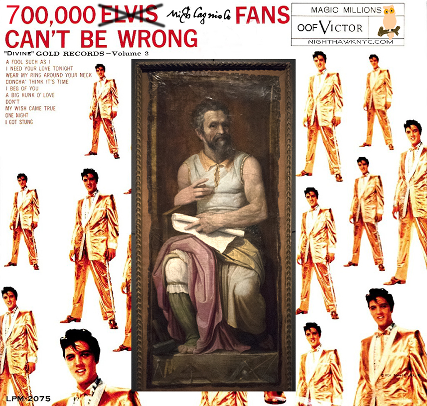
Take that, Elvis, who’s 1959 album title, and cover, I just borrowed. Michelangelo was the “King” of a different kind of rock. Old school rock.

Marble.

So “old school,” his work is proving to be timeless. Good luck outlasting him, Mr. Presley. No, they didn’t call him “The King.” Such were his skills as a Sculptor, Painter, Architect and Poet, they called him “Il Divino” during his lifetime. “The Divine One.”

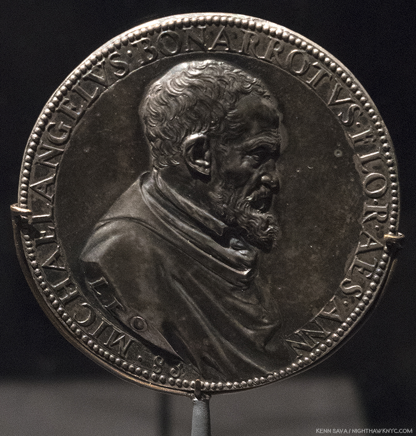
Met Curator Carmen C. Bambach deserves a medal. Nine years in the making, she now joins the ranks of The Museum’s “superstar” curators, like Andrew Bolton. After curating the Leonardo da Vinci, Master Draftsman Blockbuster, in 2003, Michelangelo: Divine Draftsman & Designer is her crowning masterpiece. In her superb catalog for this show she points out that Michelangelo, himself, was quite fond of this rendering of his profile in this Portrait Medal of Michelangelo, c.1561, one of which was given to him by its creator, Leone Leoni. Click any Photo for full size.

Since Art is my religion, “Il Divino” works in my book, too, these 542 years after his birth. For me, Michelangelo is not “Divine,” as in “more” or “other than human.” His talent is “Divine”- Merriam-Webster definition 2a “supremely good: superb.” It is in that sense I relate to him as “Il Divino.” While qualitatively comparing creative people or their work is meaningless, I will say that if there is a “greater” Artist than Michelangelo? I haven’t found him, or her. Michelangelo was Art’s first “reality” superstar. He was the first Artist to have a biography written about him during his lifetime. In fact, there were three 1. Such was his renown that people came from all over Europe hoping to simply see him, or in hopes of acquiring something from his hand (like a Drawing).

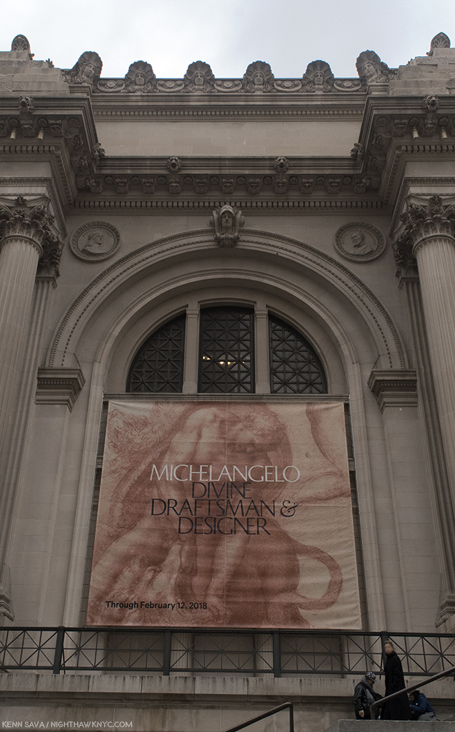
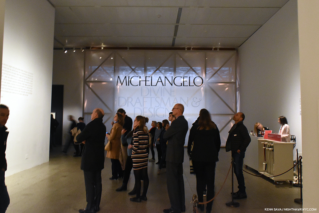
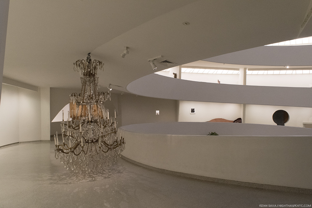
Met fun fact- If you look over the banner, one of the largest I’ve ever seen hung outside, into the corner alcove on the right, that’s Michelangelo’s circular portrait permanently part of the wall of The Museum. It’s a “Badge of Honor” now. Though, I don’t think he’d be thrilled at having to face his rival Raphael, left alcove, in perpetuity. By accounts Michelangelo wasn’t fond of the younger Artist because of his “borrowing” from/being influence by him, and then having to compete with him for work. But? He can smirk now. Raphael is still waiting for his Met blockbuster show.

Yet, a good deal of the “Il Divino” cult that has surrounded him ever since his passing in 1654, at 88, was his own doing in creating. The third of those biographies, A Life of Michelangelo, 1553, by Ascanio Condivi, has been seen by many/most Michelangelo scholars as being ghostwritten by Michelangelo as a means of giving the world his story the way he wants it to be seen and known. The recent birth of the printing press served to help make it “go viral.” Ok. Widely read by many more than had ever been possible. That theory also holds that it was created as a “response” to the story of his life as told in Giorgio Vasari’s 1550 edition of The Lives of the Artists. For instance, in Michelangelo’s view (per Condivi), he burst on the Art world fully formed- i.e. without having studied Art. If this had been true, it would have been highly unlikely Pope Julius II would have entrusted him with Painting the Sistine Chapel ceiling, the most important church in Christiandom, a surface that amounts to about 10,000 square feet, if he had not been trained in Painting2. Vasari’ “replied” with a revised version of his Life of Michelangelo in 1568, four years after Michelangelo’s passing3. The revised version includes documentary proof, that Michelangelo was, indeed, apprenticed to Domenico Ghirlandaio. Nonetheless, the legend took root, including fact and fiction, and thanks to popular novels and movies, has lived on.

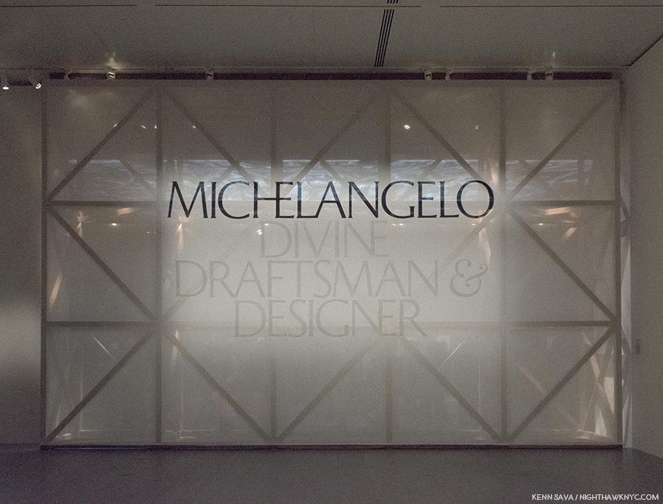
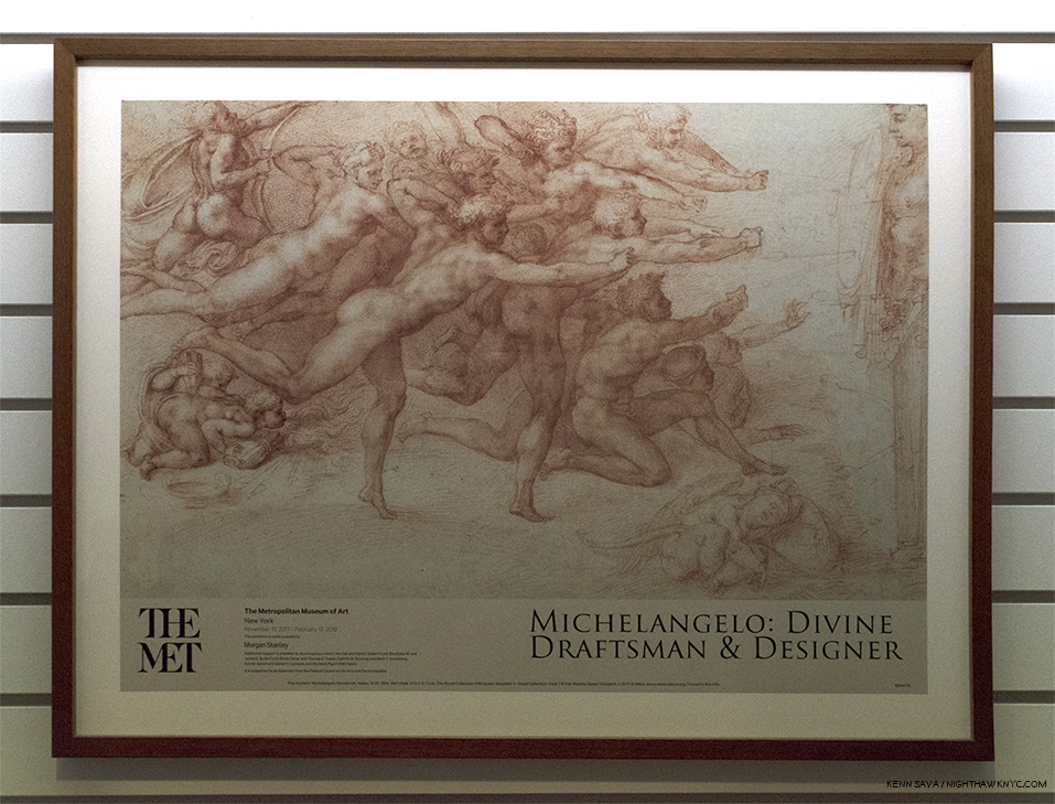
I’ll be seeing this in my dreams for the rest of my life. The show’s sign in Gallery 1 covers the faux scaffolding in the large Gallery 7 behind it devoted to the Sistine Chapel ceiling.

It doesn’t end with his life. There are all sorts of myths about Michelangelo’s works as well, and this show, along with recent scholarship, is slowly bringing the truth to light, even though it takes some darkened rooms to do so. Works by Michelangelo in the Western Hemisphere are about as rare as Leonardo da Vinci’s are. His Drawings (the only works in this part of the world besides one Sculpture and one Painting- both of which are included in this show) appear every once in a while, but given they are going on 500 years old and done in the days before acid-free or archival papers, their sensitivity to light means they’ll be shown briefly and in the darkened galleries, seen throughout this show. So, I’ve waited my whole life to see more than one or two Michelangelos in one place, let alone upwards of about ONE HUNDRED FORTY (I got chills typing that) by Il Divino among 250 items the catalog lists. The closest I’ve come to this point was when I last left Manhattan overnight, exactly six years ago in early February, 2012 to see the once in a lifetime Leonardo da Vinci: Painter at the Court of Milan, on its closing day, at London’s National Gallery, then stayed 3 more days solely to see the rest of the National Gallery, including their two, strange, Michelangelo Paintings (Photos were not allowed). So, to say I’ve been eagerly anticipating Michelangelo: Divine Draftsman & Designer since The Met announced it, is as big an understatement as I’ve yet made on this site.

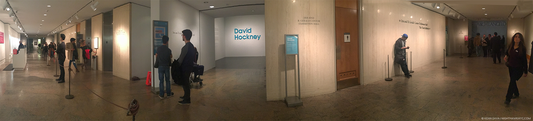
When I finally turned the corner to see it, I was stopped in my tracks. I’ve said before in these pages that sometimes I don’t feel like I’m alive anymore. Here was one of those moments. How else to explain THIS?-

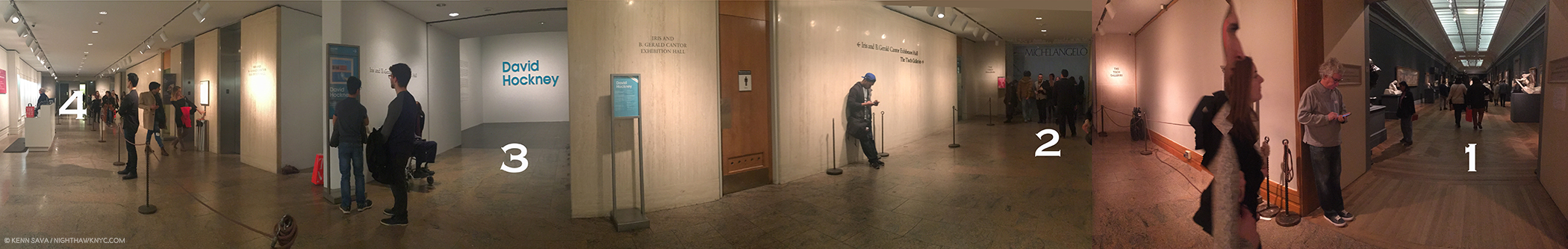
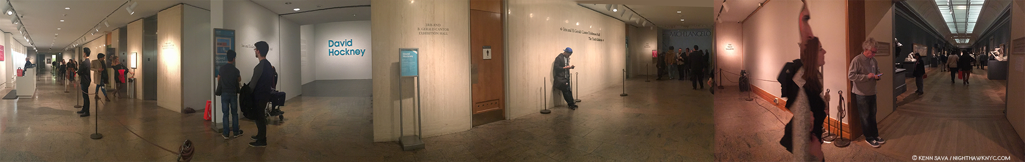
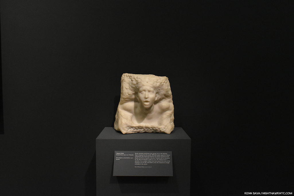
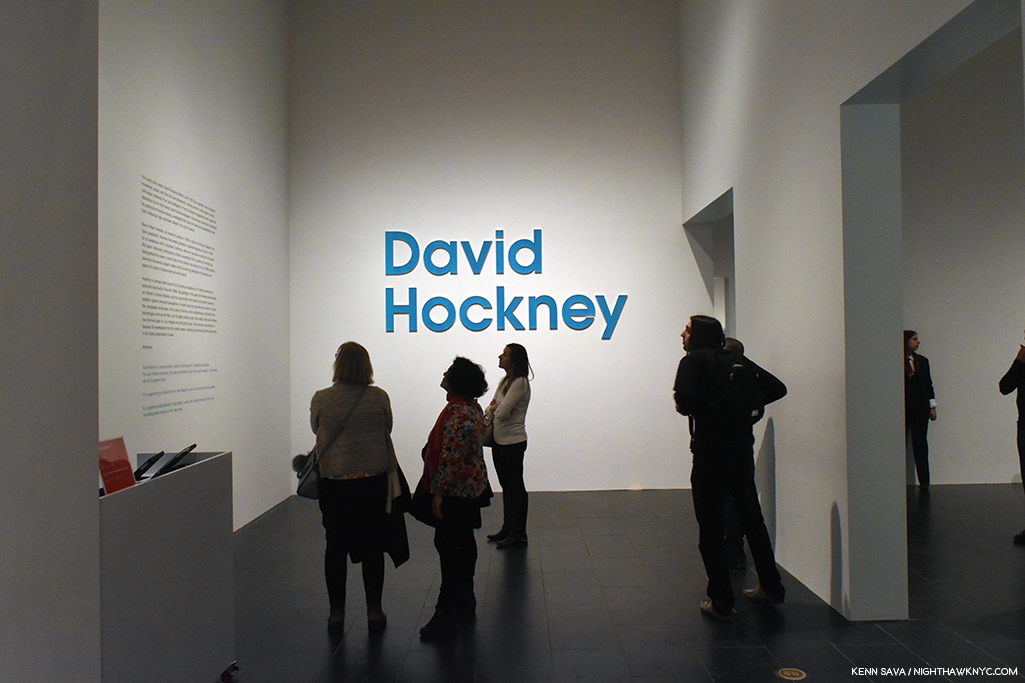
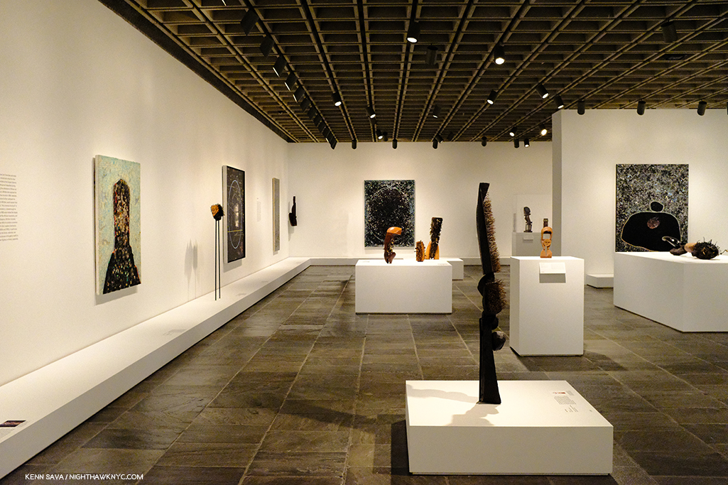
Art Heaven? No. It’s just one part of The Met’s 2nd floor. From far right to left- 1- Rodin In The Met, 2- Michelangelo, in the darkened room, 3- David Hockney, straight ahead, 4-  Joseph Cornell & Juan Gris seen in this 270 degree view. It’s so big, it’s seen better if you click to enlarge it.

Being The Met, the “once in a lifetime” (to quote their own press release) Michelangelo show, apparently, isn’t “enough.” Not only was that going on, right NEXT to it on one side, the David Hockney 80th Birthday Retrospective was going on in 8 large galleries, on the other side, “Rodin in The Met, was going on, AND down the hall, the Joseph Cornell/Juan Gris show, Birds of a Feather, had opened!  Just amazing. The run of the four shows overlapped for 8 days. I don’t know what’s on view now in Heaven’s Art Museum, and I’m not in a hurry to find out, but can it be any better? I hear they don’t allow Photos, either.

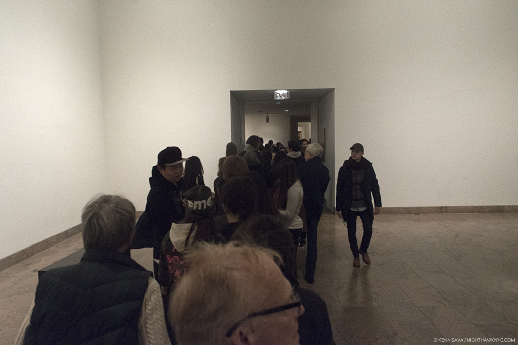
Welcome to New York. At the back of the line in the gallery now occupied by the Joseph Cornell/Juan Gris show, “4”, above, on December 29th, with a long way to go to get in.

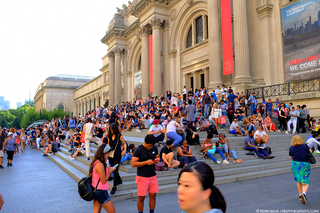
Over the holidays there was a waiting line that snaked all the way down that long hall, to the left in the panorama, around the corner and through the Modern Art galleries, including the one now occupied by the Joseph Cornell/Juan Gris show, Birds of a Feather, “4” in the panorama, above. Still, I managed 10 visits, and I was there when the show ended at 9pm on February 12th. The Met staying open that late on a Monday is unheard of in my experience. After its first month, it was continually crowded right to the end, amazing given the show’s huge size (see my floor plan further below). On February 13th, The Museum announced 702,506 other visitors attended (702,516 all told), making it the 10th most visited exhibition in Met history.

“It’s full of stars.” Stanley Kubrick was right. It really was. Before Michelangelo, the Sistine’s ceiling was a Painted blue sky with stars until a structural collapse in 1504 necessitated it be repainted after being repaired. Michelangelo’s rivals wanted the Pope to select him because they were sure he couldn’t possibly Paint as well as he could Sculpt. I would laugh out loud at them if I weren’t eternally in their debt.

Michelangelo: Divine Draftsman and Designer is a dream come true. Wandering the 20 sections in the 12 galleries, a number of them large, all of them densely lined with 250 pieces, including 133 Drawings by Michelangelo, 3 of his sculptures and one Painting, the largest Michelangelo show in this country during our lifetimes (regardless of when you were born), I was left to wonder if anything like this will ever be mounted on this side of the pond again. Only the 1980 Picasso Retrospective, which took over all of the old MoMA, is comparable among shows I’ve seen in NYC.

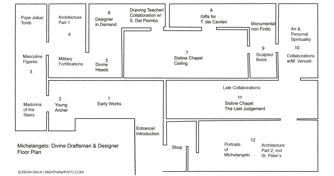
My Drawing of the show’s floor plan.

“It’s overwhelming…” was the comment I heard visitors say most often as they passed me. Most said it in the affirmative4. Yes, there is a lot to take in. The detail in the Drawings is staggering- on a number of levels. First, Michelangelo’s technical mastery of Drawing provides an endless amount to admire and study. Second, since many of the Drawings here are details of large compositions (like the Sistine Chapel’s ceiling and The Last Judgement), the show presents a rare chance to study how these details fit into his grand vision for both of those incomparable works, as well as to appreciate how much Artistry is packed into them. (A Note- Michelangelo’s immortal Vatican Pieta, and David are omitted here. In the show’s catalog, page 69, Carmen Bambach says no Drawings for the former survive. He, possibly, worked from a model, which may, or may not, have been found. I remain to be convinced by it. Michelangelo, famously, burned many of his Drawings right before he died, as Vasari theorized, so nothing remaining by him would appear to be less than perfect5.) Out of the 140 works by him on view, complete works (i.e. whole compositions) by Michelangelo are in the minority. Studies of details for huge compositions are what most of these Drawings are. They are, often, the Artist working out on paper exactly how to realize figures, body parts, faces, etc.. There are also Drawings for Architectural works, most of them details, as well. It’s hard not to come away thinking that his large Paintings for the Sistine Chapel were not conceived the way he conceived his Architectural plans. His work on Pope Julius’ Tomb, which occupied him for FORTY YEARS (Seriously!… Don’t get me started.), is something of a “bridge,” it seems to me, between these enormous Paintings and his Architectural works, since the Pope’s Tomb is equal parts Sculptured figures and Architecture. Especially in its early incarnations as a free standing monument, it combines these two of his three core Arts. Painting and Architecture are also, in a sense, combined in the Sistine Chapel, which includes Painted Architectural elements throughout the composition. But, before I get too far ahead, let’s start at the beginning…

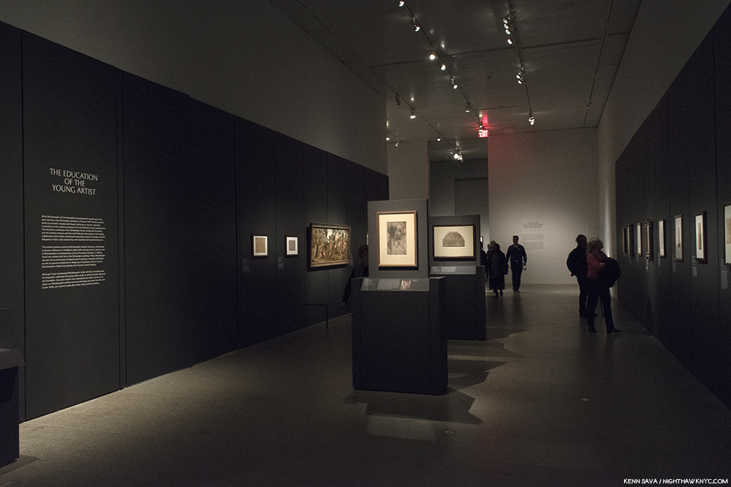
The first gallery contains his earliest surviving work, alongside brilliant examples by his teacher, Ghirlandaio (first two works, center), and his fellow student under him, Granacci (large Painting from The Met’s collection, left).

Based on the evidence here, Michelangelo demonstrated his genius for design early on. In the first gallery, we’re treated to masterpieces of Drawing by Ghirlandaio, who Michelangelo was apprenticed to, and a brilliantly executed Painting by Francesco Granacci, Michelangelo’s fellow student under Ghirlandaio, from The Met’s collection.

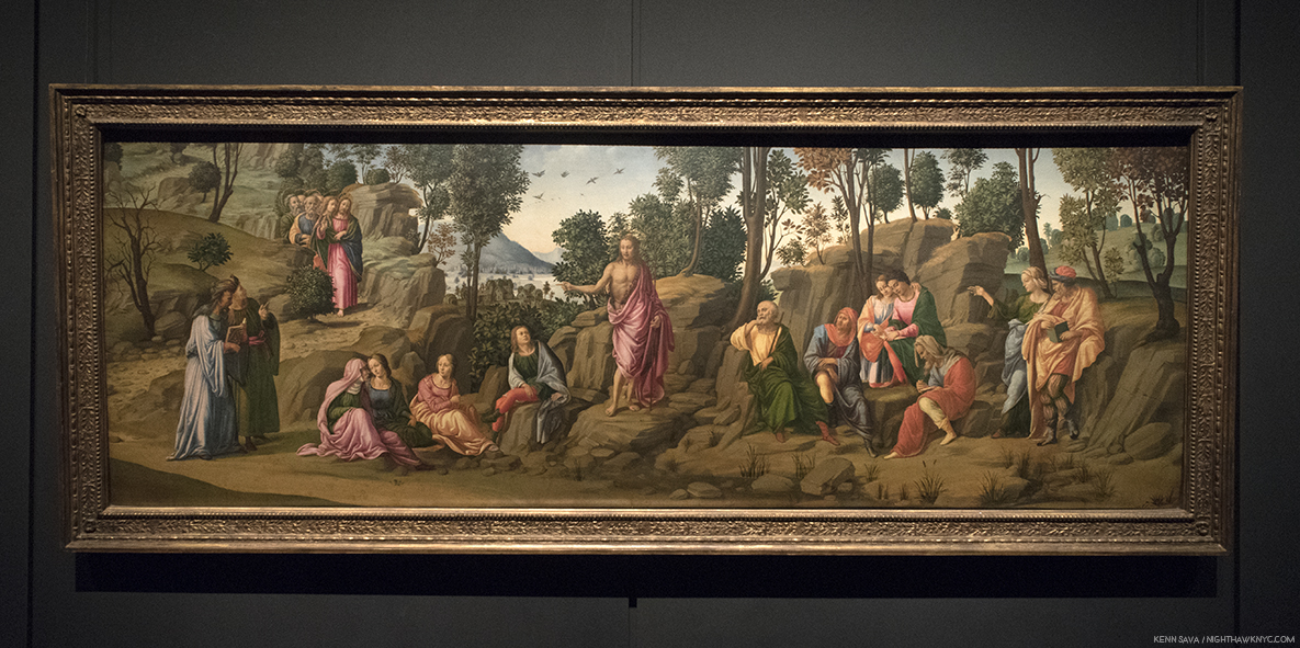
Saint John the Baptist Bearing Witness, 1506-7, by the “Workshop of Francesco Granacci.” In 2010, Everett Fahy, no less than the former head of European Paintings at The Met, announced that in his opinion, this was really by Michelangelo, not Granacci. Carmen Bambach disagrees, saying that some of the figures may be based on a Michelangelo Drawing6. Looking at it, the work lacks the overall compositional unity seen in, say, Michelangelo’s version of St. Anthony, below. Strangely, at least 6 of the foreground figures are not even paying attention to St. John. The top half of the figure of the Saint’s body doesn’t seem attached to the lower part. Finally, it’s so different stylistically, with none of Michelangelo’s “dash and daring,” combining to make it too hard for me to believe that Michelangelo could have Painted this a mere two years before Painting the Sistine Chapel ceiling, which he began in 1508.

Granacci is an Artist who, nonetheless, deserves closer study, because of his involvement with Michelangelo as well as to fully study and recognize his style, particularly in the Sistine ceiling. About 6 years older, he introduced Michelangelo to Ghirlandaio, and later became the foreman of the assistant Painters for the Sistine Chapel’s ceiling. But, the star of this gallery is The Torment of Saint Anthony, 1487-88, which Met curators determined is Michelangelo’s long lost first painting, after restoring it, and presenting it as such in its own show in 2009, which I saw. Based on a print of the same name the brilliant Martin Schongauer created between 1470-75, shown to him by Granacci, so taken with it was Michelangelo that he decided to create his own version of it- in color! Legend has it he haunted fish stands to learn how to render their skin. Beyond Painting it, in color, which adds another element of realism to it entirely, he recast the composition. Whereas Schongauer’s imagines the scene from “The Golden Legend” by Jacobus de Voragine, 1260, of Saint Anthony beset by various savage beasts, as taking place in mid-air. Michelangelo, does him one-better. He fills out the composition, adding a landscape, with rocky cliffs in the foreground, and a river complete with sailing craft behind. It’s been said that even Ghirlandaio envied it. The Torment of Saint Anthony, 1487-88, is more than “just” astonishingly well-executed for a 13 or 14 year old. It reveals a young Artist of vision, someone able to conceive, and wonderfully execute, a complex, unified, composition. Michelangelo felt something was “lacking” in Schongauer’s original and set out to solve this “problem” for himself. My question is- The Met had the chance to buy it circa 2009. WHY didn’t they? Instead, led by their own brilliant head Conservator, Michael Gallagher, they  gorgeously restored it, and it now resides in the collection of the Art Museum in Fort Worth, Texas, where it remains the only Michelangelo Painting in the country.

A shot across the bow of Art History. Two versions of the The Torment of Saint Anthony. Martin Schongauer’s print, right, which inspired Michelangelo’s astonishing first Painting, left.

Looking at it, I realized his genius for design begins here (among the works that have survived to reach us), and I now see it as nothing less than a “Rosetta Stone” of sorts for much that came after. It’s hard not to remember that both of his most famous later Paintings- the Sistine Chapel’s ceiling and The Last Judgement take place, largely, in mid-air, though both have elements that “attach” them to the Earth. On the ceiling, he does this by including faux Architectural elements he Painted between and among the scenes, and in The Last Judgement, of course, by including Earth, Purgatory and Hell. In fact, there are quite a few interesting similarities between The Last Judgement (seen here, and further below), and The Torment of Saint Anthony, including the landscape, river and sailing craft, and of course, beings suspended in mid-air. As brilliant as the execution of the Painting is, it’s the mind at work in the background creating the overall composition, from Schongauer’s original, in light of its similarities with these later works that proves for me that this IS a Michelangelo.

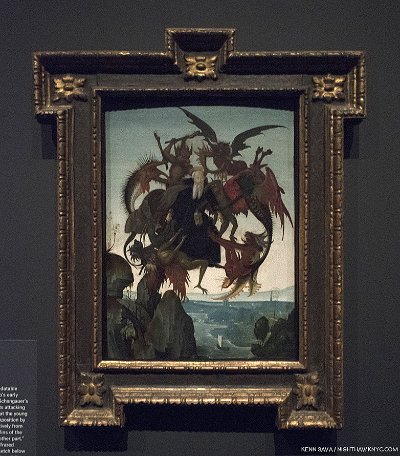
Michelangelo, The Torment of Saint Anthony.

And so, even in Gallery 1, we see that underlying much of what he created is his mastery of Drawing and his genius for design and compositions. This will be made clearer in every following gallery. As a result, Carmen Bambach serves to rewrite our understanding of Michelangelo as not only a genius of Sculpture, Painting and Architecture, but one of the supreme masters of composition and design.

The first gallery is completed with our first taste of masterpieces of Michelangelo’s Drawings. Drapery studies have been a staple for Art students probably since the advent of Drawing. Having recently seen, and written about a masterpiece of Drapery Drawing by Leonardo da Vinci at MoMA, it’s utterly fascinating to compare it with those of his great rival, Michelangelo. Leonardo’s though “perfect” as it is, is focused solely on the thigh, knee and calf of the subject, leaving much of the rest undone/unfinished, particularly on the fabric that lies on the floor. In this Drawing, a study after Giotto, Michelangelo gives us an almost complete figure, and another in less detail, save for his face and hands. While it is fascinating to compare these two supreme masters of Drawing, some consider this to be Michelangelo’s earliest extant drawing, which might make it unfair to compare with the more mature Leonardo piece.

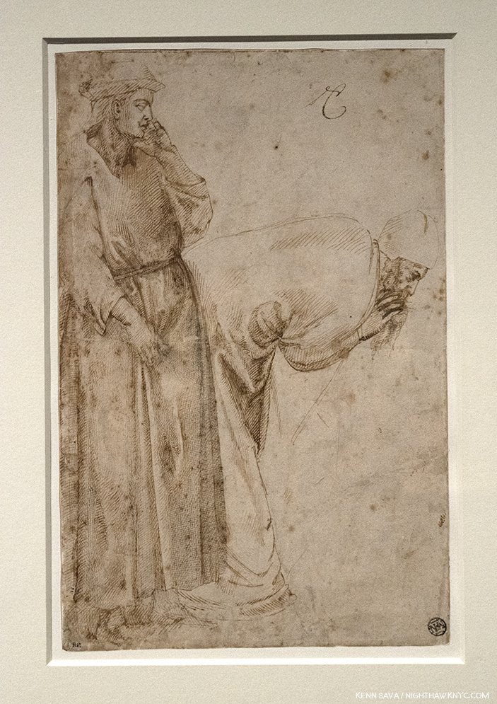
Michelangelo’s earliest surviving Drawing, Studies after Two Figures in the Ascension of Saint John the Evangelist by Giotto, c.1492. Michelangelo would have been 16 or 17. Notice the standing figure clutching at his robe- something that makes the folds so difficult to draw, you rarely see a student attempt it. Interesting, also, these are two male figures which are not “sculptural.” Rare in Michelangelo’s later figures.

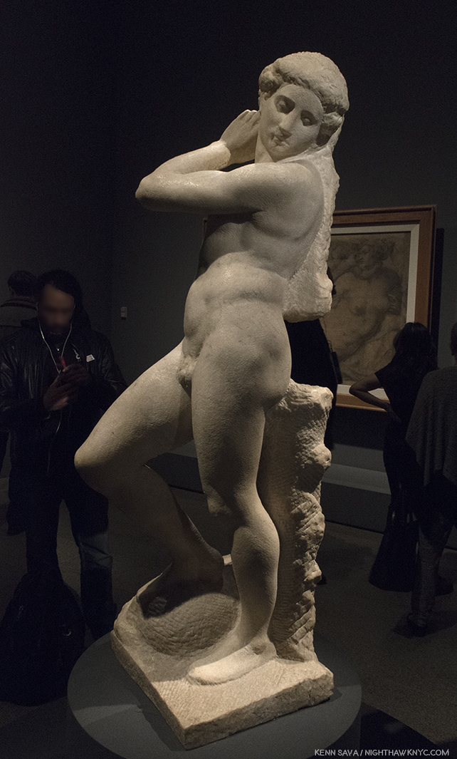
Few people may realize that Michelangelo started out as a Painter. It was only in 1490, when he was all of 15, that he began Sculpting. From Saint Anthony, the Young Archer greets us alongside a few possible influences and examples of other works that bear some similarity to lost early Sculptures by Michelangelo.

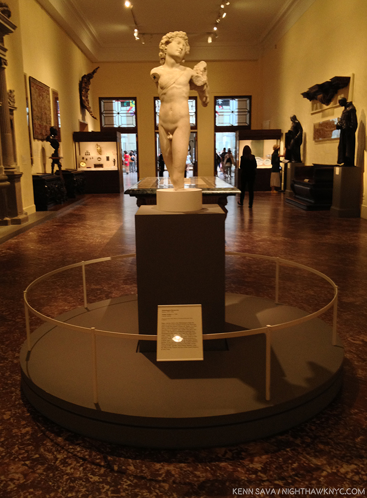
Young Archer, c. 1490, when Michelangelo would have been about 15, seen at The Met in 2015. Recognized as an early Michelangelo by Kathleen Weil-Garnis Brandt in 1996, it’s been the only work by the Master regularly on view in NYC since 2009, though, most visitors to The Museum, apparently, don’t realize it given this typical “crowd” I’ve encountered around it every time I’ve seen it- until now.

As if to make up for it’s questionable placement for much of the past decade, The Met placed it smack dab in the middle of the path to the next gallery so you can’t miss it. It’s certainly worth a long look wherever it winds up being displayed in The Museum now that the show has ended, to see if you think it’s the real thing, or…?

After 527 years? The Young Archer’s moment has arrived.

In The Room With Michelangelo.

“In the room the women come and go
Talking of Michelangelo”
T.S. Eliot, “The Love Song of J. Alfred Prufrock”

’Tis no different almost exactly 100 years after T.S. Eliot wrote those immortal words in 1920. At The Met I heard them. More than once. It was hard not to. Visitors were often shoulder to shoulder its last two months.

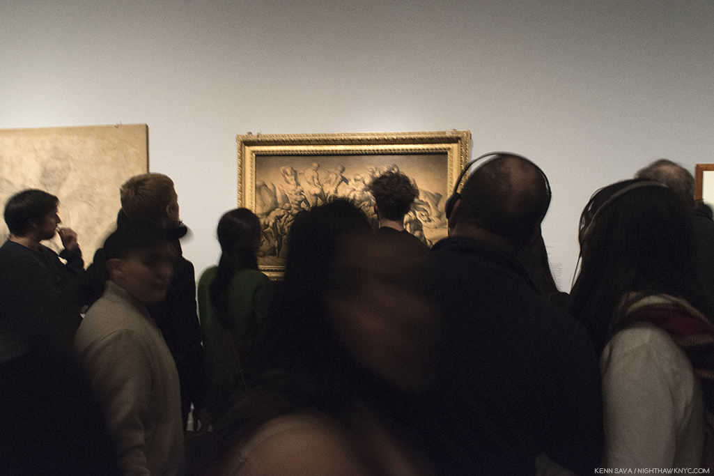
Rush hour on the A Train? Gallery 3 on February 11th, the day before it ended. I was thrilled to see so many people at this show. Not only that, they looked and they looked hard. That’s particularly amazing given that many of the works were studies of details of large compositions.

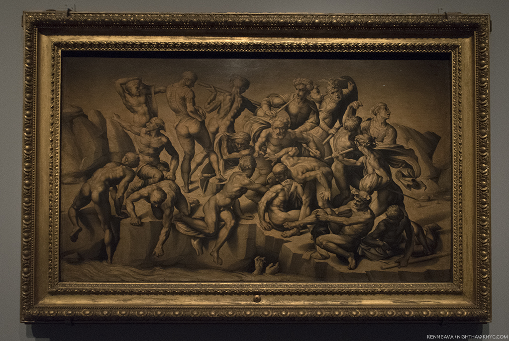
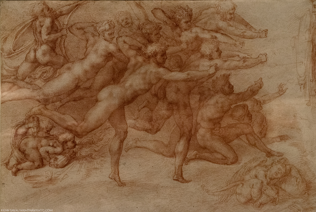
Seen without the crowd, Bastiano da Sangallo’s famous, Copy after the Central Episode of the Bathers in Michelangelo’s Battle of Cascina, The only surviving record of Michelangelo’s lost Battle of Cascina, which he was commissioned to do on a wall opposite the also lost Battle of Anghiari, commissioned from Leonardo da Vinci, of which a Drawing by Rubens is it’s only record. Still, so many Artists have been influenced by this work. I always wonder if Gericault’s masterpiece The Raft of the Medusa, is one.

I admit it. I did lean in to hear the details, and FINALLY know what Thomas Stearns Eliot was referring to. Most of the time? There were commenting on Michelangelo’s “unusual” female bodies. Their second most popular topic was his “choice of ‘friends.’” Oh well. Imagine my disappointment. Neither of these topics were news to me.

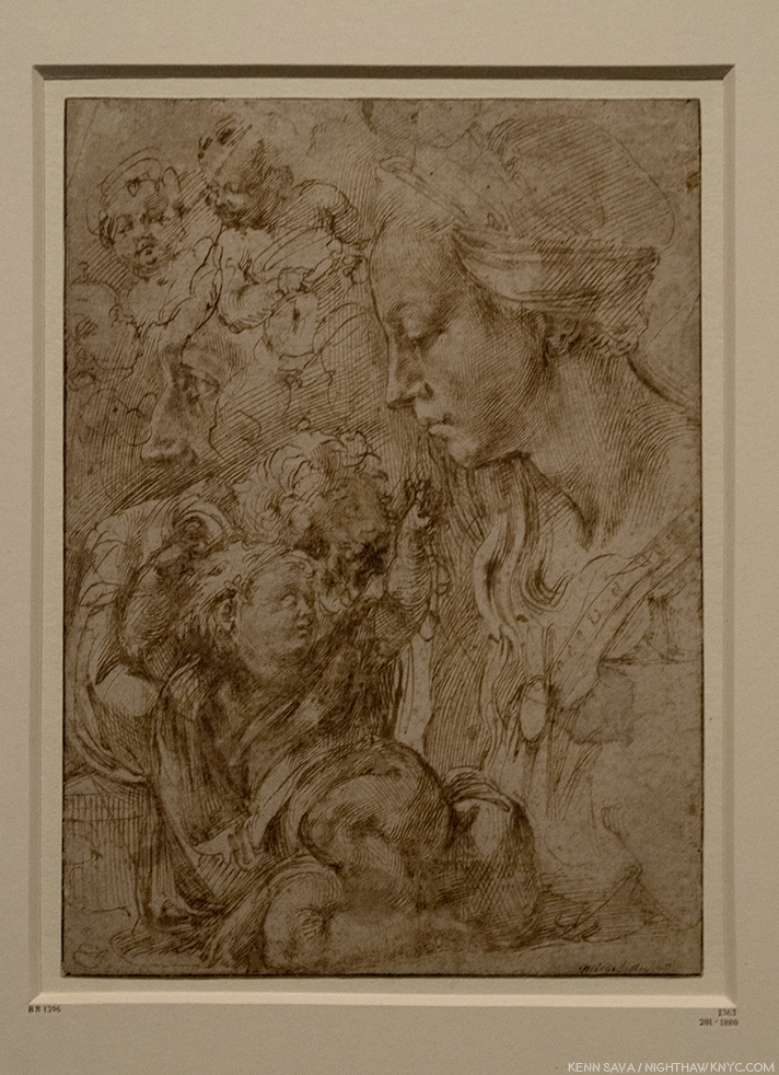
Sketches of the Virgin, the Christ Child Reclining on a Cushion, and Other Sketches of Infants. Early on, as seen here, and in the immortal Vatican Pieta, Michelangelo’s women seemed much more feminine to my eyes. This beautiful Drawing, which echoes his early Madonna of the Stairs, may have been a model for the Painting Virgin and Child with the Infant Saint John, possibly by Piero d’Argents, that was displayed next to it.

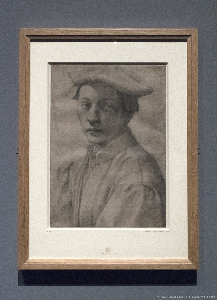
One of his “friends.” One Michelangelo portrait in the aptly titled, staggering, “Divine Heads,” section of Gallery 5, Portrait of Andrea Quaratesi, c. 1532.

A section on his early designs for Pope Julius II’s tomb leads us to a gallery of early Architectural projects, and then to a gallery full of “Divine Heads,” which includes the one above.

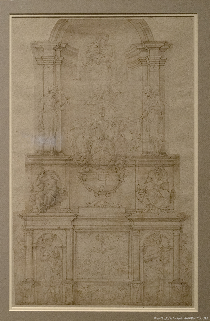
Demonstration Drawing for the 1505 Design of the Tomb of Pope Julius II. It’s interesting to me that once again, we see a compositions of multiple levels- like The Last Judgement. In this one, as well, salvation is to be found at the top. This was just one  of the countless incarnations of the design for Pope Julius’ Tomb, as it evolved from free standing monument to the wall tomb it is today, which was FINALLY finished in 1545. The haggling lasted so many years that of course the Pope died (in 1513!) before it was finished…32 years  before it was finished! Michelangelo’s Moses, one of his enduring, greatest, masterpieces, is its central Sculpture, in quite a different design, in the church of San Pietro in Vincoli.

Moving back to figurative Drawings, in Galleries 5 & 6, one card described his style perfectly- “He drew like a Sculptor.” Meaning he drew with a heavy hand, the examples just above notwithstanding. Yes, his outlines are distinct, lyrical, and strong, and yes, his figures are often “Sculptural,” but even beyond all of this, his brilliant composition extends beyond the possibilities of Sculpture. Look at this, for example-

The Archers A work of sublime beauty equalled only by its mystery that starts with the fact that most of the the titular “archers” hold no bows.

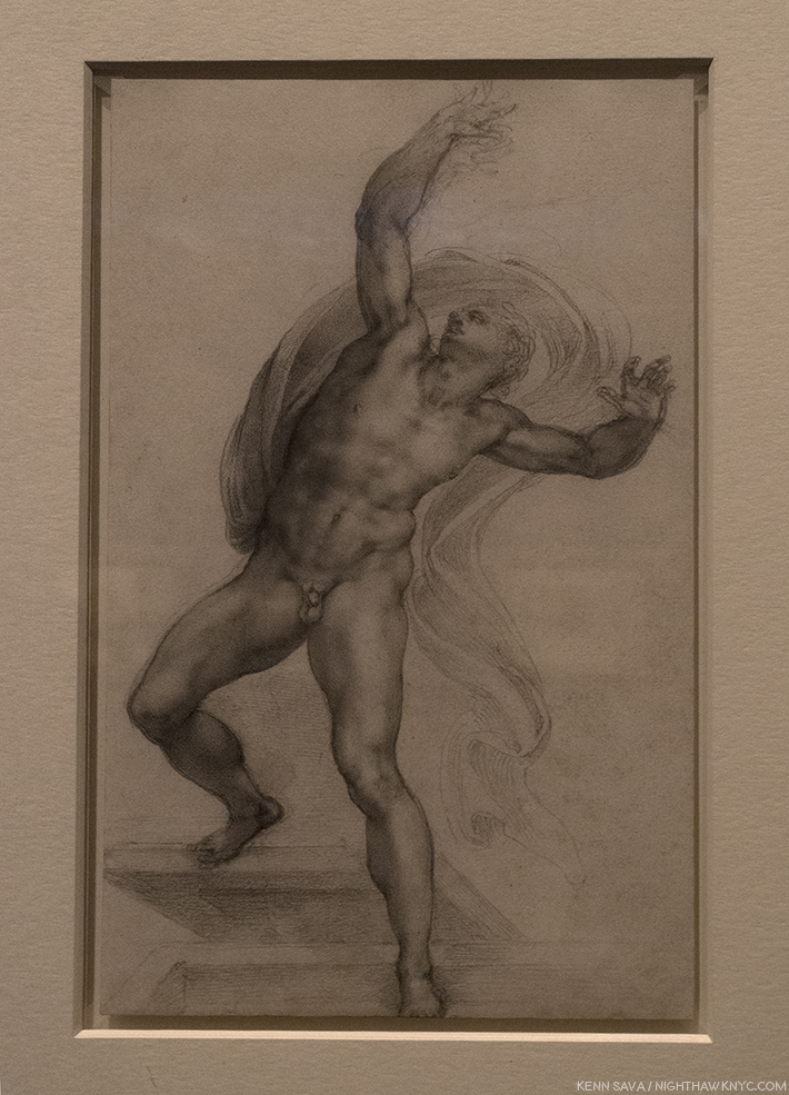
The Risen Christ. A fascinating, “simpler,” composition with only one figure that nonetheless reaches to the infinite.

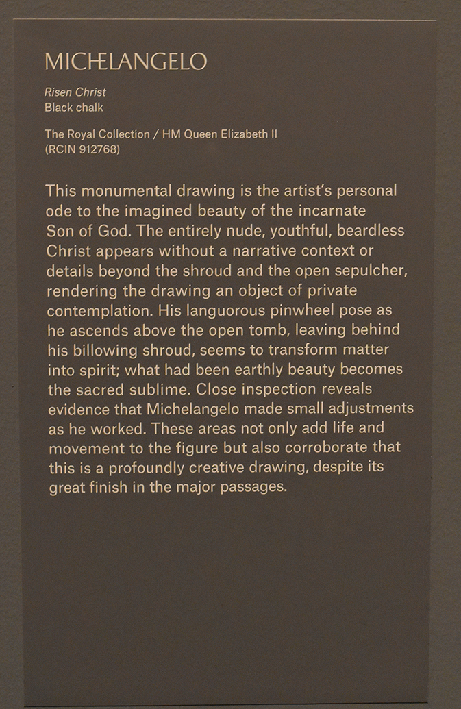
Its wall card. I selected this one as a typically, enlightening, example of the commentary throughout.

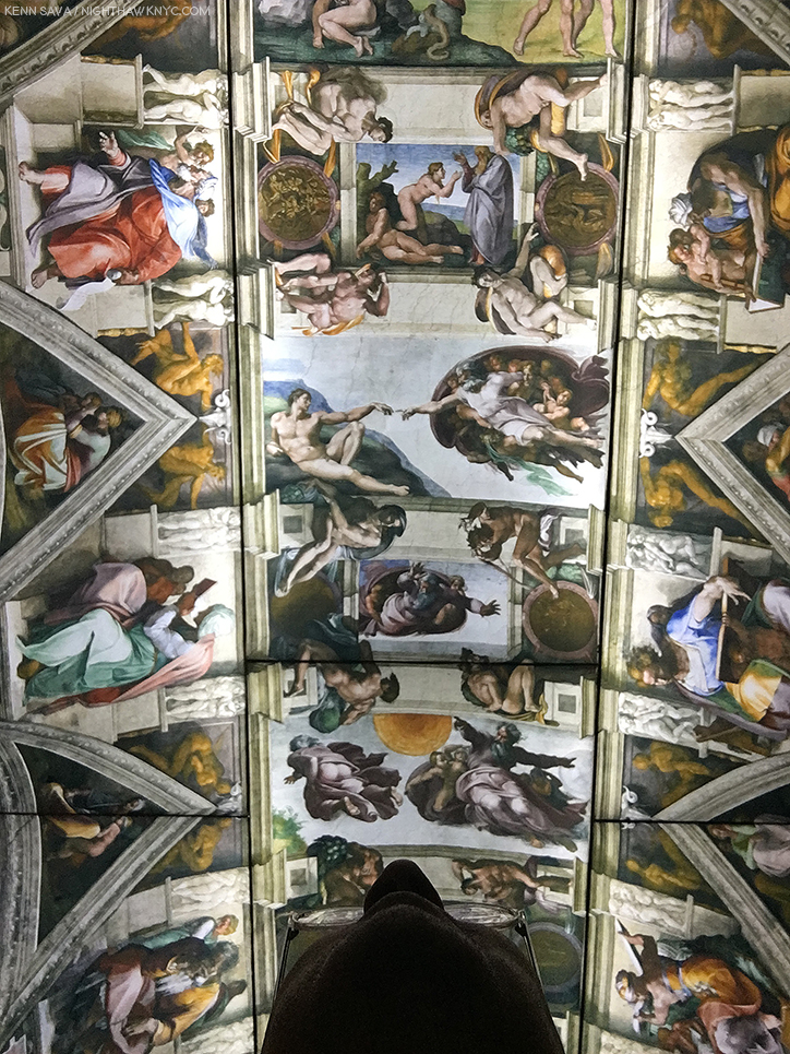
Michelangelo presented a design for the Pope’s tomb that included 40 Sculptures, a composition so incredibly ambitious it was impossible for any one man, even one with “divine” skills, to Sculpt during one lifetime. Though he considered himself a “Sculptor,” we can be thankful that he was compelled to Paint the Sistine Chapel ceiling (seen, fully, here). Painting, especially (and Drawing in lieu of a Painting), provided the best means of realizing many of his extraordinarily ambitious and involved compositions. Thankfully, he was able to finish this one- in four years. Sill clouded in drama, fiction and fantasy after 500 years of dirt was removed from it in the 1980s, the real story of the ceiling’s creation is every bit as dramatic as are the incomparable results, which many consider to be the greatest work of Art in the Western world.

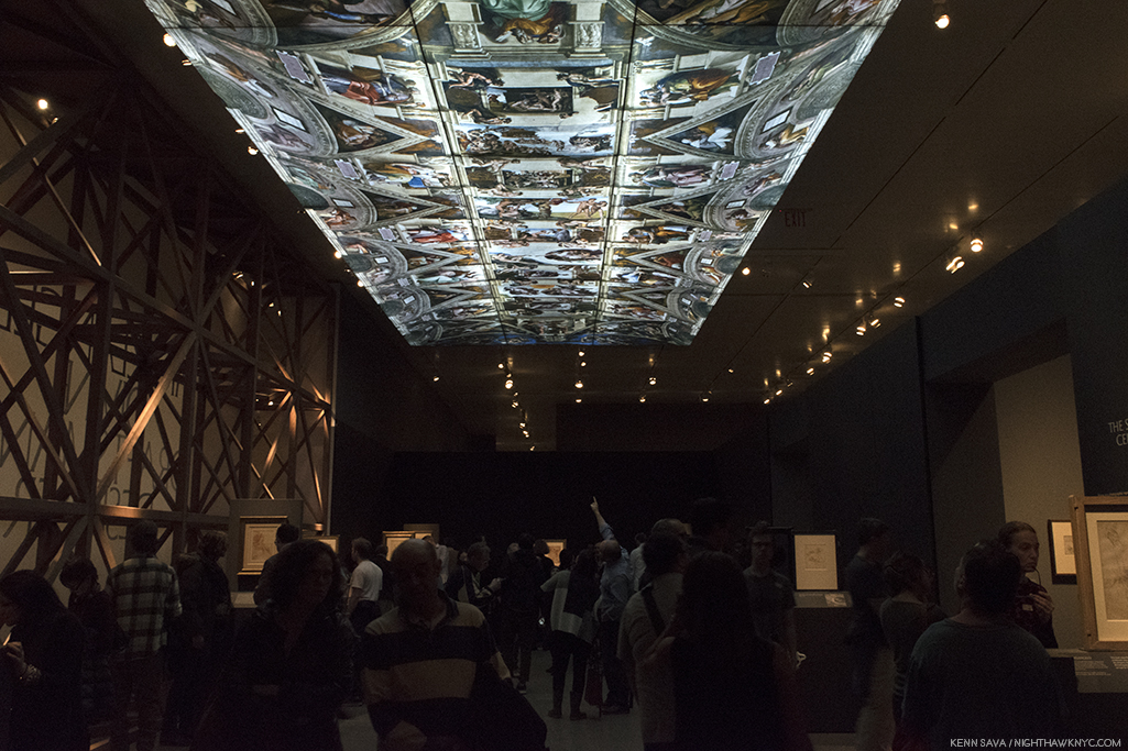
“It’s not the real thing.” I heard one visitor comment in Gallery 7. ! No, but it’s 1/4 size of the original. You can take a 360 degree tour of this gallery, with The Met’s brilliant curator, Carmen Bambach, here. By the way, Michelangelo’s scaffolding ingeniously hovered over the floor and was moved as the work progressed. So brilliantly conceived, the 1980 restoration team reconstructed it, in lightweight metals, as STILL the best option to work on the ceiling.

In the heart of the show, Gallery 7 featured a range of studies for the Sistine Chapel ceiling that provide fascinating insights to the individual characters and the overall composition. Full of details who’s meanings have faded over the centuries (like what’s up with all the acorns?), one of the most fascinating and thought-provoking voices about it belongs to Art critic, writer and filmmaker, Waldemar Januszczak, who was one of those to receive permission to observe the restoration up close on the reconstruction of Michelangelo’s ingenious scaffolding in the 1980s. He used the opportunity to launch into a full fledged investigation of the ceiling’s history, and its “meaning.” His resulting book, Sayonara, Michelangelo: The Sistine Chapel Restored And Repackaged, 1990, and documentary, The Michelangelo Code: Lost Secrets of the Sistine Chapel, looks at the history of the Chapel and the “meaning” of both the ceiling and The Last Judgement. More on that in a bit.

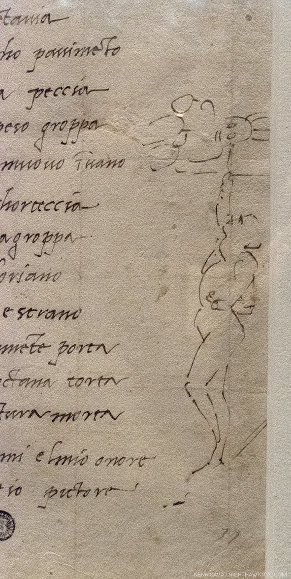
Fact versus fiction. Michelangelo’s self-portrait Painting the Sistine Chapel ceiling.

Regarding the infamous “he Painted it lying on his back” story, Mr. Januszczak says, “Its origins can be traced back to a mistranslation of Michelangelo’s first biography, 31 lines written in Latin by Paolo Giovio, Bishop of Nocera, sometime between 1523 and 1527, (which can be read here). Giovio describes Michelangelo’s posture while painting the Sistine ceiling as resupinus. This was assumed to mean ‘on his back’ by various Michelangelo commentators who spent 5 centuries enthusiastically emphasizing his agony at the expense of his ecstasy. A more accurate translation of resupinus would be ‘bent backward7.’” In the show, we see Michelangelo’s own Drawing of the way he worked, above, alongside a sonnet he wrote to a friend about it.

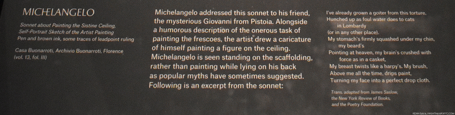
The Met’s caption for the Drawing, above.

Apparently, The Agony & The Ecstasy author Irving Stone, and the film’s director, Carol Reed, haven’t seen this. At The Met, old wives’ tales died hard in the dim light of the darkened galleries.

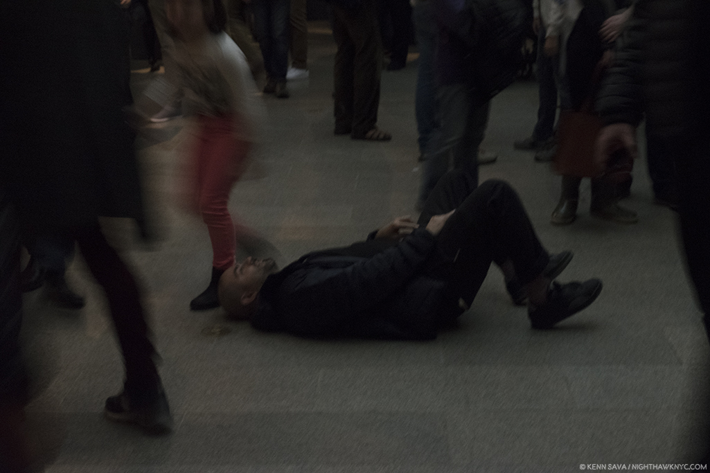
No. Michelangelo did not paint it lying  on his back. Given how crowded it was, and how many visitors were looking up, it’s a bit amazing he didn’t get stepped on, though the young lady on the left almost got him.

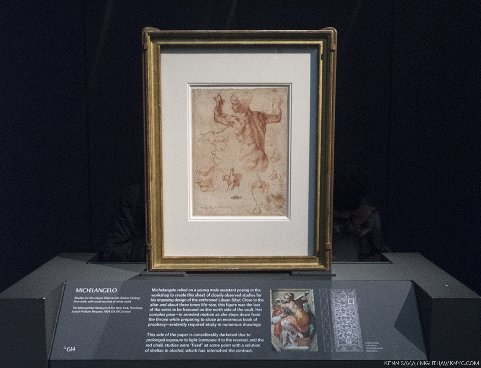
Studies for the Libyan Sibyl in the Sistine ceiling. One of the most amazing things for me in the ceiling, beyond the astounding overall composition, are the postures of the figures- almost all of them. Perhaps none is more extreme than the immortal Libyan Sibyl. In the finished work, this priestess is seen at once stepping down from her throne while apparently preparing to move or close the gigantic book she holds in both hands. So complex are these movements that Michelangelo made studies of this figure in sections so he could closely analyze them, like this well-known example, in which the left hand is slightly higher than the right- the opposite of how they are in the Painting. The Artist possibly realized this would have made the whole pose look extremely unbalanced, not to mention rob the figure of much of its timeless grace.

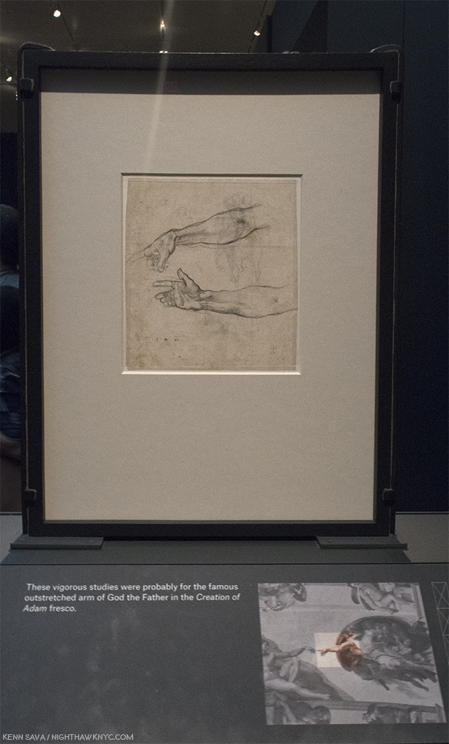
Jaw dropping. One of the most important Drawings in existence. Every time I went, I had to stop and ponder this. I never knew it existed. Two Studies for an Outstretched Right Arm, Very possibly for God the Father in the Creation of Adam section of the Sistine Chapel. According to Waldemar Januszczak, the celing’s fingers have been REPAINTED by restorers at least twice, including during the most recent restoration in the 1980s8! So? THIS is as close as we may ever get to what Michelangelo intended they look like, from his own hand. Just astounding.

In Gallery 9, viewers were treated to the rarest of the rare- TWO sculptures by Michelangelo (with, or without, assistants), both unfinished. Both remarkable. When was the last time was that THREE sculptures (counting the Young Archer) by Michelangelo were shown in the U.S.A., at the same time? I don’t think it’s ever happened. If you know differently, please drop me a line.

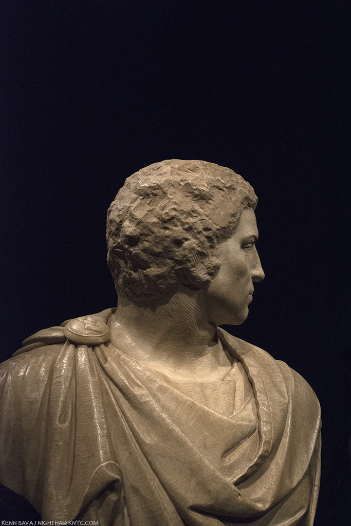
Bust of Brutus, (with “some assistance” from Tiberio Calcagni), My recreation of an iPhone Photo the great Photographer, Stephen Shore, the subject of a terrific retrospective up right now at MoMA, took of it during his visit and posted on his Instagram page.

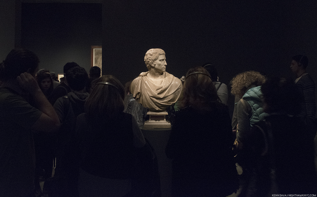
Last look. The crowd was still heavy around Michelangelo’s stunning, Bust of Brutus, in the final hour of the run of the show on February 12th.

Apollo-David, (Unfinished). Both it, and the Brutus, were on loan from the Museo Nazionale del Bargello, Florence, Italy. I can’t imagine how much the insurance was to ship these…round trip.

The Met’s glorious show goes a long way further to set the record straight about Michelangelo and his accomplishments, in my view. Michelangelo, the somehow “not human” myth, is dead. Long live Michelangelo, the all too human genius of Art & Design. It seems to me that the myth does him a disservice. If he wasn’t human, it would have been easier for him to accomplish Artistic perfection. But, he was very human, as his Poems and letters reveal, as does how hard he worked for a very long time (he died at 88, about 3 weeks short of his 89th Birthday- unheard of in the fifteenth & sixteenth century, when 35 was closer to the norm) to achieve the brilliant results he brought the world. Yes, human. He was continually worried about his finances (as we see in this show, where he uses every square inch of paper, on both sides, to economize), he continually worried about his family and their status, he worried about being paid, often by whichever Pope he was working for (He lived through the reigns of 12 popes and, extraordinarly, worked for 7 of them9.), and his temperament ran hot and cold. If you were out, he could be very hard on you. It seems to me he lived a largely loveless, isolated life. His loves, such as we see in his Drawings and Poems and in his relationships, remained largely unrequited.

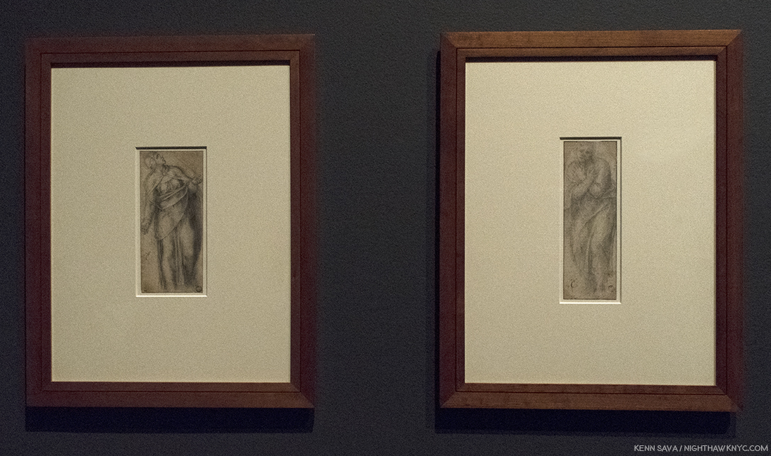
Michelangelo, Fragment with a Study for the Virgin for a Crucifixion, left, and Fragment, with a Study for Saint John the Baptist for a Crucifixion, right.

Michelangelo: Divine Draftsman & Designer, serves to revise our perception of Il Divino. To this point, he, and Leonardo, are perceived as geniuses who finished little of what they started. While there are many projects that Michelangelo didn’t complete (as well as others he did finish that are now lost), the bigger picture is that he completed a remarkable number of compositions & designs- some of which were either intended for, or realized by, other Artists, or were completed after his death. During his lifetime, Michelangelo was the only Artist thought to have excelled the revered masters of ancient Greece and Rome (per Vasari), who inspired the Renaissance- perhaps the highest esteem a Renaissance Artist could achieve.

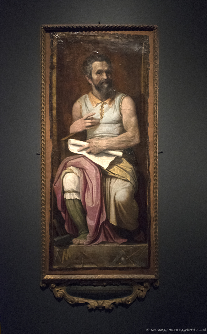
Marcello Venusti, The Crucifixion with the Virgin and Saint John the Evangelist, based on Drawings by Michelangelo, above, shown as one example among many of Michelangelo’s designs adapted by other Artists in this show. I selected Venusti’s because, well, it’s just gorgeous.

In one of the great mysteries in Art History, TWENTY FOUR YEARS after completing the ceiling, Michelangelo returned to the Sistine Chapel to Paint this. Well, almost this, The Last Judgement.

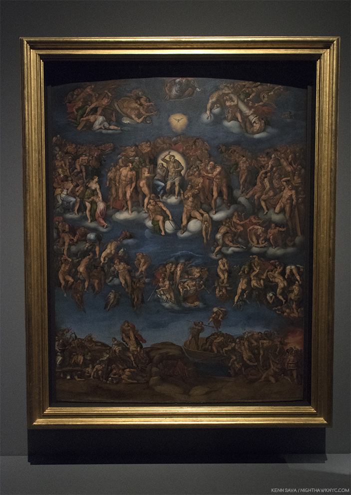
Marcello Vanusti’s copy of The Last Judgement, is a very valuable record of what the work looked like in the mid-sixteenth century, before the addition of the controversial loincloths. However, Venusti took a number of liberties elsewhere, himself, so this is not a verbatim record of what he saw, though important nontheless. Due to its popularity, this was, perhaps, the hardest work to get full frame in the entire show.

WHY? Never before had an Artist returned to the scene of one work to complete another after such a long period. Whereas the ceiling gives us Genesis, the beginning of the universe, and life, on the wall over the altar, Michelangelo now gives us the end of the world, in all of it’s shocking glory. A bit too shocking for the time as it turned out. The beginning, and the end, in one space. In the interest of keeping this piece shorter than it might be, I’m only going to briefly mention something I feel is important, though not addressed in this show- The possible “meaning” of the Sistine Chapel ceiling and The Last Judgement. There seem to be two main theories. First, Waldemar Januszczak believes the Chapel building, itself, is modeled on the plan of the universe laid out by the ancient Christian Cartographer, Cosmas, in his Christian Typography, 547 AD. In it, the universe is rectangular, with a dome, like the Sistine Chapel, and its proportions are the same as the Temple of Solomon’s, which also match the Sistine Chapel’s. The universe is bordered by curtains with heaven and a second earth lying beyond. This is where the Genesis story takes place. So, when we look at the ceiling, we see into the past, through the painted Architectural elements all over the ceiling, in a world that is flat with the Sun revolving around it.

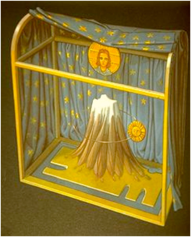
Waldemar Januszczak mentions the long forgotten sixth century Christian Cartographer, Cosmas, as the creator of this model for the universe, which looks shockingly similar to the structure of the Sistine Chapel. Notice, the Sun revolves around the Earth, with God & Christ above. Interestingly, it shows a blue background sky, with stars, which is how the Sistine’s ceiling looked before the collapse led to Michelanglo repainting it.

The second theory is based on the coincidence that Nicolaus Copernicus happened to be in Rome espousing his theory the the Earth revolved around the Sun at the exact moment Michelangelo was painting the ceiling. It believes he, and the Pope, were privy to it, though it had not as yet been published, and they included it in the ceiling and The Last Judgement. In the latter work, Jesus’ left thigh is at the exact center of the composition. Dr. Valerie Shrimplin says, “The most probable source for this choice of a central point on Christ’s thigh, as the pivotal centre of the entire cosmological fresco, seems to be the Book of Revelation 19:16. In a description of the Christ of the Judgment, it reads: ‘And he hath on his vesture and on his thigh a name written, KING OF KINGS AND LORD OF LORDS.’ This text is immediately followed by a reference to the Sun-symbol: ‘And I saw an angel standing in the sun…’ (v. 17). In the Sistine Last Judgment, Christ is thus depicted (theologically, neoplatonically and scientifically) as Michelangelo viewed Him: as King of Kings and Lords of Lords, the Sun, the centre of the Universe.”

Given the lack of anything definitive in Michelangelo’s surviving documents (his Drawings or letters), to support either of these theories, I find Mr. Januszczak’s the more compelling case. Pope Julius was a theological scholar who became a Doctor of Theology before becoming Pope. It makes sense to me that he would have known about Cosmas, and given that his uncle built the Sistine Chapel in the exact same dimensions Cosmas espoused (the building is not mentioned in the other theory), means that TWO Popes were involved in the Sistine Chapel. Nicolaus Copernicus was 2 years old when the Sistine Chapel’s construction, in Cosmas’ proportions, began, which would seem to make it a moot point. These factors tips the balance to Mr. Januszczak’s theory, in my mind.

By the way, Pope Julius II and his uncle, Pope Sixtus IV, were members of the della Rovere family who’s coat of arms include acorns and oak trees, both of which are seen all over the ceiling, and indeed, all over Italy, by way of “marking their turf,” as it has been called.

From all I’ve read, one thing seems certain. Michelangelo was a deeply religious man. An Artist who included himself in his final Pieta, called The Deposition, as well as including his Self-Portrait on his flayed skin that St. Bartholomew holds in The Last Judgement. Some see a self portrait included in the depiction of the Archangel Michael (or “Michelangelo”) on the ceiling. I don’t think he would have done any of these things if he was not deeply religious. It also makes me think that he went back to the Sistine Chapel to Paint The Last Judgement years after Pope Julius’ death because, then in his 60’s, he may have been thinking of his own mortality. Regardless, 506 years after he completed the ceiling, and going on 500 years after he completed The Last Judgement, the discussion remains ongoing about trying to understand these two incomparable masterpieces.

The controversy doesn’t end there. Regarding those “ladies talking of Michelangelo”… Waldemar Januszczak says, “Michelangelo was thus never a fully accepted and fully committed homosexual of the modern kind. He belongs, rather, besides Donatello, Leonardo, Botticelli and the painter nicknamed Sodoma among those homogamous Renaissance artists about whom we have conflicting evidentce of a conflicting sexuality. That he was a homosexual in some form seems certain. that he was not homosexual, in the way we understand the word today, appears equally unarguable10.” And, on the question of his depictions of the female body, he continues, “Given Michelangelo’s obsession with human anatomy, it seems improbable that he never actually saw a naked woman in his life. But he cannot have seen very many. And he does not appear to have looked too closely11.”

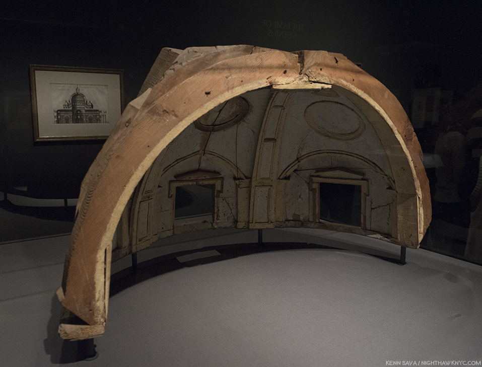
Nothing Less than Michelangelo’s model for the vault of the Chapel of the King of France, 1556-57, created under his direction by Fabbrica di San Pietro, Vaticano, Vatican City. The calotte of the dome of the south apse at a scale of 1:30. He would not live to see his designs for St. Peter’s, of which he was chief architect for 17 years,  completed, and those that were were, including its dome, were altered12.

Drawing, Draftsmanship & Design underlie all of his works. As such, they are the key to understanding his genius as a visual Artist. His brilliant Poetry lies on yet another plane of it, a tributary springing from the same font. Regarding his work as an Architect, Camen Bambach summed it up saying, “The physical beauty of the human body, which so deeply inspired Michelangelo’s Drawings, Sculptures and Paintings, also provided some meaningful analogies for his work as an Architect. His sheets with preparatory Drawings often combine ideas for figures and buildings…The human body offered an organizing principle in creating a unity of forms, whether the component parts were symmetrical or in freestyle13.”

Frederico Zuccaro, Portrait of Michelangelo as Moses, showing “Il Divino” in a similar posture to that of his brilliant Sculpture for Pope Julius’ tomb. Michelangelo was not a tall man, and I imagine his arms must have looked not all that different to these after a life of carving stone. The tools of his trade lie on the pedestal beneath his feet. Carmen Bambach says of it, “Much as the prophet (Moses) led the Children of Israel out of Egypt, do did Michelangelo save the Artis, by indicating the true path through a command of disegno and visual judgment..” (Catalog, P.257)

While I continue to love and admire his Sculpture, Painting, Drawing, Poetry, and what I can understand of his Architecture (most of which was unbuilt), I now see him as a genius of design and composition, first and foremost, due to this show. That his Art continues to speak to so many of us 542 years after his birth is the supreme testament to his skill. It makes me wonder why he felt he needed to “pump himself up” to mythic proportions when his work, itself, has done so for him. His real story, as far as is known, makes him much more “human,” than “divine,” and I, for one, find that more compelling. It gives me hope that there may be another “supremely talented” Artist, or perhaps there already has been and he or she remains unknown to us. For the here and now, nearly three-quarters of one million people saw something they’ll never forget. One of the ultimate displays ever mounted of what human Creativity is capable of, and has achieved.

I am thankful I lived to see it.

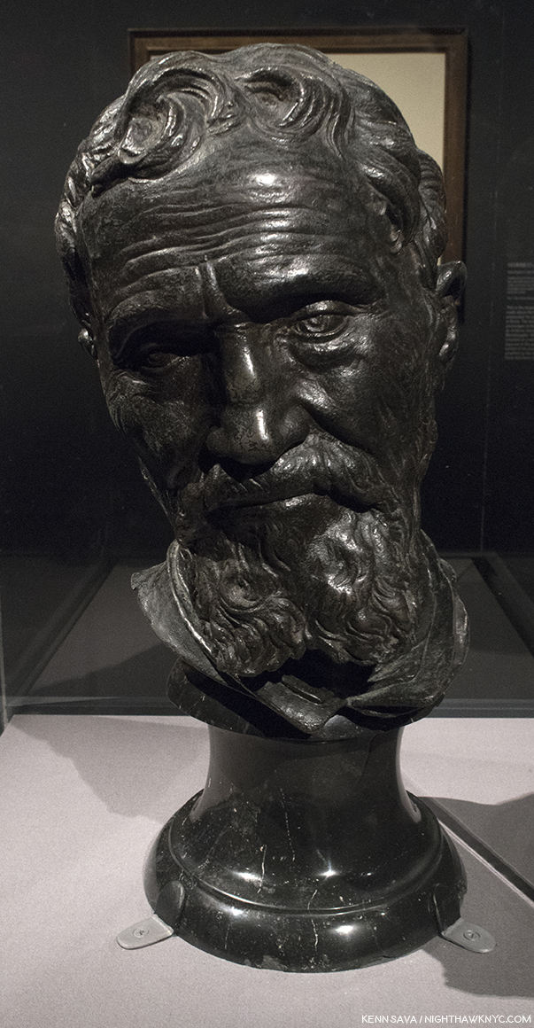
“Now, speak!,” Michelangelo said after finishing the monumental “Moses” for Pope Julius’ Tomb, according to legend. I muttered it silently when I stood in front of his friend and collaborator Daniele de Volterra”s lifelike bust of him, partially created from Michelangelo’s death mask, at the very end of the final Gallery #12.

“‘Immortality’
Here my fate wills that I should sleep
too early,
but I’m not really dead; though I’ve
changed homes,
I live on in you, who see and mourn
me now,
since one lover is transformed into
the other.
Here I am, believed dead; but I lived for
the comfort
of the world, with the souls of
thousand true lovers.
Although I have been deprived of my
own soul,
I still live on in the souls of all those
who loved and remember me.”*


* * * * * * * * * * * * *

(Happy 543rd Birthday, Michelangelo di Lodovico Buonarroti, born March 6, 1475 in Caprese near Arezzo, Tuscany, since renamed Caprese Michelangelo.)

Michelangelo: Divine Draftsman & Designer is a NoteWorthy show in my life, and for February, 2018.

*-Soundtrack for this Post is “Suite on Verses of Michelangelo Buonarroti,” Op. 145a, by Dmitri Shostakovich in 1974, the year before he died, which includes Michelangelo’s words quoted above in its final section, titled “Immortality.” Shostakovich, one of the great symphonists of the 20th Century, considered it to be his Sixteenth (and obviously, final,) Symphony, as he told his son.

Appendix- Recommended Resources-

-The Exhibition Catalog for Michelangelo: Divine Draftsman & Designer, by Carmen Bambach, is one of the best books on Michelangelo I’ve come across this past year, at least. It’s certainly the first stop for anyone who saw this show and wants to know more about it, and I highly recommend it to those who missed it as all the works displayed are wonderfully reproduced, along with a good many that were not here. Unlike many exhibition catalogs I see that are slapped together quickly, this one was NINE YEARS in the researching and writing (Catalog P.8). It shows on every page. Full of insights, stories and details, I haven’t seen anywhere else, it truly is the next best thing to having been there, and the best record of what it was. Though its focus is on the show and works included in it, Ms. Bambach never forgets to tie the works into the bigger picture, providing a remarkably thorough running biographical picture in the process, plainly sorting facts from fiction as she sees them in a wonderfully no-nonsense way, along with including priceless technical details and insights only a world class curator, who’s spent her life immersed in this work would have. Essential reading for Art History students, Michelangelo collectors (soft smile), and anyone with a passion for Art History, or Michelangelo.

-The best overall current Michelangelo book is Frank Zollner’s Michelangelo, The Complete Paintings, Sculptrues and Architecture, published by Taschen. I’m saying that while also saying there are better books for the Paintings. Better books for the Sculptures, but most are out of print and would require quite a bit of digging. But, if you want one book on Michelangelo, with as many good Photos of the full range of his accomplishment (yes, that means after restoration where they have been done, and I have no problem with any of them I’ve seen thus far), I’d recommend you look at it. Prior to the Taschen book, which originally came in the HUGE, 23 pound, XL size (which I, personally LOVE), look for “Michelangelo: The Compete Sculpture, Painting, Architecture,” by William E. Wallace, who teaches and lectures on the Artist, and has also written a good biography of him.

-The best books on the restored Sistine Chapel is the 2 Volume set, The Sistine Chapel, 1991, featuring the Photographs of Takashi Okamura, very probably the best ever taken of the ceiling and “The Last Judgment,” because he, and NHK TV had exclusive rights to Photograph it in return for NHK Japanese TV putting up 3 million dollars for their restorations. But? Being issued in limited editions, weighing 27 pounds, they’re very expensive now. The good news is there are other books with many of the same Photos, though smaller, and text by the restorers which are currently very cheap, including- “The Sistine Chapel: A Glorious Restoration,” “Michelangelo: The Last Judgement,” and Michelangelo: The Vatican Frescoes” which have all been on my shelf for years.

-As for his Sculpture- There are two ways to go- General overviews, or books that focus on one work. Which way you go depends on how closely you want to look at one particular work. A good number of the specialized books are out of print, but can be found at a decent price used, and of course, depending on age, feature black & white Photos, the older you get. I have the Hartt Frederick book published by Abrams, but it’s out of print, now and pricey. For current overviews, take a look at the Zollner and Wallace books cited earlier and see what you think of them.

-Writings- Michelangelo’s Poems are beautiful. They reveal the depth of his feelings in a way that is surprising at first, while they give a bit of insight to how his mind worked. For the true devotee of Michelangelo, they are essential. The problem is that there has yet to be a “definitive” translation of them into English. You can drive yourself crazy reading different translations of the same Poem. Find one that speaks to you, and don’t read any others…unless you’re THAT obsessed. I have the James M. Saslow paperback, which includes annotations, and more than 300 of his sonnets, madrigals and other poems.

-As for the biographies, Condivi’s or Vasari’s Biographies of Michelangelo both have the issues I outlined earlier. Condivi’s is a bit harder to find currently. Another way to go is to start by reading his letters. There’s a lot of them, and the 2 volume set edited by E.H. Ramsden (the one I have), gives a the largest number of them. They’re presented chronologically, and give you the feeling of his day to day life, which no biography does, and, in my opinion, you also get a sense of some of his values, and what’s important to him. Then, you can read the biographies and sort out for yourself what’s true and what’s “marketing.” Penguin has a paperback of selected poems and letters, which I have not looked at, so I can’t share any thoughts about it. Please, do not read Irving Stone’s books on Michelangelo (or Vincent Van Gogh) as “biography.” You’ll get much closer to the real Michelangelo’s biography reading Carmen Bambach’s catalog for this show, and it’s not, primarily, a “biography.”

-Finally, as I mention in the piece, I find Waldemar Januszczak’s book, Sayonara, Michelangelo: The Sistine Chapel Restored And Repackaged, 1990, and documentary on the Sistine Chapel, “The Michelangelo Code: Lost Secrets of the Sistine Chapel,” to be the most enlightening, and extremely well researched exploration of the ceiling’s history I have found. It also includes a fascinating presentation of a possible “meaning” Mr. Januszczak researched and developed over more than a decade. He may be right about it. Agree with him, or not, it’s well worth seeing for the tour it gives, which includes access to many off-limits areas, as well as for the history lesson. The 2-part film is out of print on DVD, but appears on Public Television’s “Secrets of the Dead” series every once in a while.

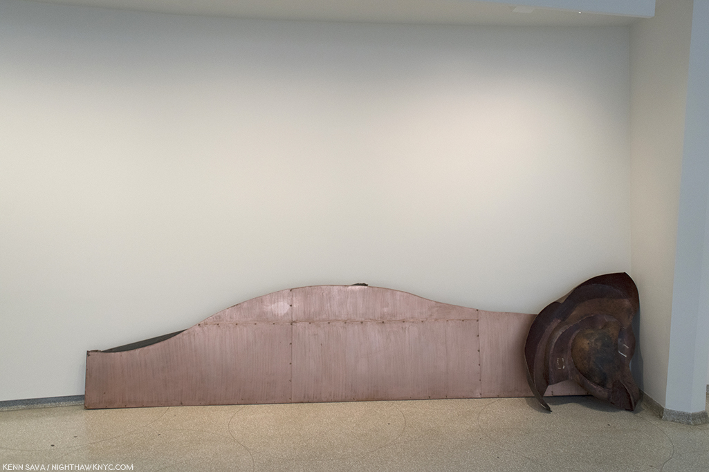
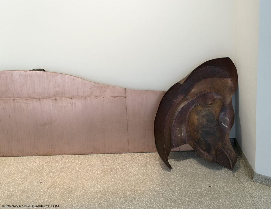
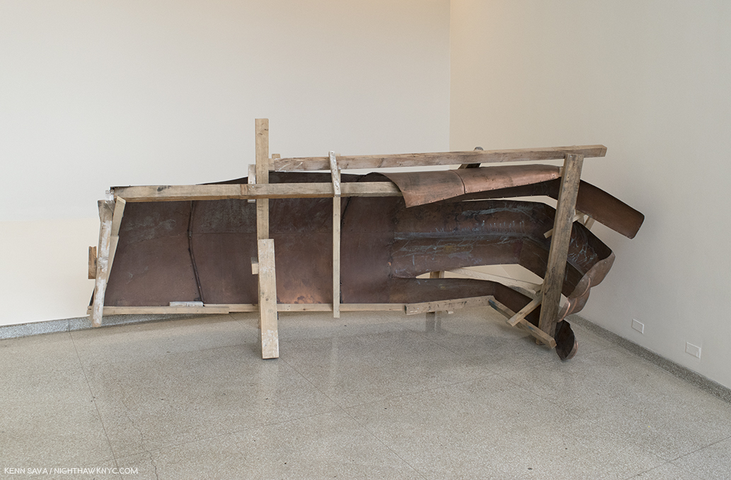
The former entrance as seen on February 23rd, thirteen days after it closed. “Sayonara, Michelangelo.”

NighthawkNYC.com has been entirely self-funded & ad-free for over 7 years, during which over 275 full length pieces have been published!
If you’ve found it worthwhile, PLEASE donate to allow me to continue below.
Thank you, Kenn.

Also- I’m pleased to announce I’m curating a selection of Art, ArtBooks & PhotoBooks for sale! All items are from my collection or selected by me in my travels through the Art world. The complete selection of over 370 items is here.

Written & photographed by Kenn Sava for nighthawknyc.com unless otherwise credited.
To send comments, thoughts, feedback or propositions click here.
Click the white box on the upper right for the archives or to search them.
Subscribe to be notified of new Posts below. Your information will be used for no other purpose.

  1. Paolo Giovio’s, brief Michaelis Angeli Vita, circa 1527, which was all of 32 lines, which can be read here, Giorgio Vasari’s “The Lives of the Artists,” 1550, which was revised in 1568, and Ascanio Condivi’s A Life of Michelangelo, 1553.
  2. as Waldemar Januszczak points out in Sayonara, Michelangelo: The Sistine Chapel Restored And Repackaged, 1990, P.22
  3. Varari also designed Michelangelo’s tomb in the Basilica di Santa Croce in Florence, Italy.
  4. One complained, “It’s overwhelming. So many small works, with so much detail…I get it. Let’s go see something big and colorful.” Yikes. The David Hockney Retrospective is right next door.
  5.  The Vatican Pieta, was shipped to NYC for the 1964 World’s Fair, where my parents saw it. Their only experience with Art, as far as I know.
  6. Exhibition Catalog P.37. Henceforth referred to as “Catalog.”
  7. Sayonara, Michelangelo, P.56
  8. Sayonara, Michelangelo P.39
  9. Sayonara P.53
  10. Sayonara, Michelangelo, P.135
  11. Sayonara, Michelangelo, P.139
  12. Catalog, P.237
  13. Catalog, P.237-8

Winterlude: Ai Weiwei’s “Good Fences Make Good Neighbors”

Written & Photographed by Kenn Sava.

Outdoor public Art in the winter anyone? In February, 2005, Christo & Jeanne Claude presented “The Gates” in Central Park, which combined the 24/7/365 beauty of the Park with a unique vision featuring a gorgeous use of the color saffron. It drew millions of visitors in the dead of winter, and I spent three solid weeks in the Park pondering and documenting it in daylight, at night, in rain and in snow, eventually seeing all of it’s 26 miles. I met the Artists before the show, which consummated a 25 year labor of love, opened, and I was there as they watched the final sunset from a hill in the Park on it’s closing night. Now, 12 years later, another visionary Artist, Ai Weiwei, has chosen the winter for another huge show, this one so big it’s spread out over all 5 of NYC’s boroughs. Luckily, this time, I had 4 months to see it.

“Circle Fence,” “The Hemisphere,” Flushing Meadows, Queens, “The Hemisphere,” built for the 1964 World’s Fair, “as an aspirational image of global unity at the height of the Cold War. During our own period of increasing nationalism and anti-immigrant sentiment, Ai draws renewed attention to its symbolism. His 1,000 foot long Circle Fence uses a series of metal frames with interconnected netting to surround the site, creating a global border that can be seen as both playful and sobering.” Click any Photo for full size.

February has also become a special month for me, the month I celebrate being “reborn.” Last February, I marked the 10th Anniversary with my first “Winterlude” Post, “Remembering ‘The Gates'” in a series of Photos I took on the High Line, where the “Art show” mother nature put on was evocative of the saffron of “The Gates.” The other reason I chose it was it was a look at life in hibernation, on it’s way to being reborn. This year, I’ve chosen to take a meditative look at Ai Weiwei’s show for the Public Art Fund, “Good Fences Make Good Neighbors,” the largest NYC outdoor Art show of 2017, which ended on February 11th, exactly 4 months after it opened. Numbering over 300 pieces, divided into “Structures” (numbering 8), “Bus Shelters” (10), “Ad Platforms” (over 100), and “Lamppost Banners,” (200), they were spread over all five boroughs. I made it to Queens(!), above, but I wound up spending the 4 months focusing on seeing as many of the Manhattan works as I could.

I’ve decided to let the resulting Photos, and the words of the Public Art Fund website, do most of the talking. So, please note- All quotations in the captions to the Photos are from the Public Art Fund.

About the show, they said-

“Ai Weiwei conceived this multi-site, multi-media exhibition for public spaces, monuments, buildings, transportation sites, and advertising platforms throughout New York City. Collectively, these elements comprise a passionate response to the global migration crisis and a reflection on the profound social and political impulse to divide people from each other. For Ai, these themes have deep roots. He experienced exile with his family as a child, life as an immigrant and art student in New York, and more recently, brutal repression as an artist and activist in China….“Good fences make good neighbors” is a folksy proverb cited in American poet Robert Frost’s Mending Wall, where the need for a boundary wall is being questioned. Ai chose this title with an ironic smile and a keen sense of how populist notions often stir up fear and prejudice.”

Lamppost Banner 136, 5th Avenue btw West 17 & 18th Streets. “This portrait depicts a refugee on the island of Lesvos, Greece, which has served as the entry point into Europe for hundreds of thousands of refugees fleeing Afghanistan, Iraq, Pakistan, Senegal, Syria, Somalia, Cameroon and elsewhere. Nearly all have attempted to reach Lesvos by crossing the narrow strait that separates the island from Turkey in overcrowded boats often without lifejackets or with defective ones. Hundreds of migrants, including many children, have drowned while making this perilous journey.” All quotes in these captions are from the Public Art Fund.

“Arch,” Washington Square Park, Washington Square North & 5th Avenue. “Ai opens a passageway through its center in the silhouette of two figures. Their outline takes its form from Marcel Duchamp’s 1937 Door for Gradiva, created to frame the entrance to Andre Breton’s art gallery in Paris. This is fitting to the immigrant conceptual Artist since Duchamp used to play chess in Washington Square Park, and once notoriously made his way to the top of the park’s arch with a group of other bohemian Poets and Artists. There, they spread out blankets, hung Chinese lanterns, tied red balloons to the arch’s parapet, declaring it the “Free and Independent Republic of Washington Square…It is also a fitting tribute to the figure who has had an enormous impact on many immigrant Artists in the years since, who have in turn made New York the hub of world culture that it is today.”

“Ai often visited Washington Square Park when he lived nearby in the 1980’s, drawn to its vitality as a hub for creative and political expression. His 27 foot tall steel cage echoes the iconic form of the marble arch, which commemorates George Washington leading the nation toward democracy. While seeming to create an obstruction, Ai opens a passageway through its center…”

“Five Fences,” Cooper Union, 7 East 7th Street. “The five arch-filling security fences…do not disrupt or confine the customary use of the portico. Yet, they do form a new physical- and metaphorical- barrier. ‘Five Fences’ suggests that the logic of social division is often opportunistic and incremental, emerging from and adapting itself to existing conditions.”

Banner 70. Sullivan St btw West 3rd & Washington Sq. “Ai created this portrait from an image taken during one of the artist’s team’s visits to the Shariya Camp in Iraq, where displaced Christian, Yezidi, Shia’ Turcomen, Arab and Shabak ethnic minority communities and religious groups have been forced to flee after being targeted by ISIS.”

Banner 58, Washington Place btw Washington Sq West & 6th Avenue.”This banner depicts Tina Modotti (1896-1942 b.Udine, Italy), the Photographer, model, actress and revolutionary who immigrated to the United States as a teenager from Italy. She moved to Mexico with her partner Edward Weston to join the Artistic community of Mexico City around Frida Kahlo and Diego Rivera. Photographer: Edward Weston”

Banner 81, MacDougal St btw Washington Sq N and West 8th Street. “Ai created this portrait from an image taken during one of the artist’s team’s visits to the Shariya Camp in Iraq, where displaced Christian, Yezidi, Shia’ Turcomen, Arab and Shabak ethnic minority communities and religious groups have been forced to flee after being targeted by ISIS.”

Banner 194, West 3rd St btw LaGuardia & Mercer Sts. “This portrait depicts a refugee from the Gaza Strip, home to a population of approximately 1.9 million people, including 1.3 Palestine refugees.”

Banner 104, Greene St btw West 4th & Washington. “Ai created this portrait from an image taken during one of the Artist’s team’s visits to the Shariya Camp in Iraq, where displaced Christian, Yezidi, Shi’a, Turcomen, Arab, and Shabak ethnic minority communities and religious groups have been forced to flee after being targeted by ISIS.”

“7th Street Fence,” 48 East 7th Street.”Since the 19th century, successive waves of immigrants have settled on the Lower East Side. Many who landed at Ellis Island made it there home.”

Banner 43, 5th Avenue btw East 18th & 19th Streets. “This banner depicts Marc Chagall (1887-1985, b.Liozana, Belarus), a Jewish-Russian Artist famed for integrating folk culture into his Art, who first emigrated to France to escape the Soviet Union and then in 1941 fled Nazi occupied France to the United States. Photograph by Pierre Choumoff, 1920.”

Banner 145, 3rd Avenue btw East 6th & 7th Street. “This portrait depicts a refugee on the island of Lesvos, Greece, which has served as the entry point into Europe for hundreds of thousands of refugees fleeing Afghanistan, Iraq, Pakistan, Senegal, Syria, Somalia, Cameroon , and elsewhere. Nearly all have attempted to reach Lesvos by crossing the narrow strait that separates the island from Turkey in overcrowded boats, often without life jackets…Hundreds of migrants, including many children, have drowned while making this perilous journey.” Before anyone asks…yes, the moon was really there.

Good Neighbors 76, 14th Street & 1st Avenue. “Location- Syrian-Jordanian Border. The Artist has co-opted spaces city-wide that are generally reserved for advertising on bus shelters…Here, he displays the new Photographic series Good Neighbors, taken during his visits to refugee camps and national borders, where fences are used to divide people and define them as different. These striking images are paired with related information from prominent humanitarian organizations, poetic excepts from writing about these issues, or quotations by the Artist to call our attention to the plight and humanity of the millions of displaced people across the planet.”

Odyssey 3, 14th Street at University Place. “Here, he displays an illustrated Greek-style frieze depicting the many forms of the contemporary global refugee crisis. In a mash-up of historical references, its stylized imagery evokes black-figure vase painting, Ancient Egyptian symbolism, classical Chinese motifs, and Ai’s own iconic imagery to represent a contemporary epic of war, ruins, perilous migration journeys, sea crossings, refugee camps with restrictive fencing, and protest demonstrations. Its compelling imagery highlights the struggle and stark conditions that millions of people worldwide face as they are uprooted and forced to flee their homes.” This work is an excerpt of the wallpaper for Ai Weiwei’s 2016 “Roots and Branches,” show at Lisson Gallery, as can be seen here.

Banner 169, East 18th Street & Broadway. “Location: Nizip Camp, Gaziantep, Turkey”

Banner 149, Bowery btw East 3rd & 4th Streets. “This portrait depicts a refugee from the Idomeni makeshift camp on the Greek-Macedonian border, which was Greece’s largest unofficial camp….the camp was populated by more that 14,000 refugees at its peak. In late May, 2016, the camp was evacuated and the refugees were relocated to other camps.”

“Gilded Cage,” 60th Street & 5th Avenue. “For the entrance to Central Park, Ai has created a giant gilded cage that simultaneously evokes the luxury of Fifth Avenue and the privations of confinement. Visitors are able to enter its central space, which is surrounded by bars and turnstiles. Function as a structure of both control and display, the work reveals the complex power dynamics of repressive architecture.”

“Exodus,” Essex Street Market, 120 Essex Street. “Spanning the flagpoles of Essex Street Market, ‘Exodus’ is a narrative series of banners depicting the flight of refugees. They are depicted escaping warfare and devastation, carrying what they can over vast distances…Since the 19th century, successive waves of immigrants have settled on the Lower East Side. Many who landed at Ellis Island made it there home.”


In addition to the portraits I’ve shown here, the following well-known persons had Lamppost Banner portraits included in the show. The number in parenthesis is their Banner Number, which you can see, and get more information about, on the show’s interactive map

Bela Bartok (Hungarian Composer who fled the Nazis to NYC) (39)
Josephine Baker (38), who emigrated to Paris at 19
Nina Simone (64)
Arnold Schoenberg (63)
Max Born (40)
Robert Capa (42)
Frederic Chopin (44)
Joseph Conrad (45)
His Holiness, The 14th Dalai Lama (46)
Marlene Dietrich (47)
Albert Einstein (48)
Anne Frank (49)
Sigmund Freud (50)
Walter Gropius (52)
Victor Hugo (53)
Wassily Kandinsky (54)
Andre Kertesz (55)
Thomas Mann (56)
Karl Marx (57)
Laszlo Moholy-Nagy (59)
Piet Mondrian (60)
Pablo Neruda (61)
Leon Trotsky (66)
Elie Wiesel (67)
Billy Wilder (68)

One former refugee who’s portrait is conspicuous by it’s absence is Ai Weiwei’s, who grew up in exile after Mao Zedong banished his father, the Poet Ai Qing, a former friend and close ally, to exile. (More on that here.) But, Ai has not forgotten his father, or his horrible experience as a refugee in his own country, beginning 6 months after Ai Weiwei was born. I made a special pilgrimage on a rainy, freezing day just to see this one lamppost, with Ai Qing’s Banner, near Avenue C in the far East Village, a neighborhood where Ai Weiwei lived for 10 years as an immigrant. The weather was somehow fitting.

Banner 69, East 3rd Street btw Avenue B & Avenue C. “The banner depicts Ai Qing (1910-1996, b. Jiang Zhenghan), one fo the foremost Chinese modernist poets who was exiled with his family (including his son, Ai Weiwei) to Shihezi, Zinjiang Province, in northwestern China. During the Cultural Revolution (1966-76), Ai Qing was forced to undertake hard labor and made to clean public toilets.”

Ai Weiwei’s father, Ai Qing. “Photographer: Unknown, Date: 1929”

“And I
-Lying on the river of time,
The waves of bitterness
Have for several times swallowed and involved me-
Vagrancy and imprisonment
Have deprived me
Of my best days of my youth,
My life, too
Wan and sallow
As your lives.”
from “Snow Falling on China’s Land,” by Ai Qing (original Chinese & English translation, here)

Fittingly, Ai Weiwei has chosen to install his father’s portrait on the nearest lamppost to NYC’s legendary Nuyorican Poets Cafe.

Ai Qing, down the street about 200 feet, looks out on the Nuyorican Poets Cafe, a cultural landmark in the East Village since 1973. One of the last remaining bastions of cutting edge creativity left from the days when Ai Weiwei lived in the area.

*- Soundtrack for this Post is “Don’t Fence Me In,” by Cole Porter and performed here by David Byrne-

Ai Weiwei’s “Good Fences Make Good Neighbors” is my NoteWorthy show for January. 

My previous Posts on Ai Weiwei may be found here.

NighthawkNYC.com has been entirely self-funded and ad-free for over 7 years, during which over 275 full length pieces have been published. If you’ve found it worthwhile, PLEASE donate to keep it up & ad-free below. Thank you!

Or-
I’M PLEASED TO ANNOUNCE I’M CURATING A SELECTION OF ART, ARTBOOKS & PHOTOBOOKS FOR SALE! All items are from my collection or specially selected in my travels through the Art world for my readers. The initial selection of over 400 items is here. Either way, all proceed go to support the site. With my thanks.

Written & photographed by Kenn Sava for nighthawknyc.com unless otherwise credited.
To send comments, thoughts, feedback or propositions click here.
Click the white box on the upper right for the archives or to search them.
For “short takes” and additional pictures, follow @nighthawk_nyc on Instagram.

Subscribe to be notified of new Posts below. Your information will be used for no other purpose.

Michelangelo, Rodin, Joseph Cornell & David Hockney: Good Neighbors

In all my years of going to The Met (TM), I can’t ever recall FOUR major or important shows going on at the same time LITERALLY within feet of each other.

Until this moment in one section of The Met’s 2nd Floor.

My cup overfloweth. Part of the southwestern section of The Met’s second floor, Friday evening. To the far left, make a right at the grey wall and you’ve entered the Joseph Cornell & Juan Gris show. David Hockney, straight ahead, Michelangelo, to the right. To the far right, that lady has just emerged from the Rodin show, which starts about 10 feet behind her. Click any image for full size.

While the once in a lifetime “Michelangelo: Divine Draftsman & Designer” is on pace to top 650,000 visitors1, “Rodin At The Met,” “David Hockney” (a retrospective), and the newly opened “Birds of a Feather: Joseph Cornell’s Homage to Juan Gris,” are drawing crowds, too.

At the back of the line in the gallery now occupied by the Joseph Cornell/Juan Gris show on December 29th. That whole, long hallway, seen above, still to go- after I make it to the hallway.

Over the holidays, the line to get in to see the Michelangelo or Hockney shows extended all the way down that long hall in the first Photo, and then all the the way through the gallery where the Cornell/Juan Gris show is now.

I know where they’re going. With one week left to go, it’s too late to beat the crowds. So, um, take a moment and get dressed, first.  The spiffy poster for  “Michelangelo: Divine Draftsman & Designer” seen in the gift shop.

650,000 would put it in the range of the number of visitors who’ve seen The Met’s more popular fashion shows, like “Alexander McQueen: Savage Beauty,” and might even place it in their all-time top 10 most visited shows (3 of which I’ve seen). I’ve now made 10 visits to the Michelangelo show, which closes on Feb. 12th, half as many to Hockney, which will be up two weeks longer (to Feb. 25th). Rodin closed today, Feb 4th, as did the excellent “Edvard Munch: Between the Clock and the Bed,” at The Met Breuer. Phew…

Hi, neighbor.

Each show is so dense, with so much to see in every work that what may be missed is the interesting connections between them. You have two of the greatest Sculptors, ever, born 365 years apart, here separated by mere yards. Then, there are two world renown Arists, who both happen to be, or were, gay, born almost 500 years apart separated by a few more yards. I’ll leave those assessments for someone else. I’m more interested in what this adds to the picture of Michelangelo we have at the moment, and the treasure trove of work that’s never been shown here.

At this point, I will be writing about “Michelangelo: Divine Draftsman & Designer,” which took me 6 trips to see in it’s entirety (12 galleries & 17 sections). Since I’m famous, or at least notorious, for writing about shows after they’ve ended, I’m Posting this as fair warning.

Back in December, I told you this was a great time to join The Met!

You’ve got a week left to see something you’ll never see again.

*- Soundtrack for this Post is “I’ll Miss You” by Ween. Because I will.

NighthawkNYC.com has been entirely self-funded & ad-free for over 7 years, during which over 275 full length pieces have been published! If you’ve found it worthwhile, PLEASE donate to allow me to continue below. Thank you, Kenn.

You can also support it by buying Art, Art & Photography books, and Music from my collection! Books may be found here. Music here and here.

Written & photographed by Kenn Sava for nighthawknyc.com unless otherwise credited. To send comments, thoughts, feedback or propositions click here. Click the white box on the upper right for the archives or to search them. Subscribe to be notified of new Posts below. Your information will be used for no other purpose.

  1. which I extrapolated from The Met’s January 22nd press release, which says they reached 500,000 visitors- 7,000 a day, with 22 days remaining.