This site is Free & Ad-Free! If you find this piece worthwhile, please donate to support it & independent Art writing. Thank you.
Written & Photographed by Kenn Sava
Among Modern & Contemporary Photographers, perhaps no one’s Portraits have been discussed more than Diane Arbus’s, the late Photographer who would have turned 99 this past March 23rd. Much of the printed discourse devoted to discussing her oeuvre over the past 50 or so years has been collected in the new, 500-page tome, Diane Arbus Documents. Paging through it reveals that there has never been a consensus on her work. Opinions range from here to there and back again. Yet even with all of those words expended on them (with countless more to follow no doubt, starting right here) they remain deeply mysterious. (A slightly smaller number of words have been expended discussing her life, which also leaves the woman in the center of them mysterious.) Seeking “the answer,” myself, for over 25 years, I put the book down. As always, my answer if there is one, is not to be found in the opinions of others. My answer is only to be found in her Art.
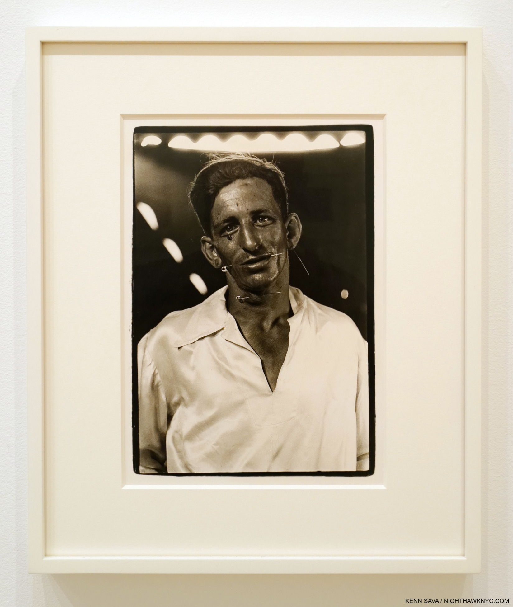
The Human Pincushion, Louis Ciervo, in his silk shirt, Hagerstown, Md. 1961, Printed by Diane Arbus 1966-1967.
Diane Arbus is one of the few Photographers, along with Robert Frank and Araki, I became interested in in the 1990s while I was exclusively a “Painting guy,” before and after my career as a musician/producer, then Music writer. My interest solidified when I saw the monumental Diane Arbus: Revelations at The Met in 20051, one of the truly great shows I’ve ever seen. The recent show, .cataclysm. The 1972 Diane Arbus Retrospective Revisited, is the 5th Diane Arbus solo show I’ve seen-
-Diane Arbus: Revelations, The Met, 2005
-diane arbus: in the beginning, The Met Breuer 2016
-Diane Arbus: In the Park, Levy Gorvy, 2017
-Diane Arbus: Untitled, David Zwirner, 2018
-.cataclysm. The 1972 Diane Arbus Retrospective Revisited, David Zwirner, 2022
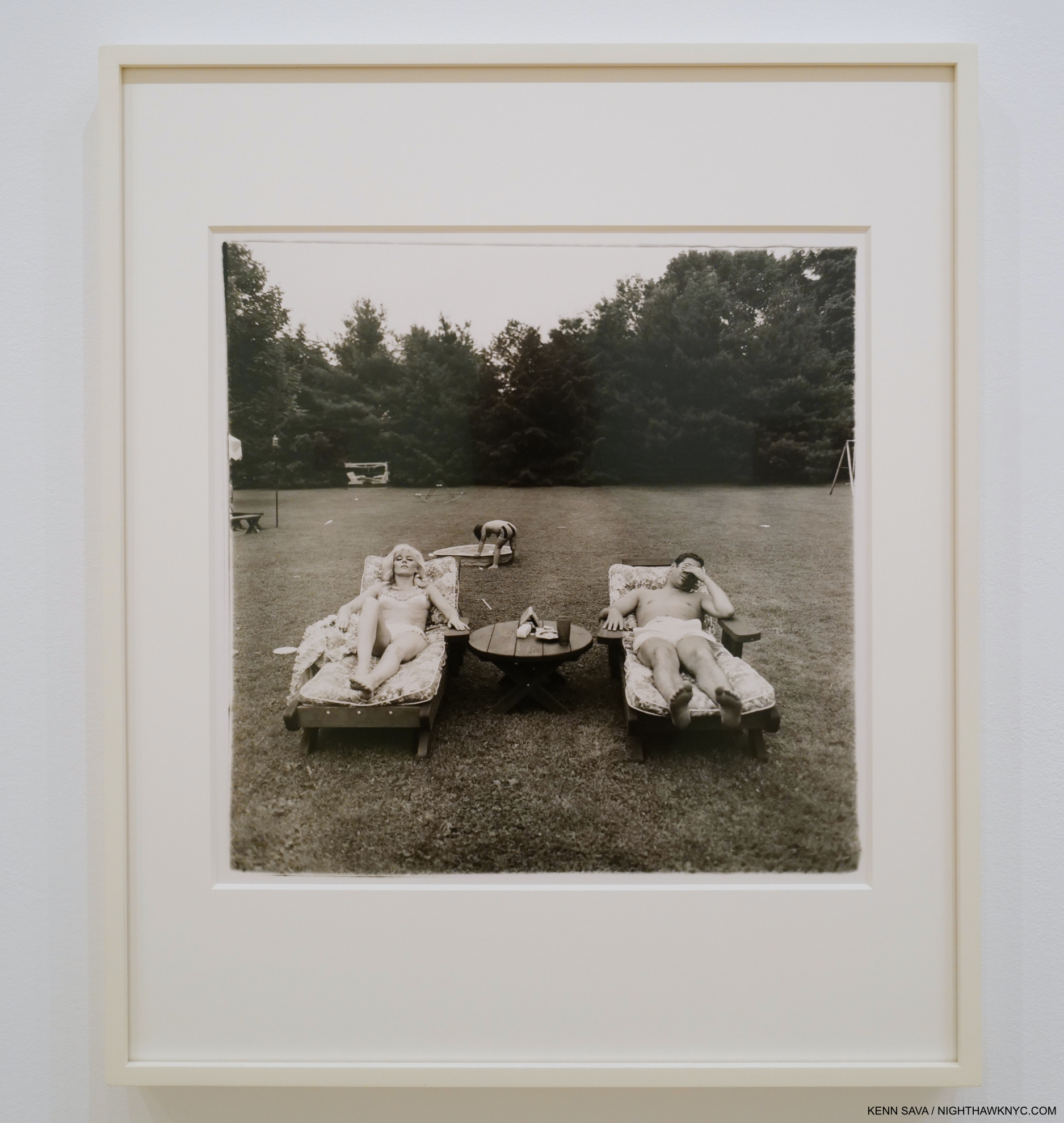
A family on their lawn one Sunday in Westchester, N.Y. 1968, Printed by Diane Arbus 1970-1971
So far, I have only written about her briefly, when I listed in the beginning as a NoteWorthy Show for October, 2016, here. I did, however, spend months working on a piece on Untitled, which I saw almost a dozen times. Beyond the other-worldly work, I was fascinated in comparing Diane Arbus’s lifetime Prints (i.e. those she Printed herself) with those issued after her passing by her estate (which have all been Printed by Neil Selkirk). I finally abandoned it primarily because Photographs were not allowed to be taken in it, or any of her shows. Up to now. Another reason is that I felt my thoughts on her work itself had still not congealed. The Untitled show was a wonderful chance to see her unique and powerful late series of the same name, shot in a center for the mentally disabled in Vineland, New Jersey, complete, but it didn’t give me the insights I longed for into her whole body of work, possibly because it is so singular. The wonderful in the beginning consisted exclusively of early work, again an outlier to the main body of her work between those two.
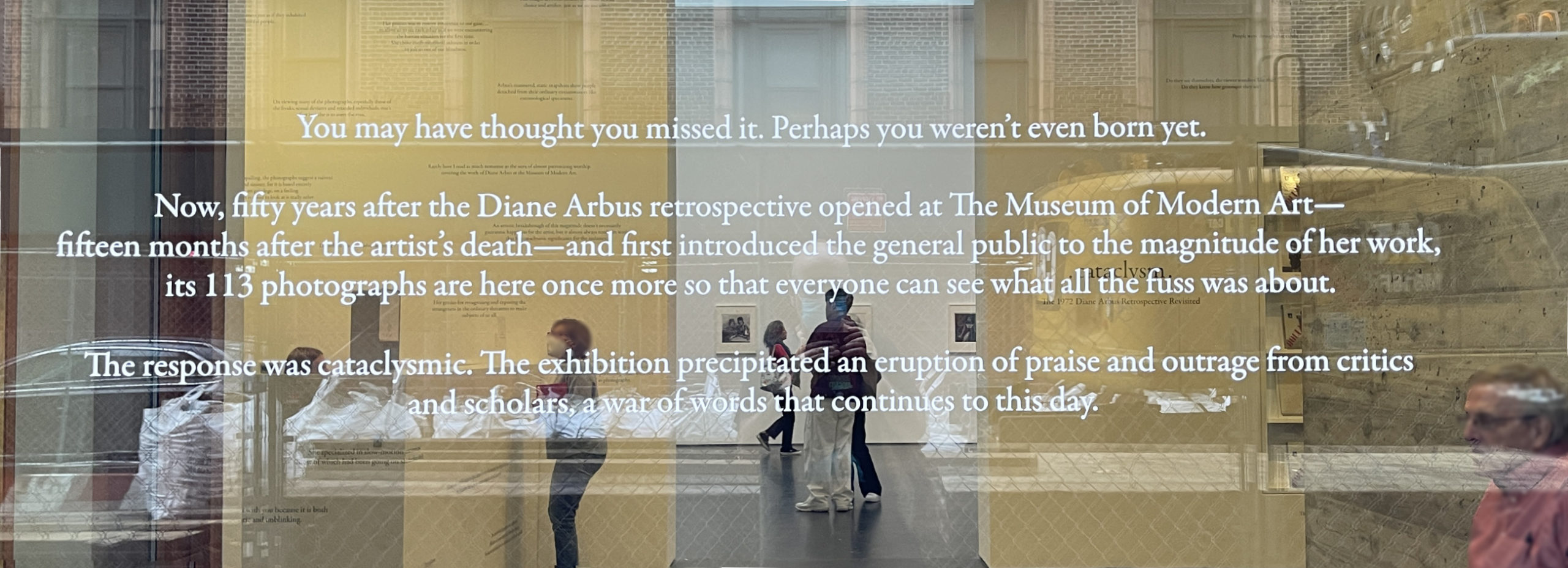
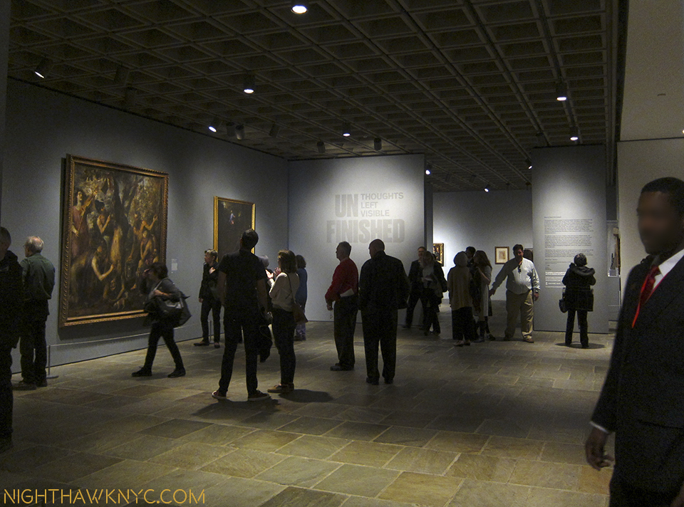
I missed the 1972 Arbus MoMA Retrospective. So, seeing .cataclysm, a “recreation” of it, was an unheard of second chance to see an important show. Being that it includes a good cross section of her mature work, originally selected by legendary MoMA Photography curator John Szarkowski, things FINALLY began to come together.
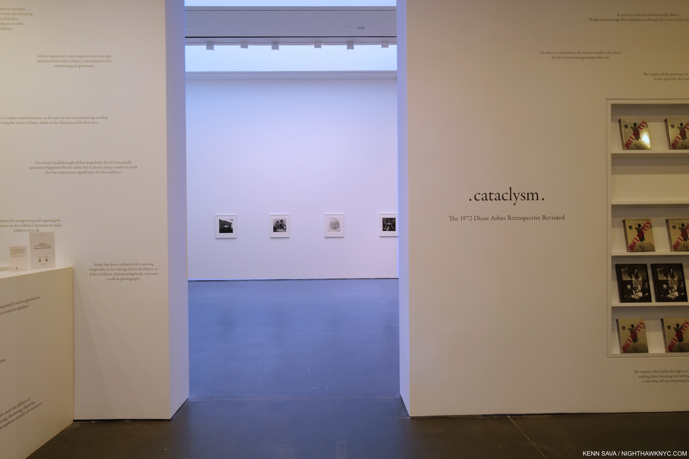
Every time I’ve stood on the precipice of a Diane Arbus show, I’ve been greeted by a “No Photographs” sign. Until now.
As I walked through it themes recurred across time and place. However, the first thing that must be said is that Diane Arbus did not Photograph “freaks,” an offensive term, as some have called her subjects.
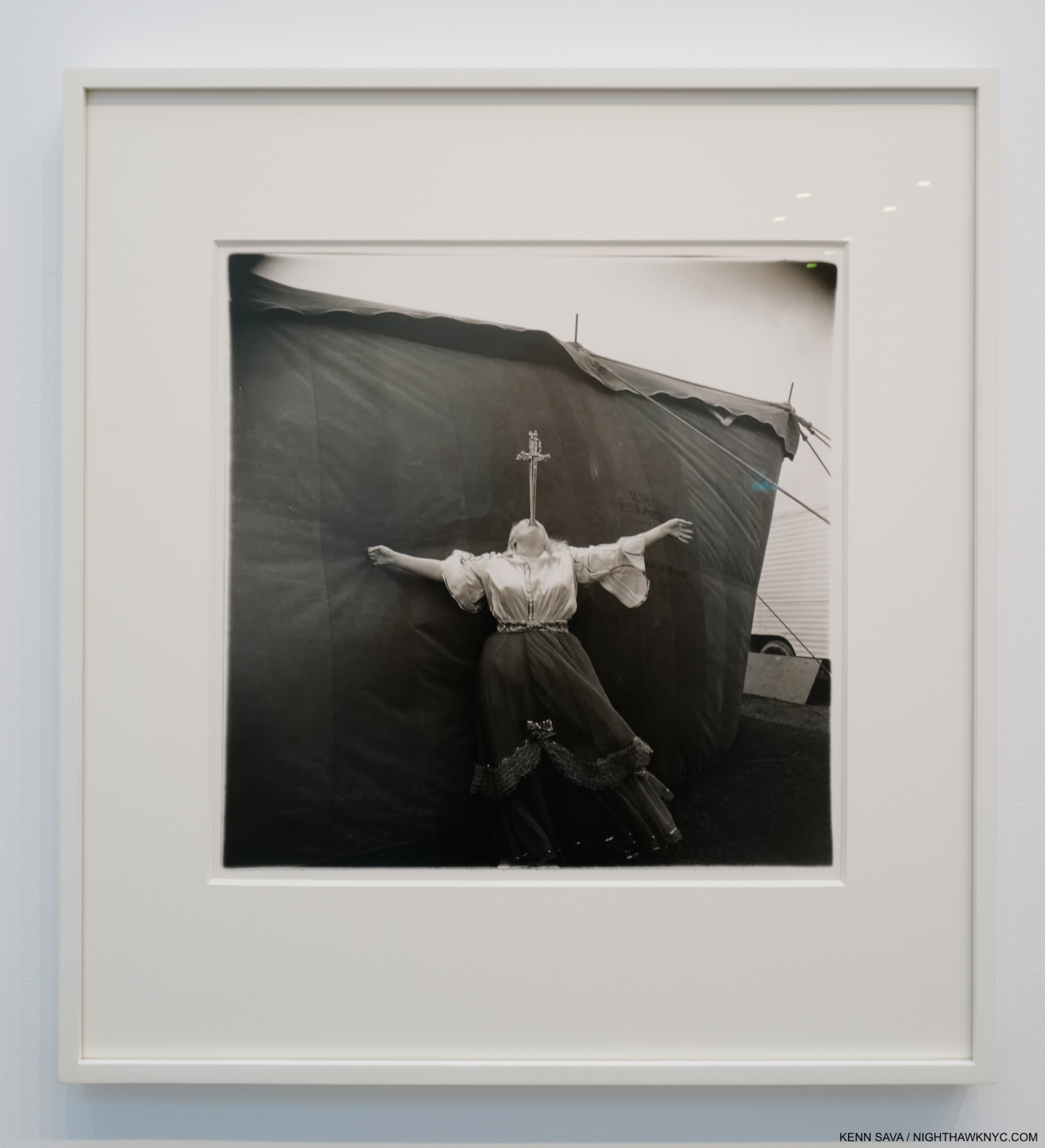
Albino sword swallower at a carnival, Md. 1970. Not one, but two swords.
She liked show people as subjects, which I feel is revealing, and took an interest in them beyond the stage.
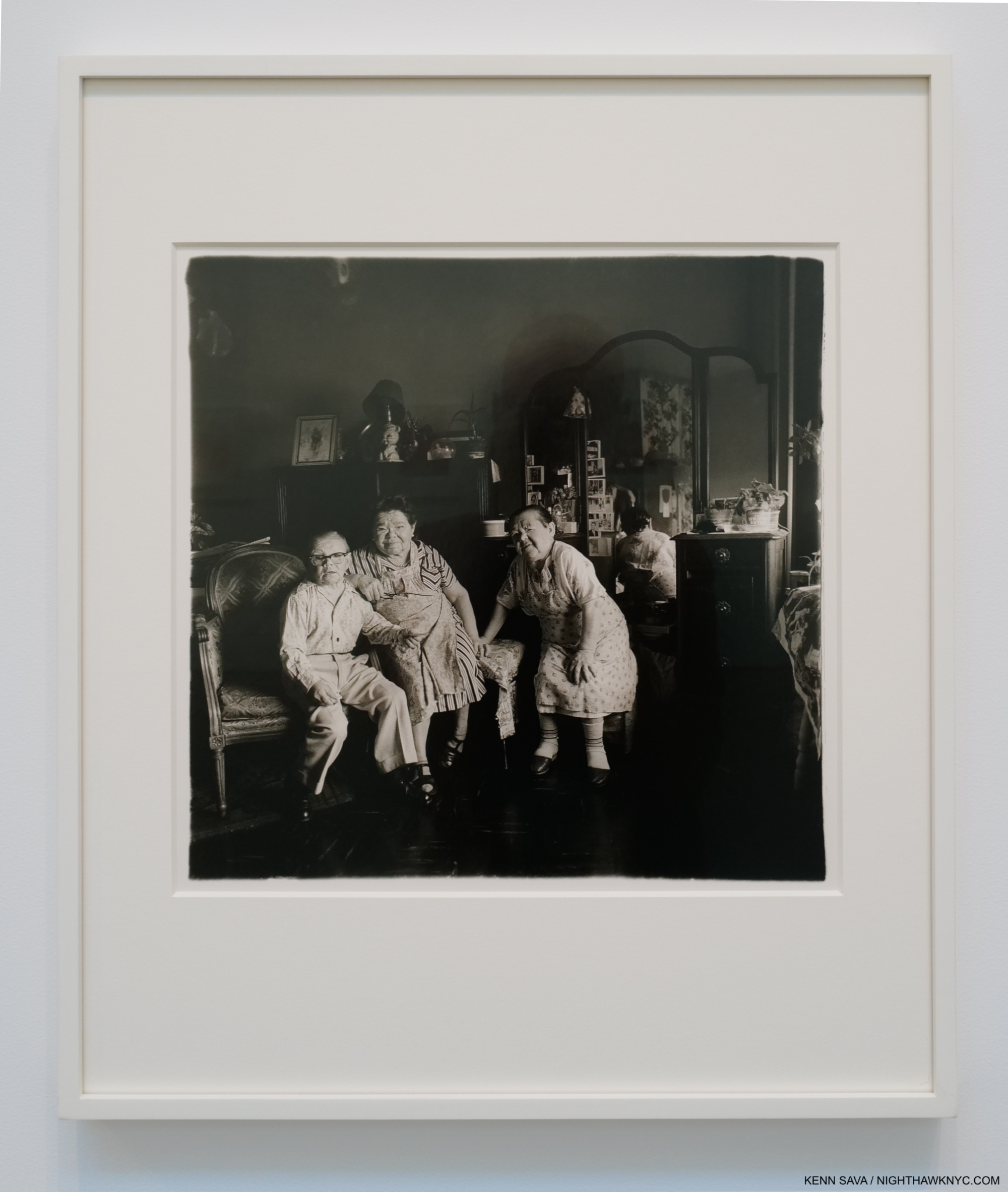
Russian midget friends in a living room on 100th Street, N.Y.C. 1963, There is so much to this Photograph, and so much going on, I find it one of the most captivating of Diane Arbus’s indoor Portraits. There is the layer of these performers as performers, who came to America with a circus in 19232 Here, we see behind the curtain and I for one just can’t stop trying to read each person’s expression, and what this image may say about their relationships.
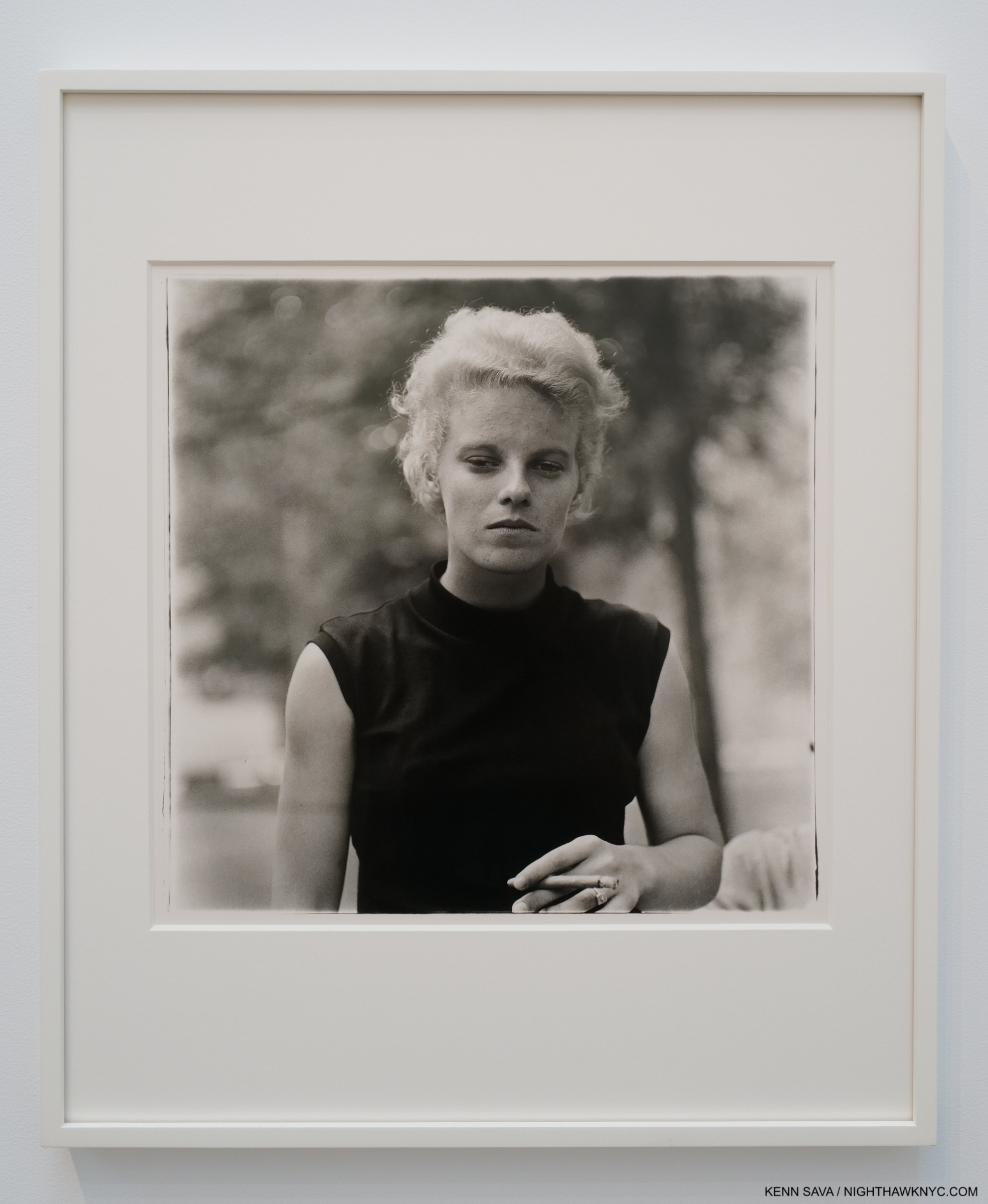
Girl with a cigar, Washington Square Park, NYC, 1965. “A blond lesbian smoking a cigar had sultry star magnetism…3.” I’m struck by the fact that at the exact moment this Photo was taken, Edward Hopper was living a few hundred feet away at 3 Washington Square Park. He & his wife frequented the Park. Too bad his path, apparently, never crossed Ms. Arbus’s.
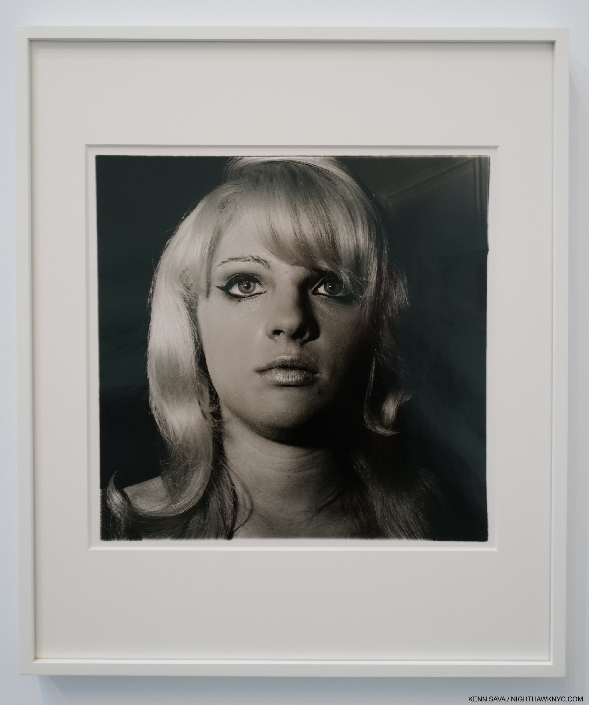
Blonde girl with shiny lipstick, N.Y.C. 1967
As Diane wrote her friend Carlotta Marshall, “The pictures are getting bigger. Some are life-size or more4.” Germaine Greer, who was Photographed by Diane Arbus in April, 1971, three months before her suicide, recalled the experience-
“She set up no lights, just pulled out her Rolleiflex, which was half as big as she was, checked the aperture and the exposure, and tested the flash. Then she asked me to lie on the bed, flat on my back on the shabby counterpane.
I did as I was told. Clutching the camera she climbed on to the bed and straddled me, moving up until she was kneeling with a knee on both sides of my chest. She held the Rolleiflex at waist height with the lens right in my face. She bent her head to look through the viewfinder on top of the camera, and waited. In her viewfnder I must have looked like a guppy or like one of the unfortunate babies into whose faces Arbus used to poke her lens so that their snotty tear stained features filled her picture frame (eg, A Child Crying, NJ, 1967), I knew that at that distance anybody’s face would have more pores than features. I was wearing no make up and hadn’t even had time to wash my face or comb my hair.
Pinned on the bed by her small body with the big camera in my face, I felt my claustrophobia kick in; my heart-rate accelerated and I began to wheeze. I understood that as soon as I exhibited any signs of distress, she would have her picture5.”
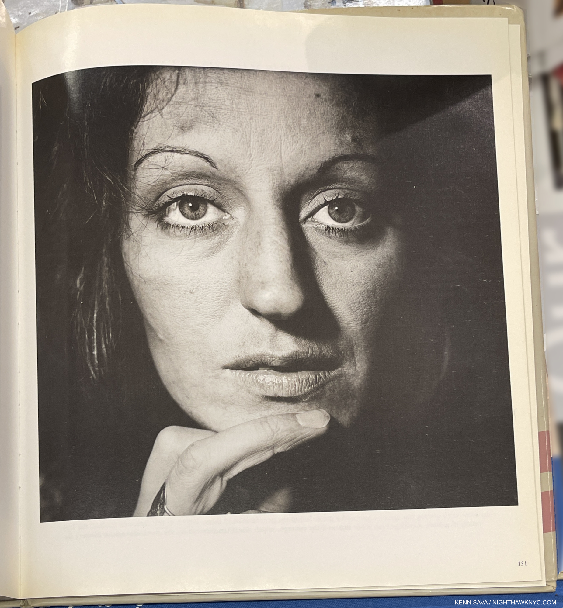
Germaine Greer from the book Diane Arbus: Magazine Work, P.151. (Not included in .cataclysm.)
Ms. Greer reports that “No permission for the reproduction of what is undeniably a bad picture was ever requested6.” It has subsequently seen as Feminist in Hotel Room. In Diane Arbus: Magazine Work, it is listed as “Unpublished, New Woman, 1970.” (Note- The Guardian article states twice that Ms. Greer posed for Diane in April, 1971. The Photographer committed suicide on July 26, 1971.)
This reminds me of what Edward Hopper means when he asserted that “An artist expresses nothing so much as his own personality in art7.” Regardless of what you think of her results, in many cases they can be a bit painful to look at. It’s hard for me to look at Ms. Greer’s Portrait and not see Diane Arbus in it.
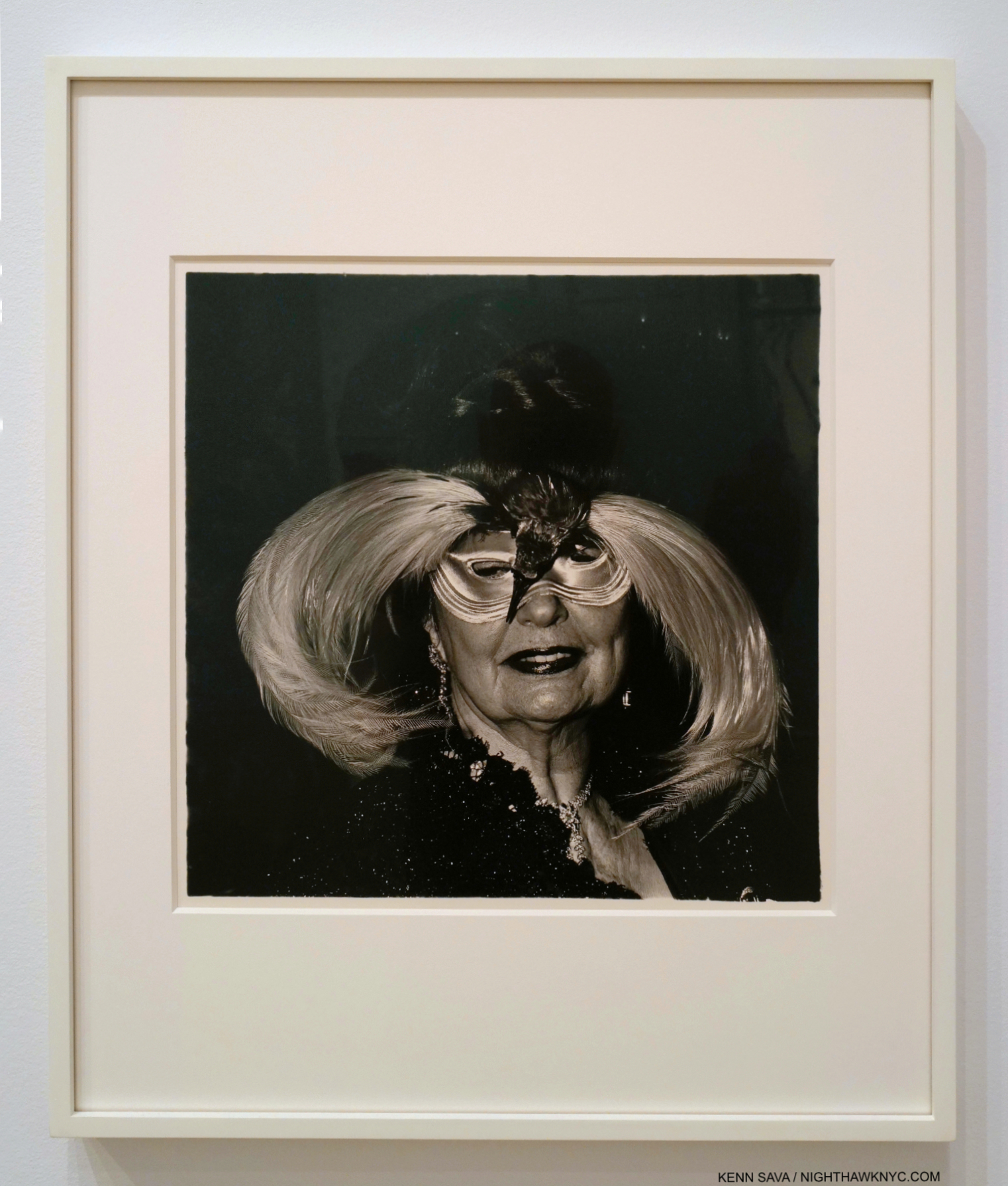
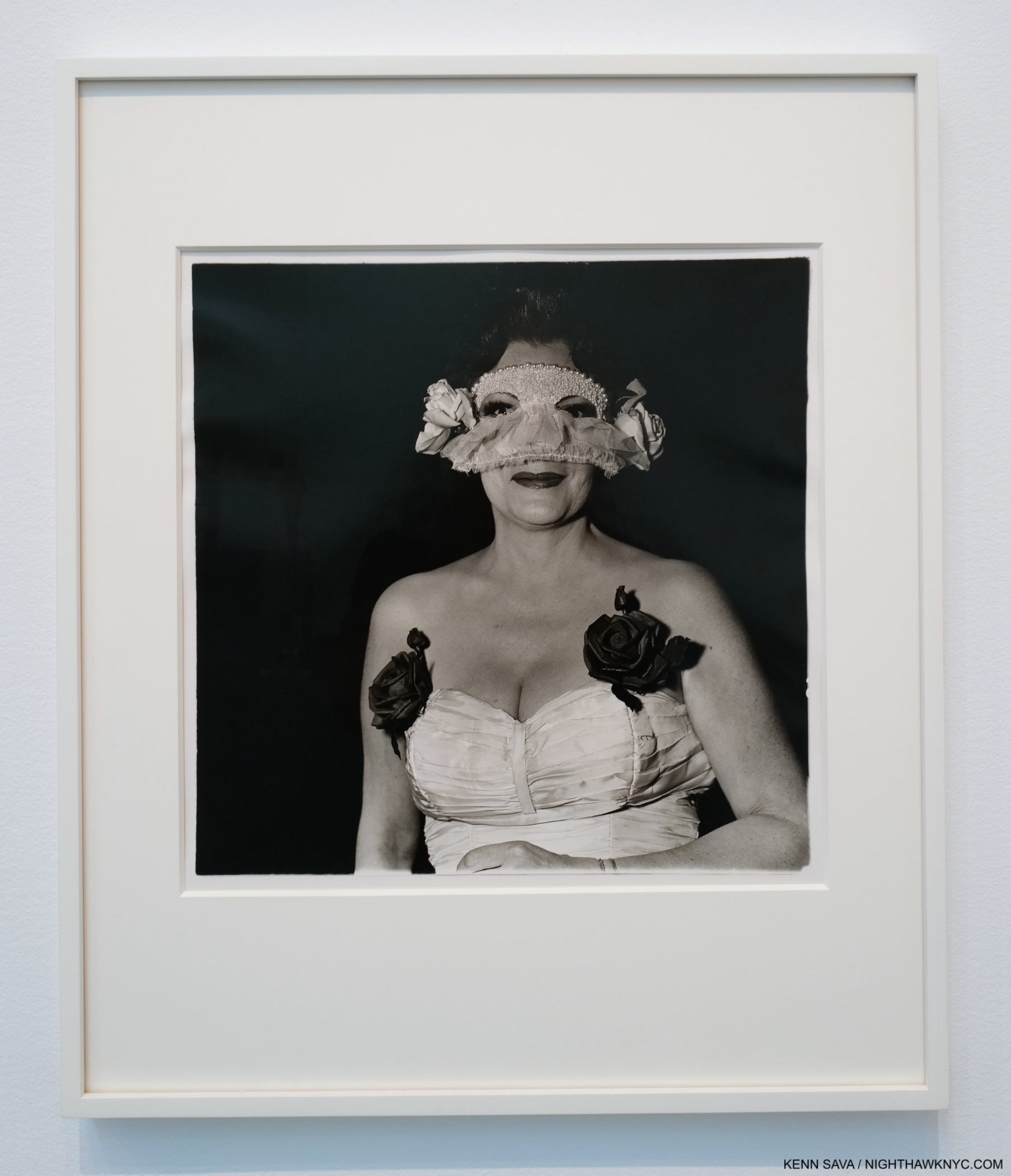
A woman in a bird mask, N.Y.C. 1967. One, perhaps the most exotic, of many Portraits of a masked man or woman in the show.
In studying her Portraits of performers, at work and at home, and then moving on to the other Portraits nearby, I was struck by a commonality- a mask. A performer is one who dons another persona when they work. Diane Arbus shot a number of them either back stage or demonstrating their “act.” Then, she shows some of them at home, as in Russian midget friends in a living room on 100th Street, N.Y.C. 1963, seen earlier.
Transvestite at a drag ball, N.Y.C. 1970.
We see the same person in two different contexts. Having seen them in the mask of performance, are they also “performing” at home? Are we seeing behind the stage mask? Showing them in two contexts is adding layers to what the viewer must peel through.
For me, perhaps no Diane Arbus Portrait sums this up than the one she took of my late friend Stormé DeLarverie, Miss Stormé De Larverie, the Lady Who Appears to be a Gentleman, 1961. I look at it and wonder how many layers there are to it. As someone who bent the lines of gender fluidly throughout her life, this Portrait can be seen as Stormé in her performing guise (multiple layers already), yet, it’s taken outdoors, and not on stage (or at home), adding even more layers. Then, the are all the layers of the woman, herself, who even in her late years, when our paths crossed, never lost her mystery.
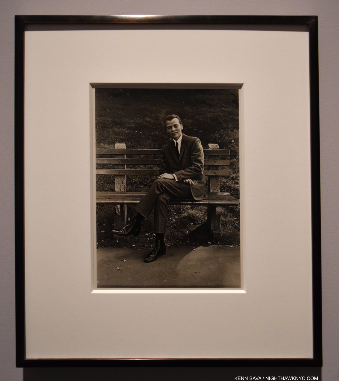
Miss Stormé De Larverie, the Lady Who Appears to be a Gentleman, 1961, 45 years before I would meet her. Not included in .cataclysm. Stormé told me Diane had taken her picture. Seen here in 2015, in a darkened gallery, this was the first time I saw it.
Subsequent history would add even more layers. 8 years after Arbus, on June 28, 1969, Stormé may have been the one who started the Stonewall Uprising, the event that is widely seen as the beginning of the Gay Rights Movement. She told me she was, and I believe her. (She also told me Diane Arbus had Photographed her, but it wouldn’t be until after she passed that I saw her Portrait). She spoke emphatically against the term “riot” being used in referring to Stonewall! “The Stonewall Uprising” is what she called it. History, take note! Photographing her in the peace and calm of Central Park shows a side of Stormé her friends knew. However, Stormé was a VERY strong person- both in her inner fortitude and her physical presence and strength. She was lightning quick to speak up. After a career as a performer and M.C., she often worked as bar security later in her life. In fact, the first time I encountered her, she denied me entrance to one because I was not a lesbian though the female I was with was. I wasn’t about to argue with her! A decade later we met again and became friends. Many a late night I escorted her home to the Hotel Chelsea during the legendary Stanley Bard-era. In fact, Mr. Bard gave me his phone number and told me to call him anytime Stormé had a problem. More than once I called him at 4am. He always picked up. Stanley was one of the people who made Chelsea the legendary neighborhood Patti Smith immortalized in Just Kids.
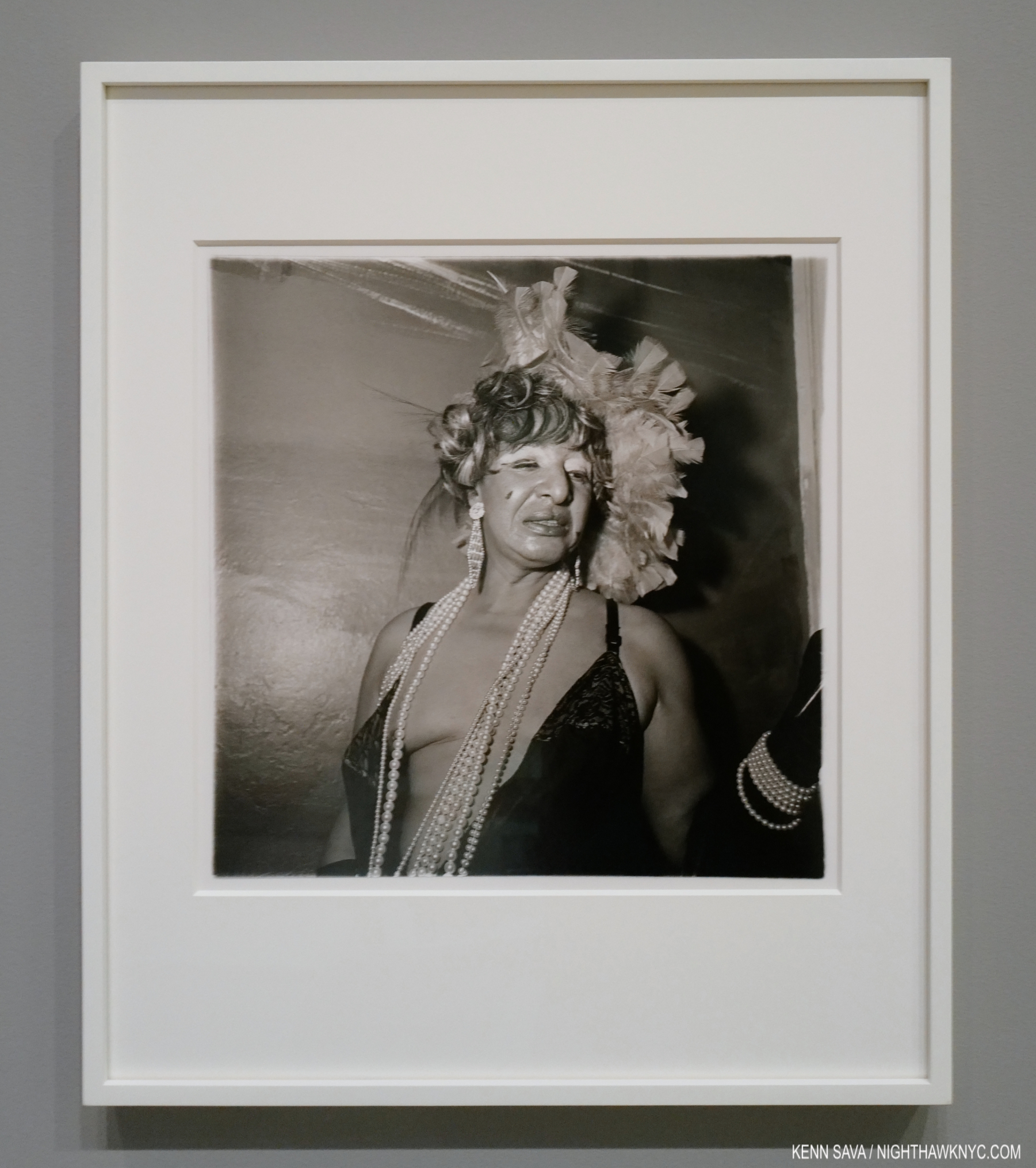
Lady at a masked ball with two roses on her dress, N.Y.C. 1967
Beyond the performers, a number of her other Photographs show people wearing actual masks. Elsewhere, we see someone dressed in the face they show the world, “performing with a mask on” in a different way, on the public stage of life, which may or may not reflect who they really are. In all of these, the common denominator is a kind of mask- literal or figurative. In a number of instances across all of these “types” Diane Arbus captures her subject at the moment when the viewer can see behind the mask. It seems to me that Ms. Arbus, who herself wore many “masks” in public, according to Arthur Lubow’s biography, strived to see under other people’s masks.
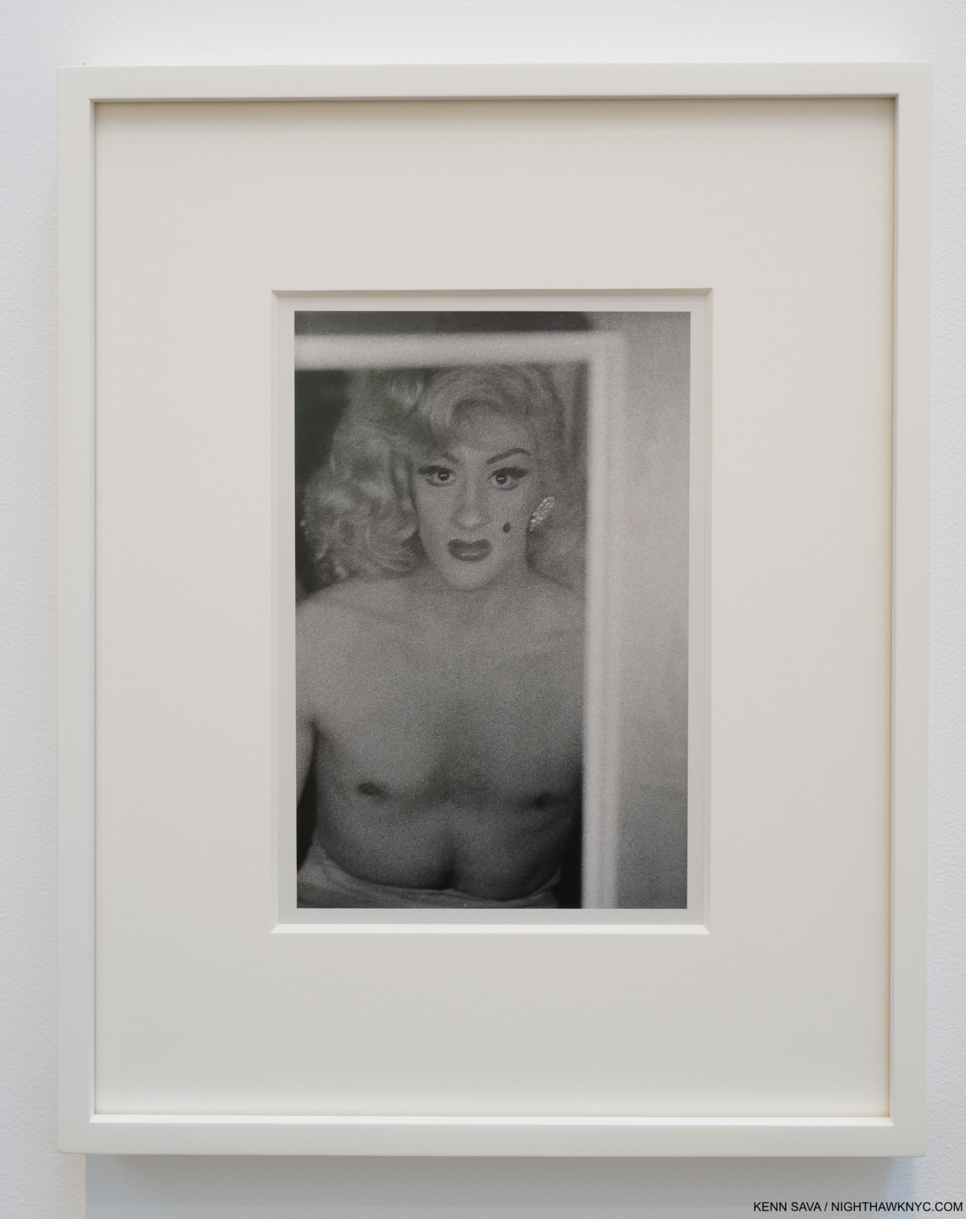
Blonde female impersonator with a beauty mark in mirror, N.Y.C. 1958, Printed by Diane Arbus between 1958-1960. For me, this is an historic and revolutionary image- for so many reasons and in so many ways, The composition astounds me. The Printing adds incalculably to the effect.
In this glimpse of someone behind the mask, of whatever kind, something IS revealed for a split second. But what? Is it an inkling of who they “really are?” Or…? We have no way of “knowing” for sure. It’s left to every viewer to read into it as they will.
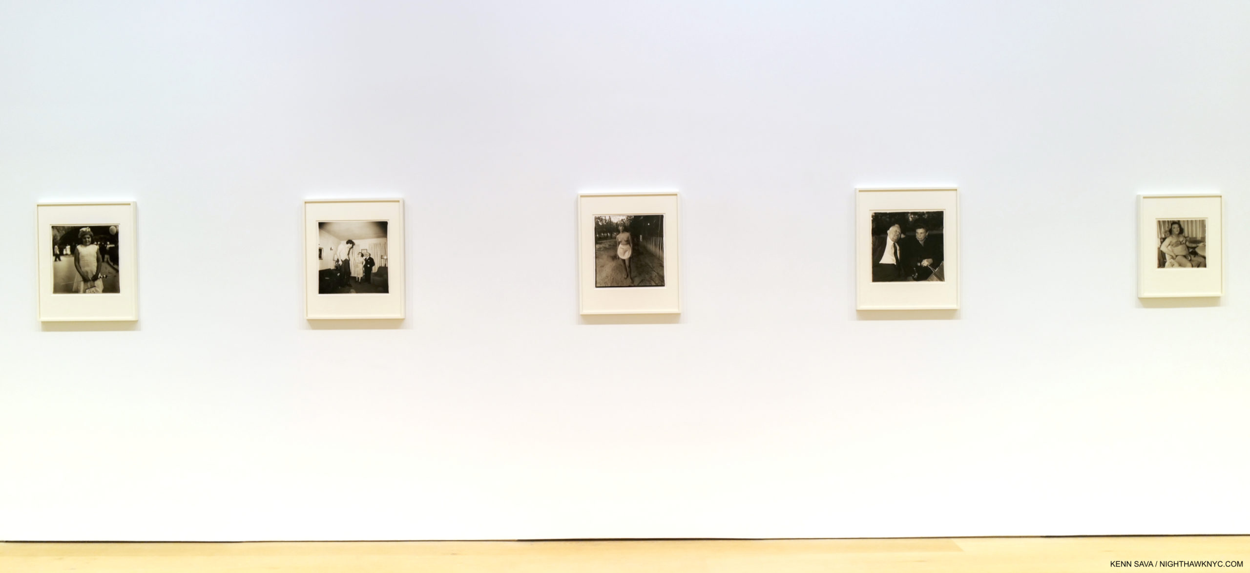
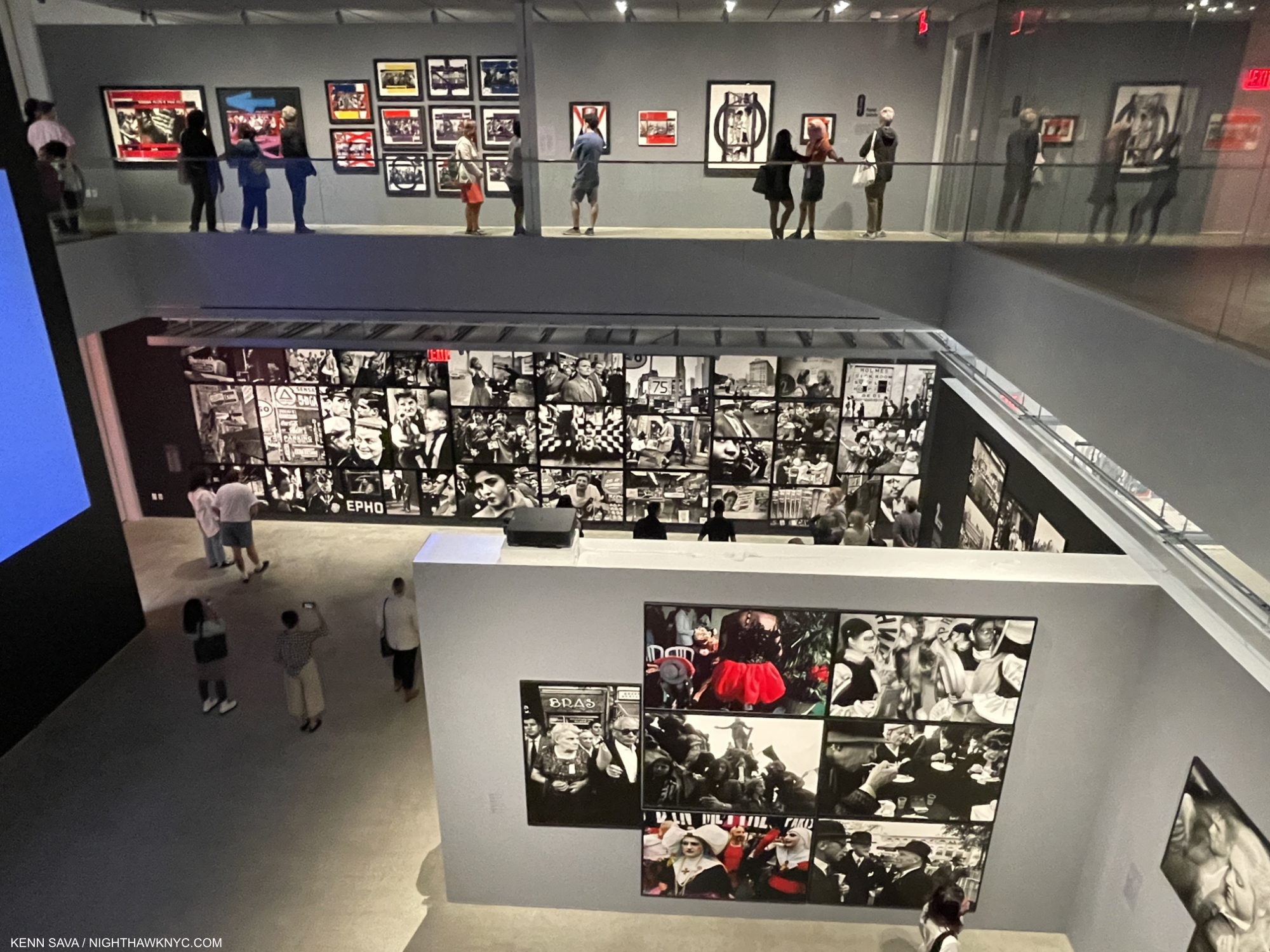
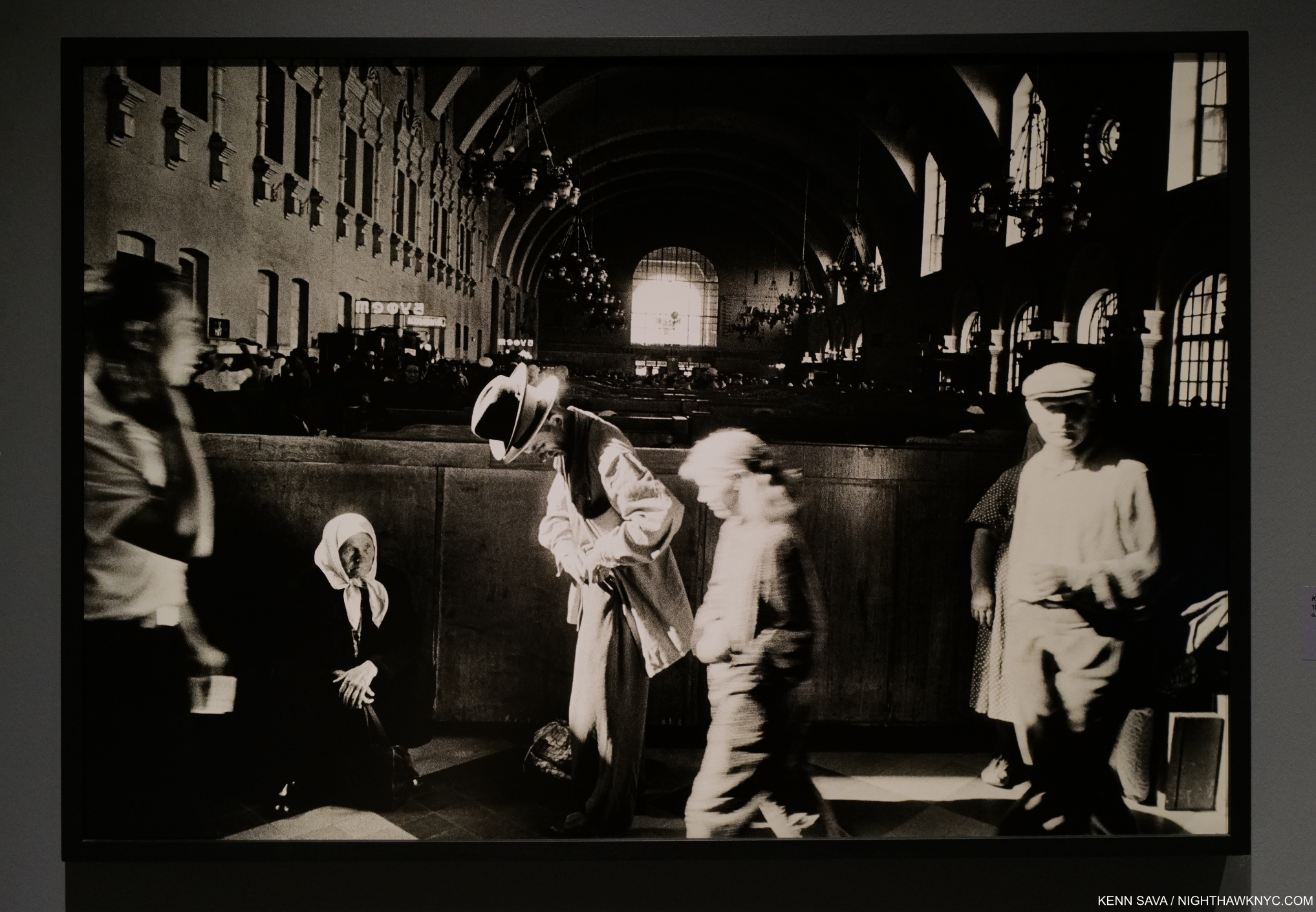
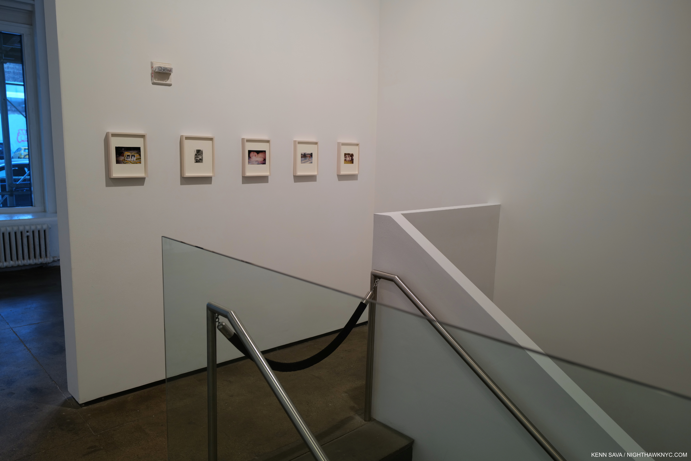
Installation view.
Then, so armed with a glimmer of “knowledge” the rest of the puzzle looms. These images, like her Portrait of Stormé, are what I call an “Arbus onion,” with as many layers for the viewer to unravel as both women who created it had. The mirror in Blonde female impersonator with a beauty mark in mirror, N.Y.C. 1958 adds even MORE layers to all the others for the viewer to unravel.
And this, it appears to me, is the crux of Diane Arbus’s Art. When one layer is finally peeled off, there’s another one under it. The “world” of her Art is an onion- one layer shows at a time, but there are many, many more underneath.
Underneath ALL of it, I’m left to wonder- “What’s left? The Artist, herself?”
“Happiness perplexed her.”
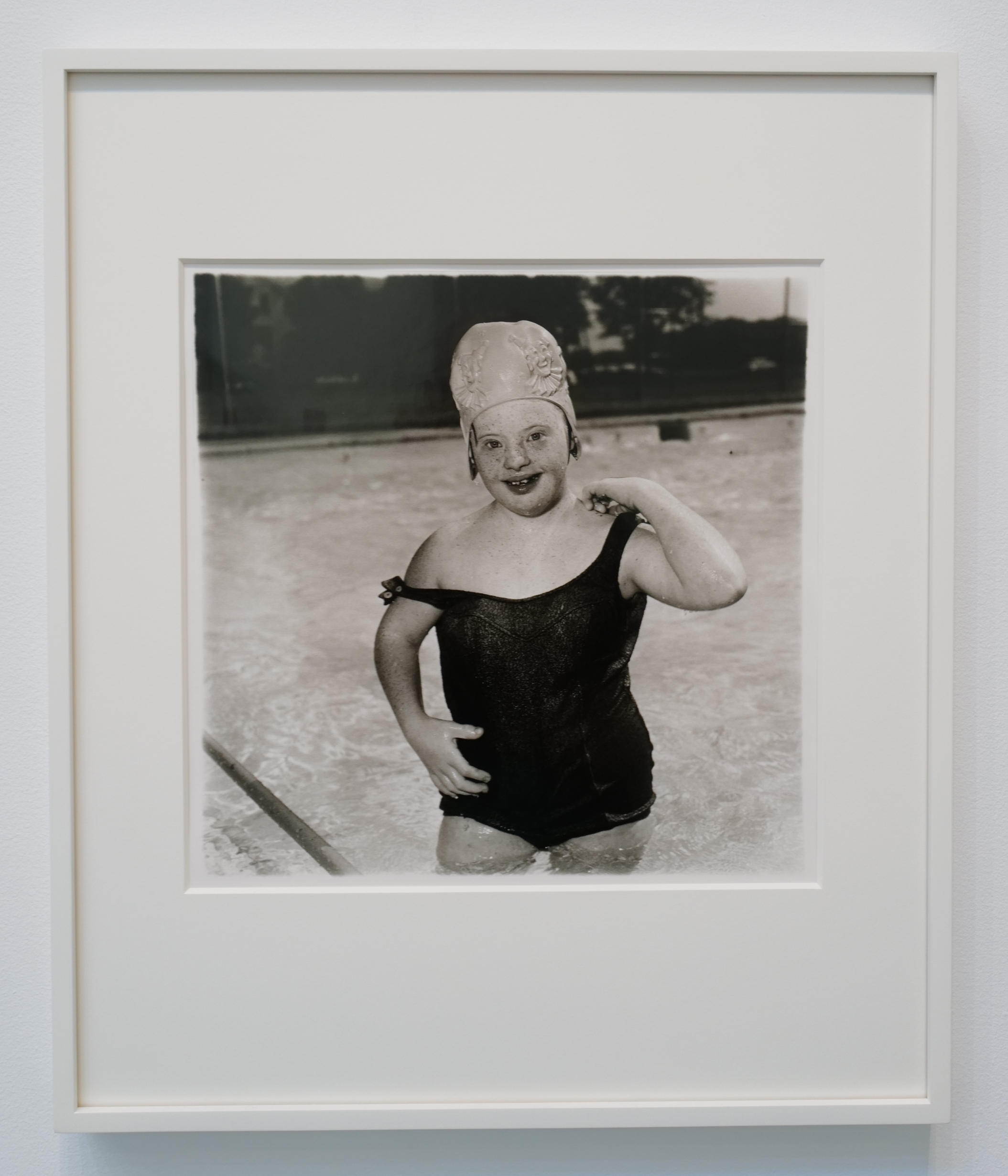
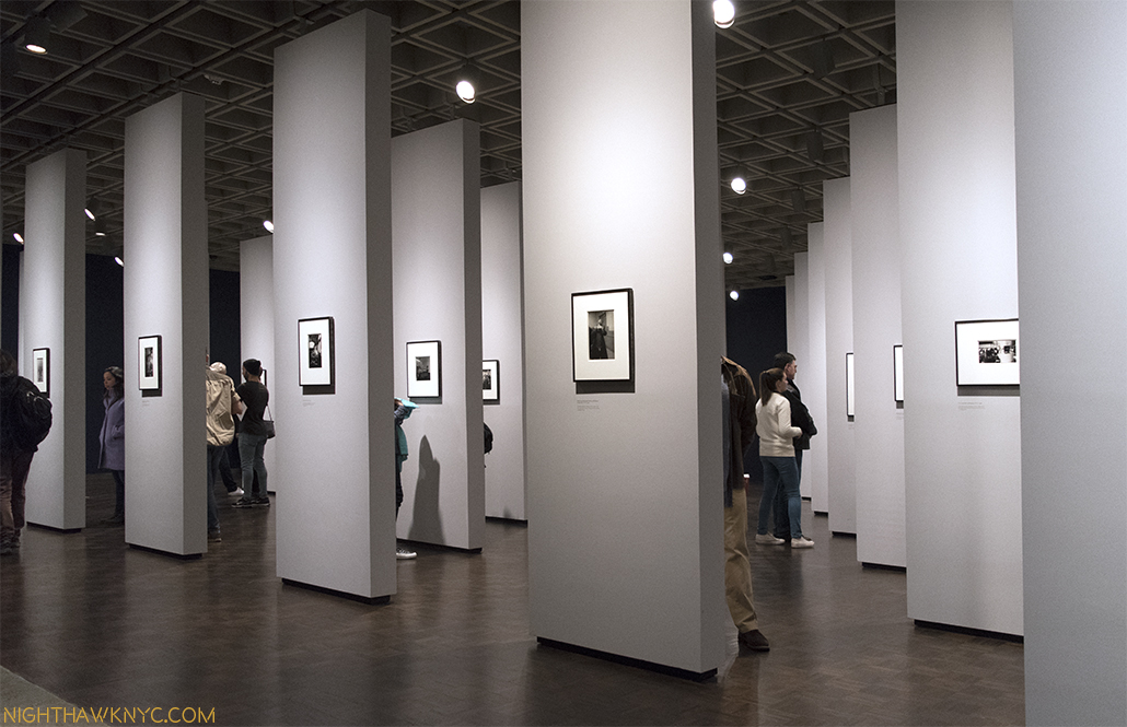
Untitled (11) 1970-71
“In the summer of 1969, she traveled to (a center for the mentally disabled in Vineland) New Jersey as often as she could to photograph the handicapped. Even before her first visit, she knew that she wanted to portray “idiots, imbeciles and morons (morons are the smartest of the three), especially the cheerful ones.” She wasn’t seeking out suffering, but rather joy in the face of terrible adversity. By artistic standards, a photograph of a severely disabled person with a smiling face would usually be more moving and mysterious than a conventional documentation of the afflicted and downtrodden. But her motives were not entirely aesthetic. As when driving through the hardscrabble backcountry of Florida, she questioned how people with so little could be this happy. Happiness perplexed her.
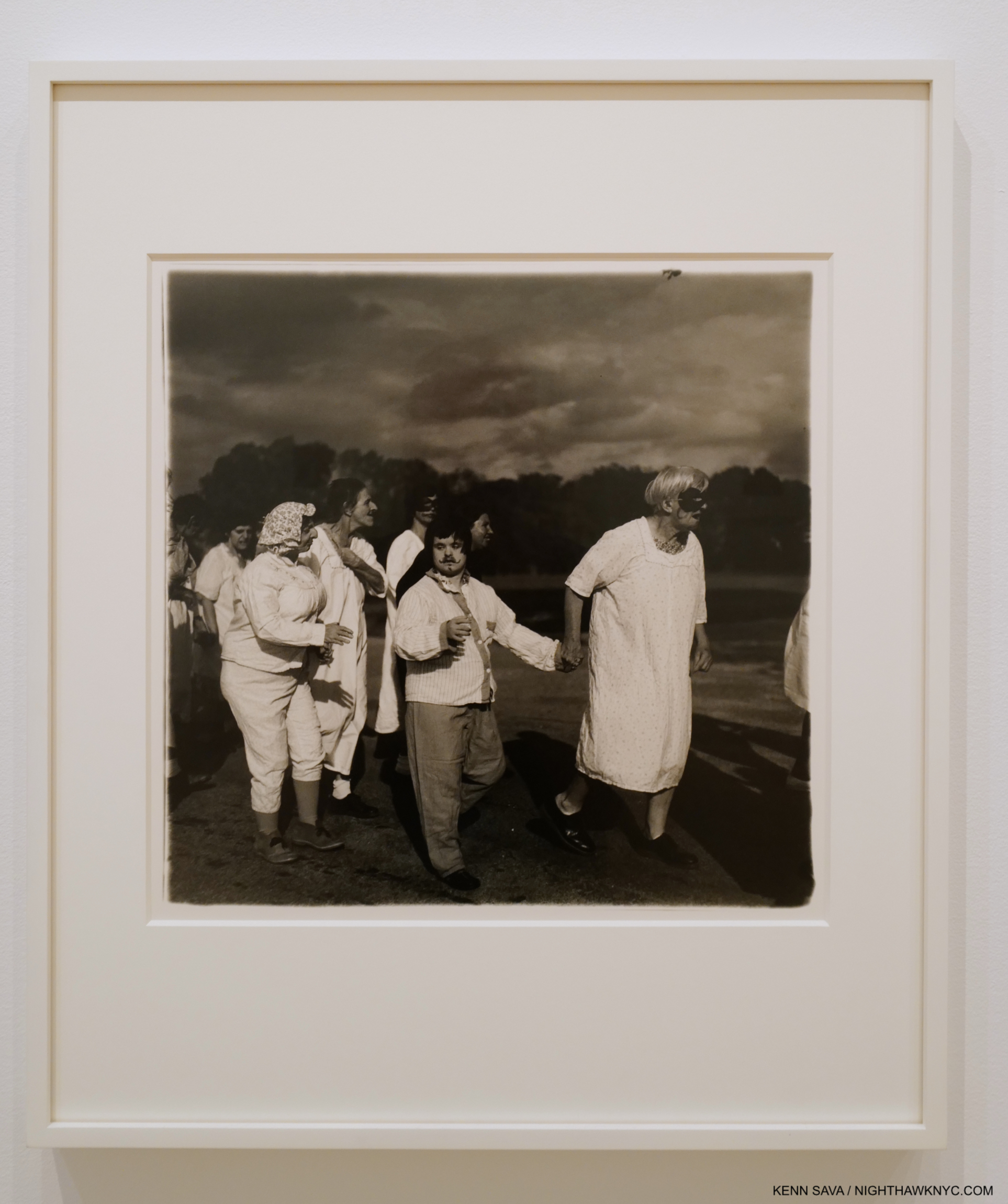
Untitled (7) 1970-71. Other-worldly. The power, and yes beauty, of Diane Arbus’s Untitled series has captivated me since I discovered them in Diane Arbus: Revelations at The Met in 2005. For me, Untitled is among the very few, if not the only, Photographic series I could speak of in the same sentence as Goya’s timeless Prints, including Los Caprichos, in therms of their mystery, power and compositional brilliance.
In the enervating summer heat, her mentally disabled subjects—whom she found “the strangest combination of grownup and child”—provided solace. Her pictures of their parties and processions convey a sentiment of acceptance and contentment. These people had stopped fighting fate. They had surrendered any pretense of control. And they seemed happy. Not all of them, of course. Some were angry or distraught. But those were not the ones she usually chose as subjects8.”
While making these Photographs which would become her Untitled series, Diane told a friend, “that one of the women, aboard a bus, touched her with an affectionate little hand. The exchange moved and depressed her. She loved these people, but they could lend her no strength9.” How utterly revealing. How utterly crushing.
November, 2022 marks the 6 year anniversary of my “deep dive” into Modern & Contemporary Photography. As time has gone on, I’ve found that most Photography doesn’t hold up to repeat looking like Painting, Drawing, or Sculpture, at least for me. Diane Arbus’s does.
*- This piece is dedicated to Stormé DeLarverie. The Soundtrack for this piece is “Andryogny” by Garbage featuring Shirley Manson, an icon in my book, from their album Garbage 2.0. In it, Ms. Manson dons an outfit at one point hauntingly similar to those worn by Stormé in her publicity photos (a coincidence?). It’s seen here in its official Music video-
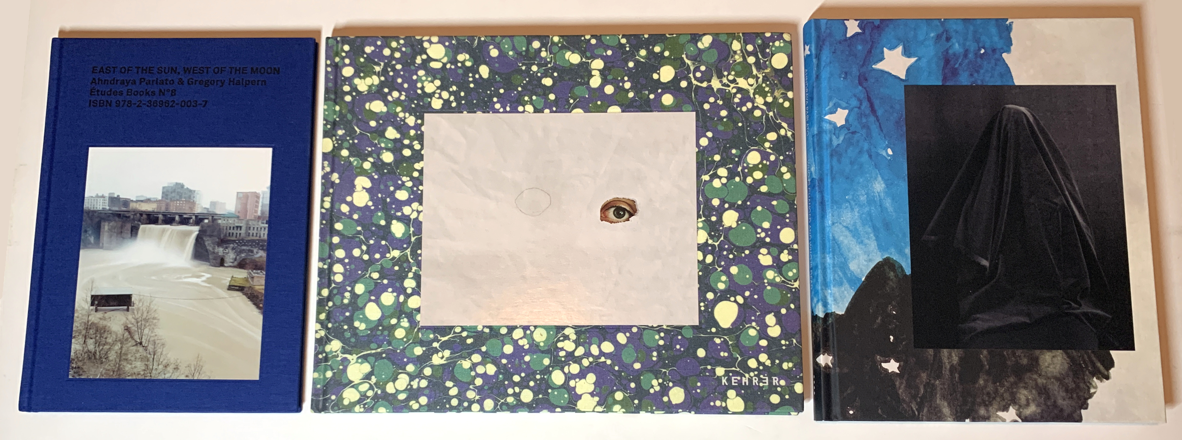
Also- I’m pleased to announce I’m curating a selection of Art, ArtBooks & PhotoBooks for sale! All items are from my collection or selected by me in my travels through the Art world. The complete selection of over 370 items is here.
NighthawkNYC.com has been entirely self-funded & ad-free for over 7 years, during which over 300 full length pieces have been published!
If you’ve found it worthwhile, PLEASE donate to allow me to continue below.
Thank you, Kenn.
Written & photographed by Kenn Sava for nighthawknyc.com unless otherwise credited.
To send comments, thoughts, feedback or propositions click here.
Click the white box on the upper right for the archives or to search them.
Subscribe to be notified of new Posts below. Your information will be used for no other purpose.
- A show that was only up from March 8 through May 30th, 2005, a pretty short run. ↩
- Arthur Lubow, Diane Arbus: Portrait of a Photographer, P.550 ↩
- Ibid, P.366 ↩
- Diane Arbus: Revelations Exhibition Catalog, P. 185 ↩
- Germaine Greer, “Wrestling with Diane Arbus,” The Guardian, October 7, 2005, reprinted in Diane Arbus Documents ↩
- Ibid ↩
- Gail Levin, Edward Hopper: An Intimate Biography, P.42 ↩
- Excerpt from Lubow, Diane Arbus: Portrait of a Photographer, P.418. ↩
- Ibid, P.422 ↩